")
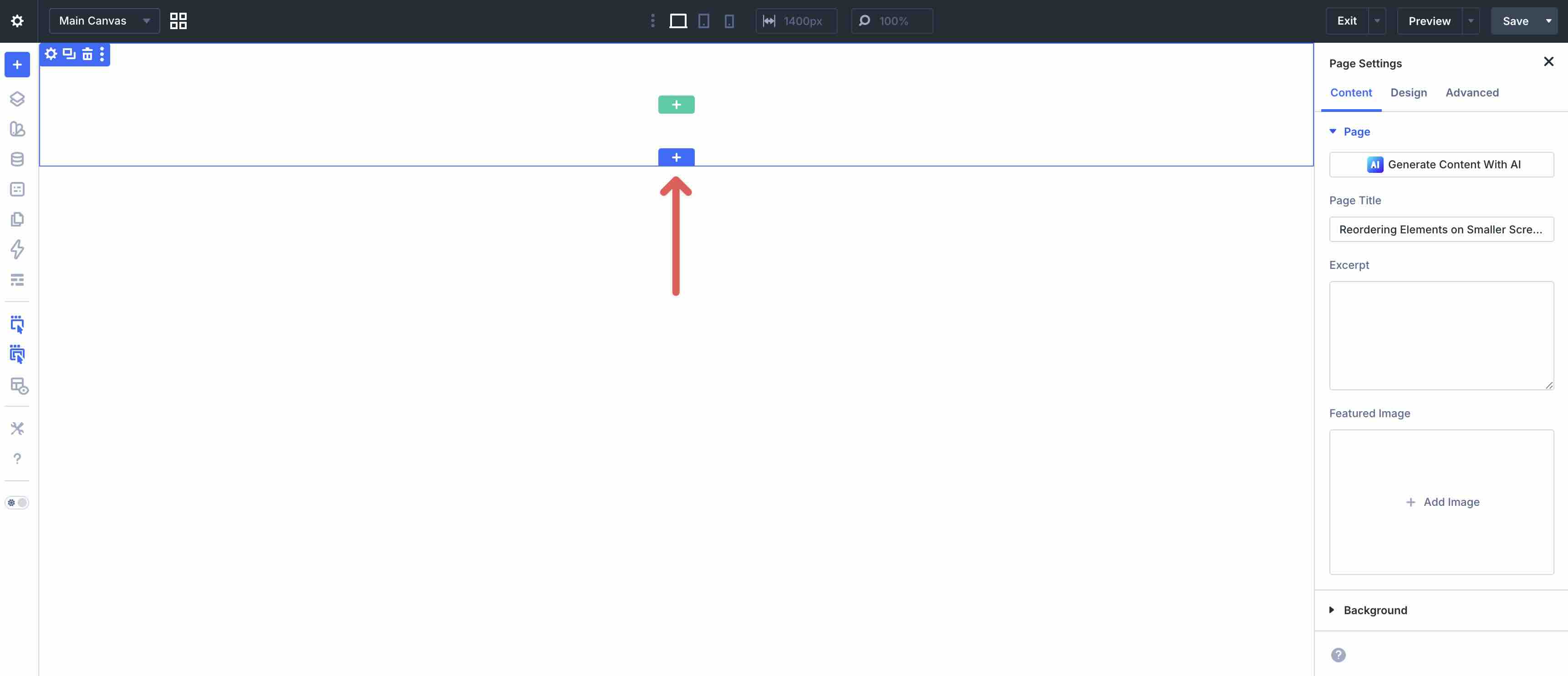
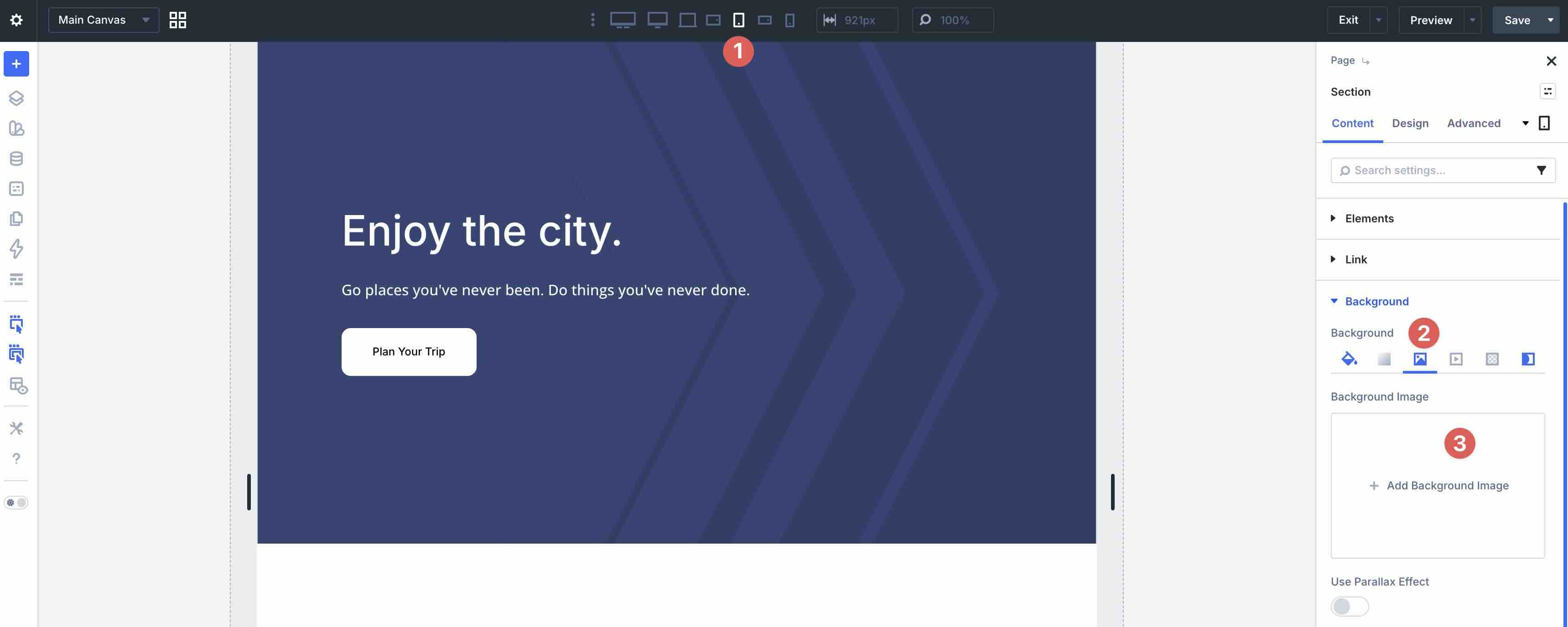
Divi 5 is now officially out of the Public Beta phase. It launches with an entirely new framework rebuilt from the ground up, moving away from shortcode-based content storage to a modern, block-editor-like format and layout system. This modular approach delivers faster performance, cleaner code, better scalability, and a more intuitive experience for Divi users.
With an entirely new Visual Builder comes a more streamlined responsive web design experience. Tools like Flexbox, CSS Grid, the Responsive Editor, and Customizable Responsive Breakpoints allow you to create complex, adaptable layouts with a few clicks.
In this post, we’ll dive into best practices for mastering mobile responsive design and show you how to implement them using Divi 5 features. Let’s get started.
- 1 Overview of Divi 5: New Features for Responsive Web Design
- 2 Download The Files
- 3 Download For Free
- 4 Getting Started with Divi 5 for Mobile Design
-
5
Mobile Responsive Design Best Practices
- 5.1 Best Practice 1: Reordering Elements For Mobile Flow
- 5.2 Best Practice 2: Natural Wrapping For Horizontal Rows
- 5.3 Best Practice 3: Hide & Show Content By Breakpoint
- 5.4 Best Practice 4: Scaling Grids For Wide Screens
- 5.5 Best Practice 5: Wrapping Flex Rows For Small Screens
- 5.6 Best Practice 6: CSS Grid Column Breakdown On Mobile
- 5.7 Best Practice 7: Clamp-Based Padding
- 5.8 Best Practice 8: Clamp-Based Width on Large Images
- 5.9 Best Practice 9: Clamp-Based Typography
- 5.10 Best Practice 10: Content-Fixed + Expanding Columns
- 5.11 Best Practice 11: Breakpoint-Free Column Wrapping
- 5.12 Best Practice 12: Simplified Mobile Background Styles
- 6 Build Fully-Responsive Websites In Divi 5 Today!
Overview of Divi 5: New Features for Responsive Web Design
Divi 5’s strengths for responsive design come in the form of advanced features that simplify creating sites that look and function beautifully across every device. These are the key new features:
Flexbox Layout System
Divi 5 uses Flexbox for arranging modules within rows and sections. This lets elements flex, wrap to new lines, reorder for better mobile flow, and align precisely with intuitive tools in the Visual Builder. Flexbox handles one-dimensional layouts, like stacking columns vertically on small screens, without forcing you into custom CSS, resulting in more natural, adaptive designs.
CSS Grid
For layouts that need two-dimensional control, you can switch to CSS Grid. Easily define explicit rows and columns that resize and reflow across screen sizes. CSS Grid is perfect for masonry grids, card layouts, or complex page structures that stay responsive with minimal tweaks.
Customizable Responsive Breakpoints
Divi 5 comes with seven Customizable Responsive Breakpoints for phone, phone wide, tablet, tablet wide, desktop, widescreen, and ultra wide desktops. By default, three are active with toggles to enable all seven. These breakpoints give you precise control over when and how designs shift, whether you’re targeting smartphones, large monitors, or anything in between.
Responsive Editor
The Responsive Editor provides a dedicated panel that consolidates all your device-specific and hover settings into one view. Switch between breakpoints, compare adjustments side-by-side, and edit without constantly toggling preview modules. Using the Responsive Editor streamlines your workflow for quick fixes and detailed refinements.
Advanced Units
Input fields now support modern CSS functions, including clamp(), vw, vh, calc(), and more. This means you can set fluid values for font sizes, padding, margins, widths, and heights that scale smoothly between min and max thresholds based on viewport size. These Advanced Units reduce the need for breakpoint overrides and create truly seamless responsiveness.
Other Responsive Features
Divi 5 introduces several new features that make complex, responsive designs easier to build and maintain over time.
Nested Rows
Nested Rows allow you to place entire row structures inside columns, so you can create multi-level designs without relying on workarounds, specialty sections, or custom code. This pairs perfectly with Flexbox and CSS Grid for more sophisticated layouts that remain fully responsive and editable in the Visual Builder.
Module Groups
Module Groups let you bundle modules together (like a headline, image, and multiple buttons), apply shared styles or presets to the group, and manage them as a single unit. This streamlines organization, speeds up repetitive tasks, and keeps the builder interface cleaner. They are especially useful when duplicating or updating consistent design patterns across a site.
Under the hood, the complete rebuild on a modern CSS foundation (ditching shortcodes) brings noticeable gains for faster front-end rendering, reduced CSS bloat, smaller JavaScript bundles, and better overall performance, even on complex pages. These improvements support a genuine mobile-first workflow: you design from smaller screens, layer in complexity as needed, and end up with clean, scalable code that’s easy to revisit or hand off later.
Download The Files
To see all twelve best practices in action, download the files for free. Each example is clearly named Styled – Responsive Section 1 through 12, so you can quickly jump to the technique you’re learning.
Import them into your Divi Library, add to any page, and start experimenting. From there, you can tweak settings, preview on different devices, and adapt them to your own projects.

Getting Started with Divi 5 for Mobile Design
With Divi 5 now officially released to the public, getting set up for mobile-focused design is easy. If you’re an active Elegant Themes member, head to the Members Area to download the latest version of Divi 5. Upload it and activate your license through the Divi Dashboard or use the Divi 5 Migrator to upgrade your existing Divi 4 installation.
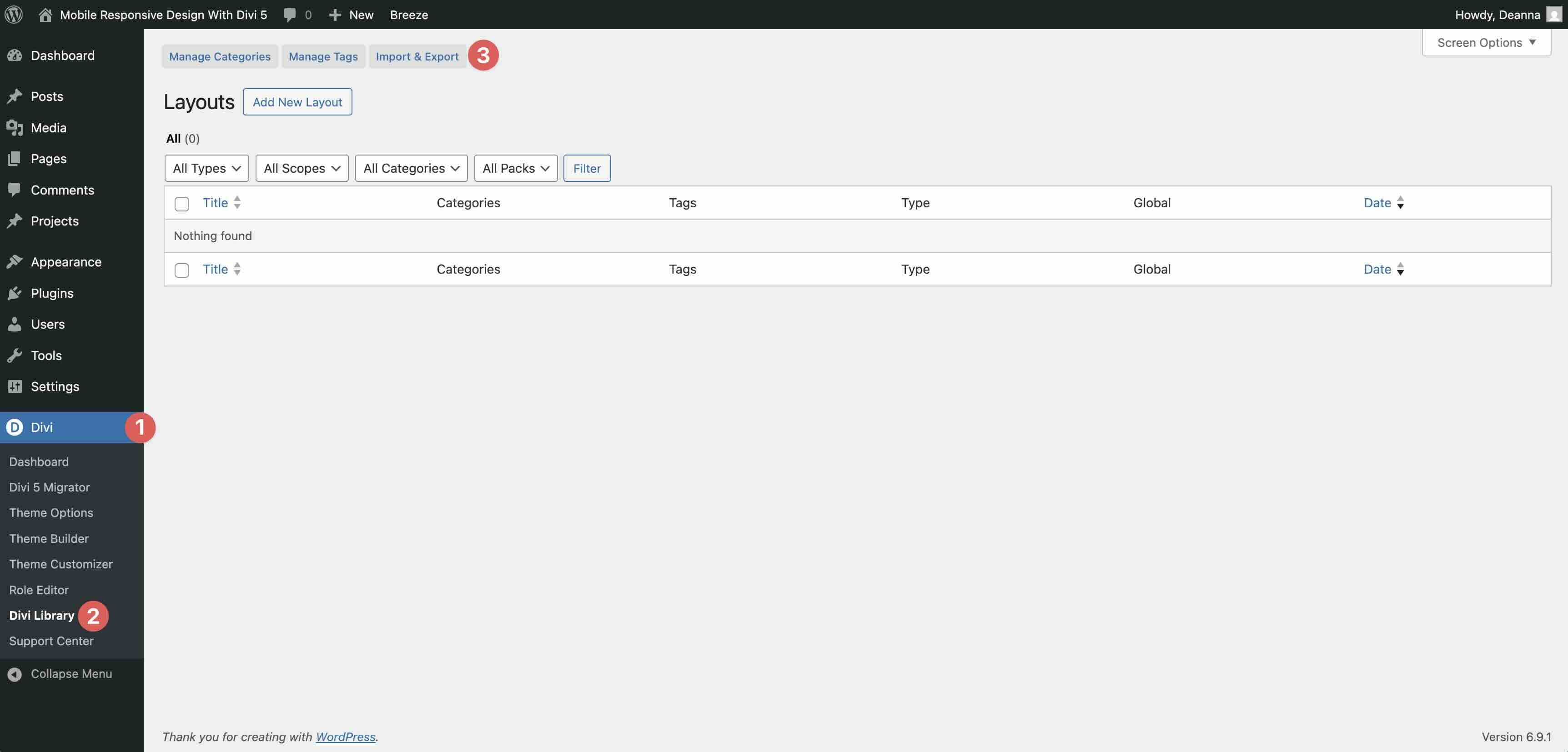
Next, grab the free downloadable layout pack that accompanies this post. These twelve ready-to-import layouts demonstrate each best practice in action. To import, open the Divi Library, click the Import & Export button at the top, and upload the layouts you want.
Once imported, you can add them to any page via the Visual Builder by clicking the blue + icon to add a new section.
To unlock Divi 5’s full responsive power right away, enable all seven of Divi 5’s Customizable Responsive Breakpoints if needed. Divi 5 offers seven in total, from phone to ultra-wide desktops.
Toggle on the breakpoints you want and adjust widths as needed.
Also, get familiar with the Responsive Editor. When editing any setting, look for the small Responsive Editor icon next to the field. Click it to view and tweak values side-by-side for all active breakpoints without switching views in the page settings bar.
Mobile Responsive Design Best Practices
With your Divi 5 responsive settings configured, you’re ready to jump into the best practices for mobile-friendly design. The downloadable Layout Pack (linked in the next section) makes these steps easy to follow, with each example named Styled – Responsive Section 1, 2, 3 , etc.
Best Practice 1: Reordering Elements For Mobile Flow
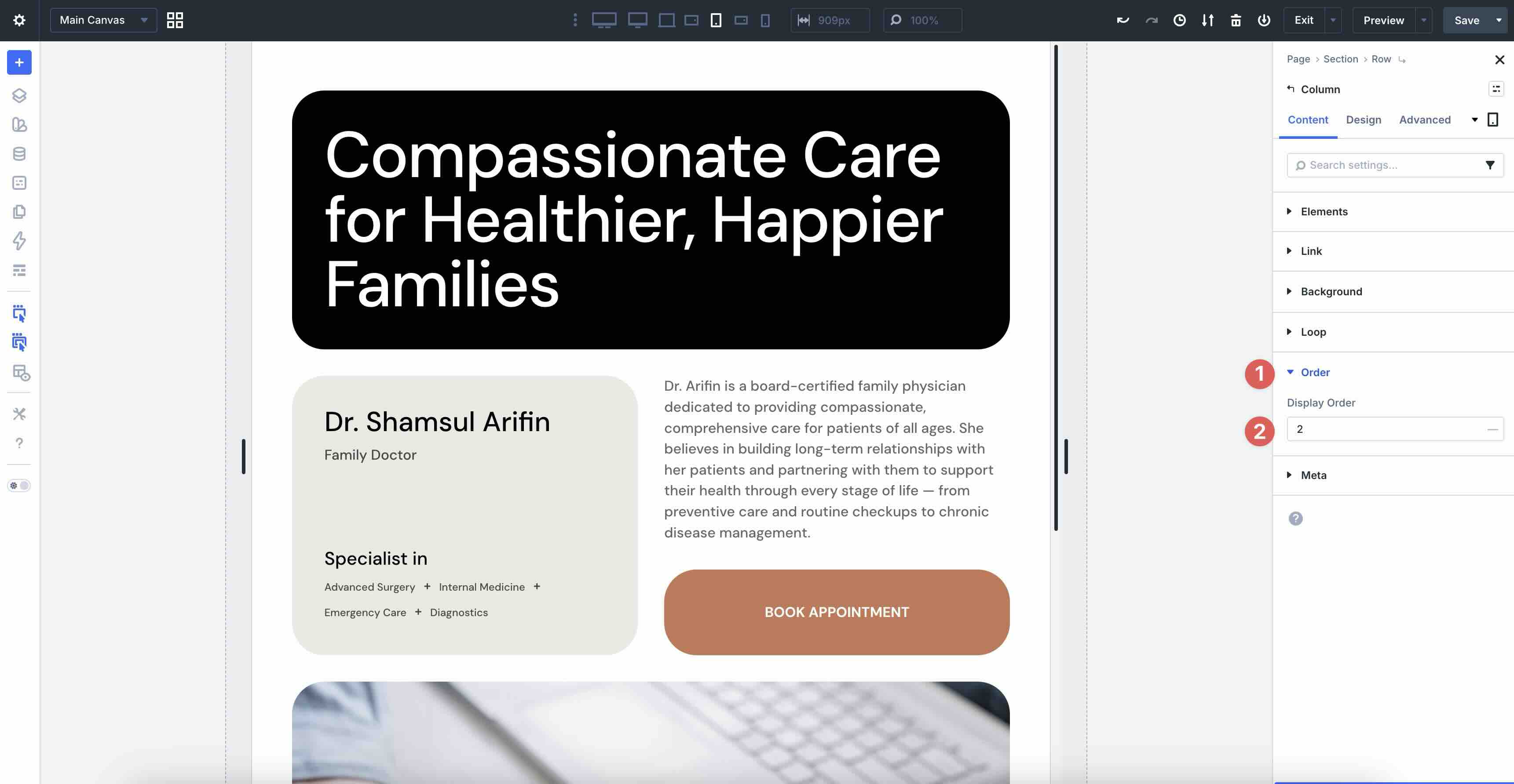
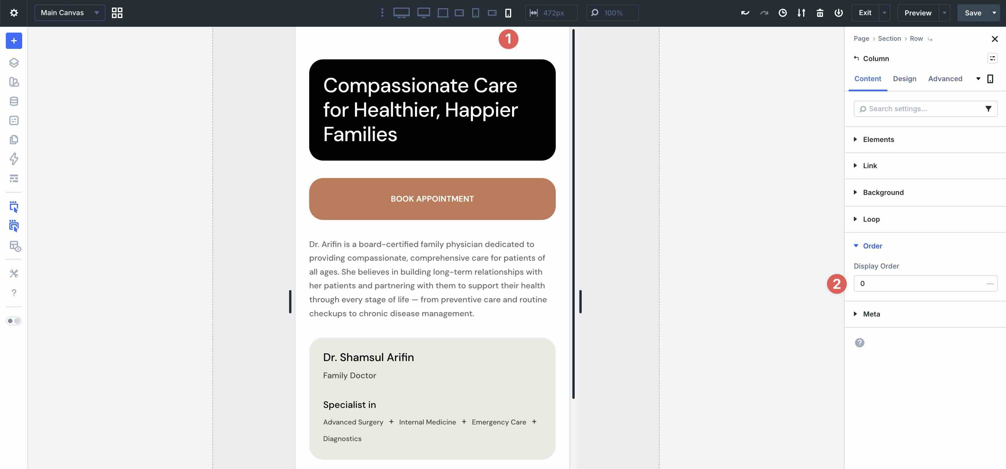
One of the most common pitfalls in mobile web design is content that lacks order, such as a CTA button pushed farther down the page, forcing users to scroll excessively before they can interact with it. On desktop, you might want a button near the bottom, but on mobile, stacking keeps the call to action prominent. In Divi 5, the Display Order field allows you to control how columns stack vertically on smaller screens.
In the example below, the Image in the second column drops down as the CTA moves up on mobile for a better viewing experience.
How To Do It In Divi 5
Using the first layout example, we want to move the column containing the Button from the fourth order to the second order on mobile devices.
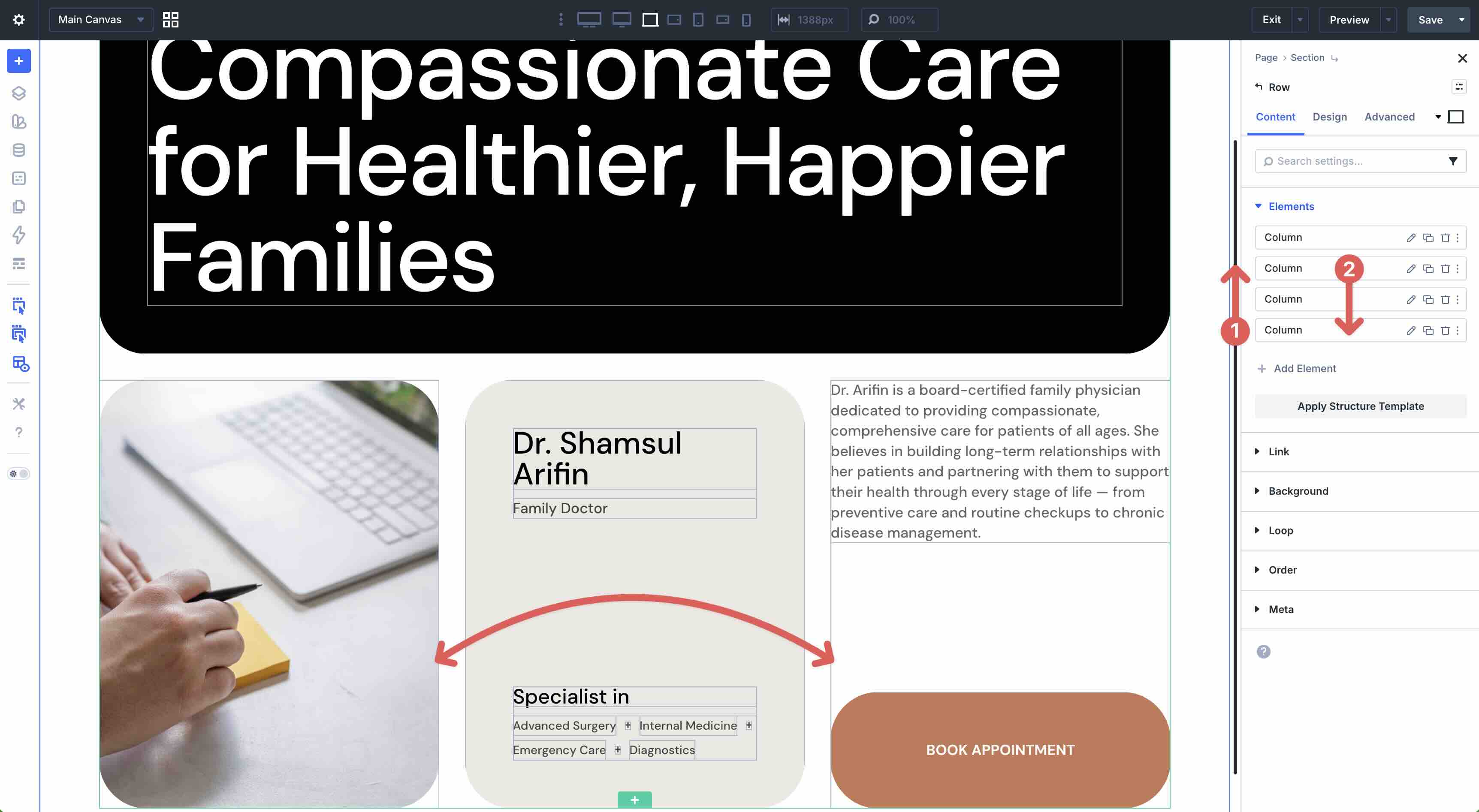
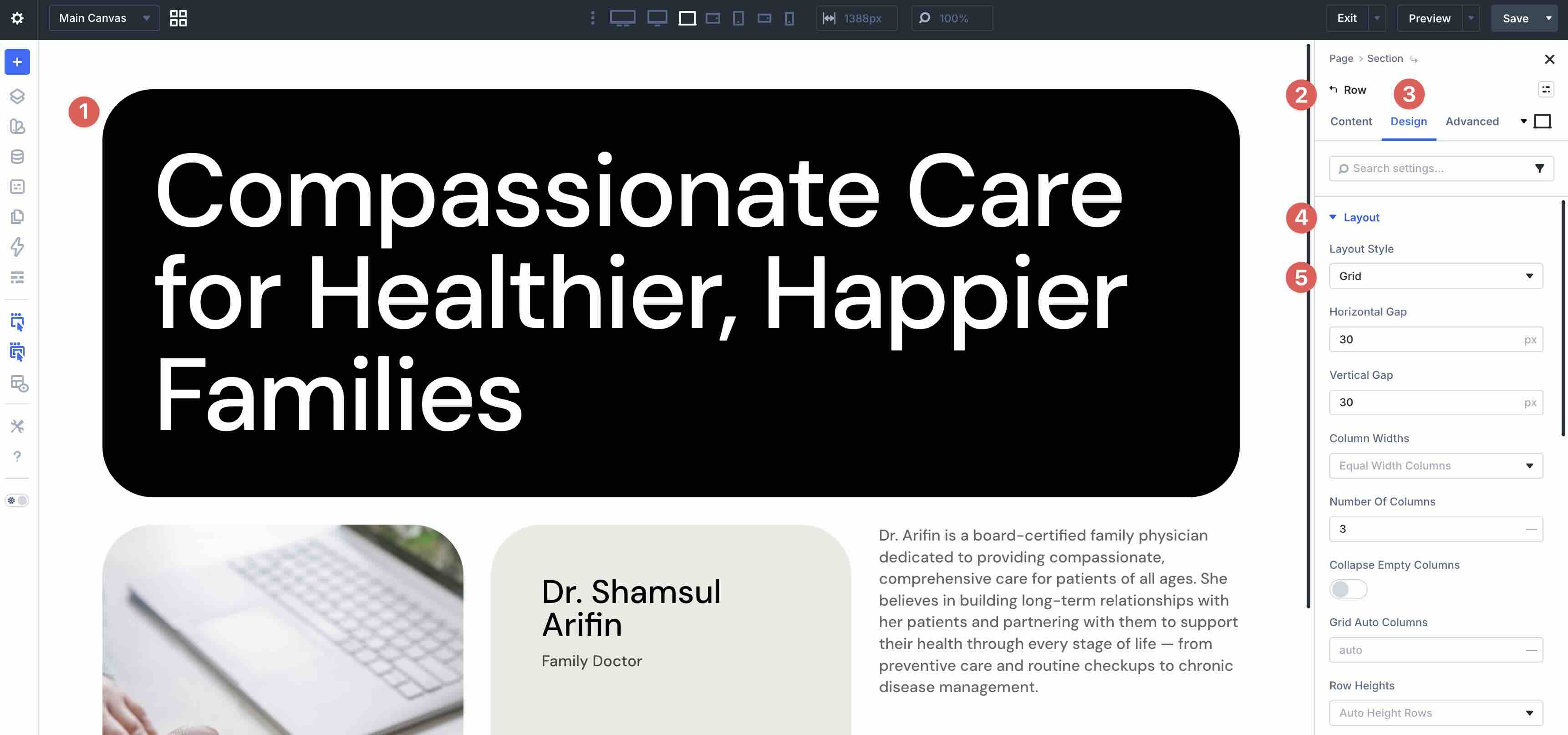
Open the main row’s settings by clicking anywhere inside it. Navigate to the Design tab and expand the Layout Style menu. Ensure that Grid is selected.
Before making any changes, select the Tablet breakpoint in the Page Bar. We’ll use this breakpoint as the baseline for responsive changes.
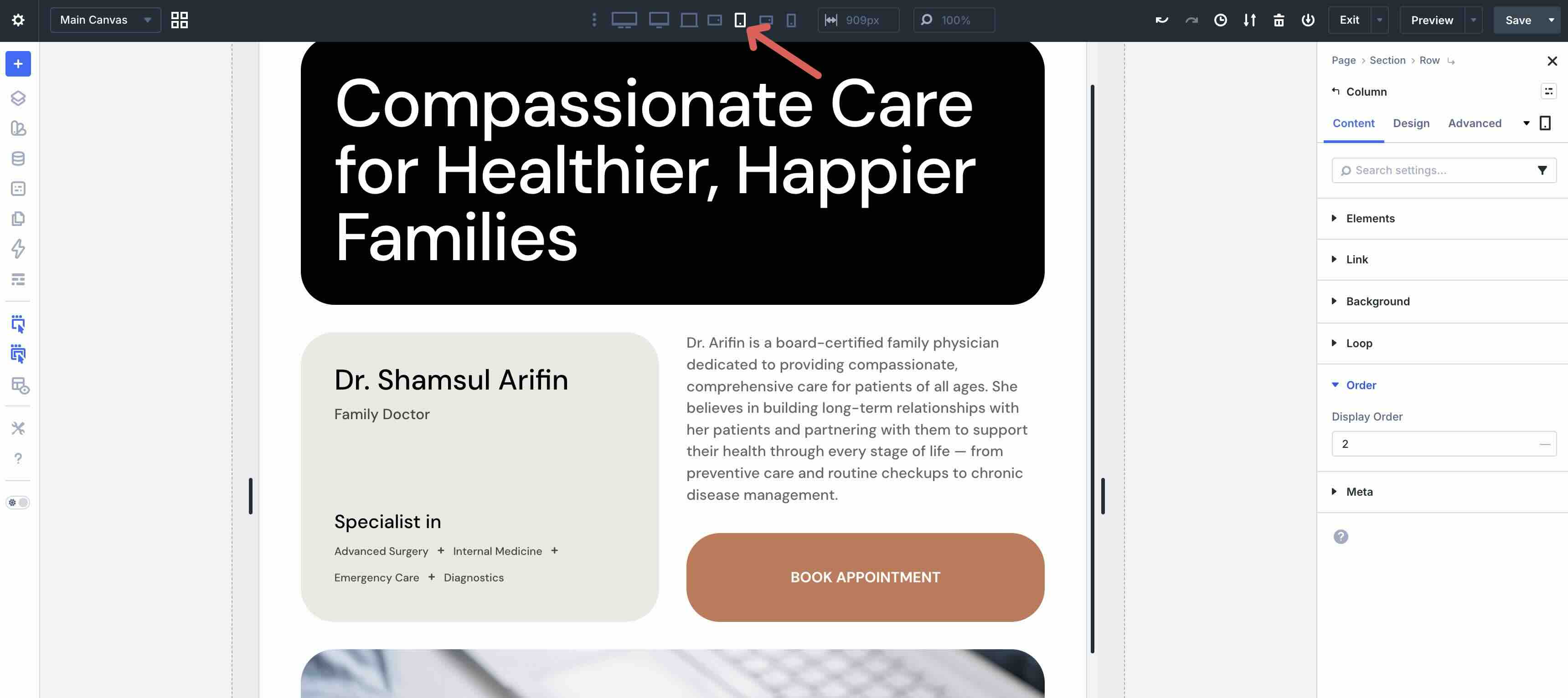
In the main row’s Content tab, click the Edit Item icon in the second column to edit it.
Expand the Order menu to reveal the Display Order field. Set the value to 2.
Next, select the third column. Change the Breakpoint to Phone, and set the Display Order to 1.
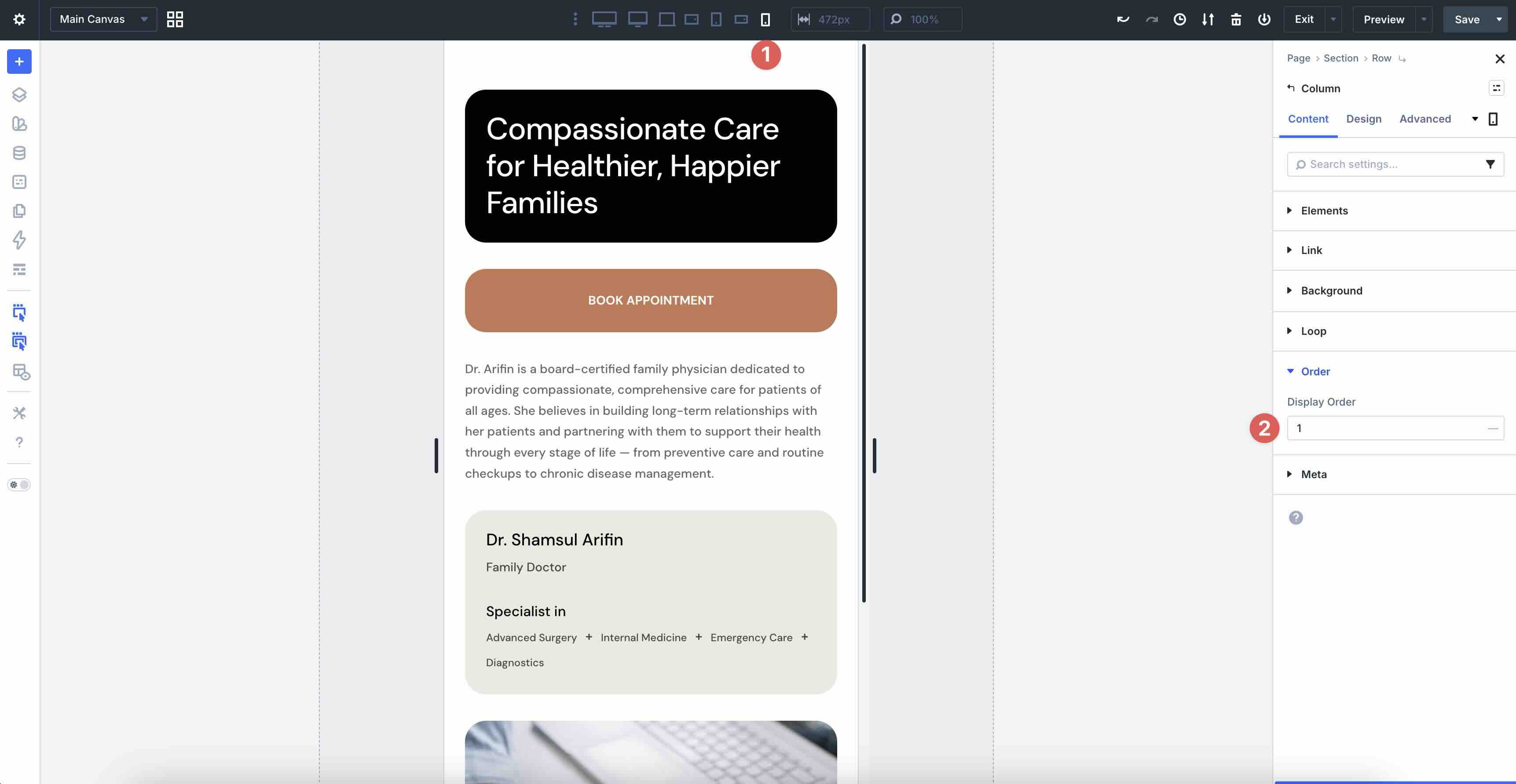
Select the fourth column. Keep the Phone breakpoint active and set the Display Order to 0.
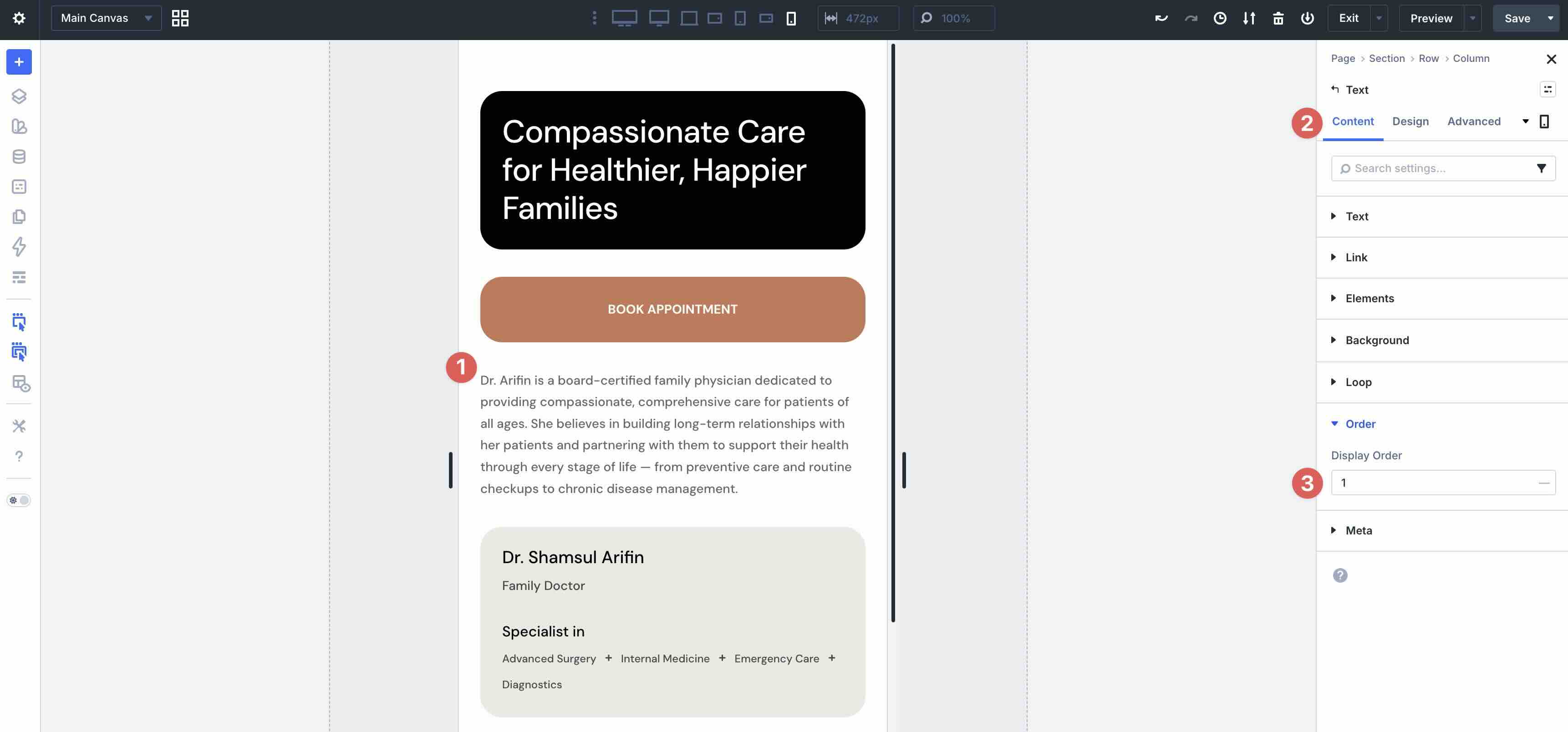
Divi 5’s Display Order feature works on columns and modules. In this example, the CTA is placed above the Text module. It’s achieved by selecting the Text module and setting its Display Order to 1, moving it below the CTA.
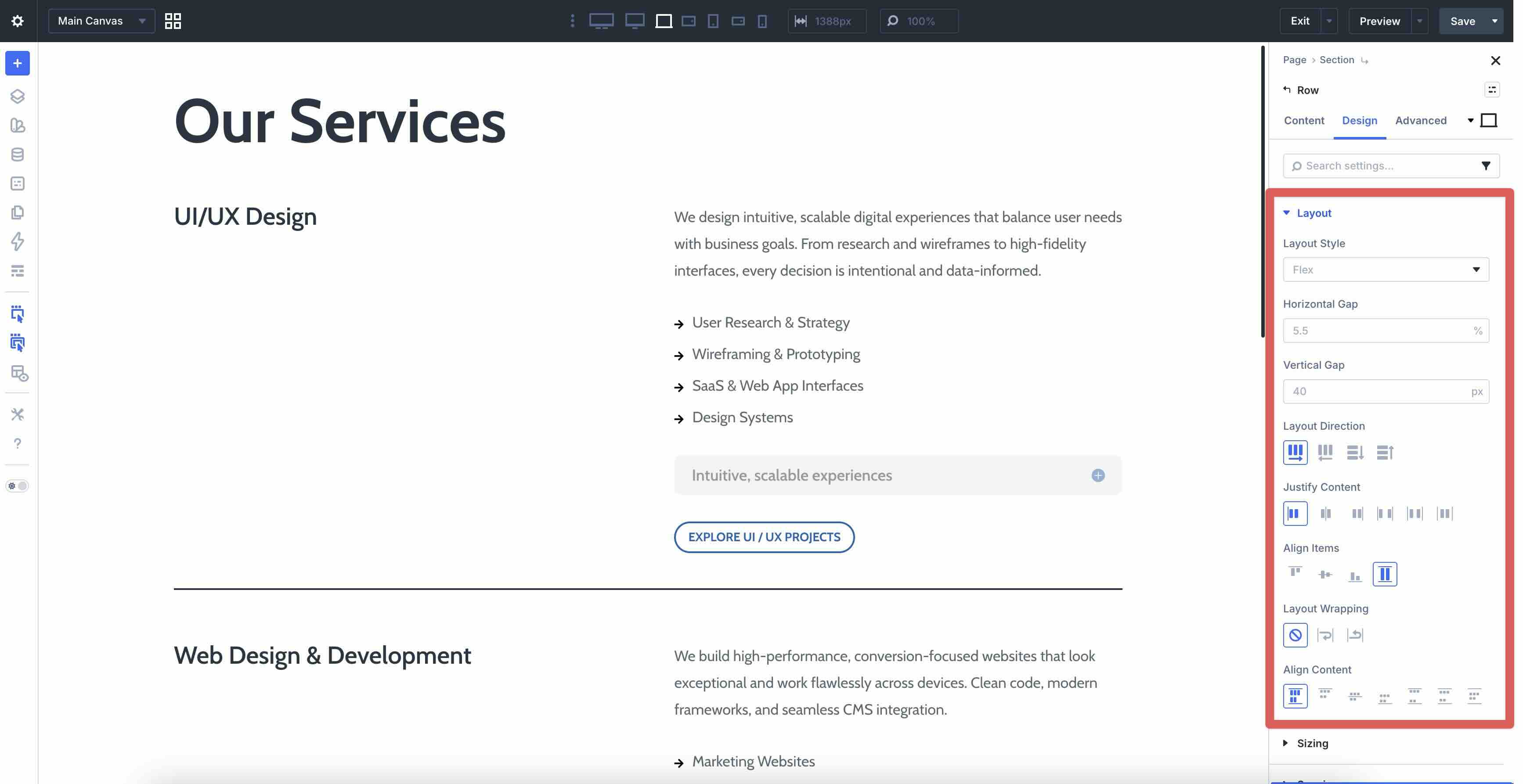
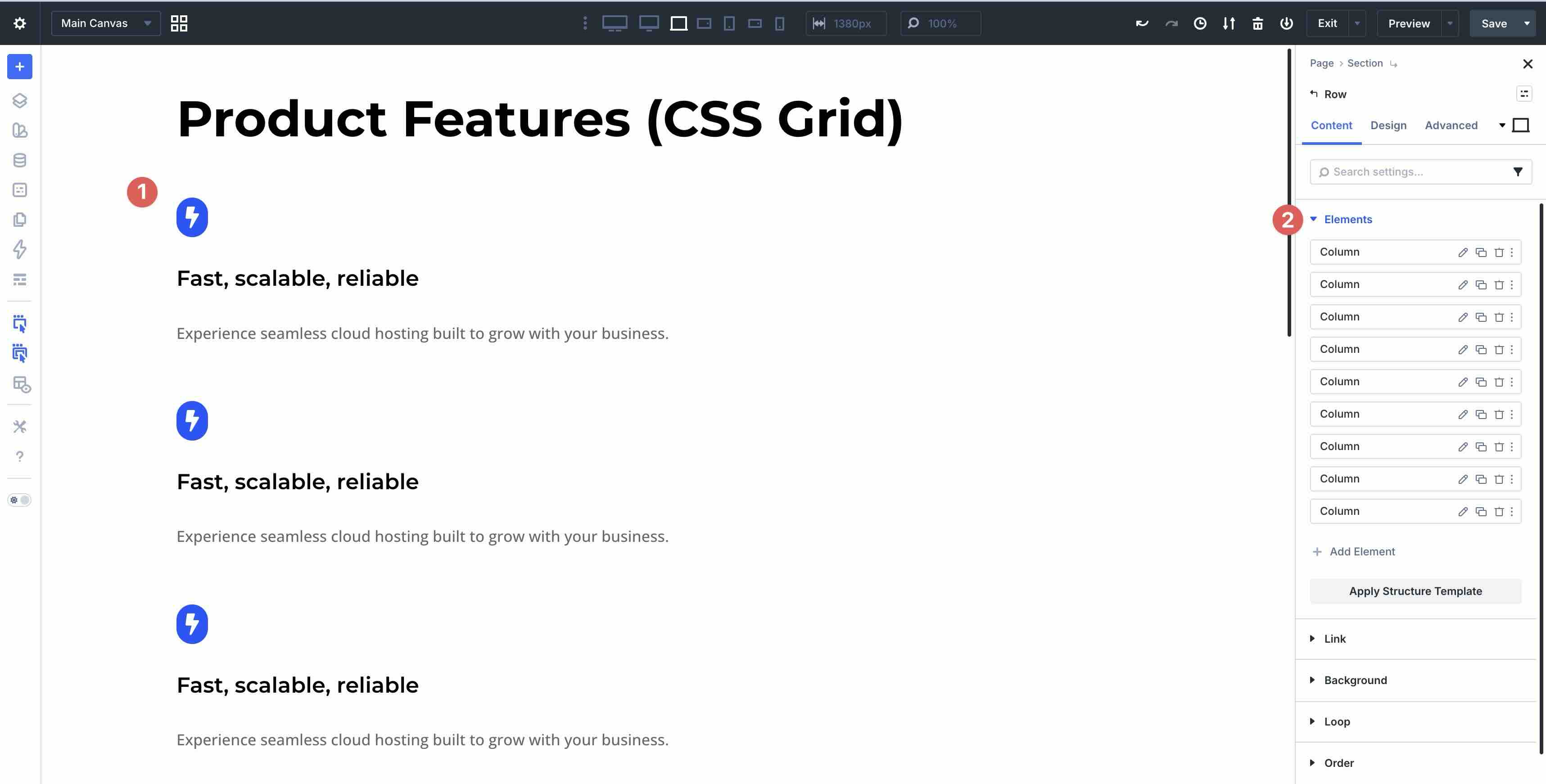
Best Practice 2: Natural Wrapping For Horizontal Rows
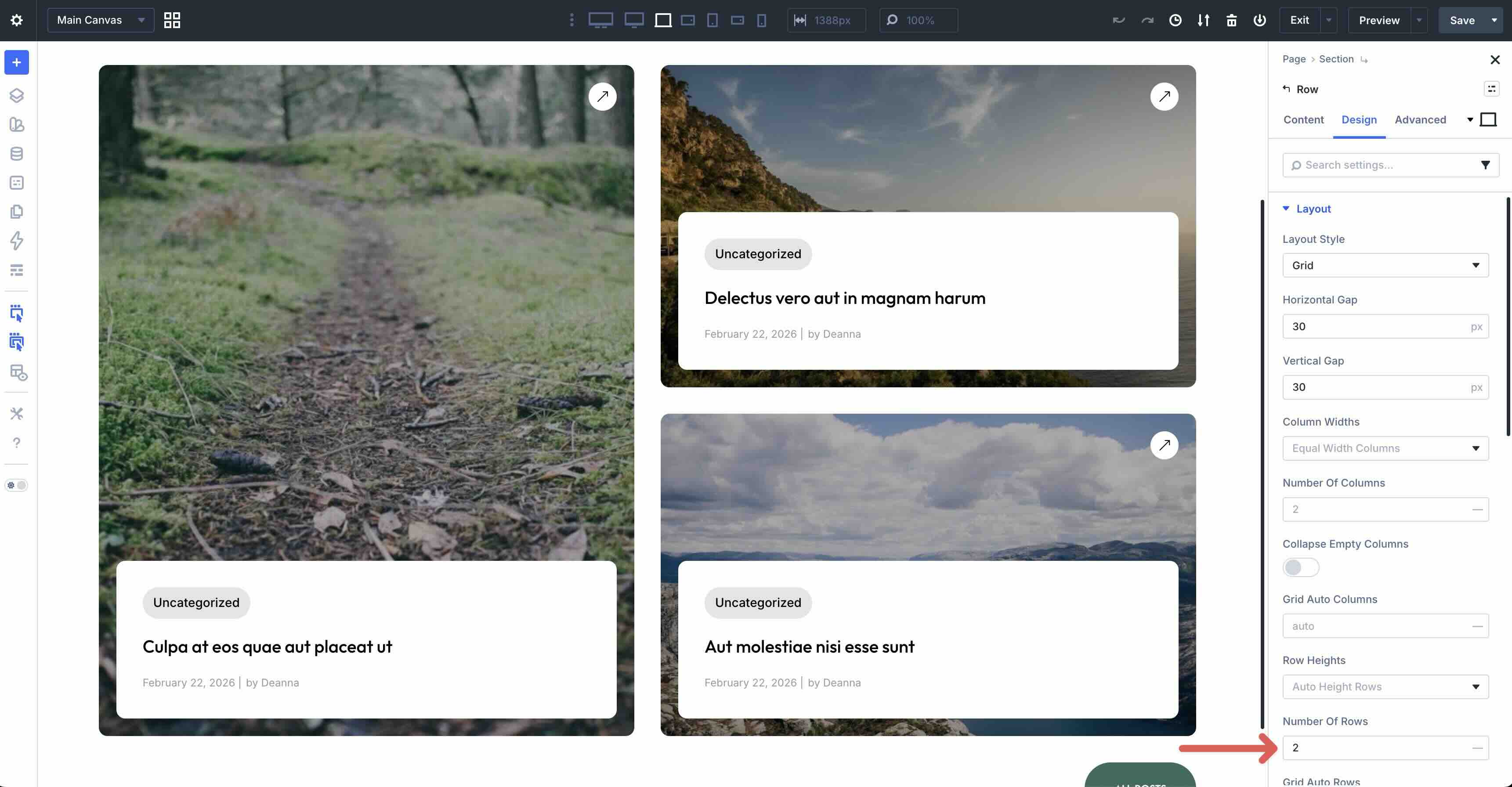
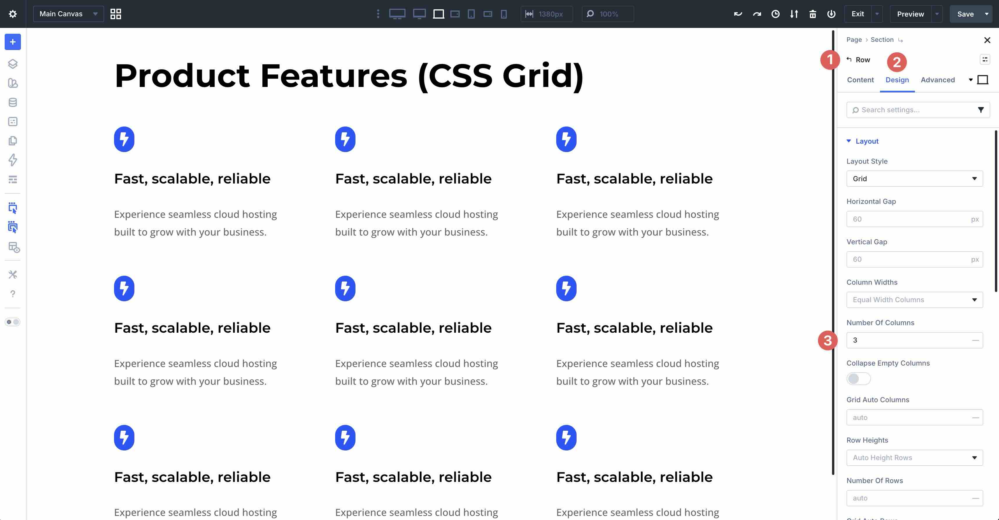
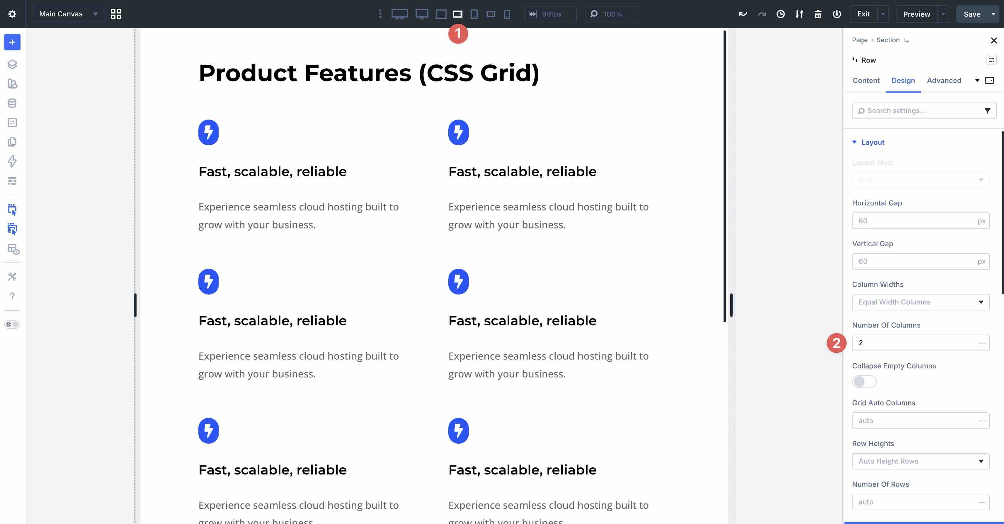
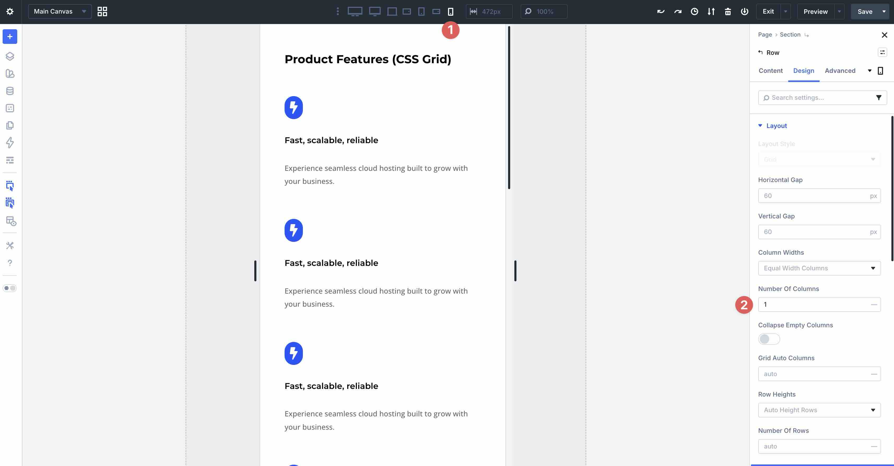
Another common challenge in mobile web design is horizontal content that doesn’t adapt well to smaller screen sizes. On desktop and tablet, the content within columns looks great, but on smaller screens, it seems compressed and hard to read. Thankfully, Divi 5 provides an easy way to solve this by adjusting the number of columns for smaller screens.
In the example below, the Number of Columns is set to 2 on all Breakpoints, except for the Phone Breakpoint, which is set to 1. This allows columns to break down naturally, avoiding awkward layouts on smaller screens.
How To Do It In Divi 5
Open the main Row’s settings, navigate to the Design tab, and ensure the Layout Style is set to Grid. Adjust the Horizontal and Vertical Gap to control the spacing between columns.
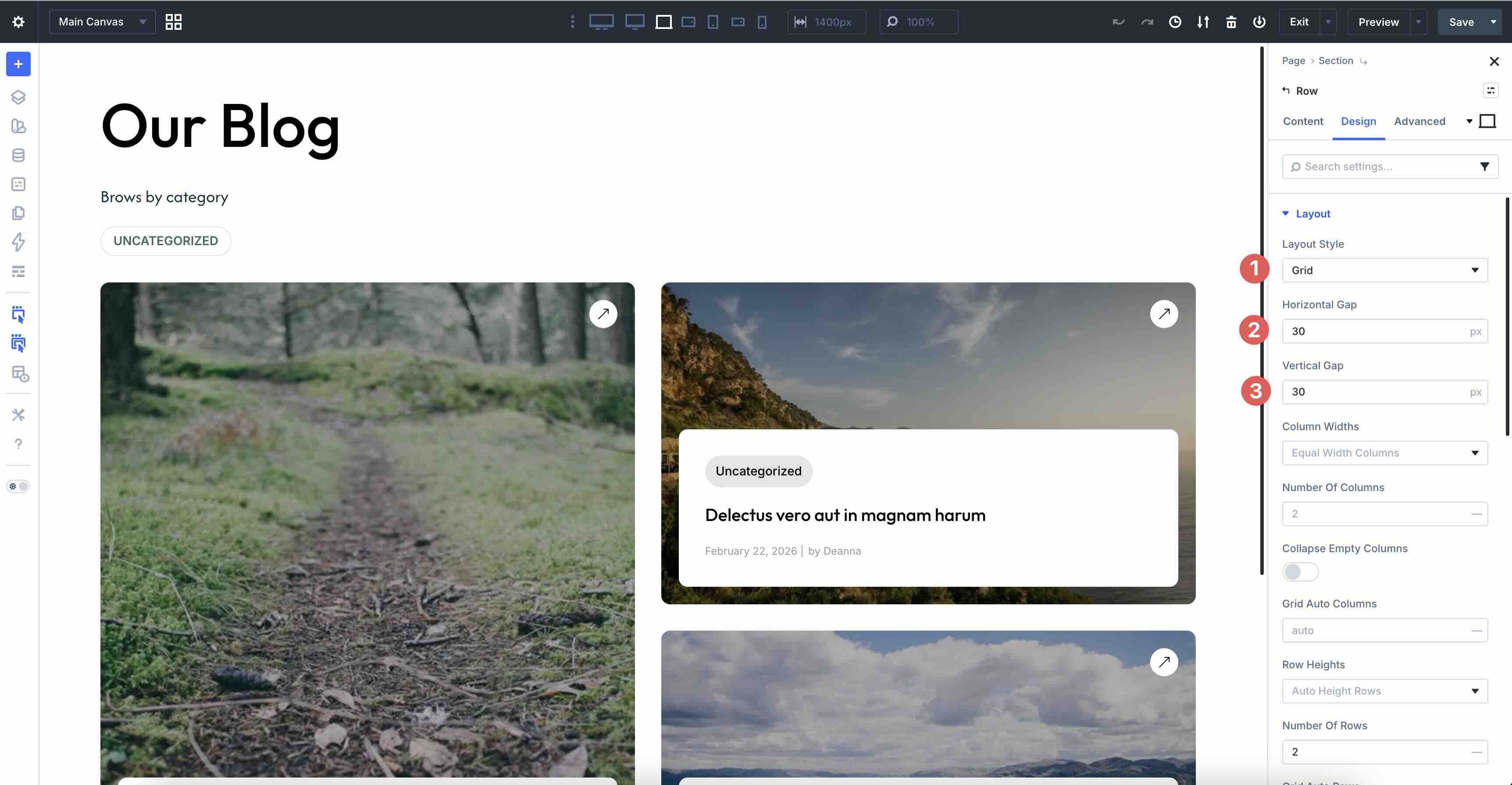
By default, Column Widths are set to Equal, so we’ll leave that as is. In the Number of Columns field, set the value to 2 for Desktop, Tablet Wide, Tablet, and Phone Wide.
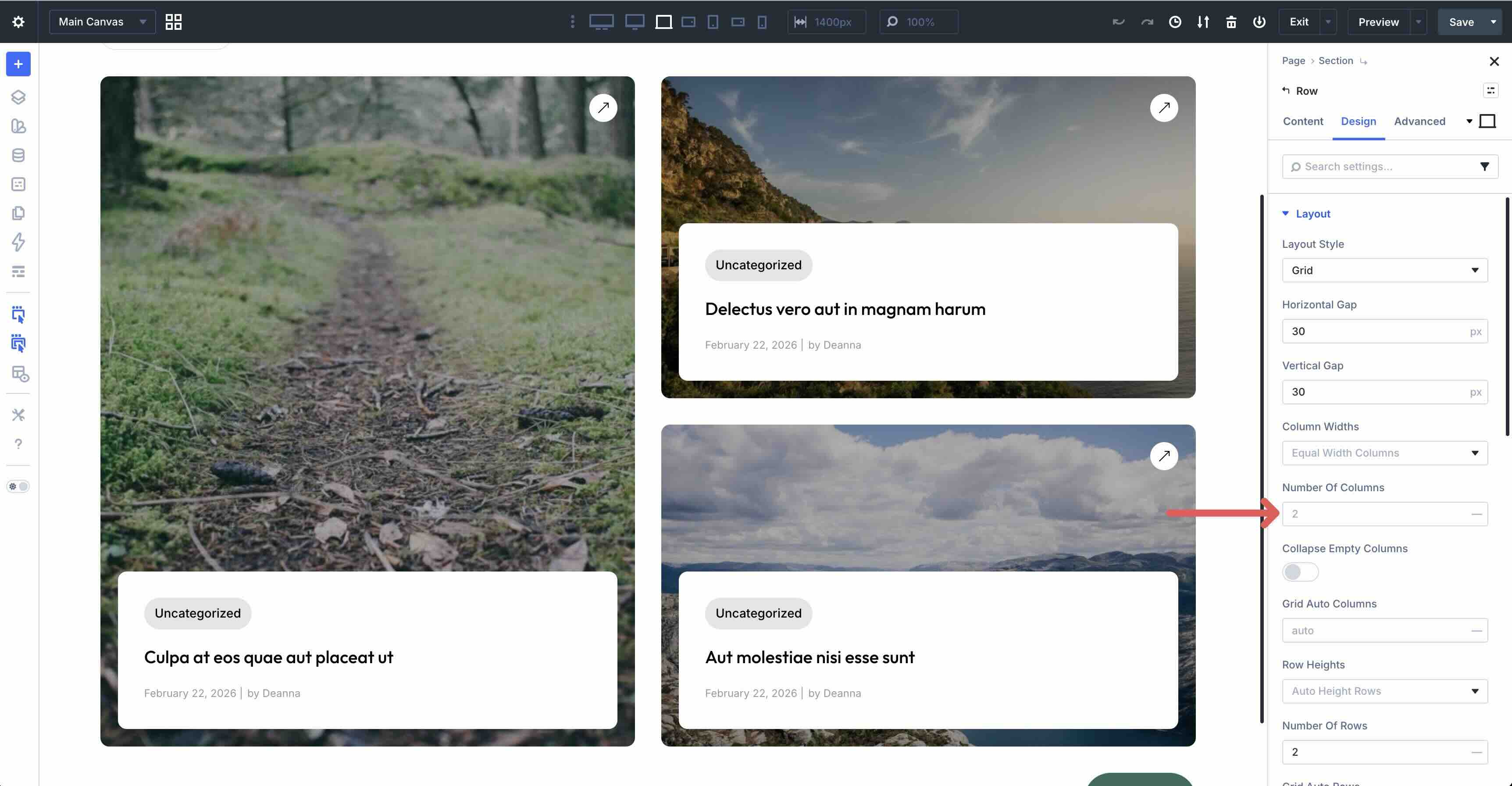
On the Phone Breakpoint, set the Number of Columns to 1.
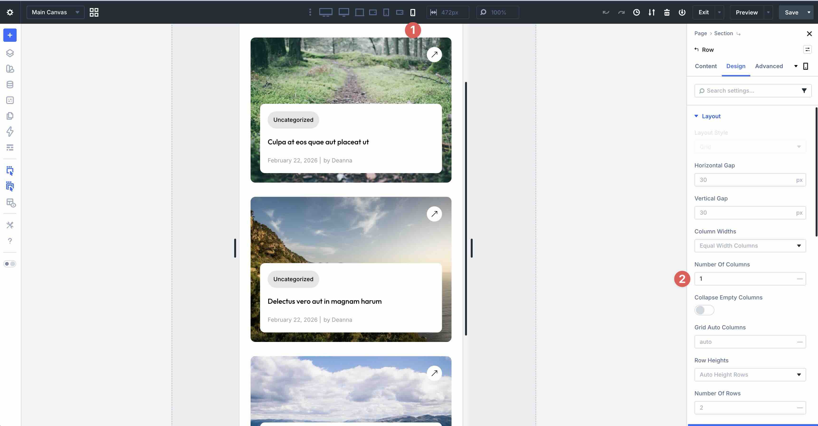
You’ll also need to set the Number of Rows to 2 on all Breakpoints.
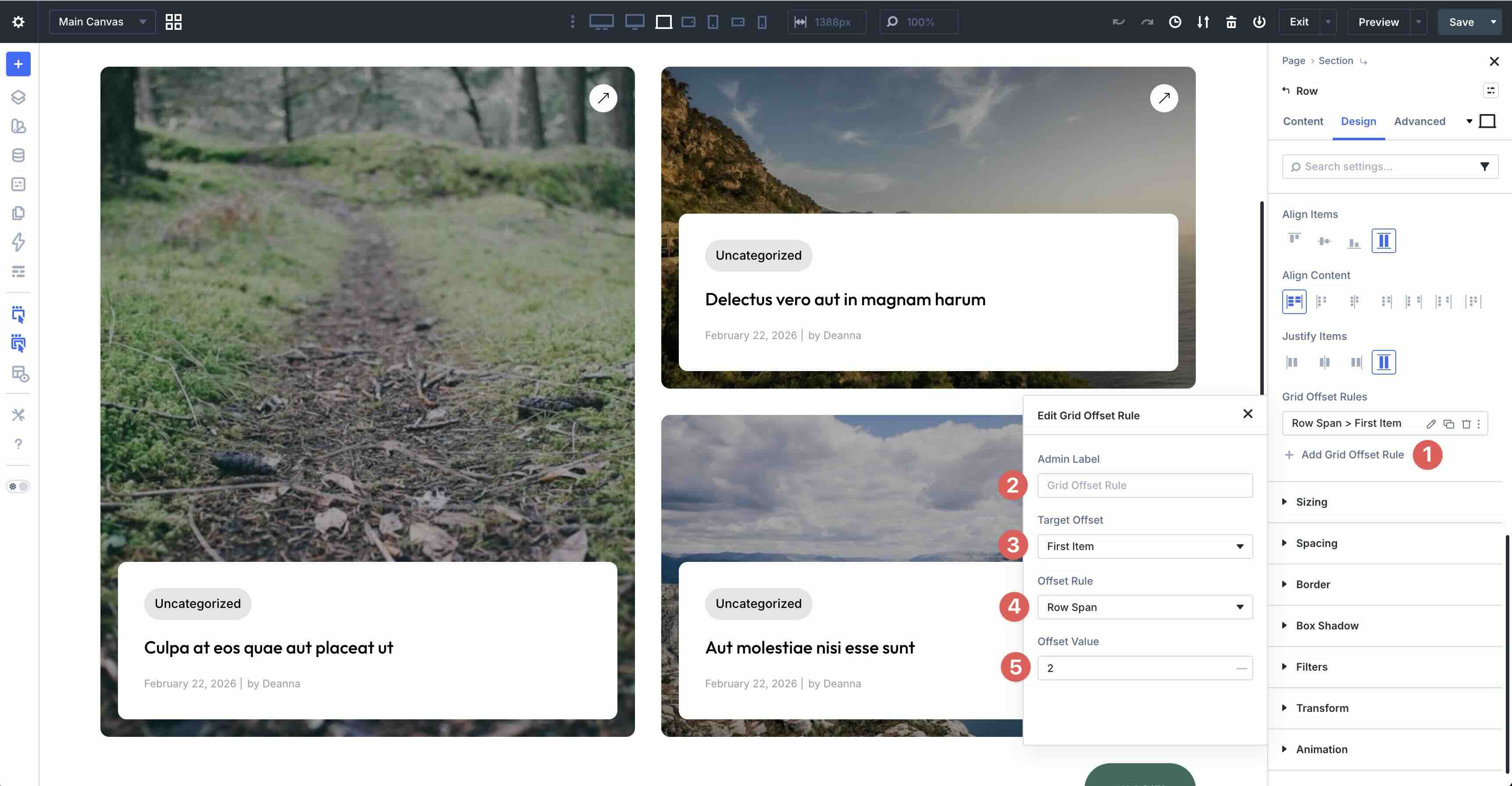
The final step is to set a Grid Offset Rule that targets the First Item with Row Span: 2, making it taller for visual hierarchy while the rest wrap naturally below.
This setup delivers polished horizontal layouts that adapt seamlessly to mobile devices, enhancing the user experience.
Best Practice 3: Hide & Show Content By Breakpoint
Another common challenge in mobile web design is overloaded layouts where too much content is crammed into small screens, leading to long scrolls, slow performance, or cluttered experiences that overwhelm users. On desktop, you might want a detailed, two-column layout with multiple text blocks and icon lists for full immersion, but on tablet and phone, hiding non-essential modules and condensing information keeps the page focused, faster-loading, and user-friendly without sacrificing key details.
In the example below, hidden elements are indicated by a greyed-out appearance. You can see them in the Visual Builder, but they are hidden on the front end.
How To Do It In Divi 5
Load the Styled – Responsive Section 3 layout onto a page in the Visual Builder. When using visibility settings in the Visual Builder, they must be configured on the Desktop view.
In the first two-column row, select the Text module in the second column. Navigate to the Advanced tab and expand the Visibility dropdown menu. Select the Tablet, Phone Wide, and Phone breakpoints to hide the module on smaller screens.
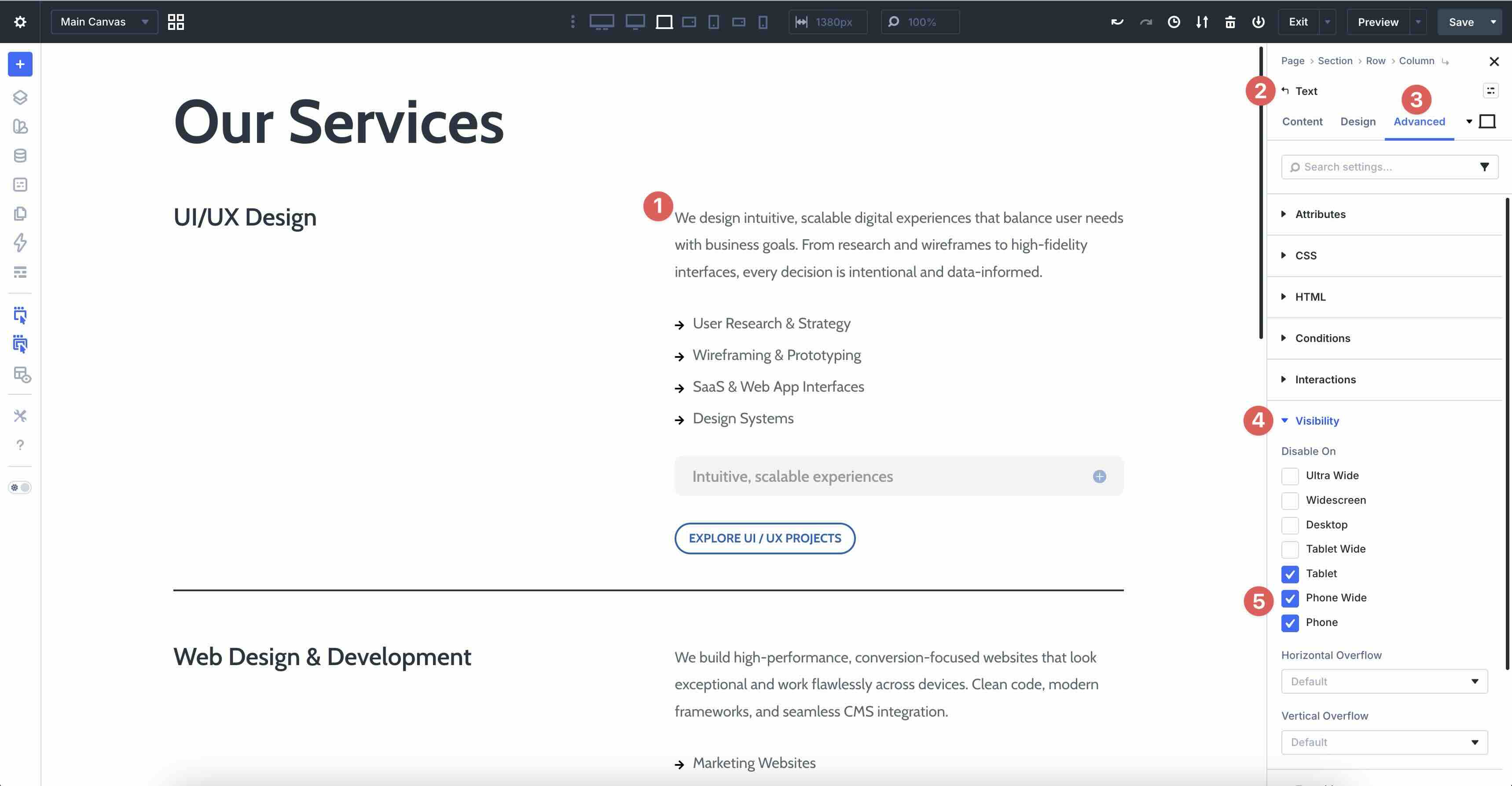
Next, select the Toggle module in the second column. This houses the exact text content as the Text module, but wraps it neatly into a Toggle. In the Visibility settings, enable the checkboxes for Ultra Wide, Widescreen, and Desktop. This will hide the toggle on larger screens.
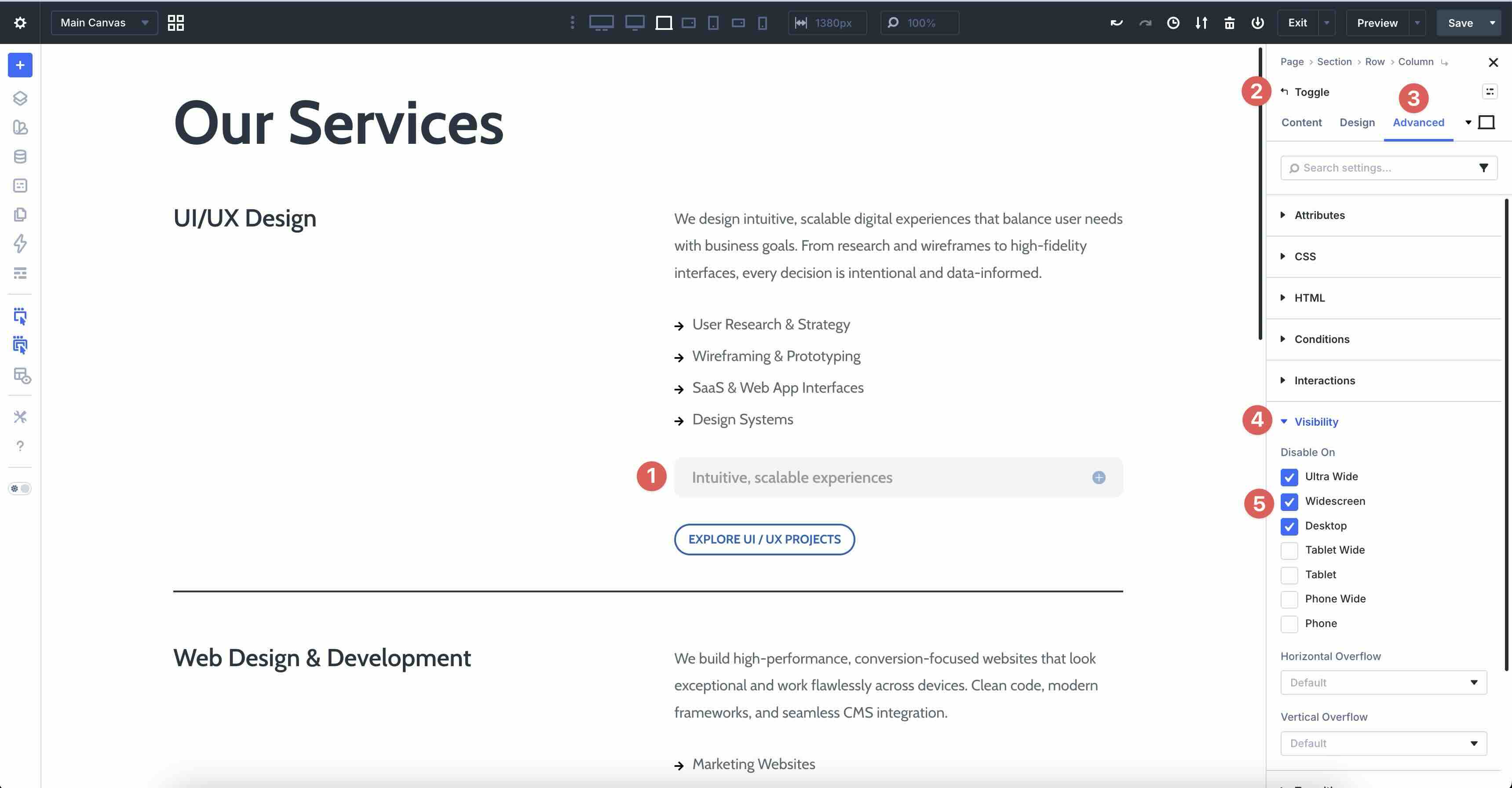
The Heading and Button modules remain visible throughout for a consistent call to action.
This technique reduces mobile clutter, prioritizes core content, and maintains accessibility by keeping information readily available on demand.
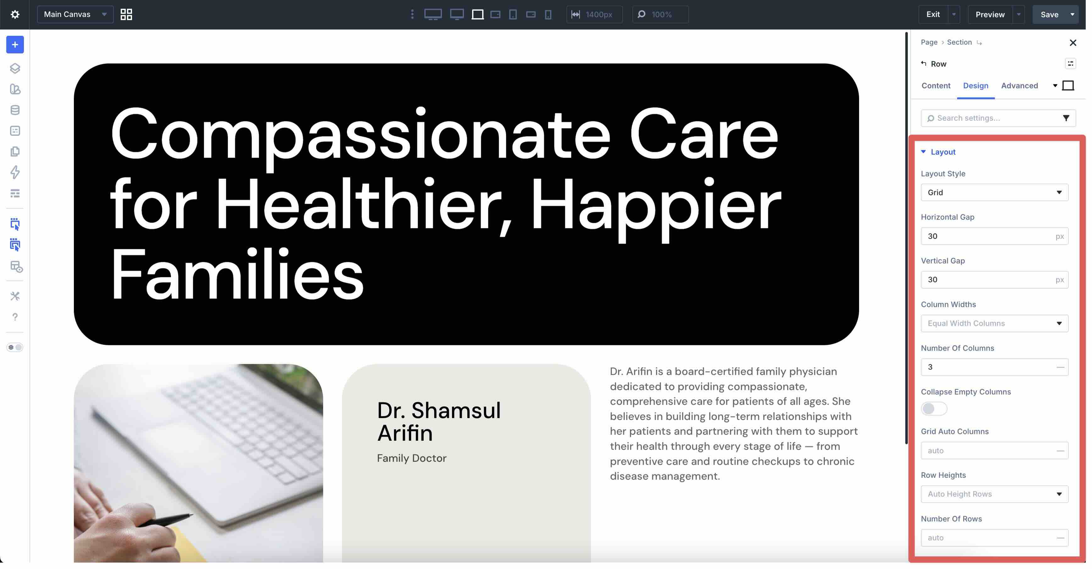
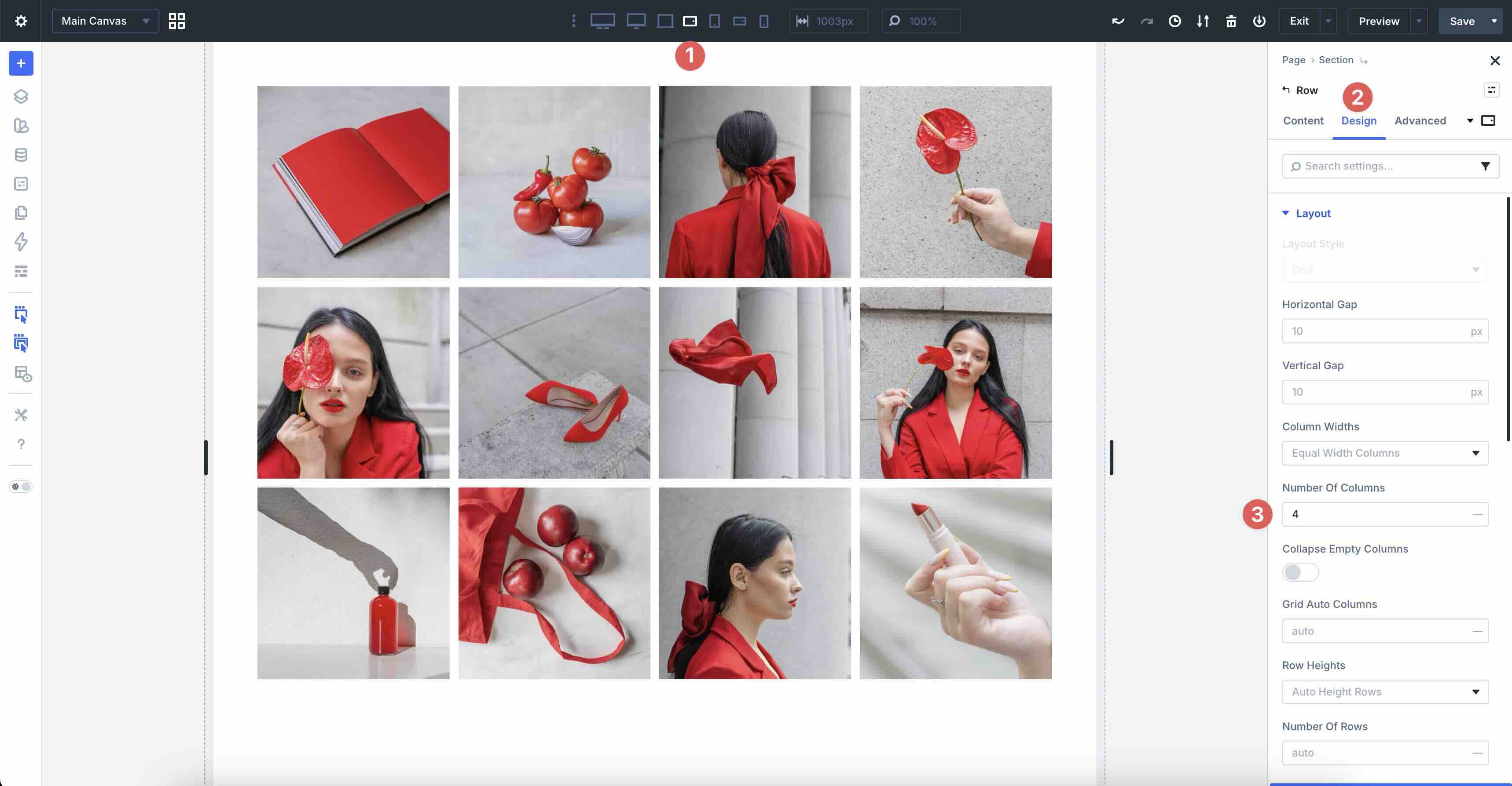
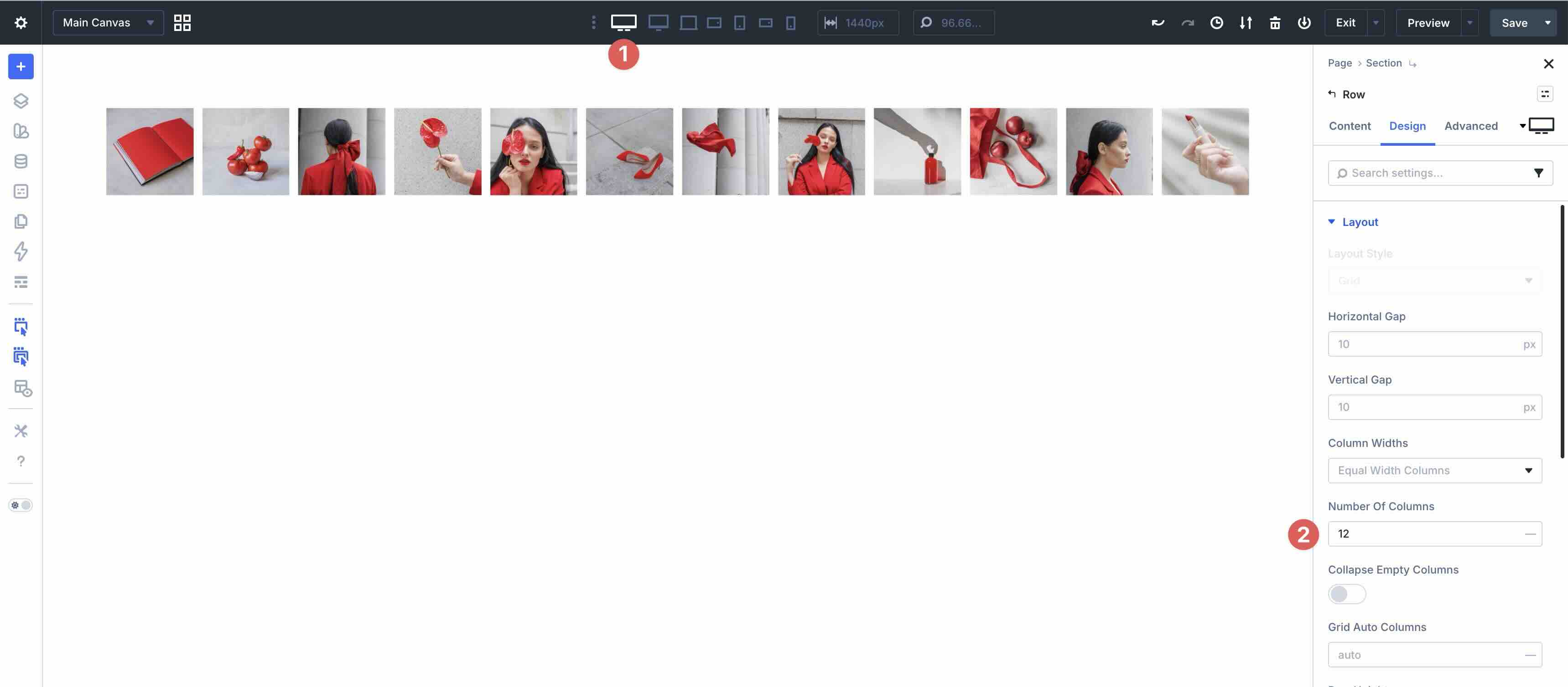
Best Practice 4: Scaling Grids For Wide Screens
Another common issue in responsive web design is ultra-wide or large-screen displays, where content can look sparse or stretched on monitors over 1440px or 1920px if the layout stays locked to a limited number of columns. On the default Desktop breakpoint, you might use a four-column grid for balanced density, but on Widescreen and Ultra-Wide, increasing the number of columns lets images, products, or cards spread out more comfortably, filling the space without empty gaps or forced scaling.
In the example below, a gallery grid starts at 12 columns for Ultra-Wide, moves to 6 for Widescreen and Desktop, and scales down to 4 columns for the remaining breakpoints.
How To Do It In Divi 5
Start with the default Desktop view and ensure Grid is selected in Layout Style. Adjust the Horizontal and Vertical Gaps to suit your preferences, and set the Number of Columns to 6. This spreads items out more to better use the extra horizontal space.
Next, select the Tablet Wide view and set the Number Of Columns to 4. This provides a solid, dense layout on typical screen sizes.
Lastly, select the Ultra-Wide Breakpoint and set the Number of Columns to 12. This maximizes the full viewport width for a gallery-like presentation with smaller, more numerous thumbnails.
This approach creates layouts that scale up gracefully on larger screens, improving visual impact and engagement on high-resolution displays while keeping mobile and standard desktop screens optimized.
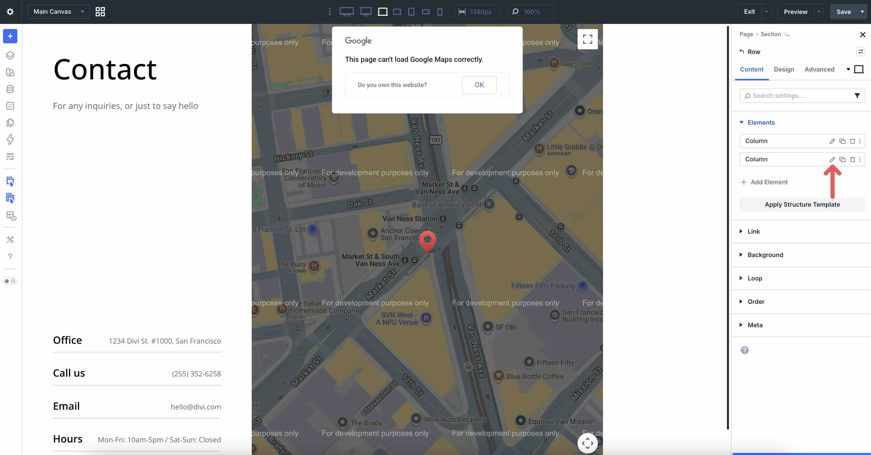
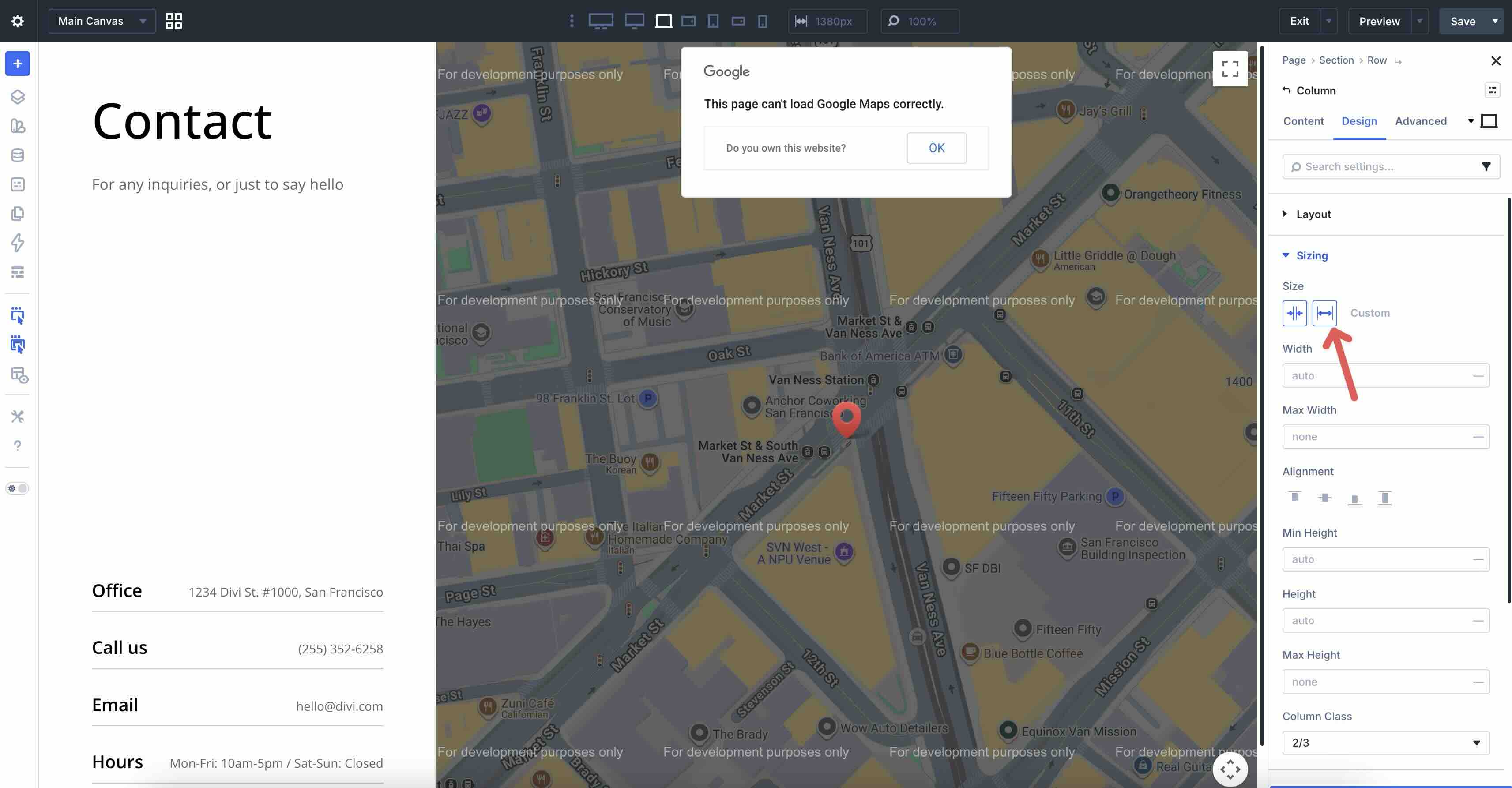
Best Practice 5: Wrapping Flex Rows For Small Screens
Another challenge in responsive design is fixed-column layouts that don’t adapt, where items stay locked in wide rows on smaller screens, resulting in horizontal scrolling, compressed content, or awkward cropping. On desktop, you might want a full 9-column grid for maximum density and visual impact, but on tablet and phone, enabling wrapping lets the same items break down naturally into fewer columns per row (like 3 columns across 3 rows), keeping everything readable, evenly spaced, and touch-friendly.
For example, using the Styled – Responsive Section 5 layout, you can see there are nine columns in the design, spanning three columns using the Flexbox Layout Style. Without Layout Wrapping enabled, all nine columns will try to spread across the page horizontally.
How To Do It In Divi 5
In the main row, ensure that Flex is enabled in the Layout Style dropdown of the Design tab. Start with a single column, add modules, and style them as you wish.
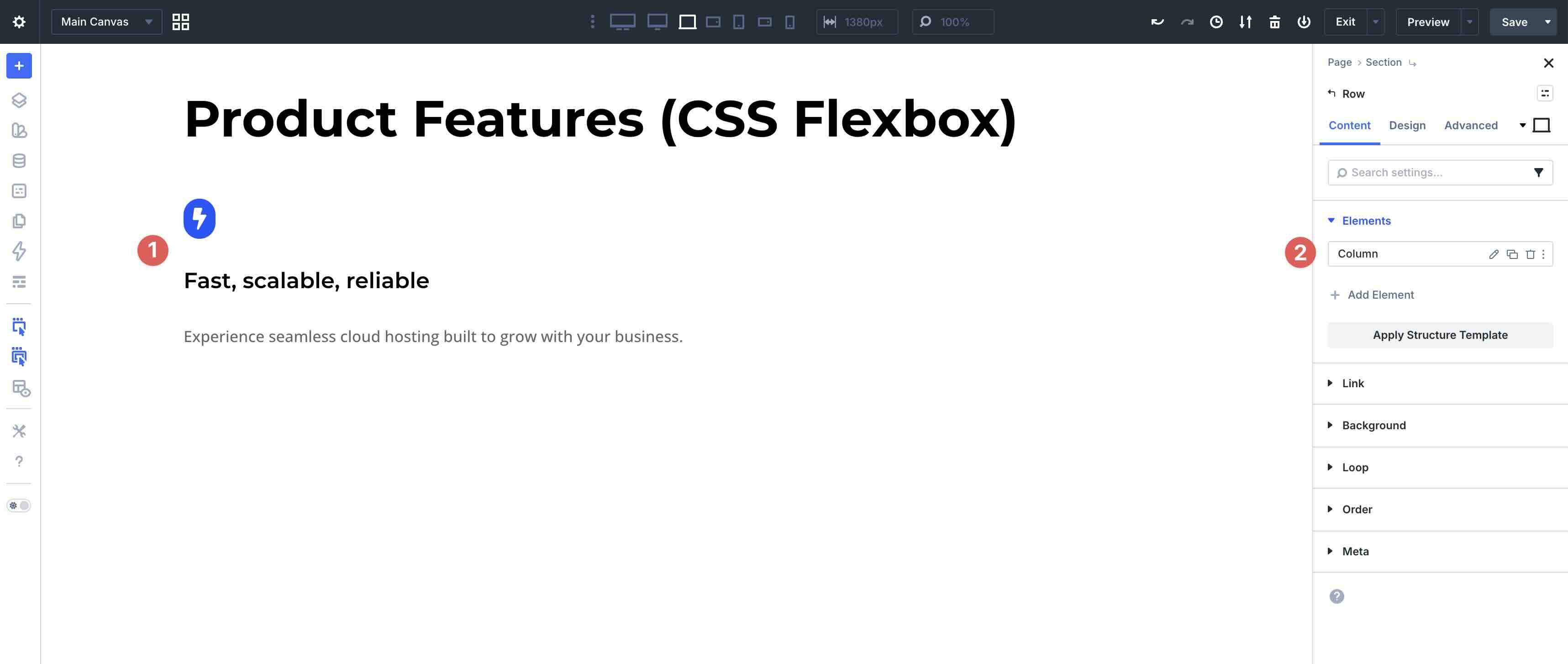
Within the column’s settings, switch to the Design tab. Expand the Sizing menu and locate the Column Class field.
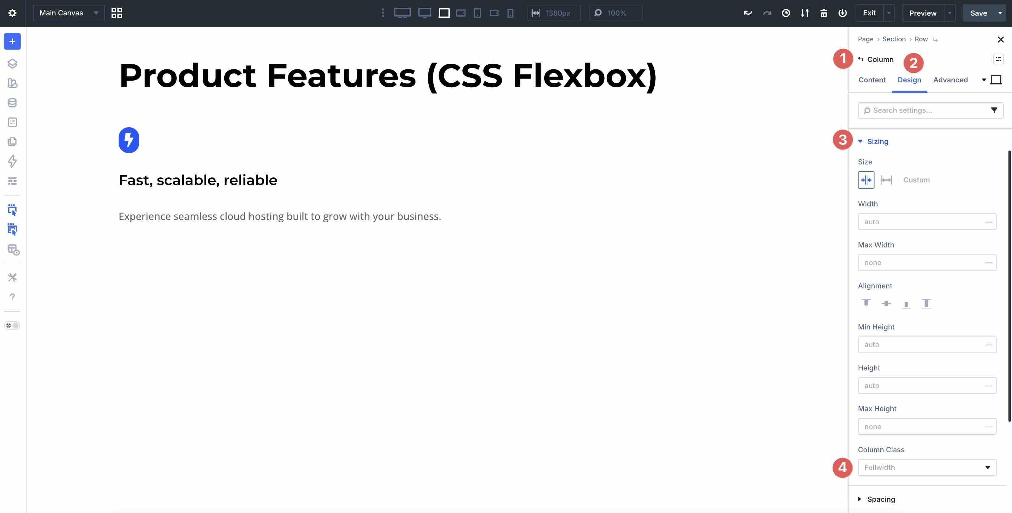
Choose 1/3 from the available options.
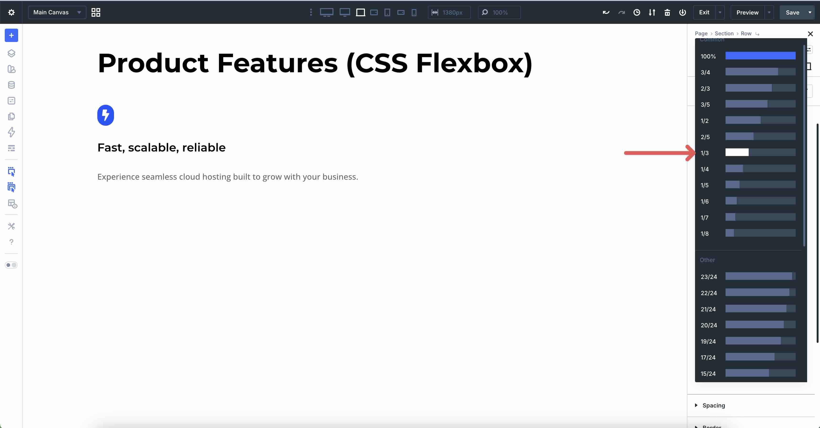
Next, duplicate the column eight times.
Finally, switch to the Design tab in the main Row and enable Layout Wrapping.
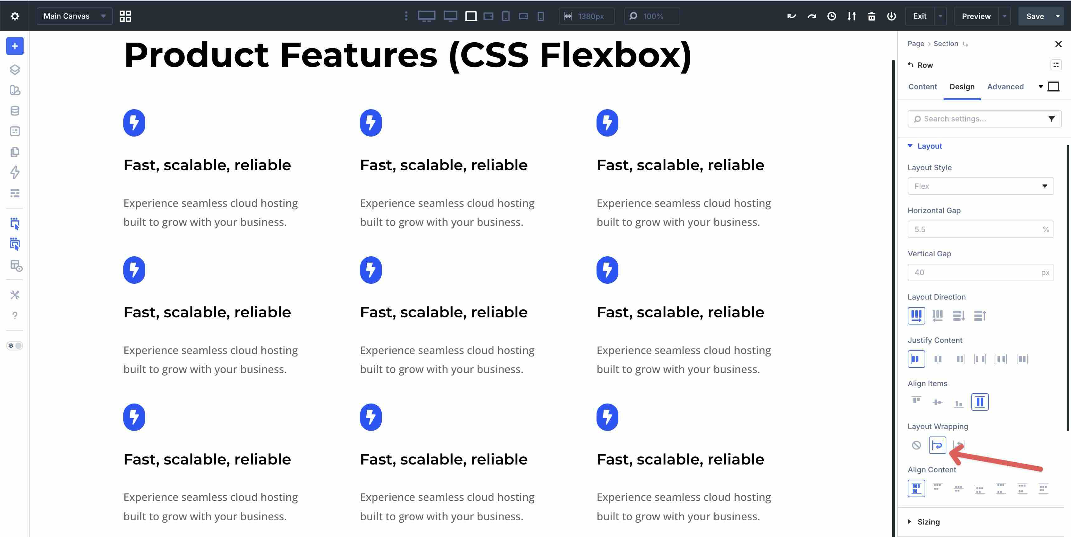
This creates a single, maintainable structure that adapts intuitively and provides perfect column wrapping on smaller screens.
Best Practice 6: CSS Grid Column Breakdown On Mobile
Responsive layouts often benefit from structured grids that scale down for smaller devices. On large screens, you might display a 9-column arrangement, but on smaller devices, reducing the column count lets items break down into fewer-per-row layouts, creating balanced rows and maintaining readability without horizontal overflow.
You can achieve the same multi-column breakdown as in Best Practice 5 (Flexbox version), but with CSS Grid for more precise two-dimensional control over rows and columns, especially when you want consistent row behavior.
In the example below, a nine-column grid starts with three columns on Ultra-Wide, Widescreen, and Desktop for a compact feel, drops to two columns on Tablet, Tablet Wide, and Phone Wide, and collapses to one column on Phone for clean vertical stacking.
How To Do It In Divi 5
Start with a single column row and set the Layout Style to Grid. Add modules and style them however you want, then duplicate the column 8 times. Divi 5 will stack the column vertically down the page.
While in the Desktop Breakpoint, set the Number of Columns in the Design tab to 3.
Swap to the Tablet Wide breakpoint and set the Number of Columns to 2.
Finally, select the Phone breakpoint. Set the Number of Columns to 1.
This Grid-based method provides cleaner control over column breakdowns and row formation compared to Flex, while delivering the same adaptive, device-optimized results with a few clicks.
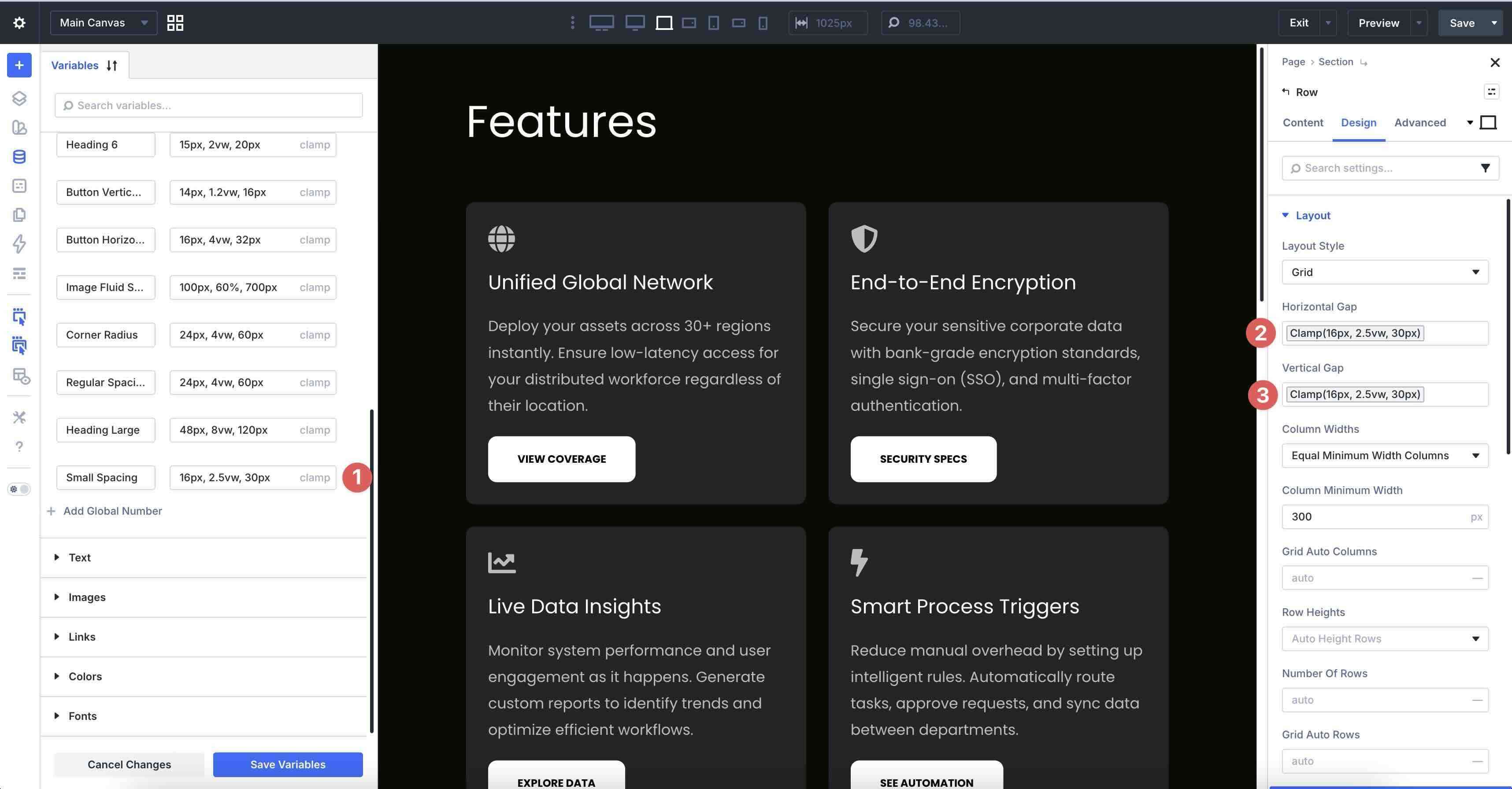
Best Practice 7: Clamp-Based Padding
Designers often aim to create spacing that feels balanced and intentional on every device. On larger screens, generous padding adds breathing room, while on mobile, more restrained spacing keeps content compact and prevents excessive scrolling. Fixed pixels can feel too tight on phones or overly loose on wide monitors, but clamp() solves this by enabling fluid padding that scales smoothly with viewport size while respecting safe minimum and maximum limits.
In the example below, we apply clamp-based padding at multiple levels in the main row, columns, and individual modules. This provides cohesive, harmonious spacing throughout the section. Notice how the padding scales smoothly from mobile to ultra-wide without abrupt jumps or manual breakpoint overrides.
How To Do It In Divi 5
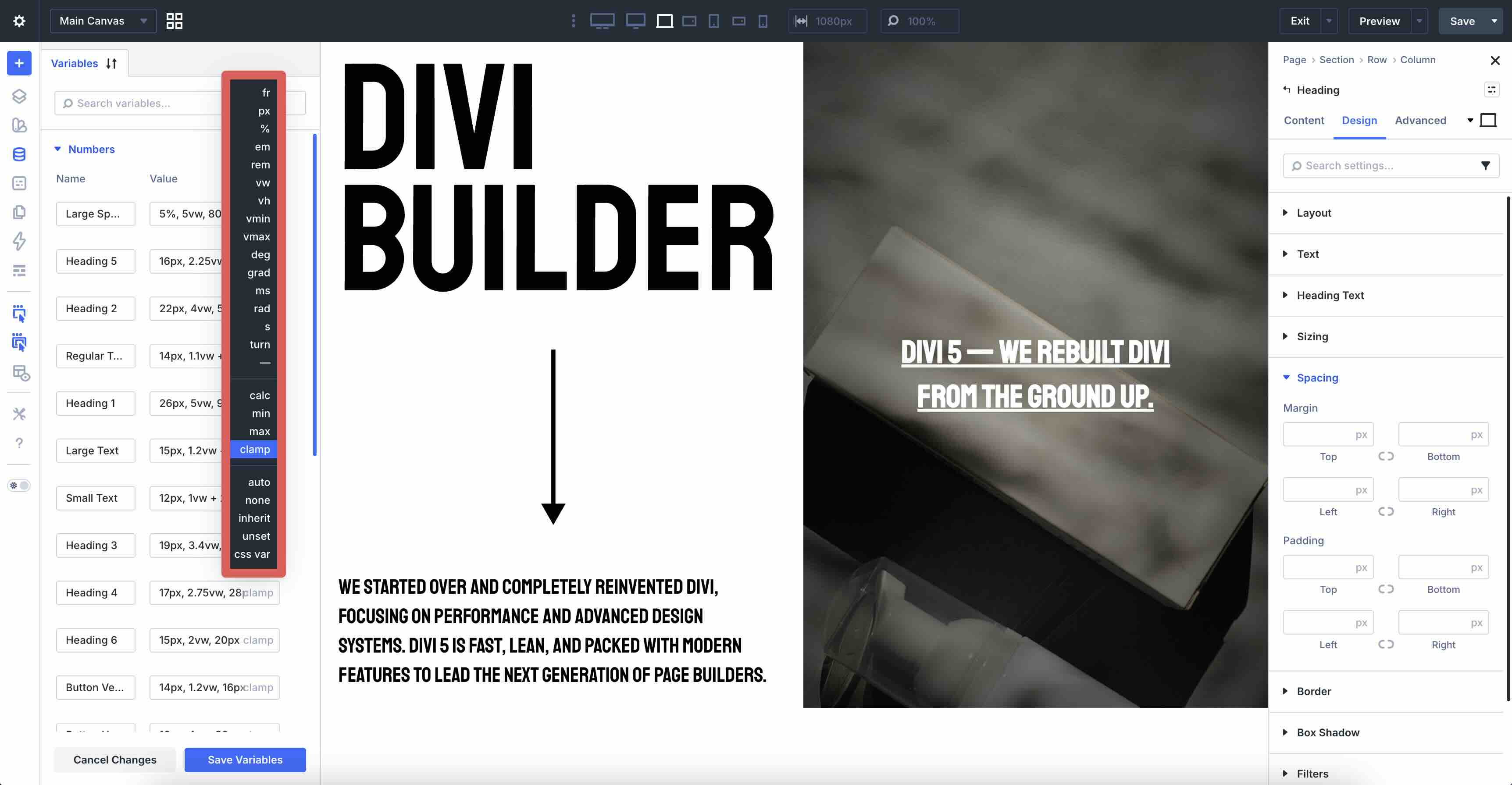
Clamp() is a native CSS function that takes three parameters: a minimum value, a preferred (fluid) value, and a maximum value. The browser uses the desired value when it fits between min and max. Otherwise, it clamps to the nearest boundary. This creates fluid, viewport-responsive sizing without media queries.
The three clamp formulas used in this example provide a consistent spacing system:
- Large Spacing: clamp(5%, 5vw, 80px)
Minimum 5% of viewport width (scales on very small screens), preferred 5vw (fluid growth with screen size), capped at 80px (prevents excessive padding on ultra-wide monitors). Ideal for outer section or row padding. - Regular Spacing: clamp(24px, 4vw, 60px)
Starts at 24px (readable on phones), scales with 4vw for a smooth increase, and maxes at 60px (balanced on desktop). Great for column padding, group margins, or module spacing. - Small Spacing: clamp(16px, 2.5vw, 30px)
Minimum 16px (comfortable for tight elements), preferred 2.5vw (gentle scaling), capped at 30px (subtle on larger screens). Perfect for inner module padding or small gaps.
These values are applied directly in the Variable Manager, then linked through the Dynamic Content icon in Divi 5’s spacing fields.
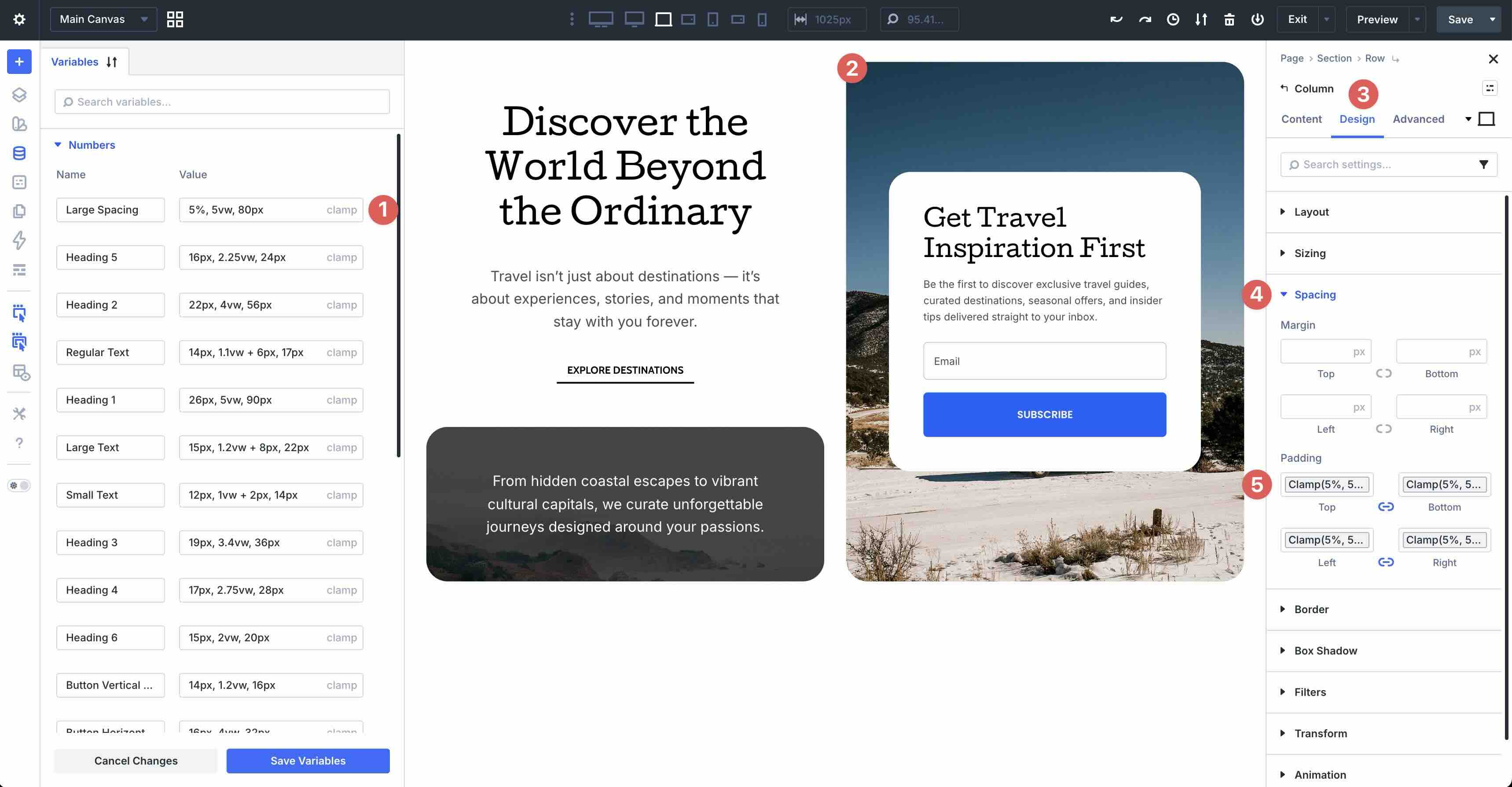
Define Design Variables once, and easily apply them throughout your layout where you want dynamic spacing. If you change the values later, every instance that uses it will be updated automatically.
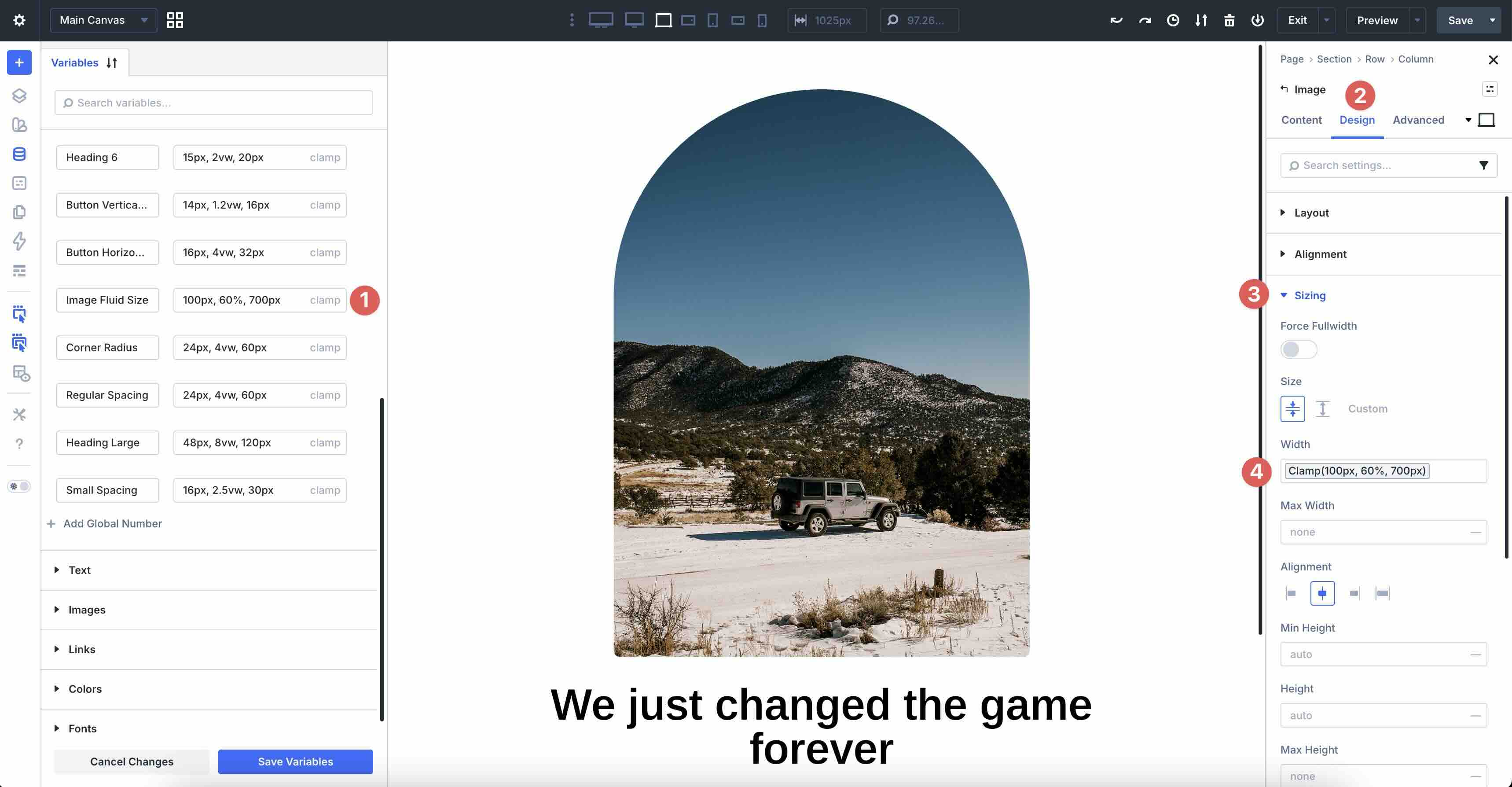
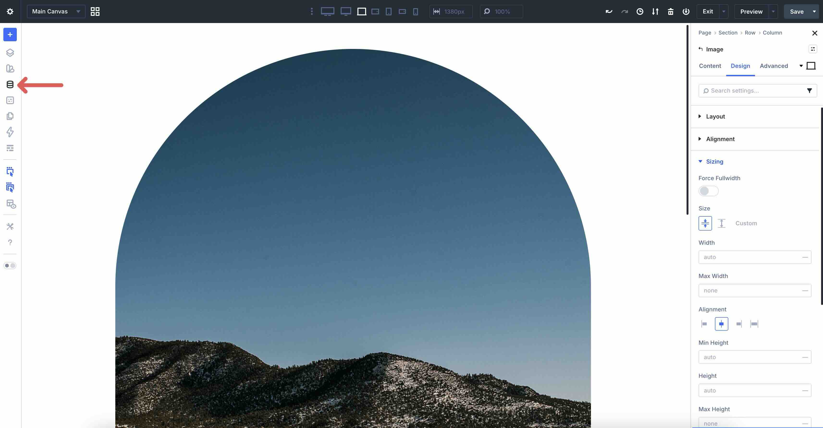
Best Practice 8: Clamp-Based Width on Large Images
In addition to using clamp() for spacing, you can use it for sizing. For example, you can apply clamp values to images to control the width on different screen sizes. Fixed pixel widths can leave images too small on big screens or too big on small ones, but applying clamp() directly to an image’s Width field creates fluid sizing that grows or shrinks smoothly with the viewport, always staying within comfortable min and max boundaries.
In the example below, an image uses the clamp value clamp(100px, 60%, 700px) in its Design > Sizing > Width setting, ensuring it never shrinks below 100px (on phones), scales fluidly to fill about 60% of its container, and caps at 700px.
How To Do It In Divi 5
As previously mentioned, Divi 5 lets you define clamp formulas once in the Variable Manager and reuse them across modules, making spacing and sizing consistent and easy to update site-wide.
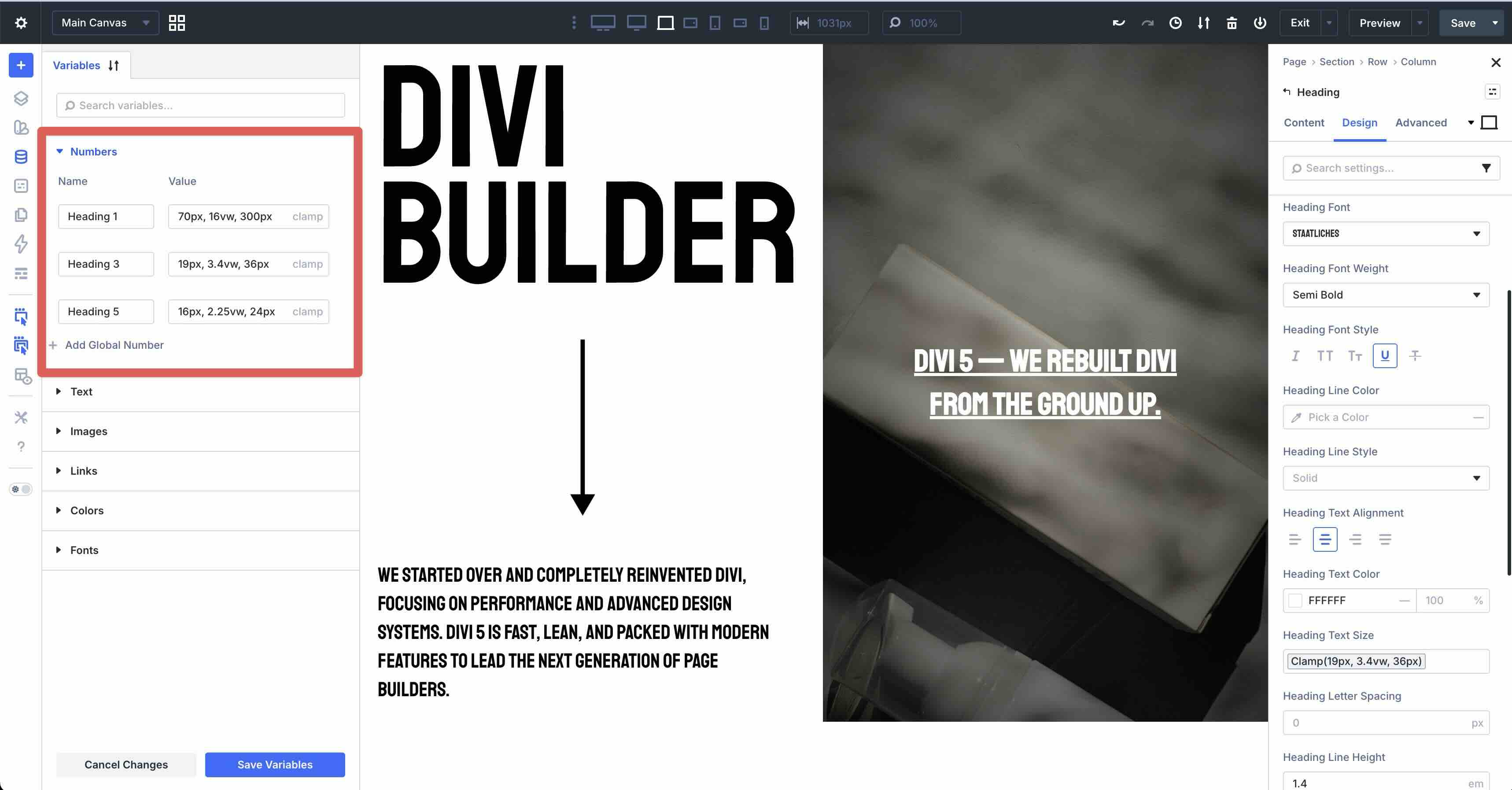
To create a new clamp value, open the Variable Manager by clicking on the corresponding icon in the left sidebar.
Expand the Numbers tab and click + Add Global Number.
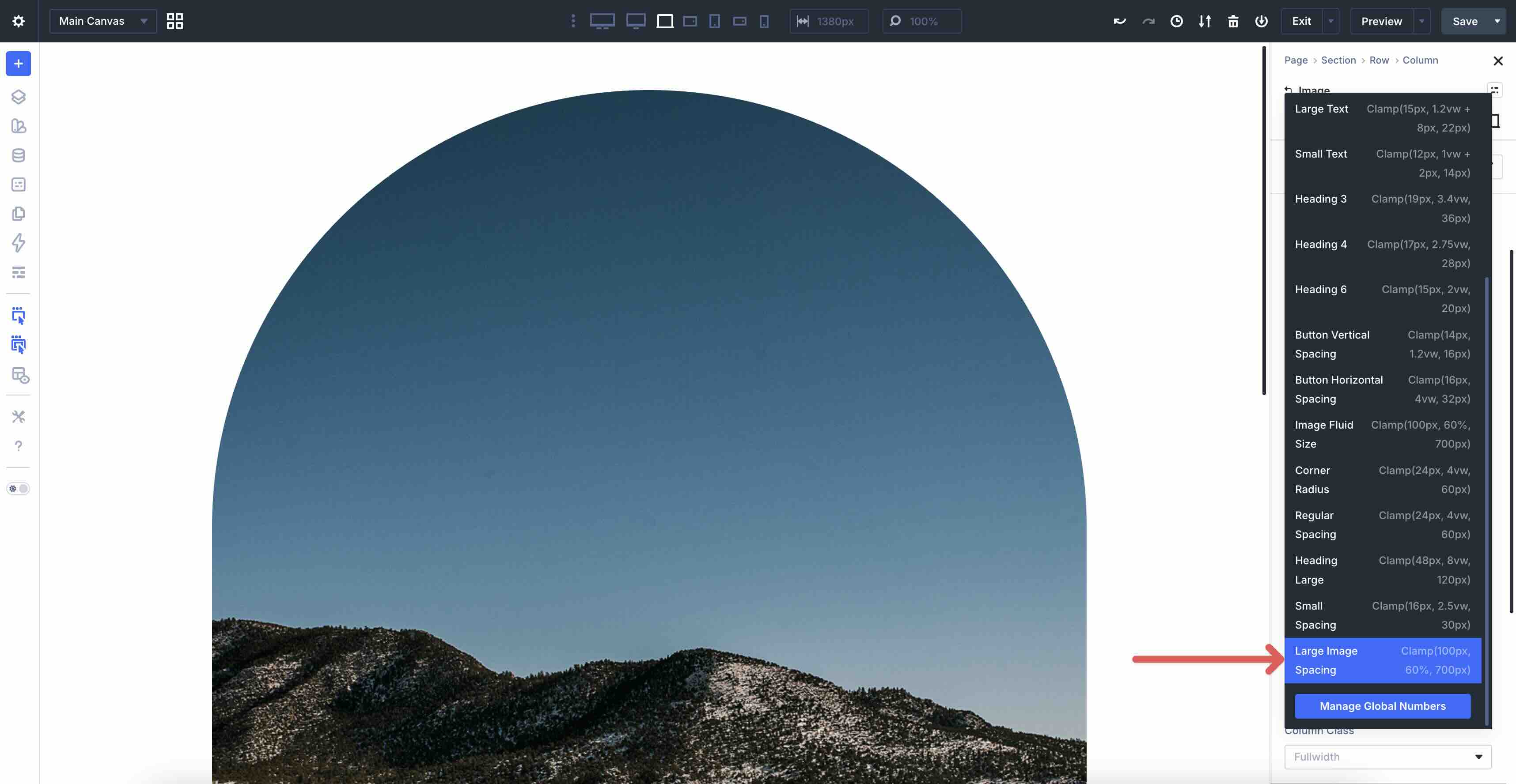
Assign a name for the Variable (such as Large Image Spacing) and select clamp from the Advanced Units dropdown menu.
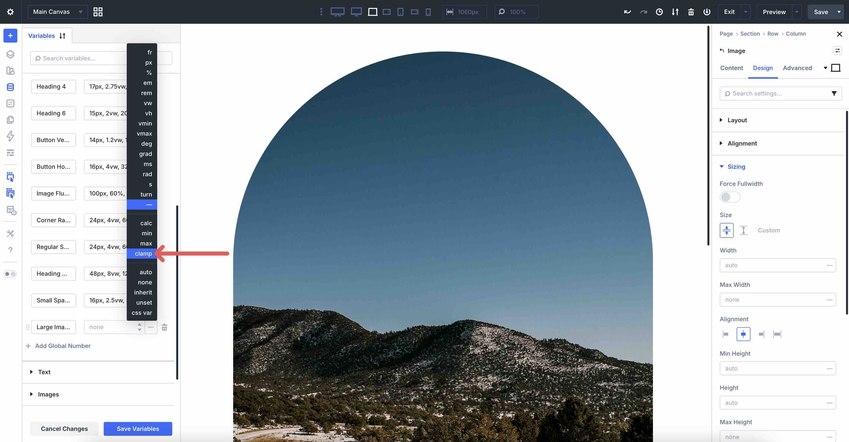
Enter 100px, 60%, 700px into the Value field. Click the Save Variables button to save it to the Variable Manager.
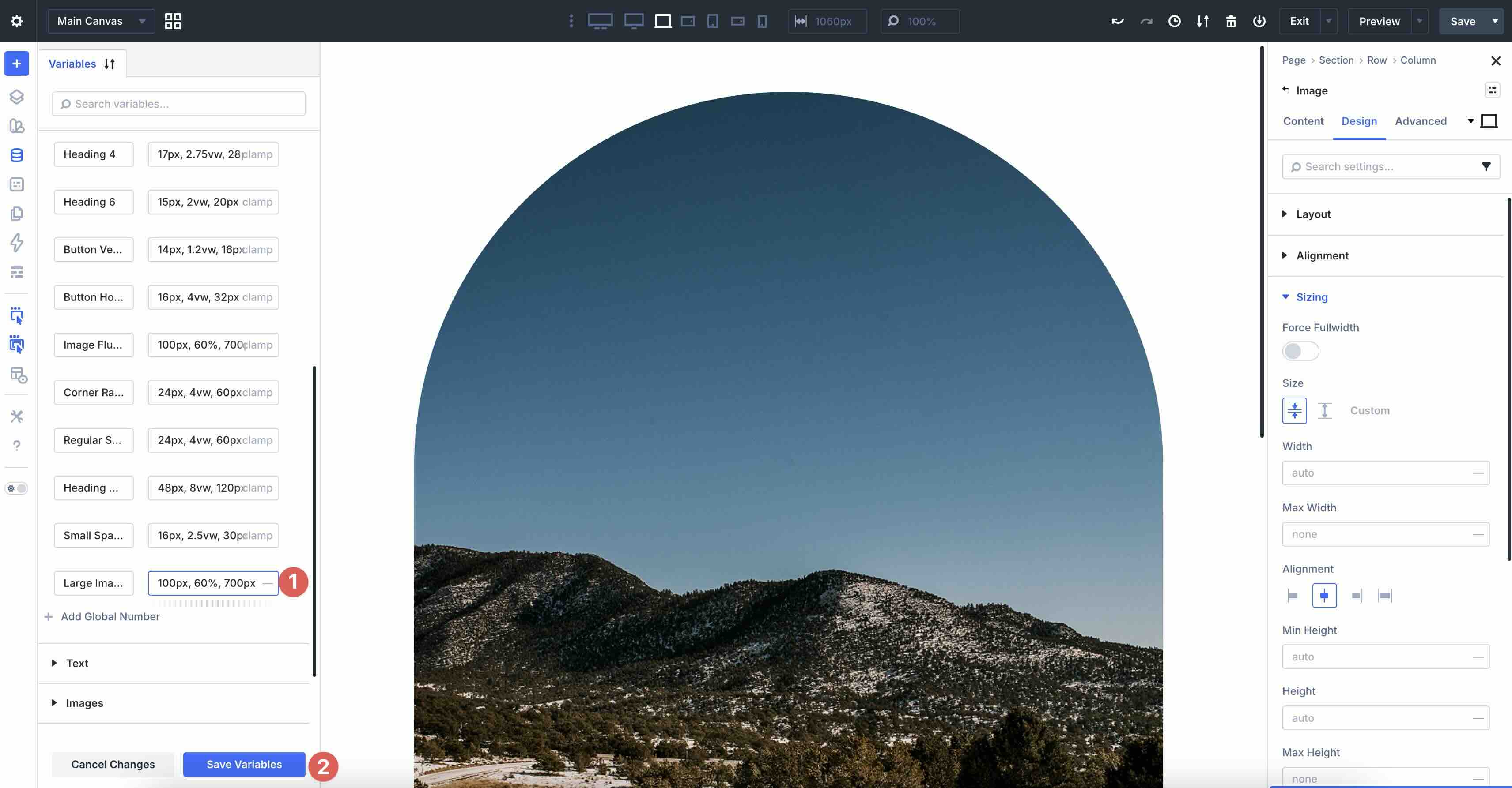
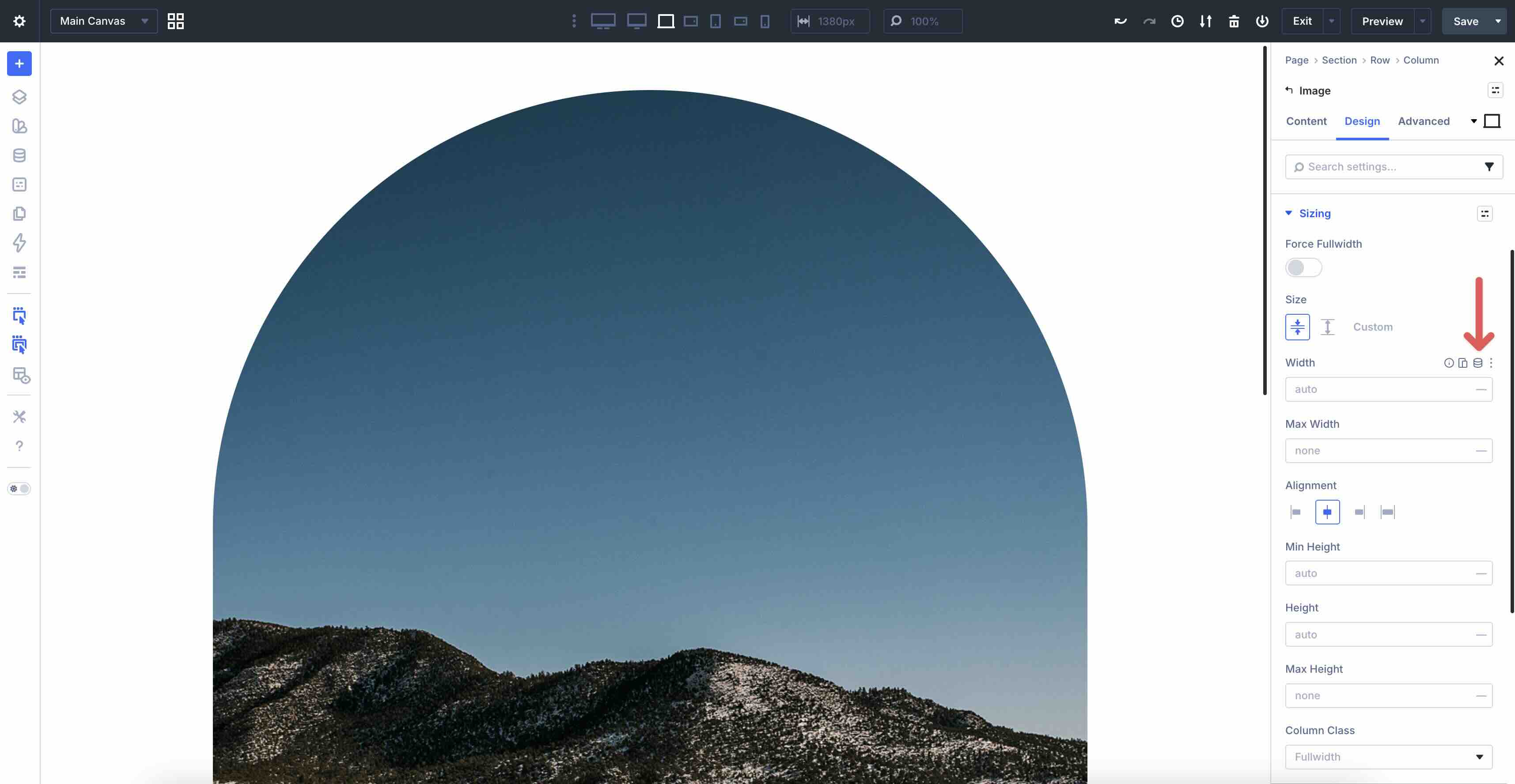
To apply the Variable, open the Design tab of an Image module in your layout. Expand the Sizing tab and locate the Width field.
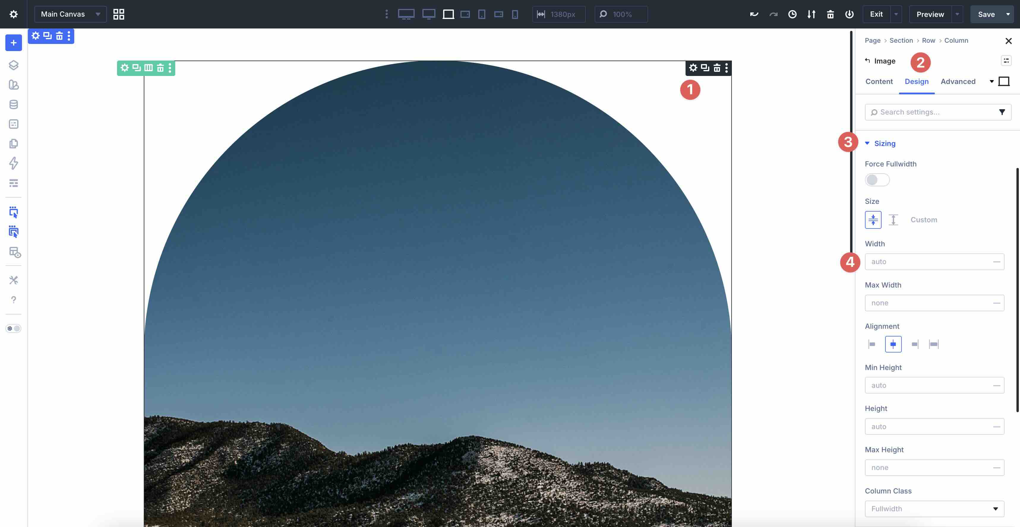
Hover over the right side of the field to reveal the Dynamic Content icon.
When the options appear, select the Large Image Spacing Variable we created to apply it to the Width field.
Adding clamp values to sizing fields helps create fluid, responsive images that stay proportional, avoid layout shifts, maintain design intent across devices, and improve the mobile experience by preventing oversized images that slow loading or cause overflow.
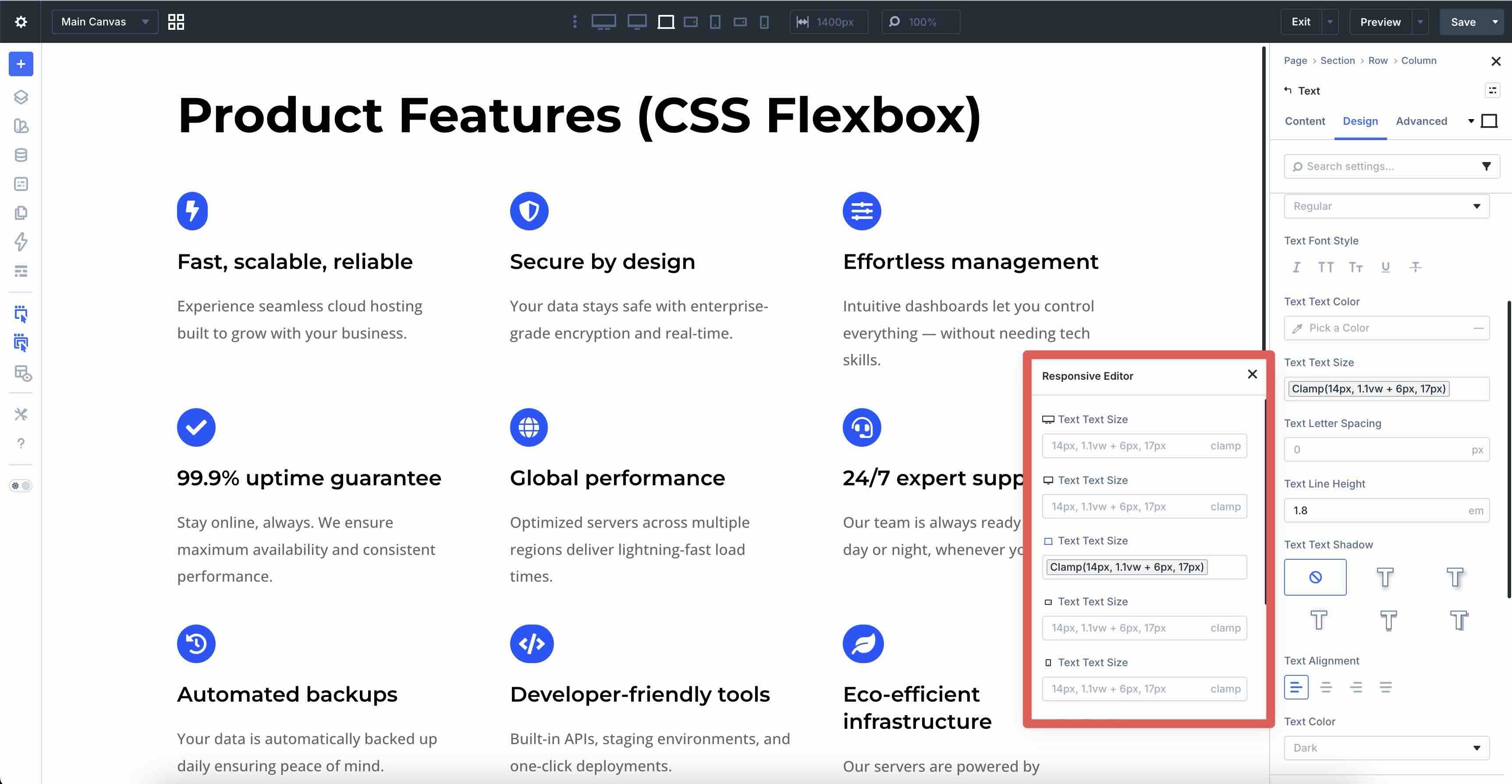
Best Practice 9: Clamp-Based Typography
In addition to spacing and sizing, clamp() can be used to create fluid typography that scales smoothly and legibly across every device size. On desktop, headings can grow large and commanding to enhance visual hierarchy and impact, while on mobile, they need to remain readable and compact to fit comfortably without forcing horizontal scrolling or tiny text. Fixed font sizes often lead to awkward jumps at breakpoints or poor legibility on extremes, but clamp() delivers continuous, proportional scaling that feels natural and maintains accessibility.
In the example below, headings use clamp values for fluid sizing, resizing from mobile to desktop without abrupt changes.
How To Do It In Divi 5
Clamp() enables typography that adapts continuously to viewport width while staying within defined limits. The browser calculates the ideal value between the min and max based on the preferred term.
Apply these Number Variables directly into the Variable Manager:
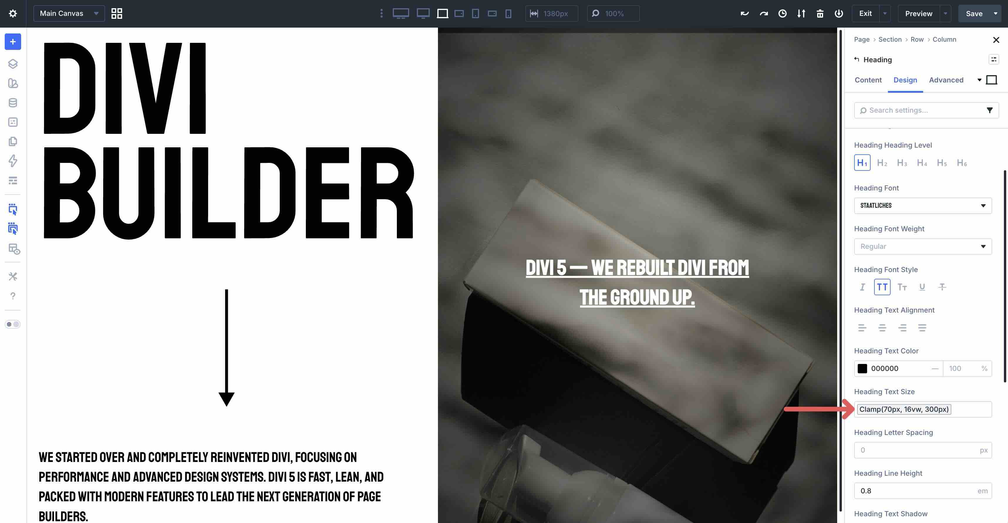
- H1: clamp(70px, 16vw, 300px) — Starts at 70px minimum (readable on small screens), scales with 16vw for bold growth, caps at 300px (prevents over-dominance on ultra-wide).
- H3: clamp(19px, 3.4vw, 36px) — Minimum 19px (legible baseline), preferred 3.4vw (smooth increase), max 36px (balanced mid-size heading).
- H5: clamp(15px, 2vw, 20px) — Minimum 15px (subtle but clear), 2vw scaling (gentle growth), max 20px (keeps smaller headings restrained).
From there, use the Dynamic Content icon to add the clamp values into the Heading Text Size field.
Best Practice 10: Content-Fixed + Expanding Columns
Another best practice for mobile web design is to use columns that fill available space while preserving the displayed content. On desktop and tablet, a compact left column can hug its natural width, while the right column expands to use the full remaining space. On mobile, you can easily stack them vertically for a natural flow.
In this example, the main row is set to 100% width. The first column remains a fixed size through all breakpoints, and the second grows to fill the remaining space.
This works well for mobile web design because it prevents layout shifts during browser resizing, preserves hierarchy as devices shrink, and creates a more intuitive, user-friendly experience that guides visitors naturally through desired actions.
How To Do It In Divi 5
Start with a two-column Flex row, add modules, and style them as desired. Next, click to edit the first column’s settings.
In the Design tab, expand the Layout tab and set Align Items to Stretch.
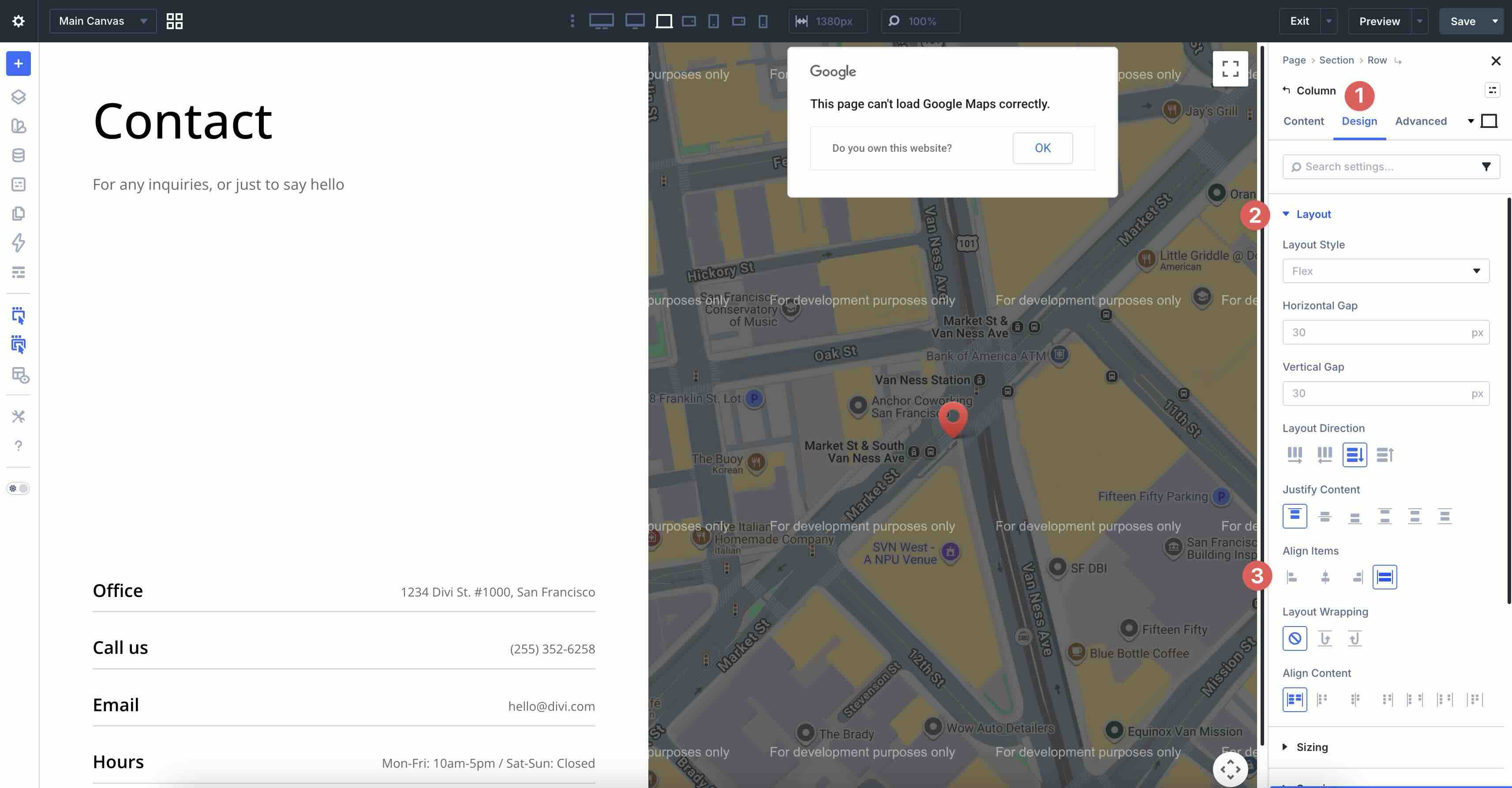
Next, expand the Sizing menu and set the Column Class to No Column Class.
Click to edit the second column’s settings.
Set Align Items to Stretch, and expand the Sizing menu. Adjust the Column Class to 2/3.

In the Size field, click to enable Grow to Fill. This will allow the column to expand to fit the available space as the screen size increases.
For stacked vertical columns on phones, set the Column Class to Fullwidth.
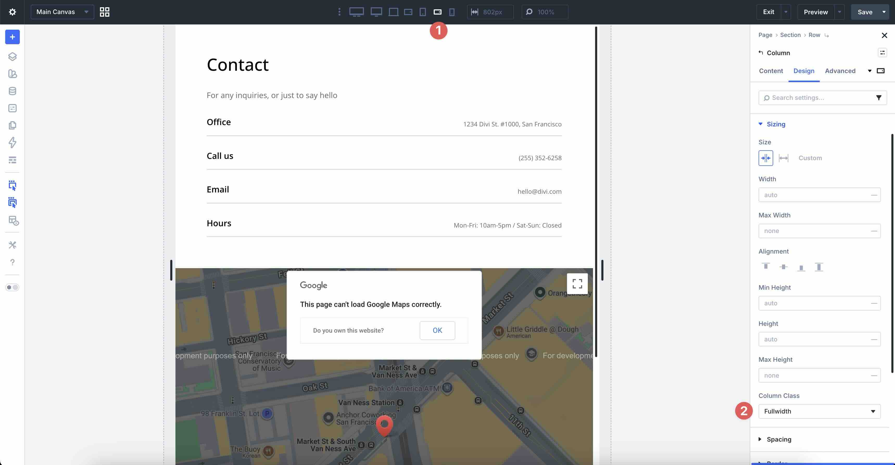
Divi 5’s Flexbox and responsive column classes make creating adaptive two-column layouts easy.
Best Practice 11: Breakpoint-Free Column Wrapping
When designing for mobile screens, layouts can use grids that flow naturally without column adjustments at each breakpoint. On larger screens, content spans multiple columns, while on smaller screens, such as phones, columns automatically stack vertically when there’s not enough space. On mobile, columns stay full-width, readable, and touch-friendly.
Instead of changing the number of columns per breakpoint, use Divi 5’s Equal Minimum Width Columns and Column Minimum Width settings. This uses CSS Grid’s minmax() behavior to ensure columns maintain a fixed minimum width, share extra space equally, and wrap automatically when the container can’t fit another full column.
How To Do It In Divi 5
Ensure that the main row’s Layout Style is set to Grid. Create Design Variables for the Horizontal and Vertical Gap fields. For example, clamp(16px, 2.5vw, 30px). Apply them to the Gap fields in the Layout settings in the Design tab.
In the Column Widths field, select Equal Minimum Width Columns and set the Column Minimum Width to 300px.
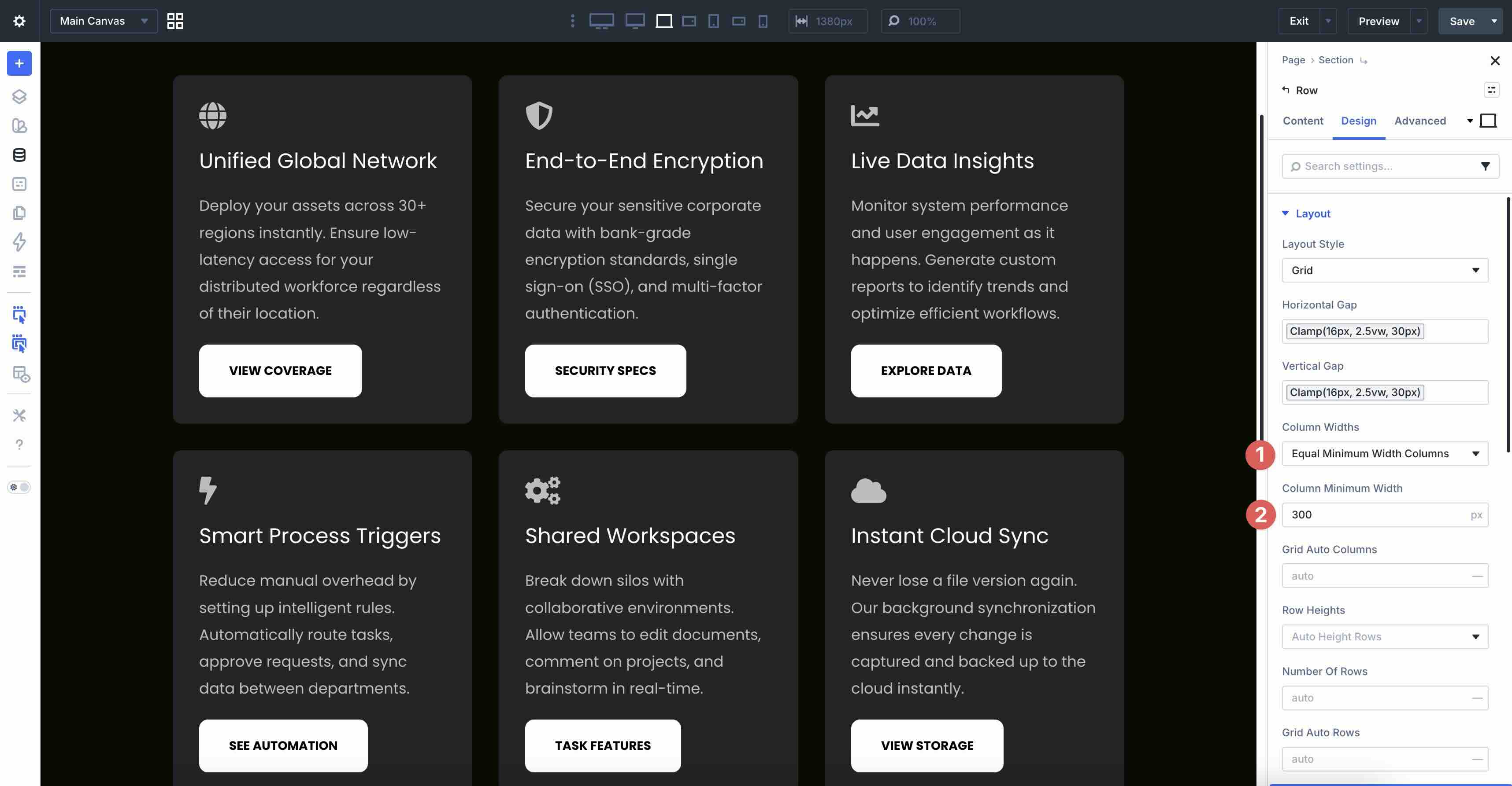
All other settings remain at their defaults.
This setup creates breakpoint-independent, content-first grids that adapt fluidly. Columns wrap naturally on smaller viewports (phones), preventing compressed content and improving readability.
Best Practice 12: Simplified Mobile Background Styles
Using background images in hero sections or elsewhere on the page is a great way to create an immersive design. However, that doesn’t always translate well to mobile devices. On desktops and larger tablets, a rich background image with a gradient overlay can create immersive depth that draws users in, but on smaller screens, heavy background images can slow page load times and distract from core content due to cropping, scaling, or reduced visibility.
In the example below, the section uses a full Background Image and Gradient overlay on Desktop and Tablet Wide breakpoints for a polished, engaging look. On Tablet and Phone breakpoints, the image is removed entirely, replaced with a solid Background Color and a subtle Background Mask to maintain visual interest without the performance hit.
How To Do It In Divi 5
To achieve this look, start by adding a Background Image for Ultra Wide, Widescreen, Desktop, and Tablet Wide breakpoints.
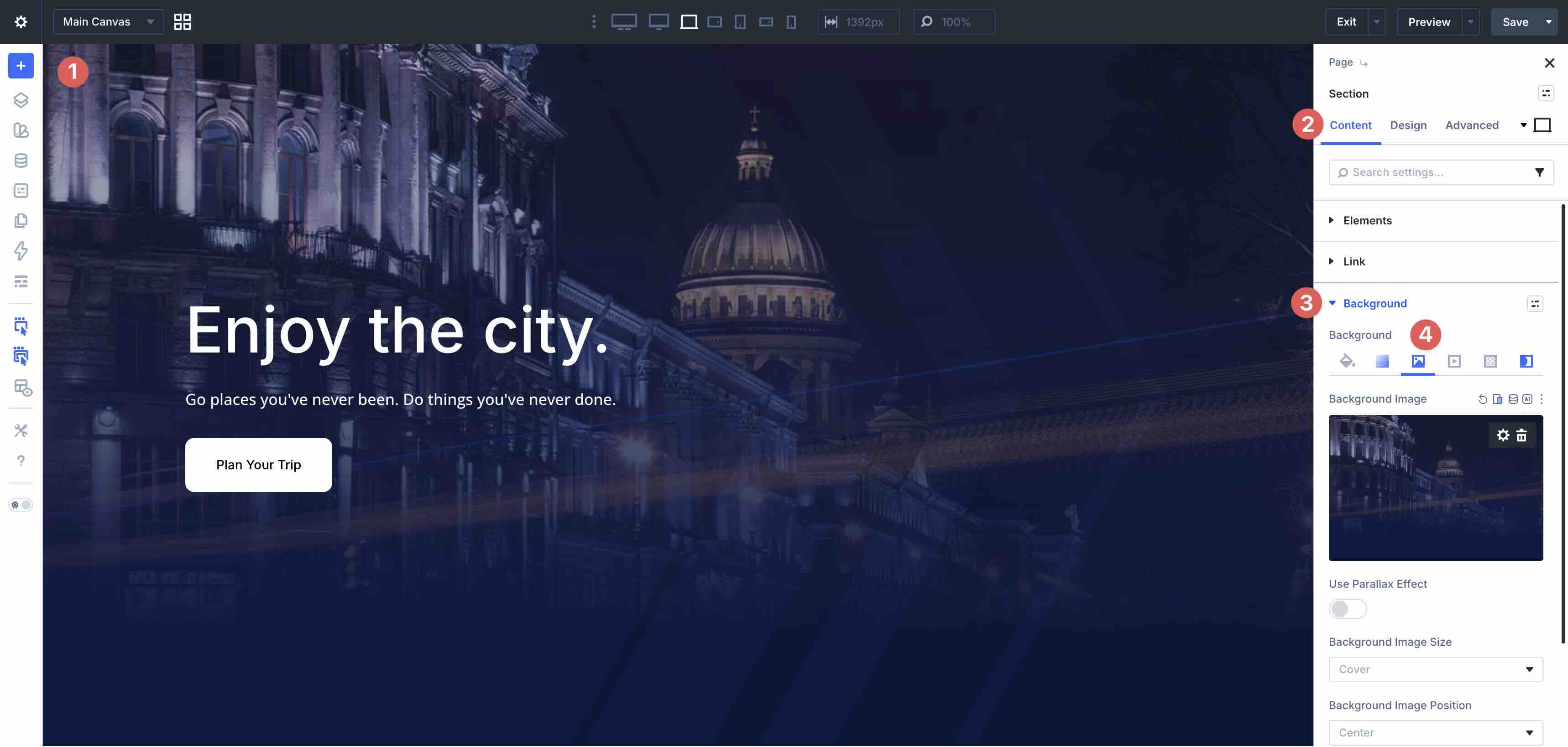
Next, add a Background Gradient to the Desktop breakpoint. Enable Place Gradient Above Background Image.
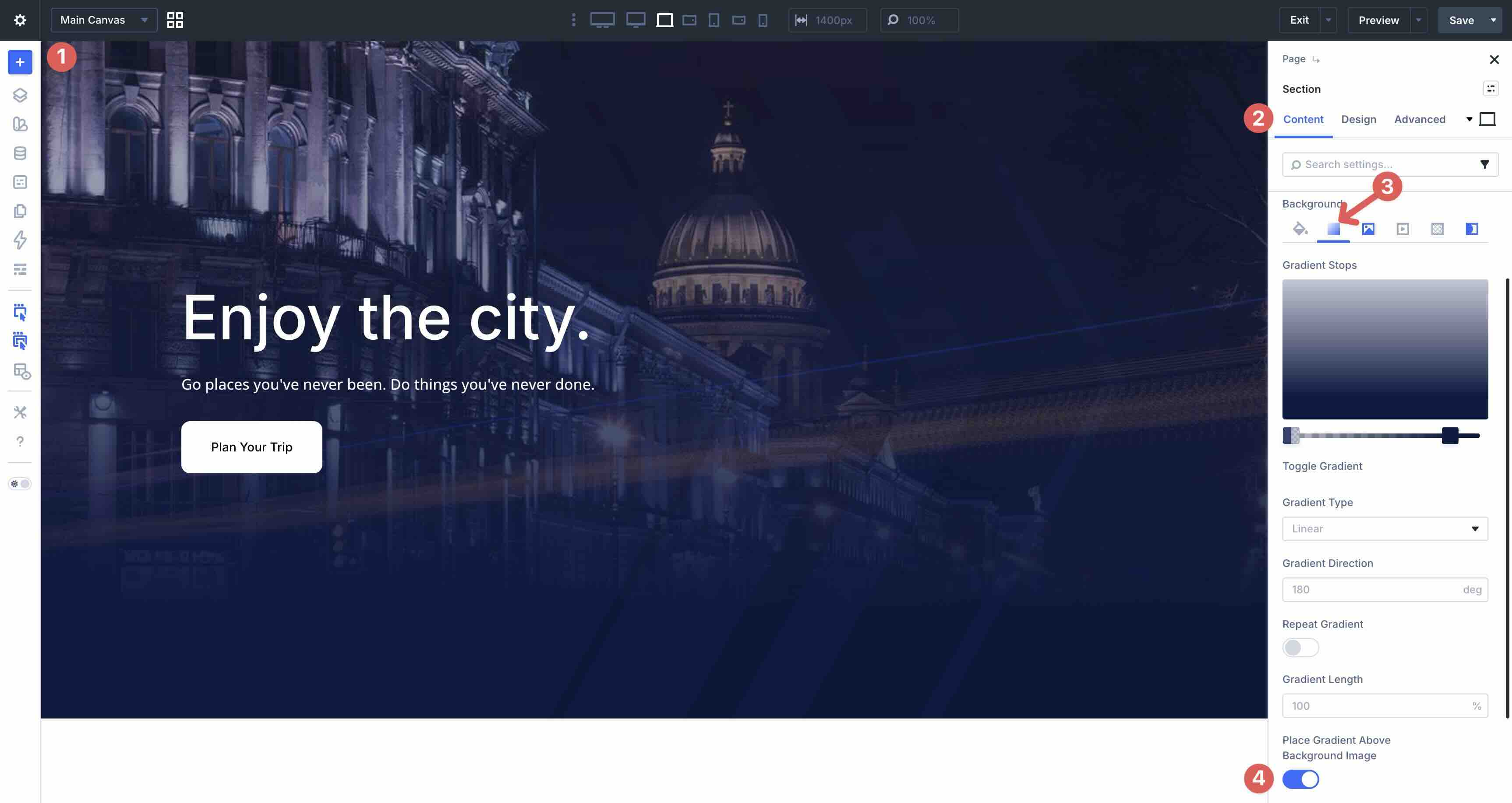
Swap to the Tablet Breakpoint. In the Background Color field, add a Background Color.
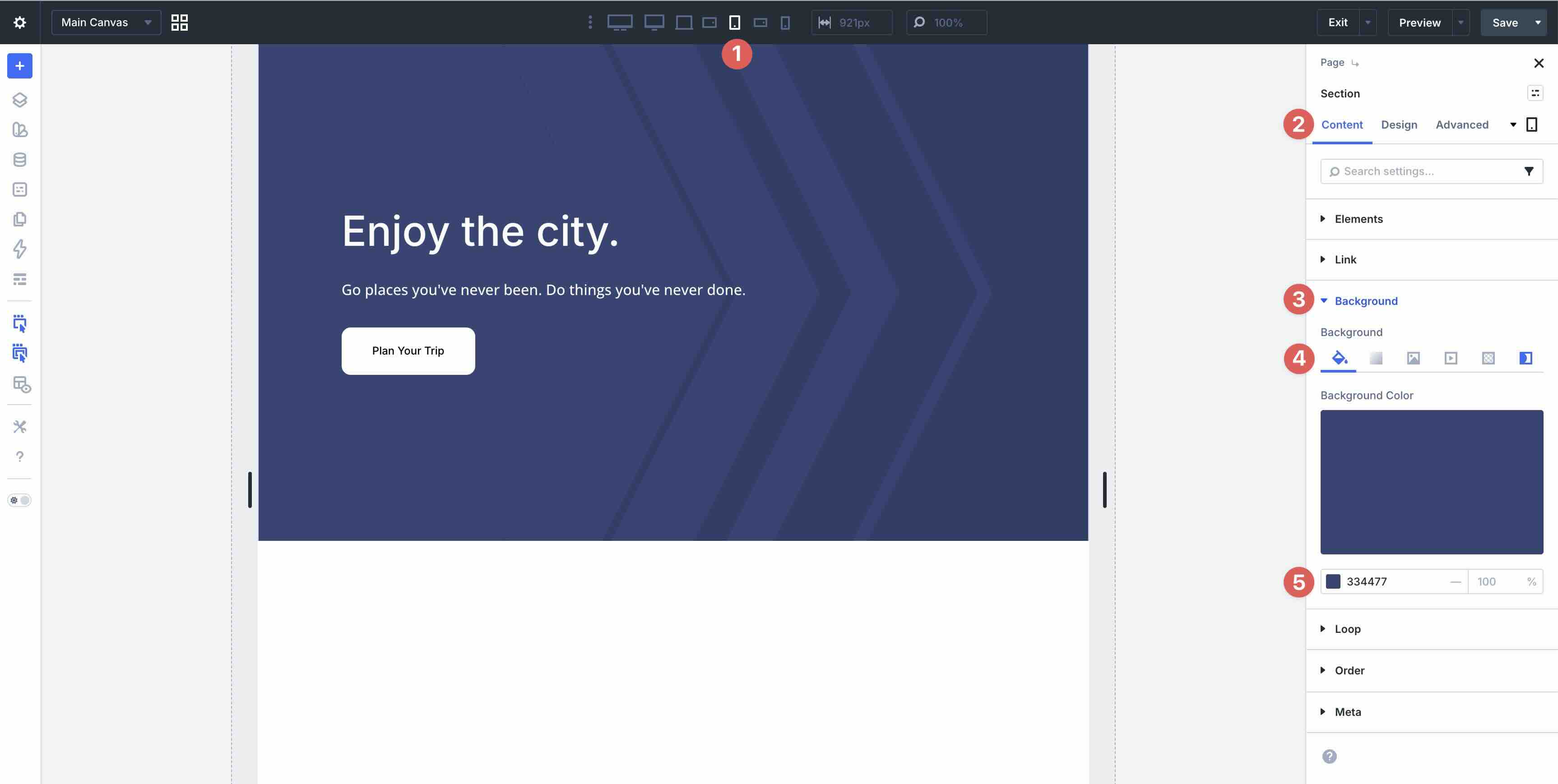
While in the Tablet Breakpoint, remove the Background Image.
Click the Background Mask tab and select a Mask from the available options.
Set a Mask Color then apply a 9% Opacity. In the Mask Transform field, select Invert. Choose Landscape for the Mask Aspect Ratio field.
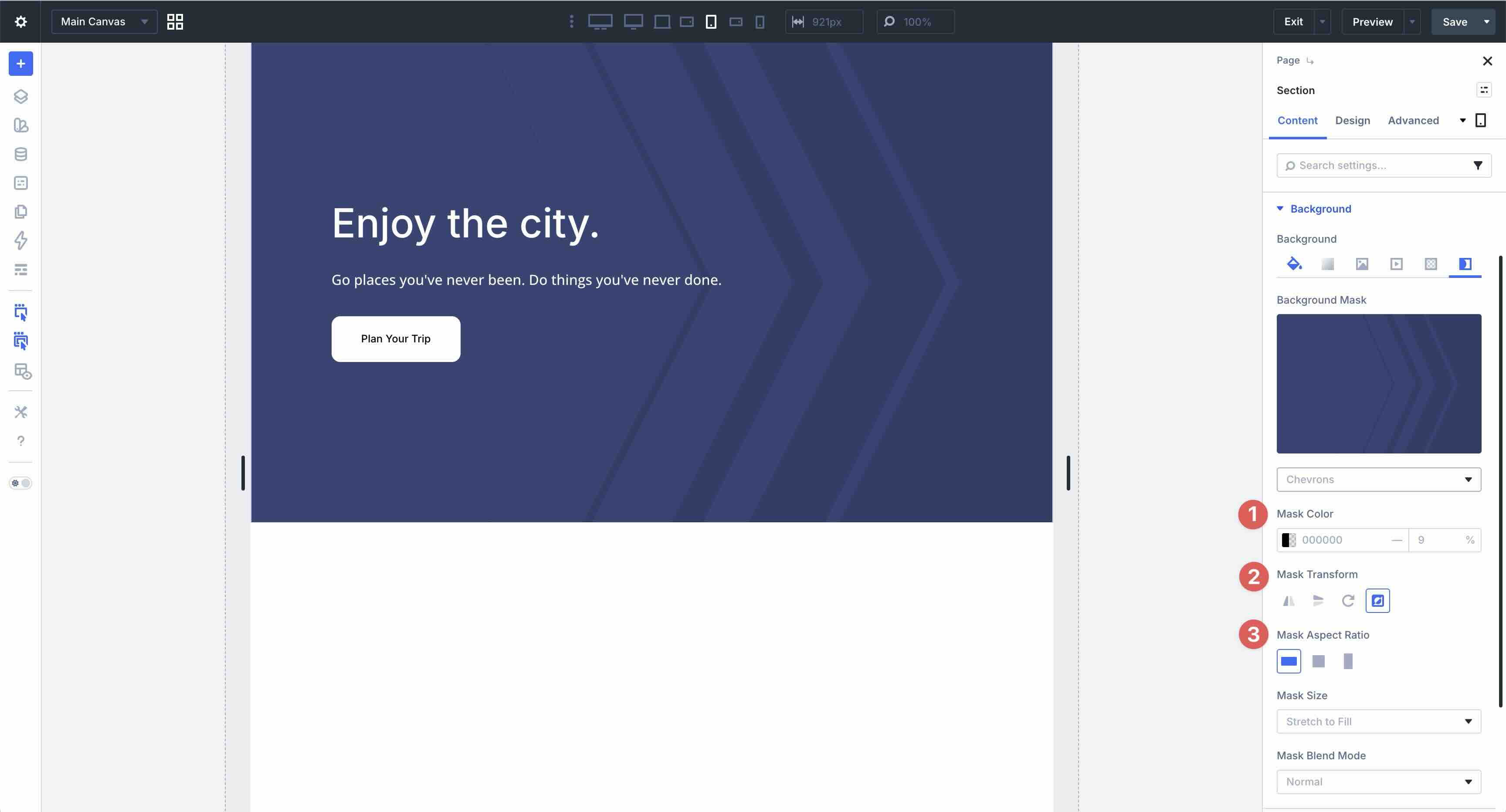
This method keeps your desktop design engaging while delivering lighter, faster, more focused mobile experiences, aligning with modern responsive best practices.
Build Fully-Responsive Websites In Divi 5 Today!
These twelve best practices form a powerful toolkit for mastering mobile responsiveness in Divi 5. From reordering elements and natural wrapping to fluid clamp-based typography, spacing, image sizing, and performance-conscious background styles, you’ve seen how Divi 5’s modern features make sophisticated, adaptive designs feel effortless.
Download the layout pack, import the examples, and start experimenting today. Use Divi 5’s responsive tools to tweak values, test on real devices, and see how quickly you can turn rigid layouts into fluid, mobile-first designs.


As someone just starting to play with Divi 5, I found this a very useful article. There’s nothing like practical examples to make learning easier.