
I know you already spend heaps of time writing content for your WordPress site. But how much time do you spend on the images you use in your content? If you’re like a lot of bloggers, probably not that much.
In this post, I’m going to dig into some basic image editing tricks and tips to help you get the most from the limited time you have to create blog images. I’m not a professional designer – so these tips should be easy to implement no matter what your knowledge level is.
Let’s jump straight into it…
- 1 1. Use These Colors Whenever Possible
- 2 2. Make Sure You Have Proper Color Contrast
- 3 3. Use the Right Fonts and Pair Them Correctly
- 4 4. Blur Background Images
- 5 5. Consider Adding Filters
- 6 6. Make Multiple Images Into a Photo Grid
- 7 7. Use the Right Dimensions and Optimize Images
- 8 What Types of Images Resonate With People?
- 9 Wrapping Up
1. Use These Colors Whenever Possible
Let’s start with a disclaimer – color advice should always be taken with a grain of salt. If I tell you X color does better on social media (on average), that doesn’t mean you need to make every single image include X color. It just means that if you have a natural opportunity to include X over Y, that might be a good idea.
We’re talking averages here – that doesn’t mean there aren’t situations where an image using a below average color does gangbusters.
With that being said, red is the key to getting your images shared more often…at least according to two different analyses of millions of Pinterest images.
In the first study, a joint project between Yahoo Labs and Georgia Tech, the researchers found that images with red, purple, and pink tones got shared more often. According to the researchers, “warm and exciting colors seem to affect the recipient’s likelihood of sharing the image.”
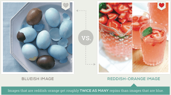
Image Source: Curalate
Similarly, Curalate looked at 500,000 Pinterest images and also found that red images got significantly more repins than blue images.
I know – this data is for Pinterest, not blog images specifically. I can’t promise the exact same principles apply. But it’s the best data I could find. And the fact that both analyses look at over 1.5 million images leads me to believe it’s not an isolated phenomenon.
Red is associated with excitement, so it makes sense that it would elicit more “excited” responses than calm blues.
Ignoring social shares, it’s also a good general idea to match the colors you use with the voice of your blog. In Jacqueline’s logo post, she has a detailed discussion of the psychology of color. So if your blog is upbeat and exciting, red is great. If you’re trying to push out a calm vibe, using blue might well be a better option.
2. Make Sure You Have Proper Color Contrast
Bloggers love adding text to the images that they share. And that’s great! Text helps your images get shared on social media. But only if people can actually read it.
See, there’s this thing called color contrast that affects how easily people can read. Ever try to read yellow text on a lime green background? It probably gives you a headache just thinking about it.
Thankfully, you don’t need to try to guess whether or not your background/foreground pairing has enough contrast – you can just use the Color Safe tool.
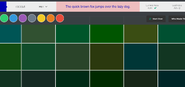
Just enter your background color and the tool will generate a number of foreground colors for you to choose from.
3. Use the Right Fonts and Pair Them Correctly
Did you know that fonts can affect everything from how cynical you are to how you perceive other people’s ideas?
Font choice is the reason that, despite the researcher’s amazing science, the public laughed at Higgs Boson researchers. All because they published their research using Comic Sans.
Though it wasn’t very scientific, Phil Renaud also did a playful analysis and found that his essays which used the Georgia font got the best grades over other fonts.
So, don’t just brush off font choice as something with no real effect. Choose fonts that match your mood. If it’s a serious post, choose a serious font.
Unsure how to match font with mood? Me too! Thankfully, Tympanus has a good post connecting fonts with their respective mood.
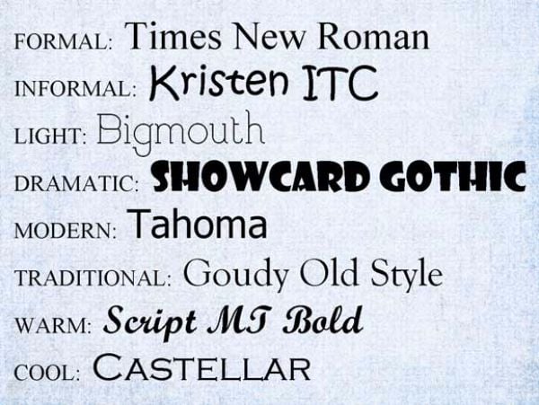
Image source: Tympanus
Also, to keep your images visually appealing, it’s a good idea to use more than one font. But when you choose to pair fonts, you need to pair them correctly. For that, I’ve got another great resource for you – Tom wrote a whole post on just font pairing.
4. Blur Background Images
If you’re adding text to a background, a neat effect is to blur the background image behind your text. This sharpens the appearance of your text and makes for a more interesting image.
If you are planning to blur the background image, you should try to choose an uncluttered image, though. If you have a busy background image, the blur effect will look more sloppy than attractive.
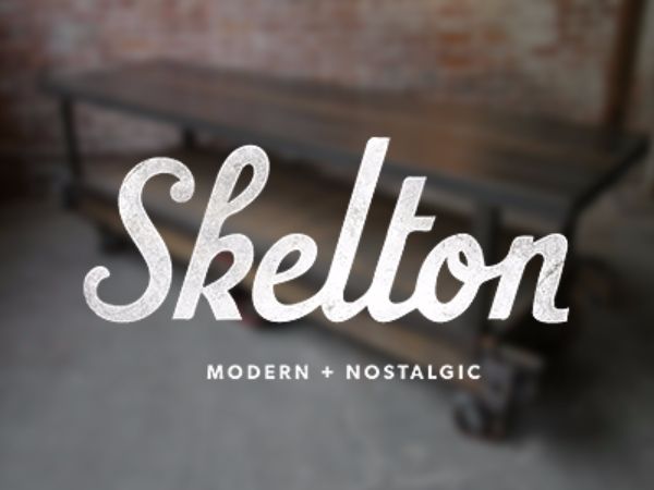
Image Source: Bill S Kenney’s Dribble
Canva’s Design School has a great guide with tips for designing with a blurred background.
5. Consider Adding Filters
All by itself, the popularity of Instagram is proof that people love image filters. They’re a neat way to add some visual variety to your blog images.
You can either add a full-on filter with something like Canva or just play around with saturation, contrast, and brightness, tint, and more using any photo editing tool.
6. Make Multiple Images Into a Photo Grid
If you have multiple images, combining them into one single photo grid can be more engaging than showing three images with the exact same dimensions:
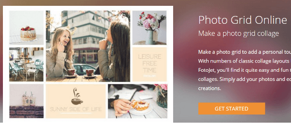
FotoJet lets you quickly create photo grids from your existing images. And it only takes a few seconds!
7. Use the Right Dimensions and Optimize Images
You know which images perform the best? The images that actually load quickly. Yeah – this isn’t a style tip, it’s a performance tip. But it’s true – no matter how cool your images look, if you’re uploading 3MB monster images, your readers might never even get a chance to look at them.
For an in-depth look at optimizing images, check out our guide to optimizing WordPress images.
What Types of Images Resonate With People?
I’m going to end with a brief rundown of some types of images that especially resonate with readers. This is not intended to be a complete list of every single image that works – just a look at some good options from the data and my personal experiences.
People Like Looking at Images of…People
Whether it’s biological or social conditioning, people love looking at images of faces on the web. In an eye-tracking study from Nielsen Norman Group, they found that people spent 10% more time looking at people’s faces than they did reading the biography paragraph next to the image.
Infographics Are Still Popular
Though the golden age of infographics may have passed, they’re still a popular type of image. They’re also easier to create nowadays – you can use Piktochart to create infographics, even if you lack any graphic design skills.
Quote Images
People love sharing quotes. Quotes consistently get more retweets on Twitter than other types of Tweets. Quote images are also quick to create, giving them a great ROI as far as blog imagery goes.
Wrapping Up
Including images on your blog is a good thing. But an even better thing is including interesting images on your blog. I hope these image editing tips help you join the latter category.
How much thought do you put into the images that you include on your blog? Do you spend time editing them or do you mainly use screenshots and stock photos?
Article thumbnail image by mut_mut / shutterstock.com


Thanks for sharing such good tips. Will help me in my business..!!
Hello, interesting article, if it is true that the images within the web content sound important. In my case, my project that goes from the animation of events to the catering with chocolate fountains, the colors and the texts of the images give another approach to the whole site.
Not so much for the search, but if I have been of help in all regards ideas to blur funds or put several images in a grid. With these changes, besides the optimization of the weight and the names of the same ones I believe that the images can have an importance and a very important weight in the visual quality of the web.
Thanks for your article.
Great tips! I do all of my own photography. Love the idea of doing a blurred shot with typography layered over it!
Great article. As someone who considers themselves lacking skill in this area, this helps shape my thinking towards images.
Hi there
Could i please make a request that the Elegant themes crew do an in depth blog tutorial on how to use images with the fullwidth image/slider/header.
Dealing with how parallax actually works, choosing image size, how divi translates fullwidth images onto different devices, etc.
I have been using divi for years now and no matter how many forum post questions are answered i still don’t have a clue about how it actually works so that i can objectively set about getting what i want out of the look of my site.
I find it utterly mystifying and frustrating and given the amounts of posts in the forums about this subject it would probably be a popular blog post.
Thank you.
Thanks for the request! We can certainly write a post up along those lines to answer your questions.
Another good aspect to cover would be how all of the above works with a boxed layout and the non boxed layout.
Oh, yes please!!! That would be amazing! I’m starting to think that it is some kind of dark art, only for the initiated! And looking through the forum questions I know that I’m not the only one. I can’t wait! Thank you!
Thanks for sharing insights.Could you please cover an article on Divi. I see many people here comments and keep asking about Divi.
Do you recommend using the paid version of canva?
This is a great article! Thanks so much for all the research and putting it together. 🙂
Brenda – great post too BTW. Thank you. So good solid tips in here for anyone designing for the online environment.
In paragraph #7, there is a reference to a guide for optimizing images which, in turn, includes a link to a WP page about “Post thumbnails”. I wonder if and how the Divi theme incorporates this?
For Posts, Divi includes “Set Featured Image”. What is the default size of that featured image in the post? And how can one change it?
The article on WP says it can create three sizes (thumbnail, medium, large) plus original. How is this option activated in Divi? Would that mean that there would be four separate images (each of a different size) in the media library for each image that is uploaded?
Steve – Eileen Lonergan has a great post on this. It’s a little unwieldy, but doable. Be good if the nice ET/Divi folks wrote this into the next Divi update to make it easier.
Hope this helps.https://eileenlonergan.com/how-to-make-the-divi-featured-images-smaller-on-your-blog-page/
That’s true that colors do a lot of help in engaging your visitors with your website. Other points are also helpful. Thanks for these wonderful tips. 🙂