
Have you ever noticed that some of the world’s top logos make no sense? At least not at first glance. Although you may admire the simple colors, a cleverly drawn graphic, or an innovative use of typography, most logos seem to ignore their brand identity completely. Observe:
What does the Good Year have to do with tires?
What does the Chiquita logo have to do with bananas?
And, in keeping with the blue and yellow theme, what does the Ikea logo have to do with a Scandinavian furniture superstore?
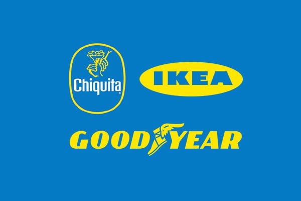
Logos don’t need to make sense to be memorable– at least not on a conscious level. What makes a logo memorable is primarily color choice and then a magical combination of cleverness, subliminal association, and editing.
But, before we begin, let’s tackle brand identity.
- 1 Finding Your Brand Identity in Two Words
- 2 The Psychology of Color
- 3 Red- Energetic, Exciting, Immediacy
- 4 Orange- Aggressively Friendly, Confident, Fun
- 5 Yellow- Happy, Optimistic, Youthful
- 6 Green- Fresh, Healthy, Growth
- 7 Blue- Trust, Dependable, Loyal
- 8 Purple- Creative, Luxurious, Wise
- 9 Black- Rich, Authoritative, Power
- 10 Color Makes An Impact
- 11 A Kaleidoscope of Competing Colors?
- 12 Get to the Point Quickly
- 13 Let’s Get Subconscious
- 14 Use White Space to Your Advantage
- 15 What Your Logo is Not
- 16 Will It Pass the Child Test?
Finding Your Brand Identity in Two Words
Your brand identity is your point of view. So, what makes you different? Perhaps you build websites for nonprofits exclusively, or you provide social media marketing consultation for mommy bloggers. Be sure to get specific. And, it doesn’t matter if your business is slightly generic. Although what you offer may not be unique, how you offer it will be unique.
Before you begin designing your logo, ask yourself this question: how do you define your brand in two words. Is it empower women, or passionate hope, or serious banking? Give yourself time to think of the two most powerful and accurate words to describe your brand. Once you’ve come up with them, write them down, and then read the next section.
The Psychology of Color
It’s a well known marketing strategy to attract customers with color. Color evokes strong emotions and associations inside of our brains.
Above, we looked at three very popular logos. Why did these companies choose the colors blue and yellow?
The yellow is obvious. That’s because yellow is optimistic and attention grabbing. Most road signs are yellow because the color instantly grabs your attention and shouts, “look at me!”
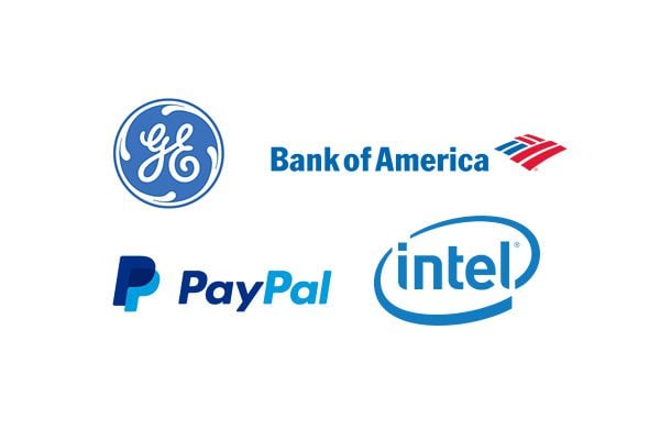
On the other hand, blue indicates trust and dependability. Although most companies want to be considered trustworthy, a company that sells tires or fruit or furniture has a particular need to come across as dependable and secure. This is also why companies like American Express, Bank of America, and PayPal choose blue as their dominant logo color.
Let’s take a closer look at how the colors break down:
Red- Energetic, Exciting, Immediacy
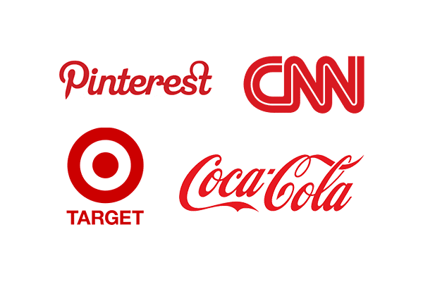
Red is intense, dynamic, passionate, and energetic. Unless colorblind, it’s impossible to ignore red. That’s because red creates a sense of urgency in our brains. Think of how stop signs and fire extinguishers grab your attention.
Red is also an appetite stimulate. It’s often used with yellow to make you feel hungry. KFC, Coca Cola, Kellogg’s, Chick-Fil-A, McDonalds, Wendy’s, Pizza Hut, and the list goes on, all use red to encourage appetite.
Red is best when used sparingly. A full sign in red may be sensory overload, and not as successful as red type against a contrasting background.
This color is awesome for brands related to action, adventure, and just plain doing stuff, such as Honda, Toyota, Canon, Red Bull, YouTube, and CNN.
Orange- Aggressively Friendly, Confident, Fun
![]()
Love it or hate it, it’s hard to stay neutral with the color orange. Combining the energy of red and the unwavering optimism of yellow, orange is bright and playful. It’s the color of choice for friendly brands, such as Amazon, Etsy, Bit.ly, Shutterfly, and Blogger. These brands communicate enthusiasm and user friendliness.
Orange works for brands geared towards fun and entertainment. It won’t make the best impression for more serious businesses, such as those in financial or wellness sectors. However, its friendliness will work if your brand appeals to youth (Nickelodeon) or community (Blogger, Harley-Davidson).
Yellow- Happy, Optimistic, Youthful
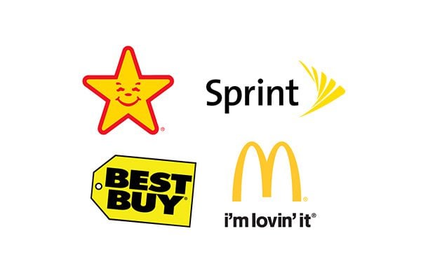
Nothing stimulates quite like yellow. The preferred color for caution signs and Post-It notes, yellow is definitely attention grabbing. But it’s also the color of optimism and happiness. Lemon wedges, afternoons drenched in golden sunlight, baby ducklings waddling behind each other– what can be happier than yellow?
This is why so many brands choose to associate themselves with this color.
Yellow elicits spontaneity. Think about well known brands that use yellow effectively in their logos. Mcdonald’s, Best Buy, Ikea, Burger King– all appeal to an impulsive customer who prefers immediate gratification.
Yellow is also preferable for restaurants because, along with red, this color is an appetite stimulant.
(Note: Many yellow logos combine with black to convey a message of friendly authority.)
Green- Fresh, Healthy, Growth
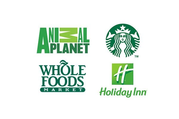
Green is soothing, natural, and fresh. It’s so relaxing because it’s the easiest color for the human eye to process. When you want to communicate eco-consciousness, vibrancy, serenity, wellness, or renewal, green is a great choice.
If your brand concerns anything natural, green is the perfect color choice. It’s one of the most assertive colors in nature. Health spas, whole food products, and all things animal can benefit from a green logo.
Because it suggests rejuvenation, green was a no brainer color for Starbucks.
Blue- Trust, Dependable, Loyal
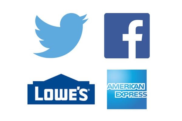
Blue is the most dependable of all the colors. Just like we can trust the color of the sky to remain the same, we associate brands with blue logos to be dependable and secure. Blue is a favorite logo color for this reason.
Brands likely to excel with a blue logo include finance and safety.
American Express, PayPal, Twitter, and Facebook all use blue to suggest trustworthiness and dependability.
Purple- Creative, Luxurious, Wise
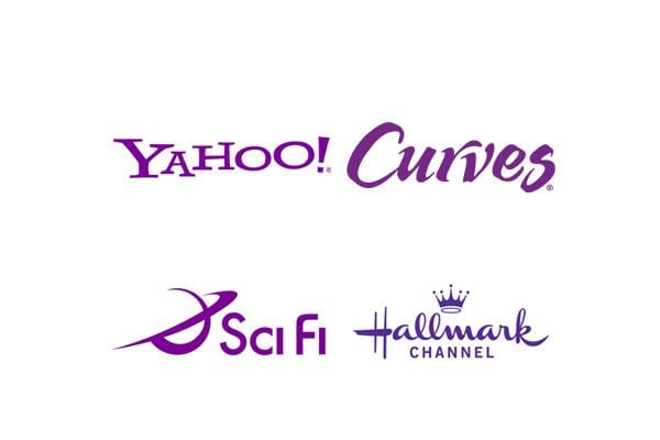
As a combination of two primary colors, purple is a balance between red’s passion and blue’s confidence. The color exudes sophistication, creativity, and imagination. Brands such as SyFy, Hallmark, Curves, and Yahoo! use purple in their logo to convey ingenuity and originality.
Purple works great for companies with a creative edge, or those that are reimagining a product or service.
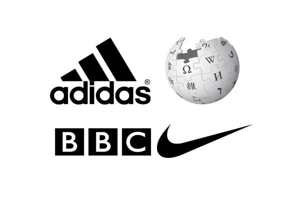
When you want to convey authority, class, or luxury, black is an easy choice. While not as flamboyant as some color choices, a black logo can really stand out in its simplicity. Think of the understated Nike swoosh, of the interlocking Cs in Chanel’s logo.
If you choose a black logo, it’s important to balance it with white or negative space. A dominance of black can convey the wrong message. While black can be mysterious, too much of it can imply sadness, loneliness, and emptiness.
Few logo styles are quite as beautiful as the dynamic dance of white and black. This yin and yang combination really soars when you use negative space to create an optical illusion.
Color Makes An Impact
You cannot over-emphasize the importance of color in your logo design. A study by the University of Loyola, Maryland found that color boosts brand recognition by a whooping 80%.
A Kaleidoscope of Competing Colors?
A lot of people get scared when they read the word “color.” Are you imagining an overly precious rainbow. Aside from a few isolated examples, most successful logos are one or two colors. Let’s look at notable examples to the two color rule:
![]()
Toys R Us is a popular kids toy store. Its colorful logo is playful and fun. The backwards “R” indicates childhood. The “R” is also the standout character, and is blue, indicating dependability. In other words, this logo says: We make toys that kids will love because we understand them, but parents can also trust us because we’re dependable.
![]()
The Google logo is colorful and slightly off. The blue, red, and yellow colors are all primary. But then there’s that rebel green in the Google “L” that elevates this logo into a brand message. Ruth Kedar, the graphic designer responsible for Google’s popular logo, used the secondary green color in the “L” to indicate that Google doesn’t follow the rules.
![]()
Everyone’s favorite bidding site, eBay, uses multiple colors in its logo. The colors here illustrate the assorted eBay community. The touching letters show that the eBay community is connected with each other.
![]()
The iconic National Broadcasting Company (NBC) logo shows a peacock with six colored feathers. Each color represents the company’s six divisions: News, Sports, Entertainment, Stations, Network, and Productions.
Although multiple colors can make the best choice for some companies, it’s hard to pull off. Unless your brand is particularly whimsical, steer clear of using more than two colors to establish your identity.
Simplicity is king when it comes to color choice. Considering the central theme of your brand message (those two words, remember?), choose one or two colors to tell that story. If you want to exude authority, luxury, or power, go with black. If you want to project passion or boldness, embrace red. Colors are instant mood-setters. Your color choice conveys exactly who you are and how to feel about you.
Get to the Point Quickly
The perfect logo is ruthlessly edited. If you can erase elements from your logo without taking away from the message, you should do it. The simplest logos are always the ones that make the most impact. Consider:
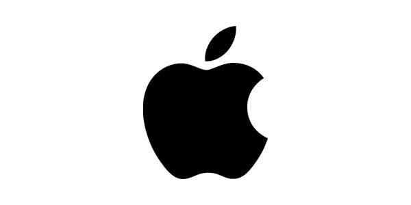
The Apple logo is clearly an apple. But not a whole apple– there’s a byte missing. Get it? The logo itself is a pun. But that’s not why it’s memorable. The Apple logo is so simple that you can draw it with your eyes closed. It’s easy to understand and very scalable. No complex shadows or gradients. And it’s not even red, it’s black, which suggests that Apple considers itself an authority. Well, duh.
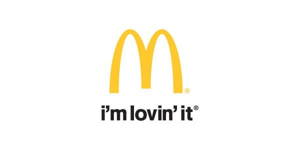
The golden arches in the McDonald’s logo are simple and instantly recognizable the whole world over, but did you know that they may have a subliminal meaning? Back in the 60s, McDonalds wanted to get rid of their now-iconic logo but psychologist and design consultant Louis Cheskin persuaded them against doing so. He noted that the rounded “M” resembles mammary glands and that customers would associate McDonald’s with nourishment. Good luck trying to forget that tidbit of information.

The Beats by Dr. Dre logo is a simple read circle with a white-space letter “b.” It’s extremely simple, but at second glance (or 57th, if you’re me), you notice that the “b” is also the headphone. Very clever. And it can’t get any simpler.
Each of the above logos display their message quickly. There’s no need to read a message or accompanying slogan. Each logo tells a story.
Let’s Get Subconscious
Without getting too spooky, a lot of solid logo design relies on hidden messages or optical illusions. Observe:
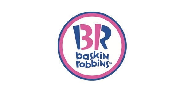
Dessert shop Baskin Robbins is known for its 31 ice cream flavors (one for every day of the month). Cleverly, the logo alludes to its popular slogan by isolating “31” from the Baskin Robbins’ initials.
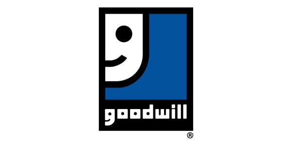
Which do you see first– the lowercase “g” or the smiley face? Bonus points if you see two smiley faces in the above logo. And, if you’re tilted like me, the larger “g” will always look like a smiley face, no matter how long you squint. And miraculously, the smaller “g” looks like a letter and not a smiley face. Herein lies the brilliance of simplicity.
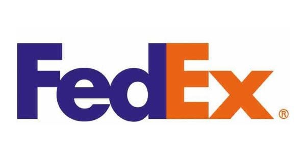
I’m embarrassed to admit that I never noticed the hidden message in the FedEx logo. Can you guess? There’s an arrow wedged between the letters “E” and “X.” It indicates forward motion.
If you can find a way to sneak more of your brand identity into your logo (without crowding the design), do it.
Use White Space to Your Advantage
White space can elevate your logo from average to stellar. This was masterfully done in the FedEx logo above.
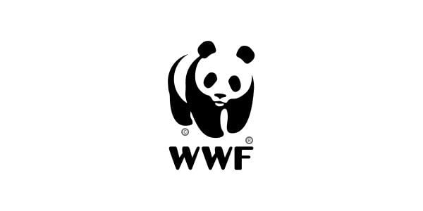
The World Wildlife Fund uses the endangered panda bear to convey its message of wildlife conservation. The white space works perfectly with the panda.
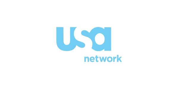
Basic cable tv network USA makes magic happen with its smart placement of “S.”

The Girl Scouts of America show fresh, youthful faces– two of which are carved against negative space.
Think about the ways you can add white space to your logo. Take inspiration from the USA logo and let one letter stand out in negative space. It can have a bold impact on your logo. That’s because our minds are drawn to puzzles. A logo with white space is similar to a puzzle. Our brains will try to figure out what’s missing. The result? A memorable logo because the brain has lingered.
What Your Logo is Not
Your logo is not going to reveal the entire story of your brand. It’s impossible. Your logo should be a hint of what your brand’s about. That’s why your color story is so important. Color gives the tone: my brand is happy, or serious, or passionate, or youthful, or healthy.
Will It Pass the Child Test?
Before humans can read, they can recognize logos. Three year olds recognize McDonald’s, Toys R Us, and Disney before they can read the word “cat.” This is because the brand behind the logo consistently delivers a reward that the kid can understand and appreciate.
All humans, no matter the age, operate on this same basic reward system. A logo is made memorable by the experience you can consistently deliver. Although it’s important to get the design right, if the experience falls flat, your logo may be memorable for the wrong thing.
Avoid the temptation to muddy the waters with too much frill. Instead, design your logo as if you were designing for a child. It should be clear and simple. And, when in doubt, edit it out.
Thumbnail image by brainpencil / shutterstock.com


Great article! Creating a logo that is relevant to your industry will help you have a greater impact on your consumers.
wonderful tips again from Elegant themes.. i will consider these tips to create my new logo thanks..
Logos are generally designed to promote a particular company, institute or brand. While designing a logo try to find out the best color combinations. Color combination is an important part of our logo design. While choosing color of the logo match with the theme of the company e.g. for a particular environmental organization mostly green color is preferred which represents the coolness of leaves. This color is generally associated with nature, good health etc.
I’ve noticed the Goodwill logo in the large G has a third hidden message. A person’s head with their single arm giving or receiving in a goodwill gesture.
Thanks.Its really helpful……Jacqueline Thomas….
Excellent article. Enjoyed it. Entertaining as well as ‘educational’. So important to get that ‘spark’ of inspiration… and, as in so many other parts of life: ‘less is often more’ ! Never noticed the ‘earphones’ in the Beats logo before – and I will NEVER look at a McDonalds sign in the same way again!
Awesome, and very useful like everything done by ElegantThemes team.
Thanks a lot!
Wow!
Now, I know.
It makes sense. I’m gonna redesign my logo. Thank you.
Wow! Fascinating information. As a freelance designer I used to submit lots of sketches, revisions on the black/white aspect of the design first, after which colors comes later. I haven’t thought much about colors psychology then until now. This is great! Thanks Jacqueline
Great information, definitely it will help me and others to chose or create a great logo for business. thanks a lot .
Great post! Thank you for putting this together.
This was an excellent article; it stood out from many other good articles on this blog. Well done, I liked the insights. 🙂
I designed my logo inspired by the crop circles…see the original image http://www.spiritandflesh.com/crop-circle-10.jpg hehe Alien design.
You’ve given me much food for thought, Jacqueline and a sense of validation. When I was working with the designers for my website 3 years ago, I was focused on the logo which I created myself using the sense of message that I wanted which was then polished up by the designer. I specifically told them that the colors of the website should be purple and black.
Not much thought went into it other than the fact that I liked purple and black. Other than that, I had not thought of color psychology. Was it my intuition or subconscious mind that was telling me that these 2 colors and my logo would convey my message?
I’m a lapsed graphic designer just got back into the business.
Logo design is a specialist subject. I did a refresher course on udemy.com all about logo design. It was inspiring because the teacher is brilliant and a designer. The name of the teacher is Tara Roskell and her course is called How to design a logo – A Beginners Course.
I receive no commission for this course and I have no affiliation with this person. I am sharing it because it is packed with excellent information and many, many examples which will benefit the novice as well as the experienced designer. Her presentation all the while is so professional I can’t fault it. This is me a designer making such a song and dance about this course. I was bowled over by her in depth approach. It is truly a comprehensive course and you will come away understanding what logos are all about and how to create your own identity with a logo.
Wonderful article! It pointed out many things I never thought of before when it came to logos. Now I need to put these tips to work!
Great distillation of information. I think I’ll make this required reading for new clients 🙂
GREAT post! When clients try to pour everything they are about into a new logo design, I am going to direct them to this article. Thank you so much.
Jacqueline,
Thank you for such a wonderful post on logo design.
It really is an interesting field to explore for us web designers.
The logo examples you have chosen really make this post interesting to read.
Best,
Timur
Thank you Jacqueline, I enjoyed reading the article as well as the comments. All of this had given me some inspiration for one of my current projects.
I would be interested to know of cleverly designed law firm logos. Take a look at the 4a Law logo combined the 4 and the A…
The Apple logo initially was not an apple – It was a stone like slab with a ribbon on the top and bottom of it. Then in 1997 a rainbow coloured apple was adopted. It them went to blue and then on to black in 1998.
Since then it has used 2 different tonalities of grey / chrome.
A white logo on grey equipment is also used very often.
By just mentioning the black only logo you have over simplified the Apple situation as it is not the full current usage of their logo.
They currently use the white, black and grey versions depending on the product, app or store front being offered/used.
Great logos do not need to be word/text based – the 3 pointed star of Mercedes Benz, the green bot of Android, the bunny ear playboy logo are good examples. They follow the same rules – simple, distinct, impactful and highly memorable.
All in all a great article on the core aspects of logo design. Much to be learned here.
Simply awesome article, Thank you Jacqueline!! Really love it
A very interesting article about logos. Thanks for that.
Since I’m Swedish so I have to tell you about what the name IKEA has to do with the furnitures and what the name comes from. The founder of IKEA was Ingvar (I) Kamprad (K) and he was growing up on the farm Elmtaryd (E) in Agunnaryd (A) here in Sweden.
The Apple logo represents the forbidden fruit from the “Tree of Knowledge” in the Biblical creation story of Adam and Eve. That is what I heard.
Great post! Very informative. The girl scout green hair also make up a 4 leaf clover : )
Nice article – so the first thing to do is to change elegant theme’s logo cause it is not a good one, sorry…. too much text, old fashioned font …. not elegant to be honest….
I disagree.. I actually really like the Elegant Themes logo. It’s simple and fresh and the * looks great by itself (like on their Twitter profile pic)
Thank you Jacqueline, I got more ideas to make my own logo and for my clients..
This is by far one of the best articles I’ve read in a long time. I thoroughly enjoyed it, and shared as well.
Fantastic!,
Just when I’m struggling in to create my own brand as an independant consultant and not a consultancy firm, this article came to me as a the missing piece in the puzzle to see why I was not happy with my first scratches.
Logo design, done properly, is a very time consuming thing to do. I tell my clients “If you have a $500 company, you need a $500 logo”.
There are so many bad, bad logos out there.
Road signs – specifically those of the warning variety as opposed to the informational kind – are yellow and black because black on a fully saturated yellow field is the highest contrast combination perceived by the human eye.
A bit over the top in places. IKEA is blue and yellow because those are the Swedish national colors, and it is a Swedish company. Goodyear Tire and Rubber is named after its founder, Charles Goodyear. Chiquita’s lady remembers Carmen Miranda, and the NBC peacock the network’s pride in delivering color broadcasting
Great post! One small point – on the discussion about the Google logo – green is a primary colour, it’s yellow that’s the secondary (made by mixing red & green). http://en.wikipedia.org/wiki/Primary_color
Green is a primary color in light, not in pigment.
True, but in pigment (or subtractive) primaries, the other 2 are cyan and magenta, not red and blue. By saying red and blue the article says it’s using additive primaries, hence the third would be green.
Excellent Article Lot of food for thought.
Good article. It certainly reinforces my dealing s with my clients that it is a good idea to have a logo to identify and reinforce your brand.
I had never heard the bite/byte from the Apple apple explanation before. To me it was a bite from the apple of the tree of knowledge…
Interesting.
If I could add one suggestion: Hire a professional.
Yes you can build your own house but should you?
I agree with Ernest. This was a very interesting review of corporate logos but I’m not confident it is a thorough guide on how to create your own. In my opinion, you need a good designer teamed up with a brand strategist. If you don’t have good guidance in the thinking behind who you are as a company, it will never come through in your design.
Great ideas for using colors in logos. Thanks!
Great job Jacqueline!
I’ve seen some of this before, but all together a one nice post.
Great post !
Thanks Jacqueline! Most Interesting …
John Malloy
http://www.thecanadiandaily.ca
Excellent article, Jacqueline.
I hope more people will now understand that logo design is one of the toughest forms of design!
Great post Jacqueline! The logos are the soul of our enterprise. Thanks for sharing your knowledge.
This is fabulous Jacqueline
I’ve never tried to produce a logo but after reading this, I’m all fired up to give it a try.