
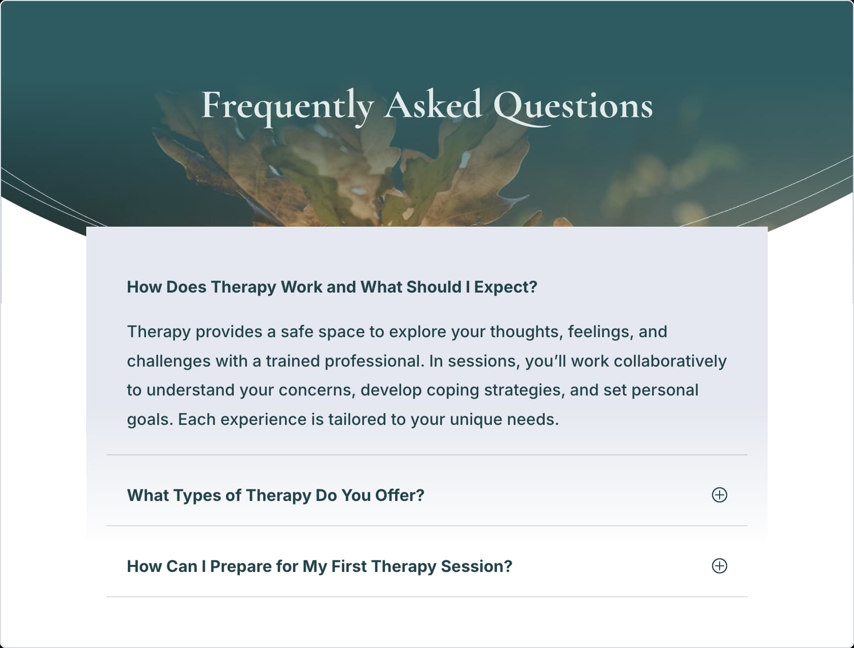
Visitors scan FAQ sections more than they read them. They skim headings, looking for the one question that matches their problem. When they can’t find it fast, it affects conversions.
The solution doesn’t lie in writing better answers, but in better organization. So, in this post, we’ll show you how to build Nested FAQs with Divi 5‘s Nested Modules. Let’s get started!
What Makes A Great FAQ Section
What separates helpful FAQs from the ones visitors usually skip often comes down to what’s inside the answers.
Subscribe To Our Youtube Channel
Plain text works fine for simple questions, but the sections that pack in helpful visuals are the ones that stand out.
Someone clicks a question about setup and finds a video tutorial right there showing the actual process, along with a quick text rundown. Screenshots prove what something looks like, rather than describing it. Direct buttons prompt people to the next step, rather than relying on them to find a buried link.
When visitors have pricing questions, for example, clear icon lists that make it clear what’s included and what’s not make it much more digestible than just a wall of text.
The flexibility to mix these content types based on what actually helps turns FAQ sections into conversion tools, rather than just information dumps.
Text alone forces people to imagine, interpret, or trust descriptions. Rich media removes that friction. When someone can watch the process, compare the options, and click through to take action, all from one expanded answer, they receive complete information instead of partial explanations that send them searching elsewhere.
Meet The Divi 5 Accordion Module
The Accordion Module in Divi 5 gives you a clean way to organize information. Visitors can click a toggle to reveal content, and then click again to hide the content.
The Accordion Module works really well with the Nested Modules feature. It can function as a proper container, offering full layout controls and the ability to add additional modules within.
You can drop in contact forms, pricing tables, image galleries, or entire row structures with multiple columns. Stack elements vertically, arrange them as grids, or mix both approaches within a single item.
Each nested module gets its own design settings. Style buttons differently across various accordion items. Assign a background color to one answer while keeping the others transparent. Control spacing, borders, and typography at both the parent accordion level and within individual nested elements.
This flexibility overhauls the Accordion Module into something far more capable than a simple collapse-and-expand module. You’re building complete content experiences within each item, giving visitors everything they need without sending them elsewhere.
That’s what separates a basic FAQ from one that actually keeps people engaged with your content.
Setting Up A Nested FAQ Section In Divi 5
Now, time to put it into practice. Building a nested FAQ takes just minutes once you know the workflow. The process remains simple, but the results provide you with far more flexibility than standard text-only FAQs. Have a look!
Adding The Accordion Module To Your Page
Open the Visual Builder on the page where we’re building the FAQ section. Click the Dark Plus icon inside your row. The module library opens, displaying all available modules.
Look or search for Accordion and add it to your row.
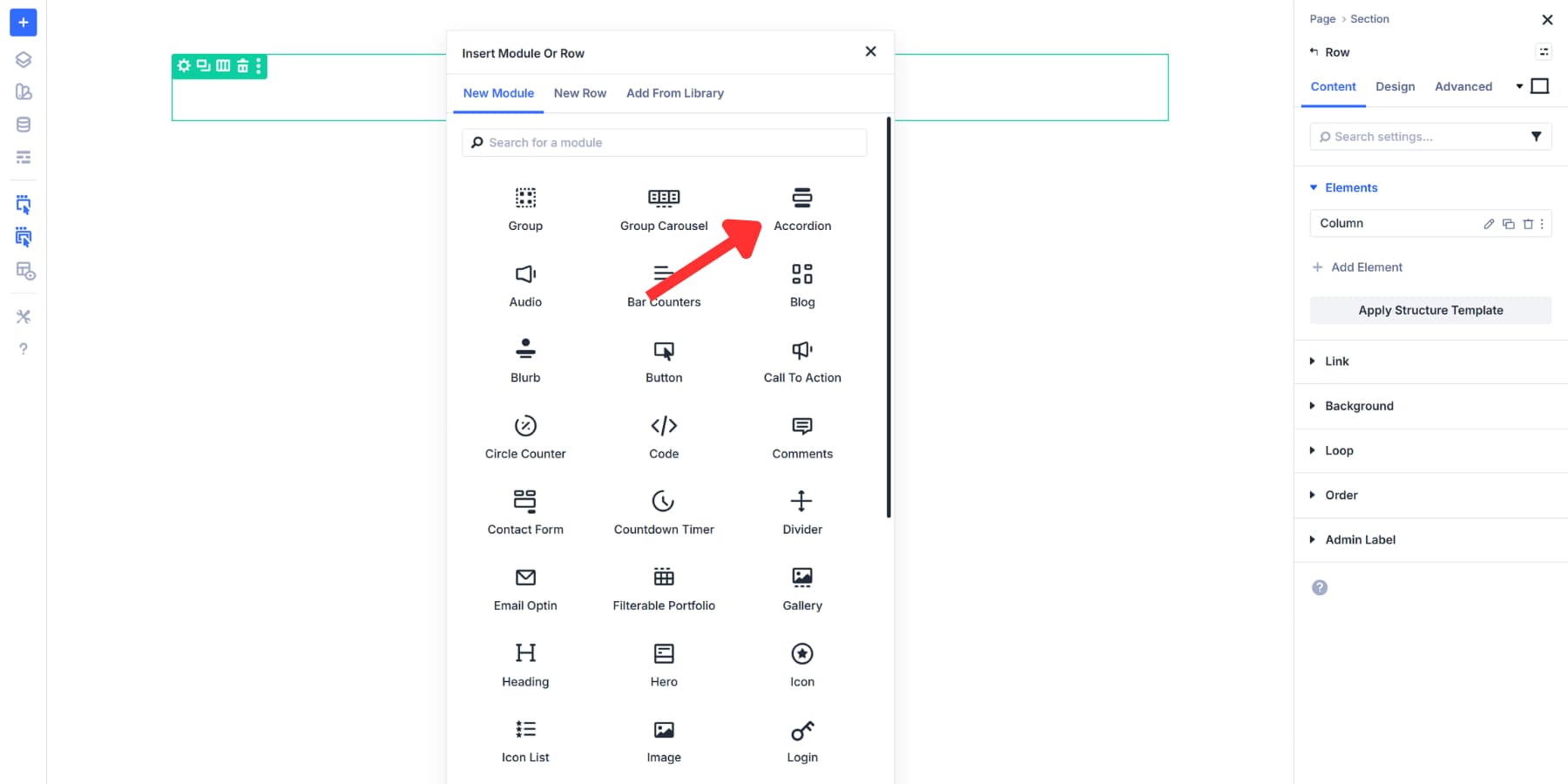
This same process works anywhere on the page. Drop an Accordion into any Row, Column, or even inside other modules that support nesting. The flexibility allows you to position FAQs precisely where they make sense within the content flow.
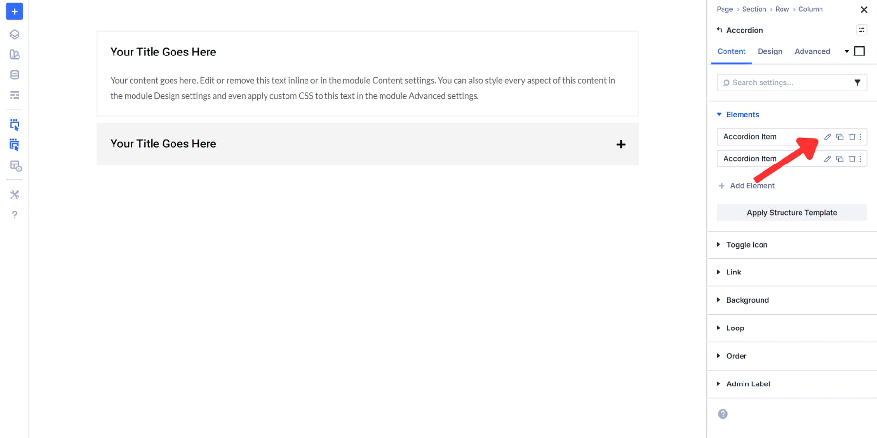
Creating Your Main FAQ Items
The accordion includes two default items, both labeled “Your Title Goes Here.” Click the Pencil icon next to the first item to open its settings.
Enter the FAQ title in the Title field at the top. Keep it short and clear. Add the answer in the Body field below. This field supports full text formatting, so you can use bold for key points, insert line breaks, or add links as needed.
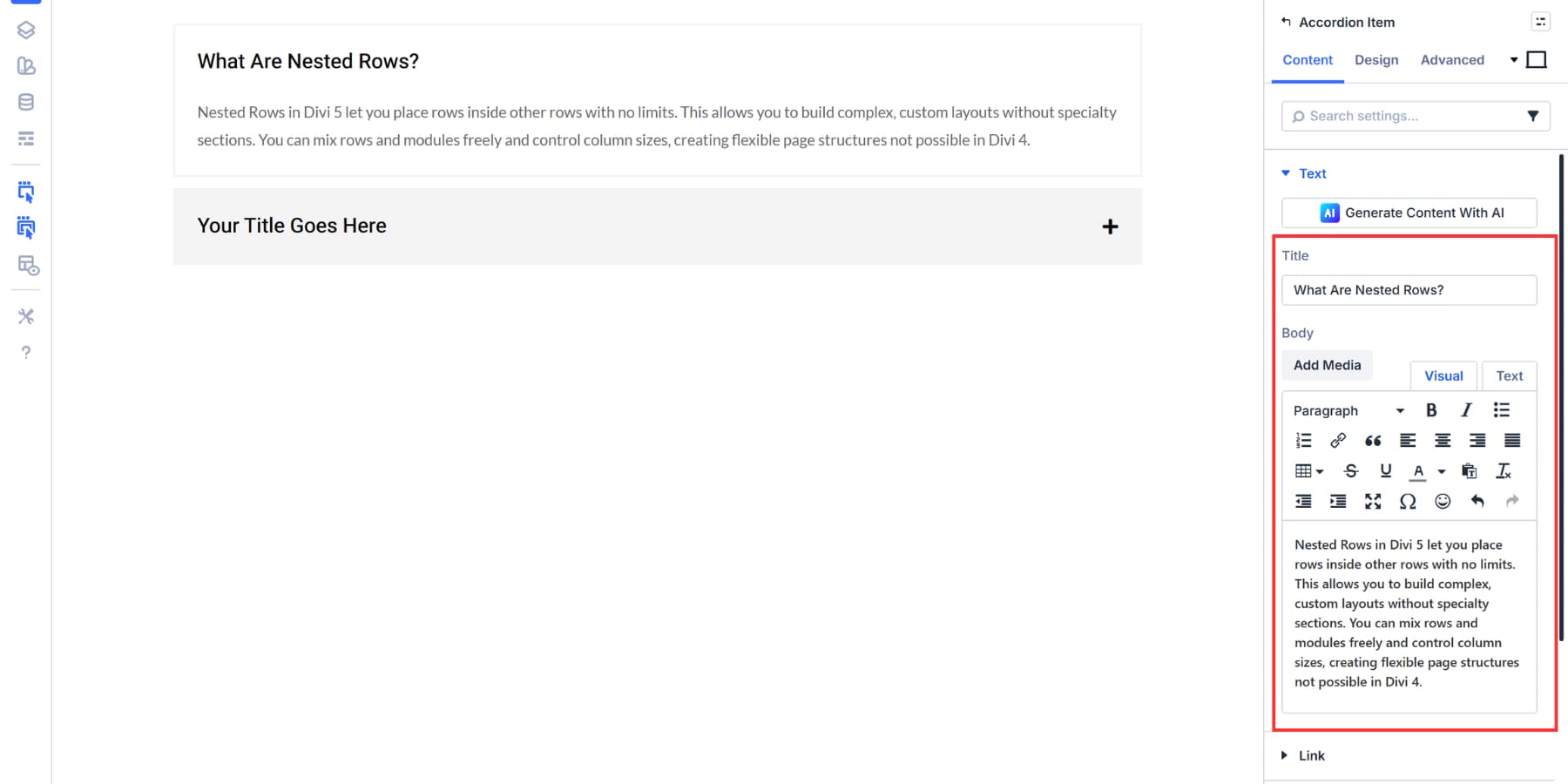
You can use Divi AI to speed up the writing process. Click the Divi AI icon in either field, describe the topic, and it will generate text for you.
You can then adjust the tone, change the length, or fix grammar with a single click. If you prefer full control, you can write everything manually.
You can click on the Add Element button and then Accordion Item to create the next FAQ entry. Drag items using the handle to change their order.
Use the Trash icon to delete an item, or the Duplicate icon to copy an existing one.
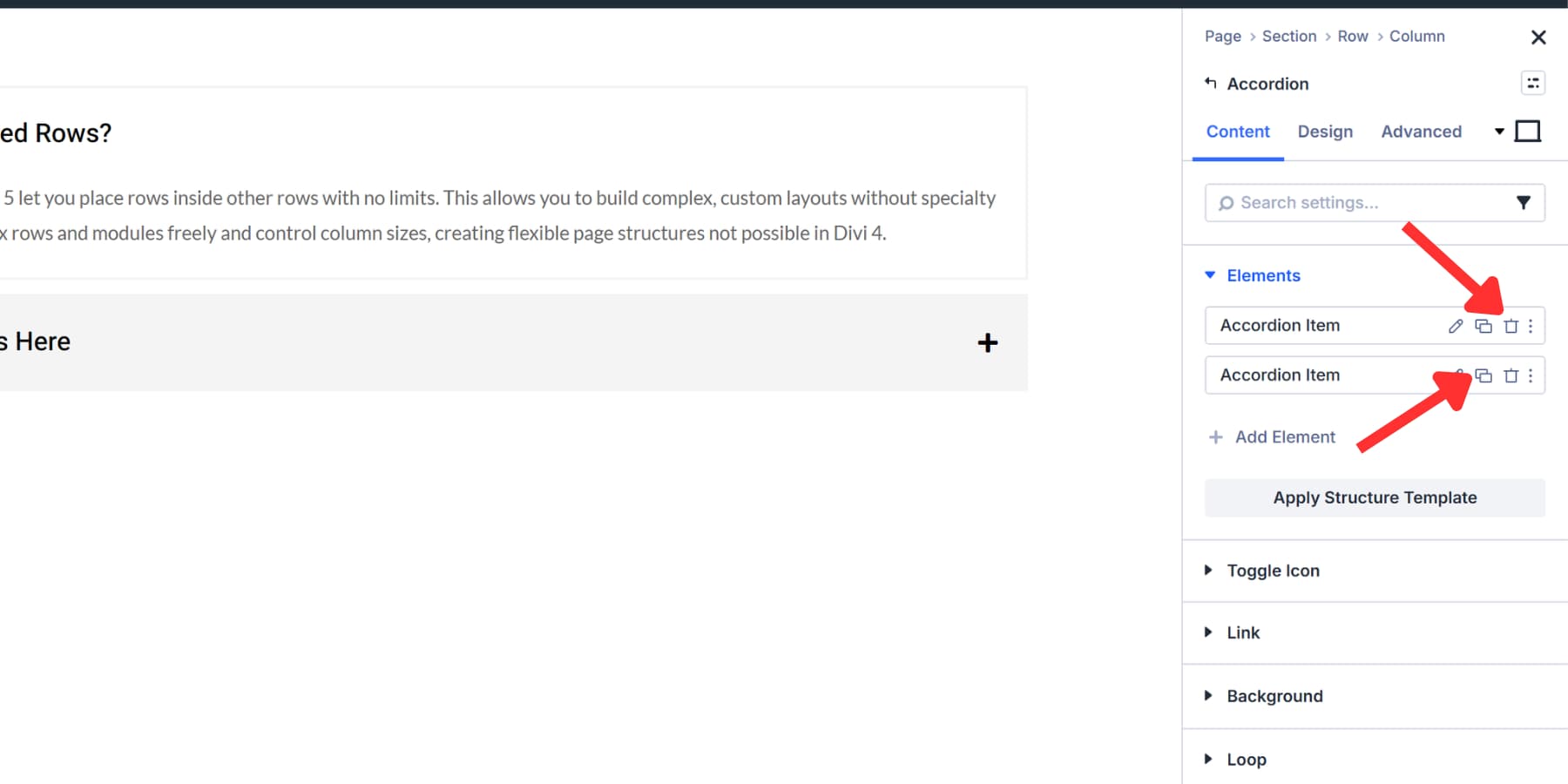
Placing Modules Inside Accordion Items
With Divi 5’s Nesting capability, each accordion item works as a full container. You can build answers that include multiple content types depending on what helps visitors most.
To add a module, open the settings for your accordion item. Scroll down in the Content tab until you find the Elements section, click on Add Element, and select the module. This allows you to add any module or even entire rows within your current element, giving you complete design freedom within each answer.
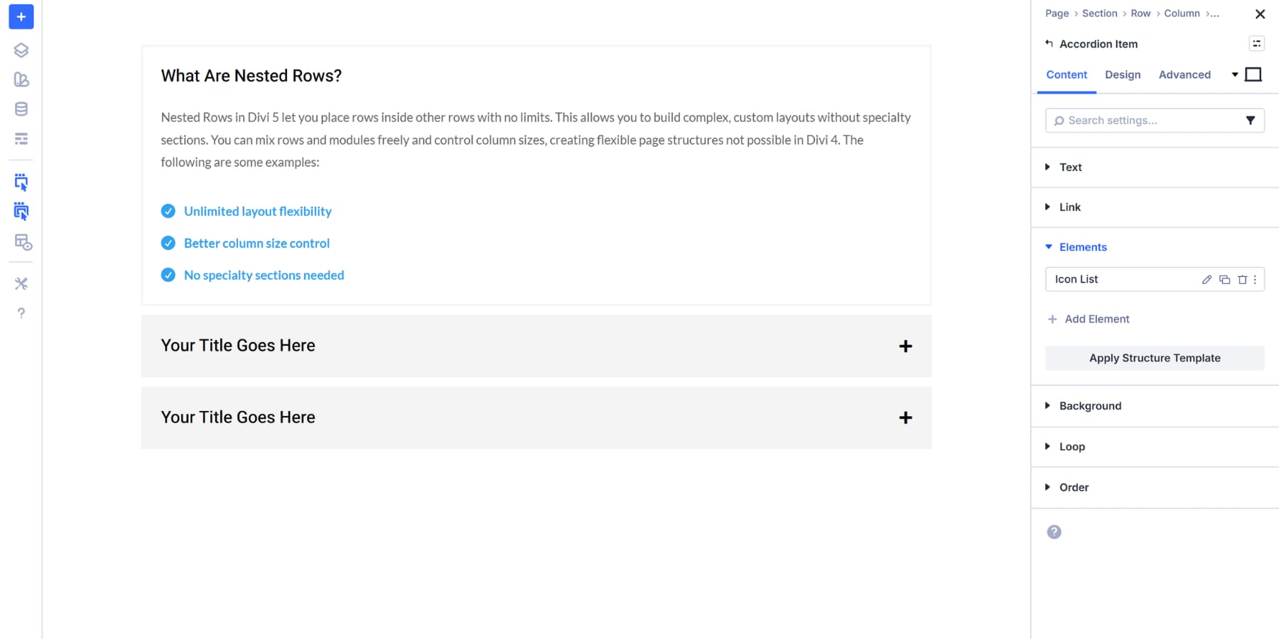
This Nestablity is new to Divi 5 and is available in the settings panel of every module. You can choose any module that fits your answer. An Icon List works well for creating visual checklists or step lists. Add your list items with whatever text makes sense for your FAQ answer. Customize the icons and design according to your specific needs.
A Video module can provide visual support for complex explanations. Upload your file or paste a video URL.
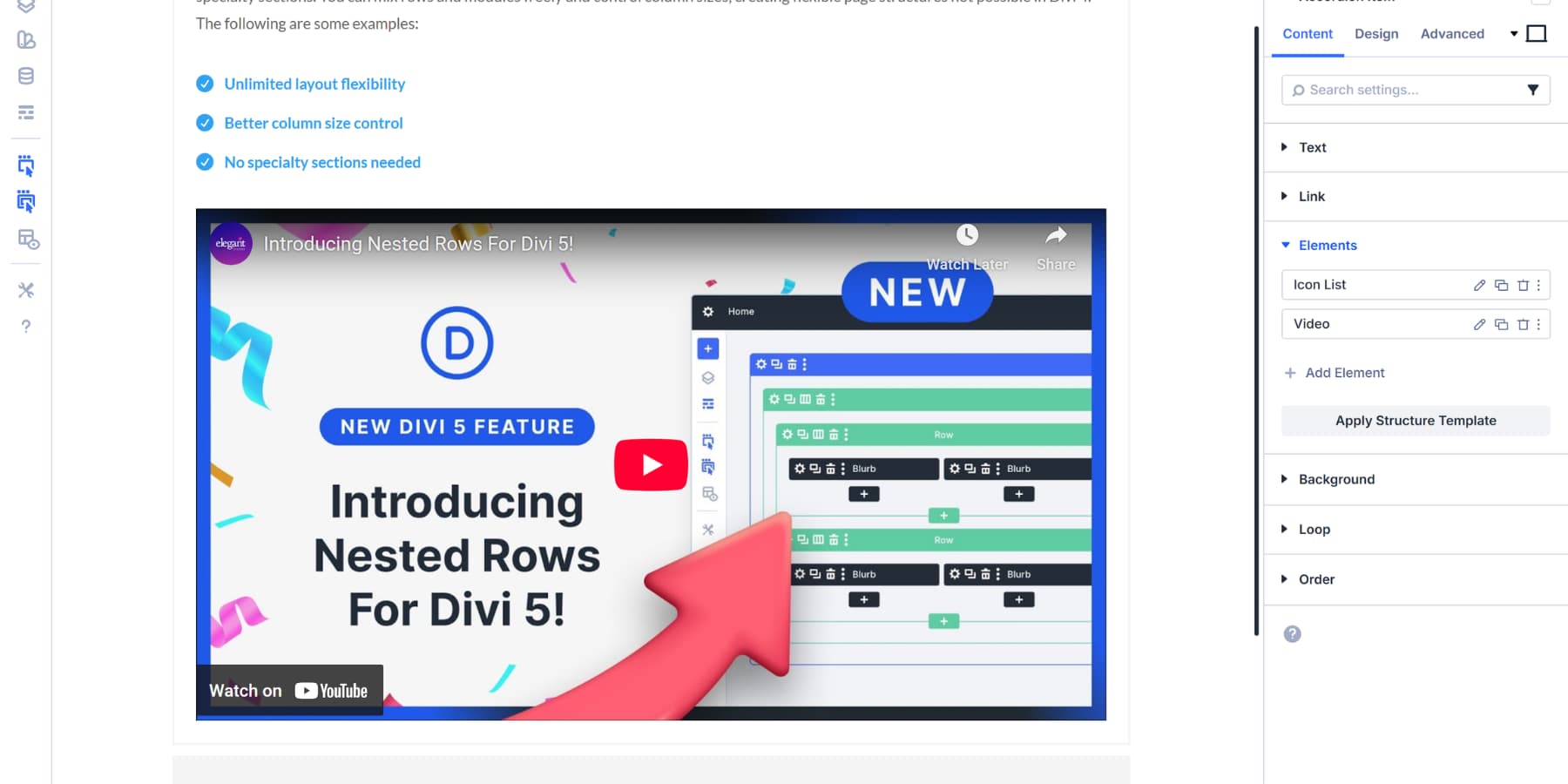
The video appears below your previous module automatically. To adjust the position, drag and drop it within the Elements tab.
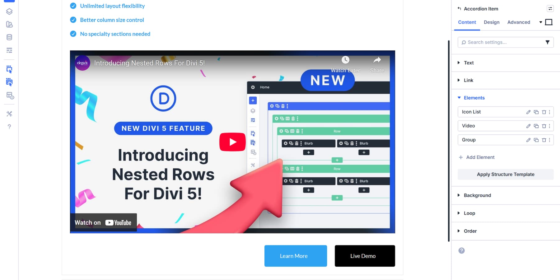
You can also add a Group to hold multiple elements you want. Add Button modules inside for calls to action. Style each button differently based on what action it represents.
Repeat the same for all your accordion items and add relevant modules as needed.
Controlling The Layout
Once you’ve added your nested modules, the Elements section displays them all in a list. Each module gets its own row with controls to edit, duplicate, or delete it.
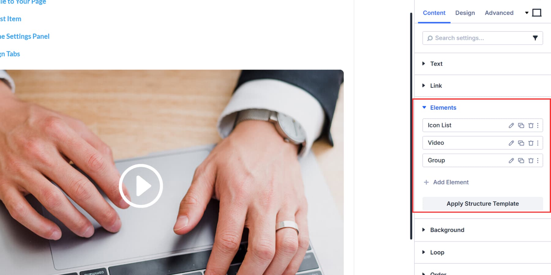
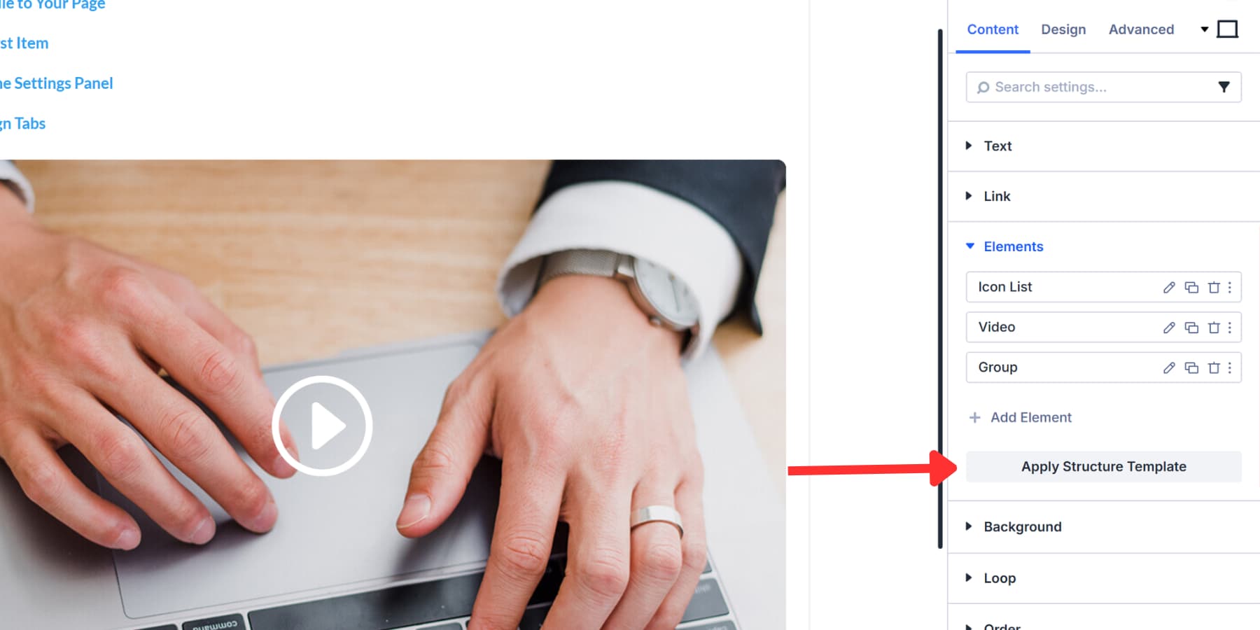
These nested elements stack vertically by default. You can change how they are arranged by clicking Apply Structure Template below the Add Element button. This opens layout presets for flex and grid arrangements. Choose a template that fits your content.
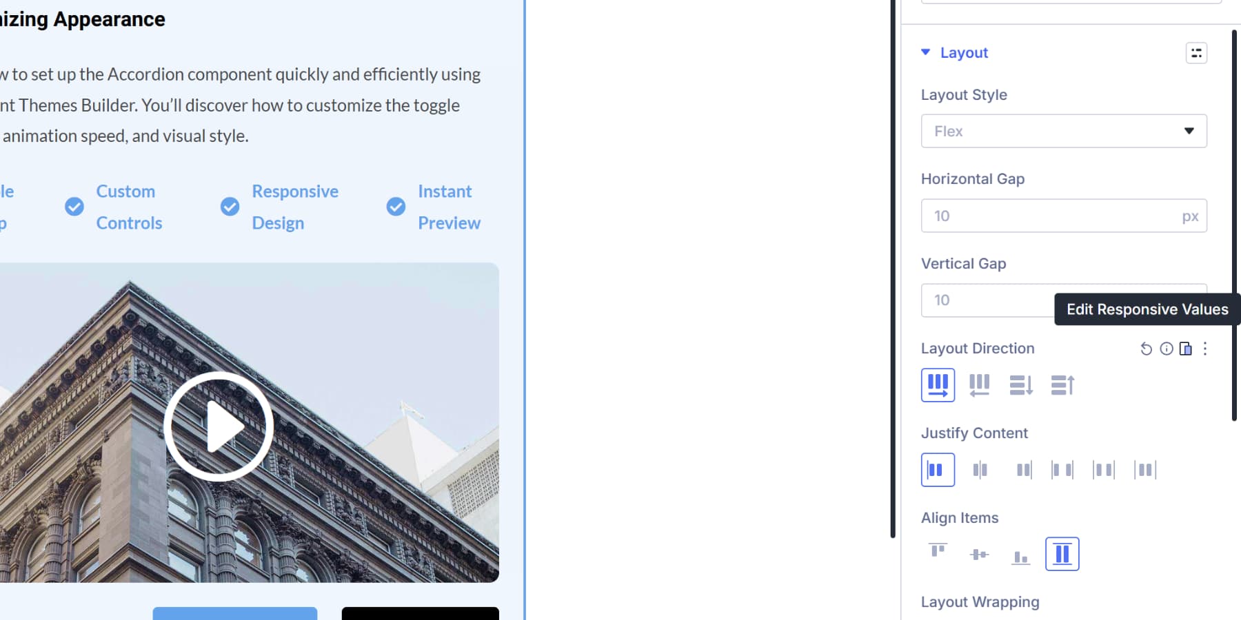
Each nested module also gets individual layout controls in its own settings panel where even more modules can be nested within the module. Open any nested module, and you’ll find options for flex direction, justify content, align items, and gap spacing. For example, an Icon List normally stacks items vertically, but you can switch the flex direction to row and arrange them horizontally instead.
A Group holding buttons can have its gap adjusted to control the spacing between each button. A Video module can be centered or aligned to either side using the justify content setting. This gives you precise control over how content is arranged inside each specific module without affecting the others.
Designing For The Best Experience
The Design tab controls both how your accordion looks when items sit closed and when visitors click them open. The Toggle option gives you different background colors for each state.
Pick a subtle color for closed items, then switch to a shade of your brand color when someone expands an answer.
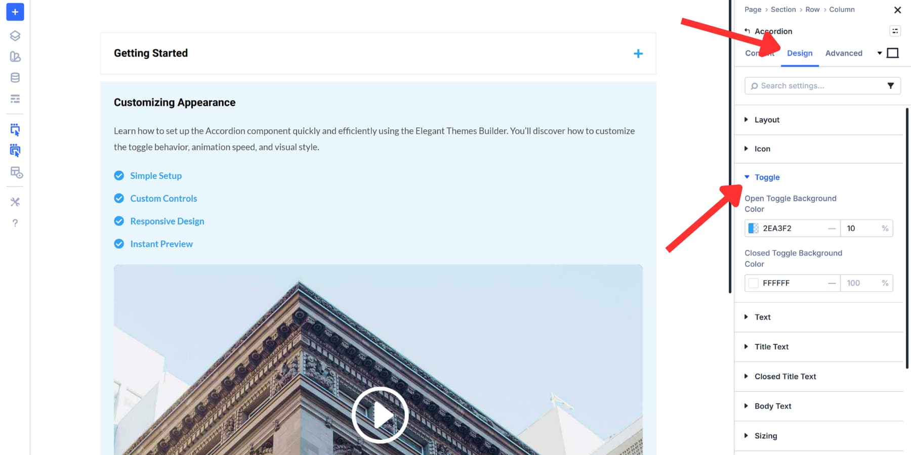
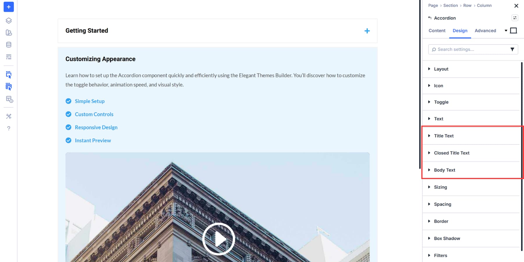
Title styling works the same way. Set your preferred font, size, and color for all titles from the Title Text tab, then adjust the Closed Title Text if you want different styling for unopened items. Body text receives separate controls, allowing your answers to stand out distinctly from your questions.
These settings apply to every accordion item simultaneously. Individual items can be styled by clicking the Gear icon, which allows you to apply styles that override the main settings.
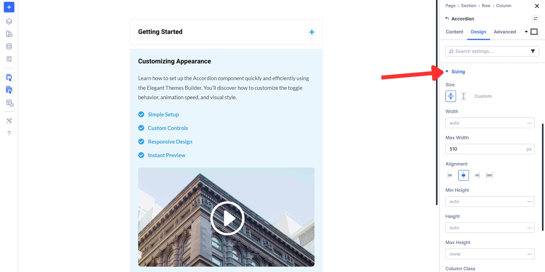
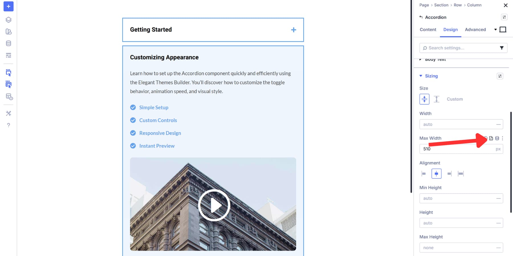
The Sizing tab allows you to control the width of the accordion. Narrower widths work well for sidebar layouts where you’re placing FAQs next to main content. Constraining the width on wide screens also improves readability, keeping text lines at a comfortable length instead of stretching across the entire viewport. You can set specific pixel values, percentages, and other advanced units.
The Border tab lets you add visual separation between accordion items and the rest of your page content. This becomes useful when your accordion sits on a busy page where the text might otherwise blend into surrounding content. You can set border width, color, style, and radius to match your site’s design language.
Using Design Variables
Now here’s where Divi 5 adds efficiency. Design Variables let you reference stored values instead of repeatedly selecting colors and fonts. This becomes more valuable when you’re maintaining consistency across your entire site.
When you apply these variables to your accordion settings, updating the blue shade or switching fonts occurs only once, rather than editing each module individually. Totally optional, but it saves time when you need site-wide changes later. You can learn everything about Design Variables here.
The same concept applies to spacing. You can enter 32px manually for padding, or create a spacing variable and reference it. Both work fine for styling the accordion itself.
If you are interested to learn more about creating such a spacing system, check out this guide on creating a gap-based spacing system in Divi 5.
Styling Nested Elements
Every module inside your accordion items gets its own design settings. That Icon List you added can have a different background from the Video Module below it. The Button modules in your Group container can each use different background colors and hover effects. Nothing forces these elements to match each other unless you want them to.
Click into any nested module, and you’ll find the full Design tab waiting. Background colors, typography, spacing, borders, shadows… everything works the same as it does anywhere else in Divi. Each nested element operates independently with complete control over its appearance.
Design Variables work here, too, if you’re using them. Reference the same color variable across multiple nested modules to maintain consistency with your site’s palette, or select colors manually for each one. The choice depends on how much consistency you need and how much you want to customize individual elements.
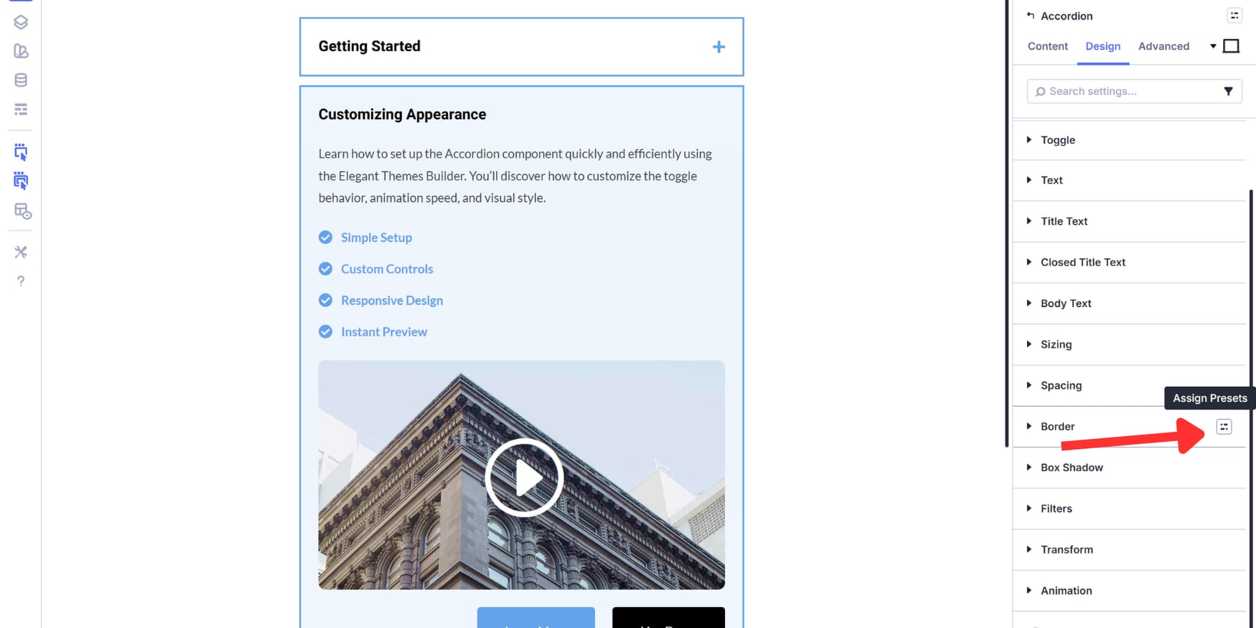
Using Presets To Avoid Repetitive Work
Option Group Presets and Element Presets save styling work when building multiple accordion items with similar designs.
Think about styling three Icon Lists inside different accordion items. You set borders, spacing, colors, and typography for the first one. Now you need those same settings on the second and third. You could manually copy each value, or you could save those settings once and apply them instantly.
That’s what presets do. Option Group Presets save individual style sections like your border setup or spacing configuration. Element Presets save the entire module with all its settings combined.
After styling an element, hover over any option group heading in the Design tab, like Border or Spacing. Click the small icon that appears, choose New Preset From Current Styles, name it, and save. Those specific settings become reusable across any module with that option group.
Element Presets work similarly but capture everything. Click the preset menu at the top right of your module settings after you have styled it completely. Save it as a new Element Preset. Apply it to other modules of the same type, and all settings transfer at once.
Both updates are global when you edit them. Change a preset, and every instance using it updates automatically across your site. Build these while styling your first accordion item, then reuse them to keep remaining items consistent without repeating the same styling steps.
Making The Accordion Mobile Ready
Divi 5’s Responsive Editor provides precise control over how your accordion displays across different screen sizes. Click the device icons in the relevant settings and make any styling changes you make in a specific view apply only to that breakpoint.
You can also customize these breakpoints. Divi 5 lets you set up to seven breakpoints and adjust their exact pixel values to match your design needs. This means you’re not locked into generic tablet and mobile sizes.
This matters most for nested modules inside accordion items. A three-column grid works well on desktop, but becomes cramped on mobile devices, where horizontal space is limited. Icon Lists displayed in rows can revert to their default vertical layout.
The Responsive Editor turns blue on any setting with device-specific values, so you always know which elements have custom mobile styling applied.
Download This Tutorial’s FAQ Layout
Download the FAQ layout for free and import it into your Divi Library to start using it on any page.

Try Nested Modules In Divi 5 Today!
Your FAQ section can now do more than answer questions. It can close sales, demonstrate features, and guide visitors exactly where they need to go next. The tools are built, the workflow is straightforward, and nothing stands in the way of creating answers that actually convert.
Download Divi 5 today and start building nested FAQs that turn curious visitors into customers. Open the Visual Builder, drop in an Accordion Module, and create rich FAQ sections that transform your content.


Thanks for the article, Aayush, and this may be the impetus for us to move to Divi 5.
Can you advise if this nested approach to an FAQ page
is also optimal for SEO purposes in terms of rich and structured snippets?
Thanks,
Peter
Is it possible to change the speed off the toggle animation?
Yes! You can definitely adjust the animation speed. You can control the toggle animation duration by adding a snippet of custom CSS. It’s super flexible! ✨
You can paste this directly into the Free-Form CSS field in the Advanced Tab of your Toggle module. This CSS targets the content area specifically to adjust the open/close duration:
selector .et_pb_toggle_content {transition: all 0.8s ease-in-out !important;
}