The right font pairing is essential to a pleasing reader experience, but choosing the right ones can be confusing. You want to create a pairing that’s visually intriguing yet clear, and it’s not always obvious where to start.
To help you strike the right balance, this post will break down the key principles of good font pairing and show you how to apply them to your design projects. Nail these principles and you’ll get the perfect font pairing every time!
- 1 Principle #1: Contrast Is Key
- 2 Principle #2: Keep Key Qualities Similar Between Fonts
- 3 Principle #3: Use Sans Serif for Heading Type and Serif for Body Type
- 4 Principle #4: Test the Fonts in Different Variations
- 5 Principle #5: Study Successful Font Pairing
- 6 Principle #6: Seek Feedback
- 7 Principle #7: Trust Your Gut
- 8 Conclusion
Principle #1: Contrast Is Key
Contrast is the whole reason we create font pairings to begin with. Contrasting fonts enables the reader to easily differentiate between various parts of the text such as headings and body copy. Additionally, contrast makes the text more visually interesting, helping to keep the reader’s attention.
However, what exactly do we mean by “contrast”? When we say that fonts contrast we simply mean that they are sufficiently different in appearance. For an illustration, have a look at the following image:

On the other hand, here’s what it looks like when two fonts don’t contrast sufficiently:

To make sure your pairing has enough contrast, choose fonts that differ in the following areas:
Weight
Weight refers to how bold or light a font is.
For example, Lato (the heading font in our first example image above) comes in five weights. From lightest to darkest, they are:
- Thin
- Light
- Regular
- Bold
- Black
The number of weights available will vary with the font you choose; the important thing is to make sure that there is enough contrast in weight between the fonts you pair.
Point Size
This is just the size of the text. Note how in the first example image above, the heading text is significantly larger than the body text.
Typographic Color
This refers to the darkness or lightness of a block of text — a trait which is emphasized when you squint at the text in question. If you squint at the first example image above, you’ll see that the heading appears much darker than the body text.
Factors such as the space between lines (leading), the space between letters (kerning), and the font size all affect typographic color. The key thing is to make sure that your chosen fonts contrast enough in this area.
Principle #2: Keep Key Qualities Similar Between Fonts
While contrast is important to successful font pairing, too much contrast can distract and even discomfort the reader, leading them to click away.
To make sure that your fonts don’t contrast too strongly, you should aim to keep the following font characteristics similar:
X-Height
X-height refers to the height of the character ‘x’ in your chosen font. Often (though not always), two fonts with a similar x-height will pair well.
For example, have a look at the graphic below. This image compares the x-heights of Montserrat and Cardo. This similarity in x-height is the start of a successful font pairing.

Montserrat (left) and Cardo (right) both have similar x-heights.
Font Super Family
Super family refers to an extended set of fonts that share certain key characteristics. You can view super families as variations on a central typographic theme, usually a basic character shape.
Because fonts from the same family share the same base form, they pair together very naturally.
For example, take this pairing of PT Sans Bold and PT Serif. The similarity creates a pleasing visual experience, but there’s still enough contrast to keep things interesting:

Mood
The ‘mood’ of a font refers to its ineffable emotional qualities. It’s the adjectives we use to describe the way the font ‘feels’, whether playful, mysterious, serious, sad, or any other emotions.
Font mood is subjective, but it’s one of the most important parts of font pairing. Mixing fonts of incompatible moods can derail even the best content.
For example, have a look at this pairing of Modak and Indie Flower. The moods simply don’t match.

On the other hand, this pairing of Fjalla One and Average is much more successful in the way it fits the fonts’ moods together:

Principle #3: Use Sans Serif for Heading Type and Serif for Body Type
If you want a surefire formula for successful font pairing, you can’t go wrong with a sans serif heading font and a serif body font. Sans serif fonts have a straightforward quality that makes your headings stand out, and serif fonts are generally easier to read, which makes them perfect for body copy.
Following this principle allows you to successfully pair very similar fonts. This pairing of Droid Sans and Droid Serif shows the principle in action:
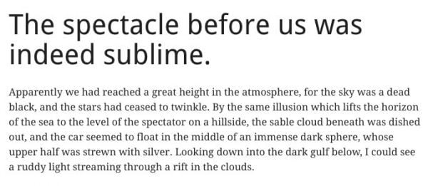
That being said, when applying this you should still keep the other principles of font pairing in mind. As Fonts.com explains:
the fact remains that many sans serif typefaces exist that are more legible at any size than some serif designs. So whichever style you choose, take note of the particular characteristics and overall legibility of the design.
Readability is your goal above all else! However, in general using sans serif for headings and serif for body copy is an ideal place to start.
Principle #4: Test the Fonts in Different Variations
When you’re creating a font pairing, it’s not enough to base it off the way the two fonts look in their ‘default’ form. If you’re choosing typography for a blog or website, you should expect that authors will employ bold, italic, and possibly even bold italic text in their articles. Additionally, you should expect that authors will create text blocks of varying lengths.
As such, it’s crucial to test your two fonts with these variations. Failure to do so can lead to some unattractive results.
For instance, here’s a perfectly respectable pairing of Raleway Bold (heading) and Libre Baskerville (body):

This pairing works fine, adhering to the principles outlined in this article.
However, things look very different when we change the Libre Baskerville to Libre Baskerville Regular Italic and use a larger amount of body text:
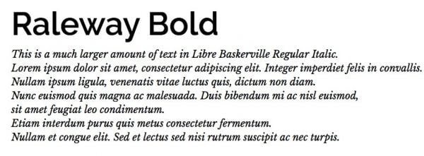
In this iteration, Libre Baskerville clashes with Raleway Bold and readability suffers.
Such font clashes aren’t always immediately obvious, so it’s critical that you reveal them by testing your font pairing in as many variations as possible.
Principle #5: Study Successful Font Pairing
“Study the masters” is common advice across all creative disciplines, and it’s no different when it comes to font pairing. One of the best ways to begin creating your own font pairings is to study those made by other designers, and figure out what makes them work.
To help you get started, here are some places to explore different font pairings in action:
- Canva Font Combinations: From the creators of the graphic design program Canva, this tool generates pairings based on the font of your choosing.
- Typ.io: Typ.io collects examples of successful font pairings from around the web, breaking them down so you can see what makes them work.
- Font Pair: Font Pair “helps you pair Google Fonts together”, showing you possible font pairings and letting you experiment with pairings of your own.
- Typewolf Site of the Day: A collection of font pairings that features a new example each day.
- Font Combinator: A tool that lets you test your pairings with the text and layout elements of your choosing.
We suggest you study these sites to see how their examples use (and challenge) the principles discussed in this article.
Principle #6: Seek Feedback
When you work on a project for too long, you can become blind to its imperfections. You spend so much time staring at a font pairing that you can’t find any fault with it, even if it has a glaring problem.
To keep from overlooking these issues, we recommend you seek feedback on your font pairings.
Who you ask will depend on the nature of your project, but we recommend you ask as many different types of people as possible. Colleagues, mentors, readers, and customers (both current and potential) are all fair game.
Try to look for common threads in what these people are saying. If they’re all finding the same problem, then something needs to change.
Above all, you should give the highest priority to what readers and customers say, as their engagement and ease of reading is paramount. While the approval of your mentors and colleagues is gratifying, it doesn’t pay the bills.
Principle #7: Trust Your Gut
Ultimately, font pairing is an art, not a science. As such, there are situations where you just need to trust your intuition.
If something about a font pairing seems off, it probably is. Even if you apply every principle in this article to the letter, some pairings will simply feel wrong. Don’t ignore this feeling – let it guide you.
Sometimes you just need to tweak a font pairing until it feels right, so don’t be afraid to experiment.
Conclusion
As in all matters of good design, font pairing is a tricky subject. It requires you to balance contrast with similarity, and interest with readability. Ultimately though, your goal is to give your reader the best experience possible.
If you apply the principles in this article (along with other fundamentals of design), you can rest assured you’ll create a font pairing that delights your readers and enhances your writing’s readability.
To create great font pairings, keep these key principles in mind:
- Contrast is key.
- Keep key qualities similar between fonts.
- Use sans serif for heading type, and serif for body type.
- Test font pairs in different variations.
- Study successful font pairings.
- Seek feedback.
- Trust your gut.
What advice do you have for making effective font pairings? We’d love you to share it in the comments section below! Don’t forget to subscribe to the comments so you can stay updated on the discussion.
Article thumbnail image by Perfect Vectors / shutterstock.com





Interesting,
I have never given a thought about the meaning of the font,
yet, in my language i believe the options are quite narrow, isn’t it?
I also Like to use Sans-Serif Pro in my site.
I like that font family type.
Thanks for the awesome guide.
No problem, Vijay. 🙂
It is nice sharing. Well, it can be more attractive by colorful backgrounds.
You touch on a good point – it’s not just the fonts, it’s how they fit in with your whole design.
Good insight, Nomi. 🙂
Would really like to thank the writer for sharing such a wonderful information 🙂
Thank you, Sherya!
Its a Great article, Thanks Tom Ewe for share valuable and interesting post.
Thanks, Ricky!
>> Use Sans Serif for Heading Type and Serif for Body Type <<
Good for paper.
For screen – Serif for heading and Sans Serif for body text.
This is an age-old argument – we’d do as the article says if you’re new to pairing fonts, but you’re welcome to do what you like with a little more experience.
Thanks for your comment. 🙂
One of the most important aspects of designing a page. Thanks for the links.
No problem, Shane.
Great brief synopsis of key typographical design, layout, and aesthetic principles! Very informative and to the point, thanks!
Thanks, Aaron. 🙂
Thank you very much again for a valuable post!
Q: What is your experience according to sitespeed and choosing Google fonts. Because my experience is that (different) google fonts slows down sites.
Thanks for your question!
We’ve personally had no issues with site speed and certain fonts. Of course, if you have the numbers to show otherwise, it would be an interesting read.
Of course, choosing more weights and fonts than you’ll need will impact your loading times, so this is something to bear in mind. Also, some themes will pre-load certain default fonts that don’t unload when selecting a different one – something else to note.
Thanks for these resources. Popular pairings can also be found on fonts.google.com.
There are absolutely tons of resources available for choosing fonts, Ted – Google are just one option.
Thanks for your contribution. 🙂
Love this post.
Font pairing always gives me crazy!!!
Don’t go crazy, Miguel! There’s plenty to love about choosing fonts.
Thanks for your comment. 🙂
Principle #3 has me completely confused. I’ve always followed the opposite rule – serif fonts for headings, sans serif fonts for the body text, for the simple reason that sans serif fonts are more readable at the smaller text sizes than serif fonts. I see even This article does it the way I do – Serif font headings, sans serif font body text. What gives?
Honestly it can go either way. I think the way Tom has written the article up is the more traditional take on the Serif/San Serif pairing but at the end of the day it’s more of a guideline than a hard and fast rule.
I like the sites list in 5th principle. Canva font combination is good references.
There are so many great resources out there, the list could have been three times as long.
Thanks for your comment. 🙂
Interesting that the advice is sans serif for headline & serif for body, yet the article has the opposite. I know, I know…it’s an art, not a science.
You know the old saying – in order to break the rules, you have to know them first. 😉
Thanks for the font pairing websites, quite helpful!
No problem, Elijah!
Great article, it refreshed the knowledge I got a few years ago from reading “The non designers design book” from Robin Williams.
I highly recommend this fast and easy to read book if you want to learn the important basic principles of design.
Great resource, Johan – thanks. 🙂
Great article Tom, thank you for the quality content. Pairing fonts can make or break a design so I think it s really important as a designer to perfect your game in that area. I am still struggling sometimes so thank yo again for sharing ome really good pointers (and great resources too)
No problem, Bianca. I’m glad we could help you out!