
In a perfect world, every WordPress developer would have access to their own crack team of battle-tested designers and front-end wizards, leaving them free to get their hands dirty with the code they love.
However, if you’re working on your own and your platform of choice is WordPress, most clients will see you as a one-man army. You’ll frequently be expected to make design choices you might not be comfortable with tackling.
Like it or loathe it, design is a crucial aspect of every web development project. It doesn’t matter how elegant your code is if your layout makes users wince.
In this article, we’ll take an in-depth look at eight design best practices you can use as a developer to up your design game and expand your overall marketable skillset.
- 1 1. Keep up with Current Design Trends
- 2 2. Commit to Responsive Design
- 3 3. Make Content Easily Accessible
- 4 4. Remember That White Space Is Your Friend
- 5 5. Understand the Importance of Fonts
- 6 6. Don’t Make Forms Difficult
- 7 7. Provide Friendly 404 Pages
- 8 8. Accept That Small Details Are Important
- 9 Summary
1. Keep up with Current Design Trends
This isn’t Vogue, so we’re not going to devote thousands of words to analyzing the in-and-outs of every current design trend. You’re probably already unconsciously familiar with what’s hot purely by virtue of general web browsing. However, it’s well worth your while taking the extra effort to deliberately investigate major trends in order to stay current.
Topping the “Most Used” list these days is parallax scrolling: a simple but effective motion design technique where foreground images move faster than those in the background. This creates an eye-catching effect, is easy to implement and lends depth and visual interest to the design of pages. You’ll see this effect employed quite often to make headlines really pop and draw readers in.
Parallax is just a single trend highlighting the overarching scroll-heavy focus of much of today’s design. Infinite scrolling is another popular, though mildly controversial, technique.
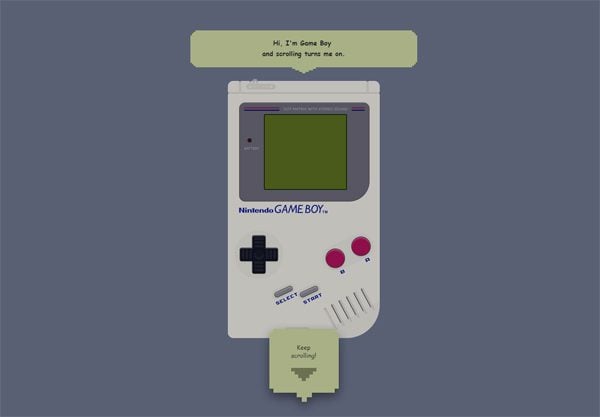
Scrolling techniques in action at I Hate Tomatoes.
Another current trend that rewards close study is material design: Google’s attempt to create a cohesive visual language across their products and services. Material design is focused on providing a seamless design experiences regardless of platform, with a mobile-first mindset.
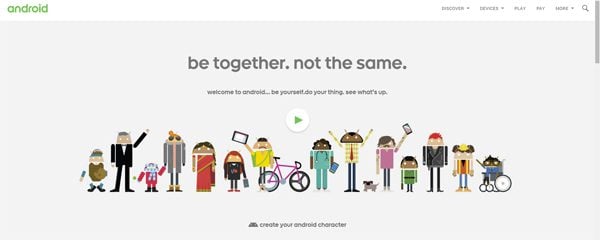
Android’s homepage keeps up with material design trends.
Moving along, we come to card-based design (of which Pinterest is a classic example), a technique with an emphasis on the elegant visual display of condensed information.
These trends are so popular because they create visual engagement by following a simple set of good design rules. We’ll touch on many of these rules as we go through the rest of our list. Getting familiar with current trends, like the ones we’ve highlighted, is a great way of turbo-charging your learning and almost instantly improving your overall design sensibility.
2. Commit to Responsive Design
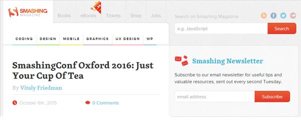
Responsive design in action on an iPad view of Smashing Magazine.
Responsive design simply involves the ability to appropriately adjust to every user’s screen size, device orientation and platform. In a mobile-first world, it’s an absolute requirement for modern sites on the front end but can often feel like a duct-taped nightmare of media queries and assorted hacks under the covers.
There’s no getting away from it though: users rightly expect websites and apps to display and function flawlessly across myriad devices. As a developer, you know that a seamless experience across platforms requires a lot of testing and fixing, but that’s no excuse to slack off.
To underline how important this is, overlooking this crucial design element means you could be kissing goodbye to a third of website traffic.
Implementing responsive design needn’t be a daunting task however, and developers these days have it much easier than even a couple of years ago in this regard. Make sure you’re getting this right and not sabotaging your designs for a considerable part of your audience.
3. Make Content Easily Accessible
Bounce rates vary wildly across websites, but one of the uncomfortable truths of online design is that a large number of people will be hitting your carefully constructed content and heading straight for the virtual door.
People make astonishingly quick decisions about whether to stay on a site or not, and your job as a designer is to make it as appealing as possible for them to linger and look around. Poor layout choices, lack of search options and plain old irrelevant or low-quality content are all things that will send visitors packing.
From a design standpoint, you want users to be able to quickly determine which part of your website holds the information they seek. Keep the navigation friendly and label everything clearly to avoid confusion.
4. Remember That White Space Is Your Friend
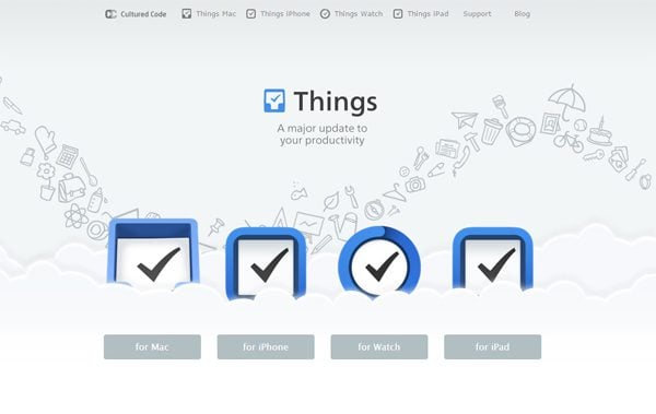
Cultured Code is a great example of good white space use.
By the nature of their work, developers are an organized bunch most of the time. More often than not, however, they are optimizing for efficiency rather than aesthetics. This is why they often tend to treat websites like old-timey newspapers – filled to the brim with information, but a nightmare for users to actually consume.
You want users to be naturally visually drawn to the most important information in any section of your website. Effective use of white space is one of the most elegant and time-tested ways of doing this.
Not only does white space serve to highlight important information, it also improves reading comprehension and makes your overall design look substantially sleeker. Add it to your arsenal of design tricks and your sites will instantly start looking more polished.
5. Understand the Importance of Fonts
Image by Olga Milagros / shutterstock.com
In design terms, fonts are a very big deal indeed. There’s a reason designers don’t just slap everything up in Comic Sans or Courier and call it a day. Unless you’re running a gallery-based portfolio, the chances are that the vast majority of the content of your projects will be in text form.
In the bad old days, you could only choose from a limited set of fonts while doing web design, but those days are thankfully gone. Browser support for web fonts means that you’re now only limited by how much time you want to spend finding the perfect font fit for your site.
An ideal font will not take attention away from the content itself, or look out of place in the overall design. Choosing fonts and font pairings is a design decision that rewards careful thought.
Begin with a simple typographic primer, such as Matthew Butterick’s Typography for Lawyers, and you’ll feel those design muscles starting to flex straightaway.
6. Don’t Make Forms Difficult
Nobody likes filling in forms. Whether online or offline, they’re a chore. There’s no getting around them in web design though; they’re the main way users interact with your site: registrations, lost password recoveries, contact pages, submissions – the list goes on.
Taking a little bit of extra time and effort to actually make your forms intuitively usable, friendly and stylishly presented instantly raises the overall design profile of your pages.
You’ve got a slight advantage as a developer here as well. Many designers instinctively shy away from the technical side of implementing forms, but it should be relatively trivial compared to some of the other problems you’re used to wrestling with daily.
7. Provide Friendly 404 Pages
Reddit’s error page design, simple and informative.
Every website breaks or goes down eventually, even if only for short periods of time. While that’s to be expected, regular users often take this as a sign that your website shouldn’t be trusted, so why not take a bit of extra time in order to build a unique error page to reassure them?
Anything looks better than a default server error message on a white page. A well-designed error page reassures visitors and gives the impression that everything is under control and things will be back to normal soon.
When using WordPress, there are a lot of great plugins that can help you set up a custom 404 page with little effort. You’ll find a great breakdown of these in our article on the 7 Best 404 Plugins for WordPress.
8. Accept That Small Details Are Important
So far we’ve covered basic design trends, responsiveness, accessibility, using white space to your advantage, typography, forms and 404 page designs, but we’re still only scratching the surface of all the elements you could consider in terms of raising your design game.
If you take away nothing else from our article, remember this: design is all about detail.
Considered in isolation, all these small points don’t amount to much but, as they are all piled on top of each other, they form a cohesive whole that people instinctively recognize as good design.
As a developer, you’re used to focusing on details in a very different context, but they’re equally important in this arena. Recognizing that truth goes a long way towards making you a better designer.
Summary
Allied to great content, all of the points we’ve discussed lay the foundation for solid design. Using them will considerably improve the look and feel of any sites you happen to be working on. Let’s run through the list one more time:
- Keep up with current design trends.
- Commit to responsive design.
- Make content easily accessible.
- Remember that white space is your friend.
- Understand the importance of fonts.
- Don’t make forms difficult.
- Provide friendly 404 pages.
- Accept that small details are important.
Adding basic design literacy to your skillset as a developer using the techniques we’ve discussed will not just delight your end users, it will also considerably increase your marketability as a developer.
Do you have any favorite tips for learning design skills as a developer? Or is there a particular area you struggle with? Let us know in the comments.
Article thumbnail image by Sentavio / shutterstock.com


Hi Tom, great article and useful links. Thanks!
Another great article. Thanks 🙂
On the issues of responsiveness and small details, my favouriter theme, Divi, has a major failing: in the builder, when one inserts an image module, or an image in a slide, Divi does not stick to the WordPress standard in managing the image size, but just uses the original image in all of it’s bloated glory.
This means that images are resized by HTML on the browser, instead of the appropriate size being sent from the server.
This is becoming more urgent, as WP 4.4 approaches. One of the improvements:
Responsive Images — WordPress automatically delivers a more appropriate image to users depending on a variety of conditions like screen size, viewport size, and screen resolution.
See https://wordpress.org/news/2015/10/wordpress-4-4-beta-1/
We really need Divi to get back to the WordPress standard in dealing with images. That is it’s only weakness, as far as I am concerned.
@Dan Shafer nice one. Design is number just like your car or house, b’cos we are all visual beings that love well design artifacts and you can begin to name it. Same in Web but WordPress developers had gotten the grip to merge design/aesthetic without rubbing off the content. Instance, I revamped this site from a theme called Stronger to Divi using a metro-tile/Card layout and do you know that when it was launched yesterday, the facebook like increased from 14,192 to 15k and the visit was also increasing. Give your site a crapping look but great content and you have a few followers but spruce your site with good design and content then you win more customers. We come to Elegant not b’cos of the site but for one thing, great design on smart framework. Good looks is everything and web design is not left out…
Thanks Tom for this piece, more fluid to your brain.
The Gameboy one is AWESOME! 😀
as @Steve said, this stuff is pretty much old hat. Rather than rules and fashions that go in and out of date, I prefer to stick to broader principles that are always correct.
For me, the overriding principle is simple: Form Follows Function. A professional designer is going to look at the content and purpose of the site and design around it, not follow a bunch of rules that may or may not be applicable to their or their clients’ sites.
Studies show that visitors don’t take more than 5-15 seconds to decide whether to stay on your site. If all they get in that time is a very glitzy parallax hero image against a busy background, and you’re trying to get them to read any of several news updates, you’ve made a bad design decision. That same decision is right and perfect for a site that wants you to “feel” something soft and textured about the design, focused less on content than on appearance; for example, a portfolio site or a designer’s site.
The best advice you gave was the first step. Visit a bunch of sites — but be sure they are sites that are related to your client’s type of business or goals. Then visit the biggest players you can find; they’re studying user response in minute detail, not experimenting with avant garde design that looks attractive but merely gets in the way of the user getting the job done.
The low contrast trend is a killer for me. My eyes are not what they used to be and 12 point type with grey text on off white background is impossible for me to read.
I agree!
If the contrast is too subtle I either use the browsers magnify function, or developer tools and force the text to black.
+1 one thousand times! This is my biggest pet peeve with modern designers. They were so quick to copy Google with the light blue font on white, then forgot to notice when Google quickly dropped it. Lately it’s the light gray on off white effect, which seems to impress other designers while driving readers away. It would appear that readability gets lost in the quest to be cool.
Is it only my iPhone, or is this post ironically not responsive? Also, yes and yes to both content needing to supersede design a little more frequently in site design and that these tips are old and common sense to good designers.
Thanx. But … anyone who hasn´t got all these points in mind by now is just totally outdated since your points aren´t “NEW” and have been around for quite some time now.
I am newbie designer and have started playing around with typography.I always just sticked to default but now see what a big difference it makes.I guess its all about exploring.As for new trends i really like paralax effect.Thanks for good list to look at
Trends don’t really matter all that much; it’s how you use them.
You know what a killer website is? Great content paired with solid design. Sadly, the former seems to be taking a back seat to the latter. If you don’t write, get someone who does and then design around it. Design for the sake of design is useless, yet I see it all the time.
And more importantly, should you follow a trend? 99% of the parallax websites I see are terribly superfluous. Medicore copy, worthless stock imagery, etc. And let’s not forget that parallax doesn’t really work all that well on mobile devices—so as much as 50% of your audience won’t “get” the effect. Nike Betterworld popularized the effect but now it’s really become a cliche for people who don’t know any better, like people who use Comic Sans to design their bake sale flyers.
You nailed it, Dave. I couldn’t agree more!
I agree.
Oh! Common.. don’t go knocking Comic Sans. It’s a legend of a Font, along with Arial, and Wingdings lol
I agree with Sam, comic sans is a legend font. Personally I could never get around liking the default font elegant themes uses. The font should not be a major issue when it comes to web designing, everybody has got their own taste. My wife like fonts with various curls and sh*t. I hate it, I like a good clean plain font.
Good points!!!
I’m iffy on the 404 pages though. 99% of the 404’s we get (across 40 or so sites) are hackers scanning for vulnerable files.
I wish there was a simple way to NOT handle these with the overhead of WP, delivery a simple message and send them packing.
Any suggestions?
Lou
Nice article for dev’s, are there any news/trend sites you recommend for item 1?