
Material Design was invented by Google in 2014 in an effort to combine tactile elements (based on the sense of touch) with technological possibilities of the real world and beyond. It capitalizes on the users familiarity with things like paper and ink and adds scientific realities like movement and shadows. It even stretches the real world limitations of technology and science just enough to bend but not break the rules of physics. The result is a design that is both familiar and magical at the same time.
Some common elements of material design include the use of meaningful transitions (or motion), the use of light and shadow, grid layouts, and bold colors. It is surprising how easily these elements can improve the overall design and user experience of your website.
Today, I will show you how to implement a few elements of material design to your website using the Divi builder and a little CSS.
Let’s get started.
Adding Material Design To Your Website With Divi
Subscribe To Our Youtube Channel
Implementing Material Design with Divi
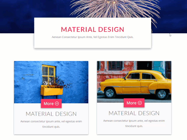
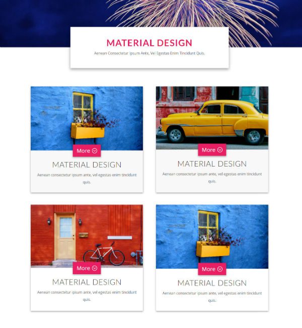
In today’s design, I’m using bold colors and images on a white background to entice the user. I’m also adding shadows and movement when hovering over certain elements to further engage the user. I’m adding a button that straddles the line between image and content since both are relevant to the call to action. And lastly, I added a little movement to the button icon which purposefully “points” them in the right direction. All of these elements are consistent with material design and easily implemented.
The design elements used are images from unsplash.com. The header image has a 1288px width and a 737px height. The four box images are 800px width by 450px height. The rest of the design is accomplished through the Divi builder and custom CSS.
Designing The Header
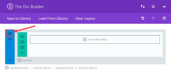
Using the default standard section shown in the Divi Builder, insert a fullwidth column.
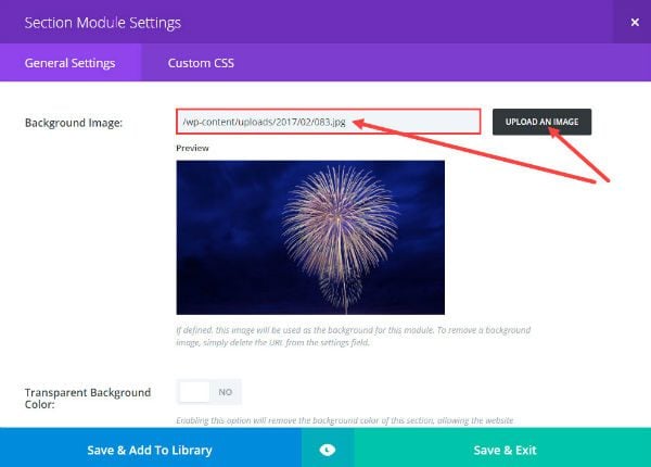
Click on the section module settings. Under General Settings, insert your background image.
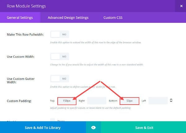
Then click on the Row Module Settings give it a custom padding:
Top: 150px
Bottom: 50px
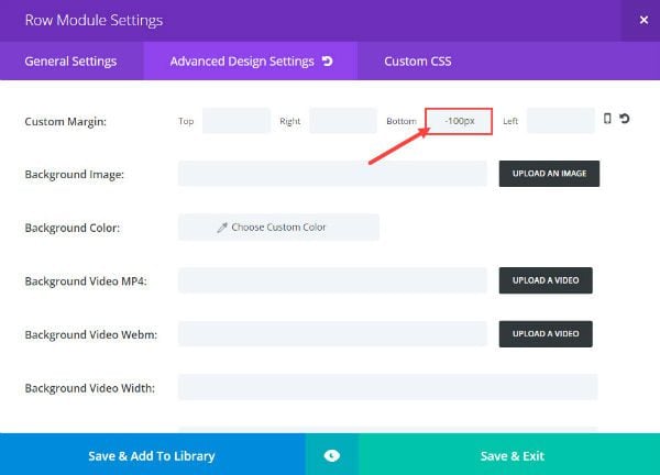
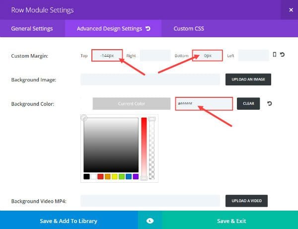
Under the Advanced Design Settings, add a custom bottom margin of -100px.
Save & Exit
Since this section will only serve as a background, you don’t need to add any modules.
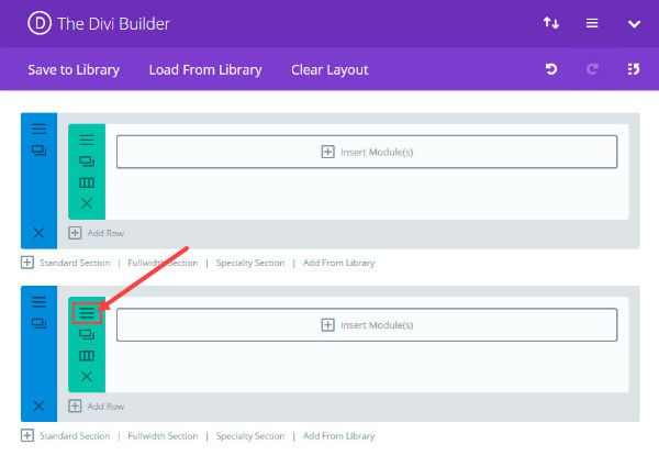
Now add another standard section using the Divi Builder and give it a fullwidth column. Then click the Row Module Settings.
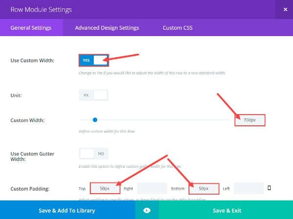
Change the General Settings as follows:
Use Custom Width: Yes
Custom Width: 700px
Custom Padding: Top 50px and Bottom 50px
Under the Advanced Design Settings give the row a custom margin as follows:
Top: -144px
Bottom: 0px
Background Color: #ffffff
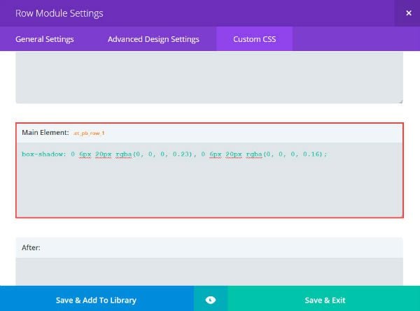
Under the Custom CSS tab, add the following CSS to the Main Element text box:
box-shadow: 0 6px 20px rgba(0, 0, 0, 0.23), 0 6px 20px rgba(0, 0, 0, 0.16);
Save & Exit
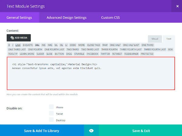
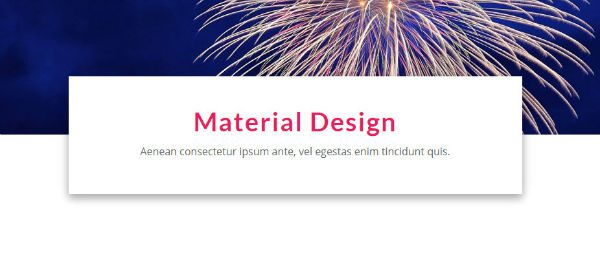
Next add a text module to the row. Under General Settings, add your content inside the Content box. Make sure to wrap your header in an h1 tag. Here is what I am adding (make sure to select the text tab when entering html):
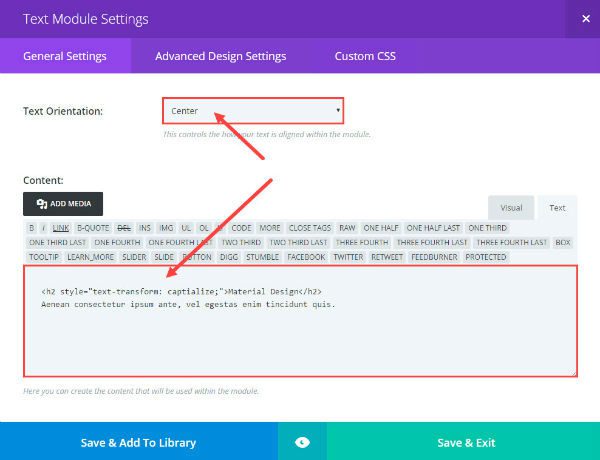
<h1 style="text-transform: captialize;">Material Design</h1>
Aenean consectetur ipsum ante, vel egestas enim tincidunt quis.
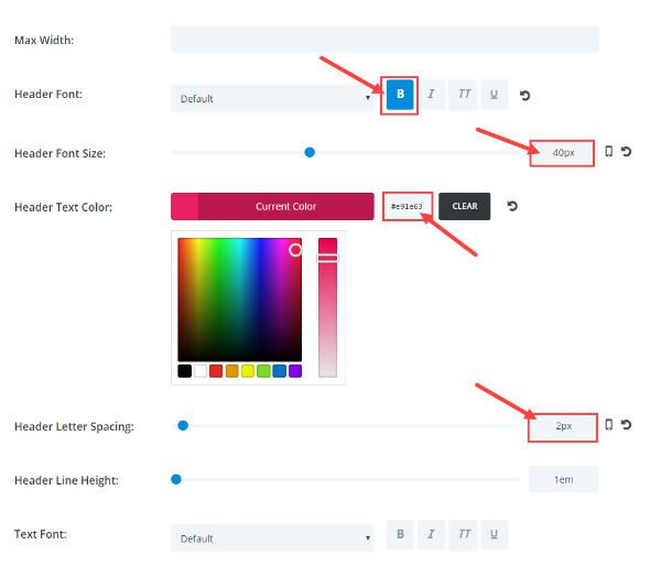
Under Advanced Design Settings, change the following:
Header Font: Bold (B)
Header Font Size: 40px;
Header Text Color: #e91e63
Header Letter Spacing: 2px
Now your header is finished.
Designing the Columns and Content Boxes
Once the header is in place, it is time to add your columns and content boxes.
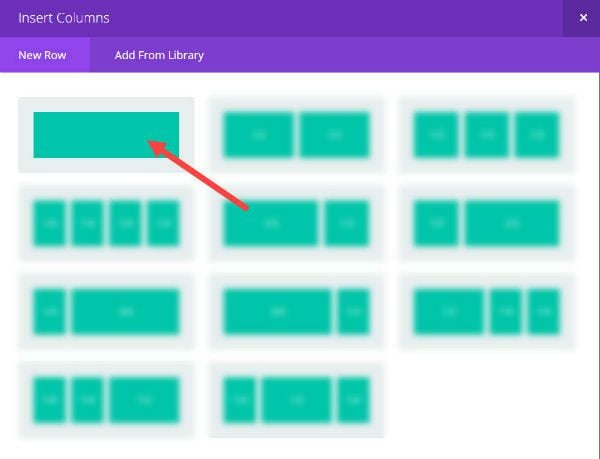
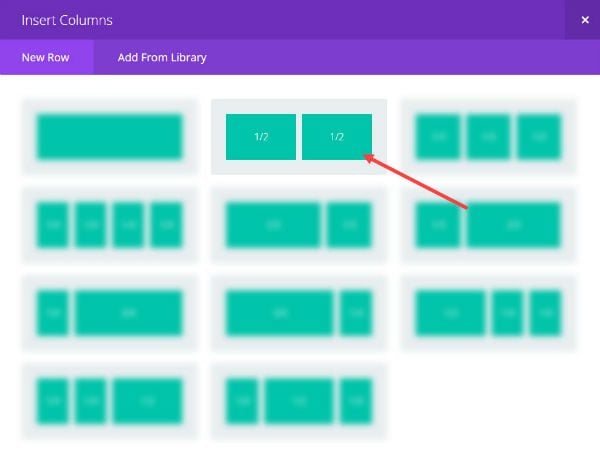
First add a standard section with a one-half, one-half column layout
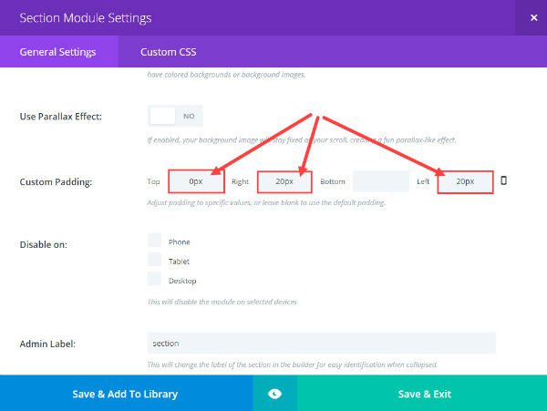
Edit the section settings. Under General Settings, change the custom padding option to the following:
Top: 0px
Right: 20px
Left: 20px
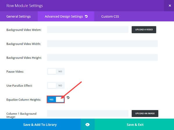
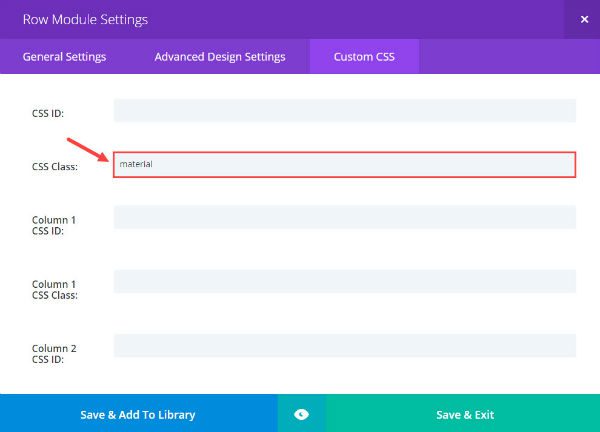
Now click the Row Module Settings. Under Advanced Design Settings, locate the Equalize Column Heights option and switch it to “YES”. It is also a good idea to add a bottom padding of 20px to each of your columns for spacing.
Go over to the Custom CSS tab and give this Row Module a custom CSS class called “material”. This will be our identifier for all of our custom css elements we will add later on. This is important so that the design elements aren’t applied site-wide, but only where you add the “material” class.
Save & Exit
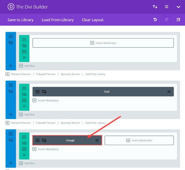
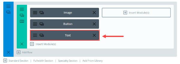
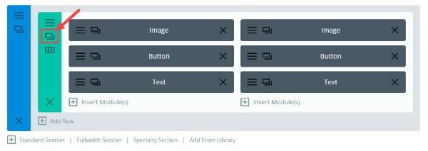
Now you can start adding modules to your row. I want to include 3 modules stacked on top of each other: an image module, a button module, and a text module. First add an image module to the left one-half column of the row.
In the Image Module Settings, under General Settings, change/add the following:
Upload/Enter Image
Remove Space Below The Image: Yes
Animation: Fade In
Image Alignment: Center
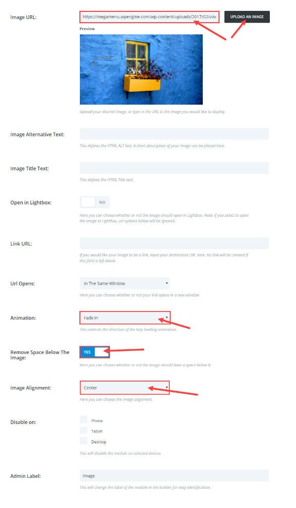
Save & Exit
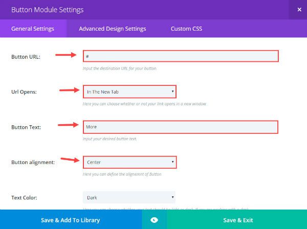
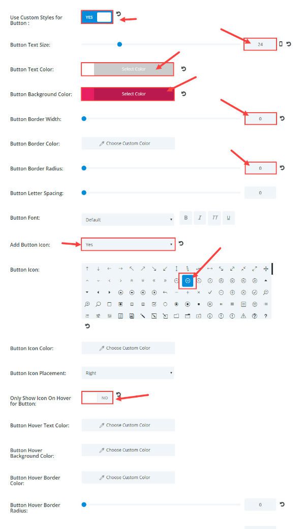
Under the Image Module, add a button module. Change the button module settings under General Settings as follows:
Button URL: [enter url] (I’m just putting # for now)
Url Opens: In The New Tab
Button Text: More
Button Alignment: Center
Under Advanced Design Settings, change the following:
Use Custom Styles for Button: Yes
Button Text Size: 24px
Button Text Color: #ffffff;
Button Background Color: #e91e63
Button Border Width: 0
Button Border Radius: 0
Add Button Icon: Yes
Button Icon: Circled Chevron down icon (make sure to select a down facing arrow icon)
Finally, add a Text Module under the button module.
Go to the Text Module settings. Under General Settings, change the Text Orientation to Center and enter your content in the content section.
Under Advanced Design Settings, give your text module some custom padding as follows:
Top: 10px
Right: 10px
Bottom: 10px
Left: 10px
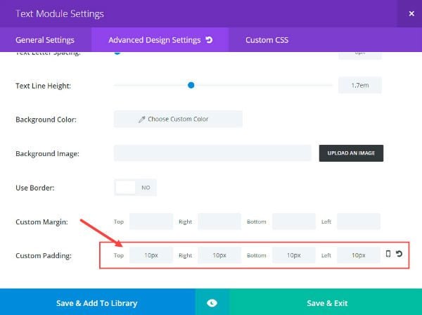
Save & Exit
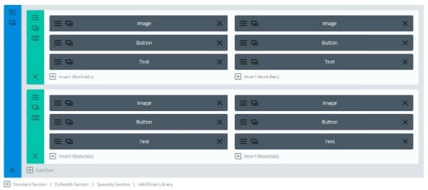
Next, you are going to duplicate the image, button, and text modules you just created and drag them over to right one-half column of the row.
After duplicating your modules, go ahead and duplicate the two column row by selecting the duplicate row icon.
Now your layout should look like this:
Go back and change the content of your modules to whatever you need them to be for your website.
Adding the Custom CSS
The next step is to add custom CSS for those additional material design elements. Go to Divi → Theme Options and add the following css in the Custom CSS text box:
.material .et_pb_image {
overflow: hidden;
}
.material .et_pb_column img{
vertical-align:top;
    -webkit-transition: all .2s ease-out;
    -moz-transition: all 0.2s ease-out;
    -ms-transition: all 0.2s ease-out;
    -o-transition: all 0.2s ease-out;
    transition: all 0.2s ease-out;
}
.material .et_pb_column:hover img{
    -webkit-transform: scale(1.05);
    -ms-transform: scale(1.05);
    transform: scale(1.05);
}

.material .et_pb_button_module_wrapper {
margin-top: -26px;
margin-bottom: 10px !important;
}
.material .et_pb_button {
box-shadow: 0 3px 10px rgba(0, 0, 0, 0.23), 0 3px 10px rgba(0, 0, 0, 0.16);

}
.material .et_pb_button:hover {
    box-shadow: 0 25px 55px 0 rgba(0, 0, 0, 0.21), 0 16px 28px 0 rgba(0, 0, 0, 0.22);
margin-top: -5px;
margin-bottom: 5px !important;

}

.material .et_pb_button:hover:after {
line-height: 1.7em;
-webkit-transform: rotate(-90deg);
    transform: rotate(-90deg);
}

.material.et_pb_row {padding: 27px 15px;}


.material .et_pb_column {
box-shadow: 0 3px 10px rgba(0, 0, 0, 0.23), 0 3px 10px rgba(0, 0, 0, 0.16);
    -webkit-transition: all .2s ease-out;
    -moz-transition: all 0.2s ease-out;
    -ms-transition: all 0.2s ease-out;
    -o-transition: all 0.2s ease-out;
    transition: all 0.2s ease-out;

}

.material .et_pb_column:hover {
box-shadow: 0 6px 20px rgba(0, 0, 0, 0.23), 0 6px 20px rgba(0, 0, 0, 0.16);

}
Save changes and go check out the final result.
A Few Tips
In addition to the use of bold colors on a white background, you now have a little extra movement that helps the “material” come alive for the user. Each of the four column boxes have a slight resting elevation (via shadowing) that increases on hover. The button straddles the image and content, and it has a resting elevation that increases even more on hover as it moves up 5 pixels. Also when hovering over the button, the button icon rotates counterclockwise 90 degrees from pointing down to pointing right. And, the image zooms when hovering over the column box.
Notice that each of the transitions and movements are purposeful and swift. They should be coherent enough to grab one’s attention, but quick enough not to disrupt the continuity of the user experience.
As far as the layout of this design goes, you can use if for a number of different things like featured portfolios, featured services, or CTA’s. Sky’s the limit.
If you would like to add additional content to the boxes, you can do this easily since the shadowing and hover effect is done at the column level. Simply add additional modules to your columns. You can also add more columns to your row if you want. A three column layout looks great.
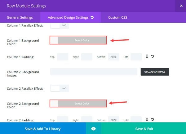
If you want to change the background of the boxes, you can go to Row Module Settings under Advanced Design Settings and change the background color for each column.
Final Thoughts
I’m not a material design expert, but I do enjoy learning more about it and implementing the design elements when an opportunity comes. For more information on material design you can visit https://material.io/. They have a useful color palette as well.
I hope you found this tutorial helpful. I’m looking forward to hearing from you in the comments below.


Thank you Jason . Very informative and useful one. I am going to us in my present project.
Hello
I may be a bit out of topic but what is the kind of layout you are using at elegant theme for your blog ? I love it and it is not the regular blog module of Divi Article card. Could we get a tutorial on this too ? I’m more of a DiYer sort of… LoL
Thanks in advance
Hi again, Jason,
I’ve had good luck experimenting a bit more. Thank you.
I’ve also tried using a full width slider in place of the header section. It looks great, except one odd thing. When the sliders transition, they cover the white material row. Not the first one, but all of the following sliders.
Can you tell me how I might change the layering or something so that this doesn’t happen?
Thanks again for an awesome design!
Jason, I LOVE your tutorial. I followed it step-by-step and was able to duplicate the effects on a friend’s website. I then exported the layout and imported it to my website… and added the css (to my child theme css file), but it does not work.
I am a bit confused as to when to add css to the Divi > Options vs. when I should be putting the css in my child theme .styles file.
Hi Jason,
Thank you so much for this outstanding tutorial!!
I have created a beautiful page with 3 columns across and it looks SO beautiful.
There’s just one problem, though. I am using a logo image (It is a wide logo with words that is approx the same width as the 700px box), not text (“Material Design” as in your example) in that white header box. And, on mobile, the image shrinks up tiny and the white box shrinks upward, with the background image seen below it, and it does not look good at all.
The site is in development and not online, so I cannot send a link, and it doesn’t look like I can attach an image here. But, I am sure you can understand what I am describing.
Can you please post a solution that would allow the position of that box to remain in that beautiful spot – halfway in the image and halfway into the white space below – when on a mobile device, when using a logo and not text in the white box.
Thank you so much for your help!
Great write-up, Jason! I put the ID tag in the row module like the tutorial but the custom CSS still isn’t working. Do you have any suggestions on troubleshooting?
Make sure you are adding the class “material” to the CSS Class and not the CSS ID.
Jason thank you so much for this great tutorial. I’ve used it to go for ‘three panels across’ instead of two.
What would be handy is a guide or article on what image sizes to use so the images display properly on desktop, tablet & mobile. It’s a bit of a minefield to get images displaying like you want them in the different components across desktop, tablet & mobile.
I measured the image dimensions for the desktop view, and used those, then when I viewed it on ‘landscape tablet’ & ‘landscape mobile’ they were too narrow. I’m managed to fix this by using iOS Web Inspector.
I know that Chrome Developer Tools ‘Test Responsive and Device-specific Viewports’ “gives you a close approximation as to how your site will look on a mobile device, but to get the full picture you should always test your site on real devices.” When I test my layout on iPad Pro ‘portrait view’ I get my ‘three across’ stacking one under each other, whilst Chrome Developer Tools shows it as being three across.
Also in Divi you’re able to specify certain values, like padding, separately for desktop, tablet & mobile. I’ve taken the time to get the padding right on desktop, tablet & mobile and it all looks good. That is until I turn my tablet from portrait to landscape – then my text is cut-off top & bottom (I’m using a text component above my ‘three panels across’). ? Do you have any tips on how to fix this?
The code in this tutorial is for a two column layout. This is probably why you are having trouble. I would need to know more to address this problem. Sorry.
Great tutorial! It worked for my recent site! Though…can we replace the background image on the top section with a fullwidth slider ? I tried with a lider, but the sliders are going to overlap that 700px text section!
If you are familiar with CSS, I would try using the z-index property to change the overlapping. Good idea though.
Jason – I’d love to implement this on one of my sites, however after following your instructions it’s not displaying as it should. It’s possible I’ve missed a step, but I went over each direction multiple times before reaching out to you.
It’s also possible I have some competing CSS in Divi Theme Options, but I’ve never experienced any CSS cancelleing out other CSS, so that’s really just a wild guess.
Have you seen this happen before?
Thanks.
Pete,
Thanks for reaching out. I would check to make sure you have the CSS Class “material” correct in your module settings under Custom CSS. This could be why your css isn’t working on the site.
Jason thank you so much for this great tutorial. I implemented this one and ken burns effect today and I couldn’t be happier!
And I really don’t understand what all the fuss is about, it takes about 15 minutes to follow the instructions and put it together. All heavy lifting has been done (thank you Jason) just a little effort of reading and following.
Looking forward to read more from you 🙂
Thanks Natalika. Glad to help!
Hi,
You should do a video. If you are doing a static explanation like you just did, you should always show the final result before you begin to explain the steps.
Your instructions to add this and add that, insert this figure and that figure, should always be accompanied with explanation as to what you seek to achieve or the effect that it will have.
It’s not easy to follow.
Thanks for the feedback. It helps me get better. And, we should have a video for this post soon.
Hi Jason, If I wanted that material effect in a full width image eg in that header image you gave as an example in the tutorial, how would I do that. I tried adding the material class to a full width image and it didnt work. Any clues? Or is there are way to make those columns stretch wide across the full width. I am using the single column at the moment and it works perfectly but I would like the image full width as the background padding on mobile makes the columns too small.
Just found a nice use for this one my website. After tweaking and digging into the css I made it work. Works on mobile too which is great. Awesome!
I would like to be able to style the blog module like this.
Yes you can. But unfortunately that would require a completely different set of CSS. Not a quick fix.
So did you do all the Material design for the ElegantThemes.com redesign?
Nope. Just a coincidence. It looks great though don’t you think?
It looks especially good on very good displays. But I find that the content areas do not contrast adequately on not-so-good displays.
Hello! Thank you for the tutorial. I tested it and in movile devices works fine but in desktop the images don’t apear.
I made some adjustments in the css to remove the cell’s shadow and other settings to get a border around it.
.material .et_pb_image {
overflow: hidden;
}
.material .et_pb_column img{
vertical-align:top;
-webkit-transition: all .2s ease-out;
-moz-transition: all 0.2s ease-out;
-ms-transition: all 0.2s ease-out;
-o-transition: all 0.2s ease-out;
transition: all 0.2s ease-out;
}
.material .et_pb_column:hover img{
-webkit-transform: scale(1.05);
-ms-transform: scale(1.05);
transform: scale(1.05);
}
.material .et_pb_button_module_wrapper {
margin-top: -26px;
margin-bottom: 10px !important;
}
.material .et_pb_button {
box-shadow: 0 3px 10px rgba(0, 0, 0, 0.23), 0 3px 10px rgba(0, 0, 0, 0.16);
}
.material .et_pb_button:hover {
box-shadow: 0 25px 55px 0 rgba(0, 0, 0, 0.21), 0 16px 28px 0 rgba(0, 0, 0, 0.22);
margin-top: -5px;
margin-bottom: 5px !important;
}
.material .et_pb_button:hover:after {
line-height: 1.7em;
-webkit-transform: rotate(-90deg);
transform: rotate(-90deg);
}
.material.et_pb_row {padding: 27px 15px;}
.material .et_pb_column {
border-style: solid;
border-width: 1px;
-webkit-transition: all .2s ease-out;
-moz-transition: all 0.2s ease-out;
-ms-transition: all 0.2s ease-out;
-o-transition: all 0.2s ease-out;
transition: all 0.2s ease-out;
}
I’m not sure why that would be. I don’t see anything in your css that would cause your images not to show just on desktop. I would need to know more info. Sorry.
Well the timing is right, I spent 8 months search for a way to create a mdl site with no experience what so ever and after numerous trial and errors I settled on divi as i find it to offer the best community but until now I was unable to get an insight as to how DIVI might be used by the pros to do it.
I just about burst into tears at the result of this on my desktop, ipad and iphone. It is absolutely beautiful. Thank you very much Jason for your super clear tutorial!!!
Awesome Leanne! You’re welcome. So glad you like it.
Hi Jason, If I wanted that material effect in a full width image eg in that header image you gave as an example in the tutorial, how would I do that. I tried adding the material class to a full width image and it didnt work. Any clues? Or is there are way to make those columns stretch wide across the full width. I am using the single column at the moment and it works perfectly but I would like the image full width as the background padding on mobile makes the columns too small.
This is great!! Really love it.
However it seems to conflict with jetpack plugin provided by WordPress.
Do you use jetpack?
Thank you!!
Thanks for letting us know. I wasn’t aware of the conflict. What seems to be breaking?
Installing and activating Jetpack plugin is fine. When it is connected to Jetpack site, however, css for material design does not work. Animation is disabled and buttons is located under the image box, not straddling between the image and text box. Please refer to following page. http://empowering.kr/material-design
What a great tutorial! This is an excellent example of the power of Divi!! Again, great article and ‘how to’!
JP
Jason,
that’s a great one and fairly good and comprehensive explained !
It give’s my Blog a professional touch …
Cheers mate !
Great Joerg! Happy to help.
This is sweet! I love these tutorials! Please keep them coming they are helping me learn CSS and beautify my sites at the same time.
Thanks Stephen. I plan on keeping them coming!
Awesome! this is so beautiful and you have made it so easy. I have one question. Can you change the font in these boxes? For example the heading material design in the 4 boxes…can you change all those fonts?
thank you so much…scot
Thanks, Scot.
The header you are referring to is in the text module and is wrapped in an h2 tag. If it was an h1 you could customize it in the text module setting for the header font style. I didn’t put an h1 for this header for seo purposes. So if you want to keep the h2 tag you would have to put some inline styling like so…
Make sense?
can someone see why i have whitespace around my image?? i can’t solve this.
Did you try using bigger images?
Nice, you guys update your theme based on this article it appears.
This is a very long tutorial with much TODO list. Please can you help make a video tutorial out of this? It will be very helpful.
Thanks.
We will definitely follow this up with a video tutorial. We’re currently working through a backlog of video tutorials so as soon as we catch up to this one it’ll be published to on our YouTube Channel and Facebook page.
I cant get the header example to work at all….dev2.firstpositiondance.co.uk
Hi,
You have to add the class “material” to the Divi section.
Regards
Sorry, not in Divi section but in Divi row !
Is that possible with 4 columns ?
Thank you
Yes it’s ok with 4 columns. I do it.
And yet, I try to have a heighest background image in the header.
Yes! It works with 1-4 columns.
LOVE IT!
For people who want to see it in action, you can visit my site http://www.BiohackCoach.com (sorry in Dutch only at the moment)
Thank you so much Jason!
Hope more material design tutorials are comming 🙂 , maybe a suggestion for a tutoral to style the shop module
Thanks Fred!
Great!
I love your tutorials, Jason. Your instructions are always so clear!
Thanks Linda!
DIVI´s layout options are so amazing … why do you guys always use CSS? I would LOVE TO keep DIVI layouts & designs “CODE FREE”.
We can certainly start creating more stuff without code. Just Divi’s built-in settings.
Yes!This would be a dream come true. Just Divi’s built-in settings as in code free. Too much extra design can distract from the content as well.
Great tutorial, just followed it and got it working easily on a local test site. Only takes about half an hour to complete.
As quite a few folk are asking for a demo i’ve uploaded the Divi layout for this demo which you can find here https://circularcube.co.uk/material-design-demo/
Make sure you take note of the bit that you also need to add the CSS to the Divi Options.
Thanks for the demo!!
Thanks for the demo. It looks great
Hi,
Thank you very much for this very nice tutorial.
Here is my page made by following your guide (live demo): http://www.inoxit.ch/material-design-with-divi/
The result is really great and fully responsive.
Thank’s again!
Nico
i have downloaded the layout file from some other person.
Please do not send it.
Thank you~
where can i download the layout, please tell me??
Hi,
Why do we still have wireframes to organize blocks?
Wasn’t wysiwyg the plan?
Regards
Hi Jason
Just tested in local.
Great
@Patrick Finney, Sarah, Pigeon, Gavin
It works also on mobile.
Just added to the text module option of second row 10px right & left padding for mobile.
Great tutorial thanks! I was actually looking to implement material design. Is there a demo somewhere?
Best regards
Fred
Awesome one!
A live demo would be great.
Great tutorial.
Wishes are never ending – could you guide on “wave” effect on “button”.
TIA.
Thanks anurag,
I’m not sure what you mean by “guide on wave effect”. Could you clarify please.
Great tutorial.
I would want to see a demo of the resulting web page before I go for it.
Any chance of giving us a demo of the page?
This looks great – i can’t wait to try it out. I would also love to see a live demo as I am keen to try it out on mobile before throwing myself into it. But many thanks for a great tutorial – much appreciated.
Interesting Div tutorial but let’s be clear: Google did not “invent” any of this. They just coined a term “material design” to refer to a set of standards and guidelines. All these design concepts have been in existence for decades.
Good point David. I stand corrected. Appreciate the clarification.
Looking at the tutorial looked great at first, but I have to agree with other comments. I cannot justify spending any more time looking into this if the main site to this tool couldn’t even be built responsively.
I’m sure that spending the right amount of time would render a responsive result, but the idea here is to spend less time.
Hi Gavin. The design is responsive. I have tested it on all screen sizes. Thanks.
Great article – tutorial. Now I can do these beautifull things in any module applying the css code and the advanced settings. Also I can make this designs in any page or web that I be creating. its not like a demo, this is very valuable to learn how to do the codes and styles any where. I am keeping this -pure gold tutorial- in a pdf document. Thank you guys.
So glad you find this useful, Sue. Thanks for the kind words as well.
Coool!
I’d like to see the live demo!
I’d like to see the live demo!
wow, thank you!!!, I wanted to do this from long time ago, but I didn´t figured out how. This is an amazing tutorial thank you!. I tryed and everything looks and works perfectly well. I like how it looks in cellphones.
thank you to take the time to teach all this. I really apreciate it. I am always learning new things about the plasticity of divi. Great Job, thank you. 🙂
Hi Sondra, what your referring to is called a “hover rise”. It’s a great effect there is an earlier tutorial to do this. Please see https://www.elegantthemes.com/blog/tips-tricks/css-tricks-for-your-divi-theme-project-and-product-thumbnails
Cheers Mark.
As I am still developing my site, I have used this and it looks amazing. A few little tweaks but very happy with the result.
Can you add this as a layout that we can just import, then tweak on our own?
How responsive is this layout?
It is completely responsive.
How would I add the zoom feature on the image when scrolling over it to a regular image? Is there a way to use this feature for grid style blog posts?
Great idea, Sondra. See Mark’s comment below for help on this. I’ll look into to the grid style blog post functionality as well. Thanks!
Big like!
It would be great to have some of these effects built into Divi.
Particularly the image scale effect on mouse over.
I feel there are some simple additions that would make this theme invaluable.
Agreed!
I’m concerned that this won’t work responsively. In the current environment, we find that over 60% of our page views come from mobile devices, so it seems vital that any modern design is optimised for these readers/customers. It seems that there will be some significant adaptation of this tutorial required to make it useable.
I love the idea and the final result. However, it remains to be seen if the time required to make it responsive is actually time well spent when considering the building of a site as a whole.
Sarah,
This works well responsively. No need for extra work. Sorry for not being clearer on this issue.
As a user of Divi each day I learn a little more, great article. Thank you
Much as I appreciate your post there should be a demo so I can see if the end result is something I want to try before I invest the time.
I understand Richard. A few people have already posted some helpful demos in the comments below.
Thanks
Thanks Jason. Great name by the way.
I second that notion!
Looks great Mr Champagne (I want that name more than lots of things), but I too would like to see a live demo please, if at all possible.
Also, and as new as I am to web design, I too thought that it might not adjust so well, considering so many different monitor sizes out there.
Having said the above, I still can’t wait to give it a whirl after looking at a live preview.
Thank you for your effort. It really is appreciated.
All the very best.
Wel, that is a long tutorial!
We bought the DIVI plugin and theme, I will take a look at it next weekend.
^ ^
A bit surprised that all the positioning is done with absolute units, almost guaranteeing that it will only display perfectly on the screen it was designed on.
We try to coach folks to use relative units to ensure that their design is responsive.
Patrick, you can use absolutes inside of a relative position container and maintain responsive design. All containers that are not otherwise explicitly controlled through the CSS and hierarchy of styles are relative to each other, to begin with. Therefore, the absolute positioning referenced above would work fine because the section and row are already relative positioned.
That’s exactly right. Thanks for explaining.
You’re missing Patrick’s point.
He meant that your design is using absolute units (pixels) to position elements (via margin and padding, width, etc) on screen instead of relative units (ems, rems, vw, vh, %).
This isn’t a dig on you, but I’ve noticed that Elegant Themes always pushes desktop-first designs and rarely cares about other screens.
Patrick, I’ve got you, buddy. ?
Hi Patrick. I’m not sure what you mean. Could you clarify? This design works on all devices. Sorry for not being clear on this.