
Responsive design has taken the world wide web by storm. Not having a mobile-friendly version of your website can hurt your website’s readability depending on the amount of mobile traffic your website receives (which varies by industry).
As of January 2014:
- 90% of American adults have a cell phone
- 58% of American adults have a smartphone
- 32% of American adults own an e-reader
- 42% of American adults own a tablet computer
Source: http://www.pewinternet.org/data-trend/mobile/device-ownership/
With more and more people using mobile devices, the need for responsive websites and apps is growing.
This post will discuss the topic of responsive design as it applies to WordPress.
What is responsive design?
Responsive design is a web design approach aimed at crafting websites to provide the best experience available for the device being used to browser a website. This tailors the experiences for reading and navigating, reducing the need for resizing, panning, and scrolling on small screens.
A typical website design with responsive capabilities is designed using CSS3 media queries, which allow specific CSS styles to be applied at different browser widths. This allow you create different designs for differently-sized screens.
Examples Of Responsive Web Design
- Our Very Own Divi 2.0
A good place to start is our very own theme library. Check out the new Divi 2.0 theme and resize your browser window. Watch how the design adapts to the width of your browser as your decrease it in size.
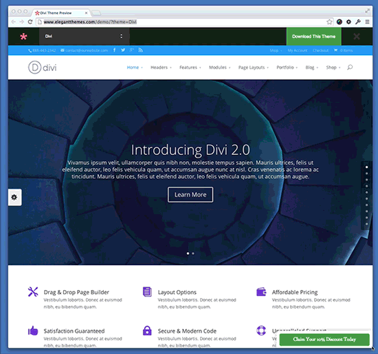
As the window decreases in width, we see the CSS3 media queries I mentioned earlier coming into effect. At various breakpoints (or points in which our CSS3 media queries change), our design retains a fluid like feel and adjusts itself based on the media query that is being triggered. The smaller the width, the more the website is optimized for a mobile device such as an iPhone or an Android device.
The design on Divi changes a handful of times because it is optimized for many different widths of devices. You too can optimize your own theme, giving you control over how your website is presented to your users no matter what device they are using.
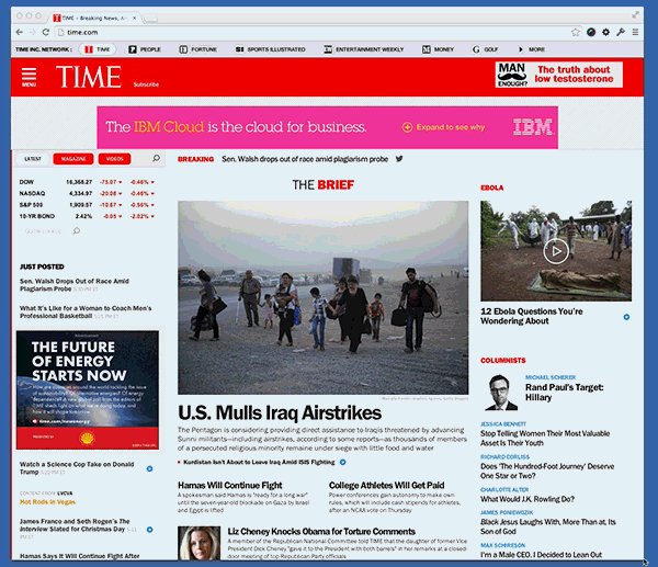
Time.com uses the same approach with their latest design by targeting specific widths of the browser in order to display a different design for specific devices like tablets and phones.
Where can I learn more about responsive design?
Test websites you already visit
A great way to explore responsive design further is to start testing each site you visit. This will become a natural habit after a while. Some sites will opt to use a different way of displaying their websites on different devices. Google, for example, uses completely different stylesheets depending on the device the user visits their website with. This method, which requires some additional coding techniques outside of CSS, is used with a lot of larger websites. Google, Amazon, Yahoo, etc…
Other Methods
- Read Blogs and Tutorials
- Take a Course
- Attend a Workshop
- Research CSS3 and how to use Media Queries
- Build something
- Make a simple website with some basic HTML and CSS and start to use CSS3 to understand how they work.
How to make my WordPress website responsive?
To make any WordPress website responsive, you can start by utilizing the CSS3 Media queries I mentioned earlier.
A typical media query looks like this:
@media (max-width: 700px) {
    .container {
        width: 100%;
        margin: 0 auto;
    }
}
By using the @media rule, a website can have a different layout for screen, print, mobile phone, or tablet. You can use more than one and define any width where the media query should come into effect.
Above we have the @media element with a (max-width: 700px) constraint, which essentially means that once the screen size or browser window becomes 700 pixels or less, the styles inside the @media brackets will be applied to the website.
It’s probably best to keep the @media rules to a minimum. In the past I have seen most website using 4-5 @media tags. This includes mobile devices, tablets, larger screens, and print stylings.
Another Example
For a demo I will be using some basic HTML and CSS to show you how we create responsive design rules within our code. The same type of rule applies to your themes inside of WordPress. You will just be applying styles in the style.css file to change your website’s design.
The HTML
<!DOCTYPE html>
    <head>
        <meta charset="utf-8">
        <title>Elegant Themes Responsive Web Design - Demo</title>
        <meta name="viewport" content="width=device-width, initial-scale=1">
                <link rel="stylesheet" type="text/css" href="style.css">
    </head>
    <body>
        <div class="container">
        <h1>Responsive Web Design</h1>
            <ul>
                <li><a href="#">Sample Link 1</a></li>
                <li><a href="#">Sample Link 2</a></li>
                <li><a href="#">Sample Link 3</a></li>
                <li><a href="#">Sample Link 4</a></li>
                <li><a href="#">Sample Link 5</a></li>
            </ul>
        </div>
    </body>
</html>
The HTML above is pretty basic. Notice in the are I have included an important tag which helps responsive design happen. The viewport meta tag is used to tell the browser to display our code based on our device’s width no matter the device. There are other configurations for this particular tag but, I’ll leave that explanation for another time. Feel free to read more about it.
After that we have our section with a div containing an un ordered list of links.
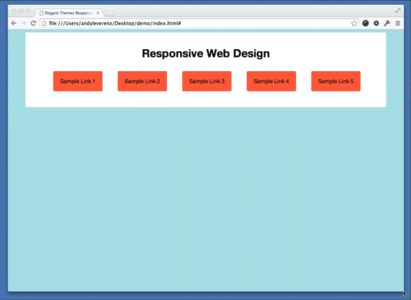
Here’s how our webpage currently looks in Chrome with no styles.
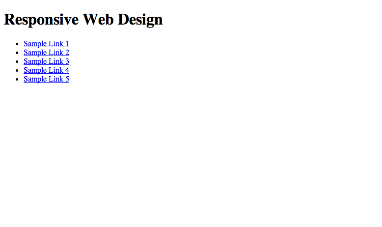
What an amazing webpage right? Just kidding! Let’s style things up a bit.
Here’s some basic CSS to kick things off:
CSS
body {
    background: PowderBlue;
    font-family: "HelveticaNeue", Helvetica, Arial, sans-serif;
    font-size: 16px;
}
.container {
    width: 1000px;
    margin: 0 auto;
    padding: 20px;
    background: white;
}
.container h1 {
    text-align: center;
}
.container ul {
    list-style-type: none;
}
.container ul li {
    display: inline-block;
    padding: 10px 20px;
}
.container ul li a {
    display:block;
    padding: 20px;
    background: Tomato;
    border-radius: 4px;
    color: black;
    text-decoration: none;
}
.container ul li a:hover {
    background: black;
    color: white;
}
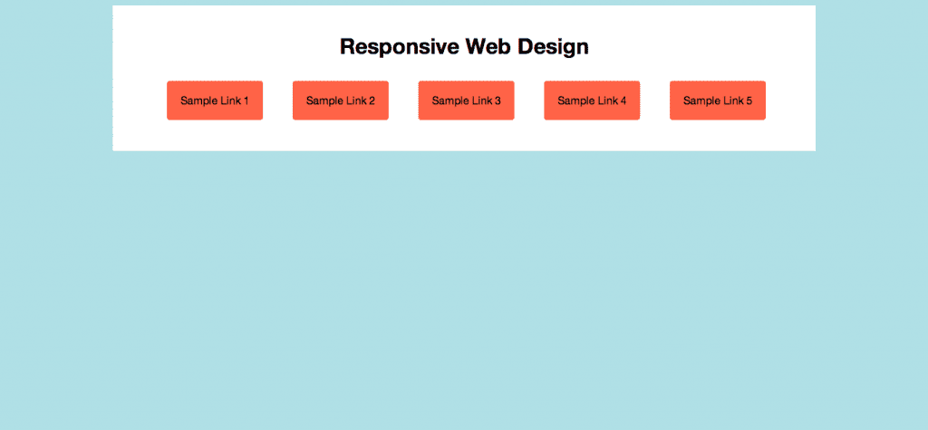
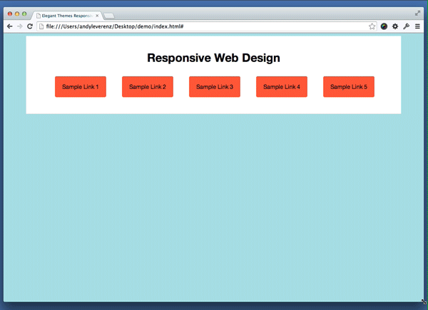
With the styles above applied, our page now looks like this:
Great, so now we have some basic styles defined. Lets think for a second about how this design could look on a mobile device. It will be rather difficult to have our links all fit in one row when the width of the device is so small. That looks like it’s going to be messy. So what can we doe?
Let’s introduce a media query to adjust the design so that when it reaches a common width for mobile devices, our design will then respond to the change within our CSS.
Add the CSS below to the bottom of your style.css file.
CSS
@media (max-width: 970px) {

.container {
    width: 100%;
    margin: 0 auto;
    padding:20px 0;
}
.container ul {
    padding:10px;
}
.container ul li {
    display:block;
    padding:10px 0;
}
Now with the CSS added, we can resize our browser to see the responsive effect. Check out the animation below:
Cool! So as you can tell we need to tweak a few things once the browser gets to its smallest width. We can add another media query to help make the transition match the width a bit better. Add this CSS at the bottom of your style.css file.
CSS
@media (max-width: 480px) {
    .container h1 {
        font-size: 22px;
    }

}
From here our styles just makes our heading a bit smaller to adapt correctly. Check out the result:
Awesome! Now our simple demo is fully responsive. Now I realize this example isn’t a WordPress theme, but the same principles apply to any website not matter what the CMS.
From here I invite you to try some CSS3 media queries on your own theme. If you are using one of our themes, try changing some styles around to suit your own design. Make sure not to edit your live site. Install a local copy of your site and go to town. If you don’t know how to install your site locally check out another post I wrote on doing this very thing on a mac and another Kevin wrote on how to do the same on a Windows computer:
- How To Create A Local WordPress Installation On A Mac
- How To Install WordPress Locally On A Windows Computer
Handling Images
Images and responsive web design have been a big topic of discussion in the web design community. There are a lot of topics discussing best practices to use when making imagery responsive on a website. Some solutions involve using some simple CSS, while others get more technical and serve specifically-sized images based on the width of the device or system you are using to access the website.
A common solution is to declare images to have a max width of 100%, which looks like this:
CSS
img {
  max-width:100%;
}
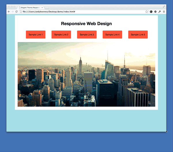
Here’s a quick example of the effect this has on an image.
Legibility
No matter what level of responsiveness you are using, you will want to keep legibility in mind. Your users need to be able to understand your content. On mobile devices, does your text need to be larger to be easily read? What elements need to be visible and what elements don’t? Keep these questions in mind as you plan out your website’s responsive experience.
Usability
How your visitors use your website should be at the forefront of your mind as you think about responsive design. If your website is unusable, then users simply won’t bother trying to navigate it to get the information they are seeking. If you provide an optimized experience, you will get positive results from existing users and even attract new users to your website.
Our Themes
Many of our themes at Elegant themes are optimized for the mobile viewing experience. Our newer themes are fully responsive, which gives you a giant step ahead of anyone else not using a completely responsive theme. Use the methods I’ve outline above to customize the theme you use to your liking. Not every website needs to be the same. Theme’s are meant to be customized after all!
Conclusion
Websites who don’t utilize responsive tactics will likely miss out on more traffic and exposure to their website. Use our pre configured themes, or use this tutorial as a starting point to get your website optimized for any user on any device.
Article thumbnail image by LuckyDesigns / shutterstock.com


Hi Team
After I changed to Dive a few month ago I realized that it does not display properly on mobile phones
It is throughout the website where I changed from an old theme to Divi.
What am I doing wrong? How can I fix it?
I now know why my inquiries are so low…. my website does not function on mobile phone since I changed to Dive.
I must have screwed up something!! I copied and pasted a lot of the info from my old theme and restored files from saved files in WordPress.
Please help!!
Thanks for these useful tips! I will surely use these tips for my next designs.
I have a Lucid installation at http://www.umrahpackagesuk.co.uk. How can I make it responsive now. Any professional help would be greatly appreciated. I have a redirect to my site made on Duda, but some pages are still not copied correctly. Please help. Thanks.
Thanks for the article. Blog is very informative . Responsive website design company can indeed design websites that can be accessed from any platforms and is compatible to all browsers.
Great post.
Thanks for sharing this post.
Greetings. I would like to find out how do you use @media queries on DIVI?
How can I make the width of the animated full banner respond to different devices eg mobile phone without cropping both sides.
Thanks
I’m busy working on my own website’s responsive design and finding it rather tricky to do, especially when it’s a design I created some time back.
Though my site isn’t a wordpress site, a lot of the advice you’ve given applies nicely. The one thing I’ve never done is use max-width for all my images, so I’ve started playing with that right away.
Cheers,
Which Test Won posted an interesting test on which led to more conversions on mobile browsers: a responsive website that worked for all browser sizes, or a dedicated mobile-only site for mobile browsers. The test is here, and you can guess which one is more effective: https://whichtestwon.com/test/mobile-site-increased-leads-ppc-traffic/
SPOILER ALERT:
Because their tests are time-limited (you need to subscribe to their newsletter to get weekly tests), I’ll tell you the result: to my surprise, the responsive website that works for all browser sizes got far more conversions than the mobile-only site. That is, the school got more people signing up to request program information from mobile users that landed on their one-size-fits-all responsive website.
the lesson is that it might be more worth a developer’s time building a responsive site than in taking the extra (and perhaps unnecessary) time to build a dedicated mobile site.
MAJOR CAVEAT: This was not a clean test, since the custom-built mobile website looked different (albeit flashier) than the responsive website. Thus, you should do your own testing before drawing conclusions for your site.
What about widgets? This is a problem I’m having with most WordPress themes. I want my sidebar there if someone is on a computer or tablet, but if they are on a phone the widgets appear underneath the post. Resulting in a total page length far longer than necessary. Any way to make widgets disappear only if the site has been resized to fit phone dimensions?
Ironic that the blog entry about responsive web sites is on a page that is not responsive!….. Love the Divi theme and its responsiveness….. looking forward to the Exta theme http://www.elegantthemes.com/blog/theme-sneak-peeks/a-closer-look-at-extra
A nice tutorials Andy of Responsive design. Such a nice article and brief information.
Is there any movement to bring most of Elegant themes into a Responsive mode?
Or are we forced to move into these Modern (not too appealing to my readers) style themes to be responsive.
What Plugin is being referred here
Nice explanation. I missed the !important tag mentioned above. And reading this article on my Android I notice the missing responsive elements in the design 🙂 Guess it will be coded in soon….. Heh heh
Using Divi as the new responsive design for my main site. Liking it a lot. Good work.
I’m using DelicateNews theme from elegant theme but not responsive yet. Are there any idea to change DelicateNews theme to be responsive without additional cost? My membership is Pesonal.
Hi Andy great tutorial for the responsive design. I am wondering what kinda software do you use to create the animated GIFs showing the transition from large with to short width. It looks slick!
Hi Andy,
Another great article from you guys! I would have to +1 @B-Smithy’s comment, I learn more from you guys than all the other blogs I read combined.
One comment that I would like to make is that responsiveness is vitally important in 2014 for the reasons you mentioned at the start of the article, but we think that mobile-OPTIMISED websites are the ideal. The first thing that a website developer needs to ask himself (or his client) is “What is my ideal customer going to be looking for when they visit my site on a mobile device?” and optimise the website to suit rather than just serving up a smaller version of the full website.
For example, in most cases they won’t be there to read your blog posts, they will more likely be looking for contact details, opening hours, directions to your store, etc, so it is better to serve up a second version of your website optimised for mobile devices which displays these details prominently, rather than just a slimmed down, vertically stretched out version of your main website. And yes, there IS a plugin for that! 🙂
Terry
A good and powerful taught Terry, but what if a Contact us/Direction button is automatically shown above the menu when a mobile device is used to view the site and the site also serve recent news in responsive design? One stone to nap two birds right? Doing this I think will eliminate creating mobile version of some pages except if you want to create an app for specific feature and purpose for your site. I would love ET to integrate this into Extra and Divi showing a button/direction above/below the collapsed menu once a mobile device is detected with a special style and google map.
Note: Not all users maybe looking for your contact details all the time and showing some new stuff on your site make us mobile user feels that the firm/person is functioning dynamically. 🙂
Cheers
Hi bb,
You raise some good points, but in our experience most mobile phone users are looking for contact details rather than your latest posts. They tend to use larger devices like tablets or laptops to actually read your blog posts because they are easier on the eyes than trying to read a 1000 word post on a mobile phone.
By all means have a link to your blog posts on your menu, but we find that prominent ‘Tap To Call’, ‘Contact Us’, ‘Find Us’ and ‘Shopping Hours’ buttons get way more clicks than blog posts, so it makes more sense to us to make these buttons nice and big on a mobile phone optimised home page.
Query: If I’m using Divi 2.1, what design elements/ideas do I need to *avoid* to prevent my site from being responsive without having to write any special CSS? IOW, how do I take advantage of the automatic responsive theming?
For example, I quickly learned that using an Image Module to create a graphical menu is a no-no; Divi doesn’t resize the images in the module, at least not automatically. I’d like to be able to use the Image Module as a nav link in one of my Divi designs but that renders the site essentially ugly on a tablet or smartphone without my doing some custom CSS.
A nice tutorial Andy. While I will try this on instyle to see if I can make her responsive, I’m wondering about ETmobile plugin if its still functional. I noticed that no one is talking about it. Its queer.
In addition, Divi is not fully responsive on Blackberry Q10 and Z10 smart phones. It left a gaping space on the right hand side of the phone screen. Anybody with the same experience or solution?
That is really a great tutorial. I love the way you explained css code that make responsiveness so easy. I understand it better now. And the images at 100%.
A good source for complete responsive solutions is http://getbootstrap.com
There are lots of plug-ins that add the bootstrap script and CSS to your theme.
Although divi is responsive i do like to use bootstrap. You need to change some origional CSS of the divi CSS… Or overide as divi uses some class names that are also used in bootstrap… Would be great if it worked without thoses changes/overrides, but it works great.
Keep up the great work!
Yes, you are right to add bootstrap, but there are number of others way to do some edit/update on css and we can make the site mobile friendly. I tried to use some of plugin but those did not looks work to me
so finally, I go for CSS Changes to make it good responsive sites
Now a days we can get so many ready made premium responsive wordpress themes. This article will surely help the beginners who wants to design WP responsive themes in a great way.
Thanks to Divi I shouldn’t have to worry about all this 😉
Any chance you could make ‘SimplePress’ responsive?
I’d honestly like to know more about how you are making those gifs… HAHA!
I love this blog and these themes. I fell like I have learned more here than anywhere else. Thank you and keep up the great work!
Great tips! I already know the basics, but it’s always good to keep reading. Awesome example GIFs by the way 🙂
This is a great little tutorial for people looking to learn how to build their own responsive designs. I have been contemplating starting our own theme creation studio. And all the themes in it would be fully responsive.
The marketplace would also have child-themes for Divi 2.0 (Including layout packs) and the up coming Extra when it releases.
I’d be interested in a few Divi child themes…
Not too shameless. And would mean additional revenue perhaps for Elegant.
Pootle press, for Canvas pulled the same trick, turned down an offer to join the Woo ranks in favor of ‘doing-their-own-thing’.
good luck!