
Brand colors usually start with hex codes being applied across headings, buttons, and backgrounds. It’s simple enough initially, but as the layout grows, you often need lighter color variations, hover states, or complementary accents. Managing that manually can get messy.
The New Color System in Divi 5 makes this easier by letting you define a palette once and build connected shades from your initial color palette. Each color stays in sync, even as the design evolves. In this guide, you’ll learn how to create a flexible, scalable color system that keeps everything consistent across your client’s site.
Understanding Divi 5’s Color System
If you’ve worked with Global Colors in Divi 4, you already know how useful it is to define a color once and apply it across your site. Divi 5 builds on that same idea, but this time, it turns color into a complete system that scales with you.
Subscribe To Our YouTube Channel
Here are the three major upgrades:
It starts with Design Variables. You define your brand palette inside the Colors tab in Variable Manager, and these values become your foundation. Once defined, they’re ready for use in any module or section. And when the brand evolves down the line, you only need to update the variables in one place. Everything linked to them adjusts on its own.
The second upgrade is the HSL color filter. The sliders allow you to adjust hue, saturation, and lightness, giving you more control when working with tone and contrast.
If your primary green feels too harsh for a background, you can soften it slightly, adjust the brightness, and save that version as its variable. This will be a brand new color, but it’s still linked to the original color.
This also opens up space to think in relationships rather than isolated values. You can link variables together so that one always remains a certain distance from another, such as darker, lighter, slightly warmer, or more subdued. These are called relative colors, which is the third improvement.
A hover color, for instance, can be defined as 20% darker than the primary. If the primary color changes, the hover state keeps its relationship without needing manual adjustments.
This three-part system creates a flexible and grounded working color system. You’re not just applying colors one module at a time; you’re building a palette that can shift as needed while keeping your design consistent and clean.
Learn Everything About Divi’s New Color System
If you’ve been relying on hex codes until now, this is the point where that workflow starts to feel limited. And that’s your cue for shifting to a future-ready color system.
Turning Your Client’s Brand Colors Into A Divi 5 Color System
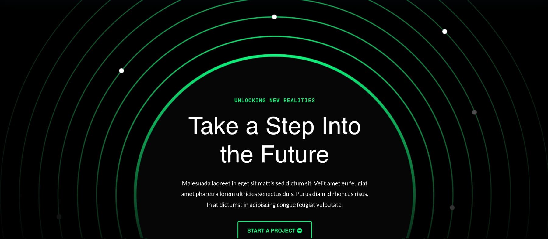
Now that you know how Divi 5’s color system works, let’s walk through what it looks like in a real project. For this example, we’ve imported the Augmented Reality Home Page layout from the Divi Library.
Let’s build a scenario. Suppose a client wants to add a complementary color to balance the bold green used throughout the site. Instead of manually adding it in a few spots, let’s take this as a chance to shift the layout over to Divi 5’s color system so we don’t have to make manual changes in the future if asked again.
If you look through the layout, you’ll notice that the same green appears in several places, such as headings, buttons, and accent elements. Each uses a fixed hex code. Our goal is to replace those with color variables and build a palette that can adapt to changes later.
Normally, updating a layout like this would mean editing each module by hand. But in the next few steps, we’ll use color variables, HSL filters, and connected color logic to build something more stable. You can follow the same layout or use your project as a base.
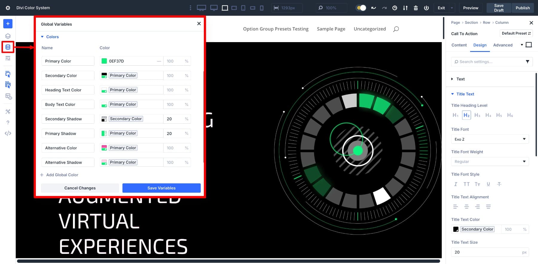
1. Save Your Client’s Primary Color As A Design Variable
If your client has shared a new hex code, or you’re sticking with an existing brand color, the first step is to add it to the Design Variable Manager. This becomes your base color and will be the foundation for the color variations you build around it.
Adding A Primary Color
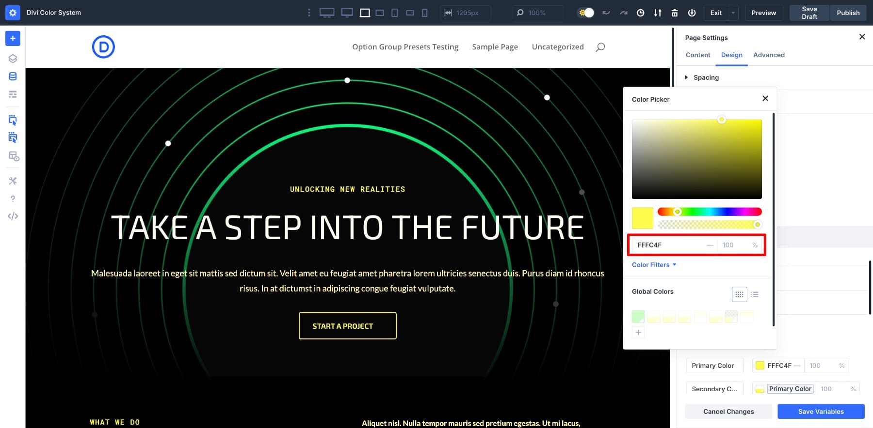
To begin, open the Variable Manager and switch to the Colors tab.
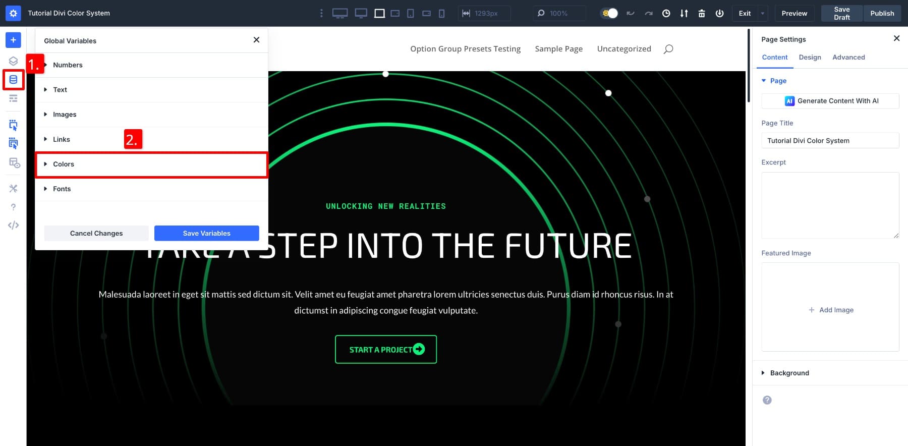
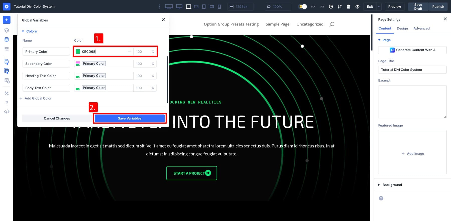
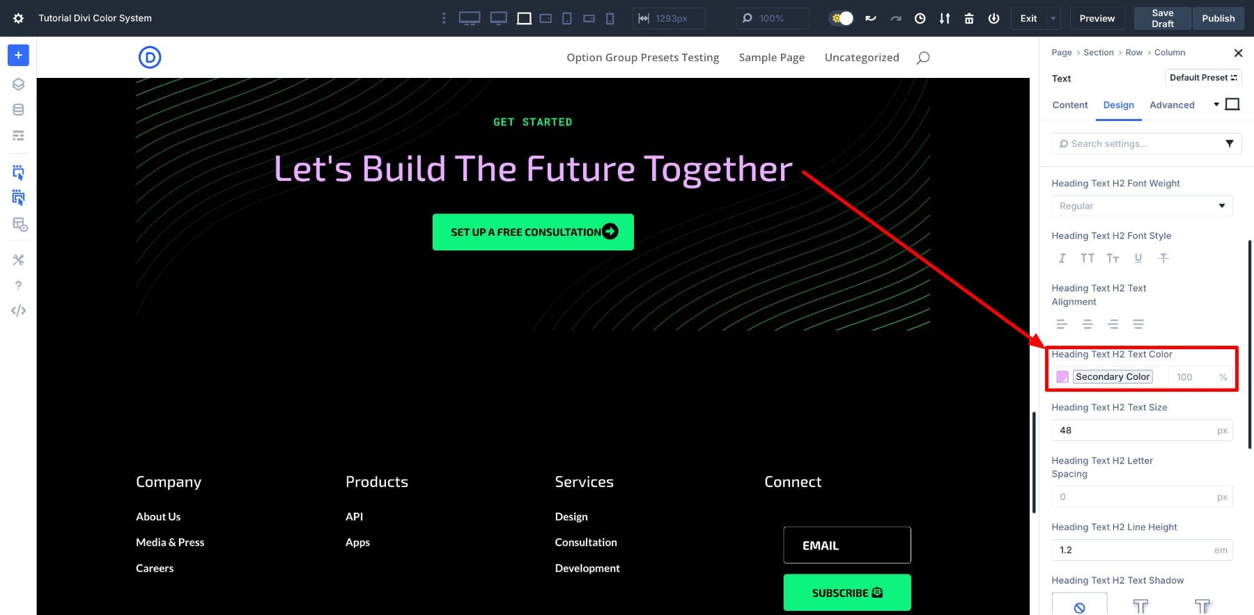
The panel may already include default values for Primary, Secondary, Heading, and Body text. In the Primary Color field, enter the hex code for the main brand color and click Save Variables.
Adding A Secondary Color
Next, we’ll create a relative version of this secondary color using the primary as a base. That way, any future changes to the base color will carry over automatically.
In this example, since we’re adding a complementary color to balance the existing green, we’ll assign that as the Secondary Color. The layout’s background is black, so this pairing stands out clearly.
If you’re only working with one color for now, feel free to leave the secondary slot set to black.
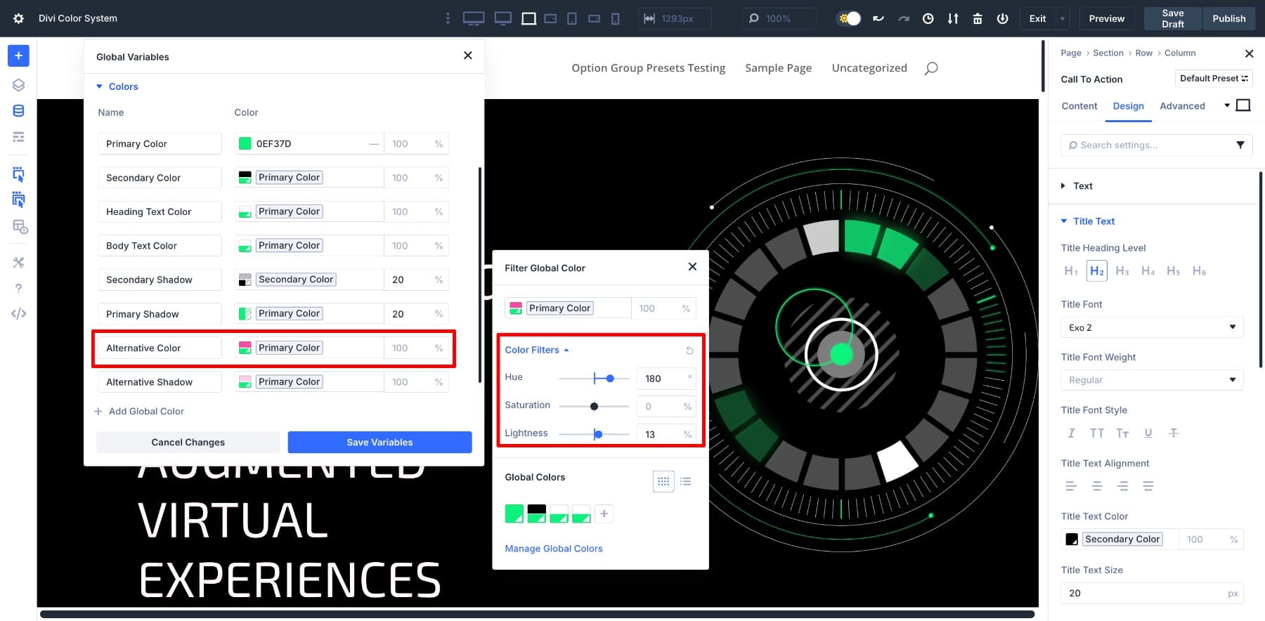
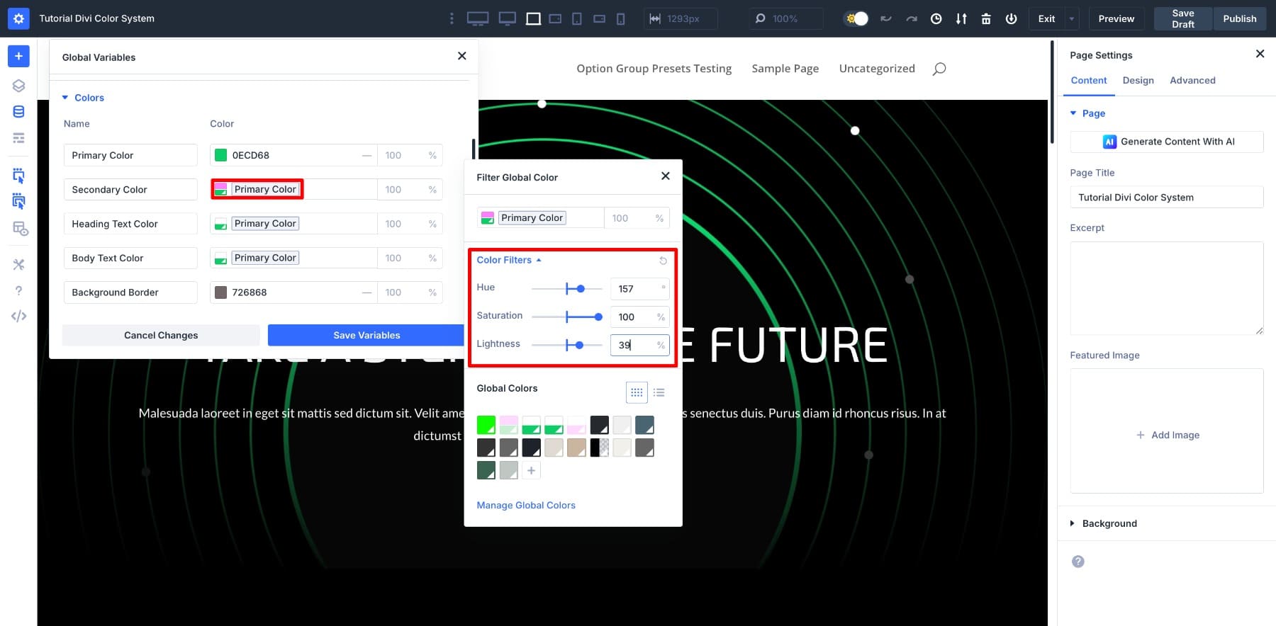
Click the Secondary Color swatch to open the color window. All your saved values will be listed under Global Colors, with the Primary Color listed first.
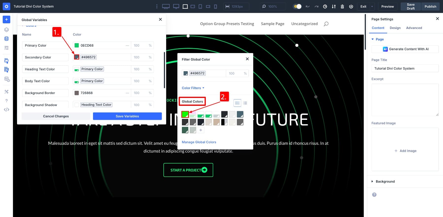
Select it. This brings in the base color as your starting point.
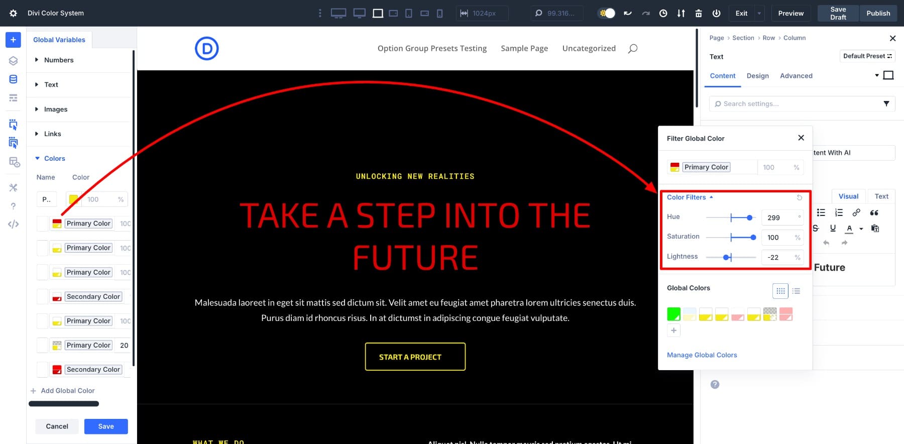
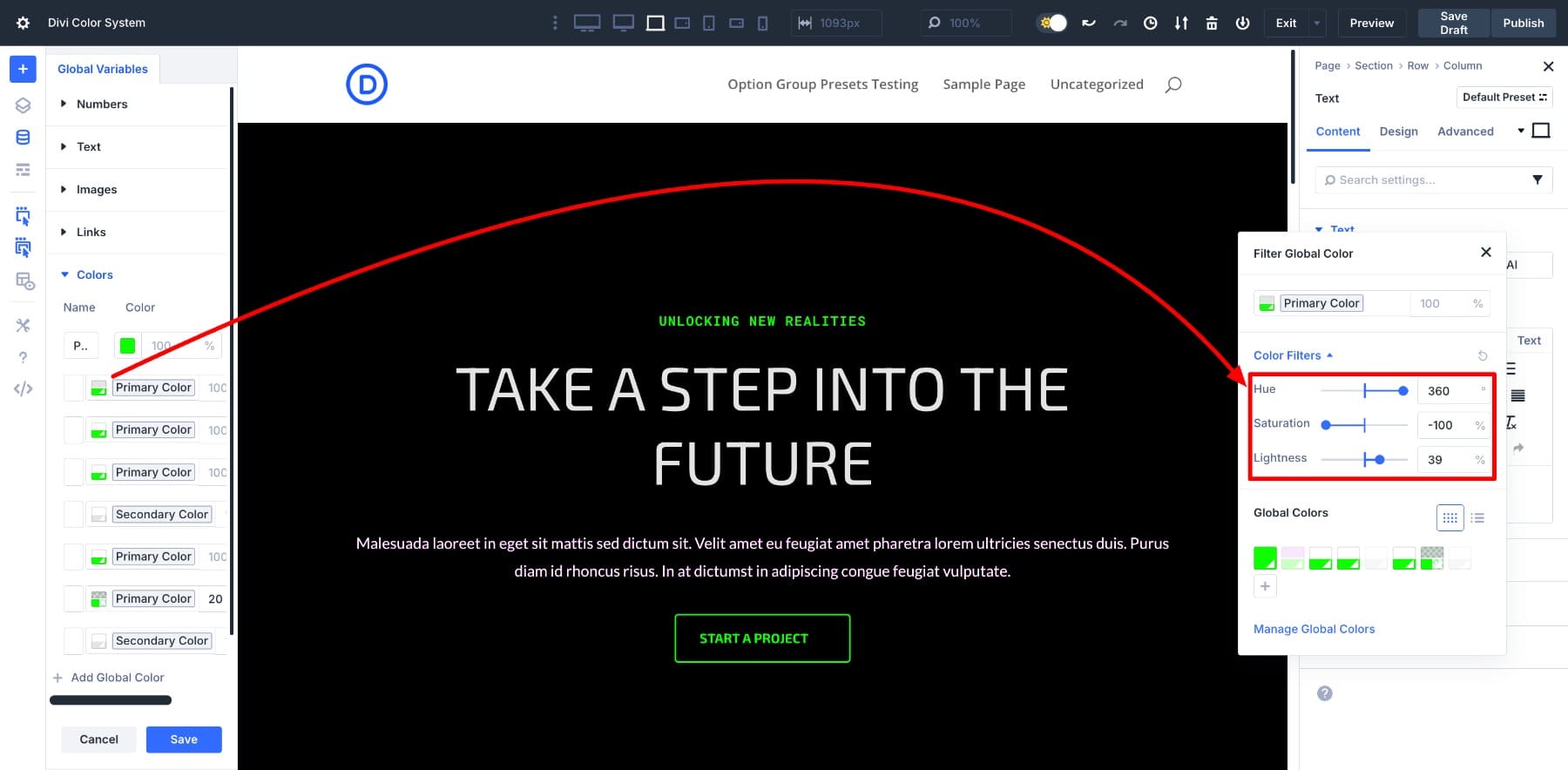
Now, click on the swatch again to reopen the window, then open the Color Filters dropdown. This reveals the HSL sliders, where you can adjust hue, saturation, and lightness.
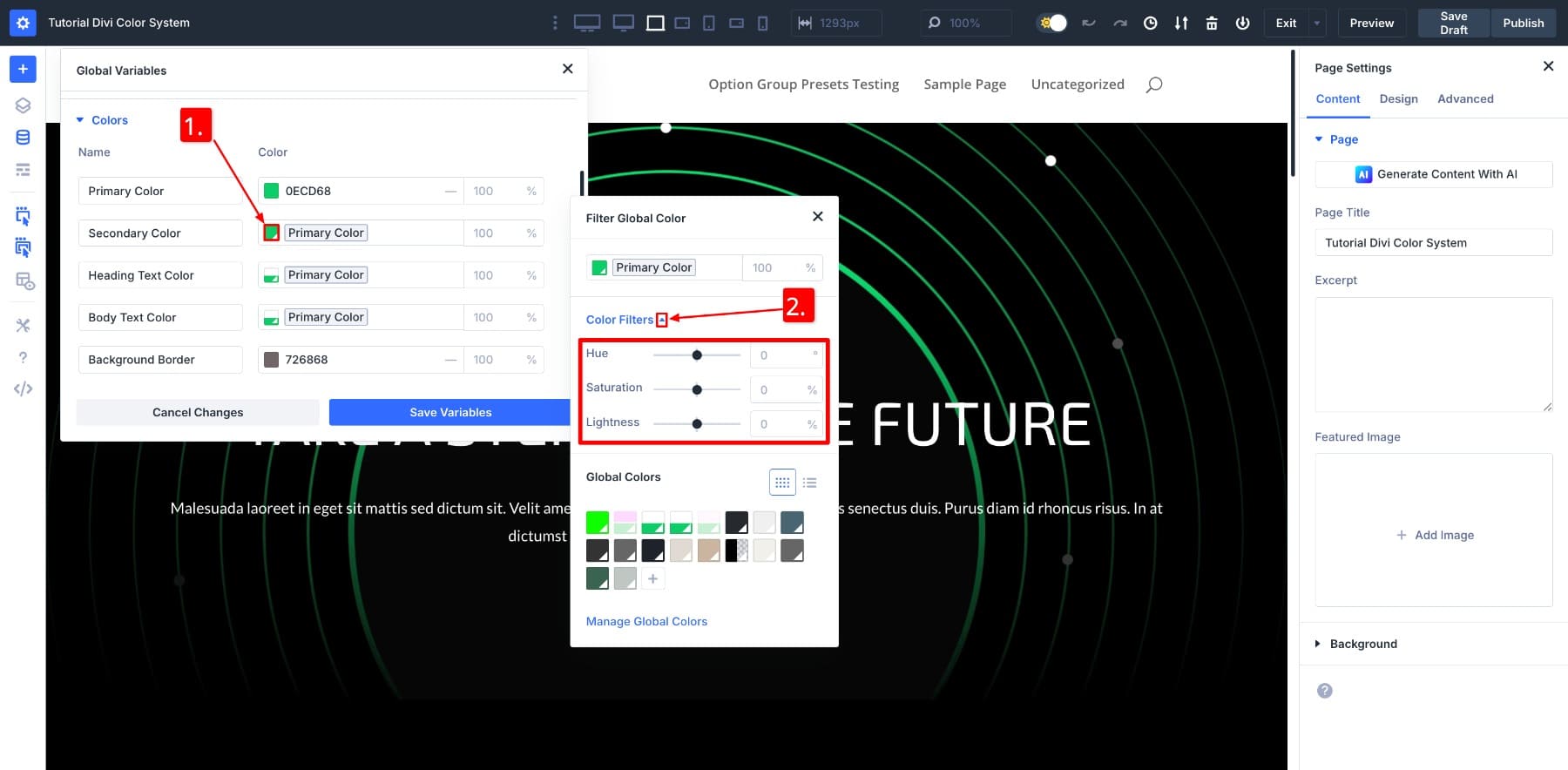
Use these sliders to shape the new color. Once you’re happy with it, save. And just like that, you have a Secondary Color connected to the primary.
If you’d like to keep the Secondary Color Black but still link it to the primary, turn both the Lightness and Saturation sliders all the way down to -100.
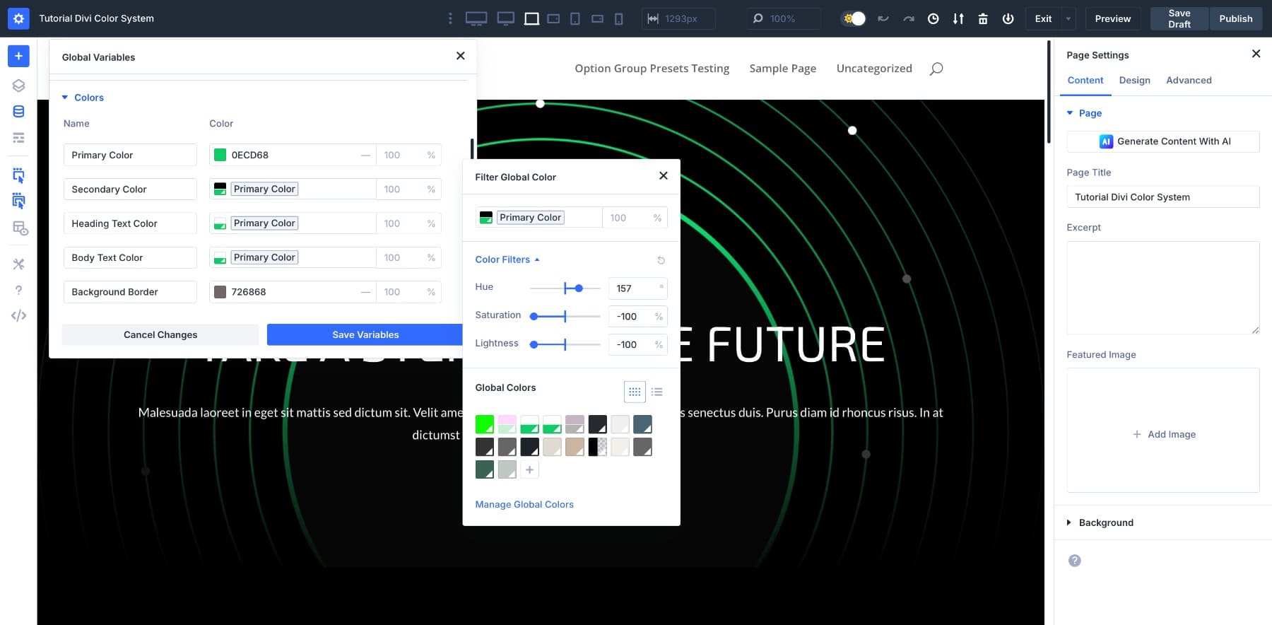
To create a darker shade instead, leave the Hue and Saturation as-is and reduce only the Lightness.

At this point, you can experiment freely. Adjust the values until the tone feels right for your design. Whether the new color blends softly with the brand palette or stands out as a contrast, it will remain linked to the primary and evolve with it.
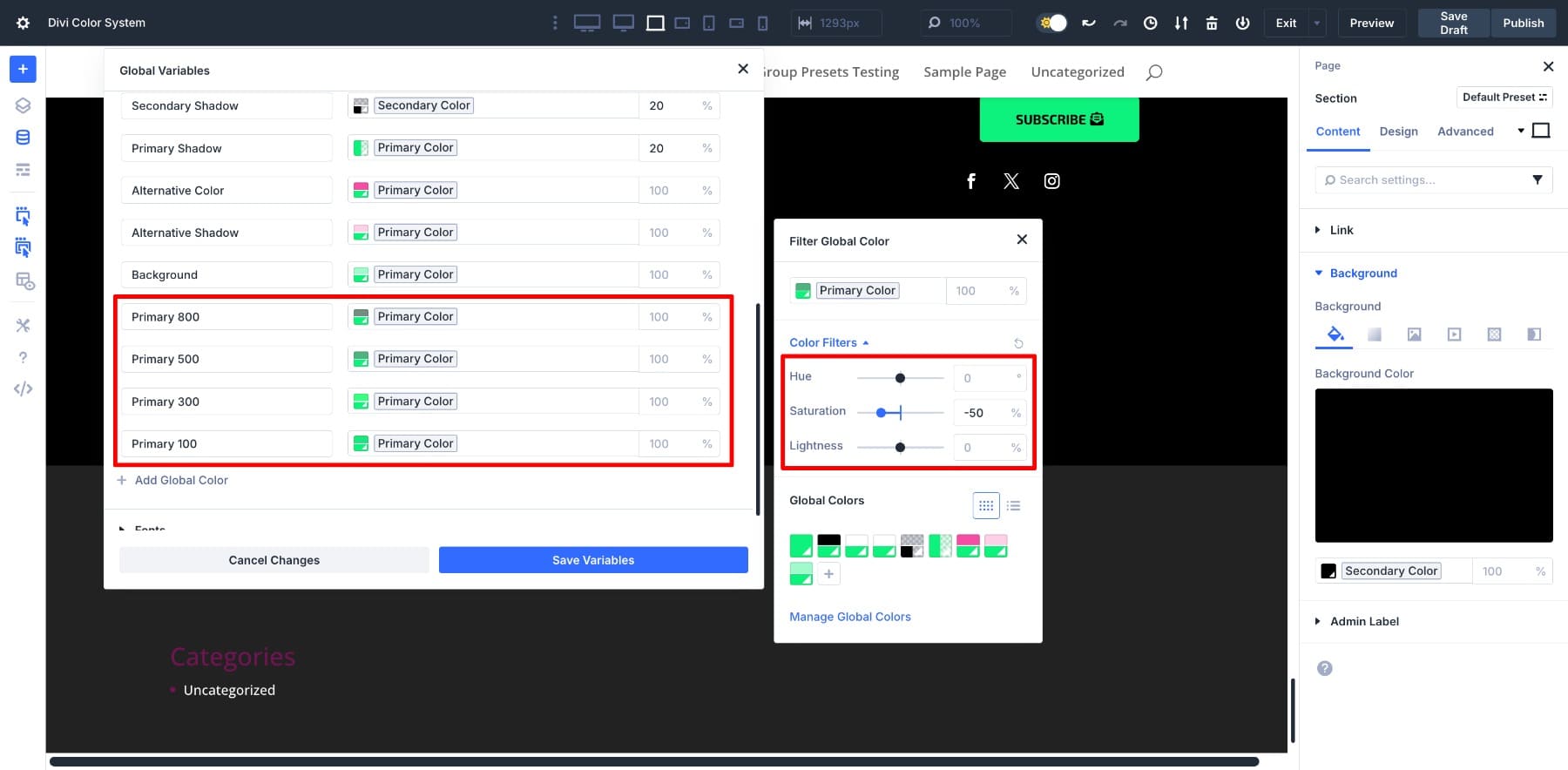
2. Build Supporting Colors Using HSL Adjustments
With your primary and secondary colors in place, the next step is to expand the palette. These supporting colors give your design room to breathe. They add flexibility, subtle contrast, and visual rhythm throughout the layout.
To create these variations, open the HSL panel and adjust the sliders:
- Create lighter shades for sections or backgrounds that need contrast without attracting attention.
- Use slightly darker tones for buttons, hover states, or bold headlines that need to stand out.
- Shift the hue or saturation slightly to form accent colors. This color is great for dividers, icons, or other small visual highlights.
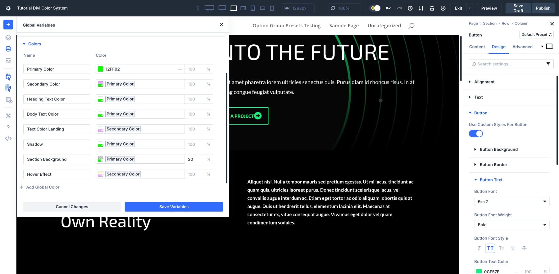
We’ll show you how to do it once, and you can follow the same approach to define all the new colors you want. Let’s say we want to make a hover version of the Secondary Color. We’ll create a new Color Variable, give it a clear name, adjust the sliders to get the tone right, and save it.
Now that the variable is saved, we can apply it to a button’s hover state, like any other color.
As you add supporting colors, try to think of them as tonal expressions of the brand, variations that reflect different levels of emphasis, contrast, or mood. For instance, soft tones work well for backgrounds, bold ones draw attention to calls-to-action, and muted tones are useful for overlays or secondary text.
You could technically create all of these manually using hex codes. And if you’re only building a one-page site, that might be fine. But the moment your client wants to change a core color, every shortcut starts to show its limits. What we mean is, you wouldn’t track how many places you used a background shade on a website. In that scenario, building these variations as connected variables takes a little more time upfront, but once they’re in place, they’ll keep your design consistent no matter how often things change.
3. Replace Existing Static Colors With Variables
With your new color variables saved, it’s time to replace the hardcoded hex values used throughout the layout. This is where moving from static to dynamic starts to make a real difference, not just in consistency, but in how easy it becomes to maintain the design over time.
Start by scanning the layout for any elements still using fixed color values. This might include buttons, headings, backgrounds, icons, or section dividers. Anywhere the brand color was applied manually is now an opportunity to connect it to your new system.
To do that, Divi gives you two options: Extend Attributes and Find And Replace. Both let you update multiple elements quickly, but each shines in a slightly different situation.
- Use Extend Attributes when you’ve already applied the correct variable to one element and want to match the rest.
- Use Find And Replace when you want to swap a specific hex value wherever it appears, even if it’s applied across different elements.
Let’s start with Extend Attributes.
Using Extend Attributes
In this example, we want to assign the new Secondary Color to all H2s in the layout. We’ll start by applying it to just one of them.
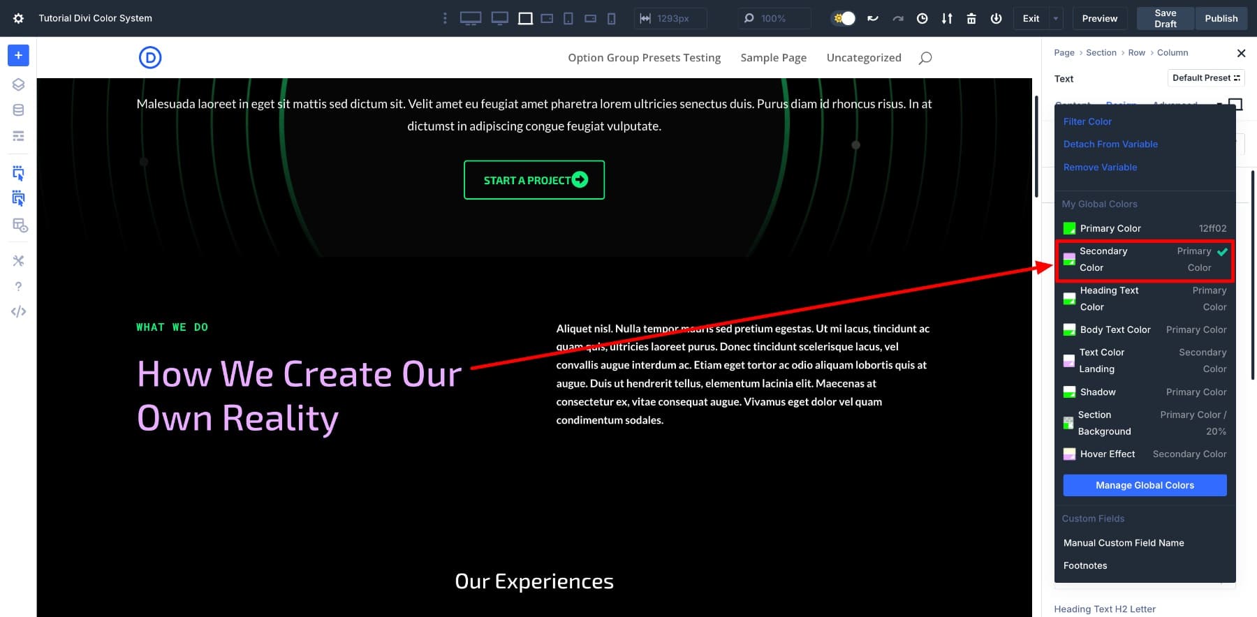
Once that’s done, we’ll right-click the element and select Extend Attributes. In the panel that appears, we’ll set the scope to Entire Page and the Element Type to Text.
With one click, every H2 across the page adopts the same Secondary Color, which will stay in sync because it’s tied to your Primary Color if that base color ever changes.
Using Find And Replace
Now let’s try Find And Replace, which works especially well when you want to swap out a specific color value across the site.
In this case, we want to update the body text color. To do so, we’ll go to Settings > Design > Body Text Color, right-click, and choose Find & Replace. Then, we’ll hover over the Replace Value field and select our new variable.
That’s all it takes. Every instance of that old color is now updated with your new variable.
There’s no single method you have to follow here. Extend Attributes is the faster way to carry that change across similar elements if you’ve already updated one module manually. If you’re still working with static hex codes and want to change them in bulk, Find And Replace will help you move quickly.
Pick whichever approach makes the cleanup easier. Once that’s done, you’ll see the real benefit of this system: how your design responds when you change just one color.
Testing Your New Color Scheme
Everything you’ve done has been about setting up. Now’s when the entire setup starts showing its value.
With your system in place, try changing the Primary Color. The entire layout will respond in seconds — backgrounds, buttons, hover effects, and any other connected elements will update instantly.
Future updates are also easier than ever. Suppose your client wants to shift from neon green to a warmer yellow, which means updating the entire website, every page, and each module manually.
Sounds painful, but not for you. You just update the Primary Color, and the rest of the site follows.
Or maybe it’s Black Friday and they’ve asked for a red-gold-black color scheme. You update the Primary to a gold tone, then tweak the Secondary into a deeper red. The layout adapts instantly, down to the last detail.
In some cases, the brand color might stay the same, but the Secondary needs a refresh. That’s just a matter of adjusting the HSL sliders. No need to touch each button or background individually.
So much of color work is about maintaining balance. You keep variations aligned even when the core color changes. This system gives you a way to control tone, contrast, and emphasis across your design without needing to retrace your steps.
And remember, what we’ve done here is only one page. Because Design Variables are global, this setup extends to your entire site, including headers, footers, blog posts, landing pages, and anything else connected to your palette.
That means every future update, whether a seasonal campaign, brand refresh, or new color direction, starts from a single place. You update a few variables and watch everything match your new color scheme.
Divi Makes Your Color Workflow Future-Proof
It’s not hard to choose a shade of blue. What’s hard is keeping that blue consistent across dozens of modules, layouts, pages, and campaigns, and updating it later without breaking something in the process.
Divi 5 simplifies that completely. With tools like the new Color System, HSL filters, and Design Variables, you can manage your entire visual identity from one place. Knowing that every color, across every layout, will stay consistent and easy to update is what Divi 5 promises.
And that’s just one of many we’ve made over the past few months, including Loop Builder, Flexbox Layout, and a completely reimagined interface for modern web designers. If you haven’t explored them yet, now’s the perfect time.


Leave A Reply