
Post displays keep visitors engaged with your content. They showcase what matters and encourage people to explore further. Static post loops work fine, but sometimes require an extra element to capture attention. That’s where carousels come in; they add movement that actually makes people stop and engage.
In this post, we’ll show you how to combine Divi 5‘s Group Carousel and Loop Builder to build post carousels that capture attention and drive engagement. Let’s get started.
How Post Carousels Beat Static Loops
Static loops get the job done. They display your posts in rows or grids, allowing visitors to scroll through them.
Carousels bring something different to the table. Movement draws the eye. When content slides into view, people pause. They notice. That split second of attention matters more than you might think.
The swiping action creates what some refer to as a micro-commitment. Once someone interacts with the first slide, they’re more likely to keep exploring. You’ve captured their attention.
Dwell time can also increase with carousels. Visitors spend longer looking at multiple slides than they do scanning a static grid. More time on your content means better chances they’ll click, subscribe, or buy.
What Is Divi 5’s Group Carousel
The Group Carousel module turns any content into a sliding display. Each slide functions as a blank canvas, allowing you to add any Divi modules you need and arrange them in a way that makes sense for your design. You’re not locked into any particular layout or content structure.
We built the controls to stay out of your way. Set the number of slides that appear at once, adjust the speed of their transition, and choose whether visitors swipe through manually or let it autoplay. Standard carousel behavior, but the content inside stays completely flexible.
Each slide is connected to Divi’s design settings, allowing you to style backgrounds, adjust spacing, add borders, and apply shadows. You’re building regular Divi layouts that happen to slide horizontally instead of stacking vertically. The motion adds interest without limiting what you can create inside each frame.
Divi 5’s Loop Builder: A Quick Overview
A loop displays the same structure multiple times with different content filling it. Your blog page displays this layout when it lists several posts, each featuring a title, a featured image, and an excerpt in the same format. The Loop Builder automates this repetition by pulling data from your site and populating your design template repeatedly.
Loop Builder brings this concept to Divi. Instead of building ten product cards manually, you design one template and let the Loop Builder fill it with actual products from your database. Same structure, different content in each repetition.
You control what appears through the query settings. Show blog posts from specific categories. Display WooCommerce products under a certain price. List team members with particular roles. Filter by custom fields if you’re using ACF.
The flexibility comes from working inside the Visual Builder with full design control. No preset layouts forcing you into rigid structures. Build what you need, then populate it with real content through looping.
Building A Loop Carousel In Divi 5
We’ve looked at each tool separately. Now they need to work together. In the following steps, we will set up the system once, and your posts will populate automatically as you publish new content:
Add A Group Carousel Module
Open the Visual Builder. Click the plus icon to insert a row, then select the Group Carousel module.
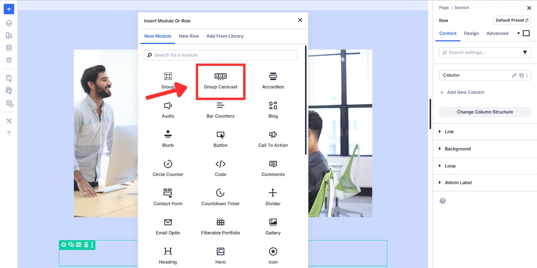
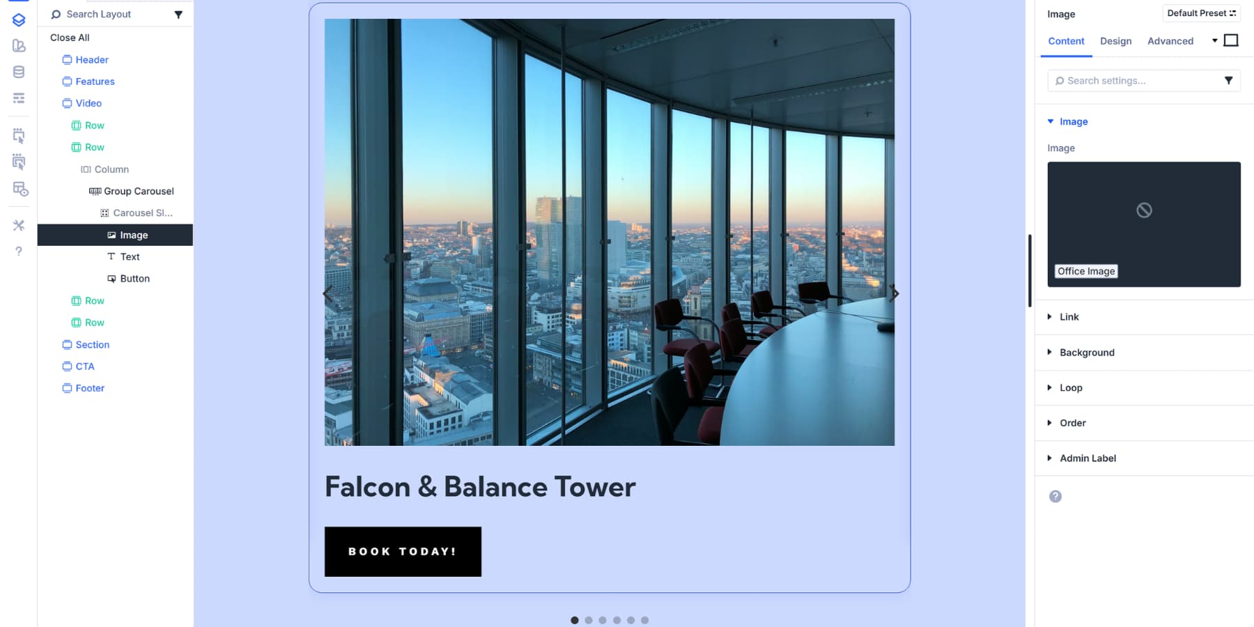
After it drops into your row with one empty group container, this single group becomes your template slide. Click the plus icon in the center to add modules, such as headings, images, or text blocks.
That’s it. The module is now on your page and ready for content. The empty group container is waiting for you to fill it with modules in the next step. Before moving on, you can add titles, subheadings, and other elements outside the container if needed.
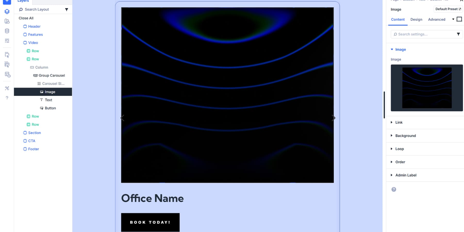
Design An Example Loop
Building a sample loop first gives you something concrete to work with before connecting dynamic data. We’ll design one slide with all the modules, spacing, placeholder content, and styling exactly how we want it.
Add modules, such as headings, text blocks, and images, to the first carousel slide. Style it with borders, padding, and colors that match your brand using Design Variables. The example loop doesn’t have to be perfect; it should simply provide a realistic preview of how things would look.
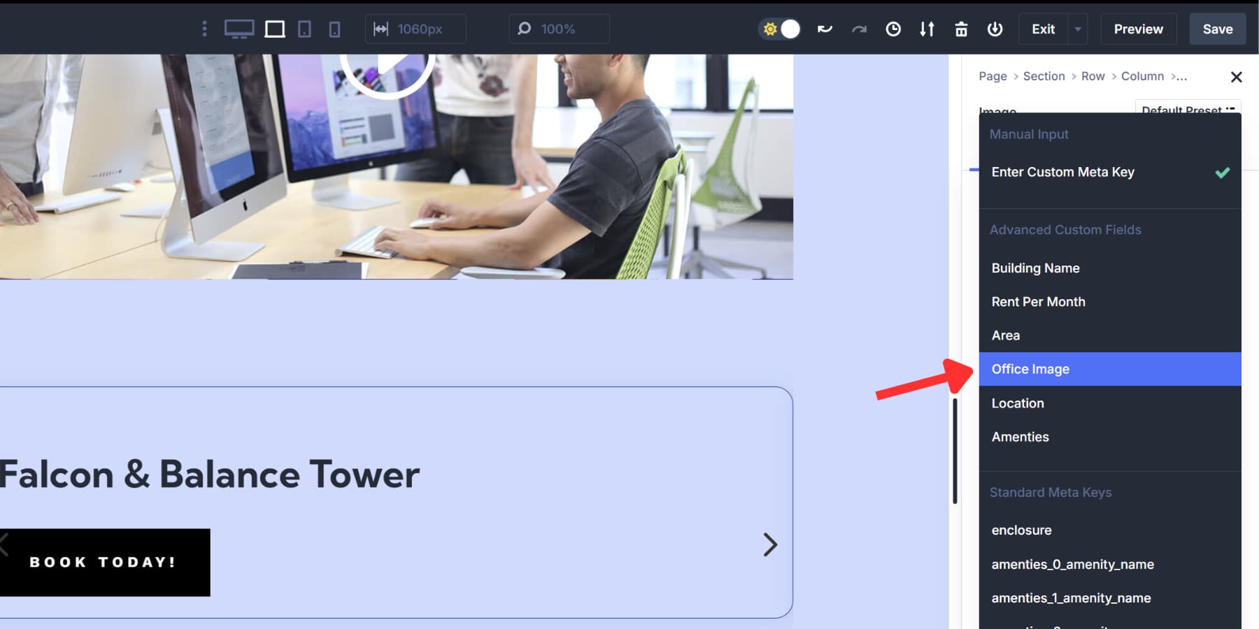
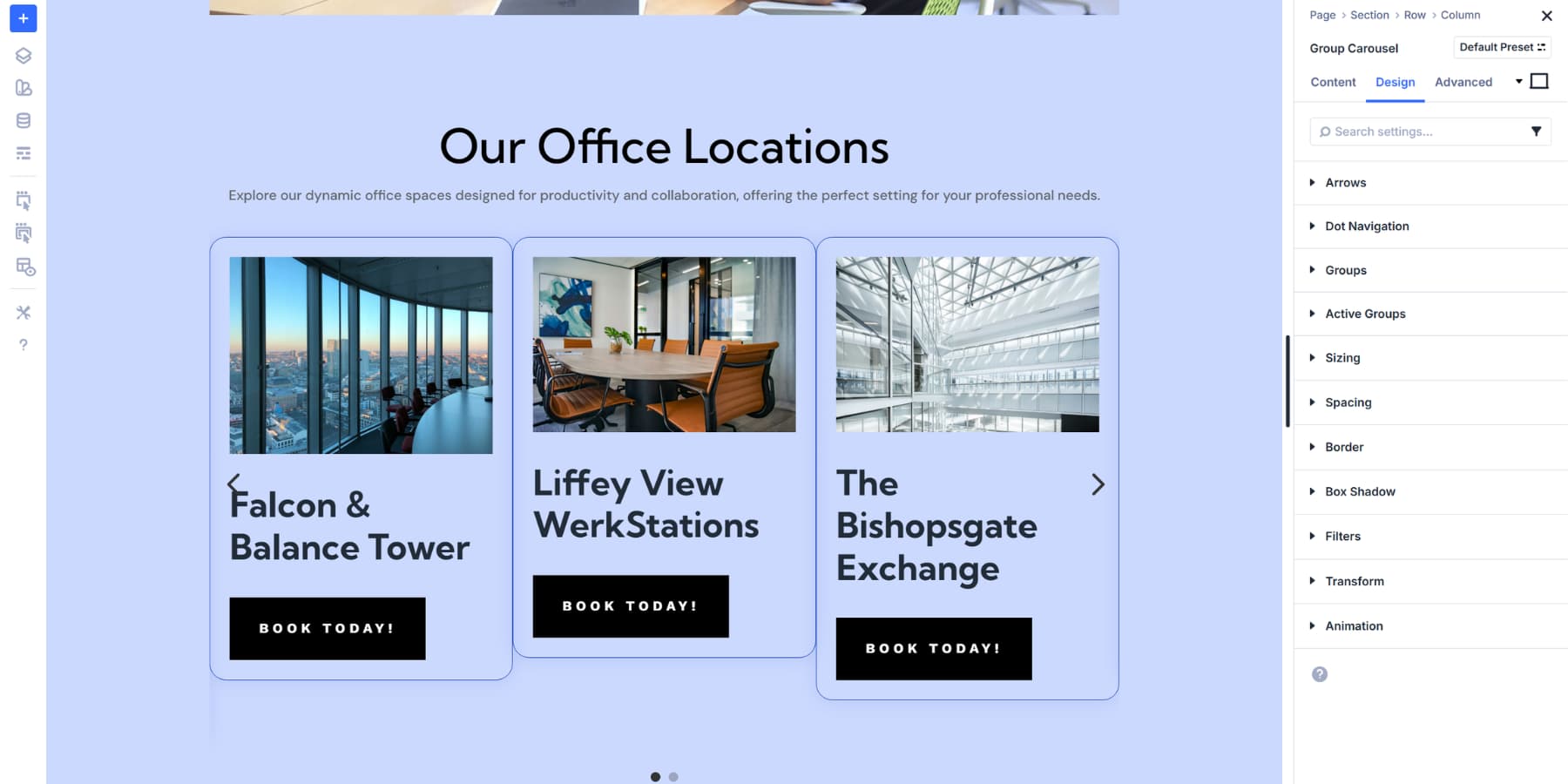
For this tutorial, we’re using Office Locations as our post type.
However, this exact process applies to anything. Portfolio pieces. Team members. Product showcases. Blog posts. Customer testimonials. The structure stays the same. Only the content type changes. Divi 5’s Loop Builder supports all dynamic content from tools such as ACF, Toolset, WooCommerce, and others.
You only need to create and style a single group inside the carousel. Once you enable looping on that group, Divi automatically duplicates it for every post in your database. That one styled slide becomes the template for everything. Once that single slide looks good, enabling the loop takes seconds. Your carousel fills itself with real content.
Enable Looping And Populate With Actual Data
Click the group settings to open the module panel. Look for the Loop Element toggle near the top and turn it on. The panel expands to show query settings.
Set Query Type to Post Type, then select your content source under Post Type. There are many more options available that you can use to customize the output completely. We go over these options in this post.
Connect your modules to real data. Click into each module you added earlier and find the Dynamic Content icon.
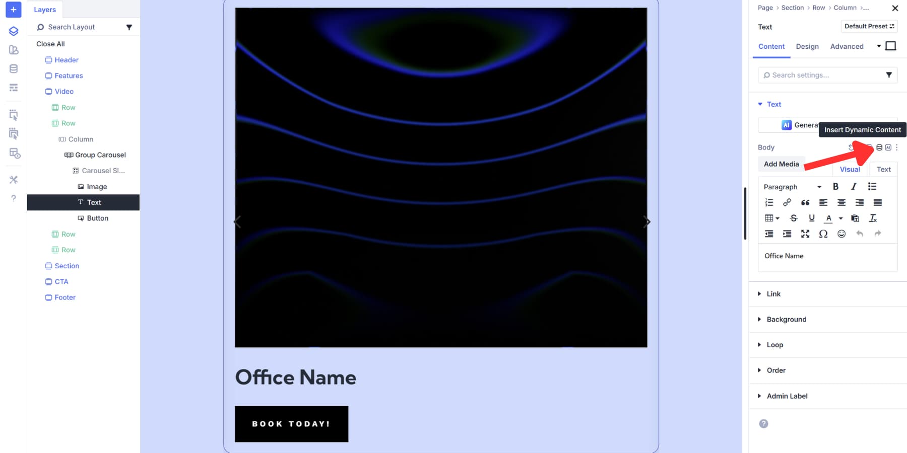
For the heading, select Loop Post Title. Text modules can also pull Loop Excerpt or Loop Author, depending on what you need.
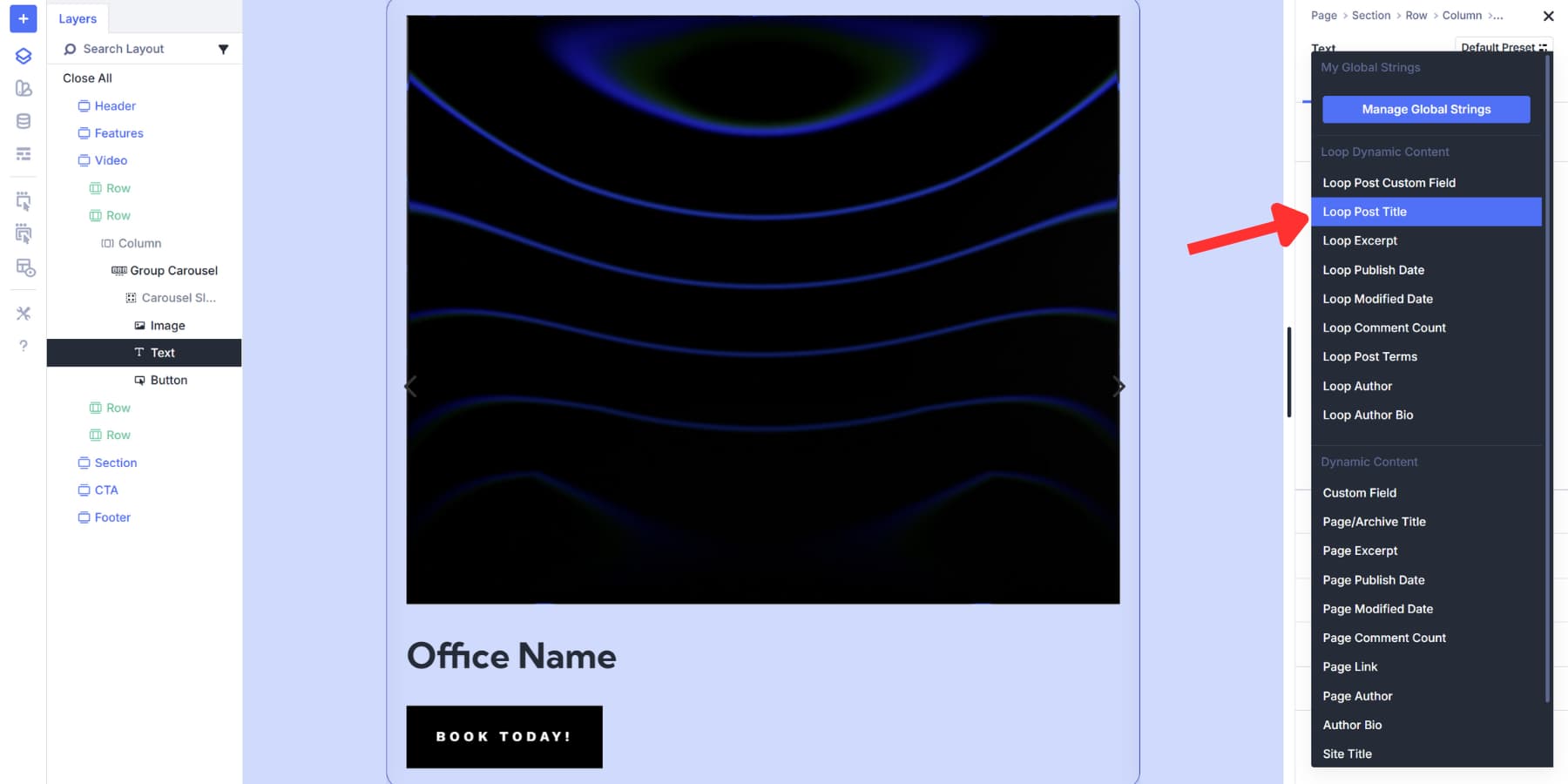
For images, choose Loop Featured Image and pick your preferred thumbnail size. You can also connect every module to your ACF fields, if required.
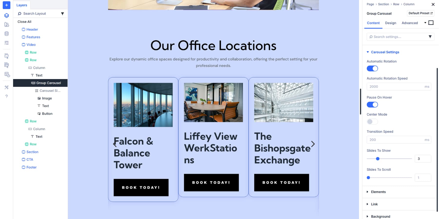
Your single-style slide multiplies across the carousel. Each one now displays different content pulled straight from your database. The structure you built becomes the template, filling itself with actual posts automatically.
Style Your Group Carousel
Now your carousel displays real content. The styling controls at the carousel level allow you to apply designs to every group simultaneously.
Under Carousel Settings in the Content tab, you can control how slides transition. Enable Automatic Rotation to make slides advance without user input. The rotation speed can be set in milliseconds to determine how long each slide displays.
You can stop automatic rotation when visitors move their cursor over the carousel by enabling ‘Pause On Hover’, giving them control to read the content at their own pace. Turn it off if you want continuous movement regardless of interaction.
Enable Center Mode to keep the active slide centered with partial views of adjacent slides. Transition Speed controls how quickly slides move during changes. Lower values for snappy transitions or higher values for smooth, gradual movements. Balance this with your rotation speed for the best flow.
Slides To Show determines how many groups appear simultaneously; you can set it to 1 for a traditional slider, or increase it to 3, 5, or more to display multiple slides side by side. And Slides To Scroll determines how many slides to scroll automatically or when visitors click on the next arrow.
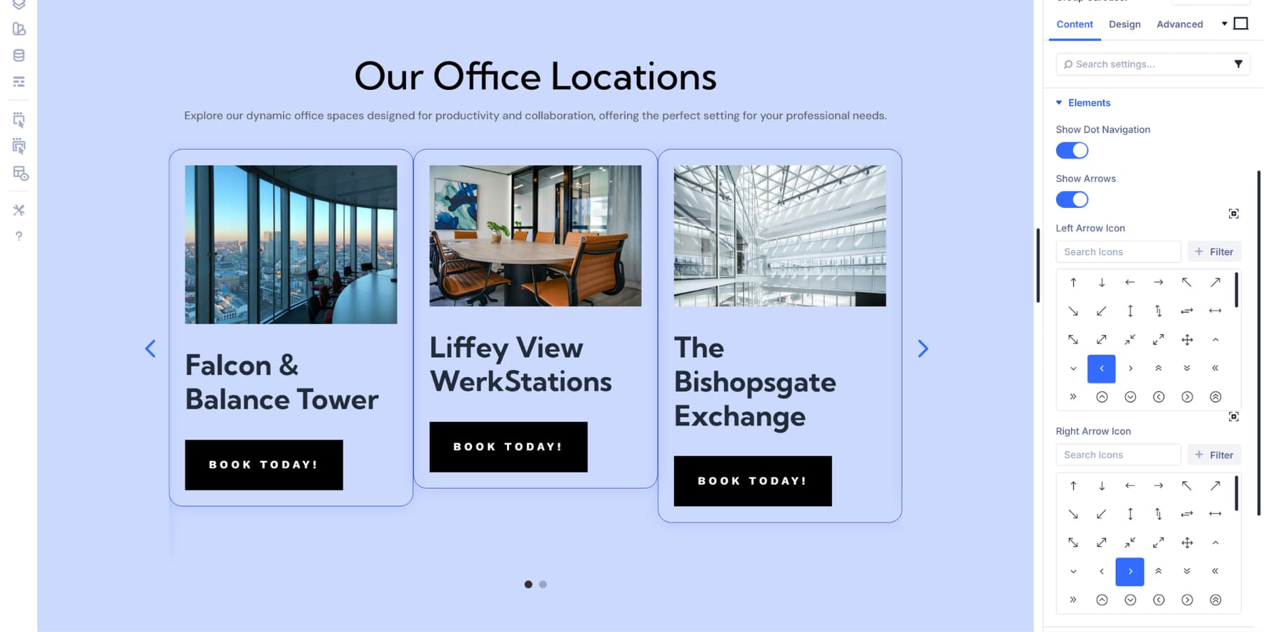
Meanwhile, the Elements dropdown controls how visitors move through your carousel. Turn on Show Dot Navigation to add clickable dots below your carousel. People can click these dots to jump straight to any slide they want. You can also replace the navigation arrows from here if needed.
Beyond these basic settings, you can also style the overall carousel by switching to the Design tab.
Let’s go over the options available to you:
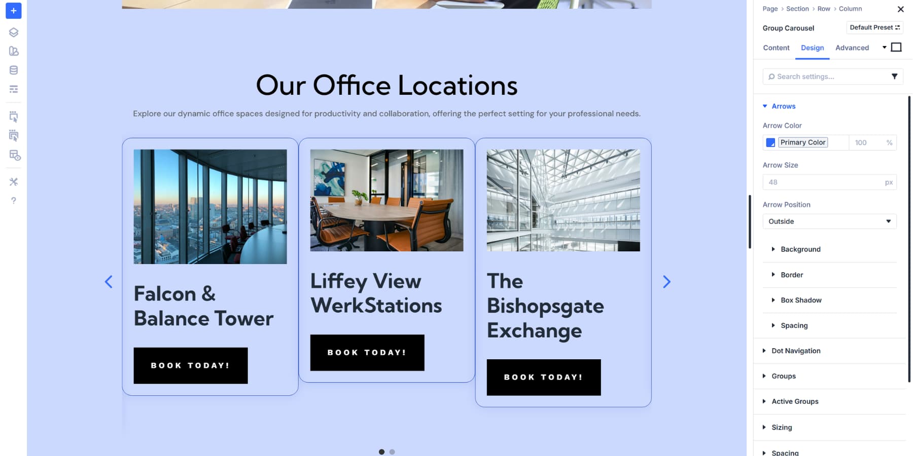
Arrows And Dot Navigation
The Arrows Tab lets you customize the arrows that appear on the carousel. You can change the colors, put arrows inside or outside the container, and adjust their sizing to fit your layout. You can also use background colors, borders, shadows, and spacing as needed.
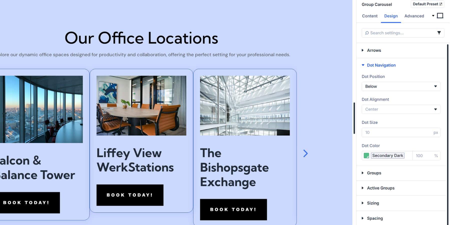
The Dot Navigation section lets you style the dots. Change their color and size as needed. You can also position them above or below your content.
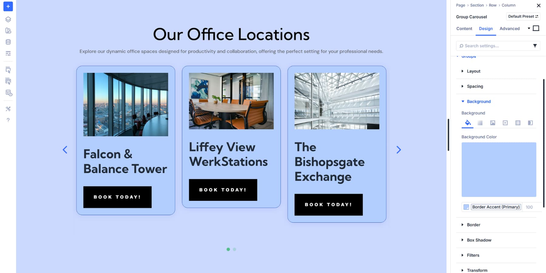
Groups Styling Options
The Groups dropdown controls how inactive slides appear. These slides sit beside your active slide but aren’t currently in focus. You can expand the Groups section to see all available design settings. We’ll be going over a few key options:
Spacing helps you space out your loop items so it looks cleaner. As you may have noticed in the screenshots, every group/loop item appears a little squished together; this is because we haven’t configured the spacing yet.
Under Background, you can add colors, gradients, or images that sit behind your slide content. Toggle on ‘Place Gradient Above Background Image’ to layer the gradient over your background images.
There are also many more options available to customize your group even further, including Box Shadows, Borders, Filters, and Transform, among others.
Active Groups Styling Options
Active Groups styling applies only to the currently focused slide, helping visitors identify the content they are viewing. You can expand the Active Groups dropdown to access the identical design options as the main Groups section.
All other design settings function identically to Groups styling. You can use Borders, box shadows, transforms, and spacing options. Separating active and inactive styling creates a clear visual hierarchy without requiring manual edits to individual groups.
Then there are similar settings, such as Box Shadows, Borders, Filters, and Transform, among others, which are general design settings that apply to the Group Carousel module itself, rather than individual groups.
Adjust For Responsiveness
Your carousel looks great on desktop. Now we’ll set it up for tablets and phones.
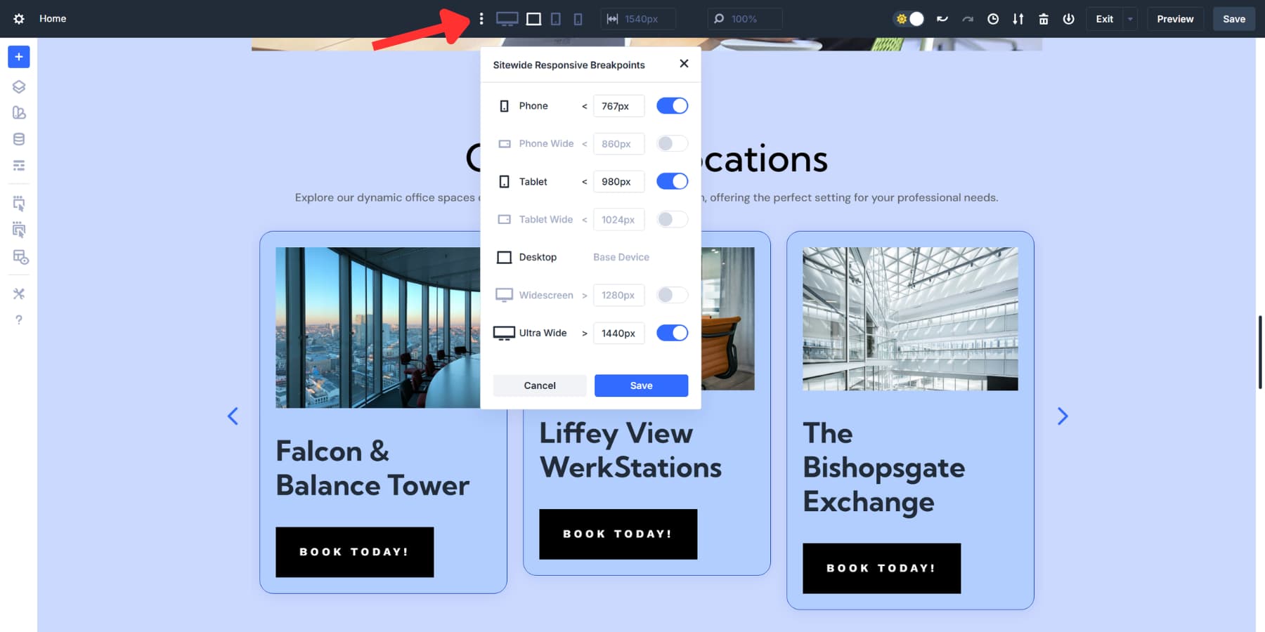
Click the three dots at the top of the Visual Builder to open the Sitewide Responsive Breakpoints panel. Divi 5 gives you seven breakpoints that you can enable and customize. Turn on Phone Wide for landscape viewing or Tablet Wide for larger tablets. Enable the necessary options and click Save.
Divi 5’s Responsive Editor allows you to adjust settings across all screen sizes without needing to switch back and forth. Look for the responsive editor icon next to any setting. Click it to adjust values for desktop, tablet, and mobile all at once.
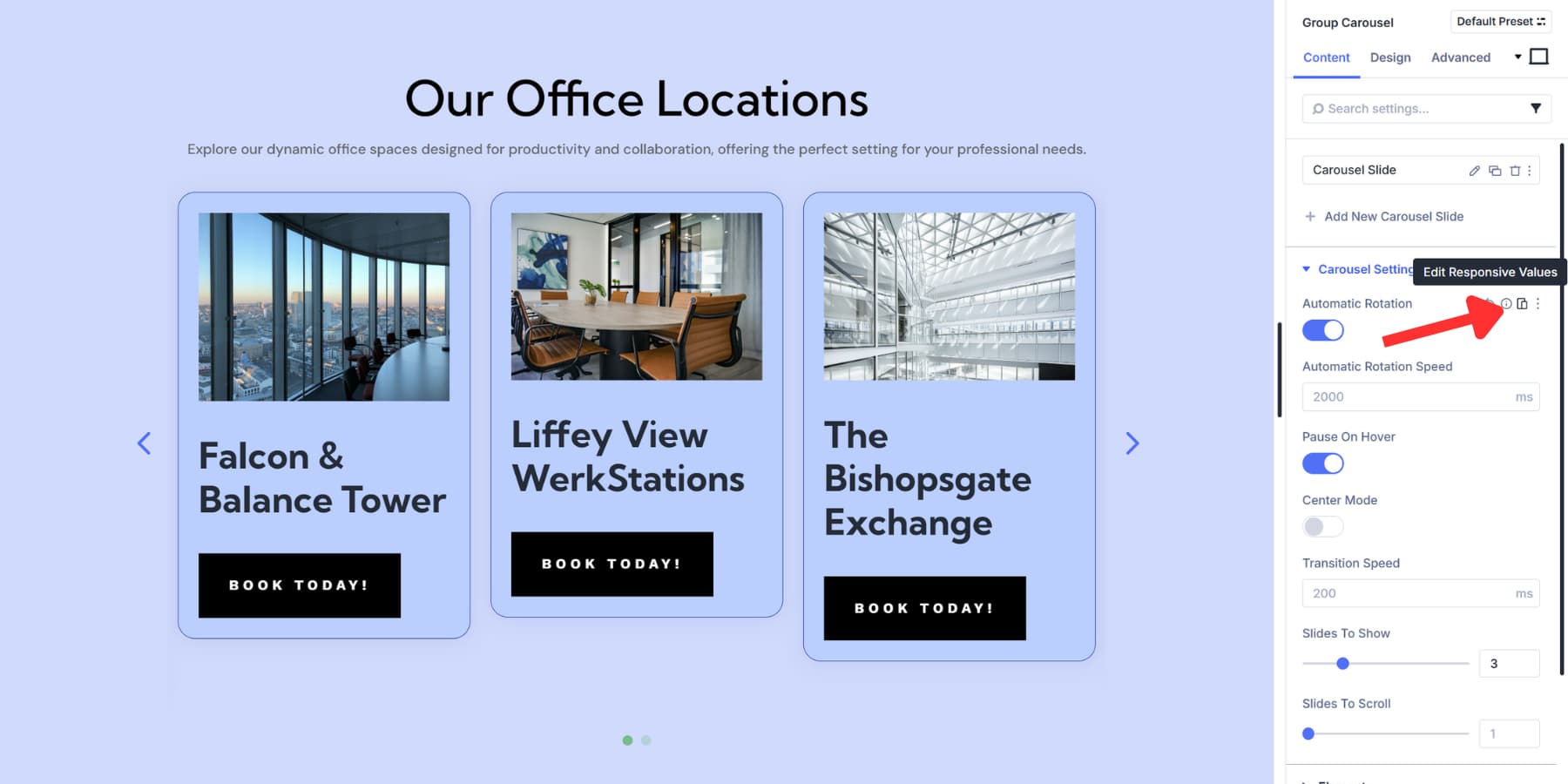
The icon turns blue when a setting uses different values at other breakpoints. This helps you spot your changes quickly. Change Slides to Show to 2 or 1 for tablets. This setting is automatically carried down to Phone Wide and Phone, unless you specifically edit it.
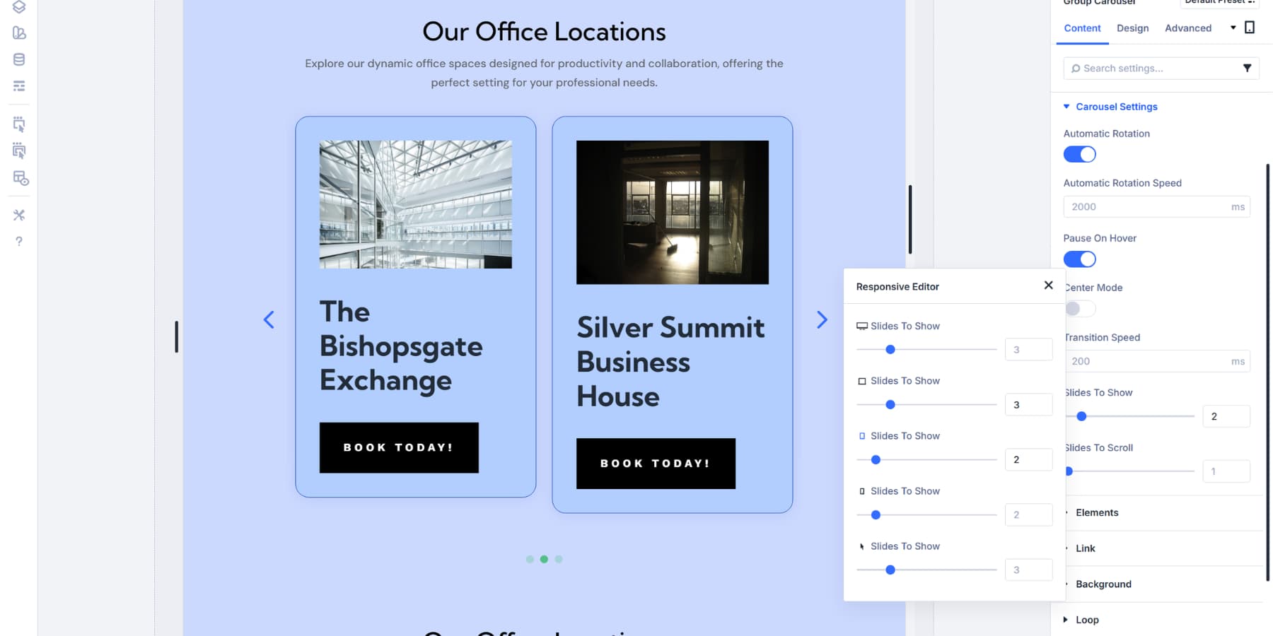
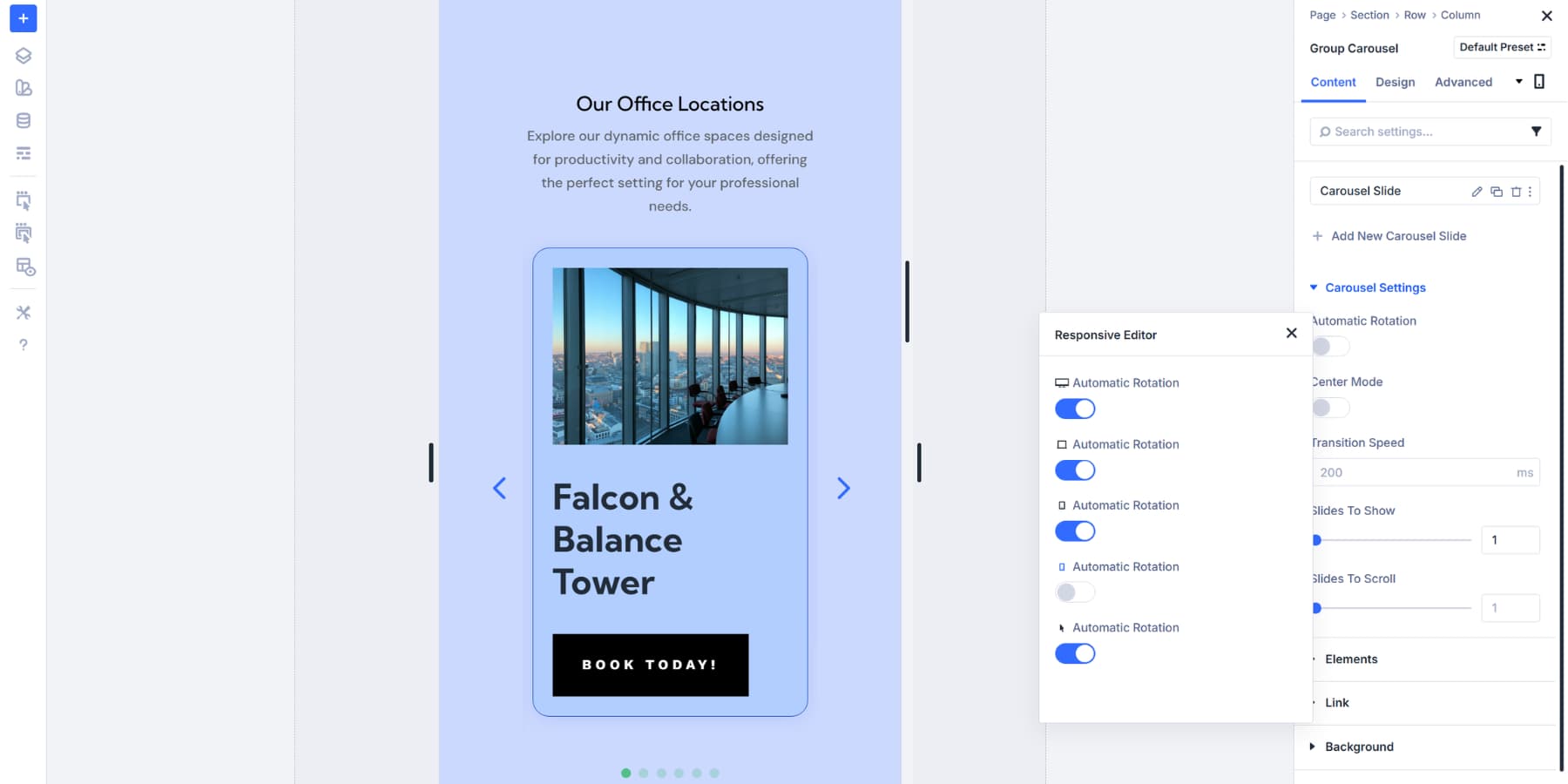
One slide at a time works best on mobile. People can swipe through without feeling crowded, so enter just 1 for the mobile breakpoint. Consider turning off Automatic Rotation on mobile, too. Most folks prefer manual control on phones. The smaller screen makes autoplay feel jarring.
Test your transition speed at each breakpoint to ensure optimal performance. What feels smooth on a desktop can seem sluggish on mobile, where people expect snappier interactions.
Try The Loop Builder & Group Carousel Module In Divi 5 Today
The Group Carousel and Loop Builder working together open up possibilities across your entire site. Portfolio galleries that update themselves. Product showcases that fill as inventory changes. Team members display growth within your company.
Your posts slide into view automatically, content stays fresh without extra work, and visitors actually interact instead of scrolling past. Movement beats static displays when you’re fighting for attention online. These tools are available in Divi 5 today. Time to see what you can build.


and where is the downloadable layout file??
We didn’t mention that there was one with this post. However, we have 16 loops that you can download.
This specific tutorial is designed to show you how to build using the Group Carousel and the Loop Builder from scratch so you can fully master the new capabilties. While this particular post doesn’t include a downloadable JSON file, we do have a dedicated “5 Carousel Designs For Divi 5” blog post that offers free layout exports you can import directly into your Divi Library. Hope this helps! 😊