
For years, Divi users relied on a block-based layout system that worked well at the time, but as WordPress page builders have evolved, limitations have emerged. Columns stacked predictably in rows, mobile reordering required duplicate sections or custom CSS, and achieving perfect vertical centering felt like a battle.
Divi 5 changed everything by making Flexbox the default layout engine. With the recent release of Divi 5 Public Beta, this new system is no longer experimental. It’s stable and ready for real-world projects.
In this post, we’ll guide you through converting a Divi starter site to Flexbox in Divi 5. You’ll learn exactly where to click and what settings to change without writing a single line of CSS.
Let’s get started.
Understanding Block-Based vs Flexbox Layouts In Divi
In Divi 4, every layout is built on a traditional block model powered by floats and inline-block elements. You drop a Row and place Modules inside the Columns. Everything stacks vertically by default, and horizontal arrangements are enforced by floating the Columns.
This system is predictable and familiar, but it comes with a few pain points:
- Changing the order of elements on mobile usually means duplicating entire sections and hiding/showing them per device.
- Perfect centering often needs absolute positioning or CSS tricks.
- Specialty sections were originally created to allow for sections with varying row structures.
- The more complex the design, the heavier the generated CSS becomes.
If you’ve ever spent an hour tweaking negative margins just to make a hero section look right on tablets, you’ve felt the limitations of the block model.
The New Way: Divi 5’s Native Flexbox Engine
Divi 5 replaces the old system with real CSS Flexbox at its core. As soon as you switch a Row or Section to Flex mode, it becomes a Flex container, and every Module or Column inside it automatically becomes a flex item.
These controls live directly in the Visual Builder under Design → Layout and are fully responsive. Simply change them once per breakpoint, and you’re done.
Key Flexbox concepts you’ll use every day in Divi 5 include:
- Horizontal And Vertical Gap: Used to control the spacing between flex items horizontally or vertically.
- Layout Direction: Row (horizontal) or Column (vertical).
- Justify Content: Controls horizontal distribution (flex-start, center, space-between, space-around, and space-evenly)
- Align Items: Controls vertical alignment of all items.
- Layout Wrapping: Items automatically flow to new lines when they run out of space.
- Display Order: Change how columns stack on mobile devices.
The Real Benefits Of Flexbox
Switching to Flexbox in Divi 5 delivers far more than just a fresh set of controls. It fundamentally transforms how you build websites with Divi. You’ll create fully responsive designs using fewer sections and almost no custom CSS, while page speeds improve. Thanks to much leaner, cleaner stylesheets, Divi 5 gives users a dramatic speed boost.
You no longer have to duplicate rows or add custom CSS to change the order of columns on mobile devices. Layouts become simpler, easier to maintain, and infinitely more logical.
Additionally, Flexbox integrates seamlessly with Divi 5’s latest capabilities, including Nested Rows, CSS Grid, and Loop Builder, providing a modern, future-proof foundation that makes complex designs easier than ever before.
Flexbox isn’t just an upgrade. It’s the foundation that makes everything else in Divi 5 feel effortless. Once you experience it, going back to the old system feels counterintuitive.
Preparing For The Transition
Before you start flipping rows to Flex, get your environment ready. The process is straightforward, especially with the Divi 5 Public Beta.
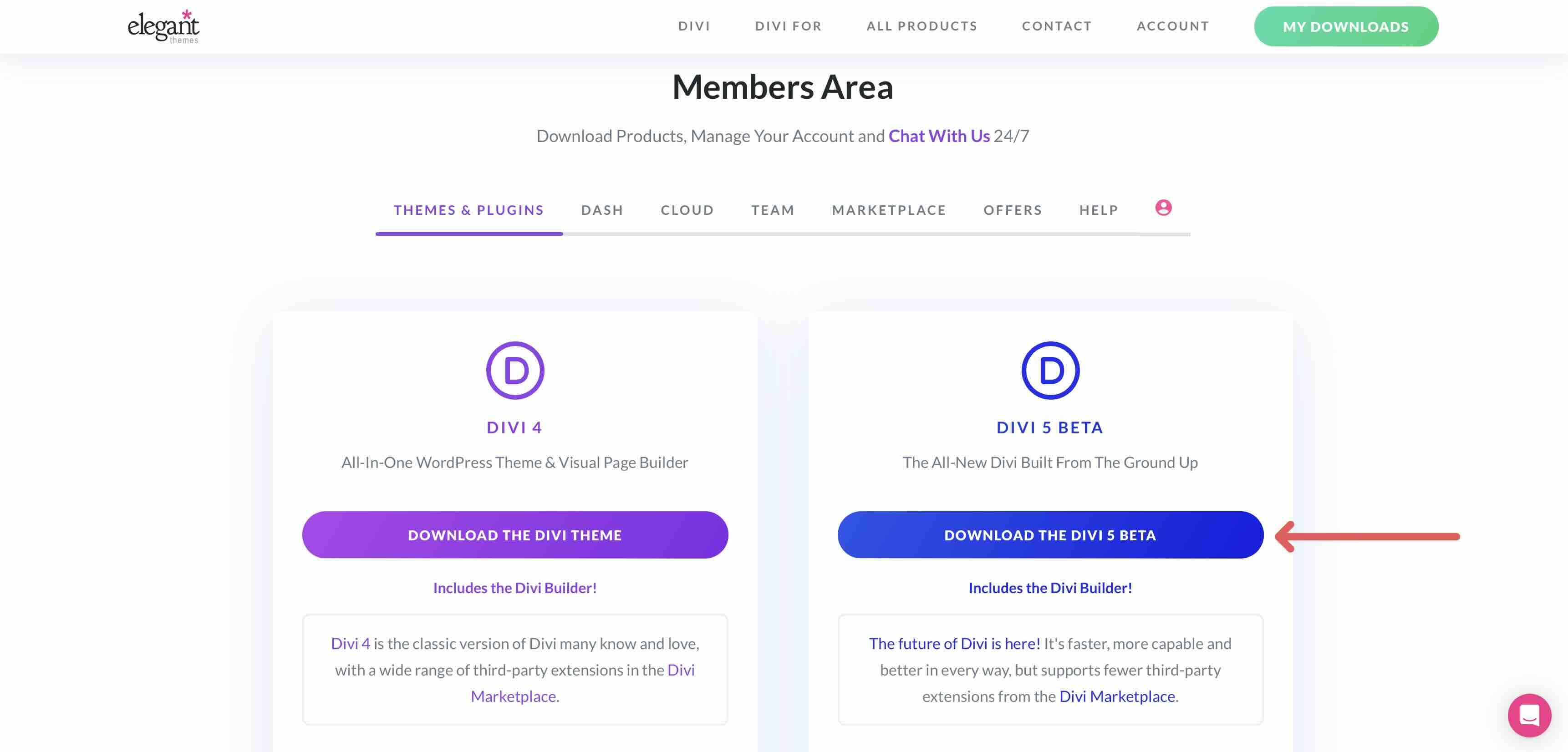
1. Install the Divi 5 Public Beta
Log in to your Elegant Themes account and go to the Members Area. Once logged in, click Download The Divi 5 Beta to download the latest version of Divi 5.
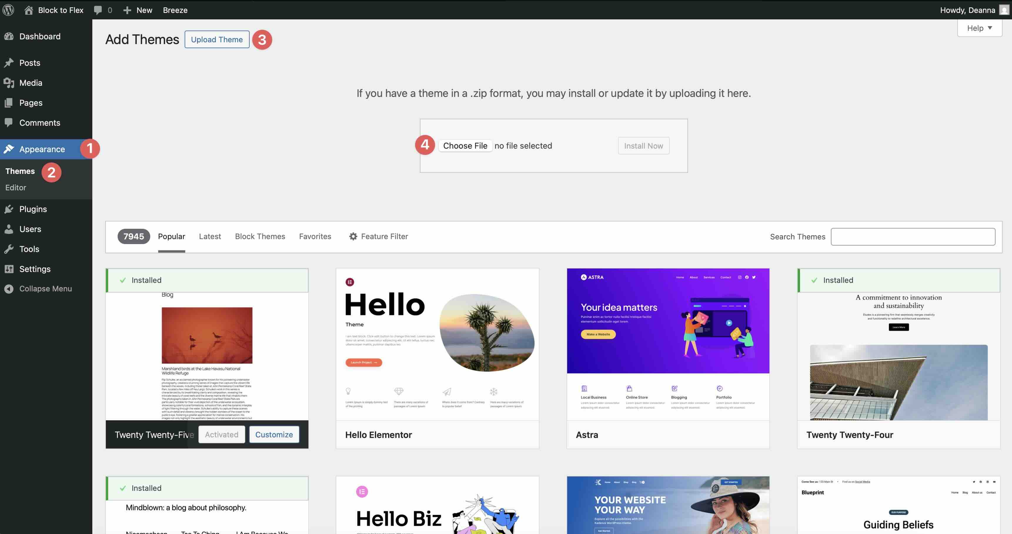
In the WordPress dashboard, go to Appearance → Themes → Add Theme → Upload Theme, select the Divi zip file, and install it.
Once installed, you’ll be prompted to log in to your Elegant Themes account to activate your license.
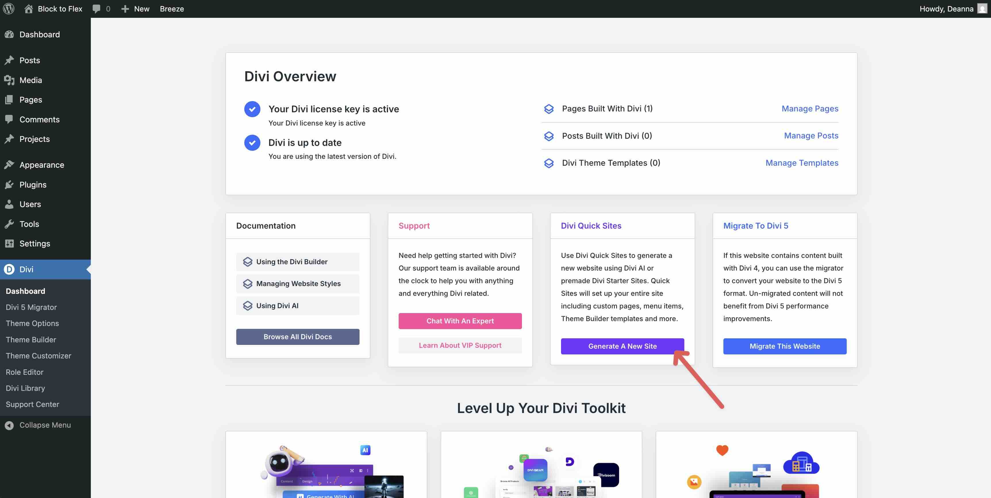
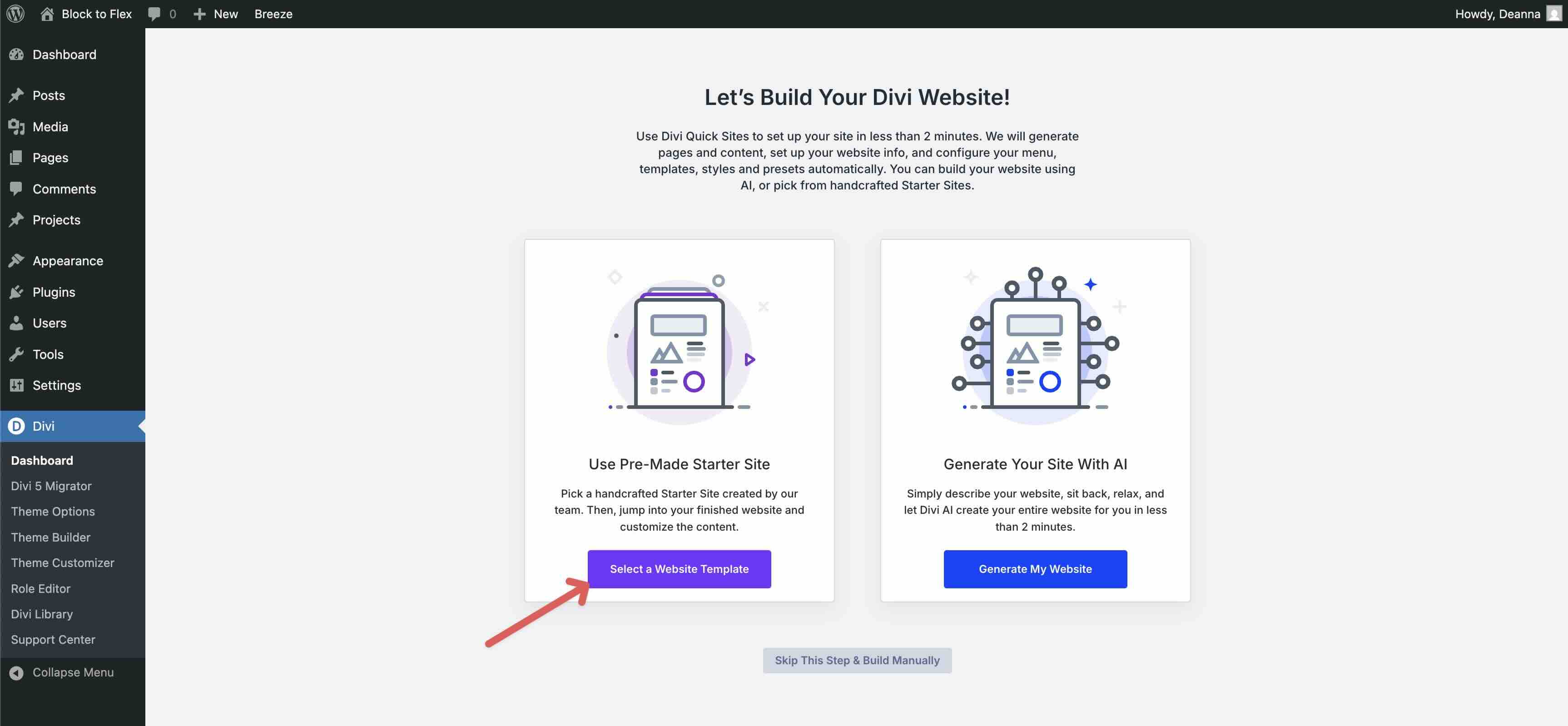
2. Install a Starter Site
In the Divi Dashboard under Divi Quick Sites, click the Generate A New Site button.
On the next screen, choose Select A Website Template.
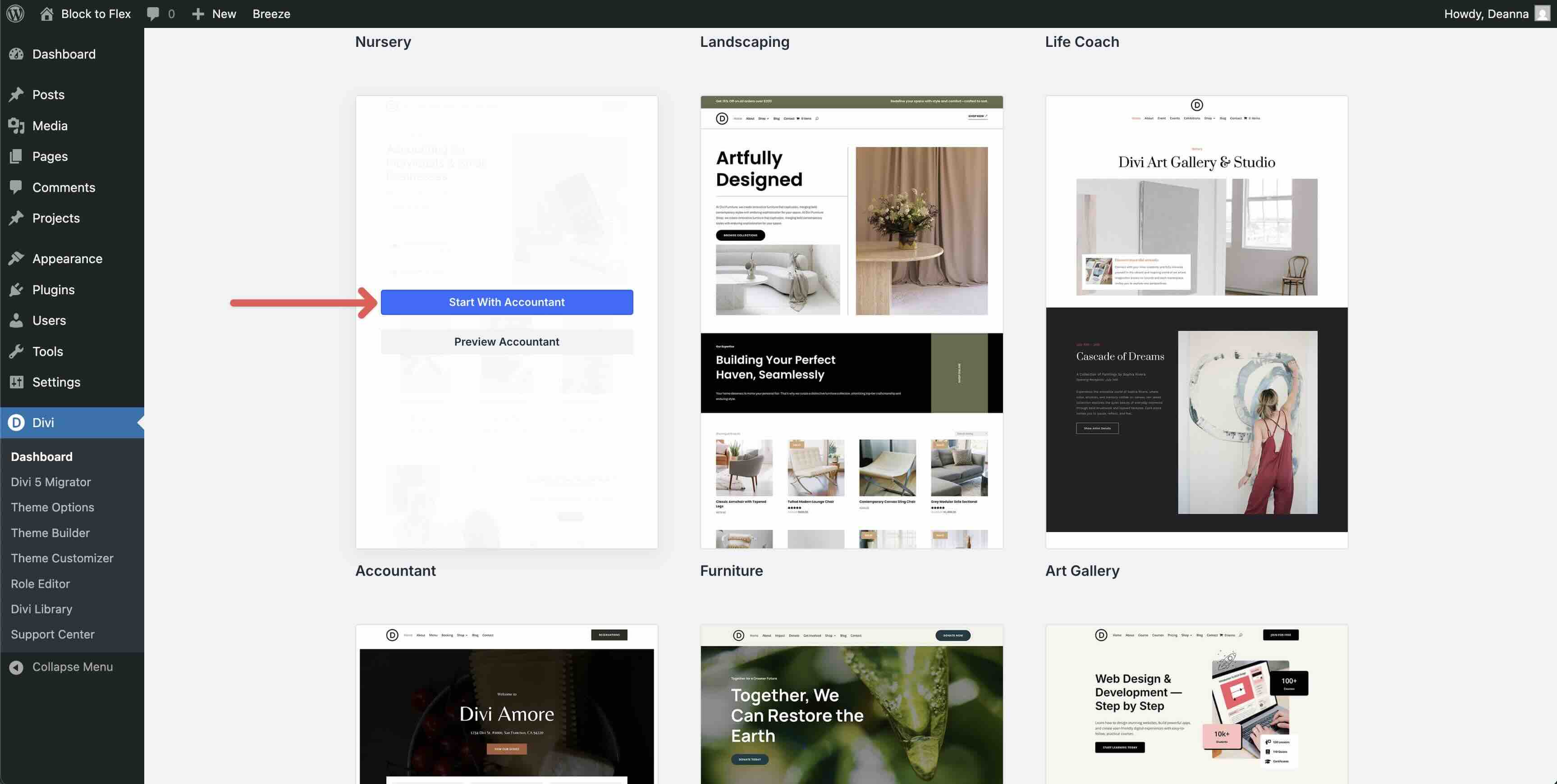
Browse the available templates. For this tutorial, we’ll go with the Accountant Starter Site for Divi. Hover over the thumbnail and select Start With Accountant.
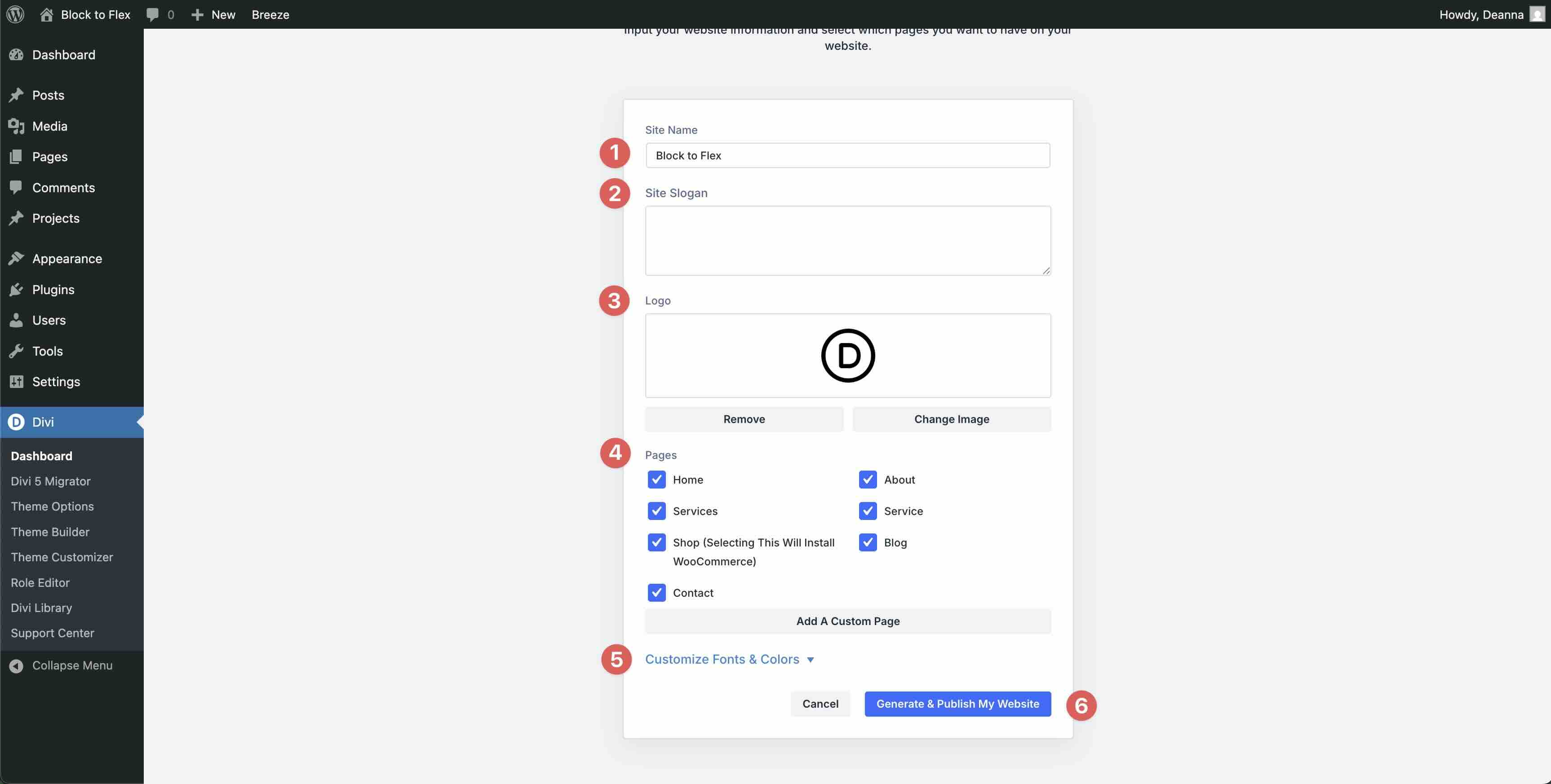
On the next screen, configure the site details by entering your site’s name, adding a logo, and selecting the pages you’d like to install. You can also customize fonts and colors by expanding the Customize Fonts & Colors dropdown. Once all selections are made, click Generate & Publish My Website.
Divi will go through the process of creating a menu and pages. The entire process takes up to two minutes.
3. Quick Flexbox Tour in Divi 5
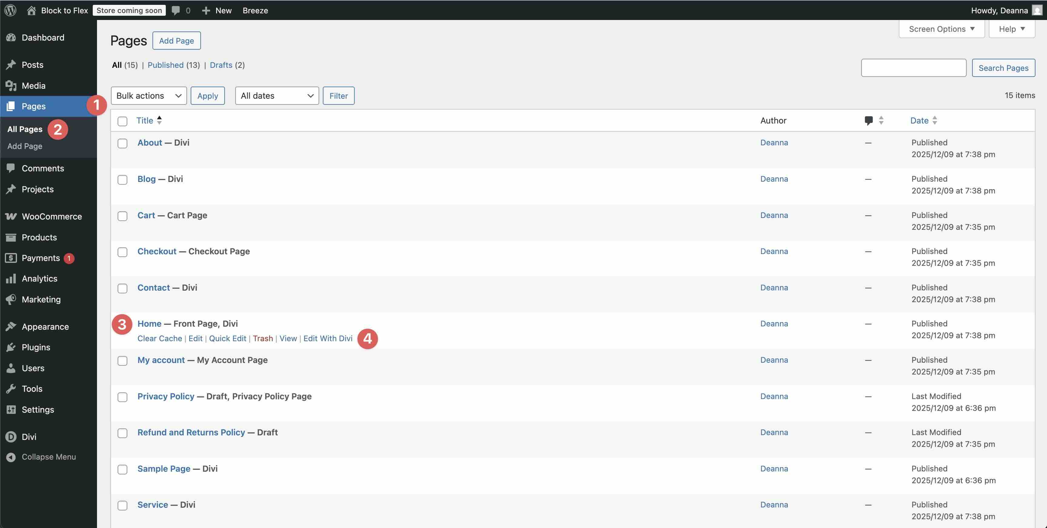
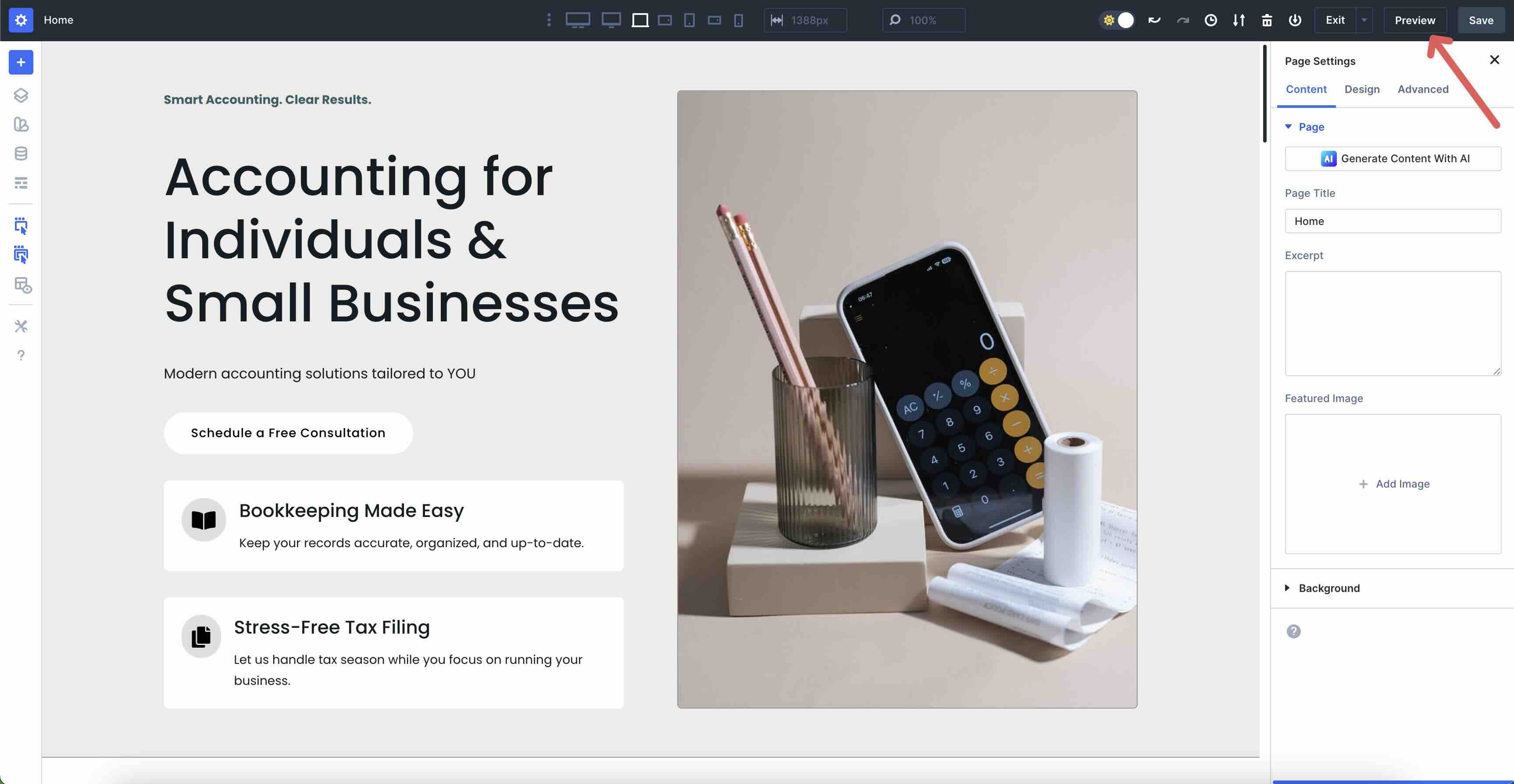
Once your site is installed, go to Pages → All Pages. Select the Home Page and click Edit With Divi.
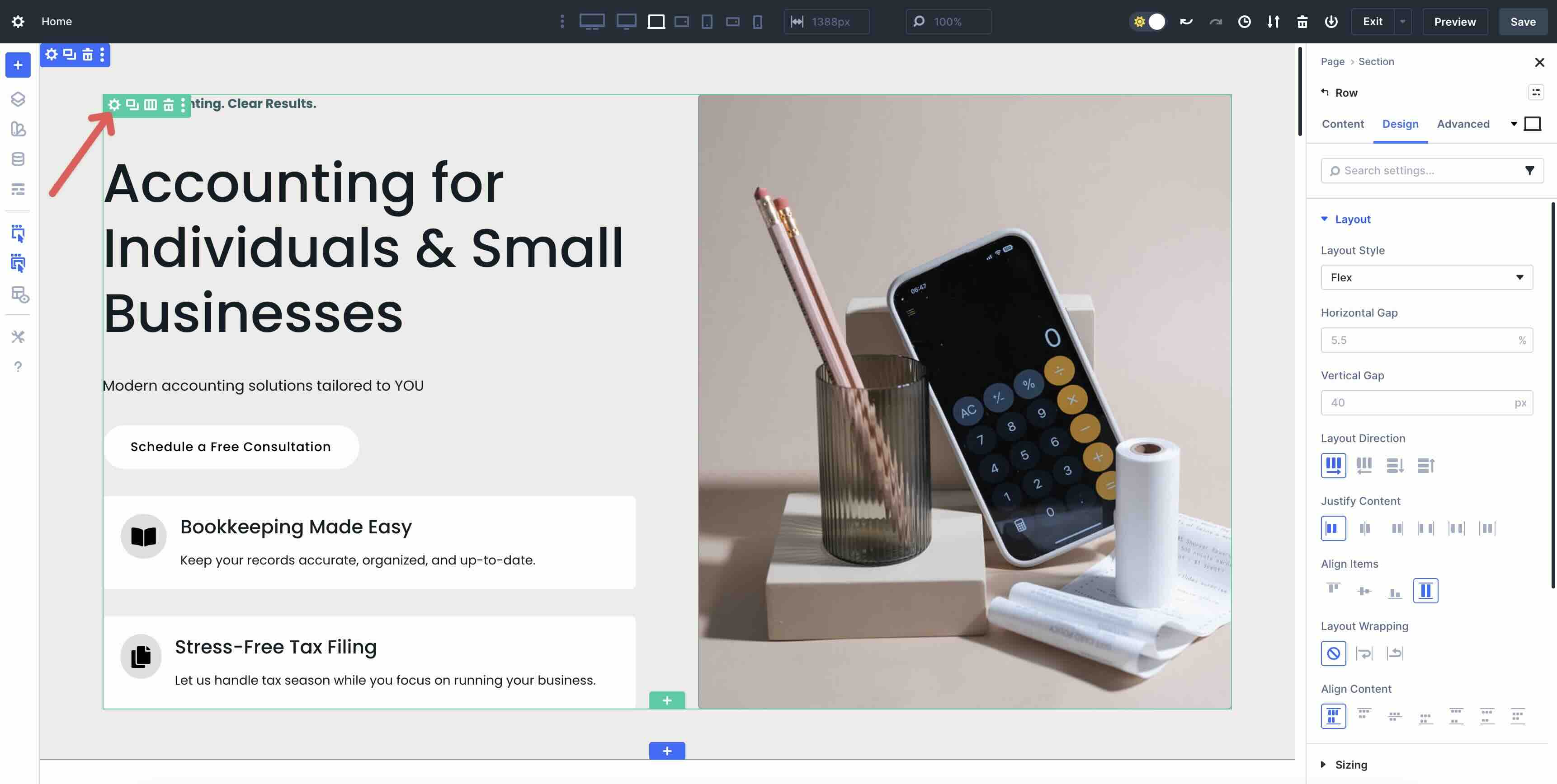
When the Visual Builder loads the page, click the first section to bring up its settings.
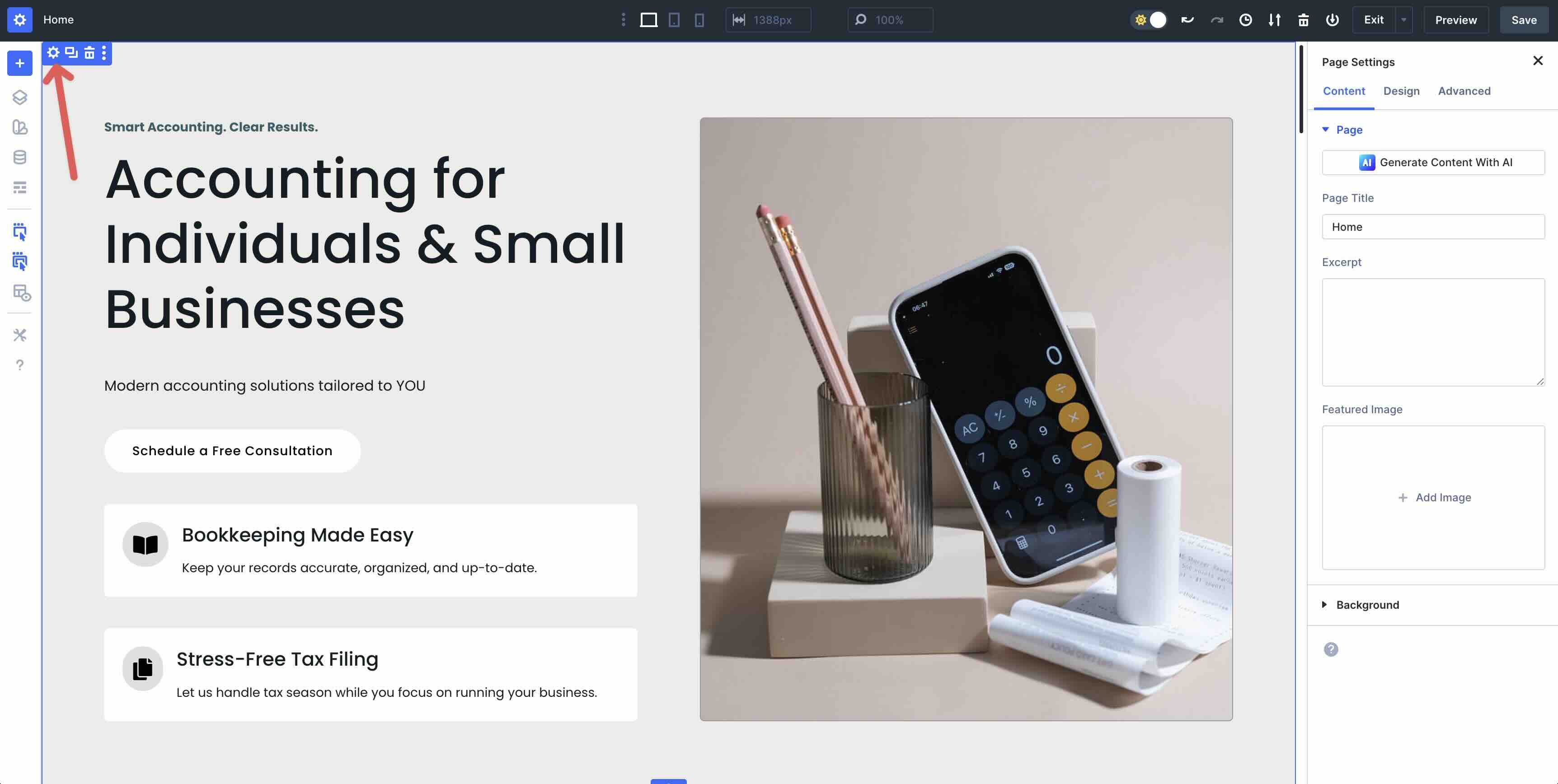
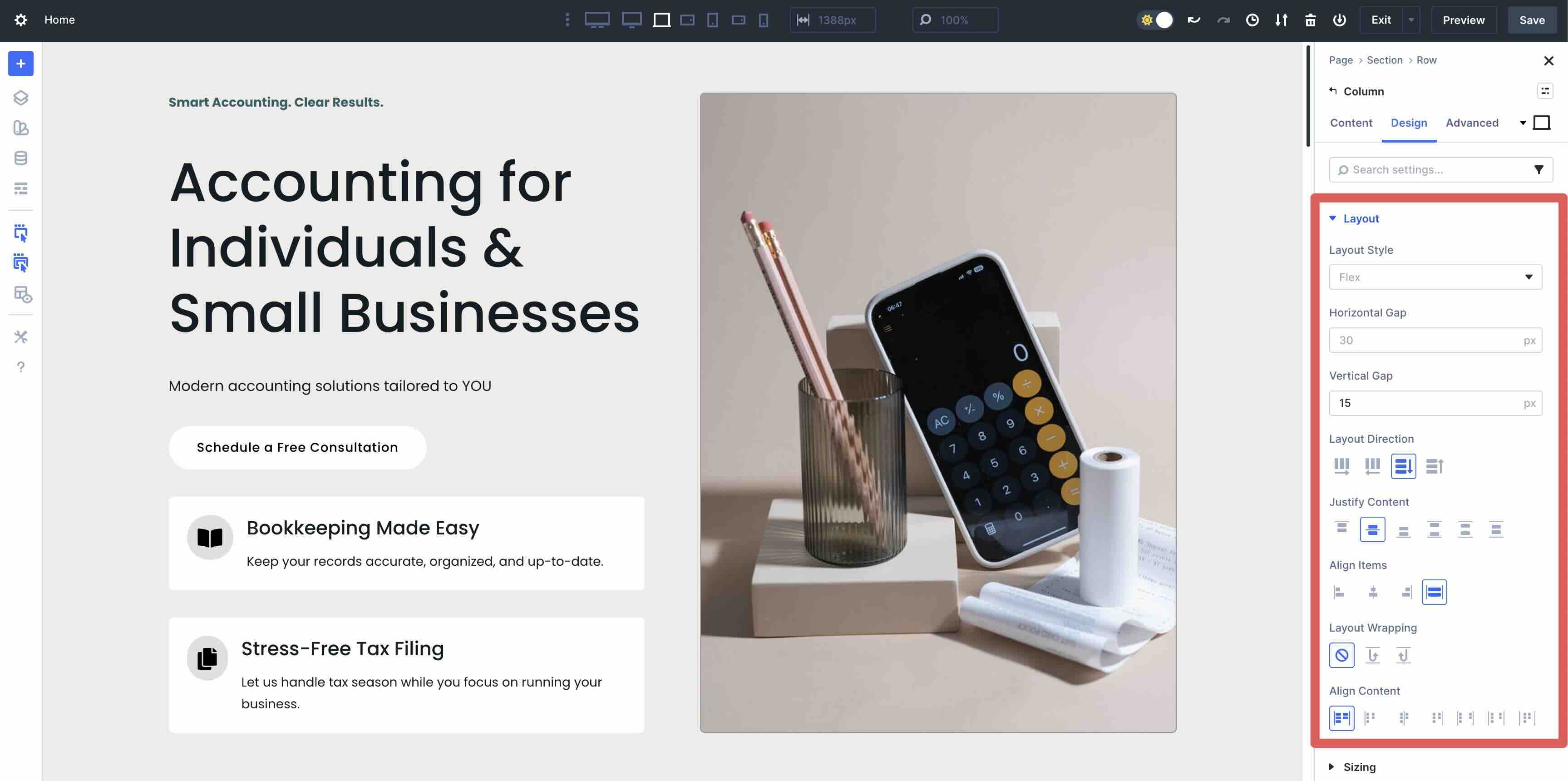
When loading a Layout Pack or installing a Starter Site, the layouts are currently automatically set to Block; this will change in the future, but you can manually make the switch now. To change this, click the Design tab and expand the Layout dropdown menu. In Layout Style, change Block to Flex using the dropdown menu.
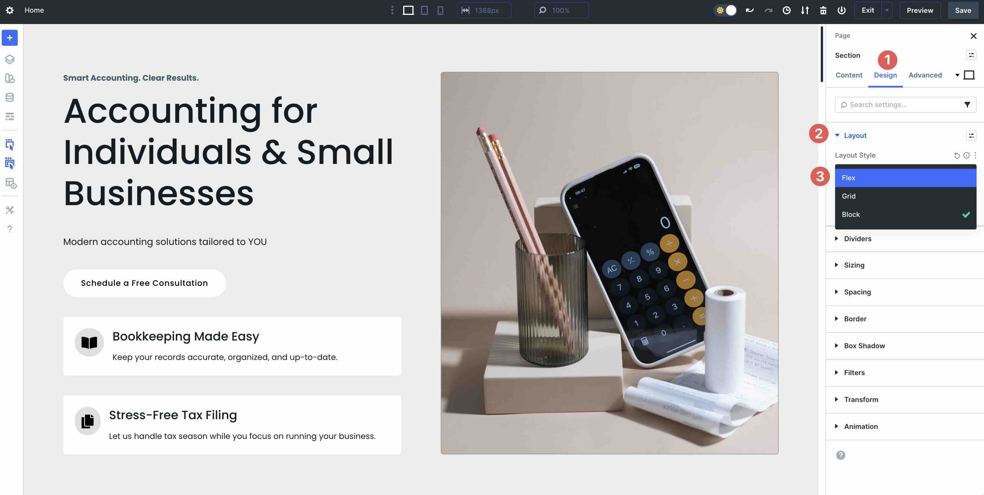
Once Flex is selected, you’ll see all of the Flex settings available to you, including Horizontal and Vertical Gap, Layout Direction, Justify Content, Align Items, and Layout Wrapping.
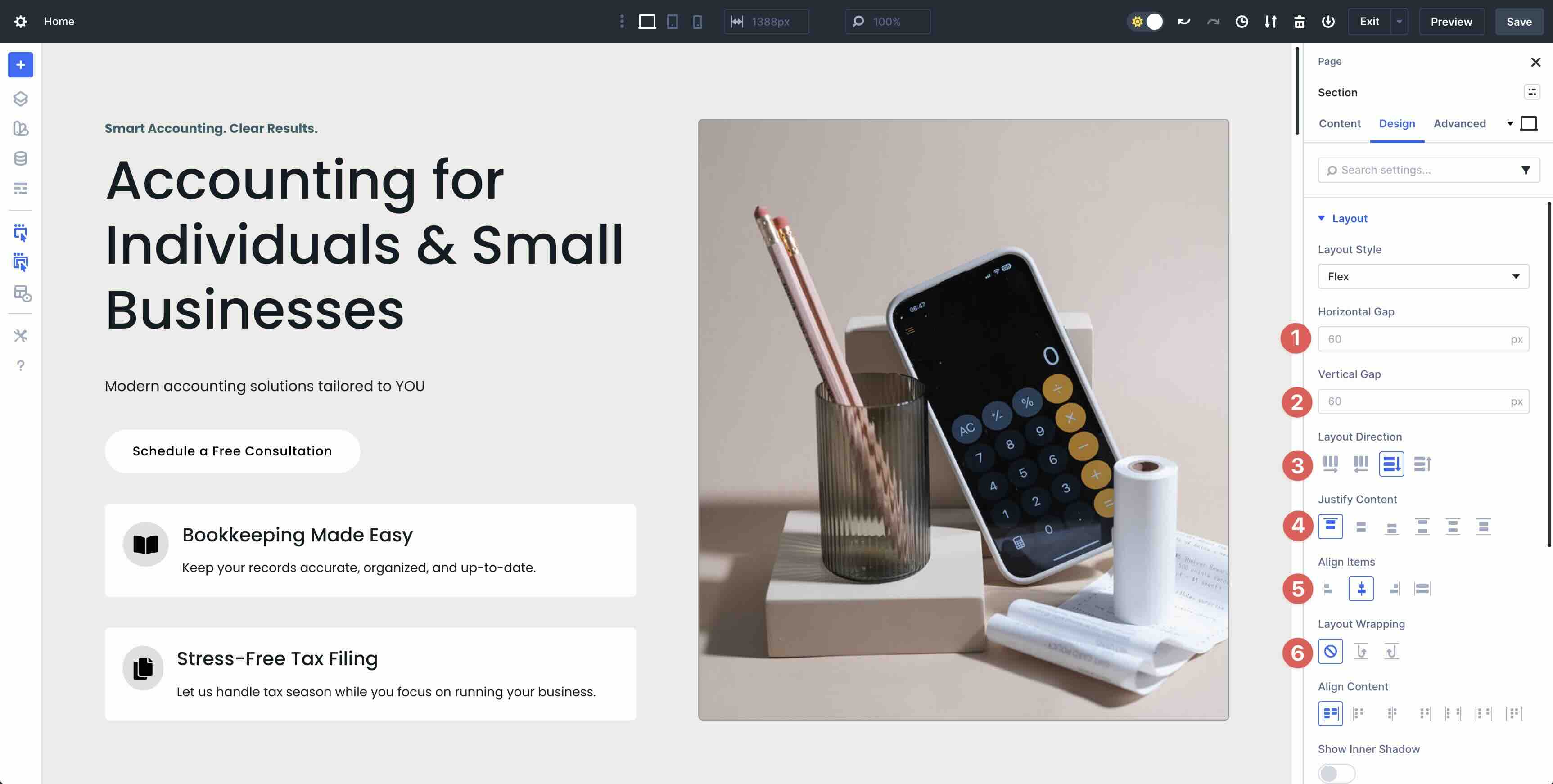
That’s it. You’re now fully set up and ready to tweak the layout to suit your preferences. In the next section, we’ll walk you through the steps of converting the page’s elements, one Row at a time.
Step By Step Guide: Converting Your Starter Site
Step 1: Audit the Current Block Layout
In your imported Home page, take a few minutes to scan the structure. Click into each Section to convert all block layouts to Flex.
Be sure to identify any Specialty sections that you may want to rebuild using Nested Rows.
Step 2: Adjust Spacing And Sizing As Necessary
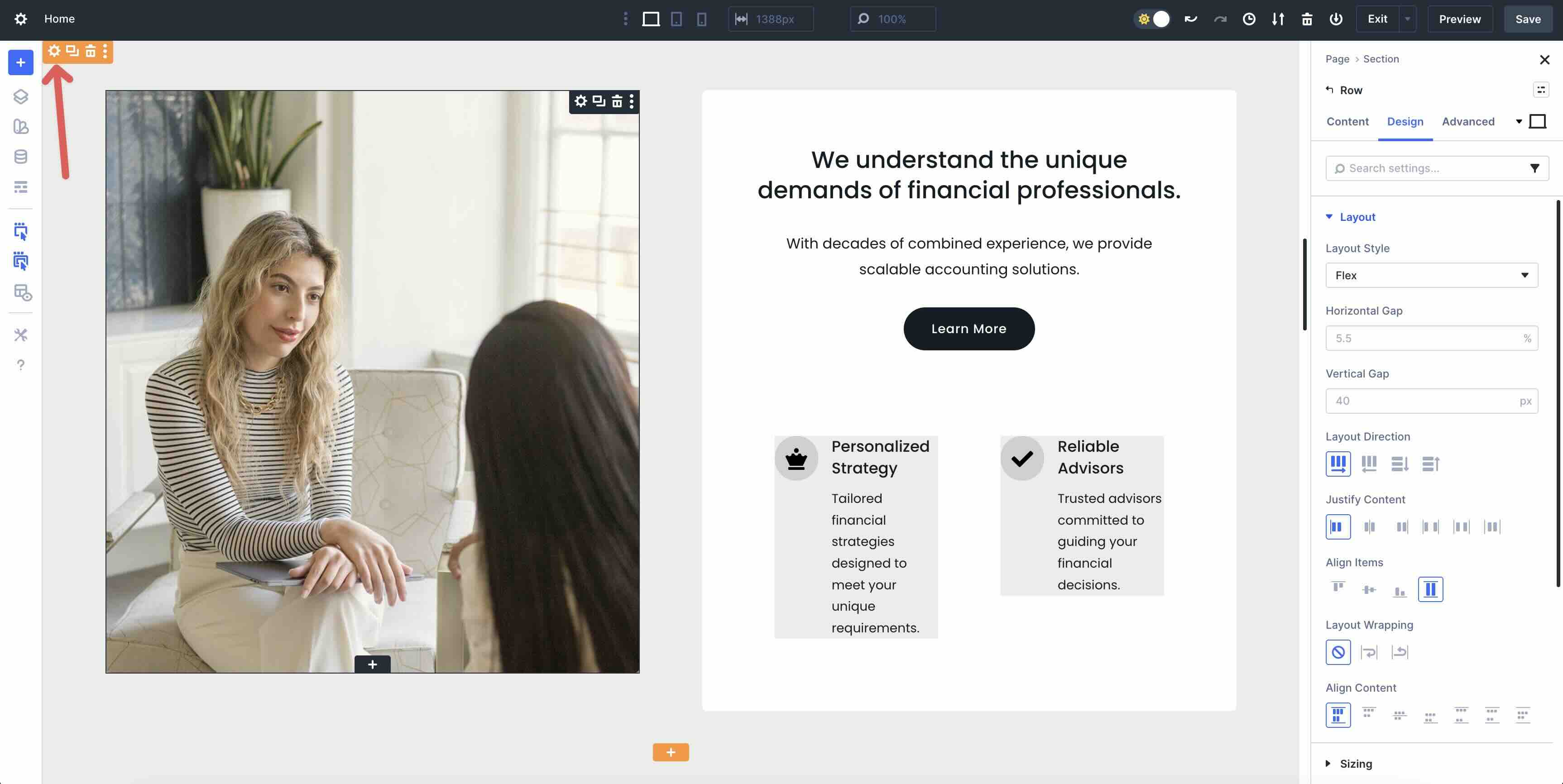
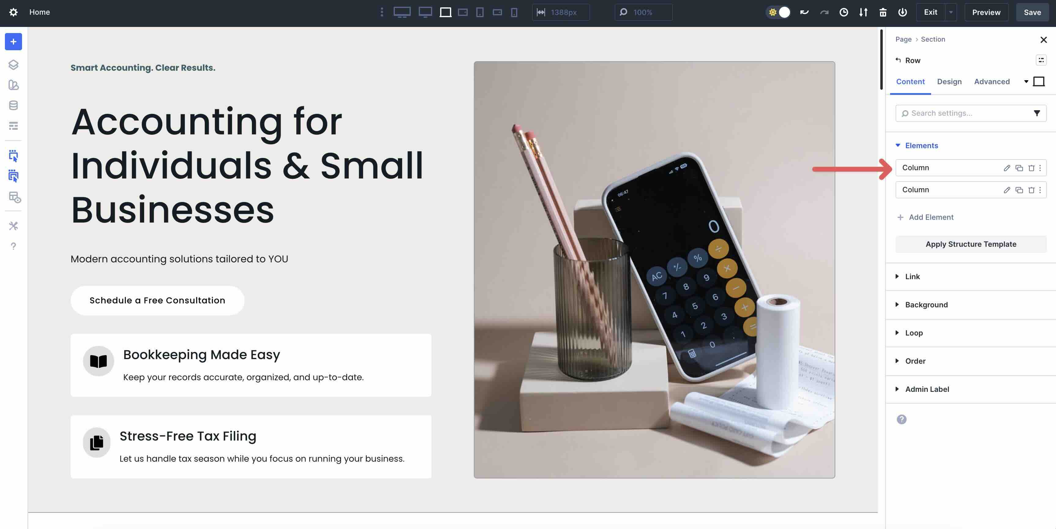
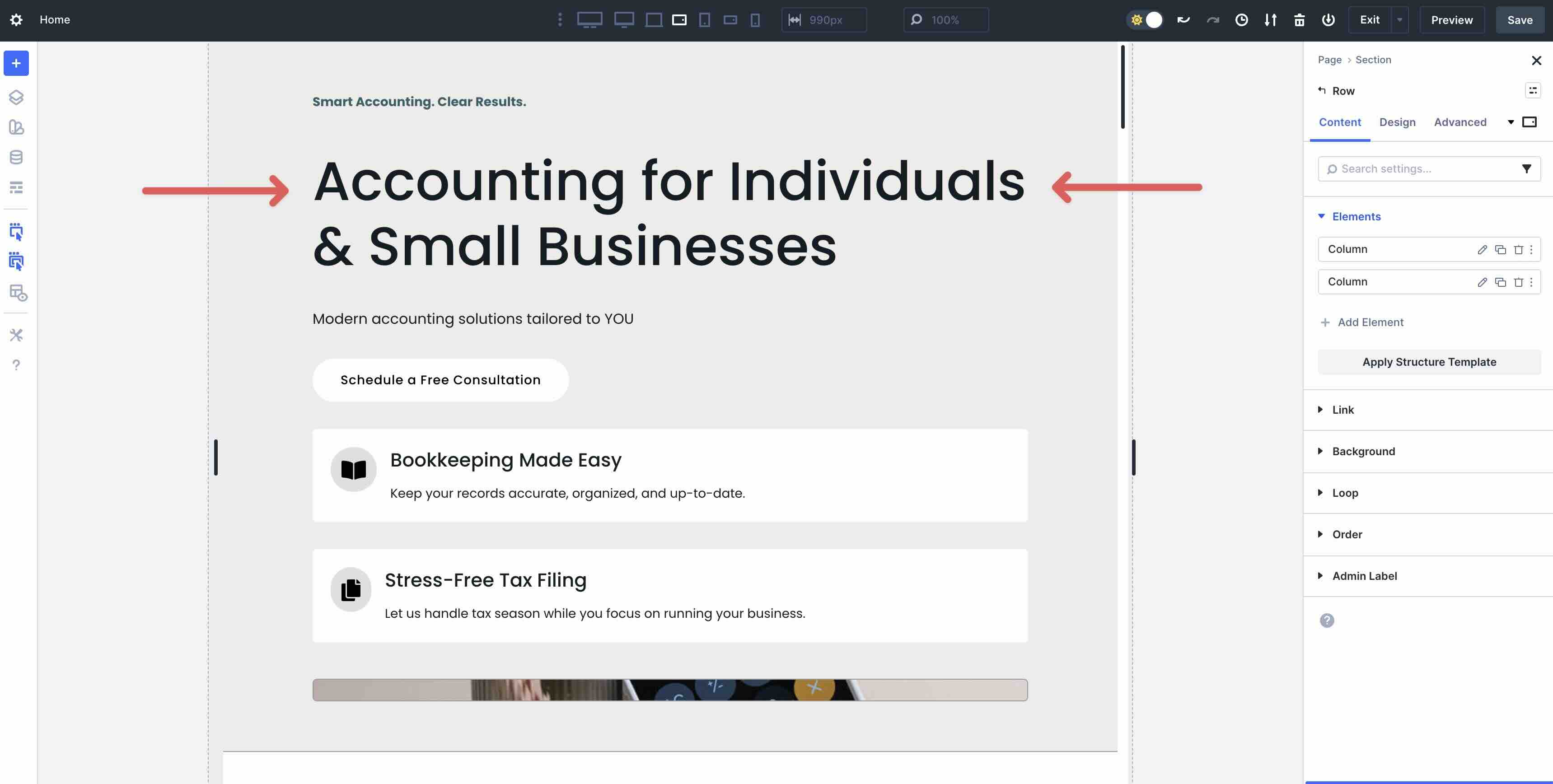
Once all Sections have been converted to Flex, it may be necessary to make adjustments to Horizontal and Vertical Gaps. Start by clicking into the first Row of the first Section in the layout.
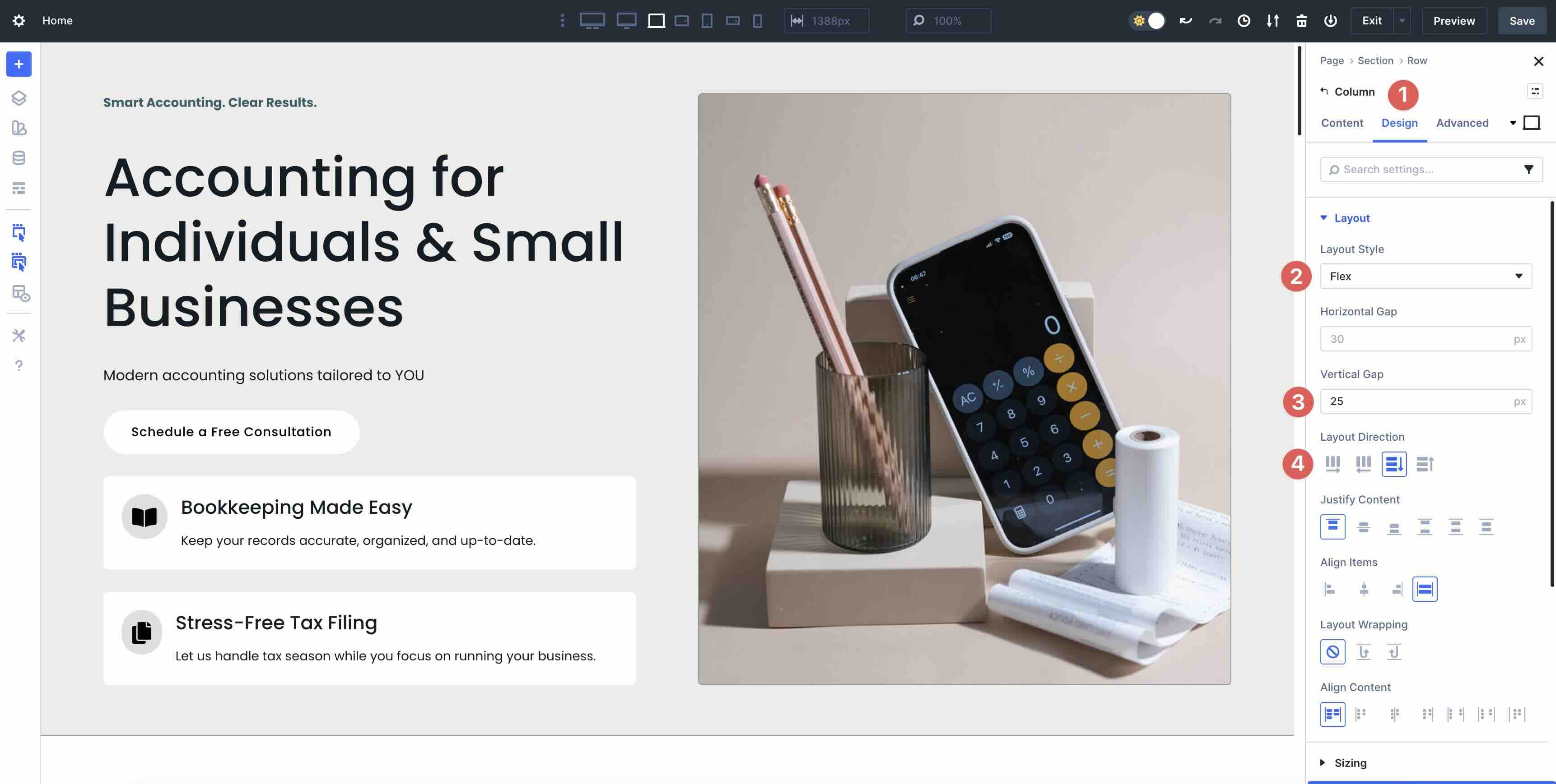
In the Content tab, expand the Elements dropdown menu and select the 1st Column.
Select the Design tab, expand the Layout menu, and select Flex as the Layout Style. Adjust the Vertical Gap to match your preference. By default, Divi 5 recognizes the content structure and sets an appropriate Layout Direction by default.
Repeat these steps for each Section in the layout. You can copy and paste styles to speed up the process.
As you work through the page, focus on consistency. For instance, if your original block layout used padding or margins to create space between elements, Flexbox’s Gap settings can replace those entirely.
Set a Horizontal Gap for even spacing between columns in a Row, or a Vertical Gap for stacked modules. If Columns appear too wide or narrow after the switch, use the Sizing options under Design → Sizing to set flexible widths.
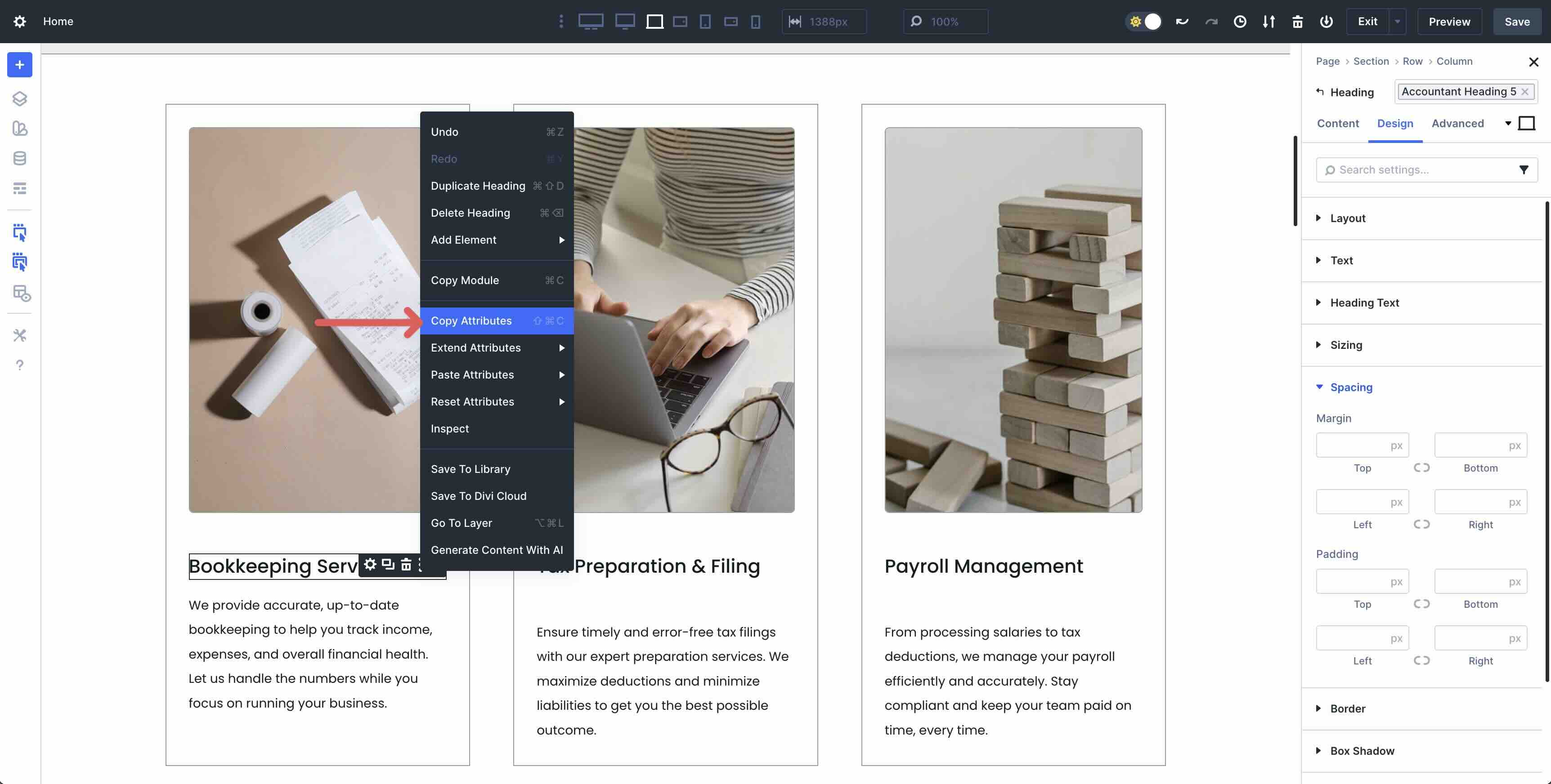
Use Divi 5’s Attributes feature to copy and paste attributes between Modules to quickly make changes.
Step 3: Reorder And Align Elements Responsively
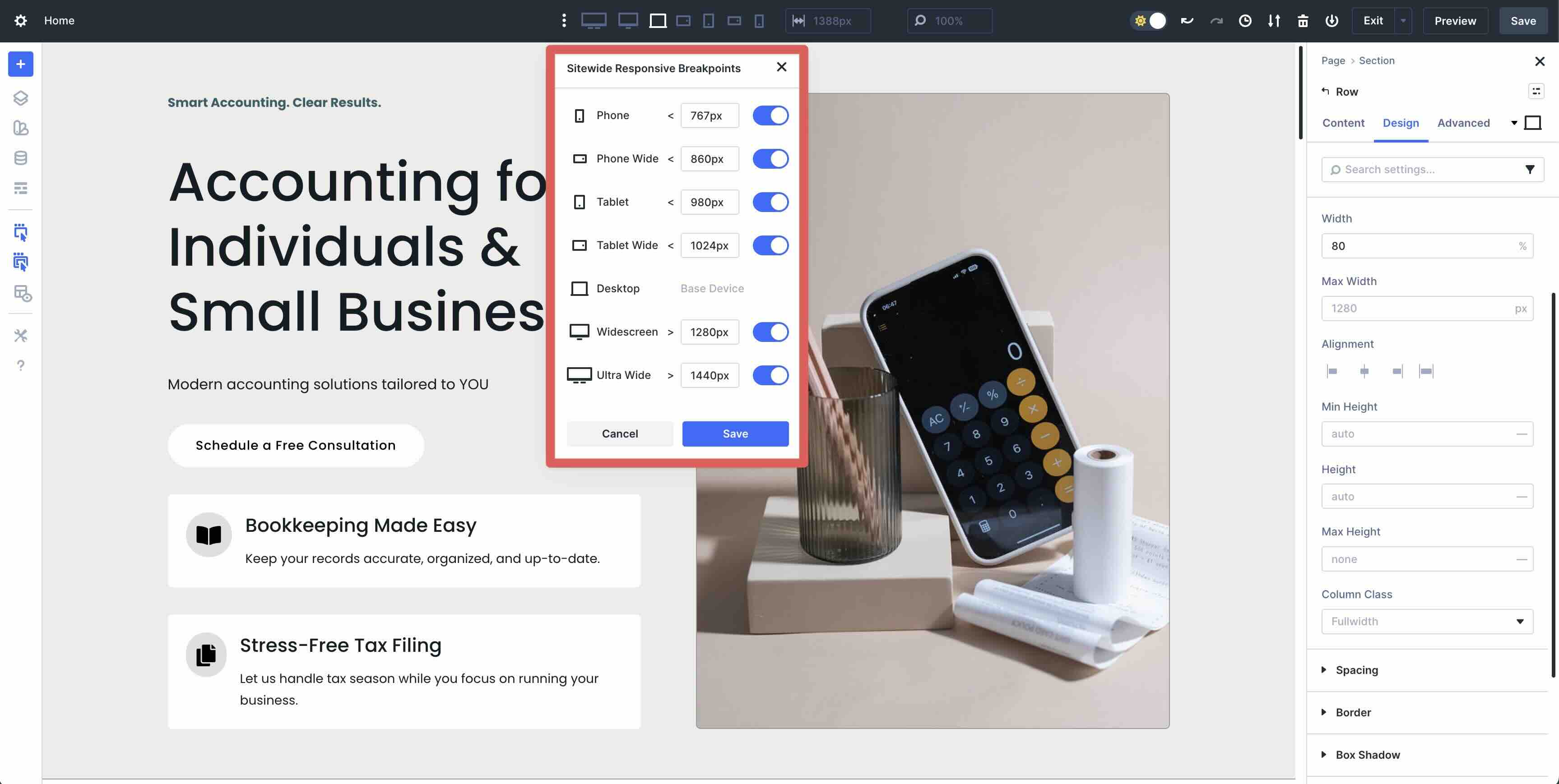
Now that the basics are in Flex mode, it’s time to leverage Flexbox’s strengths for alignment and ordering. Use Divi 5’s Customizable Responsive Breakpoints to make changes on tablet and mobile devices.
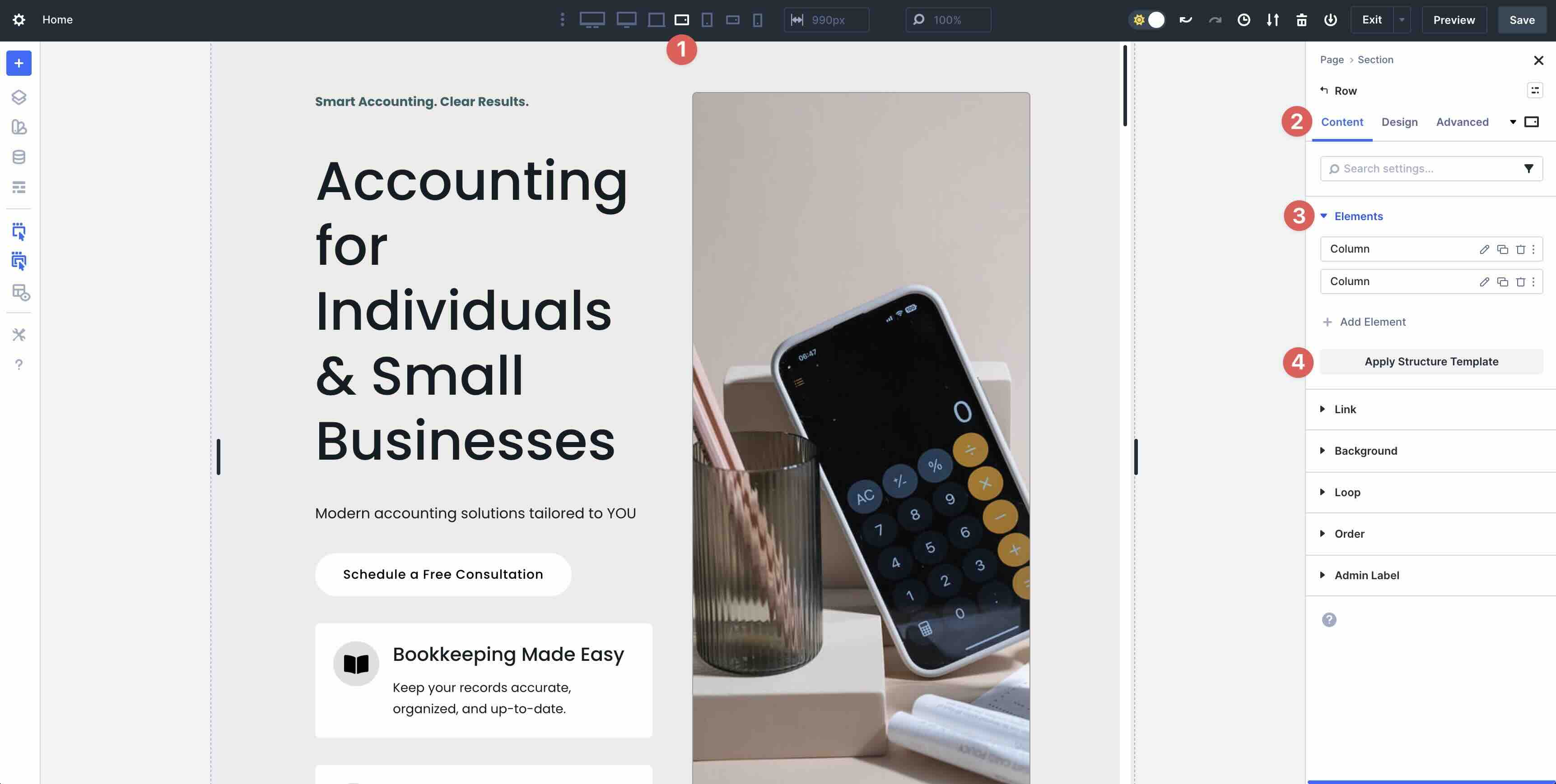
Using each breakpoint, navigate through each Section to apply Structure Templates as necessary. For example, while in the Tablet Wide breakpoint, click the Row in the first Section of the layout. In the Content tab, expand the Elements dropdown menu. Click the Apply Structure Template button.
Once clicked, you’ll have several templates to choose from that will automatically switch a two-column Row to one of your choosing.
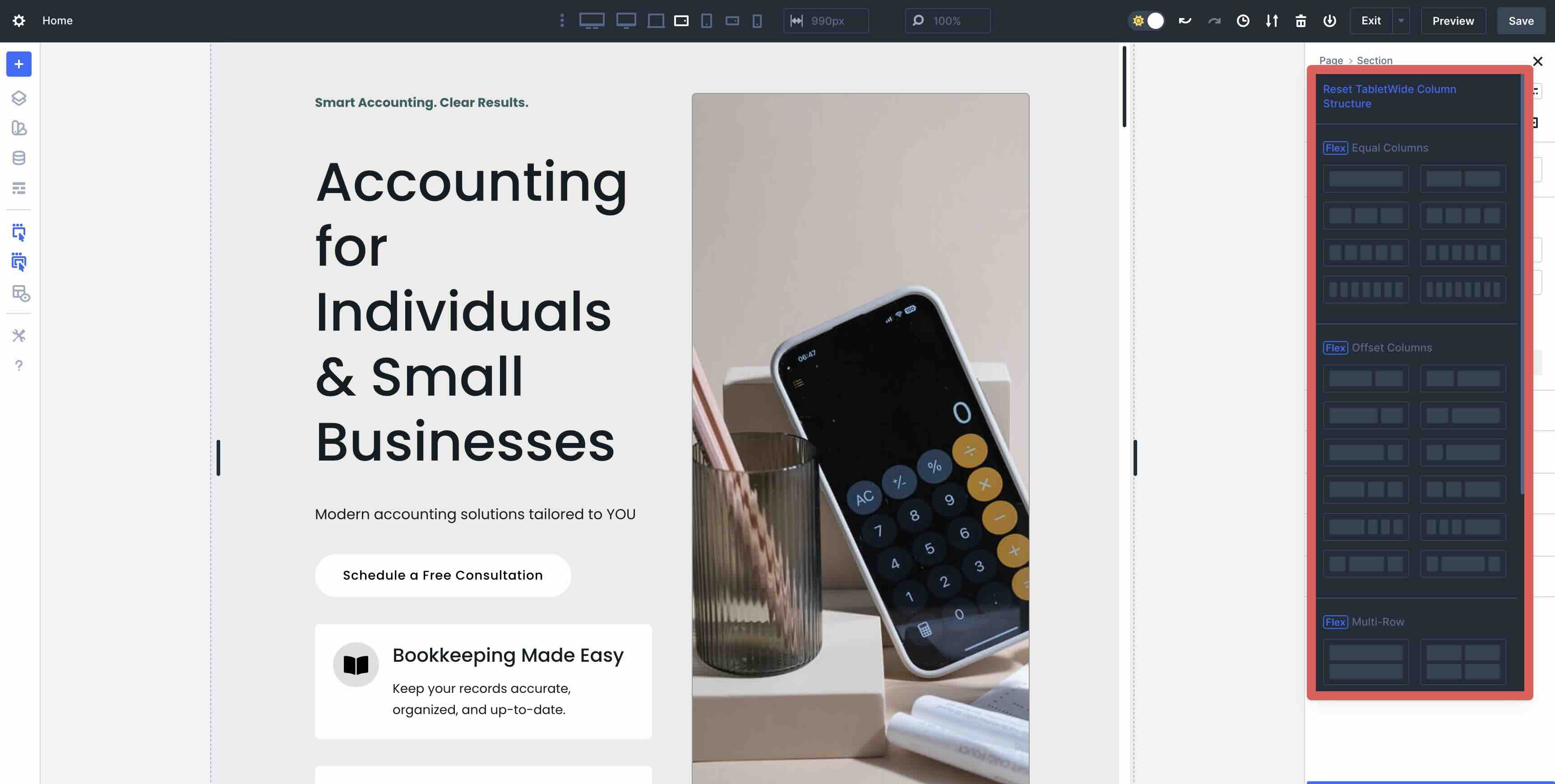
Using the single-column template allows for all elements in the Row to be converted to one Column, stacking all elements vertically down the page.
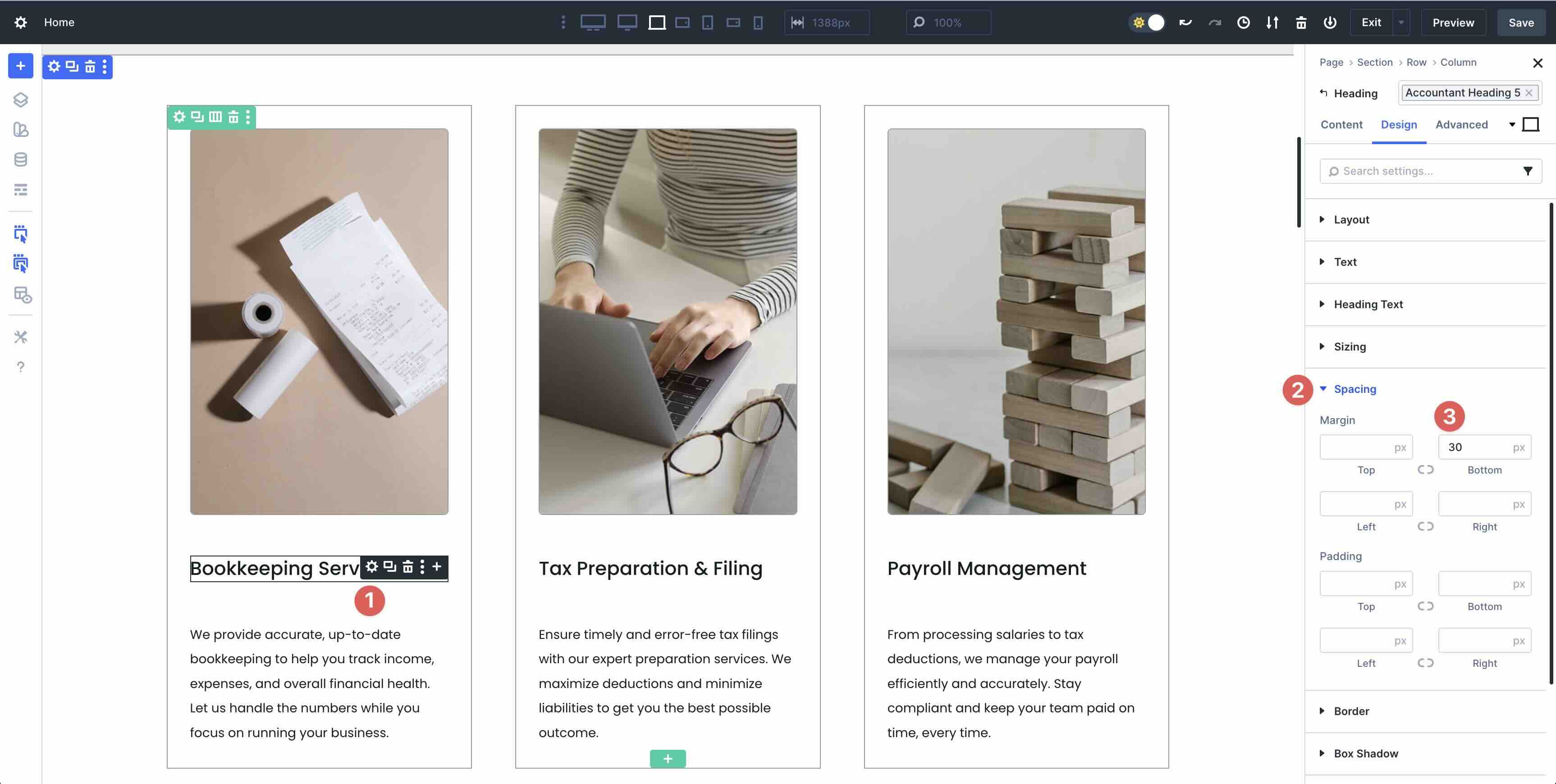
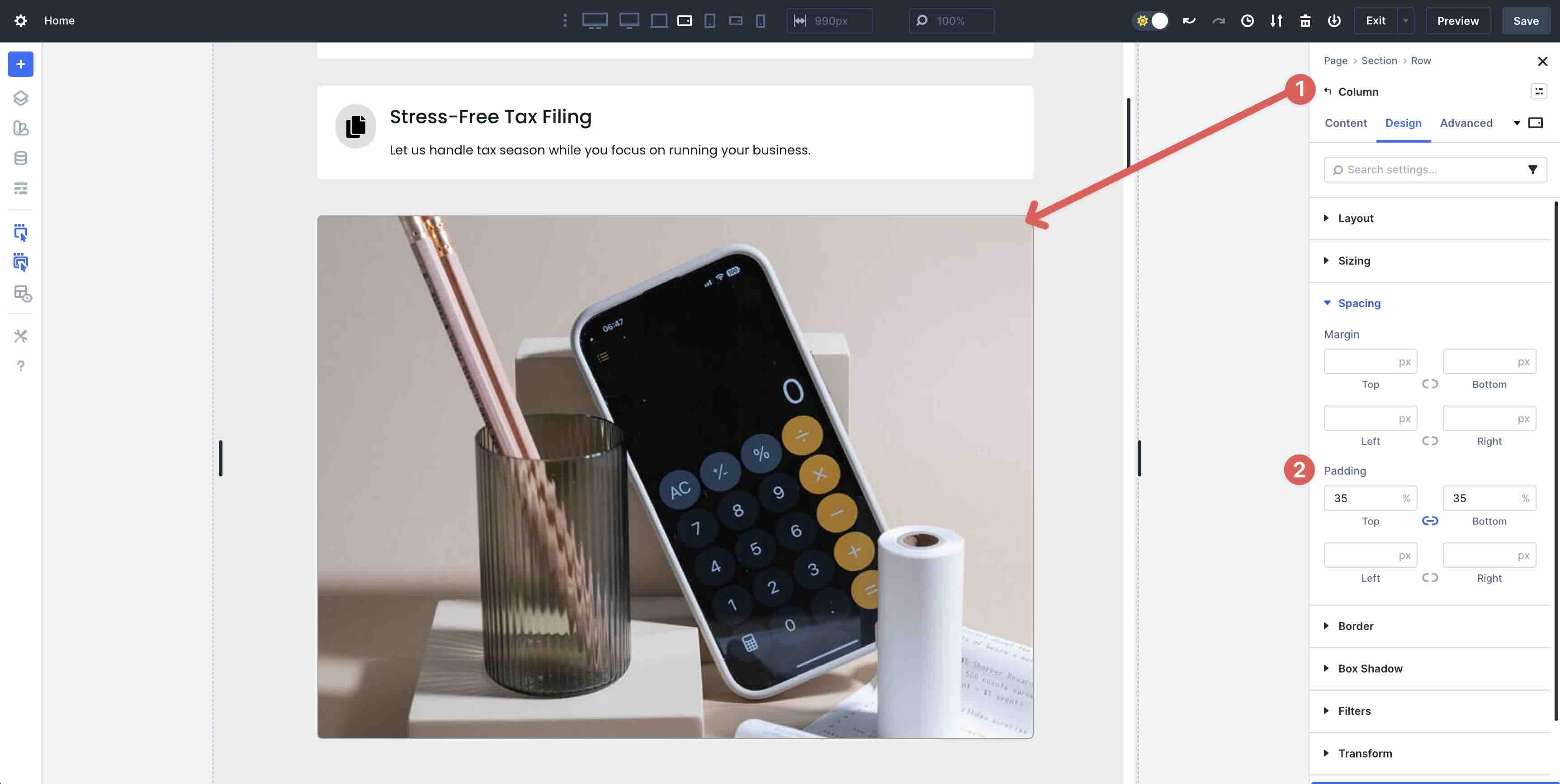
Step 4: Fine-Tune Spacing And Sizing
Pay close attention to the layout. There may be situations where certain elements don’t display correctly, requiring you to add padding on smaller device screens. For example, on this layout, the 2nd Column contains a background image. While it looks great on desktop, it shrinks on tablet and mobile devices. Adding padding to the 2nd Column allows the background image to display as intended.
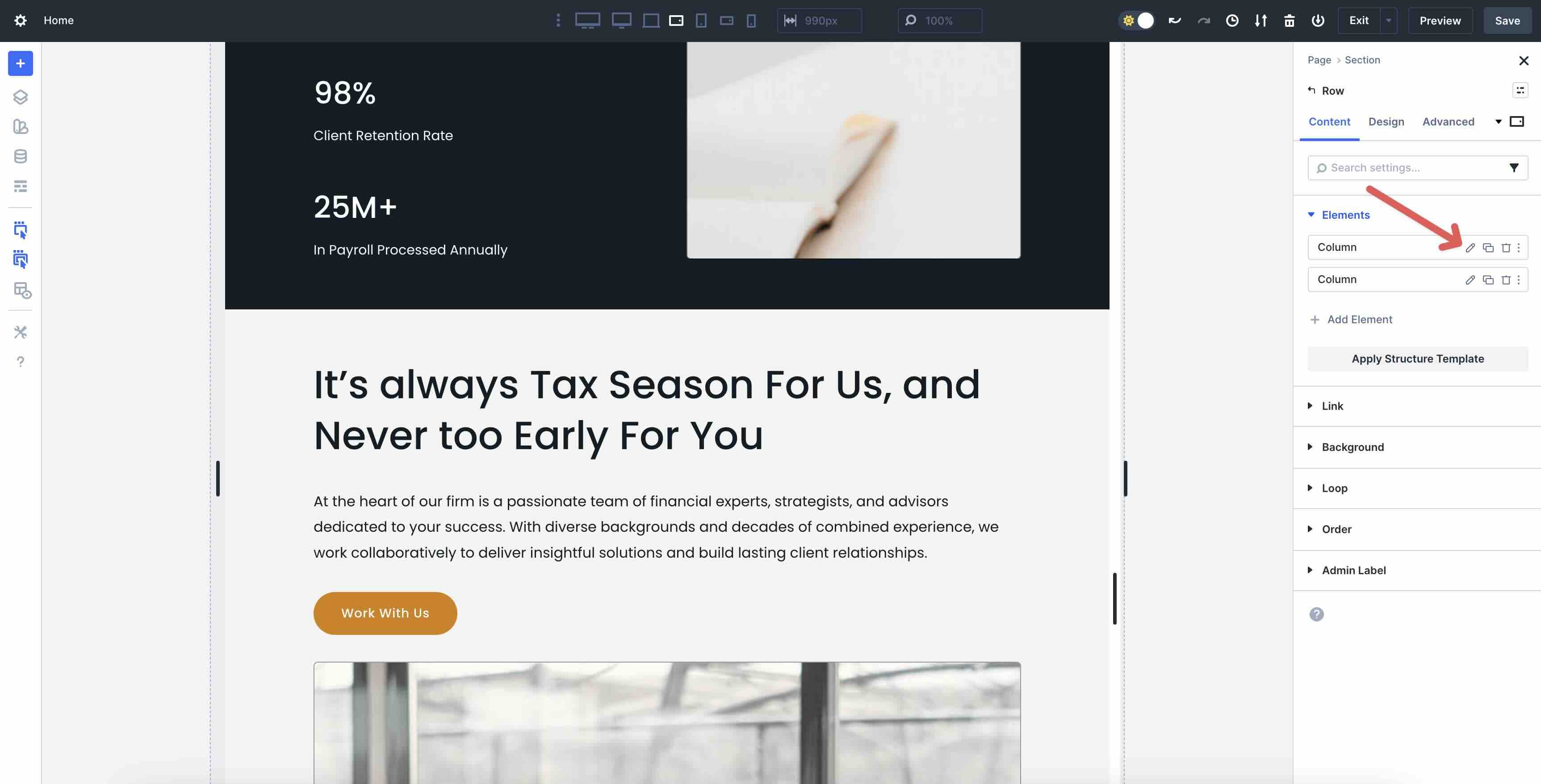
After restructuring the layout for mobile devices, look for sections where images or text stack vertically. For example, this section looks perfect on desktop, but when cycling through breakpoints, images from the 1st and 2nd Columns stack awkwardly.
In this case, you can use Divi 5’s Display Order field to change how Columns stack on mobile devices. Select the Row that you wish to alter for mobile. In the Content tab, expand the Elements menu and select the 1st Column .
Next, expand the Order dropdown menu to reveal the Display Order field. Set the Display Order to 1.
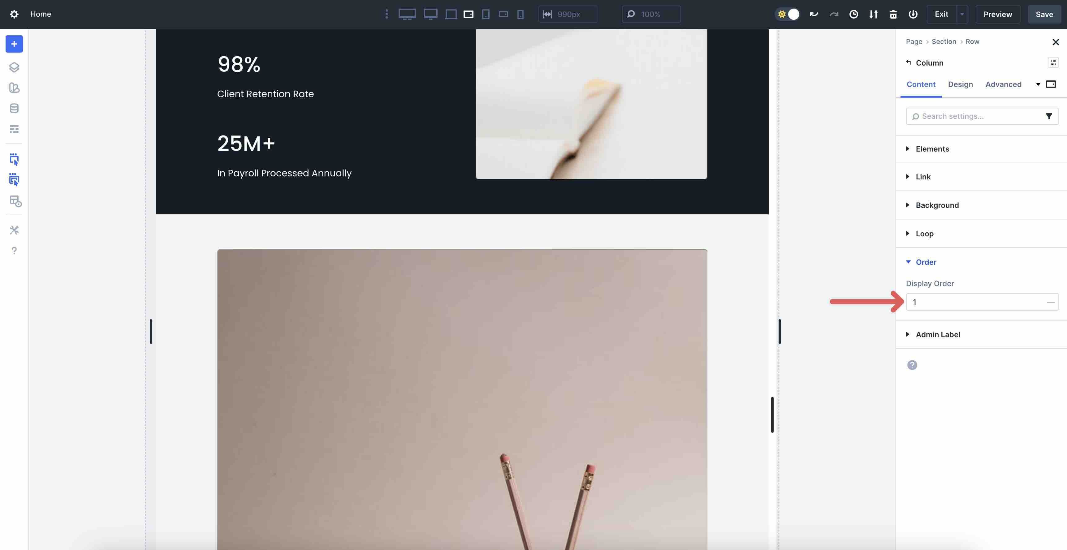
This moves Column 2 into the first position at that breakpoint, preventing the two images from stacking awkwardly on smaller screens.
Step 5: Final Preview
Once you’ve made all the changes to your layout, it’s a good idea to give the full layout one final look. Navigate through each breakpoint, look for spacing issues, and make any final adjustments as needed.
Finally, use Divi 5’s Preview feature to see how your layout looks on the front end.
That’s it! Using Flexbox for Starter Sites and Layout Packs is easier than you think. For the most part, every layout imported into Divi 5 works as expected. There may be a few instances (such as Specialty sections) where you might want to rebuild a few elements, although it isn’t necessary. Divi 5 still supports Divi 4’s block-based foundation, so converting those sections is entirely up to you.
The entire process of swapping elements from Block to Flex takes just a few minutes, allowing you to spend your time changing out images and text as needed.
Unlock The Power Of Flexbox In Divi 5 Today!
Transitioning to Flexbox in Divi 5 unlocks the theme’s full potential for fluid, mobile-friendly designs. No more wrestling with visibility settings or custom CSS. We encourage you to download the Divi 5 Public Beta today, import a Starter Site or Layout Pack, follow the steps outlined here, and experiment with this more fluid system. Flexbox isn’t just a tool. It’s a mindset shift toward limitless layout possibilities in Divi, paving the way for faster builds, better performance, and endless creativity.
Let us know your thoughts in the comment section below or hit us up on our Social Media channels. Your feedback is incredibly important, as it enables us to release the best possible version of Divi 5.


I’m puzzled. If you install the new Divi 5 Beta and then create a new site, surely it should already be created using flex, straight out of the box?
Great question! 😊 In the current Divi 5 Public Beta, imported Layout Packs and Starter Sites default to the block layout for smooth compatibility. But when you build a brand-new page from scratch (adding fresh sections and rows), they start with Flex right out of the box. Give it a try and let us know how it feels!