")
When it comes to ecommerce, standing out means ditching cookie-cutter templates for product pages that not only captivate but also convert. With Divi 5‘s Woo Product Modules, you can build high-impact product pages entirely from scratch, all while seamlessly integrating real-time WooCommerce data.
In this post, we’ll walk you through creating a product page from scratch using Divi 5’s 17 Woo Product Modules and the Theme Builder. Let’s get started.
Understanding The Woo Product Modules In Divi 5
Divi 5’s Woo Product Modules represent a step forward in ecommerce design, offering 17 native modules that pull dynamic data directly from WooCommerce. You’ll have full control over every element, from eye-catching visuals to seamless user interactions via Divi’s intuitive Visual Builder.
To make sense of this toolkit, we’ve grouped the 17 modules into four intuitive categories based on their roles in a typical product page flow. Each integrates effortlessly with Woo’s backend, ensuring your content stays fresh and functional. Let’s break them down:
Start strong by guiding users and keeping them informed with these foundational elements that handle orientation and real-time feedback.
- Woo Breadcrumbs: This module generates a dynamic navigational trail, linking from your homepage links through categories to the current product page. This helps users retrace their steps. It pulls store structure data directly from WooCommerce, making it ideal for in-depth reviews of your catalog.
- Woo Notice: Perfect for surfacing Woo system alerts — like cart addition confirmations, error messages, or success notifications. The module dynamically renders these elements, ensuring that your shoppers stay informed without disrupting the design flow.
Product Display
At the heart of any compelling product page, these modules showcase the essentials: visuals, details, and specs that hook visitors and build trust.
- Woo Product Title: Render the product’s name as a bold, customizable heading, sourced straight from Woo’s post data. It serves as your page’s anchor for SEO-friendly hierarchy.
- Woo Product Description: Display the long (or short) description, pulling content from Woo fields to create engaging, story-driven sections.
- Woo Product Images: Showcase the featured image with pro-level options, such as zoom effects or lightbox popups, and fetch Woo’s primary and gallery images.
- Woo Product Gallery: Expand the view with a grid or slider of additional images, seamlessly integrated from Woo’s gallery attachments.
- Woo Product Information: Display variable attributes (colors, sizes, materials), leveraging Woo’s database to clarify options and minimize cart abandonment.
- Woo Product Meta: Display taxonomy details, such as categories and tags, to enhance discoverability and context without clutter.
- Woo Product Price: Display dynamic pricing, including sale pricing or variable rates, directly from Woo for accuracy that builds buyer confidence.
- Woo Product Rating: Show star ratings alongside review counts, leveraging Woo’s aggregated feedback to add social proof.
- Woo Product Stock: Display availability badges, such as ‘In Stock’ or ‘Low Stock’, pulled from WooCommerce inventory.
Interactions And Reviews
With these modules, you can turn passive browsers into active buyers.
- Woo Add To Cart: Showcase simple or variable product options and an Add To Cart button that you can style using the Visual Builder.
- Woo Product Reviews: Create a scrollable list of customer testimonials, complete with submission forms, all powered by Woo’s reviews for social validation.
- Woo Product Tabs: Organize content into tabs for descriptions, additional information, and reviews, for a clean, mobile-optimized experience.
Wrap up with smart upselling and broader explorations, using these to extend sessions and inflate order values.
- Woo Related Products: Display items based on Woo’s built-in logic, displayed in columns to inspire those “customers also bought” moments.
- Woo Product Upsell: Highlight premium or bundled alternatives from your Woo upsell settings, strategically placed to elevate carts with higher-margin suggestions.
- Woo Products: Create product grids to display products and filter them by category, tags, and more. With plenty of customization options, you can adjust the number of columns, the display order, and more.
With these modules, you’re not just building pages but creating experiences that convert. In the next section, we’ll roll up our sleeves and step through building a custom product page, from layout to launch. If you’d like to follow along with a completed design, fill out the form below to download the files.

How To Create A Custom Product Page In Divi 5
This section will guide you through creating a modern product page using Divi 5’s Woo Product Modules. By the end, you’ll have a fully functional product page that beautifully showcases each product on your site. Here’s a quick preview:
You’ll want to ensure that WooCommerce is installed and activated and that you have created at least one product.
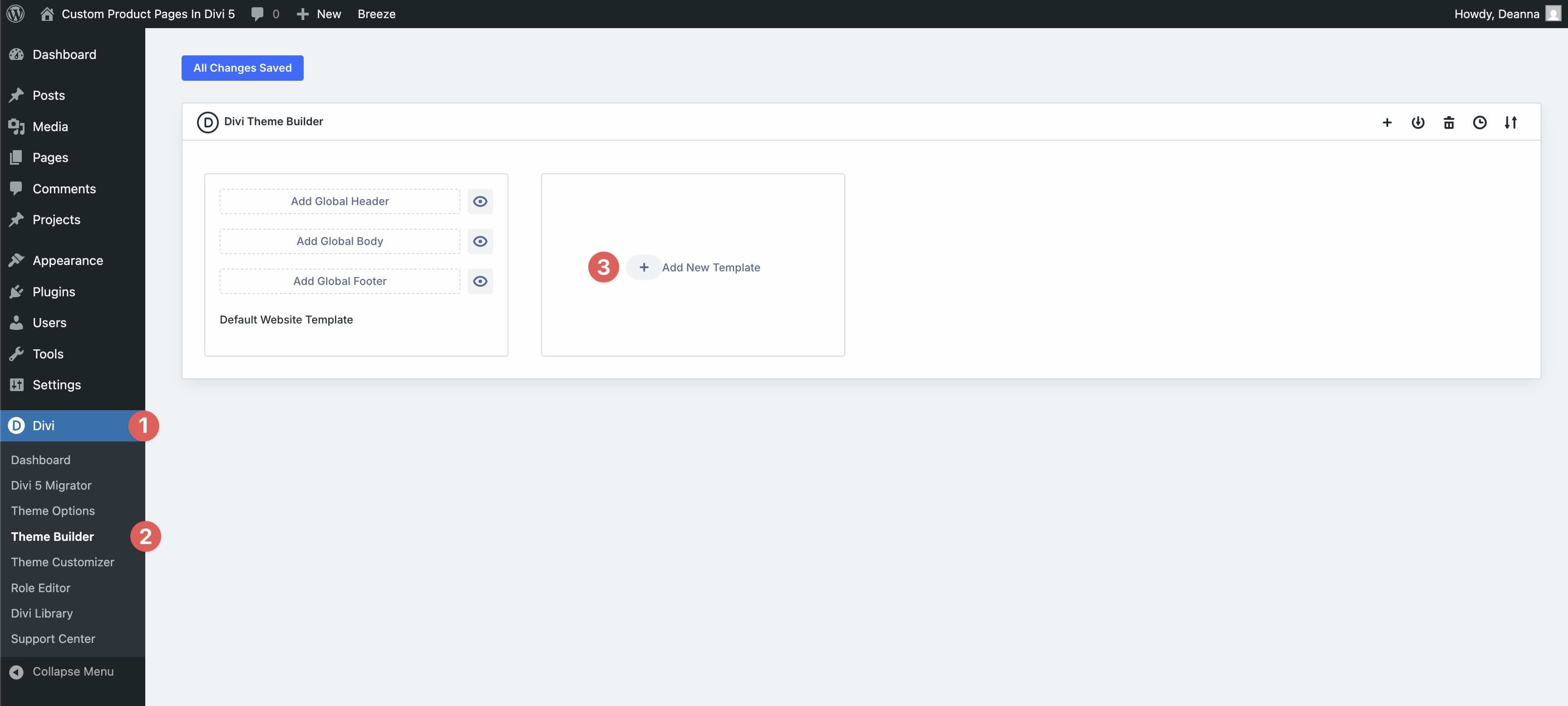
Step 1: Create A New Template
Next, navigate to Divi > Theme Builder and click the + Add New Template button.
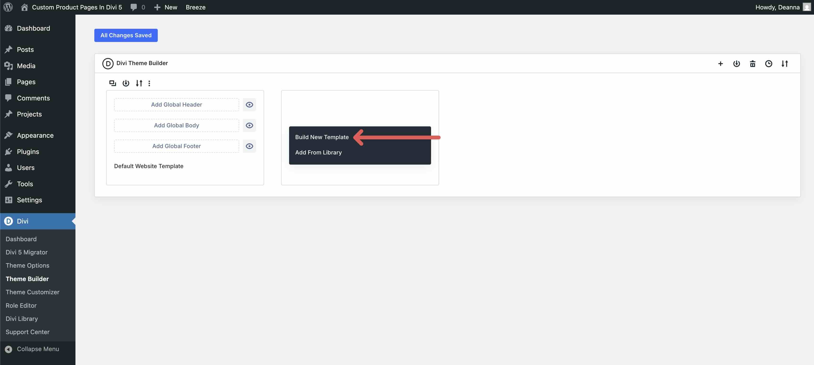
Once the modal appears, click Build New Template.
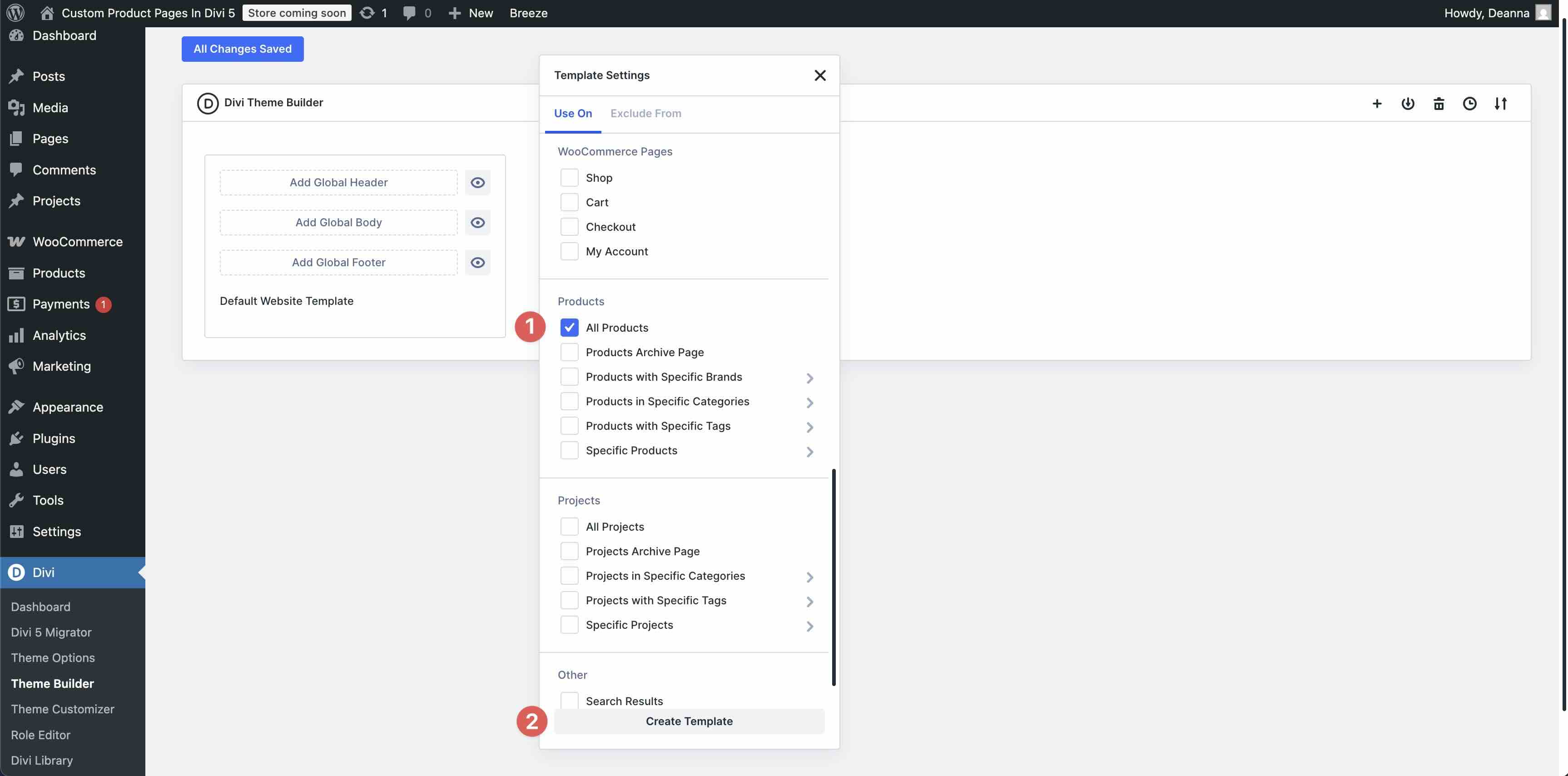
In the Template Settings modal, scroll down to and check All Products. Click Create Template to continue.
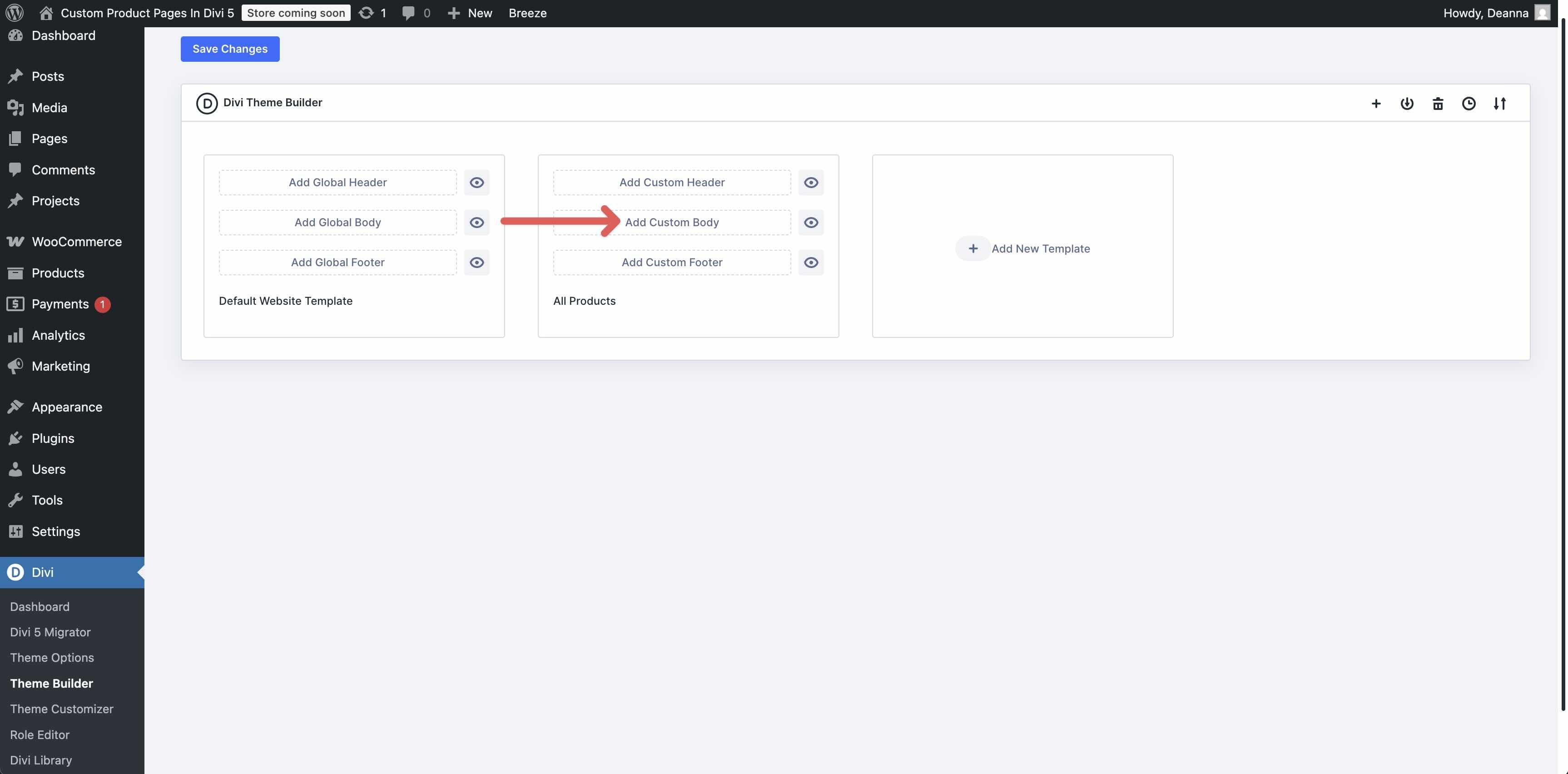
Next, click Add Custom Body.
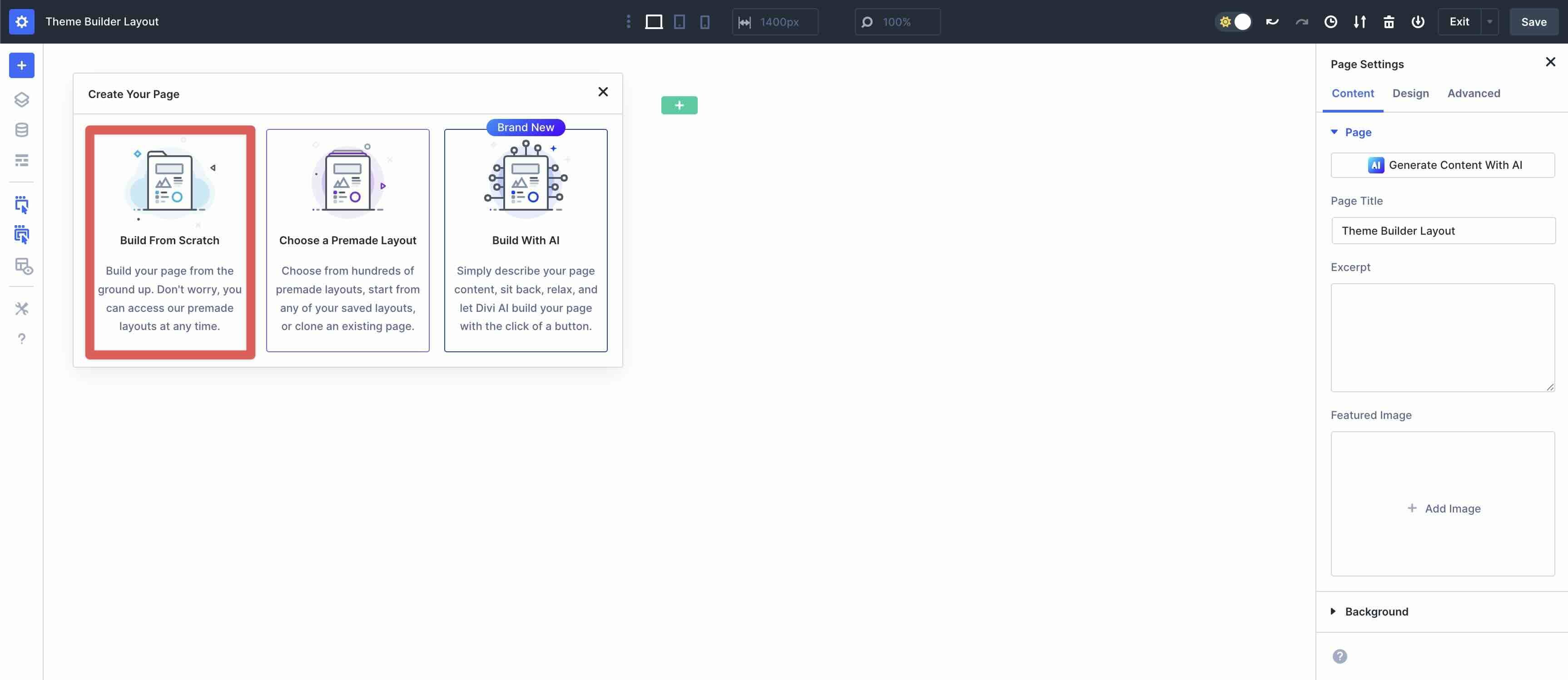
When the Theme Builder loads, select Build From Scratch from the available options.
Step 2: Add Content
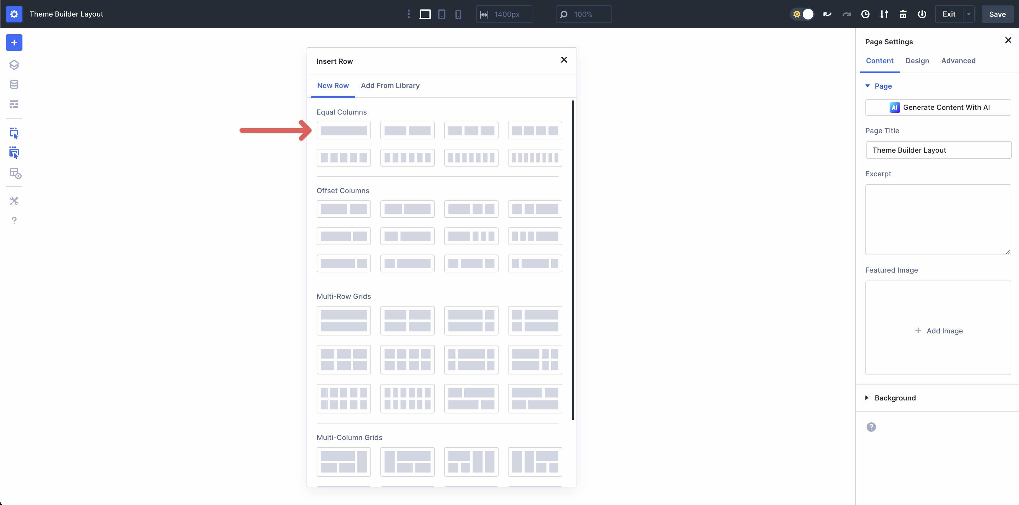
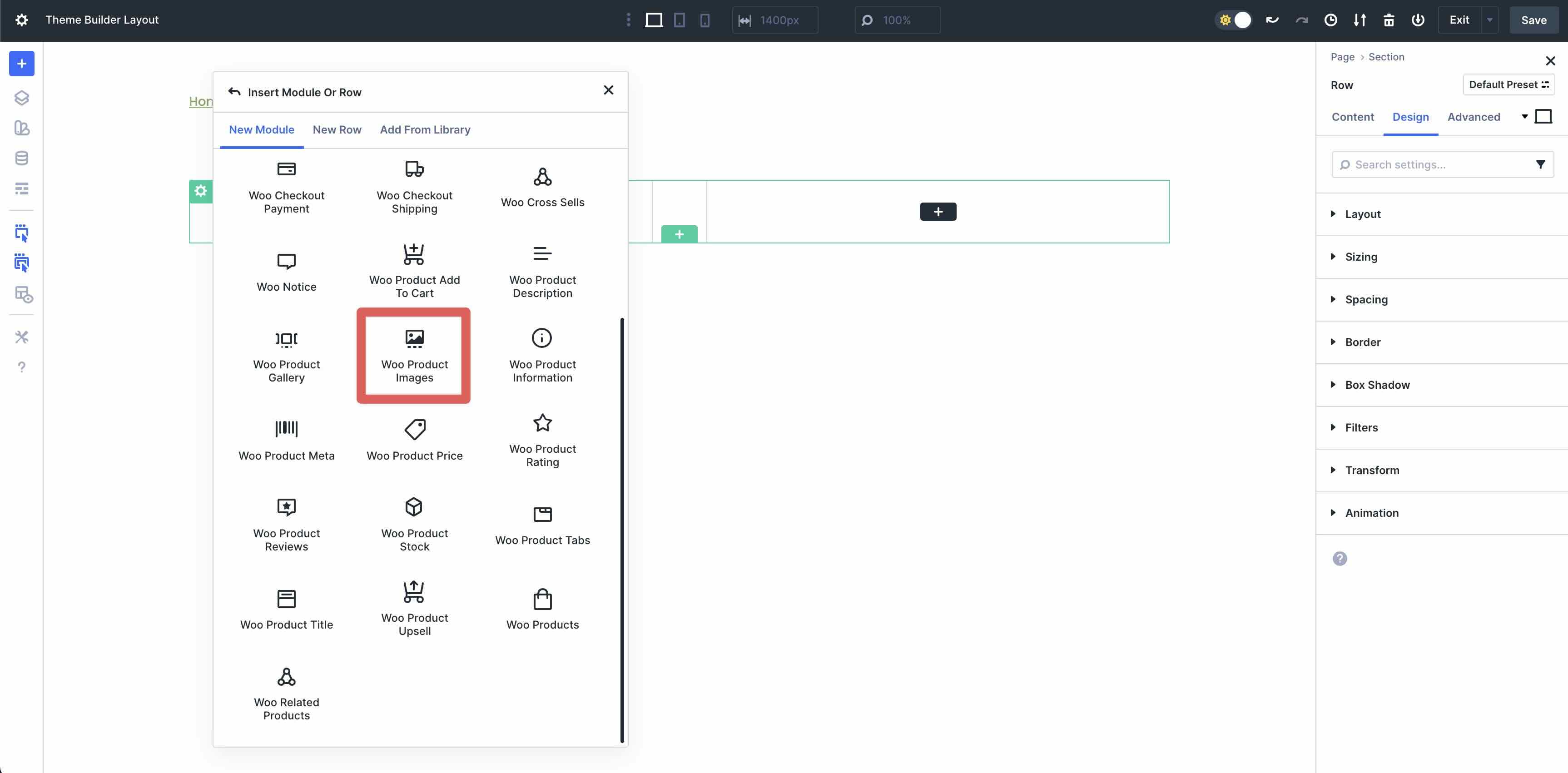
Add a single column row to the page.
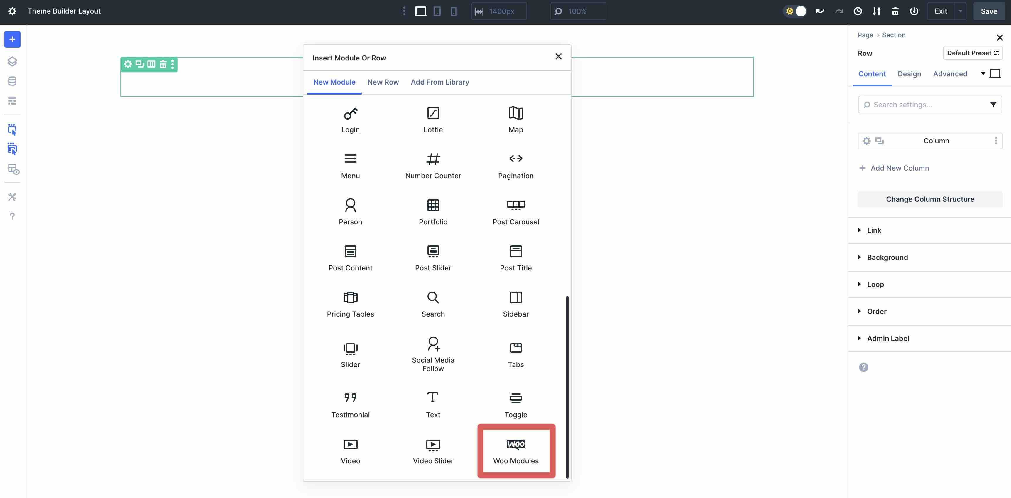
When the Insert Module Or Row modal appears, locate the Woo Modules option and select it.
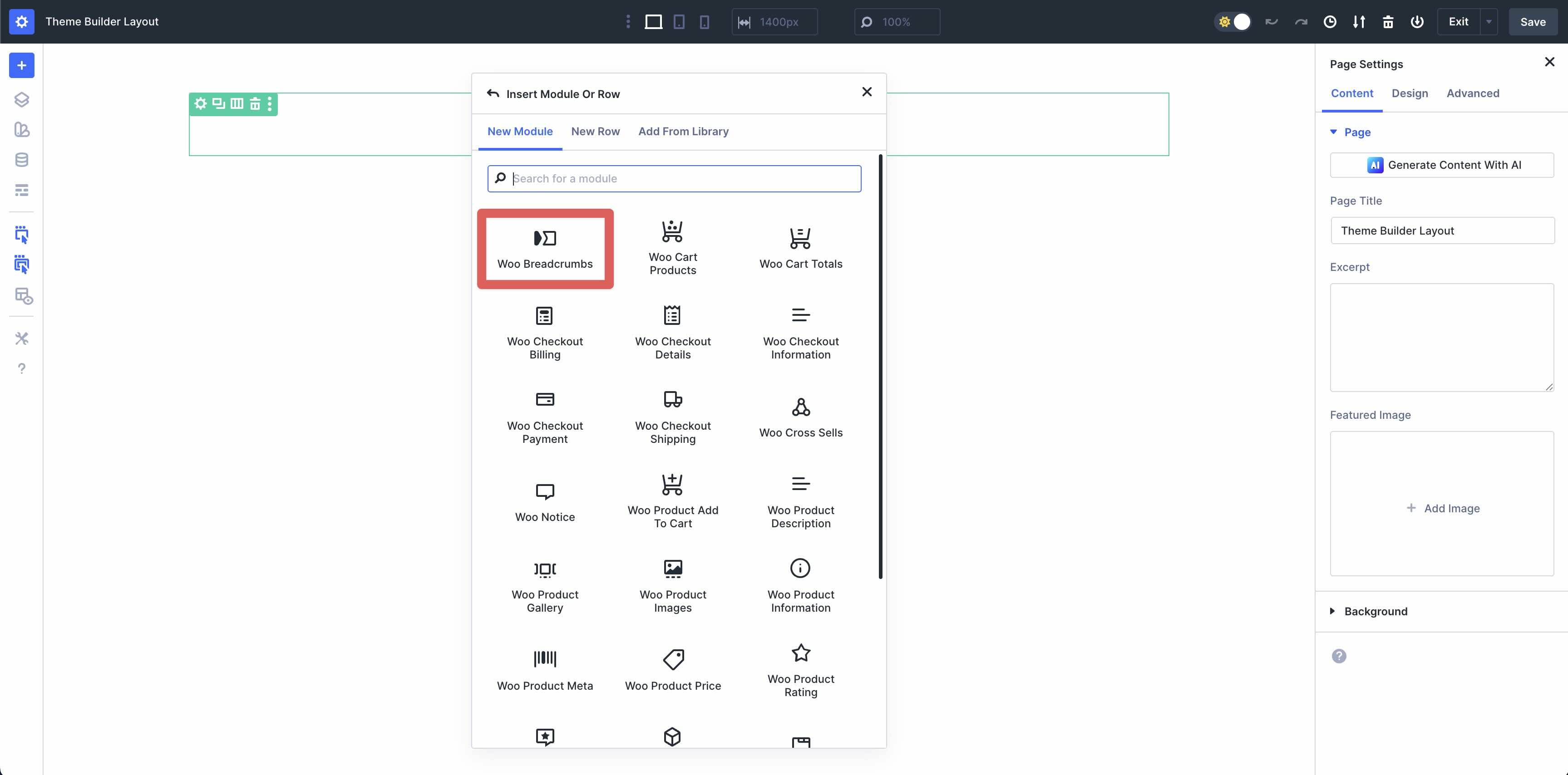
Add The Woo Breadcrumbs Module
Locate the Woo Breadcrumbs module and add it to the row.
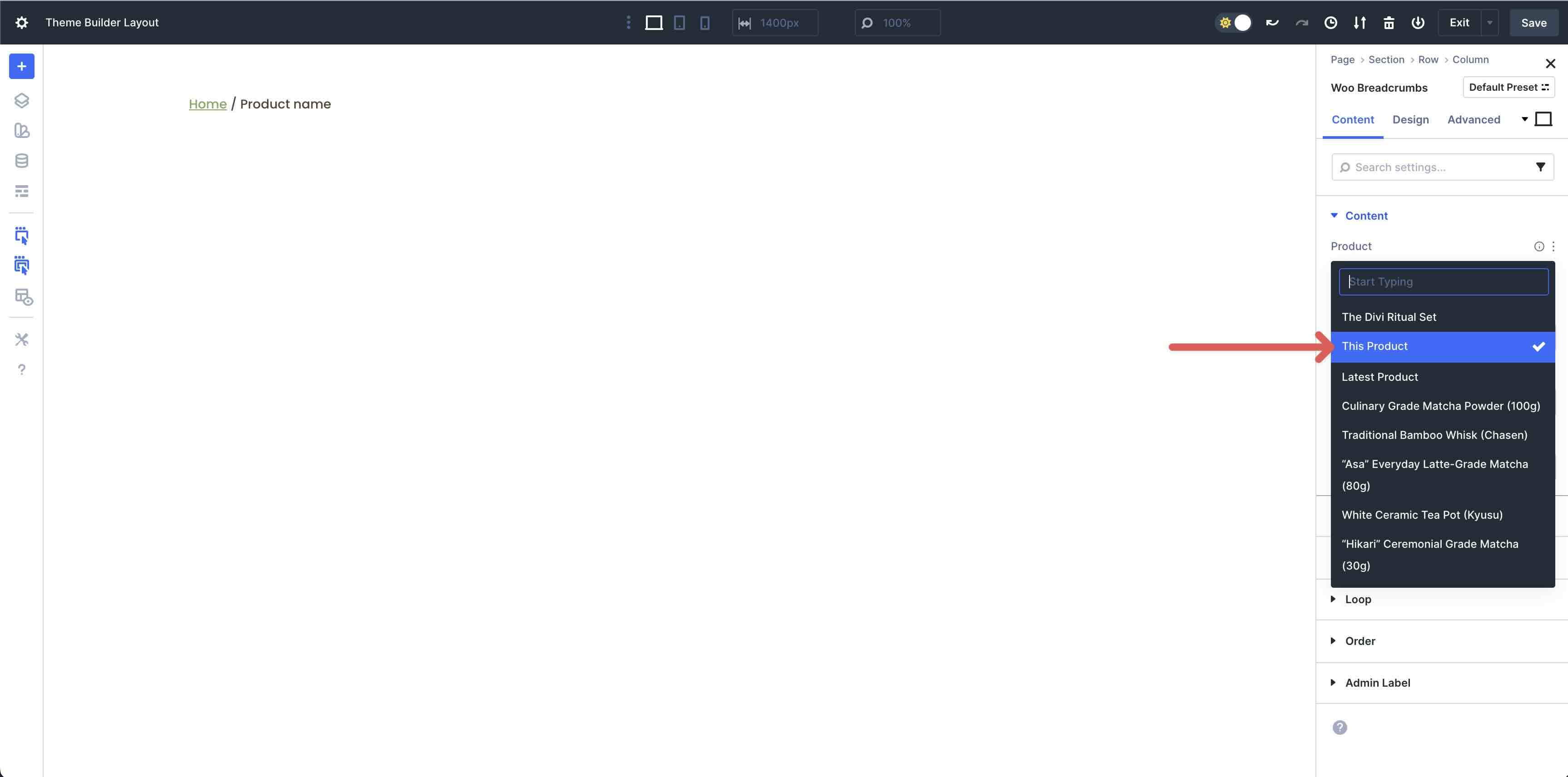
By default, This Product will be selected in the Product dropdown menu in the Content tab. This option will allow Divi 5 to easily pull content for each product in every category. For this tutorial, we will select a product to display to make it easier to see how the layout will look with an actual product in view. As you add modules to the design, ensure that This Product is always selected.
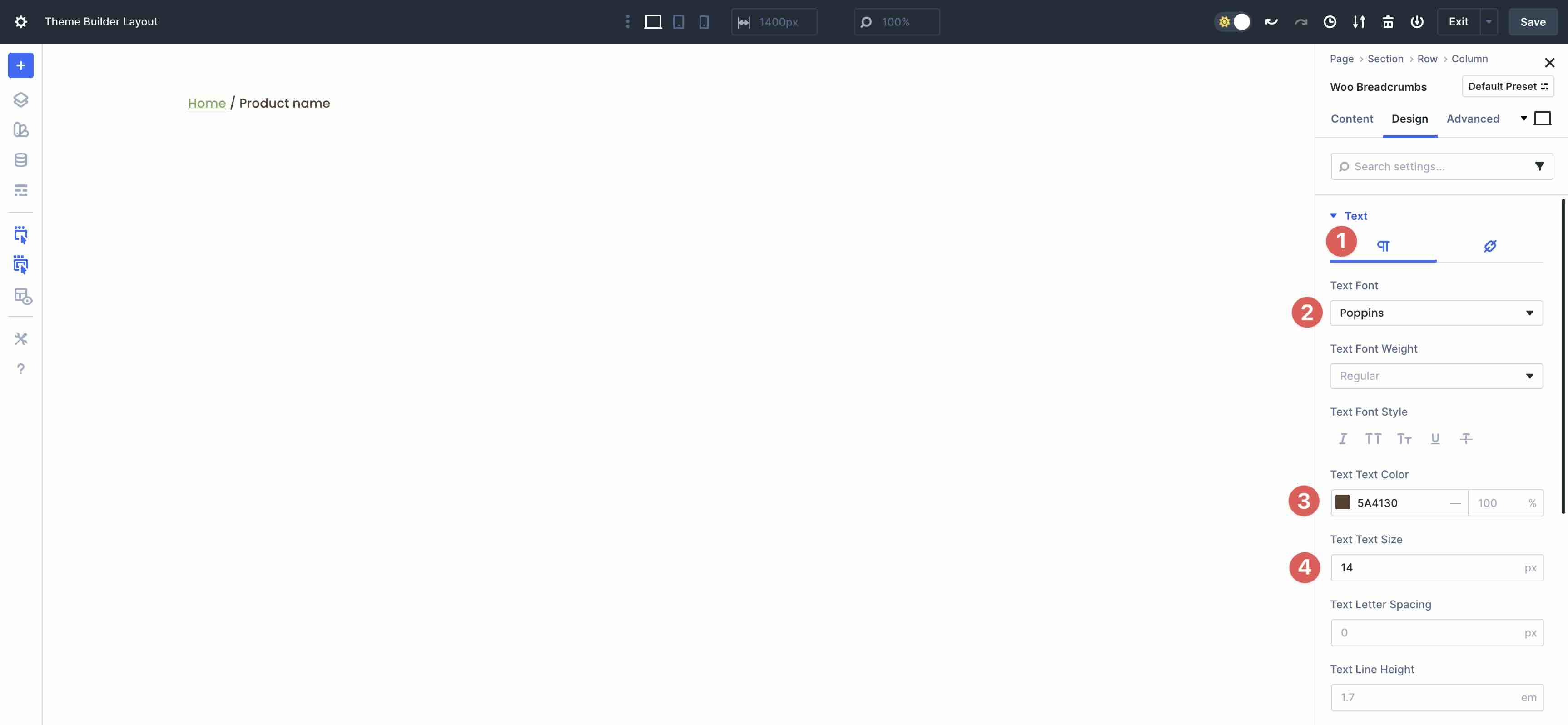
Click over to the Design tab and expand the Text dropdown menu. Ensure the Paragraph tab is selected and choose Poppins as the Text Font, #5a4130 as the Text Color, and 14px as the Text Text Size.
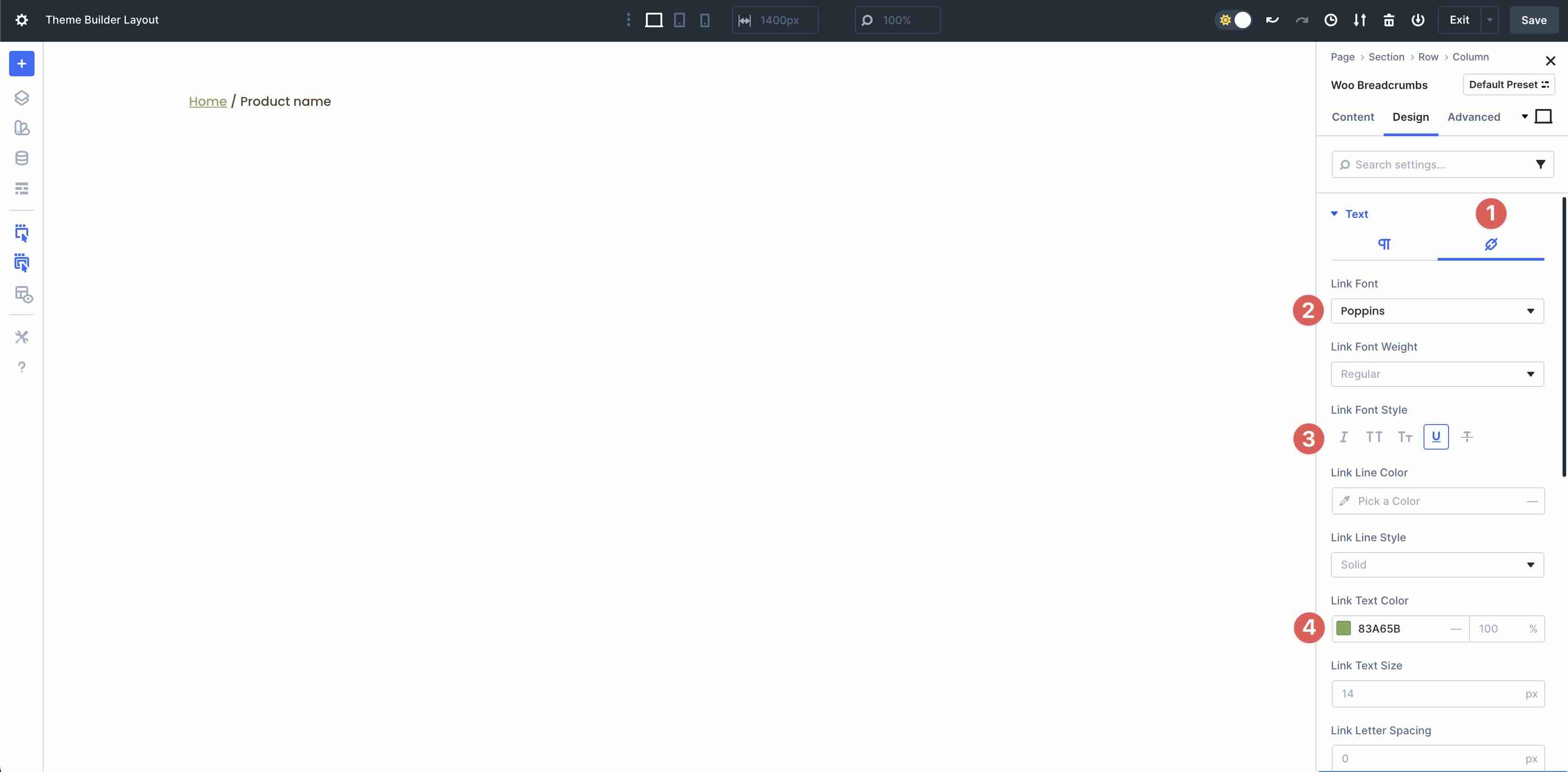
Next, select the Links tab in the Text menu. Select Poppins as the Link Font, Underline as the Link Font Style, and #83A65B as the Link Text Color.
Add The Woo Product Images Module
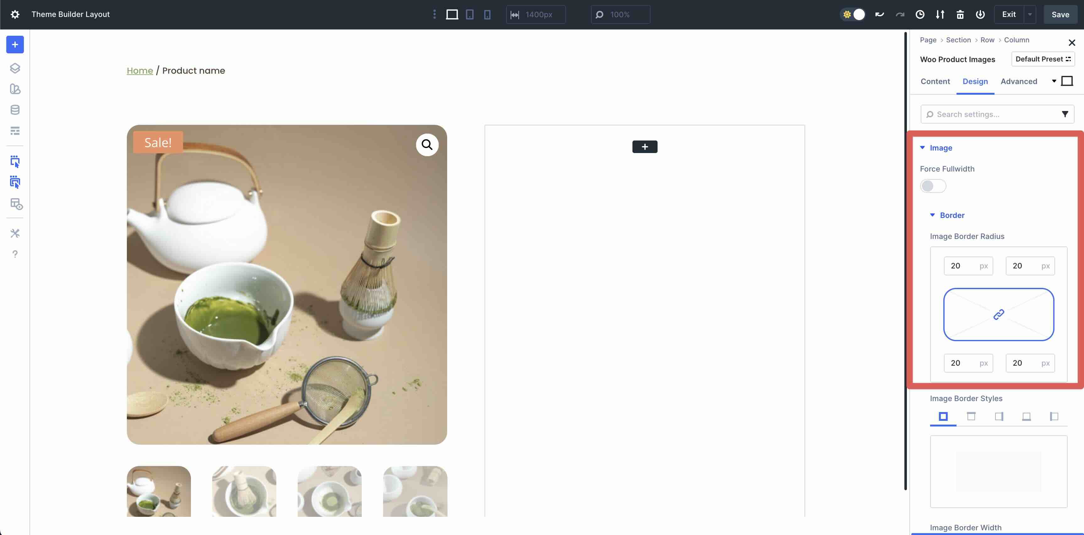
Next, add a two-column row directly underneath the first row in the layout. In the left column, add the Woo Product Images module to the column.
Swap to the Design tab. Expand the Image menu followed by the Border menu. Set the Image Border Radius to 20px on all sides.
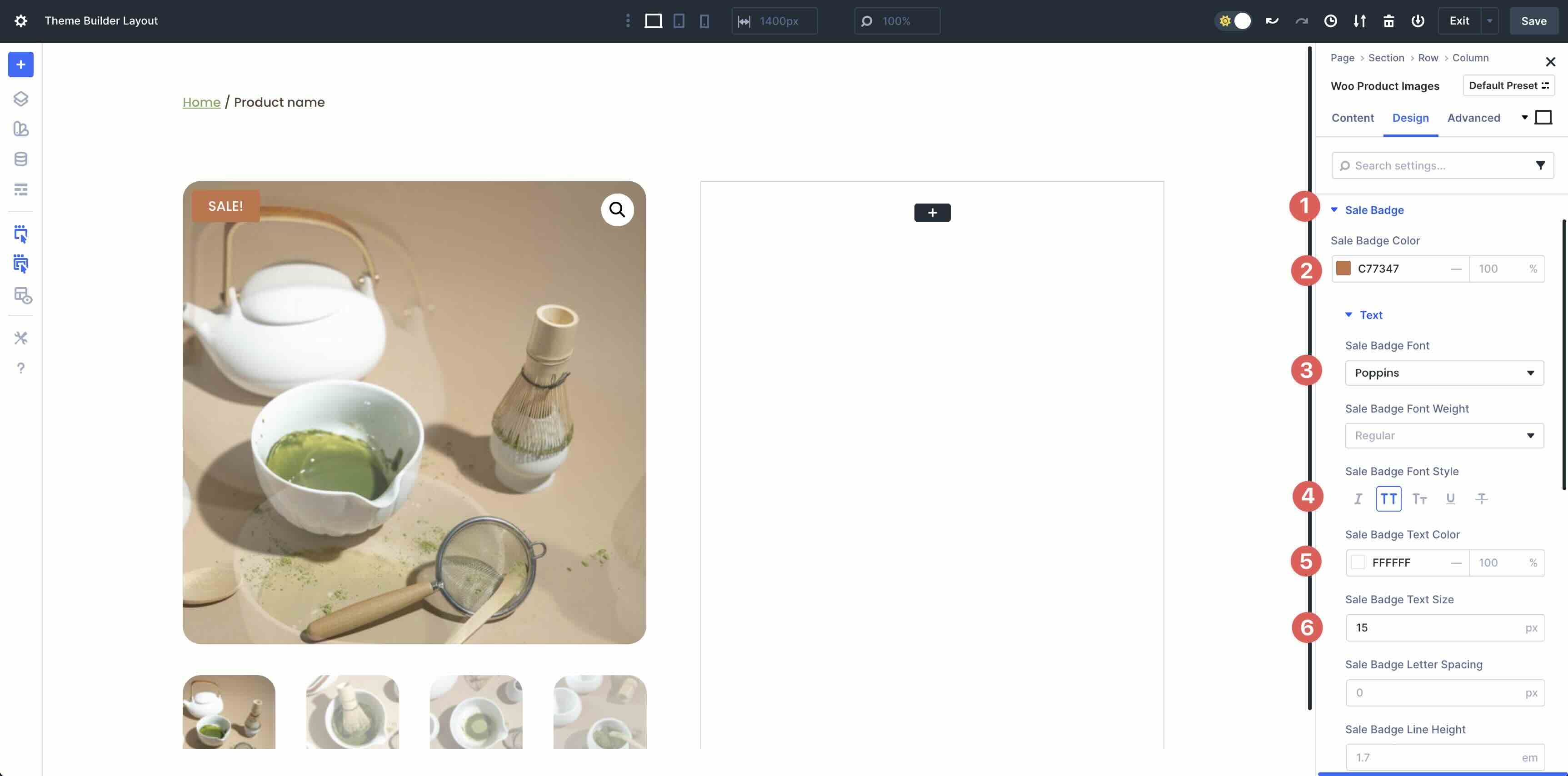
Scroll down to reveal the Sale Badge menu. Expand it and add #C77347 as the Sale Badge Color. In the Text menu, select Poppins as the Sale Badge Font, Uppercase for the Sale Badge Font Style, #ffffff as the Sale Badge Text Color, and 15px as the Sale Badge Text Size.
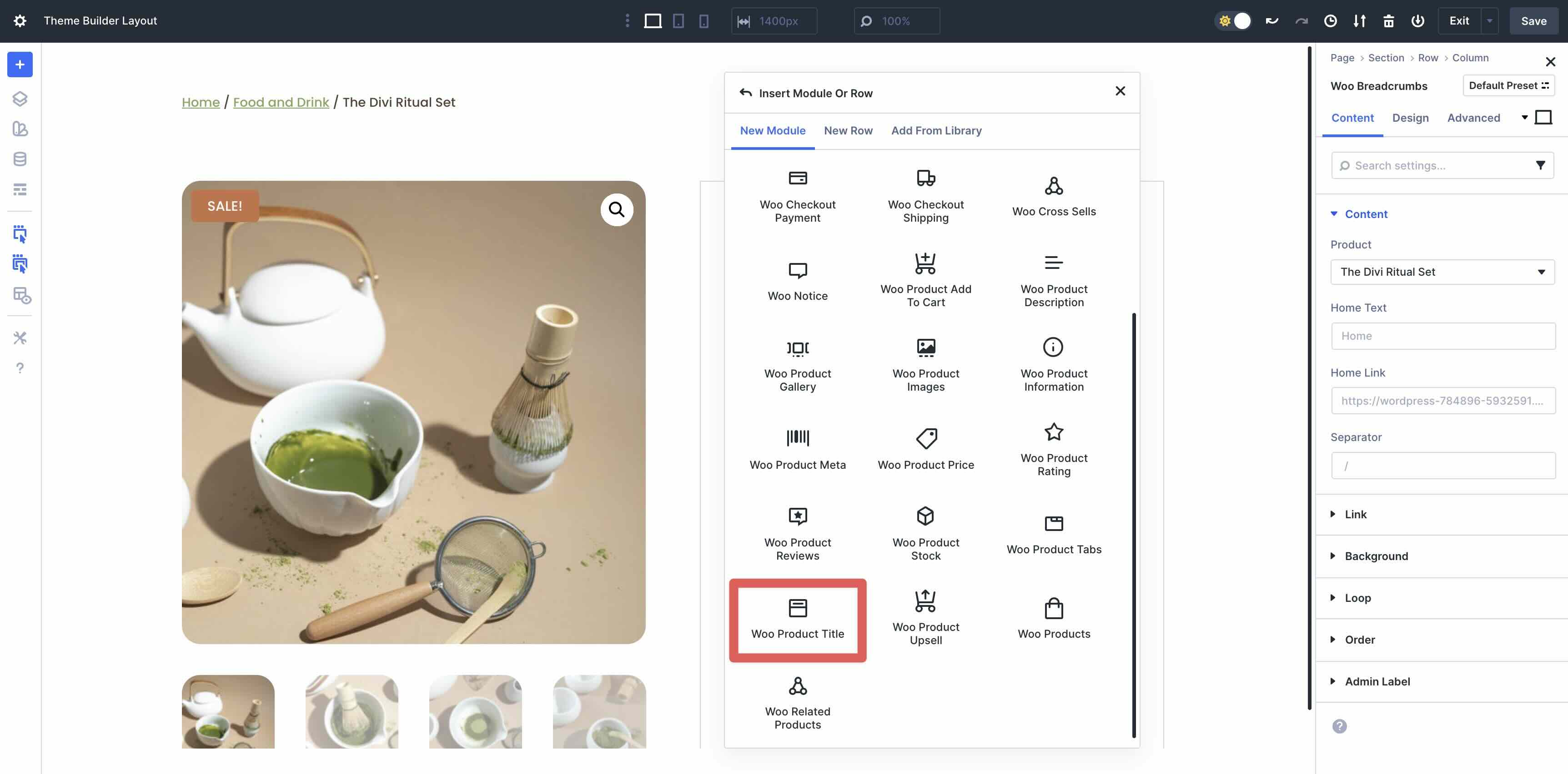
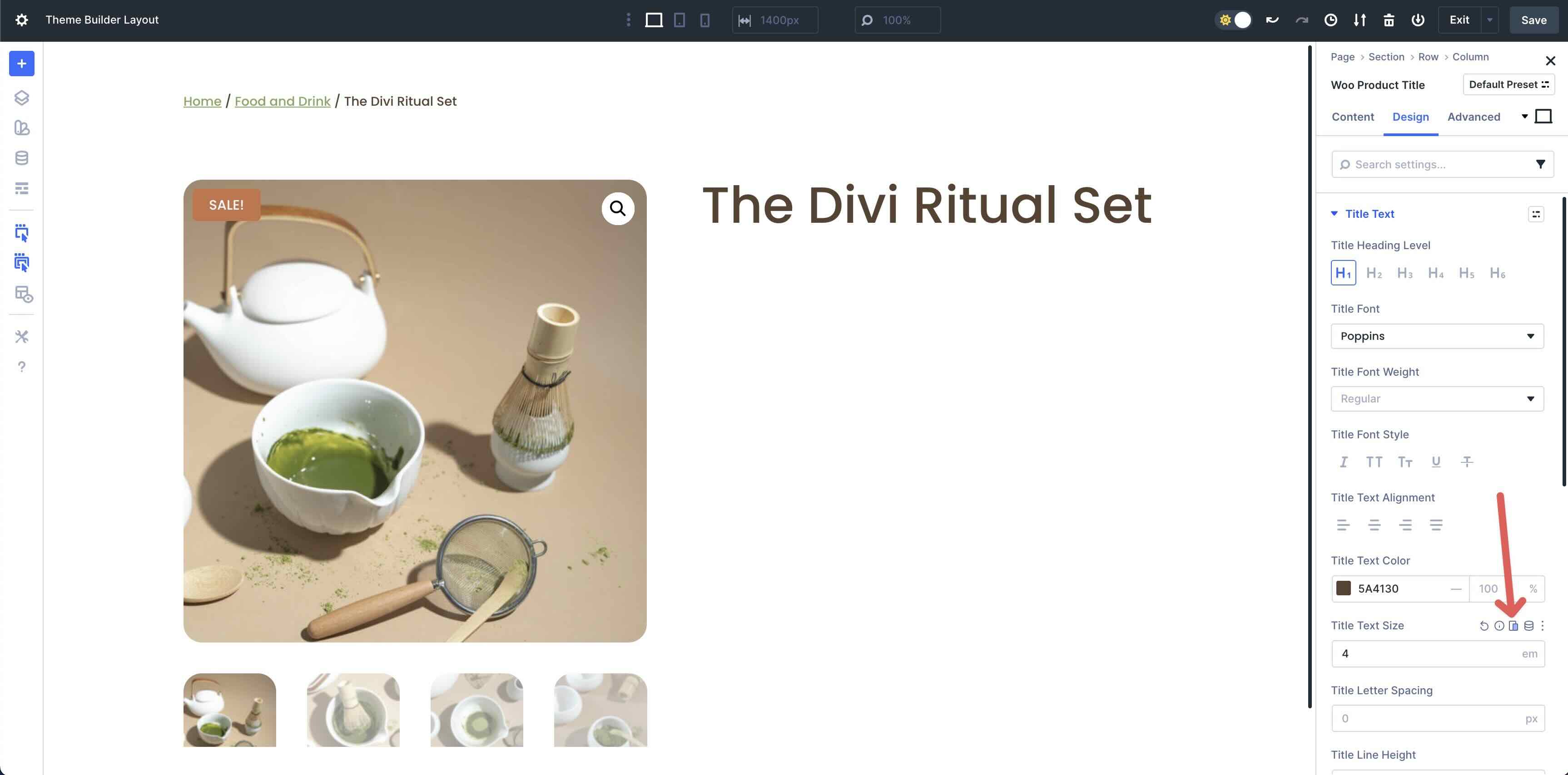
Add The Woo Product Title
Add the Woo Product Title module in the second column.
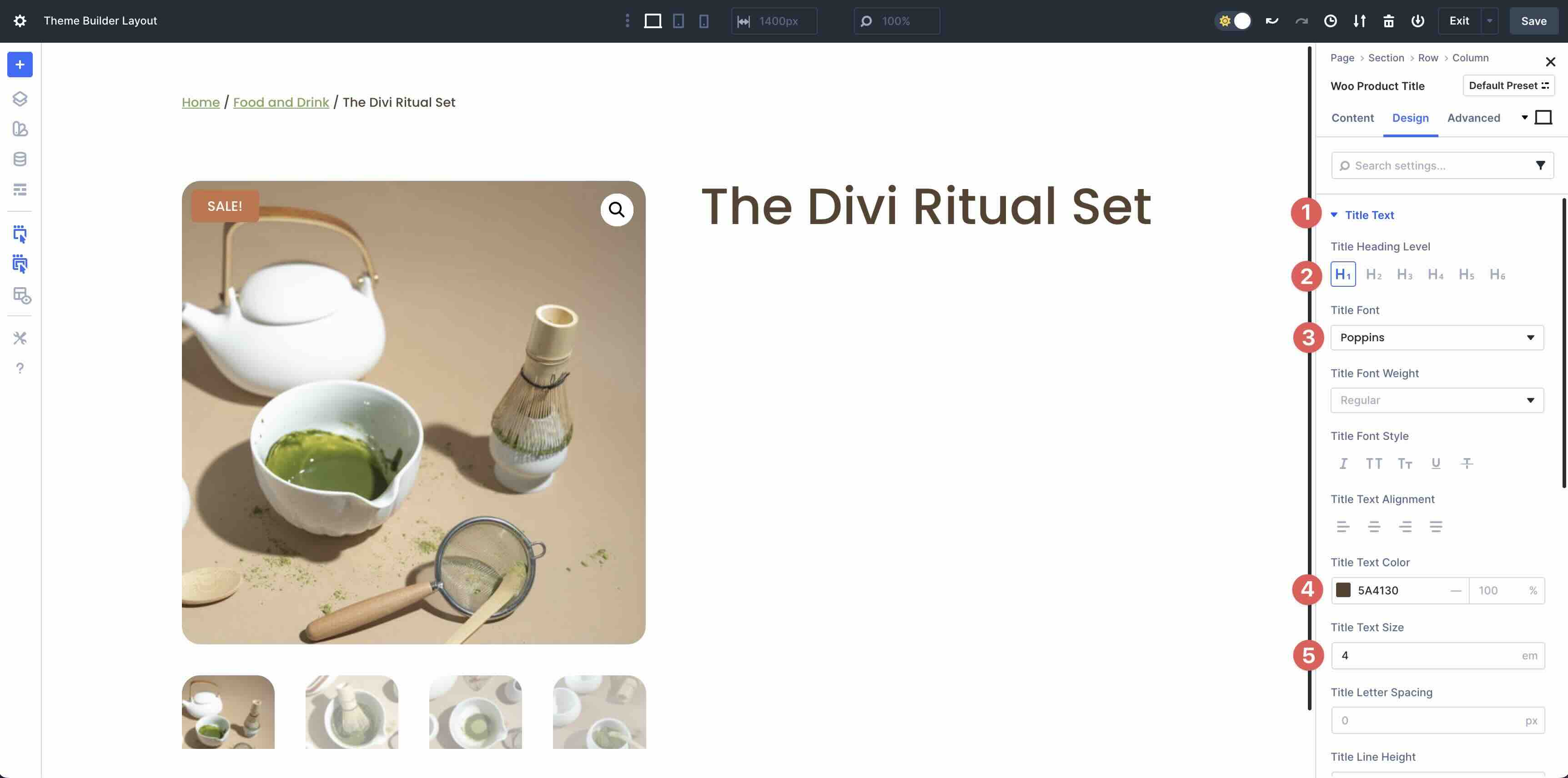
Select the Design tab and expand the Title Text menu. Set the Title Heading Level to H1, Poppins as the Title Font, and #5A4130 as the Title Text Color. Set the Title Text Size to 4em.
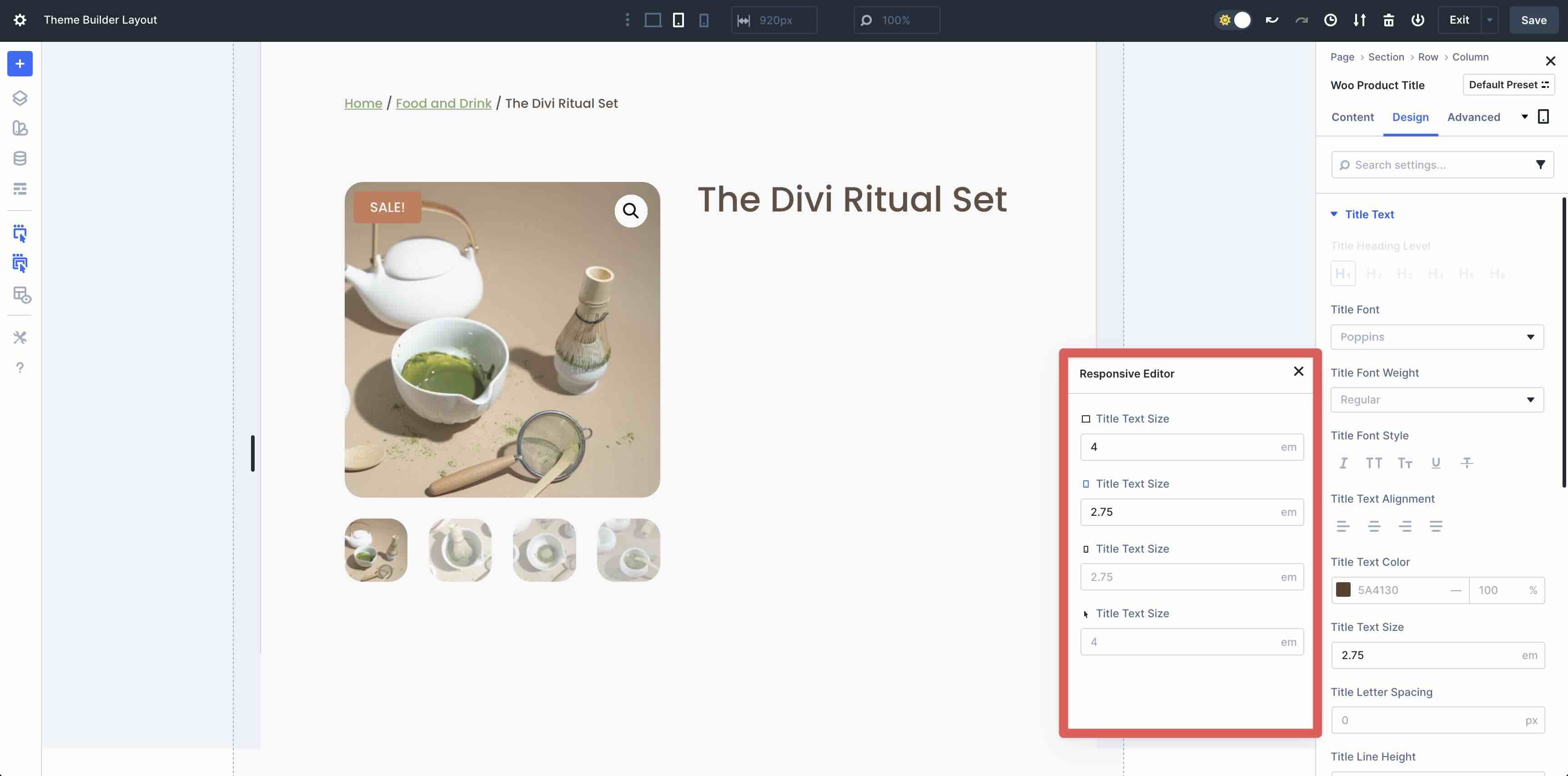
If you want to make the layout responsive as you go along, you can click the Edit Responsive Values button to make immediate changes to any module, saving time as you design the page.
When the Responsive Editor modal appears, you can adjust the values in real-time. Enter 2.75em for tablet and phone views.
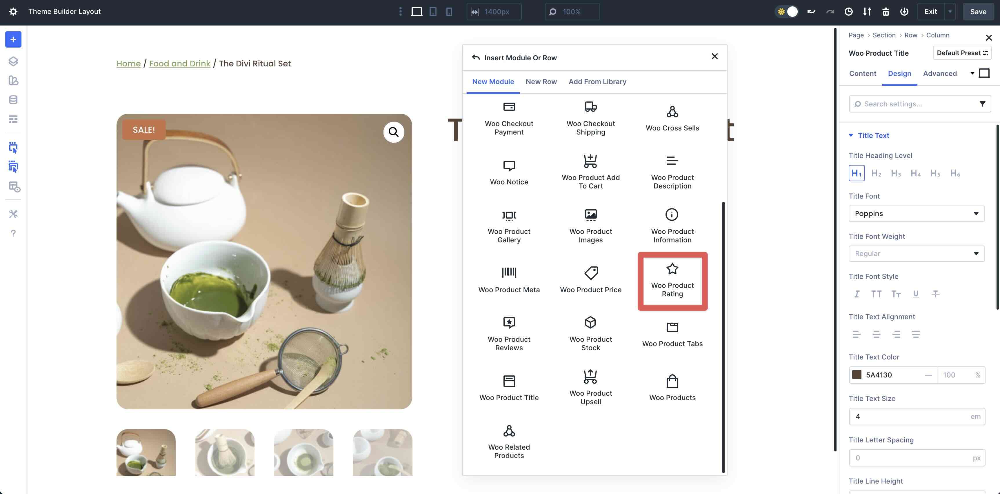
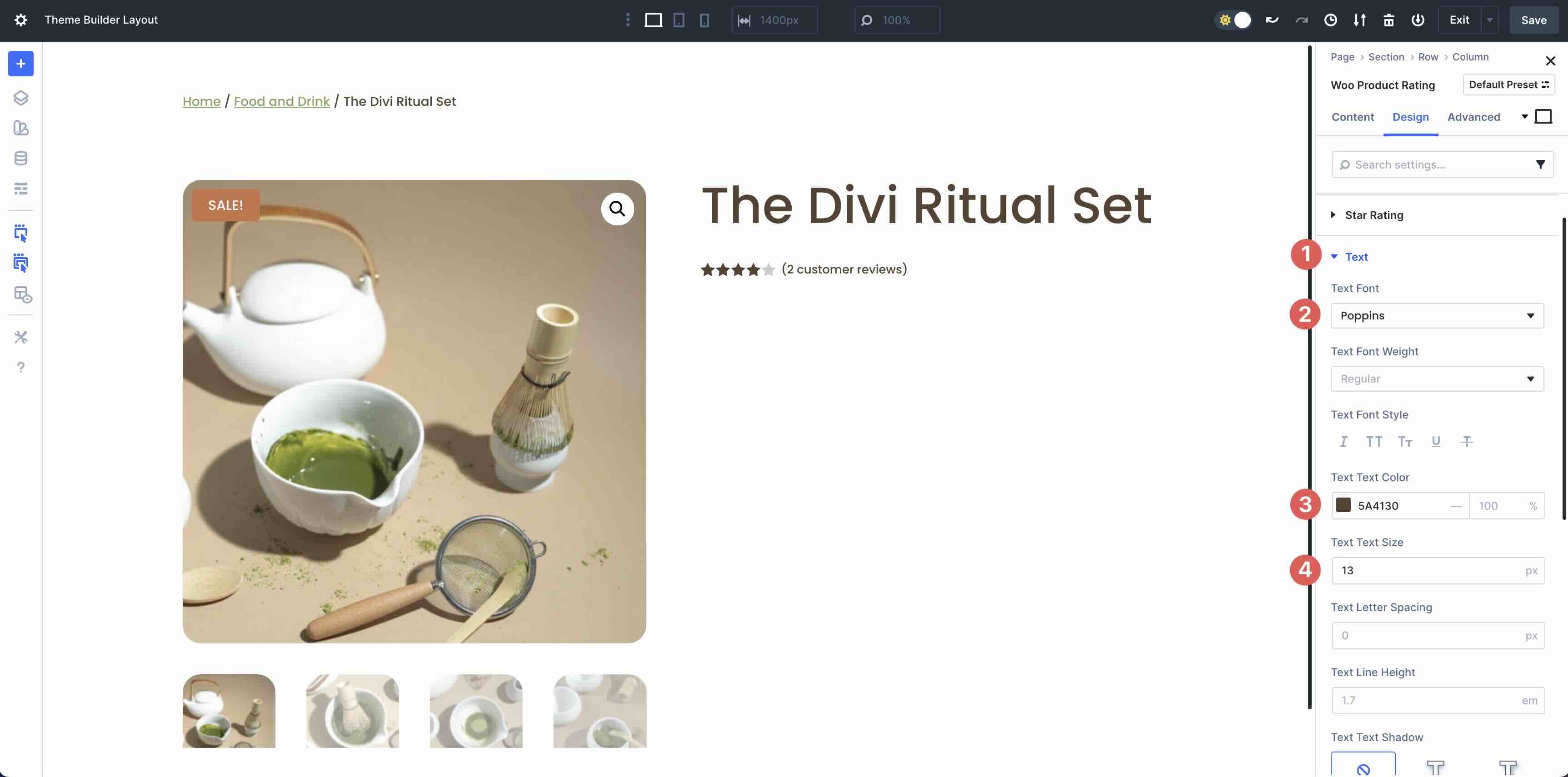
Add The Woo Product Rating Module
Next, add the Woo Product Rating module underneath the Title in the second column.
In the Design tab, expand the Star Rating menu. Set the Star Rating Text Alignment to Left, #5A4130 as the Star Rating Text Color, 15px as the Star Rating Text Size, and 1px as the Star Rating Letter Spacing.
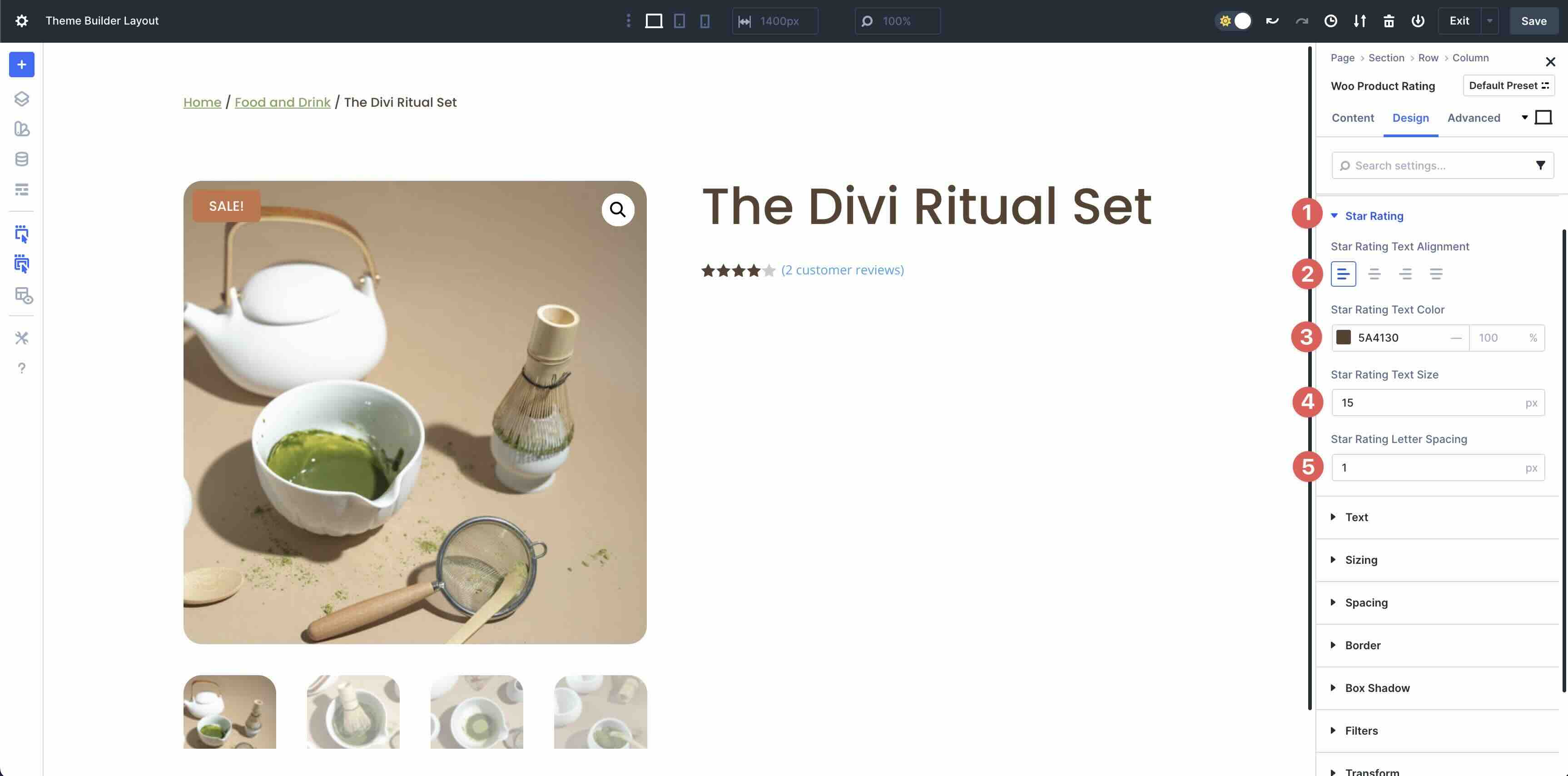
Next, expand the Text menu. Enter Poppins as the Text Font, #5A4130 as the Text Text Color, and 13px as the Text Text Size.
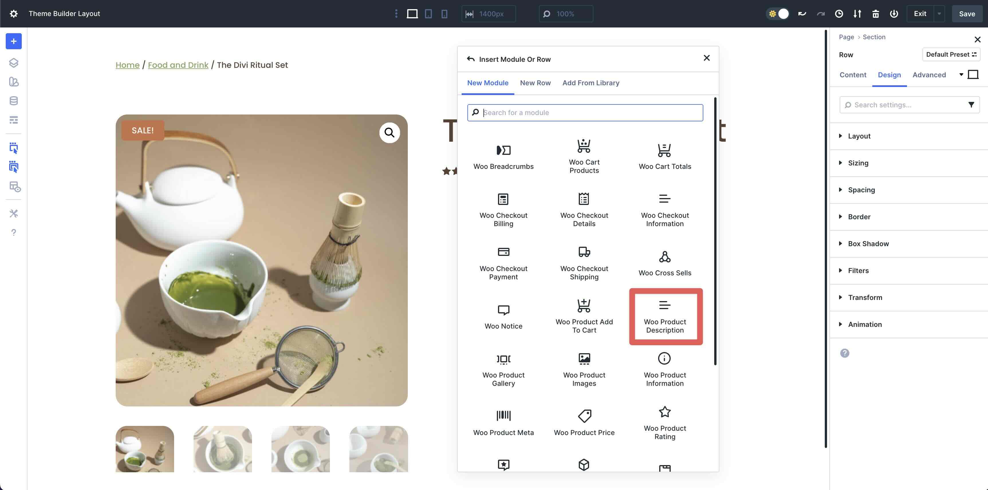
Add The Woo Product Description Module
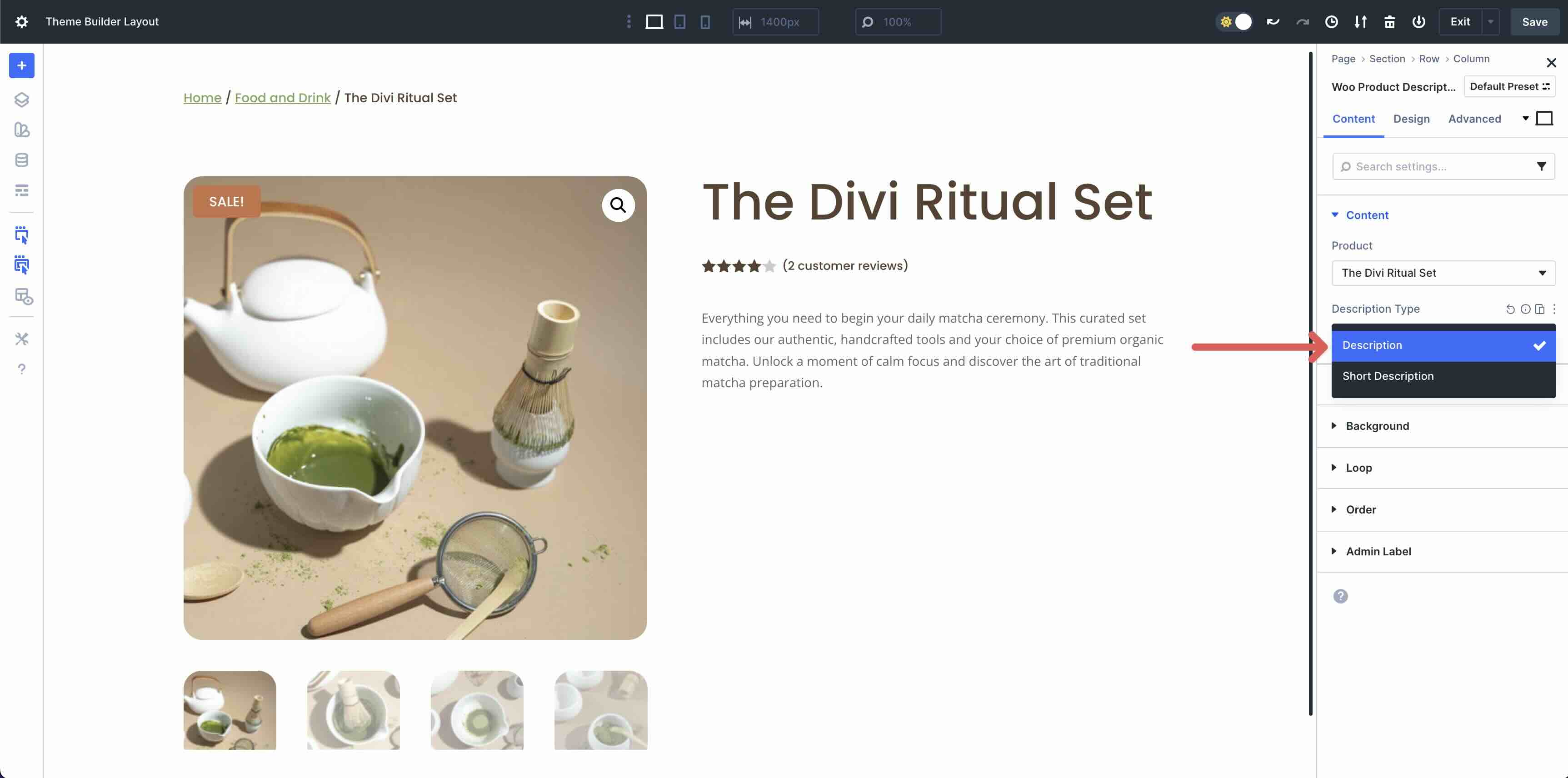
Next, add the Woo Product Description Module to the second column.
In the Content tab, decide whether to use the Description or Short Description in the Description Type field.
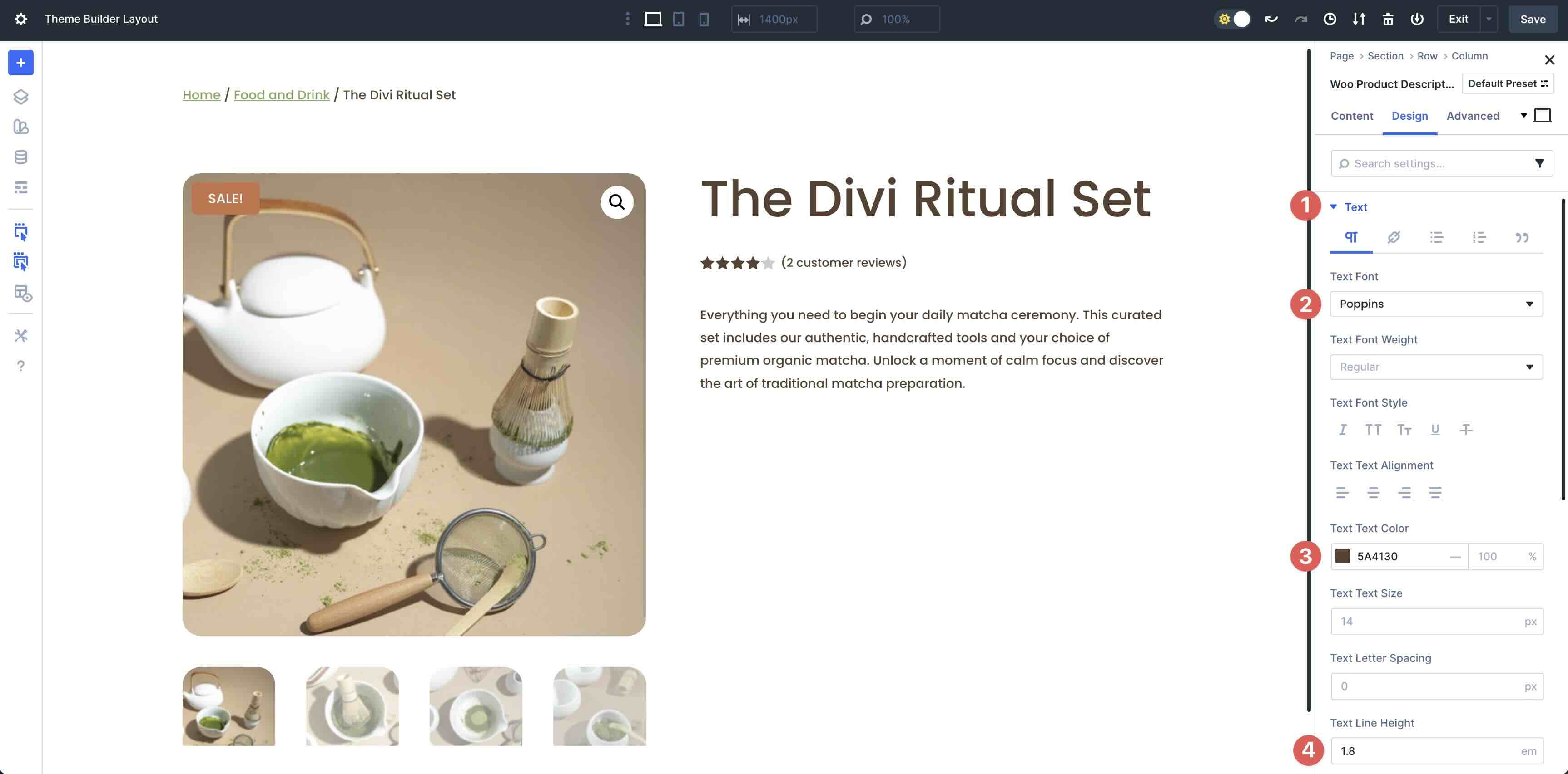
Switch to the Design tab. Expand the Text dropdown menu and select Poppins as the Text Font, #5A4130 as the Text Text Color, and 1.8em as the Text Line Height.
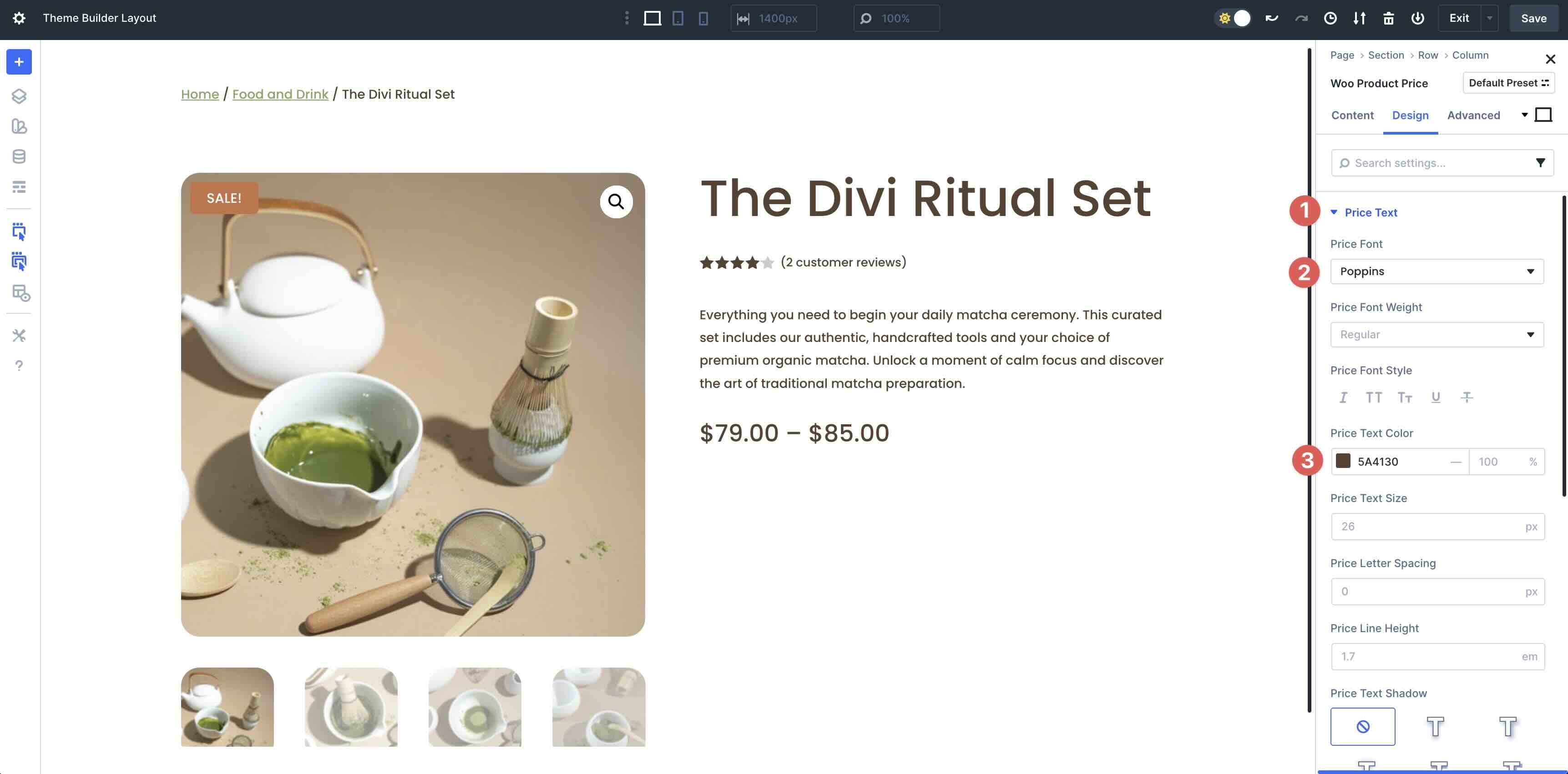
Add The Woo Product Price Module
Next, we’ll add the Woo Product Price module to the second column.
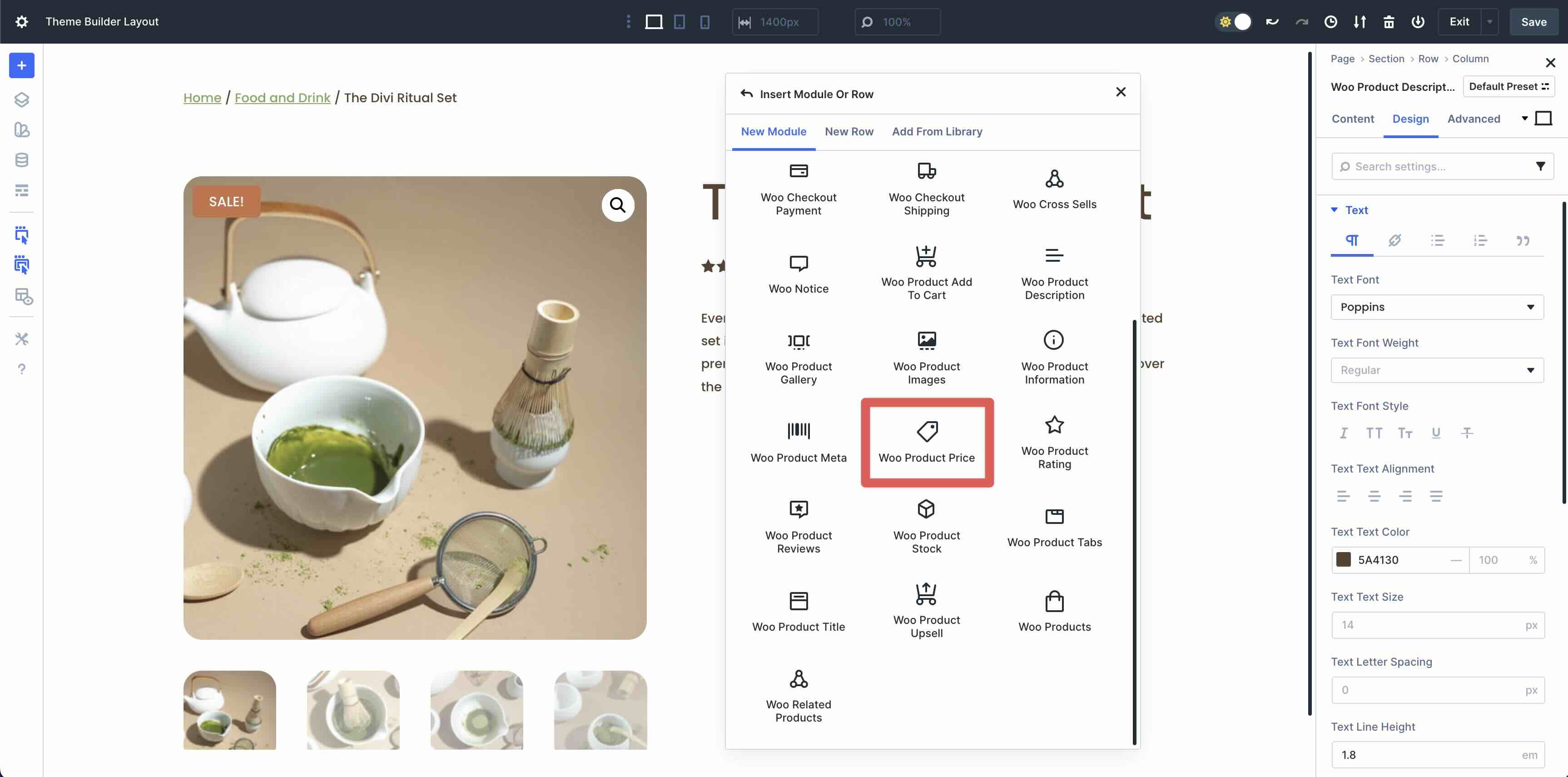
Expand the Price Text menu. Select Poppins as the Price Font and #5A4130 as the Price Text Color.
Add The Woo Product Add To Cart Module
Add the Woo Product Add To Cart module.
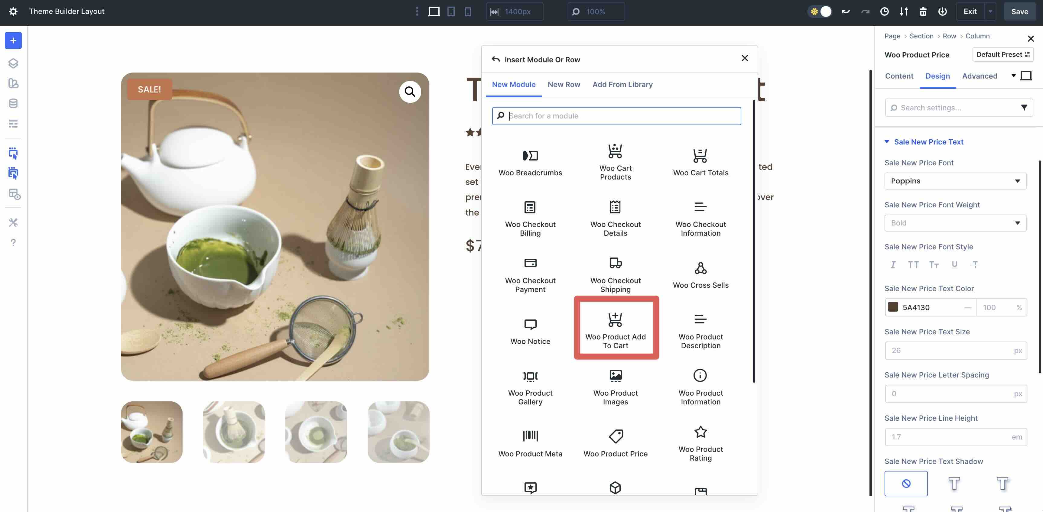
In the Design tab, expand the Field Labels menu and enter Poppins as the Field Labels Font. In the Field Labels Text Color field, use #5A4130.
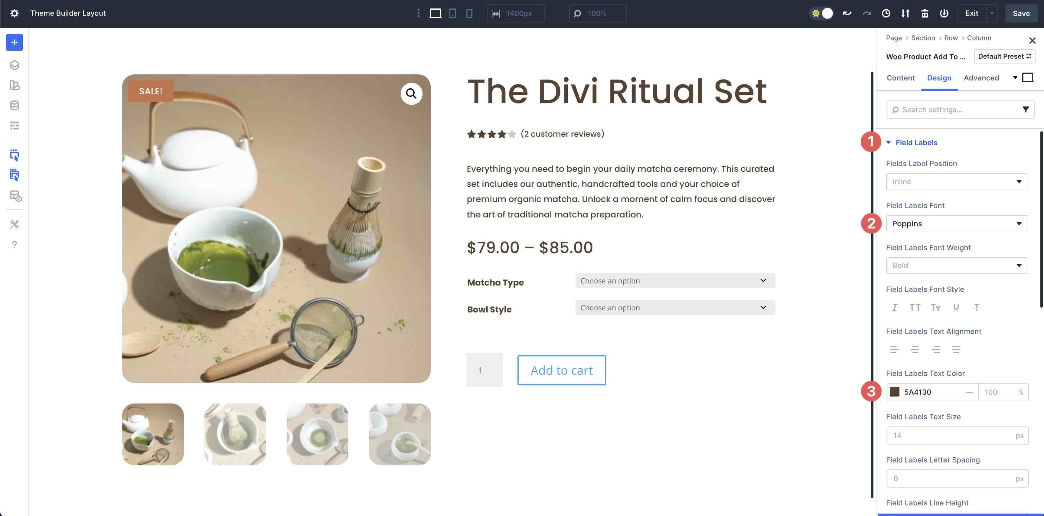
Next, expand the Fields menu. Enter #5A4130 in the Fields Background Color and Fields Focus Background Color fields. Set the Opacity to 0. In the Fields Focus Text Color field, enter #5A4130.
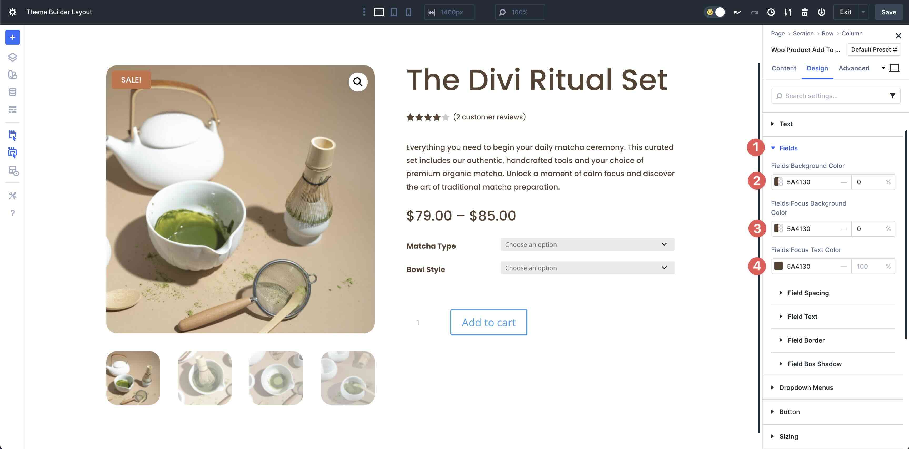
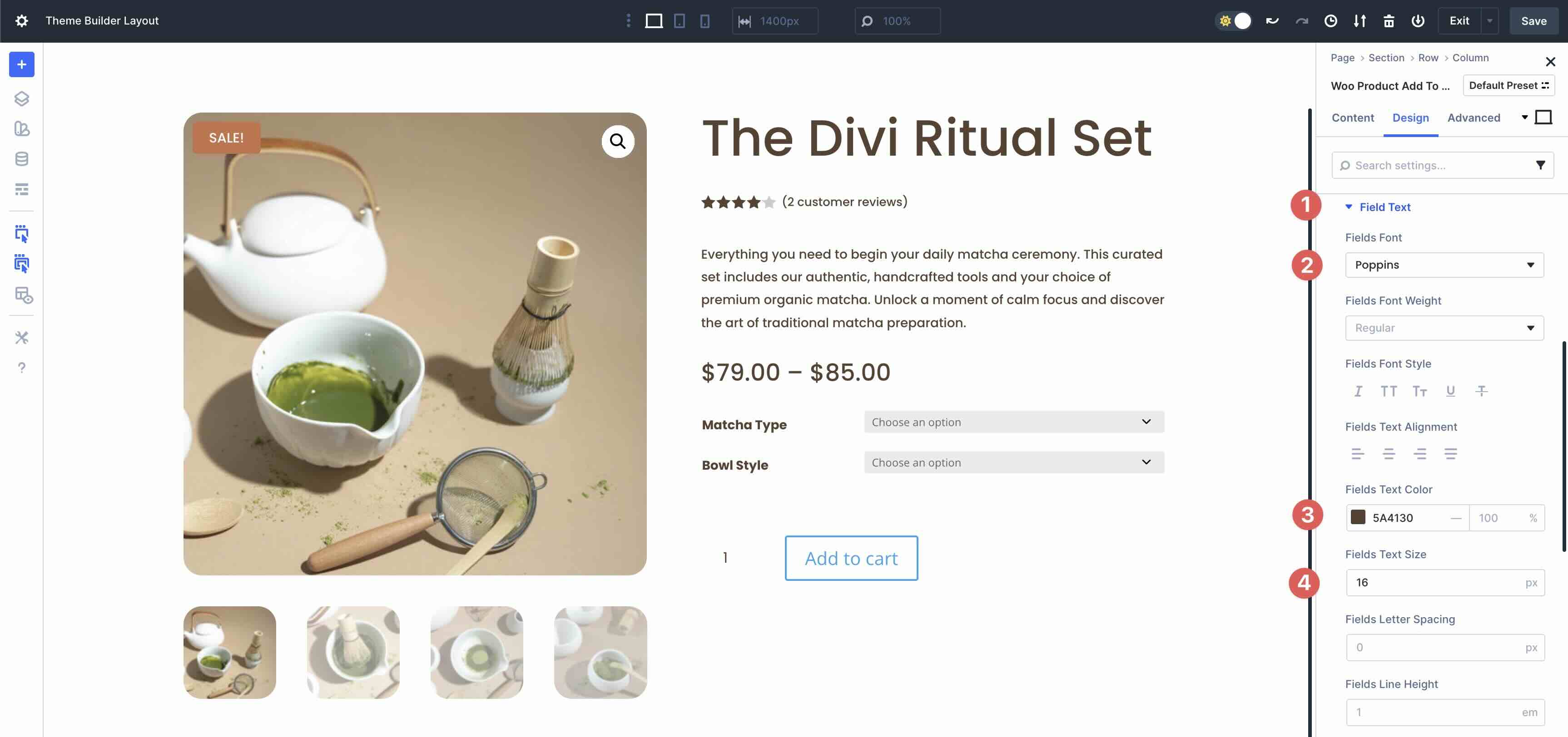
Expand the Fields Text menu. Enter Poppins as the Field Font, #5A4130 as the Fields Text Color, and 16px as the Fields Text Size.
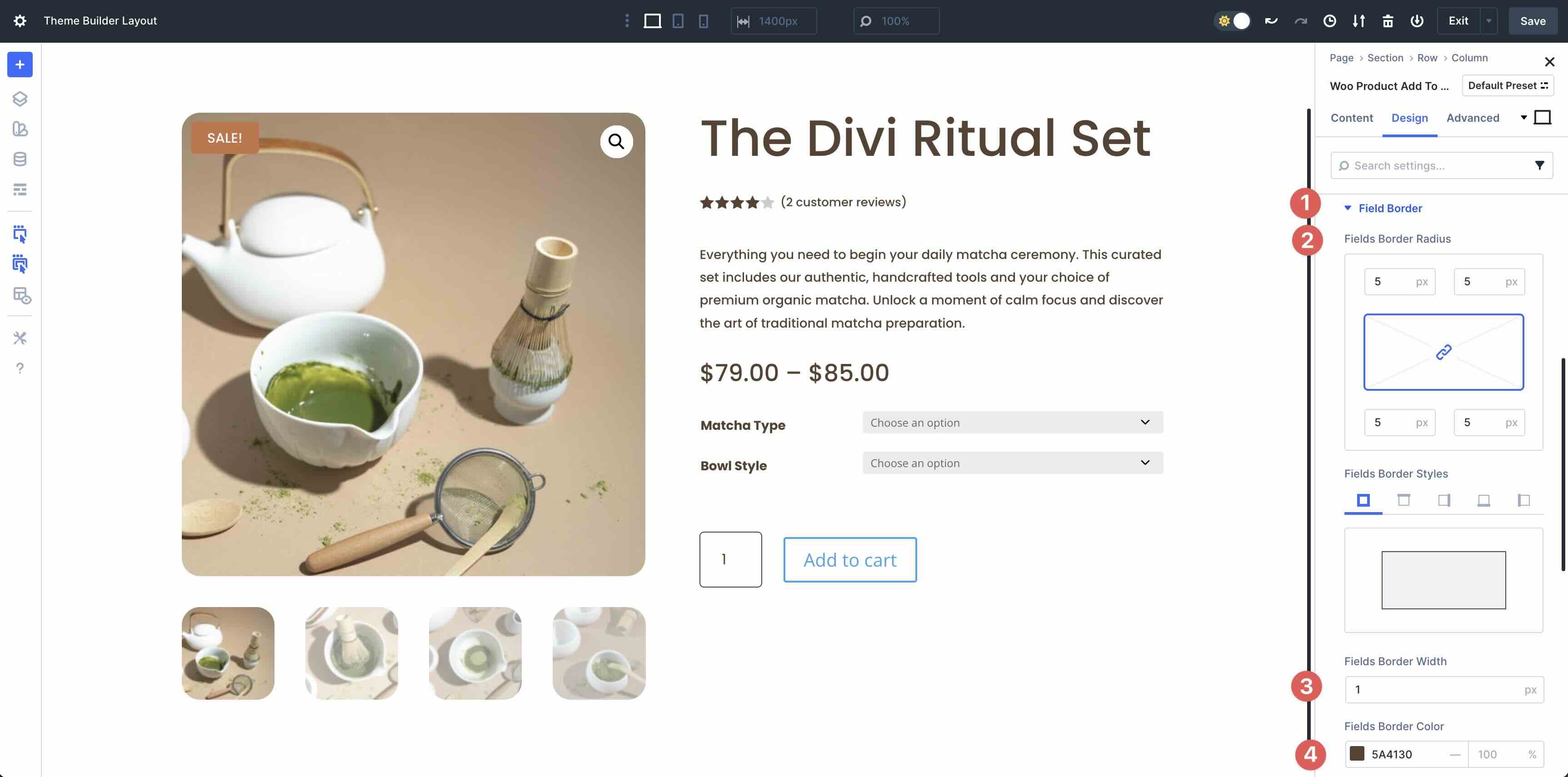
Next, expand the Field Border menu. In the Fields Border Radius settings, enter 5px. Add 1px Field Border Width and set the Fields Border Color to #5A4130.
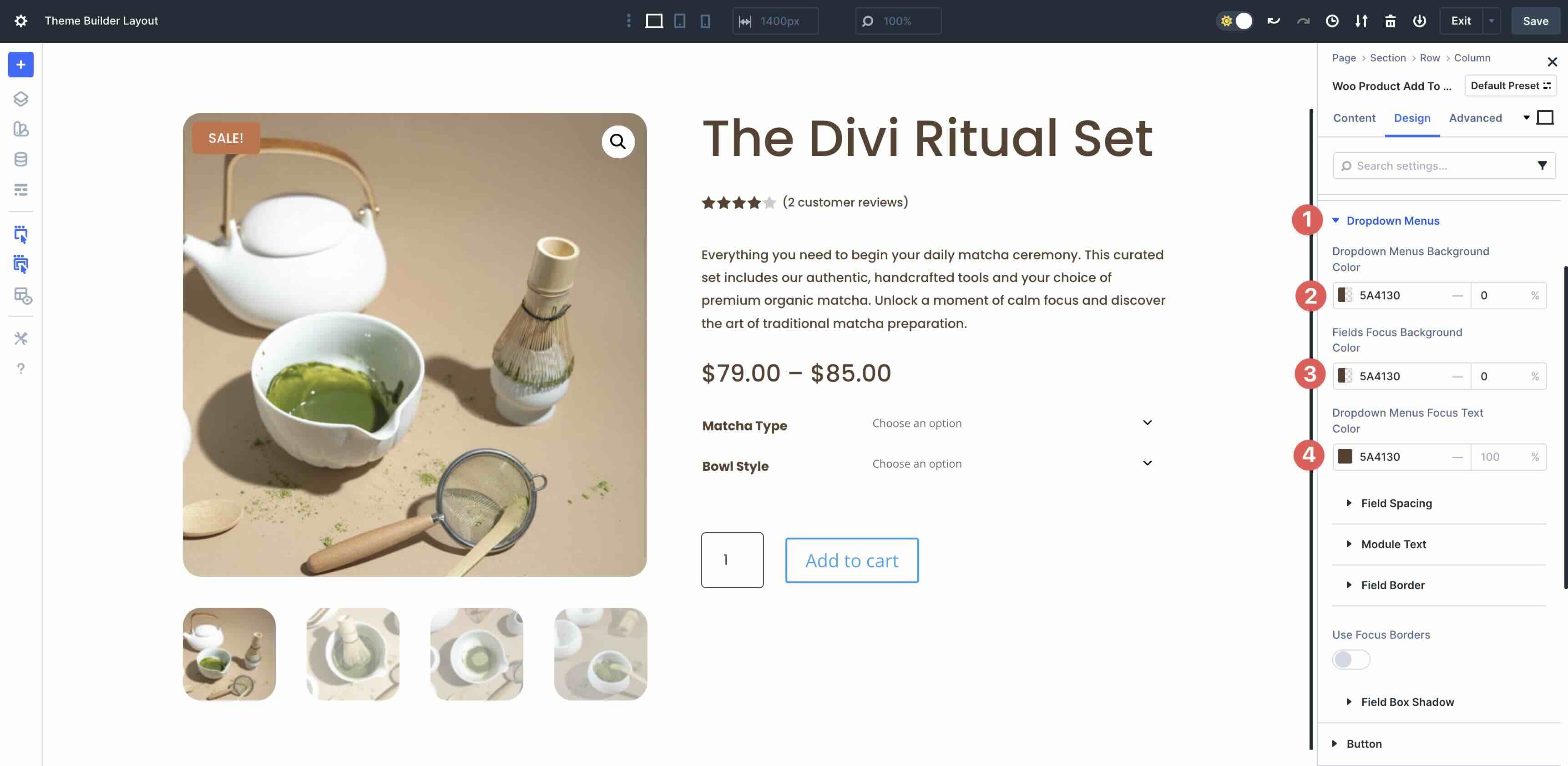
In the Dropdown Menu settings, set the Dropdown Menus Background Color and Fields Focus Background Color to #5A4130 with an Opacity of 0. Set the Dropdown Menus Focus Text Color to #5A4130.
Next, expand the Field Spacing settings. Set the Dropdown Menu Margin to 5px on all sides.
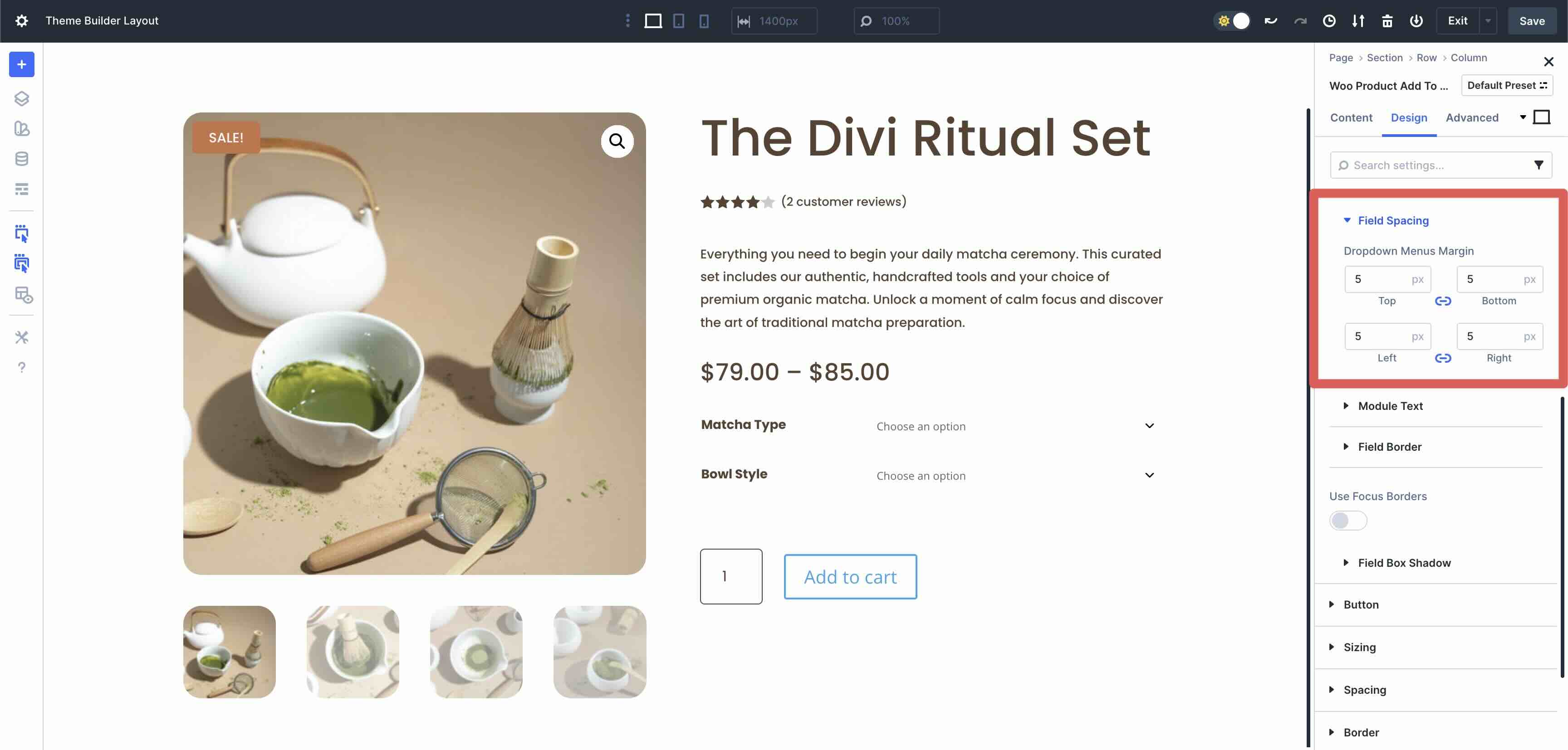
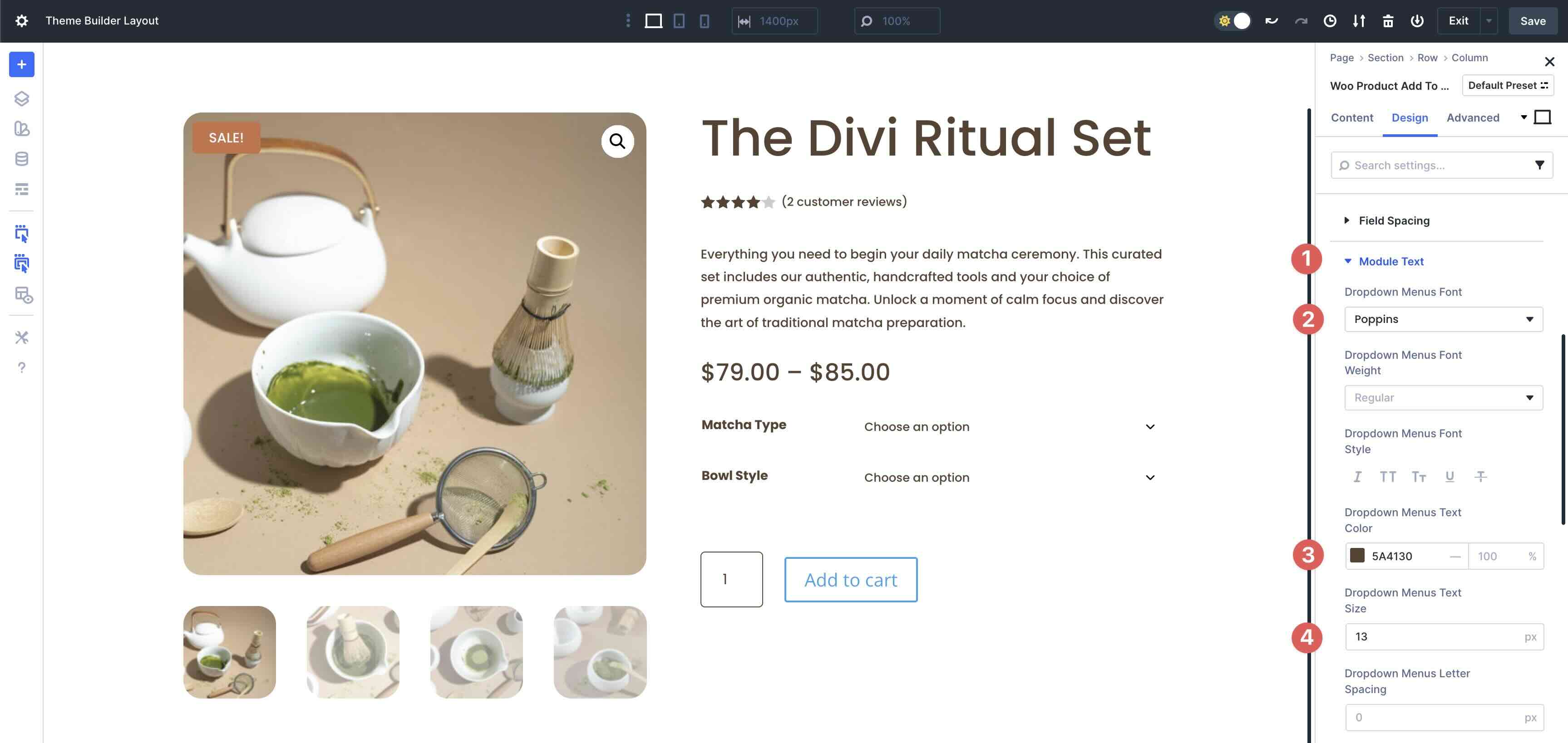
In the Module Text dropdown menu, enter Poppins as the Dropdown Menu Font, #5A4130 as the Dropdown Menu Text Color, and 13px as the Dropdown Menu Text Size.
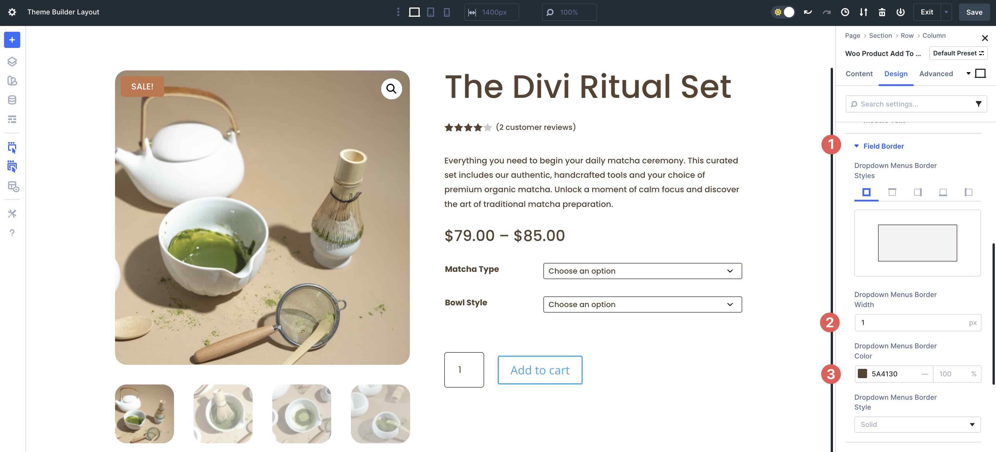
Next, expand the Field Border menu. Add 1px Dropdown Menus Border Width and set the Dropdown Menus Border Color to #5A4130.
Style The Button
The last step in this module is to style the Button. Expand the Button menu and toggle Use Custom Styles For Button on.
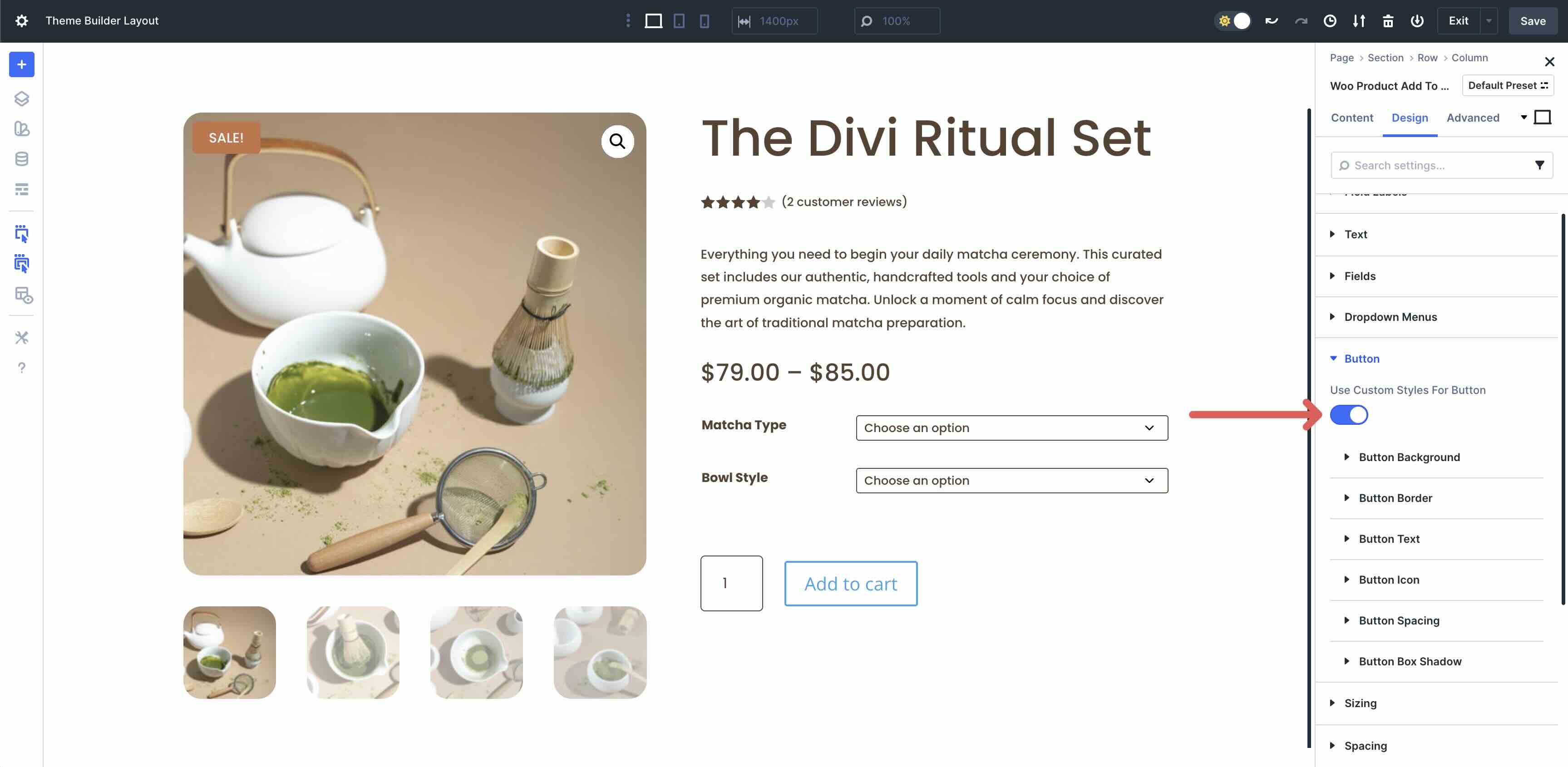
Expand the Button Background settings and assign #83A65B as the Button Background Color.
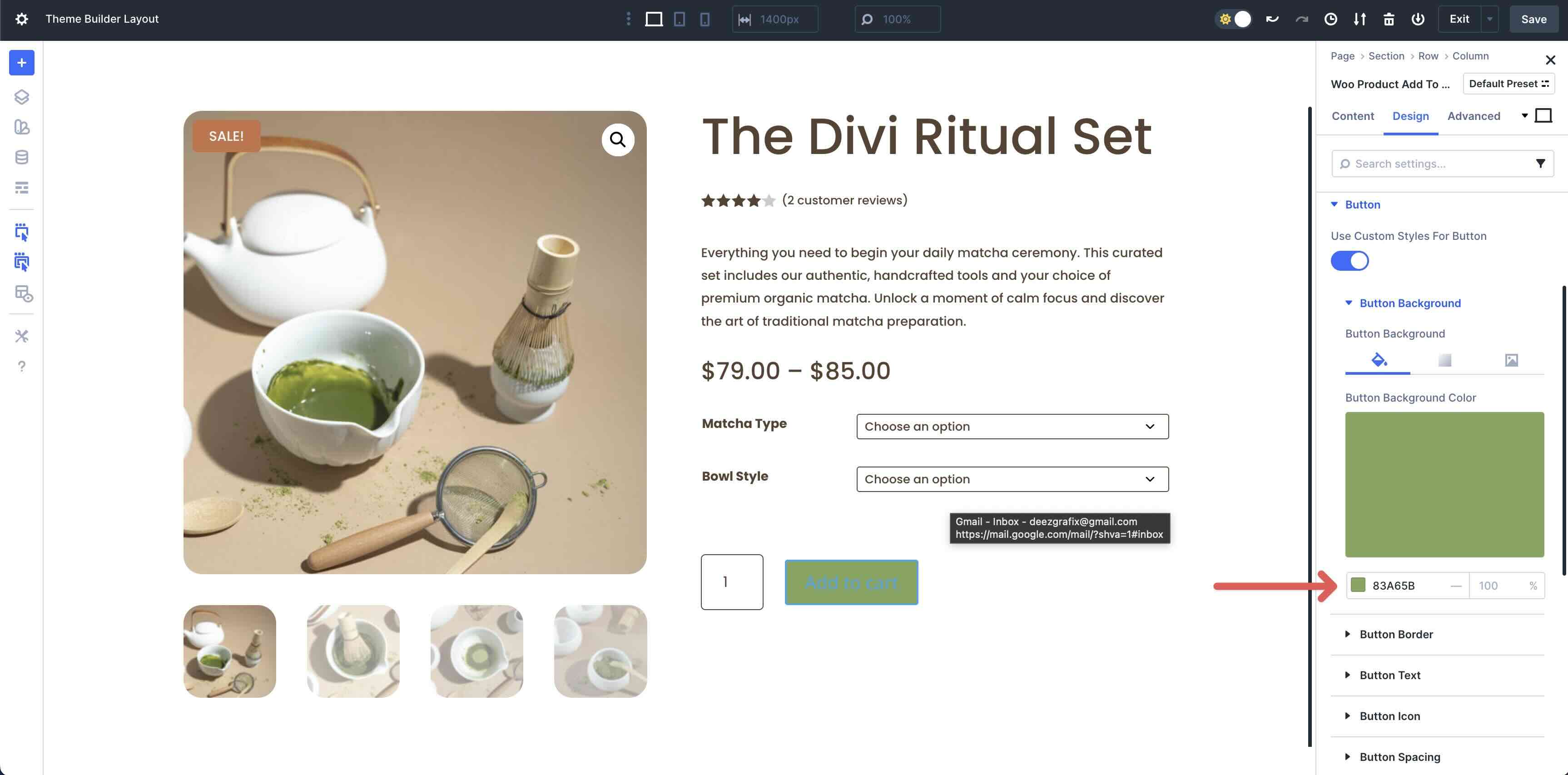
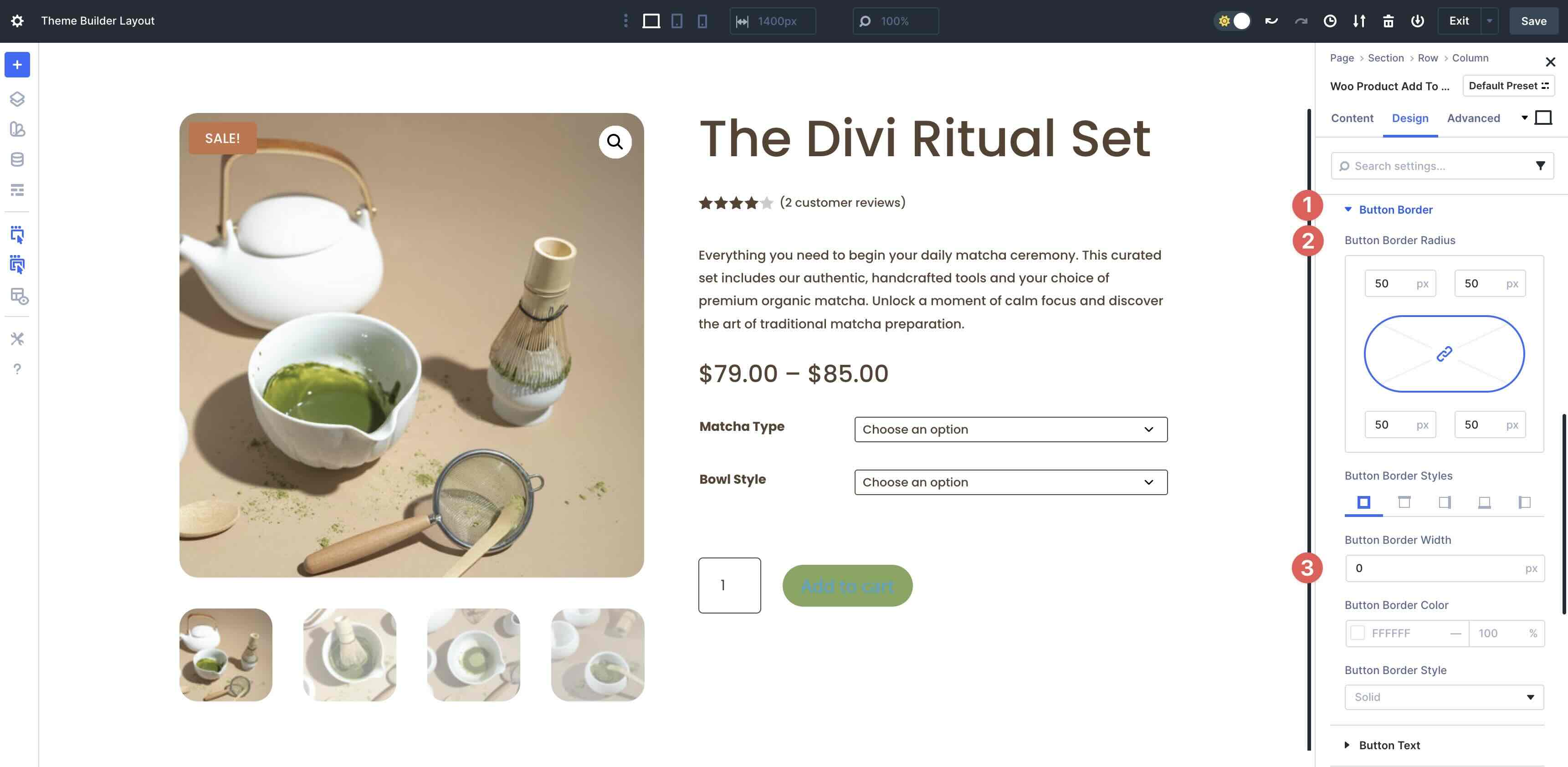
In the Button Border menu, add 50px Button Border Radius.
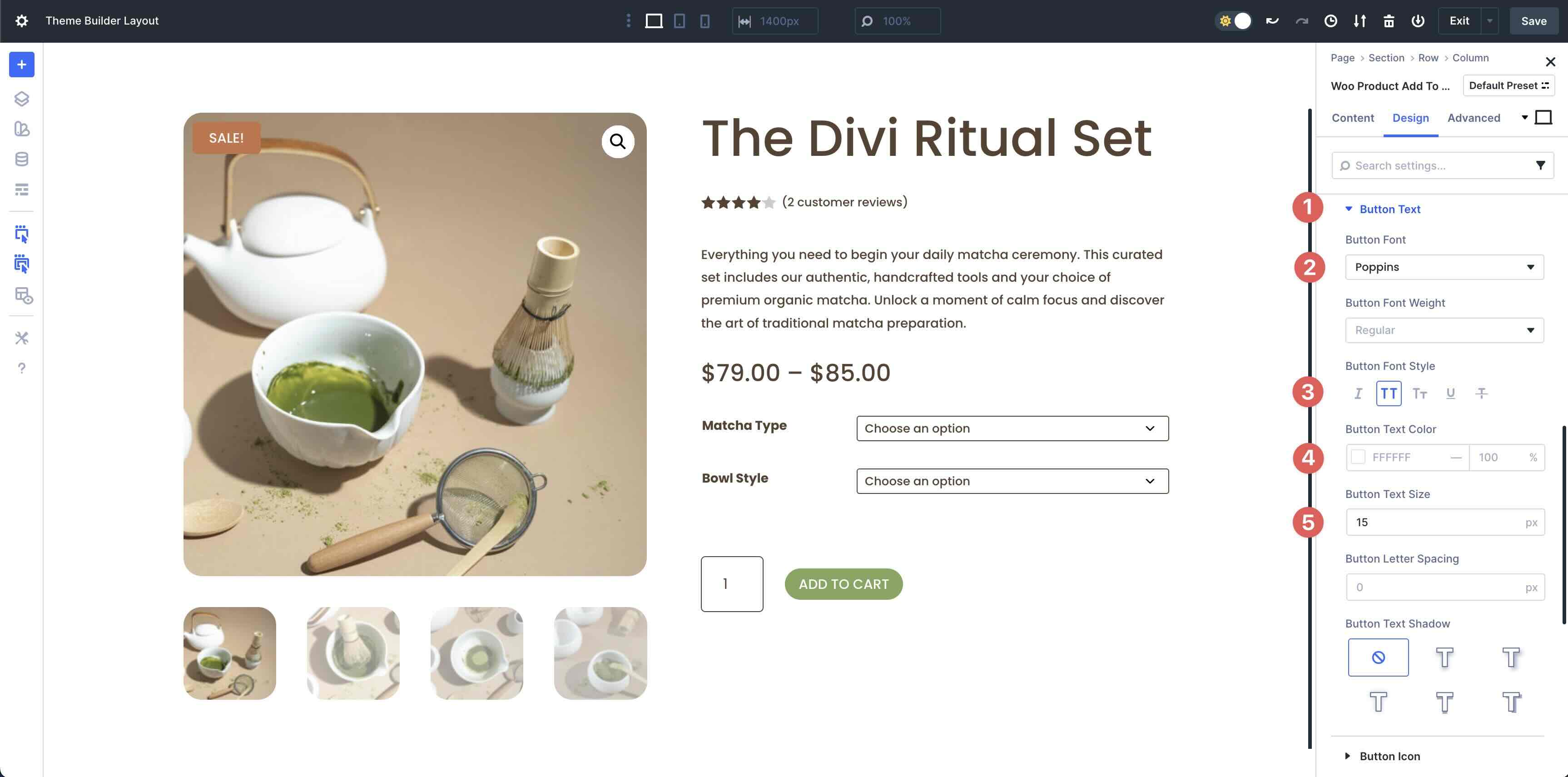
In the Button Text menu, use Poppins as the Button Font, Uppercase in the Button Font Style, and 15px for the Button Text Size.
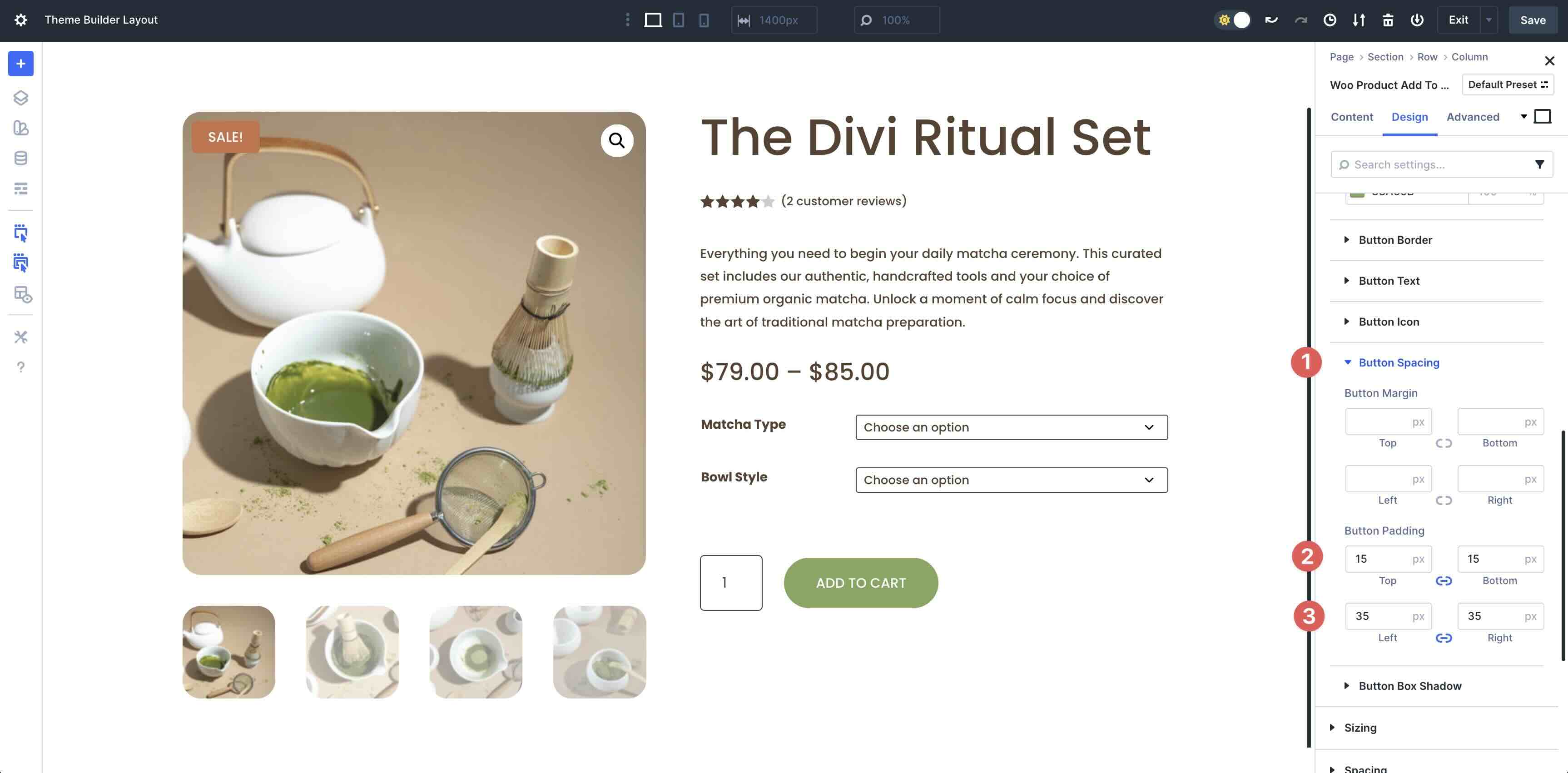
Finally, in the Button Spacing menu, add 15px Button Padding to the top and bottom and 35px for the left and right.
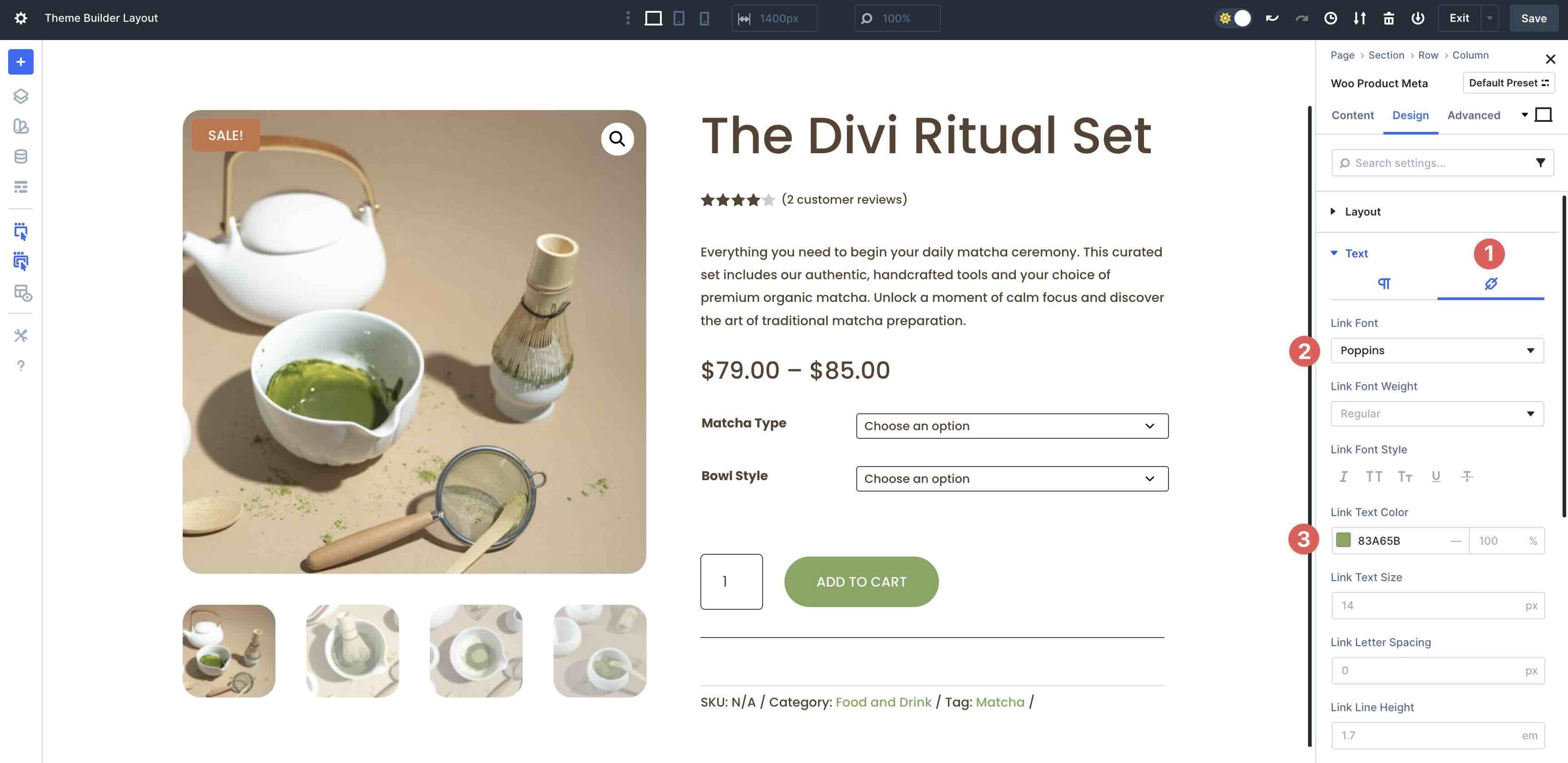
Add The Woo Product Meta Module
The last module to add to the second column of the row is the Woo Product Meta module.

In the Design tab, expand the Text menu. For the Paragraph tab, enter Poppins as the Meta Font, Left in the Meta Text Alignment field, and #5A4130 in the Meta Text Color field.
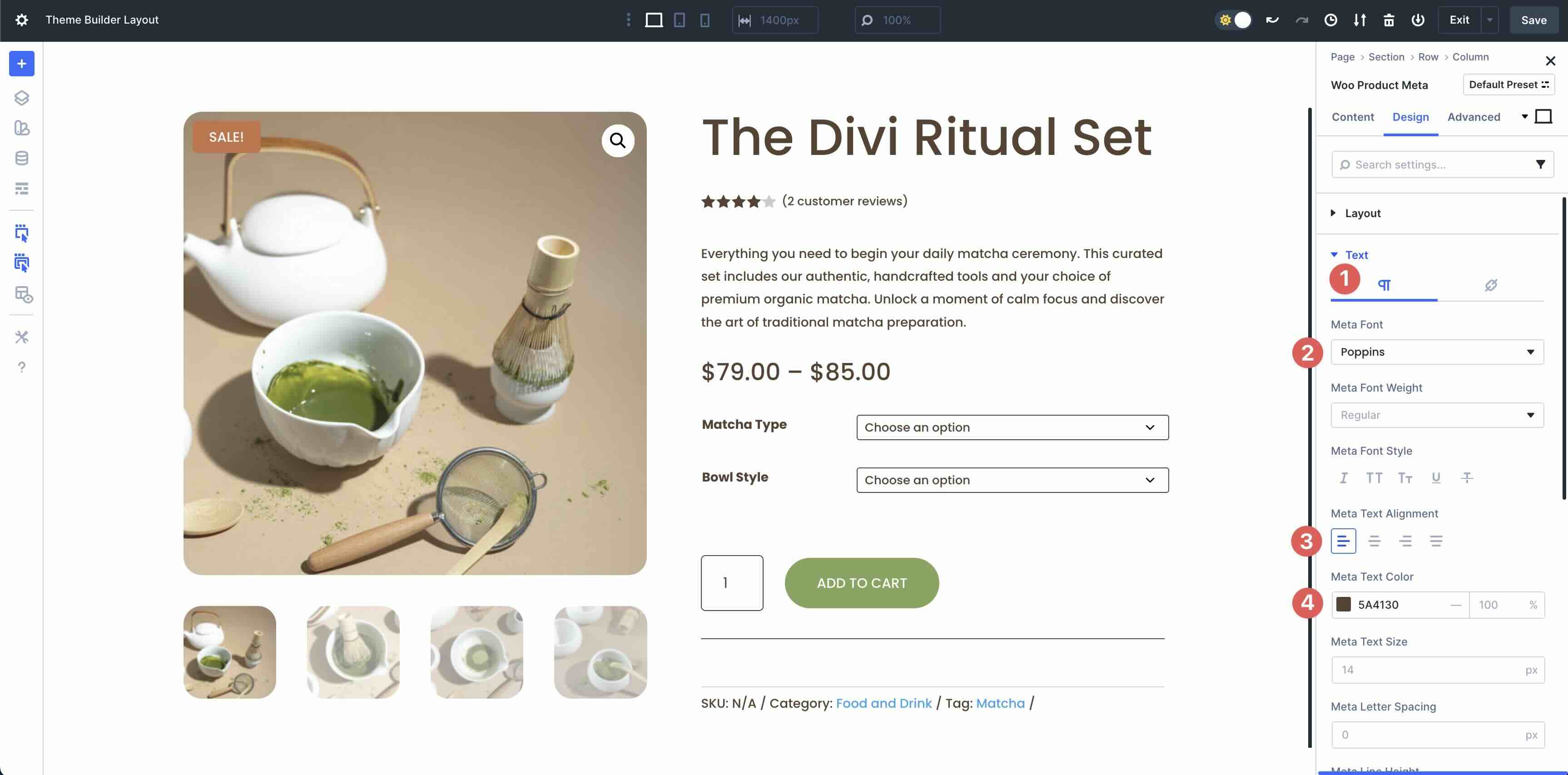
Tab over to Links. Select Poppins as the Link Font and enter #83A65B as the Link Text Color.
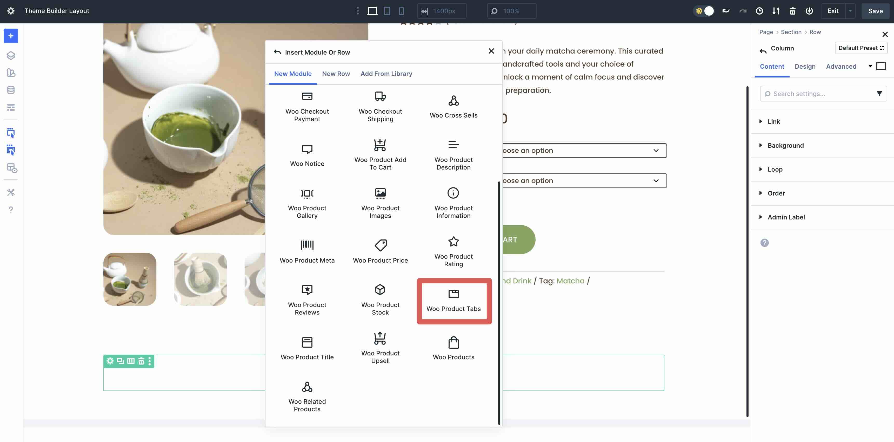
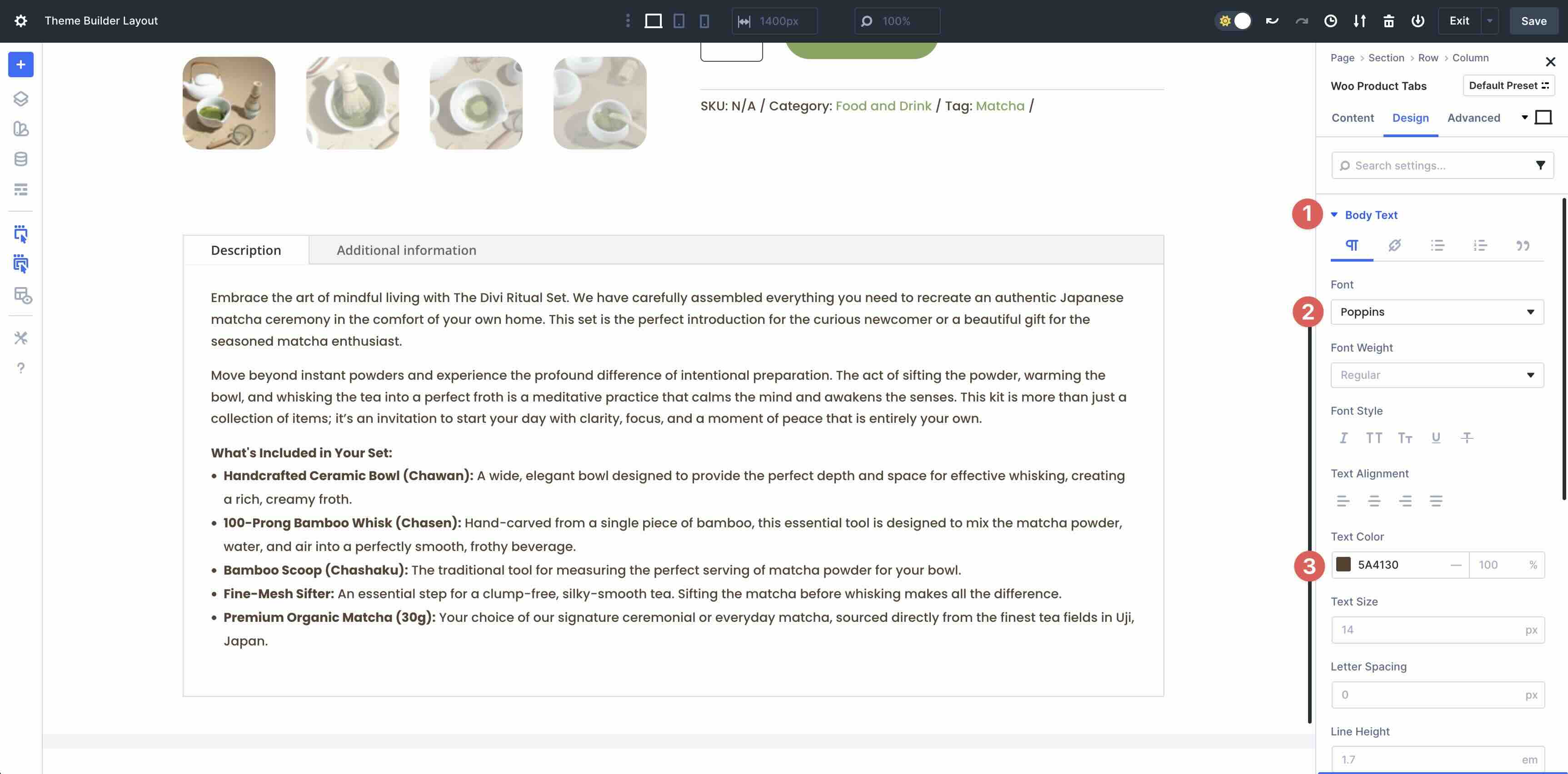
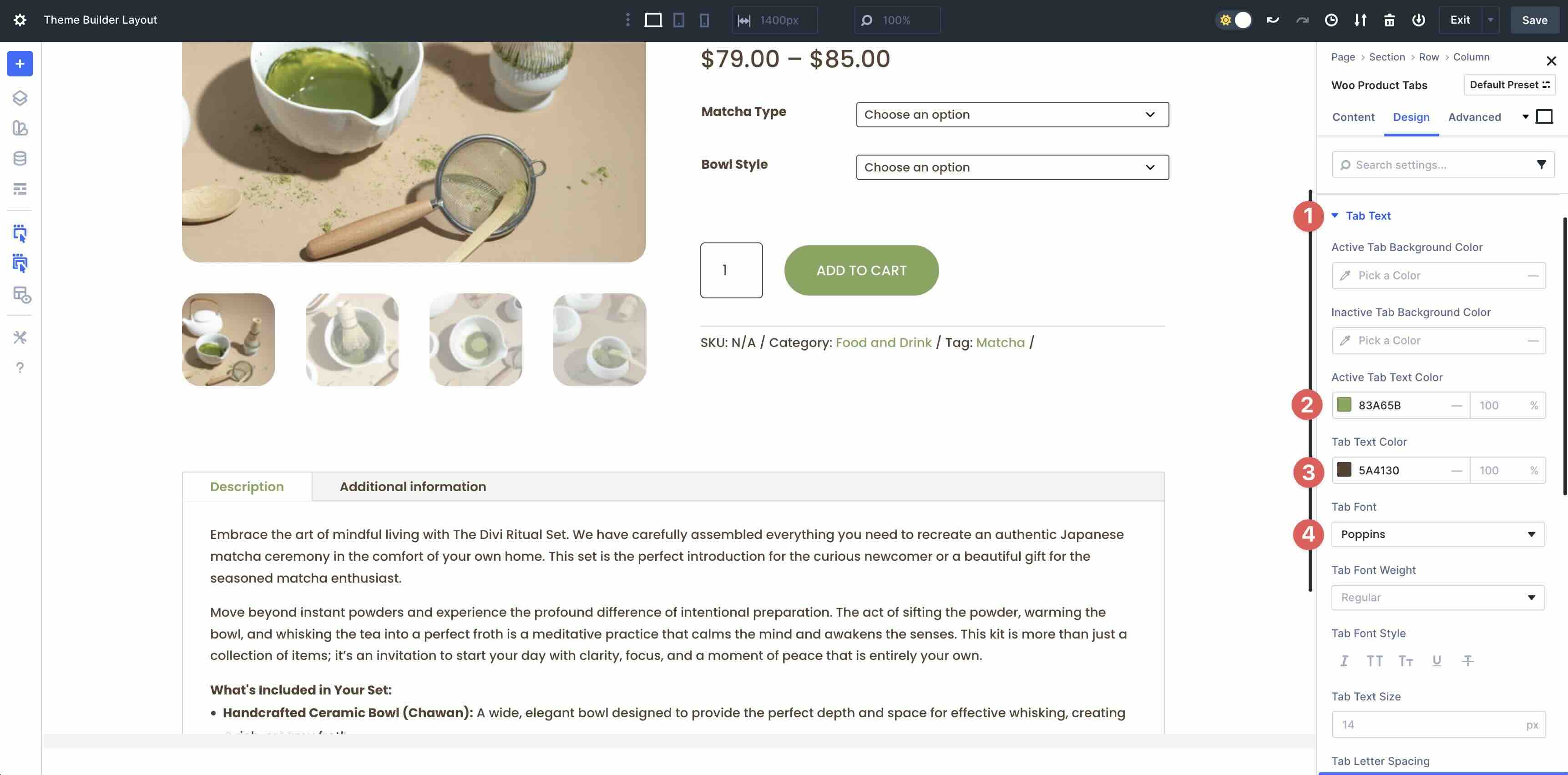
Add The Woo Product Tabs Module
Add a new single-column row under the two-column row that houses our product info. Select the Woo Product Tabs module.
Expand the Body Text menu. Enter Poppins for the Font and set the Text Color to #5A4130.
Next, expand the Tab Text menu. Enter #83A65B as the Active Tab Text Color and #5A4130 as the Tab Text Color. Set the Tab Font to Poppins.
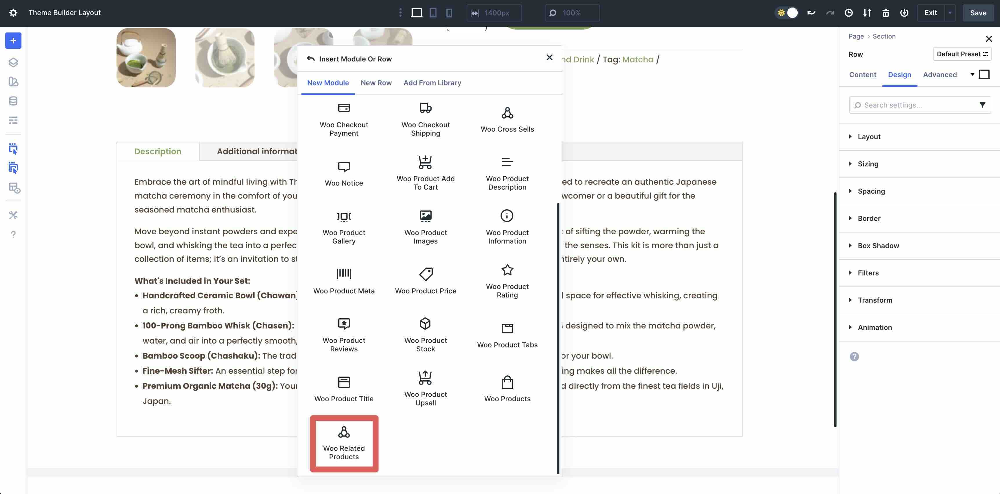
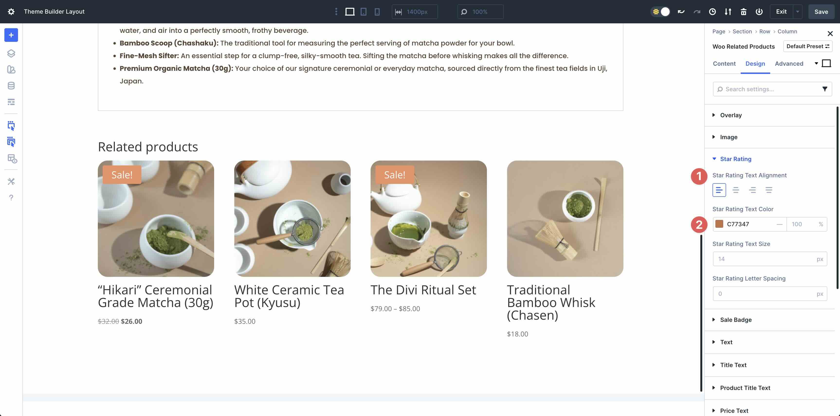
Add The Woo Related Products Module
Add a new single-column row. Select and add the Woo Related Products module to the page.
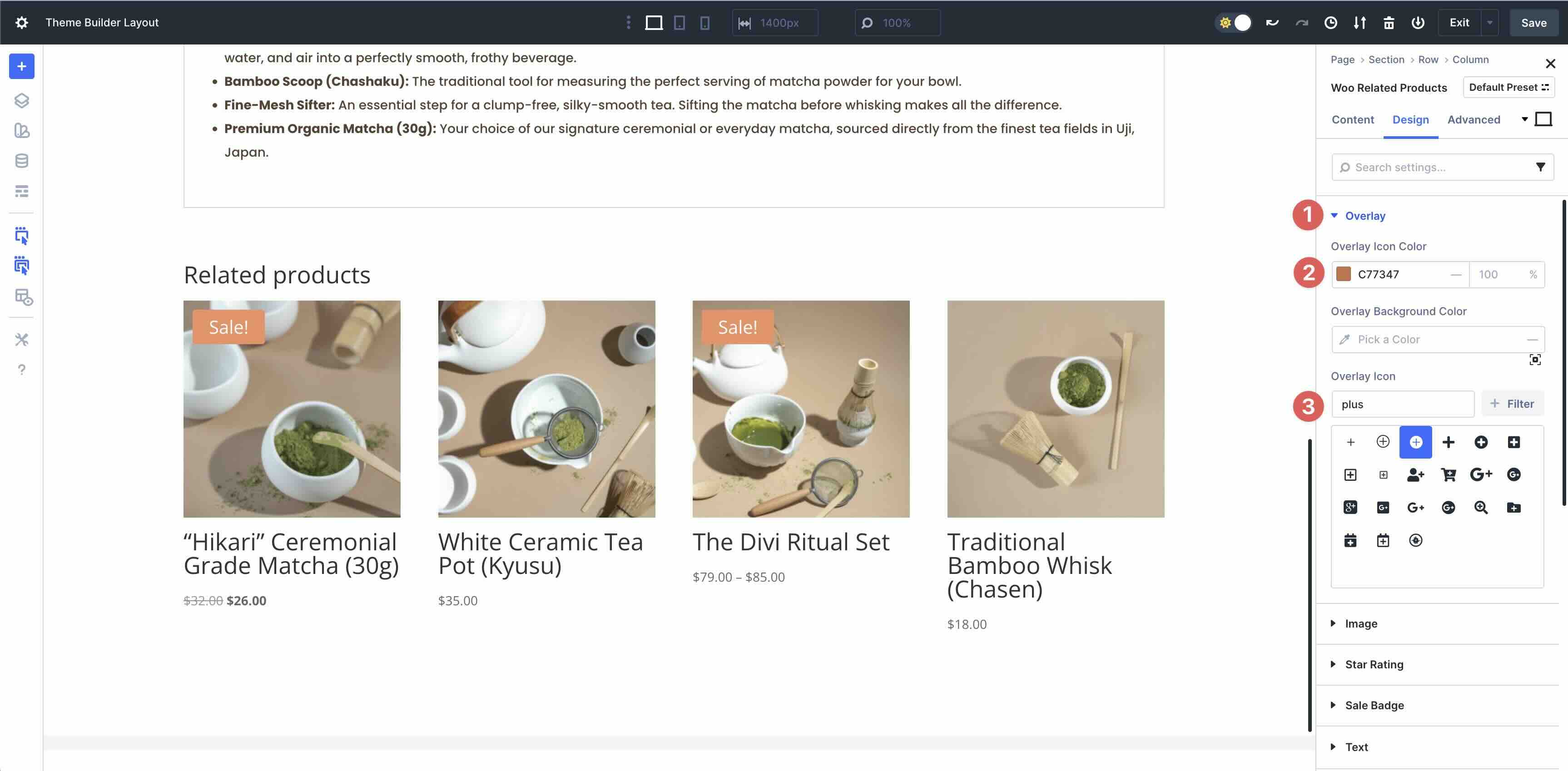
Expand the Overlay menu. Add #C77347 to the Overlay Icon Color field.
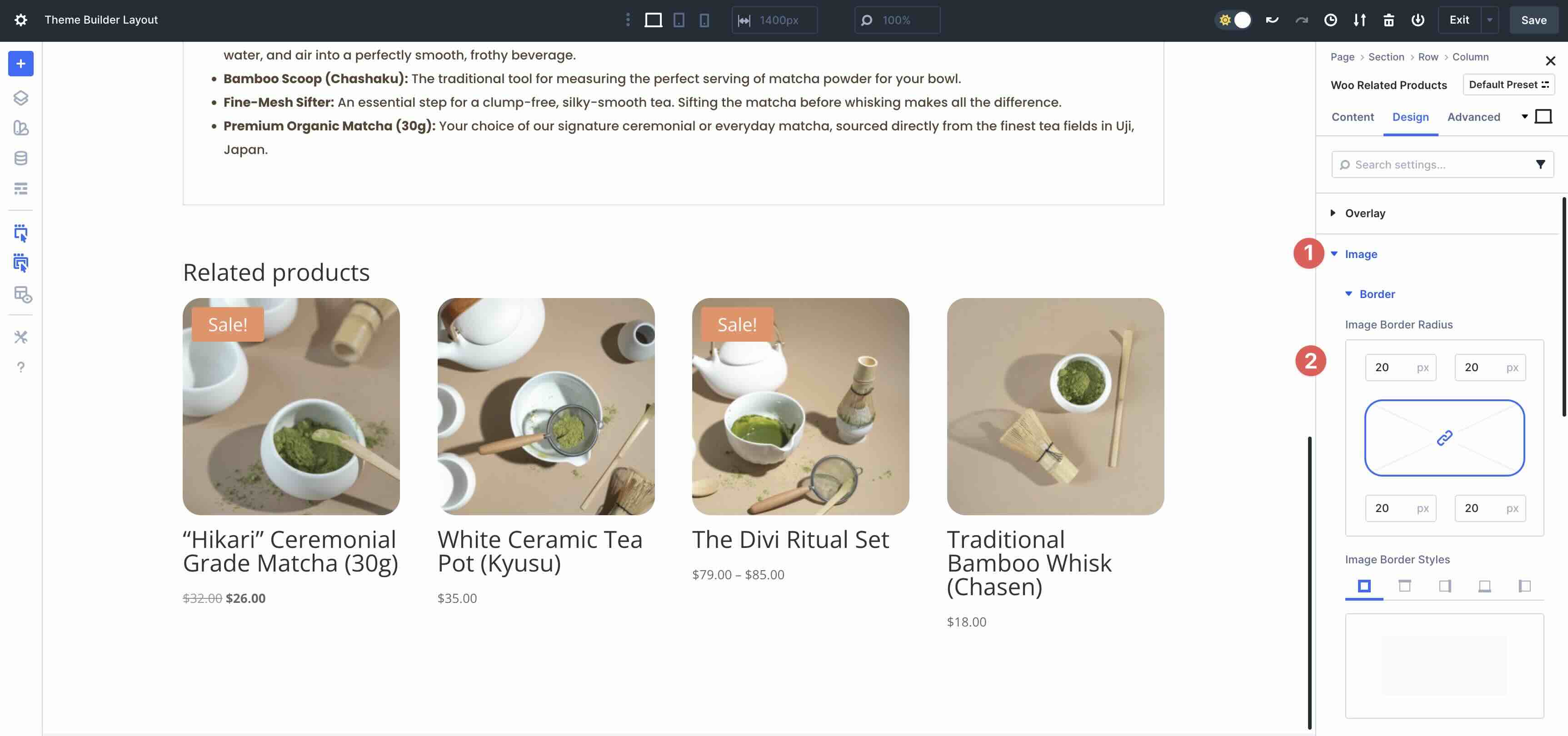
Open the Image menu. In the Border settings, add 20px Image Border Radius to all sides.
Select and expand the Star Rating menu. Set the Star Rating Text Alignment to Left. Use #C77347 for the Star Rating Text Color field.
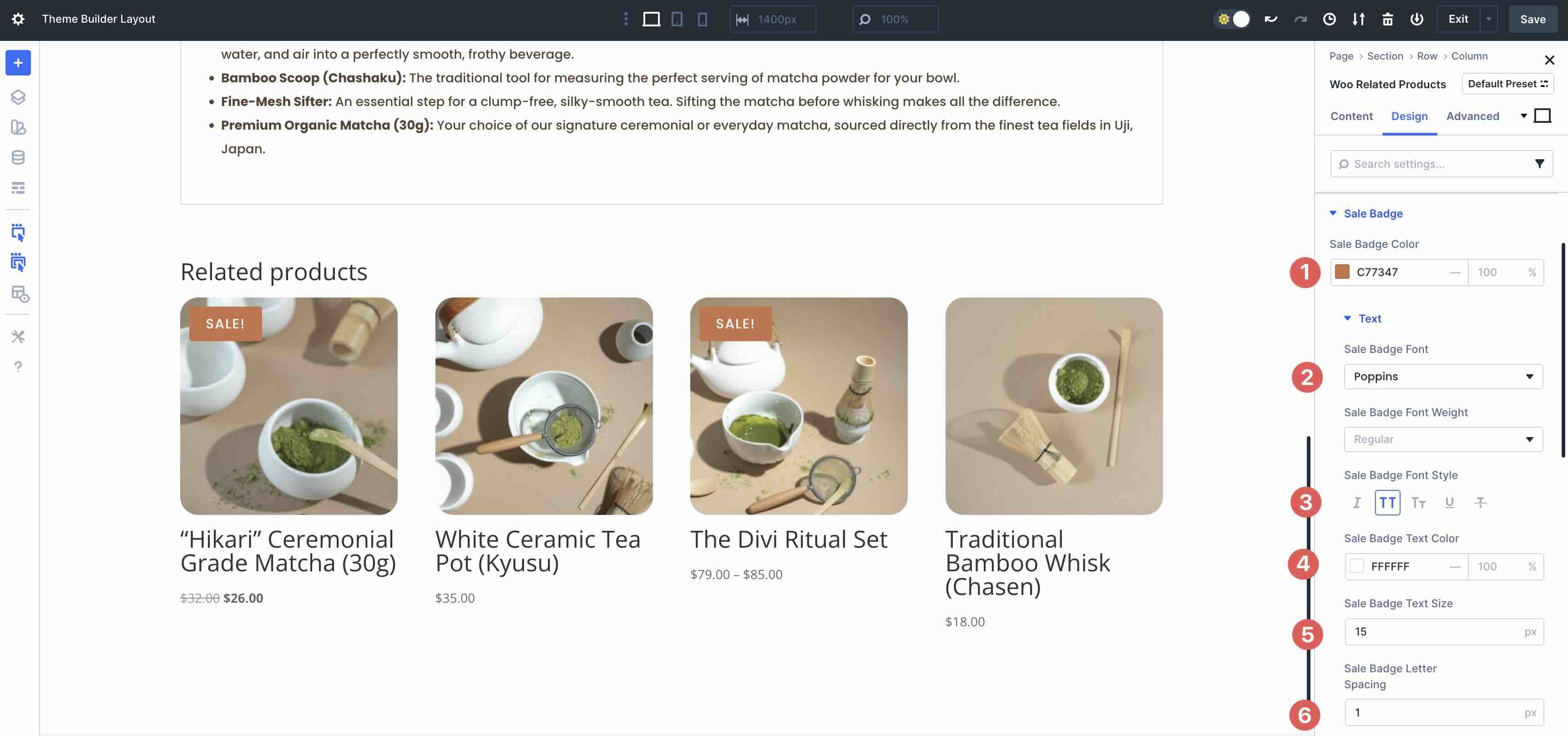
Open the Sale Badge menu. Enter #C77347 as the Sale Badge Color. Expand the Text menu. Select Poppins as the Sale Badge Font, set the Sale Badge Font Style to Uppercase, the Sale Badge Text Color to #ffffff, the Sale Badge Text Size to 15px, and the Sale Badge Letter Spacing to 1px.
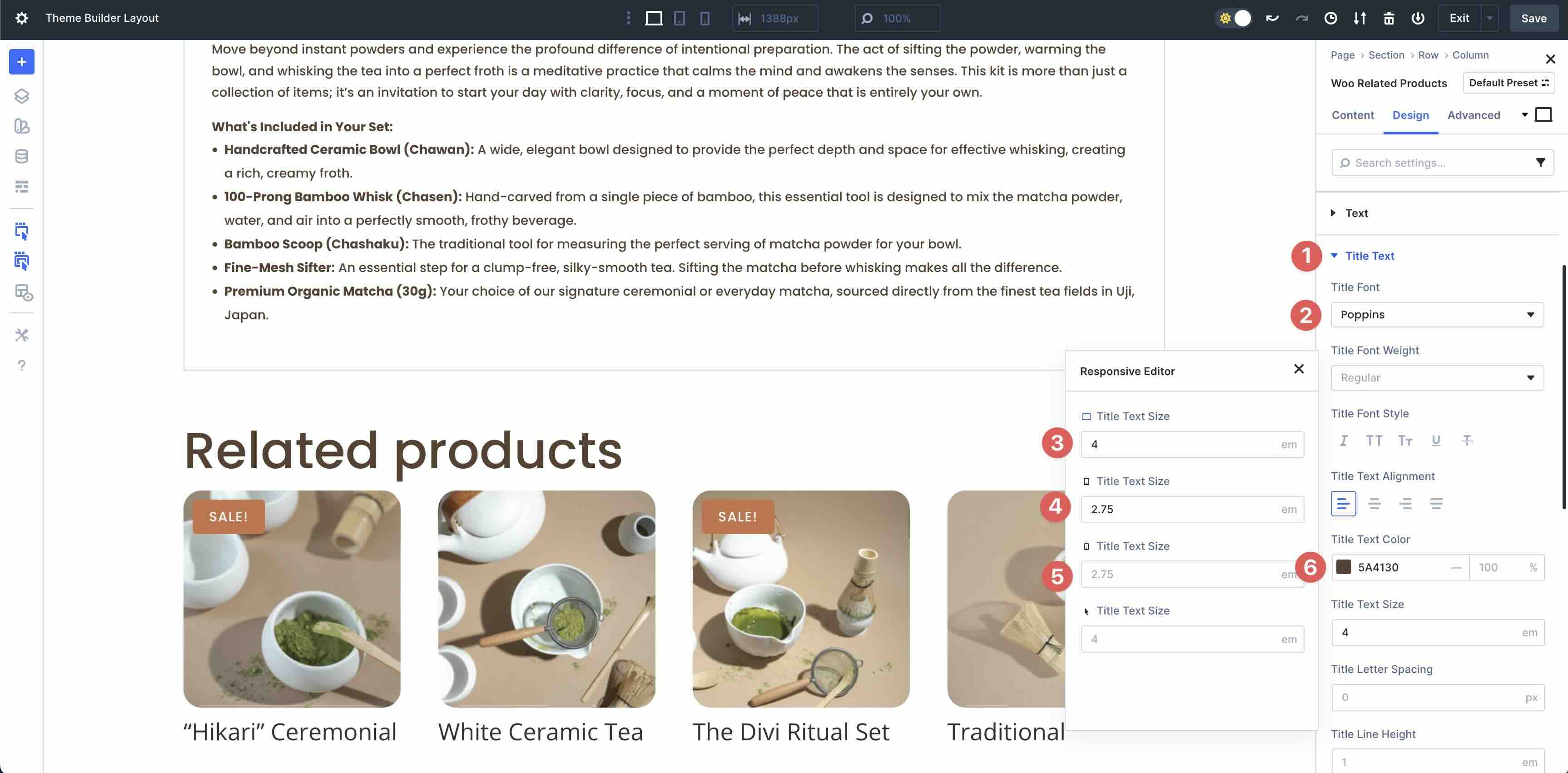
Next, open the Title Text menu. Use Poppins as the Title Font, #5A4130 as the Title Text Color, and 4em for the Title Text Size. Use Divi 5’s Responsive Editor to set the tablet and phone views to 2.75em.
Open the Product Title Text menu. Enter Poppins for the Product Title Font and set the Product Title Text Alignment to Left. Use #5A4130 as the Product Title Text Color and set the Product Title Text Size to 16px. Use 1.2em as the Product Title Line Height.

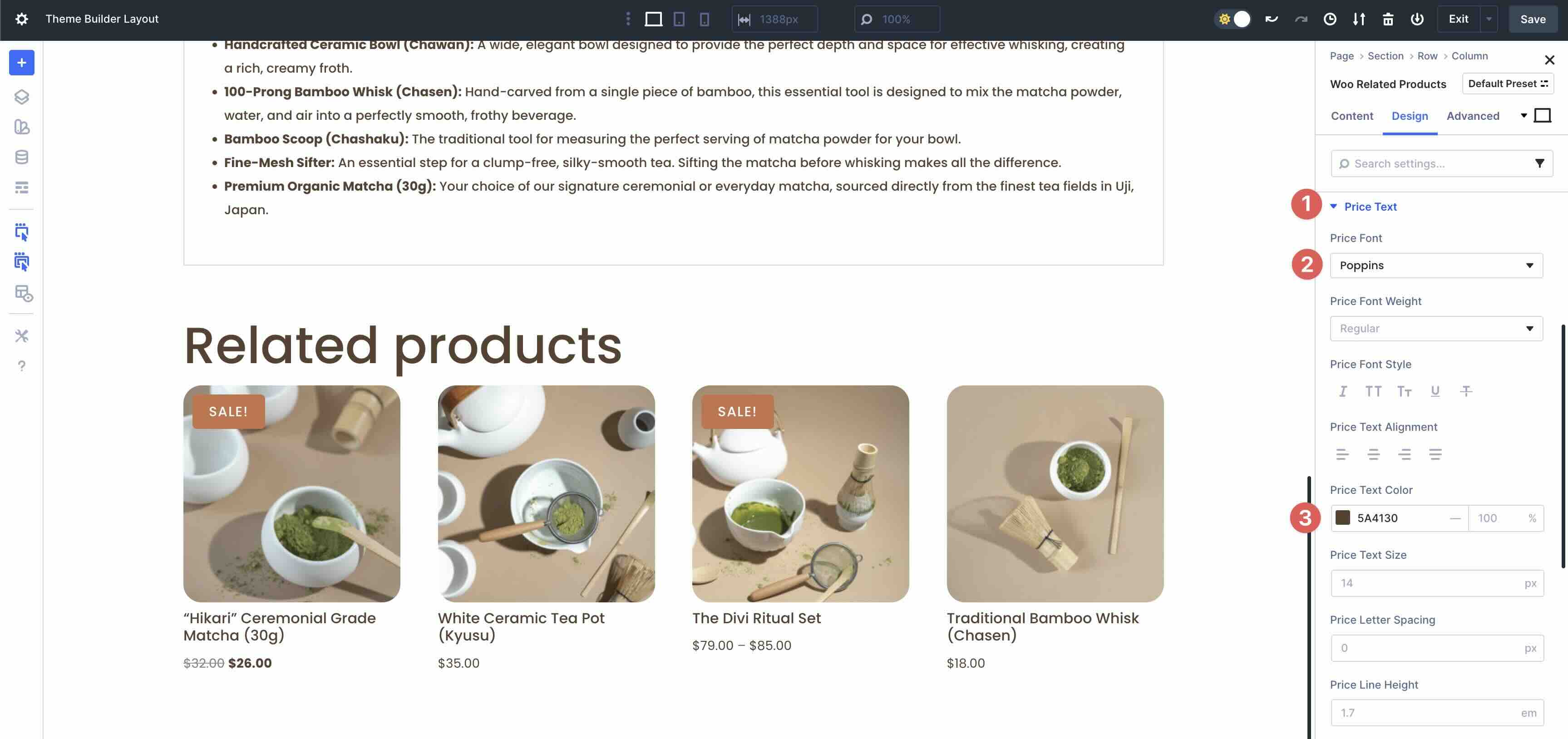
For the Price Text menu, enter Poppins as the Price Font and use #5A4130 as the Price Text Color.
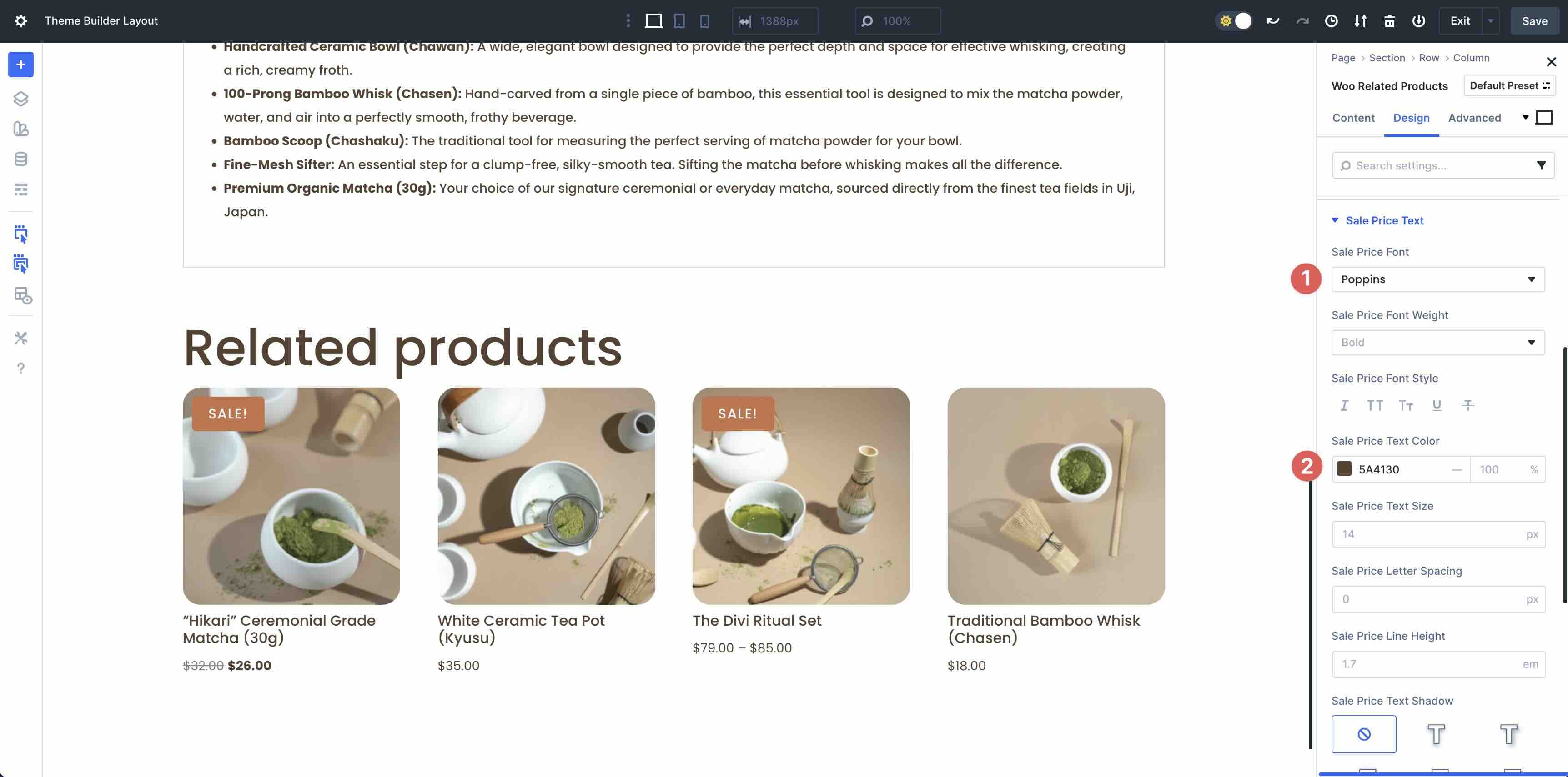
Finally, open the Sale Price Text menu. Use Poppins as the Sale Price Font. In the Sale Price Text Color field, enter #5A4130.
Step 3: Test For Responsiveness
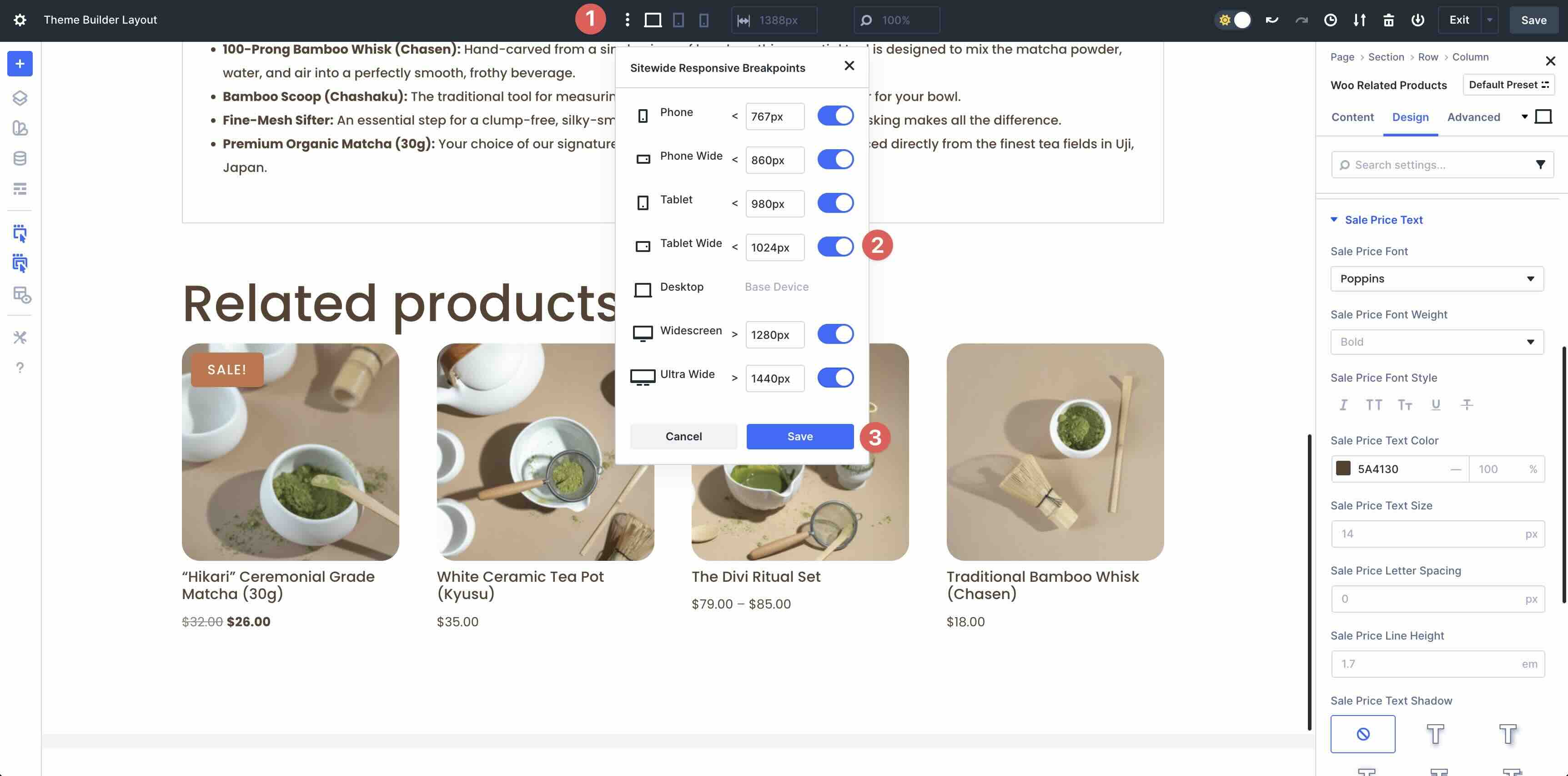
Before saving your product page, use Divi 5’s Customizable Responsive Breakpoints to navigate through each screen size. This ensures that your layout looks seamless on every device. By default, Divi enables 3 breakpoints, but you can easily enable all 7 of them by clicking the ellipsis menu in Divi’s toolbar at the top of the Builder. Use the toggles to allow the breakpoints you’d like, then click the Save Button.
As you navigate each breakpoint, you can easily change your design.
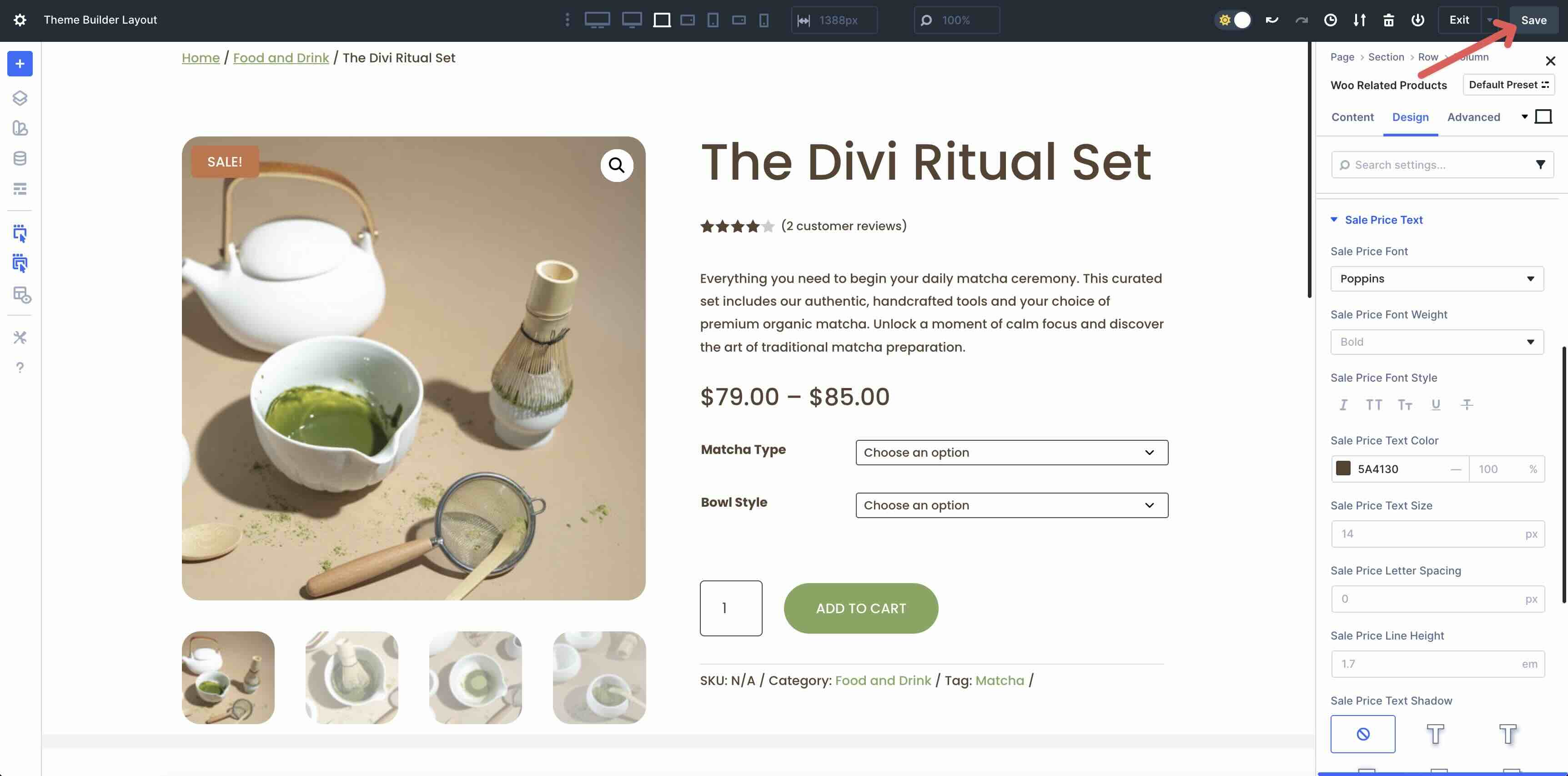
Step 4: Save The Page
Once you’ve made all the necessary refinements, save the product page in the Theme Builder. Click the Save Button at the top right corner of the Builder.
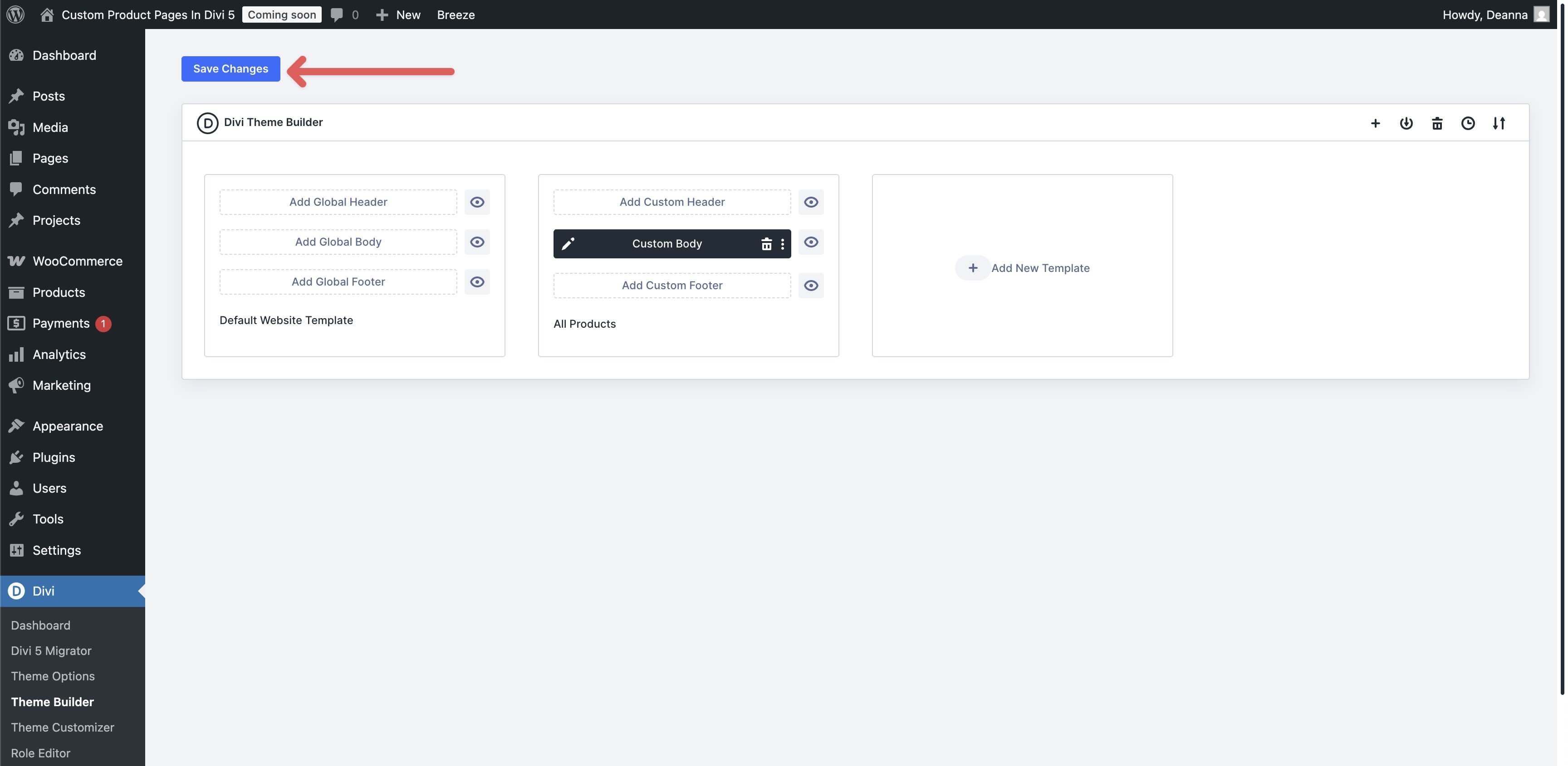
When redirected back to the WordPress dashboard, save the Template by clicking the Save Changes Button.
That’s it! As you can see, creating a polished and effective product page template is very easy thanks to Divi 5’s intuitive Visual Builder and Woo Product modules.
Build Your Next Ecommerce Website In Divi 5!
Divi 5‘s Woo Product modules unlock creative freedom for your ecommerce site, letting you build product pages that are as unique as your brand. From navigation to dynamic display modules, these 17 native modules seamlessly integrate Woo data with Divi’s Visual Builder for engaging, responsive designs without using third-party plugins. If you’re ready to take the next step, download the latest version of Divi 5 and experiment with these powerful modules.
We’d love to hear your thoughts about these new modules. Please comment below or post on our social media channels.


Leave A Reply