
CSS Grid gives you two-dimensional control so you can place items exactly where they belong, instead of fighting stacks and columns. It’s like giving your page a simple map where you can drop elements into clear spots and let the grid handle the layout.
In this post, you’ll learn how to use grids in WordPress and why Divi 5 makes the process visual, fast, and flexible. Ready to build layouts that feel designed, not just stacked? Let’s dive in.
What Is CSS Grid Exactly
CSS Grid is a layout system for arranging content on web pages using rows and columns simultaneously. You could always build these layouts by nesting containers and using floats or other workarounds, but Grid makes the process cleaner and more straightforward.
You apply Grid to a container, and it divides the space into rows and columns. The container becomes a grid, and its direct children become grid items that sit in the cells.
You control the size of each row and column. Make them all the same size. Or make some bigger than others. Mix fixed sizes with flexible ones.
You set up the structure once in your CSS. Then you place items where you want them. No need to stack containers inside containers anymore.
Adding A Grid To WordPress
CSS Grid turned web layouts into something you could design instead of hacking together. WordPress now supports grids, as do the popular WordPress page builders. Understanding your options helps you pick the right approach for what you’re building. Let’s explore:
Using Gutenberg
WordPress includes a Grid block (a variation of the Group block). You can insert it with /grid or via the block inserter.
The Grid offers two modes. Auto calculates columns from a minimum column width you set. Manual uses a fixed column count and lets you place blocks in specific cells.
Controls live in the block sidebar. Choose a mode, set column count or minimum width, and adjust row/column gaps. Items can span multiple cells (e.g., a header across three columns with cards below). Blocks inside the grid get dimension controls. Select any block, open Dimensions, and set how many columns/rows it spans. On-canvas handles also let you resize by dragging.
Why Gutenberg Isn’t Ideal For Making Grids
Great for simple layouts, but there are limits. There’s no native UI for different column counts per breakpoint, and fine-tuning mobile spacing often requires custom CSS.
Manual mode uses a fixed column count, so stacking/wrapping isn’t automatic. If you use Manual, consider two or three columns or switch to Auto for smaller screens. Some controls are easy to miss, and the minimum-width slider may change units as you adjust it.
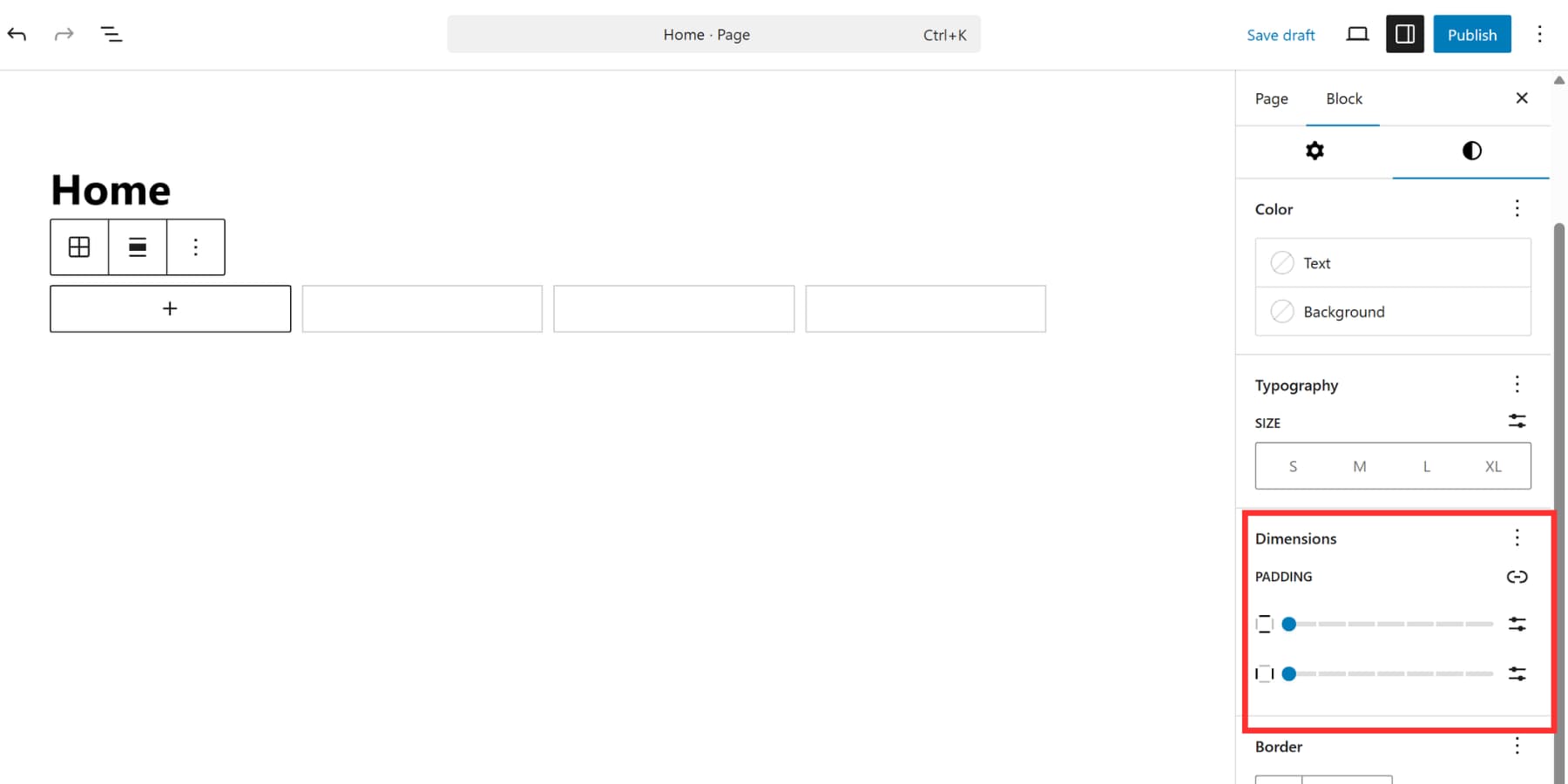
When columns collapse, content doesn’t always fill available space, which can leave gaps at certain sizes. Mixing Auto with fixed column settings can be confusing, and some blocks don’t always resize reliably. There are no explicit row-height controls in the basic UI, and there’s no UI for grid-template-areas in the Grid block.
Using Popular Page Builders
Elementor and Bricks Builder sit at the top of the WordPress page builder market. They’ve built massive user bases and get regular updates. When these tools added CSS Grid support, it seemed like the answer everyone wanted. Let’s see how that actually plays out.
Using Elementor
Elementor added Grid Containers in recent updates. You activate the feature through Settings, then select Grid when adding a new container.
The interface lets you set column and row counts, adjust gaps, and other basic settings. By default, each grid cell holds one widget; to place multiple items in a cell, nest a Container inside it.
Using Bricks
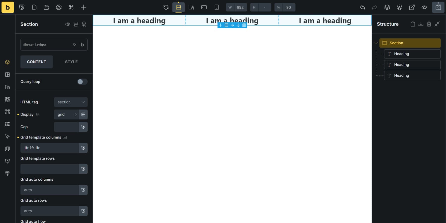
Bricks Builder supports CSS Grid as well. Select any element (section, container, block, or div), open its settings, and change the Display property to grid. That element becomes your grid container.
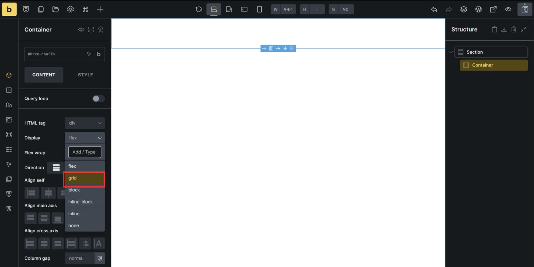
You define structure through grid-template-columns and grid-template-rows fields using standard CSS values. Type “1fr 1fr 1fr” for three equal columns or “200px 1fr 2fr” to mix fixed and flexible sizing. Gap controls handle spacing between cells.
Grid items get Grid Column and Grid Row controls for precise positioning using CSS grid line numbers. Auto-placement settings determine how items flow when you don’t specify positions manually.
Where These Options Differ (and Their Limits)
Both builders approach CSS Grid within their existing frameworks, which affects how you build certain patterns.
Elementor’s Grid Container treats each cell as a single element. If you want multiple items in one cell, you’ll nest a Container inside that cell to hold them. This works, but it adds an extra layer to manage in more complex layouts.
To place multiple widgets in a single grid cell in Elementor, add a nested Container inside that cell.
For more advanced arrangements, precise spanning, responsive tweaks per breakpoint, you may still reach for some custom CSS in Elementor.
Bricks lets you convert any section/container/block/div to a Grid by setting Display to grid, then define structure with standard CSS properties (grid-template-columns/rows, gaps, and line-based placement). It works well, but it assumes some familiarity with CSS Grid terminology and values.
How Divi 5 Handles CSS Grid
Thousands of WordPress sites run on Divi right now. It works as both a theme and a visual page builder, designed for anyone who wants a professional website but doesn’t want to write code or deal with WordPress’s awkward block editor.
Divi 5 takes things to a new level. Instead of patching up the old system, we started fresh. The entire theme is now powered by modern web standards, which means you get better speed and more control over your designs.
Shortcodes are out. Blocks, Grids, and Flexbox are in. This switch means your pages only load what they need, so everything runs faster. Your site stays cleaner, too. Plus, these layout systems put you in charge of spacing, alignment, and how everything fits together. Building complicated layouts becomes a lot easier this way.
You handle everything at the container level. Pick how many columns and rows you want. Set their sizes. Space them out however you need. Then drop your content in, and it fills the grid based on your setup. You can create pretty much any layout this way.
What’s New In Divi 5?
The Grid system represents just one piece of what makes Divi 5 different. We rebuilt the entire platform from scratch, which means you get improvements across the board that affect how you work every single day.
Here’s what else changed:
- The Inspector aggregates all colors, fonts, sizes, images, and presets from any element and its children into one panel. Click a section, see every color used throughout, then change them all at once. Right-click anything and select Inspect to open it.
- Custom Attributes add any HTML attribute to elements and sub-elements. You can now include alt text, title tags, rel attributes, aria-labels, and accessibility markers without touching code.
- Loop Builder pulls content from any post type dynamically. Works with WooCommerce products, ACF fields, custom post types, and repeater fields. You can loop anything, not just predefined loop modules, and nest loops inside other loops.
- WooCommerce Modules include many product-focused modules for custom product pages and category grids. Cart and checkout modules are also available.
- Relative Colors and HSL make color management mathematical. Set a base color, then create lighter and darker variants that adjust automatically. The HSL sliders control hue, saturation, and lightness independently for precise color relationships across your site.
- Built-in Interactions handle popups, mouse effects, scroll animations, and toggle switches without plugins.
Beyond These, Quality Of Life Improvements Include:
- Responsive Editor shows how settings behave across different screen sizes, hover states, and sticky positioning. Switch between states without opening separate controls.
- Seven Responsive Breakpoints replace the old three-breakpoint system. Set custom values for each one or use defaults. Layouts adapt to phones, tablets, and desktop monitors without media queries.
- Design Variables store colors, fonts, spacing values, images, and text once. When a variable is changed, every element using it updates automatically.
- Nested Rows stack rows inside other rows as deep as needed for complex magazine layouts or portfolio grids.
- Advanced Units work through visual controls. Type clamp(), calc(), min(), or max() values without a stylesheet.
And much more. We will be introducing more features in the coming weeks. For now, let’s see how you can build Grids using Divi 5 and why it makes it better than the options we discussed:
Building A Grid In Divi 5
Building a grid usually means wrestling with settings you don’t understand or accepting a template that almost works. Divi 5 gives you both speed and precision. Here’s how to set up a grid that actually does what you want.
Starting With Grid Templates
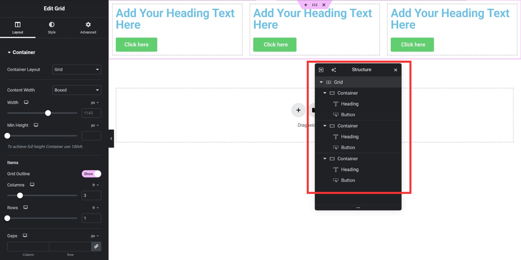
Divi 5 includes ready-made grid templates. Just click on the plus icon, browse through the visual previews, and pick one.
It applies instantly. Drop modules in, and they conform to the pattern automatically because the grid lives at the container level.
You can swap templates anytime or move to manual controls for custom work.
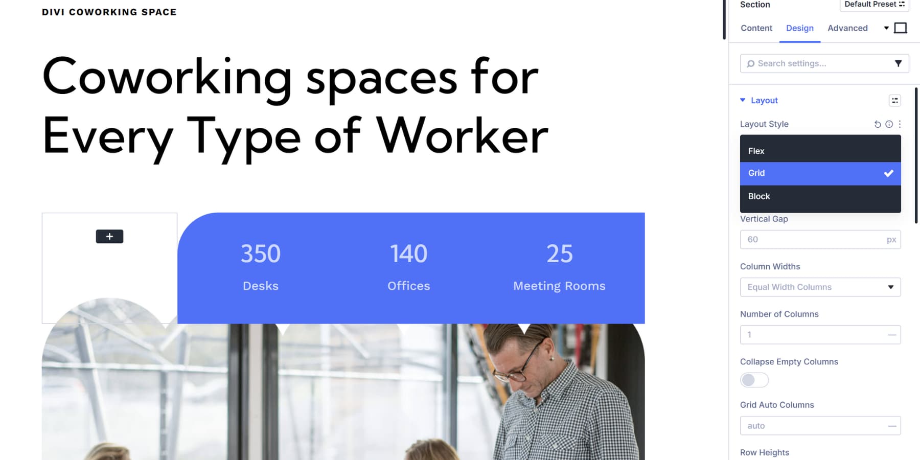
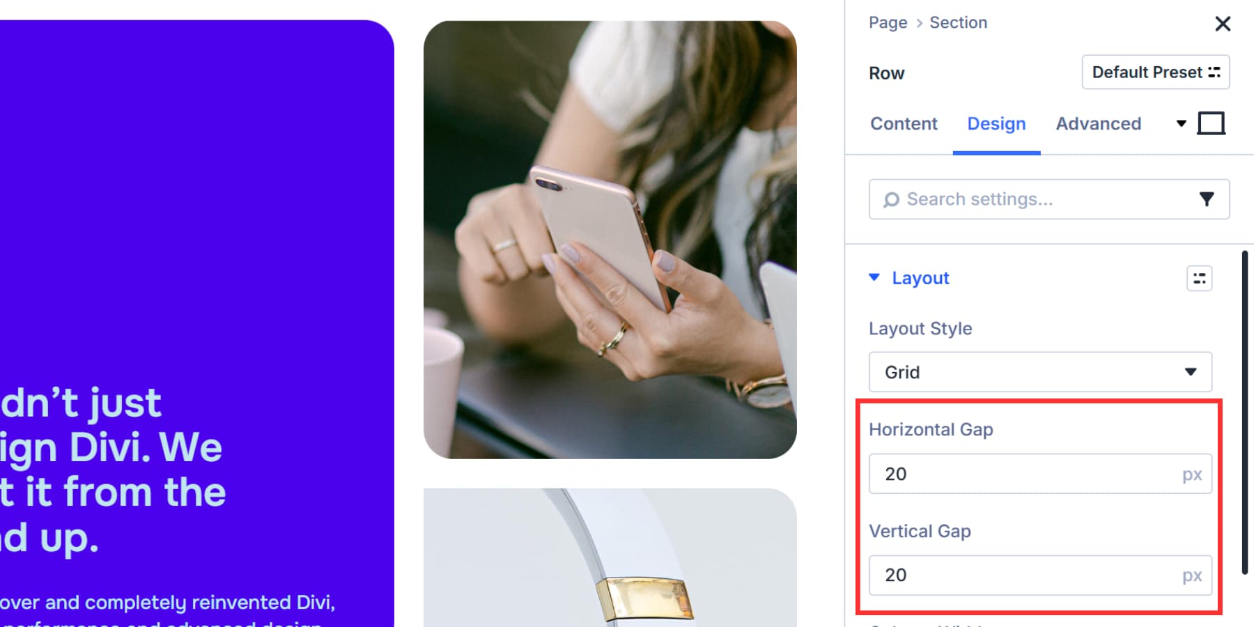
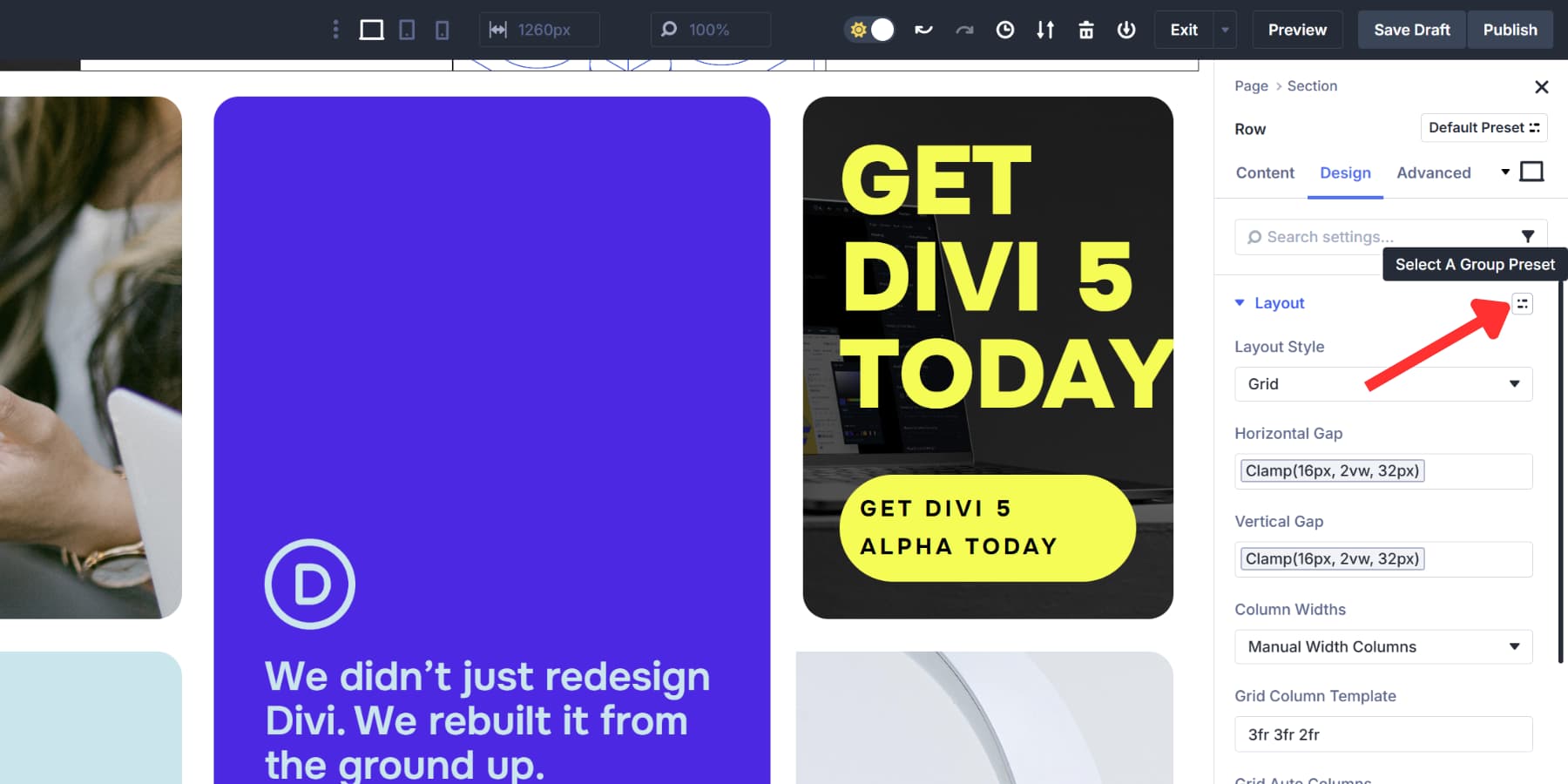
You can also convert existing layouts to Grids. Pick a Section, Row, Column, or Module Group in the Visual Builder. Open its settings and go to the Design tab. Look for Layout near the top and click the Layout Style dropdown. Select Grid.
Controlling Grid Structure
You can control the breathing room between your grid items, with Horizontal Gaps setting the distance between columns and Vertical Gaps handling the space between rows.
Both fields accept standard units like fixed pixel values when you want exact spacing, relative units like rem or em that scale with your typography, or percentage values that respond to container width.
Design Variables make spacing management easier across your whole site by letting you save standard gap values as Number Variables. Then, click the dynamic content icon in either gap field to select your saved variable.
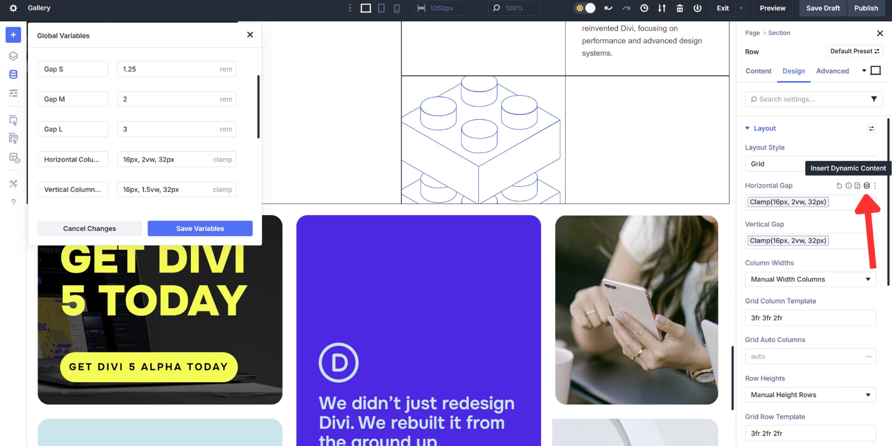
Update the variable once, and every grid using it changes automatically without needing to track down individual settings.
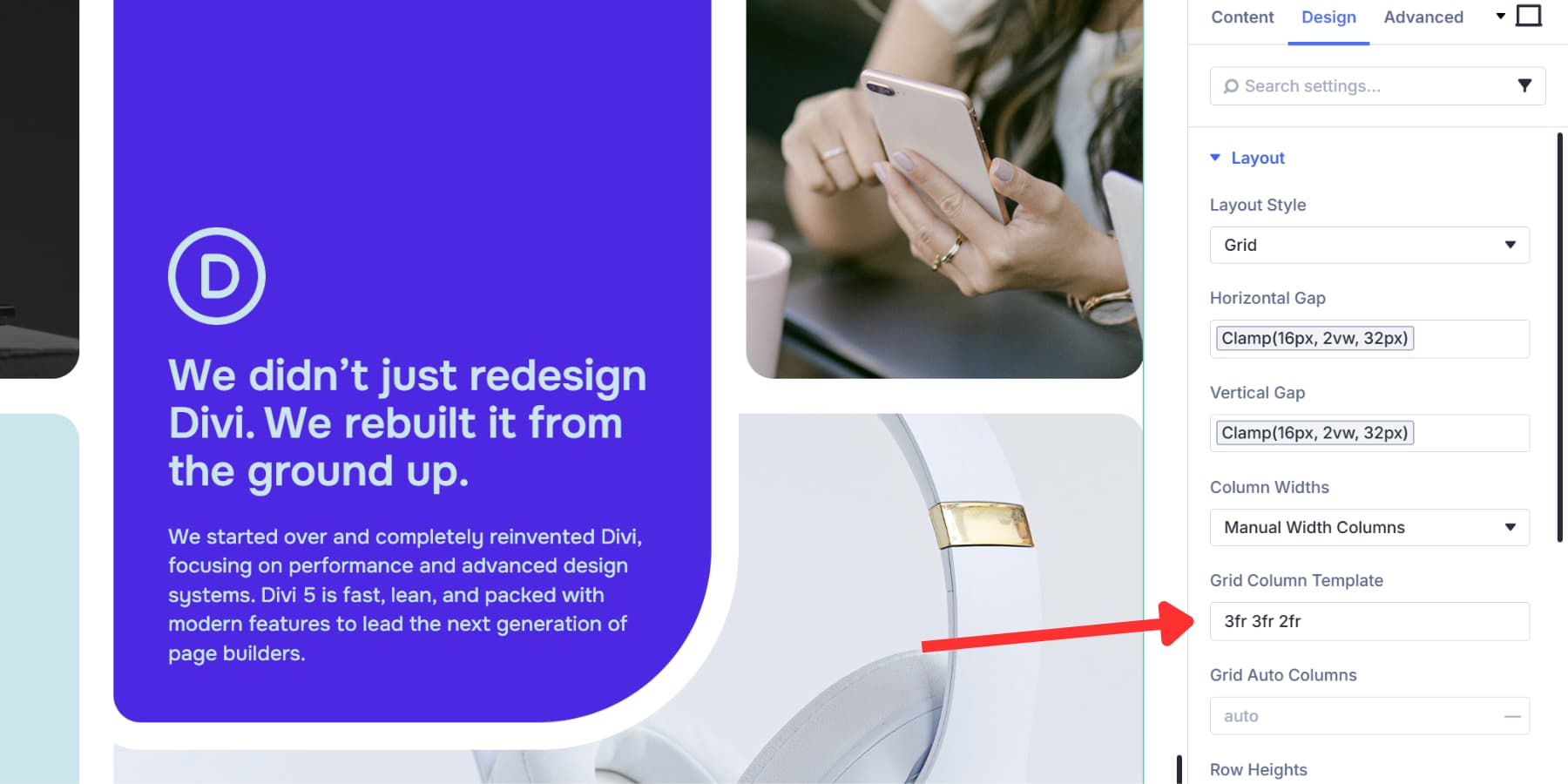
Next up, Column Width determines how wide each vertical track becomes.
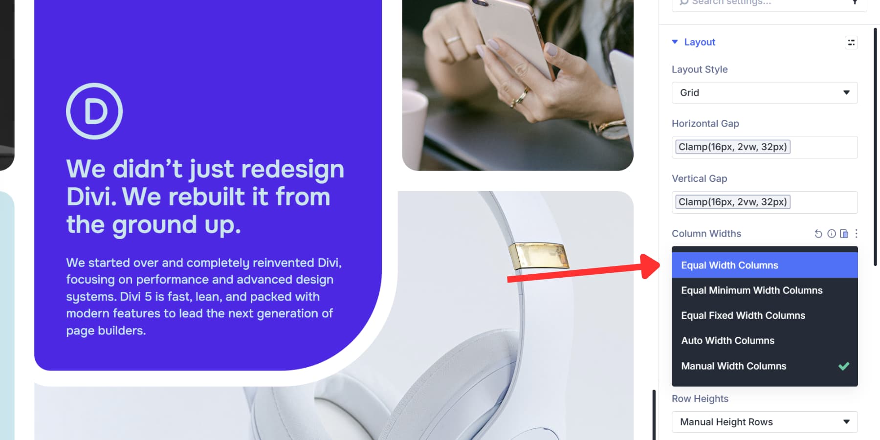
Equal Width splits space evenly across all tracks. Equal Minimum Width sets a floor value but lets columns grow when space allows.
Likewise, Equal Fixed Width locks everything at the exact pixel measurement. Auto Width sizes tracks based on their content, so a column with a large image gets more room than one with short text.
Manual Width lets you type custom patterns like “3fr 3fr 2fr” or mix units like “300px 1fr 1fr”. fr in CSS Grid lets you tell the browser how much space each row or column should take. For example, 1fr and 2fr mean the second column gets twice as much space as the first.
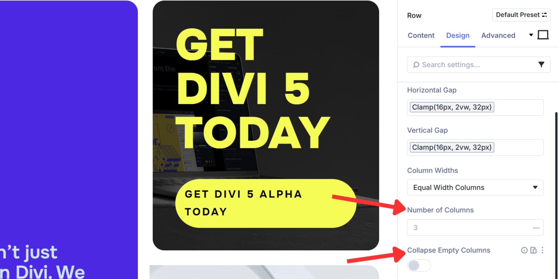
Once you pick your width mode, the Number of Columns tells the grid how many tracks to build. Items fill across one row, then wrap down to start the next.
Collapse Empty Columns cleans up dynamic layouts. Empty columns disappear automatically, and the grid shifts everything over and closes the gaps.
Adjusting Grid Behavior
Your grid needs to adapt when content doesn’t match the structure you’ve set up. Maybe you defined three columns, but an item ends up in a fourth spot, or your rows need different height treatments. These settings handle those situations and control how items flow through the grid.
Grid Auto Columns and Grid Auto Rows determine the size of overflow tracks when items land beyond your defined columns or rows. Use 200px, 1fr, or auto.
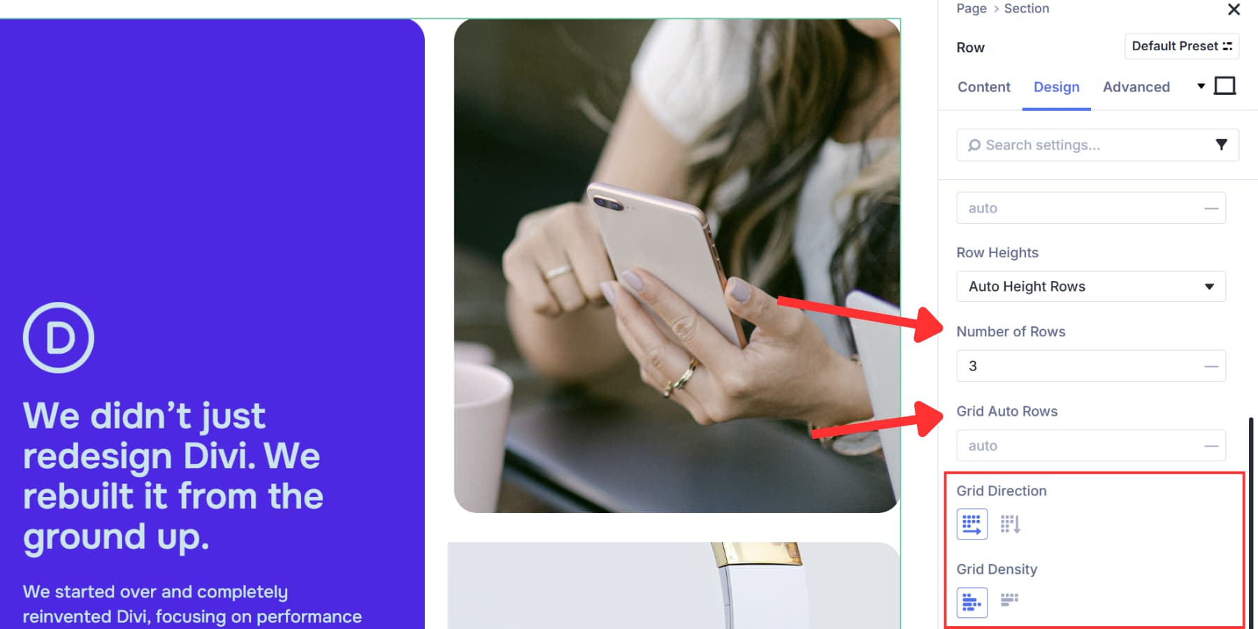
Row Heights offers four options: Auto adjusts to content, Equal makes them uniform, Minimum sets a baseline, and Fixed locks them at a value.
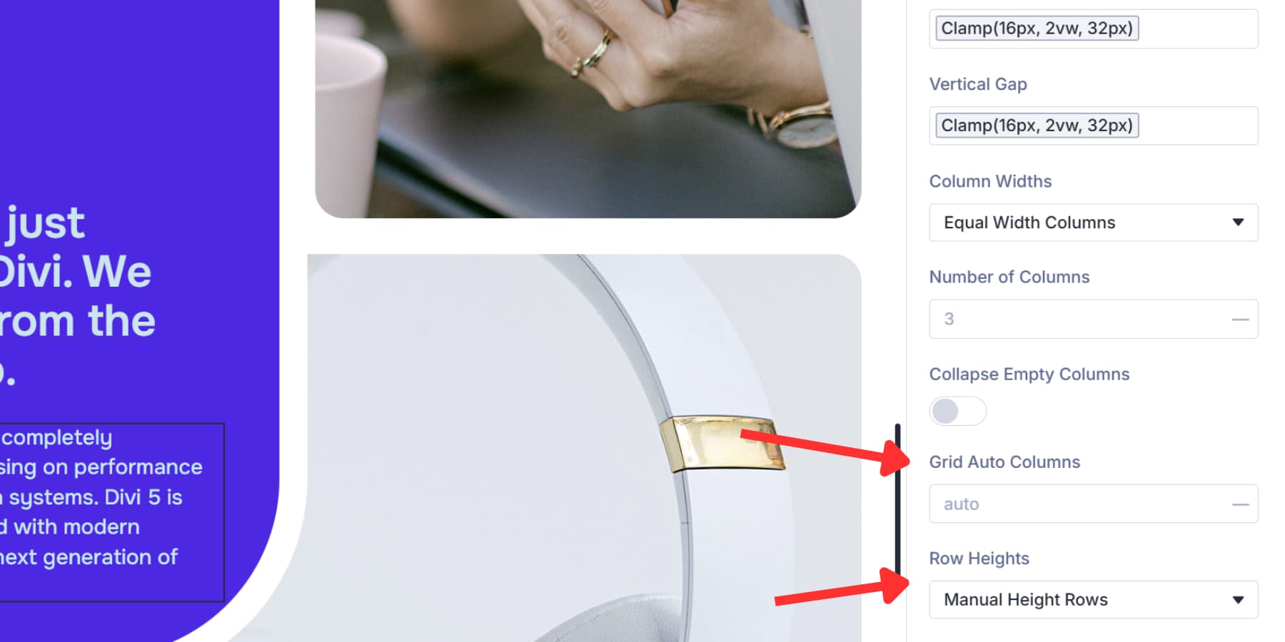
Number of Rows and Grid Auto Rows do exactly what their Column counterparts do, but for rows.
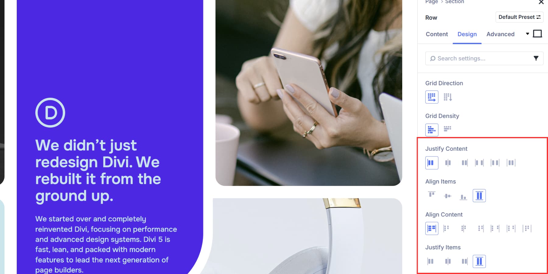
Grid Direction determines how items flow. Row mode works horizontally, then down for most layouts. Column mode stacks vertically, then moves right for timelines or vertical lists.
Grid Density controls whether items shuffle to fill gaps. Dense mode packs them tight, and auto mode maintains document order.
Once you’ve built your grid structure, you need to position everything. Justify Content moves your grid horizontally: Start, Center, End, Space Between, Space Around, or Space Evenly.
Align Items controls vertical positioning: top, middle, bottom, or stretched. Justify Items works horizontally: left, center, right, or stretched. Align Content positions the grid vertically when extra space exists.
Setting Up Offsets
Grids fill items in order by default. First item lands in the first cell, second item in the second cell, and so on. Grid Offset Rules break items out of that automatic flow and let you control individual items manually.
You pick which items to target, choose what property to apply, and then set the value.
Target options include First Item, Last Item, Even Items, Odd Items, or patterns like Every Third Item. You can also write custom nth-child selectors for complex patterns.
Once you’ve picked your target, select the property. Column Span and Row Span control item size by making them stretch across multiple cells. Column Start, Column End, Row Start, and Row End control precise positioning by pinning items to specific grid lines.
Moving Items Around the Grid
You can rearrange grid items by dragging them around in the Visual Builder. Open the Content tab, grab an item, and drop it in a new spot. The grid updates right away.
You can click the breakpoint icons to set different desktop, tablet, and mobile sequences.
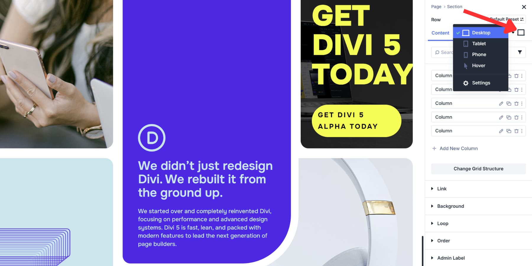
Most grid settings adjust per device, too. Column Width can be four equal columns on desktop, two on tablet, and one on mobile. The responsive controls also accept device-specific values for the number of Columns, Row Heights, and alignment options.
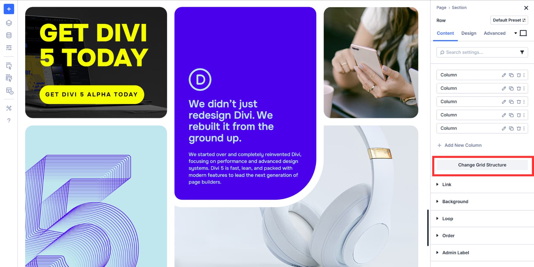
Creating Presets
Once you build a grid structure that works well, you’ll want to use it again on other pages. Presets let you save and apply your grid configuration wherever you need that same layout.
Divi 5 offers Option Group Presets to capture specific setting groups, like spacing or column configuration. Click the preset icon next to any setting group, give it a clear name, and save it.
Whenever you want to apply the same settings to a Grid, you can access your preset by clicking on the same icon and selecting the preset you created.
These presets update globally. Modify a preset once, and every element using it changes automatically. You can still adjust individual instances without breaking the original preset.
Try Divi 5’s Grid Layout System Today
CSS Grid works differently across WordPress tools. Gutenberg gives you the basics but sends you to custom CSS for real control. Elementor and Bricks add containers and raw code when layouts get complex.
Divi 5 gives you visual templates, drag-and-drop, and responsive controls that appear where needed. The time saving shows up when you save a grid structure as an Option Group Preset, connect options to Design Variables, and watch your spacing update across 50 pages simultaneously when made. You build a design system instead of copying settings between projects.
Download Divi 5 and build grids that work the way you think they should!


Any CSS grid downloads to play with?
Absolutely. Download these.
And you can follow these steps for building one yourself. These steps go with CSS Grid #4 from the pack above.
Are there any demo sites that are using all the new features that you can direct me to?
The best way to really dissect the new features is probably by downloading some of our layout packs. Try the CSS grid, Carousel, or Blog loop layouts that we’ve published on the blog recently.