")
Divi’s new Grid Layout System opens up endless possibilities for creating intelligent layouts. For many, though, this is new territory, and wrapping one’s mind around some of these new input options could get confusing. That’s why we will walk through how to build a Grid Layout using the new controls in Divi 5.
Not too long ago, we released a pack of eight premade Grid Layouts. Using Grid #4 from that pack as our design inspiration, we will rebuild it, step by step.
If this is your first foray into CSS Grid, this tutorial is a great place to start because we won’t use any Offset rules to make this happen.
How To Create A Grid Layout
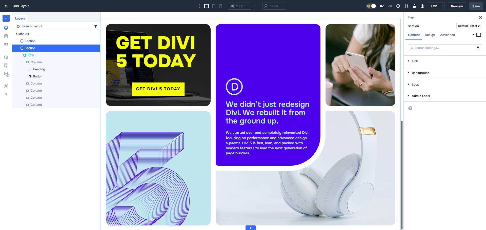
The goal is to leave this tutorial with this as your end result.
Step 1. Setting Up The Grid
The first step is to determine the basic structure required to create this grid. We need to ask ourselves, “what containers do we need?”. Assuming we are building the Grid Layout on the Row container and using Columns as the grid items, we can determine that we need five columns.

This informs what we need to add to the page. Add a new Section, scroll down to the grid options, and choose the 5×2 Multi-Row grid option.
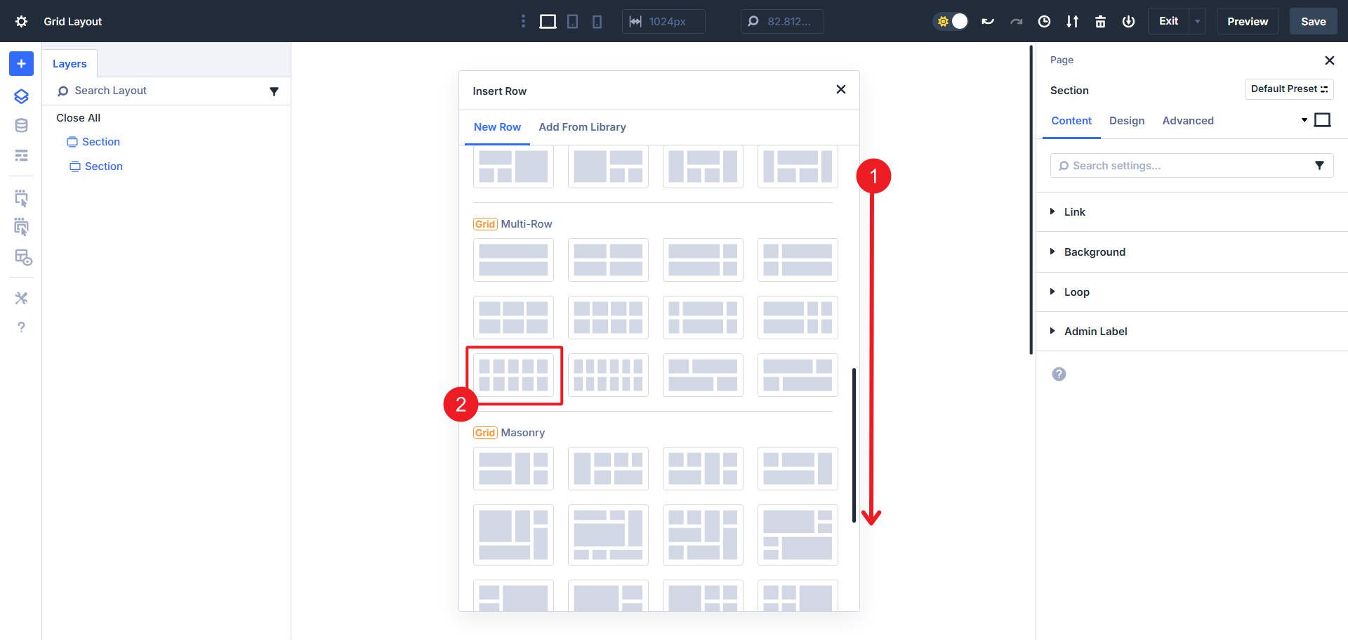
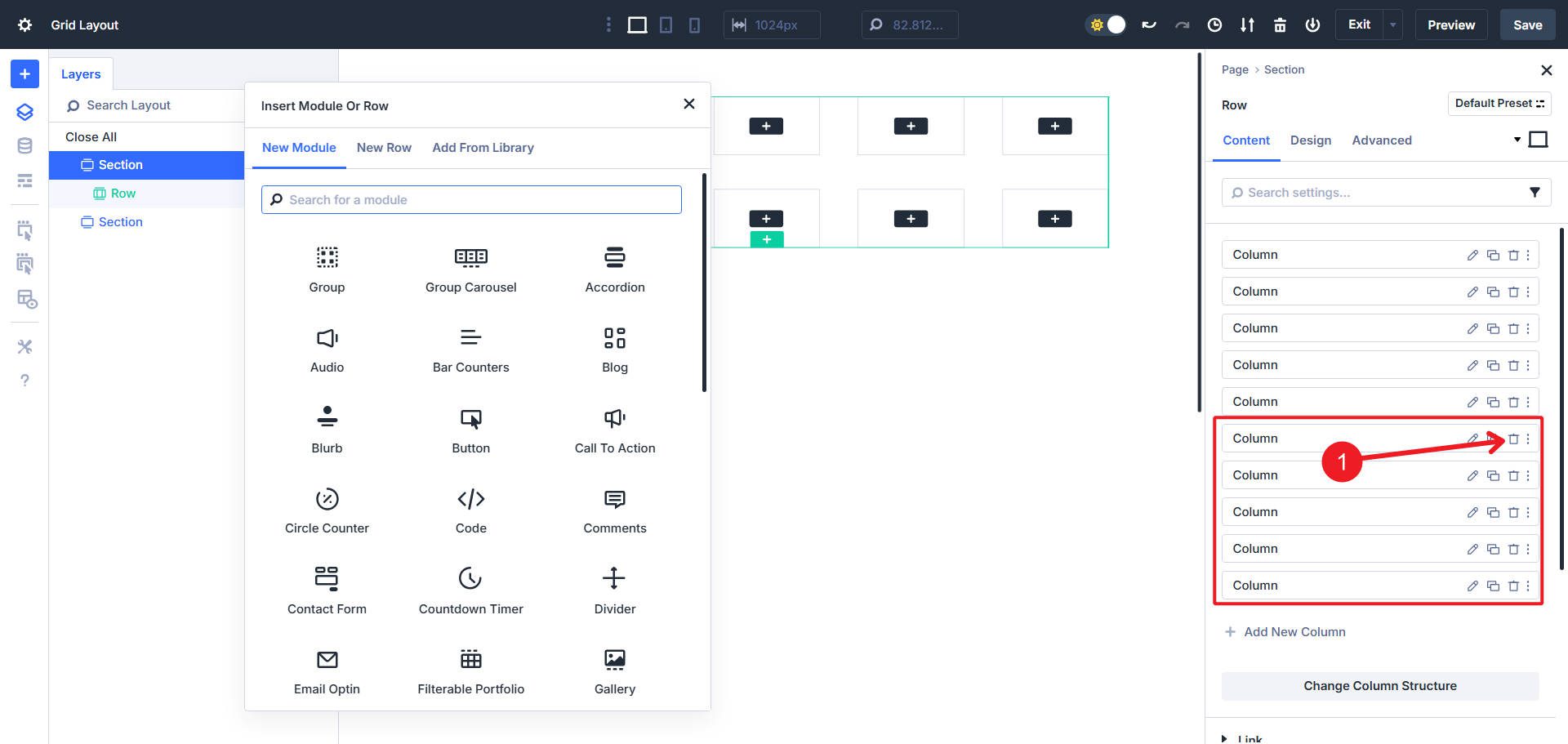
This will get us our five columns (plus an extra five). Delete the extra five columns.
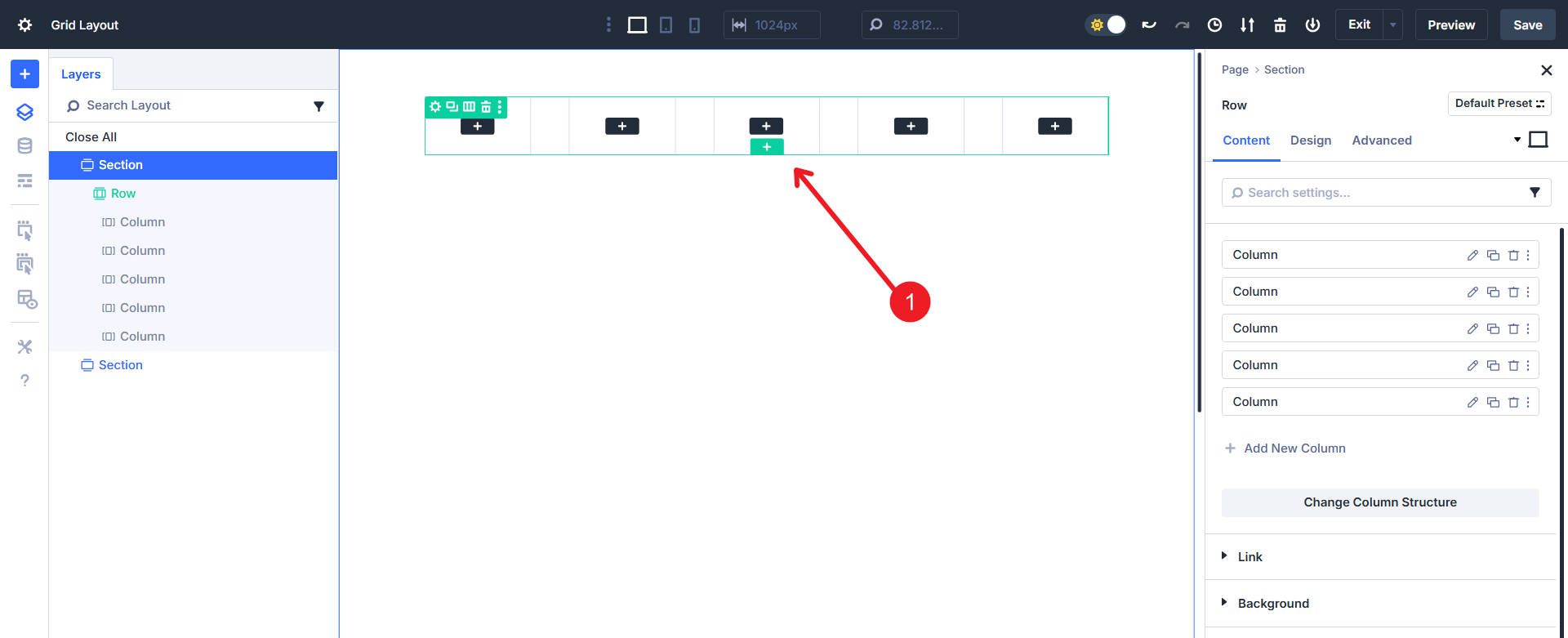
Now you should have a Row set to a Grid layout and five Columns ready for building.
Step 2. Configure the Parent Row Layout
CSS Grid has two major levels of settings: settings applied to the parent container and settings applied to the child items. The first thing we should do is set up the parent container so that when we apply the child item Grid settings, they make sense.
We’ll start by setting the Horizontal and Vertical Gaps. You should use Design Variables here and can use clamp() values, but to make this tutorial straightforward, we will set them to 20px apiece.
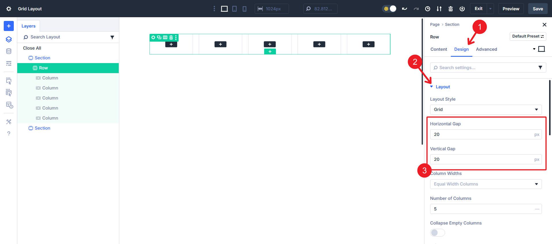
Next, we need to show more of Divi’s Grid settings. To do that, scroll down to the dropdowns for “Column Widths” and “Row Heights.”
Change the Column Widths option from “Equal Width Columns” to “Manual Width Columns.” Similarly, change “Row Heights” from “Auto Height Rows” to “Manual Height Rows.” This will allow us to enter specific width and height values that we want the grid to fit the child items in.
Setting these options to “Manual” provides us with two additional options each, allowing us to set custom values. We can now enter these values:
- Insert “3fr 3fr 2fr” into the Grid Column Template to create two wide columns and one narrow column.
- Insert “3fr 2fr 2fr” into the Grid Row Template to make the first row taller than the others.
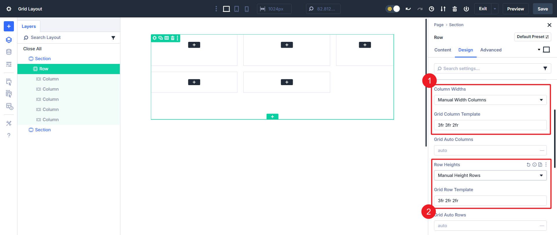
You can see that the outline is starting to take shape even though there’s no content or styling.
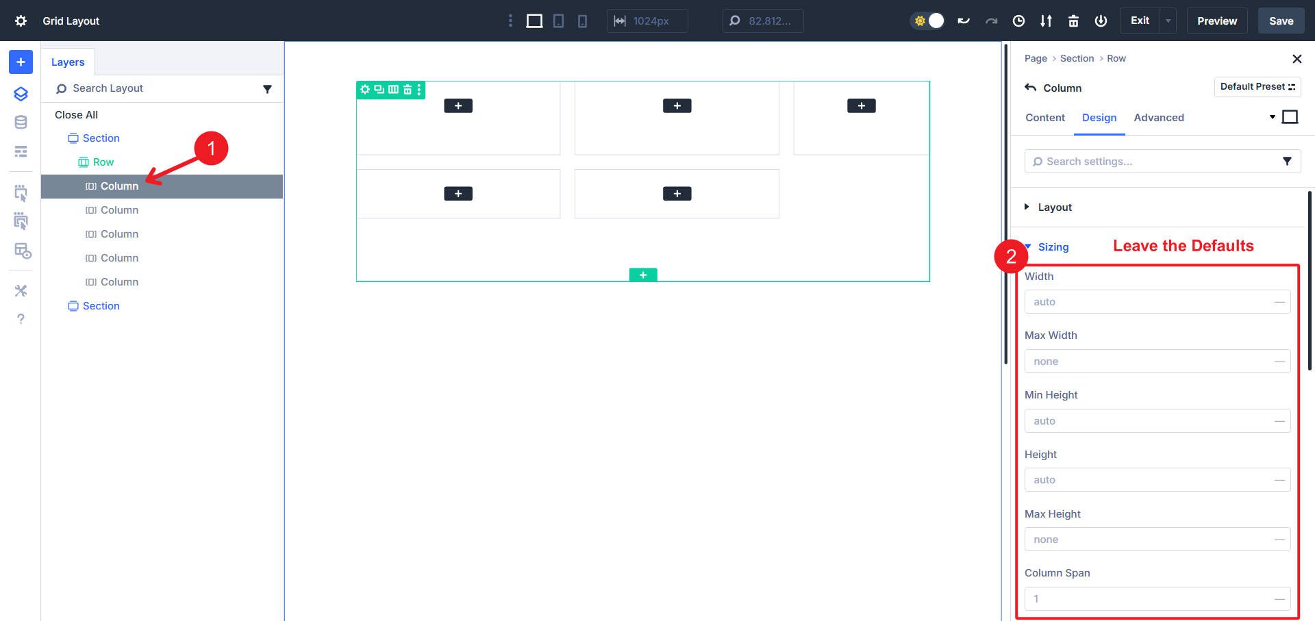
Step 3. Column Grid Settings
At this point, we have the general layout setup, but we now need to set individual grid options on the child element level. Remember that we have five columns, each with different settings.
Column 1
Column 1 is easy. We will leave all the Grid sizing default settings along so that Column 1 sits naturally in the first cell of the grid.
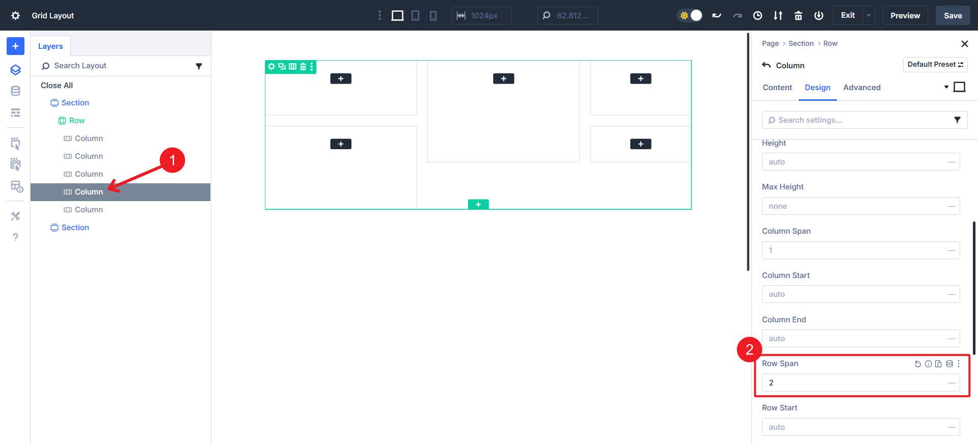
Column 2
Click into Column 1 and go to the Design tab > Sizing. Set Column Start to 2, Row Span to 2, and Row Start to 1.
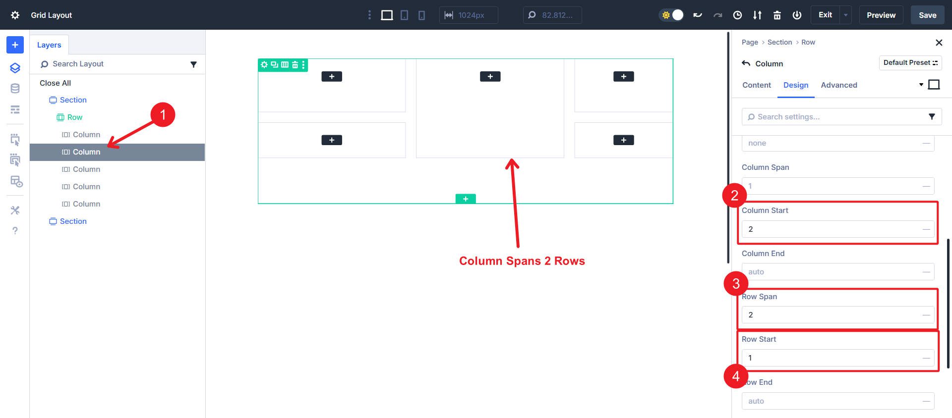
This creates a tall column in the middle that stretches across the two rows.
Column 3
Luckily for you, Column 3 is also easy and requires no changes to the default settings. This drops the column into the next available space in the top row.
Column 4
Click into Column 4 and open Design > Sizing. Set Row Span to 2.
This column stretches downward and covers two rows vertically.
Column 5
Click into Column 5 and open Design > Sizing. Set Column Span to 2, Column Start to 2, Row Span to 2, and Row Start to 2.
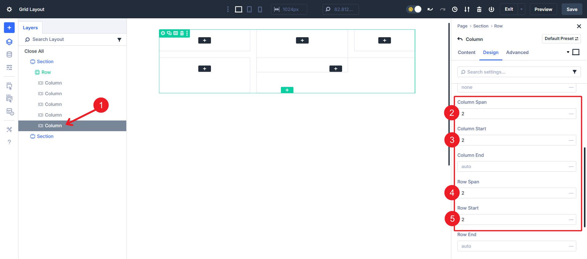
This creates a large block that fills the bottom-right corner of the grid, causing some overlap with Column 2.
Step 4. Design Each Column
As far as the grid layout goes, you are actually 80% of the way done. If you want to create your own design from here, you can build something unique while still maintaining the same grid structure. But let’s continue and paint with broad strokes. Let’s add some color and images to these columns. You can access the images by importing the layouts referenced at the beginning of this article (recall that we are using Grid #4).
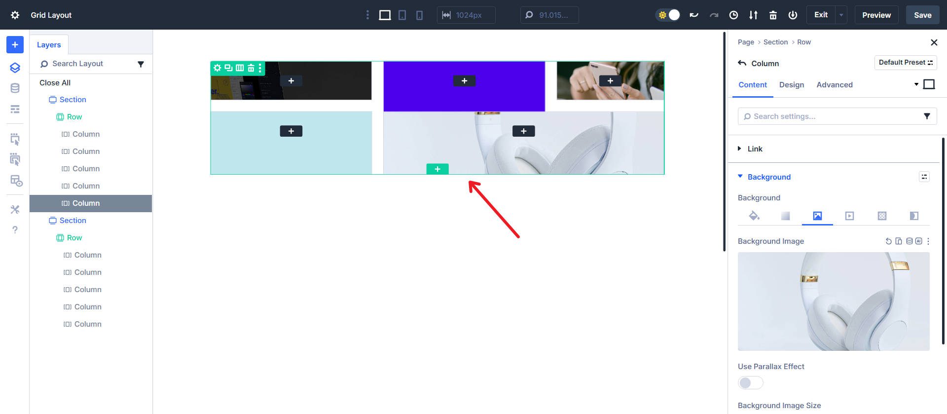
All Columns in this example either have a Background Color or Image.
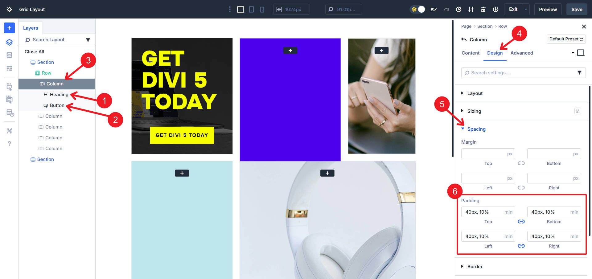
The grid is a bit scrunched. To fix that, we need to add some modules to the columns. In Column 1, add a Heading Module and a Button Module. Go to the Column itself and on the Design Tab, find the Spacing options and add internal Padding using min(40px, 10%) for all four sides.
Column 2 is similar in that it gets Padding of min(40px, 10%) on all sides. It also gets an Image, Heading, and Text Module. But then go to the Column’s Design Settings > Layout. Find the “Justify Content” icon options and choose the 3rd one, “End.” This pushes the modules to the bottom of the Column.
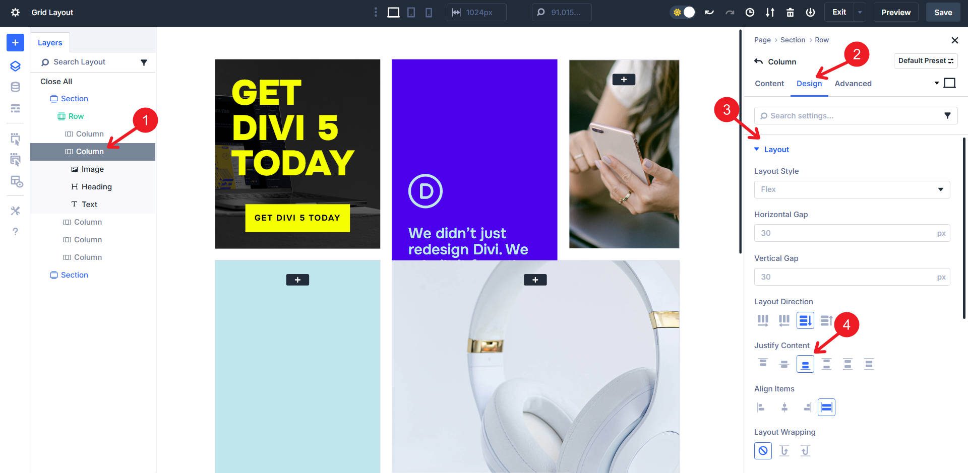
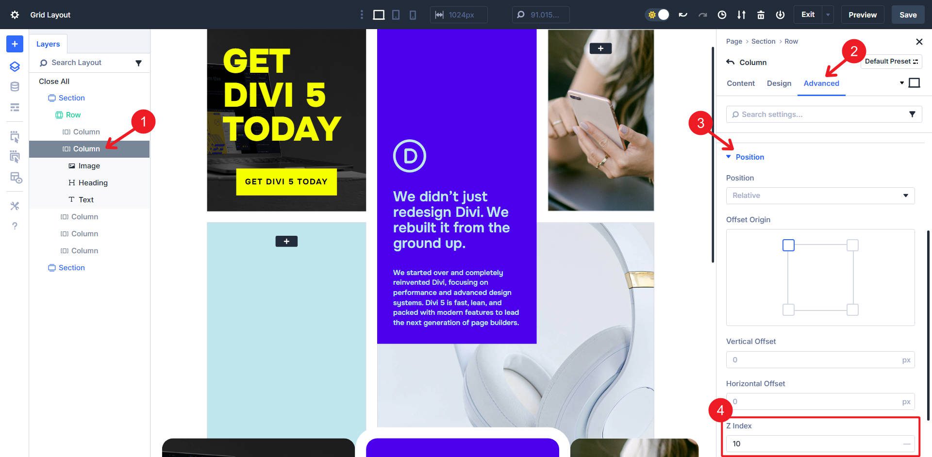
Then, still on Column 2, go to the Advanced tab > Position. Add a z-index of 10 to lift it above the overlapping Column 5.
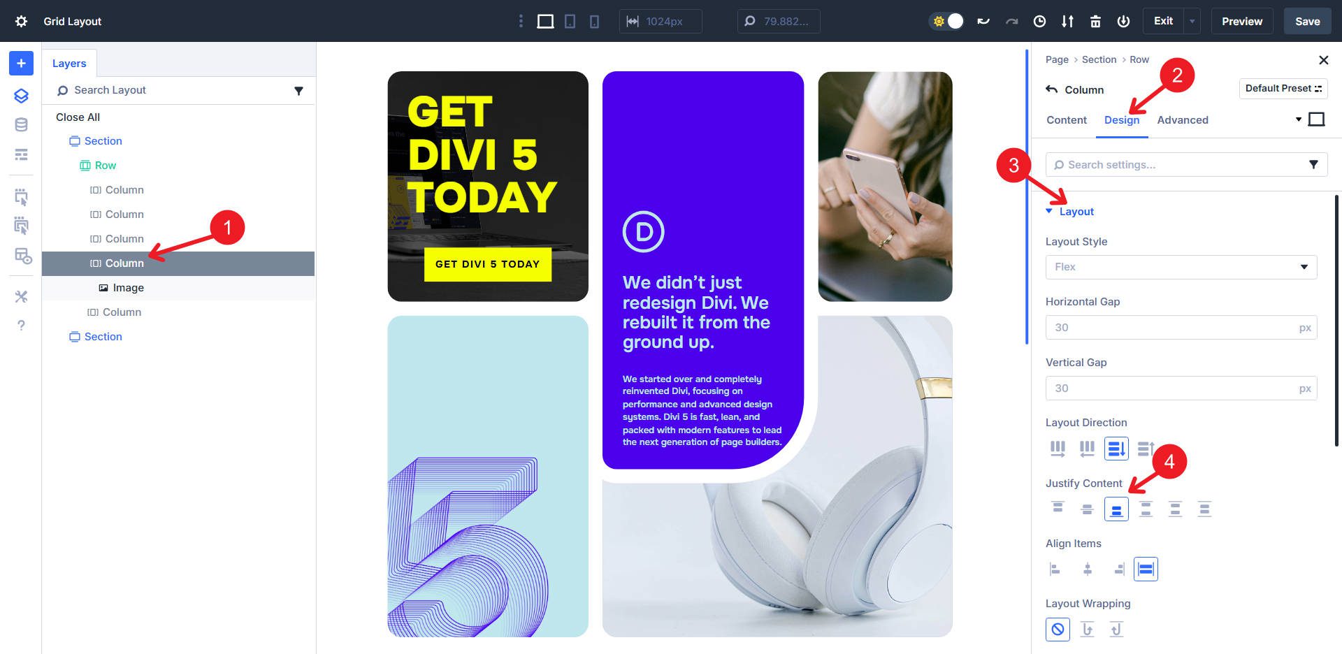
We can also introduce border radius to all our columns. On Column 2, add 20px border radius to all corners, then use Extend Attributes to give all Columns in the Parent Row the same border radius. Once that is done, set the bottom right border radius to 10vw.
To create the curved gap effect on the lower right side of Column 2, we will add a box shadow. Use Box Shadow #4, Spread Length of 20px (set all other values to zero), Shadow color of white (#ffffff at 100%), and Box Shadow Position of “Outer Shadow.”
Column 4 adds the Divi 5 “5” image inside it (for reference, it is set to 80% width.
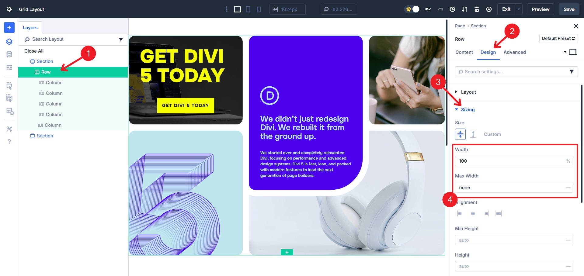
Now, all that is left to do is give the grid a little more breathing room. To do that, go to the parent Row and go to Design > Sizing. Give the row a width of 100% with a max width of none.
And there we have it: a fairly complex grid with two columns, several of which span extra length (either vertical or horizontal). We employ an interesting use of a box shadow to create the appearance of a gap, when in reality, it is two grid items overlapping.
Download 8 CSS Grid Sections For Divi 5
Get 8 grid sections for free. These are prestyled sections designed to look great out of the box. Import them into your Divi Library and add them to any page. The one we used throughout this tutorial is #4.

Build Your Grid Layouts In Divi 5 Today
You’ve just rebuilt a complex grid from the ground up. Now that you understand how Divi 5’s Grid inputs work, you can start experimenting with your own layouts — swapping spans, adjusting gaps, and stacking content in new ways. The more you practice, the more you’ll see how flexible and fast this system can be compared to the old block model.
Now that you have this foundational layout built, why not take it a step further?
- Try different values: What happens if you change the Grid Column Template to 1fr 4fr 1fr?
- Rearrange the spans: Can you make Column 4 span horizontally instead of vertically?
- Explore responsive settings: Use Divi’s responsive controls to completely change the grid structure on tablets and mobile devices for an optimized experience.
- Try using offsets: We didn’t touch on grid offsets, but they are a handy way to rearrange your grid to account for asymmetric layouts.
The layout we built today is just one of countless possibilities. Use these new skills as a springboard for your creativity. We can’t wait to see what you build with it!
Not on Divi 5 yet? Make the switch today and start building smarter, faster layouts.


Leave A Reply