
Divi 5 gives you more ways to build custom navigation without relying only on the classic Menu module or third-party plugins.
With newer menu components, Interactions, and Canvases, you can design navigation as part of the page instead of forcing every menu into one preset structure.
That flexibility works especially well for a full-screen menu. The header can stay clean with a logo, call-to-action button, and hamburger icon. When visitors need navigation, the hamburger icon can reveal a large overlay menu.
In this tutorial, we’ll build a responsive full-screen menu using Divi 5’s Link module, Loop Builder, Interactions, and Canvases.
- 1 How Divi 5’s Menu Features Work Together
-
2
How To Build A Full-Screen Menu With Divi 5
- 2.1 Step 1: Build The Desktop Header
- 2.2 Step 2: Add The Header Modules
- 2.3 Step 3: Build The Full-Screen Menu Canvas
- 2.4 Step 4: Add The Close Icon
- 2.5 Step 5: Add A Group For The Menu Links
- 2.6 Step 6: Add The Link Module And Enable Menu Looping
- 2.7 Step 7: Add Social Media Links
- 2.8 Step 8: Hide The Full-Screen Menu By Default
- 2.9 Step 9: Create The Close Interaction
- 2.10 Step 10: Create The Open Interaction
- 3 Download The Files
- 4 Download For Free
- 5 Build A Full-Screen Header Menu With Divi 5
Divi 5’s newer menu tools are built around smaller, more flexible pieces.
Instead of designing every navigation layout through one Menu module, you can combine individual modules, dynamic menu loops, detached Canvases, and Interactions. This gives you more control over how the menu looks and how it opens or closes.
For this full-screen menu, we’ll use three main pieces.
The Link Module
The Link module lets you add a single customizable link anywhere in your layout. You can style the text, spacing, icon, hover state, sizing, background, border, and other design settings just like you would with other Divi modules.
For this tutorial, we’ll use one Link module inside a menu loop. The loop will repeat that link for each item in a WordPress menu. That gives you the design freedom of a custom link layout while still keeping the menu items managed in WordPress.
Loop Builder
Loop Builder handles the repeated menu items. Instead of adding every menu link manually, you can enable looping on a container, set the query type to Menu, choose a WordPress menu, and use dynamic content to pull in the current menu item text and URL.
This is useful because the full-screen menu stays connected to your WordPress menu. If you change the menu in WordPress later, the loop can reflect those changes without rebuilding each link by hand.
Interactions
Divi 5’s Interactions feature controls the menu behavior. For this build, one Interaction will show the full-screen menu when someone clicks the hamburger icon. Another Interaction will hide the menu when someone clicks the close icon.
Interactions live in the Advanced tab. They can use triggers such as clicks, viewport events, and breakpoint changes. They also support targeting options that make it possible to show, hide, or toggle related elements. The behavior we need is simple: click the hamburger icon to open the overlay, then click the close icon to hide it.
Canvases
Canvases are detached workspaces in Divi 5. They let you build content away from the Main Canvas. That keeps complex overlay elements from cluttering your header while you work.
A Canvas is a good place to build a full-screen menu, popup, slide-in panel, or mega menu. The menu can stay hidden by default, then appear when an Interaction triggers it. The Canvas Portal Module is useful when you need to place a detached Canvas at a specific spot in a page or Theme Builder template.
For this tutorial, we do not need a Canvas Portal. The full-screen menu works as a fixed overlay controlled by Interactions.
Now let’s build the menu. By the end, you’ll have a sticky header with a hamburger trigger and a full-screen overlay menu that opens and closes with Divi 5 Interactions.
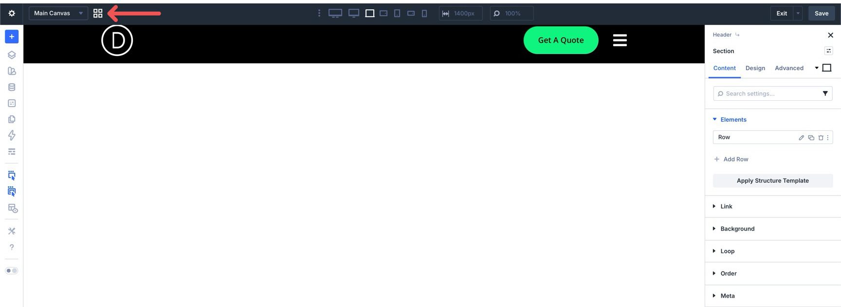
Step 1: Build The Desktop Header
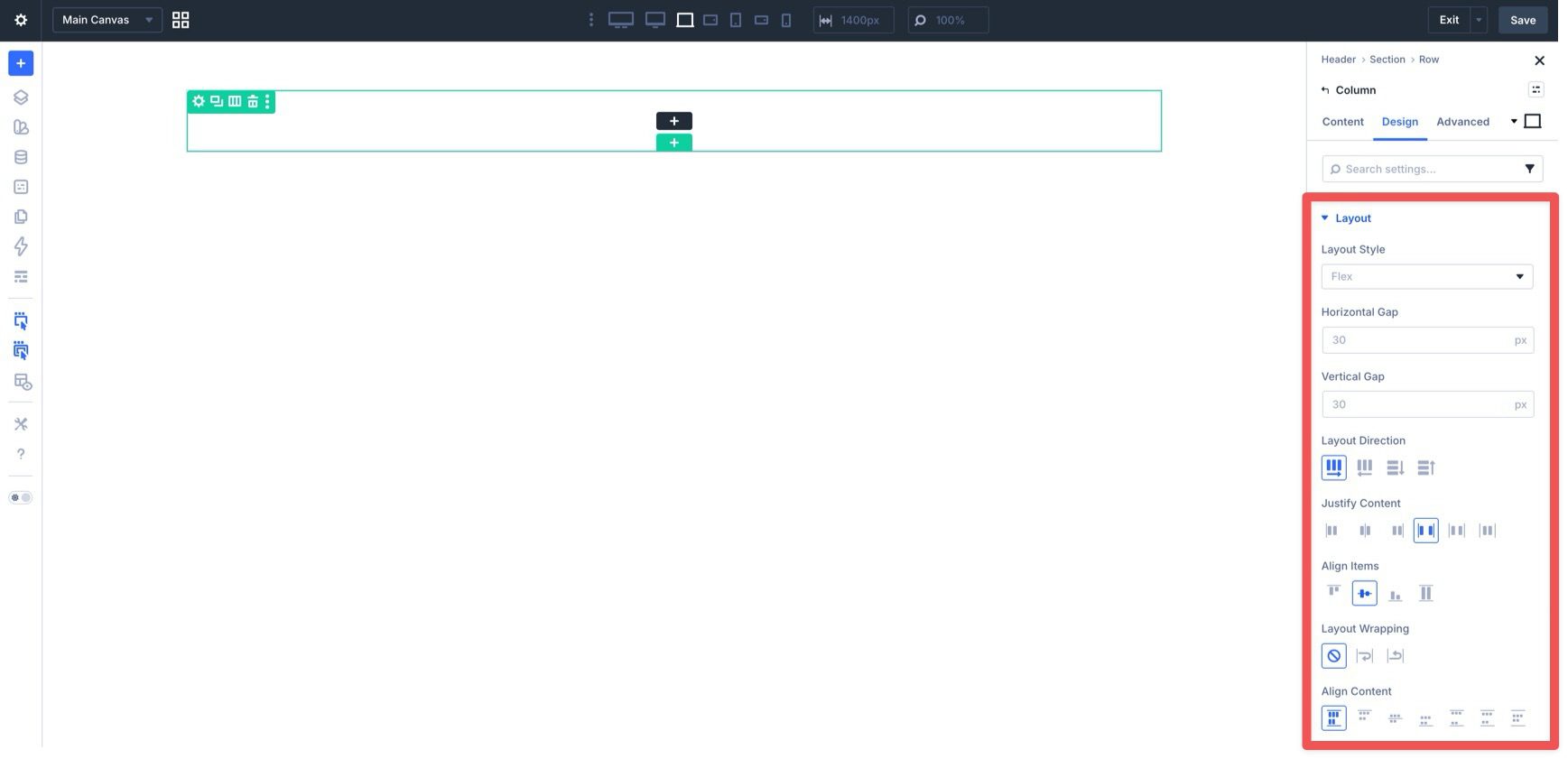
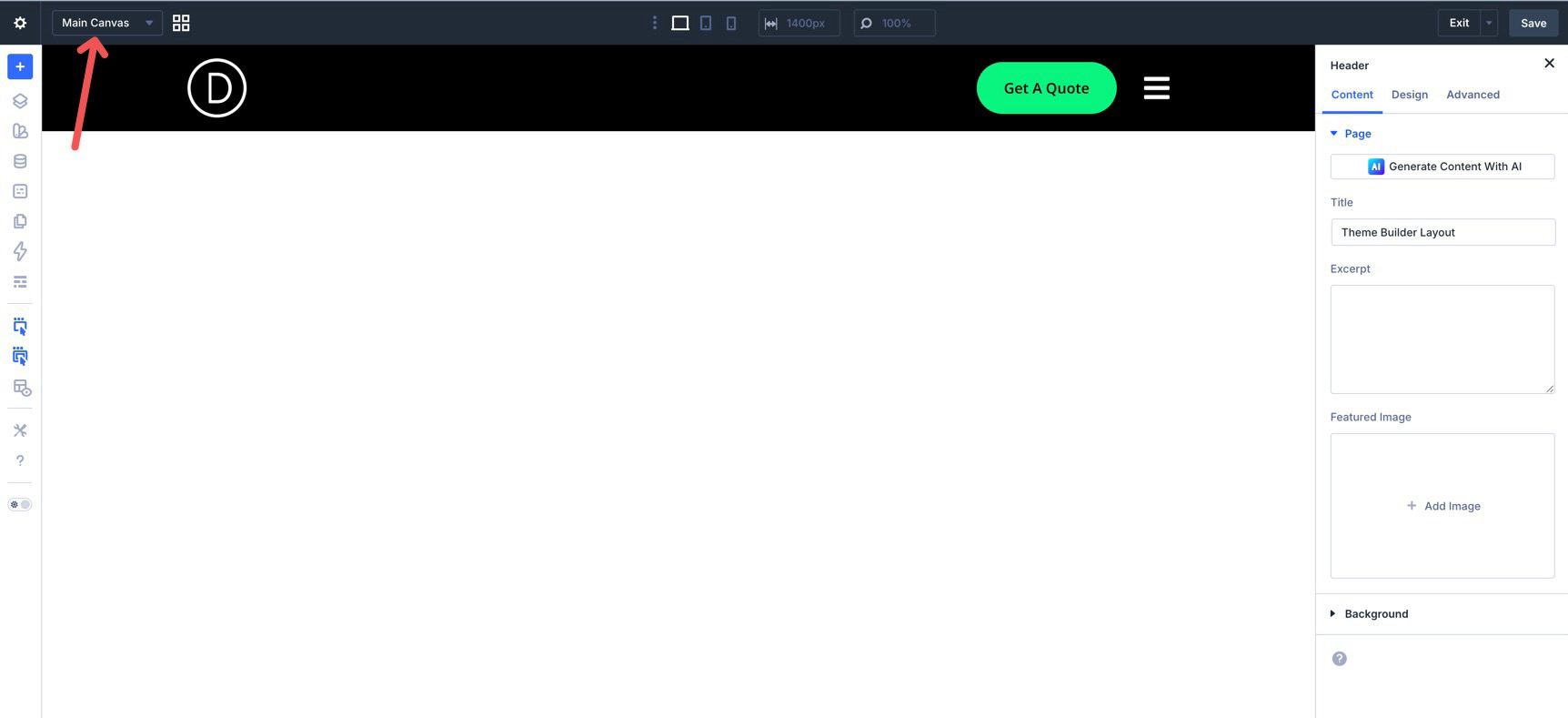
Start by creating a new Global Header in the Theme Builder. When the Builder loads, add a Single Column Row to the Main Canvas. Then open the column settings.
Open Design > Layout. Set Layout Direction to Row, Justify Content to Space Between, and Align Items to Center. This turns the column into a horizontal header container. The logo can sit on the left while the button and hamburger icon sit on the right.
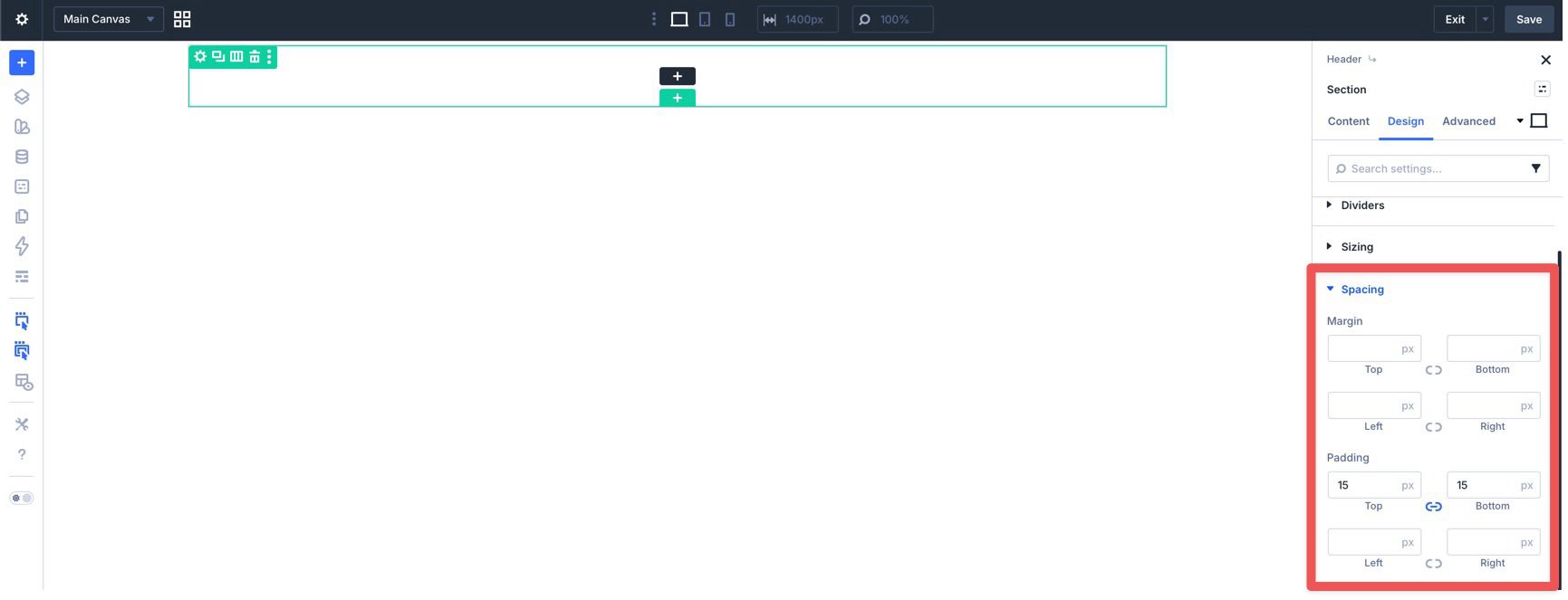
Next, open the Section settings. Go to Design > Spacing and add 15px of top and bottom padding.
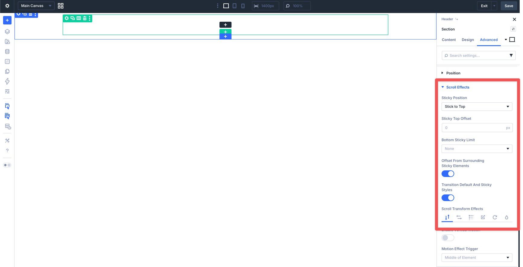
In the Advanced tab, open Scroll Effects and set Sticky Position to Stick To Top. Leave the other sticky settings at their defaults unless your header needs different behavior.
Return to the Content tab and add a background color to the Section. This keeps the sticky header readable as visitors scroll.
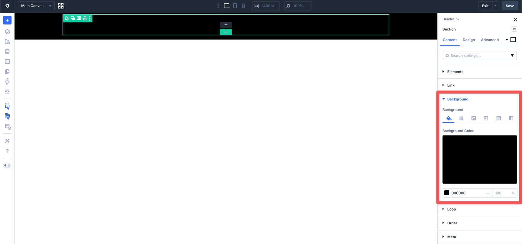
Step 2: Add The Header Modules
Click inside the Row and add an Image module for your logo. In the Design tab, open Sizing and adjust the Width value until the logo fits your header.
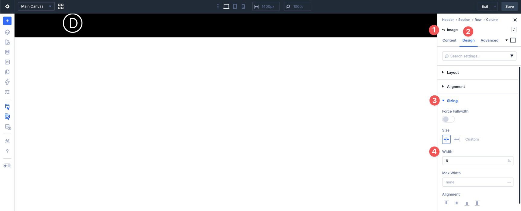
Use Divi’s Responsive Editor to adjust the logo size for smaller screens.
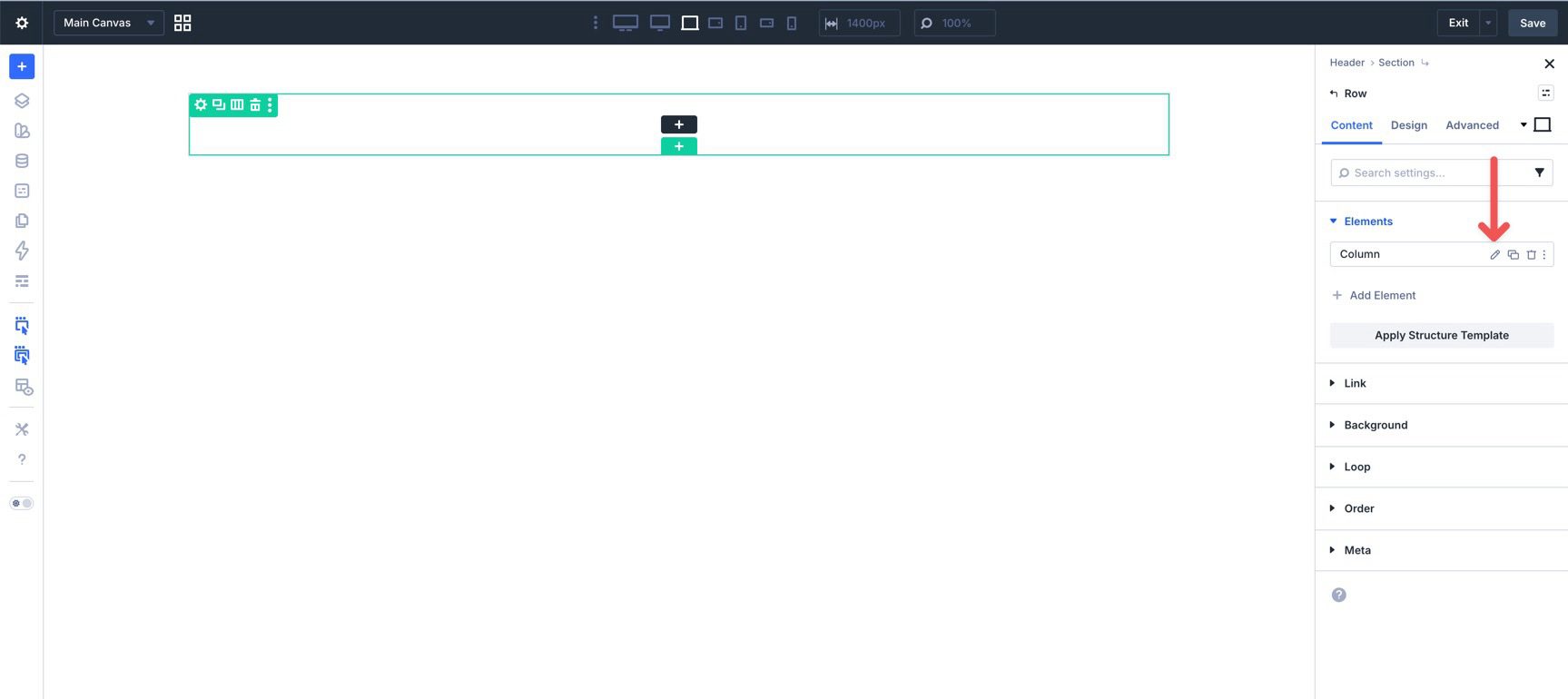
After the logo is in place, add a Group module.
Place a Button module and an Icon module inside the Group. The Button can be used for a primary call to action, such as contacting you or viewing your work. The Icon module will become the hamburger trigger that opens the full-screen menu.
Open the Group settings and go to Design > Layout. Set Layout Direction to Row and Align Items to Center. This places the Button and Icon side by side.
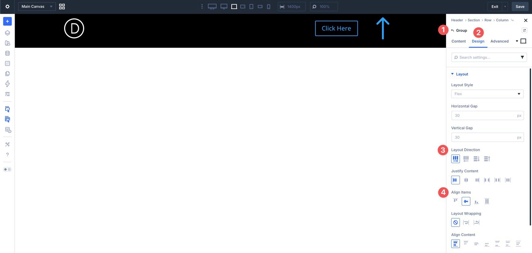
Style the Button and Icon modules to match your header. Use Divi 5’s Customizable Responsive Breakpoints to adjust spacing, button size, or icon size for tablet and mobile.
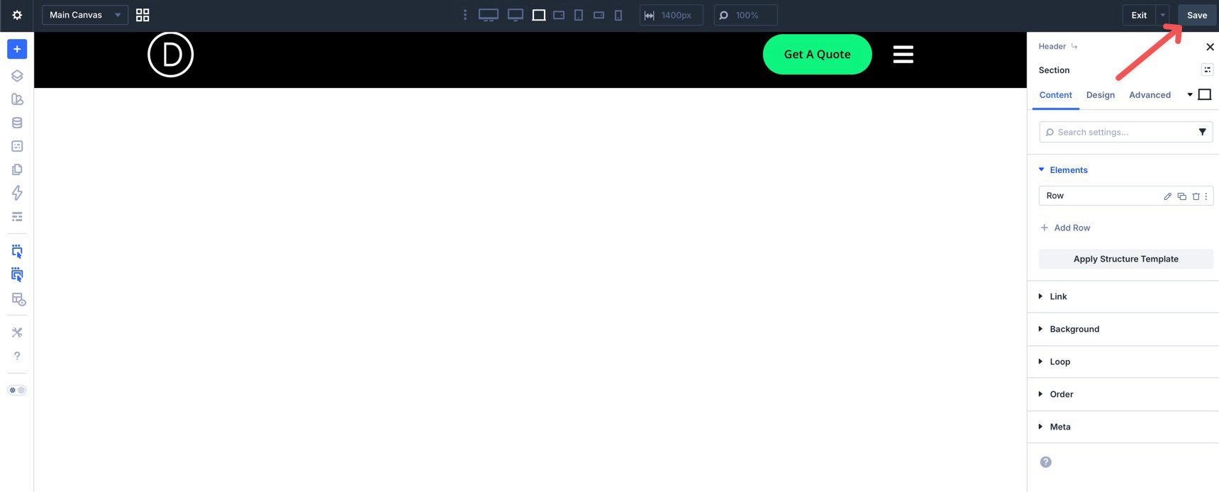
Save the template by clicking the Save button in the upper right corner of the Builder.
With the header in place, build the full-screen menu on a separate Canvas. This keeps the overlay layout separate from the Main Canvas while you design it.
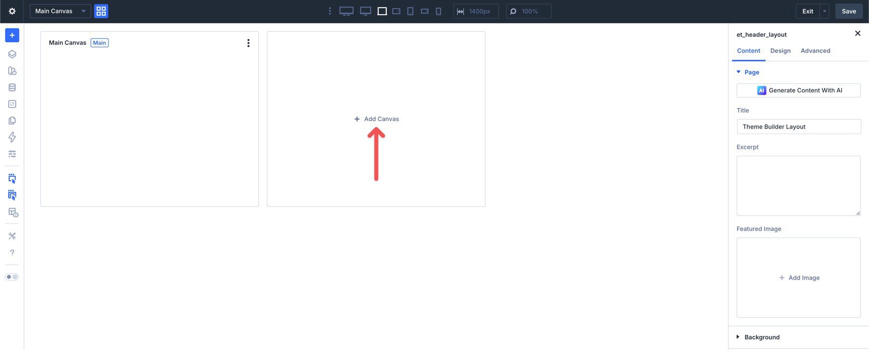
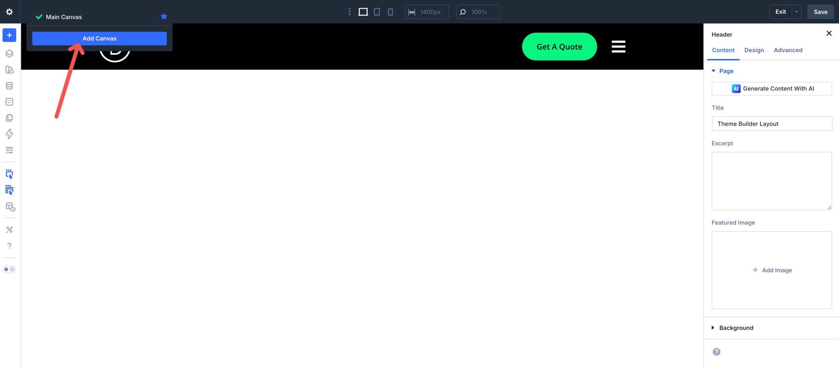
Click the Canvas Grid View button to open the Canvas Preview window.
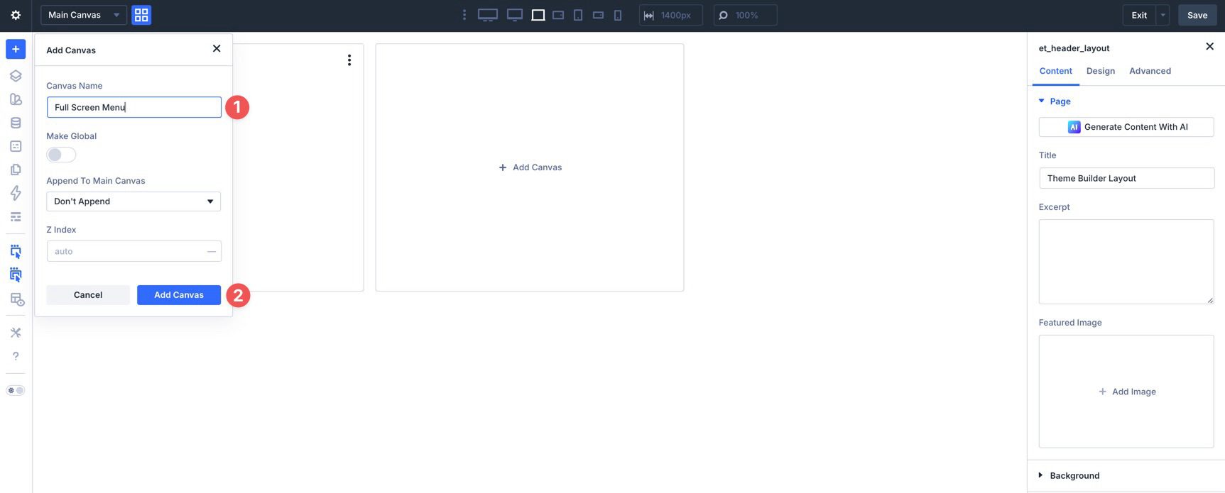
When the Canvas Preview opens, click + Add Canvas.
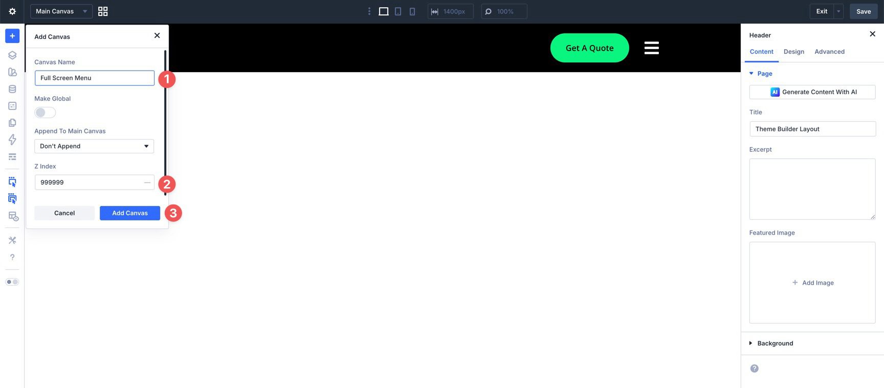
Give the Canvas a clear name, such as Full-Screen Menu. Then click Add Canvas.
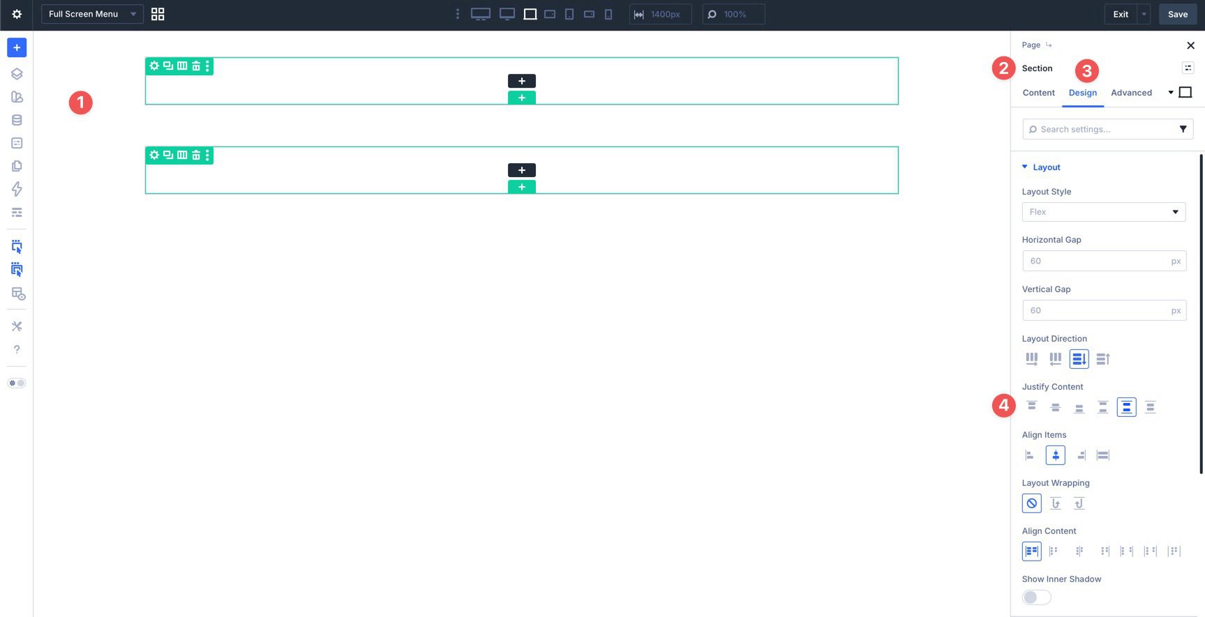
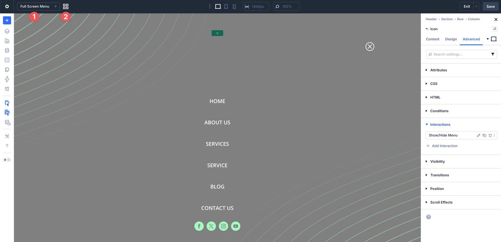
Add two Single Column Rows to the Canvas. The first row will hold the close icon. The second row will hold the menu links and social media icons.
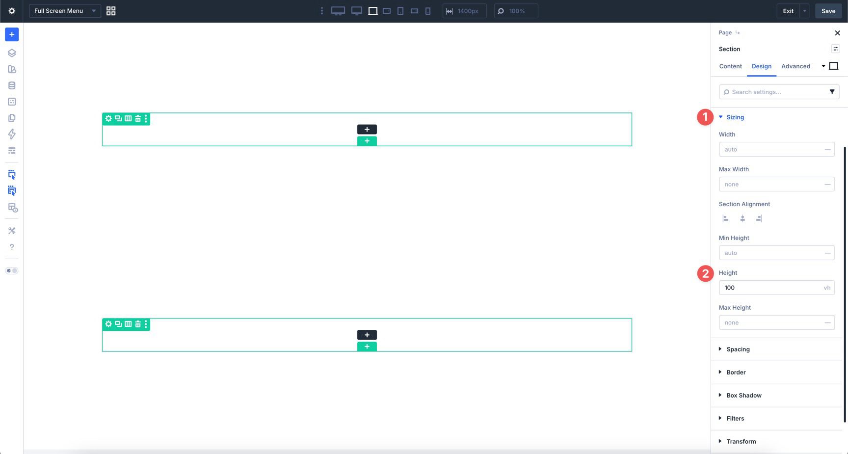
Open the Section settings and go to Design > Layout. Set Justify Content to Space Around. This gives the close icon and menu content room to breathe vertically.
Next, open Design > Sizing. In the Height field, enter 100vh. This makes the menu section fill the full height of the viewport.
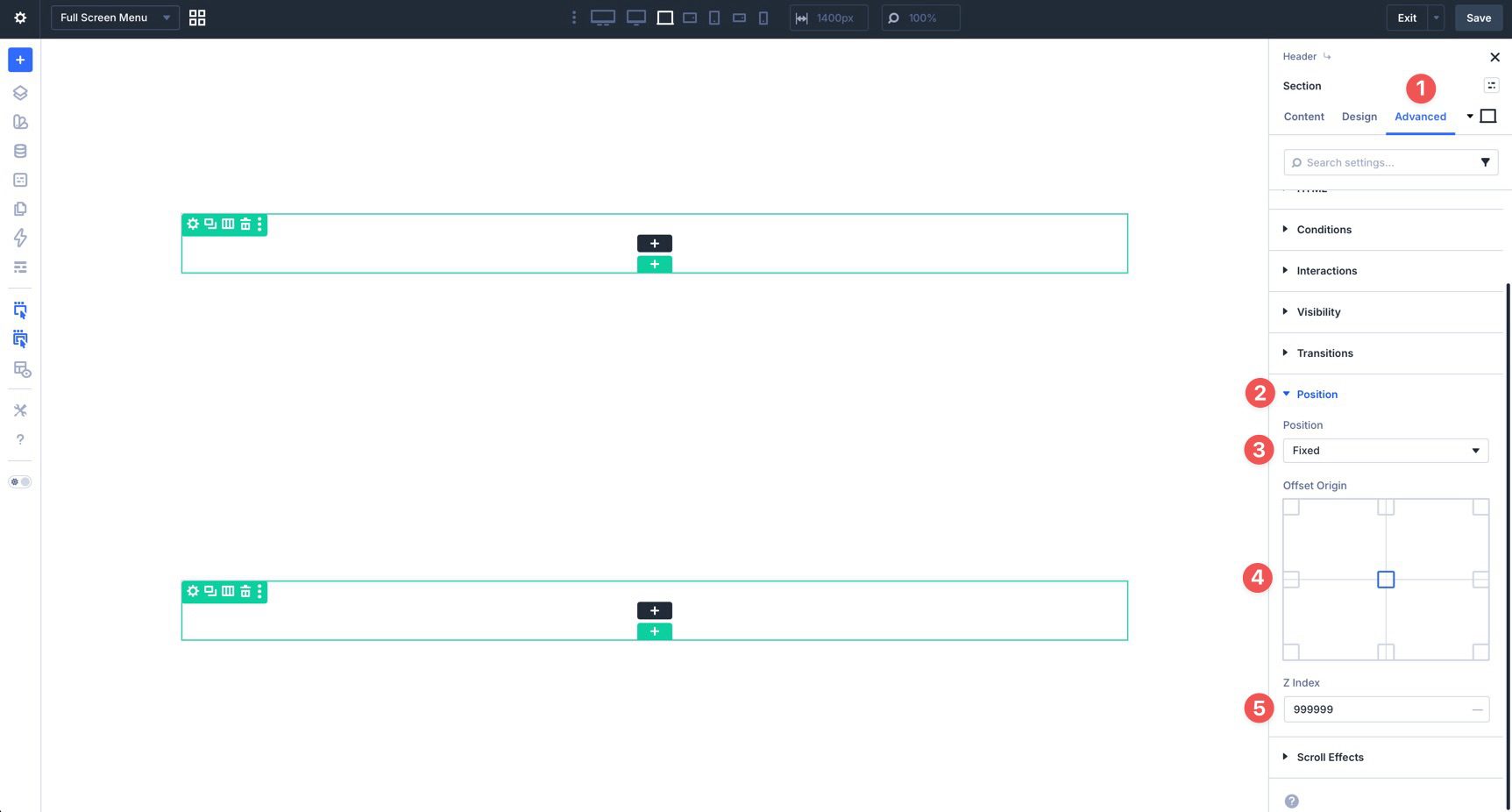
Now go to Advanced > Position. Set Position to Fixed, set Offset Origin to Center, and set the Z Index to 999999. This keeps the full-screen menu fixed over the page content when it appears.
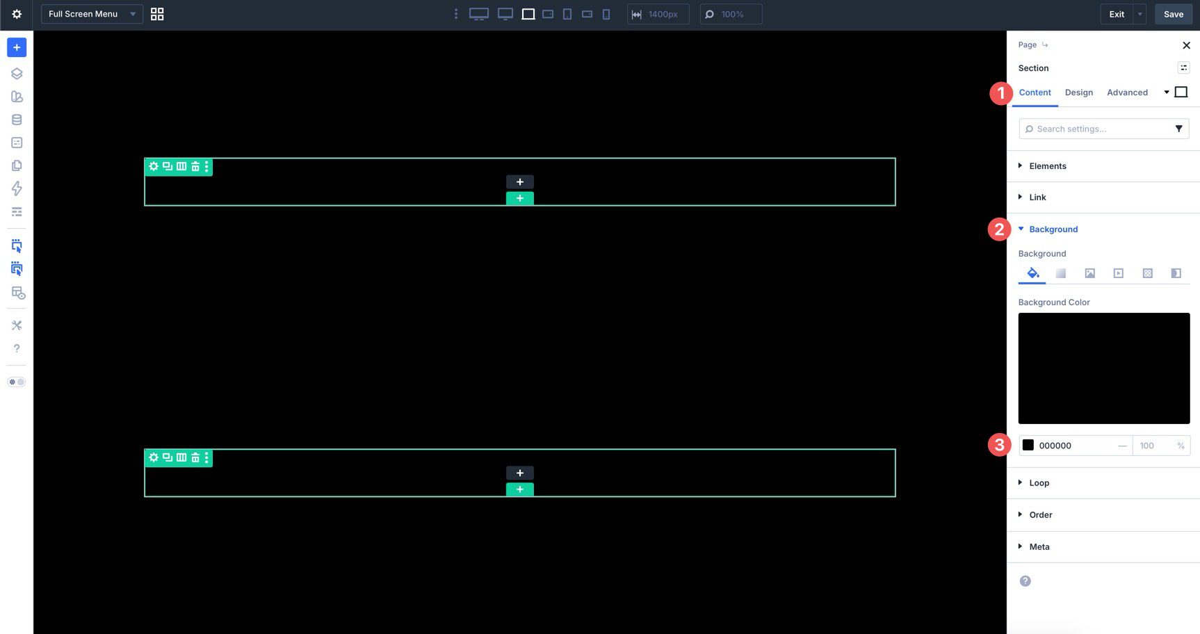
Return to the Content tab, open Background, and add a background color.
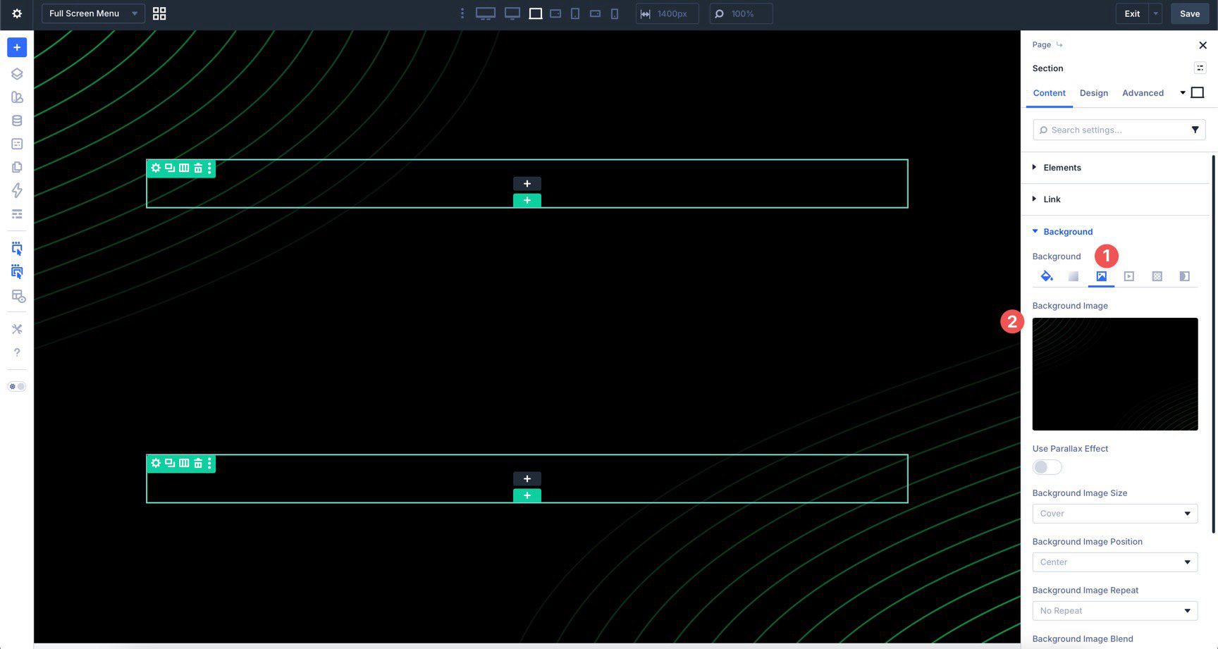
If your design needs a background image, select the Background Image tab and add one. Keep the image subtle enough that the menu links remain easy to read.
Step 4: Add The Close Icon
Add an Icon module to the first row in the full-screen menu section. In the Content tab, open Icon and choose a close icon.
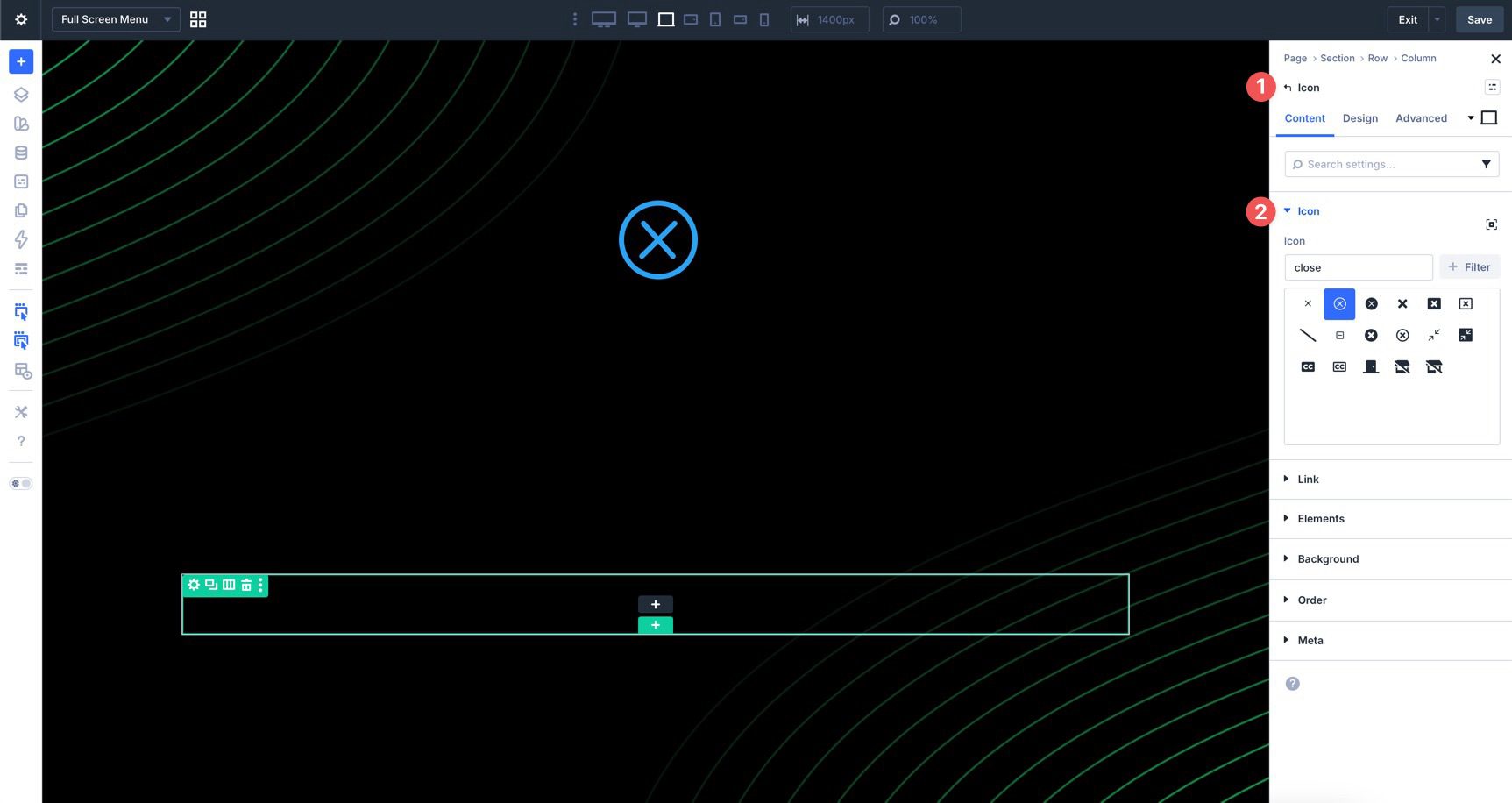
In the Design tab, use the Icon settings to choose the icon color and size. Hover settings can help the close icon feel interactive.
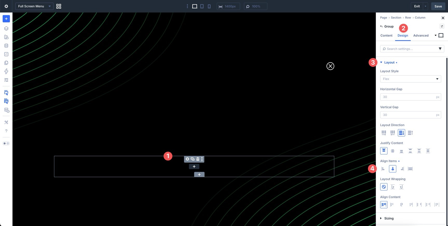
Click into the second row and edit the column. Go to Design > Layout and set Align Items to Center. This keeps the menu links centered inside the overlay.
Before adding the link, place a Group Module in the second row.
This Group will act as the loop container for the menu links. It also keeps the repeated links organized inside one layout wrapper. In the Group’s Design tab, set Align Items to Center.
Add a Link module inside the Group. Style the Link module to match your full-screen menu design.
Large typography works well here because the overlay has more space than a traditional header menu. Add hover styles so visitors get clear feedback when they move over a menu item.
With the link styled, enable Loop Builder on the Group that contains it. Open the Group’s Content tab and expand the Loop option group. Set Query Type to Menu, then select your site’s WordPress menu in the Menu field.
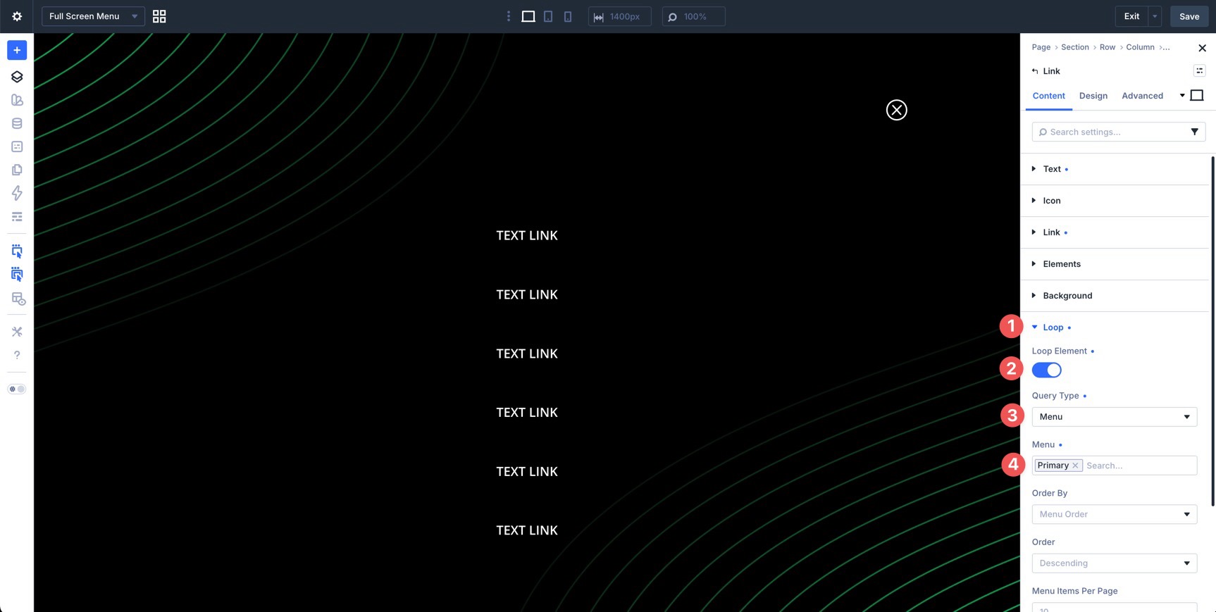
Now open the Link module’s Content tab. In the Text option group, use dynamic content for the link text and choose Loop Menu Text.
Make sure the Link module’s URL also uses the current loop menu item URL if it is not added automatically in your build. This keeps each repeated Link module connected to the correct WordPress menu item.
To finish the overlay, add a Social Media Follow module below the menu links. Use the + Add Social Network button to add the platforms you want to include.
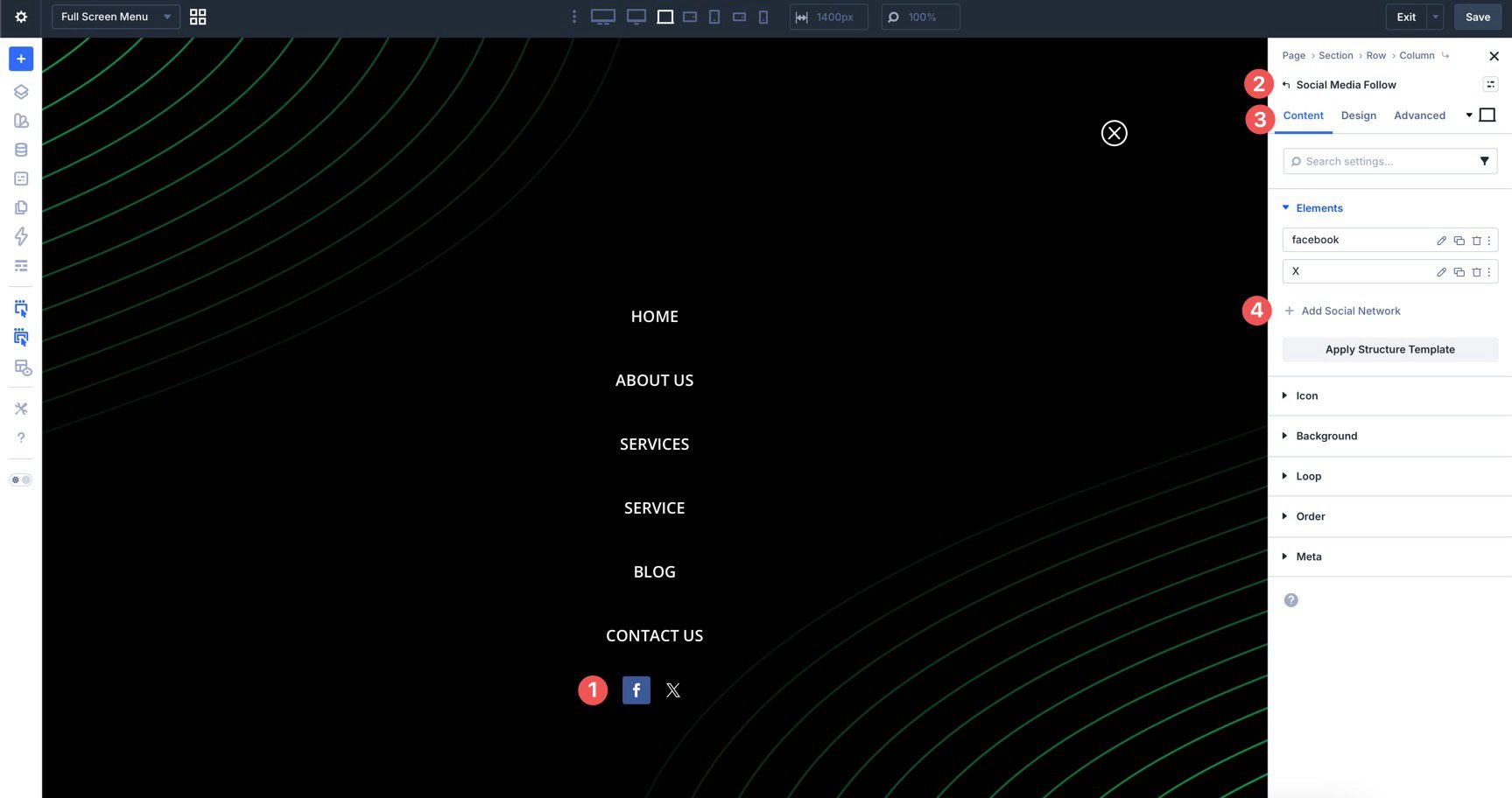
Choose a network, add the profile URL, and adjust the background color as needed.
Open the main Social Media Follow module settings. In the Design tab, adjust the icon color, icon size, spacing, border radius, and hover styles so the icons match the rest of the menu.
Before creating the Interactions, hide the full-screen menu so it does not appear when the page first loads. Select the main Section on the full-screen menu Canvas. Go to Advanced > Visibility and hide or disable the Section on all breakpoints.
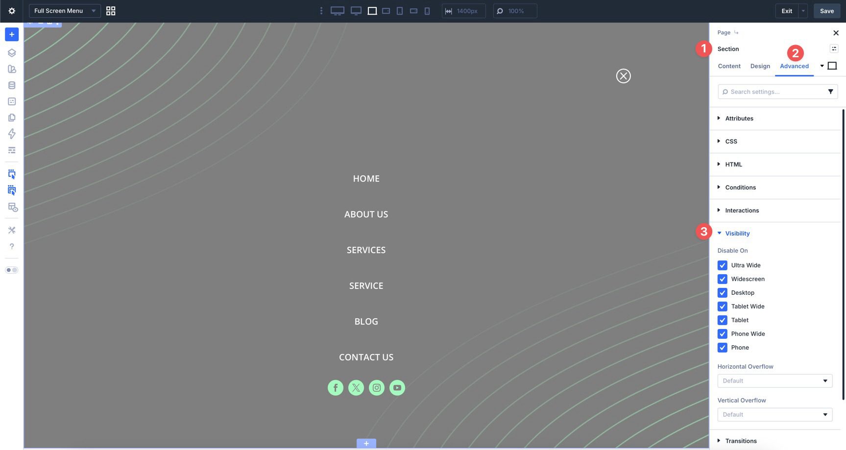
The menu is now ready to be shown by an Interaction. Save the Canvas before moving to the next step.
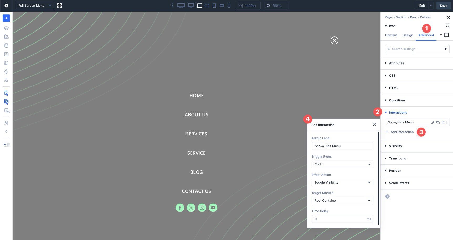
Step 9: Create The Close Interaction
The menu needs two Interactions. One Interaction closes the full-screen menu from inside the overlay. The other opens it from the header.
Start with the close icon inside the full-screen menu Canvas. Select the close Icon module and go to Advanced > Interactions. Click + Add Interaction.
In the Edit Interaction modal, add a clear Admin Label, such as Close Full-Screen Menu. Set Trigger Event to Click. For Effect Action, choose Hide Element. For the target, select Root Container if you want the close icon to hide the overlay container it sits inside.
Save the Canvas after creating the close Interaction.
Step 10: Create The Open Interaction
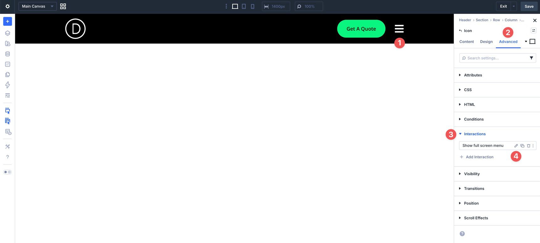
Return to the Main Canvas and select the hamburger Icon module in the header.
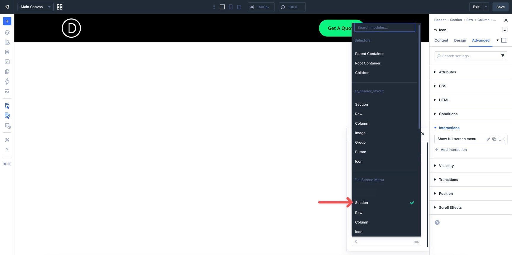
Go to Advanced > Interactions and add a new Interaction. Set Trigger Event to Click. Set Effect Action to Show Element. For the target, choose the full-screen menu Section on the menu Canvas.
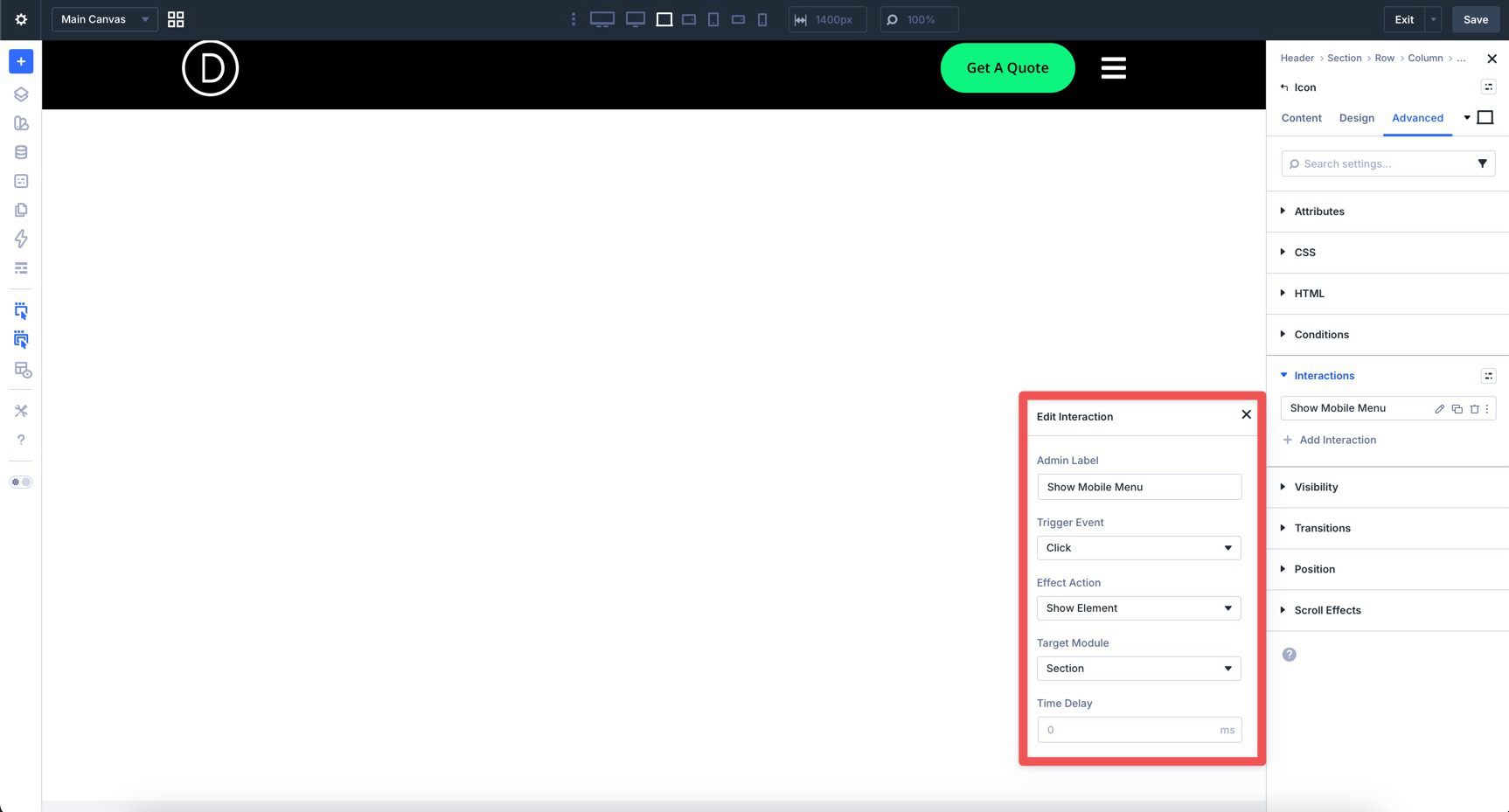
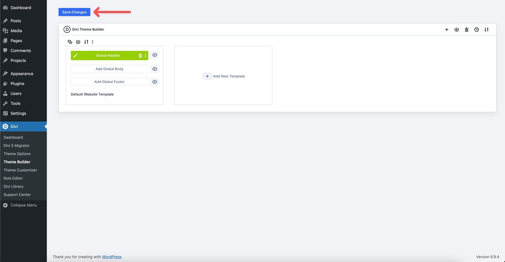
Save the Canvas. When the Theme Builder interface loads, click Save Changes. Then preview the site in a new tab.
Click the hamburger icon to open the menu. Then click the close icon to hide it again. Also test the menu on tablet and mobile. Make sure the overlay fills the screen, the links remain readable, and the close icon is easy to tap.
Download The Files
We created two JSON files for this tutorial: one for the Main Menu and one for the Full Screen Menu. After downloading the files below, create a new Global Header template in the Theme Builder.
Inside the Builder, add a new Section to the template. Select Add From Library, then load the Main Menu JSON file to the Canvas.
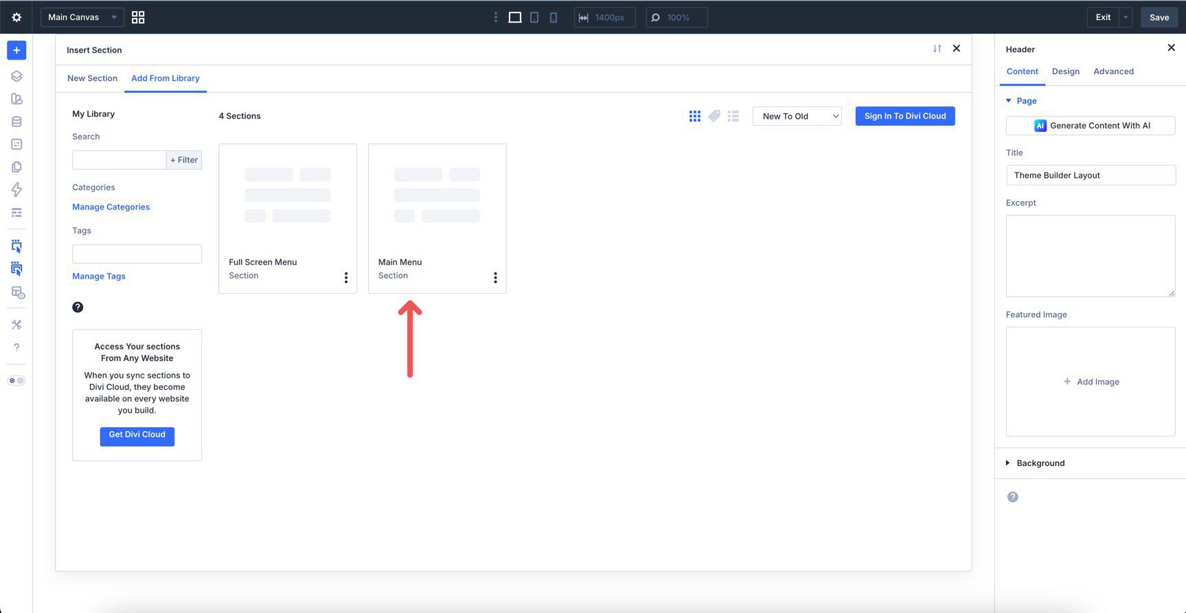
Save the template. Next, open the Canvas dropdown menu in the top left corner of the Page Bar.
Select Add Canvas.
Name the Canvas Full Screen Menu and click Add Canvas.
When the Builder loads, add a new section. Select Add From Library, choose the Full Screen Menu JSON file, and load it onto the Canvas.
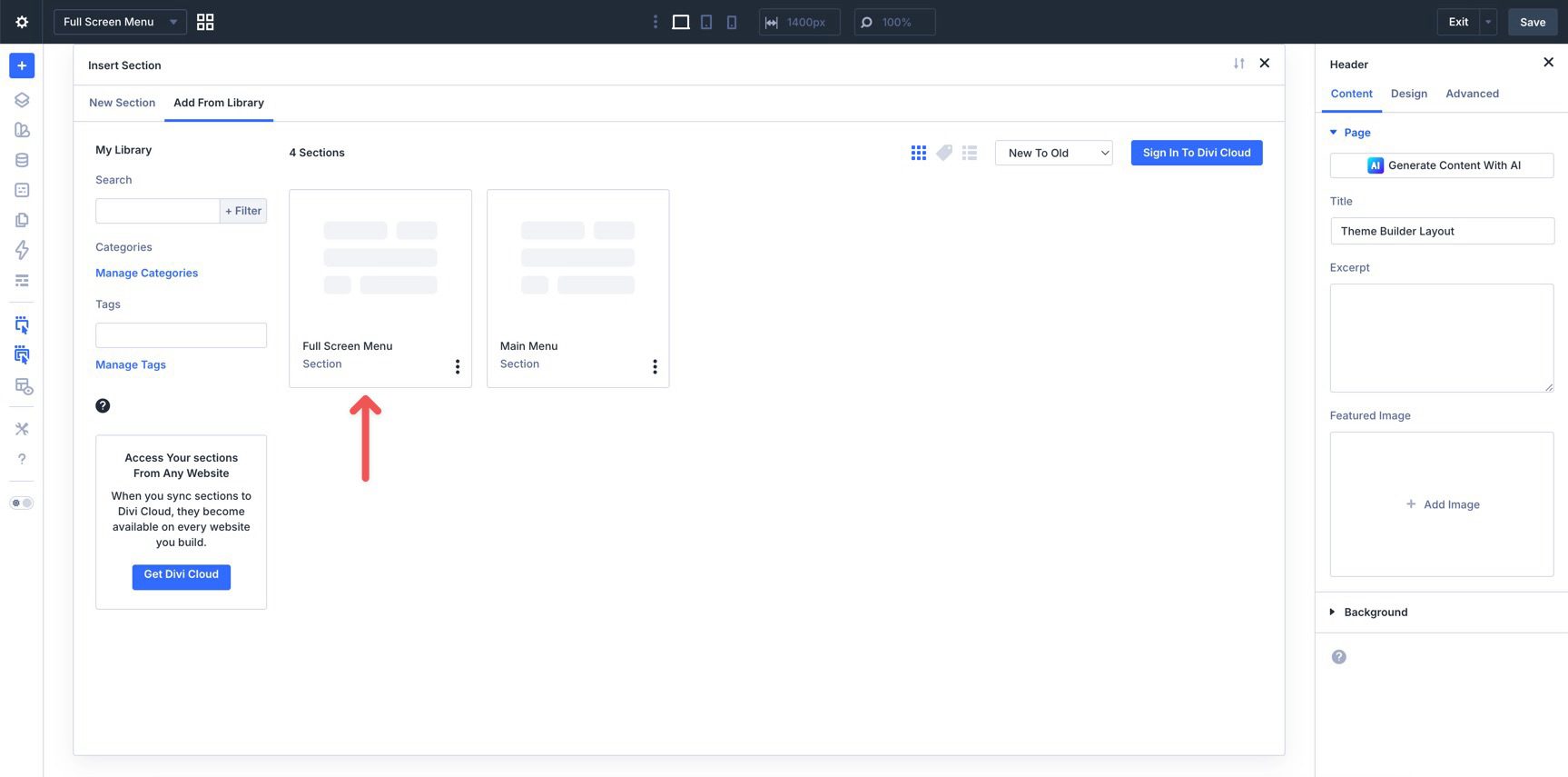
Save the Canvas. Then return to the Main Menu by using the Canvas dropdown menu or the Canvas Grid View icon.
Check that the Interaction used to launch the Full Screen Menu is set up correctly. Select the hamburger Icon module in the Main Menu. Open the Advanced tab, expand Interactions, and edit the Interaction created for the menu trigger.
Confirm that the Target Module is set to the Full Screen Menu’s Section.
Save the template one final time. Then preview the menu and test both Interactions.

Divi 5’s newer menu tools make it easier to move beyond standard header navigation. By combining the Link module, Loop Builder, Canvases, and Interactions, you can build a full-screen menu that feels custom while keeping the main header minimal.
The same workflow can support other navigation patterns too. Use a Canvas for a slide-in menu, a popup, a large editorial menu, or a mega-menu style layout. Then use Interactions to control when that menu appears and how visitors close it.
Download the files above or follow the steps manually. After that, customize the links, colors, spacing, background image, and responsive settings to match your own site.


Leave A Reply