

Hover effects make a page feel more intentional. A card shifts, an image reveals more detail, or a button stretches slightly, and the layout starts to feel designed instead of simply assembled.
In Divi 5, you can create many of these interactions with the same Aspect Ratio and Image Framing controls you already use to crop and position images. Add hover states and transitions, and those layout controls become motion tools.
In this post, we’ll build five hover effects in Divi 5, from a subtle image pan to a button morph and a team-card spotlight effect. Along the way, you’ll see how Aspect Ratio, Object Fit, Object Position, Filters, Transform, and Image Presets work together.
The Controls Behind These Effects
Before we build the effects, it helps to understand the three main controls doing the work.
1. Aspect Ratio
Aspect Ratio is found in Design > Sizing. It sets a proportional relationship between an element’s width and height. A 1:1 ratio creates a square. A 16:9 ratio creates a widescreen frame. A 4:5 ratio creates a taller portrait frame.
The important part is that the ratio stays proportional as the element scales. When the parent container gets wider or narrower, the element’s height adjusts to keep the same shape.
That makes Aspect Ratio useful for more than neat image crops. It can define the resting shape of an image, card, Group, or button, and that shape can also change on hover.
2. Image Framing
Once the frame is set, Image Framing controls how the image behaves inside it. Framing is found in the Image option group, either directly under Design > Framing for the Image module or under Design > Image > Framing when the image is a sub-element inside modules like Person or Blurb.
Object Fit controls how the image fills the frame. For most effects in this post, we’ll use Cover, which scales the image proportionally until it fills the frame and crops anything that does not fit. Object Position controls which part of the image stays visible inside that cropped frame.
Think of the frame as a window and the image as a poster behind it. Object Fit: Cover keeps the window full. Object Position decides which part of the poster you see through that window.
That is what makes hover movement possible. Change Object Position between the default and hover states, and the visible part of the image shifts.
3. Hover State And Transitions
Hover state lets you create a second version of a setting, the version visitors see when their cursor lands on the element.
Set one Object Position in the default state and another in the hover state, and Divi animates between them. The same idea applies to Aspect Ratio, Filters, Transform, and other design settings.
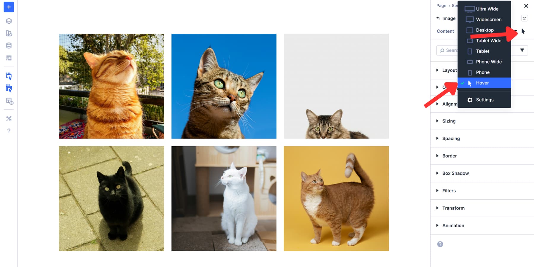
The speed and feel of that animation are controlled in Advanced > Transitions. Duration controls how long the transition takes. Timing Function controls how the motion accelerates and slows down.
A slow image drift can feel polished at 800ms. A button hover usually needs to feel faster, closer to 300ms. With those pieces in place, we can start building.
Five Hover Effects To Build In Divi 5
The effects below move from simple to more layered. Start with the first one if you want to understand the basics, or jump to the effect that fits your current layout.
1. The Focal Glide
The Focal Glide is the simplest effect in the post. On hover, the image pans across its frame and reveals detail that was just out of view.
Start with an Image module and choose a landscape photo with visual interest on both sides. A cityscape, workspace, interior, product scene, or wide travel photo works well.
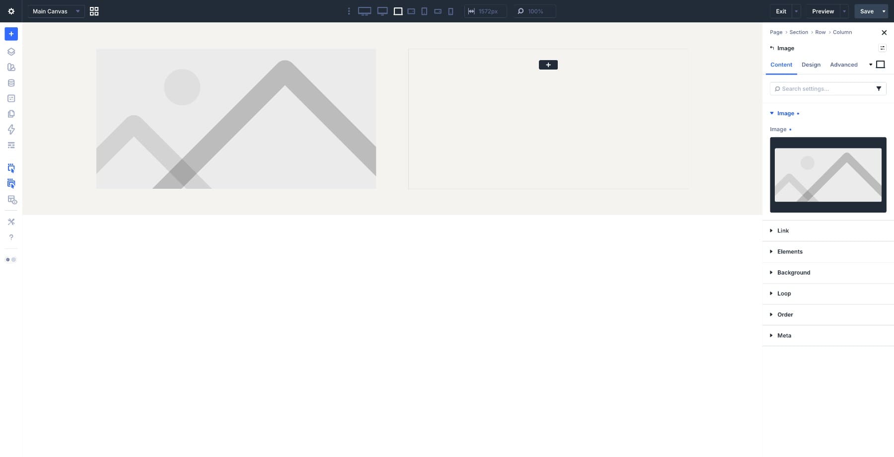
Go to Design > Sizing and set Aspect Ratio to 16:9. This creates a wide frame. Then go to Design > Framing and set Object Fit to Cover. The image now fills the frame without stretching.
Still in the Framing group, set Object Position to:
- X: 0%
- Y: 50%
This pins the visible crop toward the left side of the image.
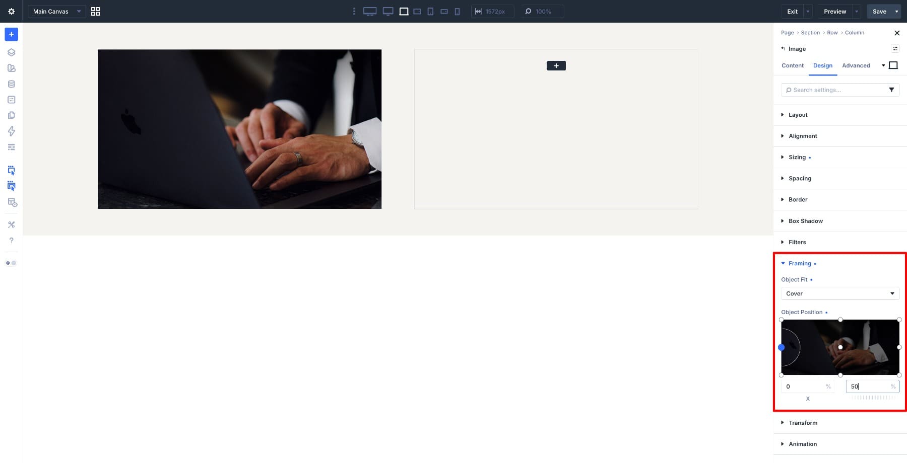
Switch to the Hover state and change the X value to 80%. Leave the Y value at 50%. That one change creates the motion. On hover, the image view moves from left to right inside the same frame.
Switch back to the default state, go to Advanced > Transitions, and set:
- Duration: 800ms
- Timing Function: Ease-In-Out
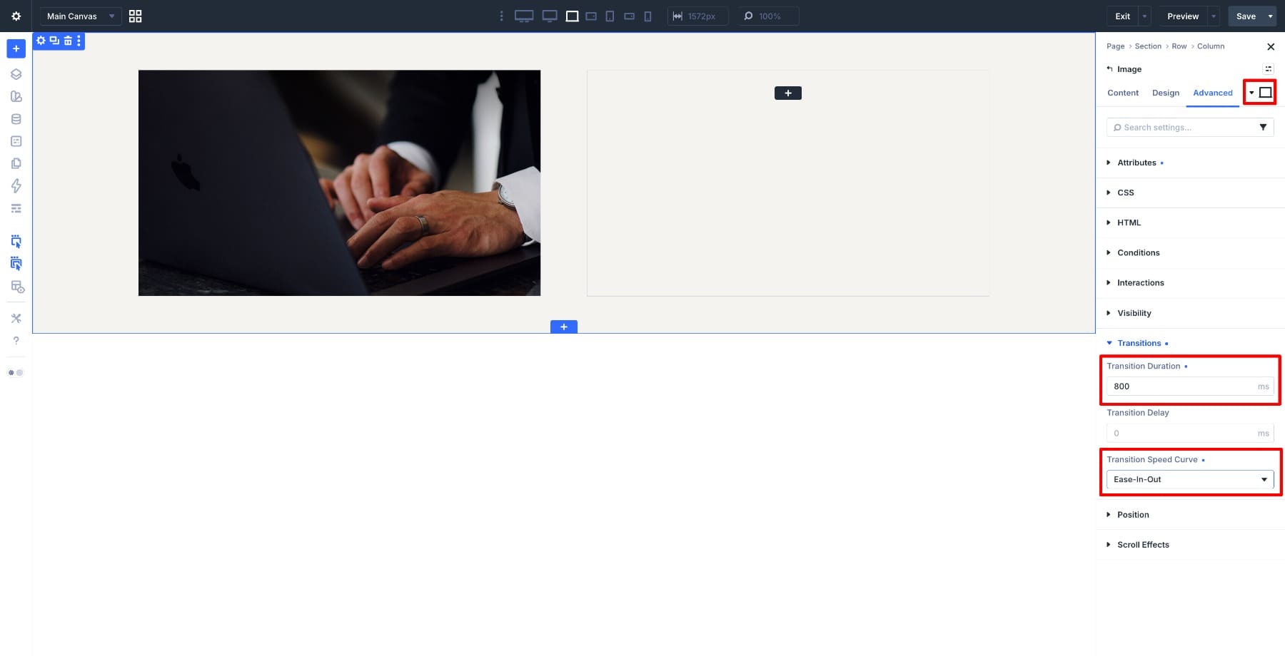
This effect works best when it feels like a slow reveal, so avoid making the transition too quick. Here is the finished effect.
To make the pan more subtle, bring the X values closer together. To make it more dramatic, move them further apart. If the effect barely shows, choose a wider image or a photo with more contrast between the left and right sides.
2. The Subject Reveal
The Subject Reveal changes two things on hover: the frame shape and the image position. At rest, the card shows a wide strip of the photo. On hover, the frame becomes taller and the image shifts toward the subject.
Choose a photo with a clear subject and enough surrounding space to crop from. Product shots, interior details, lifestyle images, and styled scenes all work well.
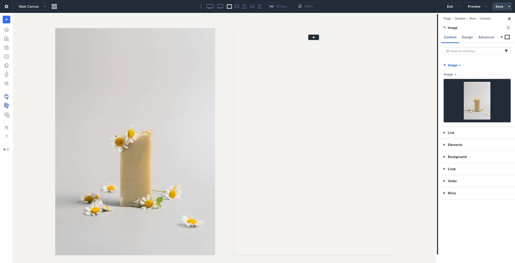
In the default state, open the Image module and go to Design > Sizing. Set Aspect Ratio to 4:2.2. This creates a wide frame that hides part of the subject below the visible area. Then go to Design > Framing and set:
- Object Fit: Cover
- Object Position X: 50%
- Object Position Y: 0%
Now switch to the Hover state. Change Aspect Ratio to 4:3. Then update Object Position to:
- Object Position X: 50%
- Object Position Y: 85%
The frame grows taller while the visible part of the image moves down toward the subject.
Go to Advanced > Transitions and set:
- Duration: 800ms
- Timing Function: Ease-Out
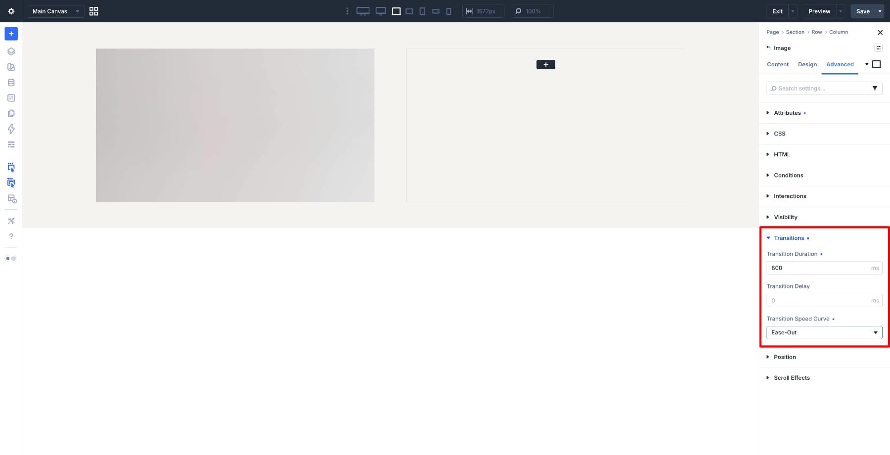
Ease-Out works well here because the card responds quickly and then slows into place. Here is the result on the front end.
Because the frame grows taller on hover, it can push nearby content downward. Give the surrounding layout enough room, or use this effect in a section where the expanding card has space to breathe. This works especially well for product pages, portfolio cards, and feature grids where the photos have a similar composition.
The first two effects moved an image inside a frame. This one changes the frame itself. Aspect Ratio can also shape a Button module. By giving the button a fixed height and then changing its ratio on hover, the button stretches sideways while keeping the same height.
Add a Button module and open Design > Sizing. Set:
- Height: 50px
- Aspect Ratio: 3:1
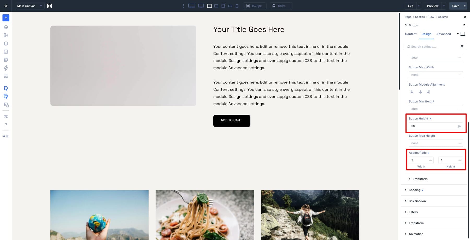
With a 50px height and a 3:1 ratio, the button becomes 150px wide. Switch to the Hover state and change Aspect Ratio to 5:1. At the same height, the button stretches to 250px wide.
Then go to Advanced > Transitions and set:
- Duration: 300ms
- Timing Function: Ease-In-Out
Buttons need to feel immediate, so keep this transition faster than the image effects.
The button grows from its alignment point, so centering the module usually looks the most controlled. Since the button genuinely changes size on hover, leave enough clearance around it.
For a variation, create a circle-to-pill morph. Set the resting ratio to 1:1, use a fully rounded border radius, and keep the resting label short or icon-only. On hover, change the ratio to 3:1 so the circle opens into a pill.
4. The Contained Zoom
The Contained Zoom is a classic image hover effect. The image scales up, but the frame stays the same size.
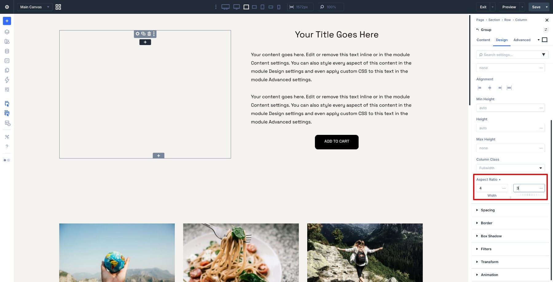
In Divi 5, the Group module makes this possible without custom CSS. The Group defines the frame and clips the overflow. The Image module inside it scales on hover. Start with a Group module. Go to Design > Sizing and set Aspect Ratio to 4:3.
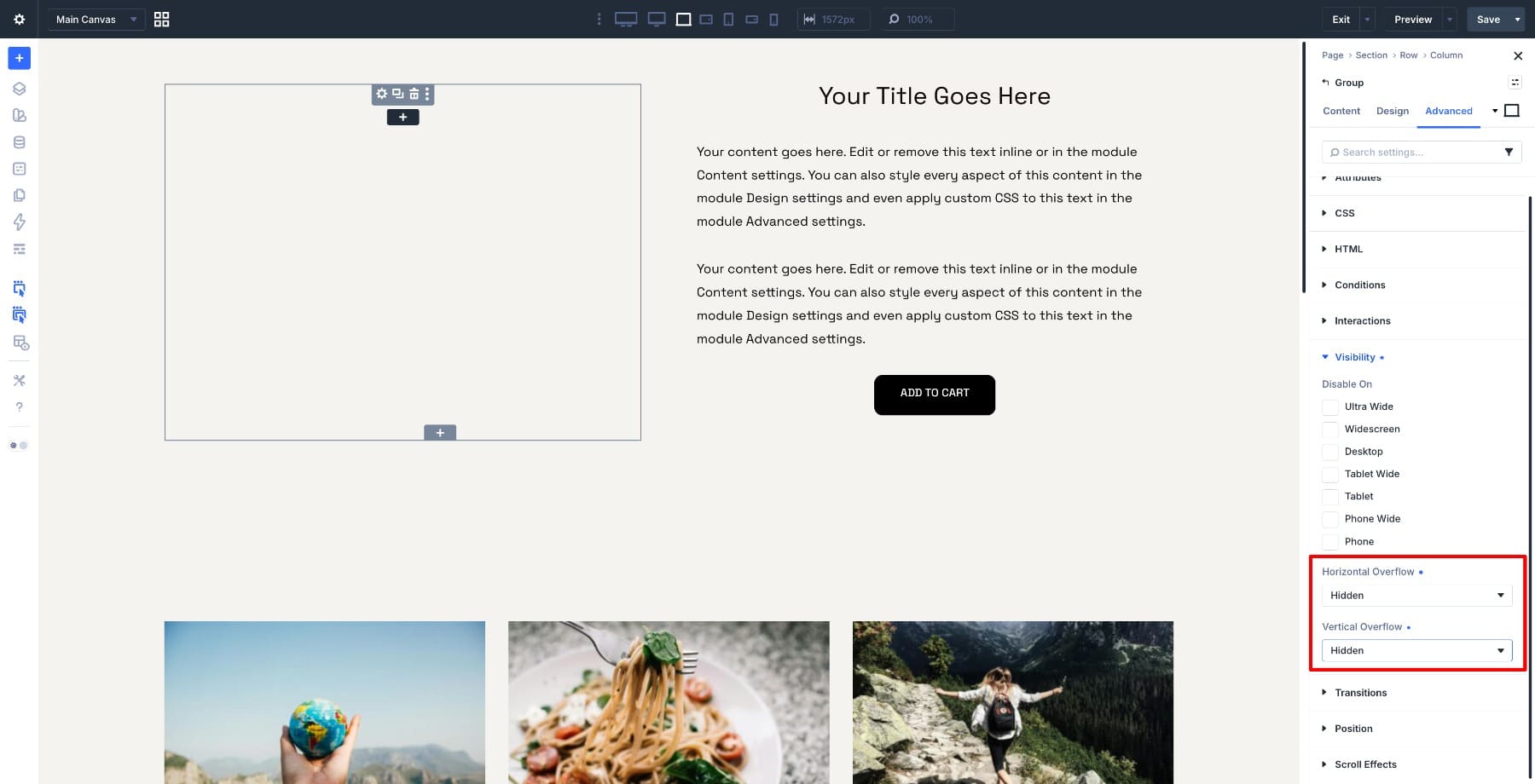
Go to Advanced > Visibility and set both overflow options to Hidden:
- Horizontal Overflow: Hidden
- Vertical Overflow: Hidden
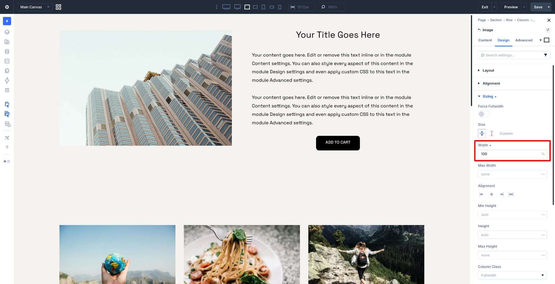
Now add an Image module inside the Group and set its width to 100%.
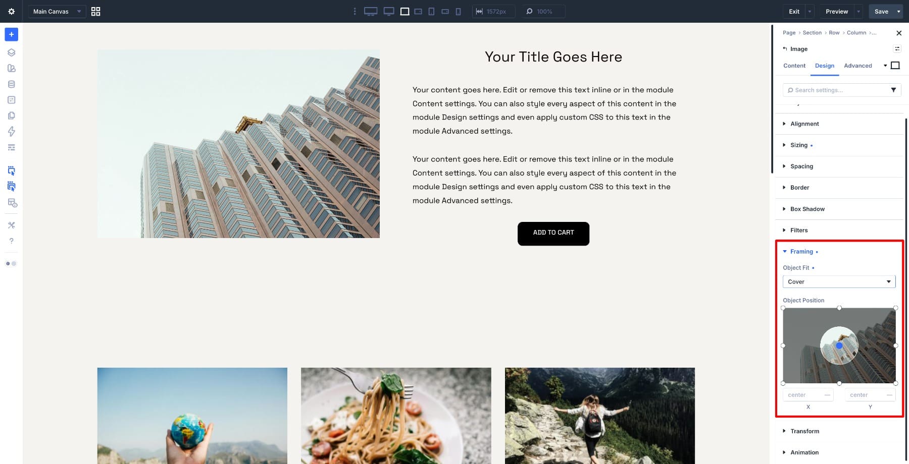
Set Object Fit to Cover and remove any extra margin or padding on the Group and Image module. The image should sit flush inside the Group frame.
The motion comes from Transform, not Object Position. Open the Image module, switch to the Hover state, and go to Design > Transform. Set Scale to 110%.
On hover, the Image module grows. The Group module clips anything that extends past the frame. Set the Image module transition to:
- Duration: 800ms
- Timing Function: Ease-In-Out
Preview the effect on the front end. If the image escapes the frame on hover, check the overflow setting. Overflow Hidden belongs on the Group module, not only on the Image module inside it.
You can use the same container idea for other hover interactions too. Add a caption inside the Group and move it upward on hover. Combine the zoom with a small rotation. Or pair the scale with a dark overlay. The Group keeps the motion contained.
5. The Spotlight Pan
The Spotlight Pan combines three changes at once:
- The image pans toward the subject.
- Saturation increases from grayscale to full color.
- Brightness lifts slightly.
At rest, the portrait feels quieter and slightly off-center. On hover, the subject comes into focus visually and compositionally. We’ll build this on the Person module. Choose portraits where the subject sits a little off-center and has some environment around them. The effect needs room to pan toward the person.
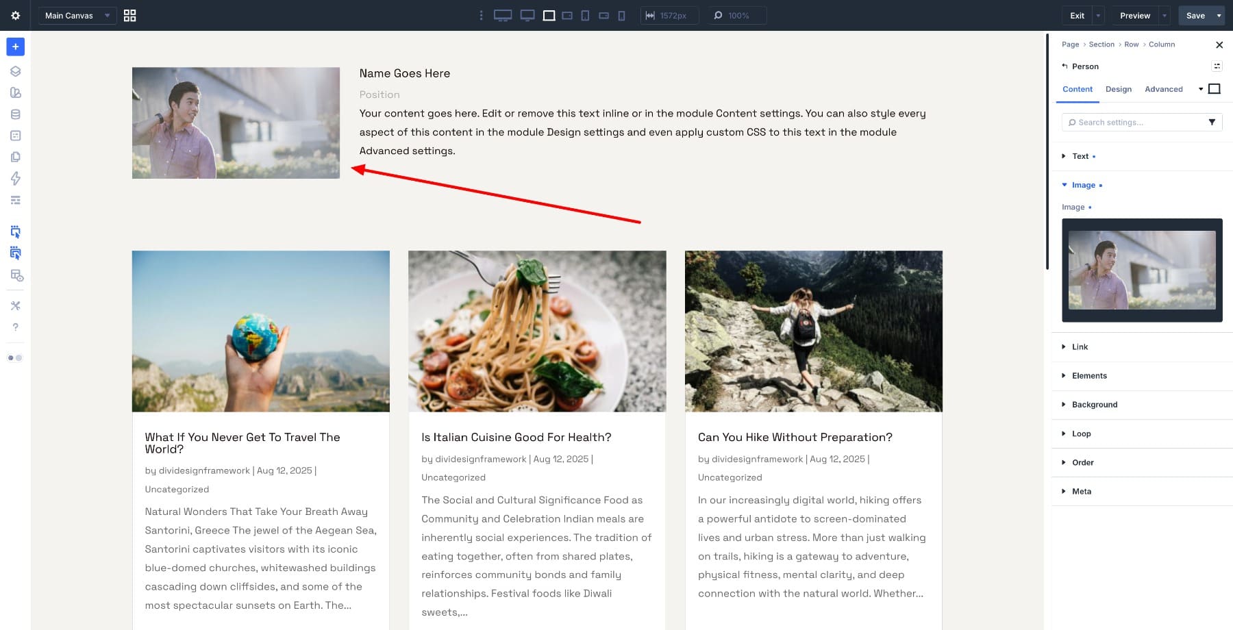
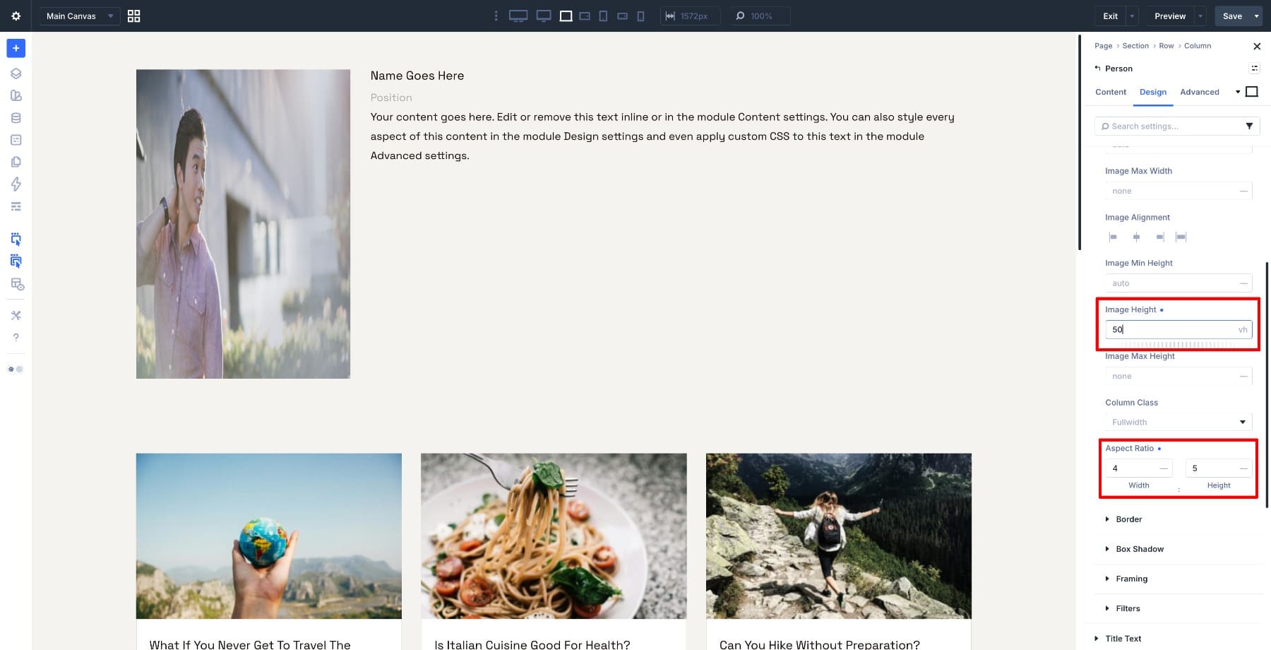
Open the Person module and go to Design > Sizing. Set Aspect Ratio to 4:5. This creates a portrait frame that works well for team grids.
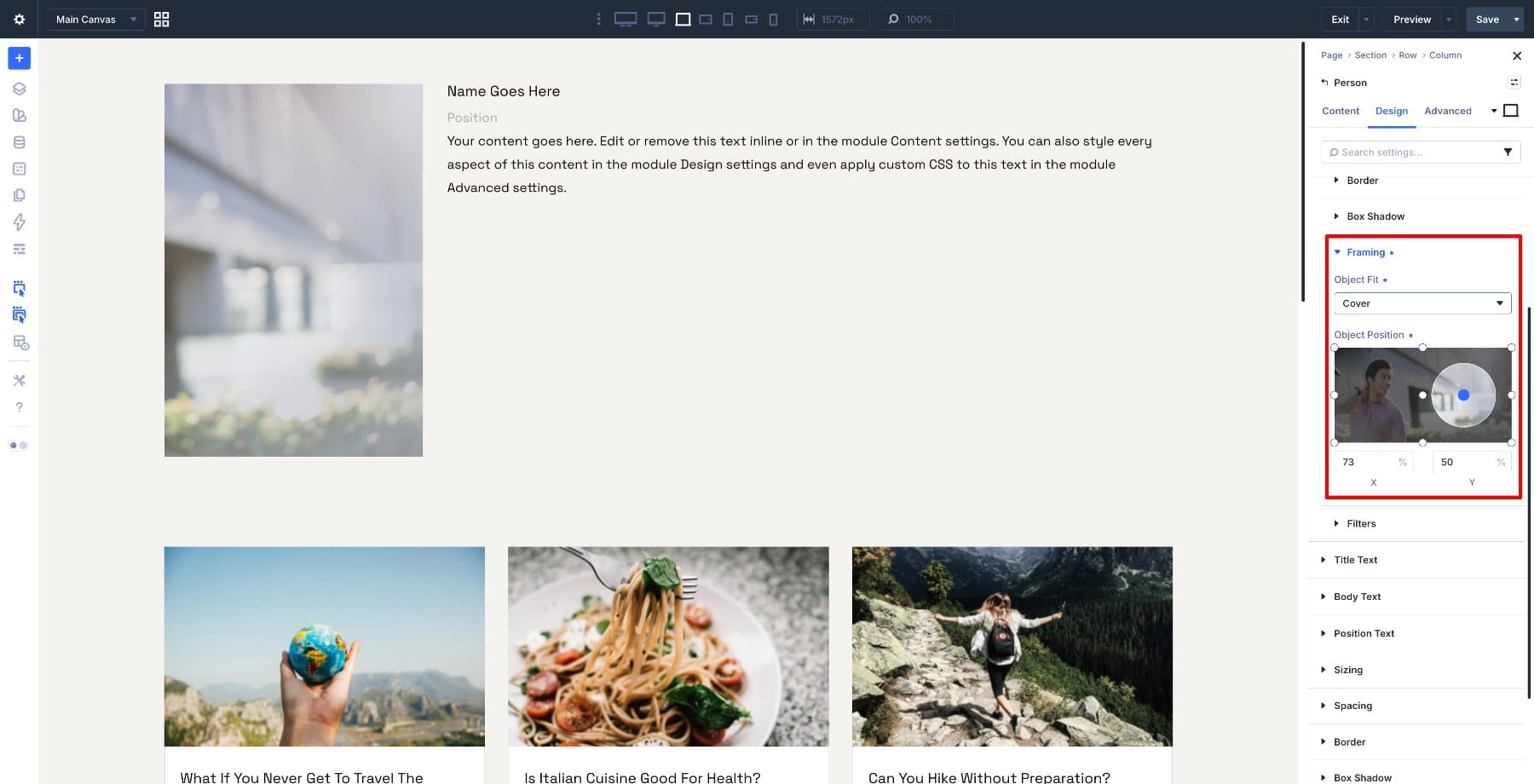
Then go to Design > Image > Framing. Set:
- Object Fit: Cover
- Object Position X: 73%
- Object Position Y: 50%
This frames the image slightly away from the subject in the default state.
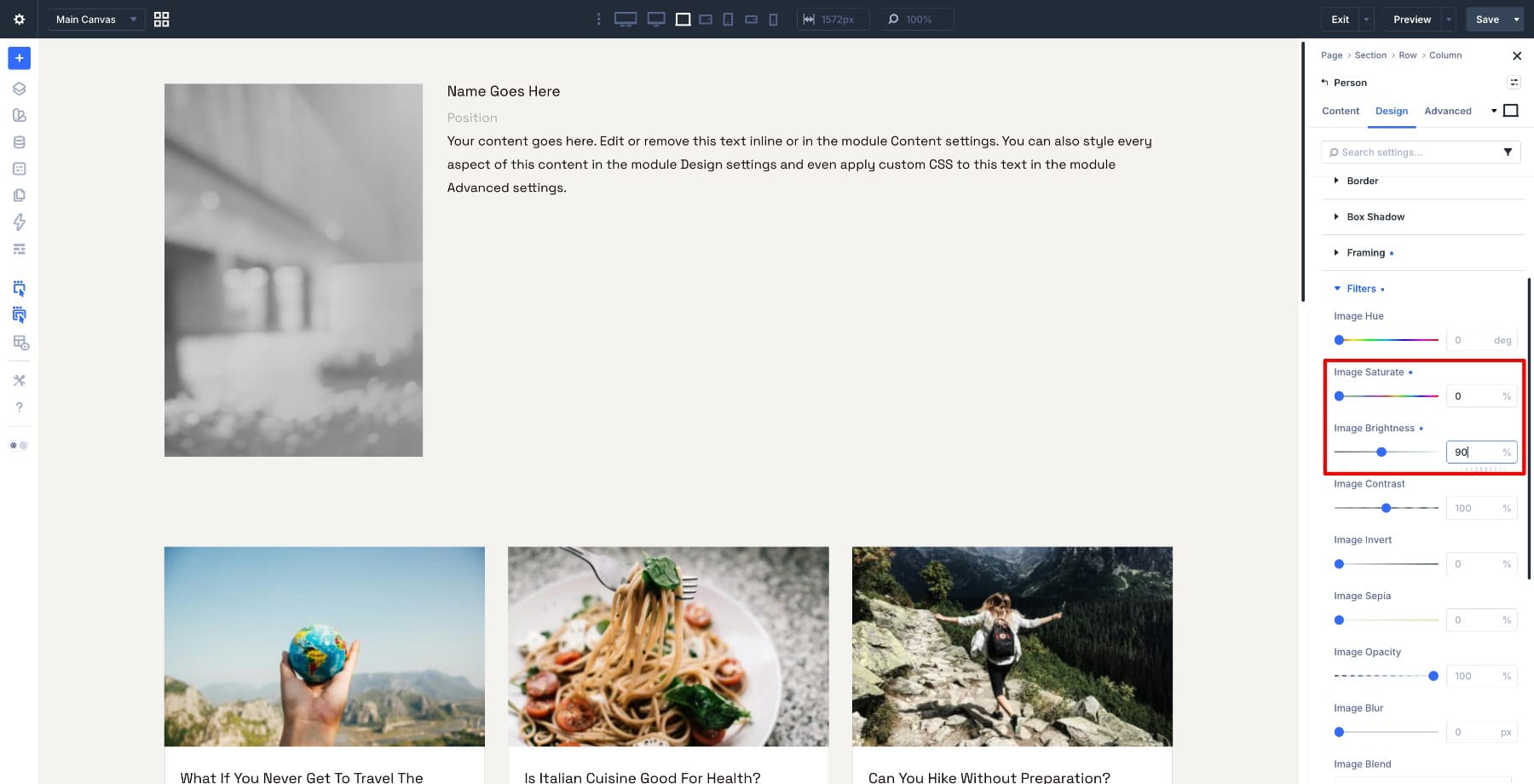
In the same Image option group, open Filters. Set:
- Saturation: 0%
- Brightness: 90%
Now switch to the Hover state. Update the values to:
- Object Position X: 70%
- Object Position Y: 50%
- Saturation: 100%
- Brightness: 100%
The image pans slightly, color returns, and the portrait brightens at the same time.
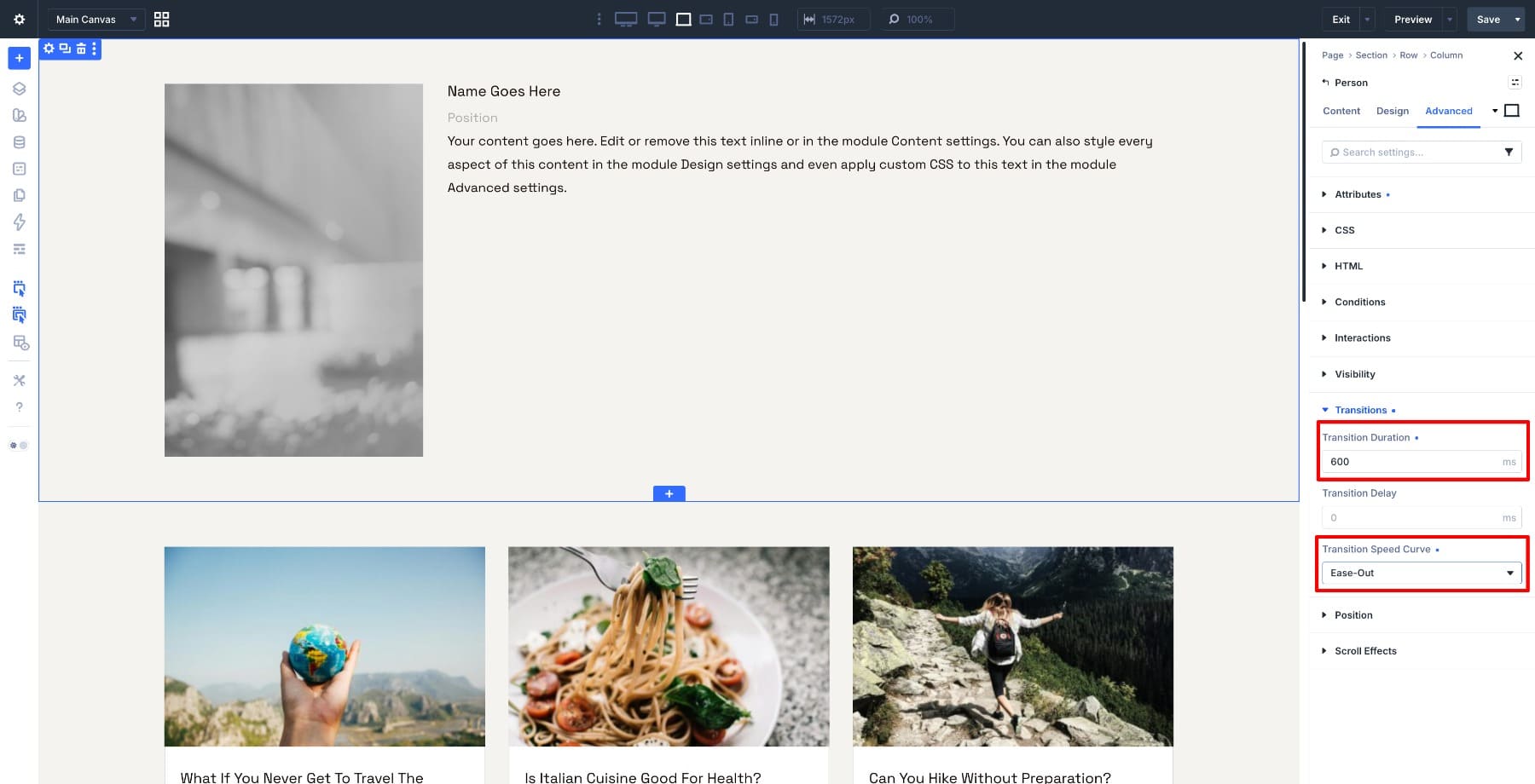
Go to Advanced > Transitions and set:
- Duration: 600ms
- Timing Function: Ease-In-Out
One transition controls the pan, saturation, and brightness changes, so the effect feels unified.
Here is the full effect on a team grid.
If the subject sits on the opposite side of the image, reverse the X values so the pan moves toward the person instead of away from them. When your team photos are composed consistently, the same settings can work across the whole grid.
Save Your Hover Effects As Image Presets
The Spotlight Pan uses several settings across default and hover states. Rebuilding that effect on every Person module would be slow. Because the effect lives inside the Image option group, you can save it as an Image Option Group Preset and apply it to other modules that use the same Image option group.
With your finished Person module open, go to Design > Image. Click the preset chip at the top of the option group, save a new preset, and give it a descriptive name, such as Spotlight Pan.
Open another Person module, go to the same Image option group, and select the saved preset. The image styling, framing, filters, and hover-state values carry over.
The one thing to watch is direction. A preset can save the pan values, but different photos may place the subject on different sides of the frame.
If a portrait pans away from the person, open that module’s Framing settings and swap the X values for that image. The preset can still handle the rest of the effect, while that one local adjustment keeps the crop correct.
Want the pan slower, the grayscale softer, or the frame a little taller? Update the preset, and every module using it updates with the same change. That is the larger Divi 5 workflow: turn a design decision into a reusable preset, apply it across the site, and manage the shared style from one place.
Create Unique Image Effects in Divi 5 Today!
Aspect Ratio and Image Framing are usually thought of as cropping tools. But when you combine them with hover states, transitions, filters, transforms, and presets, they become a flexible way to create interactive visual effects. You can pan across an image, reveal a subject, morph a button, zoom inside a fixed frame, or bring a portrait into focus without writing custom CSS.
Start with one effect, save the settings that repeat, and refine the values for each image when needed. The same tools that keep your images proportional and well-framed can also make your Divi 5 layouts feel more responsive and polished.











Leave A Reply