
Divi has evolved into a modular, performance-focused platform with a more streamlined builder, a rebuilt framework, and ongoing feature releases. As Divi 5 development continues, new features are being rolled out regularly. One recent update introduced new menu features that let you build navigation directly inside the Visual Builder, without plugins or custom CSS.
The classic Menu module is still available for simple setups, while the new Link and Dropdown modules act as building blocks for fully custom menus. Paired with updated Loop Builder capabilities and selector-based Interactions, they let you design everything from simple dropdowns to full-screen overlays, slide-ins, and mega menus using native Divi 5 modules and settings.
In this post, we’ll look at these new features, walk through creating a simple desktop and mobile menu with them, and share a few practical tips to help you get started.
Let’s dive in.
Divi 5 rethinks navigation by moving to a modular system. Instead of being locked into a single Menu module, you can now combine Link and Dropdown modules as building blocks. This gives you far more creative control directly within the Visual Builder while letting these elements work alongside native features like the Loop Builder and Interactions.
You can keep things simple by styling individual Link modules with custom text.
For menus that change frequently, Menu Loops are often the better option. By enabling looping for a menu item pattern and using Link modules with menu-based dynamic content, Divi can pull your navigation structure directly from a WordPress menu. That lets you keep your custom design in Divi while managing the actual menu items in WordPress.
For more complex navigation, the Dropdown module provides the structure for dropdown menus, nested layouts, and mega menus.
You can choose between Hover or Click triggers and use the Interactions panel to target specific elements, such as the parent, root container, or child elements.
Because these are native modules, you can nest Rows, Images, Buttons, and other modules inside Dropdown modules to build more advanced navigation patterns.
What Is The Link Module?
In earlier versions of Divi, a menu item was just a line of text inside the Menu module. In Divi 5, each menu item can be its own standalone module. That means you get the same design control over a single menu link that you would over a Button, Blurb, or CTA.
Key Features
One of the most useful aspects of the Link module is its integration with Dynamic Content. When used inside a menu loop, a Link module can automatically receive the correct menu text and URL from the current menu item. This means if you rename a page or update a menu item in WordPress, your custom menu can stay in sync.
Modern navigation often uses visual cues, such as icons that indicate a dropdown or call attention to a link. The Link module includes native icon support, letting you place an icon next to your text and style it independently in the Design tab.
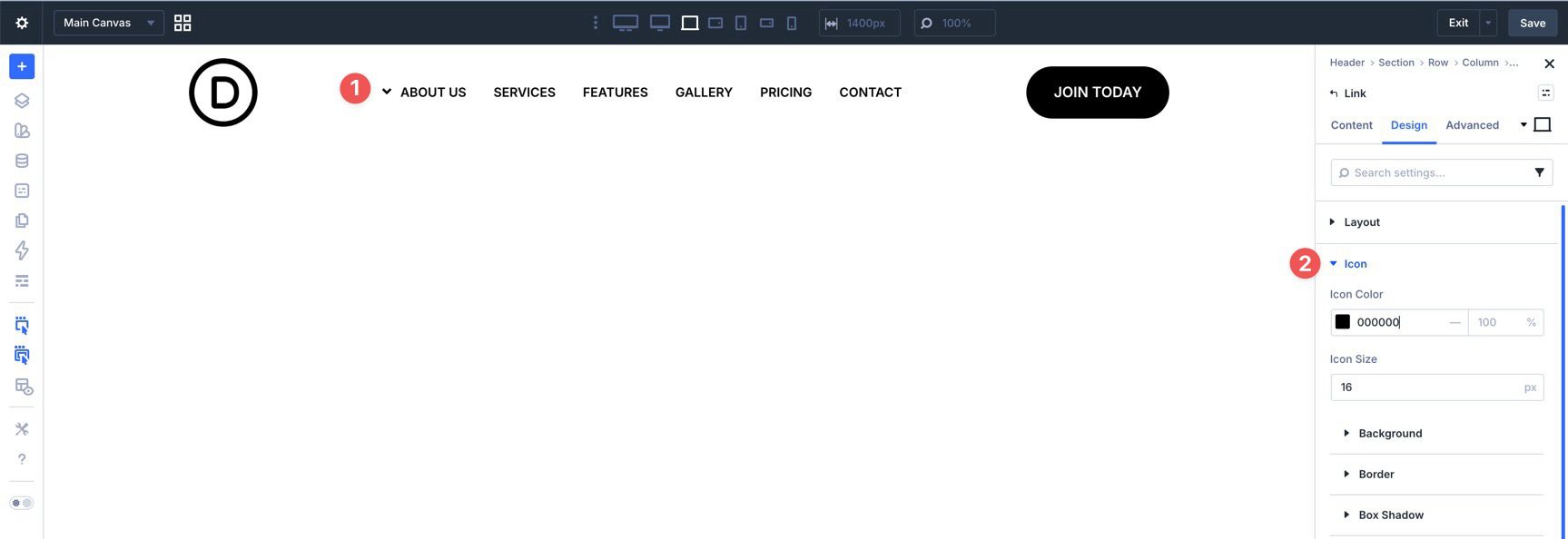
Using the built-in state controls, you can style hover states for your links, such as changing color, weight, borders, or spacing.
Because the Link module is a standalone element, you aren’t forced into a one-size-fits-all menu style. One link can remain simple text while another can be styled more like a button, all within the same navigation row.
What Is The Dropdown Module?
The Dropdown module is a container module whose content can remain hidden until a user interacts with its trigger. This makes it the parent structure for building everything from classic dropdown menus to more complex mega menus.
Key Features
With built-in trigger logic, you can control how your menu reveals itself. You can set the dropdown to open on Hover for a traditional desktop experience or on Click for a more deliberate, touch-friendly interaction.
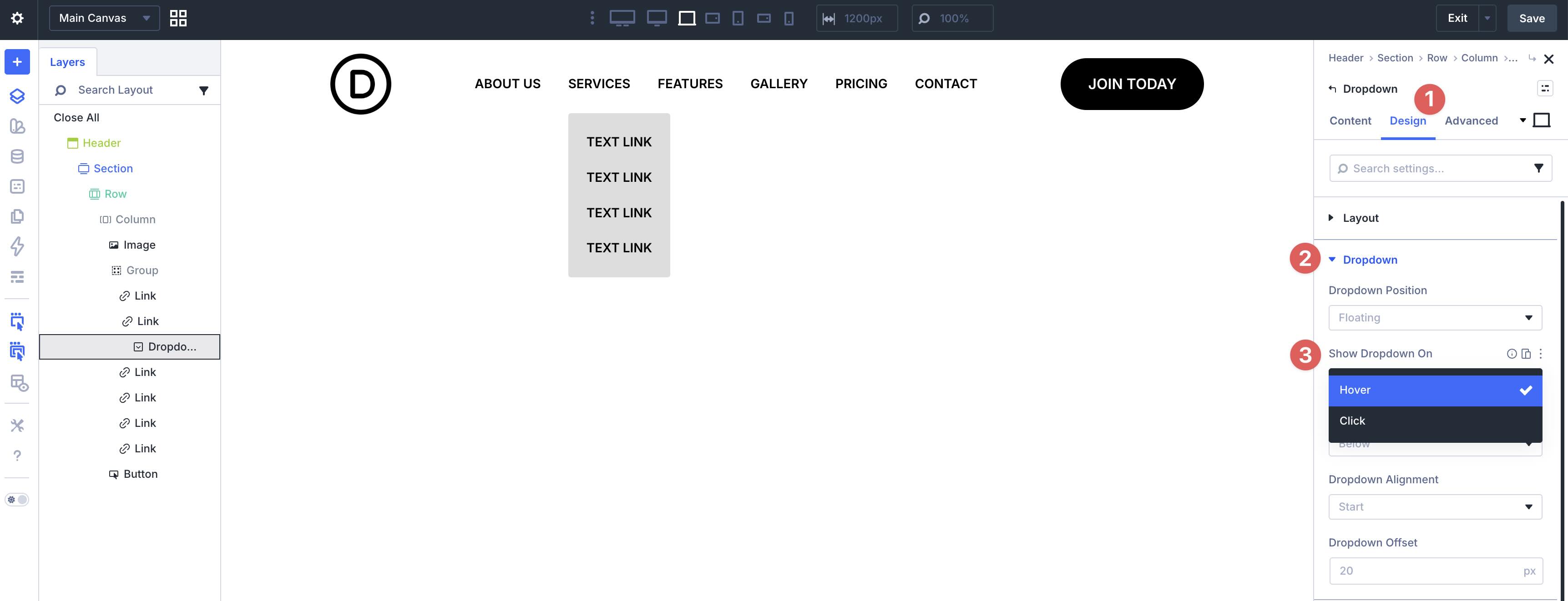
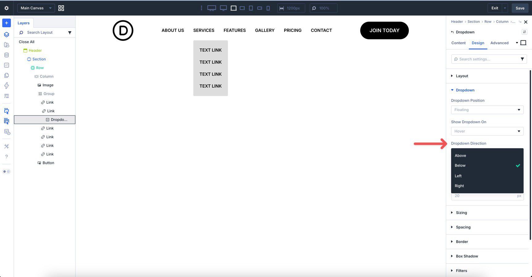
Navigation doesn’t always have to drop down. Divi 5 lets you choose where the menu appears relative to its trigger, with options such as Above, Below, Left, and Right. That makes it easier to build slide-out sidebars or other custom navigation layouts.
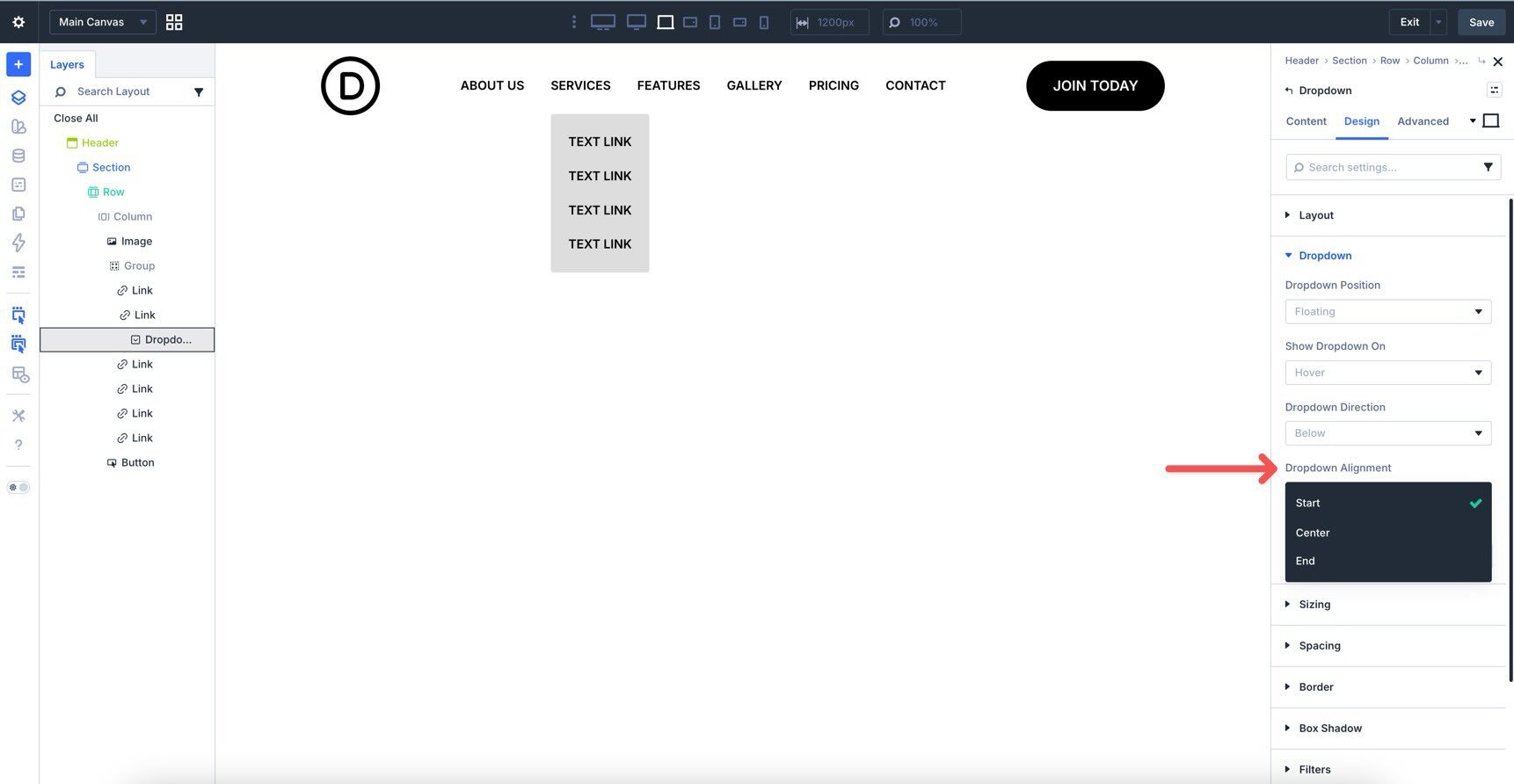
Alignment controls are built in too, with options for Start, Center, and End relative to the parent element.
The Dropdown Offset also supports Divi 5’s Advanced Units, giving you precise control over the spacing between the trigger and the dropdown content.
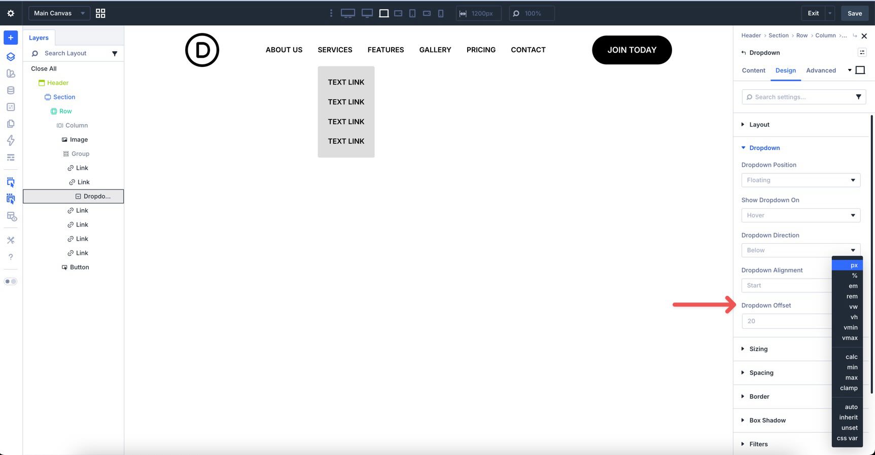
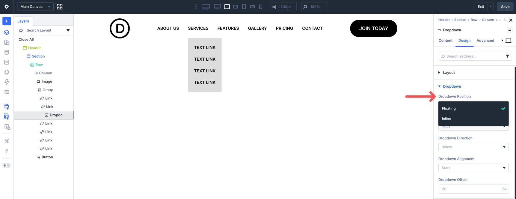
Finally, you can choose how the dropdown behaves in the layout. A Floating dropdown overlays the page content, while an Inline dropdown pushes surrounding content down when opened.
Because the Dropdown module is a native container, you aren’t limited to links alone. You can place Rows, Columns, Images, Buttons, Contact Forms, or even Video modules inside it.
The Loop Builder is one of Divi 5’s most powerful features. It allows you to design a repeatable template item and tell Divi to output that design for every item in a specific data source. In this case, that data source is a WordPress menu.
Key Features
Within the loop settings, you can choose Menu as the query type. This is a specialized loop source for navigation.
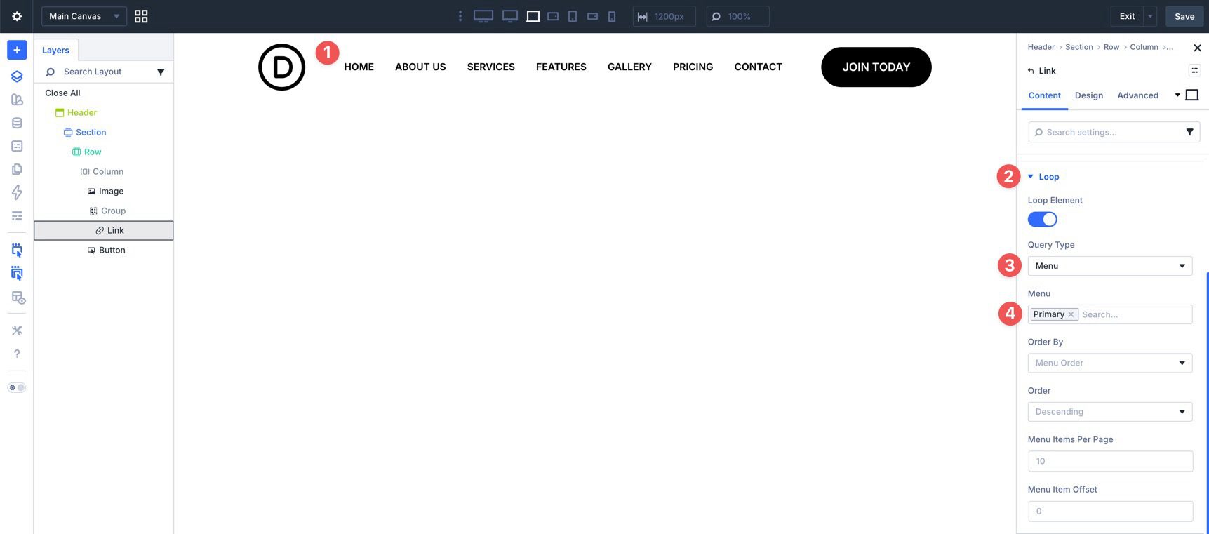
Once the Menu source is selected, Divi looks at the WordPress menu you’ve chosen and repeats your linked design for each item in that menu.
This gives you the best of both approaches. You get the design flexibility of Divi modules, but you can still manage menu items centrally in WordPress. If you add or remove an item later, your custom Divi 5 menu can update without rebuilding the layout.
Using Menu Loops also improves consistency. Rather than styling each menu item separately, you can design the pattern once and let Divi repeat it.
New Features In Interactions
In Divi 5, the Interactions tab in the Advanced tab is the control center for triggers and effects. Interactions were released during the beta, and newer additions include selector-based targeting plus breakpoint-based triggers such as Breakpoint Enter and Breakpoint Exit.
Selector-Based Targeting
There are several useful targeting options beyond selecting only an individual module:
- Parent targets the containing element of the trigger module. This is useful when a child element needs to control something higher in the structure.
- Root Container targets the top-level element in the current component hierarchy.
- Child targets child elements inside the trigger container, allowing one trigger to affect multiple items at once.
In practice, these work together with triggers such as hover, click, viewport entry, and breakpoint changes, plus effects such as showing, hiding, or transforming elements. In Divi 5, the Dropdown module already ties its visibility to its parent trigger, but Interactions let you extend that behavior further, such as closing an off-canvas menu via a child icon that targets the parent or showing a mobile menu only at certain breakpoints.
To show how these features work together, we’ll build a simple responsive menu using the Link and Dropdown modules, Menu Loops, and Interactions. By the end, you’ll have a desktop menu and a mobile menu that can be shown and hidden without third-party plugins or custom CSS.
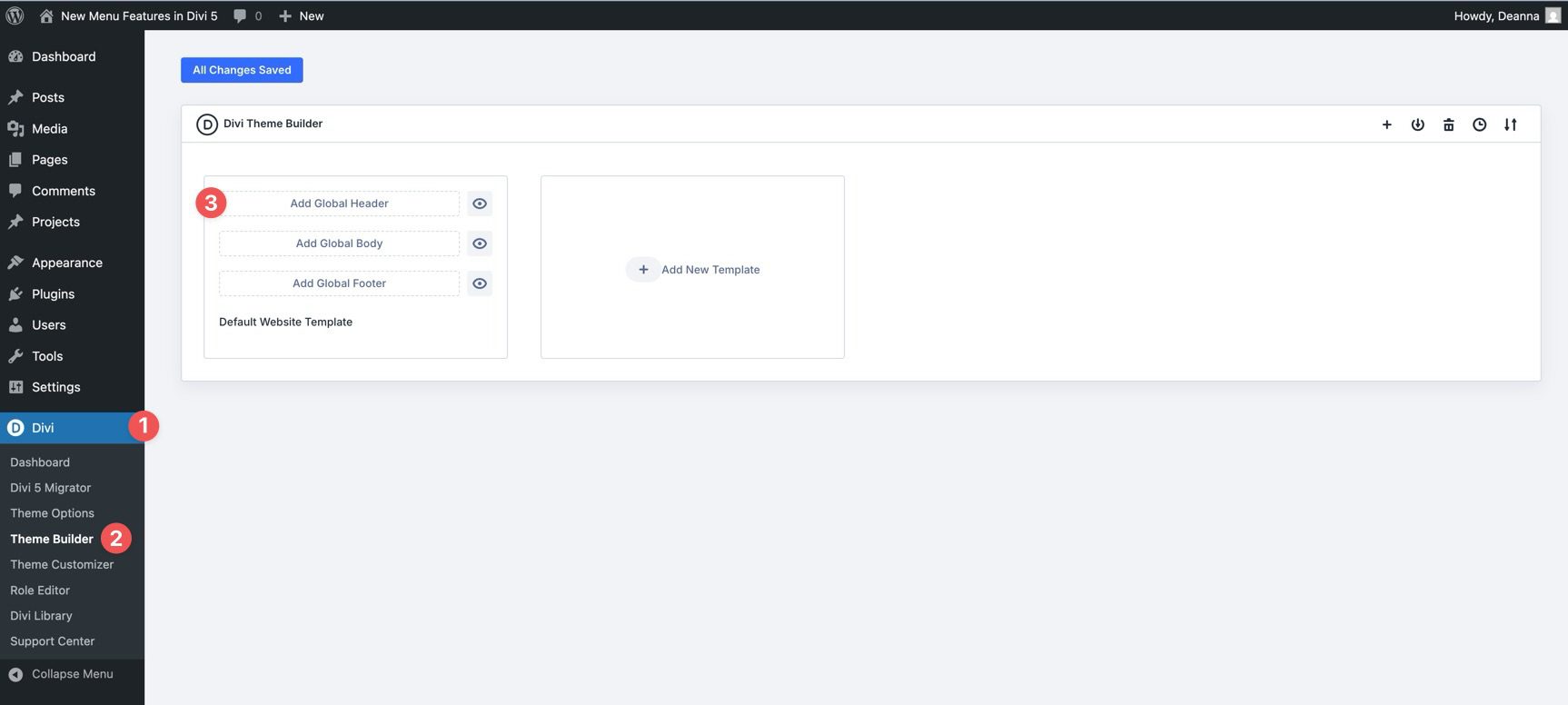
Start by creating a new Global Header in the Theme Builder.
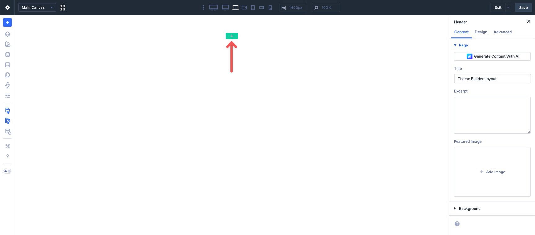
When the Visual Builder loads, click the green + icon to add a new Row.
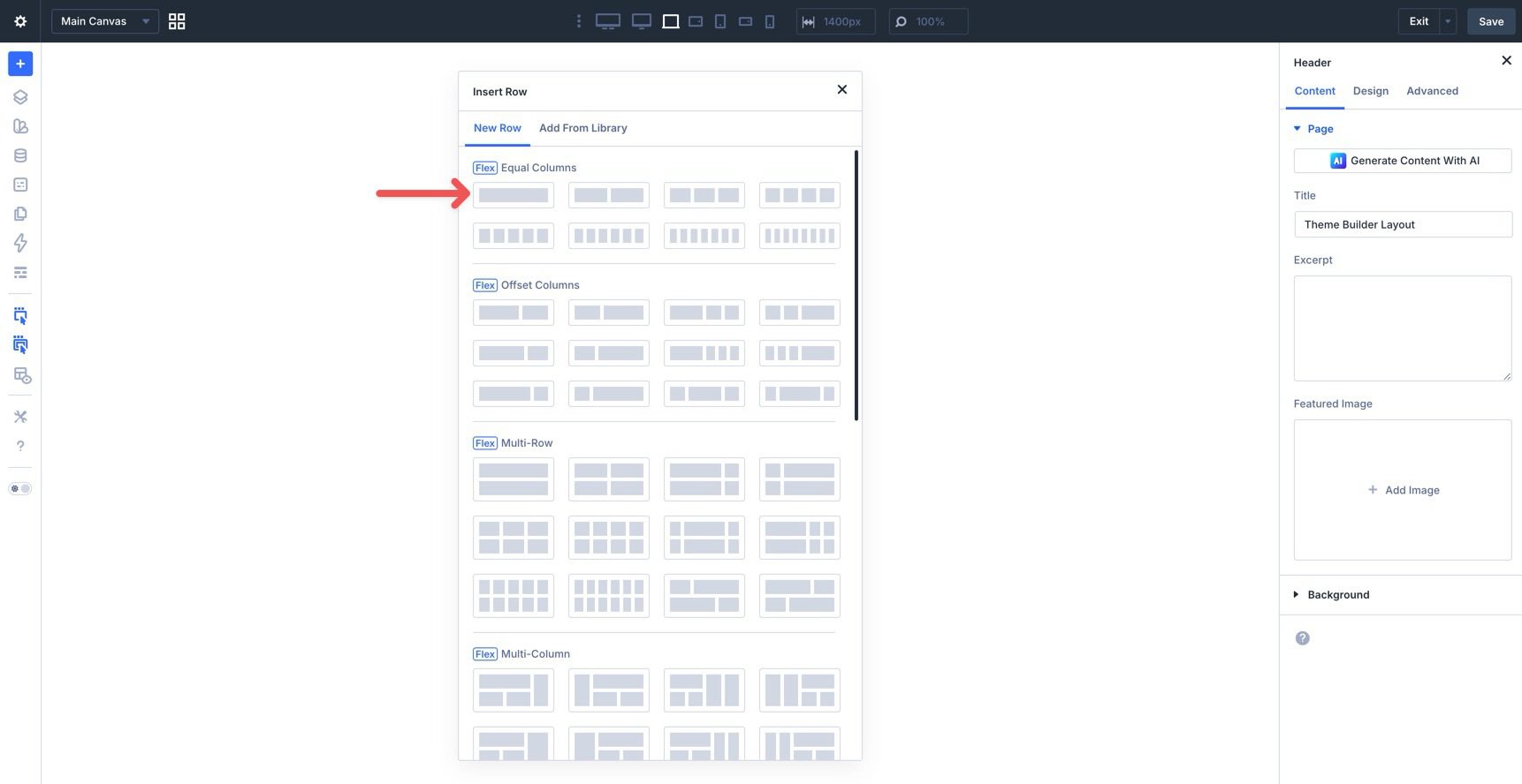
Select a single-column Flex Row.
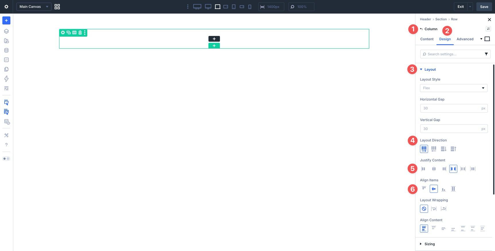
Before adding modules to the Row, adjust the Flex settings. In the Design tab, expand the Layout settings at the Column level. Set Layout Direction to Row, Justify Content to Space Between, and Align Items to Center. This places the modules side by side and vertically centers them within the container.
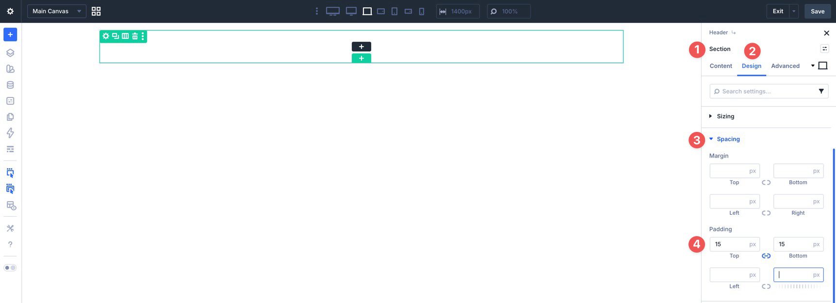
Now click into the Section, go to the Design tab, expand the Spacing settings, and assign 15px of padding to the top and bottom.
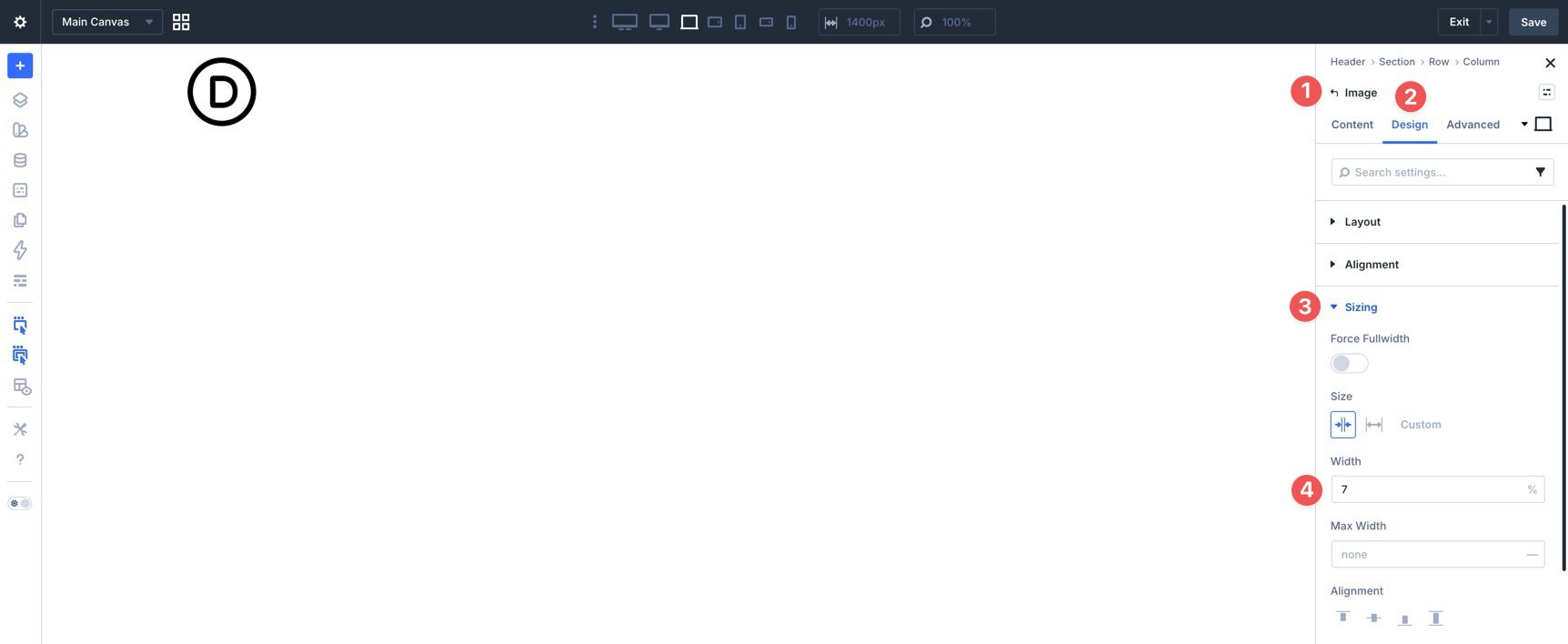
With the Section and Row ready, start by adding an Image module for your logo. In the Design tab, open the Sizing settings and set the Width to 7%.
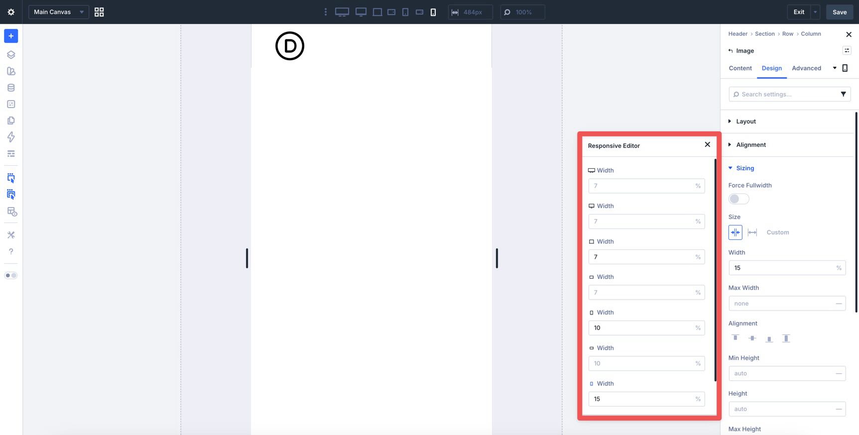
Use the Responsive Editor to define different widths for smaller screens. Activate it by hovering over the field and clicking the Edit Responsive Values icon.
Click each breakpoint in the Responsive Editor to assign the appropriate value.
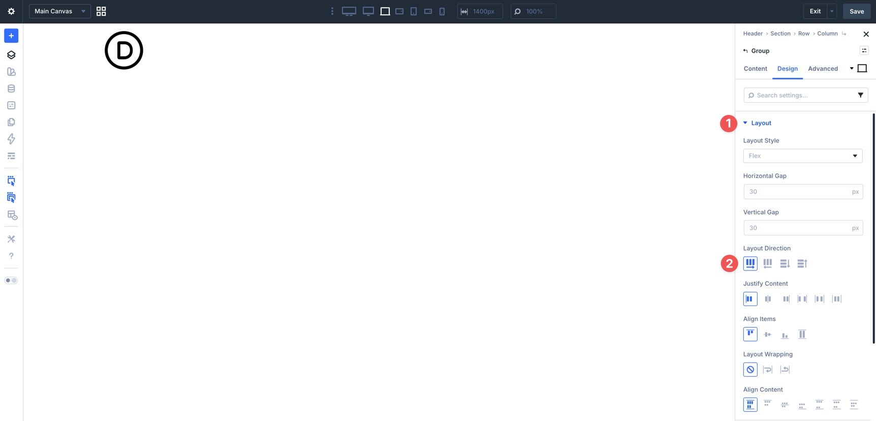
Next, add a Module Group to hold the desktop version of your navigation links.
Ensure that the Group’s Layout Direction is set to Row in its Layout settings.
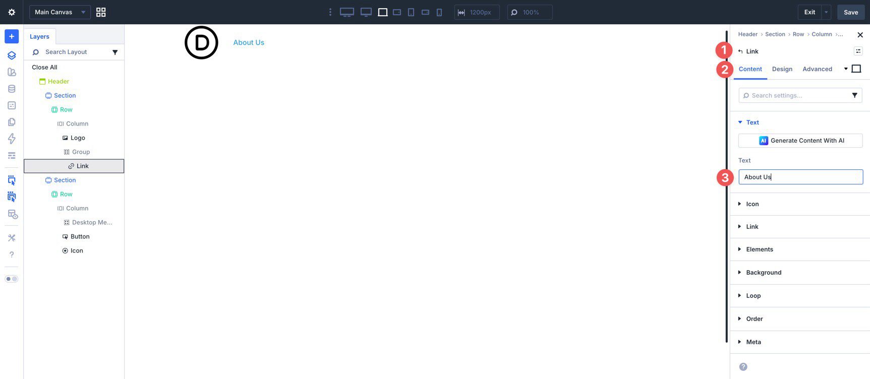
Now add a Link module inside the Group.
In the Link module’s Content tab, enter the Text value.
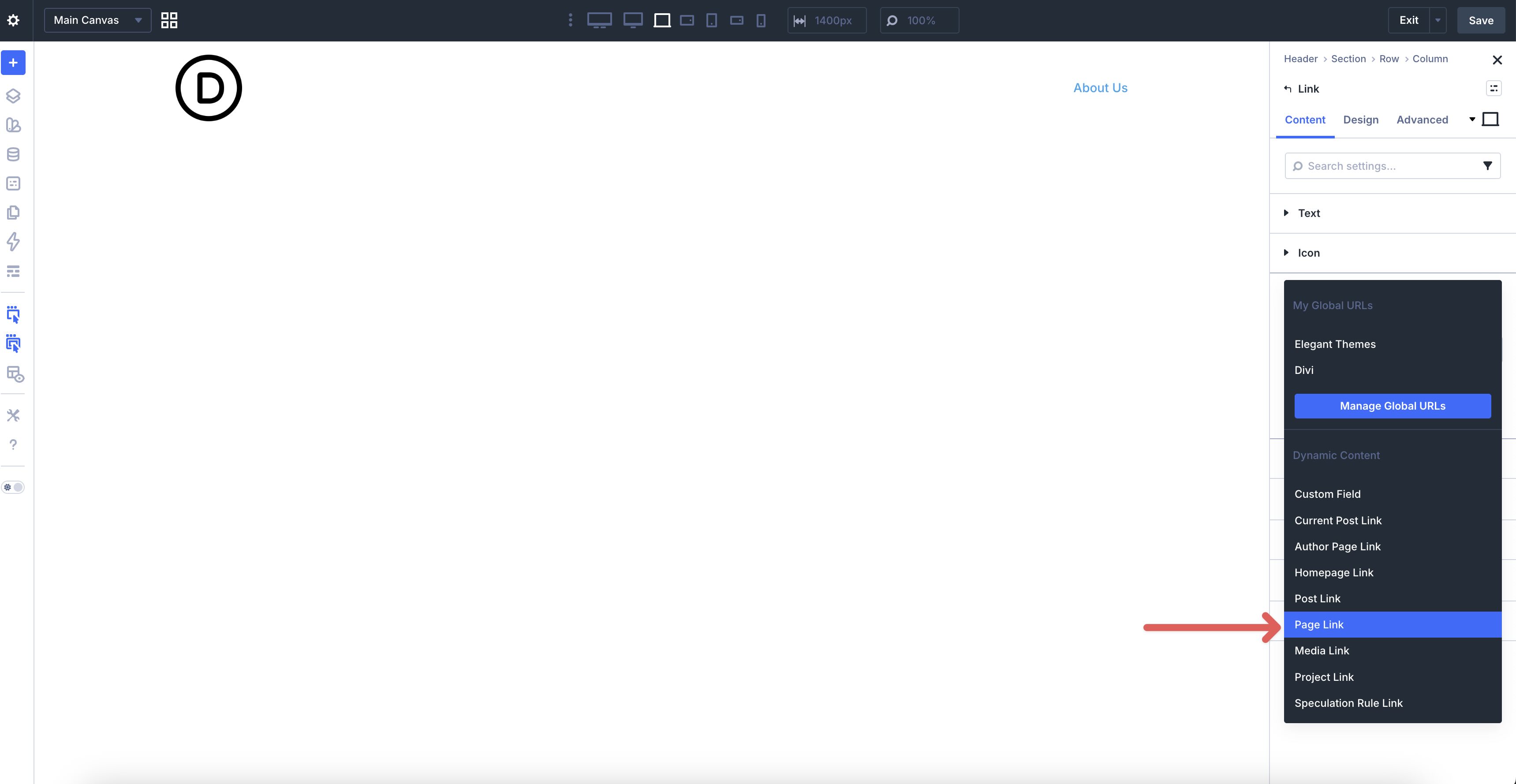
Then add the destination. Expand the Link settings and hover over the Link URL field to reveal the Insert Dynamic Content icon.
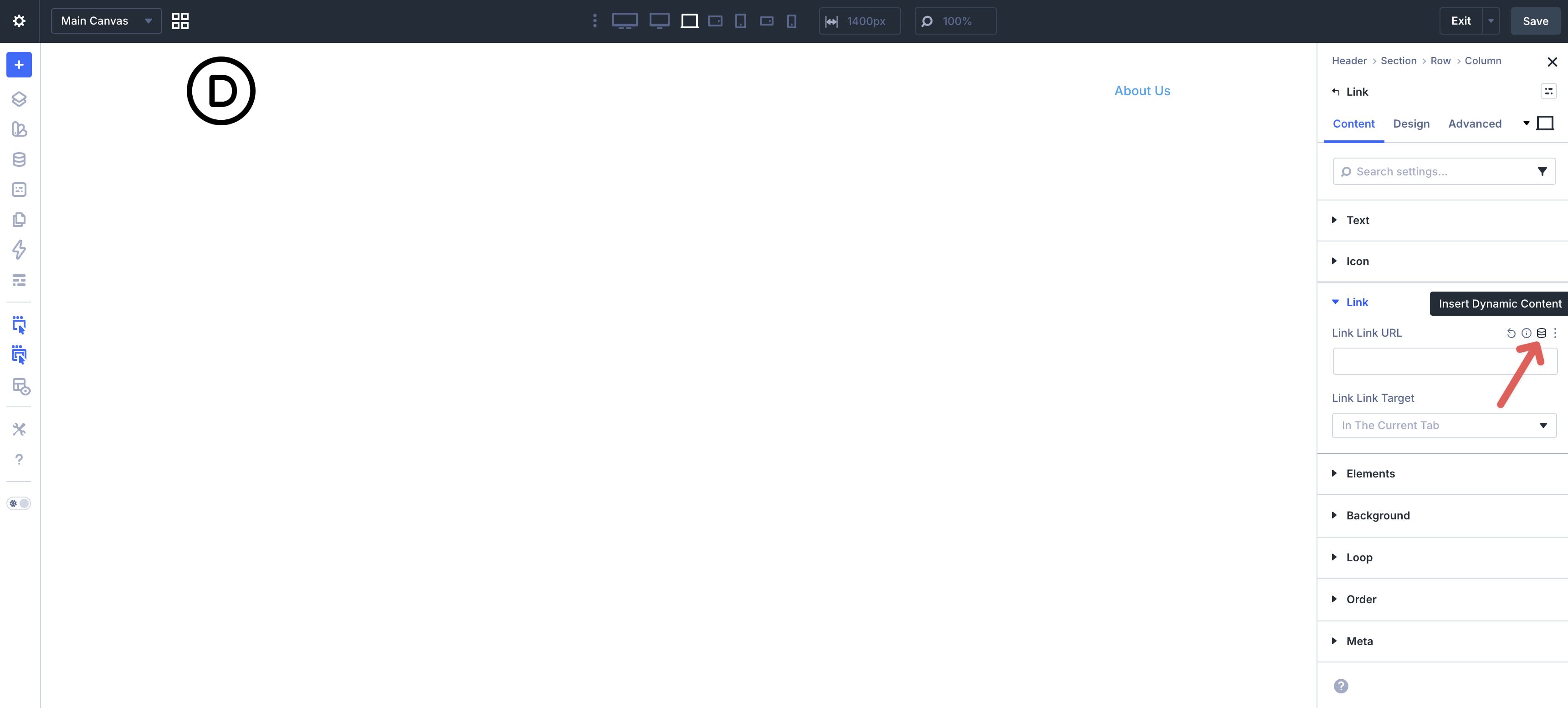
Choose Page Link from the available options.
Use the dropdown to select the page you’d like the link to point to, then click Apply.
From there, switch to the Design tab to style your link. Use hover and responsive controls as needed for color and spacing.
Duplicate the Link module to add the rest of the links in your menu, and update the text and destination for each one.
You’ll also add a Button and an Icon module. Style them however you like. The Icon module will act as the trigger for launching the mobile menu in the next section.
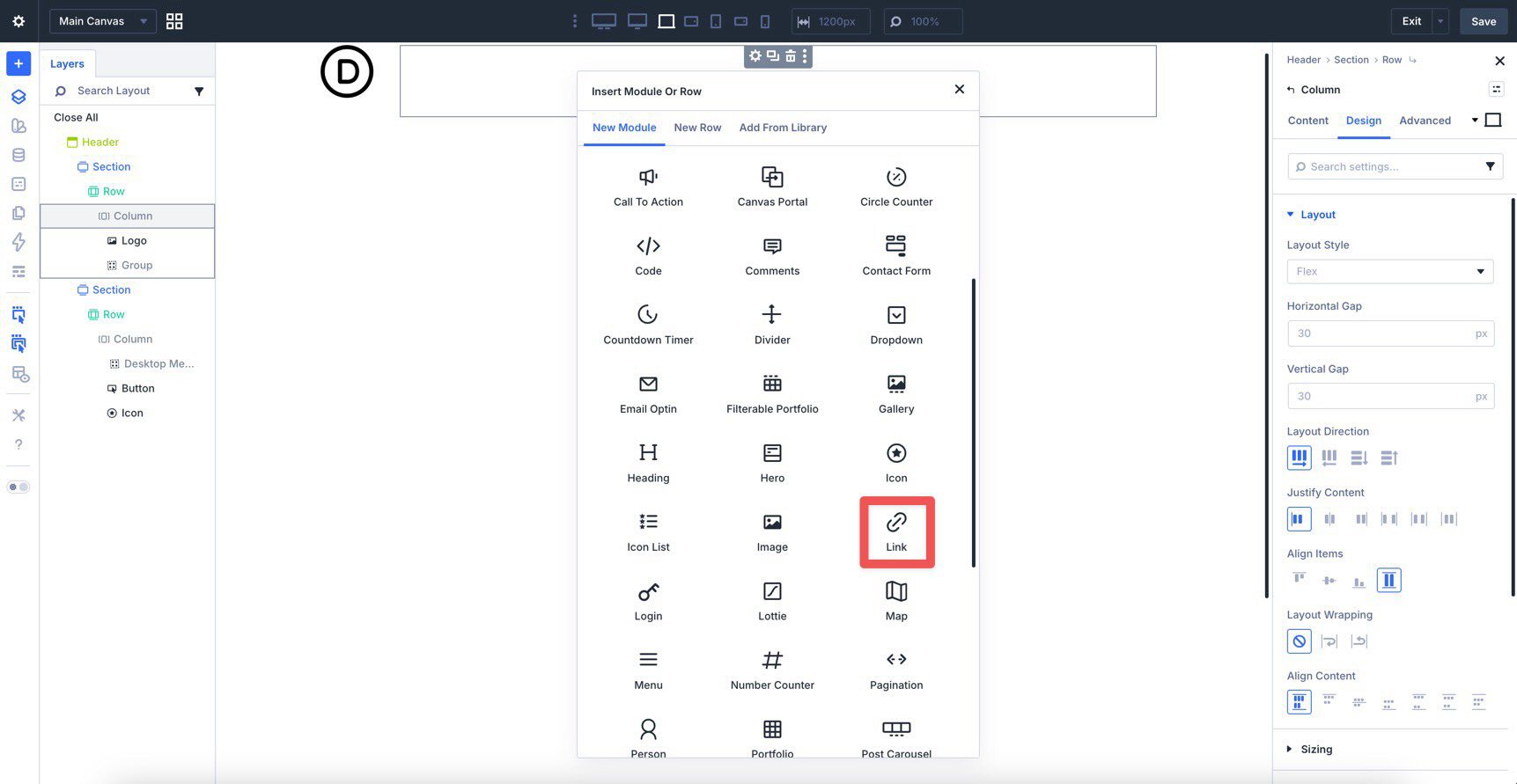
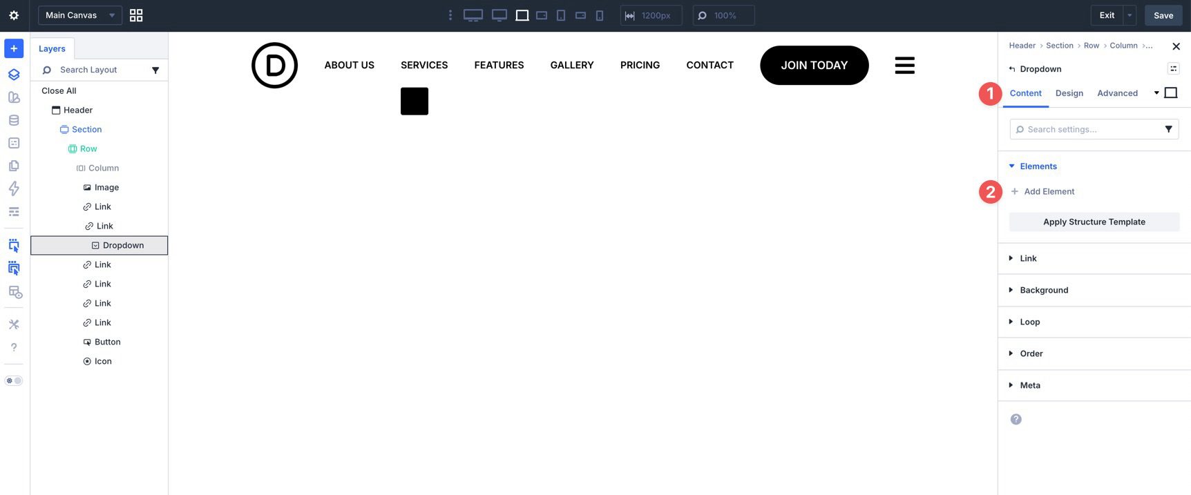
Now that the top-level navigation is in place, create a dropdown menu for one of the links. Click the Link module you want to attach it to. In the Content tab, open the Elements settings and click + Add Element.
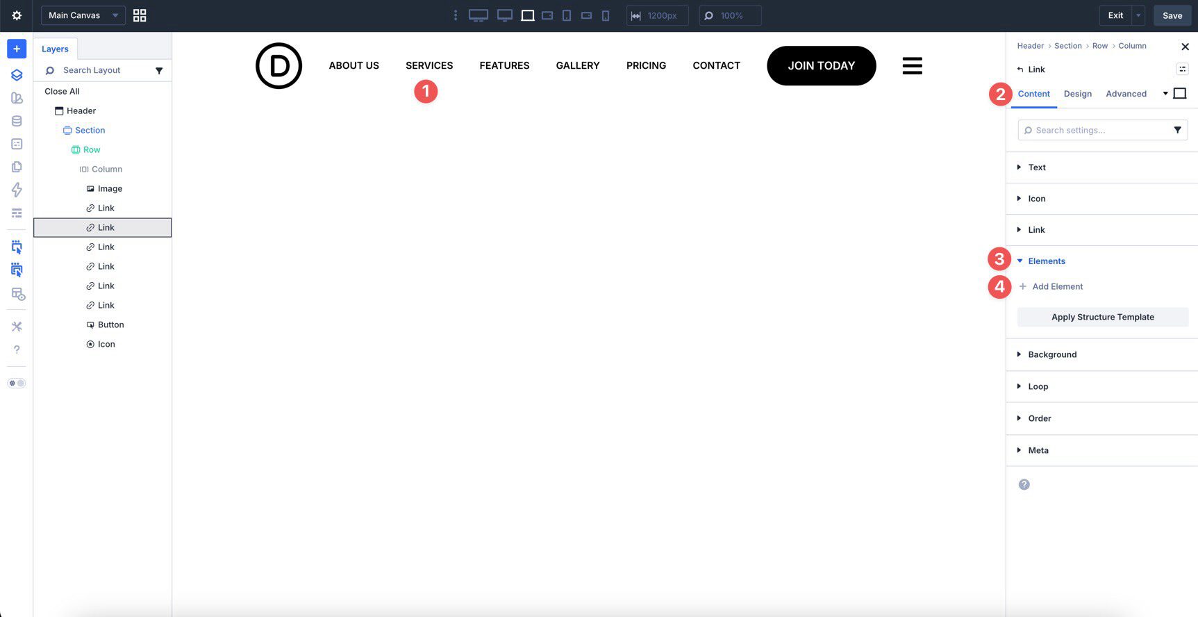
When the Insert Module Or Row dialog appears, choose a Dropdown module.
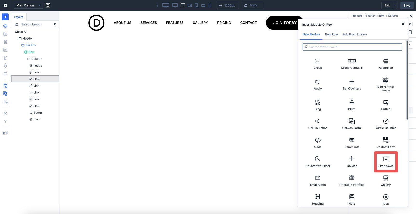
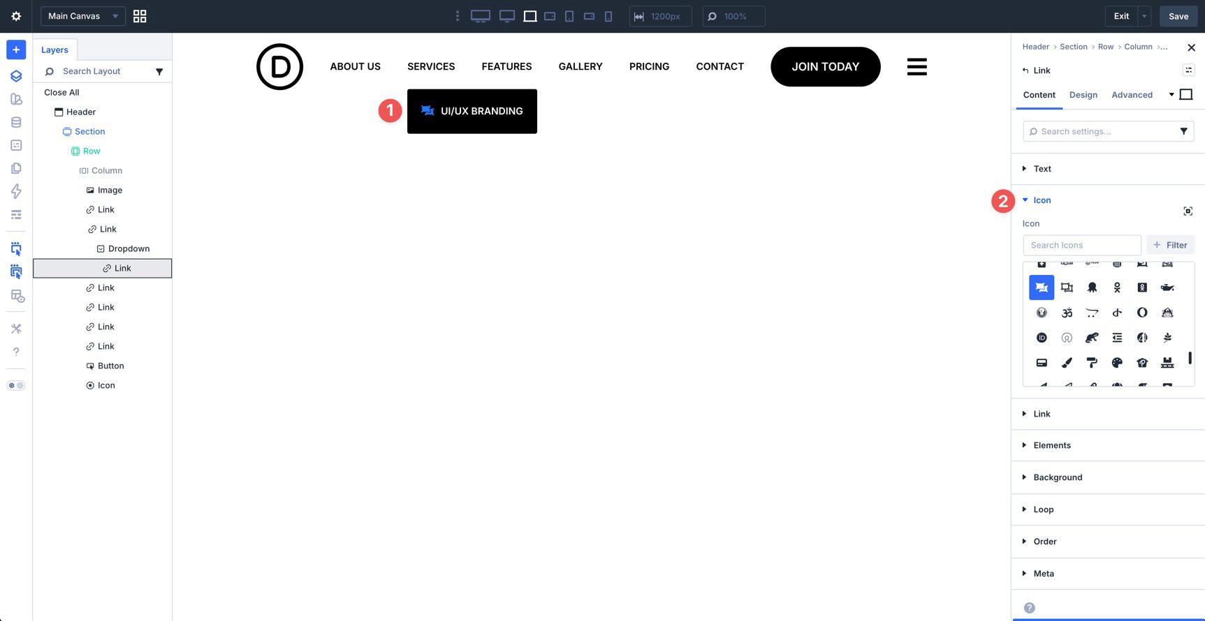
Add Link modules inside the Dropdown by clicking + Add Element in the Elements settings of the Dropdown module.
For extra visual clarity, you can add icons to those Link modules.
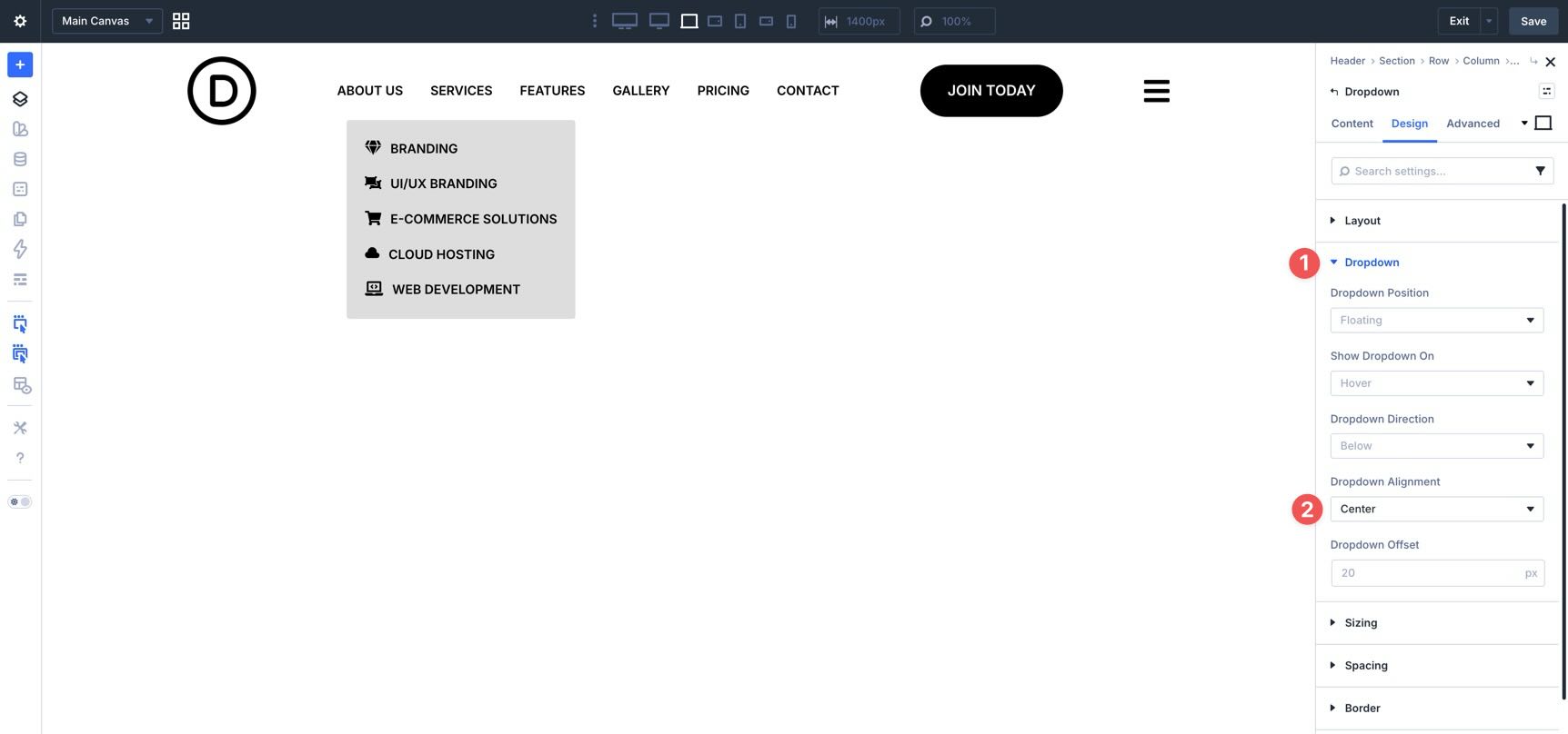
Add as many links as you need, then style the Dropdown module’s background and layout settings to match the rest of your navigation.
In the Design tab, open the Dropdown settings. For this example, keep the defaults and set Dropdown Alignment to Center.
Once finished, save the template.
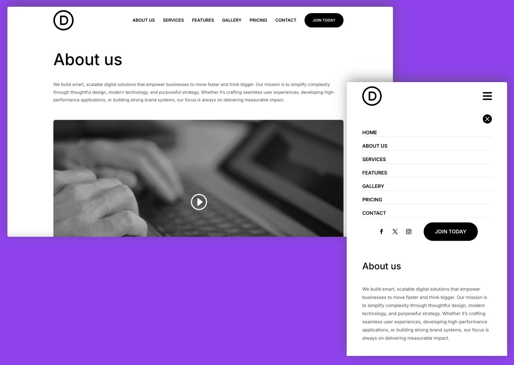
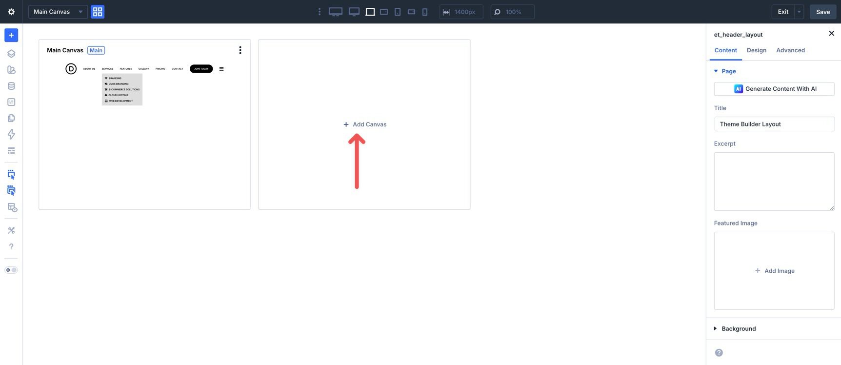
Next, create the mobile menu. We’ll use a new Canvas to house it. Click the Canvas Grid View button in the builder’s top bar.
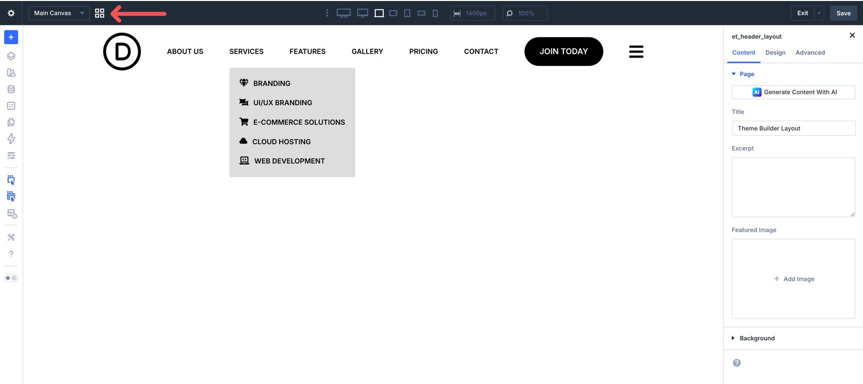
When the Canvas window opens, click + Add Canvas.
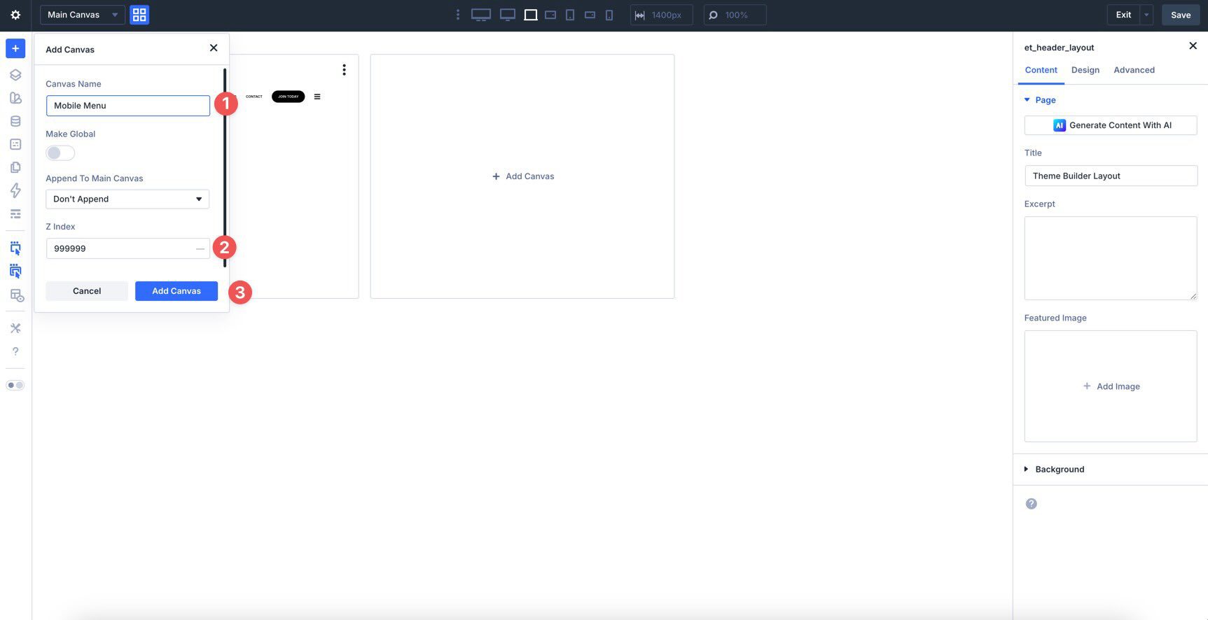
Give the Canvas a name such as Mobile Menu and assign a high Z-Index, such as 999999, so it can sit above the rest of the page content. Click Add Canvas to open it in the builder.
Add a single-column Row to the Canvas, select the Column, and open the Layout settings in the Design tab. Set the Vertical Gap to 15px.
Add Modules To The Mobile Menu
Now add the modules for the mobile menu. Add an Icon module for closing the menu, followed by a Link module and a Button module. Style them as needed.
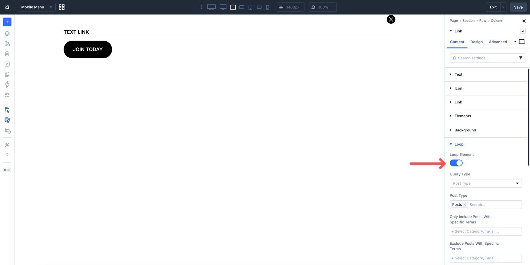
Instead of adding multiple links manually, use the Loop Builder to create a menu loop for the rest of the menu. Click the Link module and open the Loop settings in the Content tab. Enable looping or place the Link module inside the menu loop structure used in your layout.
In the Query Type dropdown, select Menu and choose the menu you want to use.
Then make sure the link text is populated automatically. Open the Text settings in the Content tab, hover over the Text field to reveal the Insert Dynamic Content icon, and select Loop Menu Text.
For the link destination, also use dynamic content for the URL so each looped item points to the correct menu target.
Configure Interactions
To launch the mobile version of the menu and close it again, configure Interactions for the close Icon, the mobile menu canvas content, and the hamburger Icon in the main header.
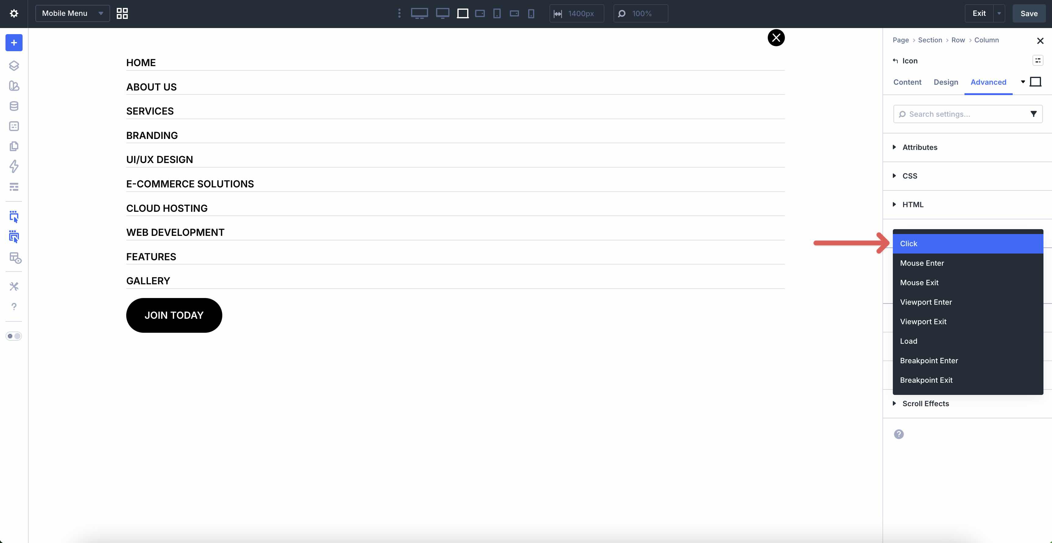
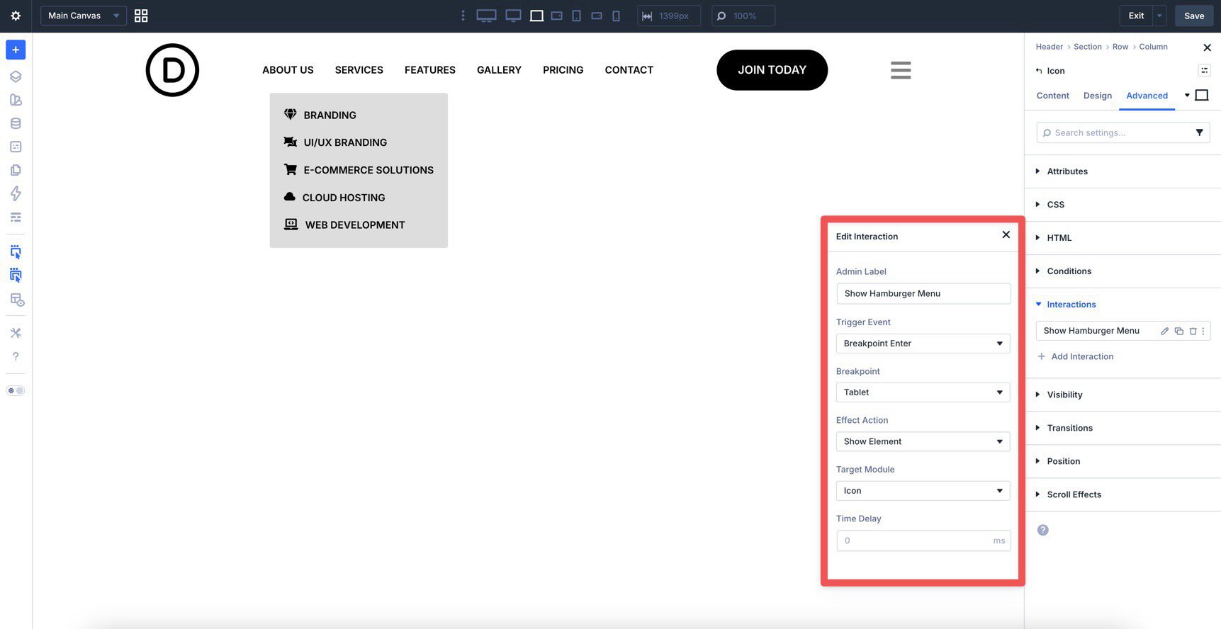
While inside the Mobile Menu Canvas, select the close Icon module. Go to the Advanced tab, open the Interactions settings, and click + Add Interaction.
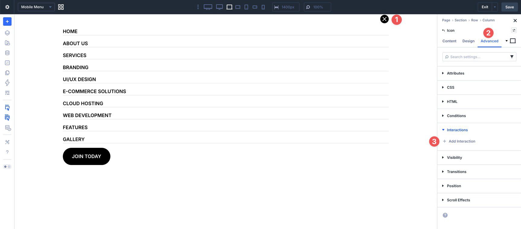
Choose Click as the trigger.
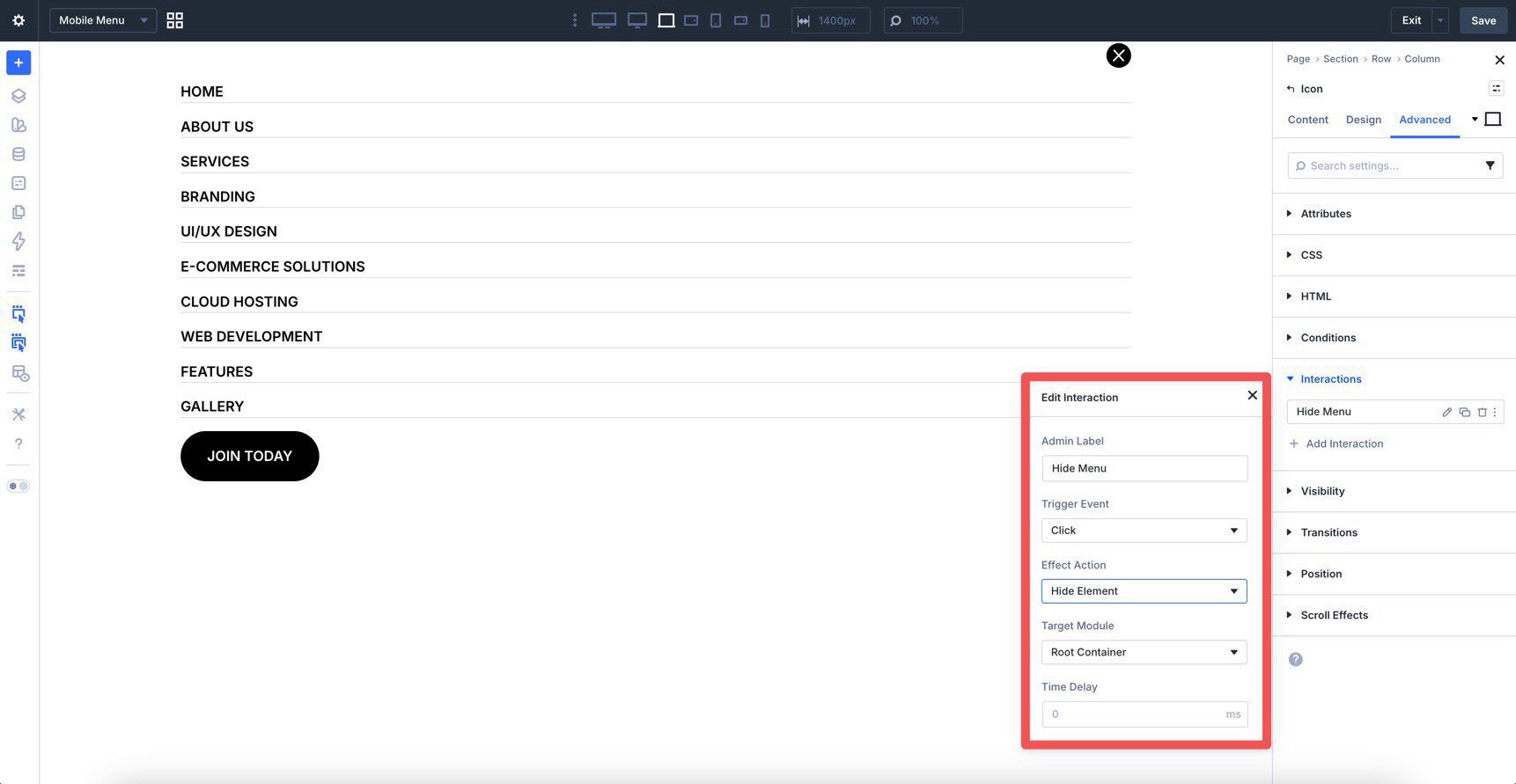
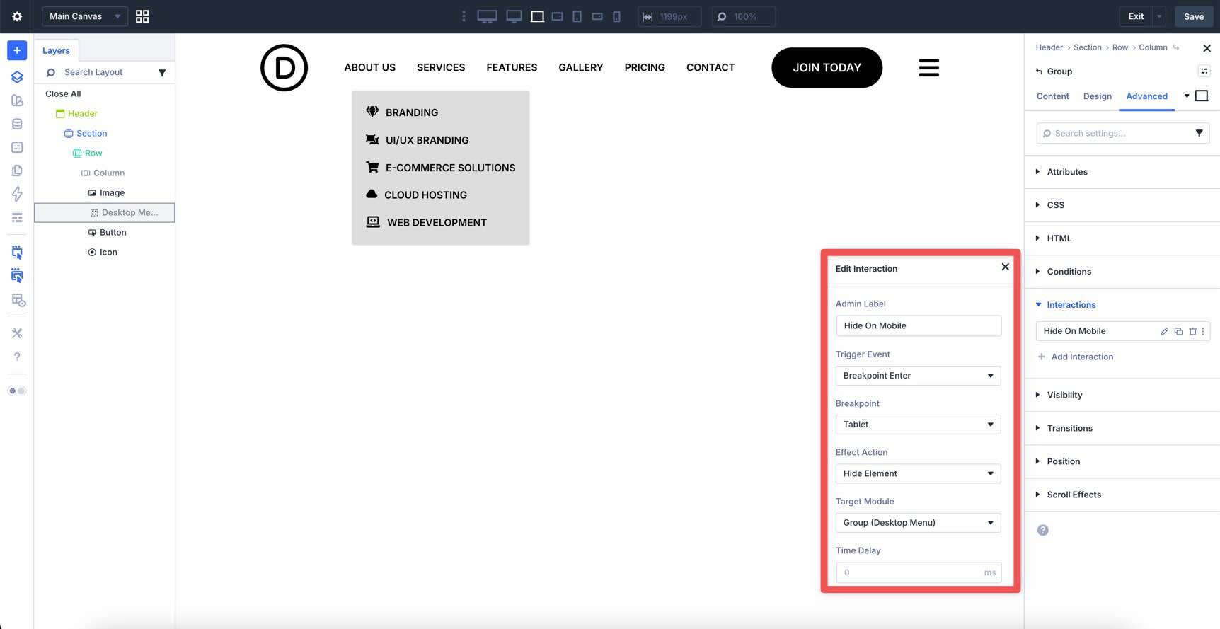
When the interaction editor opens, give the interaction an Admin Label such as Hide Menu, choose Hide Element as the Effect Action, and set the Target Module to Root Container. This closes the mobile menu when the user clicks the close icon.
Now hide the mobile menu by default so it doesn’t appear until triggered. In the Visibility settings for the mobile menu content, disable its visibility by default, then use Interactions to show it when needed.
Save the Canvas. Before heading back to the Main Canvas, use Divi 5’s Customizable Responsive Breakpoints to fine-tune the mobile layout if needed.
Click Canvas Grid View and switch back to the Main Canvas.
Configure The Main Canvas Interactions
On the Main Canvas, configure the desktop and mobile visibility behavior. Start by selecting the Group that contains the desktop Link modules. In the Advanced tab, open Interactions and add a new interaction. Give it an Admin Label such as Hide On Tablet And Below, set the Trigger Event to Breakpoint Enter, choose the relevant breakpoint, set the Effect Action to Hide Element, and target the Group.
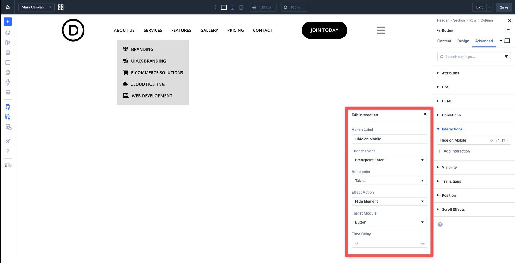
Repeat that approach for any other desktop-only elements, such as the Button module.
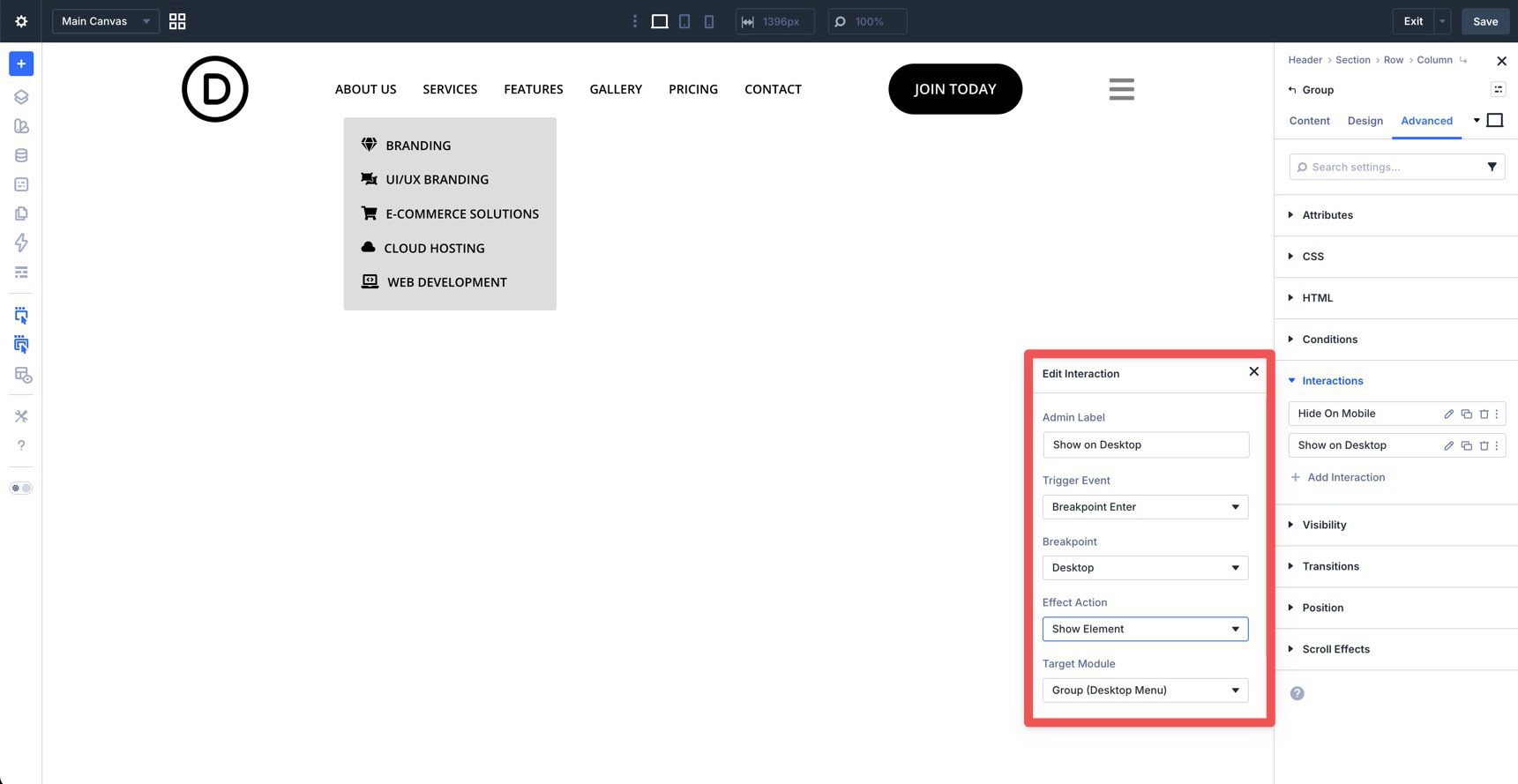
For users resizing their browser windows, it’s a good idea to add another interaction for the desktop-only elements to reveal these elements as the browser window increases in size. For example, when resizing from smaller to larger breakpoints, the menu displays the mobile version instead of the Desktop version.
To correct this, we’ll create Interactions to restore the Desktop Menu as the browser resizes. Create an Interaction for the Group and Button using Breakpoint Enter as the Trigger Event, Breakpoint set to Desktop, Show Element as the Effect Action, and choosing the appropriate Target Module.
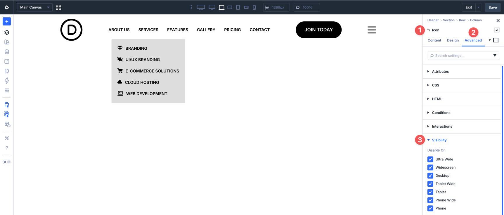
Now select the hamburger Icon module. In the Advanced tab, open the Visibility settings and hide it by default.
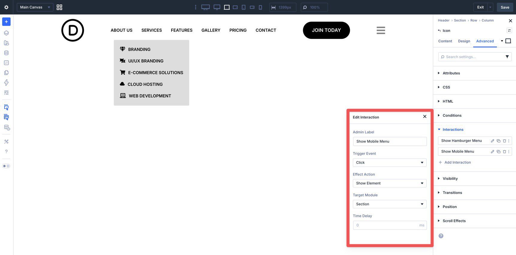
Then create two interactions: one to show the Icon when entering the tablet breakpoint and another to show the mobile menu on click. For the first, use Breakpoint Enter with the desired breakpoint, Show Element as the effect, and the hamburger Icon as the target.
For the second, create a Click interaction with Show Element as the effect. Set the target to the mobile menu section in the Mobile Menu Canvas.
Save the template and preview the menu on the front end. Resize the browser to confirm that the desktop links are hidden at smaller breakpoints, the hamburger icon appears, and the mobile menu opens and closes correctly.
Tips And Best Practices
Building a complex navigation system is only half the job. Maintaining it is the other half. To get the most out of Divi 5’s menu features, keep your menus organized, responsive, and easy to update.
Use Layer View And Admin Labels
Because custom menus often involve Links, Dropdowns, Groups, and Nested Modules, the canvas can get crowded quickly. Use Admin Labels consistently and rely on Layer View to keep the structure easy to manage.
Use Responsive Editing Early
A navigation layout that looks great on a large monitor can break down quickly on a smaller device. Use Divi 5’s Customizable Responsive Breakpoints and the Responsive Editor early in the process rather than waiting until the end.
Use Variable Manager For Design Consistency
Before styling your Link and Dropdown modules heavily, open the Variable Manager.
Define your brand colors, fonts, spacing, and other reusable values as Design Variables. That way, if your design system changes later, you can update it from one place instead of editing many individual modules.
Use Presets To Reduce Repetitive Styling
If you find yourself applying the same padding, shadows, border radius, or spacing repeatedly, use Option Group Presets. They let you save a reusable group of settings and apply it across different module types.
You can take this further by using an Option Group Preset inside an Element Preset. For example, you might create a Primary Button preset that includes a reusable spacing preset. If that spacing changes later, updating the underlying preset can update every module that depends on it.
Plan For Accessibility
Because you’re building menus from modular pieces, remember to check the final output, not just the visual design. Make sure links remain clear, hover-only behaviors have touch-friendly alternatives where needed, and mobile menu triggers are easy to identify and operate.
Download The Files
If you’d like to see these features in action, download the working files from this post. To use them, import them into the Divi Library, create a new Global Header Template in the Theme Builder, and load the sections into the builder.

The new menu features in Divi 5 let you combine the Link and Dropdown modules with Menu Loops and Interactions to build custom menus directly inside the Visual Builder. Whether you’re building a simple header, a mobile overlay, or a more advanced mega menu, these tools give you far more flexibility than the classic all-in-one approach.
Try them on a staging site or in a new header template and experiment with the combinations. Start simple, then layer in loops, dropdowns, canvases, and interactions as needed. That’s the fastest way to get comfortable with Divi 5’s new approach to navigation.


I agree with Ivo. This type of feature needs to be expanded to include subs as they are reflected in the WordPress Menu. Creating different subs just for the sake of dynamic looping is more work and time consuming. However, I do see this feature viable if I was to create a mega menu, but not for simple menus with subs.
This is really cool. Only issue here is that if the main menu has dropdown/subs, these display as parent items in the loop. The menu loop only works if you don’t have any dropdowns or sub-menus. So for mobile especially, one also will have to build the menu manually if you want it to have subs.