
Popups get a bad reputation, but that’s only because most websites misuse them. When you build them with purpose and timing in mind, they turn casual browsers into subscribers and window shoppers into buyers.
We’ll show you five ways to use popups people want to see. As a bonus, we’ll also show you how Divi 5 can build all the popup types we’re about to cover without installing a plugin or writing code in WordPress. Take a look!
What Are Popups?
Popups are overlay windows that appear on top of your website content. They create a separate layer between your visitor and the page underneath, usually with a darkened or blurred background that keeps focus on the popup itself.
Subscribe To Our Youtube Channel
These windows contain forms, messages, images, or interactive elements. Visitors must take some action, whether that’s clicking a button, filling out a field, or closing the window, before they can return to browsing your site.
The technical side runs on triggers. You can set popups to appear when someone lands on a specific page, scrolls to a particular depth, among others. You can even combine multiple conditions.
Are Popups Effective?
Popups work because they are visible and timely. Your website content competes with browser tabs, notifications, and other distractions online. A popup cuts through that noise by creating a dedicated moment where your visitor has to make a choice.
Mobile users respond even better. The smaller screen gives popups more presence, and people browsing on phones tend to stay more focused on what’s directly in front of them.
But, these numbers only show up when you build popups that match what your visitor actually wants at that specific moment. Interrupt someone on their first click, and you’ll see why popups have a bad reputation.
What To Avoid When Making Popups
Interrupting people at the wrong time or asking for too much too soon is the number one reason why people hate seeing popups on websites. Here are the mistakes that tank conversion rates:
| Mistake | Why It Hurts |
|---|---|
| Instant popups | Visitors just arrived. Let them see your content before asking for anything. |
| Long forms | Every extra field cuts conversions. Stick to email only when possible. |
| Hidden close buttons | Trapping people makes them leave your site entirely, not just the popup. |
| Same popup for everyone | A new visitor needs different content than someone who already bought from you. |
| Weak offers | Generic newsletter signups get ignored. Give people a real reason to share their email. |
| Showing repeatedly | Once someone closes your popup, respect that choice. |
5 Creative Ways To Use Popups On Your Website
The tactics below target specific pages where visitors hit decision points. Some capture attention early, others step in right before someone leaves. Build one, test it, then add another. Here’s the first one:
1. Offer Page-Specific Resources
A generic offer on every page feels like a sales pitch, while a specific one feels like a helping hand. This popup appears with a resource directly tied to the page a person is viewing.
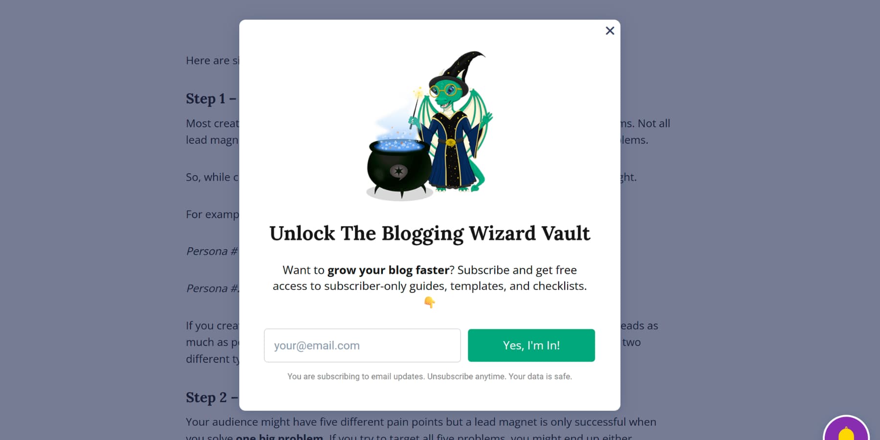
Someone reading your Instagram growth guide needs templates, not a generic social media ebook. The tighter the connection between post and offer, the better your numbers get.
This works because the offer is immediately valid. You are not interrupting their thought process. You are adding to it.
The visitor gets a valuable tool, and you get a new email contact who is clearly interested in that topic. Keep the form simple: a single email field and a button are often enough.
People trust what other people are doing. Use popups to show that your website is busy and others are making purchases. Small notifications in the screen’s corner can announce recent reviews.
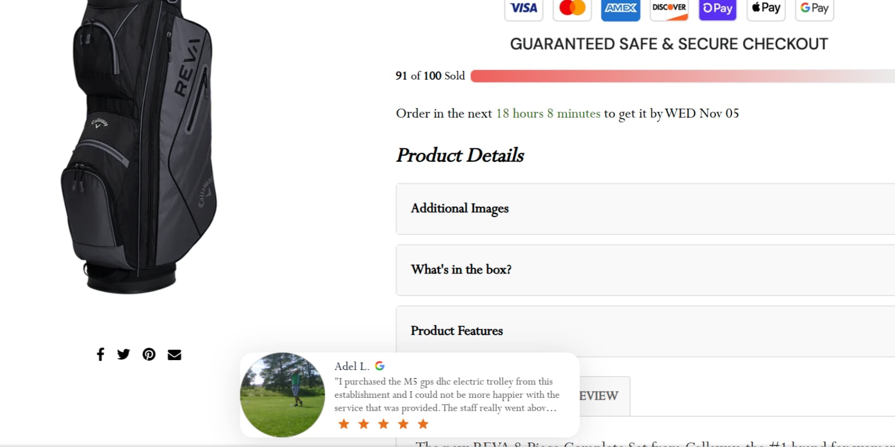
Messages like “John Doe reviewed this product with five stars” build trust and a sense of activity. They tell new visitors that your store is legitimate and that your products are popular.
This can create a gentle urgency, prompting hesitant shoppers to decide before item sells out.
3. Promote A Giveaway
Everyone loves a chance to win something for free. You can use a popup to announce your next contest or giveaway. This method works well because the exchange is clear. You offer a valuable prize, and visitors provide their email address to enter.
The popup itself should be exciting. Use a great image of the prize. Clearly state what the prize is and how to enter. Keep the entry form to a single field: their email address. Any extra steps will lower the number of people who sign up.
The prize you choose matters. It should attract the right kind of people to your list. A generic gift card attracts everyone, but a specific product from your store attracts future customers.
4. Gate Content
Some of your content is too good to give away for free. This is where you gate it. Gating content places a premium resource, like an ebook or a video course, behind an email signup form.
When someone clicks to view the resource, a popup appears. This popup blocks the page and presents the offer.
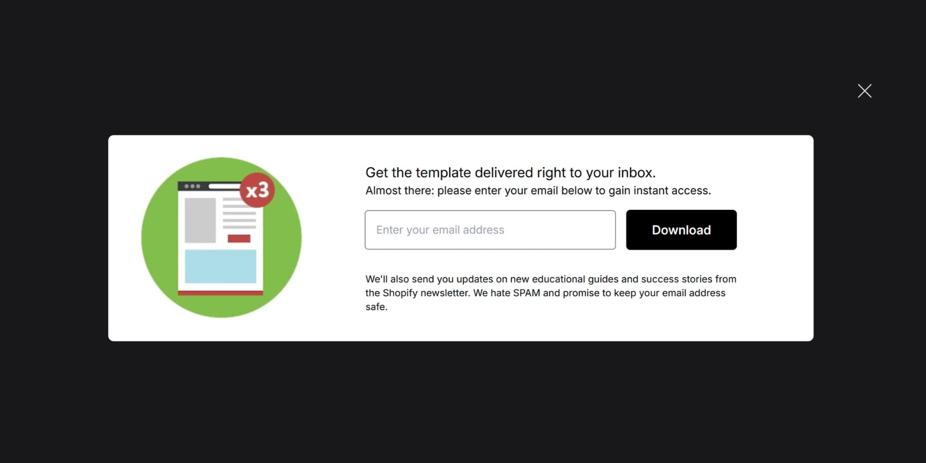
Use it to highlight the resource’s benefits with a strong headline and a few key points. To keep things simple, the form should only ask for an email.
This method works because the exchange is clear. The visitor understands they are getting something special. For this to work out, the gated item must feel like a genuine upgrade from your public content.
However, this is a bold move. It can annoy people if the value is not clear. A visitor expects content and instead finds a gate. You must use this tactic carefully and only for your most special resources.
The page or button leading to the item should signal that it is a download or an exclusive guide. This manages expectations before the click.
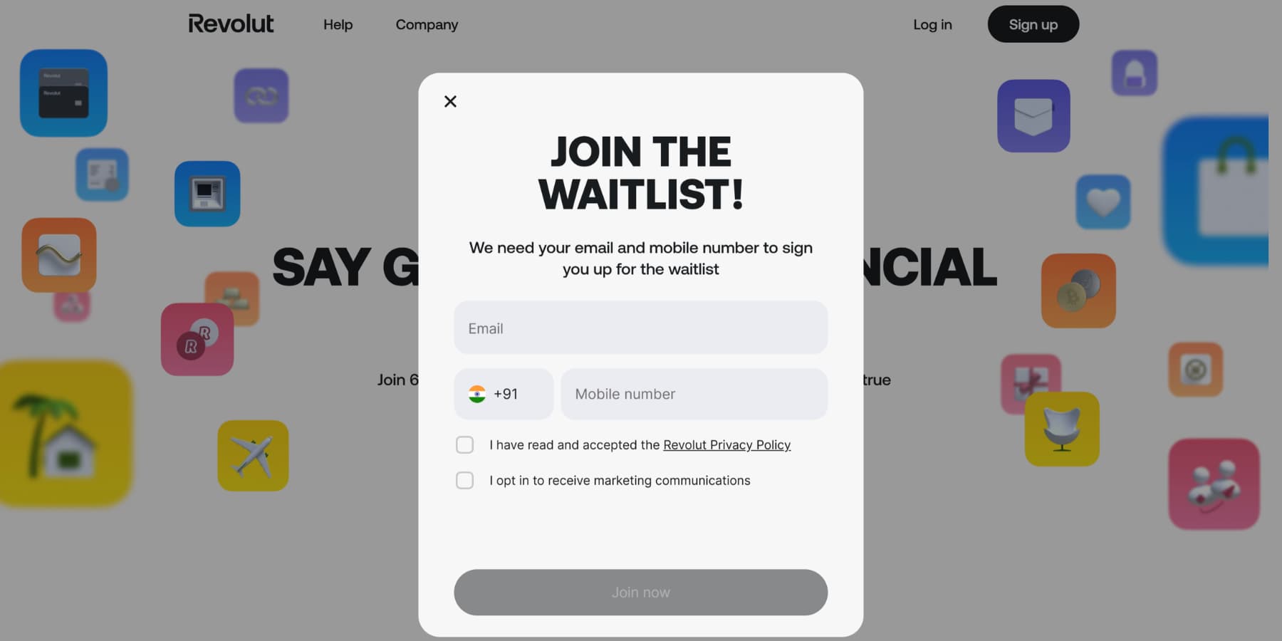
5. Waitlist Signups
A coming soon product often means a lost customer. You can turn this situation around with a waitlist popup. Instead of a simple ‘Coming Soon’ message, you can show a popup that invites visitors to join a waitlist.
This changes the experience from a dead end into a helpful service. The visitor provides their email and gets a promise: we will inform them when the item is available. They no longer need to check your site repeatedly.
This approach does two things: It helps encourage future sales and gives a clear signal of demand for specific products. The best waitlist popups are simple.
They appear on the product page and ask for only an email address. The message should be direct, like ‘Get notified when this is launched.’ Anything more complicated creates friction and would defeat the purpose.
Divi 5 Makes WordPress Popups Effortless
Divi powers WordPress websites as both a theme and a complete page builder. We built it for people who want professional websites without writing code.
It includes over 200 content modules ready to drop onto your pages. Basic text and image blocks sit alongside advanced pricing tables, testimonials, and contact forms. Every module gives you control over fonts, colors, spacing, borders, and visual effects.
What Makes Divi 5 Different
Divi 5 isn’t just an update. It’s a complete rebuild of the entire website-building framework from scratch. We discarded the old code and started fresh with modern web standards.
The biggest change is speed. Divi 4 relied on shortcodes, whereas Divi 5 works with a clean, block-based approach.
We also replaced our legacy layout system with Flexbox and Grid, giving you control over element alignment, responsive ordering, and complex layouts that were impossible before.
You can nest rows infinitely deep and create module groups that work as reusable containers.
The Visual Builder itself got a complete makeover. Light and dark modes, dockable panels, keyboard shortcuts, and a layers view with breadcrumbs make navigation effortless.
Meet Interactions For Divi 5
Interactions is among the other features, such as Design Variables, Advanced CSS Units Support, HSL color controls, Option Group Presets, Loop Builder, and much more, added to Divi 5’s trove.
It is Divi 5’s built-in system for creating any kind of interactive element. It’s not a popup builder; it’s an anything builder. Triggers start when users click, hover, or scroll to certain points on the page or after it loads.
Effects determine what happens next, such as revealing hidden elements, toggling presets, or creating movement animations. Targets tell the system which element should change.
You can build popups, toggles, mouse hover effects, scroll animations, and more without installing separate plugins. Every module, column, row, and section includes Interactions in its Advanced Settings tab.
This means you can make any element interactive or turn it into something that responds to user actions.
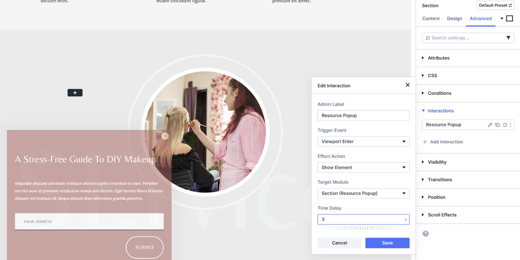
Building A Popup With Divi 5 Interaction
Let’s visualize creating a popup in Divi 5. We’ll briefly show how to create the offering resources popups we discussed earlier with Divi 5’s Interactions and show you how easy and intuitive it is.
Start by building a section with an Email Optin module inside and style it according to your needs. Label it “Resource Popup” in the Admin Label field.
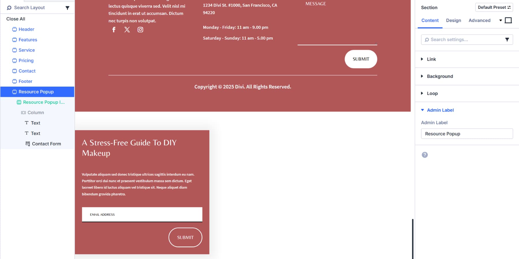
You would also need a Close Button to make it easier for those who aren’t interested to dismiss the content. Add an icon module, style it accordingly, and then in Interactions:
- Label: Close Popup
- Trigger Event: Click
- Effect Action: Hide Element
- Target: Popup section (Labeled as Resource Popup)
- Delay: 0.75 seconds
![]()
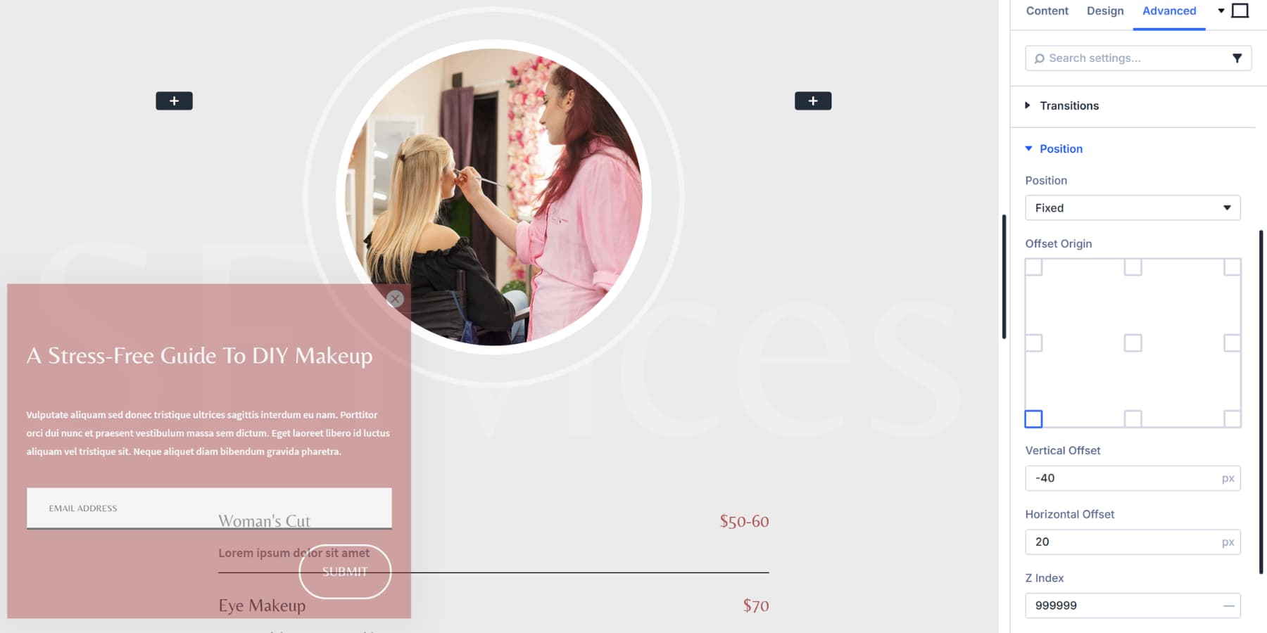
Then, in the advanced settings of the popup section:
- Visibility: Hidden on all devices
- Position: Fixed (Bottom Left).
- Adjust the Vertical and Horizontal offsets as per your needs.
- Z-index: 99999
The Main Trigger would be the Content Area. You can use the first or the second section of the page as a trigger. In its Interactions Panel:
- Label: Show Resource Popup
- Trigger Event: Viewport Enter
- Effect Action: Show Element
- Target: Resource Popup section (Labeled as Resource Popup)
- Time Delay: 2 seconds (adjust as preferred)
And the popup is ready!
If you are looking for a starting point, here are six email popup layouts we’ve created! You can also learn more about Interactions in much more detail here.
Build Your Popups In Divi 5 Today
Popups stop being annoying when they match visitor intent. Each one covers works because timing and context always prevail over aggressive tactics. If you use WordPress, Divi 5 is a complete rebuild of the most popular WordPress theme with workflow improvements that other page builders can’t match.
The Interactions system already lives inside your Visual Builder, ready to handle popups alongside everything else you build. Pick the tactic that best fits your site and set it up today.


Leave A Reply