")
Divi 5 Interactions makes it easy to build popups directly in the Visual Builder. This free pack includes 6 prestyled email popup Section layouts designed to look great out of the box and wire up quickly. Each layout pairs clean design with a ready-to-connect Email Optin Module, plus Interaction hooks for opening and closing the popup on click, scroll, or page load.
Preview
Let’s take a look at all 6 Email Popups included in this pack. The download is further down the post.
Subscribe To Our Youtube Channel
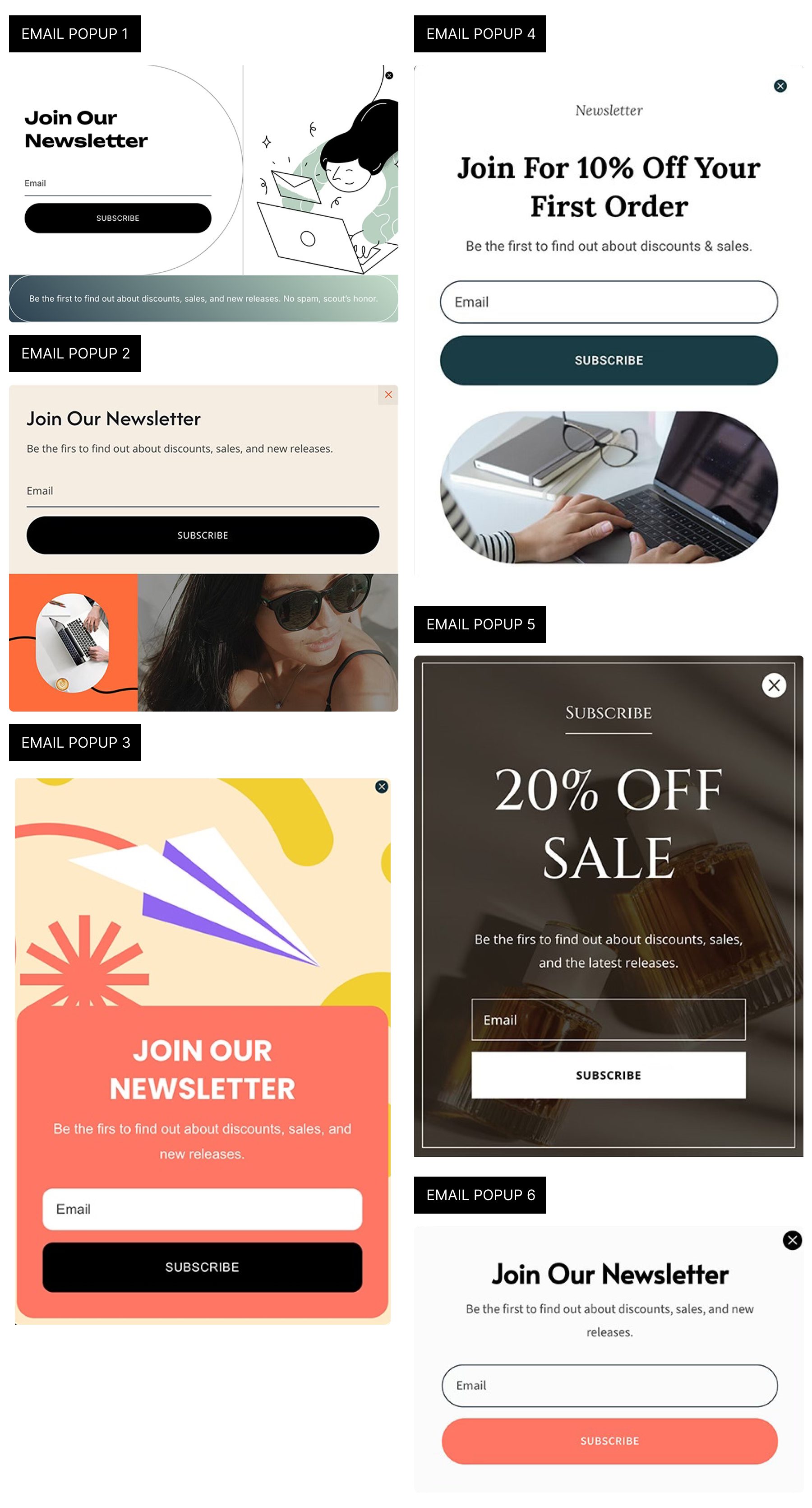
Download 6 Email Popups For Divi 5
Get all 6 prestyled popup sections for free. Import them into your Divi Library, drop one into any page, and attach a trigger using Interactions.

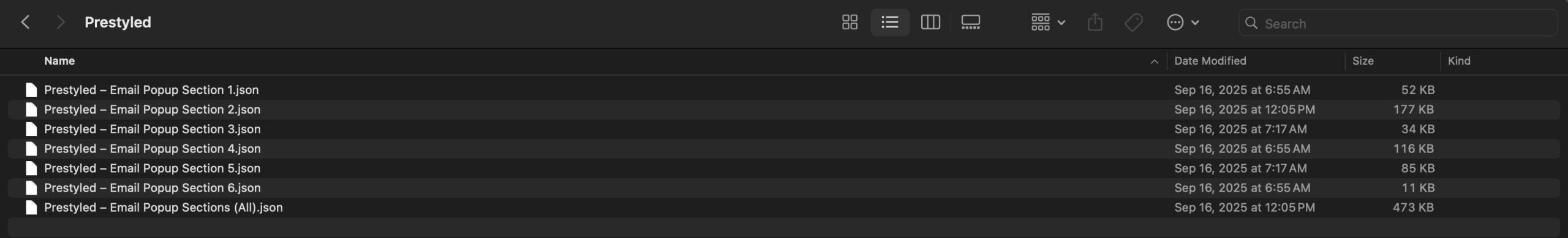
What’s Included (7 Exports)
Once you download and unzip the folder, you’ll find all 7 exports organized as individual sections and a full “All Popups” pack.
Prestyled – Individual Sections (6)
Prestyled – All Sections (1)
How To Use The Email Popups
These popups are delivered as Section layouts. Import → insert on a page → position → trigger → connect your form.
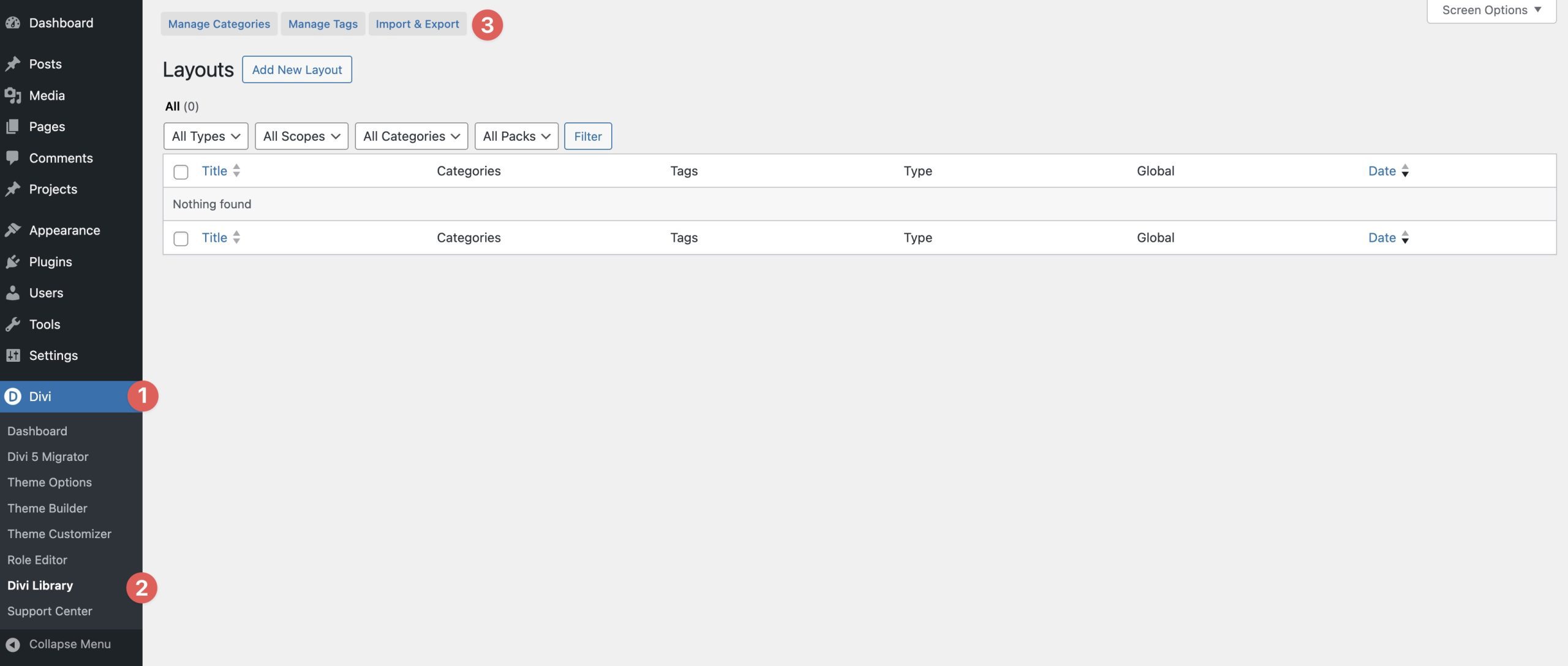
1. Import Sections Into The Divi Library
Navigate to Divi → Divi Library. Click the Import & Export button to locate the files on your computer.
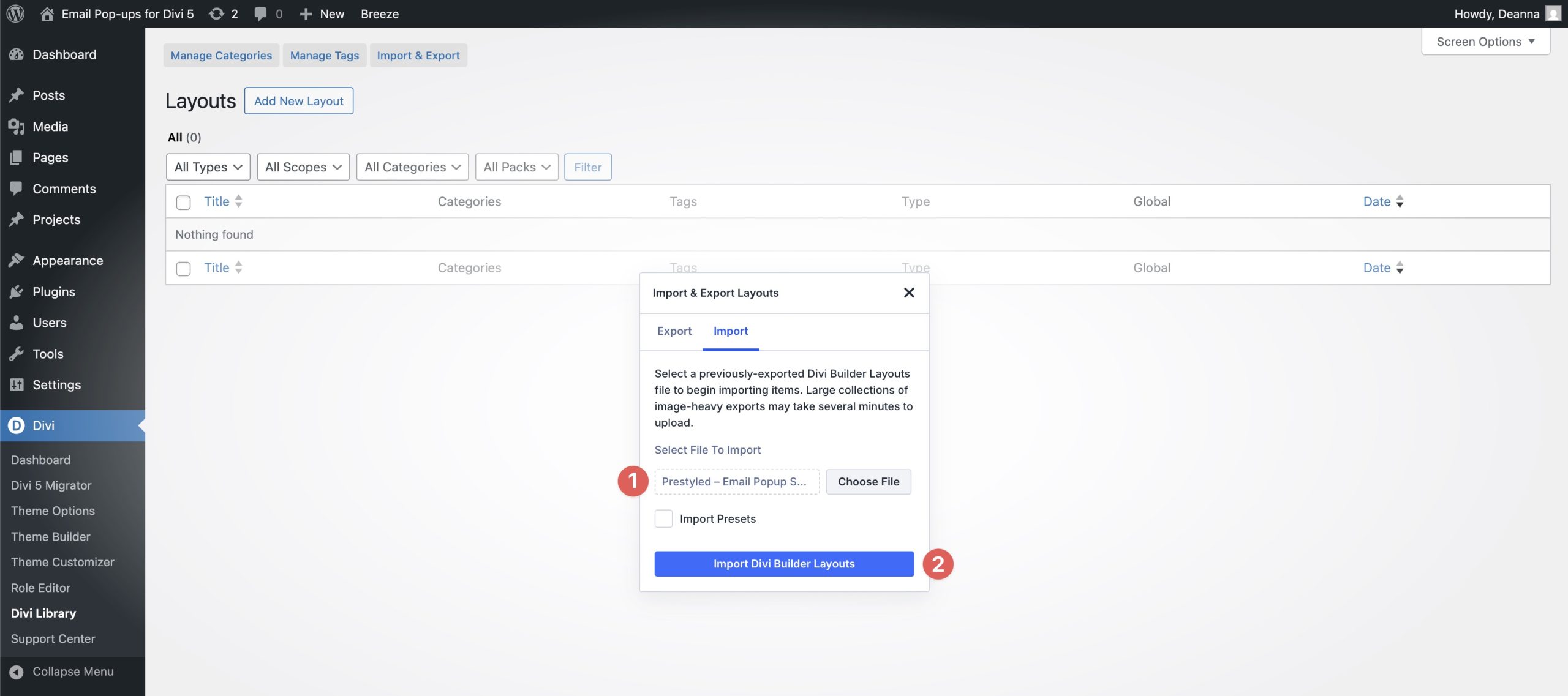
When the Import & Export Layouts dialog box appears, select the Import tab. Click Choose File to load the layouts.
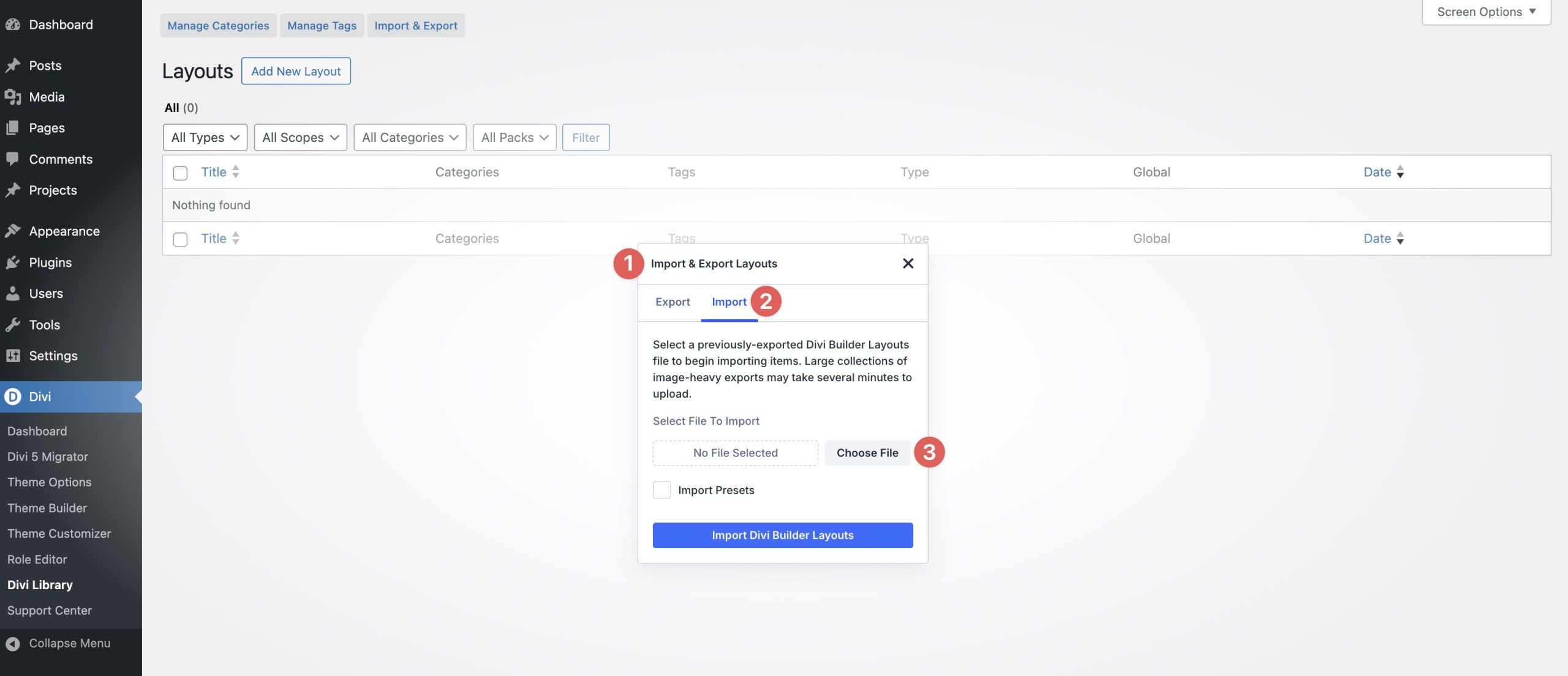
Locate the Prestyled – Email Popup Sections (All) file on your computer and select it to load the file.
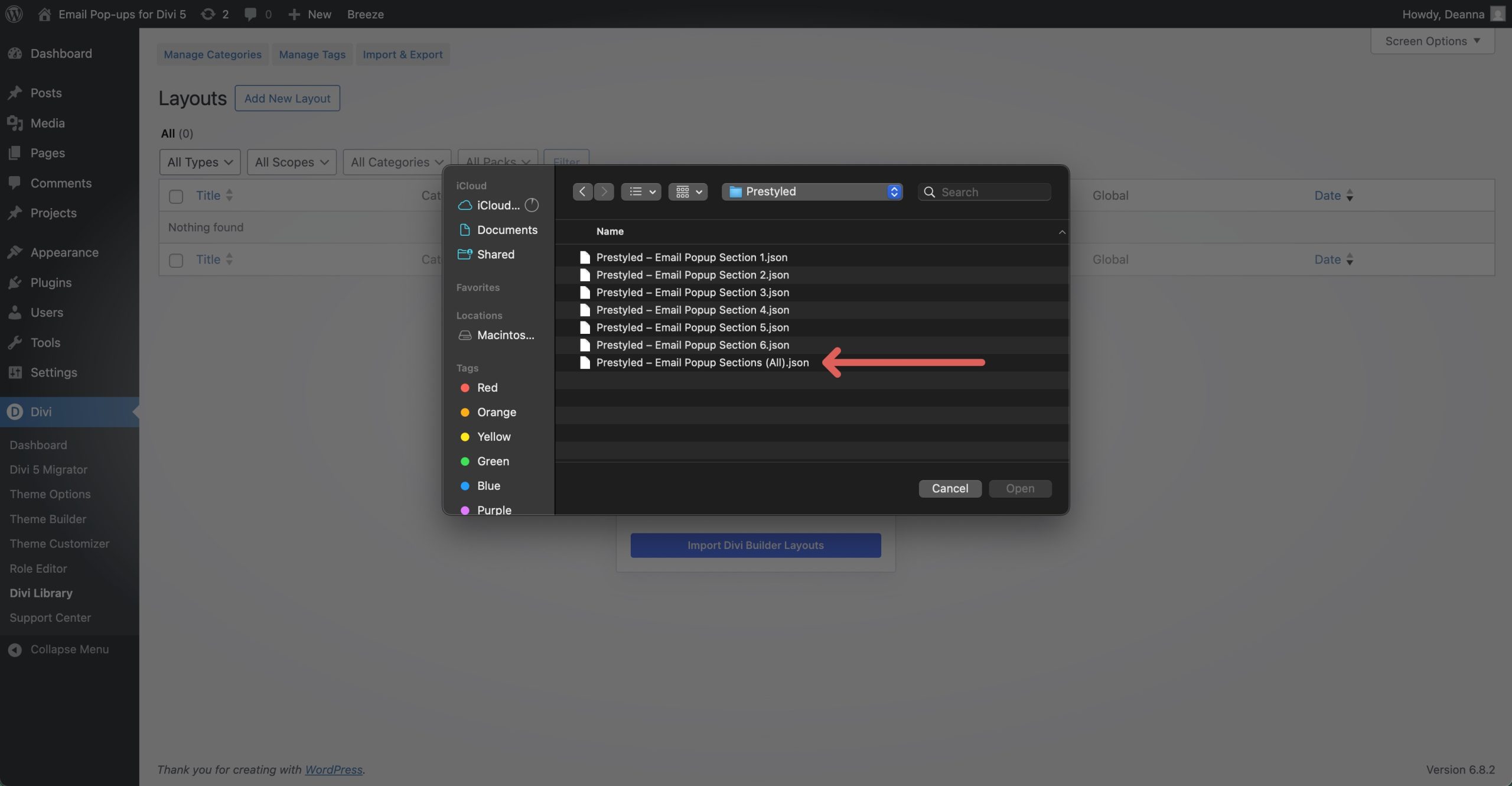
With the file loaded, click Import Divi Builder Layouts.
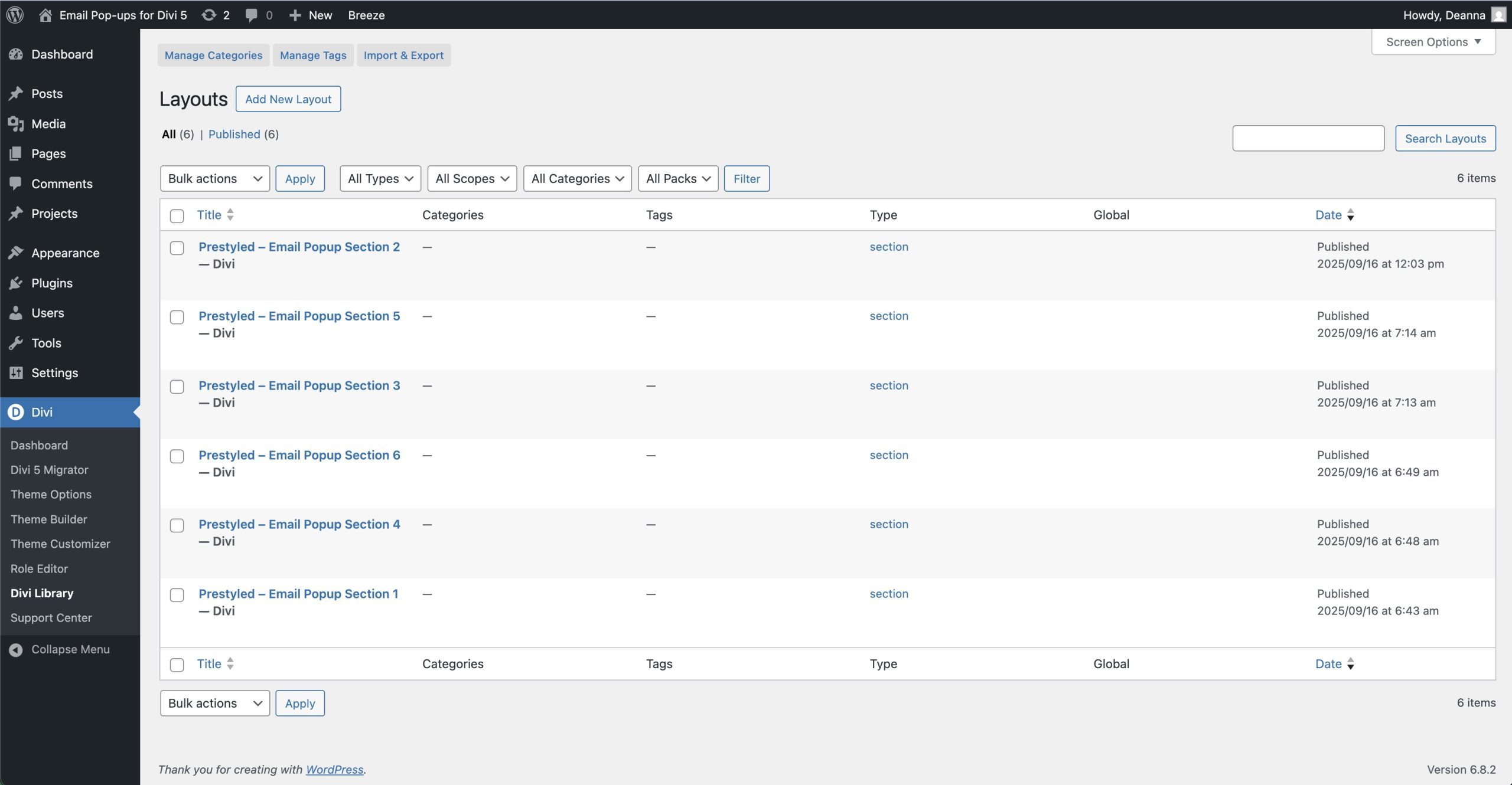
Once the process is complete, all of the JSON files will be present in the Divi Library.
2. Add A Popup Section To A Page
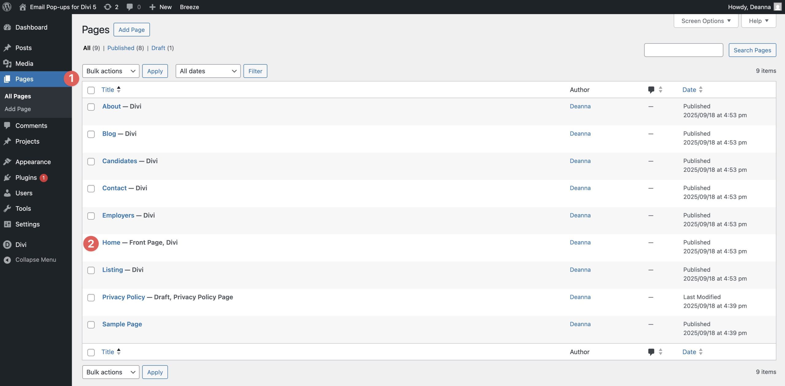
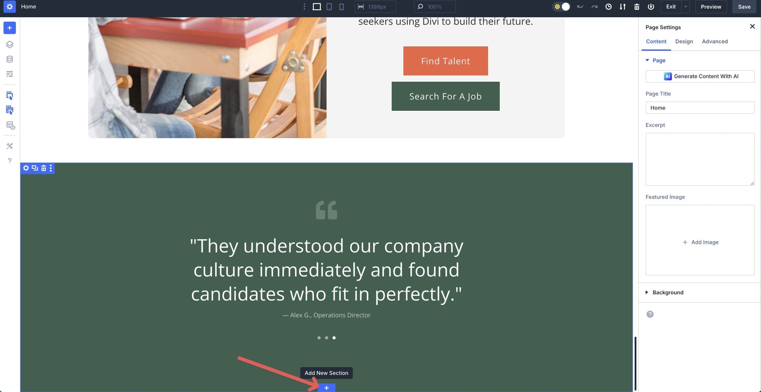
Navigate to Pages in the WordPress admin dashboard. Click on the page you wish to add a popup to.
When the page loads in the Divi Builder, scroll to the bottom of the page and click the blue “+” to add a new section.
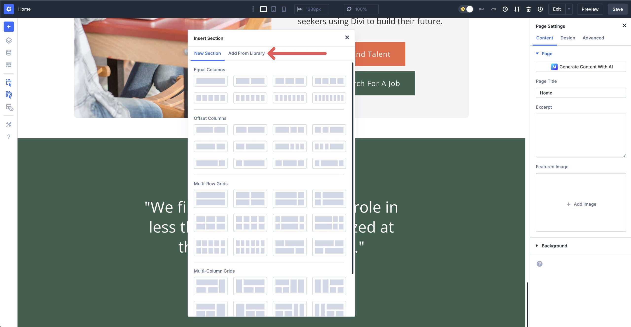
When the Insert Section dialog box appears, click the Add From Library tab.
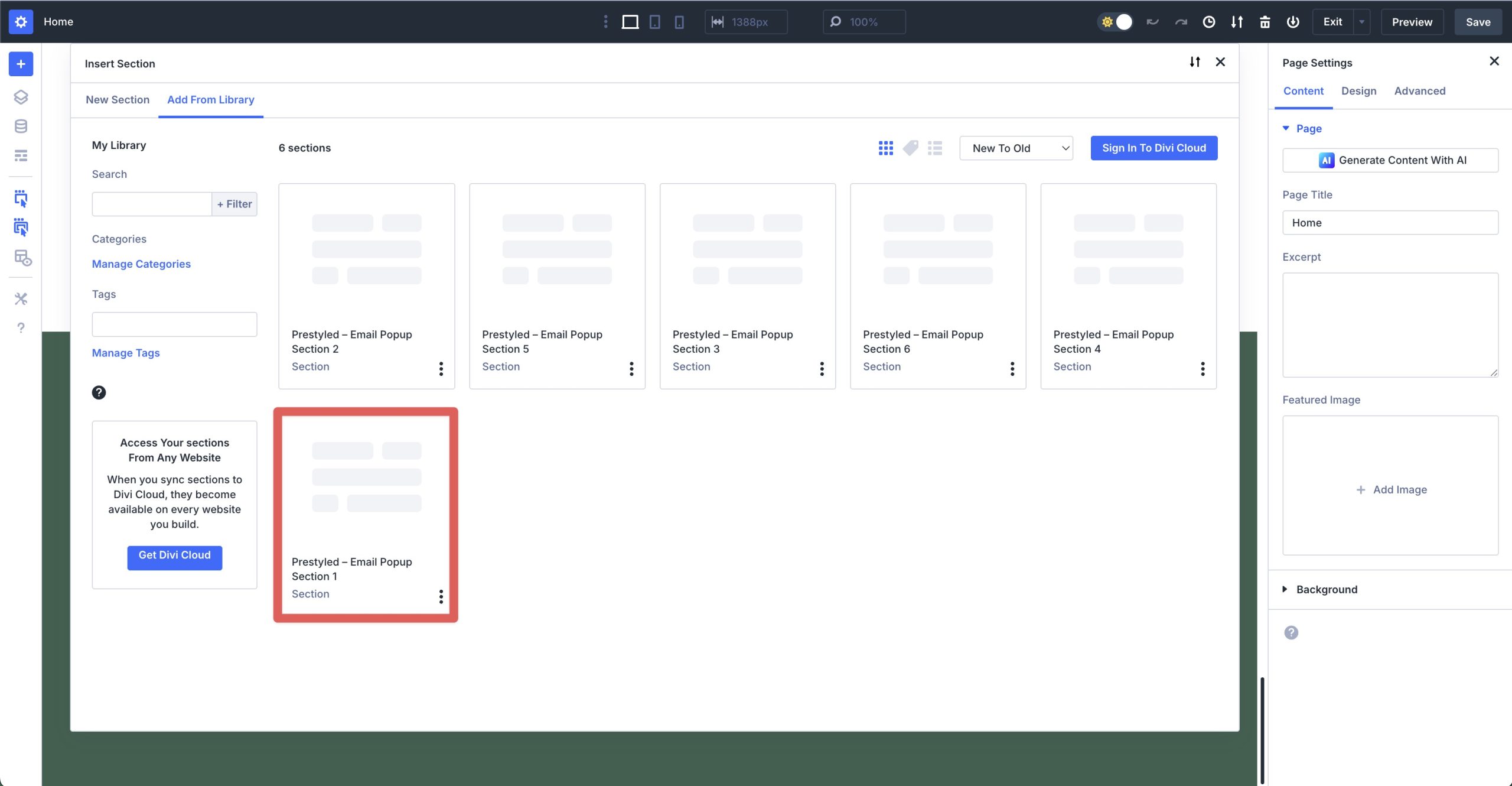
Click on a layout to select it.
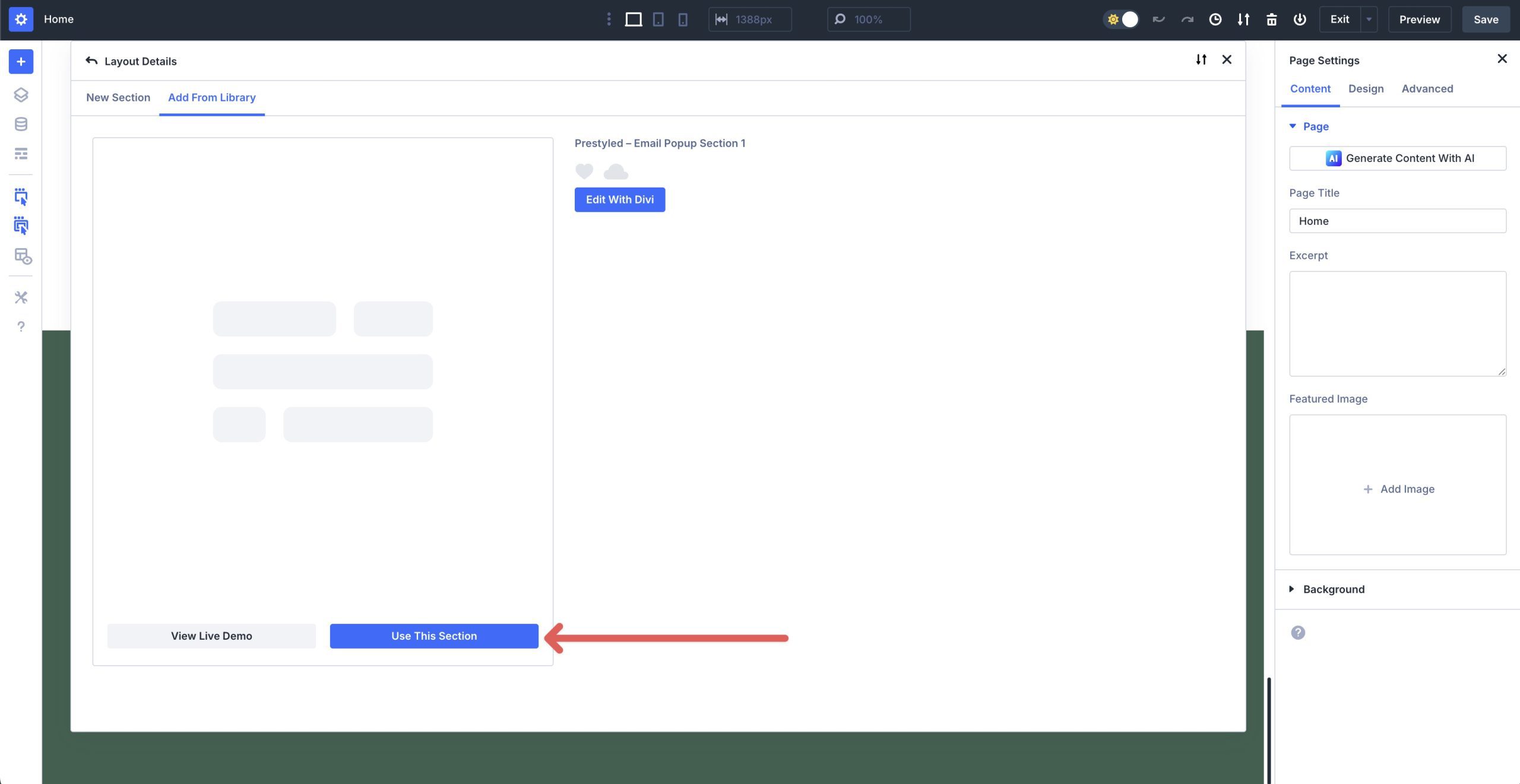
Click the Use This Section to load the popup onto the page.
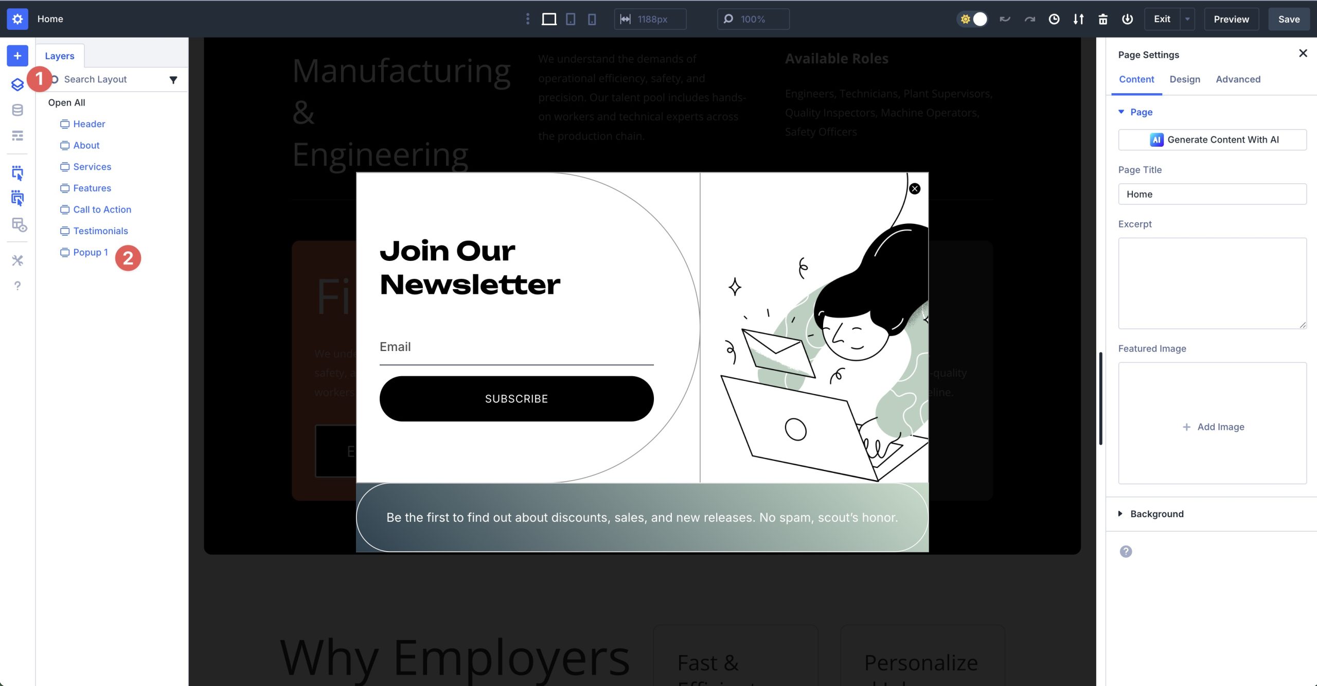
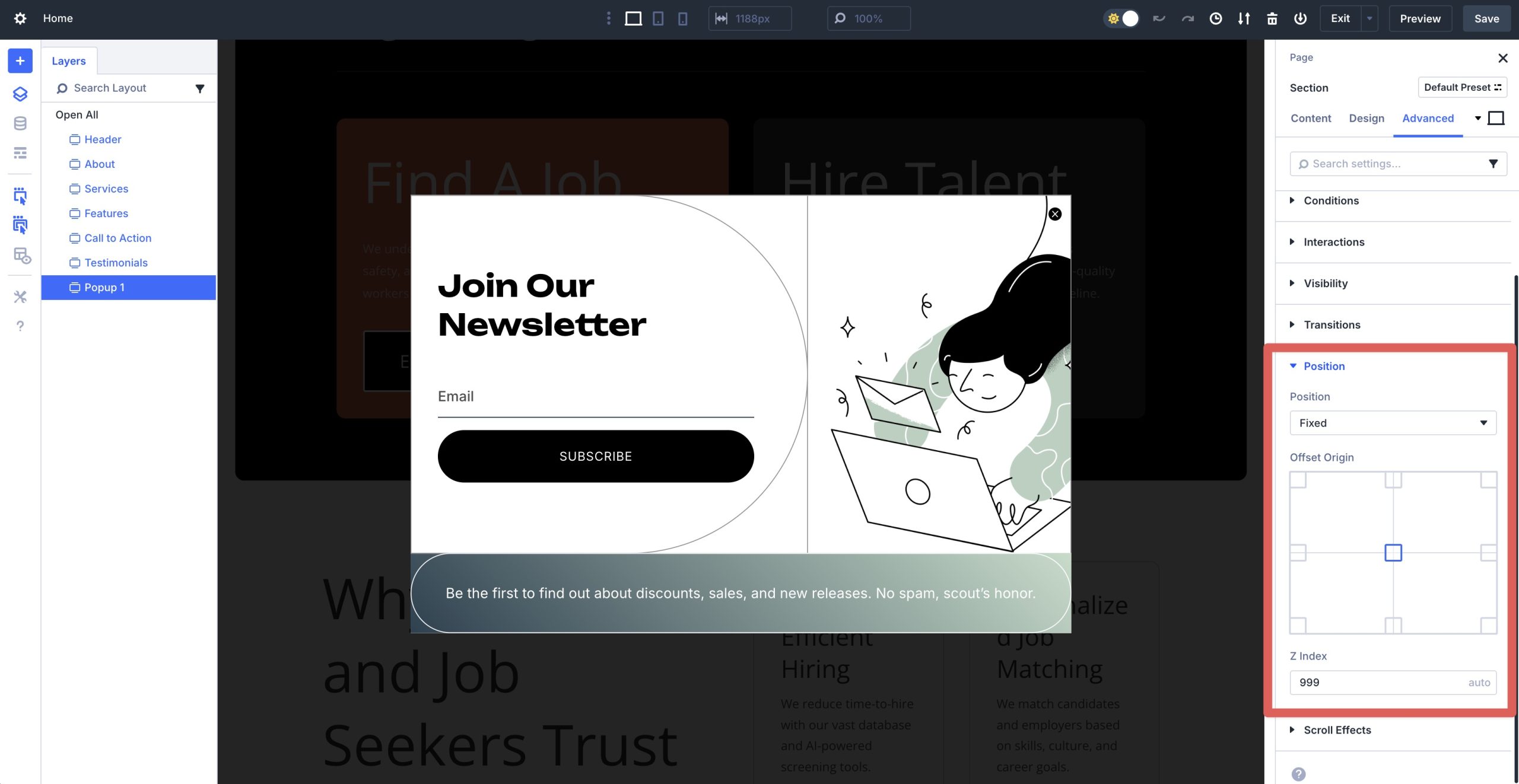
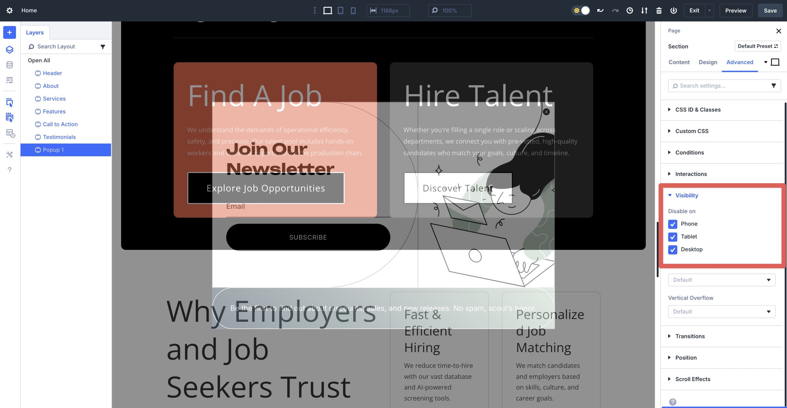
3. Position, Layer, And Hide On Load
Once the popup is loaded onto the page, it will appear over the content on the page. Click the Layers view icon to view the structure of the page. Locate the Popup section and click it to open its settings.
Navigate to the Advanced tab and scroll down and expand the Position settings. By default, each popup layout is set to Fixed in the Position settings. This places the popup in a fixed, centered position on the page. You’ll also notice that the Z Index is set to a high number. In this case, 999. That allows for the popup to appear above all other content on the page.
In order for the section to be a true popup, you must hide it so that it can appear when you want. In the Advanced tab, expand the Visibility dropdown menu and disable the popup section on all three breakpoints — Phone, Tablet, and Desktop.
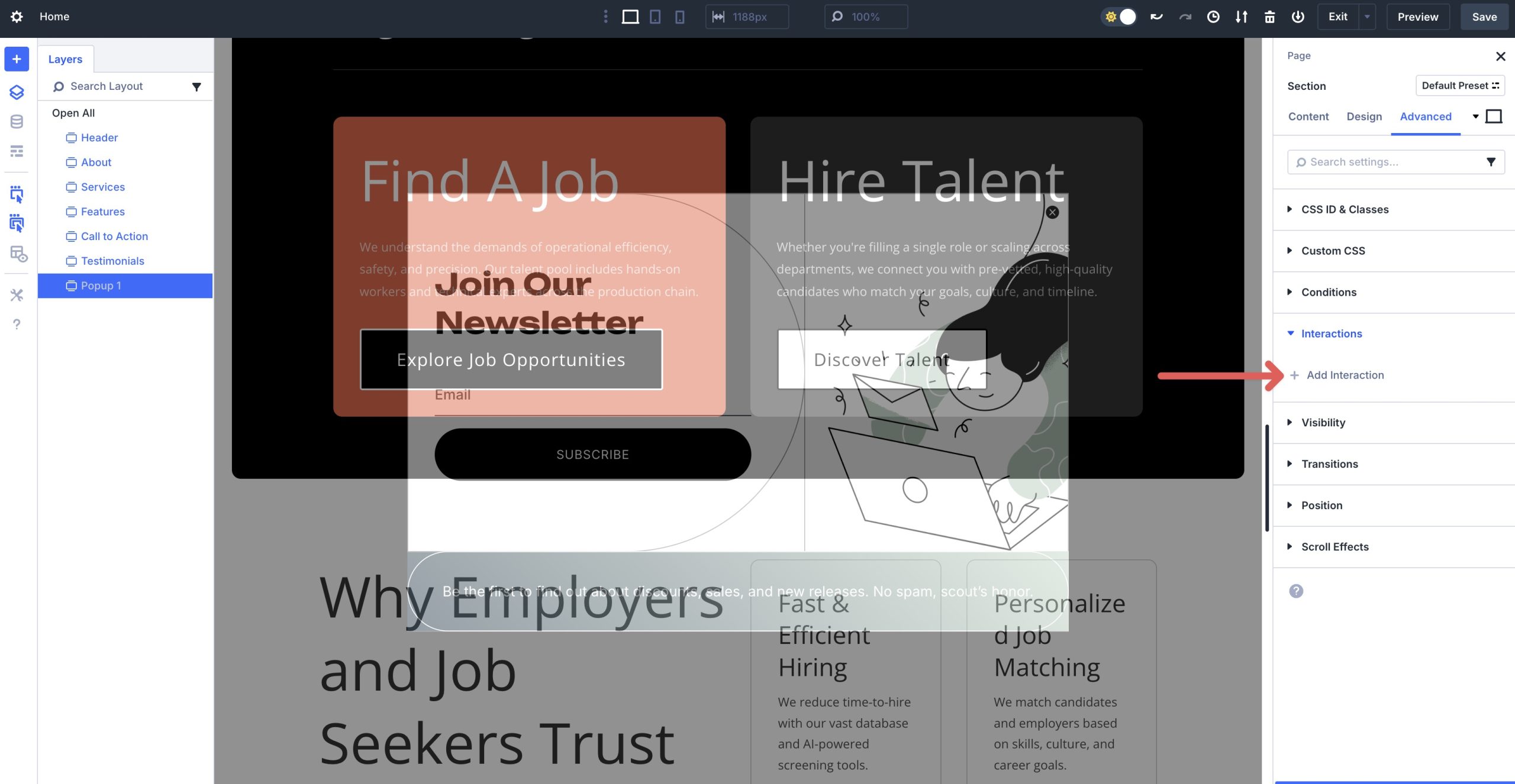
4. Wire Up Interactions
With the visibility settings and positioning locked down, we’ll need to create interactions to launch the popup. While in the Advanced tab, scroll to and expand the Interactions dropdown menu. Click + Add Interaction.
There are some common options you can use for your popup, including:
– Button Click: Click on a button → Show Element → Target = this Section
– Scroll / Viewport: Viewport Enter on a section → Show Element → Target = this Section
– Page Load: Load (with 5–8s delay) → Show Element → Target = this Section
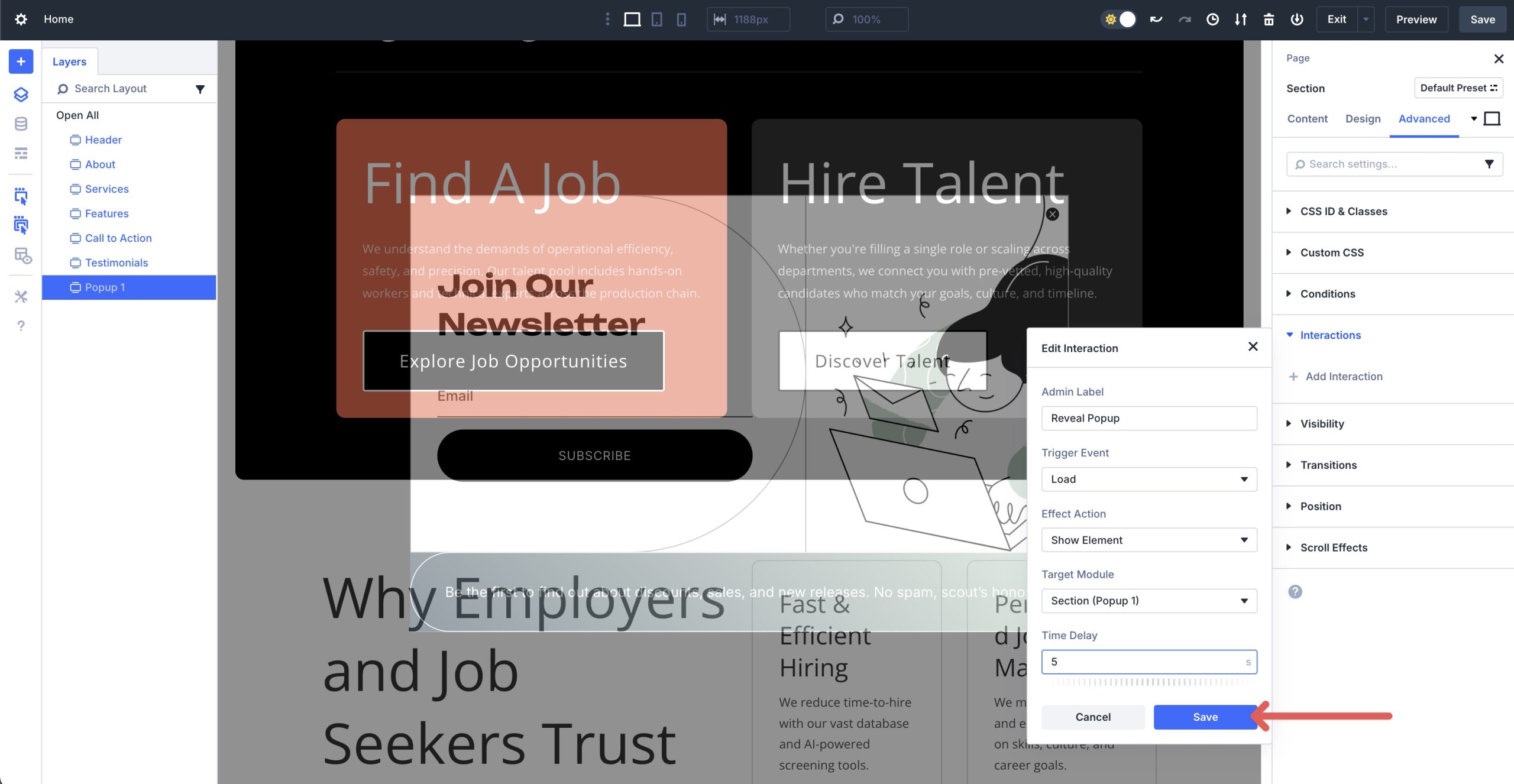
For this popup, we’ll configure it to load after a 5 second delay. Select Load from the available options.
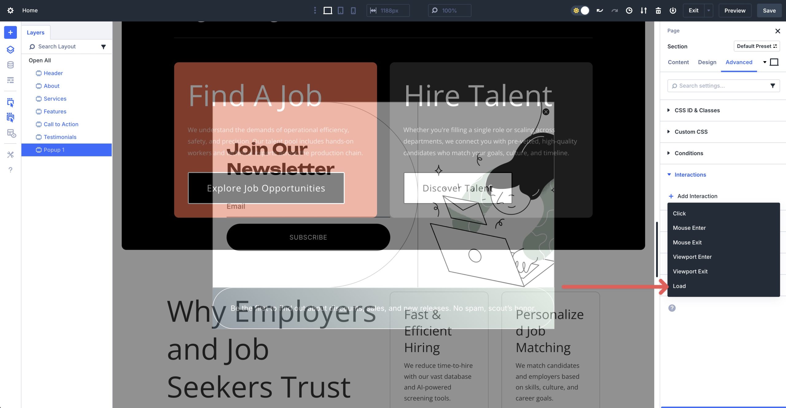
When the dialog box appears, add the following for each field to create the interaction:
- Admin Label: Reveal Popup
- Trigger Event: Load
- Effect Action: Show Element
- Target Module: Section (Popup 1)
- Time Delay: 5 seconds

Be sure to save the Interaction before closing the dialog box.
We will also need to create a way for users to close the popup. All of the popup layouts in this pack include a close button, but we need to create an interaction for the button. Using the Layers view, locate the Icon module and click on it to reveal the settings.
Navigate to the Advanced tab, expand the Interactions dropdown menu, and click to add a new Interaction. When the dialog box appears, enter the following settings:
- Admin Label: Hide Popup
- Trigger Event: Click
- Effect Action: Hide Element
- Target Module: Section (Popup 1)
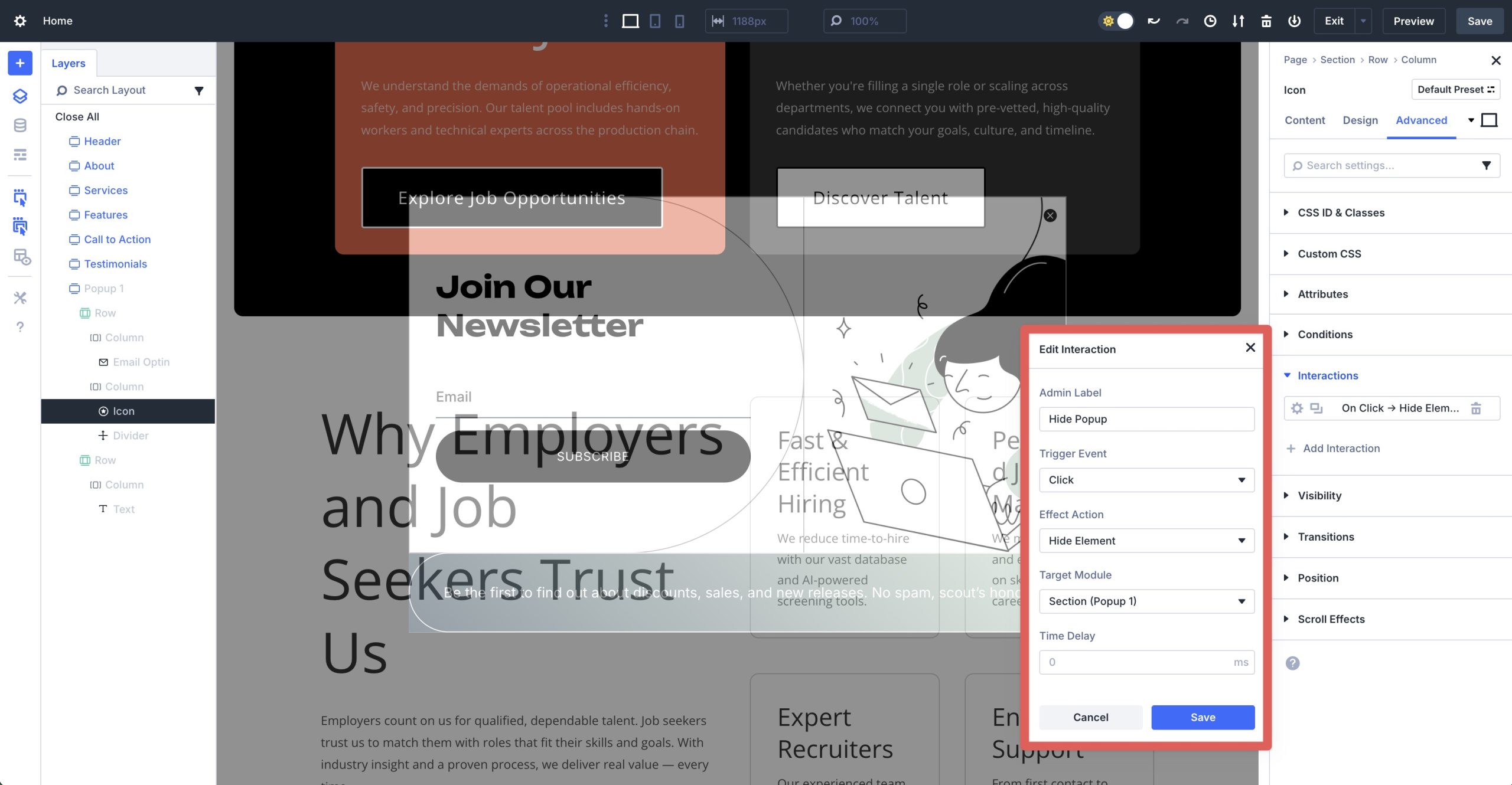
Make sure to save the Interaction.
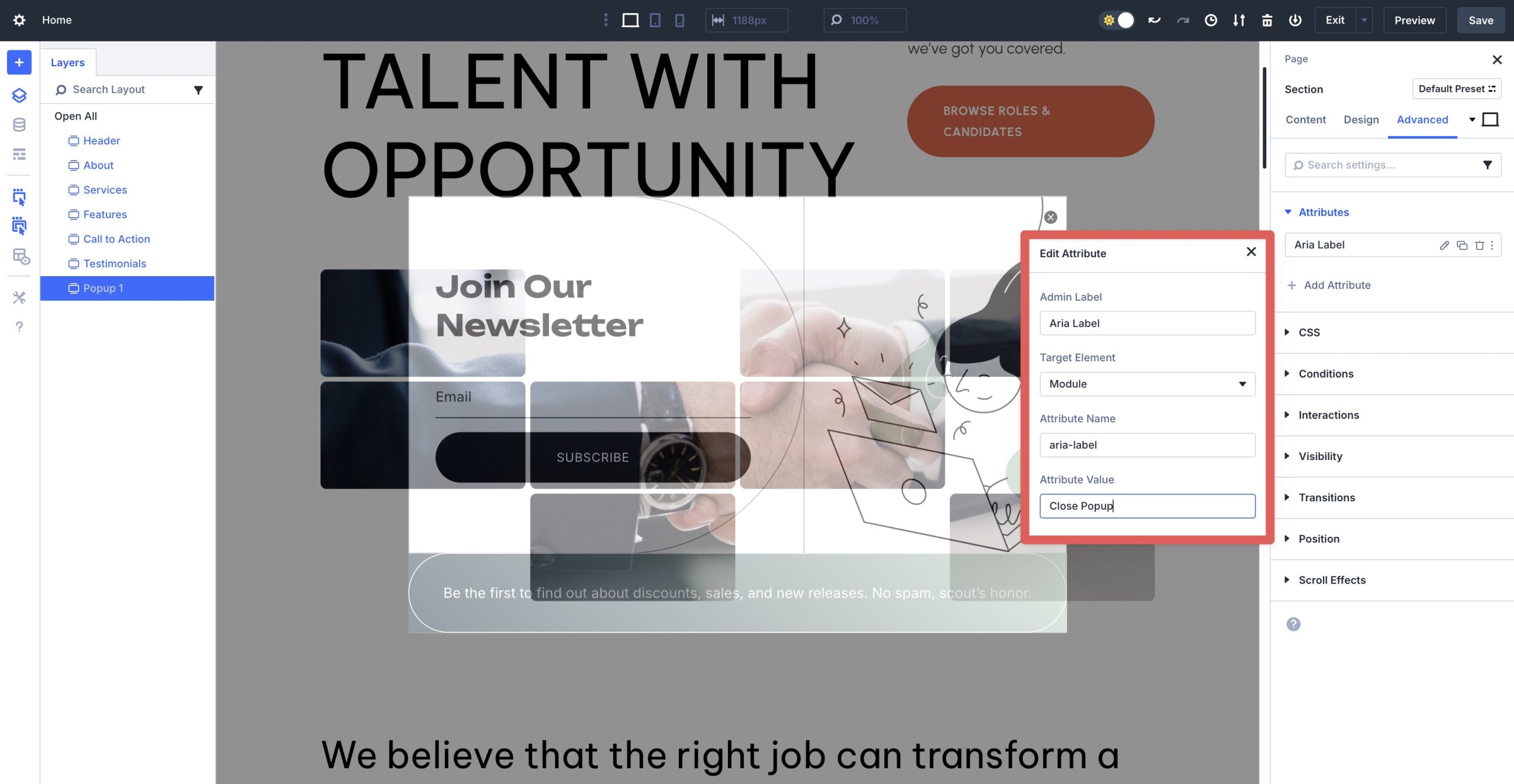
5. Use Attributes For Targeting & Accessibility
Each close button in this pack already includes a custom “close” attribute you can target in Interactions (for example, a data attribute on the close element). You can add your own in Advanced → Attributes. Add an accessible name as well — e.g., aria-label = “Close popup”.
6. Connect Your Email Form
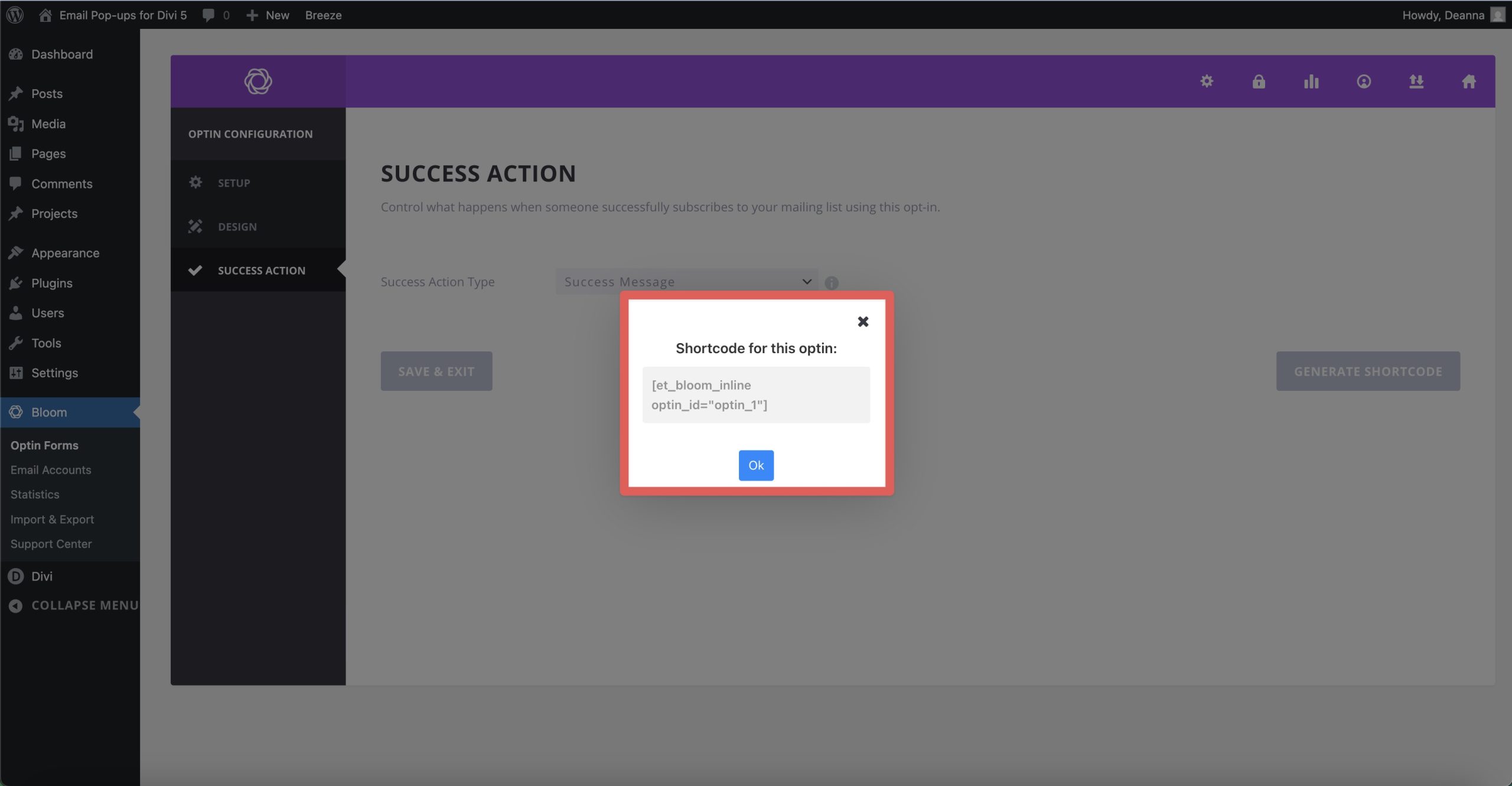
Use the Email Optin Module to connect to your provider and map fields. Prefer Bloom? Replace the form with a Bloom shortcode inside the popup content. Keep the CTA short and benefit-driven.
Use Divi 5 To Build Email Popups Today
These 6 pre-styled popup sections are a fast way to add lead capture to your Divi 5 sites. Import, connect your form, set an Interaction trigger, and you’re live. Interactions handles the show/hide logic so you can focus on design.


What is the preferred method for handling a full overlay pop-up section in the Divi Builder? Even if half-transparent, I find it makes further editing of the page quite annoying.
To handle a full overlay pop-up section in Divi Builder more easily during editing, add this CSS to your pop-up section’s Free-form CSS, in Section Settings > Advanced > Custom CSS > Free From CSS tab > CSS:
.et-fb selector {display: none;}This hides the pop-up in the builder, making page edits smoother while keeping the overlay active on the live site.