
One of the elements that’s responsible for grabbing your reader’s attention, and keeping it, is typography. If your fonts are boring, too small, or too difficult to read against your backgrounds, your visitors are likely to go find something else to read. In this article we’ll look at 8 Divi websites with awesome typography to help inspire you for your next Divi design.
One of the things I noticed when researching for this is I gravitate toward large titles and color. I like the colors of the fonts and how the colors blend with the website. I also like block and script typefaces, and they can even look good together if the situation calls for it.
Some of these websites have excellent font pairing while others use a typeface that’s unique. I’ll show an image of the section I like and discuss what I liked about the fonts. The websites are in no particular order. Hang around until the end for a few links to help you level up your own awesome typography.
1. A Conscious Collection
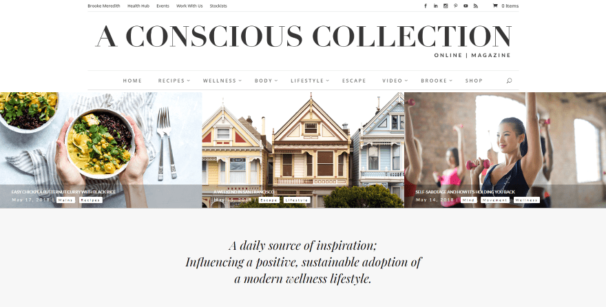
This site uses Playfair Display for both the header and body text, and an elegant font for the logo. The titles also look elegant, which helps set the tone of the magazine, and I like the use of italics for taglines and quotes. The black letters look good against the white and light gray backgrounds. The typography gives this site a series, but not boring, design that lets you know what type of website this is at a glance.
2. RSVP Wedding
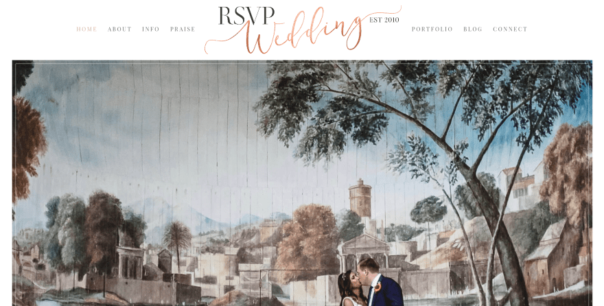
This one uses Playfair Display SC for the headers and testimonials, and Lato and Cardo for the body text and other quotes. It also uses an elegant hand-written script for the logo with a nice gradient to color the font. The elegant colors fit perfectly with the wedding theme of the website, using either tan over white or white over tan for most of the title text.
3. One Big Road Trip
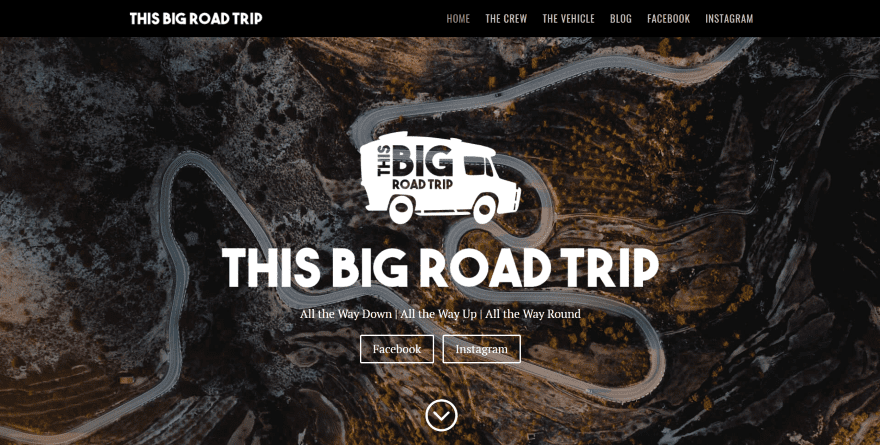
This site uses Oswald for the headers and PT Serif for the body text. One thing that stands out to me is the font in the logo, which looks similar to Saveur Sans and has cut-out text so the background shows through. I also like the yellow text for the blog post titles on the blog page, which stands out perfectly from the overlay on the post image and works well with the website’s black background.
4. Carolyn Groombridge
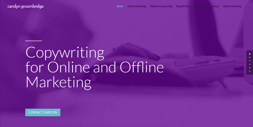
This site makes great use of the Loto font. The large white text looks great against the purple and greenish-blue overlays. Titles are extra-large, standing out and drawing attention to the various sections. Purple is used to make the most important services stand out. The pages bring the titles in using a typing effect. Once the title is there it remains on screen. I love the way the services pages use large text in the left column as a short description of the service.
5. Saint Benevolence
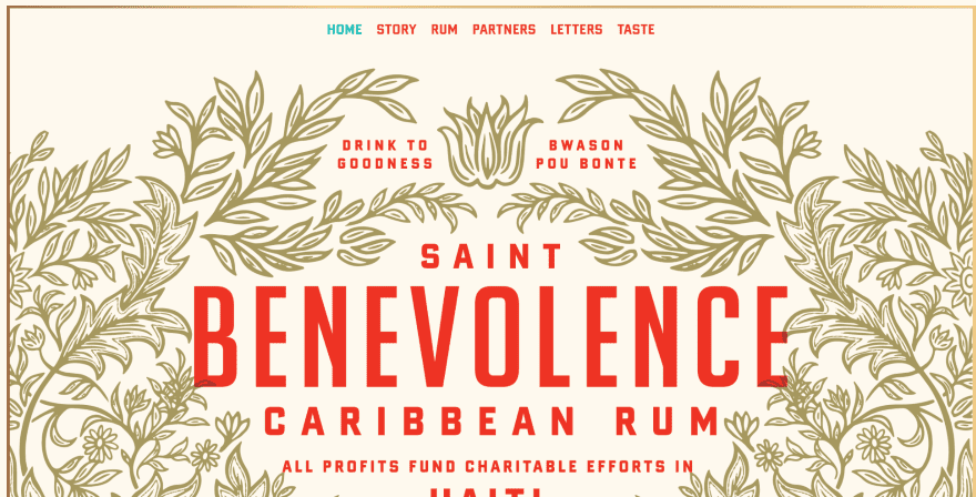
This one uses a combination of red Banque Gothic fonts for headers and gold Scheherazade fonts for the body text, which perfectly match the labels on the products. Both the red and gold look great over the tan backgrounds. I’m surprised at how easy the gold is to read against the tan. Extra spacing is added between the letters and the words to make the text stand out.
6. Bari in Jazz
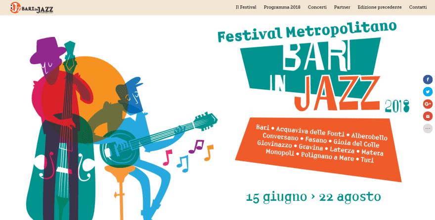
This site uses a font called Amp. It includes text that’s tilted and placed within an orange trapezoid box that fits within the branding of the website. It also uses Amp for headings within each of the sections in either orange, green, or white – fitting perfectly within the backgrounds. I love the use of typography within the site’s logo in the menu as well as within the hero section.
7. ideology
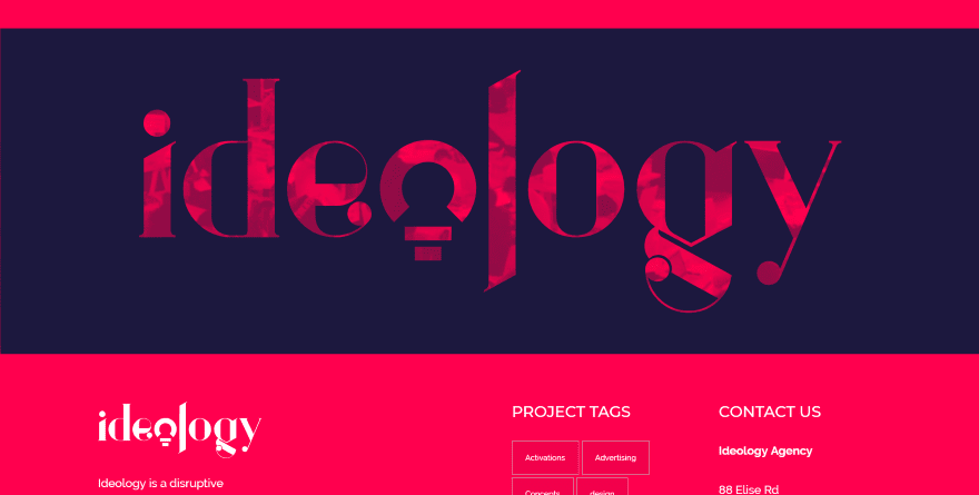
This site uses Railway for the body text and Montserrat for the title text. The titles have a touch of extra space between the letters and are in all-caps to make them stand out. My favorite use of typography on this site though is the large graphic that creates the site’s title. This is used throughout the site including in the footer to create the logo. My favorite version of it is a full-width section that has the text as a cutout to show the background in parallax over an image with a red overlay.
8. Indsgn
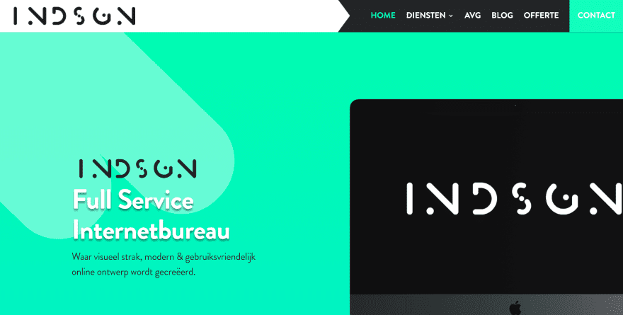
This one makes interesting use of typography within its logo design, which is used throughout the site within titles and graphics. It includes font families Alxna for the logo, B Bold for the titles, and B Regular for the body text. The tagline in the hero area uses white text with a shadow effect to stand out. Titles over white backgrounds are in green or black. The services pages display the title text as a description and overlaps the images.
Ending Thoughts
That’s our look at 8 Divi websites with awesome typography to help inspire you for your next Divi website. There are lots of articles here at the ET blog for even more help with your Divi designs. A quick search for fonts here at the ET blog shows just how popular and important this topic is. Here are just a few:
- 5 Cool Design Examples that Demonstrate the Power of Divi’s New Font Options
- 50 Typography Terms Every Web Designer Should Know (And Understand)
- 15 Essential Typography Books to Improve Your Design Craft
- 10 Typography Trends to Look for in 2018
- 20 Hipster Fonts to Give Your Site Folksy Charm
- How to Use Downloaded Fonts in WordPress without a Plugin
- How to Add Typekit Fonts to WordPress
- 30 Best Handwriting Fonts for Web Designers
- How to Create Your Own Font (In 6 Simple Steps)
- Font Pairing in Web Design: 7 Key Principles Revealed and Explained
- Free Divi Font Combination Layout Pack: 1 Beautiful Layout Design, 10 Ideal Font Pairings
We want to hear from you. Which of these websites with awesome typography are your favorites? Let us know in the comments.


I agree that typography is very important to ensure the readability of the website. Some website owners are having a hard time choosing the right fonts to use because they wanted their sites to look more creative and interesting. In their effort to choose the right fonts, they sometimes fail to see the best fonts to use. These websites look interesting and informative! It provides great insights in terms of typography because they have to use the right colors and effects that guarantee readers’ interest over the content and the website as a whole.
Real nice examples for typography use.
Downside is loading times go up 2 to 5 seconds.
Thanks for this list I was inspired by #2, #6, #5 and #8
hi guys, thanks for the post today, just saying; you have the link wrong for one big road trip. Its thisbigroadtrip.com
Hi,
No.4 uses Lato font where as you have mentioned Loto font. I think typo..
I think he’s onto a winner with Loto.
I would definitely add punkgraphic.com to this list
The website logo area looks SOOOOOO great on Desktop. WHY DID they not make sure it looks great on tablet and mobile??
Fix your link for #3.
I say #8 and #6 have the best font work. #5 has solid font and color parings.