
The internet changes so quickly and so often that web designers can barely keep up. What works for clients and converts well one month might completely falter the next. So we have to keep up with trends, specifically with typography because it is so foundational to every single project we work on.
2018 is pretty exciting, honestly, because there are some trends that we’re seeing that may just shake up what we’ve taken for granted over the past few years.
Let’s take a look at what this year has in store for us!
1. Broken & Chaotic
oneandall.io/
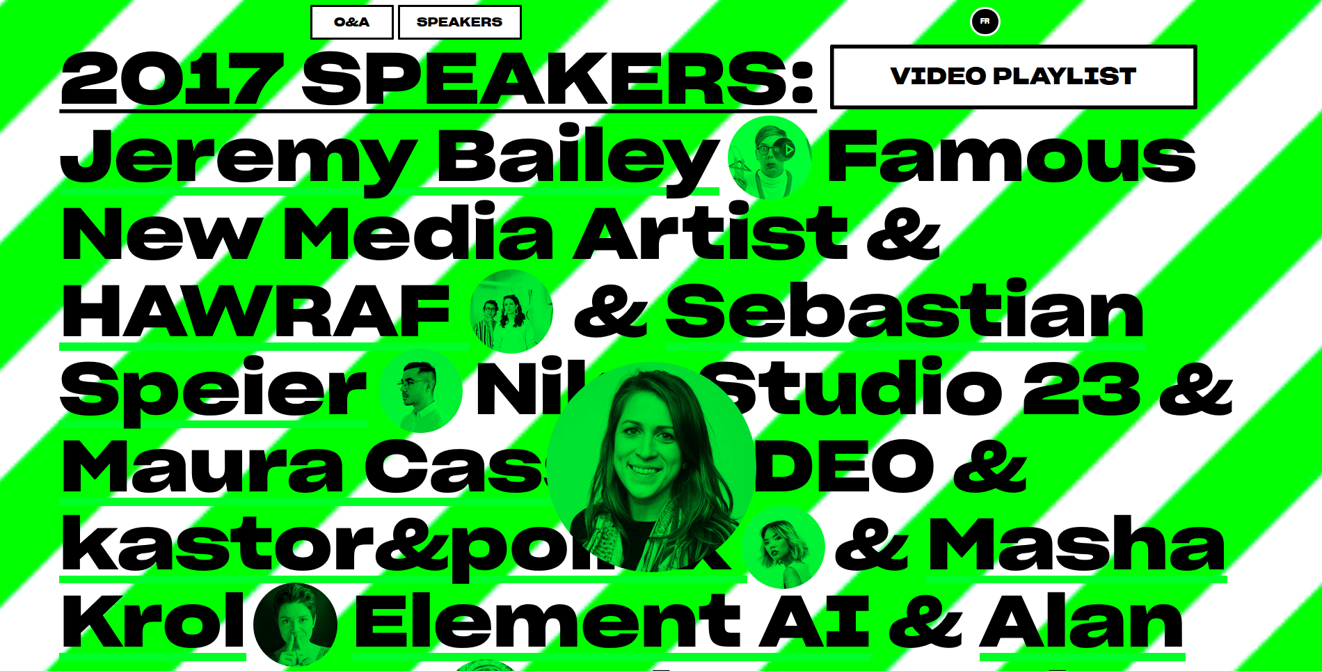
The clean, simple web of yesteryear is gone. In its place are large, flashy, chaotic, broken layouts where the user might be a little overwhelmed. At first, you might think this trends is a little overpowering, but in reality, users get drawn in by the chaos and tend to explore sites that spark something creative in them.
2. Serifs
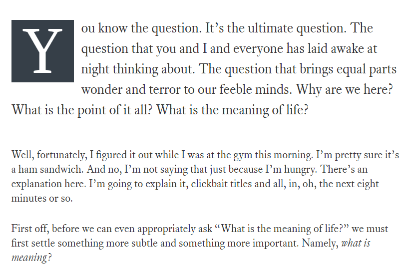
markmanson.net
Again, moving away from the stark and clean lines of minimalism, serif fonts are coming back into trend to add more warmth and character to the web. As storytelling and human connection becomes more prevalent in branding and commerce, serif fonts are a good way to add both elegance and sophistication to your work. Often you’ll pair a sans font with a serif font if you’re trying to convey an approachable business tone, but if you decide to go with a dual serif, your readers will definitely get a cozier feel from you.
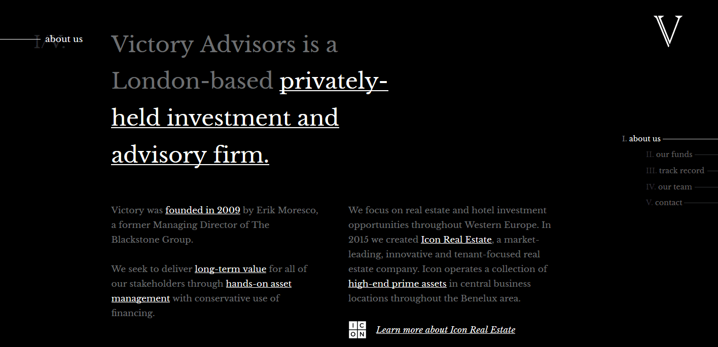
victoryadvisors.com/
3. Cutouts and Overlays
latinmedios.com
Big, bold, and bright. That’s how 2018 is going to be remembered. And while the cutout lettering and overlay type didn’t get its start in 2018, we are definitely going to see it gain momentum and move toward the spotlight. More and more, we are going to see parallax backgrounds, animated effects, and stunning photography either overlaying the text of a site or sitting a bit behind it as a background.
t-pohlmann.de
4. Highlights
biron.io/about/
Whether it’s a color highlighting part of a paragraph, underlining a single word in a sentence of headline, or using a separate font altogether, making individual elements of your typography stand out is definitely on the uptick. We will see a lot more sites drawing users’ attention to desired areas through typographical means more than traditional design.
Instead of white space and eye-catching illustrations, designers in 2018 will simply highlight what they want you to click on and read. Kind of like your teachers did on the chalkboard back in the day when they triple-underlined something for importance. What is old is new again, right?
Backchannel
5. Variable Fonts
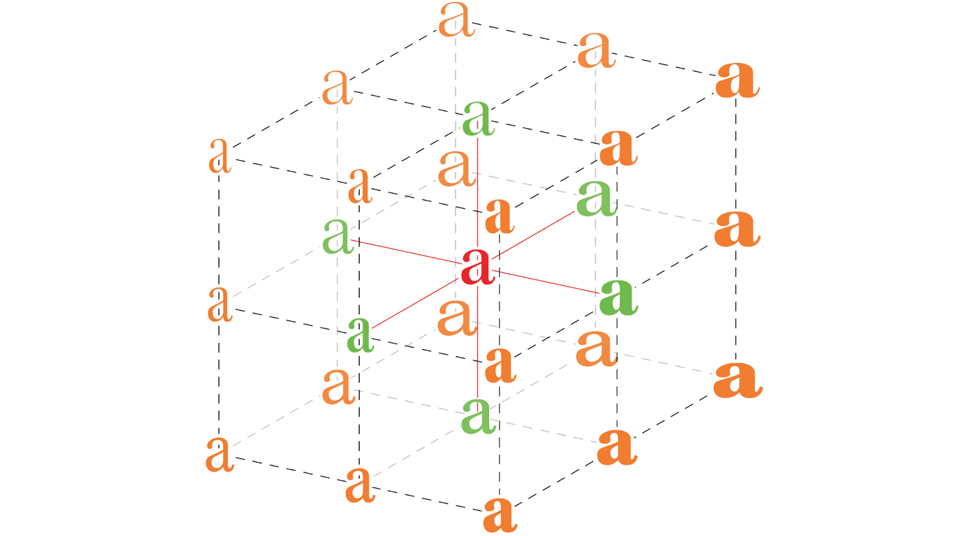
3-axis variable font
One-size-fits-all might be okay for hats and freebie sweatshirts, but it is certainly not okay for fonts. And sometimes, just having bold, italics, and “regular” fonts aren’t enough. Enter, variable fonts. Basically, this is scaling type with different weights and axes. You can totally customize every last iota of your typography now.
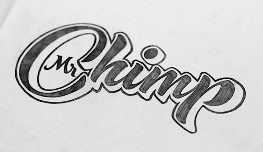
6. Hand-drawn Lettering
Year after year, this one just keeps coming back. Of course, in 2018, it’s not only handwriting-style fonts, the trend will be legitimately hand-drawn lettering. We are going to see a lot of sites that not only use hand-crafted fonts that are an idealized version of someone’s handwriting, but also unique, hand-lettered logos and headers. By that, I mean that instead of a font or type, you’ll see a legitimately one-of-a-kind creation.
Ged Palmer
7. Gradients
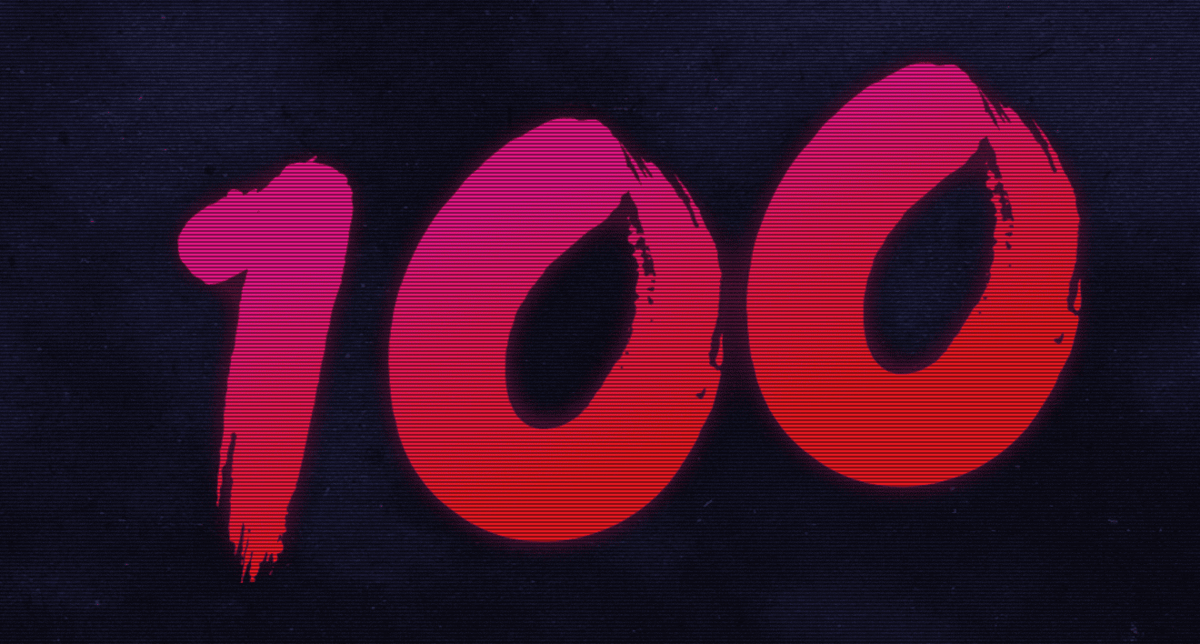
lucasbigot.com
Gradients are everywhere these days. When Instagram changed their logo background to a gradient, the internet collectively gasped. And now, it’s just another thing that happened. And as the web has become more used to gradients as backgrounds, it was only natural that the effect moved into the type itself. 2018 typography trends are leaning heavily toward having the lettering itself feature the gradient rather than the background. Depending on the site, obviously, it could be for a three-dimensional effect or just simple stylization. Regardless, expect much color in 2018.
Of course, background gradients are getting an upgrade, too, and they’re being called color transitions more and more often. Combine them together with lettering, and you’re totally ahead of the curve.
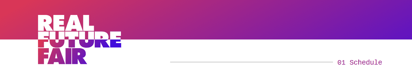
8. Maximalism
resn-experiments maximalist menu
On the opposite end of the minimalist spectrum is maximalism. If you didn’t guess it already, the trend of making your typefaces large, in-your-face, and pretty unmissable is coming into vogue much more than it was previously. Instead of simple, small, clean layouts, we are seeing an increase in large, bold, clean layouts. They still work on simplicity to function and on effective use of whitespace, but the tone is entirely different than users may expect. In some ways, I can see this being seen as maximalist minimalism.
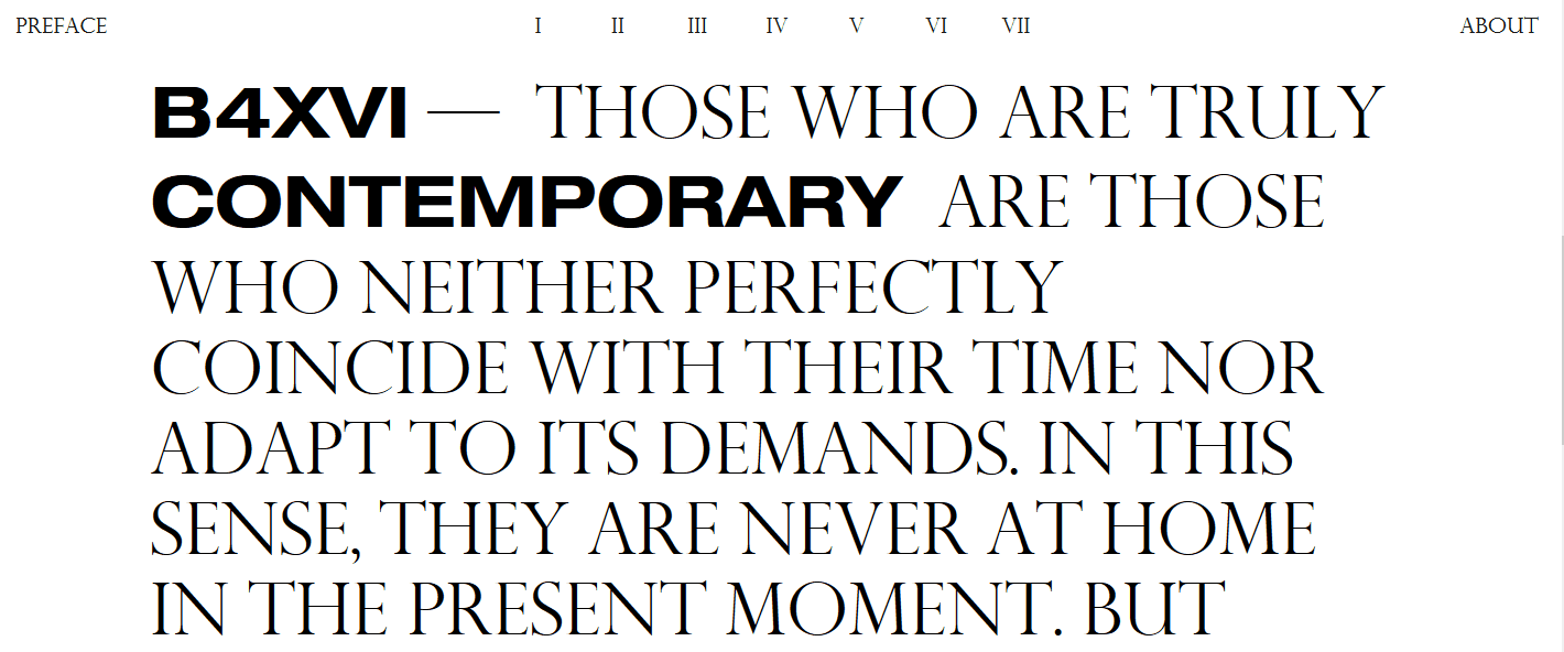
b4xvi.com
9. Hiding Content
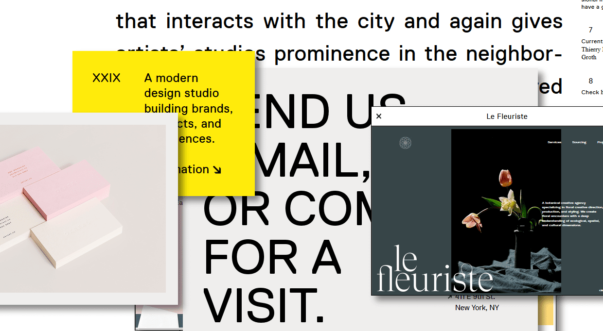
XXIX.co
Weirdly enough, hiding the stuff on your website is becoming trendy in 2018. The caveat here, however, is that the hidden elements must still allow the remaining content to be legible and understandable. If you cut out part of a letter or letters, the message of the type cannot be lost. It’s a razor’s edge here, folks, because if you do it wrong, not only do you eliminate the content of the site and alienate your user, but…it’s also ugly. However, when it’s done right, it just works.
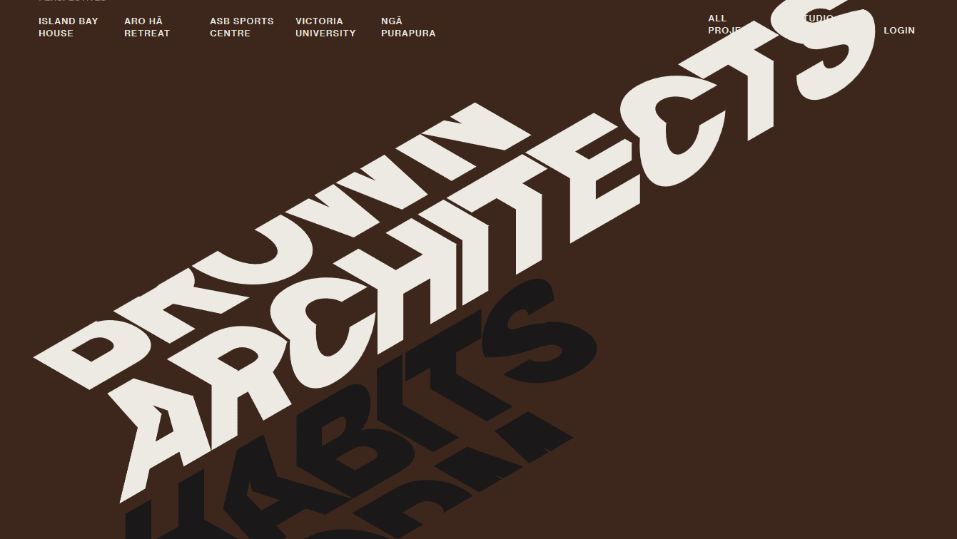
Tennet Brown Architects
10. Off-Kilter Kerning
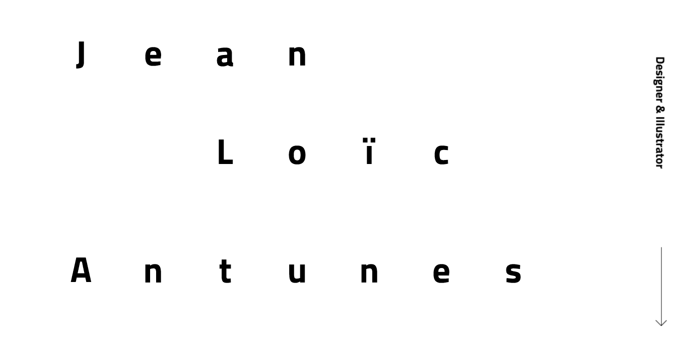
jlantunes.com
We take the space between letters for granted. As readers, we just expect things to be symmetrical, readable, and uniform. But 2018 will likely see a change in kerning styles, adding a lot more space between letters to give websites a clean and open feel that cramped lettering just can’t provide. This abnormal use of kerning–to put the letters at word-width apart–can be used to help retention rates and make your users feel more comfortable and languid as they spend time on your site.
The Next Big Thing?
Those are some of the big trends that we see coming in 2018. We here at Elegant Themes think that it’s important to stay on top of these trends so that the content and value that you bring to your clients stays as state-of-the-art (literally in this case) as possible. What’s really interesting, too, is to look back on the trends from a couple of years ago and see the evolution of what was successful and what fell by the wayside.
So what do you see on the horizon for typography trends in 2018?
Article featured image by Sentavio / shutterstock.com


Was that “Brown Architecture” example created in CSS? It looks amazing.
Thanks for this post. I was really ready to start building more-of-the-same clean minimal sites just this week.
Is it possible to get the gradient / parallax effect in #7 as seen in the example you gave?
I meant using Divi?
I worked it out!
Is there is any free tool or plugin for creating “Cutouts and Overlays” type typography?
Thanks for sharing such useful article. And please share if there is any tool.
The horrors of trends !! LOL
Let the kids play I say !! ha ha
I think these are great to catch viewers’ attention immediately. But they are only good for the first glance. The subsequent contents should go back to “normal” typography. I don’t think people can stand reading information about something with these designs for more than a paragraph.
Nevertheless, they are cool looking and creatively thought out designs. From a non designer like me, these designs caught my attention. Now all the web owner has to do is tell me what is they want to tell me, with regular fonts. 🙂
I agree. I could totally see myself using many of these in post headers or landing pages, but stick to typical readability trends in specific content.
I absolutely concur with you. A portion of the textual styles you share are entirely great and might be loved by many individuals too.
I love typography! It’s definitely something I focus on when I’m going through my design process.
Anything that gets in the way of clarity at first glance is bad for whatever content follows. Trendy? Perhaps just messy.
“What works for clients and converts well one month might completely falter the next. So we have to keep up with trends,”
Surely we’re designing sites that need to last several years, not just until next month. Going with the latest gimmick seems totally counterproductive.
If you had to have just one typography app that would allow font alteration and a good font library, what would you recommend?
In terms of alteration, I would think Adobe Illustrator is the way to go for creation and alteration (please correct me if I am wrong), and I tend to just fall back on the Typekit libraries for mine, but I am not doing this day in and day out as my main focus. https://typekit.com/
Interesting without disregarding other comments!
I see where 2018 is going (from all those predictions trending now) and I personally don’t think it will be a big deal, this will be for some sort of trendy-design-focused type of projects. But I doubt that serious website will follow this.
I don’t see any of this going mainstream.
I think the ones I see the most are serif typefaces in far more places than I did in previous years, hand-written fonts (especially for local businesses catering to a younger demo), and variable fonts. I think we’ll all be using variable fonts to some degree or another by 2020.
Unless you grew up in avant-garde Europe, serif is your default font for reading. Of course it’s easier. Ask John McWade.
First let me say that there are many blogs out there and Elegant Themes produces some of the most informative posts. Today is no exception, I have a different opinion the first item.
1. Broken and chaotic, no. Flashy and busy, yes. The bright green is “loud” but the diagonal pattern is highly regular. Even the horizontal green lines make sense and contribute to the pattern-ness of the diagonals.
The small round images punctuate the the text rather than break it up. One larger image covers some of the text in a Gestalt way that is intriguing, not chaotic. The monochrome/green treatment compliments the overall green/white/black color scheme.
Three black-bordered boxes (buttons) are two different sizes but they look to be the same aspect ratio (I didn’t measure). Although there are lowercase and capital letters, they share the same font—different but harmonious.
Rather than being overwhelmed or overpowered, users are drawn in by the pattern and they zero-in on the larger Gestalt effect in the lower center. The weight of it is well-balanced by the three boxed white buttons at the top.
Yes, it is not clean and simple. But it is exciting, organized, and pleasingly patterned.
PJ, I disagree. I did NOT ZERO in. My brain told me this was too difficult to read and so I moved on.
Unfortunately, that happened with ALL these sites. I moved on. Which prompted me to write!
I remember when WIRED started doing this wild font stuff(let me call it crap). I stopped my subscription.
And BJ, you talk like a clueless designer when you say things like,”But 2018 will likely see a change in kerning styles, adding a lot more space between letters to give websites a clean and open feel that cramped lettering just can’t provide. This abnormal use of kerning–to put the letters at word-width apart–can be used to help retention rates and make your users feel more comfortable and languid as they spend time on your site.”
When I hear designers say this sort of BS, I realize they have NO IDEA how the brain works when it comes to reading. When type doesn’t follow the rules we learned to read with, the brain HAS TO transfor words letter-by-letter into serif black and white standard leading and kerning. It HAS TO. It is impossible to learn anything new without something old on which to hang the new.
And OF COURSE, the purpose of any site that isn’t a portfolio of visual images, is to get the surfer to READ THE WORDS and DO WHAT THE WORDS SUGGEST. What the designer/writer/owner wants you to do. And that does not include remarking how clever he/she is.
If you can’t hum it . . .
All this stuff is sort of like listening to Ted Nugent shred a guitar and telling me he can really solo. If you can’t hum it or sing it, it’s not a melody and thus NOT a solo. The same sort of thinking will ALWAYS apply to reading. Or at least until the younger generation who can’t type, can’t spell, doesn’t read newspapers or books, tries to take over.
But there is hope. My son is 40 and he grew up listening to rap and hip hop. I, of course, was on old guy listening to Simon and Garfunkle, The Beatles, and The Stones. Today Matt owns ALL of Simon and Garfunkle’e albums and listens to then on a turn table. And so does his 16 year old son.
But these trends? They are basically Ted-Nugent-watch-me-doo-doo-doo-my-thing.
I’m actually ok with some of Ted’s stuff but I can’t hum a lick.
The number one thing all web designers and graphic designers MUST keep in mind is that the design (in this case, typography) must never get in the way of the content.
Sure, a catchy typography design might cause someone to pause and look more closely, but if a site visitor cannot tell what that site is about in one second or less, they’re gone.
What this means is that you MUST have enough legibility-on-first-glance to make people stay past that first second.
One example of this above is the off-kilter kerning screenshot. I wonder how many people reading this can tell me right now what that one said? How many took the time to take it all in? If a client of mine wanted something like that, I would strongly advise them against it. If a contracted designer came up with something like that, I’d send it back and tell them to make it more legible.
Second, What Goes Around Comes Around.
Those of us who are not bright-eyed, ambitious, conquer-the-world-of-websites newbies have seen most of these typography and design techniques (some of them are simply gimmicks) before. For example, the first logotype I designed with a gradient was in 1998, and I was far from the first one even back then. I did another logo with gradient in 2004, and that one is still in use today.
Bottom line here, as was pointed out not long ago – good design is timeless. Your website designs should be, too.
Good point David from Mississippi! But, your proven tactics go against what they are promoting above;
(quote), “Weirdly enough, hiding the stuff on your website is becoming trendy in 2018.”
HA Ha HA LMAO can you believe this?
I guess if you are competing with this new 2018 trend or fad, your job is going to get easier plus you’ll make more money.
Thanks again David… spot on.
Pretty much the only part I agree with is “good design is timeless.”
Most of the rest I disagree with.
First, good design is part of making the content better. I’m not saying the designs shown here are necessarily good design. I just disagree with the general thought that “design” is separate from “content” or “function.” It’s not something done deliberately, it should be the philosophy behind everything that is done in the creative process.
Second, although it may seem like designs repeat themselves, I think there’s always something new that makes it more fit for the current times, and it’s knowing what the difference is that keeps the designer up-to-date. There are many styles that come back and go away. The trick is to keep it fresh.
That off-kilter kerning didn’t offend me as much as the “broken and chaotic” and “hiding content” examples, to be honest.
I can deal with hidden content on quirky sites. I don’t mind playing around and finding it once in a blue moon. But if everyone started playing Hunt The Login, it’d be a big issue, and I am seeing more and more of that, unfortunately 😉
I am right with you, David. I see a lot of site where the design gets in the way of the content, and I am one of the internet users who sees that happen and immediately leaves. I love the idea of these trends, but I am so curmudgeonly in my personal internet use that I won’t deal with these newfangled sites if I can’t read it well, haha. 😉
I totally agree with you. Something trendy doesn’t mean is good, or it works everywhere.
Also, what a website is about should be clear at first glance. If not, people just go out.
Some of the fonts you share are pretty good and may be liked by many people as well.
Damned, I´m so 2016.
These technology trends will helps to build better web experience..keep sharing this kind of information
#1: Ah yes, the good old technique of “Let’s make our content difficult to read and comprehend, that will surely boost our sales and UI satisfaction!”.
HAAAAAAAAA I feel the same way. Don’t forget to use extra unnecessary meaningless words unrelated to anything earthly to describe your nothing service or product.
I think we’re too old for it to work on us. Like Snapchat making the app harder to use for people who aren’t there target demo, haha
#1 is missing Comic sans Font. Comic Sans makes any website better.
#1 is brilliant. The busy-ness puts all the attention in the contrasting simple buttons. I just want to click them and go there, or anywhere else.
Richard, you know the joke, right?
Comic sans walks into a bar. Bartender says, “We don’t serve your type here.”