
We all started blogging because we wanted to be heard, right? And whether we are blogging for fun, to inspire, or to make money, without an audience your blog is nothing.
But what happens if your audience isn’t consuming your content in the quantity you were hoping? Most bloggers either give up or start pointing fingers at their blog’s design or the quality of their content.
But what if the problem was more straightforward? Perhaps the issue isn’t your writing at all, but rather the way that your words are formatted.
In today’s competitive environment, first impressions are everything. With so many quality blogs out there, readers can afford to be choosy. And, if your content is awkwardly formatted, painful to look at, and difficult to read, well, most people aren’t going to stick around for long.
Fortunately for WordPress users, this is a relatively easy fix. Just implement the tips below!
-
1
10 Tips to Increase Blog Post Engagement
- 1.1 1. Use Short, Snappy Paragraphs
- 1.2 2. Use Subheaders
- 1.3 3. Use Numbered Subheaders
- 1.4 4. Use Bulleted Lists
- 1.5 5. Use – but Don’t Overuse – Bold and Italics
- 1.6 6. Use the Blockquote Button
- 1.7 7. Choose an Eye-catching Font
- 1.8 8. Use Table of Contents for Interlinking Posts
- 1.9 9. Take Style to the Next Level
- 1.10 10. Test, Test, Test
- 2 Final Thoughts
10 Tips to Increase Blog Post Engagement
Today I want to share ten tips for formatting, styling, and organizing your content. If you want the perfect platform for maximum content consumption, read on!
1. Use Short, Snappy Paragraphs
Most internet users read blogs as a form of entertainment. They certainly don’t want to feel as though they are back at school reading a textbook.
As such, keep your paragraphs short, so there’s lots of white space on the screen. There’s no golden rule, but if your paragraphs are more than four or five sentences long, you should consider breaking them up.
You can go too far in the wrong direction, though. Too many one-line paragraphs can make readers feel as though they’re reading a poorly formatted bullet list.
2. Use Subheaders
Online readers have a tendency to skim content to find the bits that interest them the most. To make your content more “skimmable,” you should use lots of subheaders – also known as H2, H3, and H4 tags.
Feel free to use different sized subheaders, too. H2 tags should be used to mark your top level subheaders, with H3 tags used for sub-subheaders, and so on.
Be consistent with the capitalization of subheaders, too. Personally, I prefer title case. (If you’re not sure how to write in title case, use this free tool.)
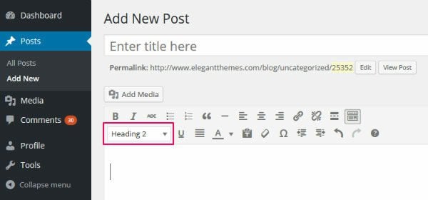
3. Use Numbered Subheaders
While we’re on the topic of subheaders, have you noticed that the internet has gone crazy for list posts?
- Ten Ways to Shed Weight
- Six Steps to Six-Pack Abs
- Eight Strategies to Grow Your Email List
Why are list posts so effective? Well, one of the main reasons is that breaking a desirable “end goal” down into a manageable number of steps makes the process sound simple. These posts also promise a lot of bang for your buck – eight strategies in one post is better than one, right?
Take advantage of this, and add a few list posts into your content schedule. After all, it’s remarkably easy to turn content into a list: just add a few numbers to your subheaders and title.
Don’t go overboard with the list posts, though – if every post is a list post, it gets a little repetitive.
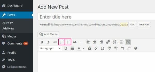
4. Use Bulleted Lists
Online readers love to skim content, remember? As such, it’s always wise to format your content in a way that enables skimming.
If you want to present lots of points or concepts in an easily digestible way, nothing beats a bulleted list – a much better solution than several paragraphs of text. And, depending on the information you’re trying to present, both bulleted and numbered lists work equally well.
Use bulleted and numbered lists by clicking on the icons in the WordPress visual editor.
5. Use – but Don’t Overuse – Bold and Italics
By now, we all understand the importance of creating skimmable content. And one of the best ways to attract a reader’s gaze towards key words and phrases is to use bold and italics.
Generally speaking, here are a few good rules to follow when deciding whether to use bold or italics:
- Use bold to draw attention to key words and phrases.
- You can also use bold for highlighting the first sentence of a new point you’re making (if you’re not using a new subheader).
- Use italics to put emphasis on an individual word.
- You can also use italics for foreign words/phrases and the names of things – like books, movies, and TV shows.
However, some bloggers, upon hearing they should use bold and italics, take this a tad too far. They end up with posts covered with bold and italics.
There’s a major problem for anyone being overzealous with the bold button, though. By highlighting the majority of your page, it has the same effect as highlighting nothing at all. Bold almost everything, and your readers will be unable to pick out the key phrases.
Another way to draw attention to your key points is to use the blockquote button. In the WordPress visual editor, it looks a little something like this:
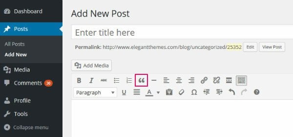
Although primarily intended to be used for literal quotes, many bloggers have recognized a blockquote is a great way to add emphasis to a major point. Because they command maximum attention, they should be used far more sparingly than bold and italics, though.
Want to see what a blockquote looks like in action? Here you go:
Blockquotes are an awesome way to highlight your post’s central point.
You could also consider installing the free Click to Tweet plugin. This allows your readers to tweet the content in the blockquote, which is an excellent way to gain traction on social media.

7. Choose an Eye-catching Font
On the face of it, the font used on your website might not seem like a big deal. However, I think that choosing the right font is actually rather underrated.
Of course, a stylish font won’t save bad content. A bad font, on the other hand, can certainly ruin good content.
Now, I certainly wouldn’t recommend going too extravagant with your font selection – I can’t think of a single blog that would benefit from using Comic Sans for example.
But I also believe webmasters don’t give enough consideration to their font. After all, your audience will spend a lot of time looking at your chosen font, and the choice will determine how effectively they can digest your content.
Some blogs create a memorable first impression with a stylish font – a perfect storm of font face, size, and color that just works for that blog. Others instantly repel, as a poorly chosen font makes reading content too much hard work.
Unfortunately, I can’t give you the perfect answer for which font you should use. You should aim to match your font to the tone of your blog, though – a vintage blog may try to use a vintage-style font, for example. If you want to view an excellent collection of fonts you can use on your blog, here are some of the best free web fonts.
Also, remember that it isn’t just the font type that matters; size and color are important, too. Here are a few pointers I recommend sticking to:
- If the font is too big, it can look childish and goofy; too small, and it’s difficult to read.
- As for font color, most blogs go for black or a dark gray. My tip: play it safe – this isn’t the time to be experimenting with a garish red.
- Don’t go overboard with too many different font types either. If you don’t know which fonts go well together, it can make a blog look clumsy.
You can install Google web fonts using a plugin, plus many WordPress themes have hundreds of them built-in – including Divi.
8. Use Table of Contents for Interlinking Posts
In my opinion, all blog posts should be capable of functioning as standalone articles. Even so, I like a bit of continuity, and I appreciate it when a blogger writes follow-up articles to expand on certain points or longer-term strategies.
Now, WordPress by default is well equipped for dealing with interlinking posts – it’s super-easy to add internal links, plus categories and tags allow you to group related content.
If you’re writing a series of posts, though, I recommend creating a table of contents at the beginning of each standalone article, linking to the other content in the series. This is a great way to encourage casual readers to navigate to the start of the series, then work their way through to the end. Not only will this result in more page reads for you, but it will also help your readers to get the most from the series, too.
If you specialize in long-form content, a table of contents can also be useful. Many readers won’t sit down and digest a 4,000+ word post in one sitting, so they need an easy way to jump back to the point they left off.
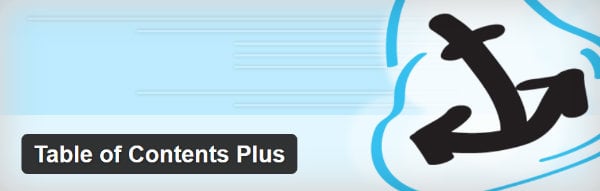
The easiest way to create a one-page table of contents is by using a table of contents plugin. One that we would recommend would be the Table of Contents Plus plugin. The moment one of your posts/pages hits more than a pre-specified number of headers, a table of contents is generated automatically. There are five skins to choose from, plus the option to create a custom skin for your table of contents.
9. Take Style to the Next Level
If you want to create super-stylish content that will blow your audience away, look no further than the excellent Aesop Story Engine plugin – available for free.

The plugin lets you add a number of stunning stylistic components to your content. This includes:
- Gorgeous full-page title images.
- Full-width images throughout your content.
- Parallax effects.
- Full-width blockquotes, with background color or image for added emphasis.
- Image galleries.
- Interactive chapters and automatic scroll-to points.
To see the full range of features, I strongly suggest you check out the demo site for some of the most beautifully styled content that you’ll ever see.
Elegant Themes users will also be pleased to hear that you can achieve the same results (and more) using the Divi Page Builder plugin. Again, it’s well worth checking out the demos if you want inspiration for what visually stunning content really looks like!
10. Test, Test, Test
As always, what works for one blog won’t necessarily work for another.
One blog’s audience might really respond to insightful, informative long-form content. Another blog’s audience might find long-form content a bore, preferring quick, to-the-point articles.
The same applies to most of the points discussed today – font, list posts, short paragraphs, etc. Just because something is generally accepted by the blogging community, doesn’t make it true 100% of the time. Until you’ve tested to see how your audience responds to something, you won’t know with any certainty.
Try organizing and formatting your content in different ways, to get a clear picture of what your readers want. You can use a tool like Google Analytics to track metrics such as time on page and page reads to test what approach your audience prefers.
Final Thoughts
Many webmasters spend weeks agonizing over their blog’s design and the content they’re going to write. However, very few give much consideration to what their content actually looks like on the screen.
In today’s post, we’ve taken a look at ten different ways you can improve the way your content is styled and formatted. If you have any more suggestions, feel free to share them in the comments below!
Thumbnail image via Jovanovic Dejan / shutterstock.com


Thanks for sharing that Aesop’s story builder that plugin. I just tried it out and I loved it!
For one of my courses in college, our professor required us to maintain a blog throughout the term. I have absolutely no experience in the art of writing a successful blog post, so your tips were extremely helpful! I particularly took interest in the Aesop Story Engine, I will definitely check that out.
I have a problem with the numbered lists. I know this tactic rules the blogging world, you see it everywhere. But I find myself just reading those subheaders and not reading the content most of the time. Especially if it’s not something technical, more of a common sense advice kind of article. For instance I did it with this one.
I think this is overused and personally if you have more than 5 subheaders I can guarantee you that I’m not going to be reading your content but just your subheaders. It just tells me that you didn’t put there a thorough analysis of that subheader but just some generic stuff.
I spent so much time on font-size e font-family!
Thanks for the tips.
Hi,
Thanks for the information. Do you suggest we leave the comments section available for readers to make comments?
Hey Shaun, Great post with full of information but I think you forgot to mention about info-graphics. These days images play a vital role in delivering information. People feel more exciting about the information which is being displayed as story points or images.
Big paragraphs are certainly boring even if these are having lots of information but using eye catching images one can easily convey the message which he wants to.
What do you think Shaun?
Very useful information, thank you!!
Great article! Reminded me to go and check the font-size for the articles on my site (and make it bigger), but also gave some really good layout ideas for future articles. And I really like the look of the Aesop Story Engine demo pages – they’ve inspired me to come up with ways to use those features.
This is very useful article. Unfortunately the ignored bugs in Divi cause most of the formatting suggested to be lost. It would be helpful if the tine and effort spent at ET was spent on fixing broken product.
Thank you for these tips! My question pertains to the Aesop Story Engine. I’ve just quickly looked at the template link and am wondering a couple of things:
Can the images be pinned?
Can my blog sidebar with advertisers, etc. be shown?
I’m sure with some hunting on their site I can find the answers, just gathering my thoughts here. Thanks!
Shaun very useful post. I liked the Aesop Story Engine plugin. Thank you for sharing valuable post.