Do you know the average length of content for pages ranking first in Google? It’s a massive ~2,500 words! And while we can’t know for sure whether that relationship is causative or correlative, the fact remains that longform content dominates the search engine rankings.
But when you create longform content, you can’t just throw up a 2,500+ word wall of text. You need to pay special attention to how your format your content so that your readers don’t get driven away.
In this post, I’ll give you some general tips to help you design great longform content that keeps your users engaged and reading.
Longform Content Offers Huge Benefits
I already talked about serpIQ’s analysis correlating higher ranking content with longer length:
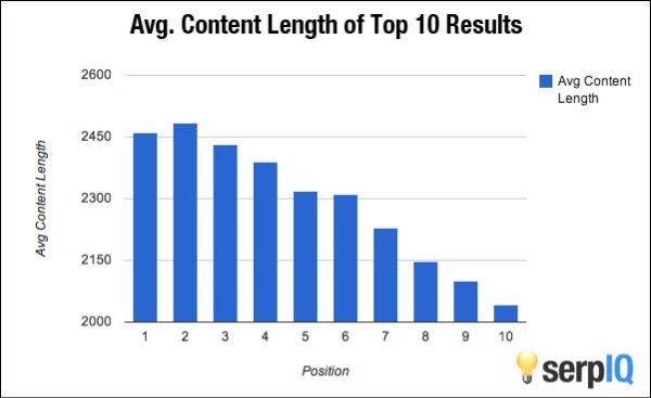
But taking advantage of that correlation is far from the only benefit of longform content:
- Longform content lets you create incredibly detailed posts to take advantage of Brian Dean’s popular Skyscraper SEO technique.
- People actually like reading longer content. Medium found that ~7 minutes was the optimum reading time for posts. That doesn’t mean you should make every post take 7 minutes to read – just that people don’t hate longer posts (as is often assumed).
- Moz found that longer content gets more links. Again, this data is correlative, but it does suggest that people view longer content as more authoritative.
If you’re convinced about longform content, here’s how you can design it to optimize your results:
How to Design Longform Content
While the exact design of your longform content always needs to fit your specific site, there are some general tips which apply to every situation:
Tell Readers What They’re in For
The Medium reading length analysis I linked earlier tells us that people don’t mind reading long content. But that doesn’t mean people want to be surprised with long content. It’s always nice to tell your readers exactly how much time they’re likely to invest in a specific piece. Maybe they’re on their Pomodoro break and only have five minutes!
Medium incorporates this exact technique into all of their posts with the “Estimated time” guide:

You can easily add something similar to WordPress with the Reading Time WP plugin. The plugin even lets you use shortcodes so you can add estimated reading time to Divi modules.
Remember to Leave Some White Space
If I had to suggest one overriding design principle for longform content, it would be this one. Many of the following suggestions will connect to white space in some form or another.
Walls of text are just plain intimidating. Put yourself in your reader’s shoes, would you ever read something that looked like this?
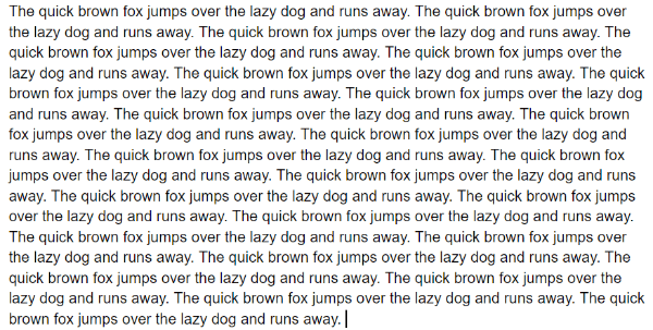
My eyes hurt just looking at that example! And it’s not just me, Jakob Nielsen found that making text more concise and scannable increased usability by 124% over the control group in his test.
Never feel like you need to fill the whole page with content. It’s okay to have a white margin around your content. Images can have some space to breathe. You can write short paragraphs and use large line spacing.
Mix Up Text With Lists, Pull Quotes, and More
One way to keep your text scannable (and incorporate white space) is to liberally use some of these elements:
- Lists
- Pull quotes
- Bolded text
- Italicized text
See what I did there? I used a list to break up my text! Isn’t that easier to read than saying “liberally use elements like lists, pull quotes, bolded text, and italicized text”?
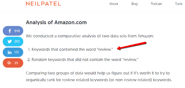
Neil Patel always keeps his content scannable by incorporating these tactics:
One of my favorite ways of breaking up text is “Click to Tweet” buttons. Not only do they generate a pull quote, but they also boost your social shares. CoSchedule always adds stylish “Click to Tweet” buttons to all of their posts:
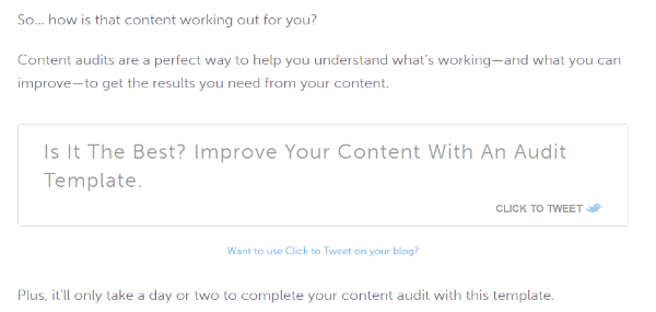
You can easily add these buttons to your own WordPress content with CoSchedule’s Click to Tweet plugin.
Add Lots of Images and Other Visual Media
You may have noticed this post, and most other pieces of longform content, includes numerous images. Not only do images help break up text and add white space, but liberal use of images also correlates with higher numbers of social shares according to BuzzSumo.
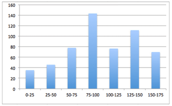
The Y-axis is number of social shares, the X-axis is “images per X words”.
One way to effectively use images is as examples to drive home your points (like I’ve been doing). But another worthwhile use of images is to bring in charts and graphs to help illustrate data.
Humans process images much more efficiently than text, so a chart or graph is a great way to help your readers understand complex data. If you don’t already have a chart, you can use a tool like Piktochart to easily create eye-catching illustrations.
And finally, custom illustrations add an air of authority to your longform content. Not only are they nice to look at, but they also signal that you invested significant time and effort into your longform content pieces.
Focus on Meaningful Headings and Subheadings
In the usability study I linked earlier, one of Jakob Nielsen’s suggestions for making pages more usable is “meaningful sub-headings (not “clever” ones).” Headings and subheadings grab readers’ attention and draw them through your content.
But in order to do that, headings and subheadings have to be:
- Used liberally
- Written to be both meaningful and attention-grabbing
One of my favorite pieces digging into subheadings is this short, but juicy, guide from Brian Clark at Copyblogger.
Include Multiple Calls to Action to Maximize Marketing Results
If you’re investing time into creating longform content, you probably have a marketing goal in mind. It might be getting readers to subscribe to your list, purchase a product, or any other type of action.
If you want your readers to actually perform those actions, you need to push them to do just that with a call to action.
But the problem with longform content is that it’s surprisingly easy for your call to action to get lost, or missed, when it’s mixed in with 3,000 other words.
For longform content, I’m a proponent of including three calls to action:
- One at the top
- Another in the middle
- A final call to action at the end
For example, you always get this call to action at the end of any Elegant Themes post:
By utilizing multiple calls to action in longform content, you maximize your chances of pushing your readers to action. And because your content is so long, three calls to action aren’t in any danger of overwhelming your readers.
Wrapping Up
Longform content correlates with higher search rankings and more backlinks. But you never want to be the writer publishing 3,000 words of pure text. Use these tips to create scannable longform content with liberal use of whitespace and images.
Keep your headings meaningful to promote scannability, remember to break up paragraphs with lists, quotes, and bolded text, and add multiple call to actions if you want to push your readers to action.
Now it’s your turn. As readers, how are your favorite pieces of longform content designed?
Article thumbnail image by Max Griboedov / shutterstock.com




And how about splitting 1 article so it comes in parts, where each one is another post? Not pagination but splitting into posts. Would it be seo-friendly? Do people like that? 🙂
One of the best articles I’ve read on the EE blog. Great links to in depth content, too.
FYI, the CoSchedule “Click to Tweet plugin shows this warning:
“This plugin hasn’t been updated in over 2 years. It may no longer be maintained or supported and may have compatibility issues when used with more recent versions of WordPress.”
I have had luck with structuring my long-form content:
Introduction
Summary Box
Estimated Reading Time
Table of Contents (clickable)
Body.
I feel that visitors appreciate it when you are being considerate of their time and helping them decide what to read.
It appears that some are reading the Summary and then picking some of the Headings to explore.
It also provides more locations and forms for keywords, and Google loves what appears to be organized content.
Great article Brenda.
Can you do an article on best curation tools etc.?
My understanding was you introduce the content…then paste a chunk of someone’s content and give them credit…then write your own conclusion and feelings etc.
Hi Brenda, Thanks for your informative post. Yes, I have seen my own posts that are quite longish are better received than very short posts. Especially when the long posts have lot of visuals, both images & videos, to enhance the reading. Correct formatting of a long post is also key to increased interest in the post.
Is there a divi module that works best for this?
Pages would be that long only for SEO purposes. Very few people would read a page that’s very long. In fact, I didn’t even read this whole post.
I would love to see a tutorial how to write and design beautiful multi-page-posts pr pages (with page breaks and navigation)
May I suggest that you use https://wordpress.org/plugins/better-click-to-tweet/ instead og using (or even recommending) a plugin that has not been updated in more than 2 years and are no longer supported?
Hi Brenda, thanks for the great post! I used to see the click to tweet text on some blogs but didn’t know what plugin is. It’s very useful to highlight some important info from the post and make them stand out from the content.