
The fonts you choose for your WordPress website play a huge part in the overall design. It’s not an afterthought by any means. Just change all of your headlines to Comic Sans if you need to see proof! Okay, that’s a bit drastic. But, with typography, even the smallest change can make a significant difference. Thanks to the web (and especially Google), there are a ton of free web fonts out there to help you pick the best one. It’s also easy to implement these fonts into your WordPress website using WordPress typography plugins. So, if you’re looking for a little inspiration or for a font upgrade of your current site, I highly recommend you browse the list below to explore some of the best web fonts the design world has to offer.
- 1 The Best Free Web Fonts
-
2
Here are 40 of the Best Web Fonts (And They’re Free!)
- 2.1 1. Roboto
- 2.2 2. Playfair Display
- 2.3 3. Open Sans
- 2.4 4. Montserrat
- 2.5 5. Merriweather
- 2.6 6. Lato
- 2.7 7. Bebas Neue
- 2.8 8. Noto Sans
- 2.9 9. Source Sans Pro
- 2.10 10. Oswald
- 2.11 11. PT Sans
- 2.12 12. Rubik
- 2.13 13. Nunito Sans
- 2.14 14. Fira Sans
- 2.15 15. Work Sans
- 2.16 16. Poppins
- 2.17 17. Josefin Sans
- 2.18 18. Ubuntu
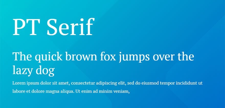
- 2.19 19. PT Serif
- 2.20 20. Muli
- 2.21 21. Arvo
- 2.22 22. Oxygen
- 2.23 23. Raleway
- 2.24 24. Noto Serif
- 2.25 25. Nunito
- 2.26 26. Archivo
- 2.27 27. Abril Fatface
- 2.28 28. Exo 2
- 2.29 29. Barlow
- 2.30 30. Slabo 27px
- 2.31 31. Aleo
- 2.32 32. Quicksand
- 2.33 33. Cooper Hewitt
- 2.34 34. Ostrich Sans
- 2.35 35. IBM Plex Sans
- 2.36 36. Cormorant
- 2.37 37. Alegreya Sans
- 2.38 38. Libre Franklin
- 2.39 39. Libre Baskerville
- 2.40 40. League Spartan
- 3 What about Script Fonts?
- 4 A Few Quick Tips on Font Pairing
- 5 Final Thoughts
The Best Free Web Fonts
Subscribe To Our Youtube Channel
Here are 40 of the Best Web Fonts (And They’re Free!)
1. Roboto
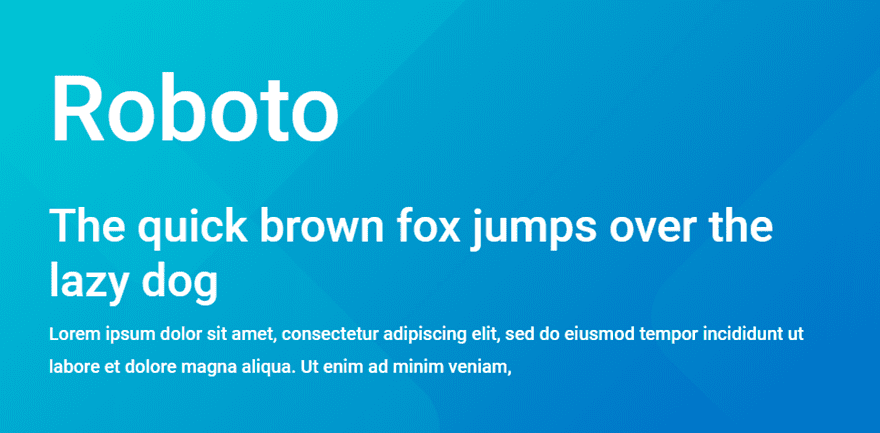
Roboto is meant to be a marriage between geometric shapes and friendly curves. It creates a natural reading rhythm and works well as title, headline, or body type. The condensed version, Roboto Condensed, is also extremely popular.
2. Playfair Display
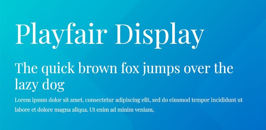
Playfair is influenced by the transition of late 18th century writing/printing technology; when quills were replaced by pointed steel pens. It’s also influenced by typefacer John Baskerville and William Martin’s typeface for the “Boydell Shakspeare”. It’s great for titles and headlines.
3. Open Sans

Designed as a good neutral type face Open Sans is very friendly and readable. Good for titles, headlines, or body text.
4. Montserrat
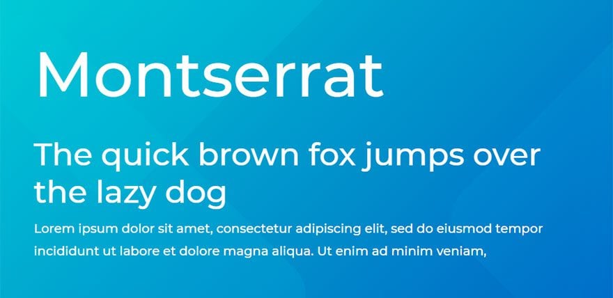
This font was originally created by Julieta Ulanovsky. Her inspiration for the font design came from all the beautiful signs and posters she saw in Montserrat, a neighborhood of Buenos Aires. It looks wonderful on short headings with large letters in all caps.
5. Merriweather
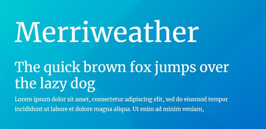
This serif typeface is extremely pleasant to read in body text on all types of screens because it was built for the web. It also works great for headings as well.
6. Lato
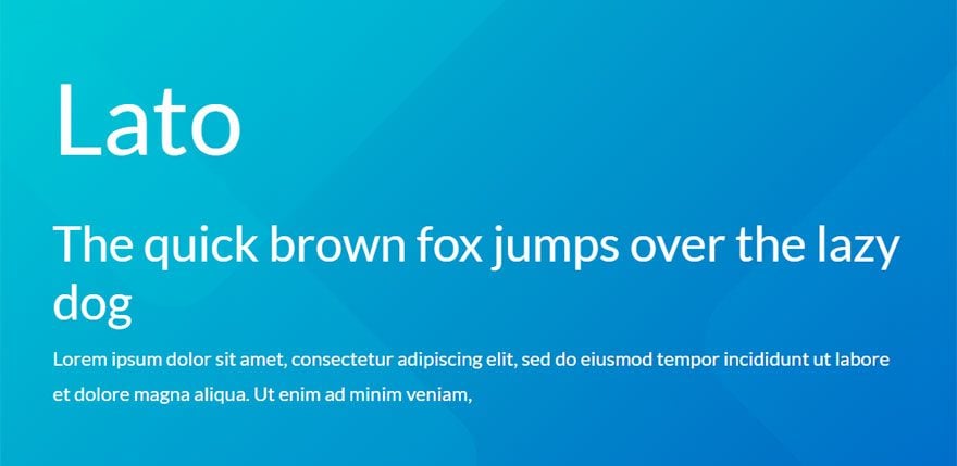
Lato was specifically designed for corporate use. It has a professional look that lends itself well to use in various sizes. Its semi-rounded details also give it a warmth that appeals to the multitudes.
7. Bebas Neue
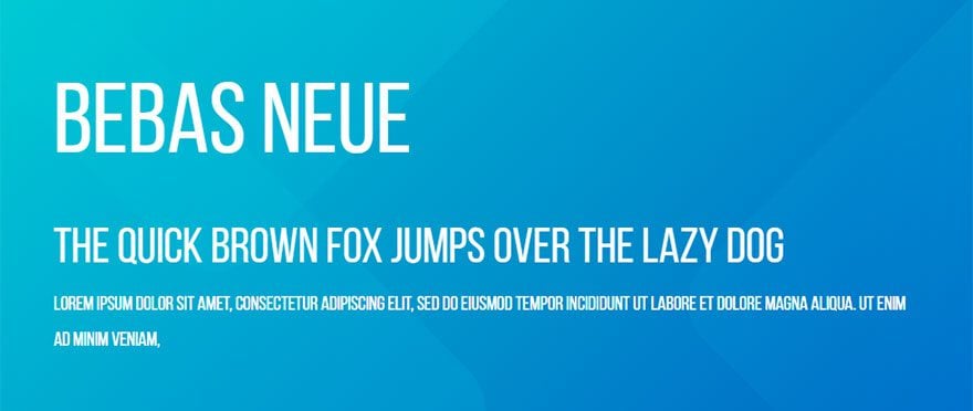
This sans serif “all Caps” font in extremely popular and considered one of the best free web fonts for good reason. It creates amazing looking displays for your website headers!
8. Noto Sans
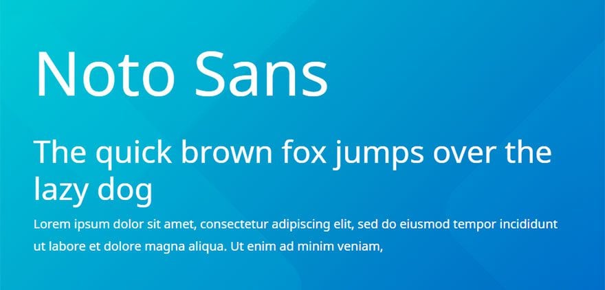
Noto Sans is unique in that it was created to look great accross multiple languages. Because of the horizontal spacing between letters, it look great on body text and on pages with a lot of content.
9. Source Sans Pro
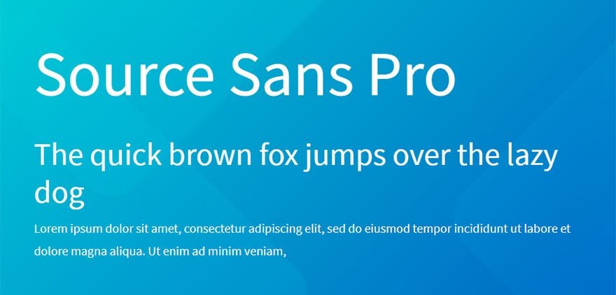
Source Sans Pro was designed primarily with user interfaces in mind. This will make a great menu font but can also be used for other things such as body text.
10. Oswald
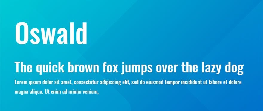
This sans serif typeface is a wonderful font for the web because it was formed to fit the pixel grid of digital screens. It is a narrow font that won’t take up a lot of space so it works great for large headers with a lot of text.
11. PT Sans
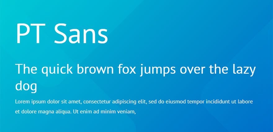
PT Sans is part of a project called “Public Types of Russian Federation” meant to make displaying text in multiple languages uniform (similar to Noto Sans). This font is good for multiple purposes.
12. Rubik

The rubik font was designed by Philipp Hubert and Sebastian Fischer to create a sans serif font with slightly rounded corners in which the letters fit perfectly inside the squares of the Rubik’s Cube. The font works great for both headings and body text.
13. Nunito Sans
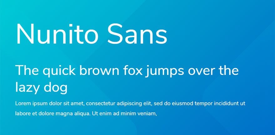
This sans-serif font is a non-rounded version of Nunito. It is a popular font for user interfaces and looks great for things like dashboards, restaurant menus, and price listings.
14. Fira Sans
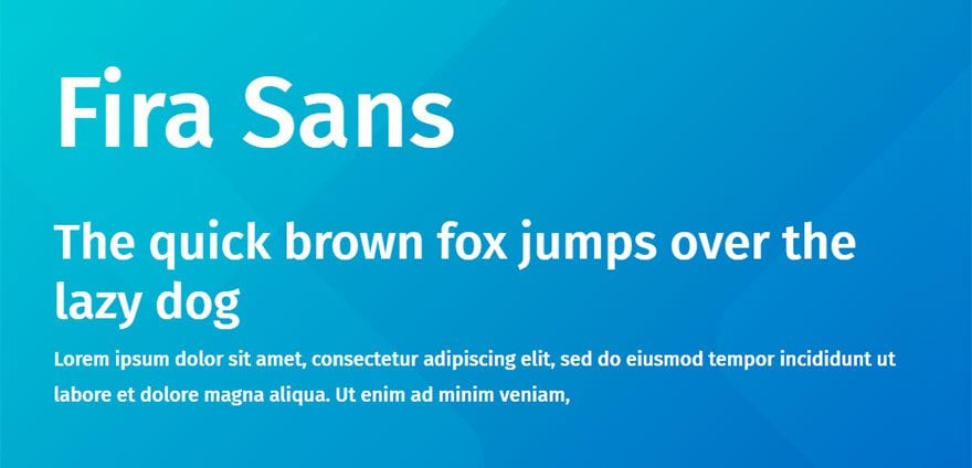
This popular web font was originally desiged for the Mozilla FirefoxOS for clear legibility on all screen sizes. Use it as a modern type for multiple purposes.
15. Work Sans
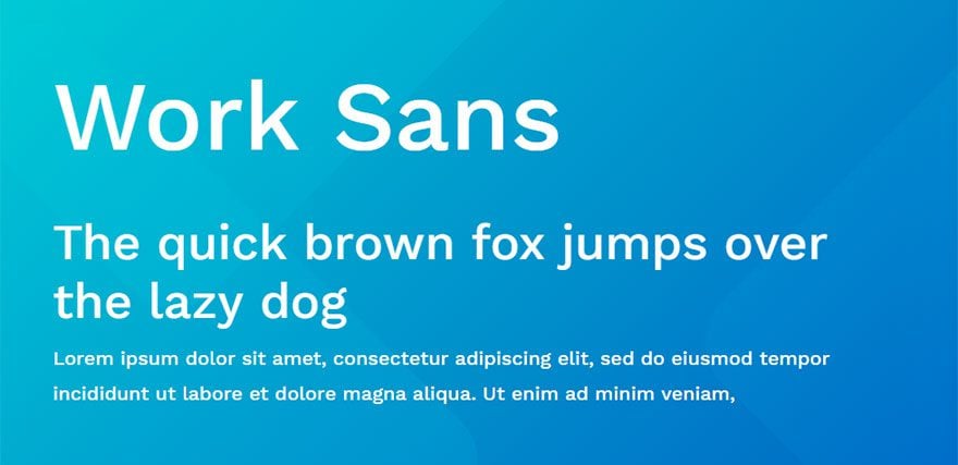
This sans serif font is designed as simplified web font that looks great on all screens. Use heavier weights for large spacious heading displays and the regular weight for easy-to-read body text.
16. Poppins
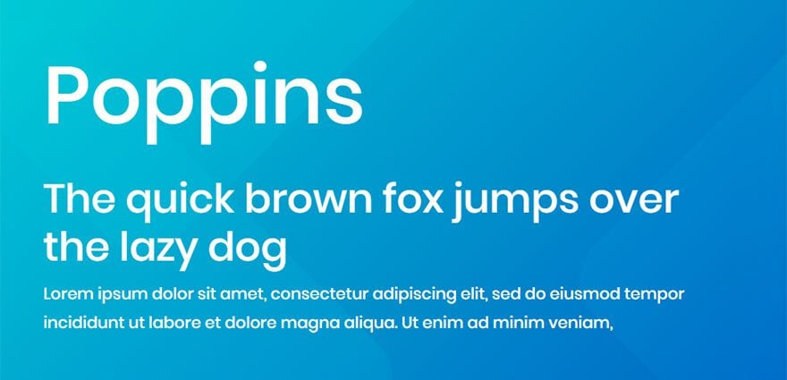
Poppins is a modern geometric sans serif typeface based on the Devanagari design which highlights the geometric circle shape of this beautiful font. Feel free to use this font for both headings and body text for a design that is very pleasing to the eye.
In case you haven’t noticed, it is also the font used on our blog.
17. Josefin Sans
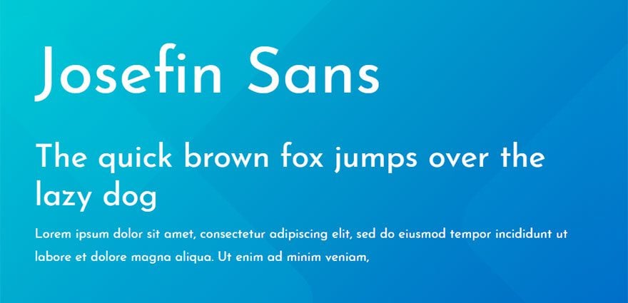
This typeface is a sister of Josefin Slab (also a great font). It was designed to be geometrically elegant and to add a vintage feel. Use negative letter spacing for larger headings and you can keep the nice default letter spacing it provides for you body text.
18. Ubuntu
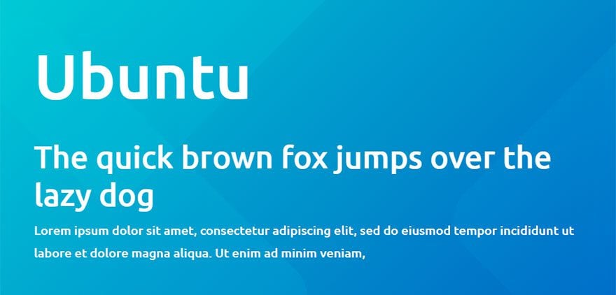
Ubuntu is a sans-serif font crafted for the web and meant to be a general purpose font. Good for titles, headlines, buttons and body text alike.
19. PT Serif
PT Serif is the new addition to the PT Sans family so the two work well together as a font pairing. It is a harmonious type that works well for almost anything.
20. Muli
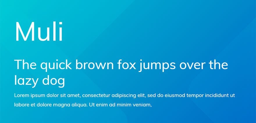
This sans serif font works great for websites that have minimalist design. It works best for large headings but can also work for body text as well.
21. Arvo
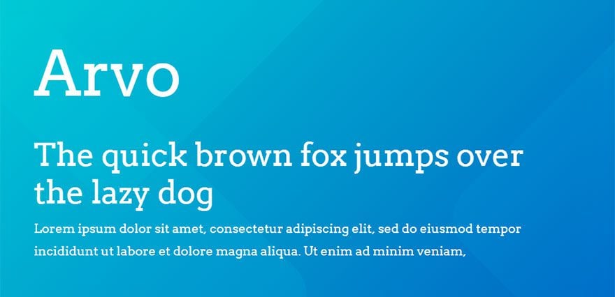
Arvo is a geometric serif typeface intended to be a “mixed” type good for multiple purposes. It can be used for titles, headlines, and body text.
22. Oxygen
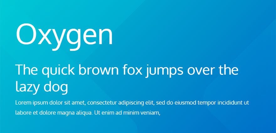
This sans serif font was created by Vernon Adams with user interfaces in mind. It is designed to clear and legible so that it looks great on all screen sizes. Use it for body text, menu items, and buttons!
23. Raleway
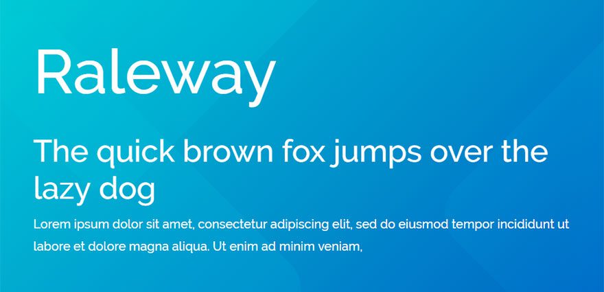
Raleway is an elegant and thin san serif font that is probably best used for titles, subtitles, and headlines.
24. Noto Serif
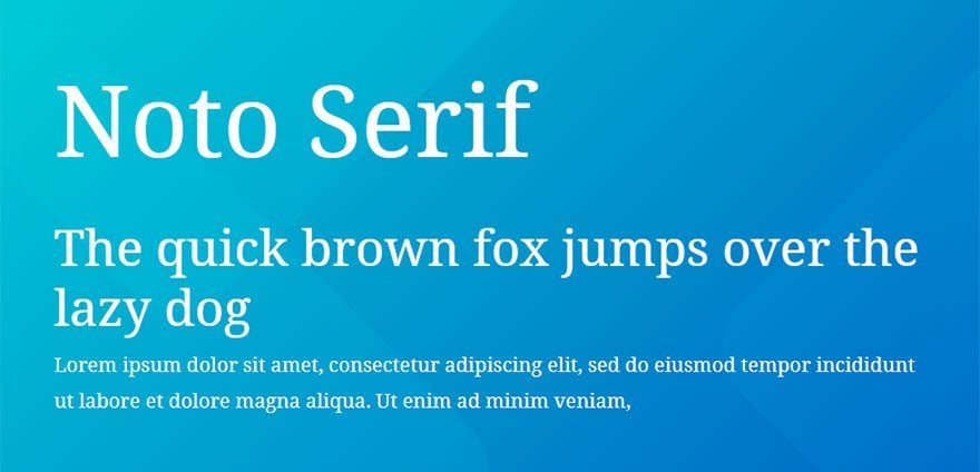
Like Noto Sans, Noto Serif is created to look great across the web in multiple languages and is a great multi-purpose font that looks beautiful on all screens. Use it with Noto Sans as a perfect font pairing as well.
25. Nunito
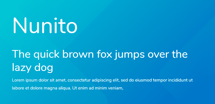
Nunito is a slightly rounded sans serif typeface that works really well for large display typography. It is a popular font for user interfaces. Using the regular weight for large headings looks really nice.
26. Archivo
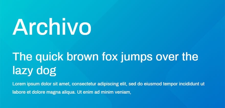
Archivo is a grotesque (older) sans serif type that has a nice technical feel. It looks especially nice on the web as a heading font.
27. Abril Fatface
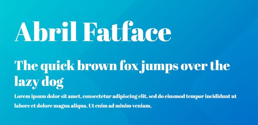
As the name suggests, Abril Fatface is a “bigger” type. It is meant to be a revamp of classic Didone styles. In particular 19th century British and French advertising posters. This font is wonderfully elegant and is probably best for titles and headlines.
28. Exo 2
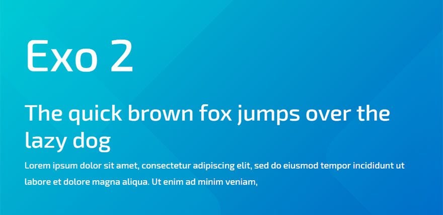
Exo 2 is a new version of Exo designed by Natanael Gama. This contemporary typeface has a technical and futuristic feel. Unlike Exo, Exo 2 also works great for body text.
29. Barlow
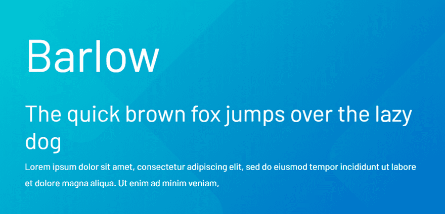
Barlow is inspired by California’s public (license plates, signs, busses, etc.). The design is slightly rounded and has condensed versions that make great headers without taking up a lot of space.
30. Slabo 27px
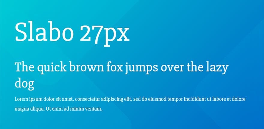
Slabo 27px is a unique typeface that (like its sister font Slabo 13px) is specifically optimized for viewing at the pixel size in its name. This makes it a great web font for clear, slightly condensed, and easy-to-read headlines.
31. Aleo
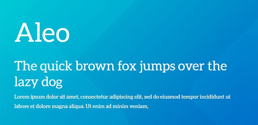
Aleo is a slab serif font similar to the popular Lato font. It is designed with sleek and semi-rounded details that make it a nice choice for headings and body text.
32. Quicksand
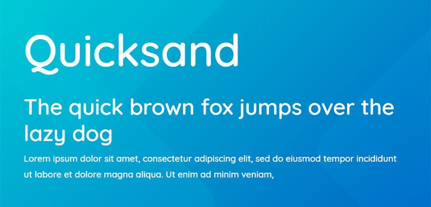
This is a display sans serif typeface that continues to be a popular choice on the web. It has a geometric design that looks great for headings.
33. Cooper Hewitt
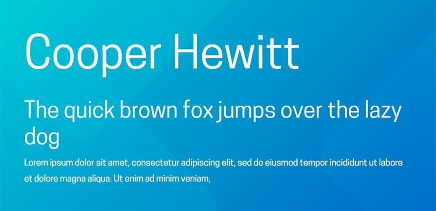
This contemporary sans serif font is designed with unique geometric arches that work well with its condensed display. This font looks great in all caps as headings but can be also used for regular body text as well.
34. Ostrich Sans
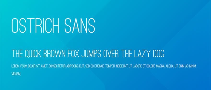
Ostrich Sans is a modern sans serif font that’s great for titles, logos, and headlines.
35. IBM Plex Sans
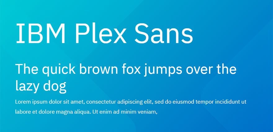
This contemporary typeface was specifically designed to reflect the spirit of the IBM brand. It has neutral and friendly appeal that can be used for multiple purposes on your website.
36. Cormorant
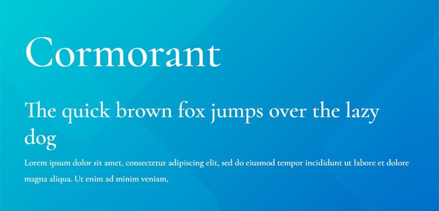
This unique typeface was designed (mostly drawn) from scratch by Christian Thalmann. To highlight the intricacies of the typeface, use this font on your website for larger displays like headings.
37. Alegreya Sans
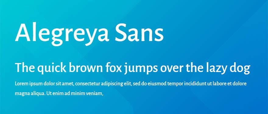
This sans serif font was originally designed for literature so it works really well as body text because of its harmonious paragraph spacing throughout.
38. Libre Franklin
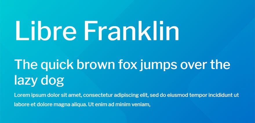
This sans serif typeface is a contemporary version of the classic font, Franklin Gothic. Use it for headings or body text. Works really well if used as heading text and paired with Libre Baskerville as the body text.
39. Libre Baskerville
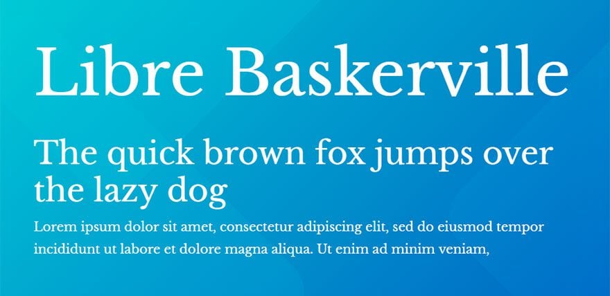
This beautiful web font is a high quality typeface that seems to be perfect for unique and readable body text. Works well if paired with Libre Franklin.
40. League Spartan
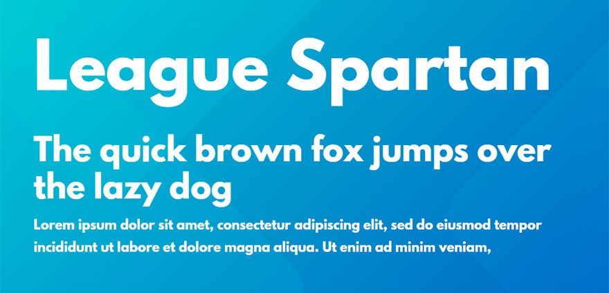
League Spartan is a single weight (bold) sans serif font that works well for creating strong and beautiful titles and headings.
What about Script Fonts?
If you found the list lacking in script (or handwriting) fonts, you aren’t wrong. But that doesn’t mean there aren’t some great free ones out there (Mali, Indie Flower, Pacifico, and Dancing Script to name a few). You can also check out this list of beautiful free & premium script fonts.
A Few Quick Tips on Font Pairing
When looking to update the typography of your website, it’s a good idea to consider how different fonts work together.
Here are a few tips to get you started:
- Keep it simple–don’t use too many fonts all at once.
- Keep it readable.
- Think in opposites. For example, pair a serif with a sans serif or bold with thin.
- Or, keep it in the family. Use different weights and styles of fonts in the same family.
- Try to match the mood of your content.
- Experiment and keep what works.
(For Google Fonts you can also use their free Pairings tool)
For more info on font pairing, check out our full article on 7 key principles.
Final Thoughts
I hope this list of fonts will help aid the process of finding the perfect font for your next project. And remember, many of these fonts will have different weights and styles that you can tweak to create countless designs. So have fun exploring!
Cheers!


This is really great collection of fonts that I very often use! My favorite are: Montserrat, Poppins, Playfair Display & Lato 🙂
Thank you for your attention to detail and great writing style. Your professionalism shows in your article. I like your interesting views and appreciate your unique ideas. This is quality.
Thanks for the wonderful article.
Thank you for the handy overview Jason, all my favourites are in it and other interesting fonts as well.
Hi to Jason and everyone! What do you think about combinate Montserrat (for titles and headlines) with Lato (for body text)?
Sounds good to me. Go for it!
It would be great to have an instruction step by step how to use these great fonts on a divi site. I have never tried to do it.
David,
That’s a good idea. Most of these fonts are built in to Divi so it would be easy to add them to your site. You could also just check out our premade layouts for some cool font inspiration.
I gotta say, Josephin Sans and Exo are two of my favorite fonts. I probably use them way too much. 😛
Yeah. You need to bring the classy Comic Sans font into your life more.
I get annoyed with myself as I love a font, it stays for a few months then I see another. Great choices here though. One thing I don’t like is gimmeky fonts, very ofputting. Good post here as always though.
Good choices… I’ve used many of them myself 🙂
I am using the Poppins for my Website already!
Great choice, Samar!