
Here’s the thing that about minimalist design: when you do it well, it’s absolutely beautiful. When you do it wrong, it’s hideous for the exact same reasons. Getting it right is a balancing act, really, of just a handful of design elements.
Like a lot of art and design, it can take a pretty keen eye to tell the difference between something that will just work and something that just does not.
And it’s those things that just don’t work you want to avoid in your web design. If you’re working toward minimalism and you want your site to elicit an ooh from visitors instead of an eww, I’ve got you covered with a whole lot of what you should do (and a whole lot of what you shouldn’t).
Do: Use Color!
People tend to think that minimalist design is monochromatic, or even worse—black-and-white and/or greyscale.
No no no. No.
Minimalist design is not, almost paradoxically, about having very little; it’s about maximizing very little. Your intent should be to make the most you can out of what little you’ve got.
That means when it comes to colors, you should…use color. Take a look at this example from Epoch Design:
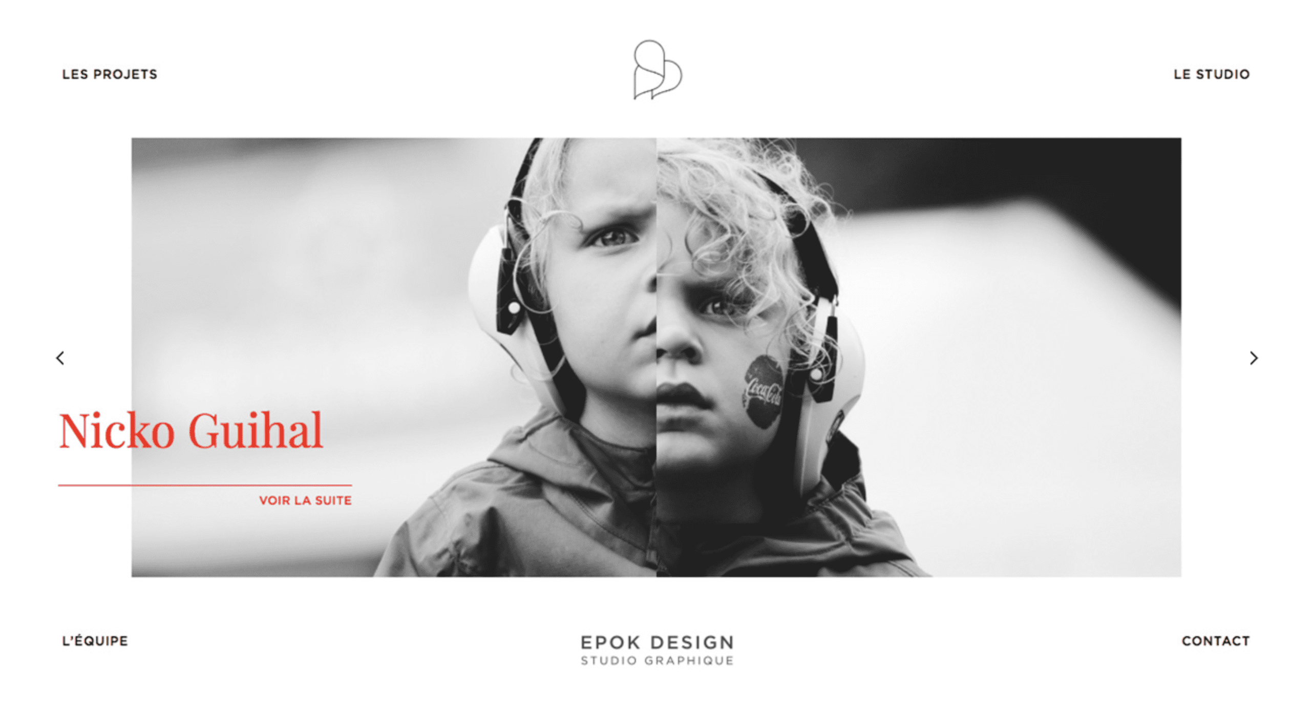
The use of color here is minimal, but the designer has maximized its use to make sure you see it.
And here, from Boorbool:

The duotone background striking and memorable, but doesn’t slap you in the face.
Don’t: Use ALL the Color!
On the other side of those delightful designs, minimalists harbor a lot of dark impulses to use all the colors, only replacing the cleanness of their designs with pretty much every shade on the spectrum.
Okay, so maybe it’s not that bad, but the overuse of color with other minimalist aesthetics can be incredibly distracting and self-defeating.
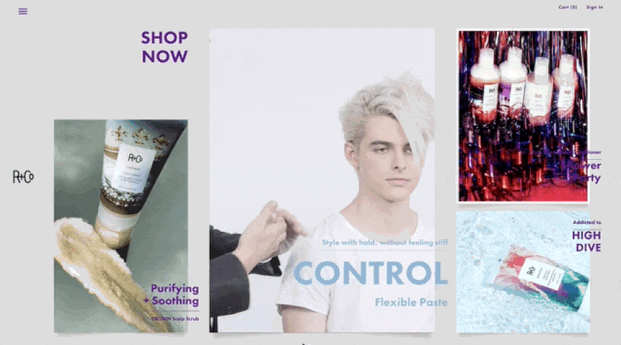
Such as Rogue + Co. They try to use minimalism’s clean lines and asymmetrical card sizes to draw the user’s attention. But they added superfluous colors to everything, and then animated it for no reason. It draws the user away from the content, rather than drawing them in.
The opposite of minimalist design, that is.
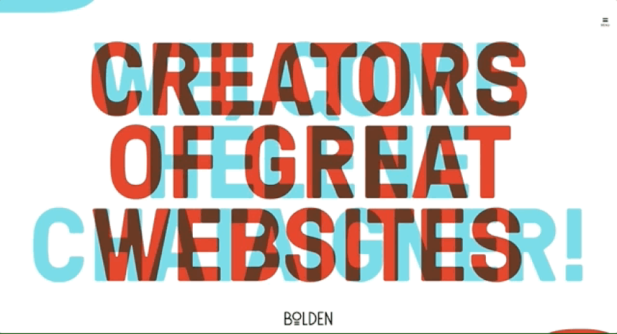
And then there’s Bolden, who totally understand minimalism. Except for the color thing. Too many colors and trying to be too clever made them have to add in superfluous animation. You have to mouse over the corners of the screen to see the text.
That’s just not minimal, now is it?
Do: Use Animation
You see, those animations above…they don’t matter. They don’t add anything to the website. But cinema graphs like Rogue & Co use can work; they just need to enhance the site, not clutter it.
For the most part, micro interactions will work—a hover on a button or an highlighted emphasis on a card. Even loading, scrolling, or background animations that aren’t obtrusive can enhance the minimalist design you’re going for.
The biggest hurdle is making sure the animation fits your design. Don’t just add them where they don’t belong. See how the footer expanding on our Divi page draws your attention as you scroll, but doesn’t detract from how you use the page.
Not surprisingly, Divi has a built-in feature to accomplish these kinds of micro interactions.
Do: Use Whitespace
Like pops of color, whitespace (or negative space) can be one of the most useful weapons in your arsenal. For instance, the absurdly popular Medium is almost all whitespace, and it works.
And see how the only color is used to draw your attention to the buttons and links you absolutely need?
There’s a balance to using whitespace effectively. You want to balance readability and utility with aesthetic appeal. When used effectively, whitespace is unbelievably powerful in making your minimalist design memorable. cough Google cough cough
Don’t: Use ONLY Whitespace
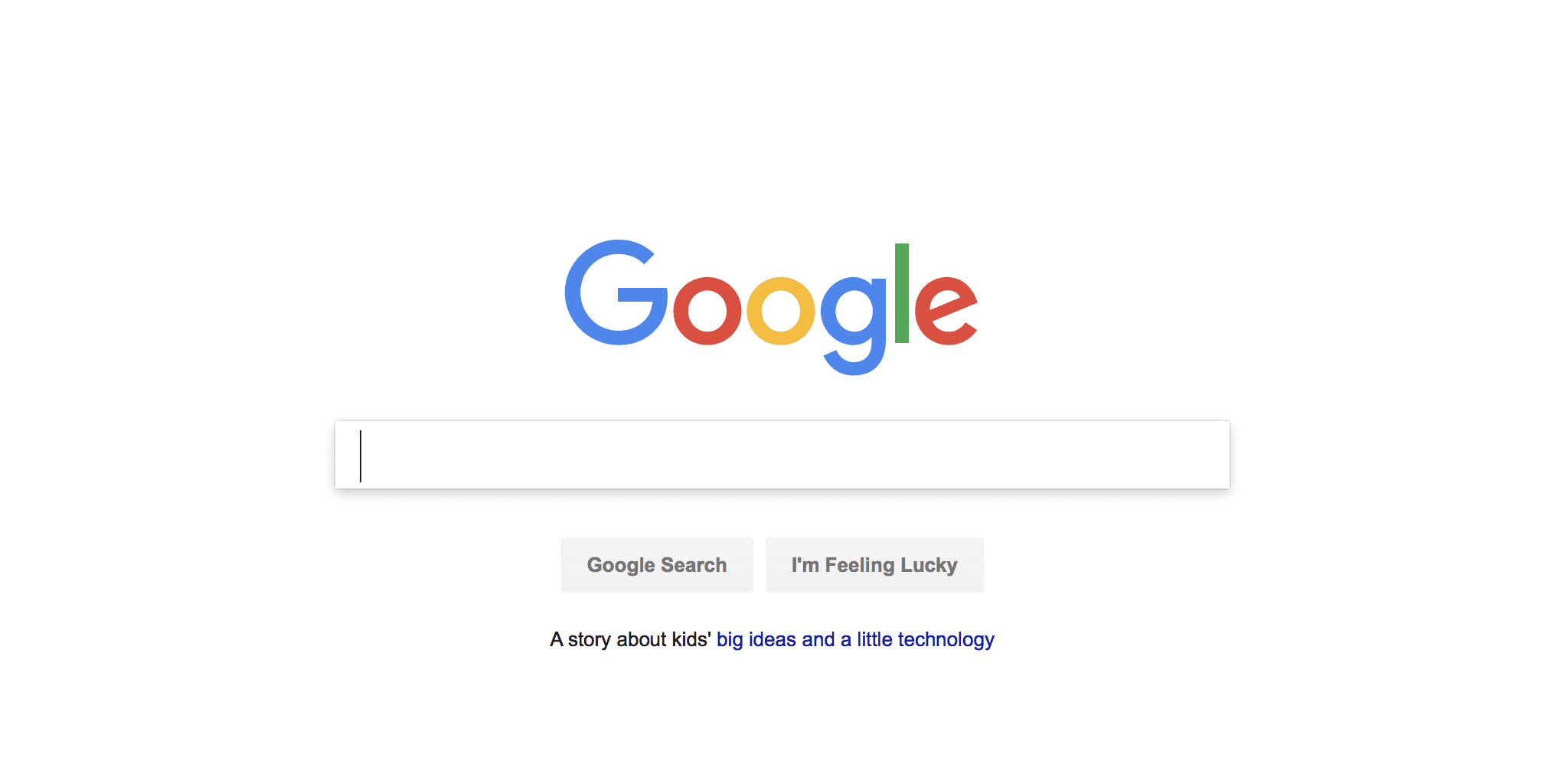
On the opposite end of the spectrum, overusing whitespace makes using your site nearly unusable to visitors. You see, Google’s use of whitespace highlights how they want you to use the site: type something in the box.
If, however, your use of whitespace doesn’t either does not direct the user to your site’s purpose or make them have a better experience on your site, you might need more explicit elements to direct them.
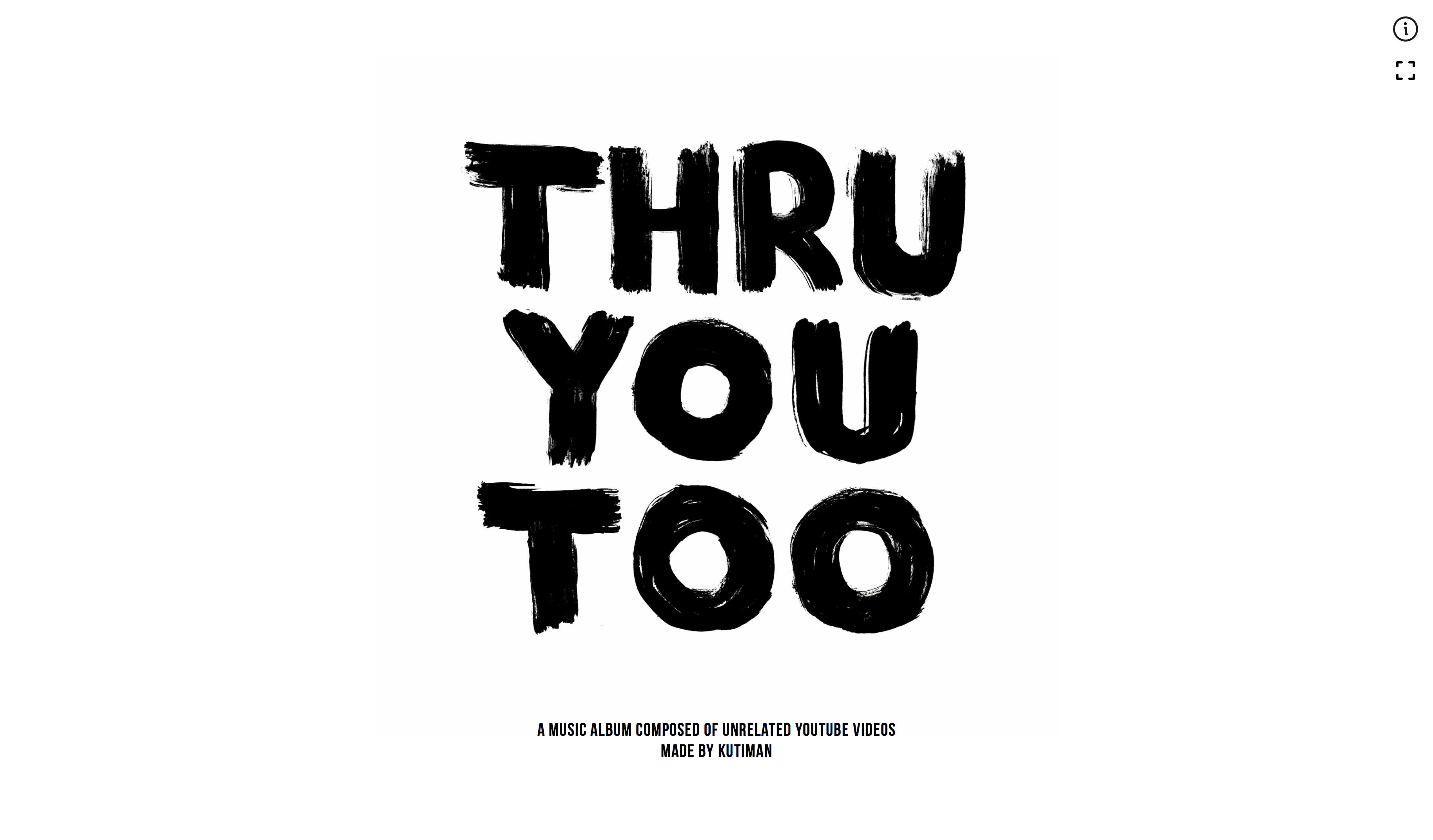
For instance, Thru You Too is an awesome project. But it took me a long time to figure out how to use it (you have to hover on the big text in the center, which I didn’t do because I wa drawn to the upper right corner). While the navigation is simple when you get it, the whitespace didn’t direct me there.
Do: Use Appropriately Awesome Fonts
One thing that pretty much all minimalist design relies on is effective use of fonts. Picking the right typeface for your site is how you show your personality and that of your product or company.
So you want a font that oozes your brand identity from the moment folks see it. Clean lines with sleek lettering. Rough edges and maybe some brush strokes. Elegant and classy. Whatever you’re going for, make sure you pick a font to match.
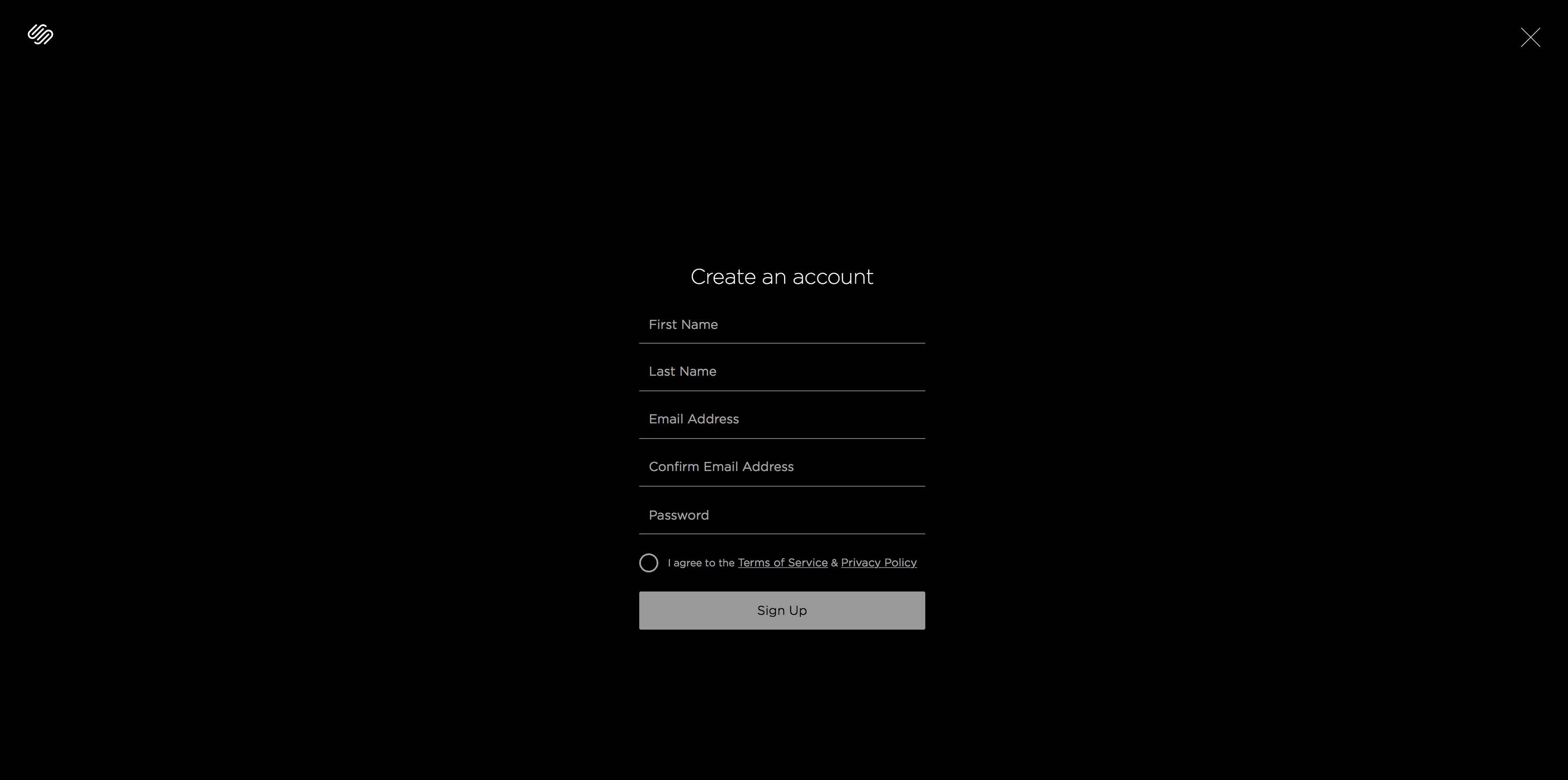
Look at Squarespace for instance. You know exactly what to expect out of their company by simply looking at the signup form and the fonts used. Clean, simple, and clear. It exudes the sleekness they advertise, primarily through the font they chose. (Because that’s really the only design element you can see here.)

And the folks at Folks are going for a folksy feel, so they definitely found a font that feels fine. Their audience is apparent, as is their take on their products. And it isn’t explicitly stated.
Don’t use INAPPROPRIATELY Awesome Fonts
On the opposite end of that spectrum, choosing a font that is too bold can pack the wrong kind of wallop. Everyone wants their site be unique and to stand out. But you don’t want it to stand out for the wrong reasons.
Imagine looking for a crisis line to help a family member in need and finding a site that looked like this:

What about a doctor who wanted to make sure you knew she was the best choice to save your life?

Or if you were looking for a fantastic, contemporary web designer and all you saw was this:

Okay, so I couldn’t resist a Comic Sans dig. Sue me. But you get my point: font choice matters. Especially when you’re using a minimalist design because the your choice of typeface might be the biggest part of the design.
Go Forth and Minimize!
And minify, too, but that’s a totally different article. #iamadelight
Joking aside, remember that color, typefaces, and negative space are kind of design fundamentals. You just have to practice discretion so that you use them correctly. As long as you do as I say, not what I don’t when it comes to minimalist design, you shouldn’t have anything to worry about.
What are your guidelines when you’re designing minimalist sites?
Article thumbnail by Boo-Tique / shutterstock.com


That comic sans for the designer choice made my day 🙂
Great article but jeez – don’t you have editors to fix all of the grammar mistakes?
Speal chek failure: “…because I wa drawn to”
I have a one page site that I like. I’ve been told that one page sites won’t rank good (at all) for SEO. If I use a menu to jump to the sections does that help?
+1, great article. Genuinely helpful info. Shared on my Pinterest board for designers. Thanks, BJ!
What are some great fonts that you all recommend?
This is indeed a GREAT article! Please keep up the astronomically phenomenal quality content! ^^
Very helpful – thank you!
I like to say “less is more, work.”
Great article.
Bolden’s address is wrong (it’s .nl, not .nk).