
With the introduction of Divi 5‘s Flexbox Layout System and the Loop Builder, you can create modern, flexible designs with ease. Flexbox delivers intuitive, responsive layout control with effortless alignment and spacing. The Loop Builder integrates dynamic content from posts, products, or custom fields into your website.
Together, these features unlock a world of creative possibilities, allowing you to build advanced layouts, such as custom portfolios, sleek e-commerce grids, or responsive event calendars, without relying on third-party plugins.
In this post, we’ll dive into how Flexbox and Loop Builder work and explore practical examples like dynamic grids and carousels, and share pro tips to help you build stunning, scalable layouts with Divi 5’s Public Beta release.
Let’s get started!
Understanding Flexbox In Divi 5
Flexbox is a CSS model designed for the efficient arrangement of elements, allowing precise control over spacing, alignment, and ordering within a container. In Divi 5, Flexbox makes it easier to create layouts without the constraints of Divi’s legacy grid system. Unlike the older setup, Flexbox offers simplified responsive layouts, custom element ordering, true vertical alignment, and equal-height elements, all without special code.
Additionally, Divi 5 deprecates specialty and full-width sections, streamlining design by adding new Flex and CSS Grid rows to handle all layout needs with flexibility and efficiency, making complex designs more intuitive and adaptable across devices.
Core Features And Controls
Divi 5’s Flexbox integration offers a comprehensive set of tools for building dynamic, responsive layouts.
Layout Direction, Wrapping, And Ordering
Flexbox allows rows, columns, and modules to be arranged horizontally or vertically, with options to wrap elements for responsive grids or reorder them visually without altering the HTML structure. This is ideal for prioritizing content on different devices.
Responsive Structures
Customize column sizes, flex settings (like grow or shrink), and element flow for each breakpoint. This ensures layouts adapt seamlessly to any screen size without manual overrides.
New Row Templates And Nesting
Divi 5 supports unlimited columns within rows and Nested Rows for complex hierarchies, such as multi-tiered layouts.
Adjustable Gap settings allow precise control over spacing between elements, eliminating the need for custom CSS padding.
Positioning Tools
Flexbox introduces effortless vertical and horizontal centering, as well as unified heights for modules or columns. These tools make it easy to create polished layouts, like equal-height cards or centered hero sections, with minimal effort.
How To Use Flexbox
Getting started with Flexbox in Divi 5 is straightforward within the Visual Builder. Simply add a row and navigate to its Design settings. Ensure Flex is selected in the Layout dropdown menu.
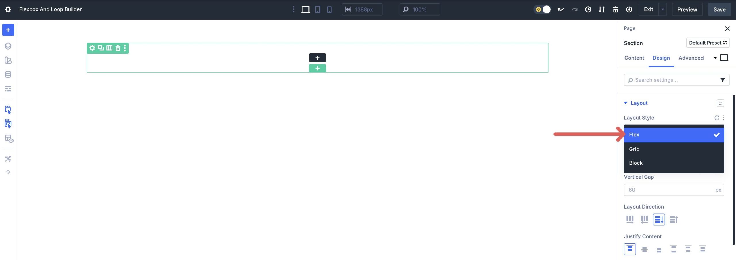
Adjust the Layout Direction (Row, Column, Row Reverse, or Column Reverse), Alignment, and Wrapping to define how elements behave.
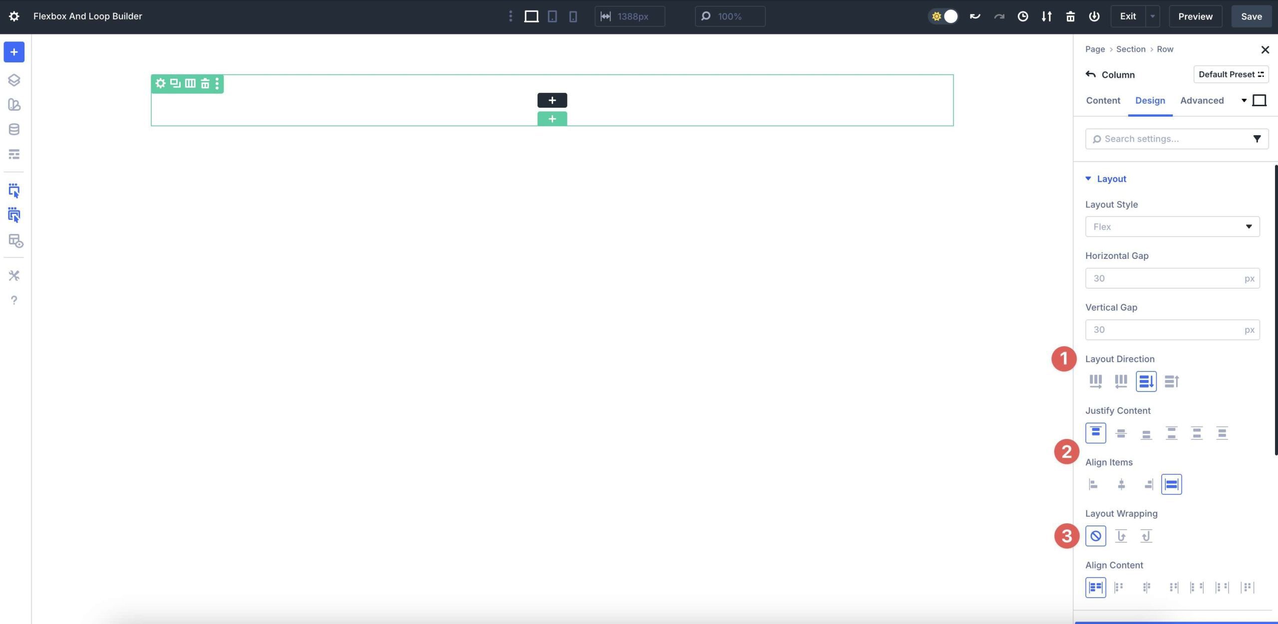
You can also set column sizes and ordering for each breakpoint to ensure responsiveness.
By mastering these basics, you’ll unlock the power of Flexbox layouts that are visually dynamic and responsive, setting the stage for advanced designs. This is especially true when paired with features like Divi 5’s Loop Builder.
Mastering The Loop Builder
Divi 5’s Loop Builder is a robust feature that transforms static layouts into dynamic, content-driven experiences. It allows you to loop through blog posts, terms, users, or custom fields, using any Divi element as a template. This feature turns rows, columns, or Group Carousel modules into dynamic feeds, seamlessly integrating with Woo products, Advanced Custom Fields (ACF), and custom post types.
Unlike traditional Divi modules, such as the Blog or Portfolio Module, which are designed for dynamic content, Loop Builder enables designers to create custom displays — including blog grids, product showcases, or team member listings — directly within the Visual Builder. It also features offset capabilities, enabling multiple loops on a single page without compromising load times, making it an ideal solution for content-heavy sites.
Key Components And Customization
Loop Builder’s flexibility stems from its extensive customization options, enabling developers and designers to create dynamic layouts with precision.
Building Templates
Create a template for looped items using any Divi module. Insert dynamic tags to pull in content, such as post titles, featured images, excerpts, or custom meta fields. For example, a product card might include a dynamic price, image, and post link, all of which are styled within the Visual Builder.
Query Controls
Define what content to display by selecting post types, filtering by Categories, specific IDs, or Meta Queries. Customize ordering by date, title, or custom fields, set item limits, and integrate pagination for a user-friendly navigation experience.
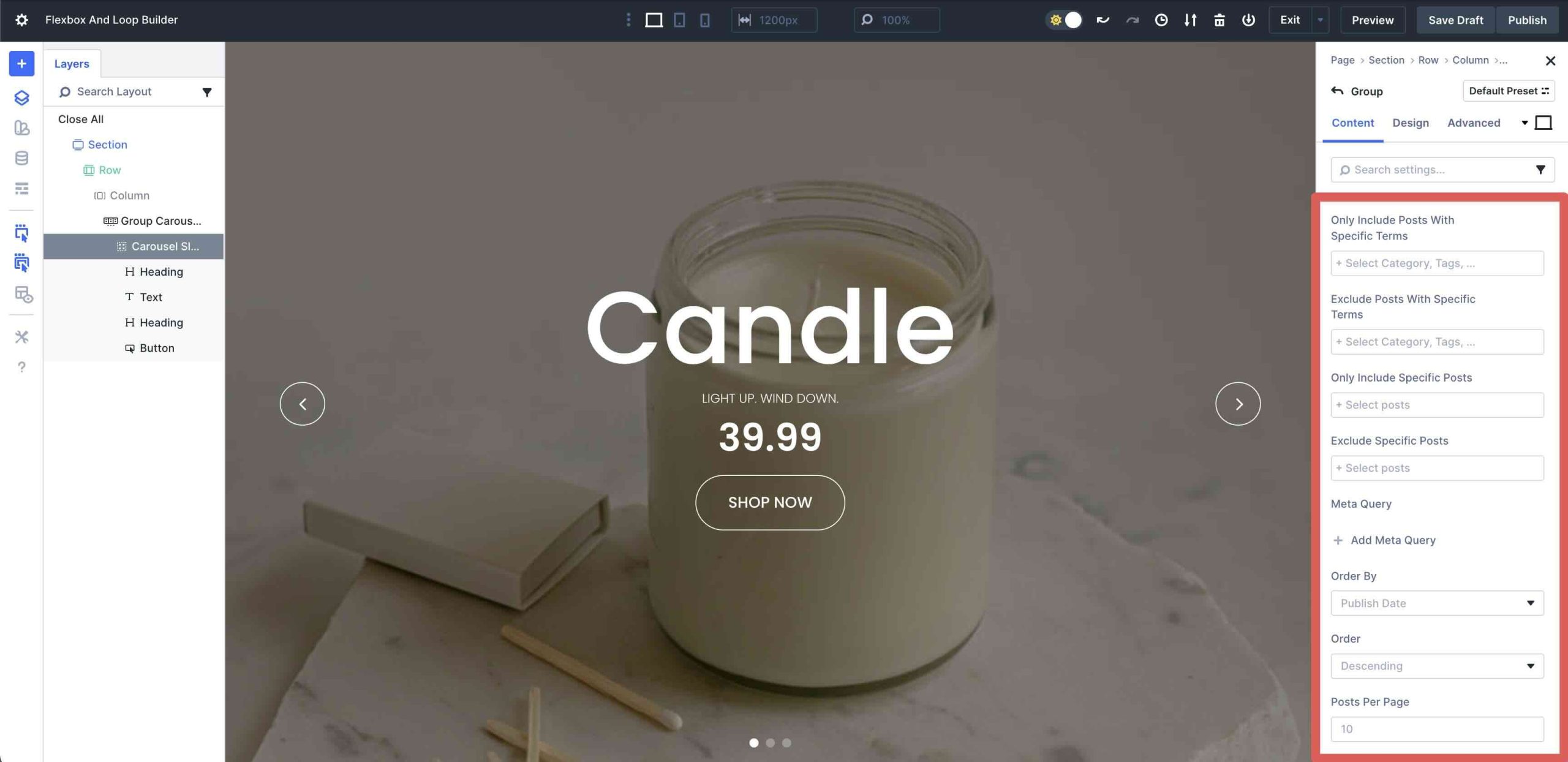
These controls enable you to tailor loops to specific needs, such as showcasing recent posts or top-rated products.
Advanced Options
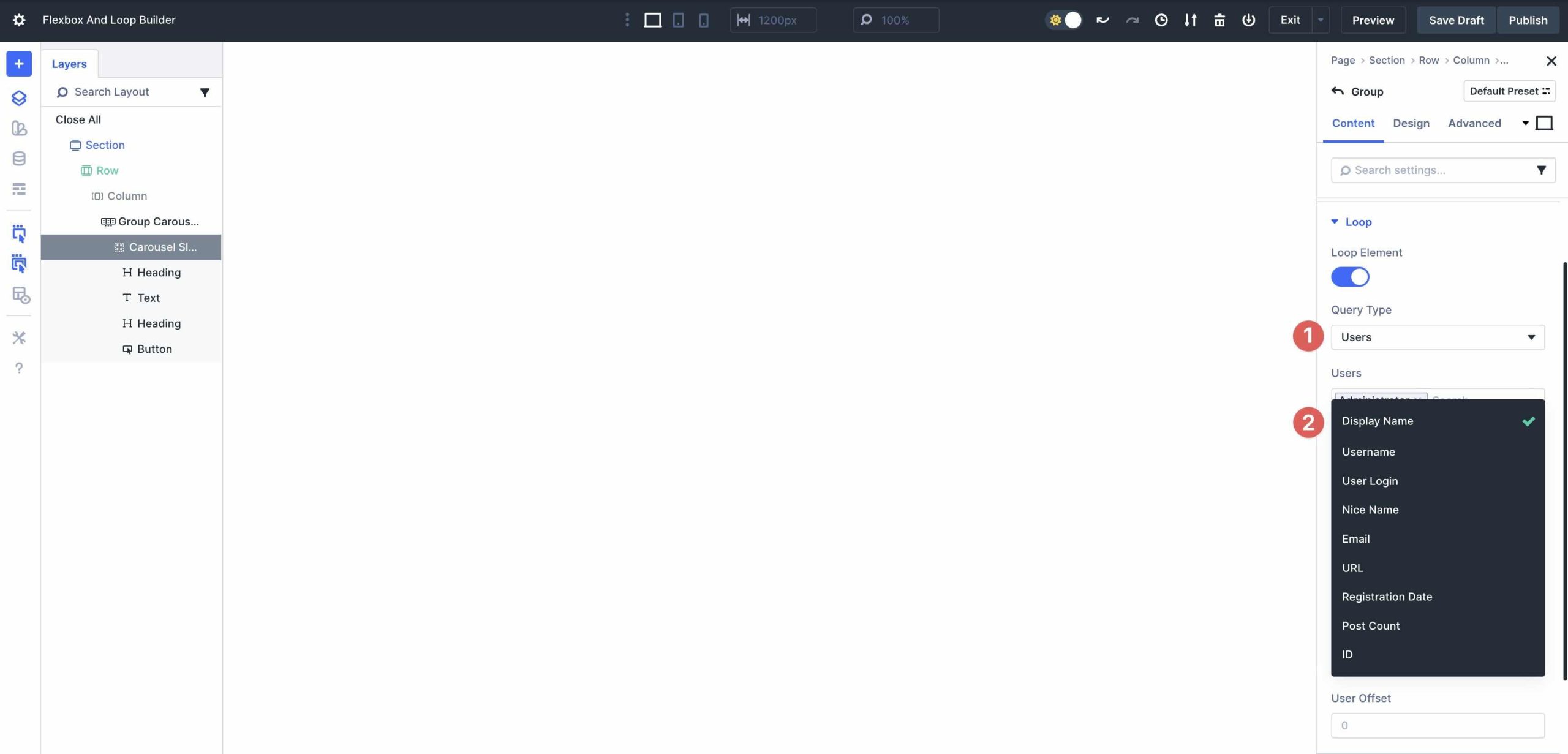
Loop Builder supports ACF repeater fields for complex data structures, user or role-based loops for team or author pages, and term-based content for category or tab displays. For instance, you can loop through taxonomy terms to create a dynamic category grid or display user profiles with custom metadata, such as job titles or bios.
These features make Loop Builder a versatile tool for creating dynamic, data-driven layouts without coding expertise.
How To Use The Loop Builder
Setting up Loop Builder in Divi 5 is intuitive and beginner-friendly. In the Visual Builder, select a column, navigate to the Content tab, and enable the Loop Element toggle.
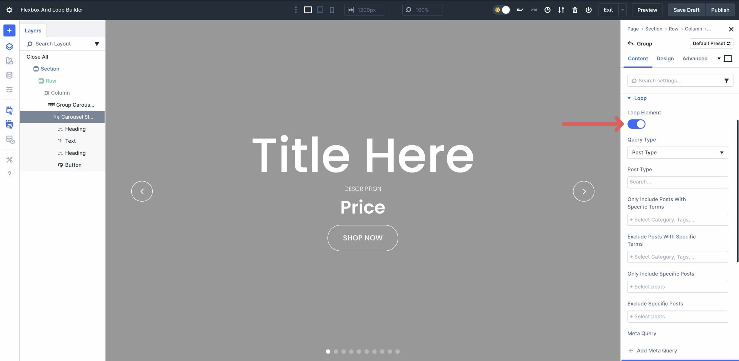
Select a Query Type and Post Type in the Loop Settings.
Apply filters, such as Categories or Meta Queries, set the number of items to display, and select sorting options.
Within the Loop Template (Column), add Divi modules and insert dynamic tags via the Dynamic Content icon.
Loop Builder’s seamless integration with Divi’s ecosystem makes it a must for displaying dynamic content, setting the stage for powerful combinations with Flexbox to create advanced, responsive layouts.
Combining Flexbox And The Loop Builder: Creating Advanced Layouts
The combination of Divi 5’s Flexbox Layout System and the Loop Builder allows you to build advanced, content-driven websites that are visually compelling and highly functional.
Flexbox’s strength lies in its ability to create flexible and responsive layouts that adapt seamlessly across various devices and screen sizes. With features like responsive reordering, custom wrapping, and equal-height elements, it ensures your designs look polished without relying on heavy CSS hacks or manual adjustments.
The Loop Builder, on the other hand, transforms these layouts into dynamic containers by pulling in real-time data.
Practical Examples And Tutorials
Divi 5’s Flexbox and Loop Builder shine brightest when combined, allowing you to build infinitely adaptable layouts. Below, we’ll walk through three hands-on examples, complete with setup steps. Each example leverages Flexbox for layout control and Loop Builder for dynamic population, resulting in lightweight, striking designs.
Example 1: Dynamic Portfolio Grid
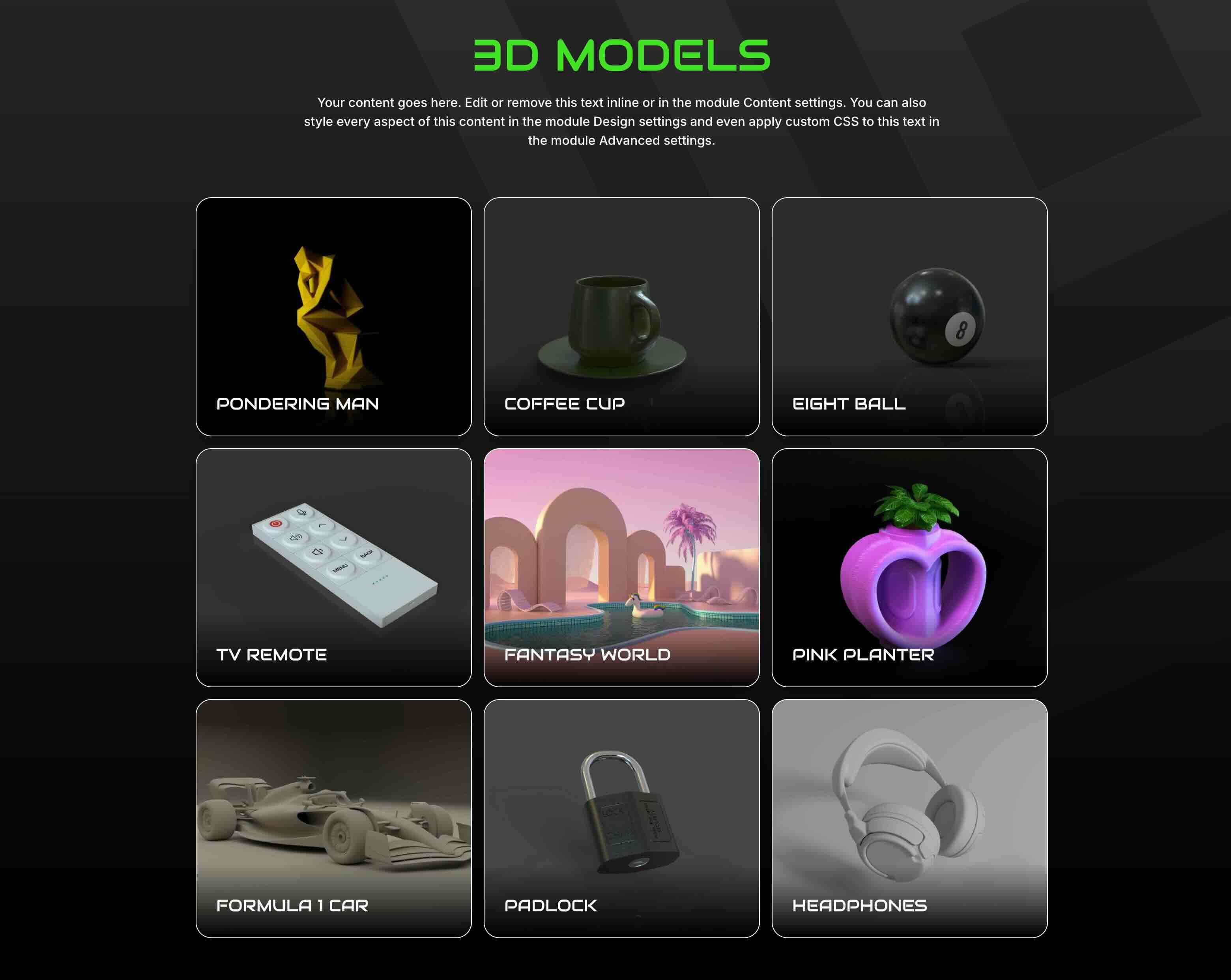
In this example, we’ve created a loop with the Projects post type. The concept is the same as the others. Add a single-column Flex row and then click to enable the Loop Builder at the column level.
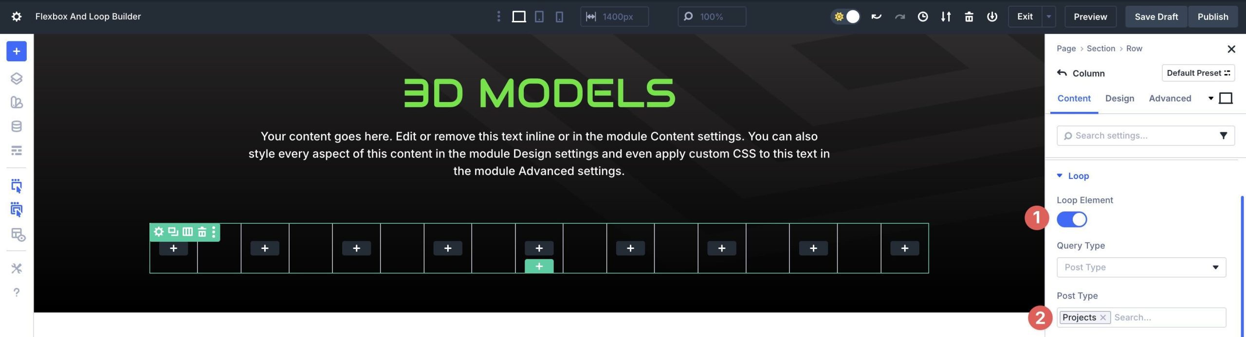
Set the Posts Per Page to 9.
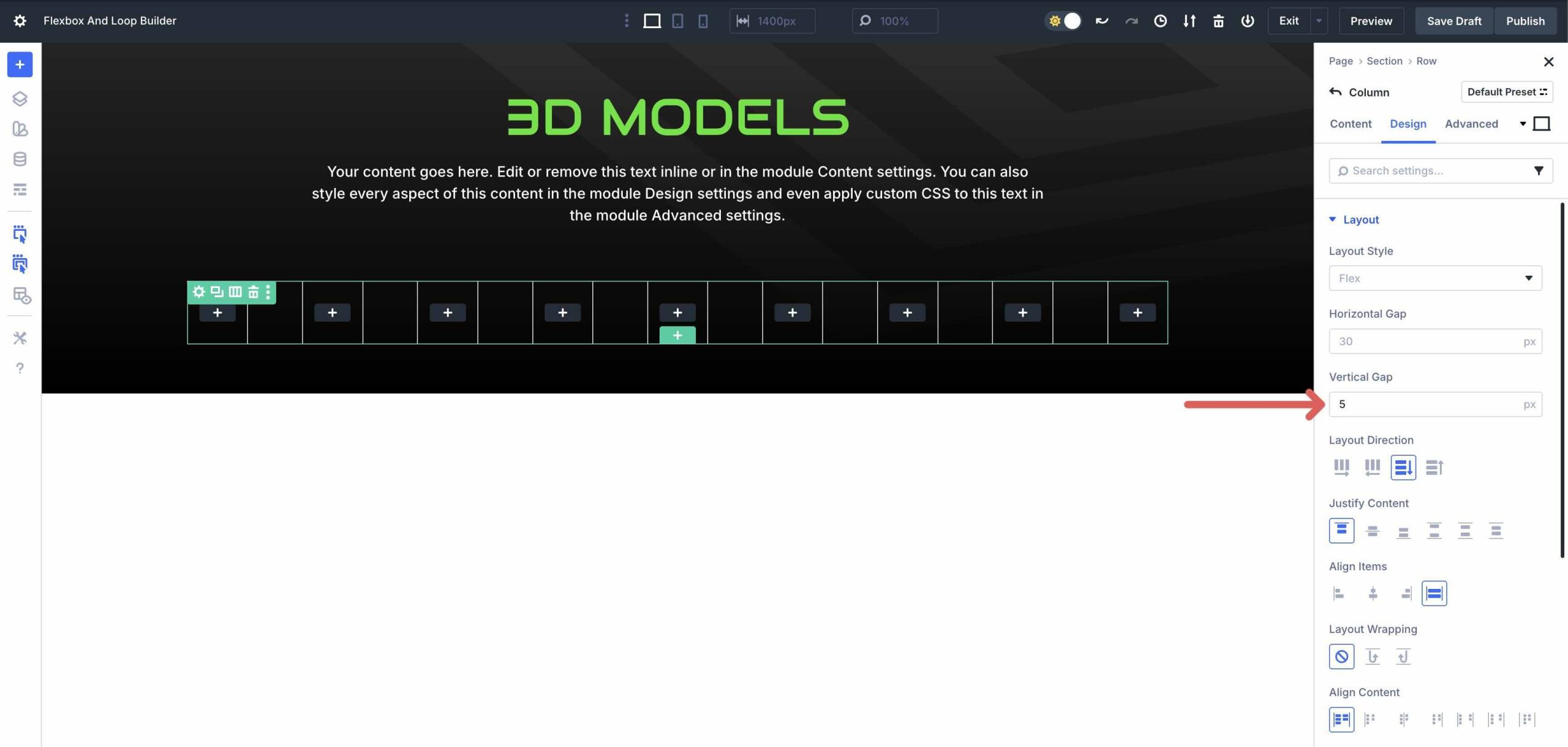
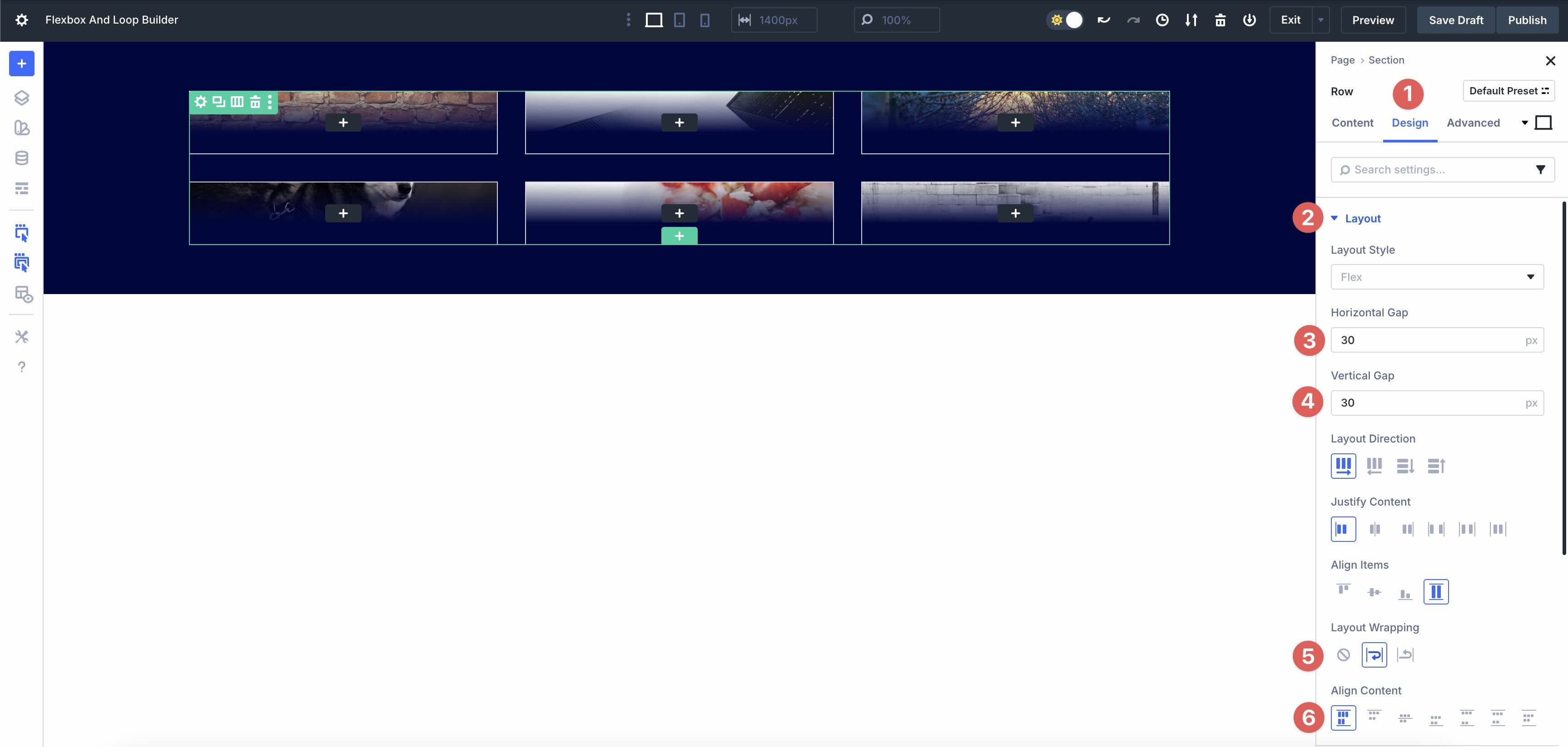
Click the Design tab and expand the Layout menu. Set the Vertical Gap to 5px.
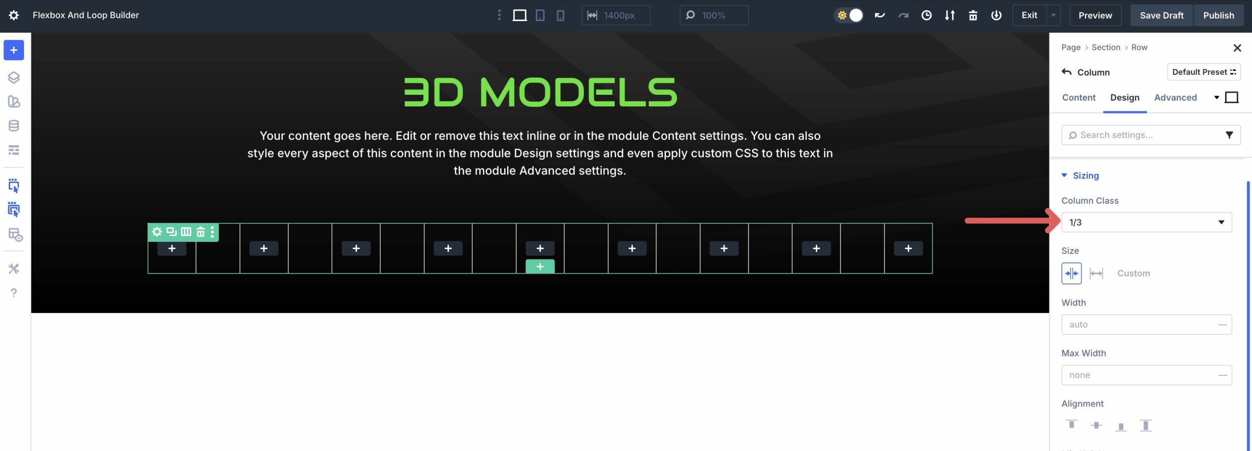
Next, expand the Sizing menu. Set the Column Class to 1/3.
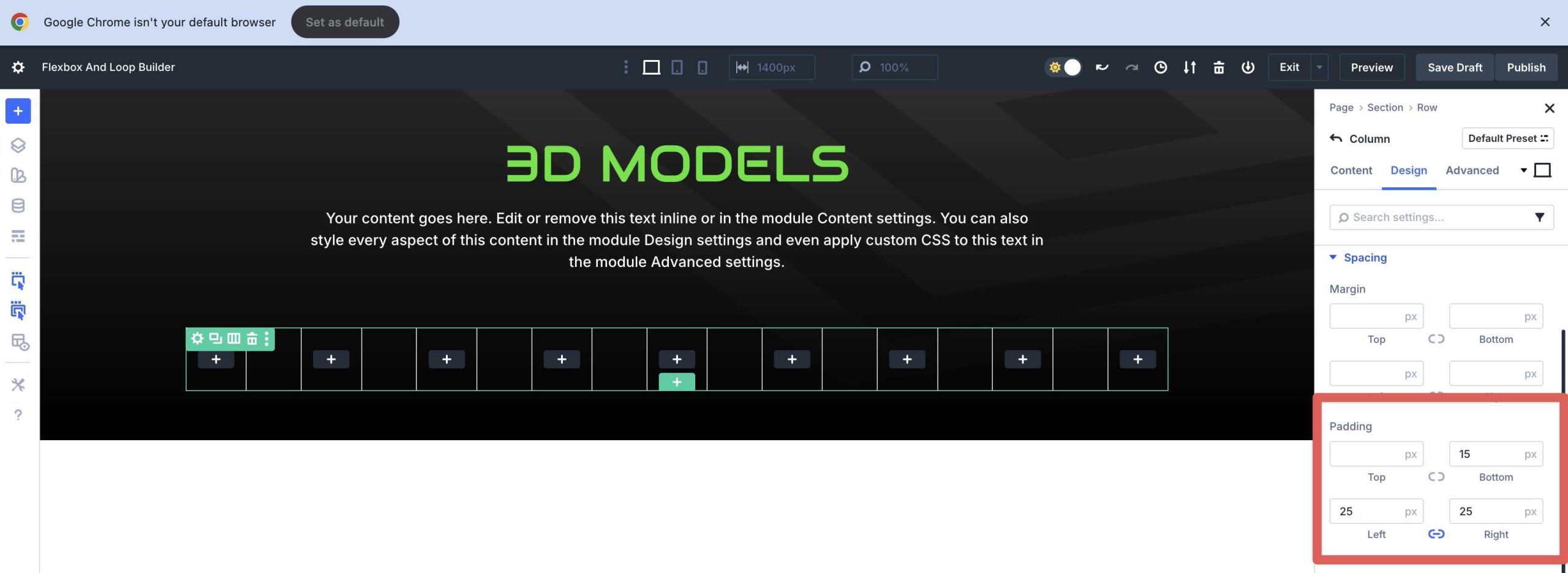
Finally, click to expand the Spacing menu. Add 15px bottom padding and 25px padding for the left and right.
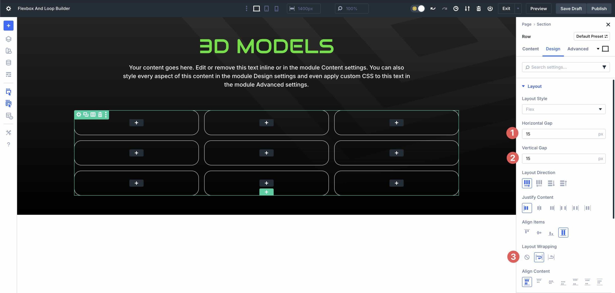
Click into the Row’s Design tab. Set the Horizontal and Vertical Gap to 15px. Enable Layout Wrapping.
From this point, you can add modules to the Loop and assign dynamic tags. Once complete, you’ll have a fully dynamic portfolio Loop to display all of your projects.
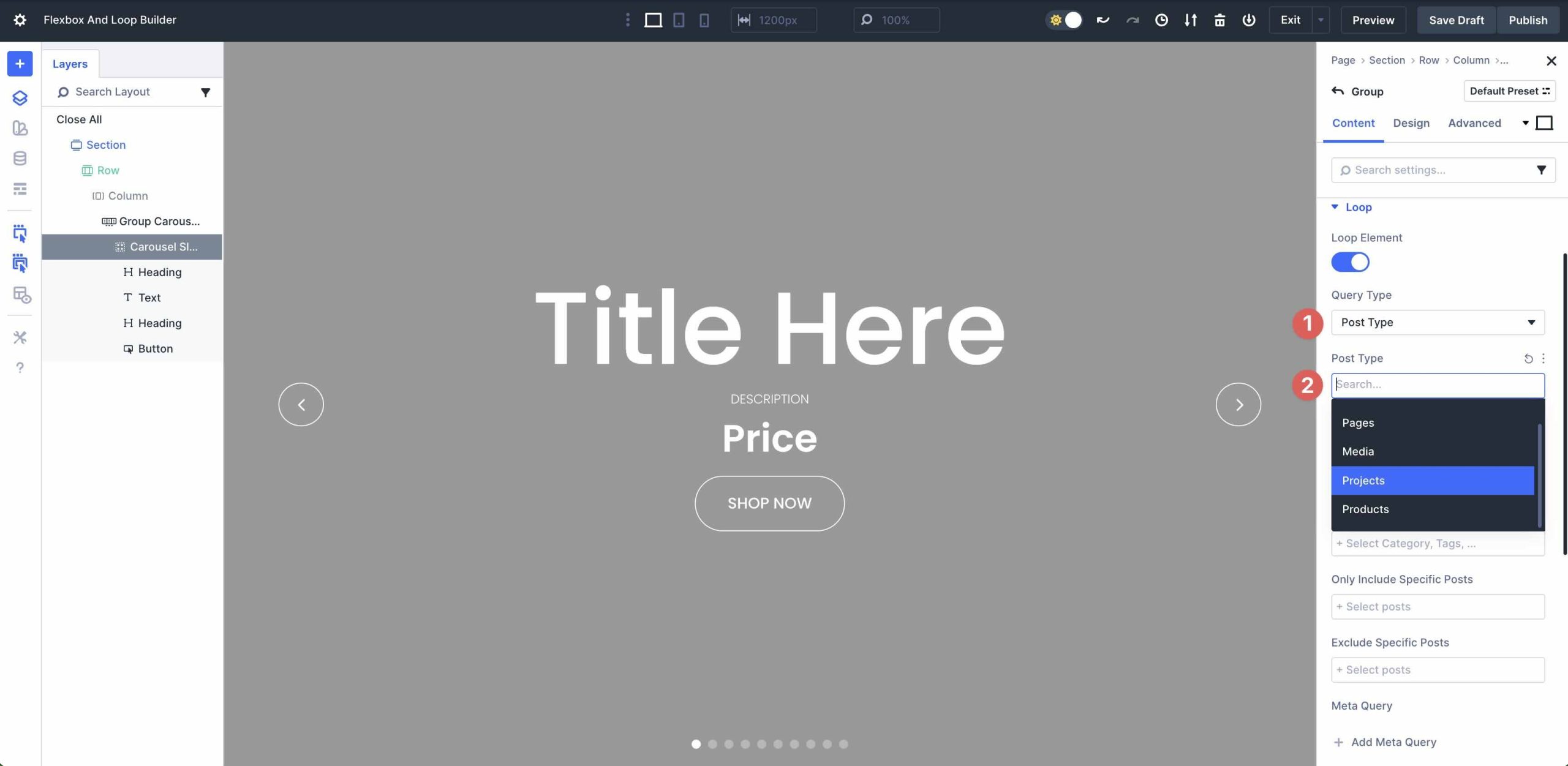
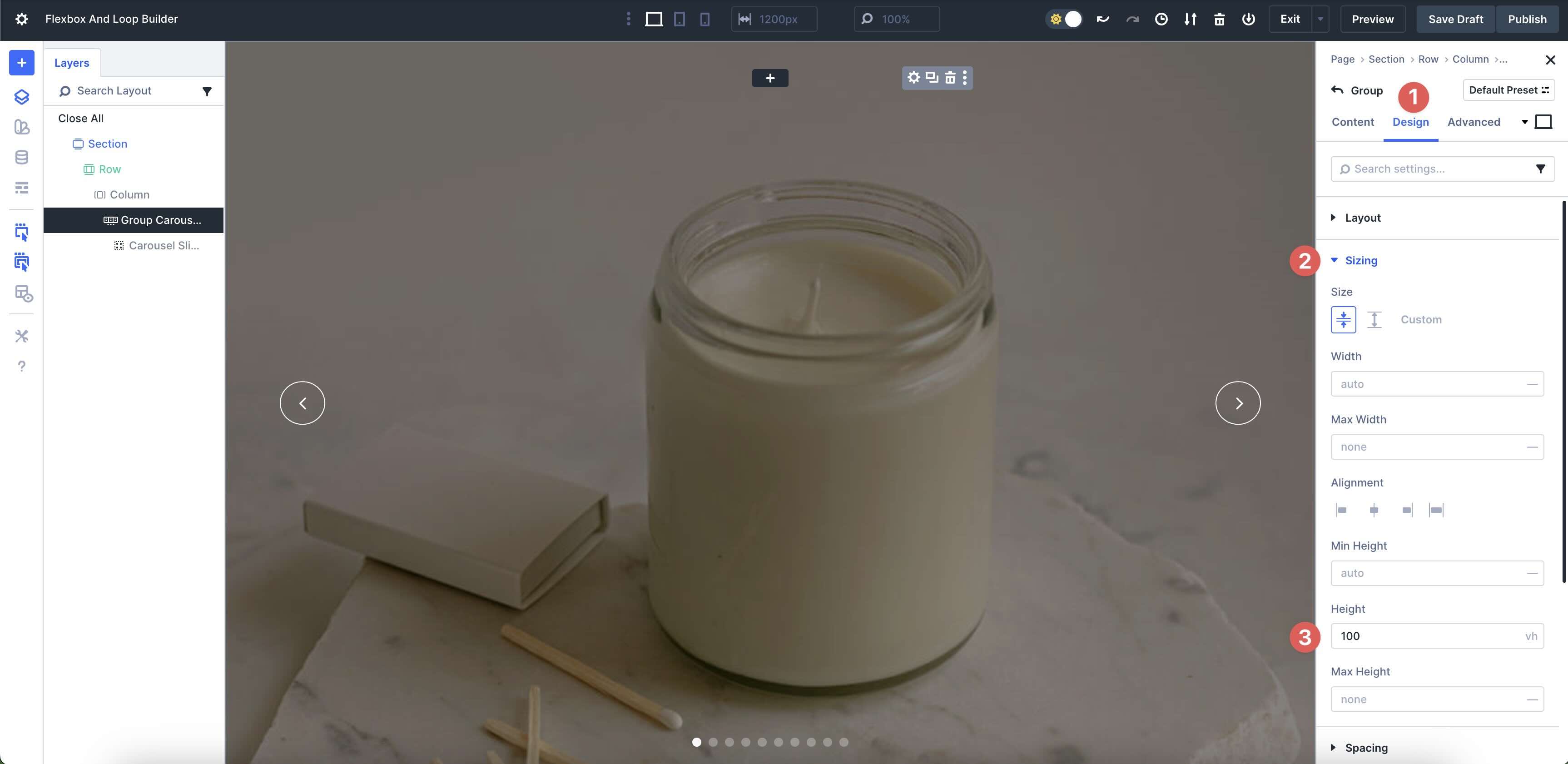
Example 2: WooCommerce Product Carousel
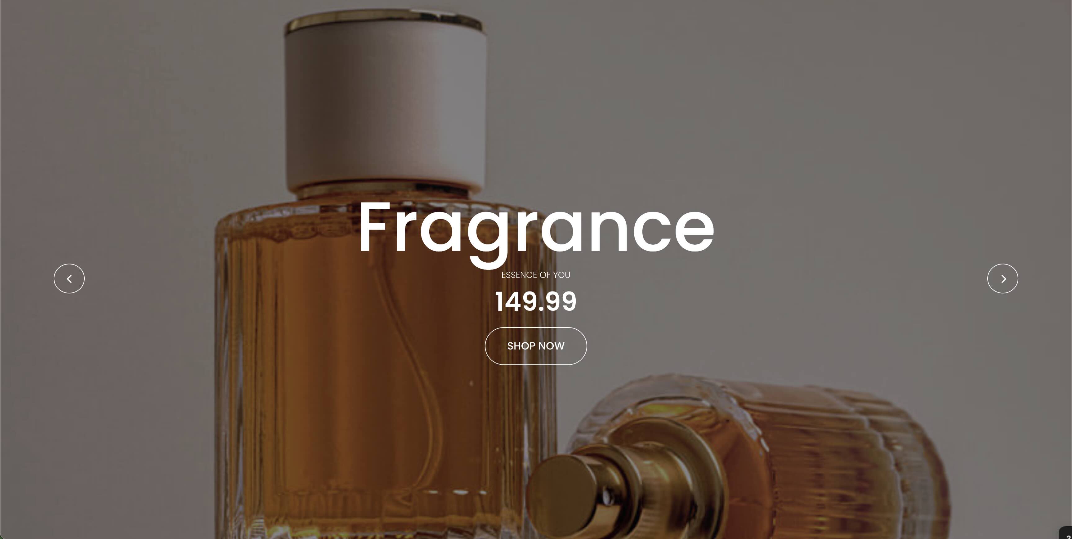
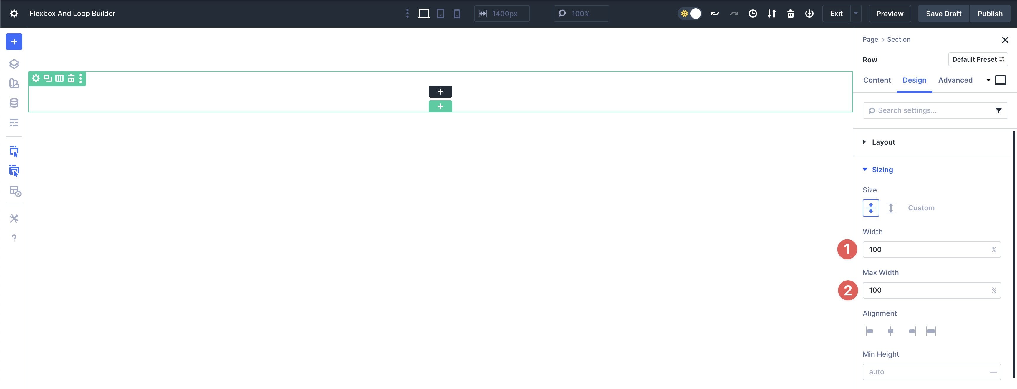
Begin with a single Equal Columns Flex row.
In the Row’s Design tab, expand the Sizing menu. Enter 100% for Width and Max Width.
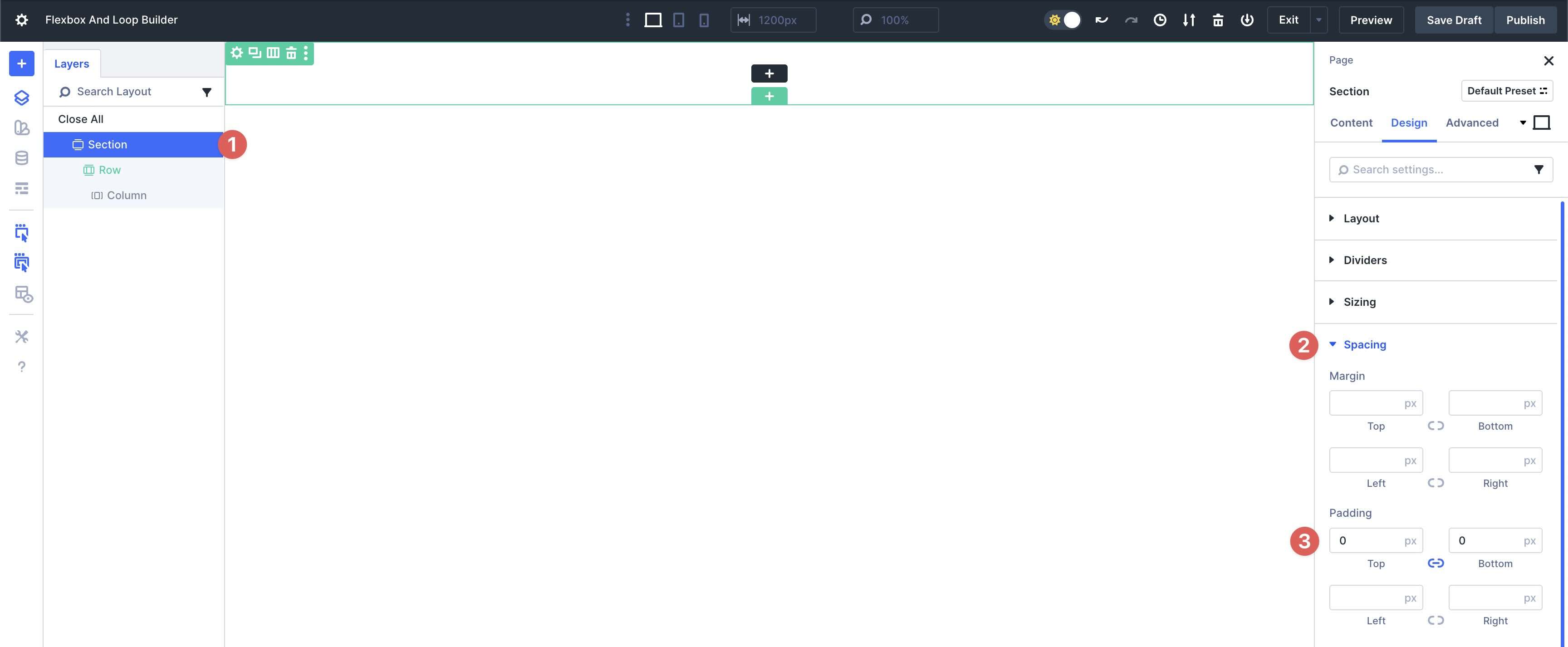
Using Divi’s Layers View, open the Section that holds the Row. Click the Design tab and expand the Spacing menu. Enter 0px Padding to the left and right.
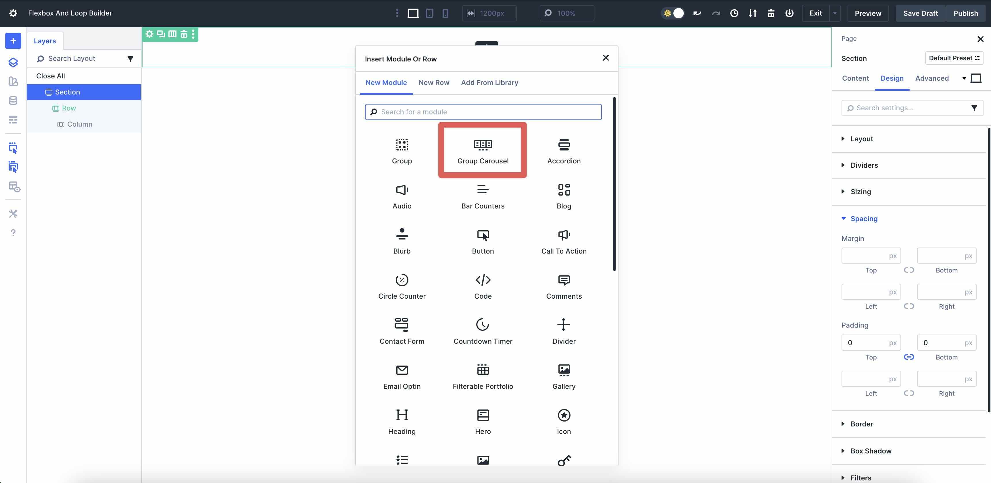
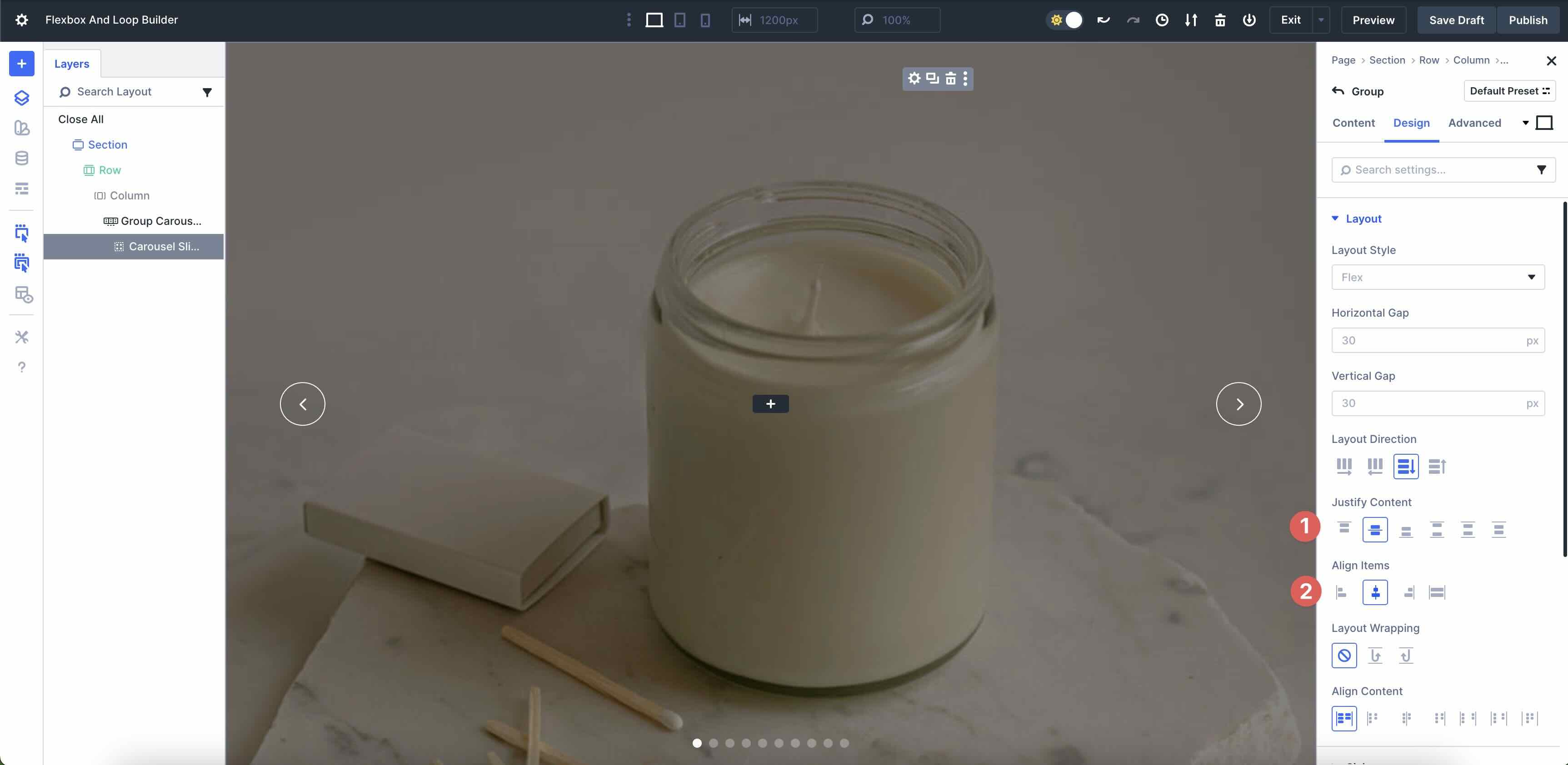
Next, add the Group Carousel module to the Row.
Style the Arrows and Dot Navigation to suit your needs.
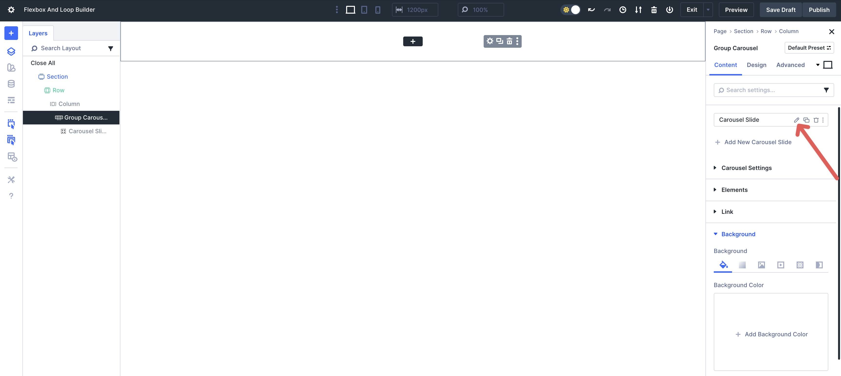
Click into the main Group Carousel module. Edit the Carousel Slide Group by clicking on the Pencil icon.
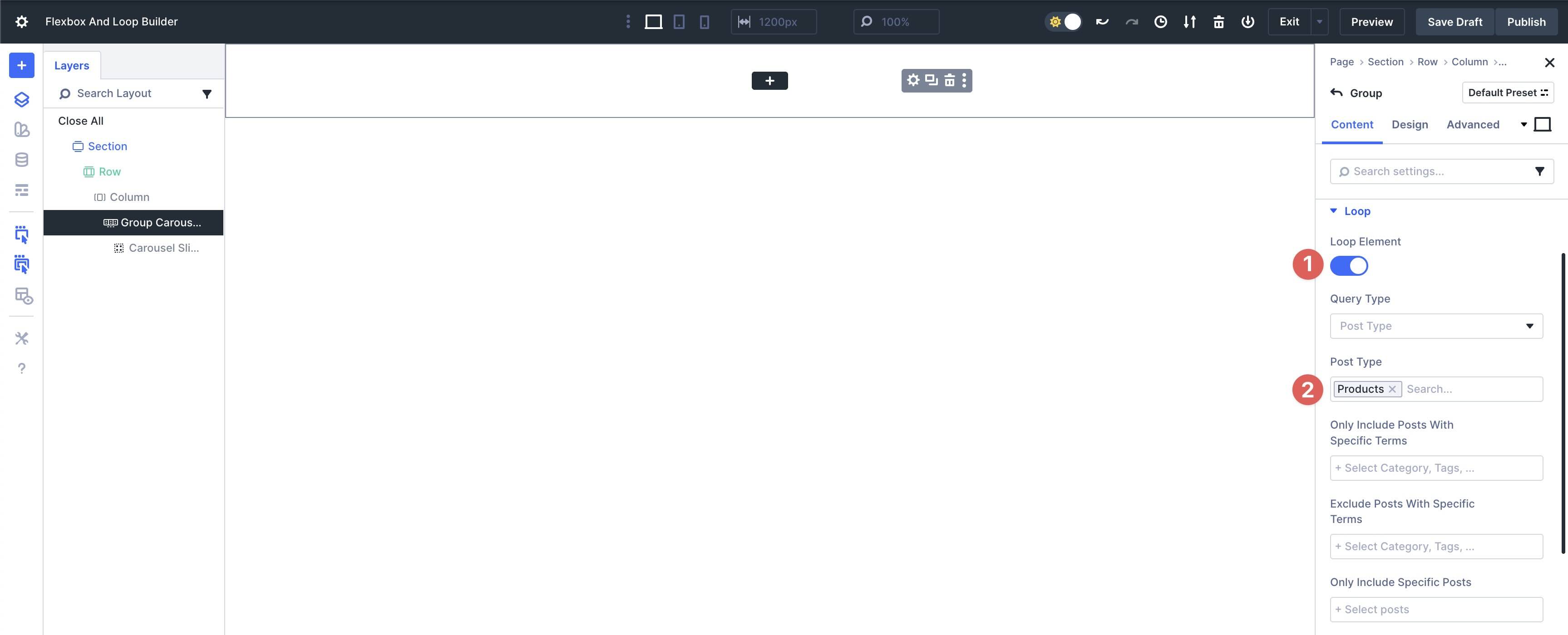
Expand the Loop menu to enable the Loop Element toggle. In the Post Type field, select Products.
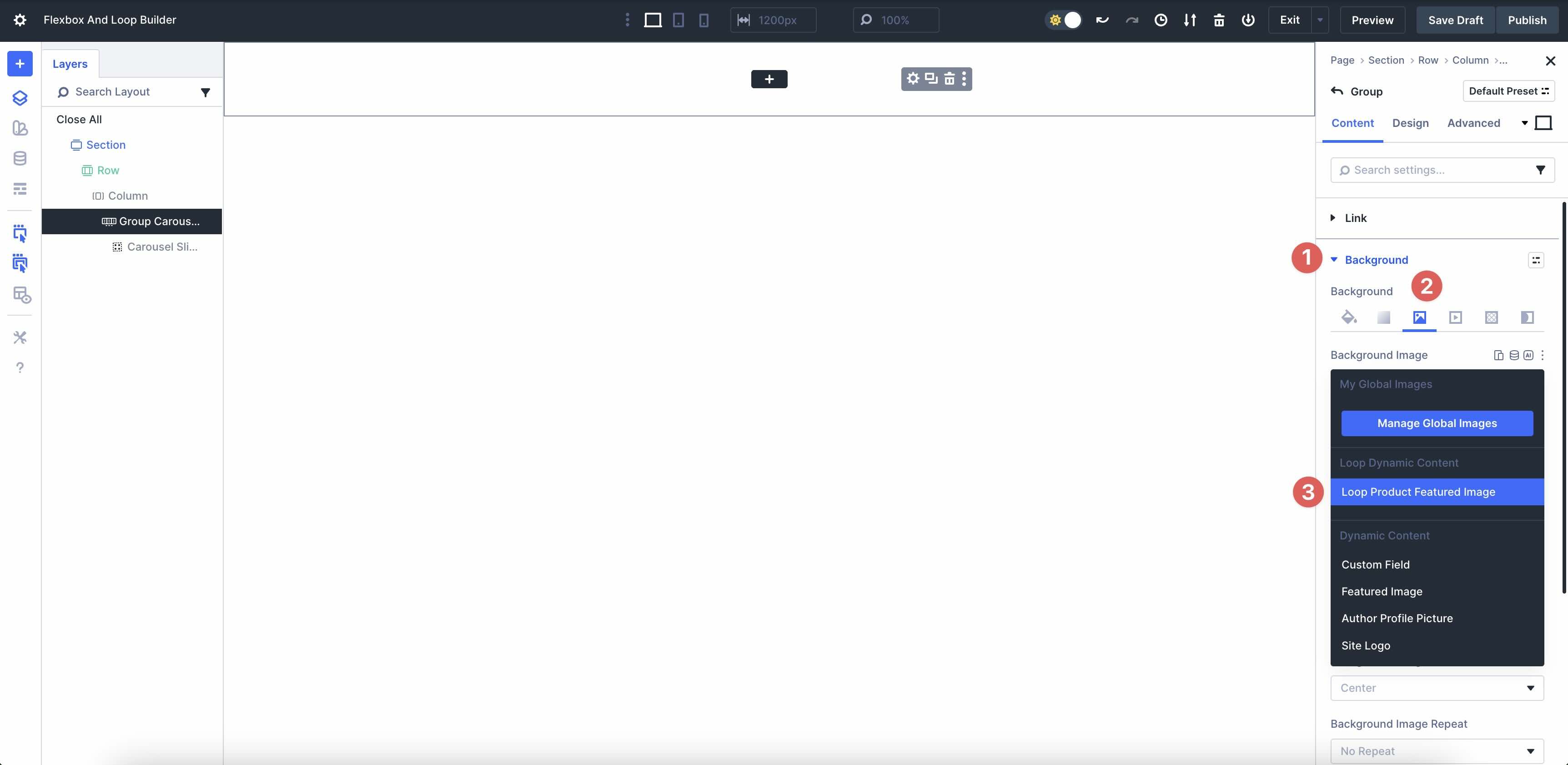
Locate the Background menu and tab over to Background Image. Select Loop Product Featured Image.
In the Design tab, expand the Sizing menu and set the Height to 100vh. This will enable the carousel to occupy the full height of the page.
From there, set the Group’s Flex settings to Justify Content to Center and Align Items to Center.
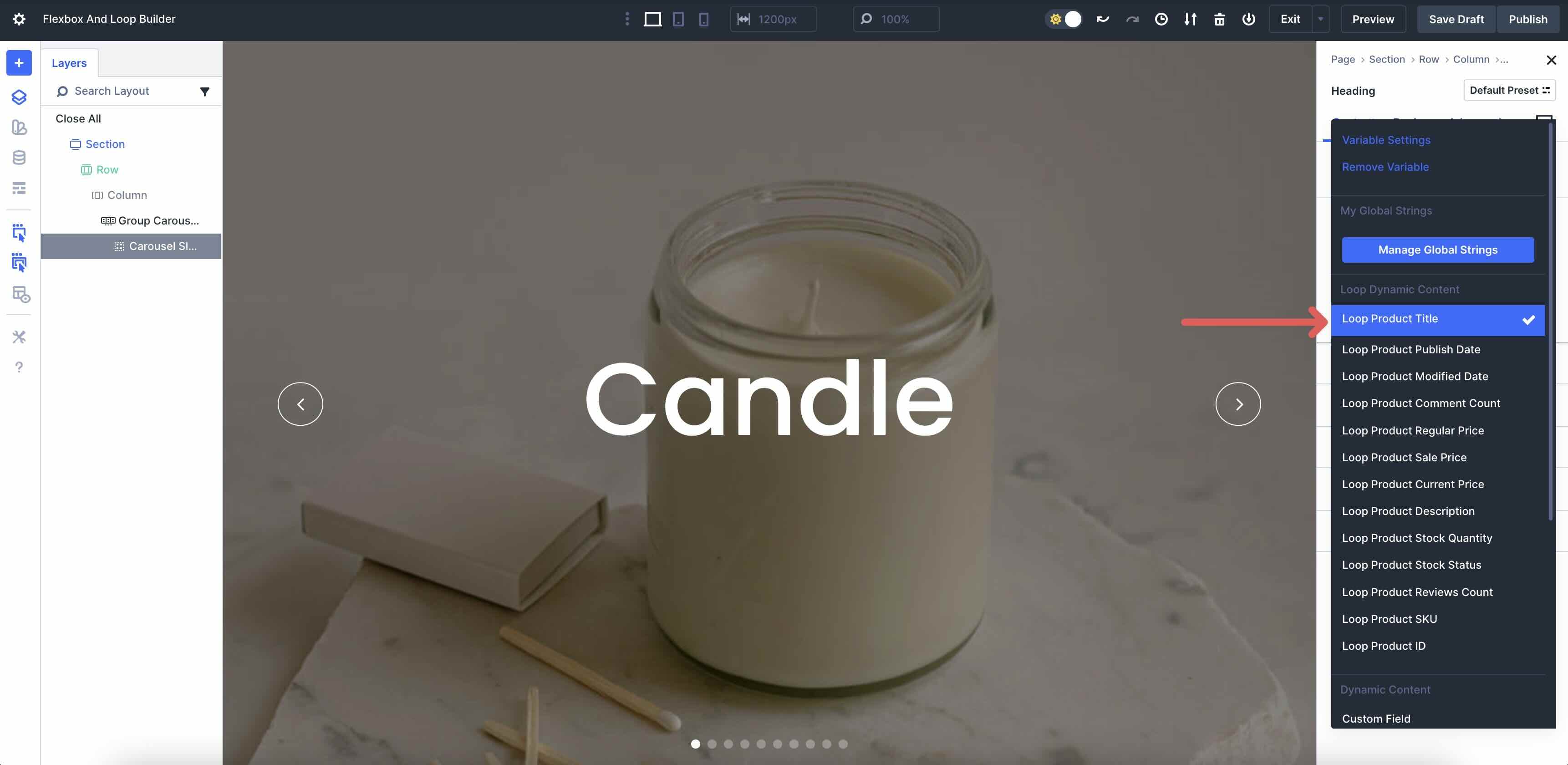
Finally, add modules to the Group to loop the Woo data, including the Loop Product Title, Product Description, Product Price, and Product Link.
When completed, you’ll have a full-width, full-screen slider that you can display featured products on your shop page.
Example 3: Blog Loop Page
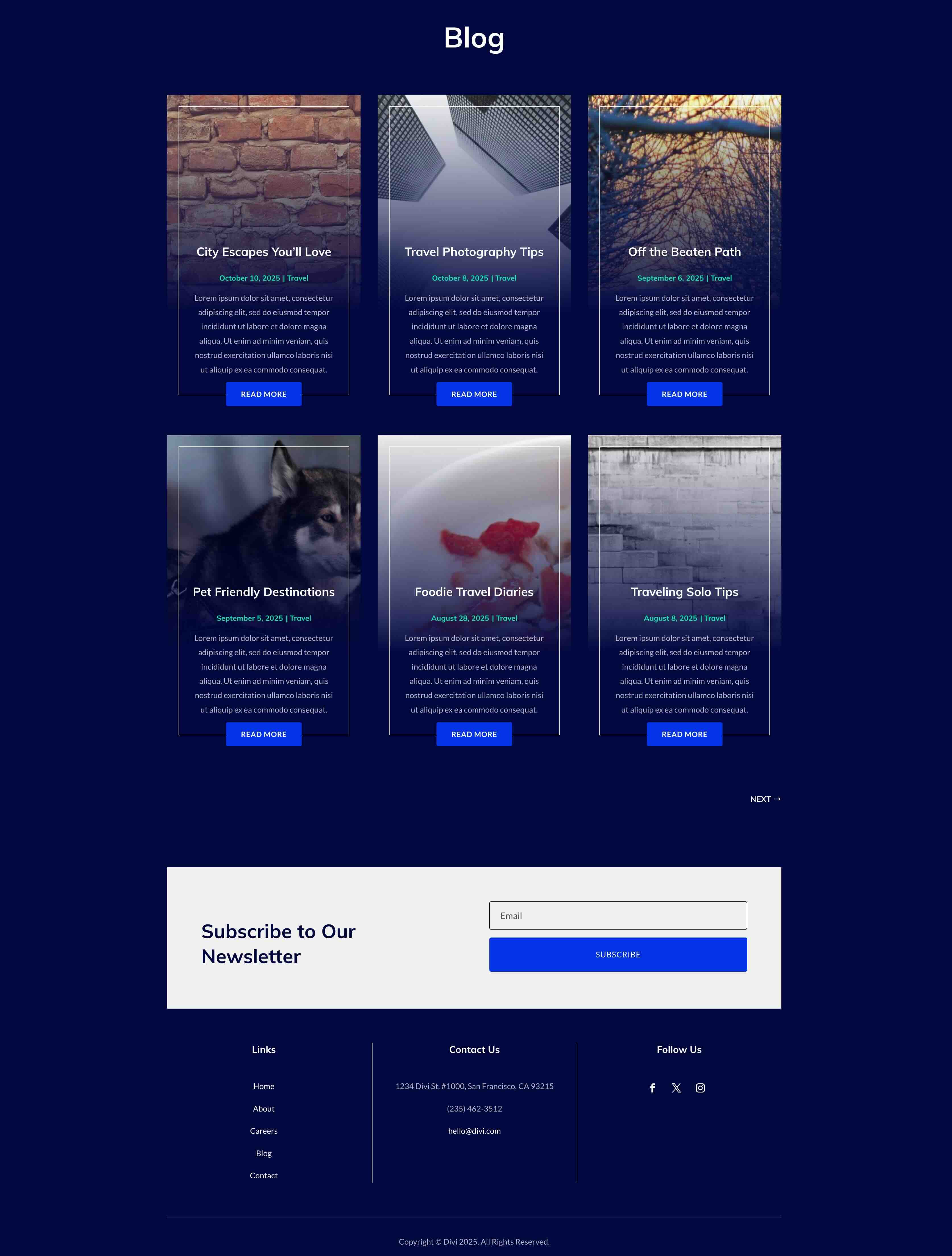
Inspired by modern blog designs that blend visual appeal with effortless content updates, this example transforms a standard blog archive into a sophisticated loop page, utilizing Flexbox for structure and Loop Builder for dynamic content population.
To create this look, start by adding a single-column Flex row to a new or existing page. Navigate to the Column settings and expand the Loop menu. Toggle Loop Element on.
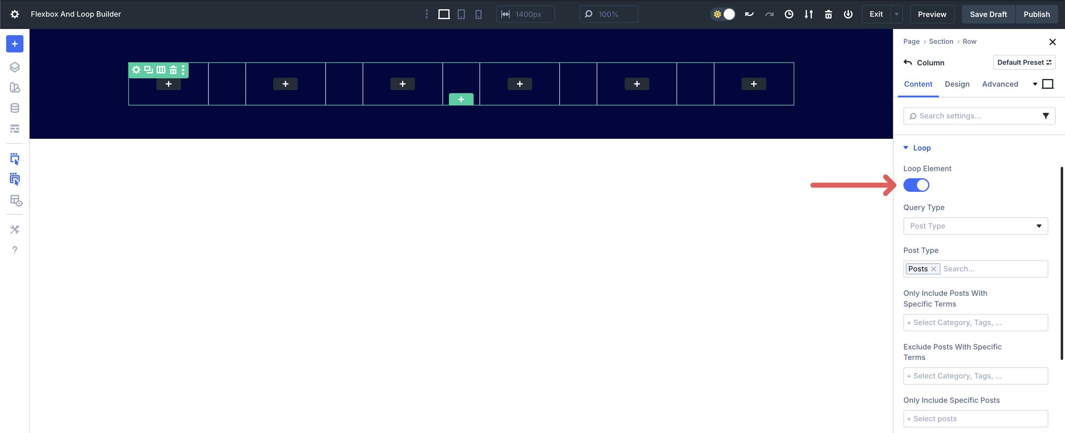
Locate the Posts Per Page field and set it to display 6 posts.
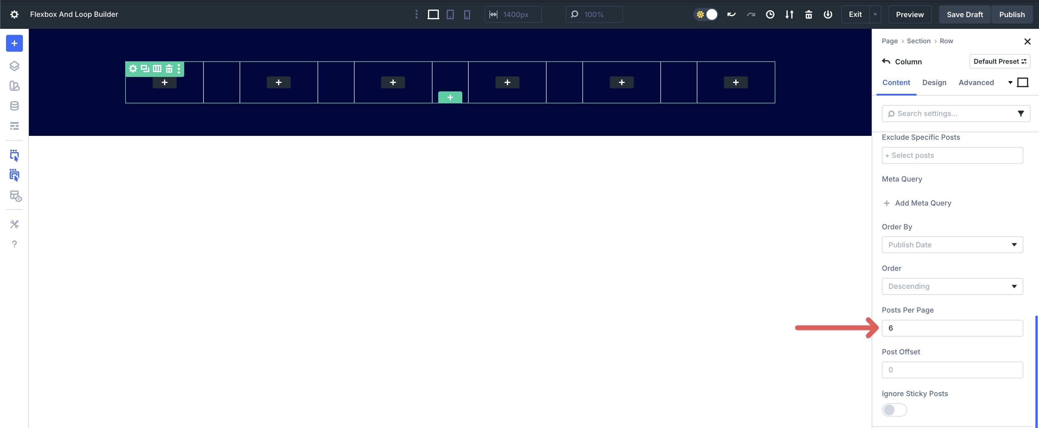
Choose the Design tab and expand the Sizing menu. In the Column Class field, select 1/3.
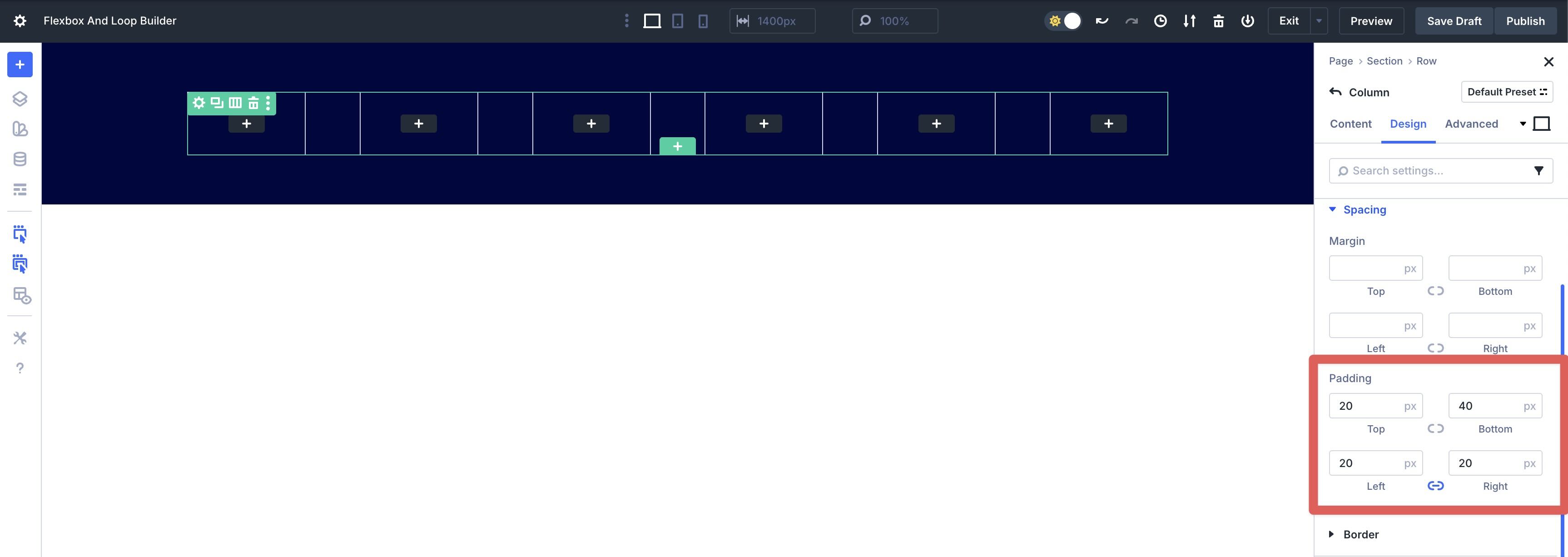
Expand the Spacing menu. In the Padding fields, enter 20px for the top, 40px for the bottom, and 20px for the left and right.
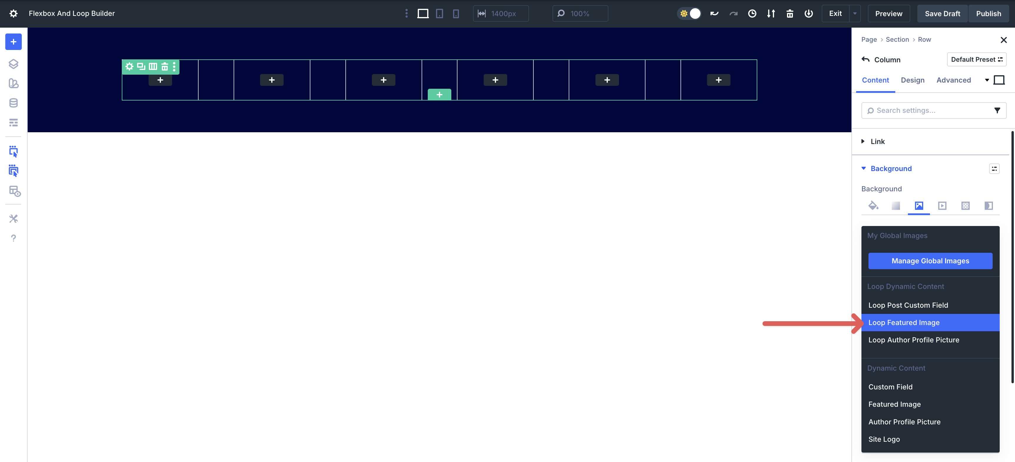
In the Column’s Content tab, expand the Background menu. Next, select the Background Image settings. Click the Dynamic Content icon and choose Loop Featured Image. This displays the featured image of the post as the Column’s background.
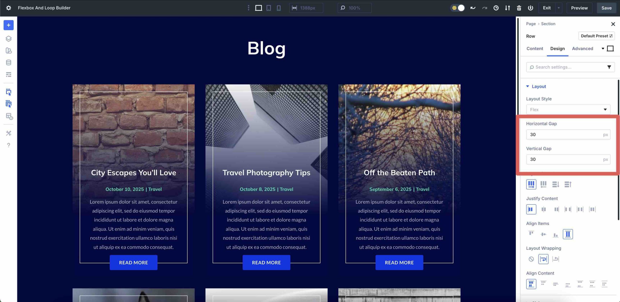
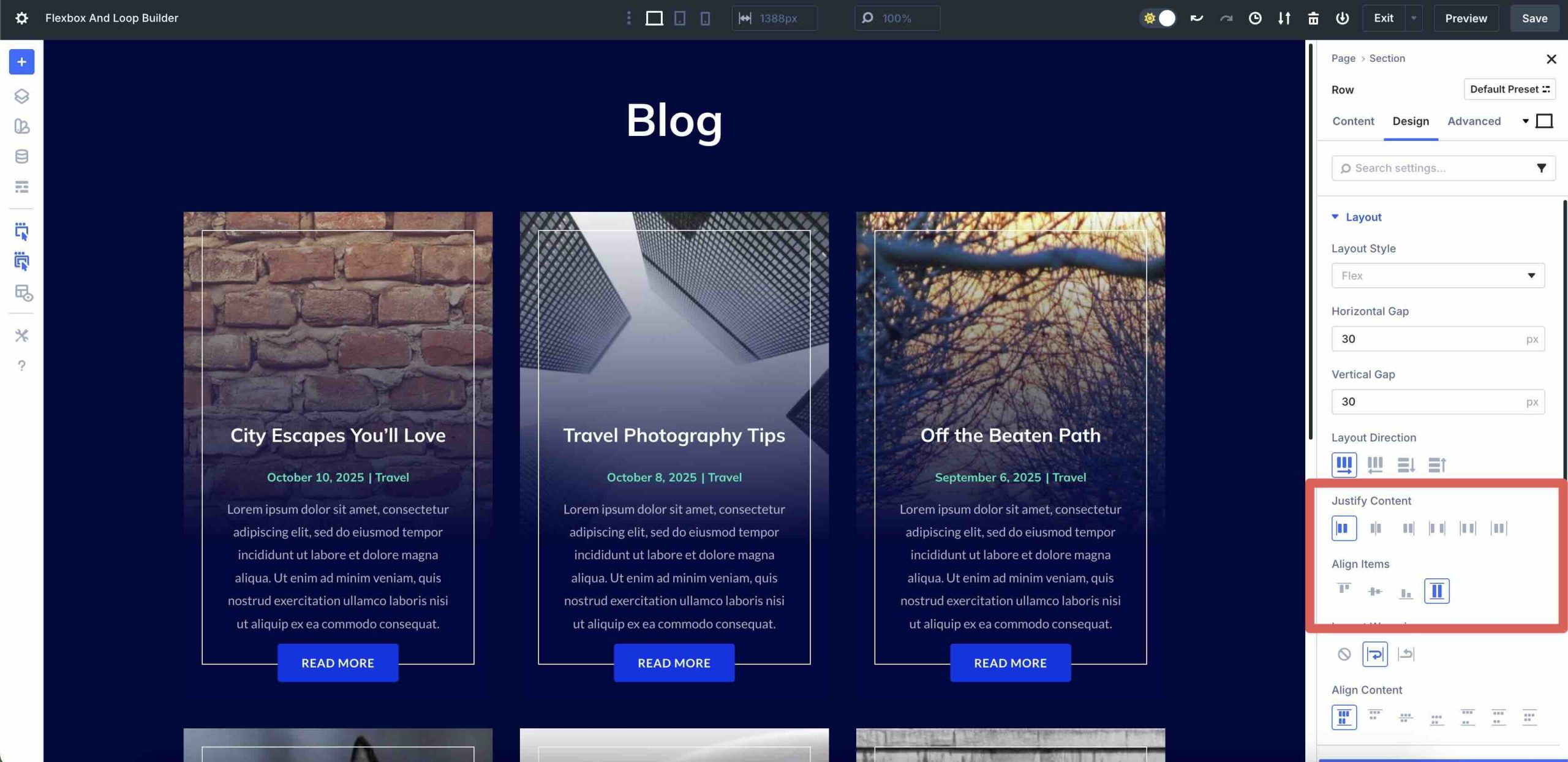
Next, we’ll need to adjust the Row’s Flex settings. Navigate to the Row’s Design tab. Expand the Layout menu and enter 30px for the Horizontal and Vertical Gap. Leave all Flex settings at their defaults, but enable Layout Wrapping. This will enforce the 1/3 column structure and create two rows of 3 posts for the Loop.
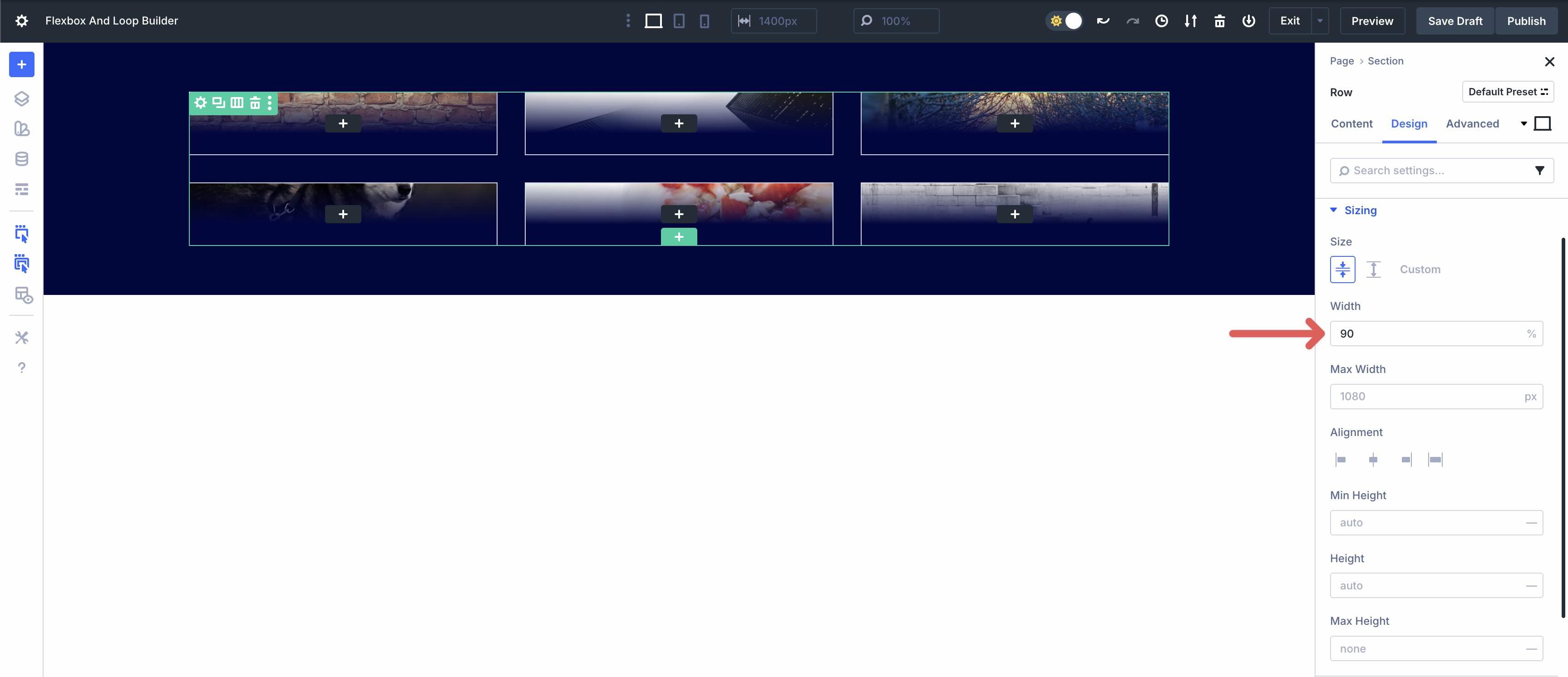
Expand the Sizing menu and enter 90% for the Row’s Width.
From there, add other Dynamic Content tags — Post Title, Post Excerpt, Loop Post Date, Loop Post Terms, etc — to populate the Loop. Once complete, you have a beautiful blog post displayed in a matter of minutes.
Download The Layouts
Creating layouts with Flexbox and Loop Builder is fast, efficient, and helps you break free from the constraints of pre-formatted modules, such as the Blog, Portfolio, and Slider modules. In just a few steps, you can create visually stunning, responsive layouts with ease. If you’d like to download these examples for use on your website or simply to see how they’re created, please fill out the form below.

Create Advanced Layouts With Flexbox And Loop Builder
Divi 5‘s Flexbox and Loop Builder represent a shift in how we design with Divi, turning rigid, static pages into data-driven experiences that scale effortlessly across devices. Flexbox provides the foundation for responsive design, while Loop Builder injects real-time content without requiring a plugin. From equal height dynamic portfolios to blog loops and Woo carousels, these features allow you to build faster, smarter, and more creatively than ever before.
We’re building the next era of Divi together. Your feedback helps to shape what is possible with Divi 5. We encourage you to download the latest Public Beta and share your thoughts with us. Please leave a comment below or on one of our social media channels to share your thoughts.


Leave A Reply