
The majority of website visitors browse on mobile devices, so ensuring the hero section is responsive is crucial to your success. With Divi 5’s Flexbox layout system, reordering hero content for varying screen sizes is quick to do. The integration of Flexbox and Customizable Responsive Breakpoints makes it easy to adjust content, letting you fine-tune layouts with a few clicks.
In this post, we’ll dive into building and reordering a hero section with Flexbox, so you’ll better understand the system and how to use it.
What Is Flexbox?
Flexbox, short for Flexible Box Layout, is a CSS layout model designed for arranging elements in rows or columns. It allows items to dynamically expand, shrink, or wrap to fit the available space. This makes it ideal for creating flexible and responsive designs with precise control over alignment, spacing, and ordering.
In Divi 5, Flexbox has been fully integrated as the core layout system, marking an evolution from previous versions. It replaces older systems, such as Specialty Sections and Fullwidth Sections (which have been deprecated), eliminating many of the constraints that required workarounds. In Divi 5, you no longer need to duplicate content or use custom CSS for responsive reordering. At its core, Divi 5 enables you to use Nested Rows and Module Groups, and allows for infinite layout possibilities.
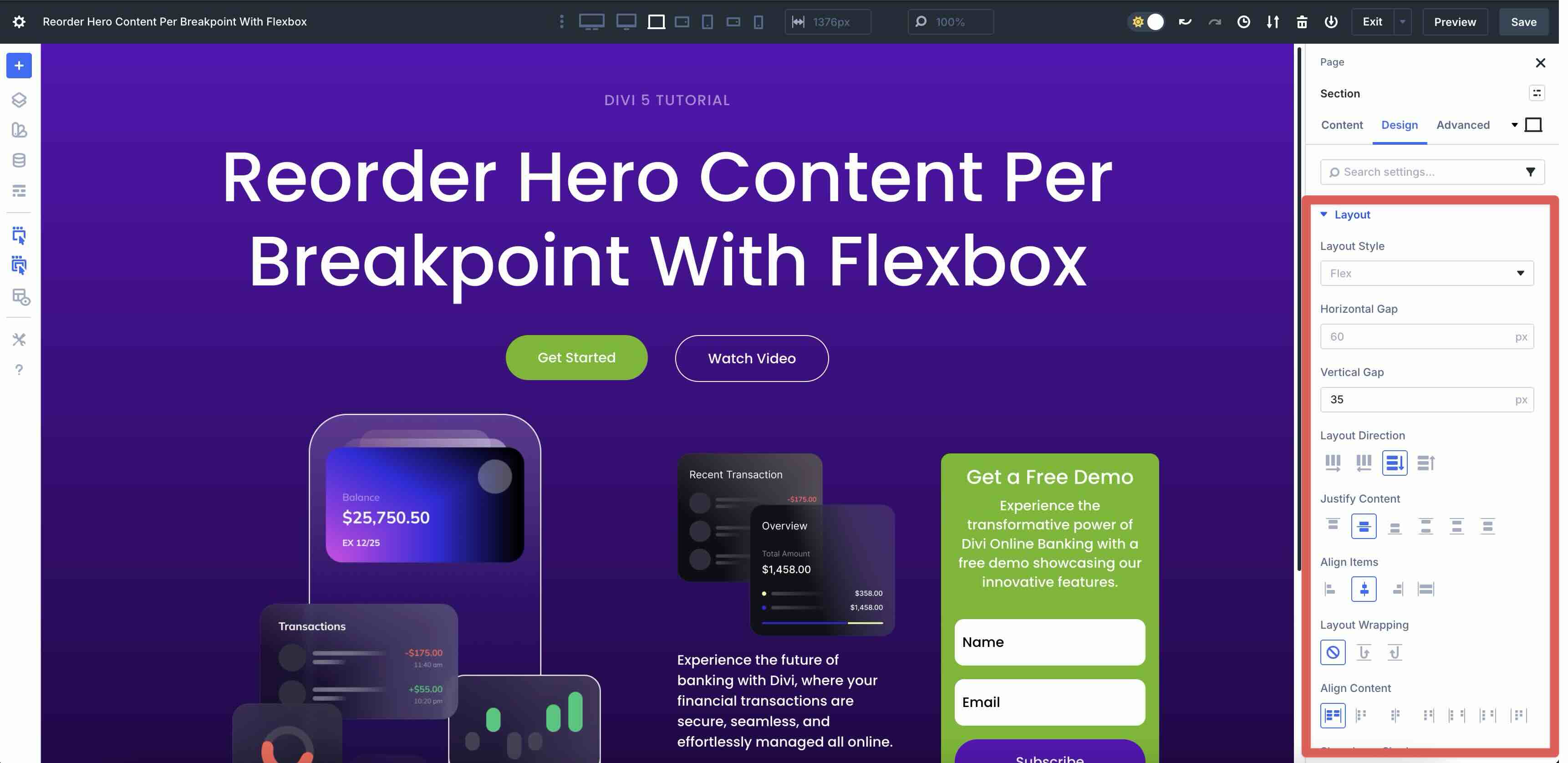
Working with Flexbox in Divi 5 is straightforward. When adding new rows, Flex is selected as the default layout style, unless you choose a Grid-specific structure. When using Layout Packs or Divi Starter Sites, you’ll currently have to switch from Block to Flex. It’s as easy as opening the Design tab in the Row’s settings, expanding the Layout menu, and setting Layout Style to Flex.
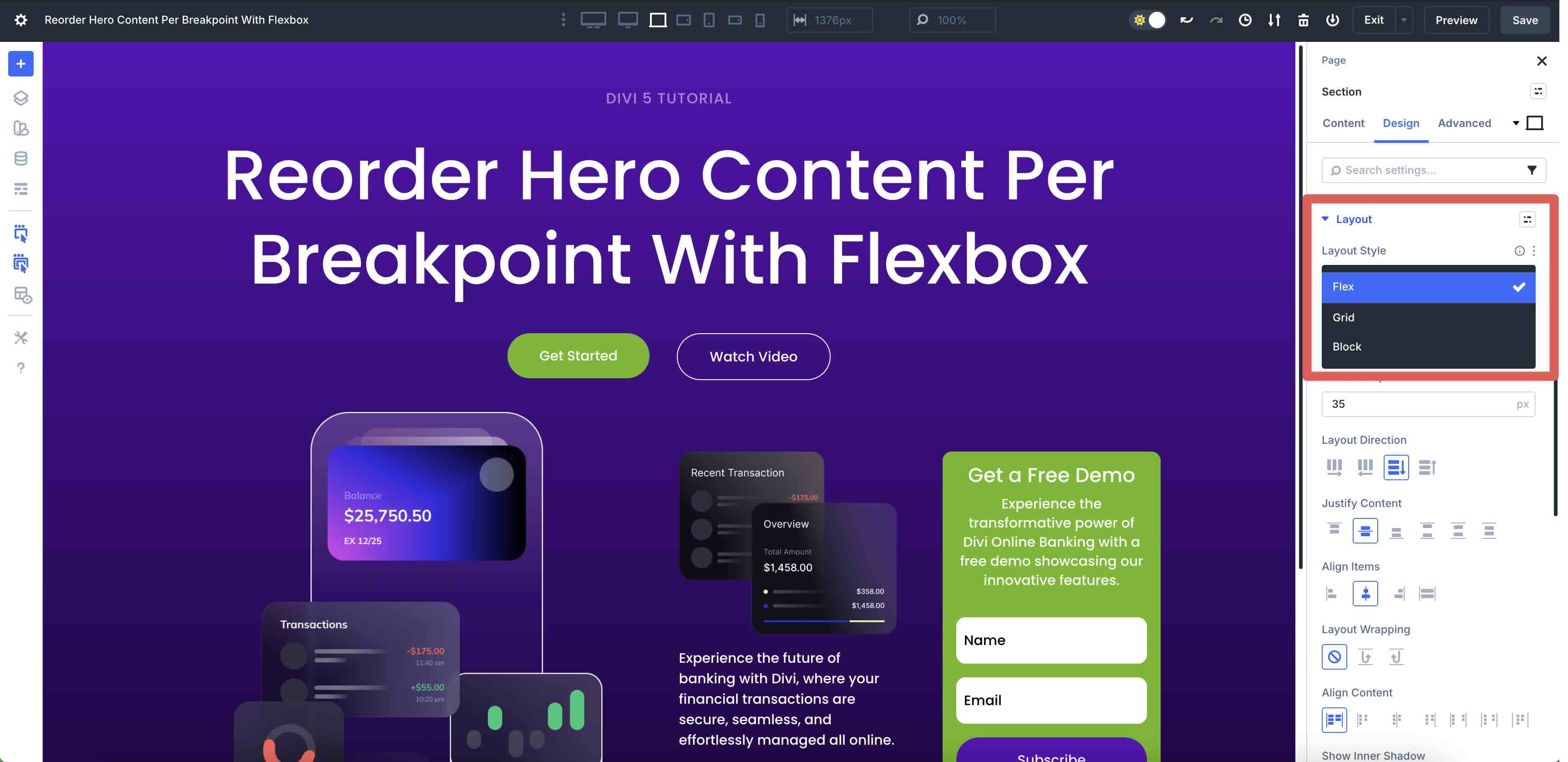
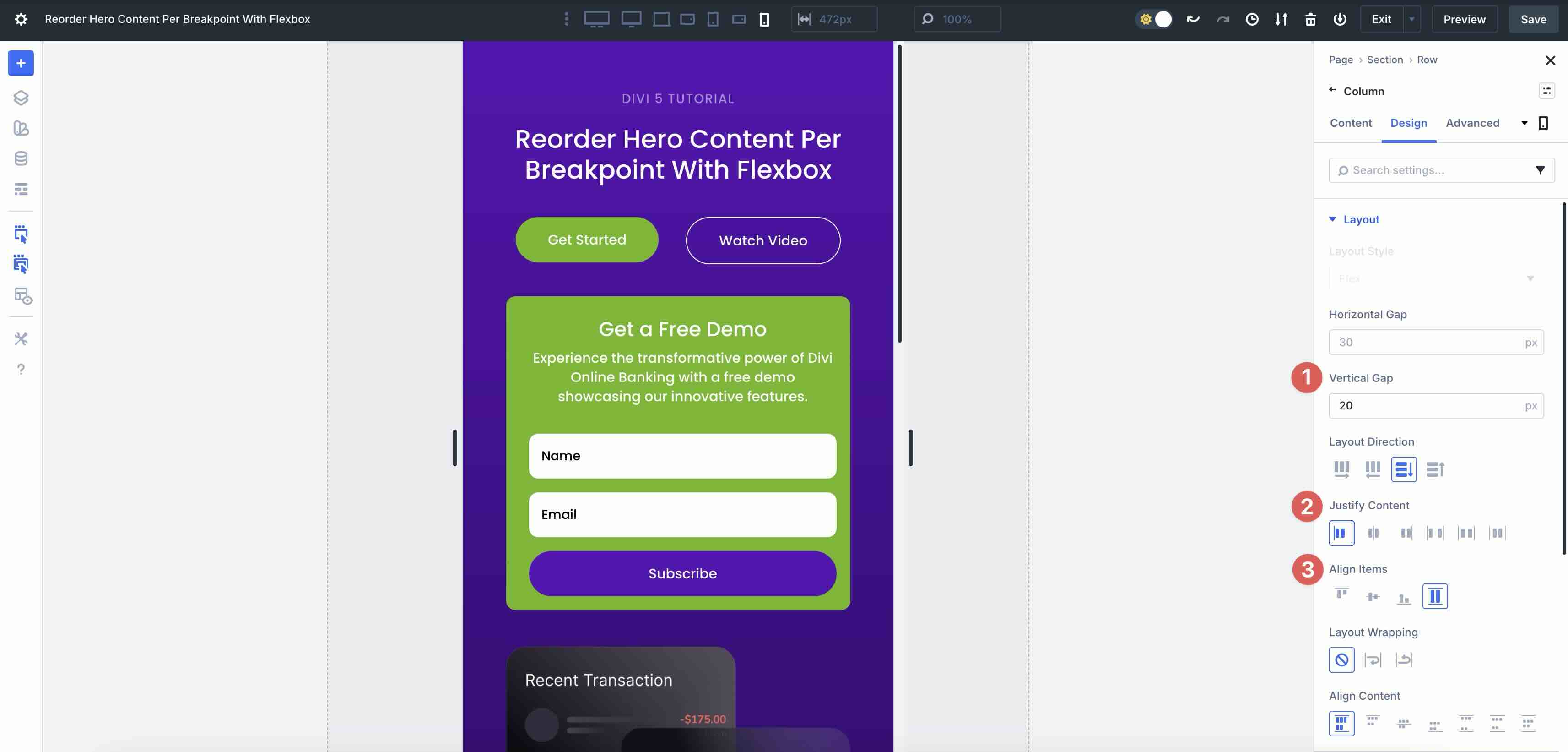
From there, you’ll gain access to intuitive controls for Layout Direction, Justify Content, Align Items, and Layout Wrapping. These settings are fully responsive, allowing for unique layouts per breakpoint right inside the Visual Builder.
Key Features Of Flexbox
- Layout Direction: Choose from Row, Row Reverse, Column, and Column Reverse to control the main axis and flow of elements. This setting is ideal for reversing content order on mobile or switching to vertical stacking.
- Justify Content and Align Items: Precise horizontal and vertical alignment options, including Start, Center, End, Space Between, Space Around, Space Evenly, and Stretch, for perfect spacing and positioning.
- Layout Wrapping: This setting decides how elements behave when space is limited. Use Wrap for items to flow to a new line, Wrap Reverse, or No Wrap to keep items on one line.
- Nested Elements: Infinite nesting of rows and modules enables complex, multi-level designs, such as overlapping-element grids.
- Responsive Integration: Seamlessly pairs with Divi 5’s Customizable Responsive Breakpoints and the Responsive Editor, allowing per-device tweaks like unique directions, alignments, or individual column reordering.
- Structure Templates: A selection of pre-built row templates that leverage Flexbox for quick starts on hero sections and beyond.
Benefits Of Flexbox
Flexbox in Divi 5 simplifies responsive design by letting you reorder elements across devices with ease. Using Display Order and Layout Direction changes, you can prioritize content — like moving text above images on mobile — without duplicating sections, hiding modules, or adding custom CSS.
It also boosts flexibility, allowing elements to grow, shrink, or wrap dynamically to fit any space. This results in fluid layouts that adapt smoothly to different screen sizes and varying amounts of content. Flexbox generates cleaner, lighter CSS for faster page loads and a more responsive Visual Builder experience, even with complex, nested layouts.
The intuitive controls put the power at your fingertips through the Visual Builder’s real-time previews and responsive toggles, making adjustments quick and straightforward.
How To Reorder Hero Content Per Breakpoint
This section will walk you through how to reorder hero content at each breakpoint — Desktop, Tablet, and Phone — so that you have a clean, consistent hero section that displays beautifully on any screen size. I won’t walk you through the design process. Instead, I’ll focus on demonstrating how to use Divi 5’s Flex settings to create a responsive hero section in a few easy steps.
Enabling Responsive Breakpoints In Divi 5
Before beginning, ensure that you enable all seven customizable responsive breakpoints. This will allow you to control how your website looks across different screen sizes.
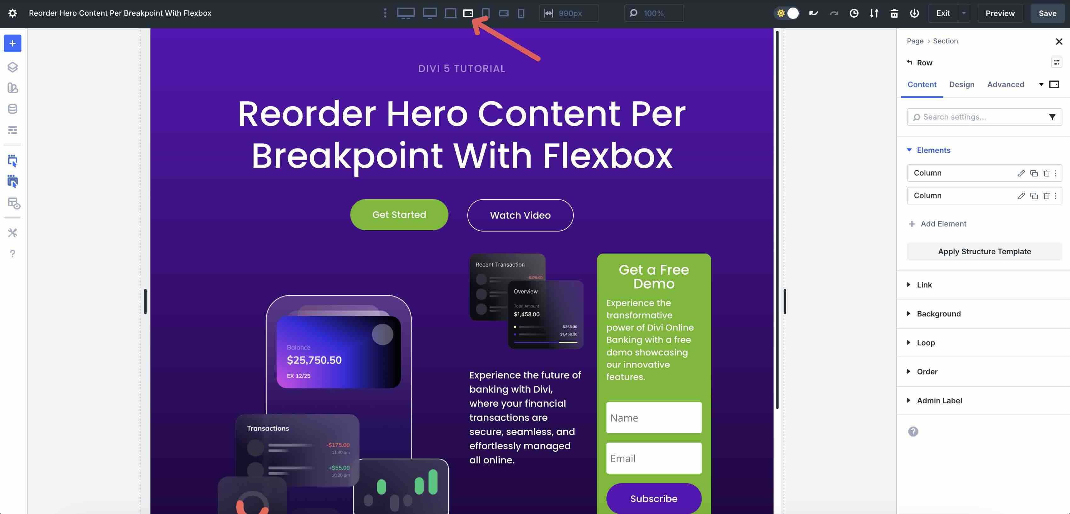
Locate the ellipsis menu in the toolbar at the top center of the Visual Builder. Select it to open the settings.
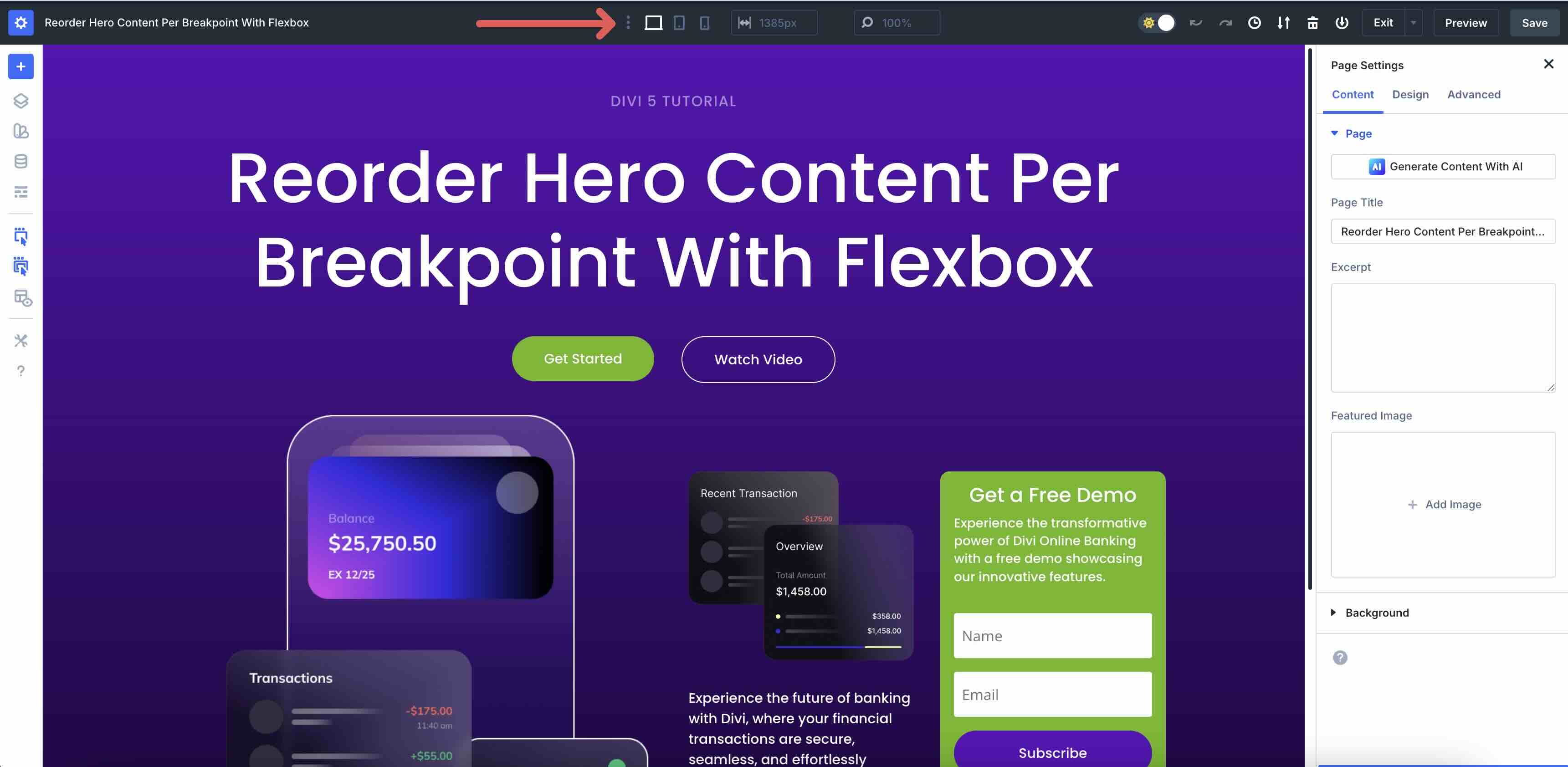
When the Sitewide Responsive Breakpoints modal appears, toggle on the breakpoints you want to enable. Click the Save button and then Update to add those breakpoint views to the Visual Builder.
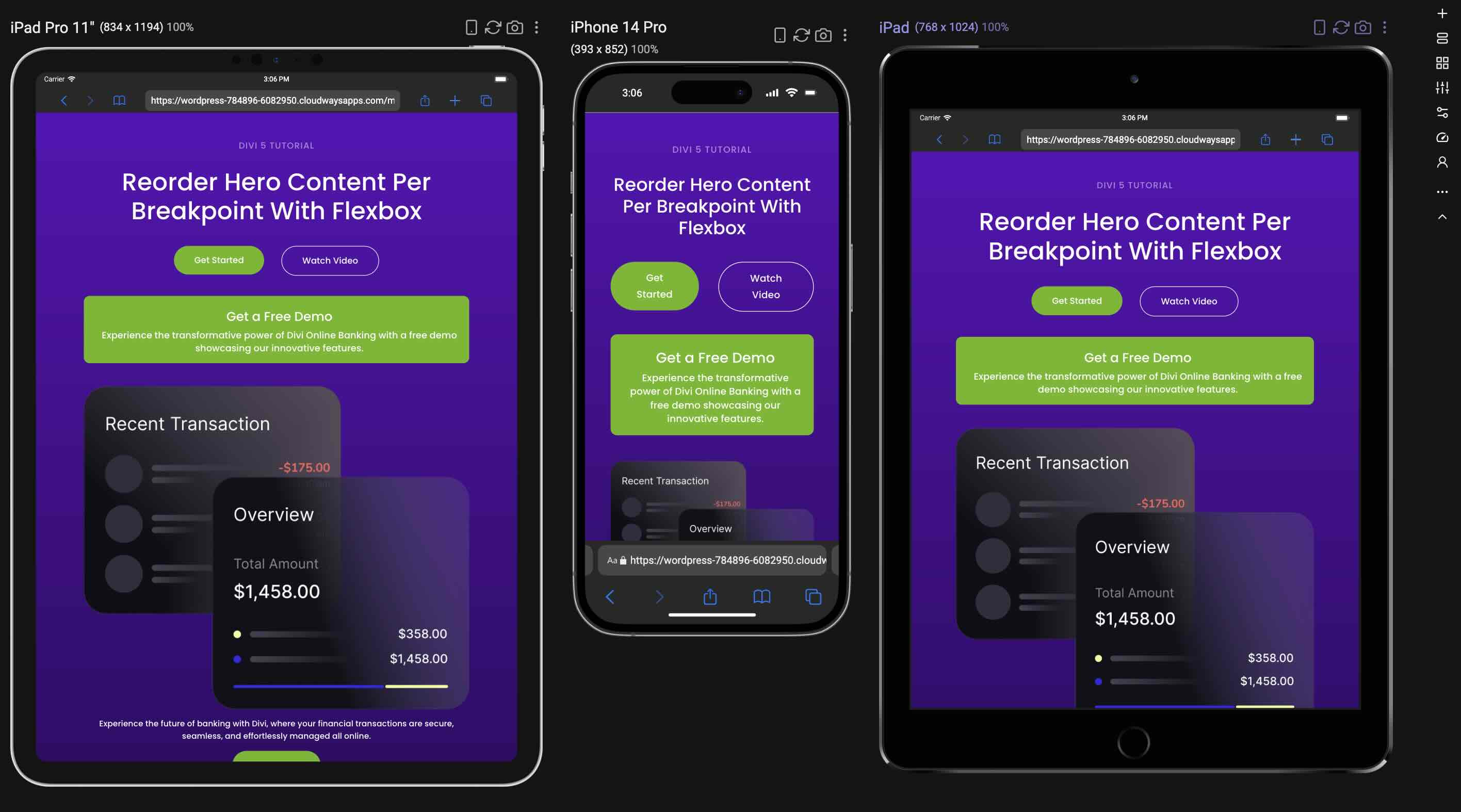
Beyond the default Desktop view, we’ve added six new breakpoints. With them, you can easily view and edit designs from Ultra Wide to Phone Wide, as well as Tablet and Phone views. Changes are saved specifically to each breakpoint, allowing you to edit individual views without affecting the others.
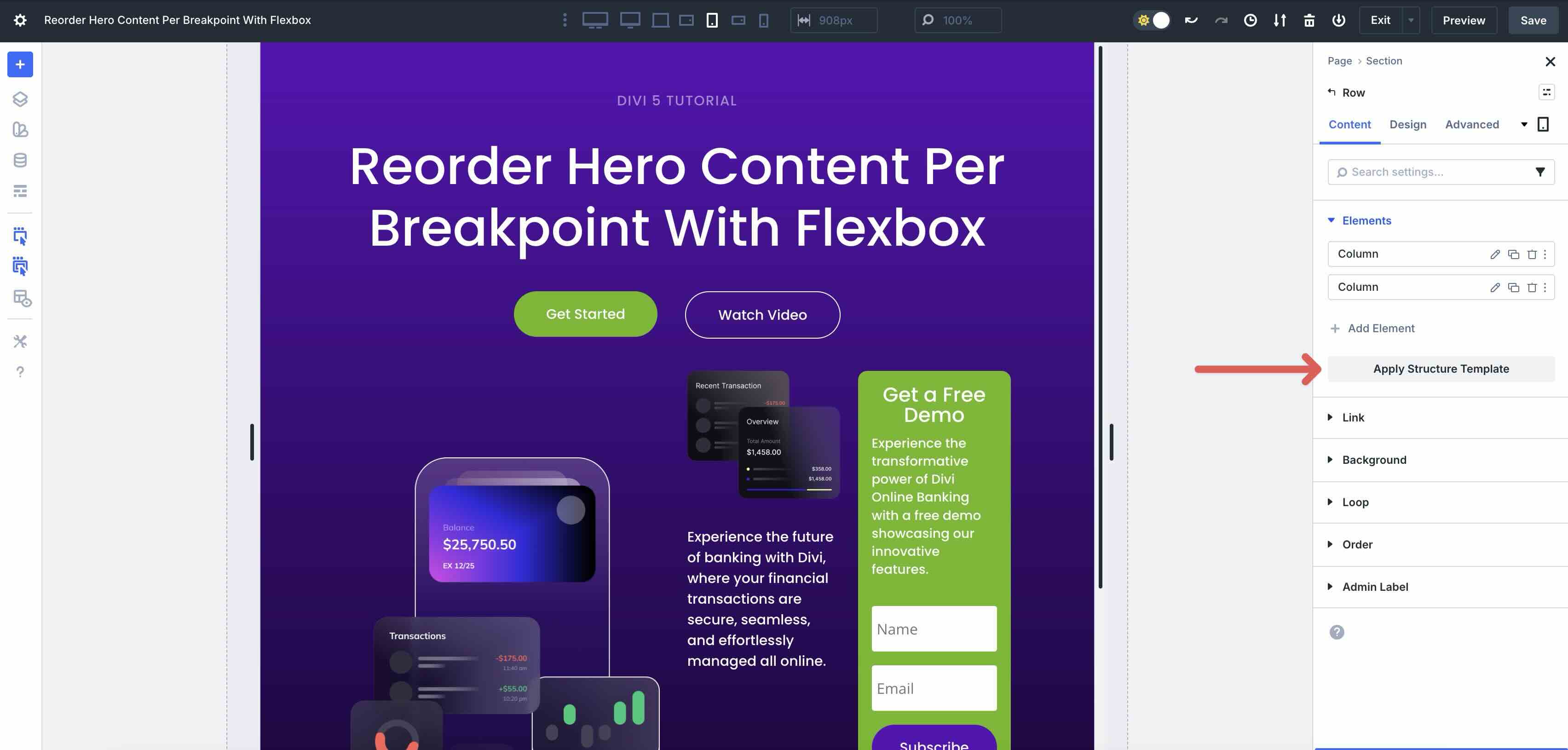
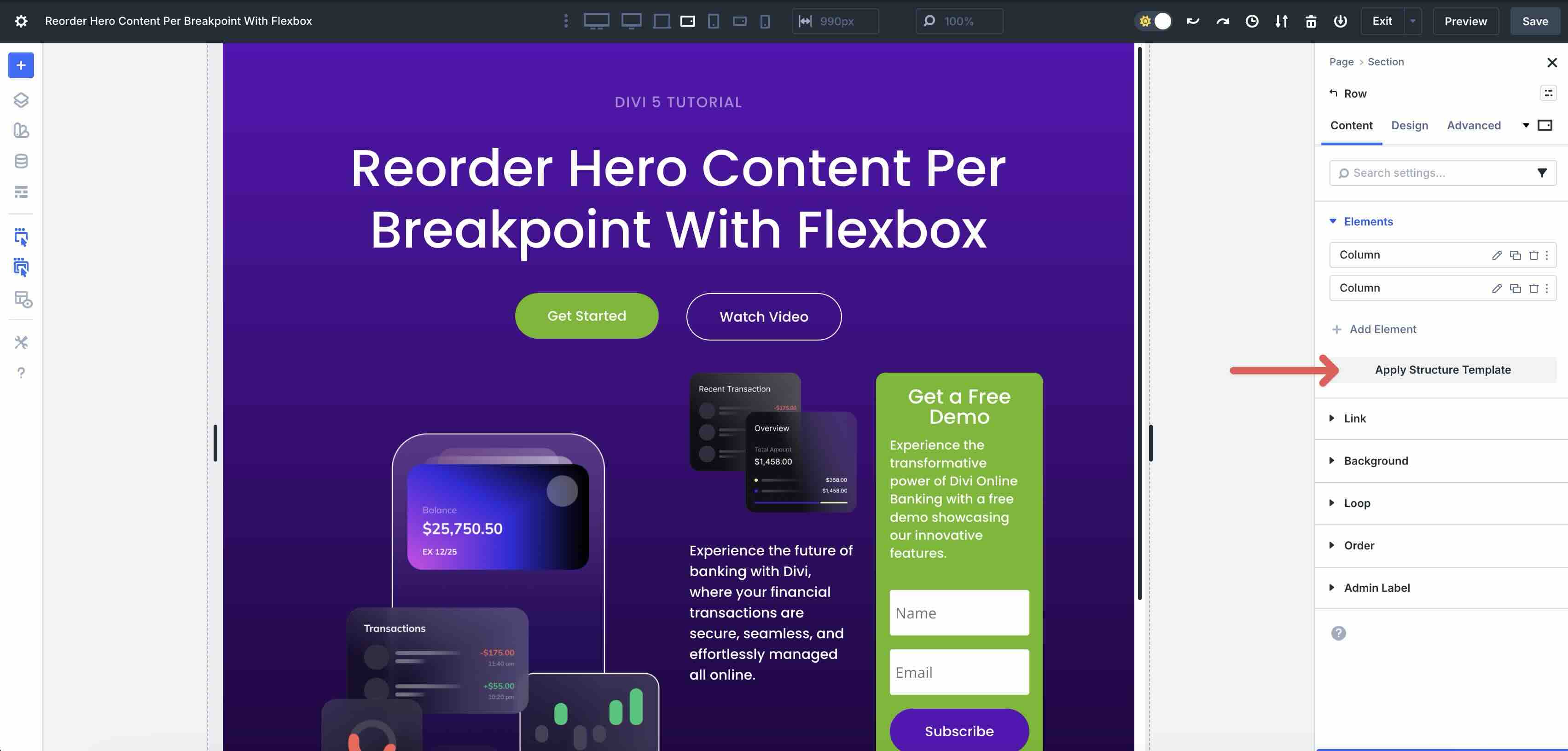
Understanding Display Order and Structure Templates
One of Flexbox’s best features for responsive reordering is the Display Order field. In Divi 5, you can assign an order value to individual columns within a Flex row. These values enable you to swap column positions without using Visibility settings or custom CSS. For example, you can keep an image on the left and text on the right for desktop, then set the text column to order 1 and the image to order 2 on mobile so the text appears first.
You can assign any numerical value in the Display Order field, with the default always set to 0. Items with lower numbers appear first in the visual flow, while higher numbers come later. For example, set a Column to 1 to make it appear first. Set another to 2 or leave it at 0 if you want it first. Negative numbers are also allowed if you need to push something to the very top.
These order values are fully responsive. Set them once per breakpoint in the Visual Builder. This gives you precise control over stacking order without changing the underlying HTML structure or relying on CSS.
What Are Structure Templates?
Complementing Display Order are Divi 5’s Structure Templates. You can adjust the column structure for smaller screen sizes to control how content is displayed.
For example, a two-column layout on Desktop can be changed to a one-column layout for tablet and mobile, setting up a better viewing experience for your site’s visitors.
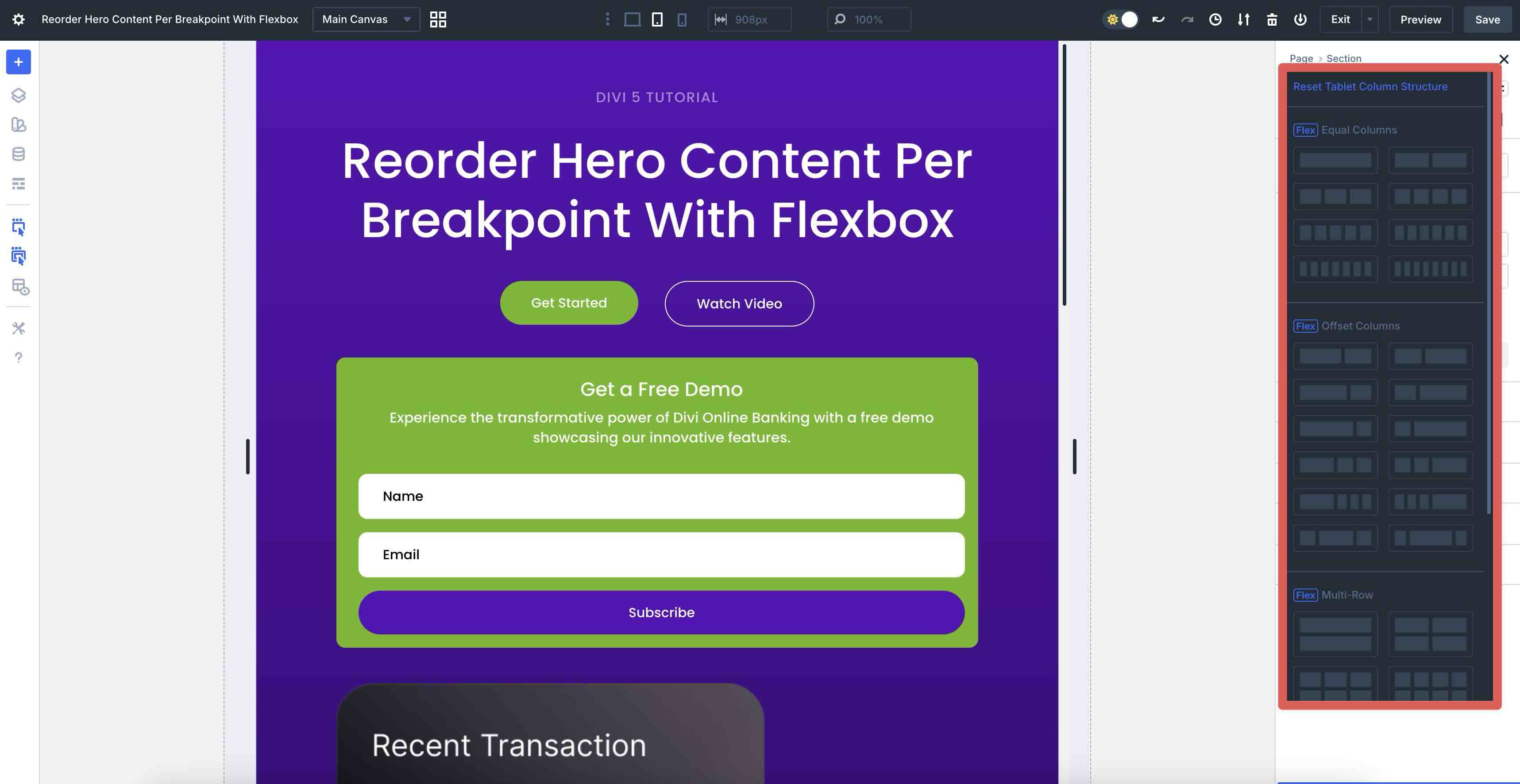
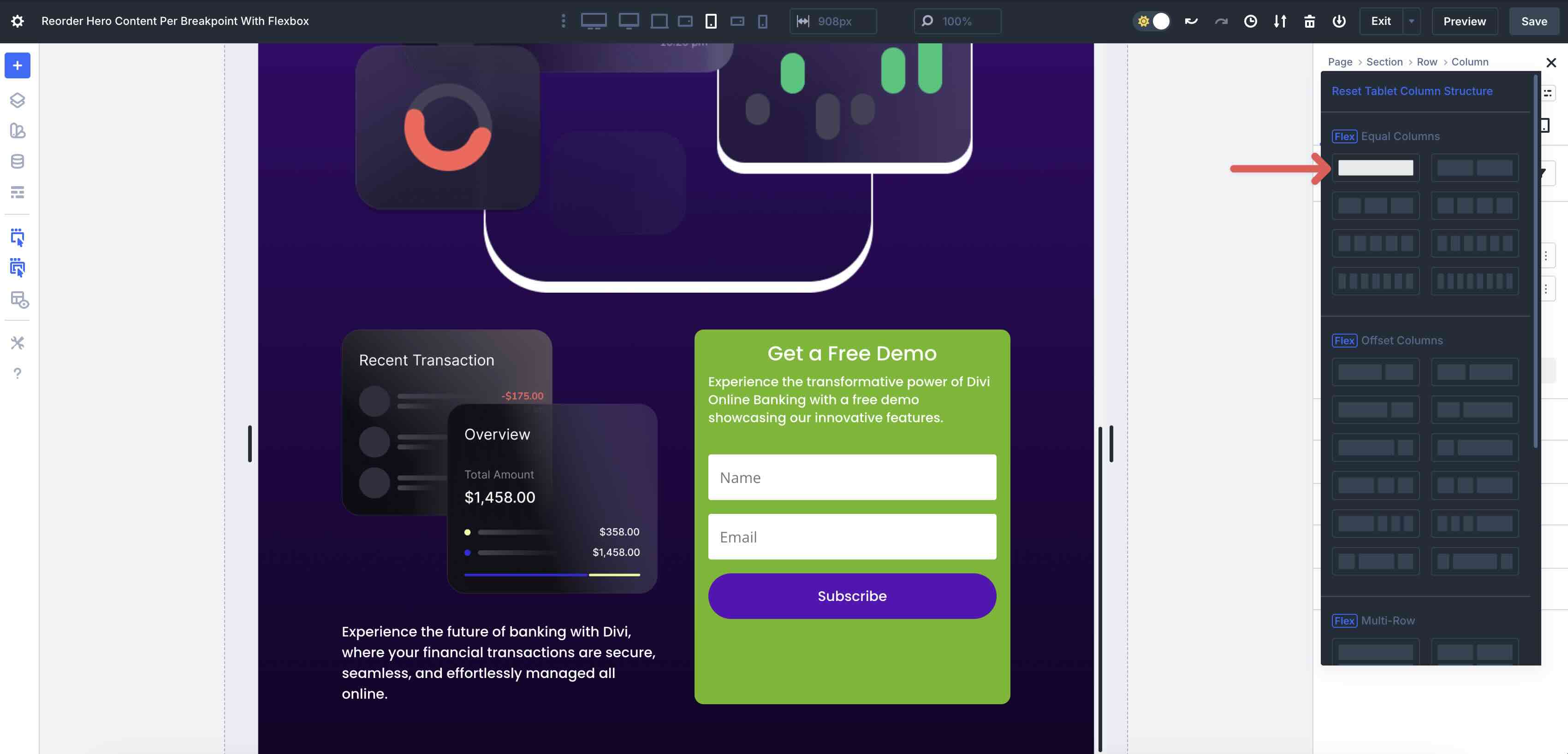
Structure Templates are pre-built Flex or CSS Grid row configurations, like Equal Columns, Offset Columns, or Multi-Row stacks, that you can apply with one click via the Apply Structure Template button in the Row’s Content tab.
You can apply a different template for each breakpoint, allowing the same row to transform completely for Tablets, Phones, or even Ultra Wide views without duplicating content or using CSS.
Reordering Content For Tablets & Phones
With all customizable responsive breakpoints enabled, we can adjust each one to ensure the best possible browsing experience.
Adjust The Tablet Wide Breakpoint
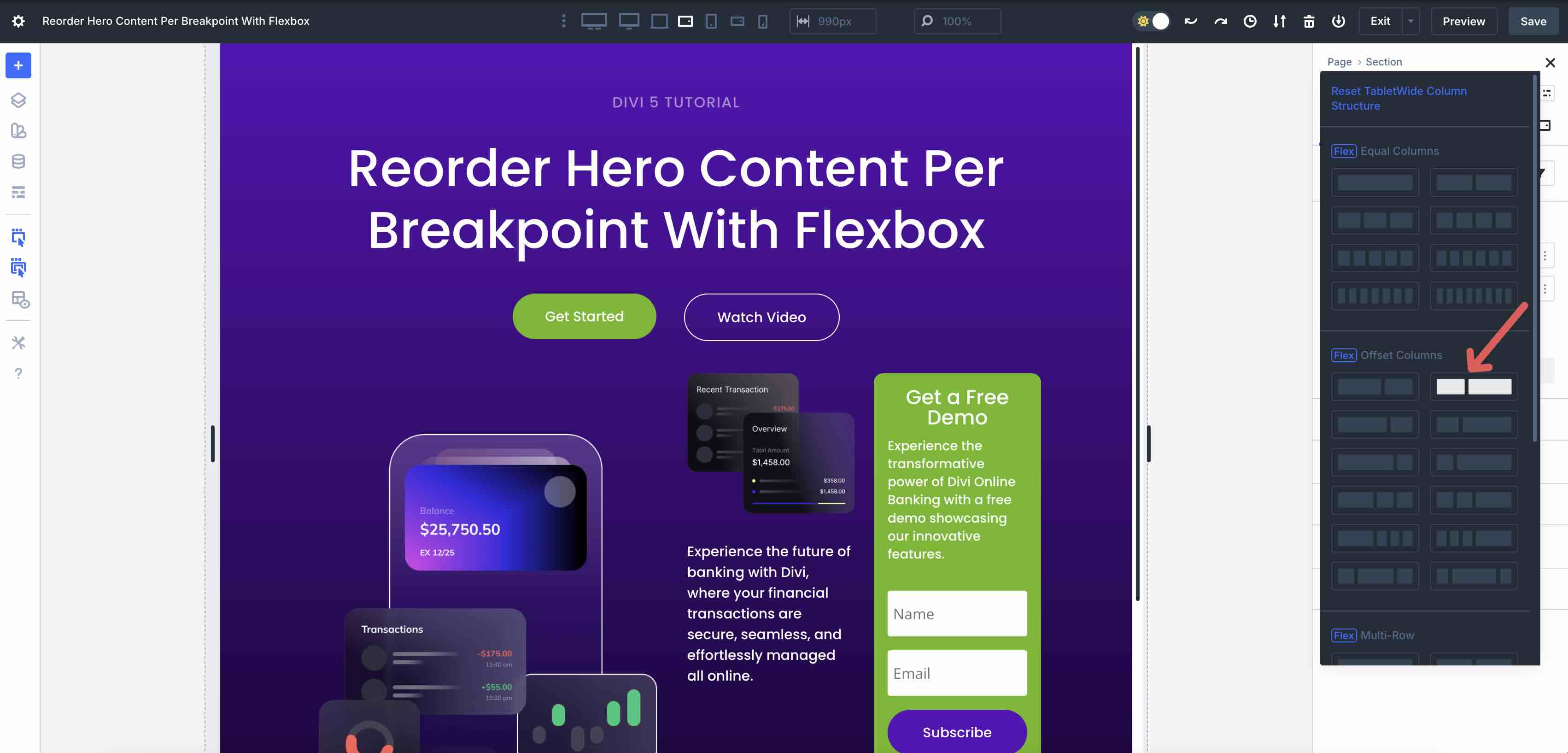
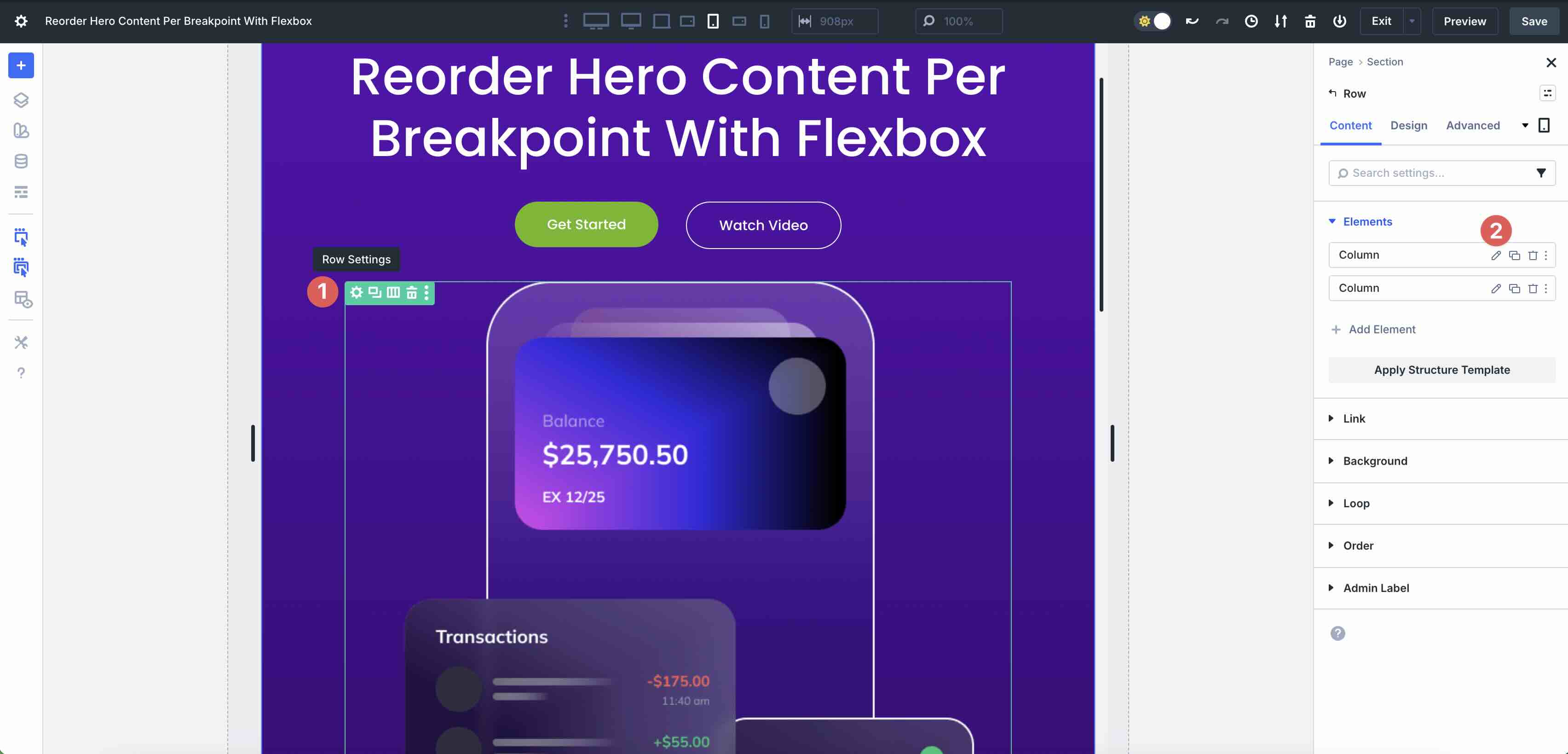
In this layout, we have a two-column Row with a Nested Row in the second Column. Start by clicking on the Tablet Wide breakpoint.
In the Content tab, click the Apply Structure Template button beneath the Column elements.
When the Reset Tablet Wide Column Structure modal appears, select a pre-made template to change the column structure of the Row. In this example, I’ll choose an Offset Column template to give the content in the second column more breathing room.
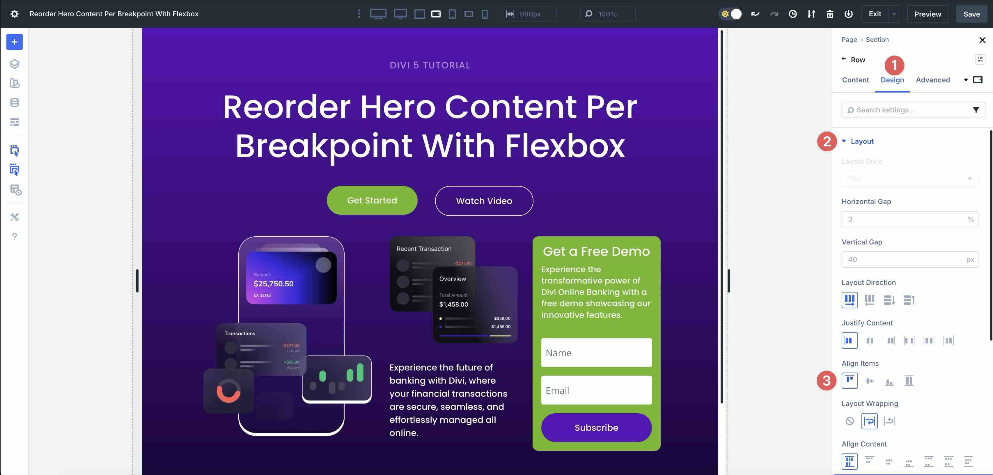
While in the Tablet Wide view, switch to the Design tab. Expand the Layout dropdown menu to adjust the row’s Flex properties. In the Align Items field, select Start to align all content to the top of the row.
Adjust The Tablet Breakpoint
Next, click on the Tablet breakpoint.
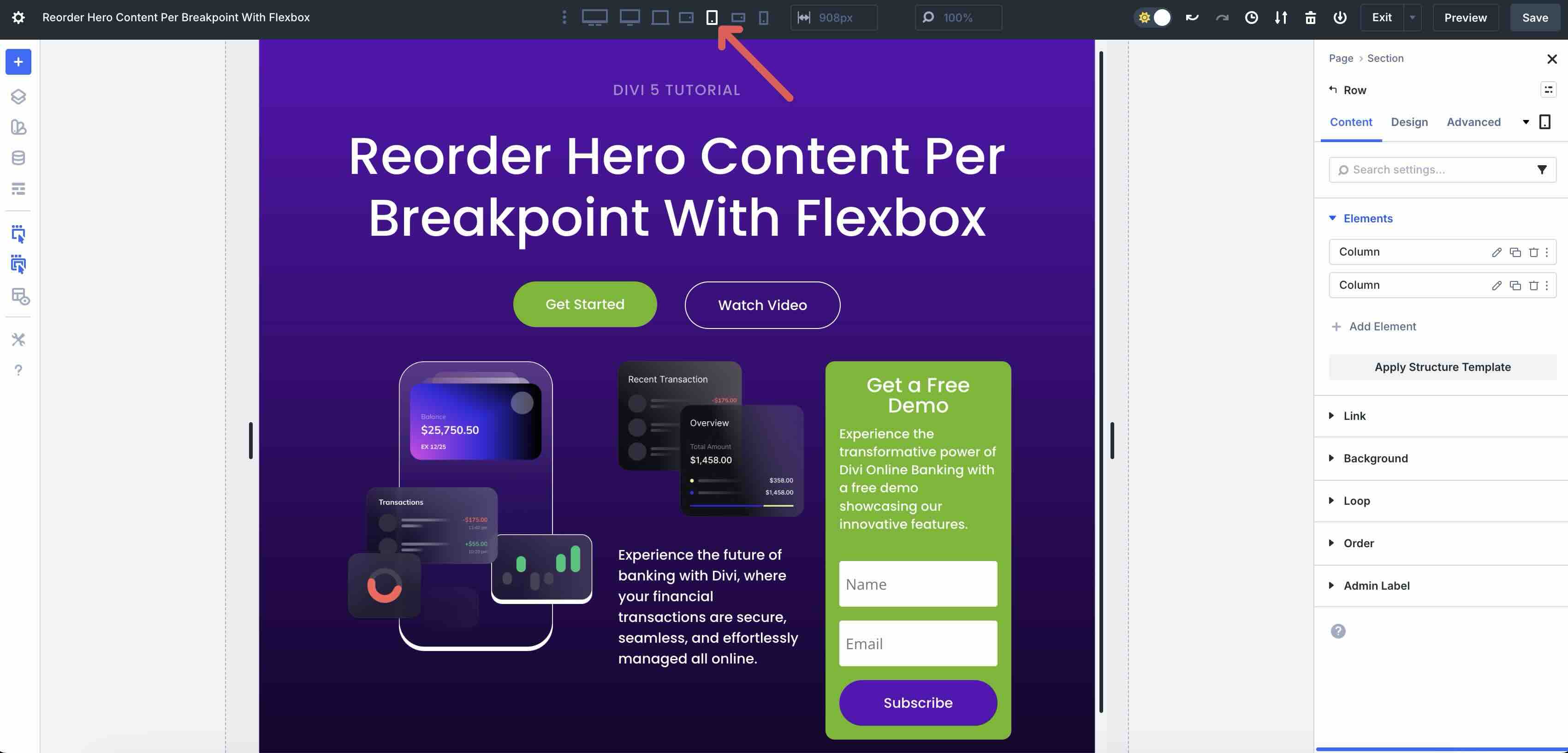
In the Tablet Wide breakpoint, our three-column row (offset row + two-column nested row) has plenty of space. However, on the Tablet breakpoint, the content seems cramped. Let’s click Apply Structure Template once more. This time, select a one-column row from the Equal Columns options.
Scroll down to the Nested Row. Click the Apply Structure Template button once more and select a single-column row.
With our column structure in place, we need to do more work to achieve the intended look.
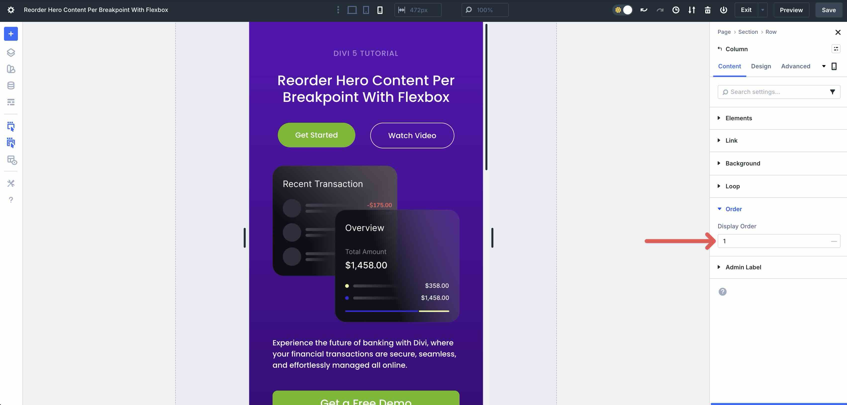
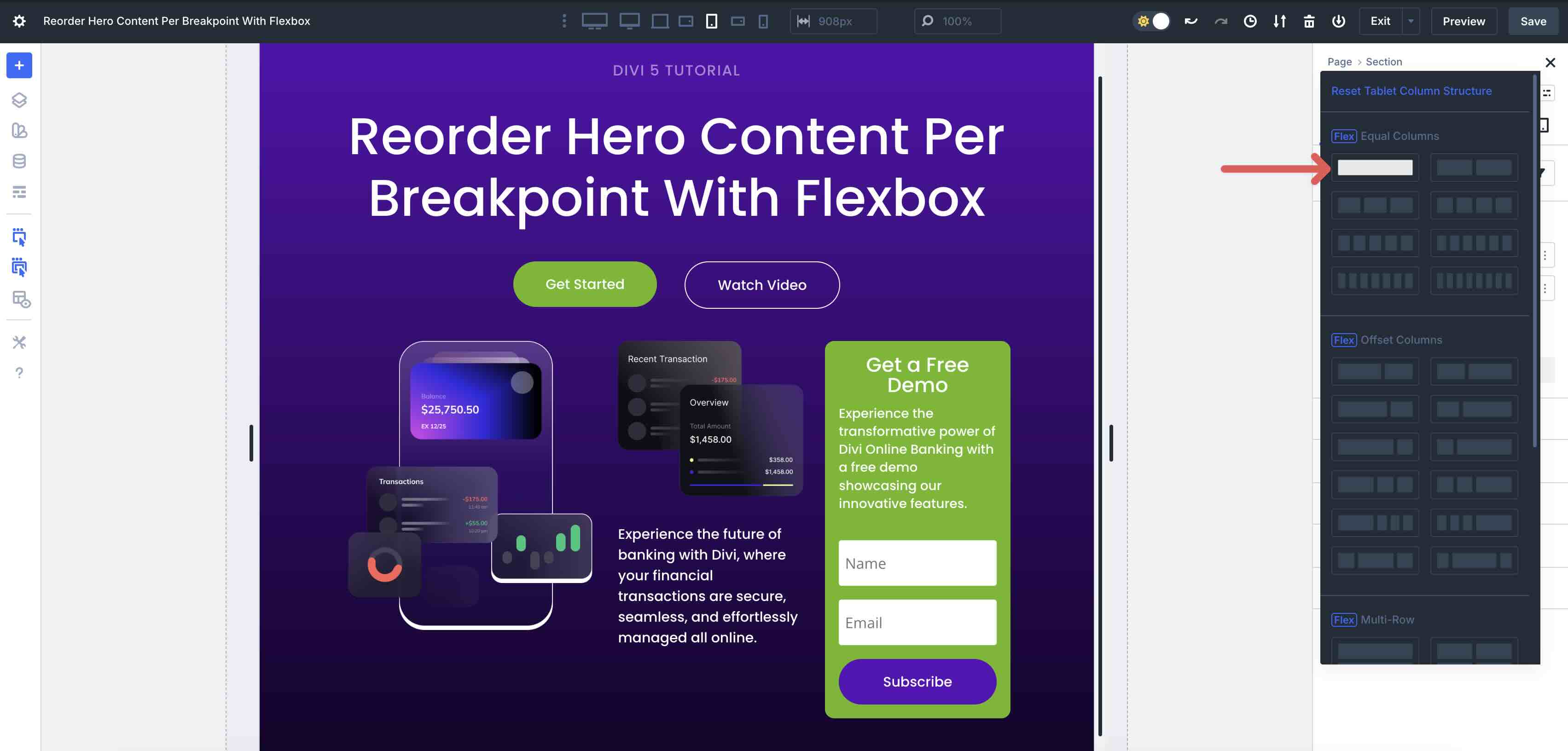
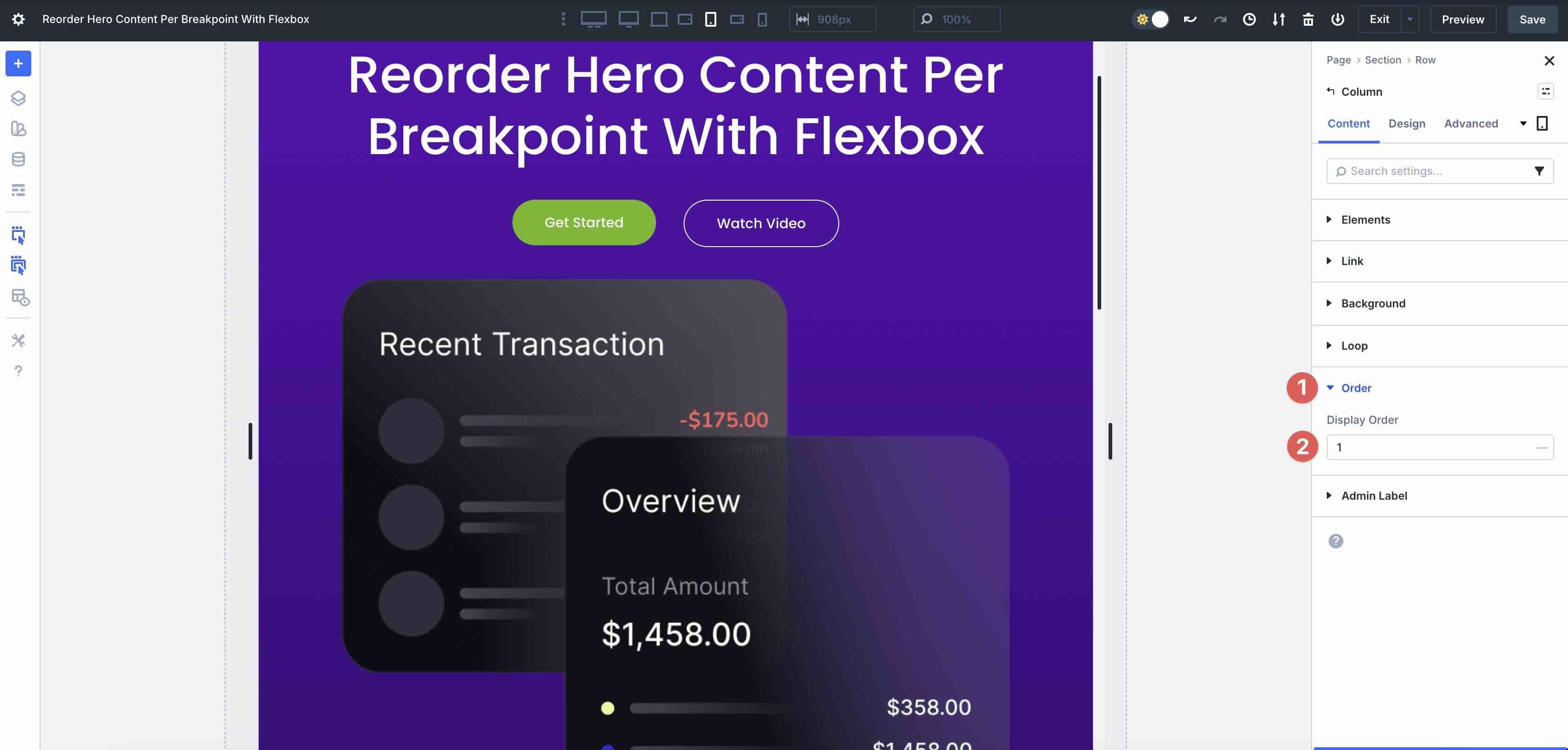
This is where column reordering comes into play. Select the row and then click to edit the first column‘s settings.
Next, expand the Order dropdown menu and set the Display Order to 1.
As you scroll the section, you’ll see that the columns have been reversed, allowing the content to flow more naturally.
Repeat the steps as necessary to reorder any additional rows in the hero section.
Testing And Fine-Tuning Across Devices
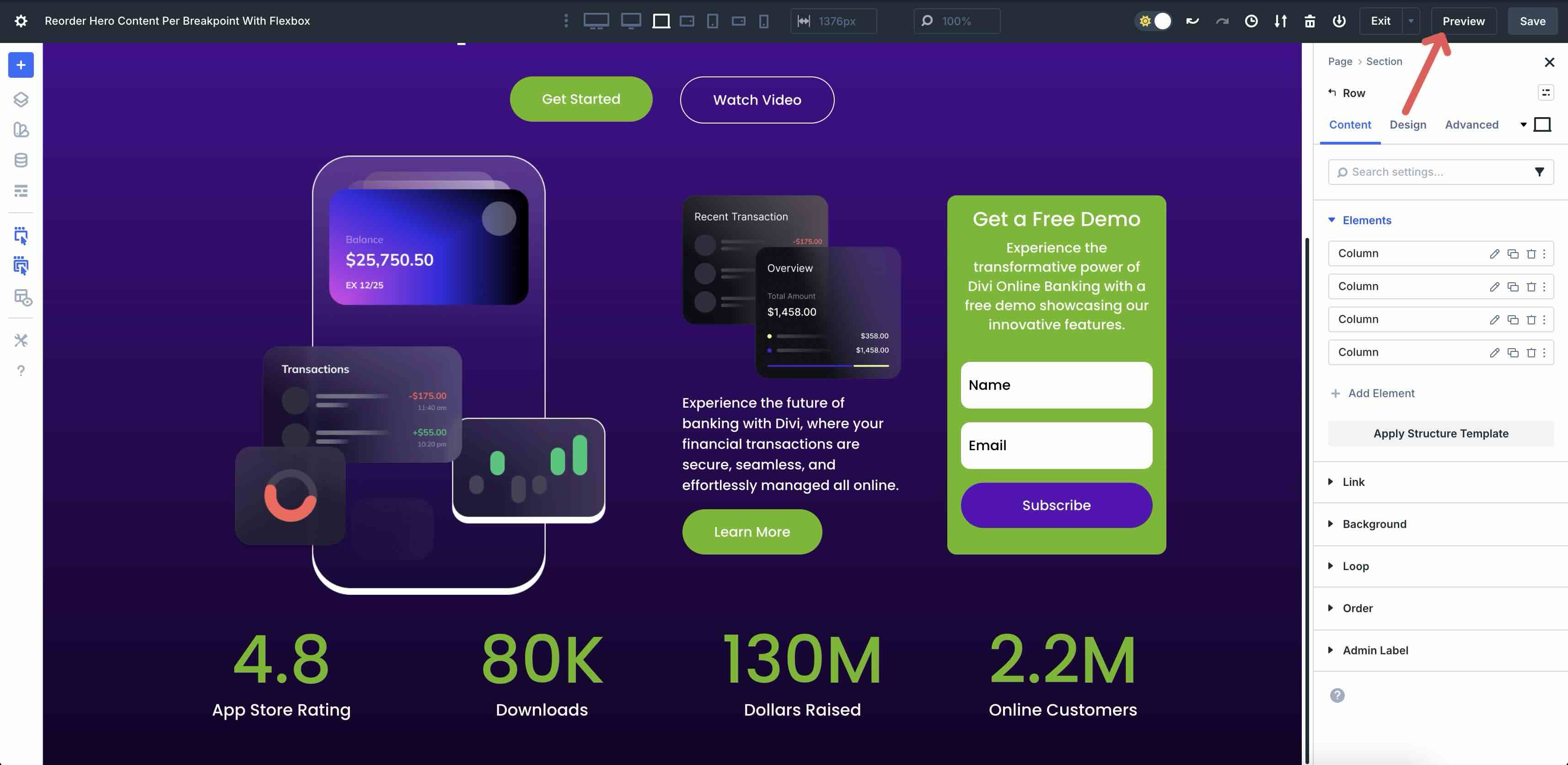
With reordering complete, it’s time to test the hero section across all breakpoints. Cycle through each breakpoint and make any necessary revisions.
Preview the live page through the browser using Divi 5’s Preview feature.
You can also browse screen sizes using third-party applications like Sizzy or view them on actual devices, as real-world testing often reveals subtle issues you might otherwise overlook.
During this phase, double-check alignment issues and make final polish revisions using Flexbox settings, such as Align Items or Justify Content. Use Divi 5’s Horizontal and Vertical Gap controls to adjust the amount of spacing between items throughout the layout.
Once everything looks perfect across devices, save your changes and publish the page.
You’ve now successfully reordered content for your hero section without duplicating sections or using custom CSS, demonstrating the transformative power of Flexbox in Divi 5.
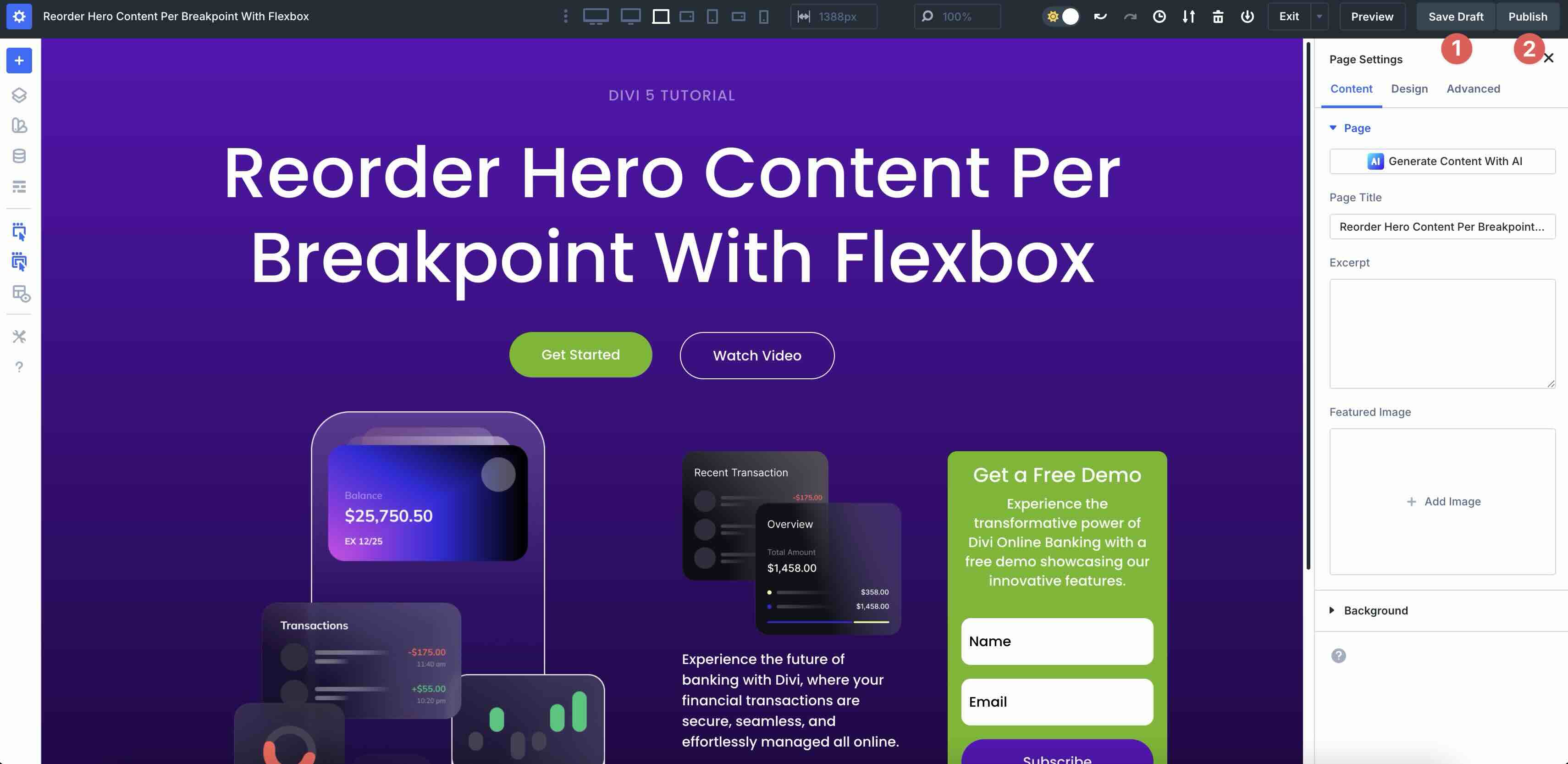
Download The Files
Fill out the form below to download the tutorial’s working files. The included JSON contains two versions: a base file without Flex settings, and a completed version featuring the reordered hero section content for each breakpoint.

Conclusion
Flexbox in Divi 5 represents a forward-thinking responsive web design system that makes it easier than ever to build hero sections that look stunning across all screen sizes. With intuitive controls for Layout Direction, Display Order, Structure Templates, and seamless integration with Customizable Responsive Breakpoints, you can reorder content with a few clicks.
We encourage you to download the latest Divi 5 Public Beta, experiment with Flexbox, and share your thoughts in the comments below.


Leave A Reply