

Editorial design gives a website the visual depth of a magazine. Oversized headlines, carefully framed photographs, and varied layouts help readers distinguish the lead story from the supporting content. With Divi 5, you can build that structure visually and keep your latest stories connected to live post content.
In this tutorial, we’ll build a modern editorial magazine homepage using the CSS Grid Editor, Loop Builder, Image Aspect Ratio and Framing, Variable Fonts, and Divi 5’s newer text styling controls. By the end, you’ll have a complete editorial homepage, with a latest stories section that updates as you publish new posts.
- 1 What Makes A Website Feel Editorial?
- 2 What We’re Building
- 3 Step 1. Build The Editorial Hero With Variable Fonts
- 4 Step 2. Frame The Featured Story With Aspect Ratio And Text Columns
- 5 Step 3. Fill The Latest Stories Grid With Loop Builder
- 6 Step 4. Compose The Newsletter Section With The Grid Editor
- 7 Step 5. Close The Page With The Footer
- 8 Step 6. Adjust The Layout For Tablet And Phone
- 9 Make Every Divi 5 Design Your Own
What Makes A Website Feel Editorial?
Editorial websites borrow their visual language from magazines and newspapers. Layout, typography, imagery, and spacing work together to establish an order of importance and move the reader through the page.
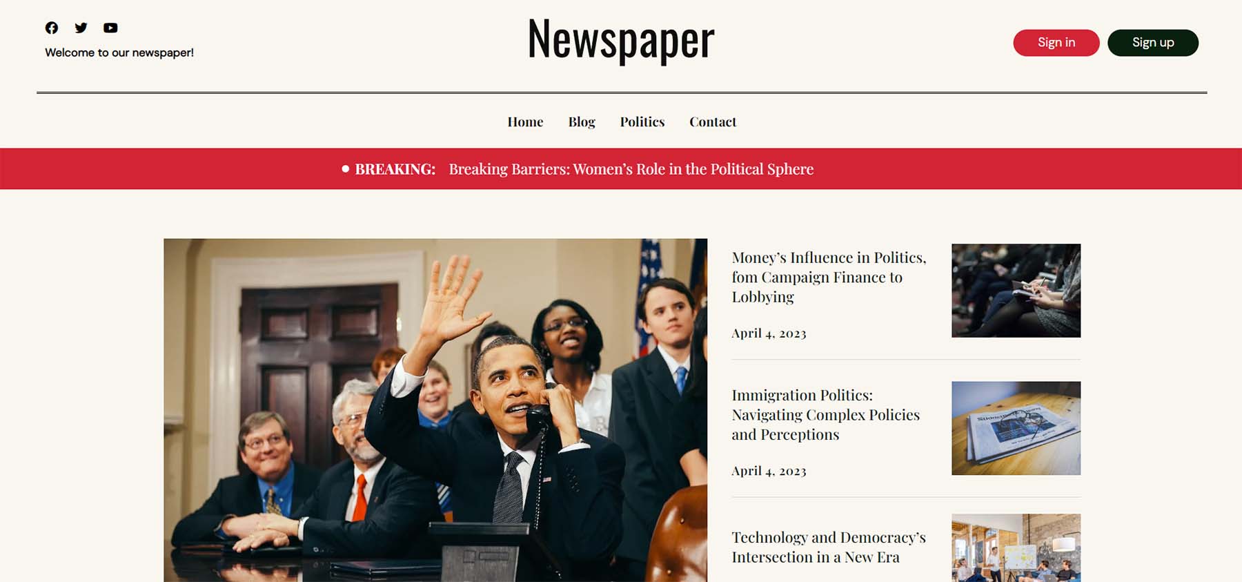
Several design choices create that effect. Asymmetrical layouts break up repeating rows and equal-sized cards. Large photographs give important stories more prominence, while oversized headlines contribute to the composition. Whitespace separates key elements, and alternating between dense and open sections gives the page a varied reading rhythm.
Together, these choices establish a clear visual hierarchy. Readers can identify the featured content, scan the supporting stories, and decide where to begin.
Divi 5 Features We’ll Use
- CSS Grid Editor: A visual canvas for building grid layouts. Set the number of columns and rows, size each track individually, and drag items into position without writing CSS.
- Loop Builder: Turns a layout you’ve designed into a repeating content loop. Build one card and it fills the rest from your posts.
- Image Aspect Ratio And Framing: Sets a consistent image shape and controls how each photo fits within it. Use Cover to crop without distortion, then reposition the frame around the subject. The original file stays unchanged.
- Variable Fonts: One font file with adjustable axes such as weight, width, and slant, plus others specific to the typeface. Continuous axes let you fine-tune values between fixed styles; the available controls depend on the font.
- Text Styling Options: Controls for how a block of text sits on the page, including columns, column gaps, line wrapping, hyphenation, and drop caps.
Each feature has a specific role in this layout. Variable Fonts shape the hero headline and section headings. Aspect Ratio and Framing give the featured image a panoramic crop and keep the story card images consistent. Text Columns and a Drop Cap give the featured excerpt its magazine treatment. The CSS Grid Editor arranges the latest stories and newsletter panels, while Loop Builder supplies the latest stories with post content.
What We’re Building
The homepage has five parts: a hero with an oversized headline and a photograph extending beyond its column, a featured story inside a thin border, a grid of latest posts, a newsletter section layered over a photograph, and a footer that repeats the featured story’s dark background.
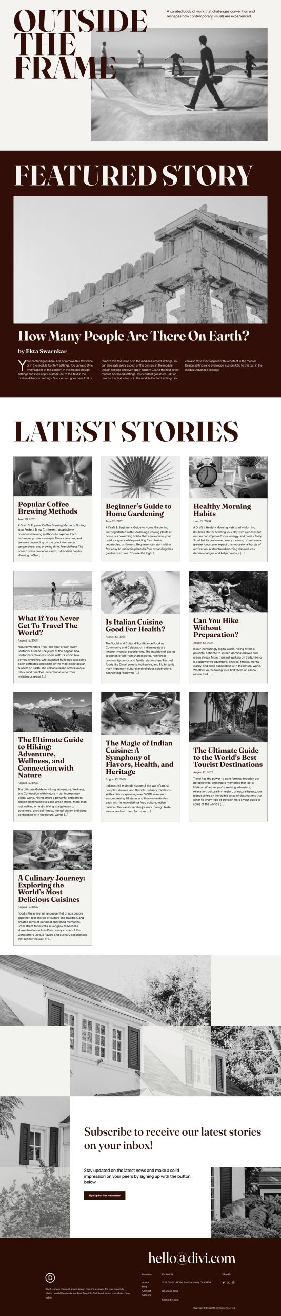
A cream background and deep brown text alternate throughout the page, supported by Fraunces headings and Google Sans Flex body copy. A slightly darker brown is used for the newsletter button. Repeating this palette and these typefaces keeps the different layouts connected.
Before starting, open a page in the Divi 5 Visual Builder and prepare the photographs, story copy, and newsletter signup link you want to use. Your latest posts should have featured images and useful excerpts so the Loop has content to display.
Step 1. Build The Editorial Hero With Variable Fonts
Add a new section and open the Content tab to set Background Color to #F5F3EF. Insert a row with two columns. The headline sits in the first column, while the supporting text and hero image go in the second.
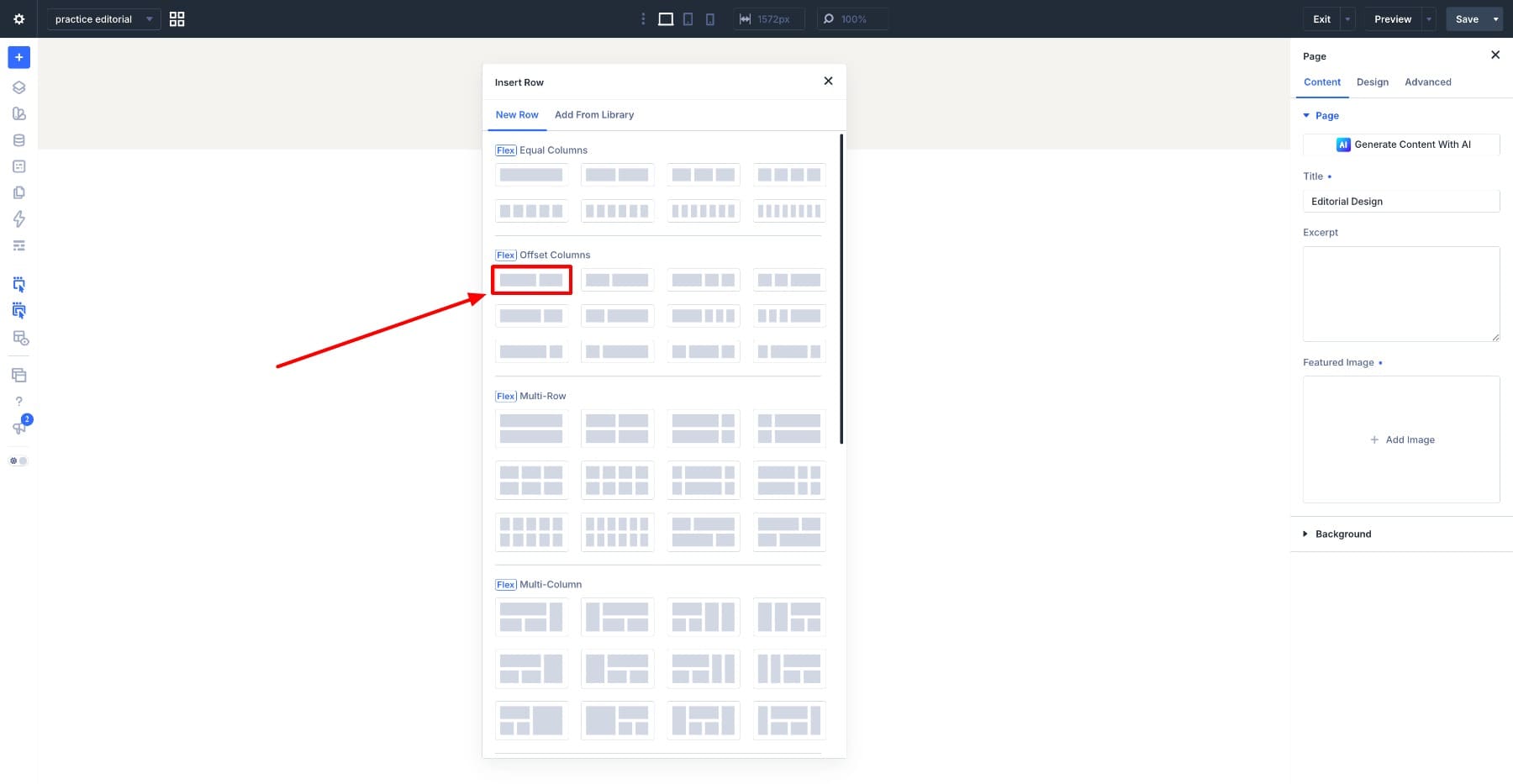
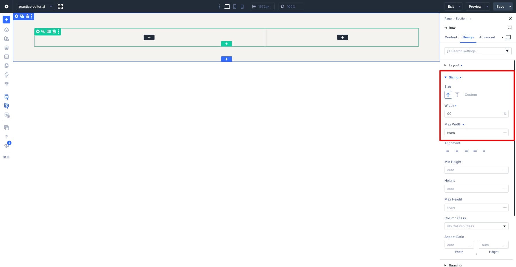
Select the row and apply the following settings.
- Design > Layout > Flexbox > Horizontal Gap: 10px
- Design > Layout > Flexbox > Vertical Gap: 10px
- Design > Sizing > Width: 90%
- Design > Sizing > Max Width: None
Clearing the max width lets the row extend beyond the default content width, giving the headline room to fill the screen.
Add The Main Heading
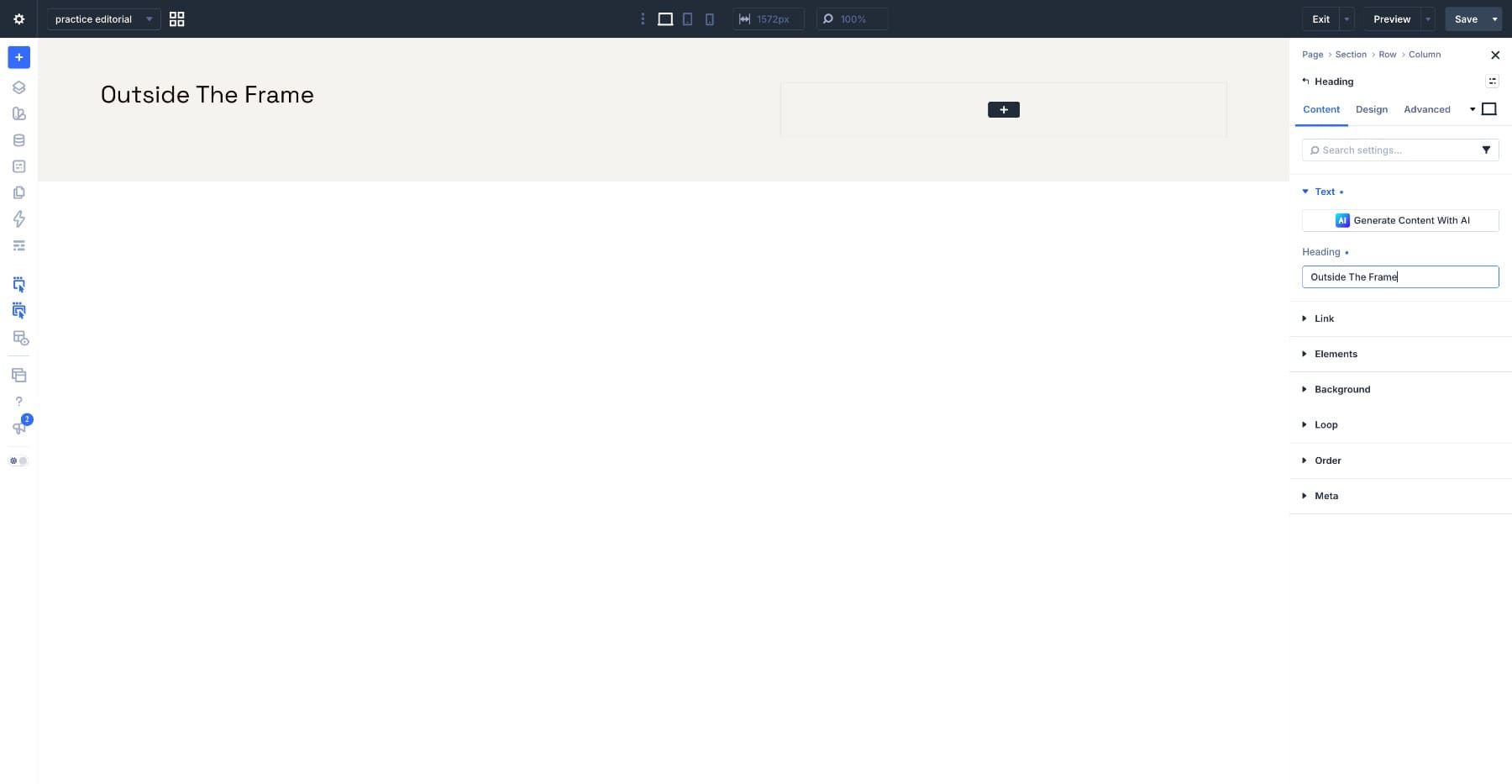
Add a Heading Module to the first column and enter your headline. We used Outside The Frame across three lines.
Open Design > Text and apply the following settings.
- Heading Level: H1
- Heading Font: Fraunces
- Variable Font Weight: 678
- Optical Sizing: Auto
- Variable Font Softness: 50
- Variable Font Wonk: 0.5
- Heading Text Size: 11vw
- Heading Text Color: #310E07
- Heading Line Height: 0.75em
- Heading Letter Spacing: 0px
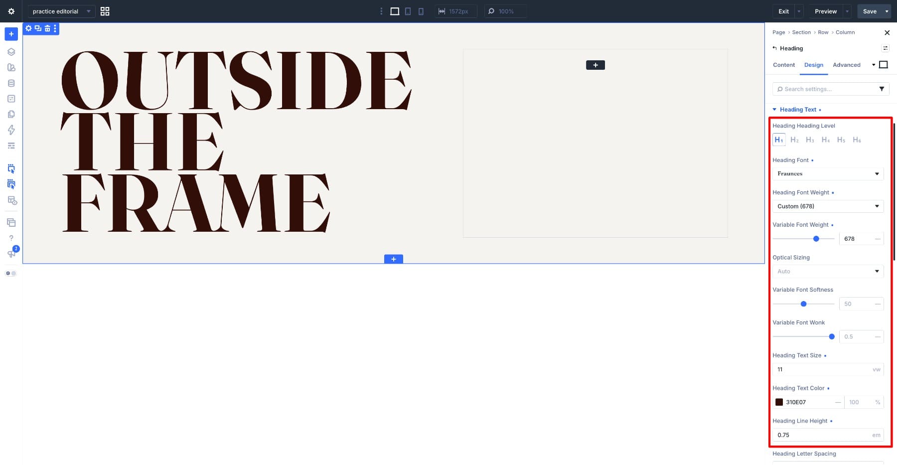
The 11vw size ties the headline to the viewport width, while a 0.75em line height pulls its three lines into a compact block. Fraunces adds two distinctive controls: Softness changes its stroke contrast, and Wonk controls alternate character shapes. Wonk switches forms rather than producing a gradual halfway shape. The values above reproduce the example, but check the line breaks with your own headline.
Add The Supporting Text
Move to the second column and add a Text Module. Write a short introduction and keep it to two or three lines so it sits cleanly above the image.
Open Design > Text and apply the following settings.
- Text Font: Google Sans Flex
- Text Font Weight: Regular
- Variable Font Weight: 400
- Optical Sizing: Auto
- Variable Font Width: 88
- Variable Font Slant: -5
- Variable Font Rond: 0
- Variable Font Grade: 50
- Text Size: clamp(16px, 2.25vw, 24px)
- Text Color: #310E07
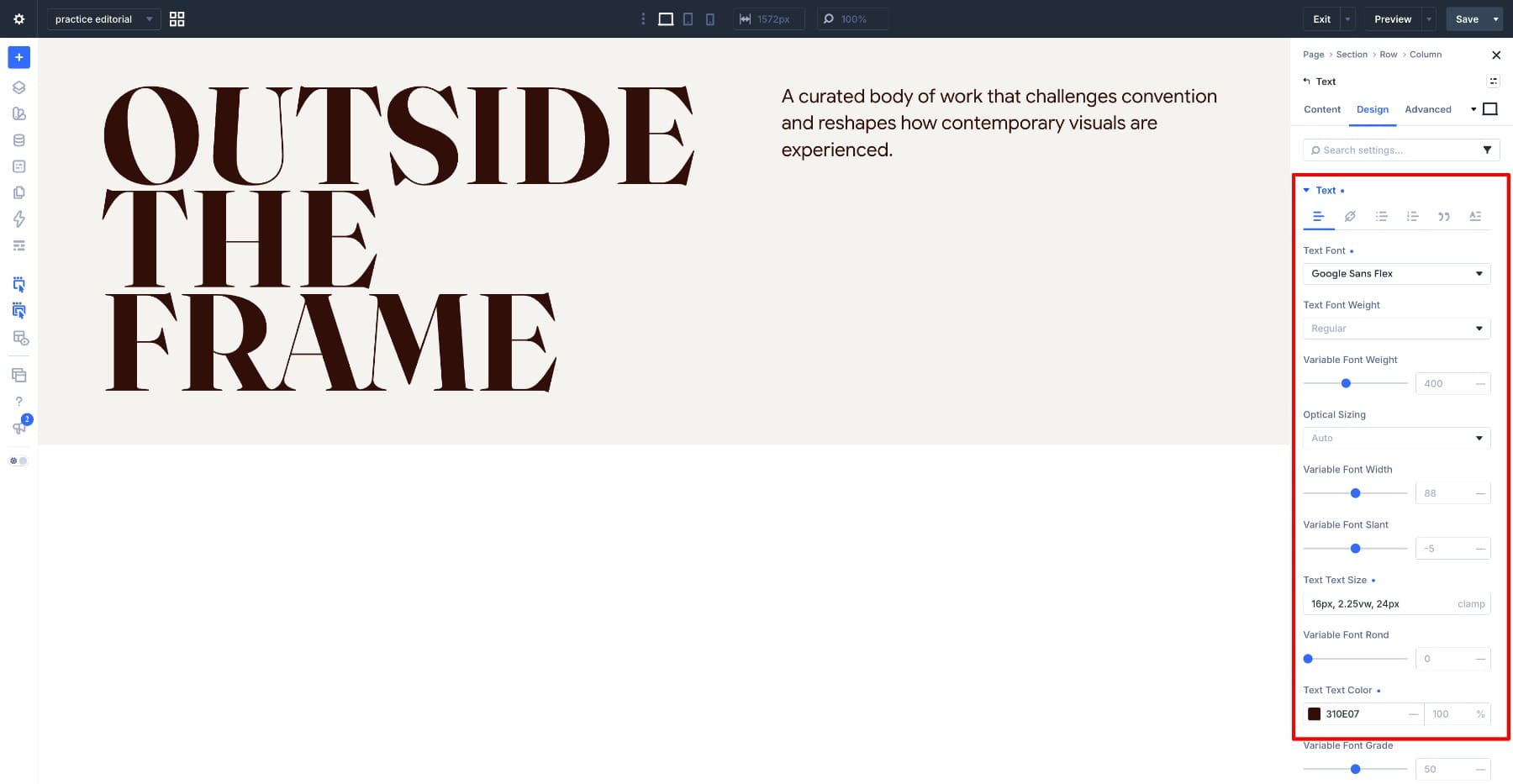
The clamp() value gives the copy a 16px minimum and a 24px maximum, with 2.25vw controlling the size between those limits. The Width value of 88 makes the letters more condensed, while a Slant of -5 adds a slight lean. These adjustments give the supporting text its own character without competing with the large serif headline.
Create The Oversized Hero Image
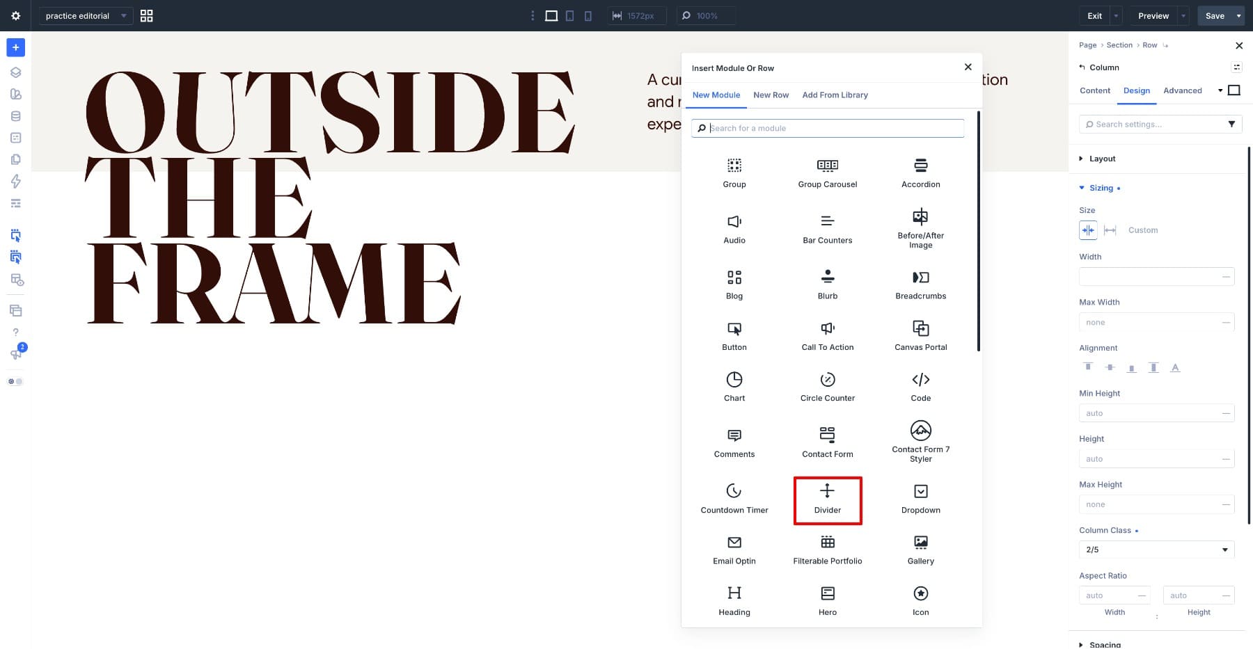
Add a Divider Module below the Text Module and turn off Show Divider. Here, the Divider acts as a decorative image container: its background holds the photograph, and its width and margin create the overlap. This approach gives us direct control over the image area without adding a visible divider line.
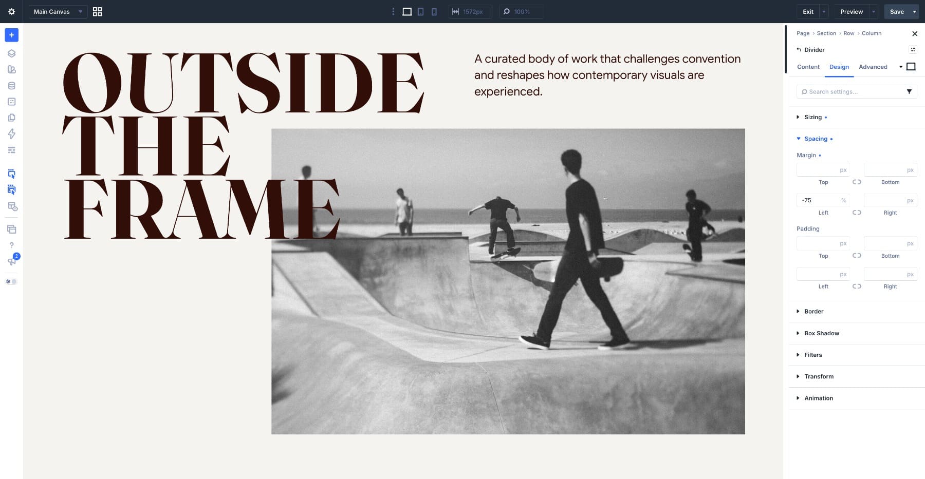
Open the Content tab and add your photo as the Background Image. The example uses a black-and-white photograph with a circular gray gradient to adjust its tone. Start with a monochrome image if you want the same treatment; a gray overlay alone does not remove color from a photograph.
Apply the following to the Divider.
- Design > Sizing > Width: 175%
- Design > Sizing > Max Width: None
- Design > Sizing > Height: 40vw
- Design > Sizing > Column Class: Fullwidth
- Design > Sizing > Aspect Ratio: Auto
- Design > Spacing > Left Margin: -75%
The 175% width makes the Divider wider than its column, while the -75% left margin pulls it toward the headline. Together, these values create the image extension shown below. Keep an eye on the right edge when adjusting them, and leave enough clearance for the headline to remain readable. We will simplify this overlap for smaller screens in Step 6.
With the hero in place, the page has its main typeface, palette, and image treatment. The featured story reuses those choices on a dark background.
Step 2. Frame The Featured Story With Aspect Ratio And Text Columns
Add a new section below the hero and set Background Color to #310E07 on the Content tab. Using the hero headline color as the background creates a strong section change while keeping the same palette.
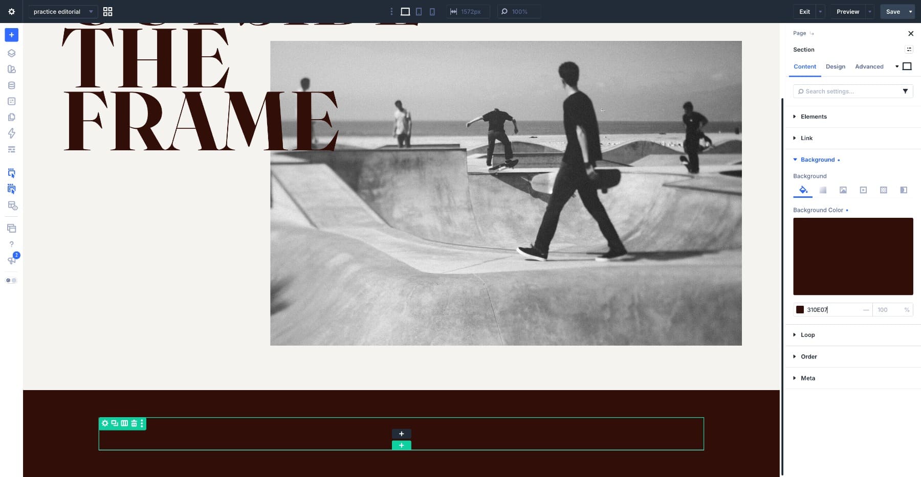
Add two rows inside it. The section title goes in the first and the story in the second.
Add The Section Title
Add a Heading Module to the first row and enter Featured Story. Open Design > Text and apply the following settings.
- Heading Level: H2
- Heading Font: Fraunces
- Variable Font Weight: 670
- Optical Sizing: Auto
- Variable Font Softness: 50
- Variable Font Wonk: 0.5
- Heading Text Size: 10vw
- Heading Text Color: #F5F3EF
- Heading Line Height: 0.75em
- Heading Letter Spacing: 0px
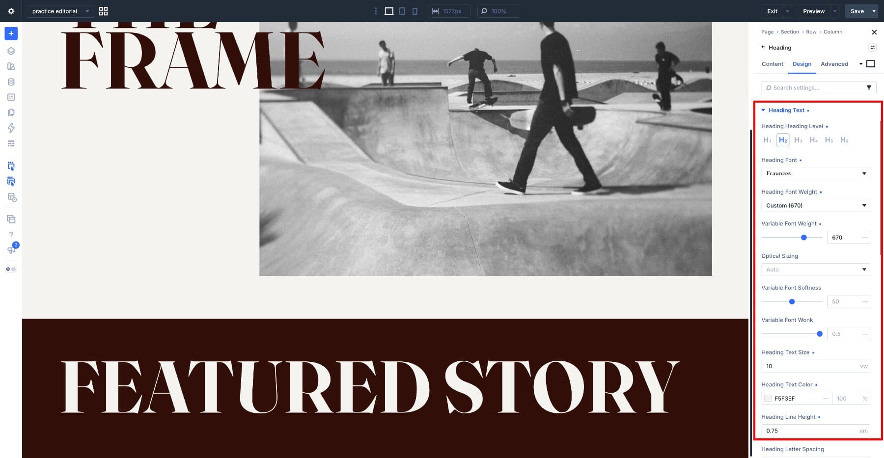
The section title keeps the hero’s Softness and Wonk values, with a slightly lighter weight of 670 instead of 678. Its size drops from 11vw to 10vw. This keeps the display headings closely related while giving the hero a little more emphasis.
Set Up The Story Row
Select the second row, open Design > Border, and set a 1px border in #F5F3EF on all four sides. The thin rule frames the story against the dark background and separates it from the oversized title without pushing them further apart.
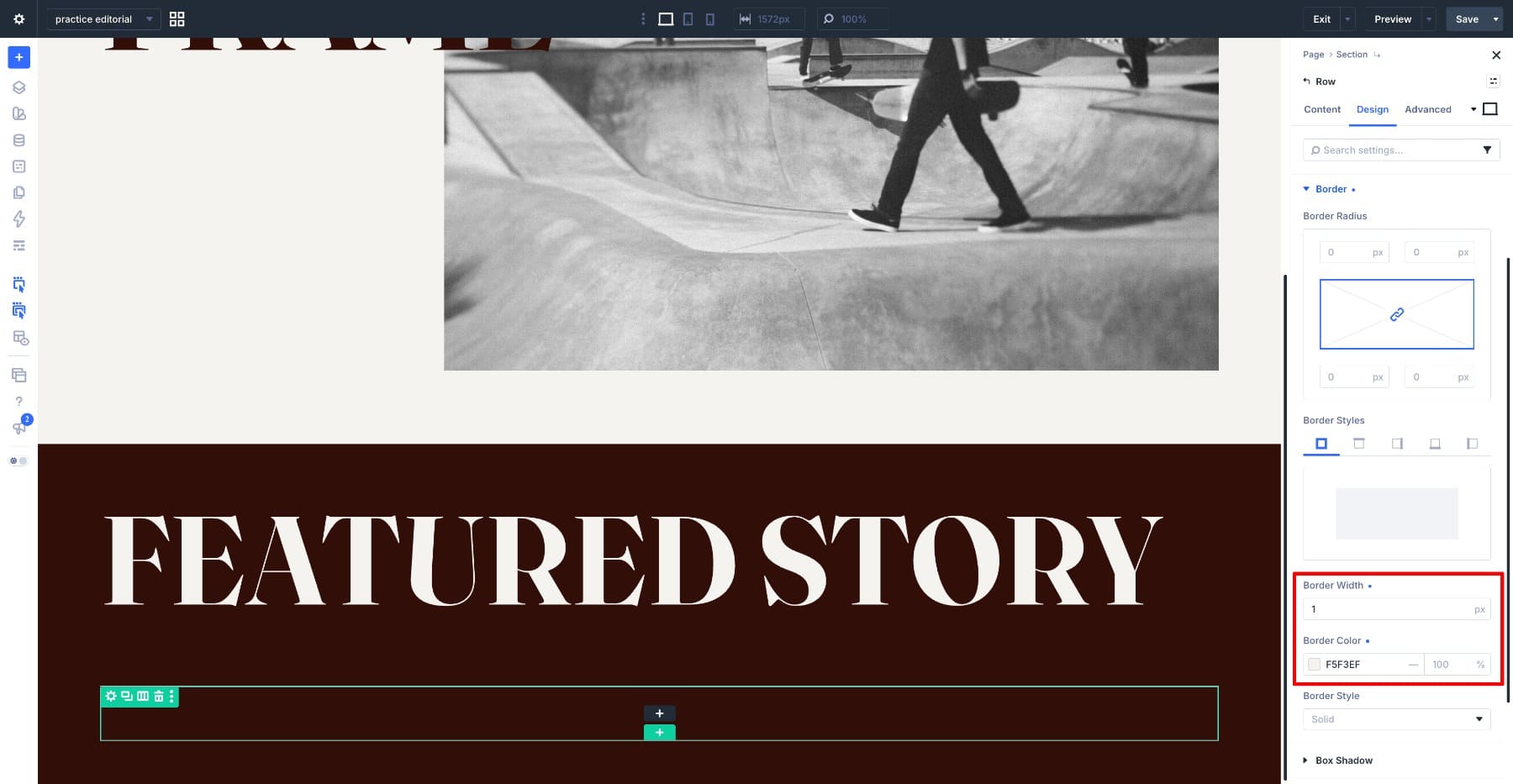
Add The Story Image
Add an Image Module as the first element in the row and upload your featured image. Open Design > Sizing, set Image Alignment to Center, enable Force Fullwidth, and set Aspect Ratio to 2:1.
Force Fullwidth lets the image use its container’s full width. Keep horizontal padding off the image container if you want it to meet the story border. The 2:1 ratio gives the photograph a panoramic shape and maintains those proportions when you replace it with another image.
Then open Design > Framing and set Object Fit to Cover so the photo fills the 2:1 frame instead of squashing to fit. If the crop cuts off an important part of the photo, move Frame Position until the subject sits where you want it. Your original file stays untouched.
Add The Story Title
Add a Heading Module below the image and enter the story title. Apply the following under Design > Text.
- Heading Level: H3
- Heading Font: Fraunces
- Variable Font Weight: 670
- Optical Sizing: Auto
- Variable Font Softness: 50
- Variable Font Wonk: 0.5
- Heading Text Size: 5vw
- Heading Text Color: #F5F3EF
- Heading Line Height: 1.05em
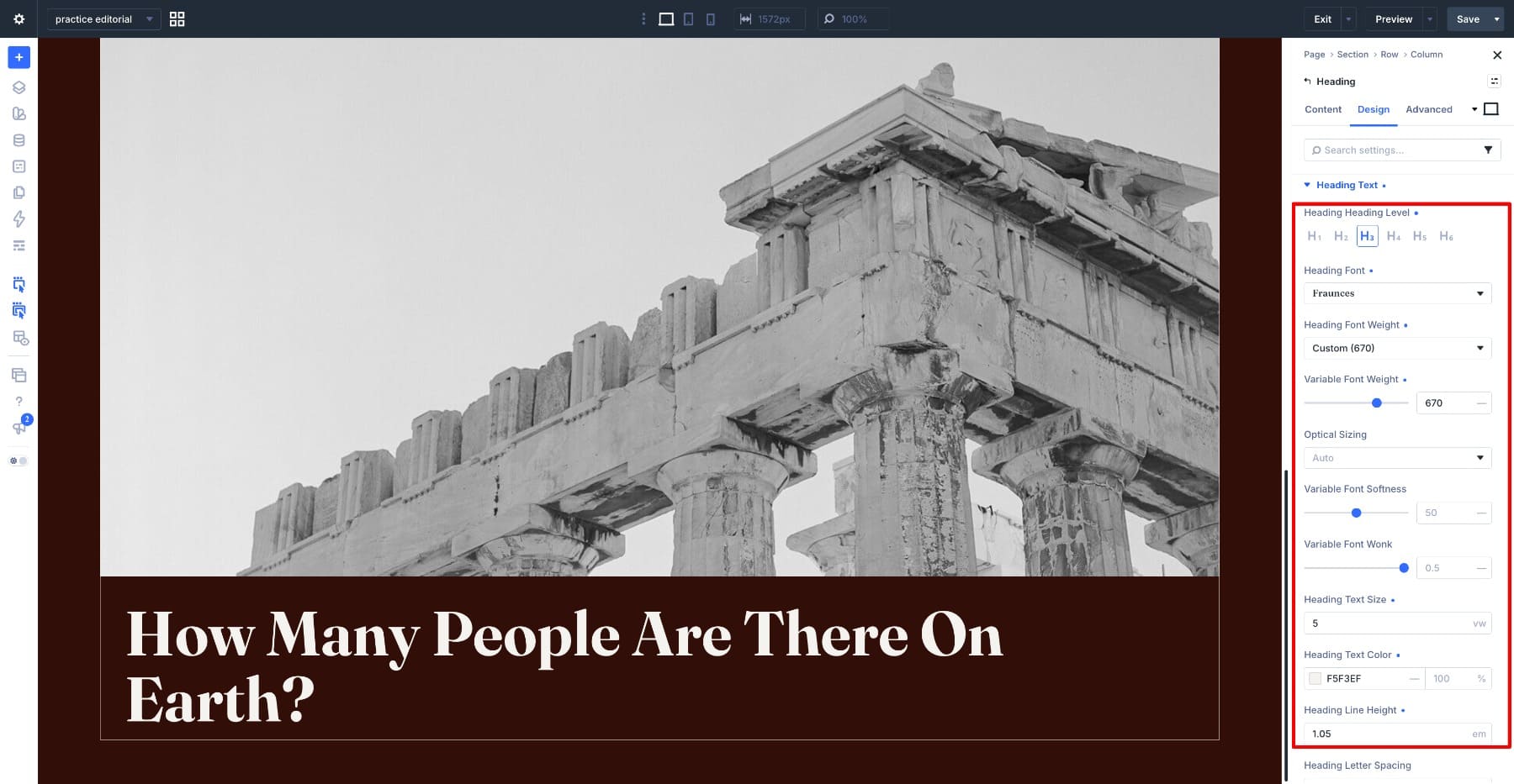
At 5vw, the story title is half the size of the section heading above it. Its 1.05em line height gives a longer title more room to wrap, while the shorter display heading can use tighter spacing.
Add The Byline
Add another Heading Module underneath for the author credit and apply the following settings.
- Heading Level: H4
- Heading Font: Fraunces
- Variable Font Weight: 670
- Optical Sizing: Auto
- Variable Font Softness: 50
- Variable Font Wonk: 0.5
- Heading Text Size: 2vw
- Heading Text Color: #F5F3EF
- Heading Line Height: 0.75em
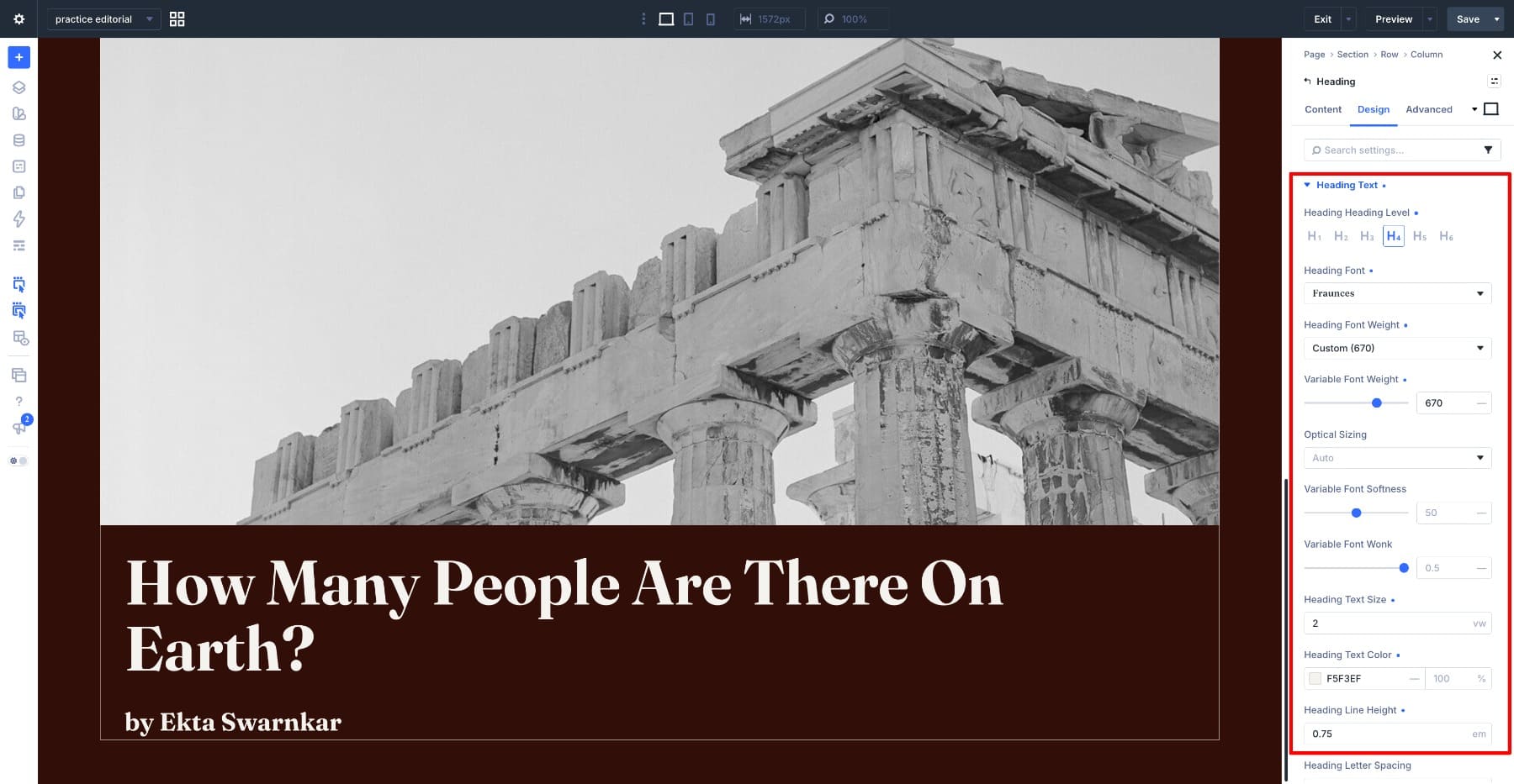
The section label, story title, and byline step down from 10vw to 5vw to 2vw. Their shared typeface and axis values keep them visually connected, while size and line height distinguish their roles. For a semantic byline rather than a heading, you can use a Text Module with the same visual styling.
Open Design > Spacing on the byline and story title and set Left Padding and Right Padding to 30px on both. This holds the text off the row border so nothing touches the frame.
Set The Story Text In Columns
Add a Text Module below the byline and paste in the story excerpt. Open Design > Text and apply the following settings.
- Text Font: Google Sans Flex
- Text Font Weight: Regular
- Variable Font Weight: 400
- Optical Sizing: Auto
- Variable Font Width: 88
- Variable Font Slant: -5
- Variable Font Rond: 0
- Variable Font Grade: 50
- Text Size: 19px
- Text Color: #F5F3EF
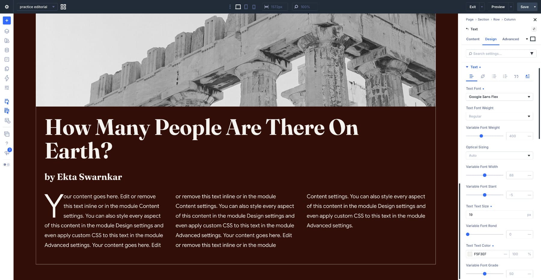
Scroll further down the same panel and set the following.
- Text Columns: 3
- Text Columns Gap: 2em
- Text Line Wrap Style: Balanced
- Text Hyphenation: Off
- Text Alignment: Left
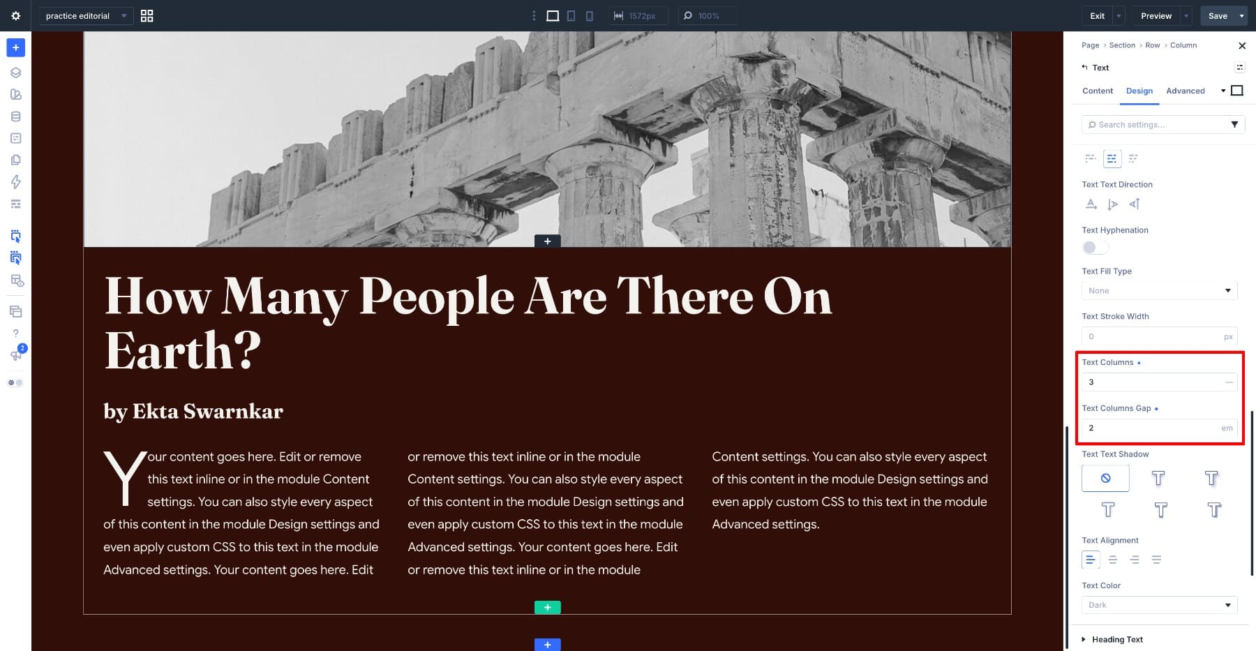
Three columns give the excerpt a print-like structure, and the 2em gap separates the text without adding a rule. Balanced wrapping can improve line lengths in shorter text blocks, but it does not guarantee even endings in a long excerpt. Browser limits affect when balancing applies. Keep Hyphenation off for this example and judge the result with your actual story text.
Add The Drop Cap
Open Design > Text in the same Text Module, then select the Drop Cap tab and apply the following settings.
- Drop Cap Dropcap Line Size: 3
- Drop Cap Dropcap Spacing: 0px
- Drop Cap Font: Default
- Drop Cap Font Weight: Regular
- Variable Font Weight: 400
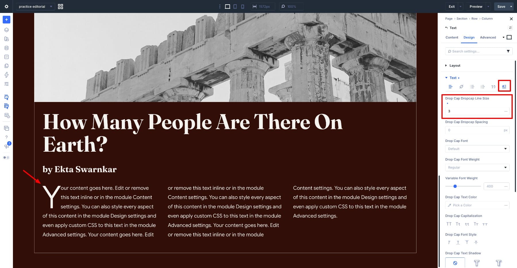
A line size of 3 drops the first letter across three lines of body text, enough to read as a magazine detail without taking over the first column. Leaving the font on Default lets the drop cap inherit Google Sans Flex, so it stays part of the paragraph rather than becoming an ornament.
Then open Design > Spacing on the Text Module and set Left Padding and Right Padding to 30px to align the columns with the headings above. Add Bottom Padding of 50px so the last line does not sit against the border.
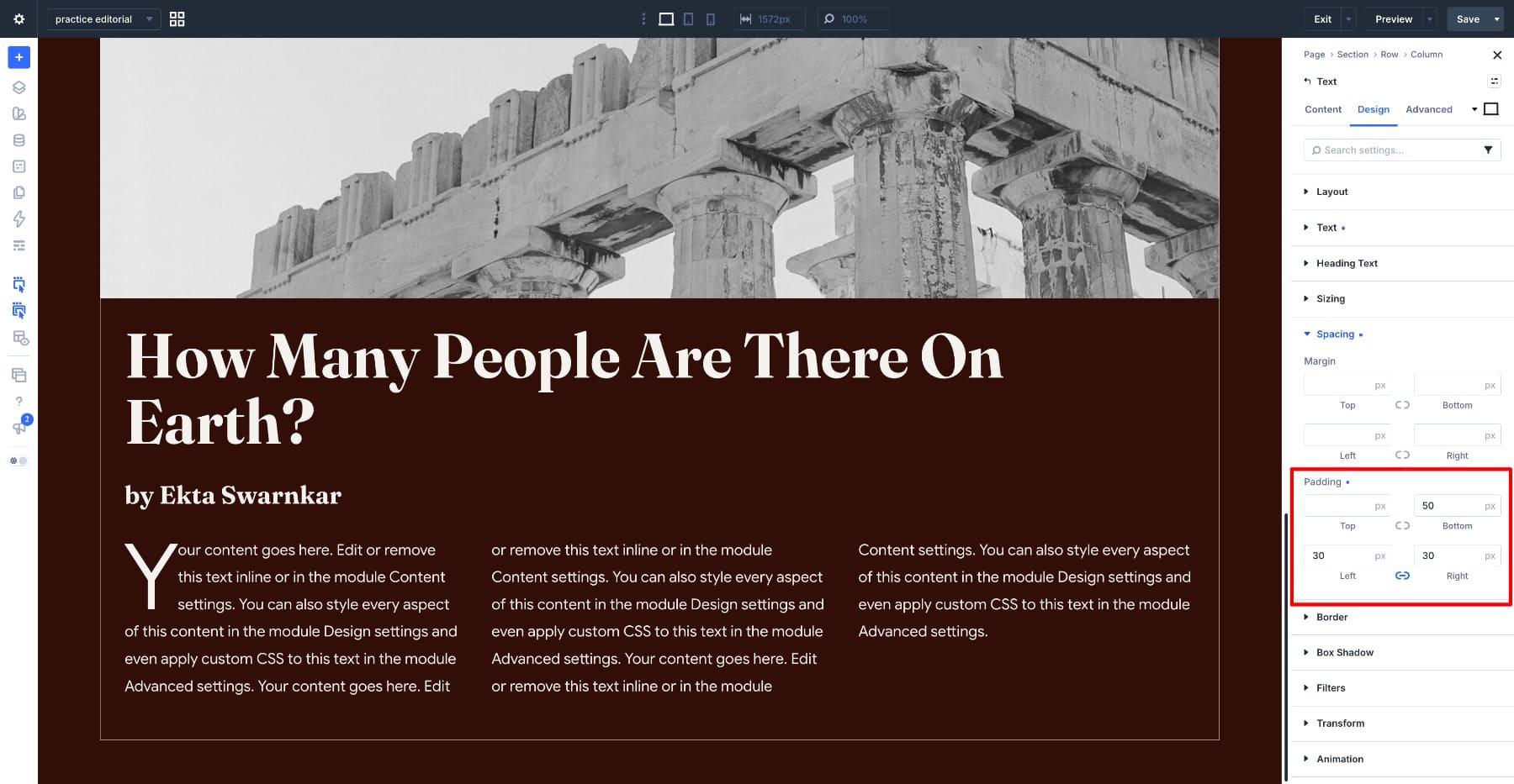
The featured story now combines an oversized title, a framed photograph, and a columned excerpt. Next, we will build a reusable story card and let Loop Builder repeat it with live post content.
Step 3. Fill The Latest Stories Grid With Loop Builder
Add a new section below the featured story and set Background Color to #F5F3EF. Add a row for the section title, insert a Heading Module, and enter Latest Stories. Reuse the Fraunces settings from Featured Story, but change Heading Text Color to #310E07 so it is readable on the light background.
Set Up The Grid
Add a one-column row below the title. Open Design > Layout, set Layout Style to Grid, then click Open Grid Editor.
Apply the following.
- Columns: 3
- Column Gap: 60px
- Row Gap: 60px
Three equal columns provide a consistent structure for the latest stories after the larger featured section. The 60px horizontal and vertical gaps separate the cards without extra dividing lines. Leave the row count automatic so the grid can accommodate the number of posts returned by the Loop.
The editor can handle much more than this. Uneven track widths, items spanning several columns, and offset rules for asymmetric magazine compositions all use the same canvas. Our guide to building grids visually with the CSS Grid Editor covers the track controls and item placement in full.
Turn The Grid Into A Post Loop
Keep the Grid layout on the row. Open the settings for its single child column, go to Content > Loop, and enable Loop Element. This is the column that will repeat, with one story card inside each copy.
Set Query Type to Post Type and Post Type to Posts. Choose your Posts Per Page count, such as 9 for three rows of cards, then set Order By to Date and Order to Descending. Enable Ignore Sticky Posts if you want date order to apply consistently. Our guide to building a blog loop in Divi 5 explains the query and dynamic content settings in more detail.
Divi repeats the column for each post returned by the query and places those copies inside the row’s three-column grid. You only edit the card structure once. When a new post matches the query, it appears according to the selected order, within the Posts Per Page limit. With date descending, the newest post appears first rather than being added at the end.
Build the card once inside that loop item. Start with a Group Module to hold the card together, then add an Image Module inside it for the featured image. Below the image, add a second Group Module for the text. Inside it, place a Heading Module for the title, a Text Module for the date, and a Text Module for the excerpt. The nested Group lets you pad the text away from the card edges later without moving the image, since the image needs to reach the edge and the text does not.
Connect each module to its corresponding Loop field using the dynamic content icon. Set the image source to Loop Featured Image, the heading text to Loop Post Title, the date text to Loop Post Date, and the excerpt to Loop Excerpt. Connect the title’s link URL to Loop Post URL so readers can open the story.
Each connected field now changes with the post being displayed. Any field left as static text will repeat unchanged, so confirm that the cards show different titles, images, dates, and excerpts before continuing.
Style The Card
Featured images often have different dimensions. Open the Image Module inside the looped column, go to Design > Sizing, and set a consistent Aspect Ratio. Use Design > Framing > Object Fit > Cover to fill that shape without distorting the photo. Adjust the framing if the subject is cropped awkwardly. Our guide to using Aspect Ratio to design cleaner loops explores this setup further.
Then style the card itself. Give the outer Group a light background so it separates from the section, and add padding inside the text Group so nothing sits against the edge. Set the title in Fraunces at a size well below the headings above, and use Google Sans Flex for the date and excerpt.
The card titles complete the Fraunces type scale, from the large hero down to the smaller repeated stories. Check the cards with both short and long titles so the grid stays readable when new content arrives. The Loop updates the content automatically, while the card styling remains consistent.
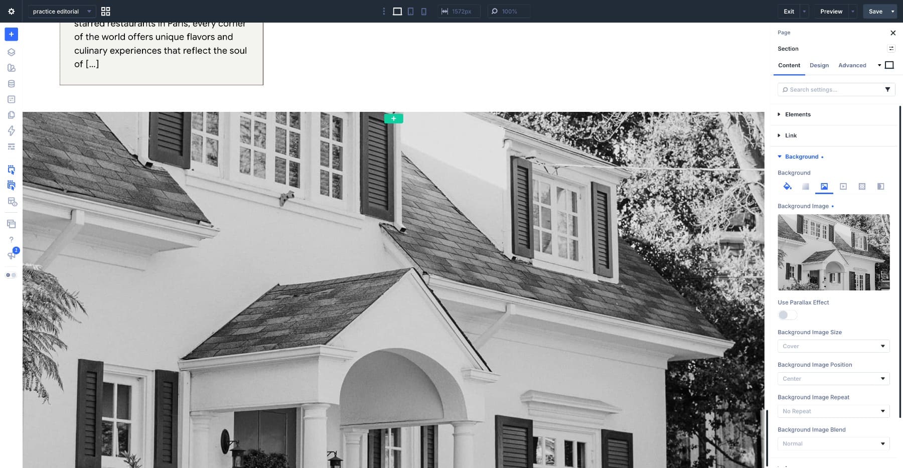
The newsletter section uses one background photograph with opaque and translucent white panels arranged over it. Transparent areas reveal the photograph, while the solid panels provide space for the signup copy. The grid controls where the image is visible and where the content takes priority.
Add a new section and set your photograph as the Background Image on the Content tab.
Add a row inside it, set Width to 100% and Max Width to None, open Design > Layout, and set Layout Style to Grid. Apply the following.
- Number Of Columns: 4
- Column Widths: Equal Width Columns
- Row Heights: Equal Height Rows
- Horizontal Gap: 0px
- Vertical Gap: 0px
Keep both gaps at zero so adjacent panels meet edge to edge. The visible photograph will come from transparent grid areas, rather than spacing between the panels. This creates a continuous composition across the section.
Click Open Grid Editor and use 13 grid items to plan the arrangement. Before any items span multiple tracks, that count fills three rows of four with one item on a fourth row. Spanning the content columns later changes that placement.
Make sure the row contains the actual column elements needed for the layout. The Grid Editor can show extra items for visualization without creating content. Keep the transparent placeholder columns in the structure so the following items retain their intended positions.
Add The Translucent Panels
Add a Divider Module to each column you want covered and turn off Show Divider. Keep the columns where the photograph should remain visible transparent. Set the first Divider’s Background Color to white at 100% opacity.
Then vary the rest. We set the fourth and fifth panels to full opacity, the seventh to 70%, and the thirteenth to 30%. Adjust these values against your own photograph rather than copying ours. The goal is to let the image show at different strengths across the grid instead of placing it under one flat overlay.
Open Design > Sizing on each Divider and apply the following settings.
- Width: Auto
- Max Width: None
- Height: 100%
- Column Class: Fullwidth
- Aspect Ratio: 1:1
The 1:1 ratio gives the decorative panels a square starting shape, and Fullwidth lets them occupy the available column width. Their final height also depends on the grid tracks and the content sharing those rows. Check the panels after adding the heading and button, and keep the text areas tall enough to fit their content.
Add The Heading
Use the tenth grid item as the heading area. Add a Heading Module inside that column and enter your subscribe line. Open the column’s settings, go to Design > Sizing, and set Column Span to 3. This widens the containing area across three grid tracks, as shown below. Give the content area a white background so the heading stays readable.
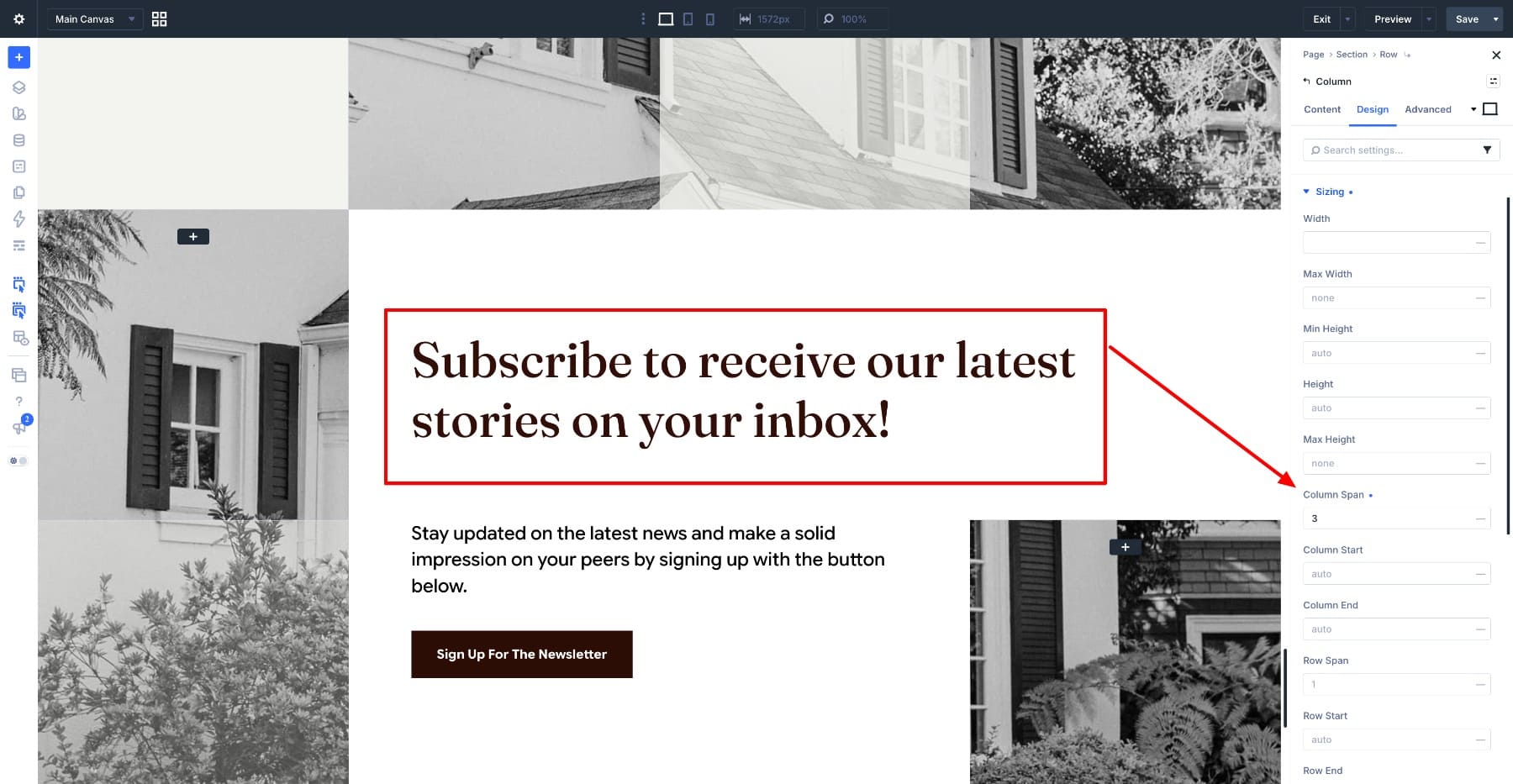
Apply the following under Design > Text.
- Heading Level: H2
- Heading Font: Fraunces
- Variable Font Weight: 500
- Optical Sizing: Auto
- Variable Font Softness: 50
- Variable Font Wonk: 0.5
- Heading Text Size: max(4vw, 30px)
- Heading Text Color: #310E07
- Heading Line Height: 1.2em
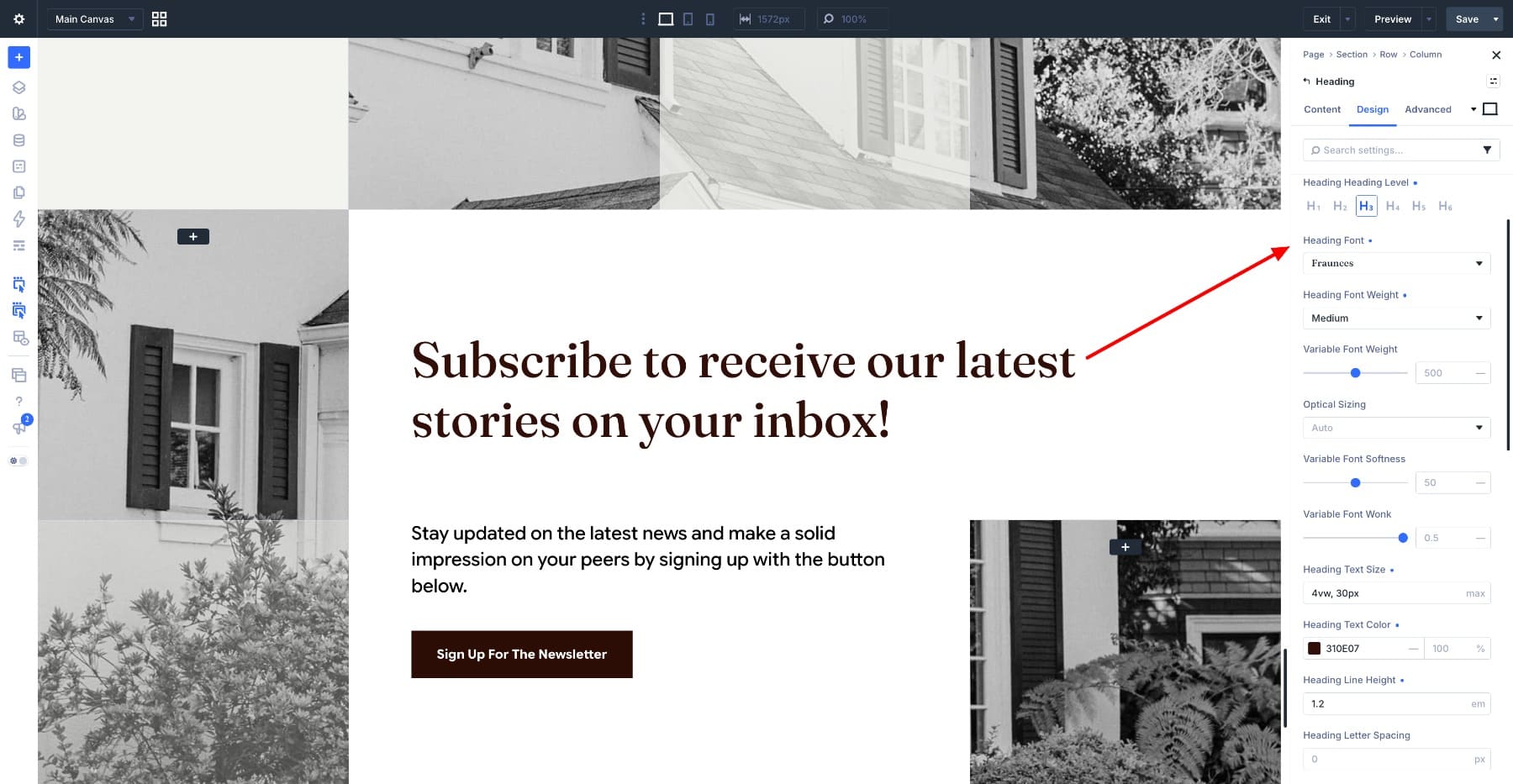
The weight drops to 500 from the 670 used for the display headings above. This heading asks the reader to do something rather than announcing a section, so it carries less visual weight. The max() value keeps it from dropping below 30px on narrow screens.
Use the twelfth grid item for the supporting text and button. Set its containing column to span 2 tracks to reproduce the wider text area beneath the heading. Add a Heading Module for the supporting line and apply the following settings.
- Heading Level: H5
- Heading Font: Google Sans Flex
- Variable Font Weight: 500
- Optical Sizing: Auto
- Variable Font Width: 88
- Variable Font Slant: -5
- Variable Font Rond: 0
- Variable Font Grade: 50
- Heading Text Size: max(1.5vw, 20px)
- Heading Text Color: #000000
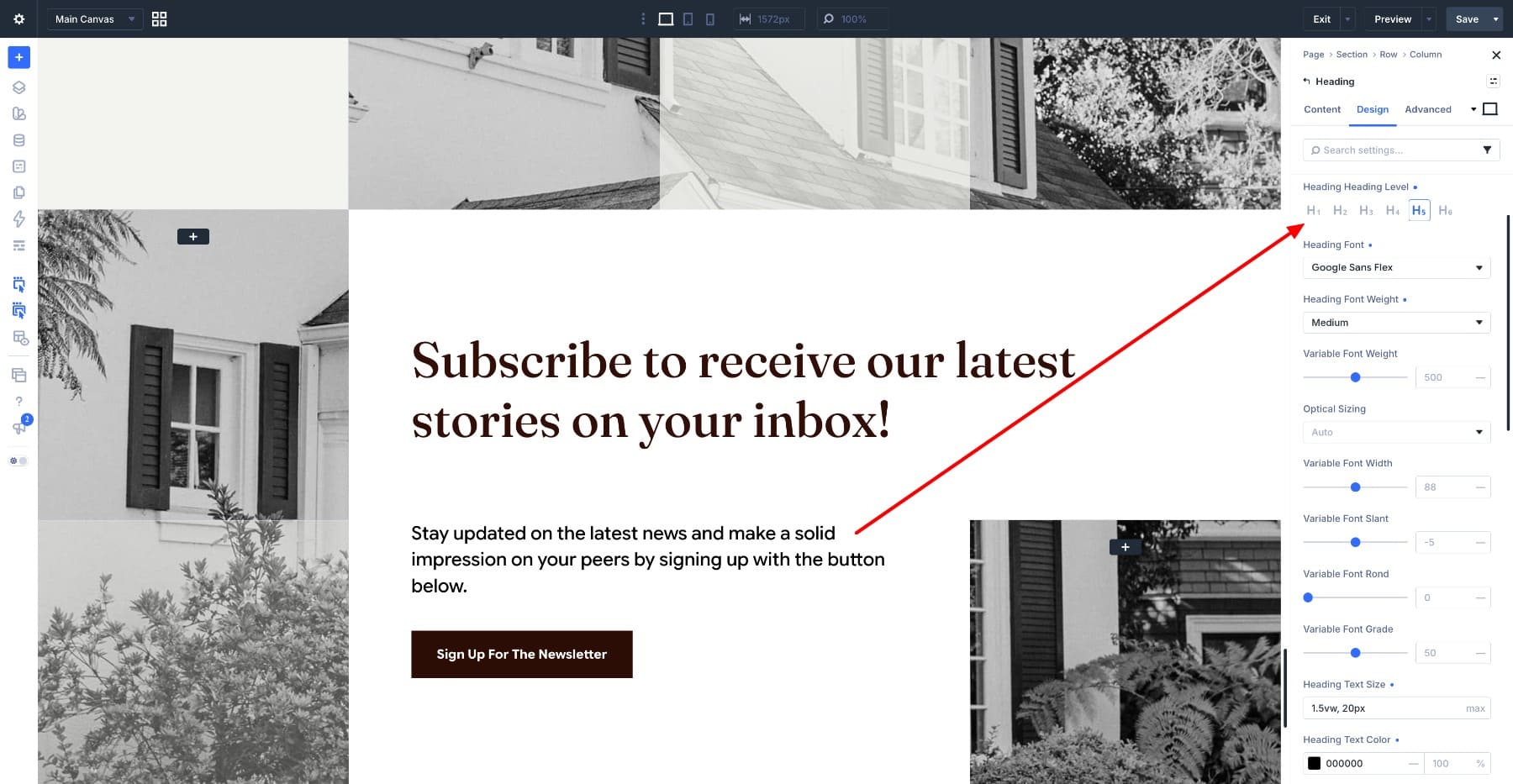
The example uses a Heading Module for this line, with Width, Slant, Rond, and Grade matching the other Google Sans Flex text. You can use a Text Module with the same styling if the line is supporting copy rather than a section heading.
Below it, add a Button Module in the same column. Enter a clear label, such as Sign Up For The Newsletter, and connect its URL to your signup page or form. Set Button Background Color to #2B0C05. Then open Design > Text and apply the following settings.
- Button Font: Google Sans Flex
- Button Font Weight: Bold
- Variable Font Weight: 700
- Optical Sizing: Auto
- Variable Font Width: 88
- Variable Font Slant: -5
- Variable Font Rond: 0
- Variable Font Grade: 50
- Button Text Size: clamp(14px, 1.1vw + 6px, 16px)
- Button Text Color: #FFFFFF
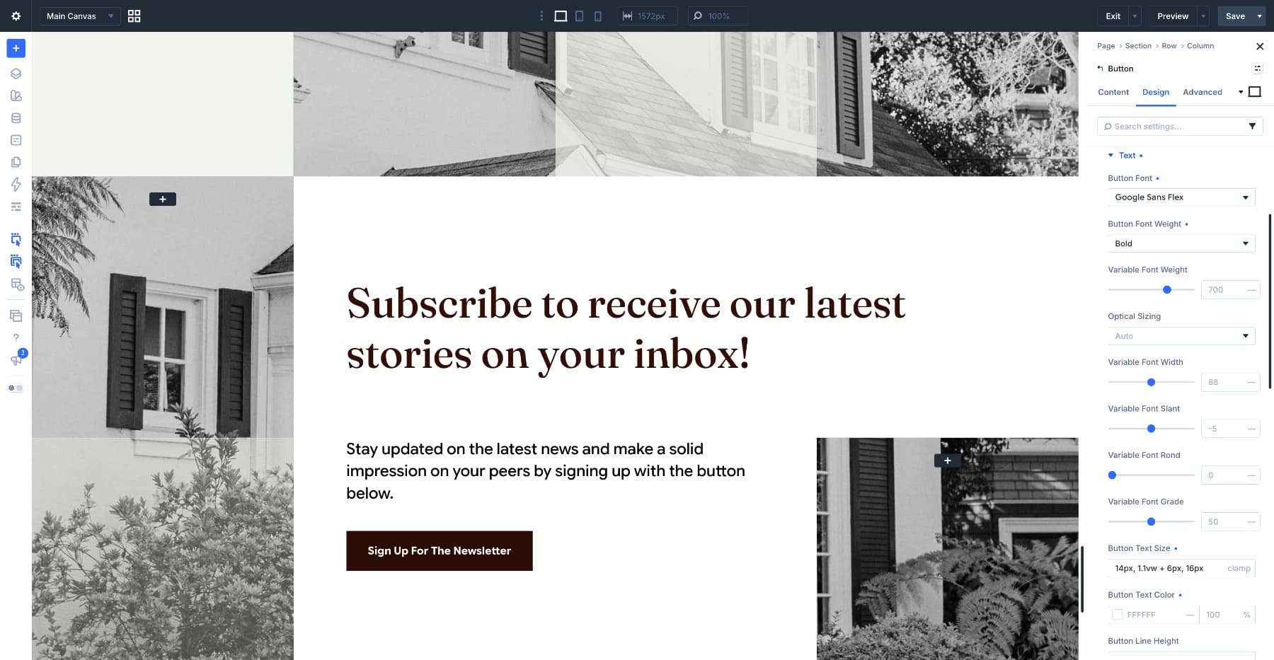
Then open Design > Spacing and set Top Padding and Bottom Padding to clamp(14px, 1.2vw, 16px), with Left Padding and Right Padding at clamp(16px, 4vw, 32px).
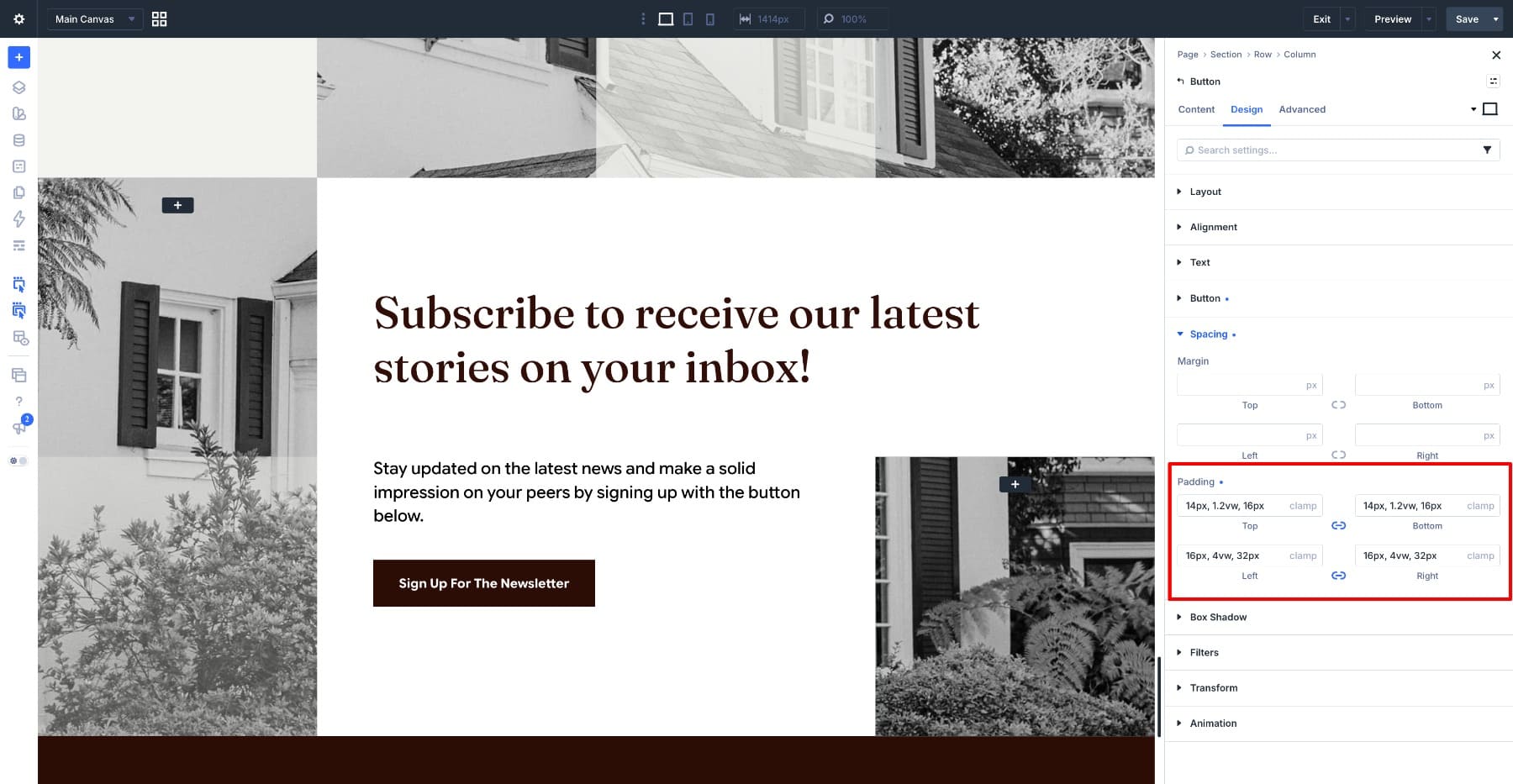
These values let the horizontal padding vary more than the vertical padding, keeping the button comfortably proportioned at different widths. The minimum and maximum values prevent either from growing or shrinking indefinitely. Check the full button label on phone as well, since padding alone does not determine whether it fits.
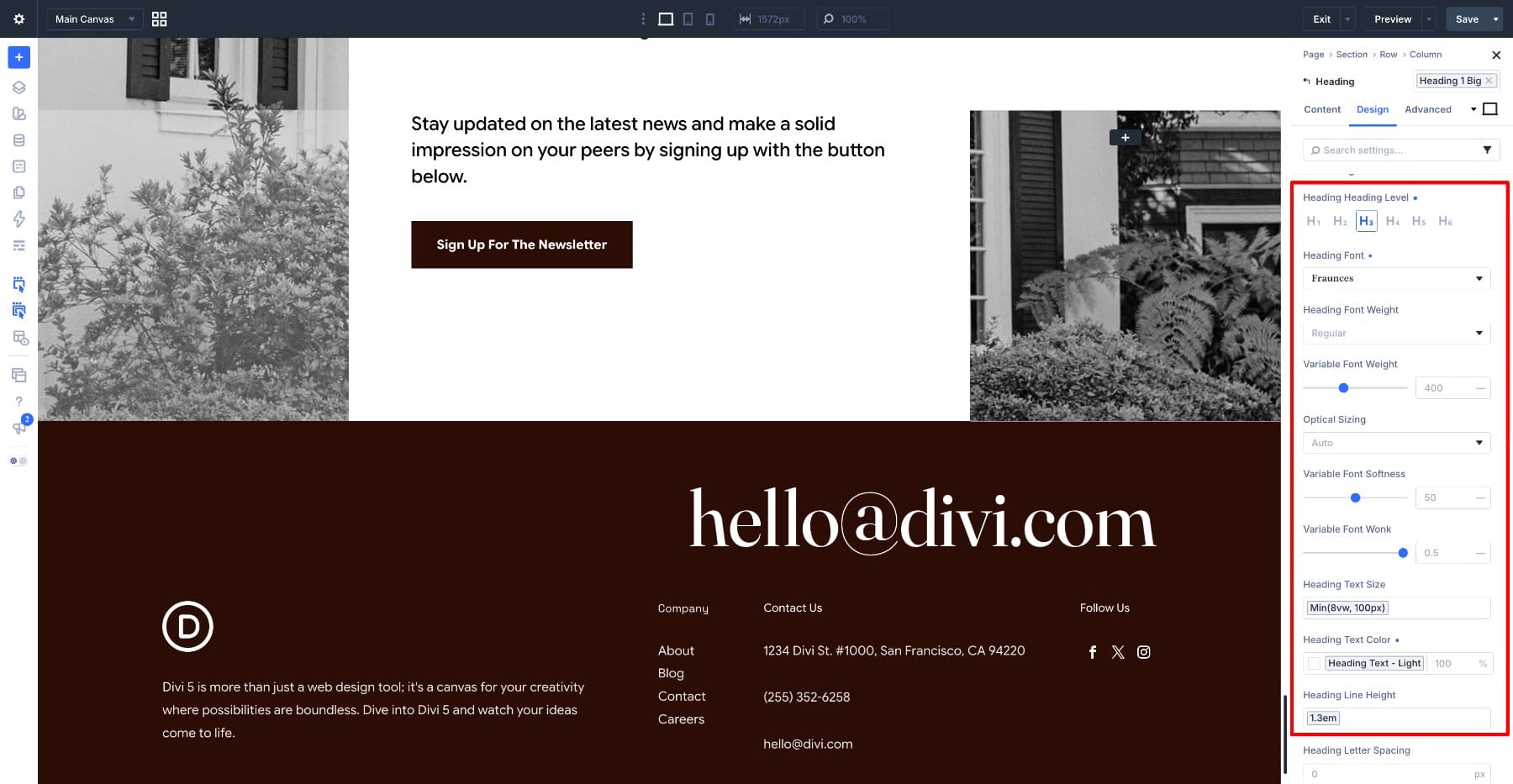
Add a new section and set Background Color to #310E07, closing the page on the same dark block used for the featured story. Add a row and place a Heading Module inside it for your contact email, then apply the following under Design > Text.
- Heading Level: H3
- Heading Font: Fraunces
- Variable Font Weight: 400
- Optical Sizing: Auto
- Variable Font Softness: 50
- Variable Font Wonk: 0.5
- Heading Text Size: min(8vw, 100px)
- Heading Text Color: #F5F3EF
- Heading Line Height: 1.3em
- Heading Letter Spacing: 0px
The cream and deep brown recur throughout the layout, making them useful Design Variables. Save each color as a variable and assign it to the relevant background and text fields. Later, changing the variable updates the fields connected to it, rather than requiring separate edits in each section.
At 400, this is the lightest Fraunces weight on the page. The letterforms have enough presence at this size to hold the corner on their own, while the thinner strokes keep the email address from reading as heavily as the section titles. The min() value lets it shrink with the viewport but caps it at 100px so it never takes over the footer on a wide screen.
Add a second row underneath with four columns. Put the logo and a short description in the first, group your links across the other three under simple labels, and finish with a copyright line at the bottom. Set everything in Google Sans Flex at a small size, using the same width and slant values as the body copy above.
Keep the footer link groups compact, with consistent text sizes and enough spacing to distinguish the labels from the links. This lets readers find the practical information without competing with the large contact email above.
Step 6. Adjust The Layout For Tablet And Phone
Everything so far was built at desktop width, and the two grid layouts need adjustments at smaller sizes. Switch to the tablet breakpoint and reduce Text Columns on the featured story excerpt from 3 to 2, then to 1 on phone so the lines never become too narrow to read. Do the same with the latest stories grid, moving from three columns to two on tablet and one on phone.
Fluid values help the typography scale, but they still need a responsive pass. A 2vw byline becomes very small on a phone, and a tight 0.75em line height may not suit a headline that wraps differently. Set readable breakpoint values where needed, or use clamp() to add a minimum and maximum.
When the hero columns stack, reset the image Divider’s Width to 100% and Left Margin to 0. Adjust its height for the new composition so the desktop overlap does not push the image off-screen. Reduce the story grid gaps and text padding if they leave too little room for the content.
For the newsletter, simplify the grid on smaller screens and reset the three-track and two-track spans to fit the new column count. Keep the heading, supporting text, and button in reading order, with sufficient background coverage for contrast. Finally, stack the footer groups and preview the page at several widths to check for clipped text or horizontal scrolling.
Make Every Divi 5 Design Your Own
You now have an editorial homepage built in Divi 5 from reusable design choices: a consistent type scale, carefully framed images, varied grid structures, and a latest stories section connected to your posts. Change the Grid Editor tracks to try a different composition, or adjust the Fraunces axes to give the headings a different character.
Image ratios remain local to the elements you style. Changing the featured story image from 2:1 to a square updates that image; changing the Image Module inside the Loop updates its repeated instances. To coordinate styles across other images, apply a shared Image Preset.
Use this layout as a starting point for a magazine, portfolio, or content-focused homepage. Keep the visual hierarchy clear, give the copy room to read, and adapt the same Divi 5 controls to the stories and photographs you want to feature.






Leave A Reply