

Divi 5 already gives you a complete CSS Grid system for building two-dimensional layouts inside the Visual Builder. You can define columns and rows, control gaps and track sizes, use premade grid structures, and create Grid Offset Rules for layouts where certain items need to span or move differently.
The new CSS Grid Editor adds a visual layer to that workflow. Instead of shaping an advanced grid through settings alone, you can open a live grid canvas, drag tracks to resize them, reposition items, change gaps, and pull corner handles to create row and column spans while watching the structure take shape.
In this tutorial, we’ll use the Grid Editor to build an asymmetric twelve-photo gallery across four columns. Along the way, we’ll also connect the layout to Grid Offset Rules, Number Variables, Presets, Extend Attributes, Aspect Ratio, and Image Framing so the finished gallery is reusable and responsive.
What The CSS Grid Editor Actually Does
CSS Grid is a two-dimensional layout system. You define columns and rows on a parent container, then the child elements flow into that structure. Individual positions can span multiple columns or rows, which makes Grid especially useful for galleries, editorial layouts, feature cards, product collections, and other designs where horizontal and vertical alignment need to work together.
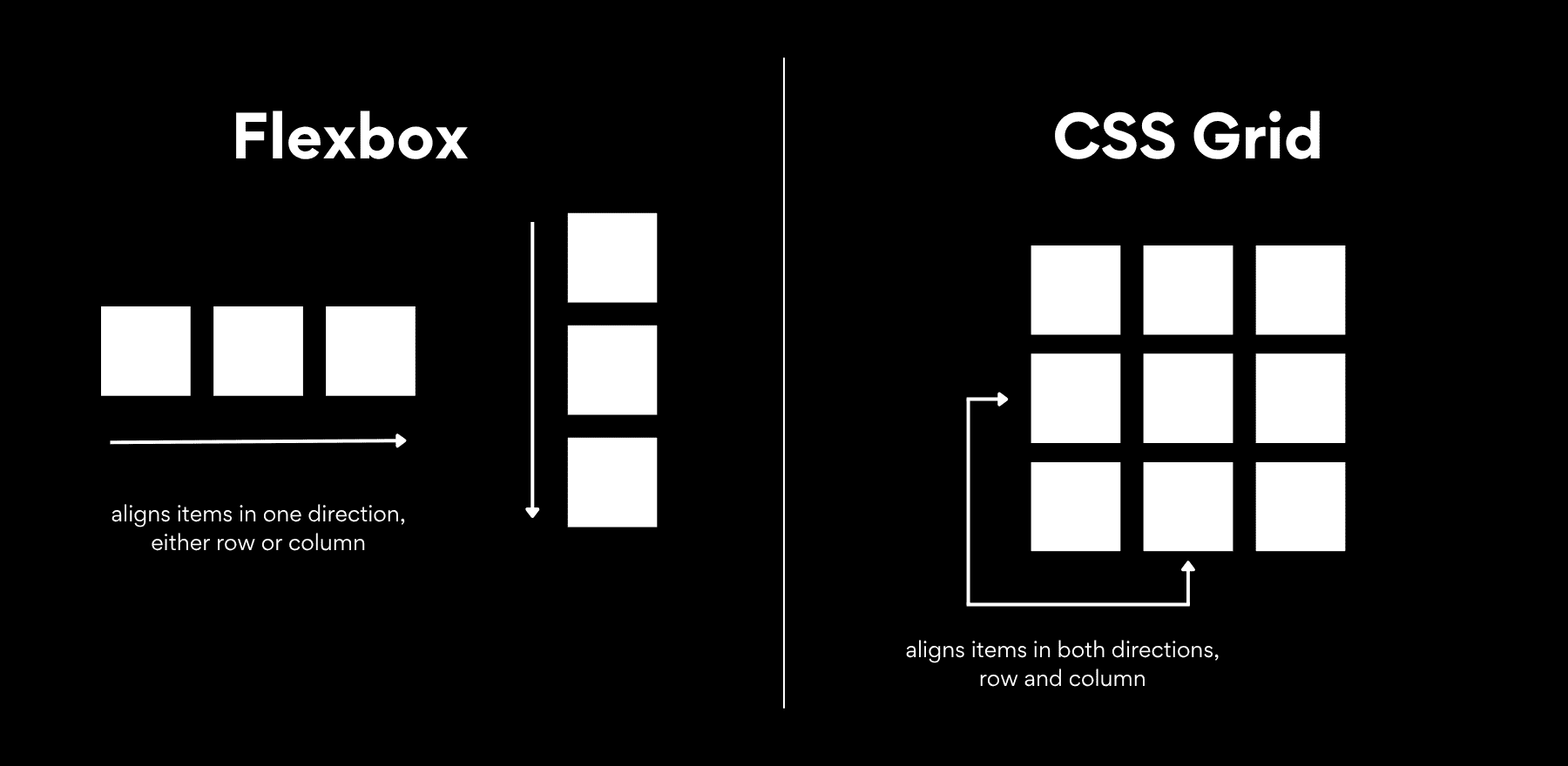
Flexbox is designed primarily around one axis at a time, while Grid handles rows and columns together. A layout with one large image beside two smaller stacked images, with the surrounding edges remaining aligned, is a natural use case for Grid.
Divi 5’s CSS Grid system already exposes the underlying layout controls in the Visual Builder, including columns, rows, track sizing, gaps, alignment, and Grid Offset Rules. The Grid Editor gives you another way to work with that same system by translating the structure into a visual canvas.
Open it and you can see the grid as a collection of tracks and preview items, then shape those tracks directly. Changes made on the canvas are reflected in the corresponding Grid settings and Offset Rules, so the visual editor and the settings panel remain two views of the same layout.
The Grid Lives In The Container, Not The Items
One of the most useful parts of Divi 5’s Grid implementation is that the layout is stored at the container level. Grid Offset Rules target positions using pseudo-classes rather than placing layout settings directly on the child modules themselves.
That means resizing a preview item in the Grid Editor changes the container’s rules rather than modifying the Image, Text, Group, or other module occupying that position. You can replace the content, add or remove children, and reuse the structure with the Loop Builder while keeping the grid logic separate from the content.
Things You Can Do Inside The Editor
Six core actions cover most of the visual grid-building workflow.
Drag The Corner Anchors To Resize An Item. Every preview item has draggable handles on its four corners. Pull one outward to make that position span additional columns, rows, or both. This is how we’ll create the larger feature cells in our gallery.
Drag And Drop An Item To Reposition It. Move a numbered preview item into a different cell to change its position within the grid. Divi records that placement through the container’s Grid Offset Rules.
Adjust The Gaps. Horizontal and vertical gaps can be changed numerically or dragged directly between tracks. A live value appears as you adjust them, making it easy to explore spacing visually and then settle on an exact value.
Drag Column And Row Edges. Drag a grid line to resize the tracks on either side. This gives you a visual way to create uneven columns and rows instead of relying only on equal-width structures.
Add Placeholder Grid Items. The Grid Items control adds sample boxes to the editor so you can preview a longer layout before every real module has been added. These are visualization aids only; they do not create actual modules or content in the Row.
See Offset Rules Highlighted. Grid Offset Rules are displayed on the canvas, including which positions they affect. That makes an existing advanced grid easier to understand because you can connect each rule to the part of the layout it controls.
Grid Offset Rules
Grid Offset Rules tell positions inside a Grid to behave differently from the base structure. A rule can target a specific position, the first or last item, odd or even items, repeating intervals such as every third item, or a custom nth-child pattern.
You manage them under Grid Offset Rules in the container’s Design tab. Depending on what the layout needs, a rule can control values such as Column Span, Column Start, Column End, Row Span, Row Start, and Row End.
Repeating targets are especially useful for dynamic or longer grids. For example, a rule targeting every fourth item can create a repeated visual rhythm without styling each child separately. We cover those patterns in more depth in this guide to Divi 5’s Grid Offset Editor.
The new Grid Editor makes the same system more visual. When you move or resize a preview item on the canvas, Divi automatically creates the corresponding rule for that targeted position. You can then open the generated rule and fine-tune its placement values or change its target if you want the pattern to repeat.
How To Build A Grid Visually With Divi 5’s CSS Grid Editor
We’re building a twelve-photo gallery with four columns and a mix of large, tall, wide, and single-cell positions. The first image acts as the opening focal point, while the remaining spans create a staggered rhythm further down the gallery.
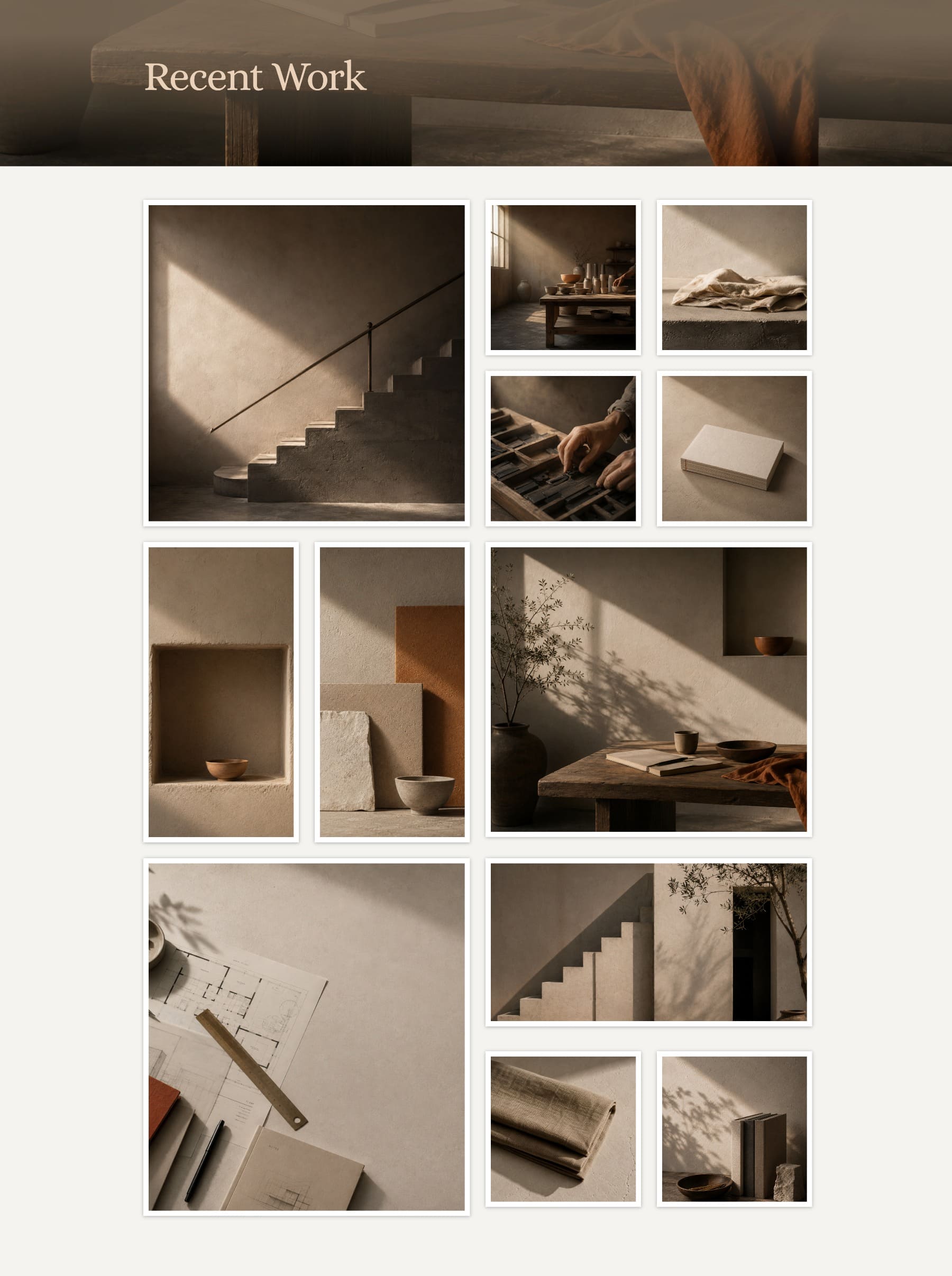
We’ll shape the structure visually first, then connect repeated design values to Number Variables and Presets. Finally, we’ll adjust the image crops and responsive Grid settings so the gallery keeps its intended hierarchy at smaller breakpoints.
Step 1: Add A Grid Row And Open The Editor
Open a blank page in the Divi Builder and add a Section. When you insert a new Row, you’ll see Build Custom Grid alongside Divi’s premade structures. Choose it when you want to begin with the Grid Editor rather than a predefined layout.
You can also start with an existing structure. Open the container settings, go to Design > Layout, set Layout Style to Grid, and click Open Grid Editor. This route works well when a premade Grid structure already gets you close to the design you want.
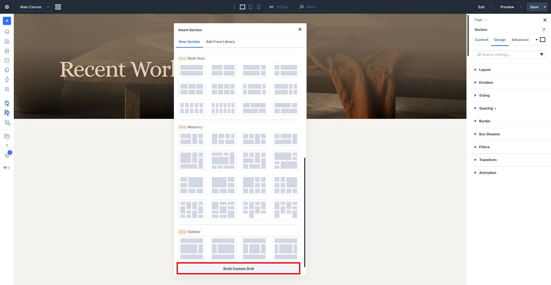
For this tutorial, choose Build Custom Grid. The Grid Editor opens as a floating tool panel, where you can configure the grid and continue working in the builder while it stays open.
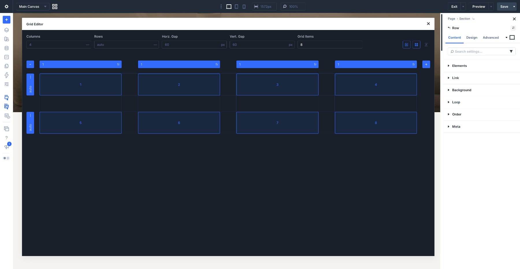
If you are working with an existing element and cannot find the Open Grid Editor button, check its Layout Style first. The Grid Editor becomes available once that element is using Grid.
Step 2: Build The Grid Structure
Start by setting Grid Items to 12. Remember that these are preview placeholders inside the editor, not actual Image modules. Showing all twelve lets us see the complete pattern while we shape the layout.
Back in the actual Row, add twelve Image modules and upload the photographs you want to use. The Grid Container controls where those child modules land.
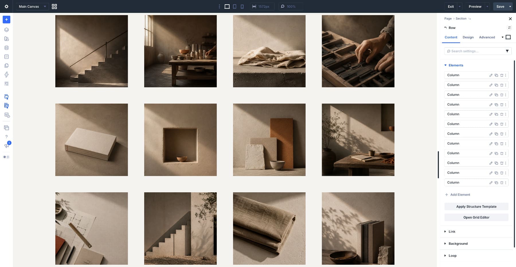
The four columns appear across the Grid Editor, with their current track sizes visible above the canvas. Use the plus and minus controls when you need to add or remove tracks, and leave the row heights on Auto for this gallery so their final size can respond to the content and image proportions.
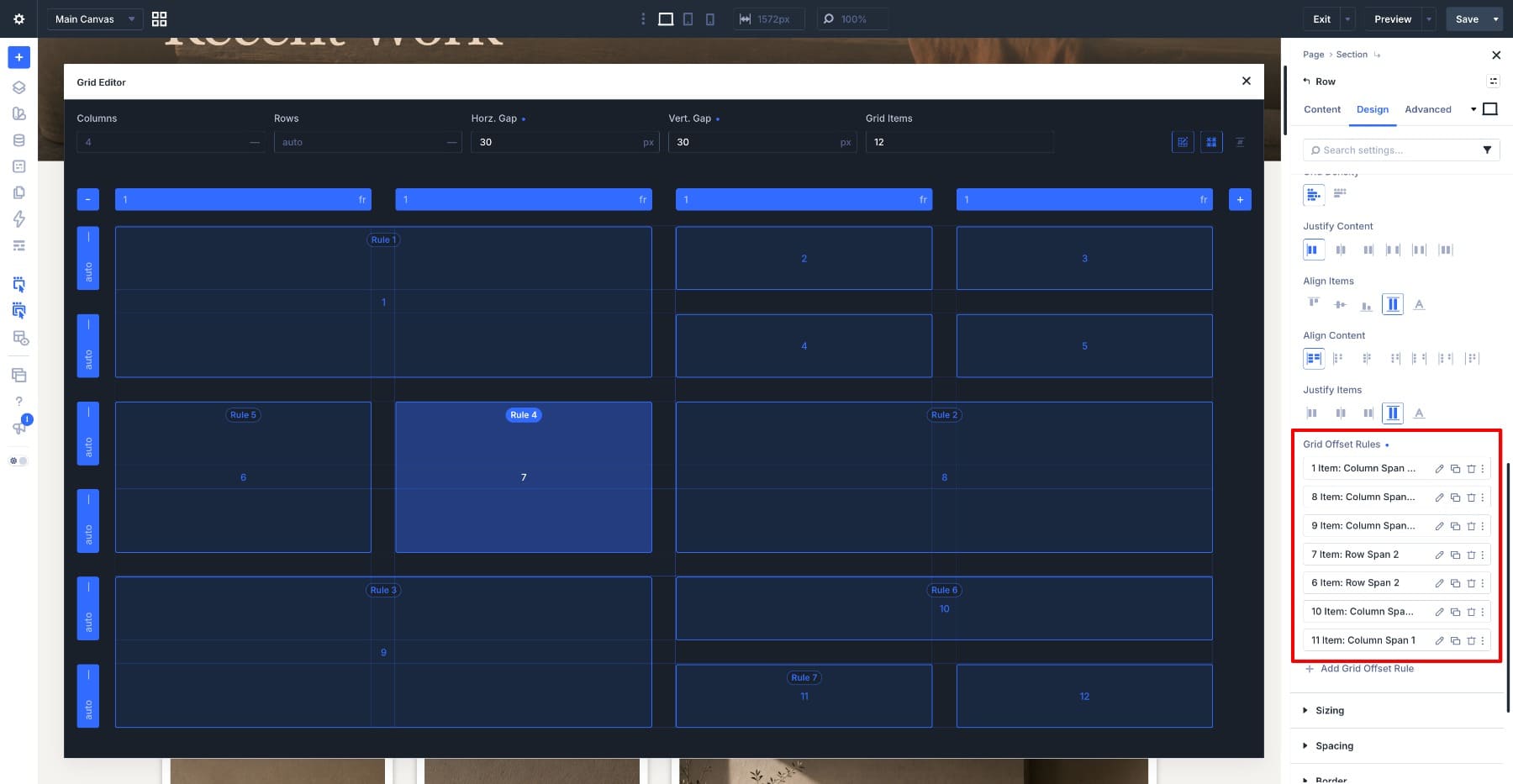
Now shape the first feature position. Grab a corner handle on item 1 and drag it right and down until it spans two columns and two rows. Items 2 and 3 occupy the remaining positions in the first row, while items 4 and 5 continue the structure below them.
Move further down the grid and give items 6 and 7 taller positions by extending each one across two rows. Then expand item 8 across the two columns beside them, creating a larger feature block opposite the tall cells.
For the final part of the gallery, expand item 9 across columns 1 and 2 and down through the next row. Let item 10 span the remaining two columns above items 11 and 12, which stay as single positions.
As you resize items, rule labels appear in the editor. Those labels connect the visual spans to the Grid Offset Rules being generated on the container.
Preview the page and the Image modules now occupy the structure you created. The Grid rules belong to the parent container, so replacing an image or changing the child content does not require rebuilding the grid itself.
Step 3: Set The Horizontal And Vertical Gaps
The cells are currently sitting directly beside each other, so add some breathing room. Set Horz. Gap and Vert. Gap to 30px. You can type those values directly or drag the gaps on the Grid Editor canvas and watch the layout update.
Using the same value in both directions gives the gallery a consistent rhythm while still allowing the differently sized cells to create the visual interest. Because this spacing value may be useful elsewhere on the site, save 30px as a Number Variable and reference that variable in both Gap fields.
Step 4: Style The Images And Save The Design
The grid structure is finished, so now we’ll give the photographs a shared visual treatment. Open the first Image module, go to the Design tab, and open Border. Set Border Width to 10px, Border Color to #FFFFFF, keep Border Radius at 0, and use a Solid border on all four sides.
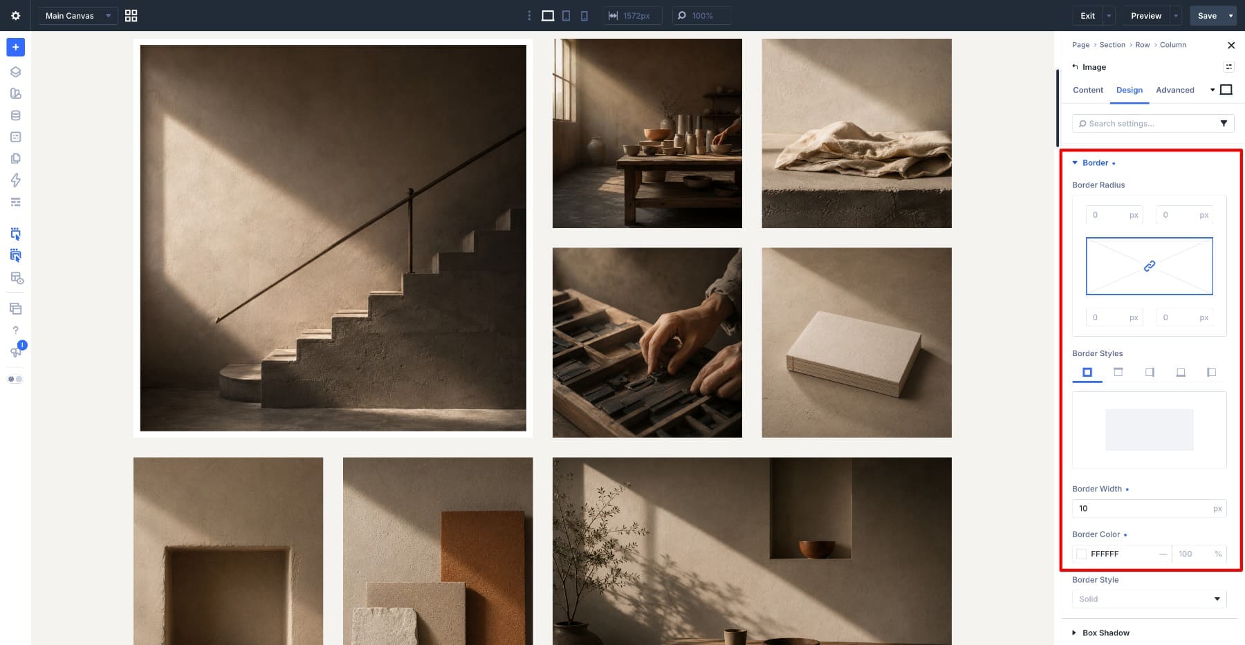
Next, open Box Shadow and select the second preset. Set Box Shadow Vertical Position to 1px, Box Shadow Blur Strength to 7px, leave Horizontal Position and Spread Strength at 0, and set the shadow to #000000 at 30% opacity with Outer Shadow selected.
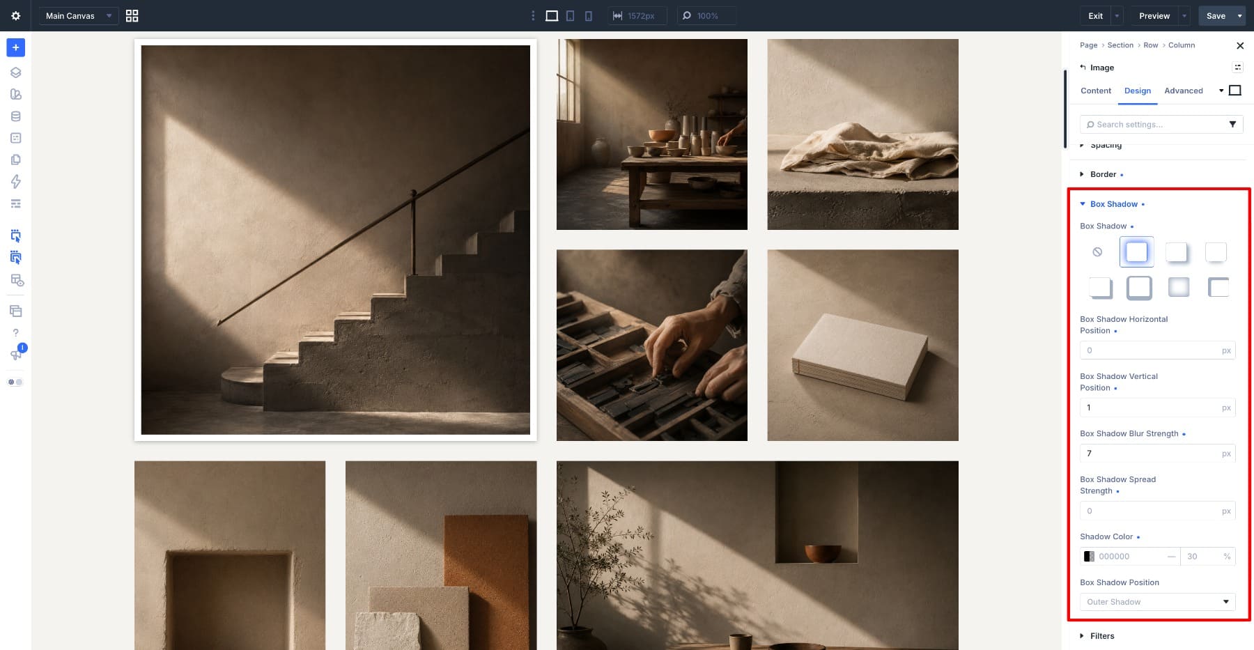
The white frame defines each photograph against the gallery background, while the soft shadow creates enough separation to keep the borders from blending into lighter areas.
Save the completed image styling as an Element Preset. Because the border and shadow belong to the same gallery-image treatment in this example, keeping them together makes the preset quick to apply.
If you expect to reuse the border and shadow independently elsewhere, save them as separate Option Group Presets instead and combine those reusable decisions within an Element Preset. That gives you more flexibility when another image or module only needs one part of the treatment.
Now right-click the styled Image module and choose Extend Attributes. Extend its Design Attributes to the other Image modules in the Row so they receive the same preset and styling without copying the source image content.
Extend Attributes lets you choose which attribute category to propagate, so selecting Design Attributes here keeps each photograph’s unique content intact while distributing the shared design treatment.
Step 5: Match The Image Ratios To The Grid
The Grid defines the layout proportions, but the source photographs still have their own intrinsic shapes. To make the larger and taller positions feel intentional, give those Image modules ratios that match the intended visual proportions of their cells.
Open the first Image module, go to Design > Sizing, and set Aspect Ratio to 1:1 for the large opening image.
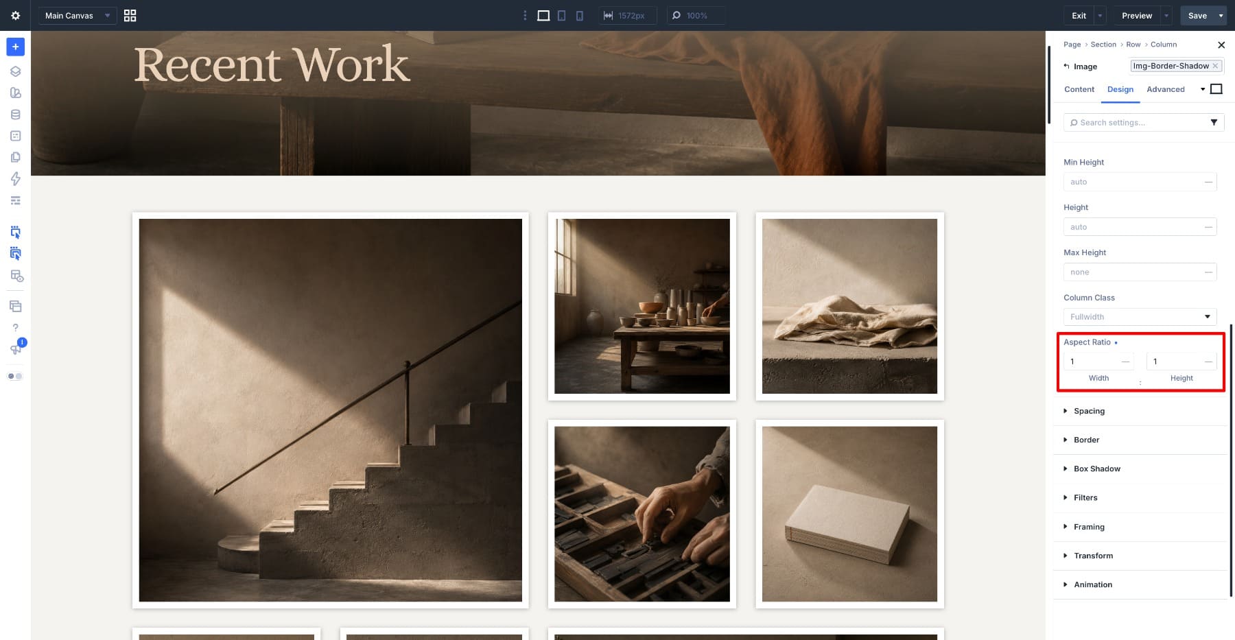
Continue through the feature positions using the proportions designed for this gallery. Set items 6 and 7 to 1:2, item 8 to 1:1, and item 10 to 2:1. The remaining single positions can keep the ratio that works for their source photographs and available grid tracks.
When a ratio differs from the source photograph, open Framing and set Object Fit to Cover. Cover fills the defined frame without stretching the image, while Object Position lets you control which part of the photograph remains visible when cropping occurs.
Pay particular attention to portraits, faces, architecture, or other images with an obvious focal point. The Grid gives each image a shape, but Framing is what lets you protect the part of the photograph that matters inside that shape.
Step 6: Adjust The Grid For Tablet And Phone
The desktop gallery uses four columns and larger gaps, so the final step is adapting the structure for smaller screens. Grid settings are responsive in Divi 5, which means you can simplify the layout at each breakpoint without changing the desktop design.
Switch to Tablet view, open the Row settings, and go to Design. In Sizing, set Width to 88% and Max Width to None. Then open the Grid Editor and reduce both Horz. Gap and Vert. Gap from 30px to 10px, giving the images more room at the narrower width.
Switch to Phone and simplify the Grid to 1 column. Because the desktop layout contains Grid Offset Rules with multi-column and multi-row spans, review those rules at the phone breakpoint as well and override any spans that no longer belong in the single-column version. The goal on phone is a clean vertical gallery where every image can use the available width instead of trying to preserve the more complex desktop pattern.
Divi’s responsive values cascade from larger breakpoints into smaller ones until you override them, so always inspect Tablet and Phone after changing the desktop Grid. In this example, the 10px tablet gaps can continue into phone, while the column count and Offset Rules receive their own mobile treatment.
Build Your Grids Visually In Divi 5
The CSS Grid Editor gives Divi 5‘s existing Grid system a much more visual workflow. Columns, rows, gaps, track sizes, item placement, and Grid Offset Rules are still part of the same underlying layout system, but you can now see and manipulate that structure directly instead of working through settings alone.
Our finished gallery is a good example of why that matters. The twelve photographs can change, the modules can be replaced, and the same container could eventually be connected to the Loop Builder, but the asymmetric structure remains defined at the parent level.
That separation makes the Grid Editor useful beyond galleries. You can use the same approach for portfolio layouts, team directories, product collections, feature sections, editorial feeds, and dynamic loops: build the shape visually, let the container own the structure, and then decide what content should fill it.












Leave A Reply