
Before CSS Grid in Divi 5, complex layouts often meant extra columns, negative margins, and duplicate sections. It wasn’t clean or flexible, especially when layouts needed to adapt across breakpoints.
CSS Grid support in Divi 5 introduced a proper two-dimensional layout system that allows you to control structure without relying on workarounds. And within that system, Grid Offset gives you direct control over where an element starts, how far it stretches, and how tall it runs in the grid. You define position in the structure itself, rather than nudging things into place.
Once you understand how start and span work together, you can build flexible layouts without clutter or hacks.
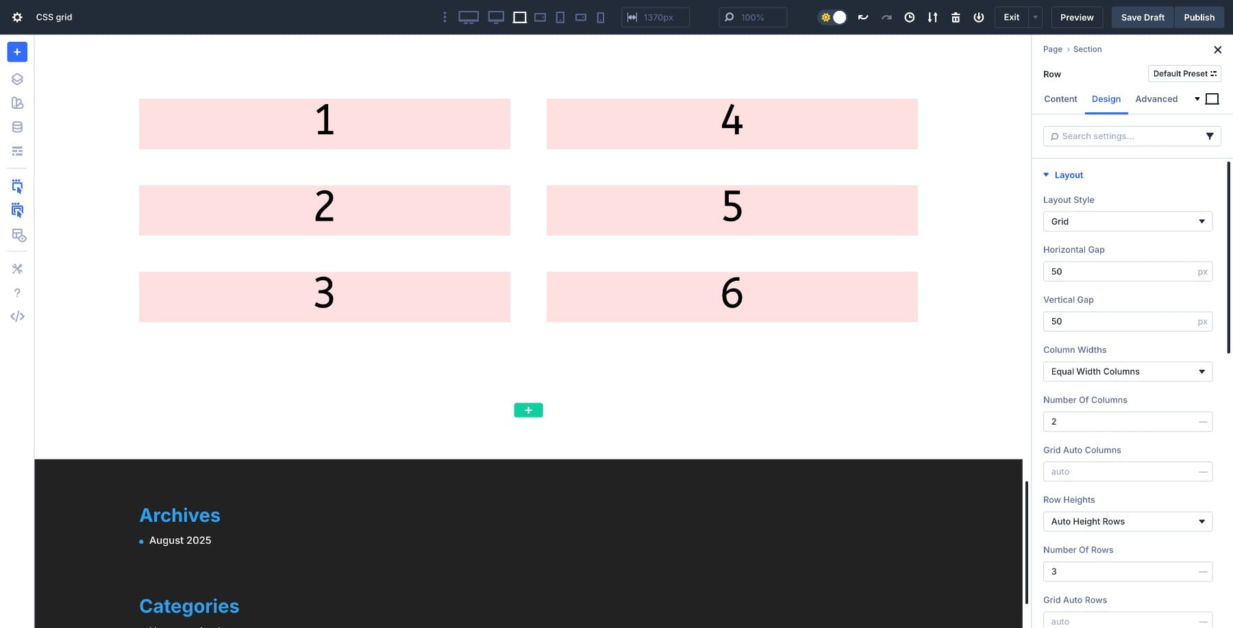
How Grid Positioning Works
Divi 5’s Grid Offset Editor gives you precise control over where modules land in your layout. But positioning elements on a grid makes a lot more sense once you see what’s actually built when you turn Grid on.
Grids Are Built On Lines
When you enable Grid on an element, an invisible structure is created. Vertical lines define columns, and horizontal lines define rows. The modules you place inside live in the spaces between those lines.
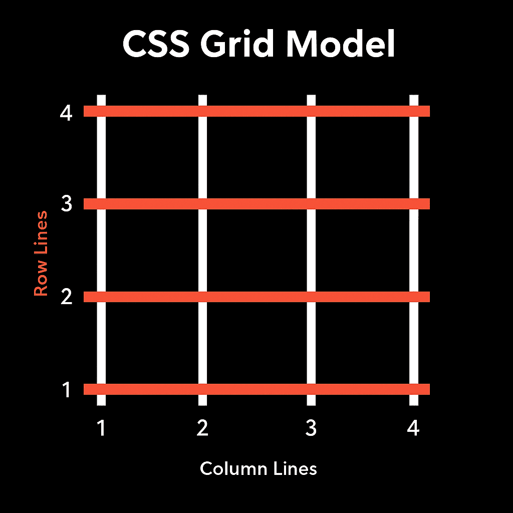
Look at the grid above. The white vertical lines are numbered 1 through 4 at the bottom. Those are column lines. The orange horizontal lines, numbered 1 through 4 on the left, are row lines. The spaces between are the gaps where your content lives.
Here’s what most people miss: in this 3-column grid, you’re not working with three things. You’re working with four column lines. The columns themselves are just the spaces between those lines.
Every module you place gets positioned by telling it which line to start at and how far to stretch. Want a module in the middle column? Tell it to start at column line 2 and span 1 column, ending at line 3.
Start, Span, And End
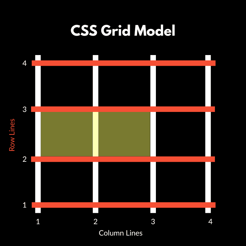
Three settings control where each element lives. The start line is where the module begins. The span is how many tracks (columns or rows) it covers. The end line is where it finishes.
Say you set Column Start to 1 and Column Span to 2. The module starts at line 1 and stretches to line 3, covering the first two columns.
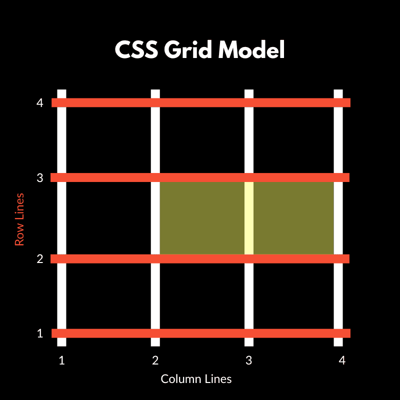
Change Column Start to 2, and the module begins at the second line. Combined with your Span value, it shifts into the next available column space.
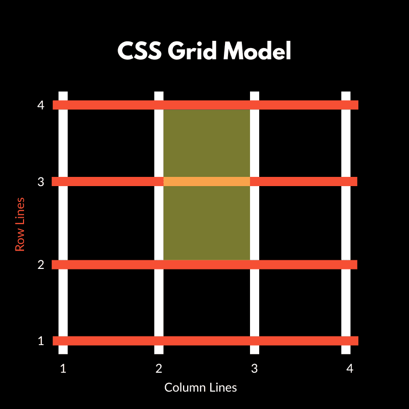
The same logic applies vertically. A module with Row Start at 2 and Row Span of 2 occupies rows 2 and 3, between row lines 2 and 4.
Why This Matters For Offset
When you apply an offset, you change the location of a module’s start line. Column Start 2 moves the module to begin at the second column line. The span setting then determines the amount of space it occupies from that starting point.
This line-based positioning makes grid layouts stable and predictable. You lock modules into precise locations on an invisible framework, rather than pushing things around and hoping they land in the right spot.
When you enable Grid on a Section or Row in Divi, the builder automatically creates this line structure based on your column and row settings. You define how many columns you want, and Divi draws the necessary lines to form that grid. Modules get placed automatically in the order they appear, filling columns from left to right and rows from top to bottom.
But when you need a module to sit somewhere specific (like skipping the first column or spanning multiple rows), you’ll use the Grid Offset Editor to override the automatic placement and position modules exactly where you want them on those numbered lines.
What You Can Actually Control With Grid Offset Editor
When Divi introduced CSS Grid, it brought the ability to structure layouts using rows and columns directly. Previously, most complex layouts relied on padding adjustments, empty placeholder columns, or duplicate sections to position elements.
Those spacing tricks worked for simple structures, but fell apart at different breakpoints. A grid is two-dimensional, so you can control where each element sits horizontally and vertically without those workarounds.
Subscribe To Our YouTube Channel
Once your grid is set, the Grid Offset Editor allows you to adjust the placement of individual modules within it. You apply rules to move, stretch, or reorder elements within the existing grid structure.
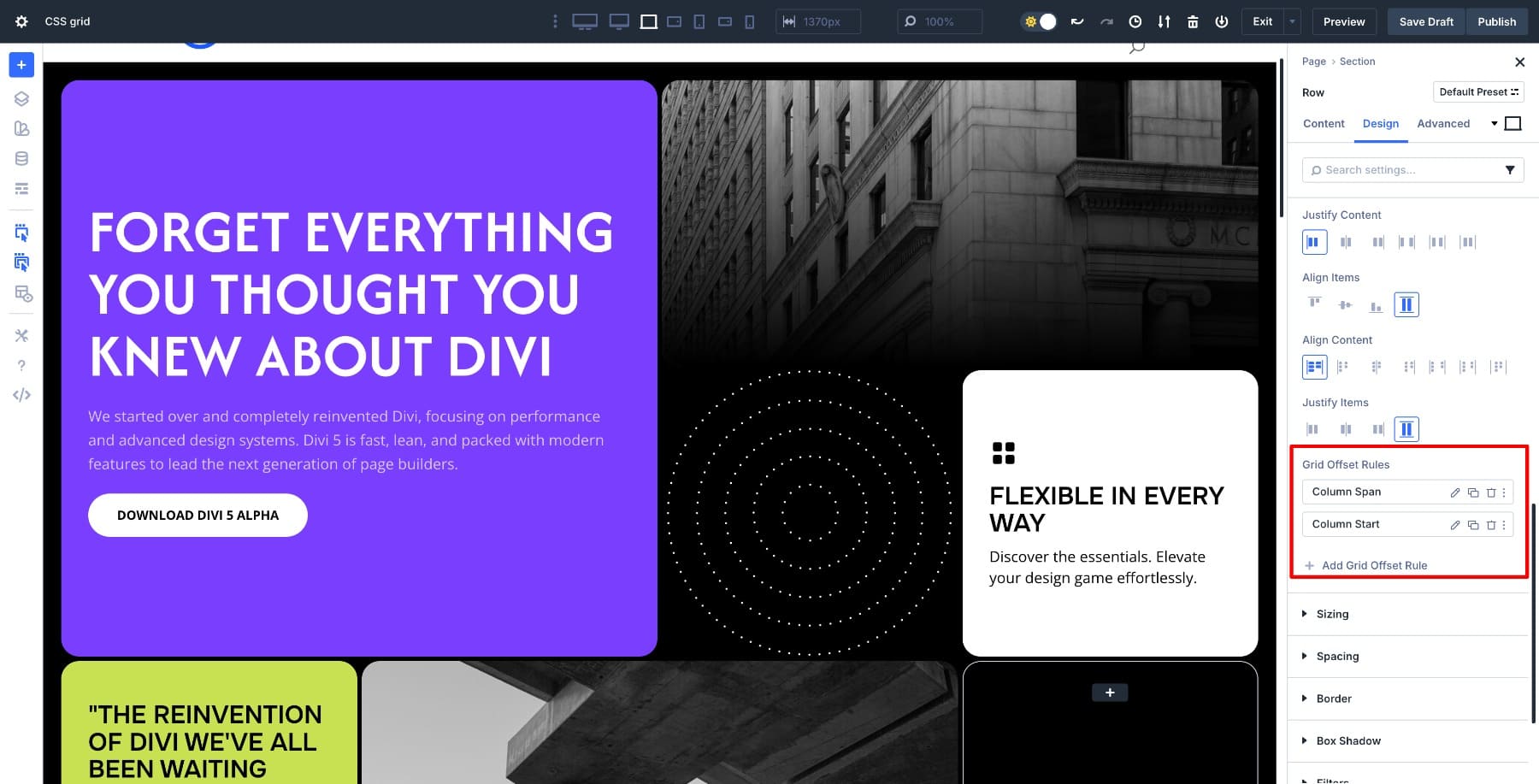
It opens when you click + Add Grid Offset Rule.
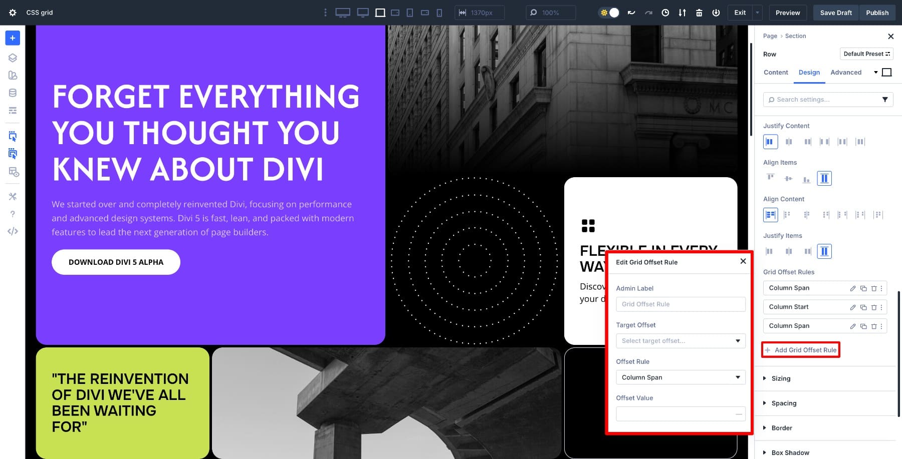
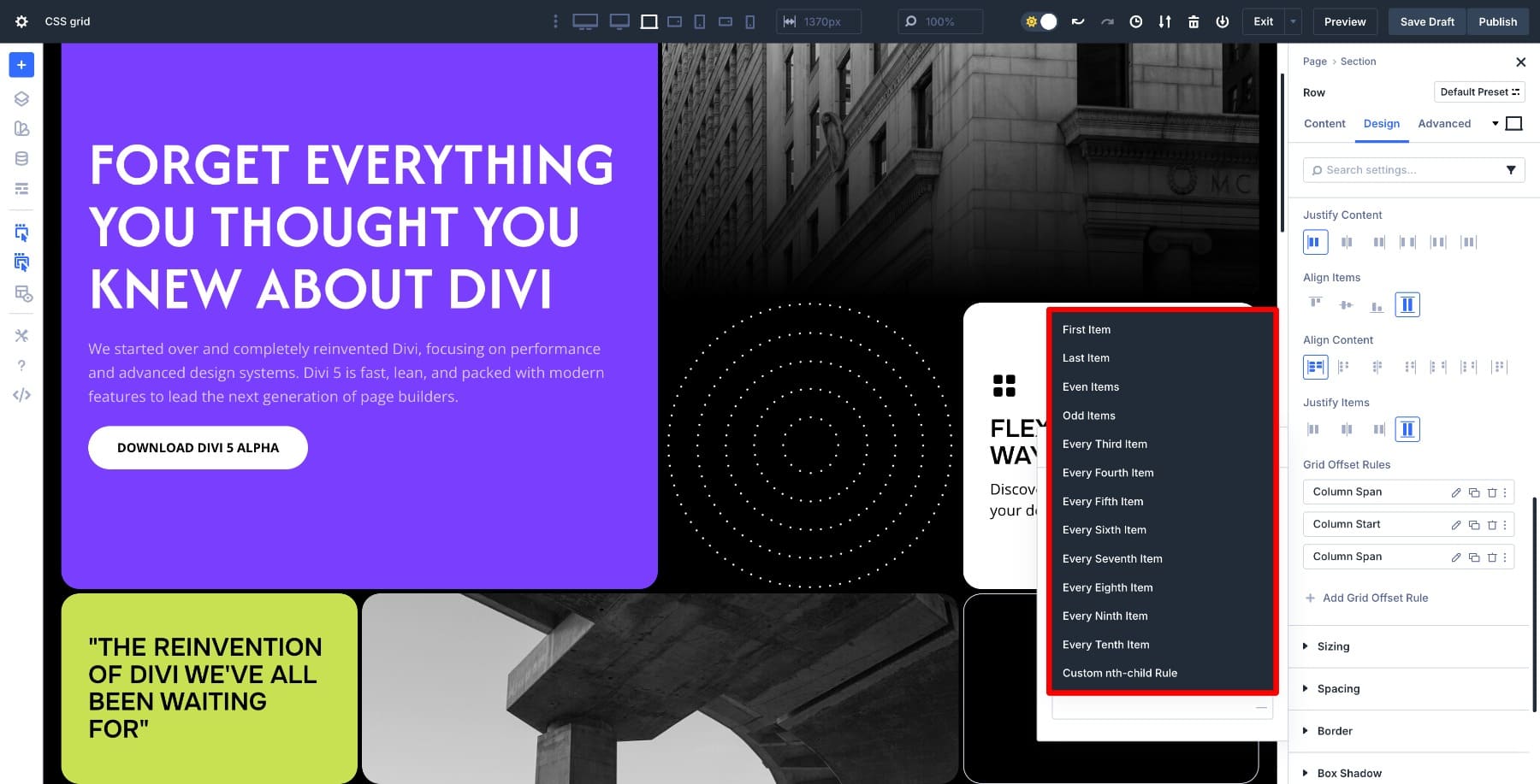
Give it a label, then decide which element the offset rule should apply to in the Target Offset dropdown:
The Offset Rule dropdown gives you 7 key rules covering almost every layout scenario.
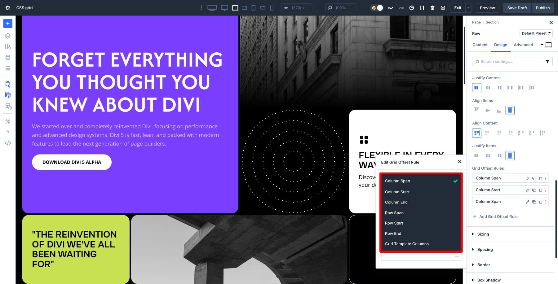
- Column Span: Sets how many columns a module covers. Ideal for full-width headings or wide images.
- Column Start: Moves a module horizontally by choosing the column line where it begins. Useful for staggered card layouts or centered content.
- Column End: Defines where it stops horizontally. Combine with Column Start for precise placement.
- Row Span: Sets how many rows a module occupies. Perfect for tall images or highlight blocks that stretch vertically.
- Row Start: Moves a module down by choosing the row line where it begins. Great for staggered or responsive flows.
- Row End: Defines where it stops vertically. Works best paired with Row Start.
- Grid Template Columns: Defines the column track sizing for the targeted grid item (so one item can have its own internal column structure).
Finally, you set the Offset Value as 1, 2, 3, etc. to give a parameter for positional changes.
Each of these settings addresses a layout problem that previously required workarounds or duplicate sections. By applying a rule, you place modules exactly where you want them. Once you understand how these pieces fit together, positioning becomes deliberate and fast.
Every offset rule you create automatically adapts across desktop, tablet, and mobile views. Divi applies the same rule to all breakpoints by default, keeping your layout consistent. If you need different positioning on smaller screens, you can override any rule at the tablet or mobile level.
Learn Everything About Divi 5’s Grid System
Using Offset Rules In Real Layouts
Now that you understand how the offset controls work, let’s look at how they solve real layout challenges.
1. Creating Full-Width Elements
Sometimes you need one element to stretch across the entire width, while other modules stay in their columns. Set Column Span to match your total column count, and the module expands instantly without affecting anything else around it.
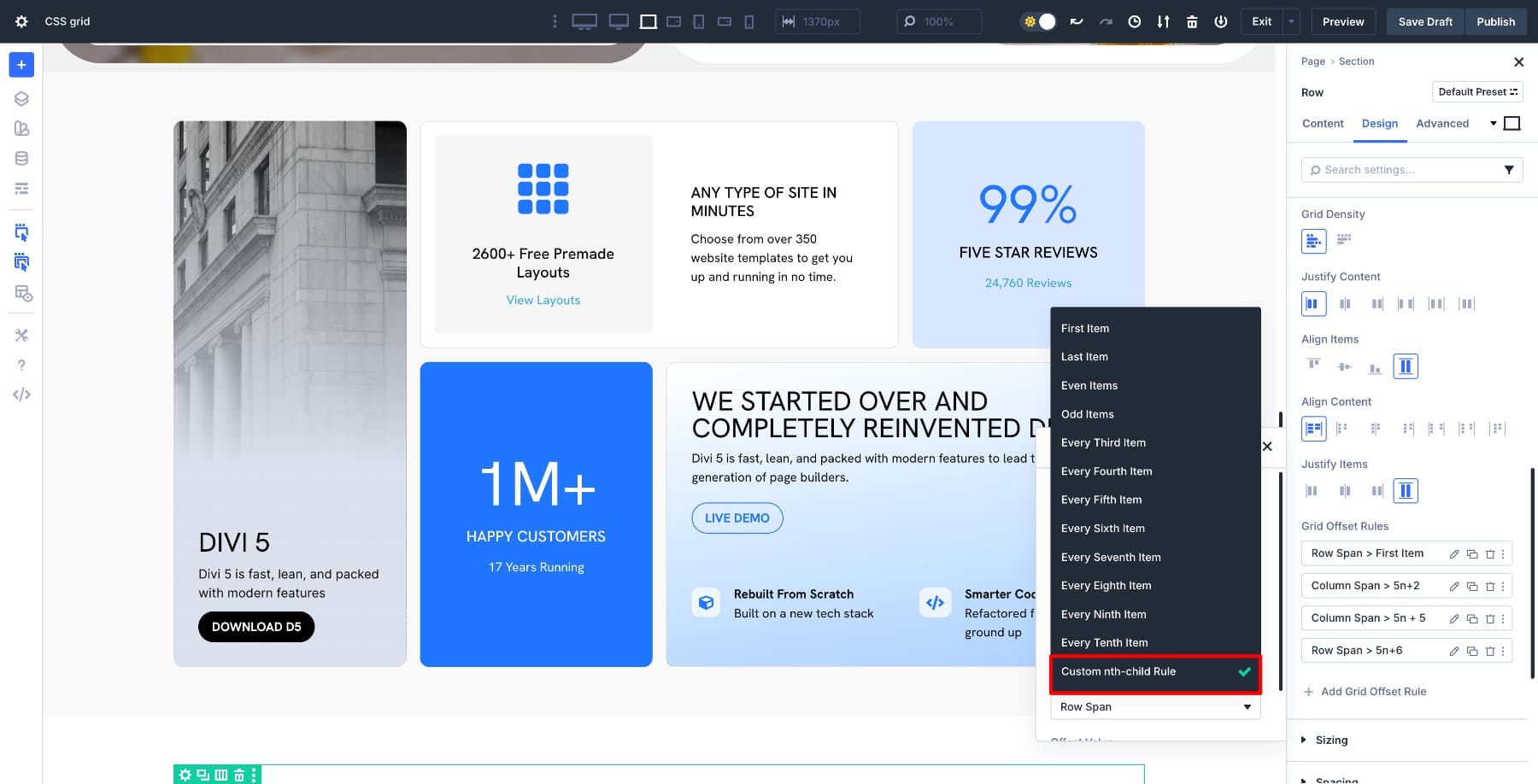
The real power shows up in how you target elements. Apply the span rule to the first item in the grid to create a hero section at the top. Target the last item to make a full-width footer block. Need something more specific? Use the nth child rule to expand any module by its position, like making the third card full-width in a product grid.
You’re setting one rule that controls placement based on structure, which makes the layout adapt automatically as you add or remove content. This same approach works in two dimensions when you pair Column Span with Row Span, creating wide and tall blocks.
Column Span also combines with Column Start to position full-width modules lower in the grid. Targeting goes beyond nth-child as well. You can target even or odd items for alternating full-width sections, or use first and last to handle edge cases.
2. Creating Staggered Layouts
Staggered layouts add visual interest by offsetting elements rather than lining them up uniformly. With Column Start and Row Start, you can shift specific modules to begin at a different column line, creating that offset effect naturally.
Set your grid to three rows, then target every third item and set Row Start to different numbers. Those modules shift over, leaving space in earlier columns and creating a clean staggered pattern. The layout stays structured, but the rhythm breaks up the monotony. The stagger works because you’re controlling where elements begin.
When you need more control over how much space each element takes, pair Column Start with Column Span. A module that starts at column 2 and spans two columns creates a different visual weight than one that starts at column 2 and spans 1. You can also layer Row Start values across different nth-child rules. Every second item offsets slightly, and every fourth offsets more, giving you rhythm variations without building separate grids.
3. Stretching Elements Vertically
Not every element needs the same height. Row Span allows you to stretch a module vertically across multiple rows, making it stand out without disrupting the grid structure. Set your grid to three rows, then target a specific item and set Row Span to 2 or 3. That module stretches taller, occupying multiple row tracks while surrounding elements flow around it naturally.
Featured content, highlight cards, and images that need more visual weight all benefit from this approach.
The grid holds everything in place while you tell one element to take up more vertical space. Row Span works alongside Column Span when you want featured cards that dominate both dimensions. A module with Row Span 2 and Column Span 2 becomes a focal point in a card grid.
You can also position tall cards lower in the layout using Row Start with Row Span, creating asymmetric designs where visual weight shifts down the page. For responsive layouts, different Row Span values work at each breakpoint. A tall card on a desktop might span three rows, but on mobile, where vertical space matters more, you can reduce it to span 1 row.
Try CSS Grid In Divi 5 Today!
Grid Offset in Divi 5 puts precise positioning control into a visual interface. Once you understand how lines, spans, and start positions work together, building layouts becomes deliberate rather than guesswork. The structure holds across every screen size because you’re defining position in the grid itself.
Complex layouts no longer need padding tricks, empty columns, or duplicate sections. You apply offset rules that tell each module exactly where to sit, and the layout adapts as your content changes. The same principles work whether you’re creating full-width hero blocks, staggered card layouts, or tall featured sections.


All very good but when is the final product being released.
Love Divi and been using it since early days so seen it grow. Having one live project with divi 5 I’ve kept using Divi 4 because some plugin companies won’t commit to Divi 5 until it’s out it Beta.
Any idea which month, I assume it will be 2026.
Thanks and keep up the good work.
Not long at all now.
+1
I am also excited about the new features, but I would prefer to have the stable version of Divi 5 even without some of the extras.