

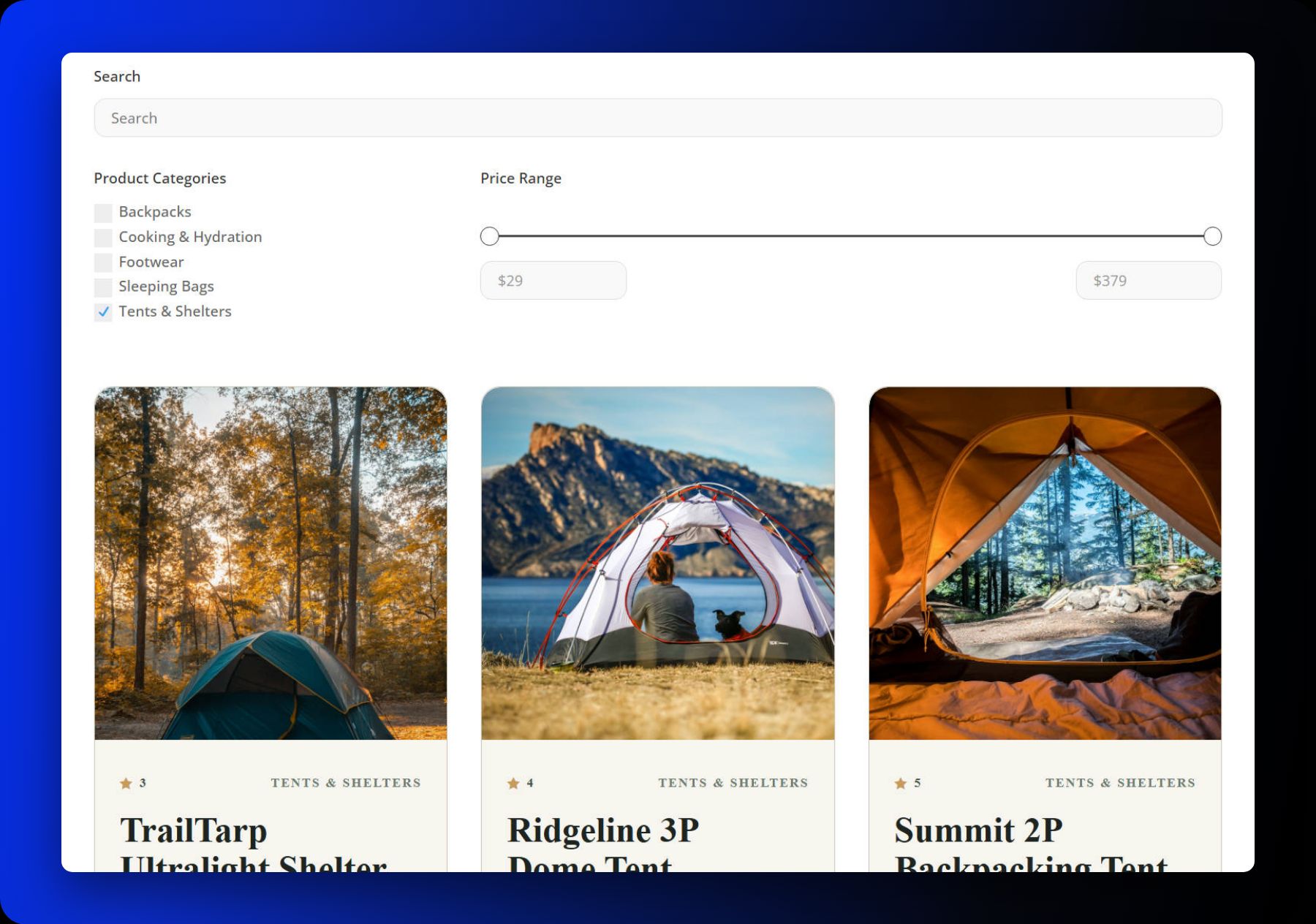
A product grid gives shoppers a way to browse your catalog. Search, filters, and sorting help them narrow that catalog to products that fit their needs. In Divi 5, the Loop Builder lets you create custom product cards and repeat them in a grid, while the Post Filter Module provides the controls shoppers use to refine the results.
Below, we’ll build a product grid that shoppers can search by keyword and narrow by category and price. Along the way, we’ll look at other controls you can add, including stock status, review ratings, product attributes, and sorting by price, popularity, or rating. You’ll need Divi 5, WooCommerce, and a few products in your catalog.
Prepare Your Product Catalog
WooCommerce must be installed and have products ready to display before you begin. If you need help with that, our guide to installing WooCommerce covers the setup, and the Divi and WooCommerce integration page explains how the two work together.
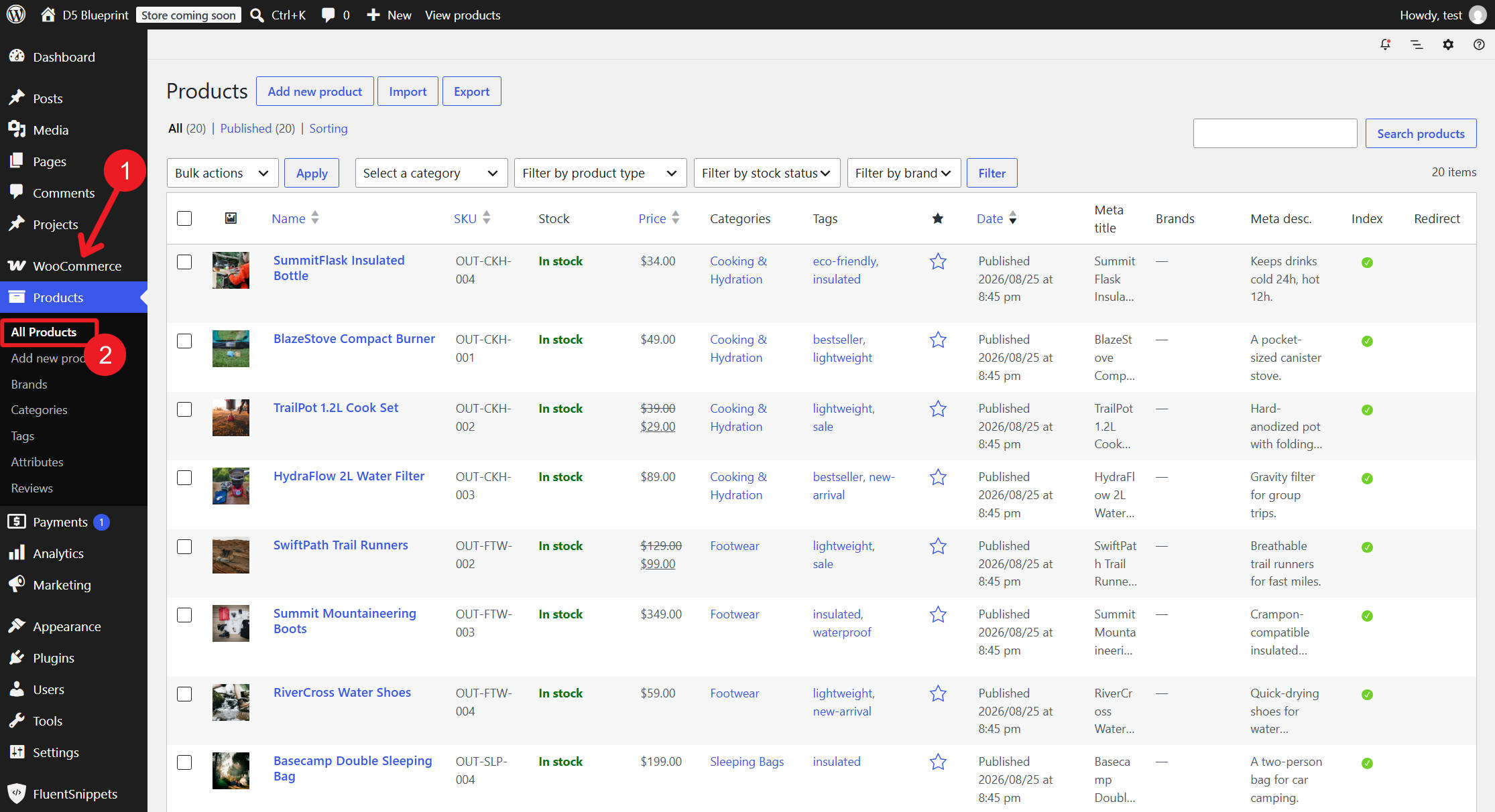
Filters use data that already exists. If you want shoppers to filter by category, color, or size, the relevant categories and attributes need to be assigned to your products. Adding a filter control does not create that underlying information.
Before building, confirm that your product categories contain products. For global attributes, define the terms and assign them to the appropriate products. A range of prices makes it easier to demonstrate the price slider, while products with different review ratings help you see how a rating filter affects the results.
Sorting also depends on the available data. For example, Popularity (Sales) uses sales counts. Products with no sales can still appear, but a catalog where every product has the same sales count will not produce a meaningful popularity ranking.
Build A Product Loop
Divi includes several WooCommerce Modules for displaying product information throughout your store, including in Theme Builder templates. For this tutorial, we’ll use individual Image, Heading, Text, and Button Modules, then enable a Loop on their parent container.
This approach gives us control over the product card’s structure. We can decide which information to show, how to arrange it, and which parts need their own layout before connecting the modules to product data.
If you would rather start with a finished card design, 12 Shop Loops For Divi 5 includes twelve free product-grid layouts. Import the JSON under Divi > Divi Library, add a layout to your page, and continue with the query settings below.
Either way, build the Loop first and connect the Post Filter Module afterward. This tutorial uses a custom Divi product Loop rather than the standard WooCommerce shop grid.
Build The Product Card
Open the page in the Visual Builder and add a Row or Group to hold the grid. Inside it, add a second container for the product card.
Select the outer container and switch its Layout to CSS Grid. The outer container arranges the repeated cards into columns, while each inner card remains one unit. Set the column count and gaps to suit your design.
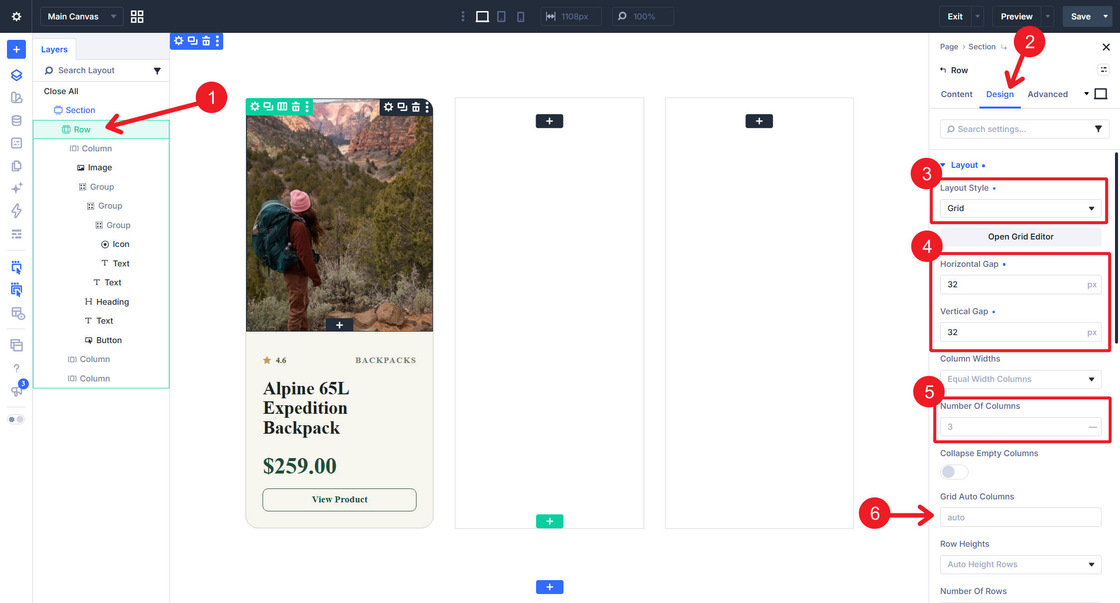
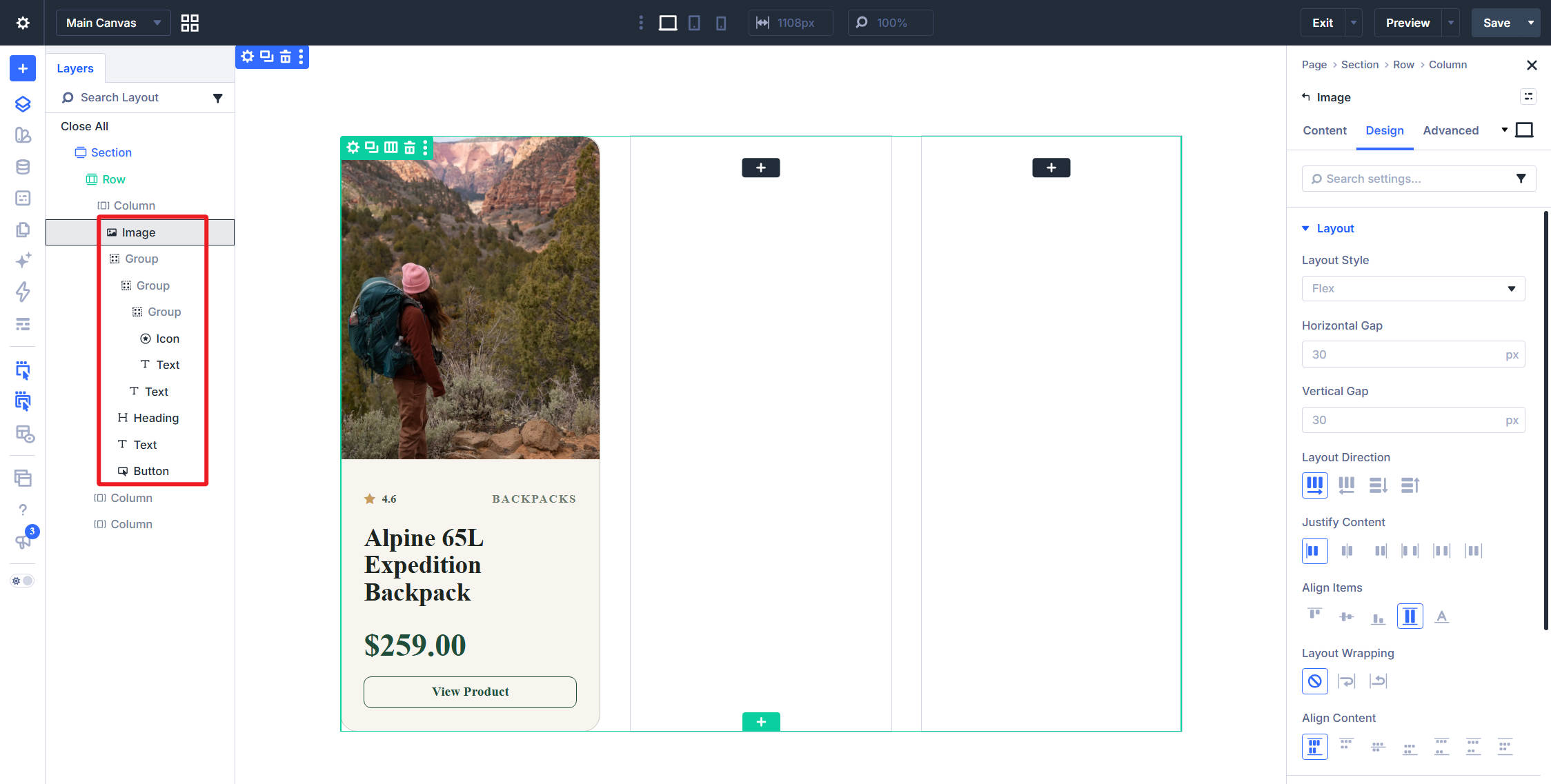
Inside the card container, add an Image Module for the product photo, a Heading Module for the title, a Text Module for the price, and a Button Module linking to the product.
We’ve also added Group Modules to organize parts of the card. These let us arrange selected elements horizontally while keeping the overall card vertical. You can adjust that internal structure without changing how the outer grid arranges the cards.
Enable The Loop And Set The Query
Remove any unused Columns from the grid so only the intended card structure remains. Then select the card’s own container, the one holding the Image, Heading, Text, and Button Modules, and enable its Loop.
Set Query Type to Post Type, choose Products as the Post Type, and set Posts Per Page to the number of products you want to show before pagination.
Pagination is handled by a separate module. A Pagination Module connected to the same Loop follows its active filters and returns to the first page when they change. Our guide to using the Loop Builder and Pagination Module together covers that setup.
Once the query is set, Divi repeats the card container for the products it returns. The outer grid handles their arrangement, so you do not need to duplicate the card manually.
Bind The Modules To Dynamic Content
Next, connect the modules inside the card to the current product’s data. Open each module and use its dynamic content options to assign the appropriate value:
- Image: The product’s featured image.
- Heading: The product title.
- Text: The product price.
- Button Link: The product URL.
Set the Button’s text separately to the label you want shoppers to see.
Each repeated card receives the data for its own product. A Heading connected to the product title displays the correct name in every card, while the Image and price update in the same way.
You configure the structure and dynamic connections once. Changes to that shared card design then apply across the products displayed by the Loop.
Label The Loop
Give the two containers distinct labels under Meta > Element Label. Use Product Grid for the outer container and Product Card for the inner container with the Loop enabled.
The Post Filter Module’s Target Loop dropdown identifies Loops by their Element Labels. For this setup, the filter should target Product Card, because that is the element repeating for each product.
Clear labels become especially useful on pages with several Loops. They also help you identify elements in the Layers Panel and when choosing targets for Interactions.
Connect The Post Filter Module
With the product Loop in place, add a new one-column Row above the grid and insert a Post Filter Module. Keeping the form in its own Row means the grid’s layout does not need to account for the filter controls.
The starter form includes a Search field, a Category checkbox list, a Reset button, and an Apply button. Until you choose a target, the module displays a Select a Loop message.
Open Content > Target and set Target Loop to Product Card, using the label assigned to the looped container.
Two additional settings control how the form works:
- Apply Mode: Submit waits for the shopper to click Apply. Auto applies changes as a field is adjusted.
- Relation: And requires all active filter conditions to match. Or allows products matching any active condition.
For this build, use Auto and And. This lets shoppers combine a search term, category, and price range to narrow the grid.
The example removes both buttons for a compact form. The Apply button is unnecessary in Auto mode, but Reset can still provide a convenient way to clear selections. Keep it if you want that option available to shoppers.
One Post Filter Module can contain the different field items needed for this form. We’ll keep them together here, with the parent module controlling the target and the relationship between the active filters.
Set Up The Filter Items
With the buttons removed, the Search and Category items remain. The default Search field searches product titles and content. It does not automatically search every value displayed on a card, so use dedicated controls for categories, attributes, and price.
The Category item initially refers to standard post categories. Open it and change Field Option to Product Categories so it matches the Products query used by the Loop.
Check that the displayed options now correspond to your product categories. If they do not, confirm both the field’s source and the products assigned to those categories.
Add The WooCommerce Filter Items
When targeting a WooCommerce product Loop, you can use three product-specific field types:
- Price Range: Gives shoppers a slider for narrowing products by price.
- Stock Status: Filters by availability, including in stock, out of stock, and on backorder.
- Review Rating: Filters products by star rating.
These controls use the information saved with your products. For this build, we’ll add only the Price Range slider, but you can include the others when they are useful for your catalog.
Click Add New Post Filter Item, set Field Type to Price Range, and enter Price as its label. Check the displayed price bounds against your catalog before moving on.
Attributes help shoppers compare products by details such as size, color, or material. For example, a jacket catalog may benefit from size and color filters alongside its product categories.
Use global product attributes with terms assigned to the relevant products. Filtering the grid helps shoppers find matching products; selecting a specific variation still happens through the product’s variation controls.
To add an attribute filter, create a Post Filter Item, set Field Type to Checkbox, and choose the attribute under Field Option. Checkboxes allow shoppers to select multiple available values.
The same general setup applies to product tags and shipping classes: create a separate item and select the corresponding source under Field Option.
Custom fields can provide additional filtering criteria. Choose the relevant field source and make sure the filter values match the data saved with your products. The field type and comparison should suit that data, particularly when working with numeric values.
We are leaving these optional controls out of the finished example. Its search field, product categories, and price slider are enough to demonstrate the setup without making the form unnecessarily long.
Let Shoppers Sort The Grid
Sorting changes the order of the products returned by the Loop. An Order By item lets you choose which sorting options shoppers can use. For a product Loop, these include Price, Popularity (Sales), and Rating, alongside options such as title and date.
An Order item gives shoppers ascending and descending choices. A Multiple Order item lets them combine up to five sorting rules.
Sorting reads the underlying product data rather than the visible card content. For example, shoppers can sort by rating even if your card design does not display a rating.
We are not adding sorting to this particular form, but these items are available in the same module when your product grid needs them.
What Happens When A Filter Is Used
The form applies its active conditions to the selected Target Loop. With And selected, a shopper can enter a keyword, choose a category, and adjust the price range to display products matching those conditions together.
Apply Mode determines when those changes take effect. In Auto mode, filters apply as the shopper adjusts the fields. In Submit mode, shoppers can make several selections before clicking Apply.
A separate grid with a different target is not controlled by this form. That distinction lets you place multiple collections on a page without making every filter affect every Loop.
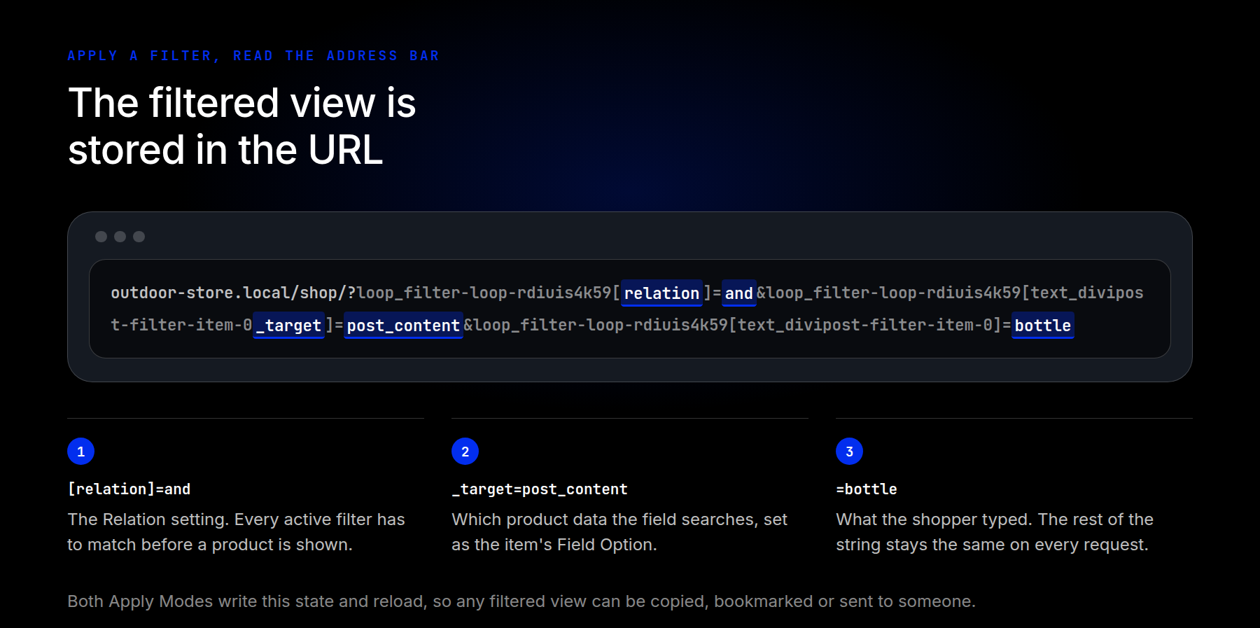
The example also shows active filters in the page URL. This makes filtered views useful beyond the current browsing session: shoppers can bookmark a selection, and you can share a link to a specific set of results.
For example, a link to tents within a particular price range can lead to the same grid with those filters already applied. Open a copied filtered URL in a new tab to confirm that it restores the intended selection.
Before styling the form, try the controls individually and together. Confirm that the results match your catalog, then clear the selections to return to the unfiltered view.
Style The Filter Form
The parent Post Filter Module’s Design tab provides shared styling for the form’s items. Its layout settings control the overall arrangement, while groups for fields, options, checkboxes, radio options, and buttons let you style the controls within it.
For this example, we use off-white backgrounds, thin borders, and consistent label colors to connect the form visually with the product grid.
To reproduce the demonstrated arrangement, use a Flex layout with wrapping enabled. Each Post Filter Item has its own Column Class under Sizing, which determines its share of the available width.
Set Search to full width, Product Categories to one-third, and Price to two-thirds. This places Search on its own line, with categories and price sharing the line beneath it.
A Size of Shrink to Fit can make an item follow its content width. Use it where that suits the layout, while leaving enough space for the price slider to remain comfortable to use.
Style Every Field In One Pass
With the arrangement in place, open the parent module’s Field group. Set the background color, border width and color, and corner radius.
These shared settings help the search field, category control, and price slider feel like parts of the same form. You can establish the common styling here before adjusting any individual exceptions.
Next, adjust the field padding and label typography. Padding gives the controls enough space, while the Label Text group controls font weight, color, and line height.
A slightly heavier label can distinguish it from input text without overpowering the form. If your chosen font supports variable weights, Divi 5 lets you choose a weight between the usual regular and bold values.
Individual Post Filter Items also have their own design settings. Use those when one item needs to differ from the shared parent styling, rather than configuring every field separately from the start.
You can save reusable styling as Option Group Presets and apply it to other forms. This is helpful when several filtered grids should share the same field and label design.
Set The Filter Layout For Small Screens
The one-third and two-thirds arrangement works on wider screens. On a phone, give the category and price items their own lines so neither control feels cramped.
Switch to the phone breakpoint and set each item’s Column Class to full width. Search, categories, and price will then stack vertically.
Check the product grid’s responsive column count at the same time. The form and cards should remain easy to use together, with readable text and enough space for the slider and category options.
Build A Product Grid Shoppers Can Explore
Your product grid in Divi 5 now lets shoppers search by keyword, choose a category, and narrow the price range. The Loop Builder handles the repeated product cards, while the Post Filter Module controls which products appear. This setup uses Divi and WooCommerce without a separate filtering plugin.
You can build on the same foundation with attributes, stock status, ratings, and sorting when they are useful for your catalog. Start with the controls shoppers need most, then add others as the product range requires them.
The Loop Builder also supports other data sources, including custom post types and custom fields. The same general approach can be used for other filterable content, while WooCommerce provides the product-specific controls used in this tutorial.












Leave A Reply