

A large word can become more than typography when the image or texture behind it becomes part of the letterforms themselves. In this free pack, you’ll get 7 Text Background Clip Sections for Divi 5, using oversized type, imagery, contrast, and structured layouts to turn text into a central visual element.
These designs work as starting points for portfolios, agencies, fashion and lifestyle brands, architecture sites, product pages, creative studios, and editorial layouts. Import a section, replace the sample copy and imagery, and adapt the colors and typography to fit your project.
The collection explores several ways to use clipped backgrounds inside text. Some designs make one oversized word the main focal point, while others combine image-filled typography with supporting copy, buttons, navigation, and photography to build a complete section around the effect.
- 1 Preview
- 2 Download 7 Text Background Clips For Divi 5
- 3 Download For Free
- 4 What’s Included (8 Exports)
- 5 A Closer Look At The Text Background Clip Designs
-
6
How To Use The Text Background Clip Sections
- 6.1 1. Import The Sections Into The Divi Library
- 6.2 2. Add A Section To Your Page
- 6.3 3. Replace The Main Text
- 6.4 4. Replace The Background Image Inside The Text
- 6.5 5. Adjust The Typography
- 6.6 6. Update The Supporting Content
- 6.7 7. Adapt The Colors To Your Brand
- 6.8 8. Refine Spacing And Positioning
- 6.9 9. Check The Design On Smaller Screens
- 7 Tips For Effective Text Background Clips
- 8 Start Building In Divi 5 Today!
Preview
Here’s a look at the seven Text Background Clip Sections included in the pack. The download is further down the post.
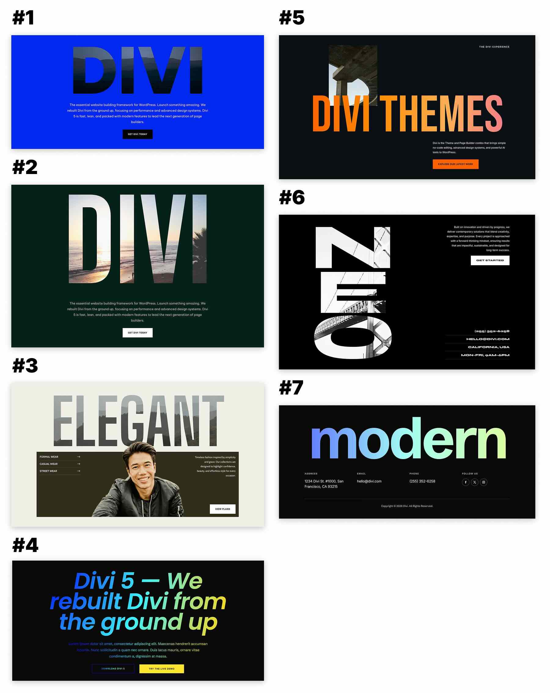
The designs range from restrained editorial compositions to much bolder layouts where oversized clipped typography dominates the section. In each case, the imagery inside the letters becomes part of the visual hierarchy rather than sitting separately from the text.
Download 7 Text Background Clips For Divi 5
Get all seven sections for free. Download the ZIP file, unzip it on your computer, and import the included JSON files into your Divi Library.

What’s Included (8 Exports)
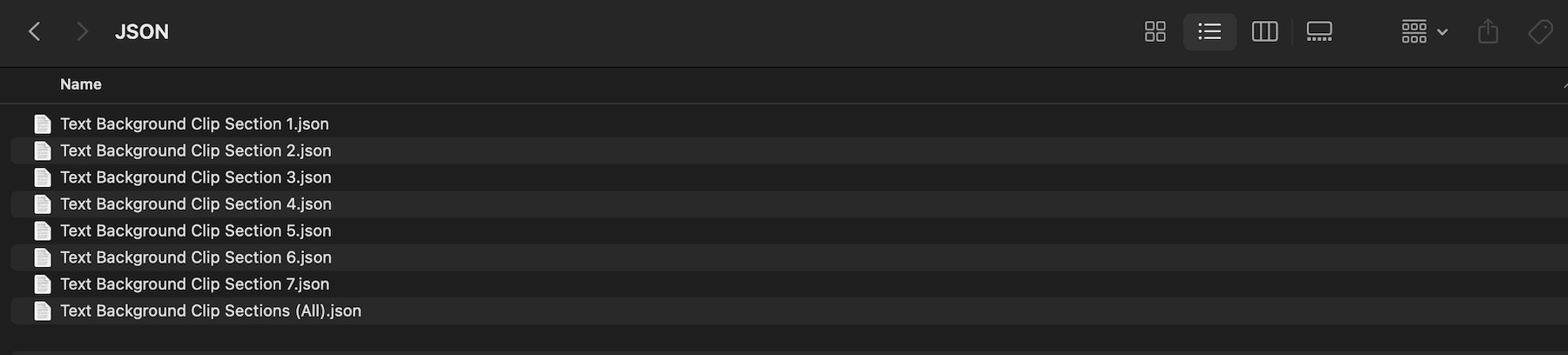
Inside the download, you’ll find seven individual section exports and one combined export containing the complete collection.
- Text Background Clip Section 1.json
- Text Background Clip Section 2.json
- Text Background Clip Section 3.json
- Text Background Clip Section 4.json
- Text Background Clip Section 5.json
- Text Background Clip Section 6.json
- Text Background Clip Section 7.json
- Text Background Clip Sections (All).json
Choose an individual JSON file when you only need one design, or import the combined file to add the full collection to your Divi Library at once.
Each section is already styled with example typography, imagery, spacing, colors, and supporting content. Use the original composition as a starting point, then replace the sample assets with content that fits your own website.
A Closer Look At The Text Background Clip Designs
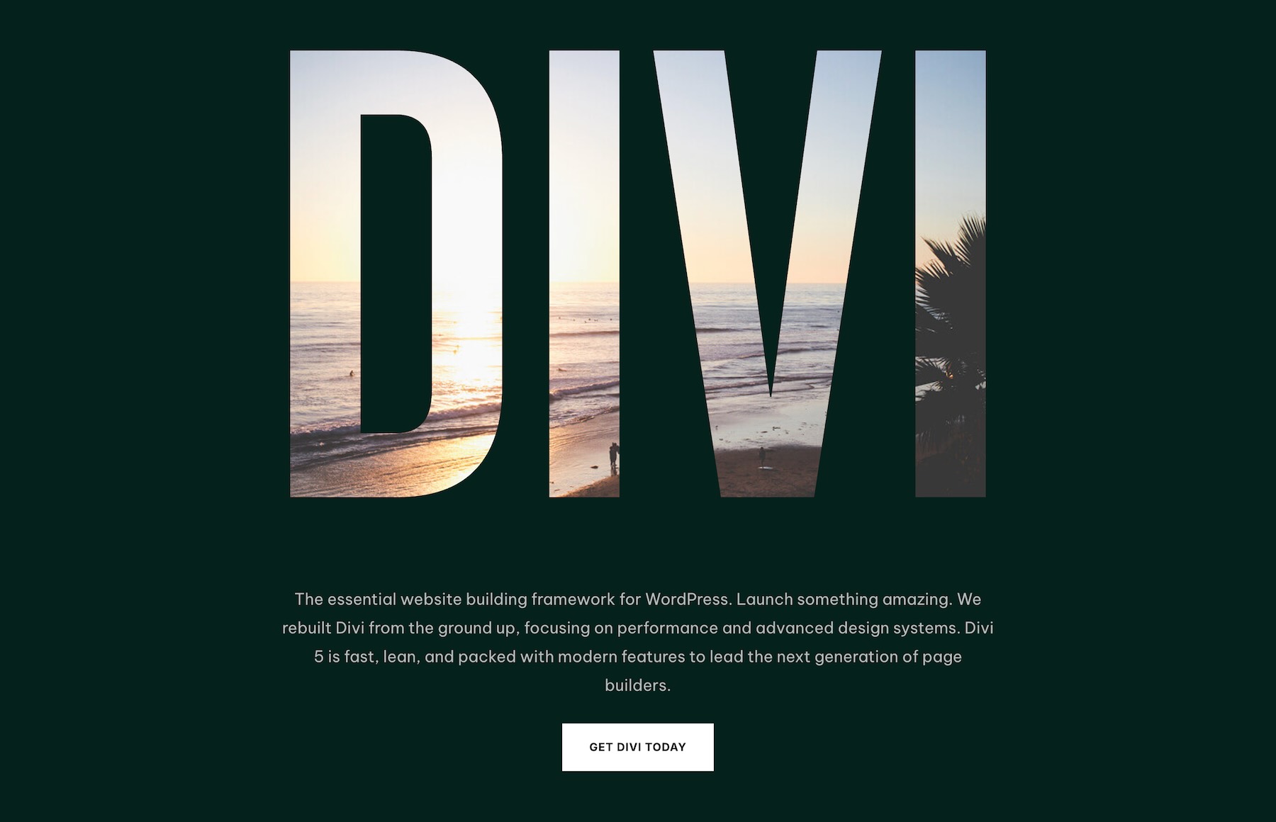
The same clipped-text idea can produce very different results depending on the scale of the typography, the image used behind it, and how much surrounding content is included.
Oversized Editorial Typography
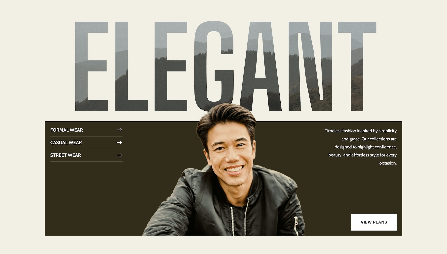
One of the lighter designs uses an oversized word across the top of the composition, with photography visible inside the letterforms. A portrait overlaps the lower part of the headline, while supporting navigation, copy, and a button sit inside a darker content panel underneath.
The result feels closer to an editorial cover than a conventional website heading. The clipped image gives the headline visual texture without requiring another large photograph beside it.
This type of composition works particularly well when the headline itself is short. A single word gives the letterforms enough width for the image inside them to remain recognizable.
Vertical Typography As The Main Graphic
Another design takes a darker, more experimental approach. Large vertical letters fill much of the left side of the section, with architectural imagery visible through the text. Supporting copy, contact details, and a call to action remain relatively small, allowing the typography to act as the primary graphic.
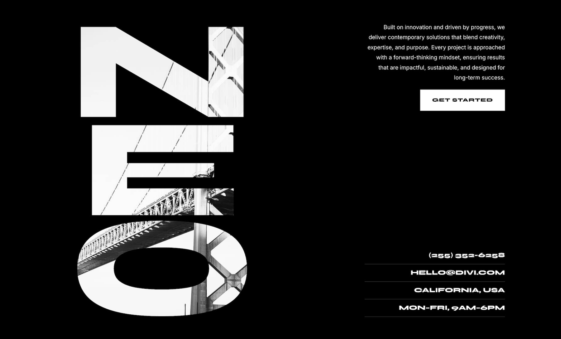
This treatment works well for architecture, design studios, creative agencies, portfolios, and other projects where typography can take a more expressive role.
Because the image is being viewed through the letter shapes, subject placement matters. Strong lines, recognizable forms, and clear contrast tend to work better than images with lots of tiny detail.
How To Use The Text Background Clip Sections
Keep your unzipped download folder handy. We’ll import one of the sections into Divi, add it to a page, and customize the text, imagery, and surrounding design.
1. Import The Sections Into The Divi Library
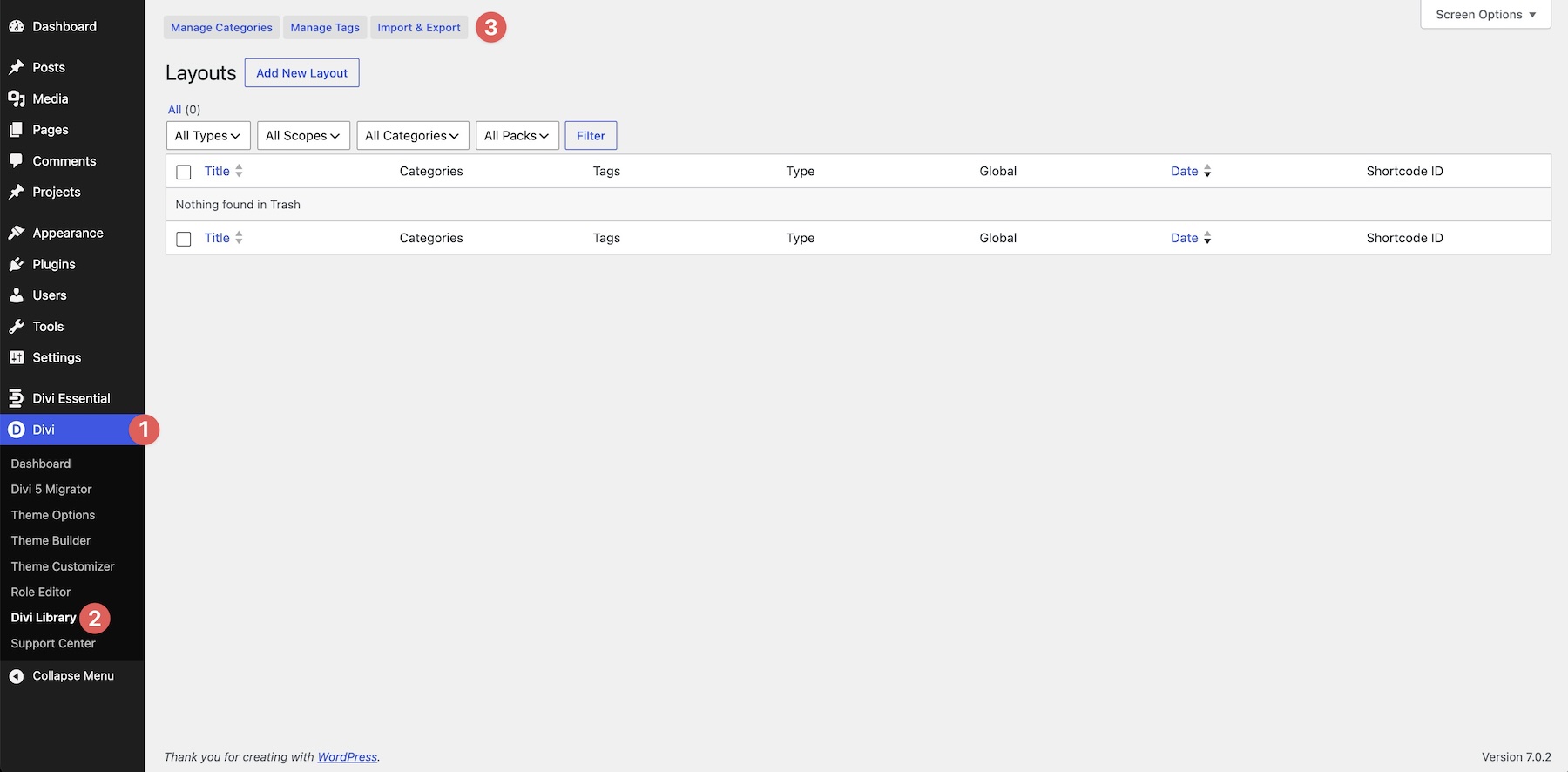
In your WordPress dashboard, go to Divi > Divi Library. Click Import & Export at the top of the screen.
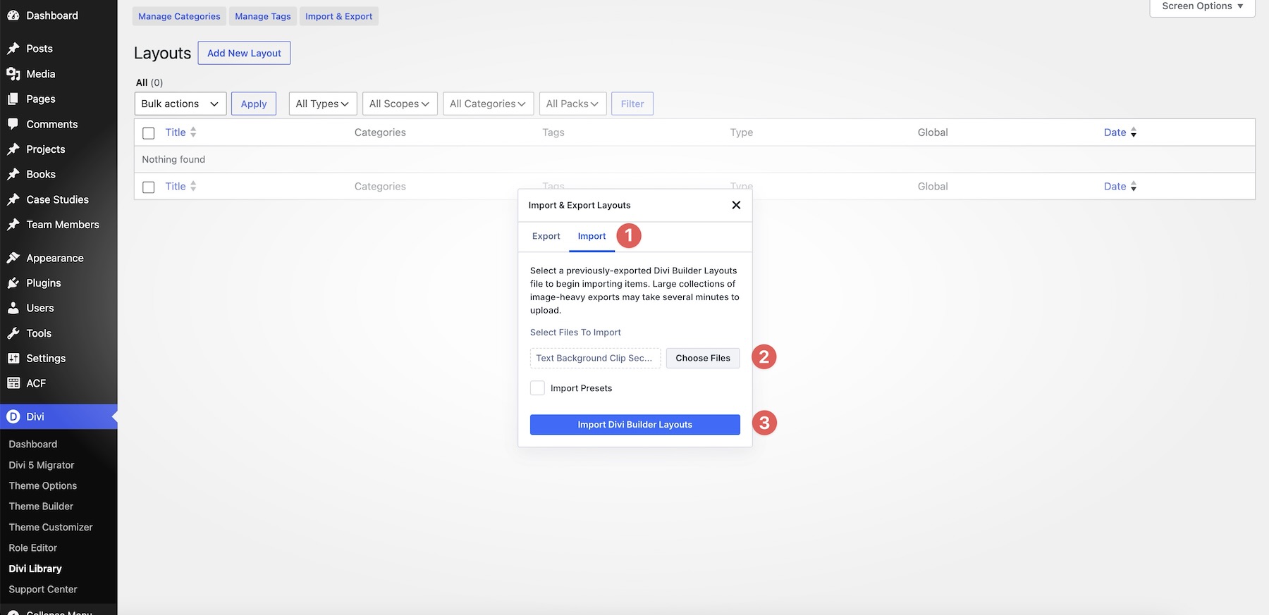
Open the Import tab and click Choose File. Select one of the individual Text Background Clip Section JSON files, or choose Text Background Clip Sections (All).json to import the complete collection. Then, click Import Divi Builder Layouts and wait for the import to finish. Select the JSON file itself rather than the ZIP archive.
2. Add A Section To Your Page
Open a page in the Visual Builder and add a new section where you want the design to appear. Choose Add From Library, select the imported design, and click Use This Section.
The imported section contains the full starting composition. Before making major changes, review the existing structure and identify which text element carries the clipped background effect.
For designs with overlapping content, the Layers panel can make individual elements easier to find and select.
3. Replace The Main Text
Start with the oversized word or headline. Open its text settings and replace the sample wording with your own.
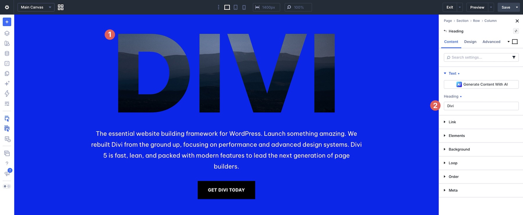
Keep the length of the replacement text in mind. The shape and width of the letters directly affect how much of the background image is visible, so replacing a short word with a long sentence can completely change the composition.
Try the new wording at the existing size first. If the result no longer fits the available space, adjust the font size, line height, or width deliberately rather than shrinking the text until it loses its impact.
4. Replace The Background Image Inside The Text
Next, replace the image used for the clipped typography with one that fits your message or brand.
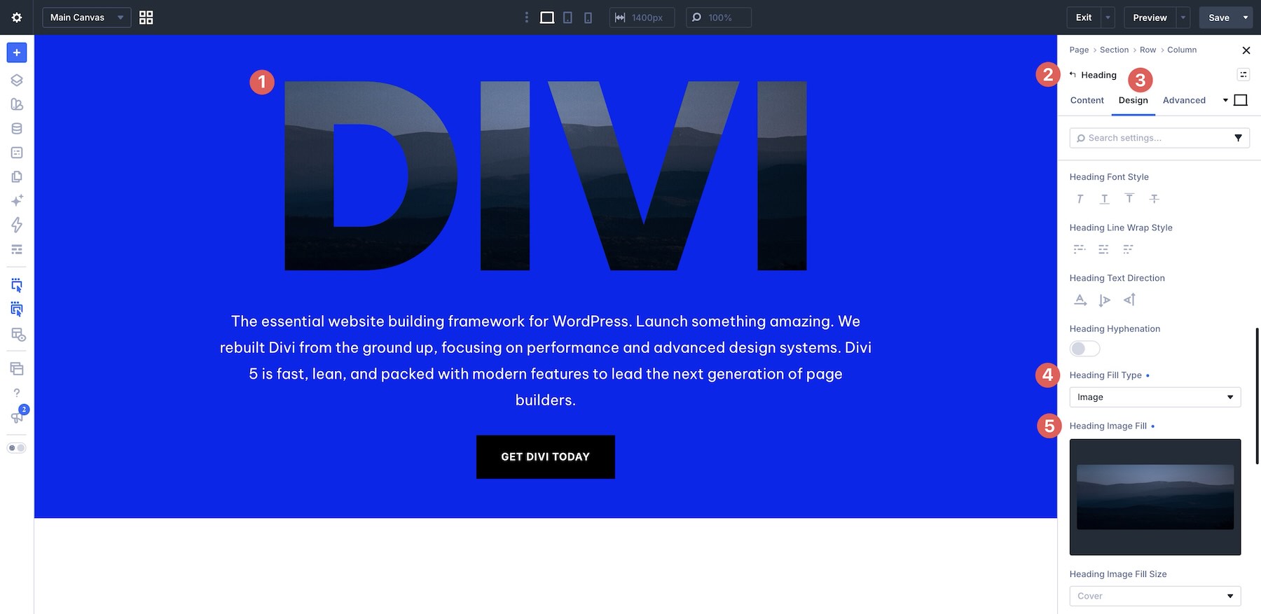
Choose imagery with enough contrast and recognizable detail to remain effective when it is only visible through the letterforms. Architecture, portraits, landscapes, textures, and large graphic shapes can all work well.
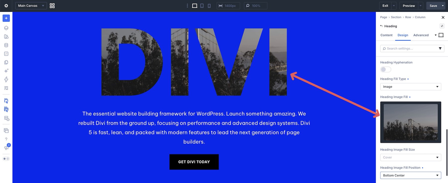
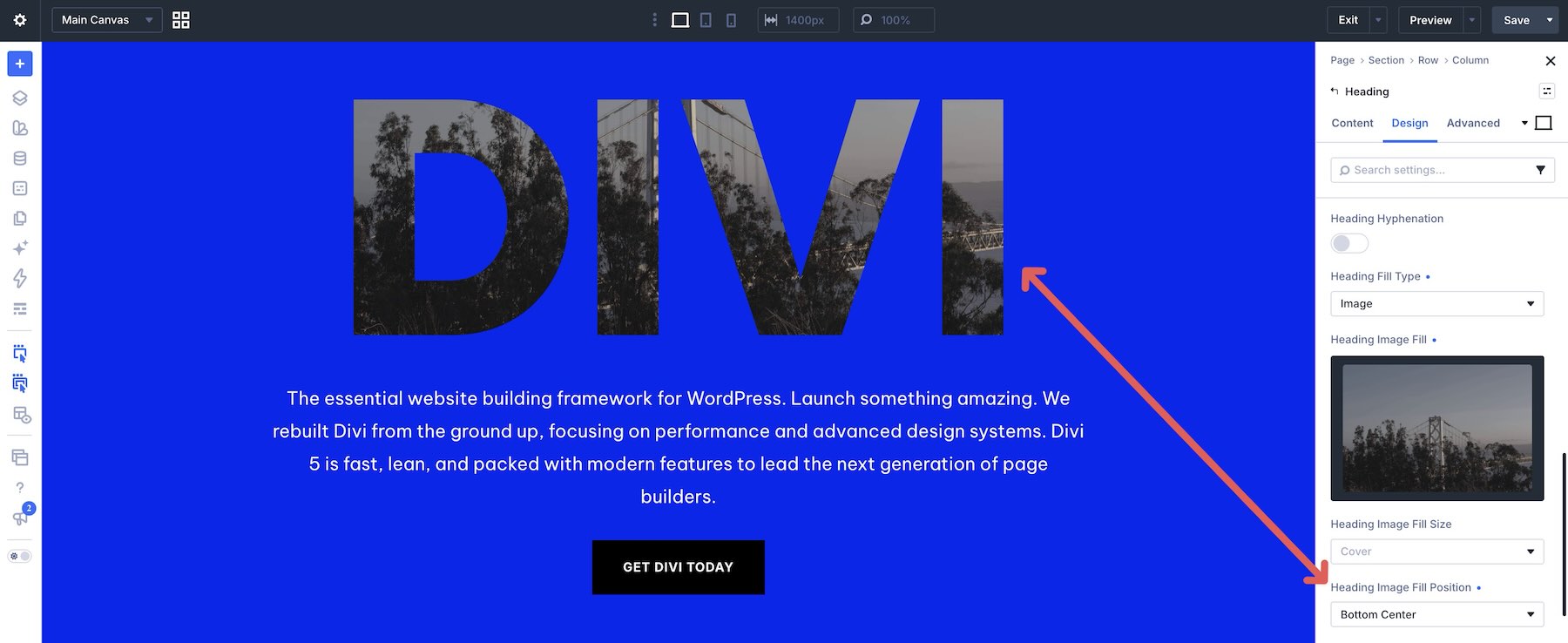
Pay attention to image position. Moving the focal point horizontally or vertically can make a significant difference because only selected portions of the image will appear inside each letter.
5. Adjust The Typography
The font plays an especially important role in this effect. Wider and heavier letterforms reveal more of the background, while thinner typefaces leave much less image area visible.
If you change the typeface, review the entire composition again. The same word can occupy substantially more or less space depending on the font, weight, width, and letter spacing.
Large display type usually works best for the main clipped element. Keep supporting copy simpler so it does not compete with the focal typography.
6. Update The Supporting Content
Work through the surrounding headings, body copy, labels, buttons, navigation items, and contact details included in the section.
These elements help turn the text effect into a complete section rather than an isolated visual. Keep their hierarchy quieter than the clipped headline unless the design intentionally gives another piece of content equal emphasis.
If the section includes a button or linked text, update both its label and destination URL.
7. Adapt The Colors To Your Brand
Replace the section backgrounds, text colors, buttons, and accents with colors that suit the rest of your site.
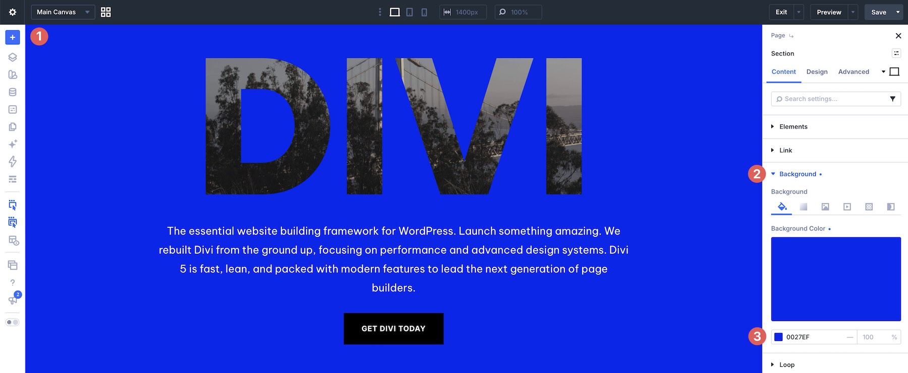
Keep enough contrast around the clipped text for the edges of each letter to remain clear. A complex image inside the typography can become difficult to read when the surrounding background is visually similar.
If you want to reuse the same palette elsewhere, save your colors as Design Variables and assign them to the relevant settings.
8. Refine Spacing And Positioning
Large typography can change the balance of a section quickly. Review the margins and padding around the focal text and adjust background position after replacing the wording, image, or font.
For designs with overlapping portraits, text panels, buttons, or other supporting elements, check that every element still has enough room and that the intended reading order remains clear.
Make small adjustments while viewing the whole section rather than focusing on one element in isolation.
9. Check The Design On Smaller Screens
Review the section on desktop, tablet, and phone. Oversized clipped typography can behave very differently as the available width decreases.
Check headline wrapping, font size, background positioning, image visibility, overlap, and the order of supporting content.
On smaller screens, it may be better to reduce the size of the clipped text, change its alignment, or simplify an overlap rather than trying to reproduce the exact desktop composition at a much narrower width.
Preview the finished page outside the builder as well and make sure there is no unwanted horizontal scrolling.
Tips For Effective Text Background Clips
The effect works best when the word, image, and surrounding layout all contribute to the same focal point.
Use Short, Strong Wording
A short headline gives the image inside the letters more room to become visible. Single words and compact phrases often produce the clearest result.
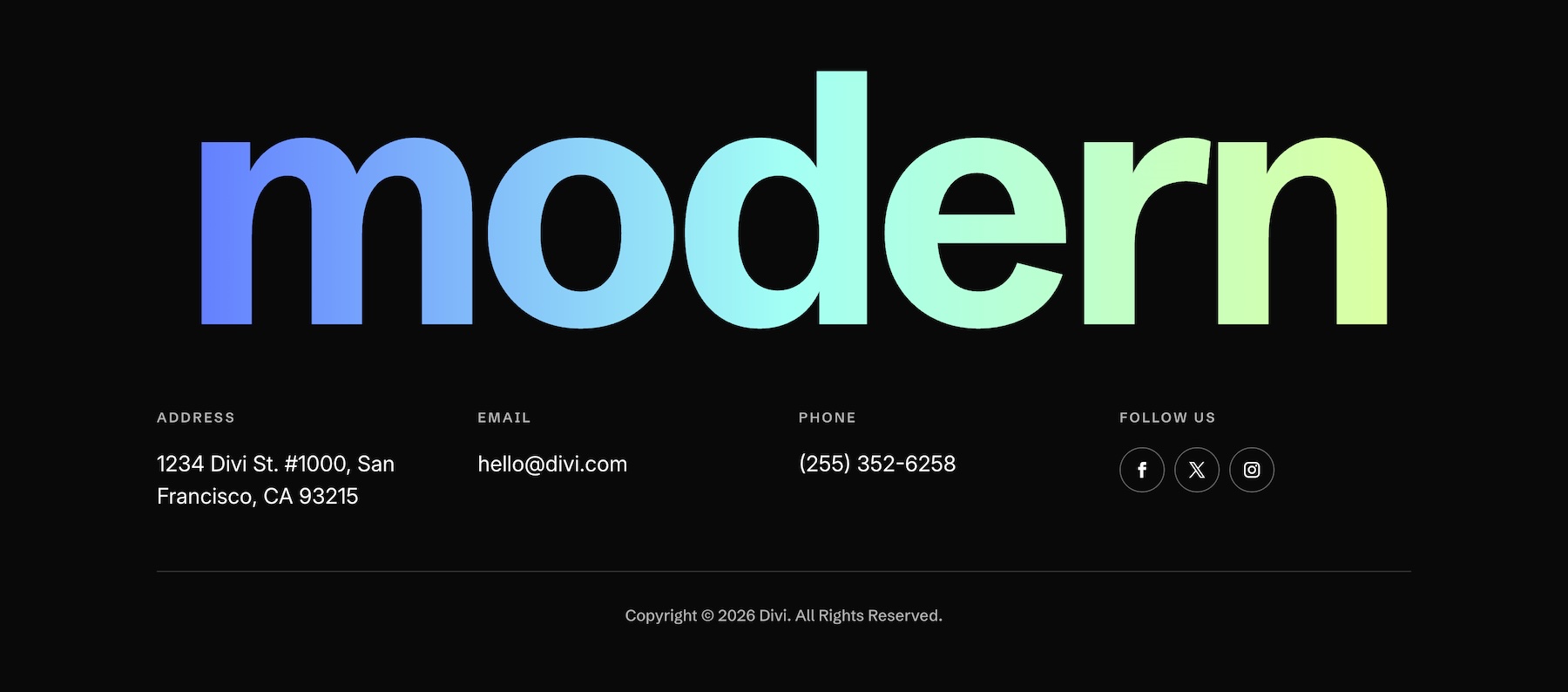
If the text becomes too long, the letters may need to shrink so much that the clipped image loses its impact.
Choose Images With Clear Shapes
Remember that visitors will only see fragments of the image. Strong silhouettes, faces, architectural lines, or areas of clear tonal contrast are easier to recognize through large letters.
Avoid relying on tiny details that disappear once the image is clipped into the typography.
Think About The Image Position
Two sections using the same photograph can look completely different depending on which part of that image appears inside the letters.
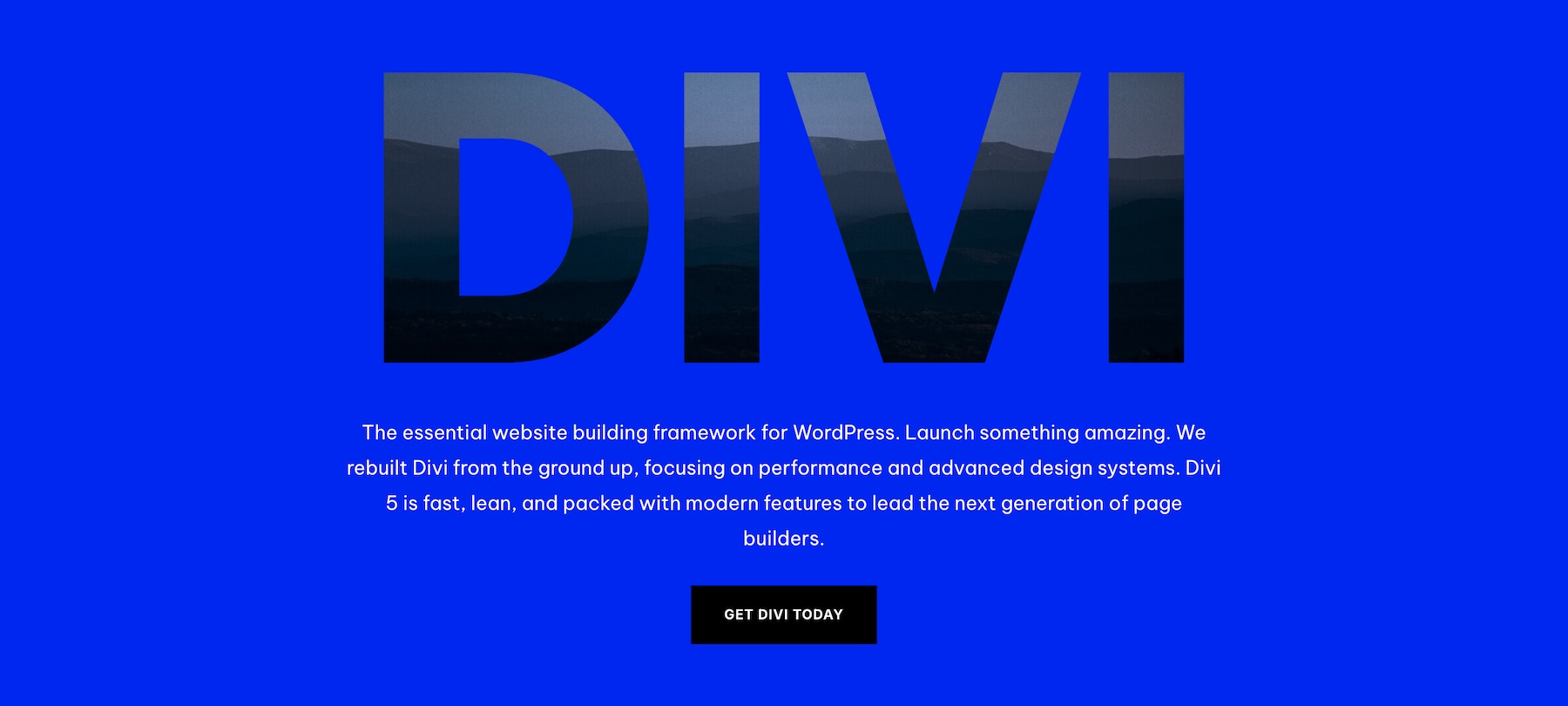
Adjust the image position until the most useful part of the photograph falls inside the most prominent areas of the text.
Let The Clipped Text Stay Dominant
The effect already contains both typography and imagery, so it can carry a lot of visual weight on its own.
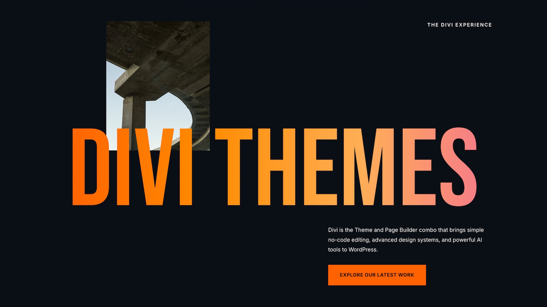
Keep secondary text, buttons, decorative elements, and supporting photographs restrained enough that the primary word or headline remains the first thing visitors notice.
Keep Readability Ahead Of The Effect
The image should enhance the typography without making the word difficult to identify. If the photograph creates too little contrast inside parts of the letters, try a different crop, image, or surrounding background.
The strongest result is one where the clipped image is noticeable after the word itself is already easy to read.
Start Building In Divi 5 Today!
These 7 Text Background Clip Sections give you ready-made starting points for combining bold typography and imagery in a single focal element.Import the design that fits your project, replace the text and background imagery, and adapt the typography, spacing, colors, and supporting content to your brand.
Use the collection as a starting point for your next creative section in Divi 5.









Leave A Reply