
Canvases and Interactions are two of Divi 5‘s most useful tools for building dynamic layouts without custom code. Canvases keep off-page content organized in separate workspaces. Interactions control when that content appears, changes, or responds to a visitor.
Cross-Canvas Interactions bring those two features together. A trigger on your Main Canvas can show, hide, or change an element that lives on another Canvas. That lets you build cleaner pages, keep modals and panels out of the main layout, and still connect everything through the Visual Builder.
In this post, we’ll explain how Cross-Canvas Interactions work and build a practical example: a button on the Main Canvas that opens a feature breakdown modal stored on a separate Canvas.
- 1 What Are Divi 5 Interactions?
- 2 What Are Divi 5 Canvases?
- 3 What Are Cross-Canvas Interactions?
-
4
How To Build A Cross-Canvas Interaction In Divi 5
- 4.1 Step 1: Create A Canvas For The Modal
- 4.2 Step 2: Size And Position The Modal Overlay
- 4.3 Step 3: Style The Modal Panel
- 4.4 Step 4: Add The Feature Breakdown Content
- 4.5 Step 5: Add A Close Button
- 4.6 Step 6: Hide The Modal Before Launch
- 4.7 Step 7: Create The Close Interaction
- 4.8 Step 8: Create The Open Interaction From The Main Canvas
- 5 Use Canvas Portals For Shared Cross-Canvas Content
- 6 Add Another Cross-Canvas Layer
- 7 Scale The Pattern Across Multiple Content Cards
- 8 More Ways To Use Cross-Canvas Interactions
- 9 Best Practices For Cross-Canvas Interactions
- 10 Try Creating Cross-Canvas Interactions In Divi 5 Today!
What Are Divi 5 Interactions?
Divi 5 Interactions let you add behavior to modules, rows, columns, and sections from the Advanced tab. Every Interaction has three main parts:
- Trigger: The event that starts the Interaction, such as a click, hover, viewport enter, viewport exit, page load, or breakpoint change.
- Effect: The action Divi performs, such as showing an element, hiding an element, toggling visibility, applying a preset, changing an attribute, setting a cookie, scrolling to an element, or mirroring mouse movement.
- Target: The element that receives the effect, such as the current element, a parent, a child, another module, a row, a column, a section, or an element selected by ID or class.
You can also add more than one Interaction to the same element. For example, one button click can show a modal, apply a preset to another module, and hide a different element at the same time.
For this tutorial, we will use the simplest version of that system: one click Interaction to show a modal and another click Interaction to hide it.
What Are Divi 5 Canvases?
Every Divi 5 page starts with a Main Canvas. This is the primary layout visitors see when they land on the page.
Additional Canvases are detached workspaces that still belong to the same page or template. They are useful for content that should stay separate from the main layout while you build, such as popups, slide-in panels, off-canvas menus, temporary staging layouts, and reusable design components.
Canvases keep the Visual Builder cleaner because your modal, menu, or panel does not have to sit inside the Main Canvas while you design the rest of the page.
Detached Canvases can be local or global. A local Canvas belongs to the current page or template. A global Canvas can be reused across the site.
Canvases can also be connected to the page in different ways. You can target them with Interactions, append them to the front end when needed, or display them in a specific location with the Canvas Portal Module.
What The Canvas Portal Module Does
The Canvas Portal Module displays content from a detached Canvas in a specific place in your layout.
Think of it as a window into another Canvas. You build the source content once, then place it wherever you need it with a Portal.
This is useful for reusable content blocks, shared cards, mega menu content, announcement panels, detail cards, or any design that should be managed from one source but displayed in multiple places.
What Are Cross-Canvas Interactions?
A Cross-Canvas Interaction is an Interaction where the trigger and target live on different Canvases.
For example, a button on the Main Canvas can show a hidden section inside a detached Canvas. A close icon inside that detached Canvas can hide the same section again. A button inside one detached Canvas can also trigger another detached Canvas.
That is the main benefit: the trigger stays where the visitor interacts, while the content can live in its own organized workspace.
Same-Canvas Vs Cross-Canvas Interactions
| Workflow | Where The Trigger Lives | Where The Target Lives | Best For |
|---|---|---|---|
| Same-Canvas Interaction | The active Canvas | The same Canvas | Simple toggles, accordions, small reveals, and section-level effects. |
| Cross-Canvas Interaction | One Canvas, such as the Main Canvas | Another Canvas, such as a detached popup or menu Canvas | Popups, slide-ins, off-canvas menus, modals, reusable panels, and layered experiences. |
| Canvas Portal | Optional, depending on the layout | A detached Canvas rendered through a Portal module | Reusable Canvas content that needs to appear in a specific place in the layout. |
Same-Canvas Interactions are usually simpler. Cross-Canvas Interactions are better when you want to keep complex or conditional content out of the Main Canvas.
How To Build A Cross-Canvas Interaction In Divi 5
Let’s build a practical example.
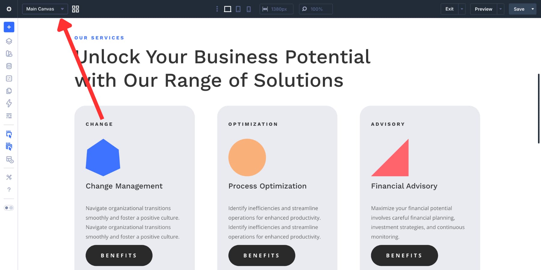
The Main Canvas will contain a content card with a View Benefits button. A detached Canvas will contain a feature breakdown modal. When the visitor clicks the button, Divi will show the modal from the detached Canvas. When the visitor clicks the close icon, Divi will hide it again.
Step 1: Create A Canvas For The Modal
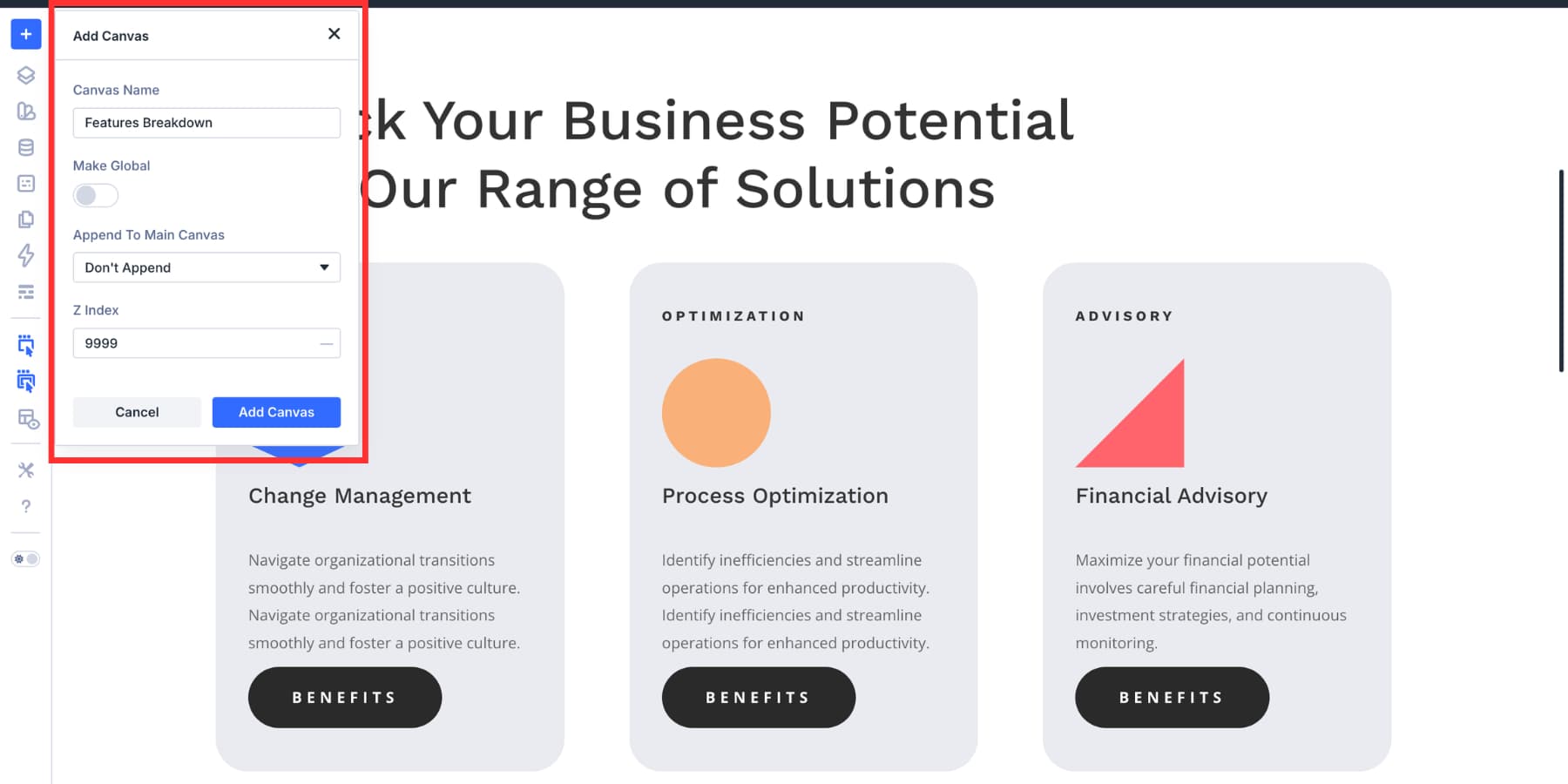
Open the Canvas dropdown in the Visual Builder.
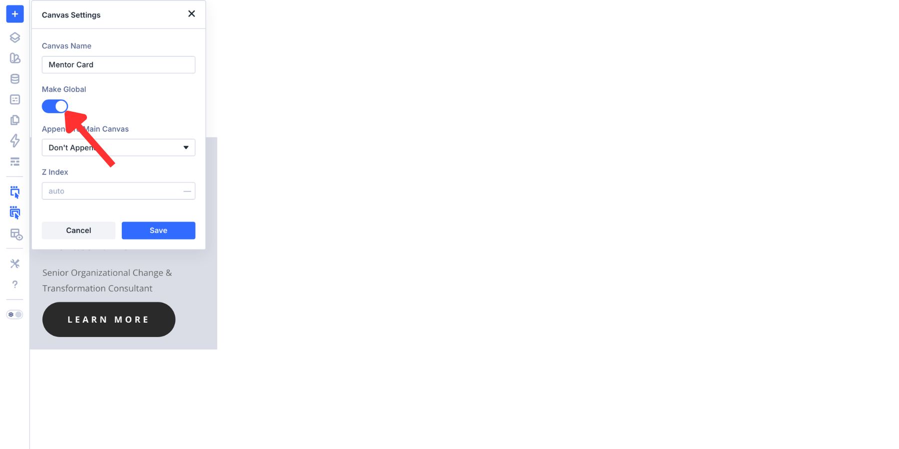
Click Add Canvas. Name the new Canvas something clear, such as Feature Breakdown. For this example, keep Make Global off because the modal is specific to this page. If you plan to reuse the same modal across multiple pages or templates, make it global instead.
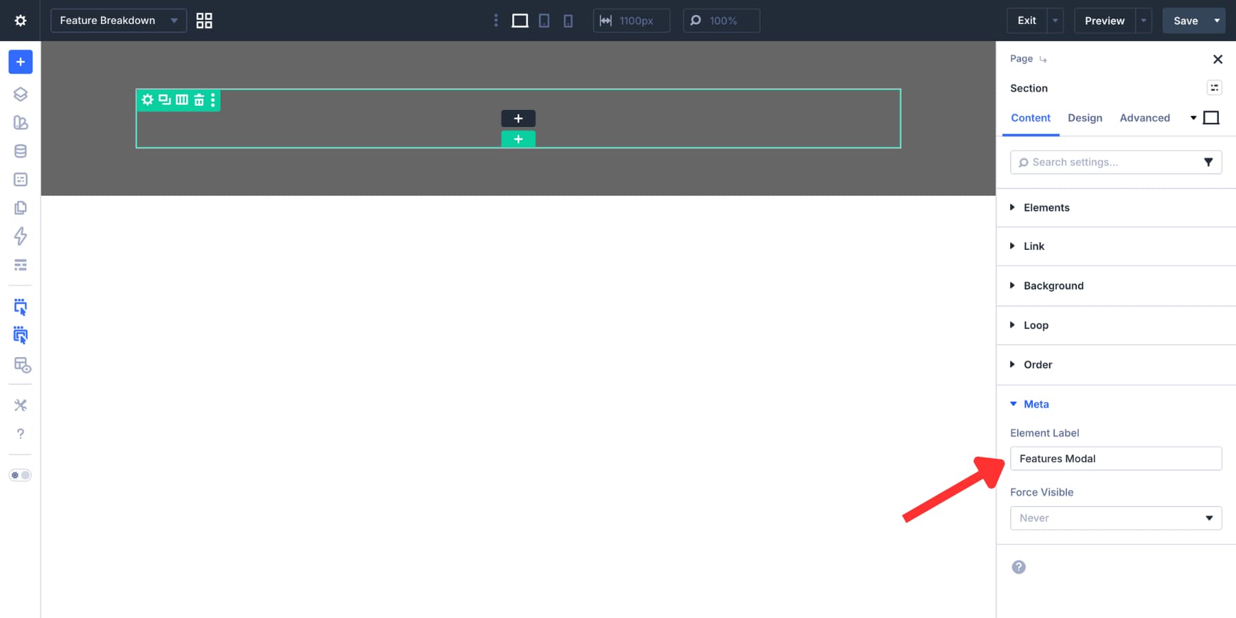
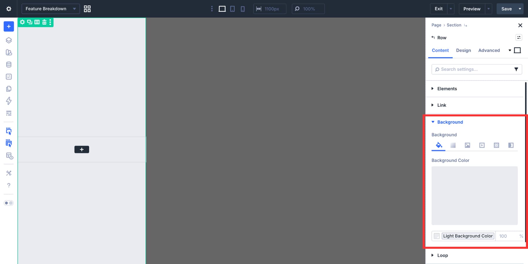
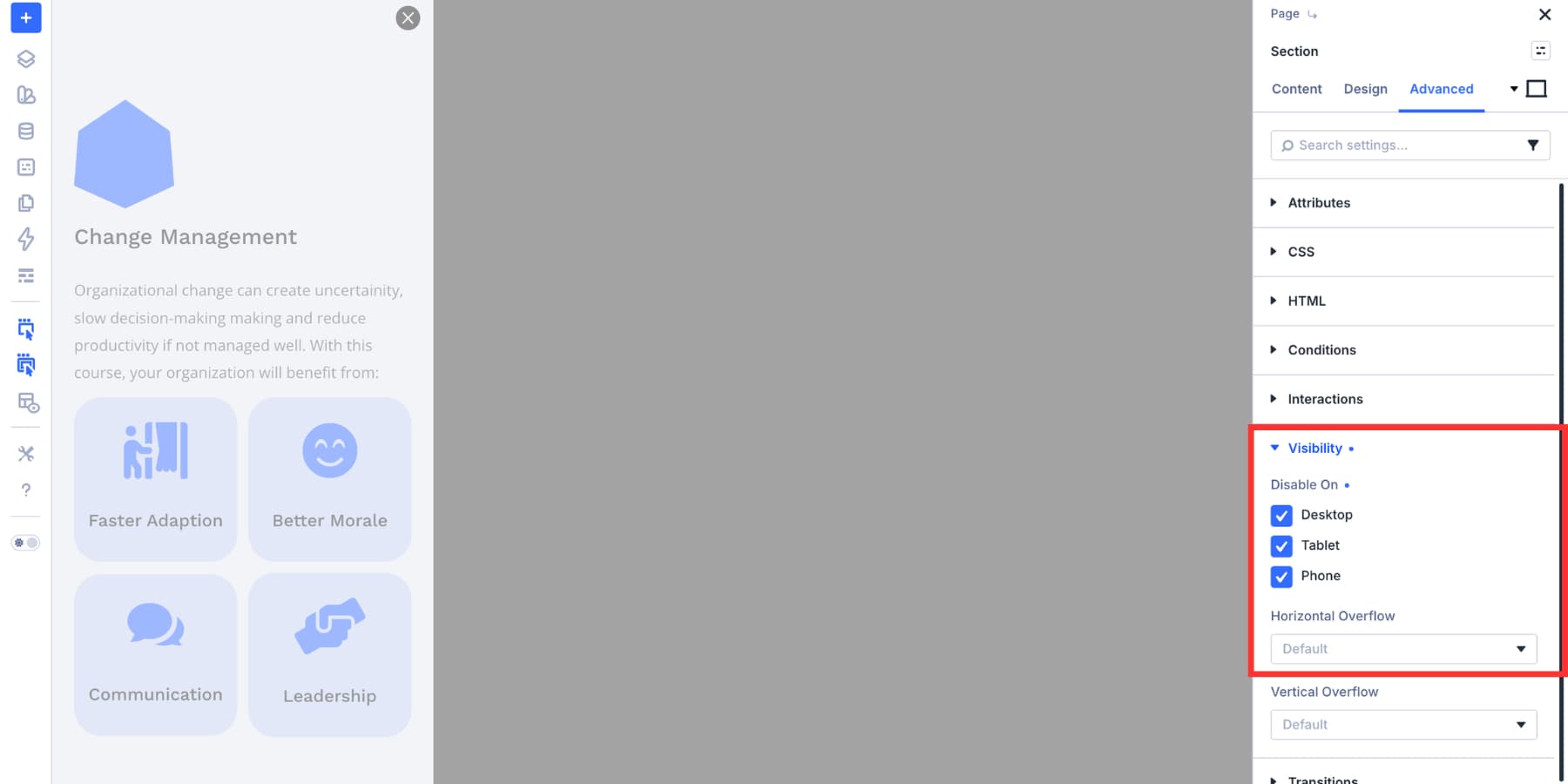
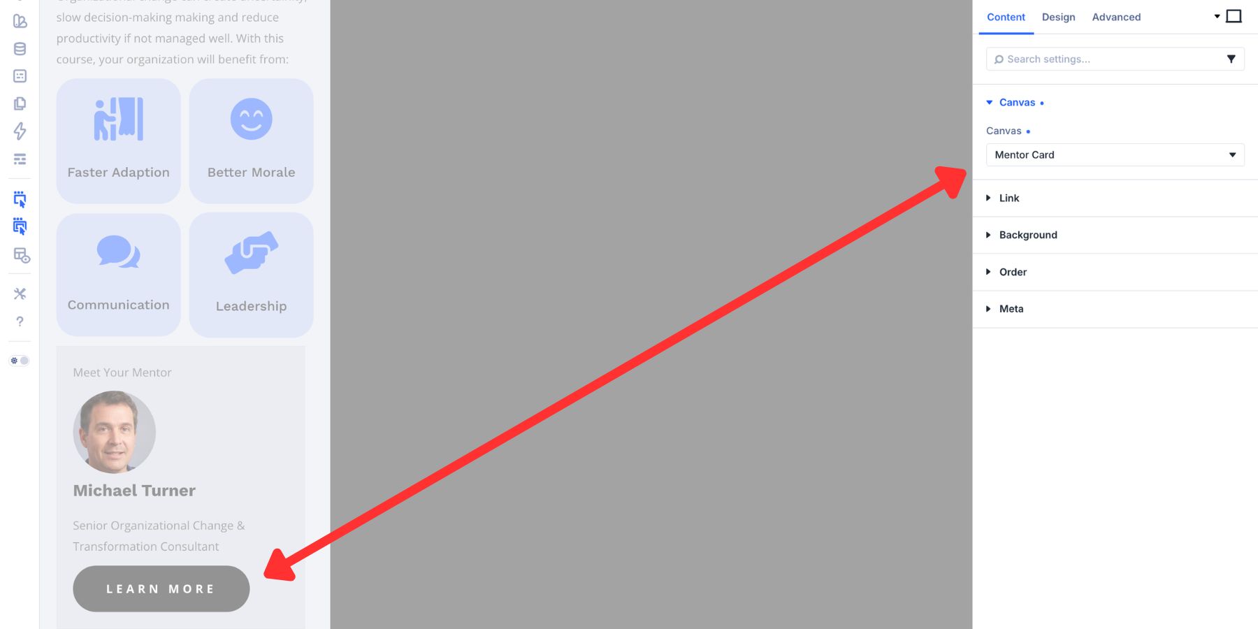
Inside the Canvas, open the Section settings and add a semi-transparent background color. This creates the overlay behind the modal panel. Then open the Meta option group and set the Element Label to Features Modal. A clear label makes the target easier to find later when you create the Interaction.
Step 2: Size And Position The Modal Overlay
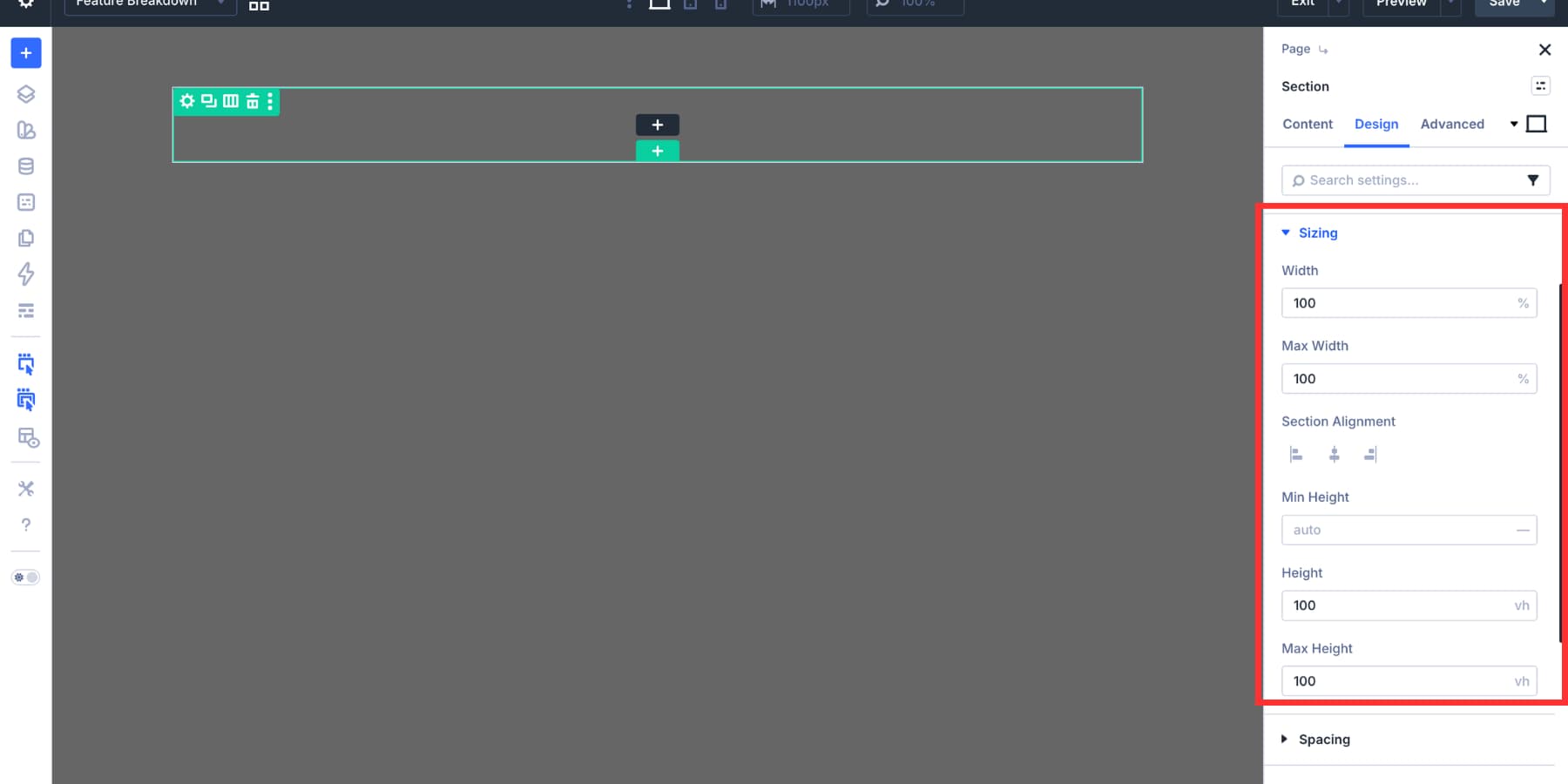
Open the Section’s Design > Sizing settings. Set Width and Max Width to 100%. Then set Height to 100vh. This makes the overlay span the full viewport.
Next, open Design > Spacing and set the top and bottom padding to 0.
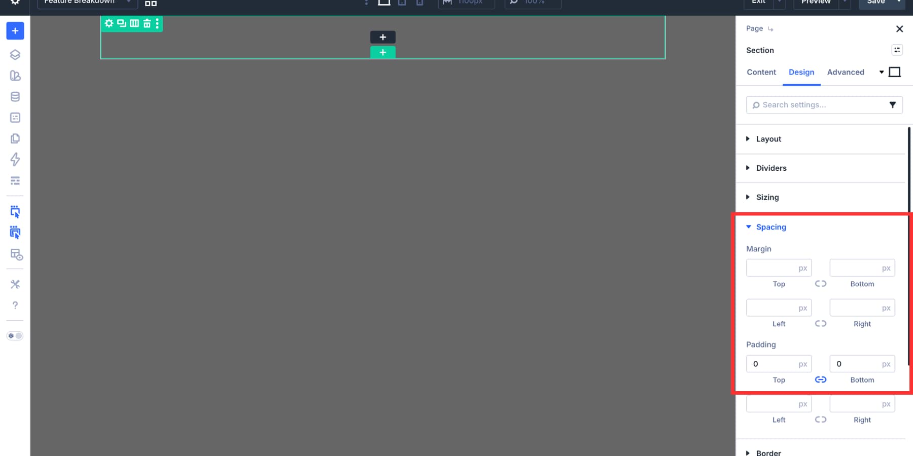
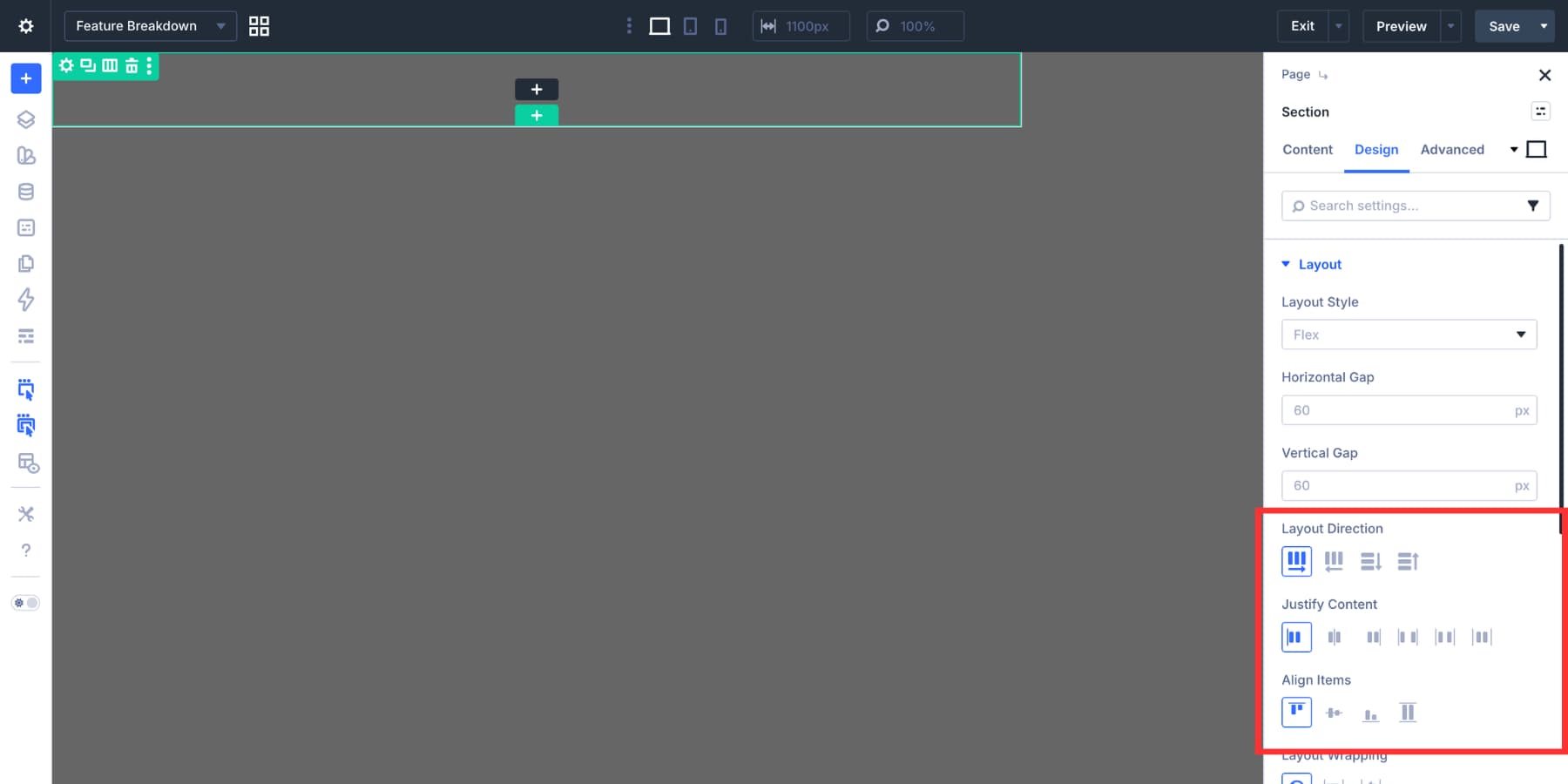
In Design > Layout, set the layout direction to Row. Align the content to the start so the panel can sit along one side of the overlay.
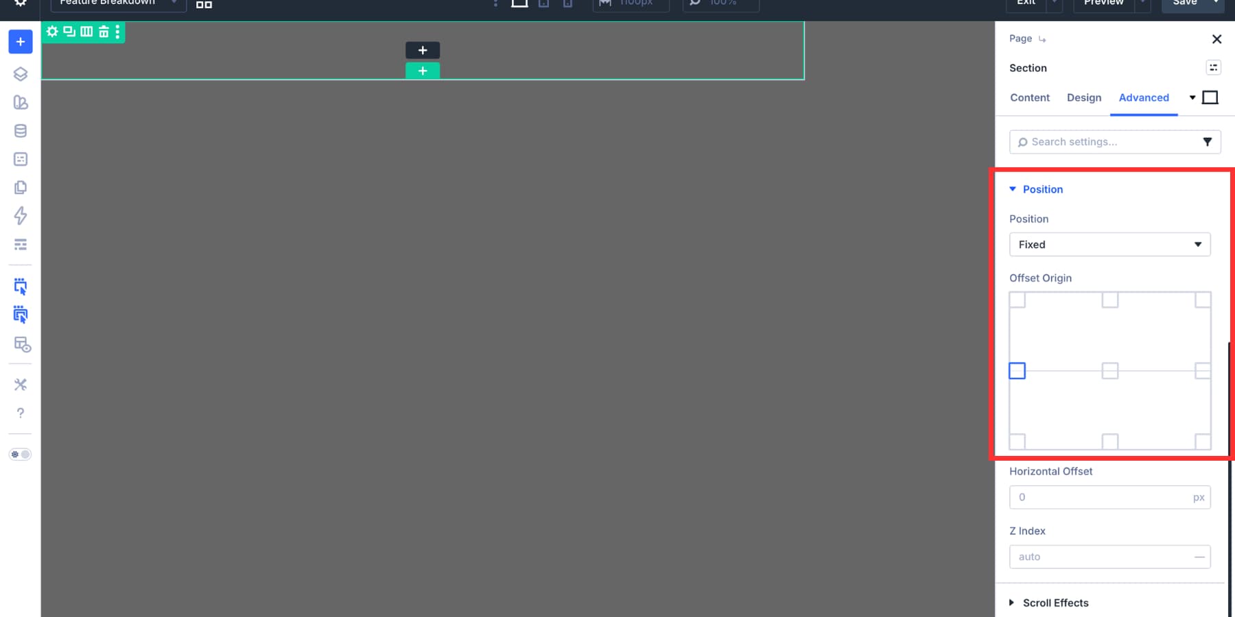
Now go to Advanced > Position. Set the Section to Fixed, choose the left origin point, and set a high Z Index so the modal appears above the page content.
Step 3: Style The Modal Panel
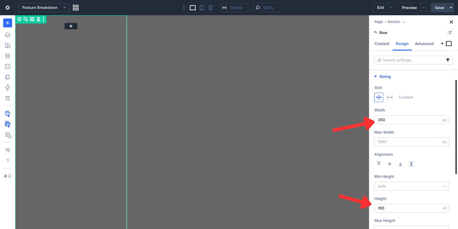
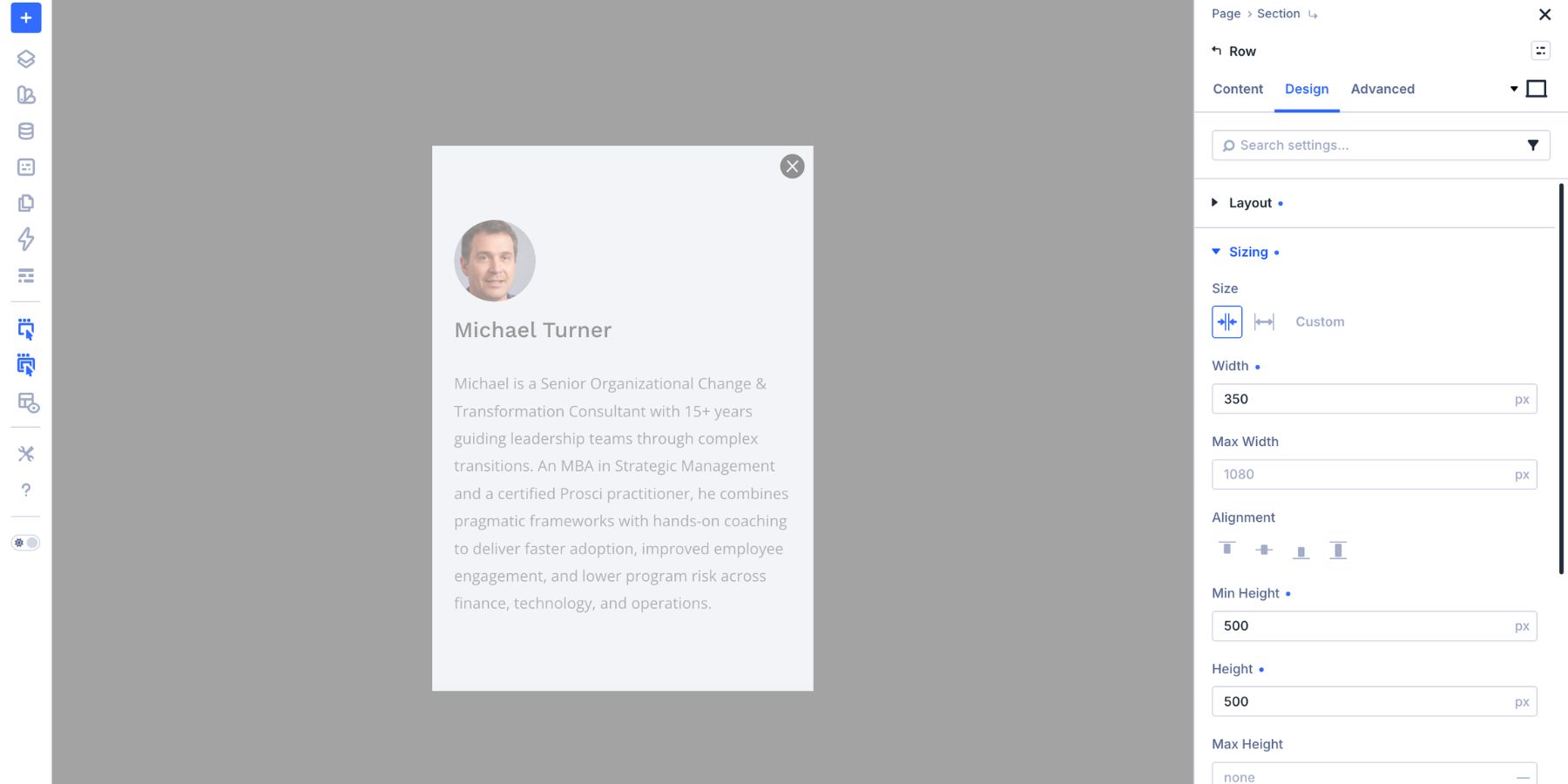
The Row inside the overlay becomes the modal panel. Set the Row width to 350px and the height to 100vh. This creates a narrow slide-in style panel that stays full height without overflowing smaller screens.
Open the Row’s layout settings. Set the layout direction to Column, justify the content to the center, and align the content to the left.
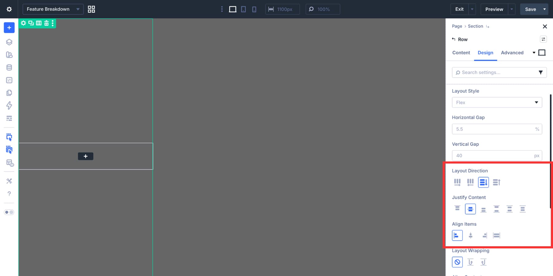
Add a solid background color to the Row. Use a value from your Design Variables so the panel matches the rest of the page.
Step 4: Add The Feature Breakdown Content
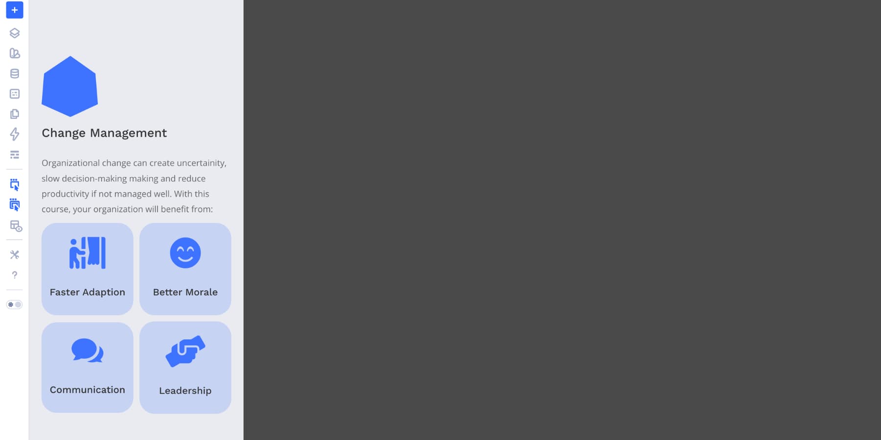
With the panel structure in place, add the content visitors need. In this example, the modal includes an image, title, short intro, and a nested row of Blurb modules with icons. Each Blurb explains one important feature or detail.
Keep the copy scannable. A modal should answer the visitor’s question quickly, not become a full landing page inside a panel. Use the same fonts, colors, and spacing values as the rest of the page. Design Variables are useful here because they keep the detached Canvas connected to your sitewide design system.
The modal needs a clear close control. Add an Icon module near the top of the panel and choose a close or X icon. Place it where visitors expect to find it, usually the top-right corner of the modal panel.
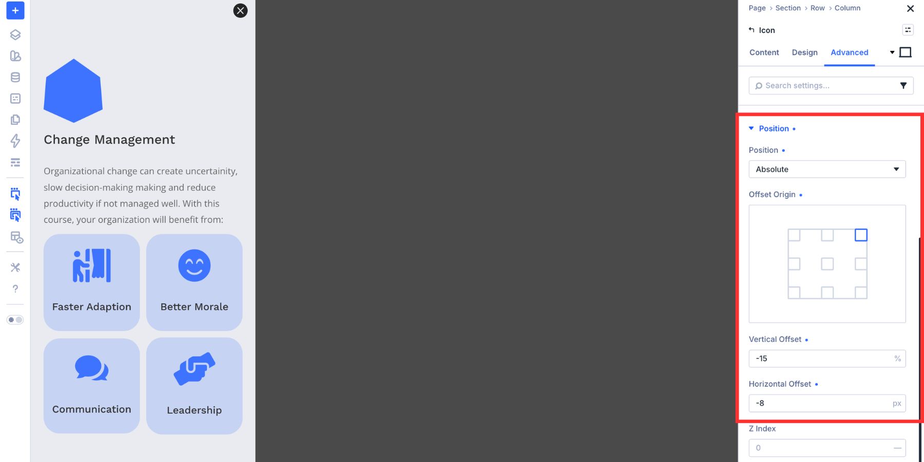
Set the icon size to 24px, then choose a color from your Design Variables. To position it precisely, open Advanced > Position. Set the Icon module to Absolute, choose the top-right origin point, and adjust the offsets until the icon sits cleanly inside the panel.
Step 6: Hide The Modal Before Launch
Before adding the open Interaction, make sure the modal does not appear by default. Select the main modal Section and hide it using your preferred Divi workflow. In this example, the Section is hidden across all devices from the Advanced > Visibility settings.
The important part is that the modal starts hidden and appears only when the Interaction fires.
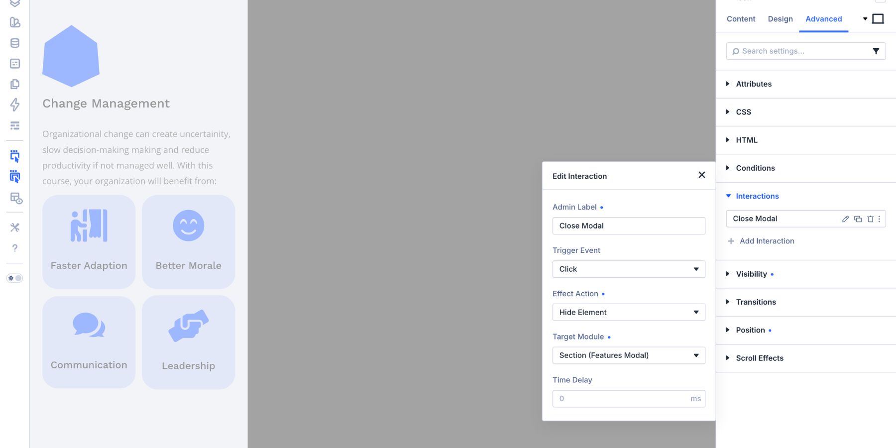
Step 7: Create The Close Interaction
Start with the close icon inside the Feature Breakdown Canvas. Select the Icon module, open the Advanced tab, and expand Interactions. Click Add Interaction. Use these settings:
- Admin Label: Close Modal
- Trigger Event: Click
- Effect Action: Hide Element
- Target Module: Features Modal
Now the close icon can hide the modal Section when clicked.
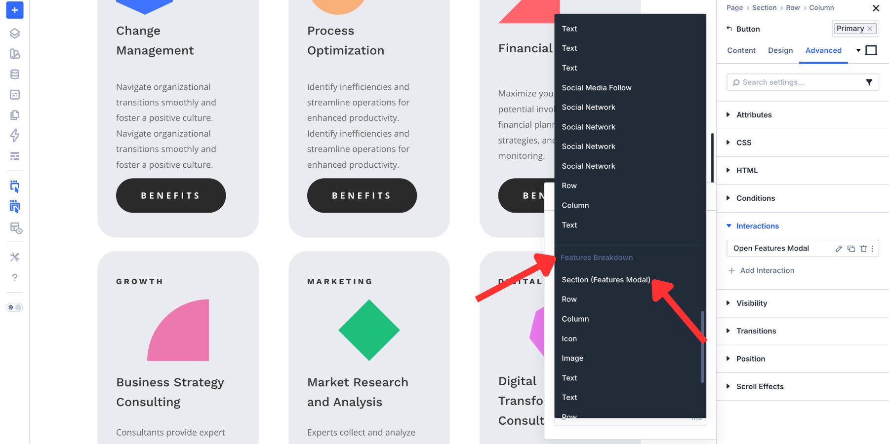
Step 8: Create The Open Interaction From The Main Canvas
Switch back to the Main Canvas using the Canvas dropdown. Select the View Benefits button on the content card. If the Button module has a URL field, set it to # so the click can act as an Interaction trigger without sending the visitor to another page.
Open Advanced > Interactions and add a new Interaction. Use these settings:
- Admin Label: Open Feature Breakdown
- Trigger Event: Click
- Effect Action: Show Element
- Target Module: Features Modal
The Target Module dropdown is where the Cross-Canvas connection happens. Divi can list targetable elements from other Canvases, so the button on the Main Canvas can target the modal Section on the Feature Breakdown Canvas.
For a smoother feel, add a short delay such as 150ms. This keeps the modal from feeling abrupt without making the page feel slow.
Now the Main Canvas button opens a modal that lives on a detached Canvas.
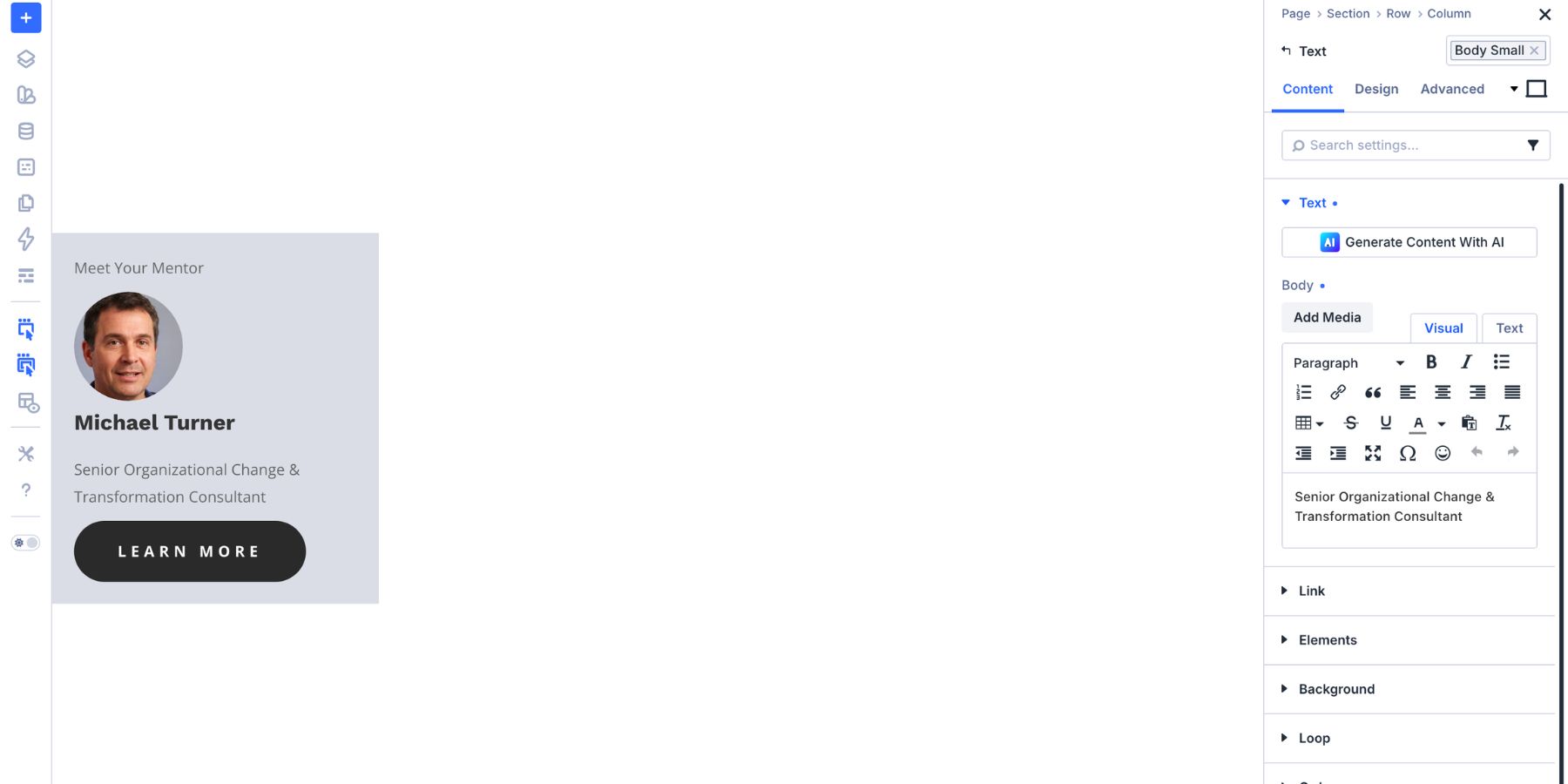
The feature breakdown modal works on its own. But you may also have reusable content that should appear inside more than one layout.
In this example, a mentor card makes a good reusable component. It includes a photo, name, title, and short credential line. The same card could appear inside the feature modal, on a course detail page, in an About section, or inside a sidebar.
Instead of rebuilding that card in each place, create a separate Canvas for it.
Step 1: Create A Mentor Card Canvas
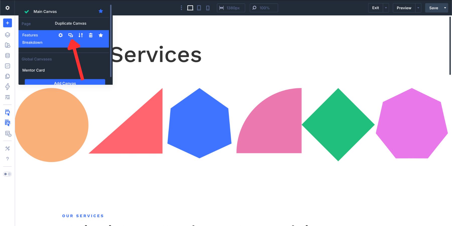
Add a new Canvas and name it Mentor Card. Build the card inside that Canvas.
If the card should be reused across the site, make this Canvas global.
Step 2: Add The Card With A Canvas Portal
Return to the Feature Breakdown Canvas and add a Canvas Portal module where the mentor card should appear.
In the Canvas Portal settings, choose Mentor Card from the Canvas dropdown.
The Portal displays the Mentor Card content from its source Canvas. If you update the mentor photo, title, or credential in the source Canvas later, the places displaying that Canvas through a Portal can reflect the update.
Use this pattern for reusable design blocks that need to appear in multiple places but should be edited from one source.
Add Another Cross-Canvas Layer
Cross-Canvas Interactions are not limited to one modal.
You can create layered experiences where each Canvas handles one purpose. A feature modal can show supporting details. A mentor card can show the instructor. A separate mentor info modal can show the full bio only when a visitor asks for more.
That keeps the page focused while still making deeper information available.
Step 1: Create The Mentor Info Canvas
Duplicate the Feature Breakdown Canvas so the positioning, sizing, and overlay styling come along with it.
Update the content with the mentor’s extended profile, then change the modal Section label to Mentor Info.
If the duplicated close button still targets the original modal, update its Interaction so the target is the Mentor Info Section.
Step 2: Trigger Mentor Info From The Mentor Card
Inside the Mentor Card Canvas, select the Learn More About The Mentor button. Add a new Interaction:
- Trigger Event: Click
- Effect Action: Show Element
- Target Module: Mentor Info
Now the visitor can open the feature modal, see the mentor card, and then open a deeper mentor info modal without leaving the page.
The key is organization. Each Canvas has one job, and each Interaction points to the right labeled target.
Scale The Pattern Across Multiple Content Cards
A real page may include several cards or sections that need their own supporting details. Each card can open its own feature breakdown without making the Main Canvas harder to manage.
Duplicate the Feature Breakdown Canvas for each item. Use clear names such as:
- Feature Breakdown: Course
- Feature Breakdown: Service
- Feature Breakdown: Resource
Update the content inside each Canvas so it matches the correct card or section.
Then update each button on the Main Canvas. The Interaction setup stays the same, but the Target Module changes. Each button should point to the modal Section for its own content.
Also check each close icon after duplicating Canvases. Duplicated Interactions may still point to the original modal target, so update each close Interaction before testing.
This makes the system repeatable. Every card can open the correct modal, while the Main Canvas stays clean.
More Ways To Use Cross-Canvas Interactions
The feature modal example is only one use case. The same pattern works anywhere you want a clean main layout with dynamic content stored elsewhere.
Build the header on the Main Canvas or in the Theme Builder. Then build the mobile menu in a detached Canvas.
Use a click Interaction on the hamburger icon to show the menu Section. Add a close icon inside the Canvas with a click Interaction that hides the same Section.
This keeps the header layout simple while the full navigation menu lives in its own workspace.
Off-Canvas Side Panels
A button on the Main Canvas can open a sidebar panel stored in a detached Canvas. Use this for service details, lead magnets, filters, course outlines, cart reminders, or support prompts.
Click is usually the safest trigger for important panels. Hover can work for desktop-only experiences, but it is less reliable on touch devices.
Scroll-Triggered Context Panels
A section on the Main Canvas can use a viewport trigger to show an element on another Canvas.
For example, when a visitor reaches a Services section, a floating contact panel or support sidebar can appear from a detached Canvas.
Use this carefully. Scroll-triggered panels should support the page, not interrupt the reading experience.
Cross-Canvas Preset Switching
Interactions can also apply, remove, or toggle presets. That means a control on the Main Canvas can change the style of an element on another Canvas.
For example, a toggle button could switch a promotional banner Canvas between light and dark styles, or change a panel from a standard offer to a limited-time offer.
Use clear labels and test the interaction chain so the right Canvas element receives the right preset.
Best Practices For Cross-Canvas Interactions
Cross-Canvas Interactions are powerful, but they are easier to manage when you keep the system organized.
- Use clear Canvas names: Names like Feature Breakdown: Course are easier to target than names like Canvas 2.
- Label target sections: Add Element Labels such as Features Modal or Mentor Info so they are easy to find in the Target Module dropdown.
- Keep one purpose per Canvas: Separate menus, modals, cards, and profile panels into their own workspaces when possible.
- Update duplicated Interactions: After duplicating a Canvas, confirm that open and close buttons target the duplicated section, not the original.
- Set proper stacking: Use fixed positioning and a high z-index for overlays that should appear above the page.
- Test on mobile: Modals and side panels need enough width, readable content, and tap-friendly close buttons.
- Use global Canvases for reusable elements: Use local Canvases for page-specific content and global Canvases for shared content.
- Avoid unnecessary layers: If a simple same-Canvas toggle does the job, use that. Cross-Canvas setups are best for content that benefits from being separated.
The cleaner your naming and structure, the easier the Interaction setup becomes.
Try Creating Cross-Canvas Interactions In Divi 5 Today!
Cross-Canvas Interactions in Divi 5 let your Main Canvas stay focused while dynamic content lives in organized detached workspaces.
That is useful for modals, slide-ins, full-screen menus, reusable cards, context panels, and multi-step content reveals. The visitor gets a smooth experience, and the builder stays easier to manage.
Use Canvases to separate the content. Use Interactions to connect the behavior. Use Canvas Portals when detached content needs to appear in a specific place. Together, these tools give you a cleaner way to build advanced Divi 5 layouts without custom code.


Leave A Reply