

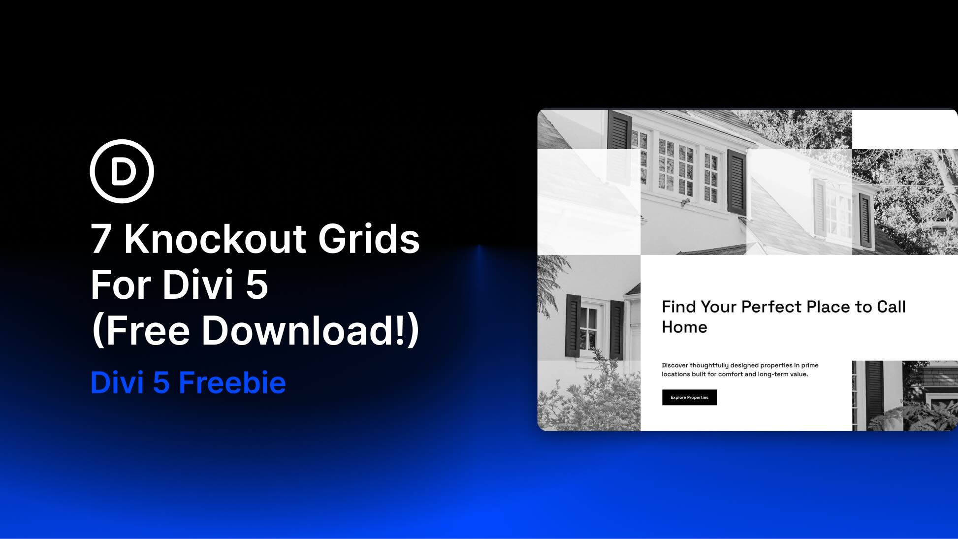
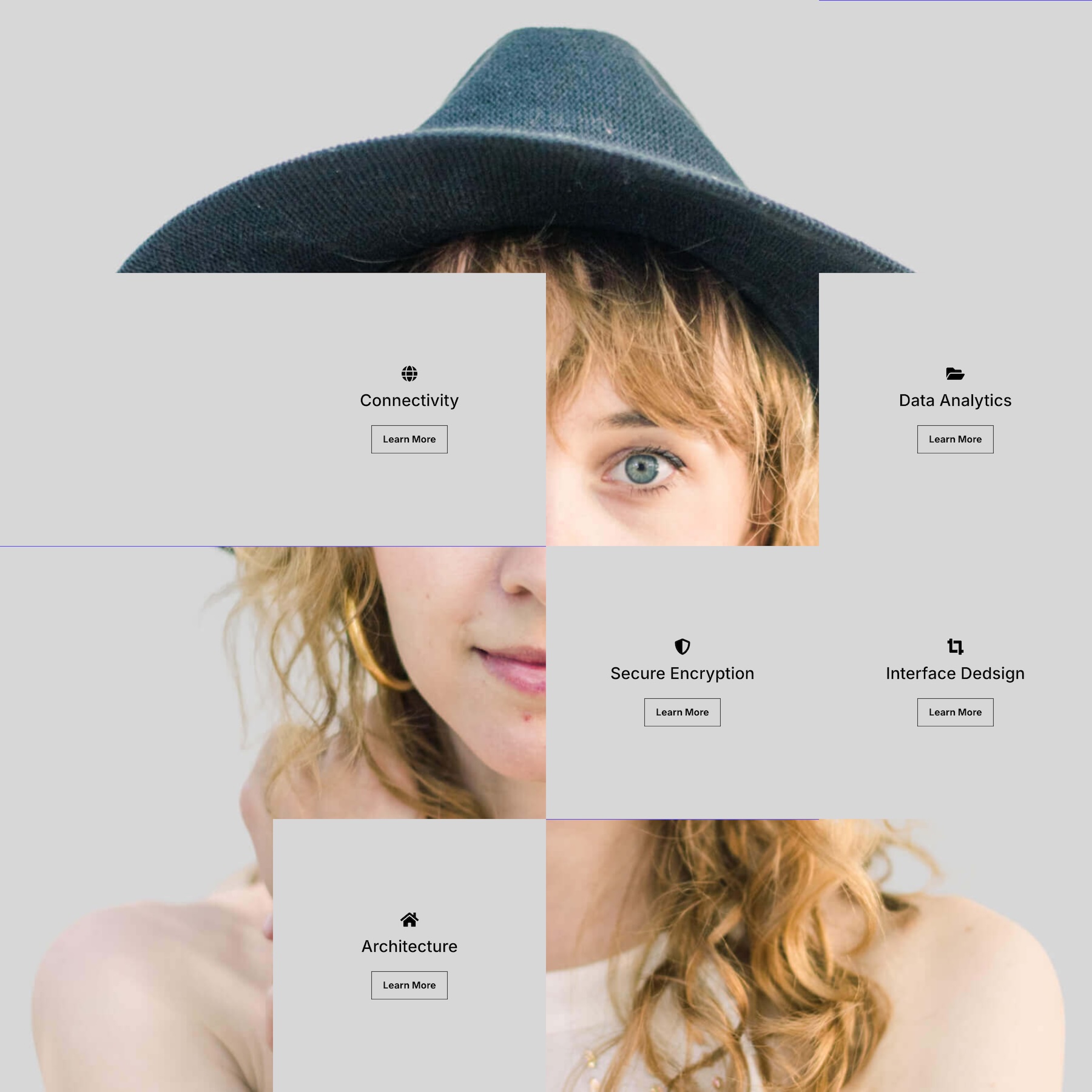
Divi 5 makes it easy to create structured layouts with strong visual rhythm and bold image placement. In this free pack, you’ll get 7 Knockout Grids for Divi 5 that are perfect for landing pages, hero sections, portfolio layouts, real estate websites, service pages, design studios, travel sections, editorial layouts, and more.
Each design uses grid-based composition, image blocks, text panels, color contrast, and intentional negative space to create polished sections that feel modern, layered, and easy to customize. Import a section, replace the content, update the images, and you’re ready to go.
Preview
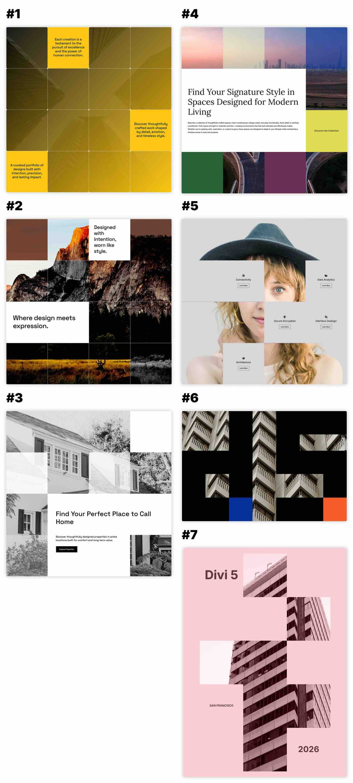
Here’s a quick look at the 7 Knockout Grids included in the pack. The download is further down the post.
Download 7 Knockout Grids For Divi 5
Get all 7 sections for free. Import them into your Divi Library and add them to any page in the Visual Builder.

What’s Included (8 Exports)
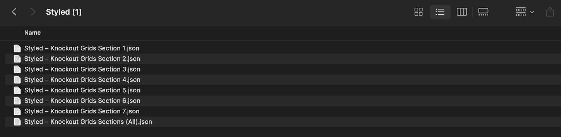
After you download and unzip the file, you’ll find 7 styled Knockout Grid section exports, plus 1 file containing all layouts.
Styled – Knockout Grids Section 1 to 7 (7) → Seven fully styled knockout grid section layouts with image grids, layered content blocks, bold color treatments, text panels, buttons, structured spacing, and responsive visual compositions that you can use as-is or customize.
Styled – Knockout Grids Sections (All) → Imports all 7 designs into your Divi Library at once.
How To Use The Knockout Grids
Keep your download folder handy. We’ll import the files, add a section to a page, and then replace the content.
1. Import Sections Into The Divi Library
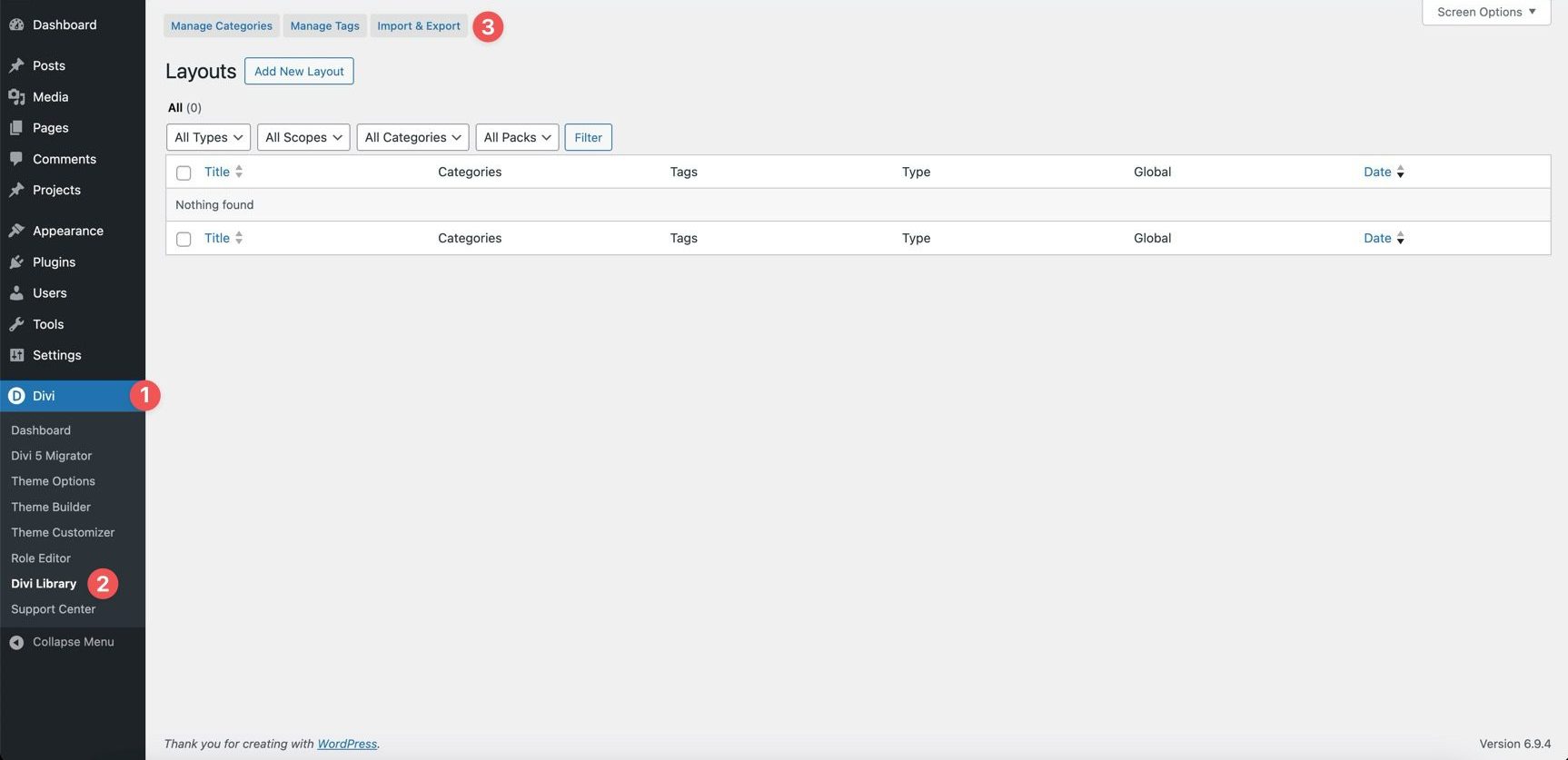
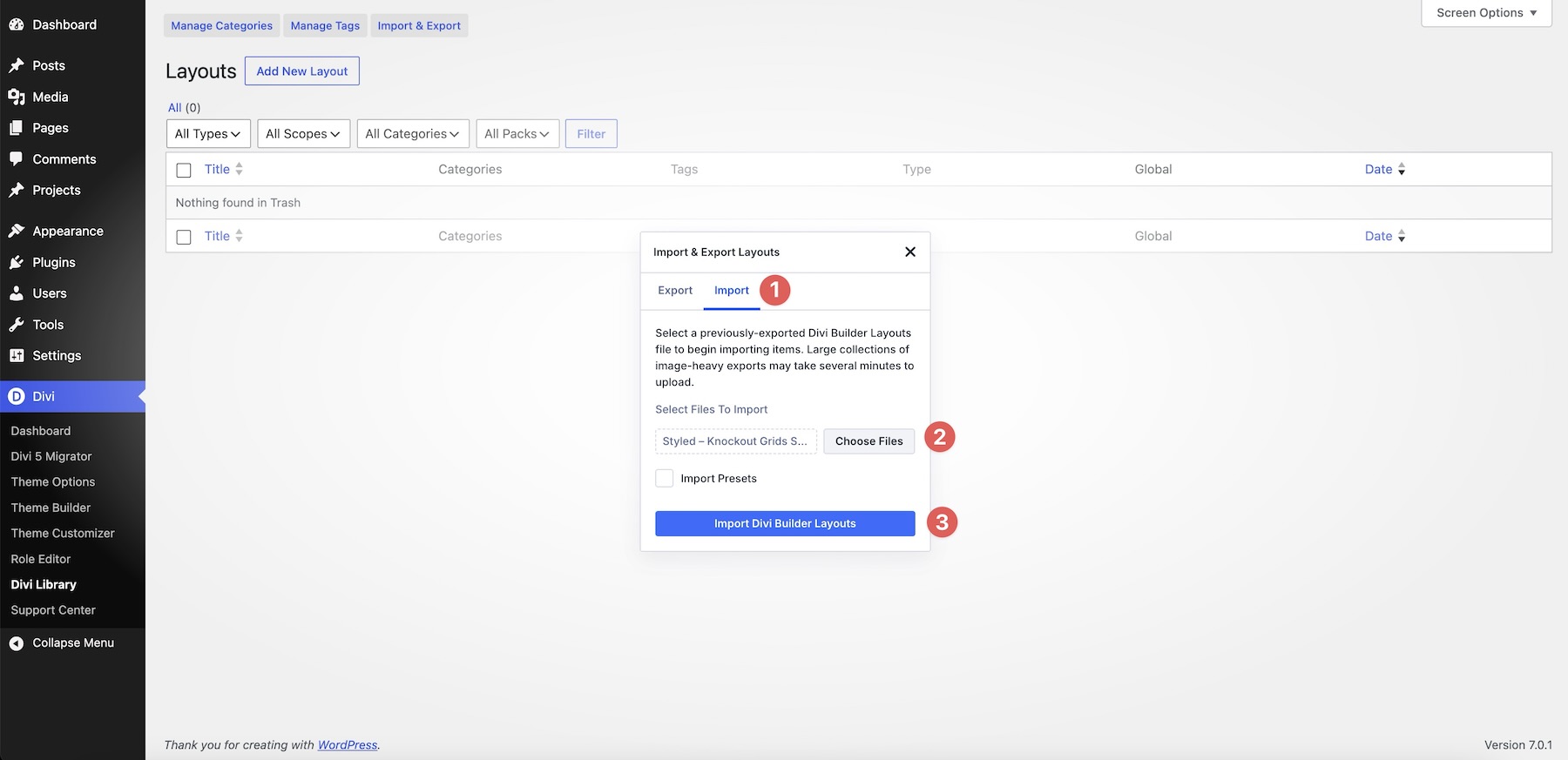
Go to Divi → Divi Library. Click Import & Export at the top of the screen.
In the Import & Export Layouts modal, switch to the Import tab, then click Choose File and select your JSON file. Choose any Knockout Grids Section JSON you’d like to use, then click Import Divi Builder Layouts.
2. Add A Knockout Grid Section To Any Page
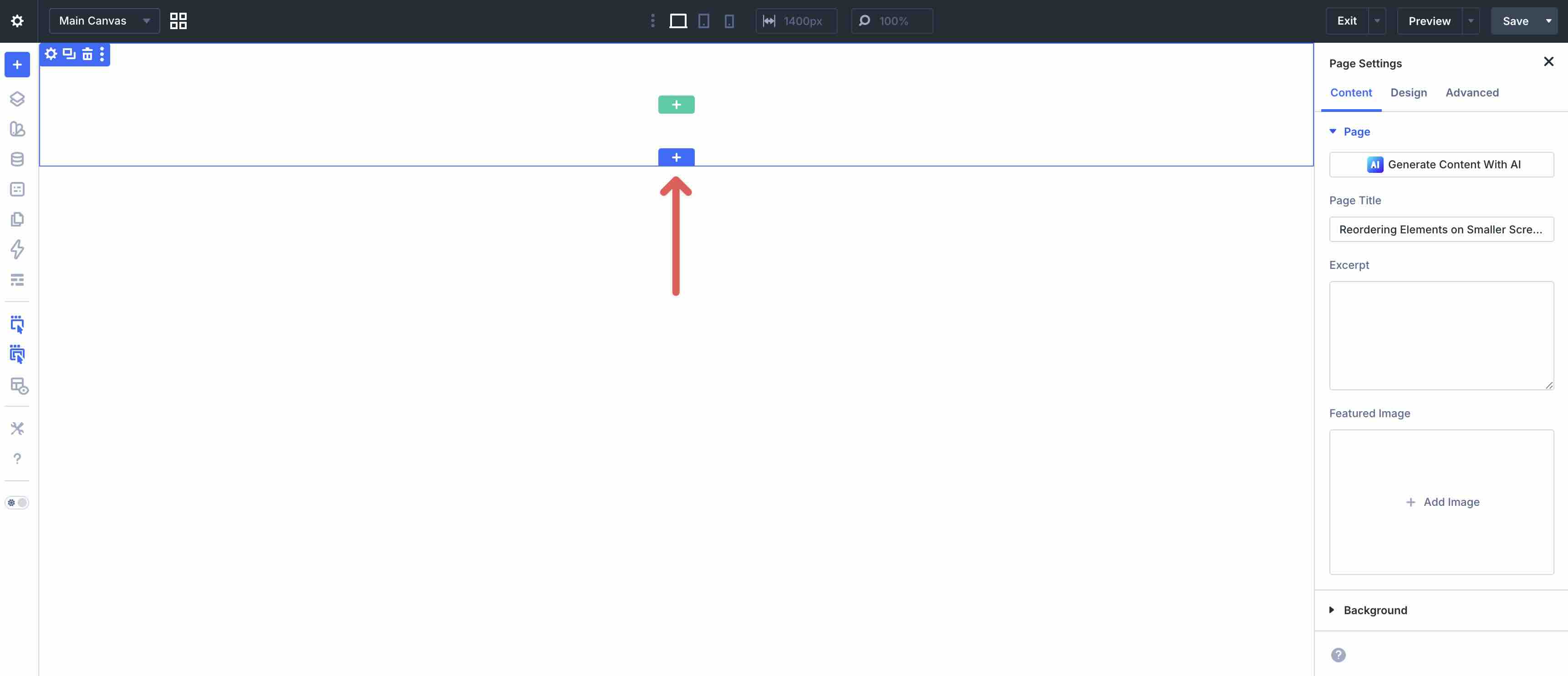
Open a page in the Visual Builder and add a new Section.
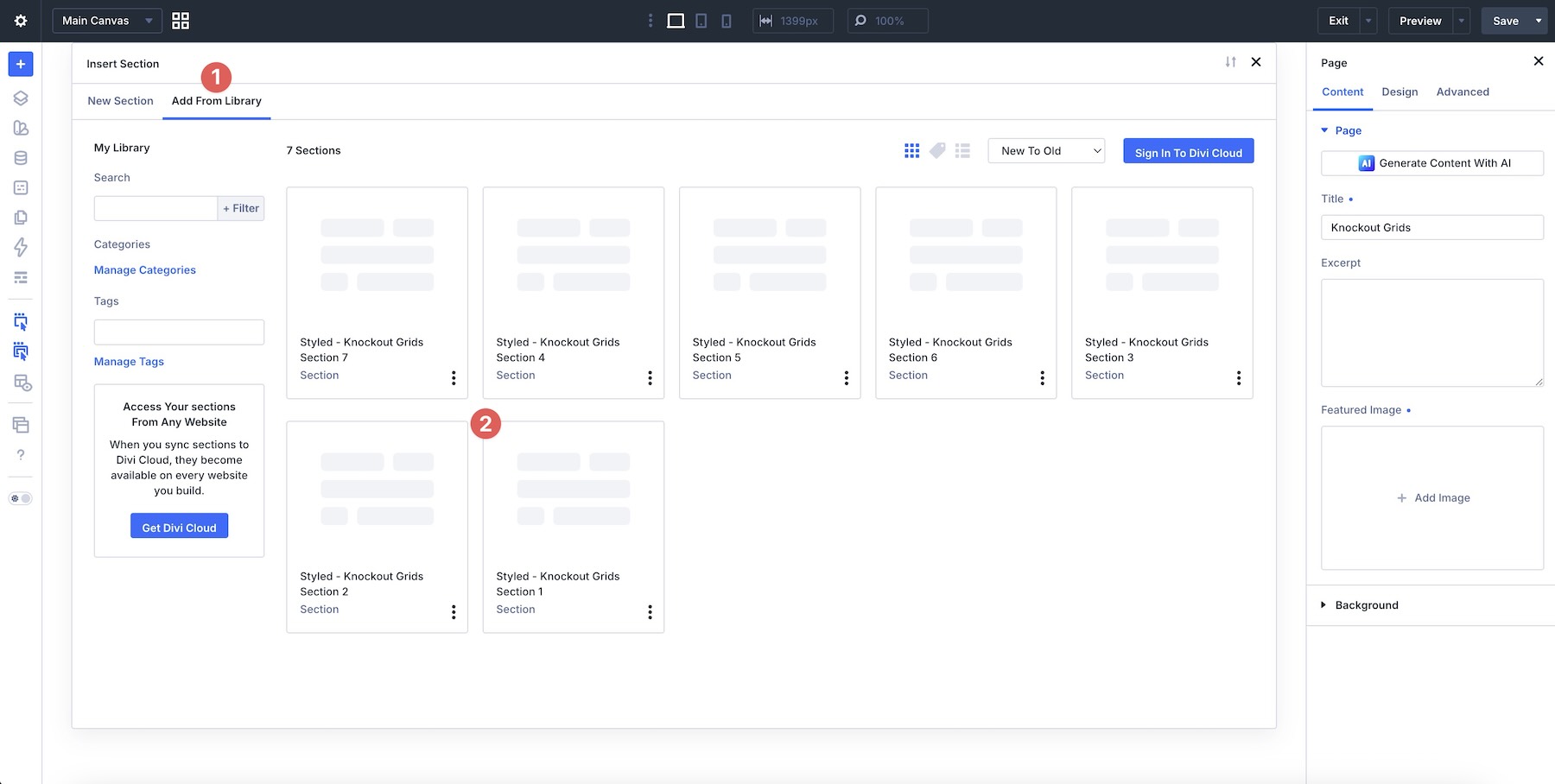
Click Add From Library and select one of your Knockout Grid sections.
3. Swap The Content
Once the section is on the page, replacing the placeholder content only takes a few clicks. Start by updating the heading, body copy, buttons, labels, captions, service details, property text, portfolio copy, and calls to action so the section matches your brand and message. Then swap in your own images, background photos, product visuals, portfolio screenshots, or supporting content as needed.
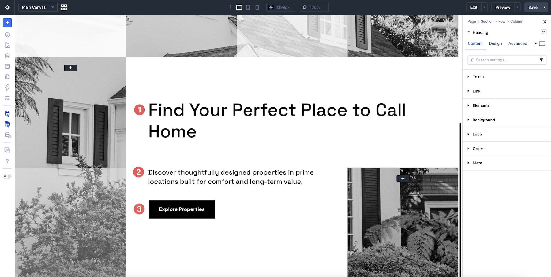
Because knockout grids rely on image placement, grid rhythm, color blocks, and text panels working together, it’s best to replace content one area at a time. This helps preserve the balance between imagery, typography, spacing, and negative space as you customize the design.
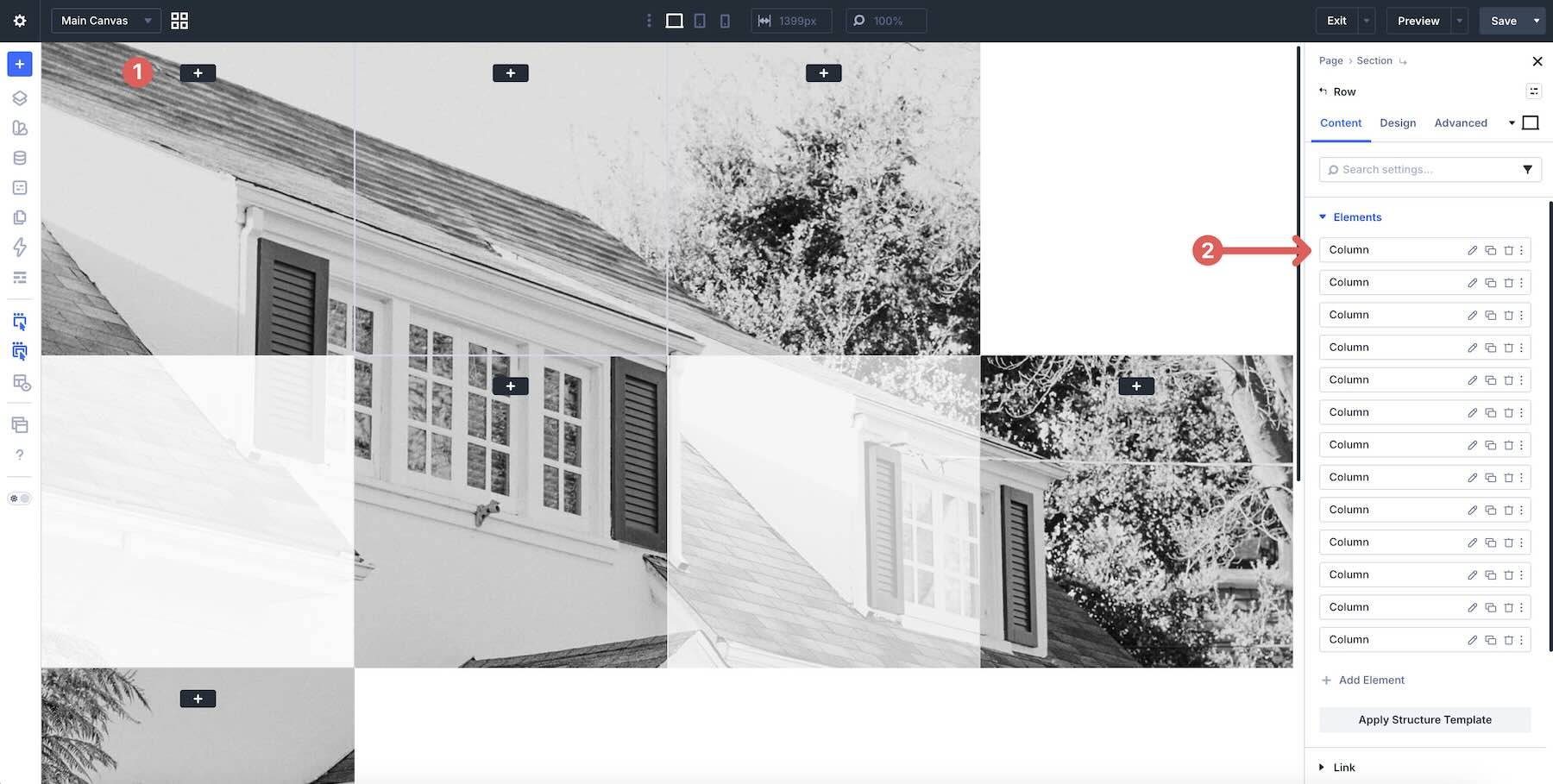
If your new images have different proportions from the originals, review the grid after swapping them in. Image-heavy sections can change quickly when focal points, cropping, or contrast shift. Adjust image positioning, sizing, spacing, or background settings as needed to keep the composition intentional.
If you want to expand or simplify a section, duplicate or remove existing rows, columns, groups, image modules, text modules, buttons, or content blocks rather than rebuilding the design from scratch. That’s the easiest way to preserve the original grid structure, spacing, and visual rhythm.
4. Adjust Styles (Optional)
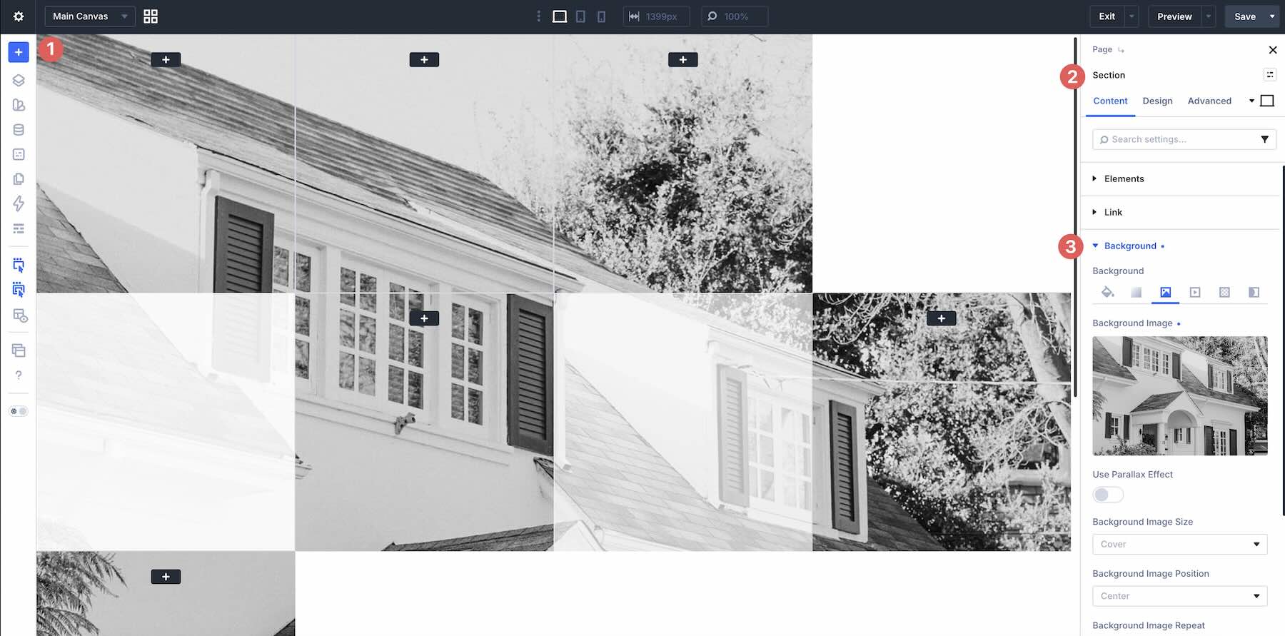
These Knockout Grids are already styled, so you can use them right away or refine them to better match your site. Update typography, colors, backgrounds, image treatments, overlays, borders, spacing, buttons, and layout sizing as needed using the settings in the Design tab.
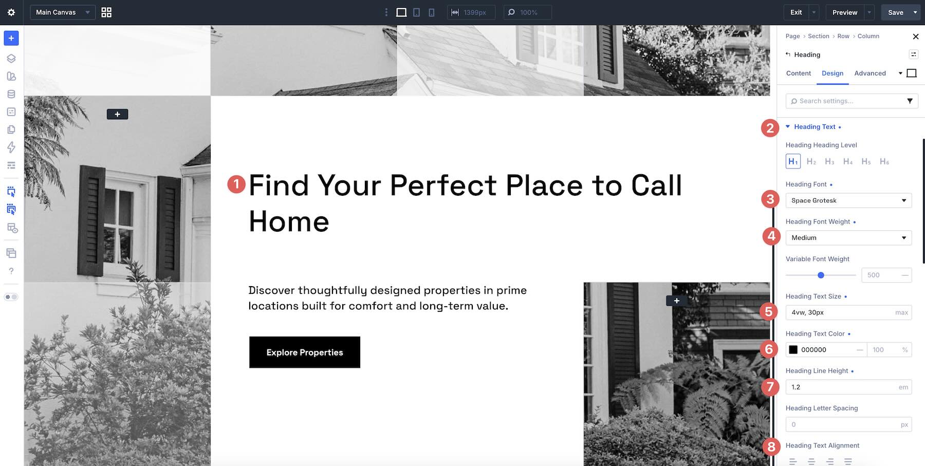
To change typography, open any Text or Heading module and go to the Design tab. Expand the relevant text settings to adjust Font, Font Weight, Text Alignment, Text Color, Text Size, Letter Spacing, Line Height, and more.
To refine the grid styling, open the section, row, column, group, or module you want to adjust and use the Content and Design tabs to tweak Background, Border Width, Border Color, Border Radius, Box Shadow, Sizing, Spacing, and Position settings.
If your section uses split image blocks, overlapping color panels, empty grid cells, text cards, photo mosaics, monochrome treatments, or alternating content areas, keep those relationships in mind as you edit so the layout remains balanced and easy to scan.
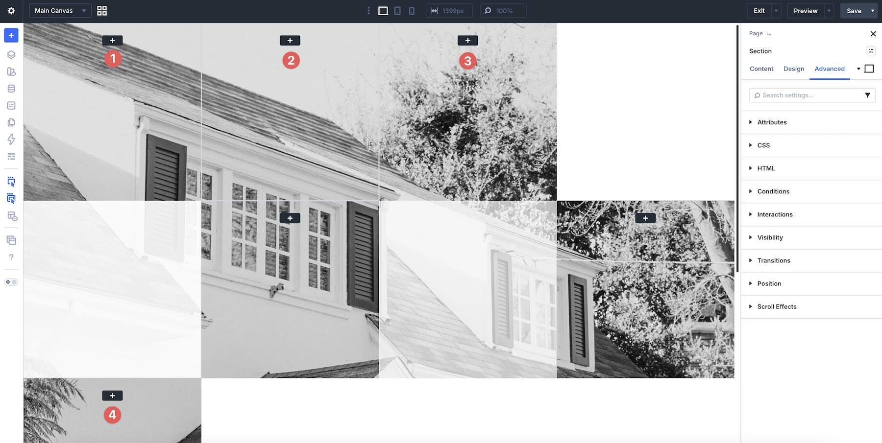
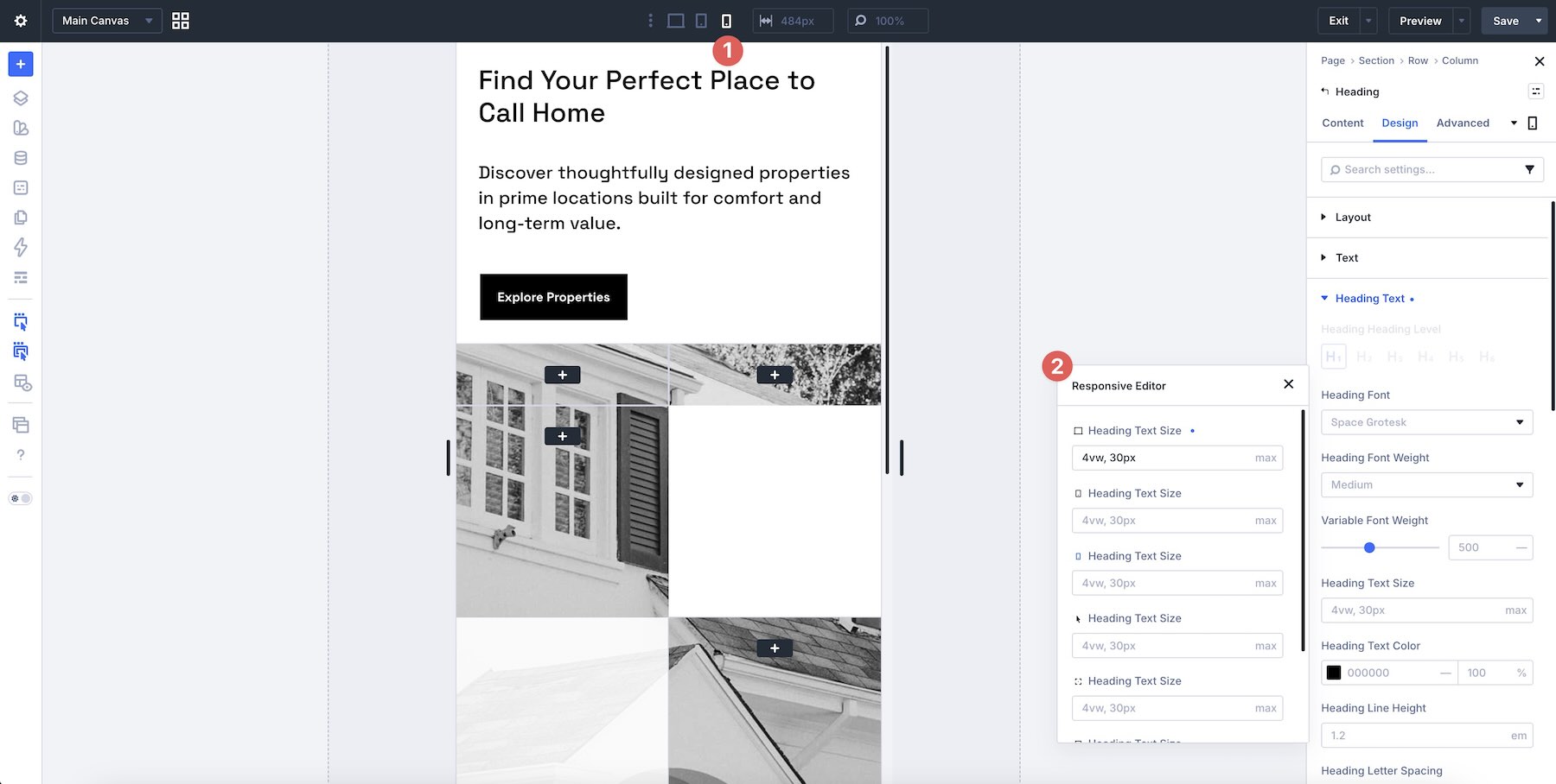
Use Divi’s responsive editing tools to fine-tune stacking, image height, crop position, spacing, text size, column order, and button placement on smaller screens so the layout stays polished across devices.
Tips For Effective Knockout Grids
Knockout grids work best when the grid feels structured but not predictable. Use these quick tips to keep your sections polished, modern, and easy to customize.
Use The Grid To Guide The Eye
A strong grid should help visitors move through the section naturally. Use image blocks, text panels, empty space, and color areas to create a clear path from the main visual to the key message and call to action.
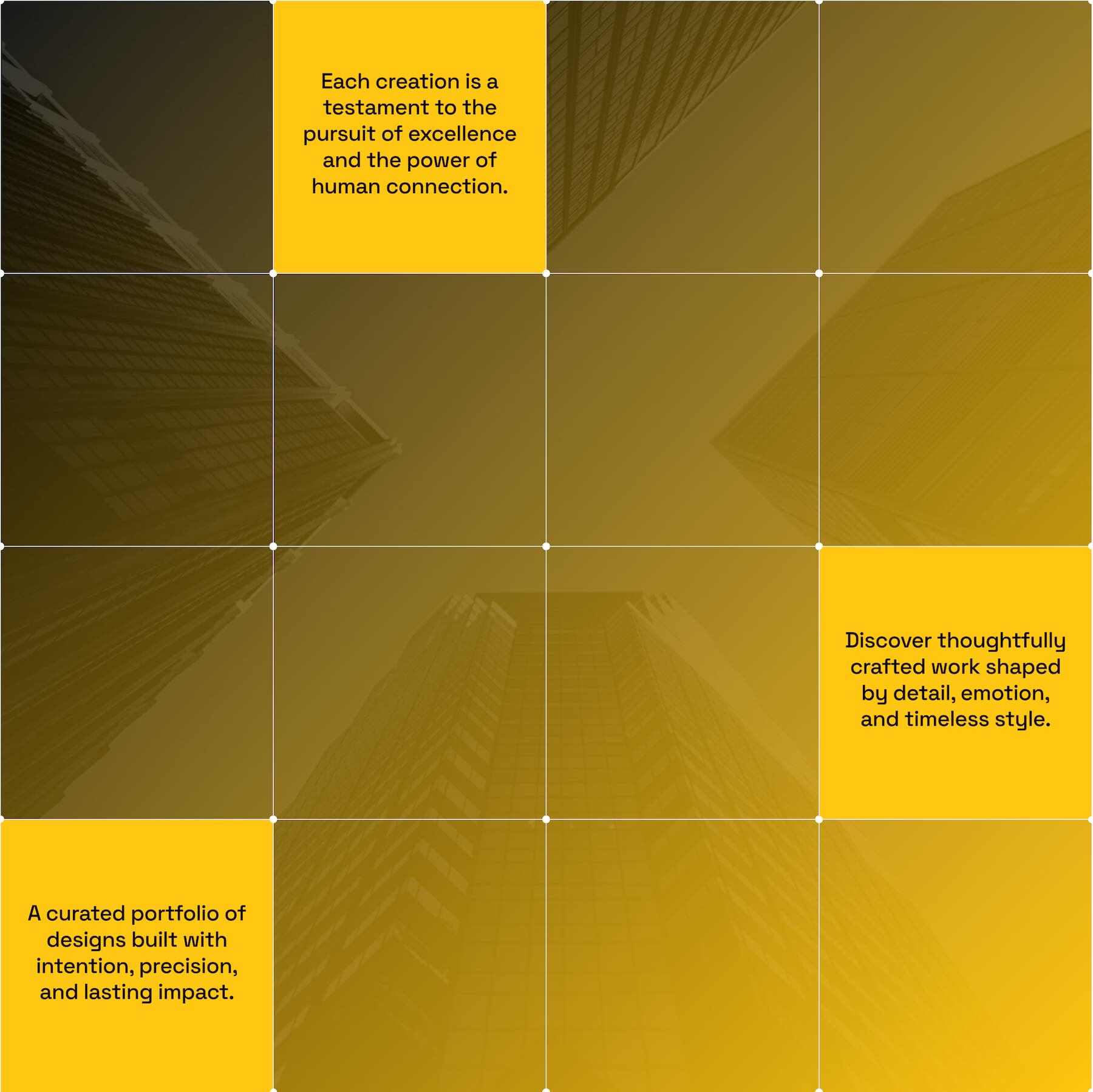
Balance Images With Negative Space
Knockout grids often rely on contrast between filled and empty areas. Let some cells breathe so the layout does not feel crowded, especially when using detailed images or high-contrast photography.
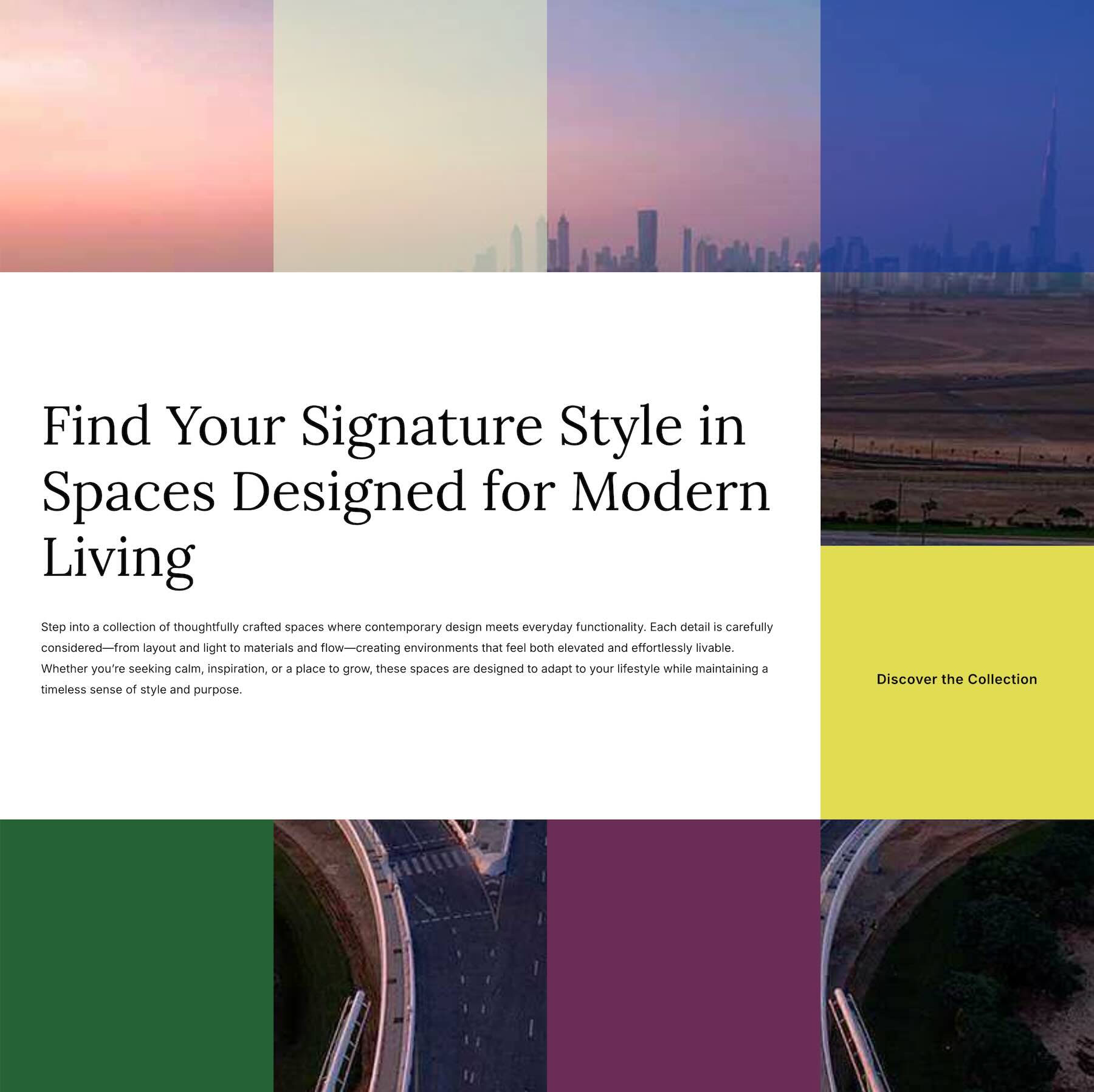
Keep Text Blocks Focused
Grid sections can become busy if every block has too much content. Keep headings short, supporting text concise, and calls to action easy to spot so the structure stays clean and useful.
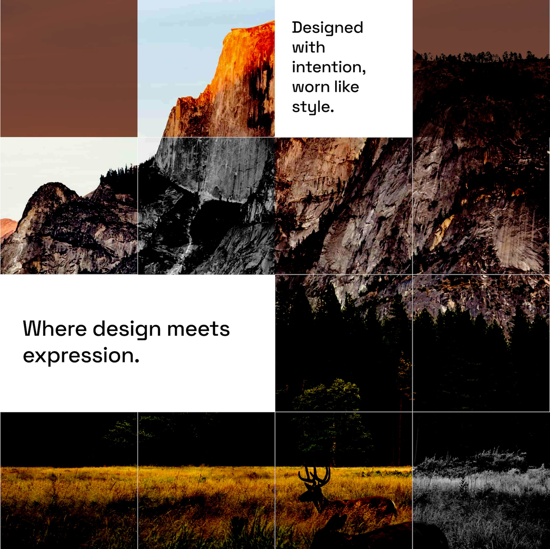
Choose Images With Clear Focal Points
Images may be cropped, split, or placed inside tight grid areas. Choose visuals with strong focal points so they still work when resized or repositioned inside the layout.
Check The Layout On Mobile
Knockout grids can change noticeably on tablet and phone screens as columns stack and image areas resize. Review your layout on smaller devices to ensure images crop well, text remains readable, spacing feels balanced, and calls to action stay easy to tap.
Start Building In Divi 5 Today!
These 7 Knockout Grids give you a fast way to build modern, image-led sections for landing pages, hero areas, portfolios, real estate websites, service pages, travel layouts, creative studios, editorial pages, and more. Swap in your content, customize the styling if needed, and you’ll have a polished grid-based section ready in minutes with Divi 5’s Visual Builder.










Leave A Reply