

Gradient and image-filled headings are everywhere now, from SaaS landing pages to bold editorial hero sections. They look polished, but they used to be awkward to build. You either copied custom CSS, saved the text as a flattened image, or rebuilt the effect every time the wording changed.
Divi 5 now handles this visually with its new Gradient Options and Text Effect Settings. Gradients are easier to manage, gradients can be saved as variables, and text can now be filled with gradients or images directly inside the builder.
The result is a more flexible text-design workflow. You can create gradient headings, image-filled editorial type, transparent outlined text, and reusable brand gradients without turning your headline into a static image.
In this post, we’ll look at how Divi 5’s new text fill options work, how to use gradient and image fills, when to add text strokes, and how Gradient Variables help you reuse the same effect across your site.
What Are Text Fills In Divi 5?
A text fill changes what appears inside the shape of your letters. Instead of using only a normal text color, you can fill text with a gradient or an image. The text remains editable in the builder, while the visual treatment becomes more expressive.
Divi 5’s new Text Effect Settings also include text strokes. A stroke outlines each letter, which is useful when text needs a stronger edge against a busy background.
These settings appear in text option groups, including heading and other module text groups. That means you can use them anywhere Divi exposes the relevant text controls.
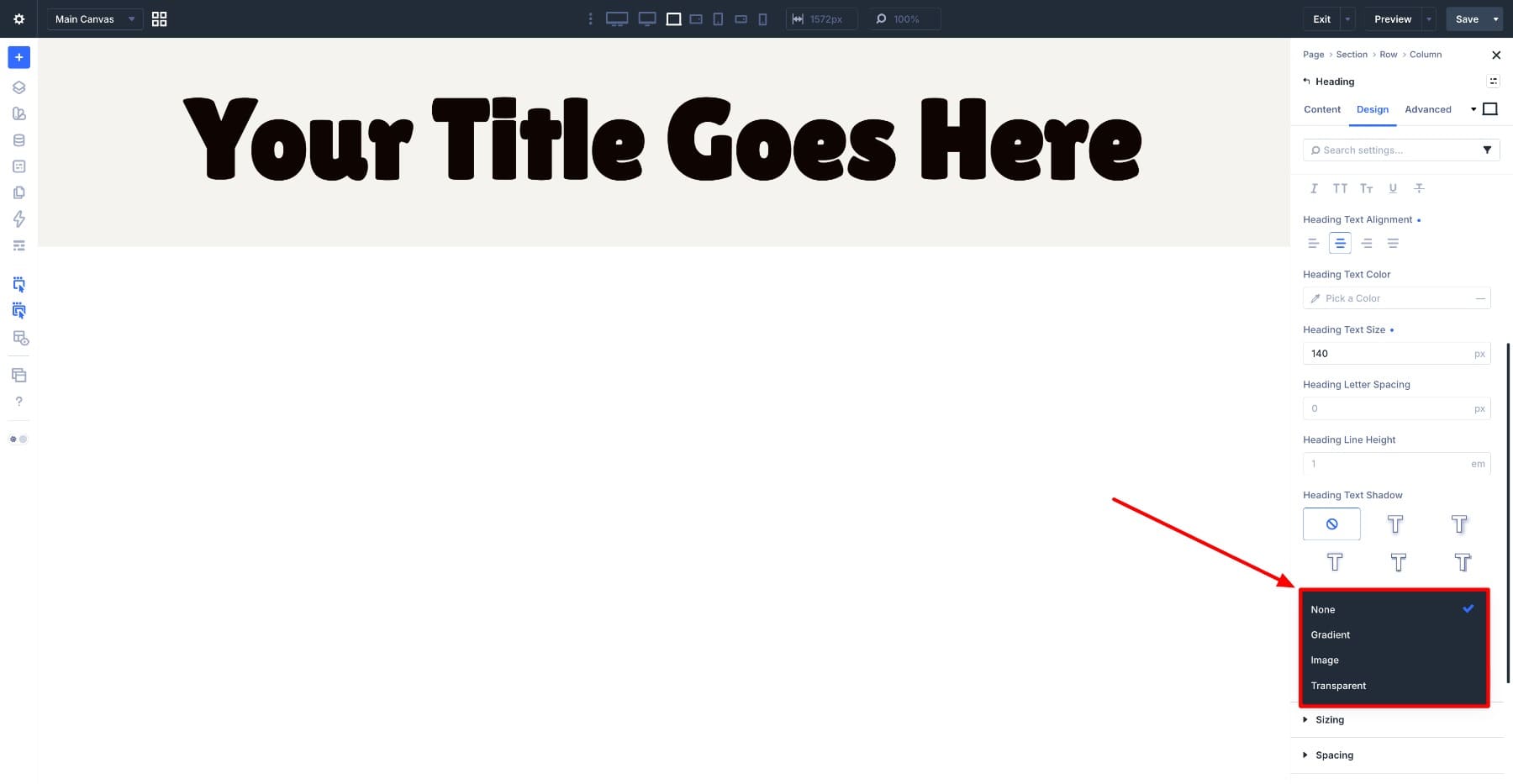
The main setting is Fill Type. It includes:
- None: Keeps the normal text color.
- Gradient: Fills the letters with a gradient.
- Image: Fills the letters with an image.
- Transparent: Removes the fill so the text can work as hollow lettering, usually with a stroke.
This update is tied to Divi 5’s broader gradient improvements. Gradients are now handled as a unified field, which makes them easier to copy, paste, extend, inspect, find, replace, and reuse. Divi 5 also adds Gradient Variables, so a gradient can become part of your design system instead of staying as a one-off setting.
How To Apply A Text Fill
Open a Heading module, go to the Design tab, and find the relevant text option group. Depending on the module and heading level, you may see this inside Heading Text or a heading-specific option group such as Heading Text H1.
Look for the Fill Type option.
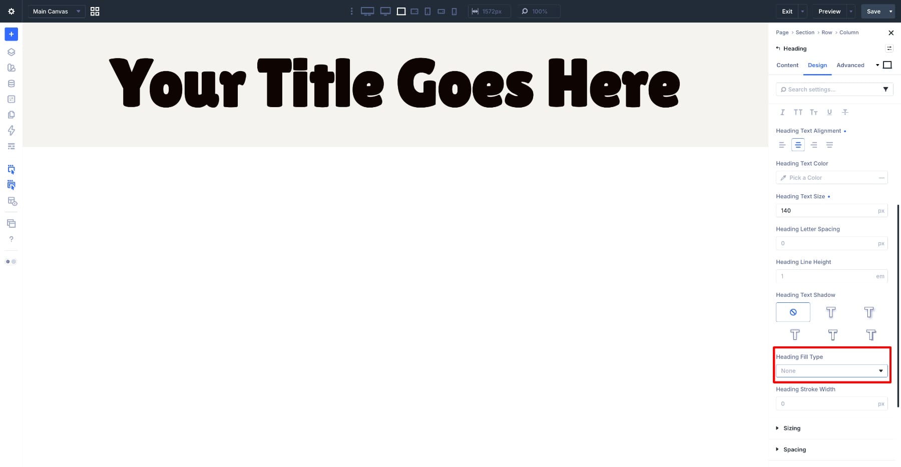
By default, Fill Type is set to None, which keeps the normal text color. Switch it to Gradient, Image, or Transparent, and the related controls appear below.
Apply A Gradient Fill
Choose Gradient to reveal the gradient fill controls. Divi 5’s new gradient picker panel consolidates gradient settings into one place. It works more like the color picker, giving you access to gradient options and variables from the same interface.
Build the gradient with color stops. Click the gradient bar to add a stop, drag stops to reposition them, and adjust each stop’s color.
Set the Gradient Type based on how you want the color to move through the letters. Divi includes options such as Linear, Circular, Elliptical, and Conical. From there, adjust the direction or position depending on the type you choose.
For most headings, a simple Linear gradient is the easiest place to start. It keeps the color movement readable and predictable across one or multiple lines of text.
Apply An Image Fill
Set Fill Type to Image, and the image fill controls appear.
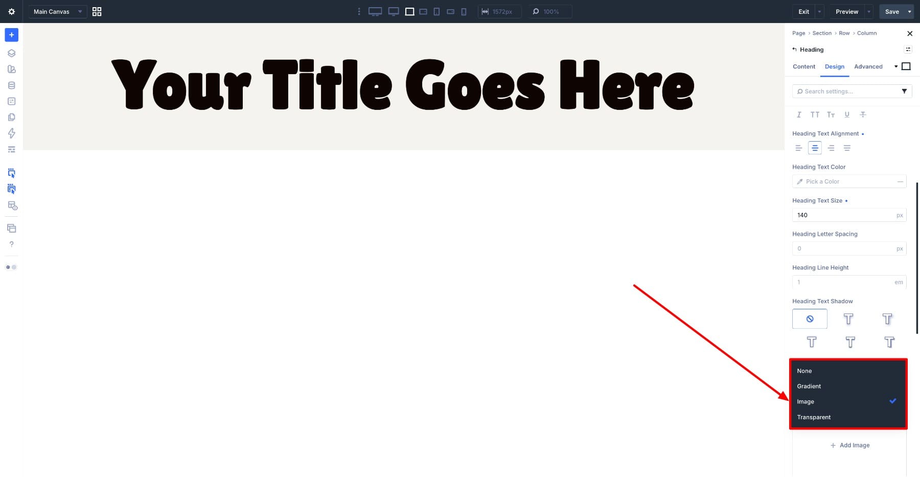
Choose an image, then adjust how it sits inside the letters. The goal is to frame the most recognizable part of the image inside the text so the fill reads clearly.
Image fills work best with large, bold type. Thin fonts usually do not give the image enough surface area to show.
Use Transparent Fill And Text Stroke
Set Fill Type to Transparent when you want hollow letters. Transparent fill works especially well with the Stroke settings. Add a stroke width, choose a stroke color, and the letters become outlined while the inside remains see-through.
Text strokes can also be used with other fill types. They are especially helpful when text sits over a busy image or high-contrast background and needs a clearer edge.
Putting Text Fills To Work
Text fills are most useful when they solve a design problem or create a clear visual focal point. The examples below use gradient fills, image fills, transparent fills, and strokes in different situations.
Example 1: A Gradient Fill Hero Heading
Here we have a SaaS-style hero section with a large headline on a near-black background. The original white heading is readable, but it does not connect strongly to the green and blue brand colors used in the logo and button.

A gradient fill is a quick way to bring those brand colors into the headline. Open the Heading module and set the relevant Fill Type to Gradient. The gradient fill controls appear below.
Build the blend with two stops. Set the first stop to the brand green and the second to the deep blue from the logo. Then adjust their positions until the transition feels balanced across the heading.
Set Gradient Type to Linear and choose a top-to-bottom direction so the colors move vertically through the text.
Because the lower part of the gradient sits close to the dark section background, we made the lower stop slightly lighter. That keeps the bottom letters from blending into the background.
A Linear gradient works well here because the headline spans multiple lines. The color can travel through the full text block without gathering around a center point.
On a real hero section, you may use fewer words than this example. The gradient still works; you simply see a smaller portion of the blend.

The important part is that the text stays editable. You can rewrite the headline later without rebuilding the gradient effect or exporting a new image.
Example 2: A Heading That Stays Readable Over A Busy Background
Busy photos can make headings difficult to read. In this coffee hero section, the text sits over a full-bleed espresso machine photo with chrome, steam, highlights, and shadows.
The original black heading struggles because parts of the letters sit over bright reflections while other parts sit over darker areas.
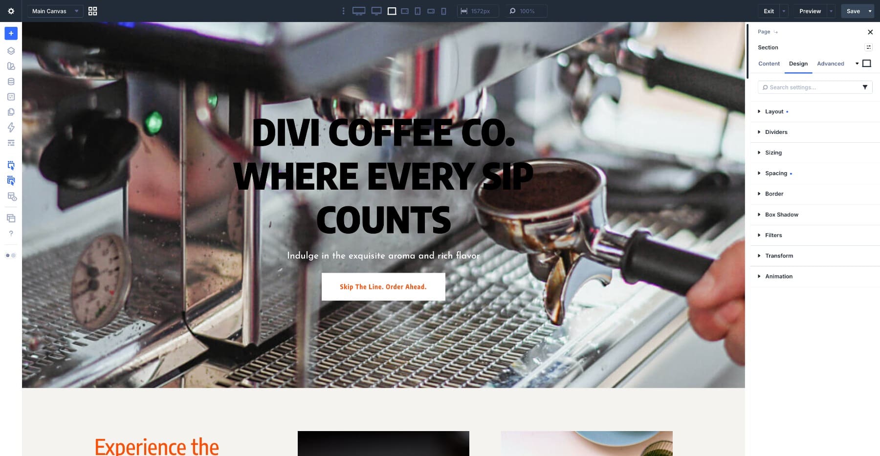
You could add a heavy shadow or place a dark box behind the text, but both options can make the design feel less refined. Instead, use two lighter touches: calm the background and define the letter edges.
First, add a dark gradient overlay to the section background. In this example, the overlay fades from roughly 50% to 30% opacity. That softens the brightest areas of the photo without hiding the espresso machine.
Then style the heading. Set the heading Fill Type to Gradient and use a warm off-white that fits the photo’s tone.
On its own, that fill can still get lost in lighter parts of the image, so add a thin text stroke. In this example, the stroke uses the brand orange at 1px.
The overlay calms the background. The stroke defines the text. Together, they make the heading easier to read without covering the photo.
The orange stroke also connects to the button color, so the outline feels like part of the brand system rather than a readability patch.
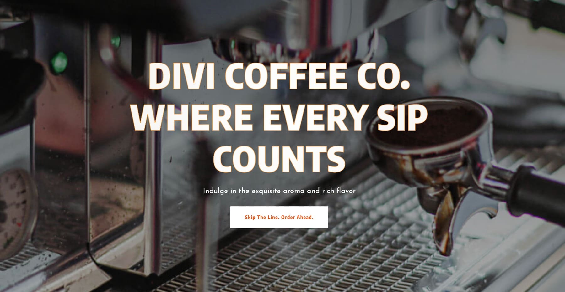
Keep strokes subtle. A thin stroke can sharpen the edges. A heavy stroke can crowd the letterforms and make the heading feel messy.
Example 3: An Image Fill Editorial Heading
An image-filled heading used to be a Photoshop task. You masked a photo inside the letters, flattened the result, and exported a PNG. That gave you the look, but the words were no longer editable text.
Image Fill gives you a similar visual result while keeping the heading editable inside Divi.
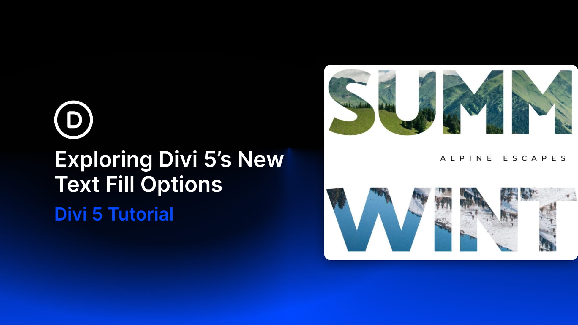
In this travel hero, two large words use two different image fills. SUMMER is filled with a green alpine landscape, while WINTER is filled with a cooler blue forest image. One setting creates two different seasonal moods.
This effect depends heavily on your font and image choices.
Use a heavy, tightly spaced typeface so the image has enough room to show. Choose an image with strong contrast and a clear subject. If the image is too dark, too busy, or too low contrast, it can turn into visual noise inside the letters.
Once the image is added, adjust the fill so the most recognizable part of the image sits inside the text.
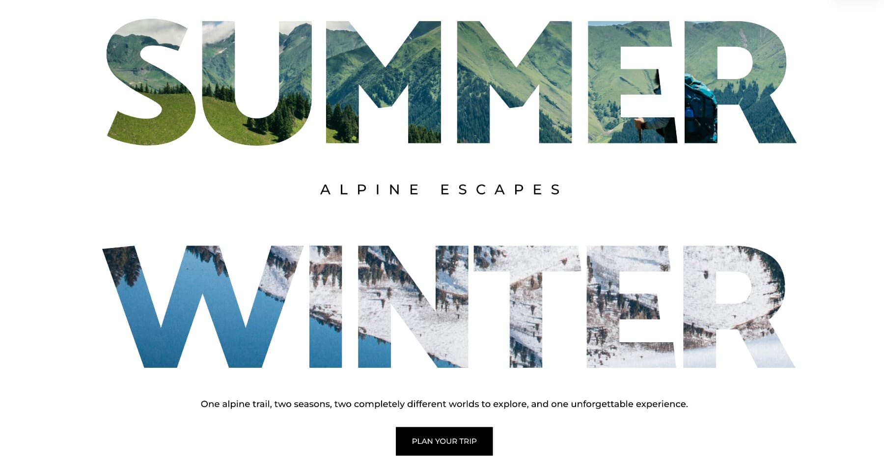
Image Fill works best when the image supports the word. A landscape inside SUMMER or WINTER makes sense because the fill adds meaning, not just decoration.
Example 4: Two Fill Types In One Heading Design
For the last example, we use more than one fill treatment in the same design.
The section splits down the middle, with a soft pattern on the left and a leaf photo on the right. The words FRESH and LEAVES sit across the layout.
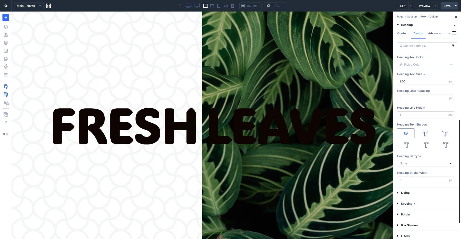
Before styling, both words are solid dark text. LEAVES almost disappears into the leaf photo behind it.
We fixed this by giving each word a different treatment. FRESH uses an Image fill, so the leaf texture appears inside solid letters. LEAVES uses a Transparent fill with a white Stroke, so the letters become hollow and outlined over the photo.
The contrast between the two treatments creates the design. One word feels full and textured. The other feels lighter and outlined.
Each word is its own Heading module, so each one can use its own Fill Type and Stroke settings while staying editable.

This is where Text Effects become more interesting. You do not have to choose one fill style for an entire section. You can combine gradient fills, image fills, transparent fills, and strokes across different text elements as long as the composition stays controlled.
Make Text Fills Reusable With Gradient Variables
So far, we have styled one heading at a time. That works for a single hero, but repeated gradients should not be rebuilt manually. Gradient Variables solve this.
A Gradient Variable lets you save a gradient once and use it anywhere gradients are supported. When the variable changes, every element using it updates. The fastest method is Convert to Variable. Build a gradient on any element, right-click the gradient field, and choose Convert to Variable. Give it a clear, role-based name such as Brand Gradient.
You can also create one directly from the Variable Manager by opening the Gradients category and adding a new Global Gradient.
Once saved, the gradient appears in the Variable Manager alongside your other variables.
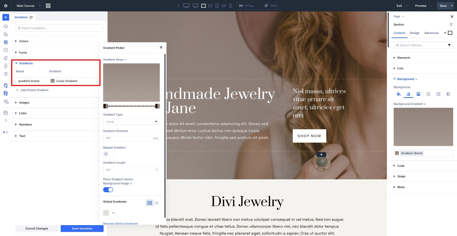
Now you can apply that same gradient to a text fill. Open a Heading module, set Fill Type to Gradient, and choose the saved Gradient Variable instead of rebuilding the stops by hand.
Gradient Variables work beyond text fills too. You can use the same variable on a heading fill, a button background, a section background, or a footer treatment. Each element points to the same reusable gradient.
When the gradient needs to change, edit the variable. The headline, button, footer, and any other element using that gradient update from the same source.
This is useful for brand gradients, seasonal campaigns, product launch pages, and any layout where the same gradient should appear in more than one place.
If you want to see how variables and presets hold a whole site together, our guide on building a Divi 5 Design System covers the broader workflow.
When To Use Text Fills And When To Hold Back
Text fills are strongest when they are selective. One filled heading can make a page feel more polished. Several filled headings competing with each other can make the page feel noisy.
Use text fills when:
- A hero heading needs a stronger brand moment.
- An editorial layout needs a visual focal point.
- A heading sits over a busy image and needs a stroke for readability.
- A campaign page needs a reusable gradient treatment.
- A single word or phrase needs extra emphasis.
Hold back when:
- The heading is small or body-sized.
- The surrounding design is already visually busy.
- The image fill makes the words harder to read.
- The effect does not connect to the brand, image, or message.
A good rule of thumb: let one heading carry the effect and keep the surrounding text simpler.
Try Text Fills On Your Next Heading In Divi 5
Divi 5’s new text effects make gradient fills, image fills, transparent fills, and text strokes part of the visual builder.
You can create brand-colored hero headings, editorial image-mask text, hollow outlined lettering, and photo-backed headings that stay easier to read. More importantly, the text remains editable, so you can update the copy without recreating the effect.
Gradient Variables make the workflow even stronger. Save a gradient once, reuse it across your site, and update every connected element from one place. The look that once needed custom CSS or a flattened image can now be built directly in Divi 5. Open a heading, choose a Fill Type, and see how far one text treatment can go.












Leave A Reply