

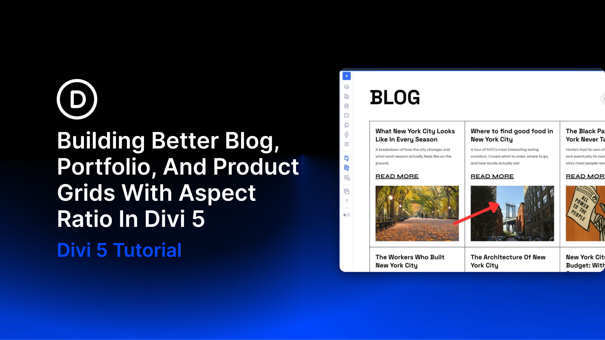
Upload a dozen images from different sources, and your grid can start to lose its shape fast. One blog post has a wide featured image. Another uses a square crop. A product image comes from a supplier. A portfolio image is vertical because the work itself was vertical. The result is a grid shaped by the uploads, not by your design.
Aspect Ratio in Divi 5 gives the layout a rule to follow. Instead of letting every image decide the height of its own card, you can define the shape once and keep blog, portfolio, and product grids visually consistent. In this post, we’ll look at why grids need consistent image shapes, how Aspect Ratio and Image Framing work together, and how to apply them to blog loops, portfolio grids, and WooCommerce product grids in Divi 5.
- 1 Why Grids Need A Consistent Shape
- 2 What Aspect Ratio And Image Framing Do In Divi 5
- 3 Using Aspect Ratio In Website Grids
- 4 Build A Consistent Blog Grid
- 5 Create A More Curated Portfolio Grid
- 6 Build Cleaner WooCommerce Product Grids
- 7 Best Practices For Better Grid Ratios
- 8 Try Out Aspect Ratio In Divi 5 Today!
Why Grids Need A Consistent Shape
A grid makes a visual promise: every card belongs to the same system. When cards sit at different heights, that promise breaks. Visitors may not stop and describe the issue, but they feel it. The layout starts to look unfinished, even when the content itself is strong.
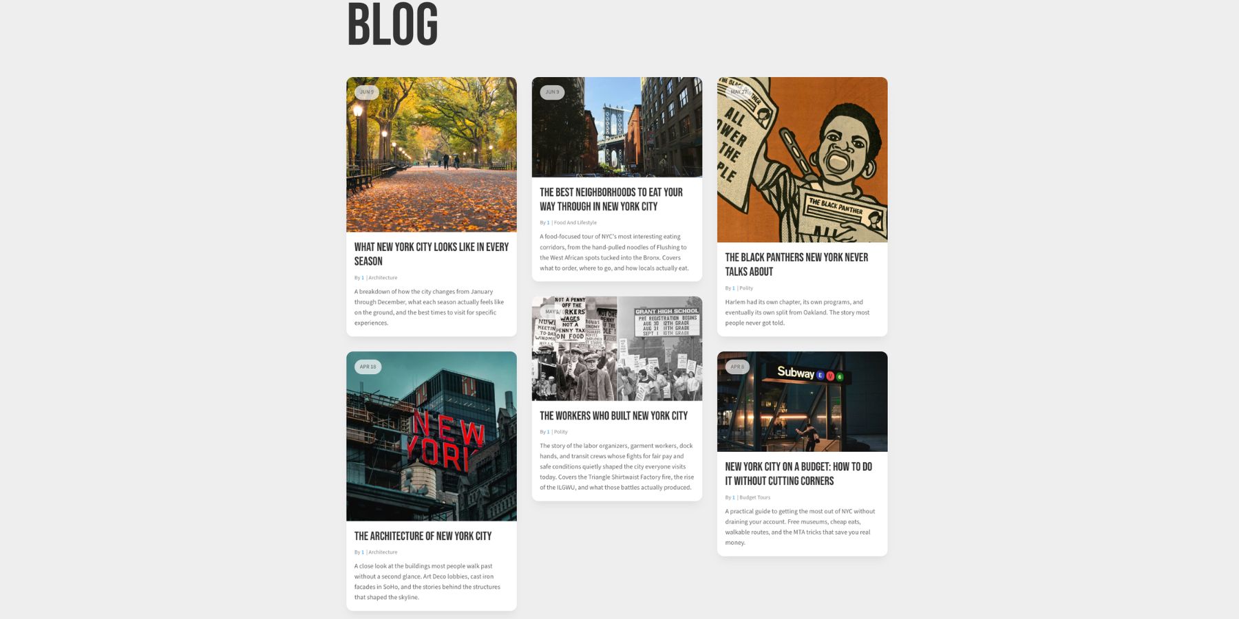
The browser usually follows the content. A tall image makes a tall card. A short image makes a short card. A wide crop behaves differently from a portrait crop. The columns may still line up, but the rows drift, and the grid stops feeling intentional.
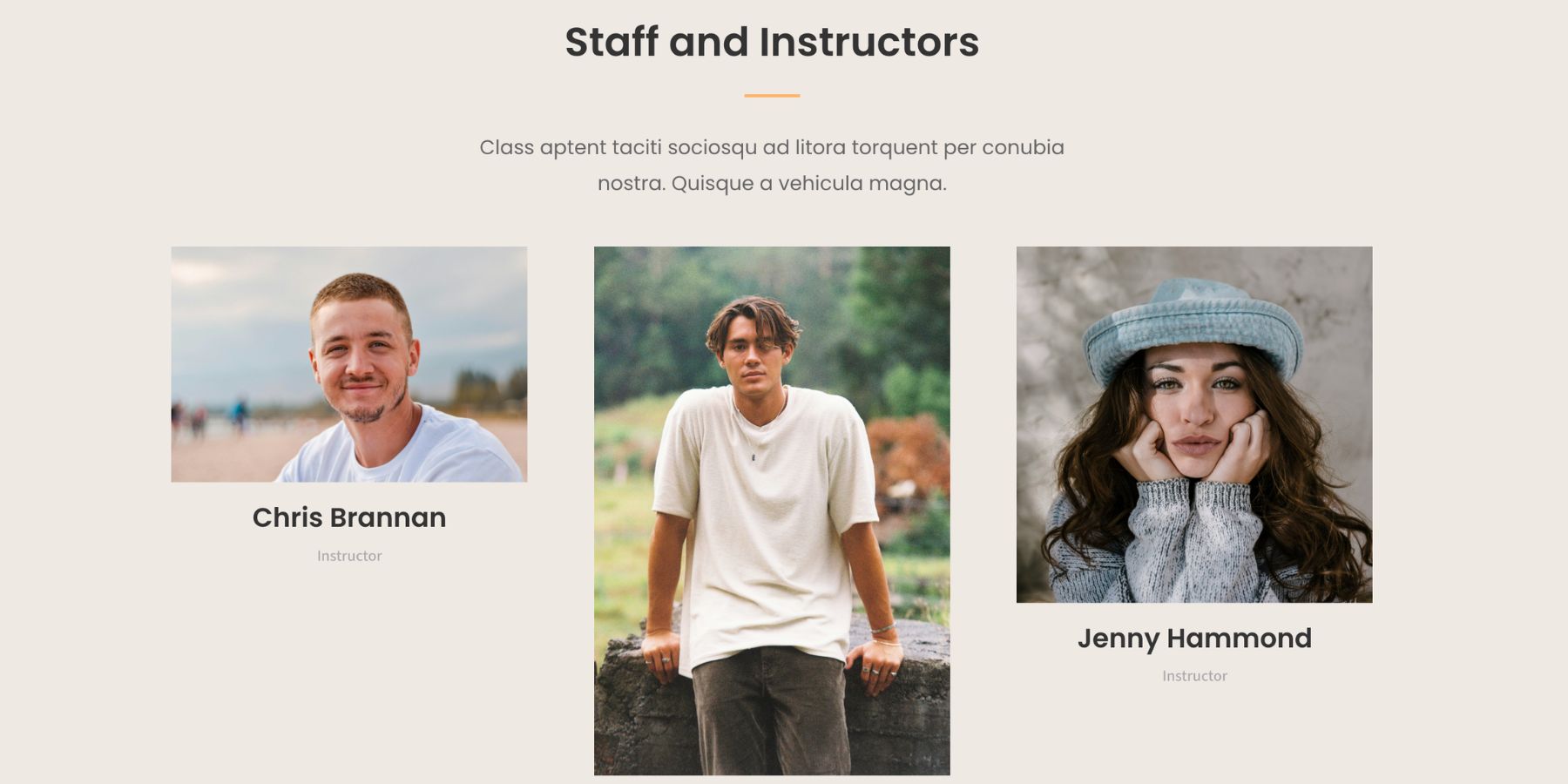
That drift affects different grids differently. A blog grid can start to feel careless, even if the articles are worth reading. A portfolio grid can weaken the presentation of the work. A product grid can make the catalog harder to scan and compare.
The fix is not to hope every upload follows the same spec.
That works until a client sends a phone photo, a contributor uploads a Canva export, or a supplier provides a product shot in a different crop. Even when image dimensions are consistent at upload, the layout still has to respond across desktop, tablet, and phone sizes.
A better approach is to let the layout define the frame. When each grid image follows the same Aspect Ratio, every new upload falls into the same visual system. The original image can still be wide, tall, or square. The grid card stays consistent.
What Aspect Ratio And Image Framing Do In Divi 5
Aspect Ratio controls the shape of the frame. In Divi 5, the Aspect Ratio field lives in the Sizing option group. It accepts a width-to-height proportion such as:
- 1:1 for a square
- 16:9 for a wide landscape frame
- 4:3 for a balanced editorial frame
- 4:5 for a taller portrait-style frame
- 3:2 for a classic photography-style frame
Set the ratio, and Divi keeps that proportional relationship as the element scales. The width can change across screen sizes, but the height follows the ratio instead of being determined only by the image file.
Image Framing controls what happens inside that frame. When an image is forced into a shape that differs from its original dimensions, it needs a fit rule. That is where Object Fit and Object Position matter.
- Object Fit: Controls how the image fills the frame. Cover fills the frame without stretching the image, cropping anything that does not fit.
- Object Position: Controls which part of the image stays visible when cropping happens.
Aspect Ratio sets the container shape. Image Framing controls the crop. Together, they are especially useful in Loop Builder templates. If you set the ratio and framing on the image inside a loop template, every repeated card inherits the same structure. None of this changes the original media file. Divi changes what the browser renders, while the file in the Media Library stays untouched.
Using Aspect Ratio In Website Grids
The basic workflow is similar across blog, portfolio, and product grids:
- Choose the ratio that fits the content type.
- Apply that ratio to the image or image area inside the card.
- Set Object Fit to Cover when you want the image to fill the frame without distortion.
- Adjust Object Position when the crop needs a different anchor.
The difference is why each grid needs the ratio. A blog grid needs editorial consistency over time. A portfolio grid needs a curated presentation of creative work. A product grid needs easy comparison and clean catalog scanning. Let’s go through each one.
Build A Consistent Blog Grid
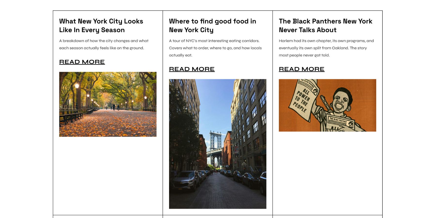
A blog grid keeps changing after launch. Every new post brings a new featured image. One author may upload a wide landscape. Another may use a square social crop. Another may use a portrait-style image because that was the only good asset available.
The longer the blog runs, the more those differences compound.
Choose A Blog Image Ratio
The right ratio depends on the type of blog and how much content sits around each image. Use these as starting points:
- 3:2: A strong default for general editorial blogs.
- 4:3: Useful when cards include titles, metadata, and excerpts below the image.
- 4:5: Good for food, lifestyle, fashion, and photography blogs where taller images are part of the visual style.
- 1:1: Works well for social-style grids, design roundups, or posts with mostly square graphics.
- 16:9: Useful for video-heavy blogs, tutorials, and posts where the image should feel closer to a thumbnail or cover frame.
For most editorial blog grids, 3:2 or 4:3 is the safest place to start. They give images enough height to carry visual interest without pushing the post title too far down the card.
Set The Ratio On The Featured Image
If you are building the blog grid with Loop Builder, open the loop template and select the Image module that displays the featured image. Go to Design > Sizing, then enter your chosen value in the Aspect Ratio field.
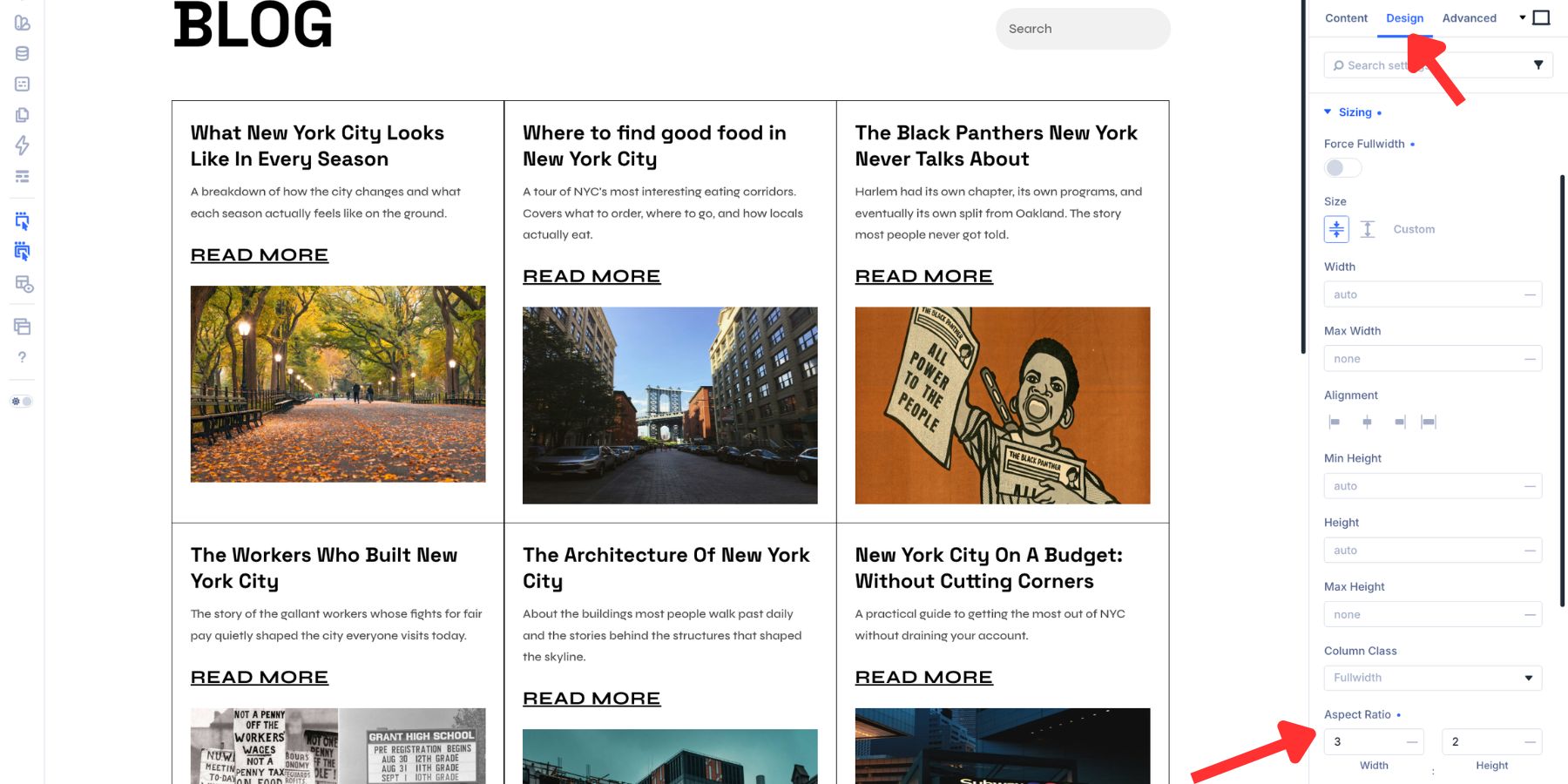
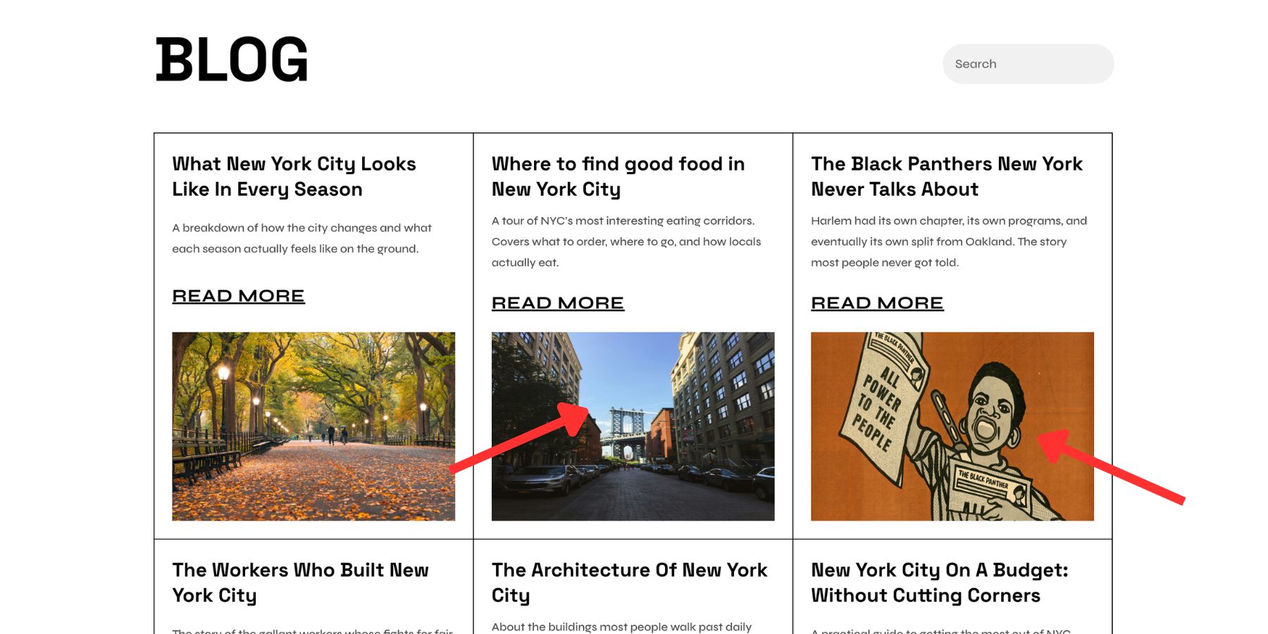
Because this image sits inside the loop template, the same ratio applies to every repeated post card. A new post can have a wide image, square image, or portrait image. The card still keeps the same frame. If your loop uses a background image on a Column or Group instead of a standalone Image module, apply the Aspect Ratio to that container instead.
Set Object Fit To Cover
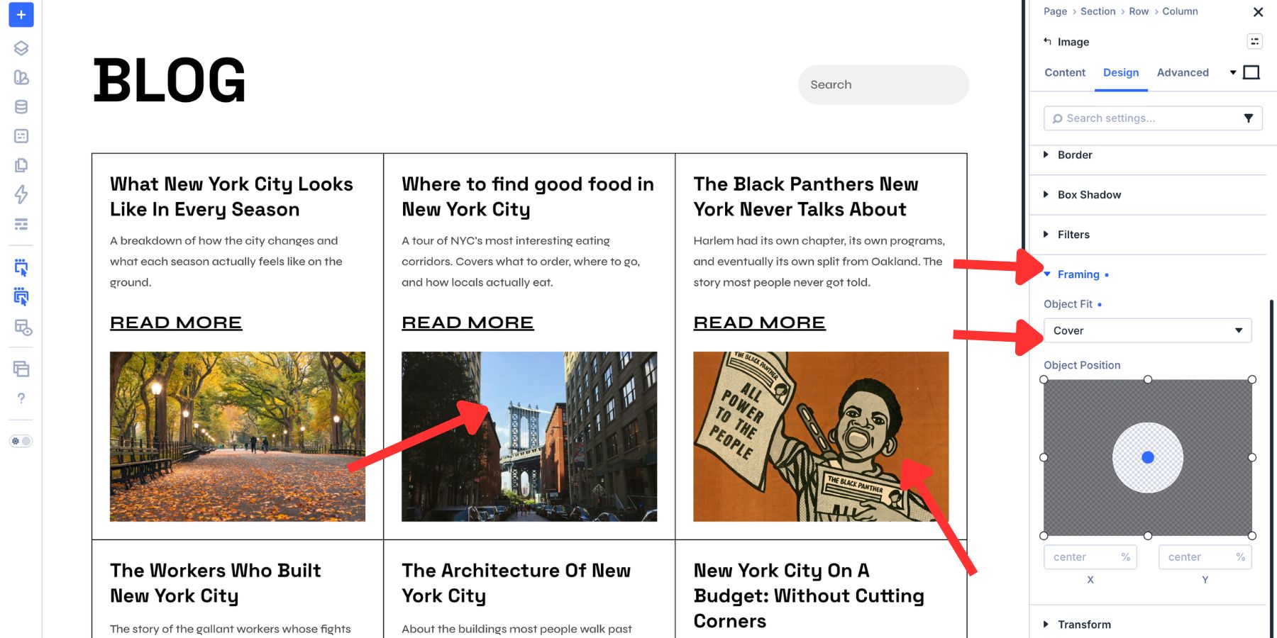
Aspect Ratio sets the frame, but it does not decide how the image should behave inside it. If the image appears stretched after applying a ratio, open the image’s Framing controls and set Object Fit to Cover.
With Cover, the image fills the frame at its natural proportions. Divi crops the overflow instead of stretching the image.
Use Object Position Carefully
By default, centered framing works well for many blog grids. It keeps the crop balanced across a mixed set of images.
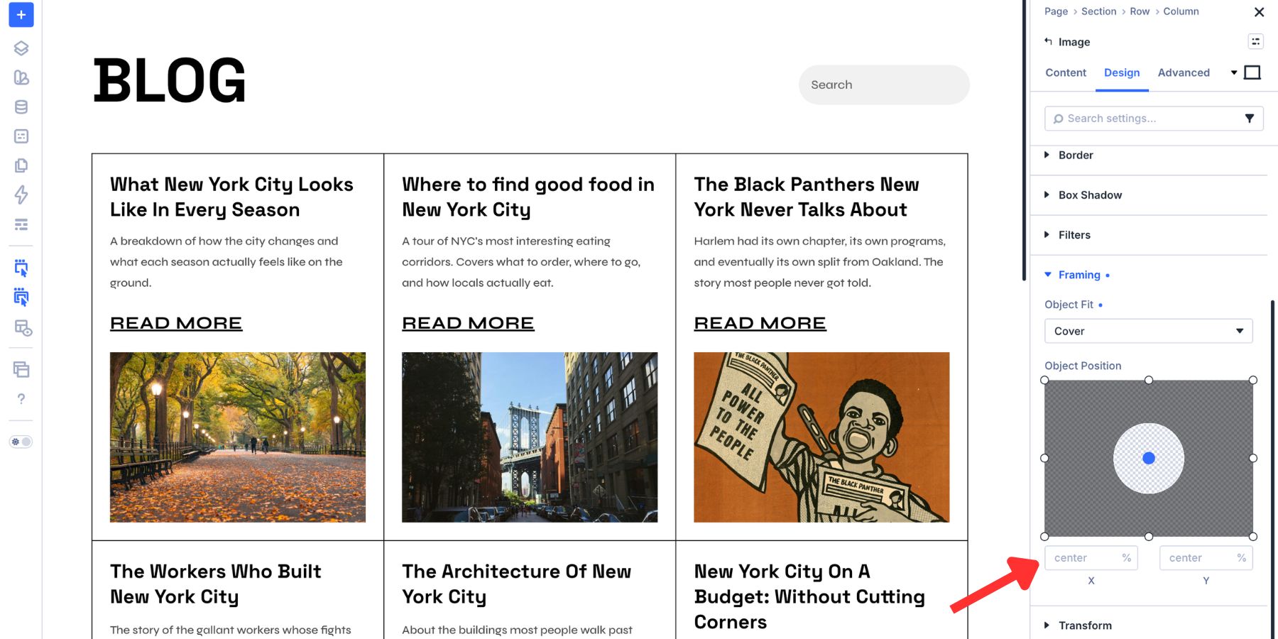
If most featured images share a composition, you can choose a more specific anchor. For example, a contributor blog with headshots may work better with Top Center. A recipe blog where the dish is always centered may work best with Center. A news site with images that place the subject high in the frame may need a higher vertical position.
Just remember that a loop template repeats the same Object Position across every card. If one image needs a completely different crop, the better fix is usually to edit that source image before it enters the loop.
Create A More Curated Portfolio Grid
A portfolio grid does more than display work. It frames the work before visitors click.
The card shape tells people how to read the projects. A square grid feels neutral and gallery-like. A landscape grid gives each piece more horizontal breathing room. A portrait grid adds visual weight and works well for print, fashion, editorial, and photography-heavy portfolios.
Without a fixed shape, mixed orientations can make the portfolio feel less curated.
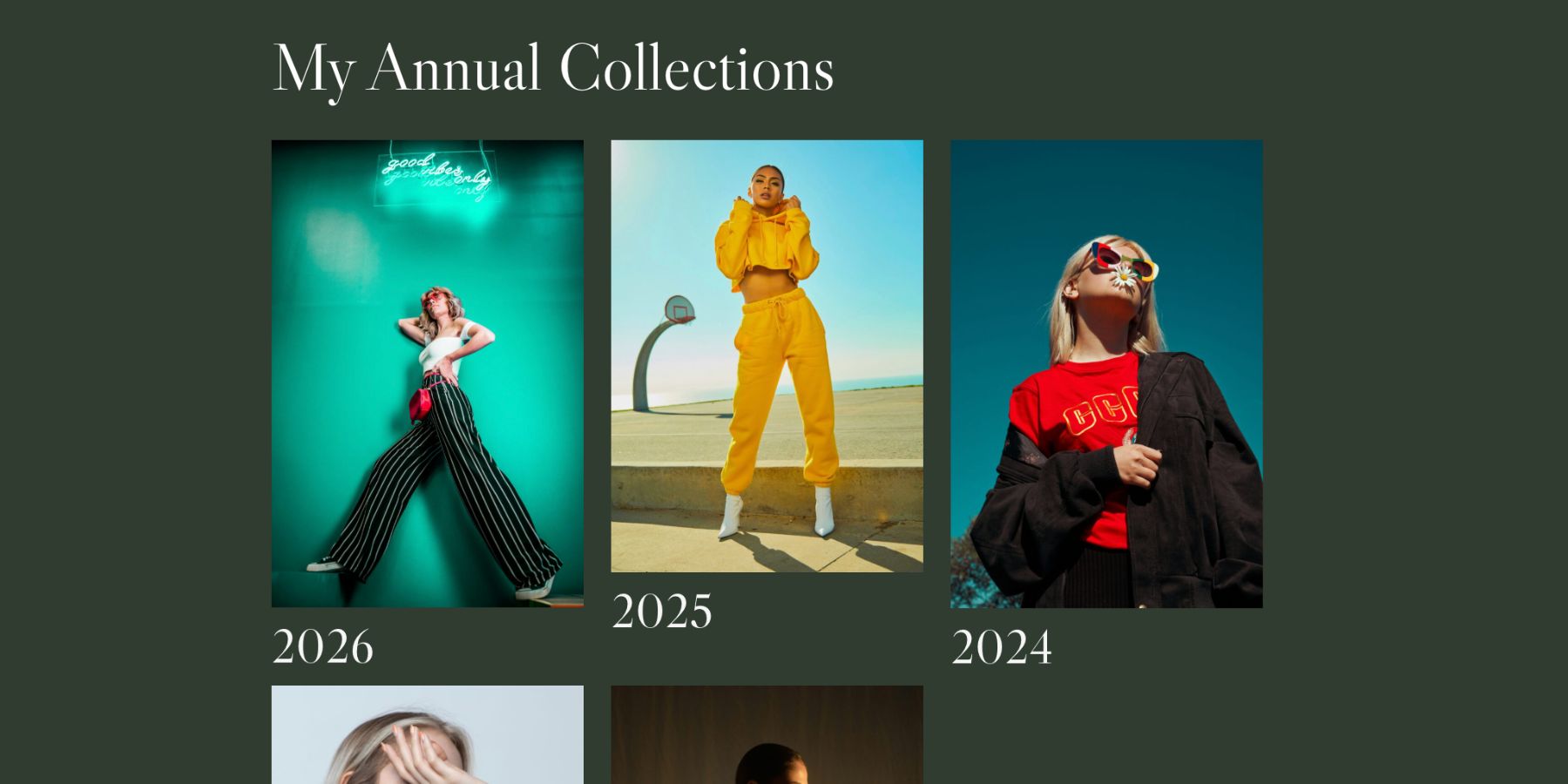
Choose A Portfolio Ratio
The best portfolio ratio should match the type of work being shown. Use these as starting points:
- Graphic design, UX, branding, and web design: Use 3:2 or 4:3. These ratios suit screens, mockups, decks, and brand presentations.
- Fashion and portrait photography: Use 4:5 or 2:3. Taller cards preserve the shape of portrait work.
- Landscape and architecture photography: Use 3:2 or 16:9 when the work needs horizontal space.
- Print and publication design: Use 4:5 or 3:4. These ratios feel closer to covers, posters, and printed layouts.
- Mixed portfolios: Use 1:1. Square is often the most stable choice when projects come in several orientations.
- Video-first portfolios: Use 16:9. It matches video thumbnails and keeps motion work in a familiar frame.
Do not choose a ratio only because it looks tidy in the builder. Choose the shape that helps the work feel intentional.
Set The Ratio In A Portfolio Loop
If you are using Loop Builder to create the portfolio grid, the workflow matches the blog grid. Open the loop template, select the Image module that displays the project image, go to Design > Sizing, and enter the chosen Aspect Ratio.
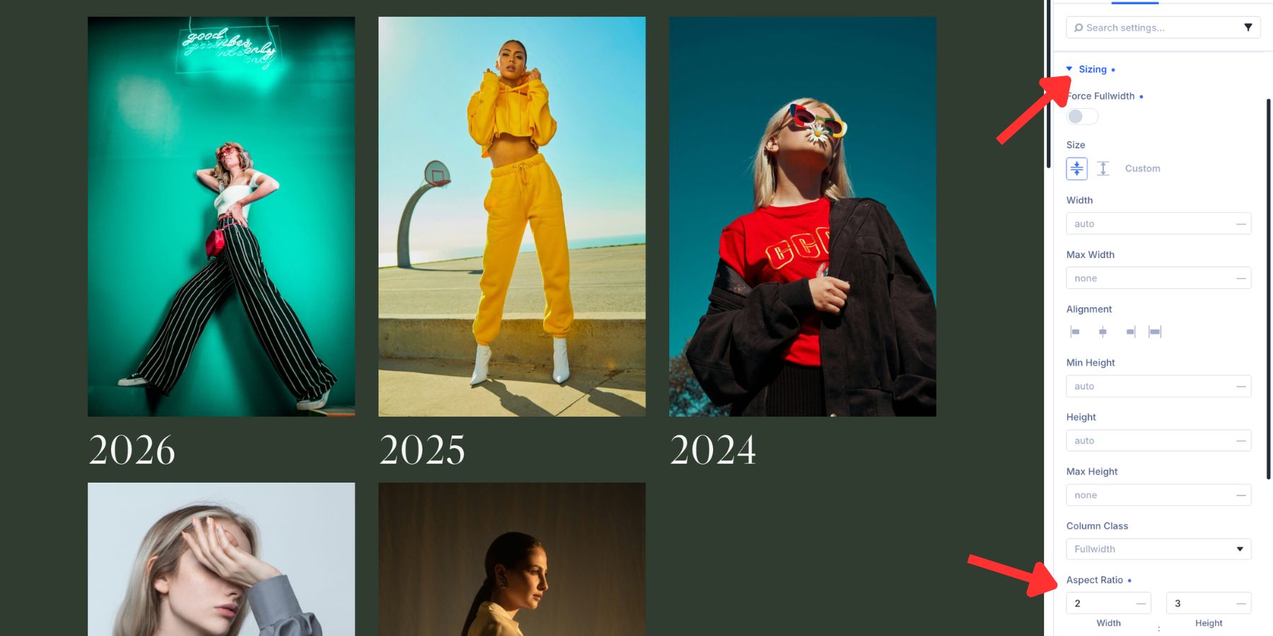
One setting now applies to every project card that uses that loop template.
If you are using a Portfolio module instead of a custom loop, look for the image controls inside the module’s Design tab. In modules where the image is a sub-element, the path is usually Design > Image > Sizing. Set the Aspect Ratio there so the portfolio images follow the same frame.
Adjust Object Position For Portfolio Images
Portfolio images often have deliberate compositions. A fashion image may place the face higher in the frame. An architecture shot may place the building’s weight toward the bottom. A product mockup may need to stay centered.
Object Fit Cover keeps the image proportional, but Object Position decides which part of the crop is protected. Go to Design > Image > Framing, then adjust the position based on the majority of images in the grid.
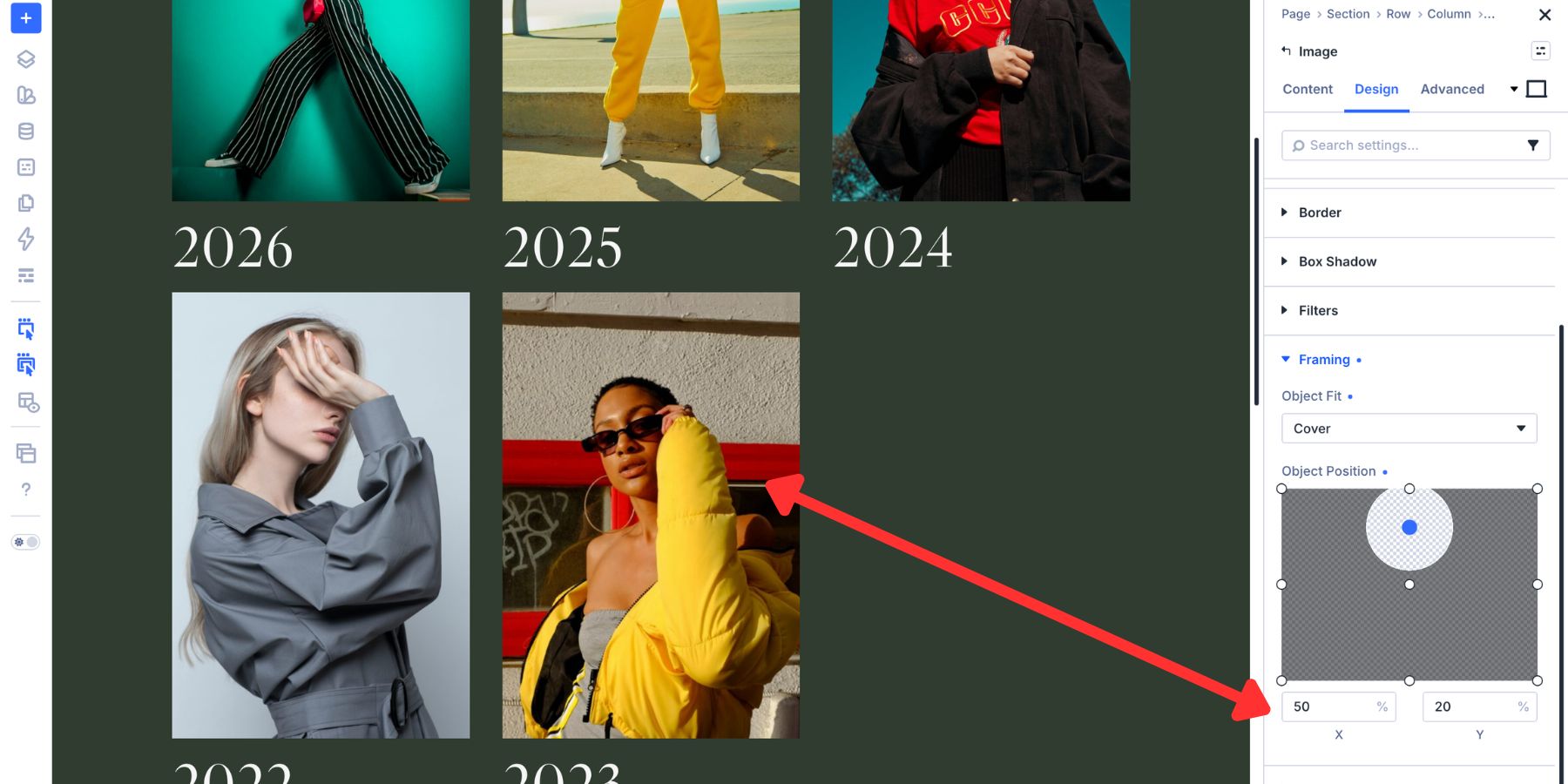
Use Top Center when faces or important details sit near the top. Use Center for balanced mockups, branding work, and general design projects.
Use Bottom Center for interiors, architecture, or product scenes where the visual weight sits lower. Again, this setting applies across the loop. Choose the anchor that protects most images, then fix outliers at the source when needed.
Build Cleaner WooCommerce Product Grids
Product grids are often the hardest to keep consistent because product images come from many places. One product may use a white-background manufacturer image. Another may come from a lifestyle shoot. Another may be a vendor-supplied portrait crop. Without a fixed image shape, the grid can become harder to scan.
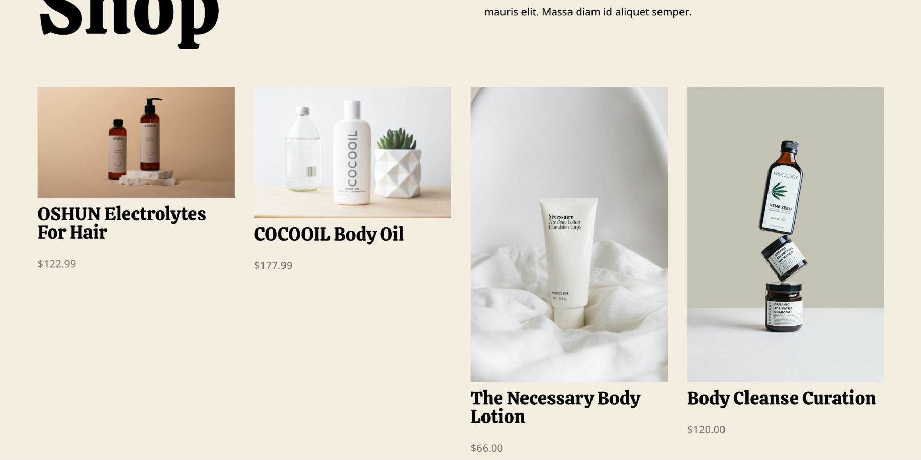
A strong product grid should make comparison easy. Visitors should be able to scan product images, names, prices, and buttons without the card rhythm changing from item to item.
Choose A Product Image Ratio
For product grids, the ratio should follow the product category. Use these as starting points:
- 1:1: A strong default for electronics, home goods, books, accessories, and many white-background catalog images.
- 4:5: Useful for apparel, fashion products, beauty products, and taller product photography.
- 3:4: Good for shoes, bags, bottles, packaged goods, and products that need a little more vertical room.
- 3:2: Useful for wider lifestyle product shots, bundles, furniture, and horizontal compositions.
Square is often safest for broad catalogs, but it is not always best. Apparel and beauty products often benefit from a taller frame because the product shape needs more room.
Apply The Ratio In A Product Loop
If you are building a custom product grid with Loop Builder, set the ratio on the Image module inside the loop template. Open the looping Image module, go to Design > Sizing, and enter the product ratio.
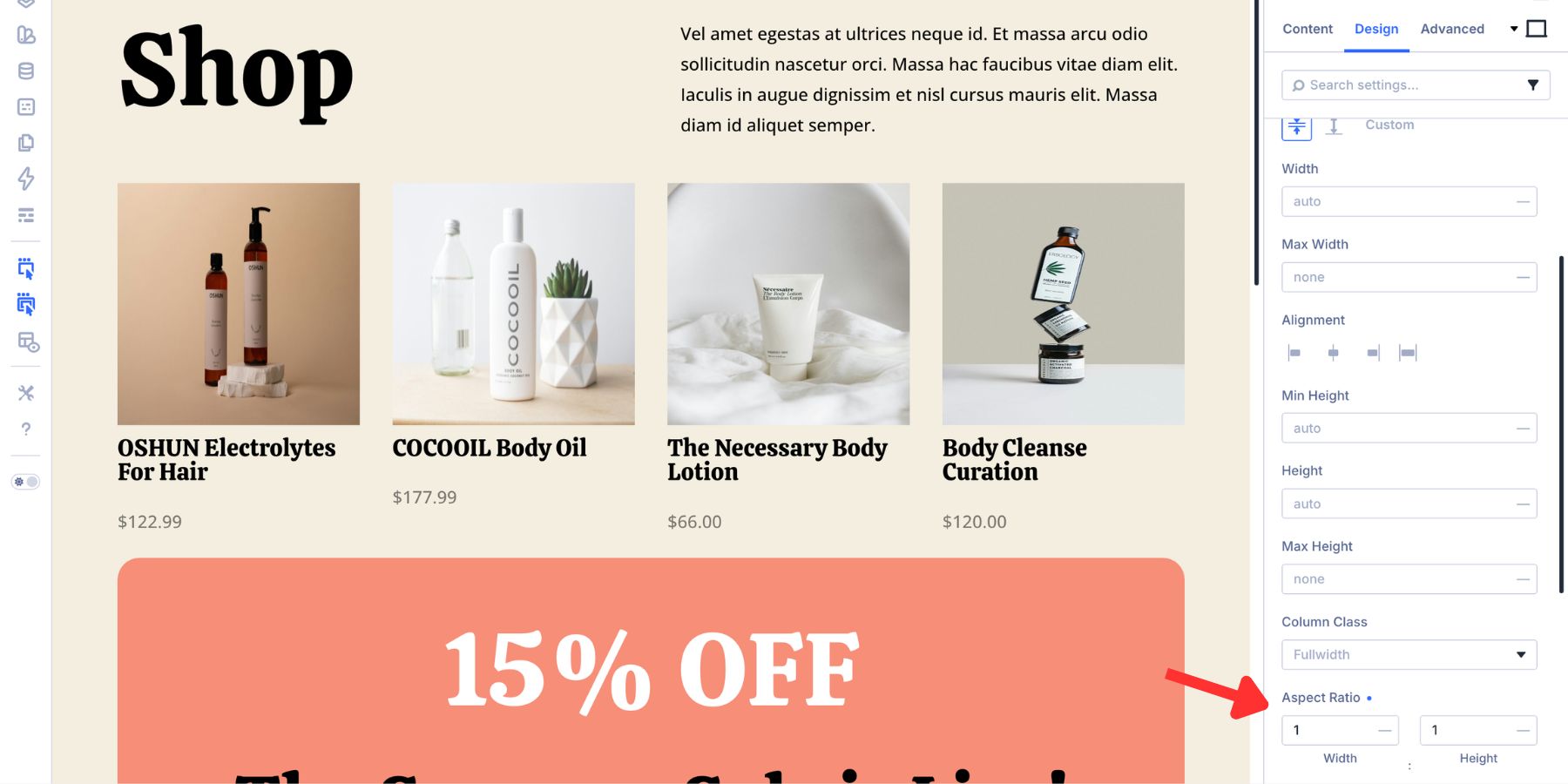
Every product card using that loop template now inherits the same image frame. This gives you the most control because you can design the product card yourself: image, title, price, rating, badge, button, spacing, and hover states.
Apply The Ratio In The Woo Products Module
If you are using the Woo Products module, open the module settings and go to the Design tab. Expand the Image option group, then open Sizing and set the Aspect Ratio for the product images.
This applies one image shape across the product grid generated by the module. The Woo Products module is useful when you want a quicker grid. Loop Builder is better when you need full control over the product card design.
Protect The Product Crop
After setting the ratio, open the product image’s Framing controls and set Object Fit to Cover.
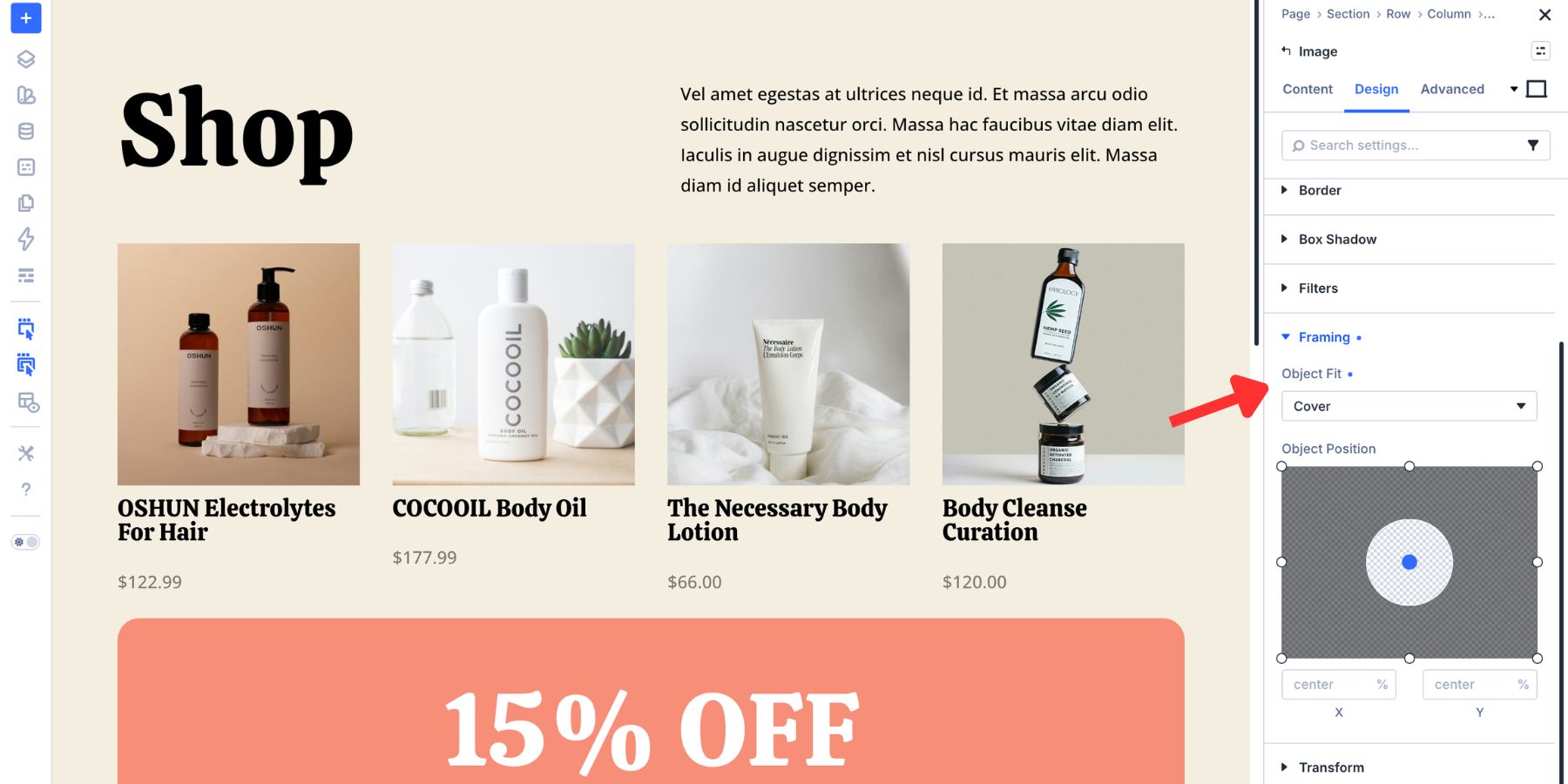
This keeps product photos from stretching. Product grids need a little more care, though. A tight crop can cut off the exact detail that matters: a zipper pull, heel shape, watch face, bottle cap, label, stitched seam, or product edge.
Object Position can help, but it still applies the same crop anchor across the repeated product images. If the catalog is mixed, the best long-term fix is usually to prepare product images with enough padding before they enter the grid. When reshoots are not realistic, Divi AI can help adjust source images. Its Expand and Fill workflow can extend the canvas around a product image so the product fits a new ratio without cutting into the subject.
Once the corrected image is saved back to the Media Library, any grid pulling that image can use the improved source.
Best Practices For Better Grid Ratios
Aspect Ratio is simple, but the strongest results come from using it consistently. Use these habits when building blog, portfolio, and product grids.
- Choose one ratio per grid. Mixing ratios inside the same grid usually brings the inconsistency back.
- Set the ratio inside the loop template. For dynamic grids, the loop template is where one decision can reach every repeated card.
- Pair Aspect Ratio with Object Fit Cover. The ratio defines the frame, and Cover prevents stretching.
- Use Object Position as a broad rule. It works best when most images share a similar composition.
- Fix outliers at the image level. If one image needs a different crop, edit the source image instead of weakening the whole grid.
- Match the ratio to the content type. Blog grids, portfolio grids, and product grids do not always need the same shape.
- Check responsive views. A ratio that looks perfect in a three-column desktop grid may feel too tall or too shallow on mobile.
- Save repeated image styling as a preset. If the same image ratio, framing, border, and shadow treatment repeat across the site, use an Image Option Group Preset.
The goal is not to force every image into the same crop everywhere. The goal is to make each grid feel like it was designed on purpose.
Try Out Aspect Ratio In Divi 5 Today!
A featured image, portfolio thumbnail, or product photo can arrive in almost any shape. Without a layout rule, each upload gets to influence the grid. Aspect Ratio gives that control back to the design.
Set the image frame once, pair it with the right Object Fit, and every card follows the same visual structure. Use Loop Builder when you want one template to control repeated blog, portfolio, or product cards. Use Woo Products when you want a quick product grid with consistent image styling.
The result is simple but important: cleaner rows, steadier cards, fewer distorted images, and grids that keep their shape as new content is added. Open Divi 5, choose a ratio that fits the content, and let the grid hold the line.










Leave A Reply