")
Divi 5’s new menu tools let you build navigation from smaller, more flexible pieces instead of relying on one all-in-one menu module.
That matters most on responsive sites. A desktop header, dropdown menu, and mobile overlay do not always need the same structure. With the Link module, Dropdown module, Menu Loops, Canvases, and Interactions, you can build each version of the menu in the way that fits the screen.
In this post, we will build a responsive Divi 5 menu from start to finish. The desktop version uses looped menu links and optional dropdowns. The mobile version uses a separate Canvas that opens and closes with Interactions.
- 1 Divi 5’s New Menu Building Features
- 2 How To Create A Responsive Menu In Divi 5
- 3 Optional: Add Dropdowns To The Desktop Menu
-
4
Make The Menu Responsive With A Mobile Canvas
- 4.1 Step 1: Hide Desktop-Only Header Elements On Smaller Screens
- 4.2 Step 2: Add A Mobile Menu Canvas
- 4.3 Step 3: Set Up The Mobile Menu Section
- 4.4 Step 4: Add Mobile Menu Items
- 4.5 Step 5: Add A Close Button
- 4.6 Step 6: Position The Mobile Menu As An Overlay
- 4.7 Step 7: Add Dropdown Cards For Mobile
- 4.8 Step 8: Add The Close Interaction
- 4.9 Step 9: Add The Hamburger Trigger
- 5 Responsive Menu Best Practices
- 6 Create Responsive Menus In Divi 5 Today!
Responsive menus in Divi 5 are built from a set of focused tools. Each one handles a different part of the navigation workflow.
The Link module handles individual menu items. The Dropdown module handles flyouts and mega-menu panels. Menu Loops keep links connected to WordPress menus. Canvases hold off-canvas mobile menus. Interactions control how those hidden menus open and close.
The Link Module
The Link module lets you add a single customizable link anywhere in your layout. You can use it as a standalone navigation item, connect it to dynamic content, or pair it with a Menu Loop so one styled link repeats for each item in a WordPress menu.
In this post, we will use the Link module as the foundation for the desktop and mobile menu links.
When a Link module is connected to a Menu query, Divi can pull in the current menu item text and URL. That keeps the menu connected to Appearance > Menus, so future menu changes do not require rebuilding the header.
The Dropdown Module
The Dropdown module lets you add a submenu or mega-menu panel inside a parent element.
Place it under a parent Link module, then choose whether it opens on hover or click. The dropdown content is flexible. You can add a simple stack of links, or build a richer panel with rows, columns, images, text, icons, buttons, and other modules.
This gives you more control than a standard dropdown menu. You are not limited to a plain list of links.
Canvases
A Canvas is a detached workspace in Divi 5. You can build content on a Canvas the same way you build anywhere else in Divi, using sections, rows, columns, and modules. The difference is that the Canvas can stay separate from the Main Canvas while you work.
This makes Canvases useful for mobile menus, off-canvas panels, popups, and mega menus. The header stays clean, while the menu layout gets its own dedicated workspace. You can manage Canvases from the Canvas dropdown at the top of the Visual Builder. From there, you can add a Canvas, switch between Canvases, open Canvas Grid View, duplicate a Canvas, export it, or delete it.
Interactions
Interactions control behavior in Divi 5. Every Interaction has three main parts:
- Trigger Event: What starts the Interaction, such as a click, hover, page load, viewport event, or breakpoint change.
- Effect Action: What happens after the trigger fires, such as showing an element, hiding an element, toggling visibility, applying a preset, or changing an attribute.
- Target Module: The element affected by the action.
For this menu, Interactions will handle the mobile overlay. A hamburger icon will show the mobile menu Canvas, and a close icon inside that Canvas will hide it again.
Breakpoint triggers also help here. You can make sure mobile-specific behavior runs only on the screen sizes where that menu exists.
Now let’s build the menu. The workflow starts in the Theme Builder. We will create a global header, build the desktop navigation, add dropdowns when needed, and then create a mobile menu on a separate Canvas.
Step 1: Open The Theme Builder
Go to your WordPress dashboard and open Divi > Theme Builder. Find the default website template, click Add Global Header, then choose Build Global Header. Divi opens the Visual Builder for the header template.
Using the Theme Builder keeps the navigation in one reusable template. That way, the responsive menu can appear across your site instead of being rebuilt page by page.
Divi 5 also lets you work with editable template areas directly alongside page content. That can be useful when you already built part of a header or footer on a page and want to move it into a template.
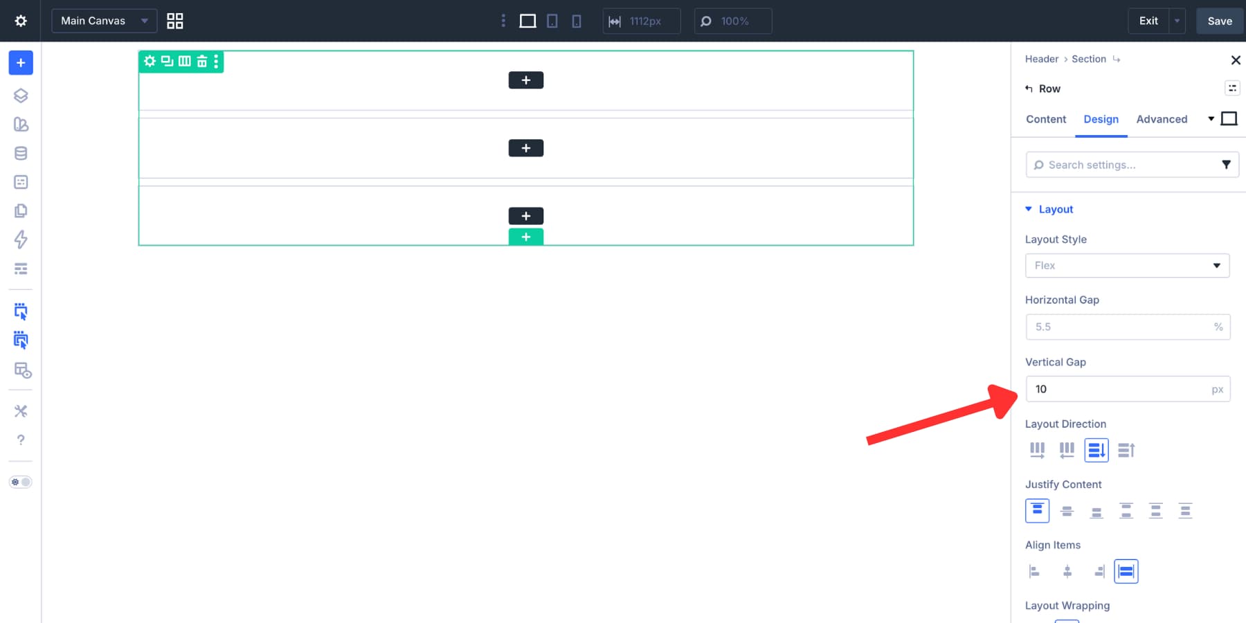
Step 2: Build The Header Structure
When the Visual Builder opens, Divi can show starter Flexbox templates. For this example, start with a multi-row header structure. We used a two-row layout, then duplicated one row to create three stacked rows:
- Row 1: Announcement bar.
- Row 2: Logo and call-to-action button.
- Row 3: Desktop menu links.
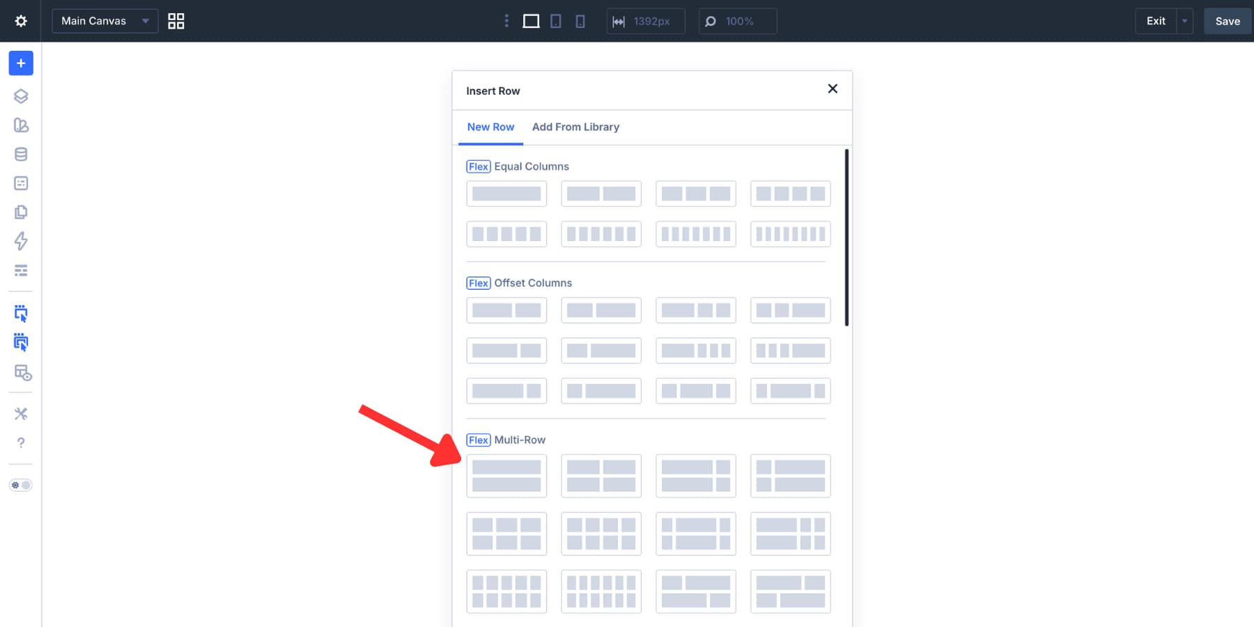
This build uses a centered header style. It works well for minimal, editorial, portfolio, and boutique-style websites. A left-aligned logo with navigation on the right is also a good option. The same Divi 5 menu features work either way.
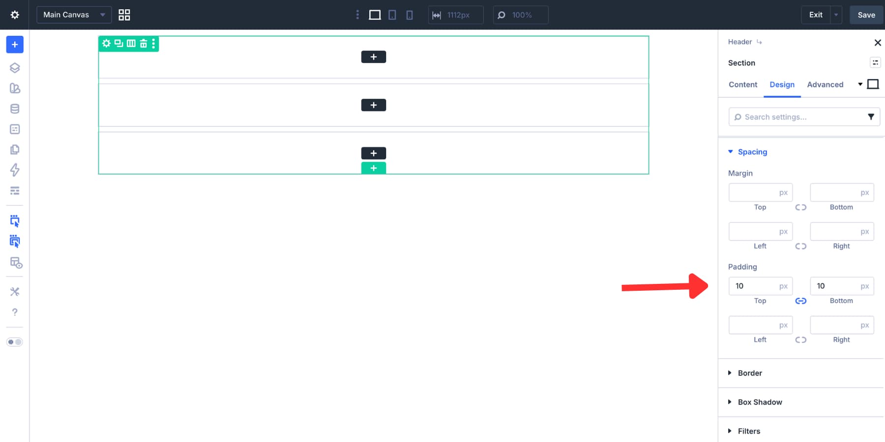
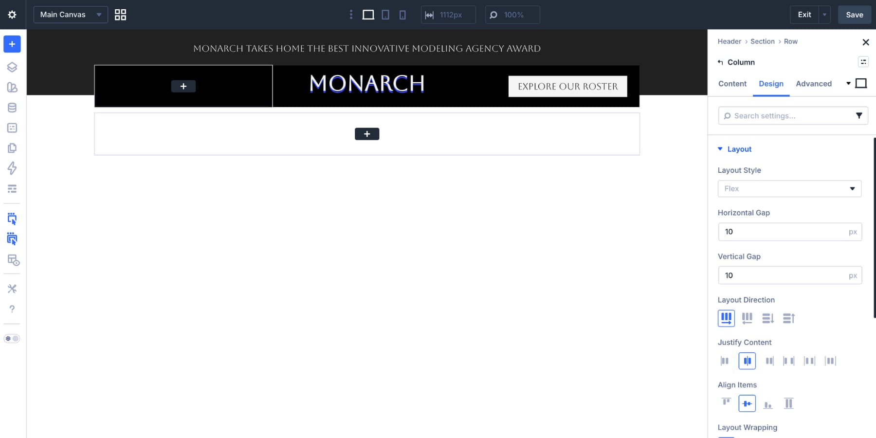
Open the header section’s layout settings. Set the layout direction to Column, then add a 10px vertical gap between rows.
Next, add 10px of top and bottom padding to the section. This keeps the header compact without feeling cramped.
If you want a faster starting point, you can also use our free 20 Flexbox header layouts pack.
Before adding the header modules, set the section background. In this example, we used a gradient that moves from a dark neutral Design Variable to transparent, with both color stops set to 50%.
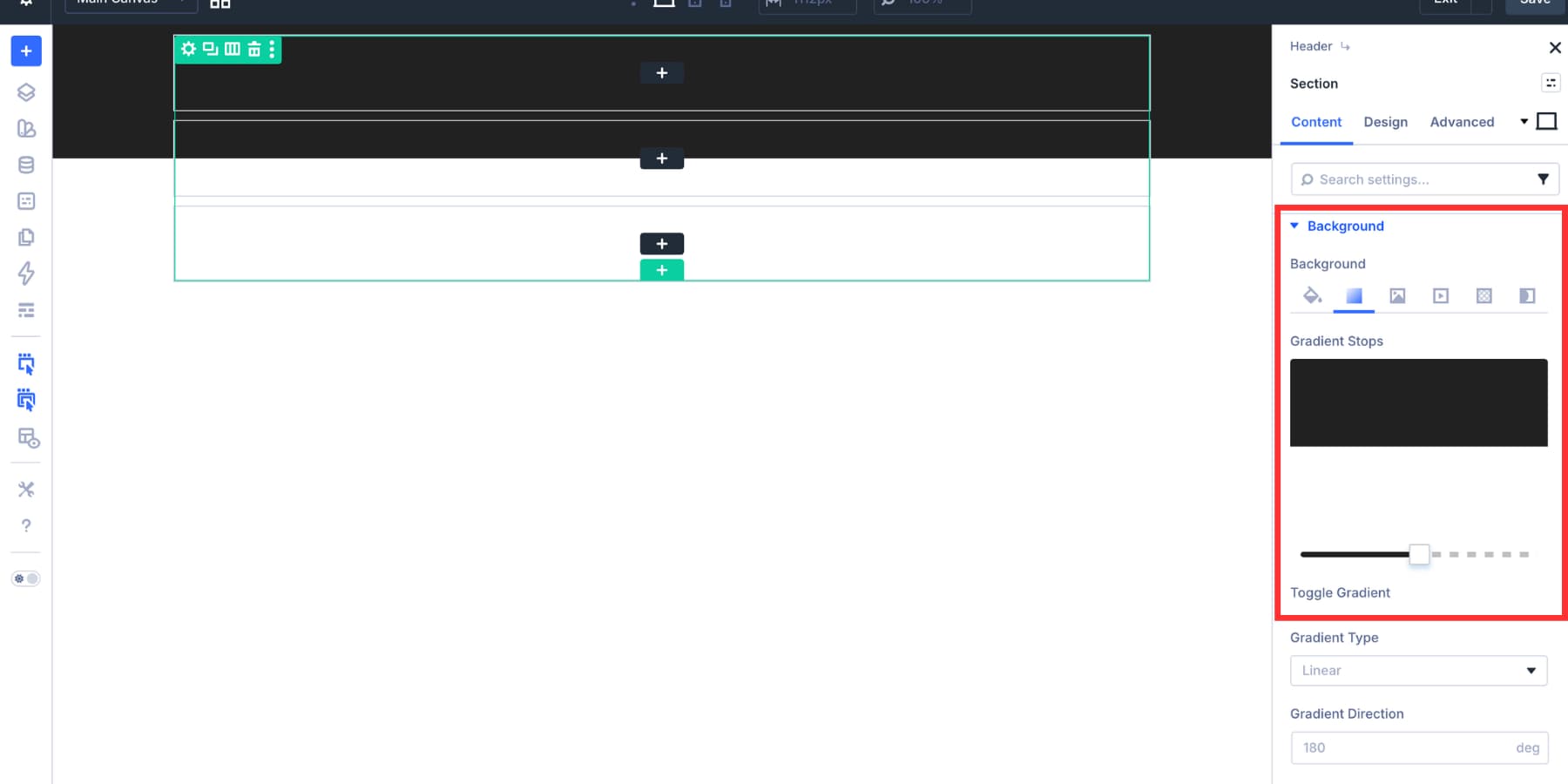
That clean color break helps the middle row feel lifted from the rest of the header.
Step 3: Add The Announcement Bar
The first row is a simple announcement bar. Use a single-column row. Set the column alignment and justification to center, then add a Text module. Keep the announcement short. It should support the header, not compete with the menu.
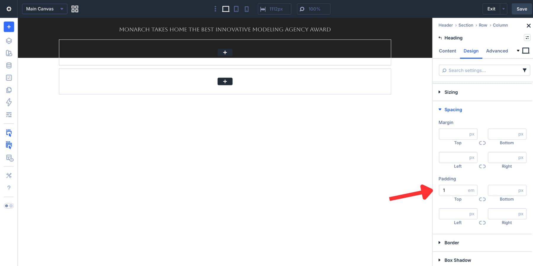
Use your brand font and a color variable from your design system. A smaller font size usually works best here. Set the top padding to 1em. In this example, the text line height handles most of the lower spacing, which keeps the announcement bar compact.
The second row holds the logo and call-to-action button. Add a nested row with three columns. Set the row and its columns to use a horizontal layout so the columns sit side by side. Add a 10px gap between columns, then align and justify the contents to center.
In this example, the first column acts as visual spacing. The second column holds the logo. The third column holds the CTA button. Add a background color to the parent column or row so the middle header area stands apart from the surrounding section.
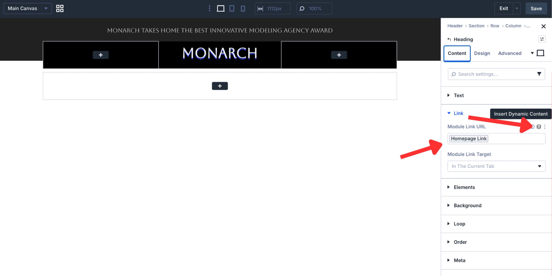
For the logo, add an Image module and link it to the homepage. A dynamic home URL works well because it keeps the logo link connected to your site setup.
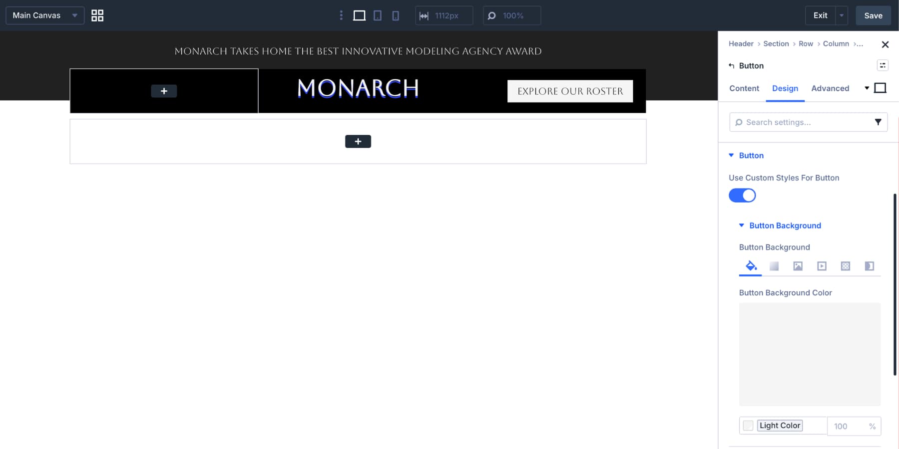
In the third column, add a Button module. Use the Design tab to style the button color, font, border radius, and spacing. For this layout, we used a light button background with dark text so it stands out against the darker header row.
The third row is where the desktop navigation lives. Open the row’s Design tab and set Layout Direction to Row. This keeps menu items side by side rather than stacked vertically. Add a 10px gap and a subtle box shadow to help the menu row feel separate from the rest of the header.
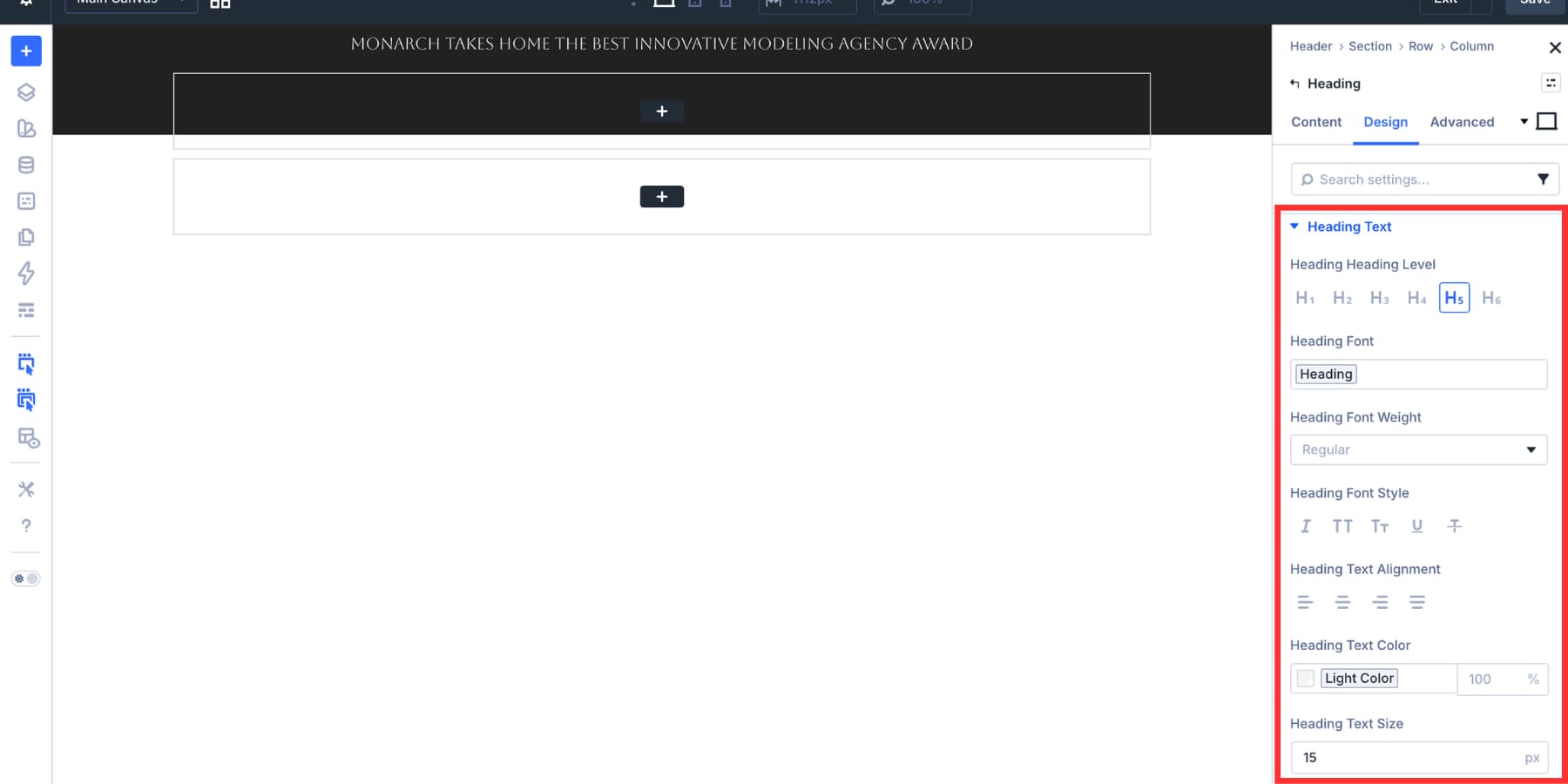
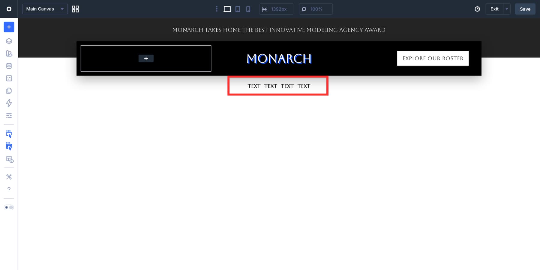
Add a Link module inside the row. Style the font, size, color, hover state, and spacing to match your header design. The text can remain temporary until the menu loop is connected.
Enable The Menu Loop
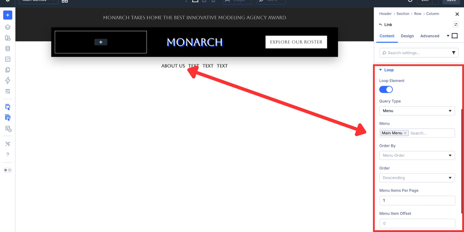
Open the Link module’s Content tab and enable Loop Element. Set Query Type to Menu, then choose the WordPress menu you want to display.
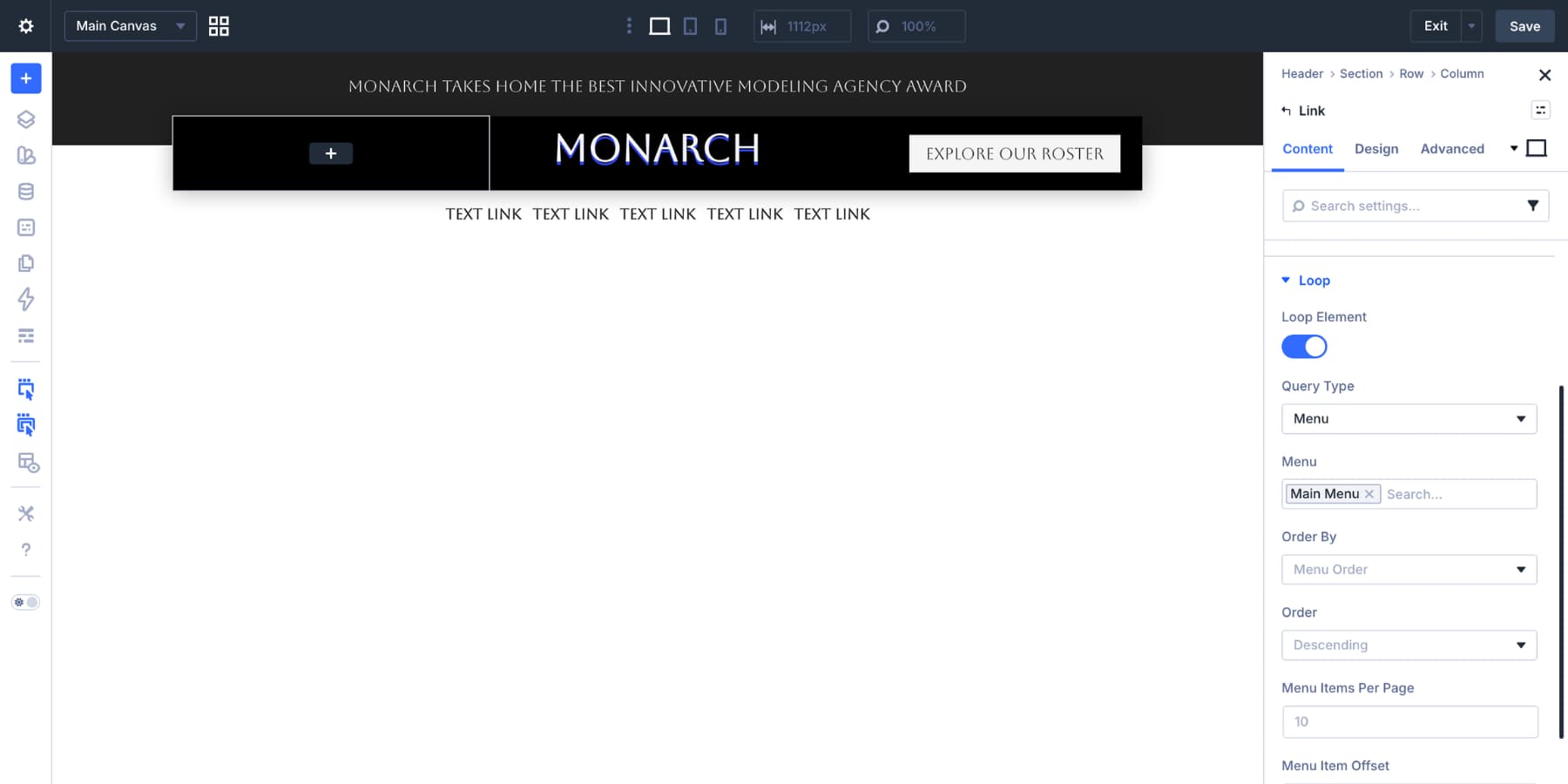
Most navigation menus can use the default loop settings. Still, these options are useful when you need more control:
- Order By: Controls how menu items are sorted.
- Order: Controls ascending or descending order.
- Menu Items Per Page: Limits how many menu items the loop renders.
- Menu Item Offset: Skips a set number of menu items from the start.
For a simple desktop nav, leave the defaults in place.
Connect The Labels And Links
After the loop starts running, you may see the same placeholder label repeated across the menu. That happens because the text is still static. Open the Link module’s URL field and click the dynamic content icon. Choose Loop Menu Link so each repeated link gets its correct destination.
Then open the label or text field and choose Loop Menu Text. Now each repeated item uses the correct menu label.
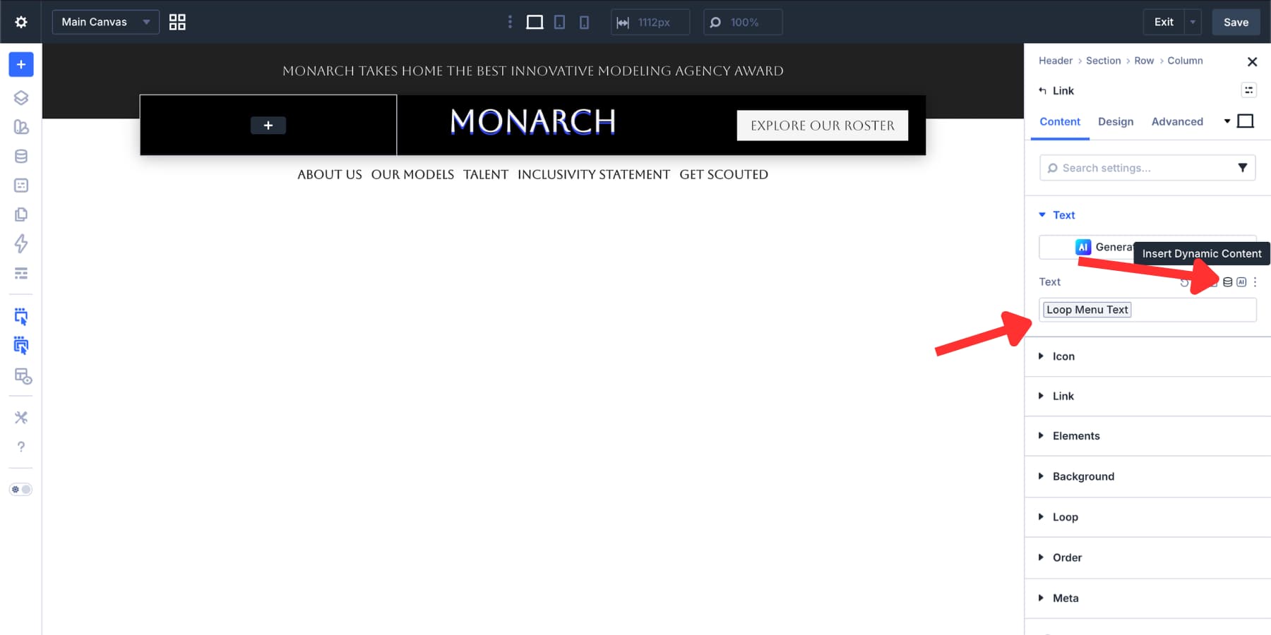
From now on, changes in Appearance > Menus can flow into the header without editing each menu item in the Visual Builder.
A flat looped menu works well for simple navigation. For larger sites, you may want some items to open dropdowns or mega-menu panels. The setup needs a little planning.
If you place the same Dropdown module inside one fully looped Link module, the dropdown can repeat across every item. That is useful only if every menu item needs the same dropdown structure. For mixed navigation, use separate segments. Keep simple items in menu loops, then add static Link modules for the items that need custom dropdown content.
Start by sketching the menu structure. For this example:
- Item 1 is a looped menu link.
- Items 2 and 3 are static Link modules with Dropdown modules inside.
- Items 4 and 5 return to a looped menu segment.
This setup gives you the benefits of a dynamic WordPress menu while still allowing custom dropdown panels for specific items. In WordPress, remove the planned dropdown items from the menu used by the loop, or create a separate WordPress menu that contains only the flat links. This prevents the same items from appearing twice.
Back in the builder, turn off the loop on the existing Link module. Duplicate the Link module until you have the number of menu positions you need. For this five-item example, you will use four Link modules:
- One looped Link module for the first flat item.
- Two static Link modules for dropdown items.
- One looped Link module for the remaining flat items.
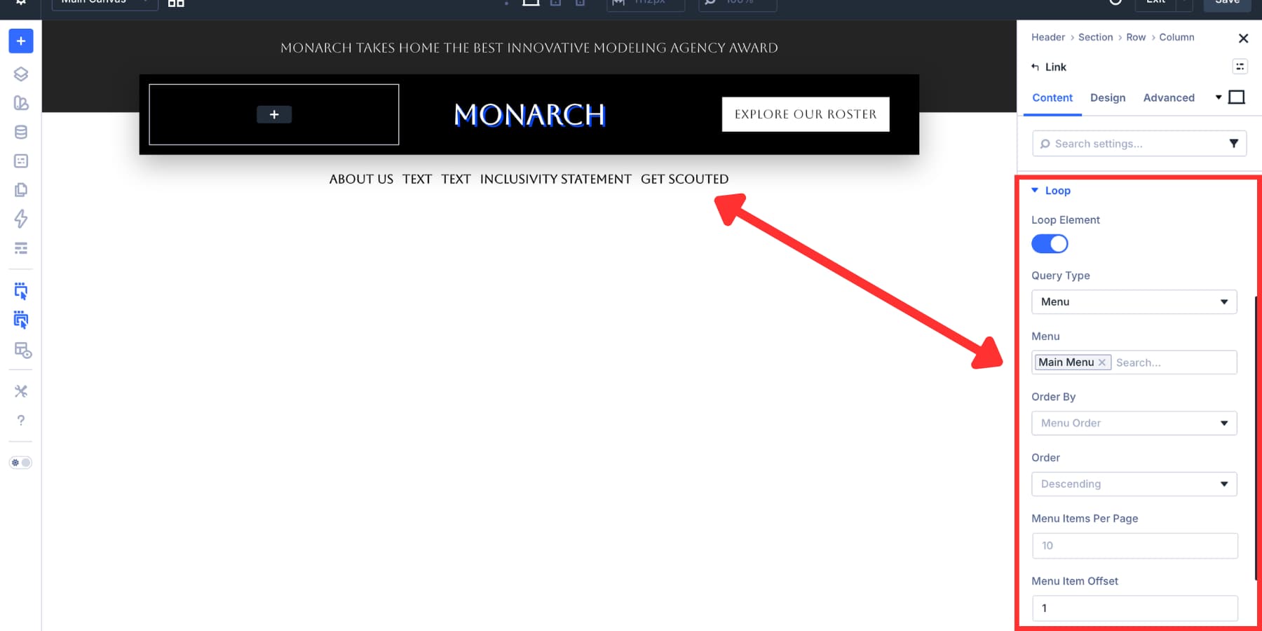
On the first Link module, enable the menu loop again. Set Menu Items Per Page to 1 so it only shows the first flat item.
Leave the second and third Link modules static. Those will become dropdown triggers. In the fourth Link module, enable the same menu loop and use Menu Item Offset to skip the items that have already been displayed. Adjust the offset and item count to match your exact menu structure.
Another option is to create two separate WordPress menus and assign each one to its own looped Link module. That avoids offset math, but it does mean managing more than one menu in WordPress.
Add The Dropdown Module
Select one of the static Link modules. In the Content tab, open the Elements area and click Add Element. Search for Dropdown and add the Dropdown module as a child element.
The Dropdown module starts as an empty container. Add simple links for a standard submenu, or build a richer mega-menu panel with rows, columns, images, headings, and buttons. In the Content tab, use the Background settings to add a color, gradient, image, pattern, or video background.
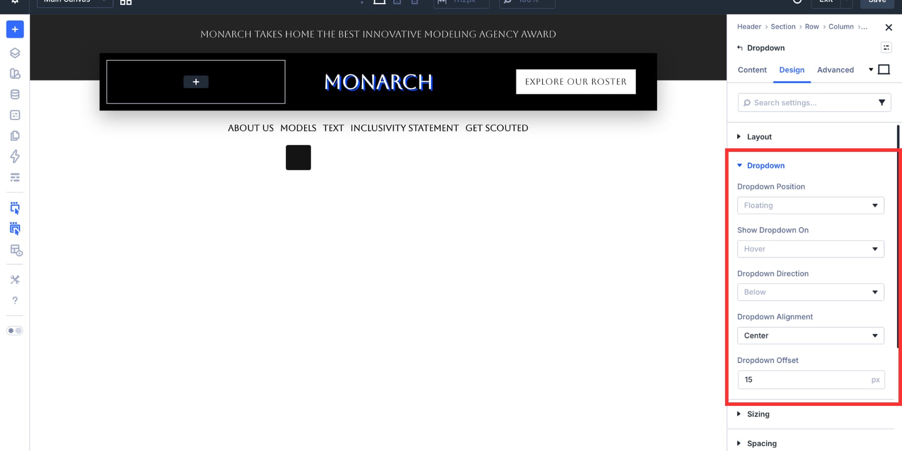
Next, open the Dropdown module’s Design tab and find the Dropdown settings. Useful options include:
- Dropdown Position: Choose whether the dropdown floats over the page or appears inline.
- Show Dropdown On: Choose hover or click behavior.
- Dropdown Direction: Choose whether the panel opens above, below, left, or right of the parent.
- Dropdown Alignment: Align the panel to the start, center, or end of the parent.
- Dropdown Offset: Set the gap between the parent and the dropdown panel.
For this desktop build, we used Floating, Hover, Below, Center, and a 15px offset.
Build The Dropdown Content
Inside the Dropdown module, add a three-column row. Place an image at the top of each column and a short heading below it. Adjust the horizontal and vertical gaps in the row and column Layout settings so the dropdown content feels balanced.
In each column’s Design tab, add a subtle border using a Design Variable. Once the first card looks right, duplicate it for the remaining columns.
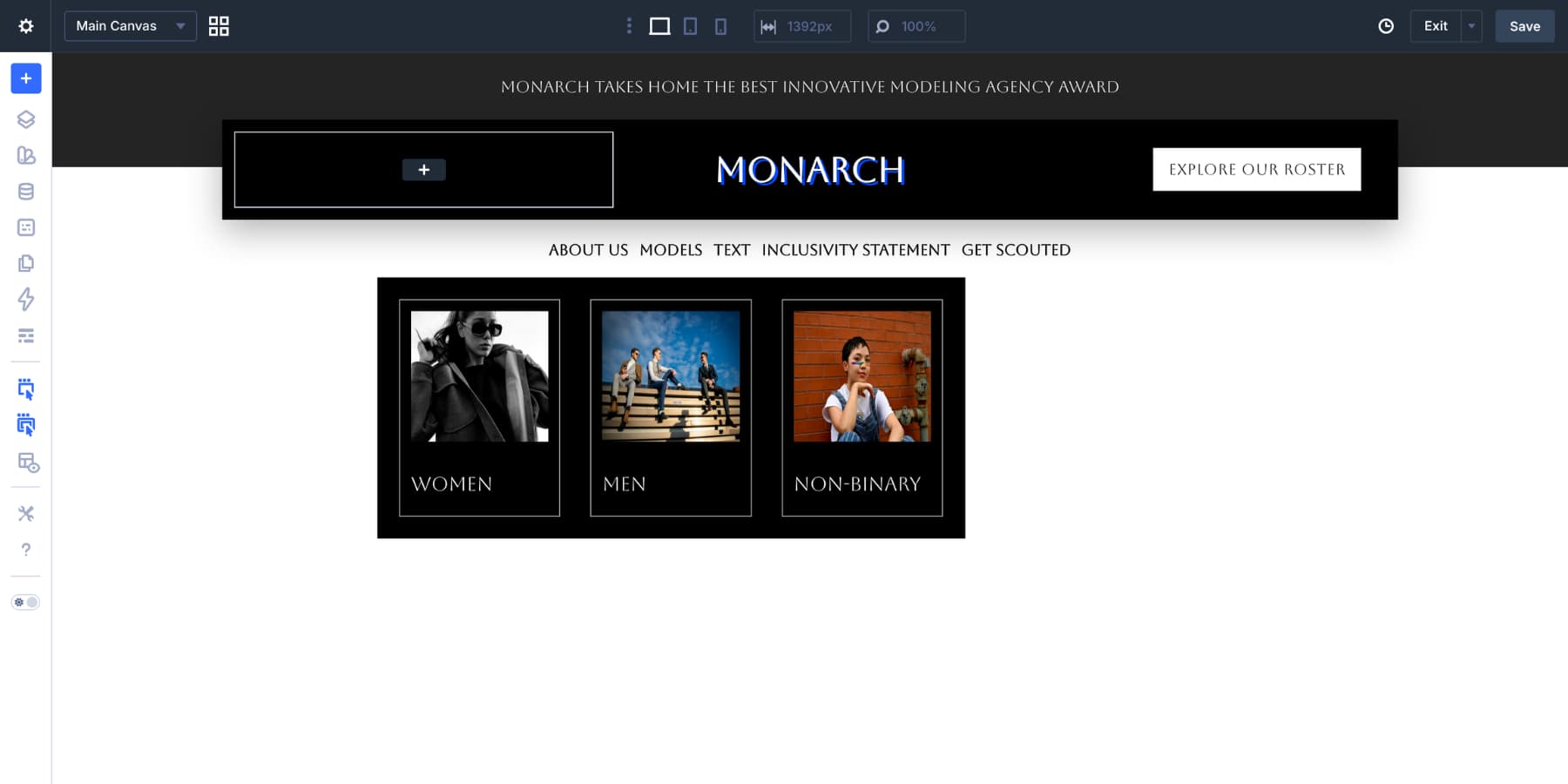
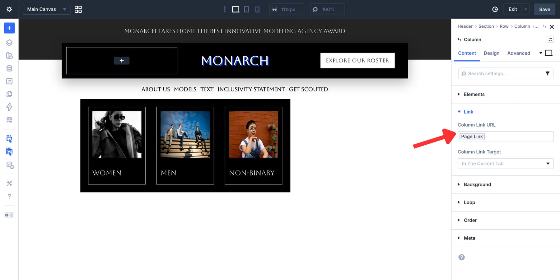
To make the full column clickable, open the column settings. In the Content tab, add the destination to the Column Link URL field.
From there, style the spacing, border radius, shadows, and hover states until the dropdown matches your header design.
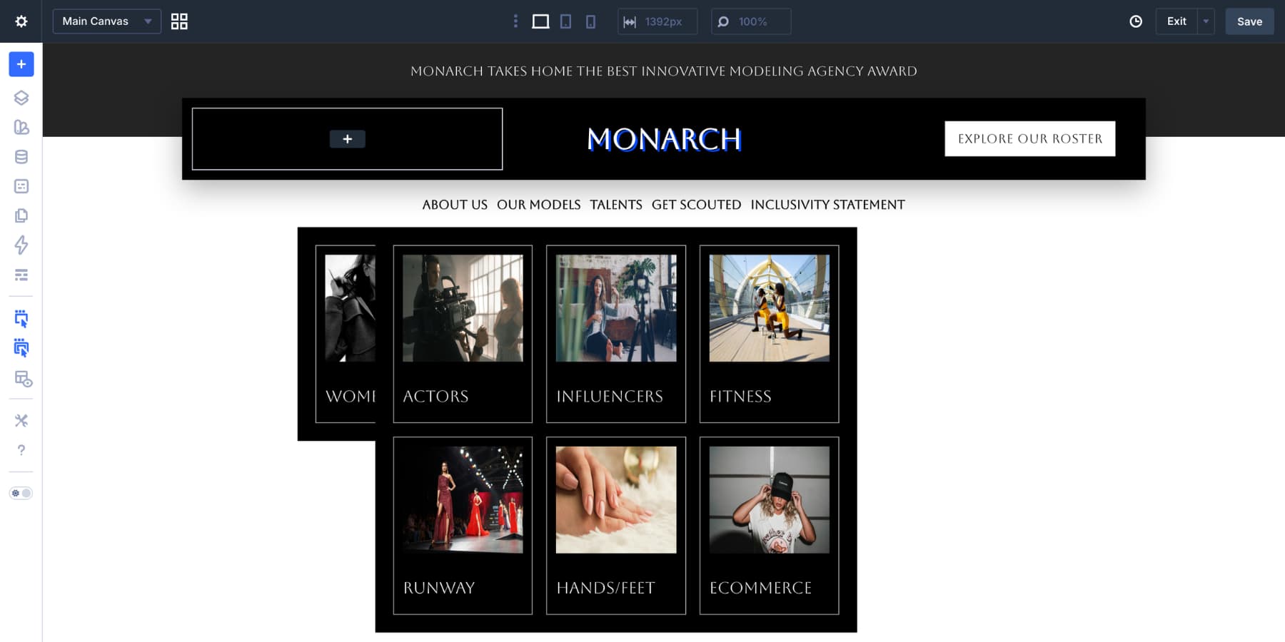
Repeat the same process for the second static menu item. At this point, the desktop menu has dynamic flat links and custom dropdown panels.
The desktop menu is complete, but a wide dropdown layout can feel cramped on tablets and phones. For smaller screens, we will use a separate Canvas. This lets the mobile menu use a vertical layout, larger tap targets, click-based dropdowns, and a full-screen overlay without forcing the desktop header to change.
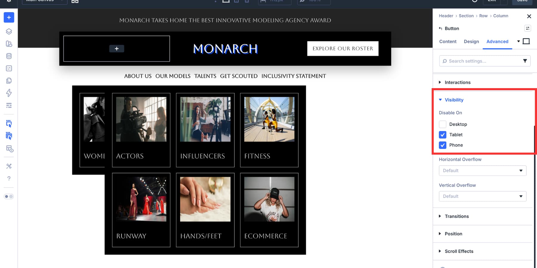
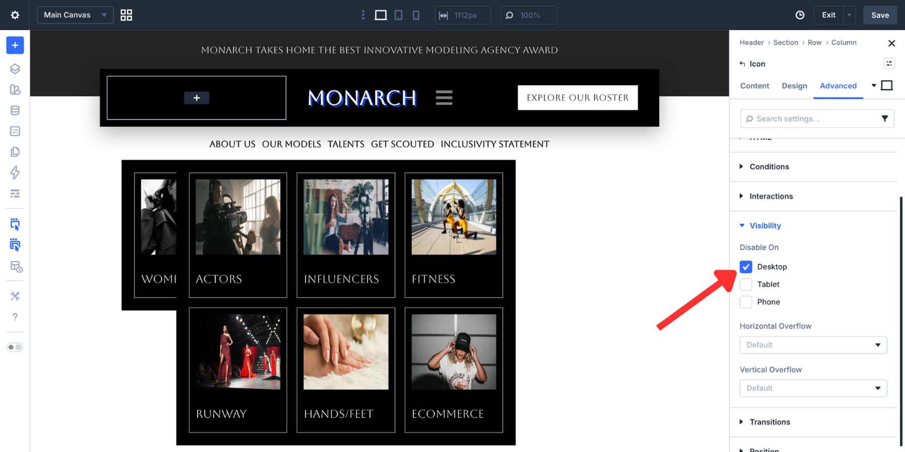
Step 1: Hide Desktop-Only Header Elements On Smaller Screens
Before building the mobile Canvas, hide the desktop-only parts of the header on tablet and mobile. In this example, the first and third columns in the logo row are hidden on smaller screens. That leaves the logo visible while removing the desktop CTA and spacing column.
Go to Advanced > Visibility for the elements you want to hide, then disable them on tablet and mobile. Use your custom breakpoints if your site needs more precise control.
Open the Canvas dropdown at the top of the Visual Builder and choose Add Canvas.
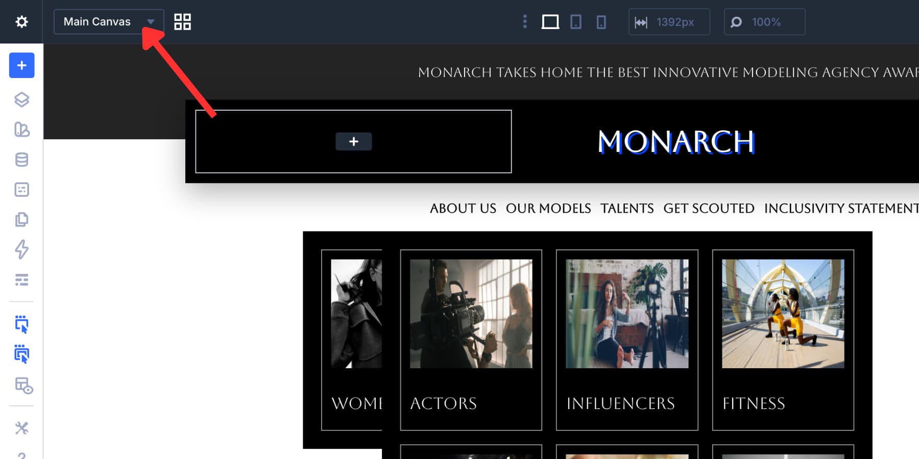
Name the Canvas Mobile Menu. If this header will be used across the site, enable Make Global. If the menu only belongs to one template, you can keep it local.
Leave the Canvas detached so it stays out of the Main Canvas while you build. If your Canvas settings include a z-index field, give it a high value so the menu can appear above the header and page content when opened.
Click Add Canvas. Divi opens the new Canvas workspace.
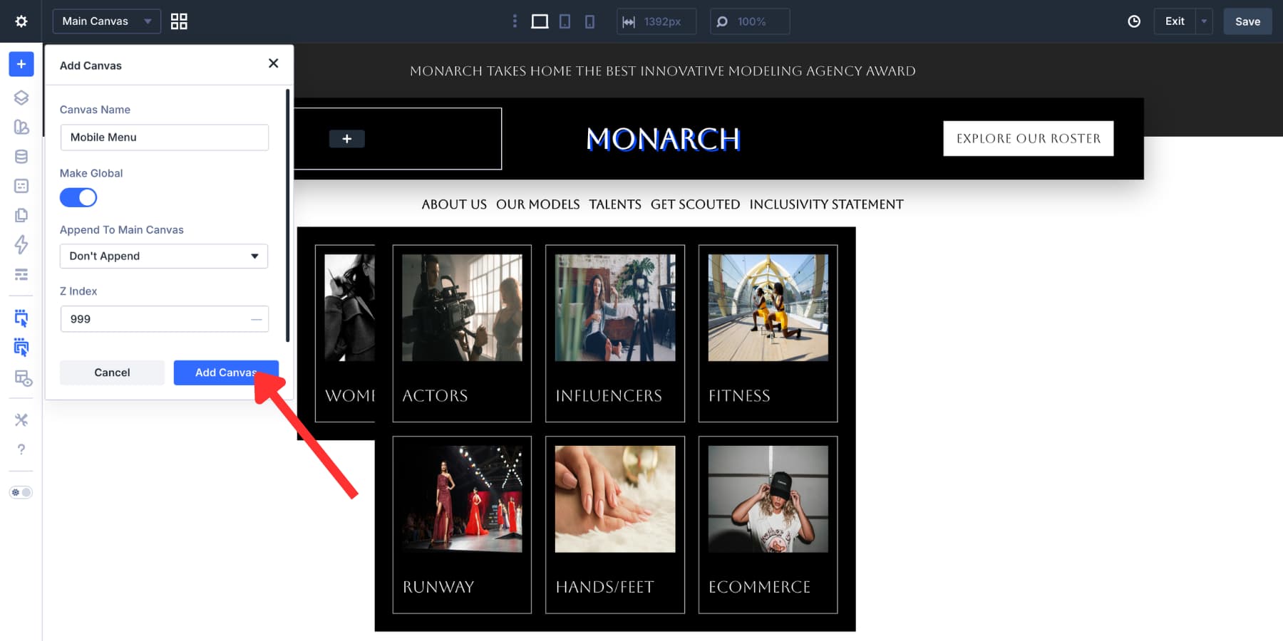
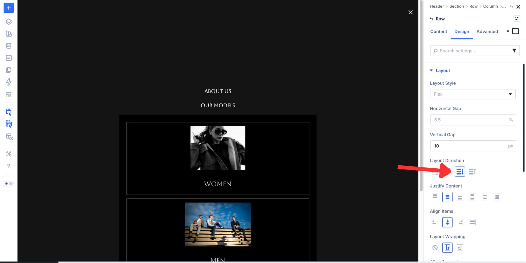
Inside the Mobile Menu Canvas, add or select the main Section and Row. The Section acts as the full-screen overlay. The Row and Column control how the menu content sits inside that overlay.
Open the Section’s Meta option group and give it a clear Element Label, such as Mobile Menu Section. This label makes the Section easier to find later when you create Interactions.
Style The Section
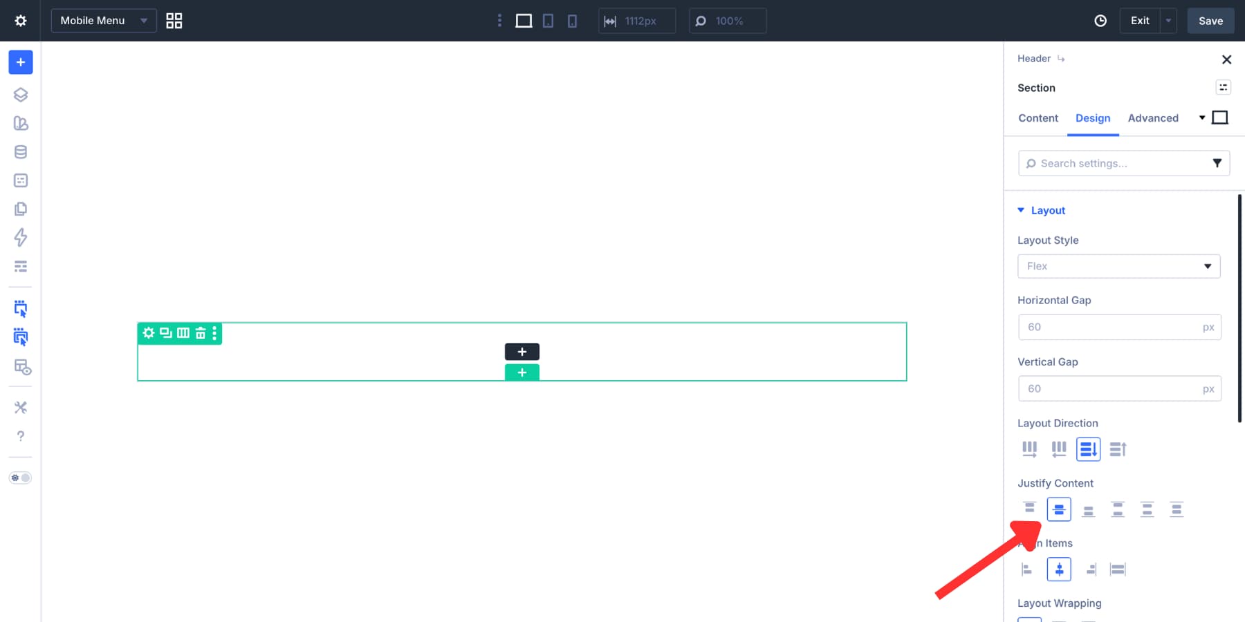
Open the Section’s Design tab. In the Layout settings, set Justify Content to Center.
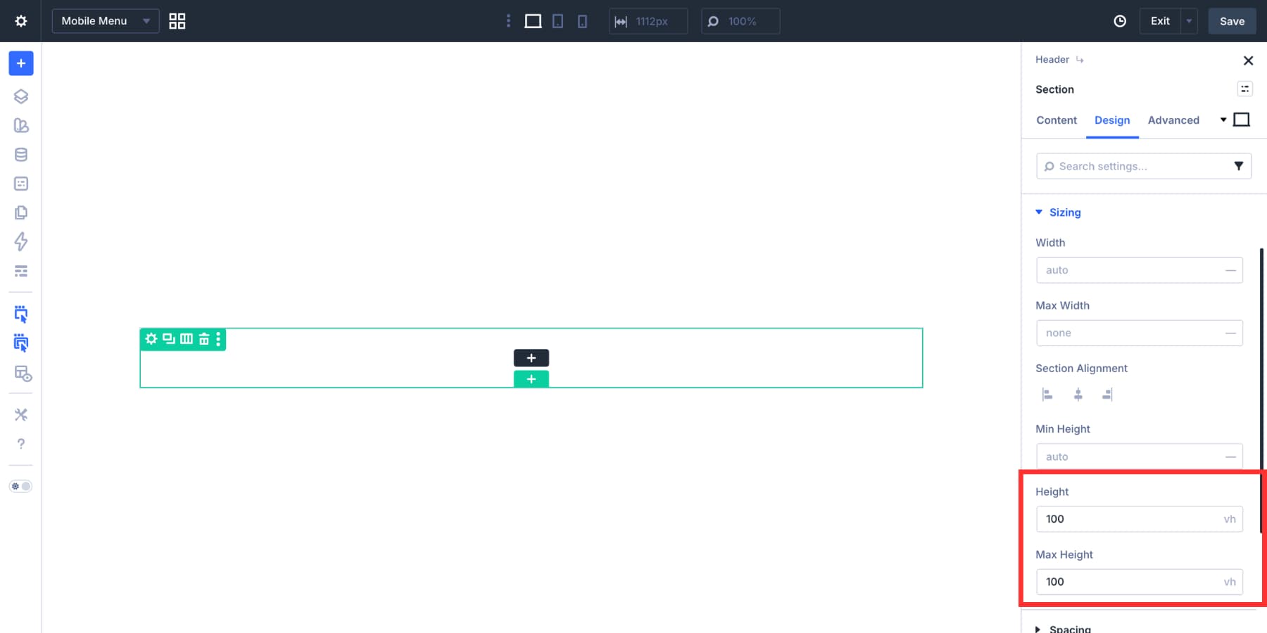
In the Sizing settings, set Height and Max Height to 100vh so the menu fills the viewport.
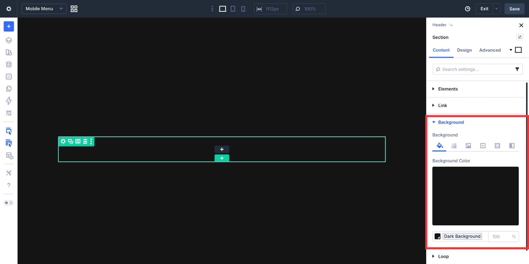
Add a dark background color to the Section. Use a Design Variable if you already have a dark neutral in your color system.
Next, open the Column settings inside the Row. In the Design tab, go to Layout and set:
- Layout Direction: Column
- Justify Content: Center
- Align Items: Center
- Vertical Gap: 15px
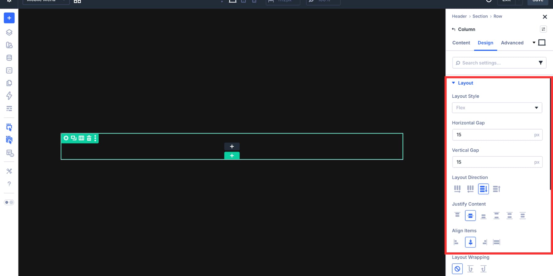
This creates a centered vertical stack for the mobile menu.
Add Link modules to the mobile menu column. You can reuse the same menu loop workflow from the desktop menu. Connect the URL field to Loop Menu Link and the label to Loop Menu Text.
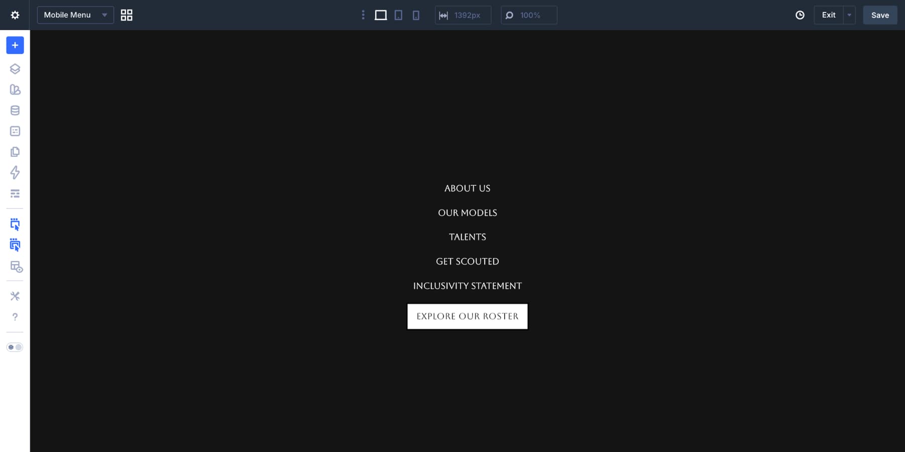
The difference is in the layout. On mobile, the links run vertically and can use larger spacing to make them easier to tap. Copy the CTA button from the desktop header if you want it to appear in the mobile menu too. Paste it below the menu links, then remove any visibility setting that would hide it on tablet or mobile.
The mobile overlay needs a clear way to close. Add an Icon module to the Canvas and choose a close or X icon. Style the icon to contrast with the dark background.
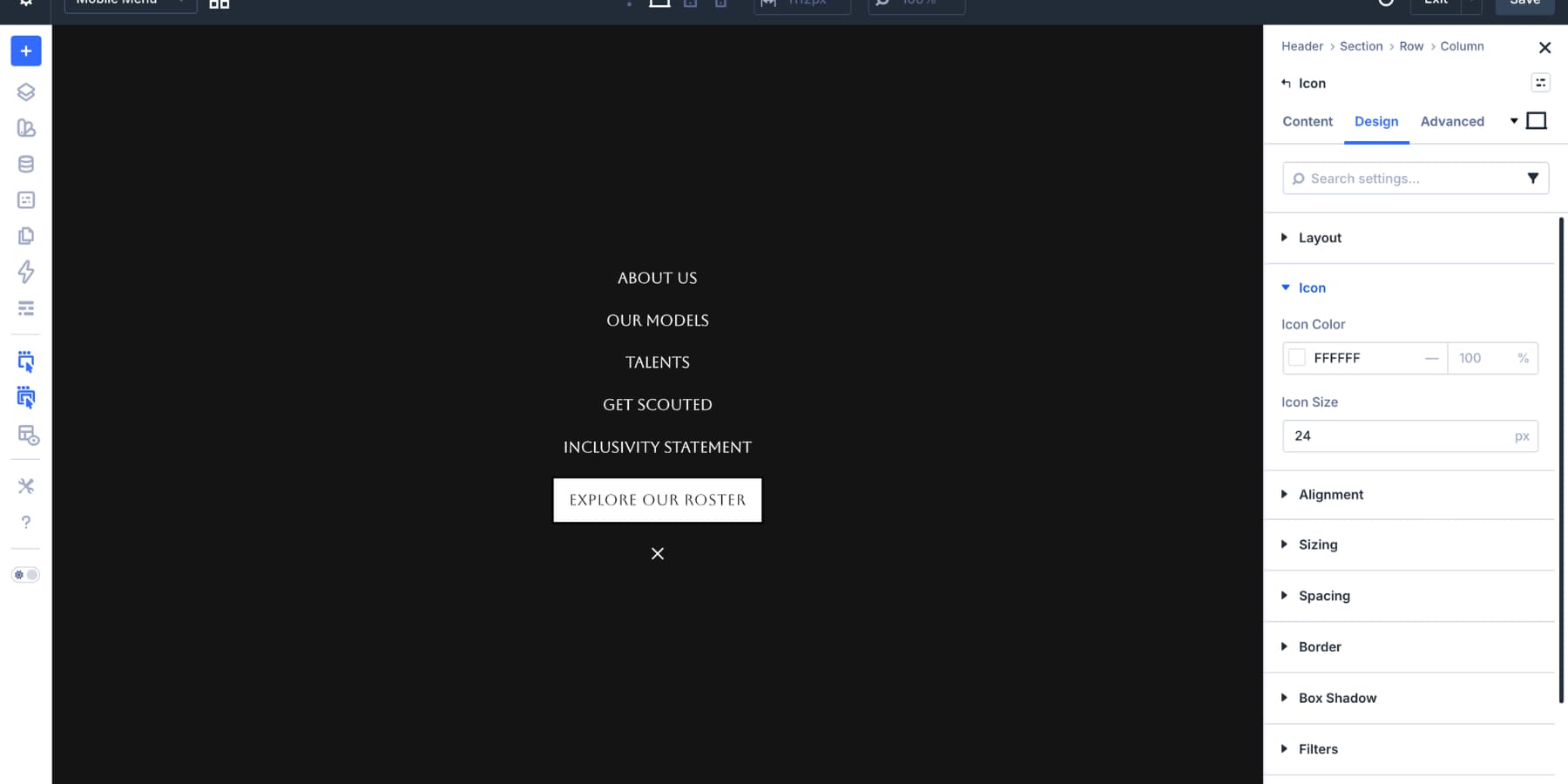
Set the icon size to around 24px, then add enough padding so the tap area feels comfortable on touch devices. Where possible, set the icon’s semantic element to button and add a clear accessible label such as Close menu.
Open Advanced > Position. Set the icon to Fixed, choose the Top Right origin, and set both offsets to 20px. Set a high z-index so the close icon stays above the menu content.
Before wiring up the Interactions, position the Mobile Menu Section as an overlay. Open the Mobile Menu Section settings and go to Advanced > Position.
Set Position to Fixed, choose the Top Left origin, and set the top and left offsets to 0.
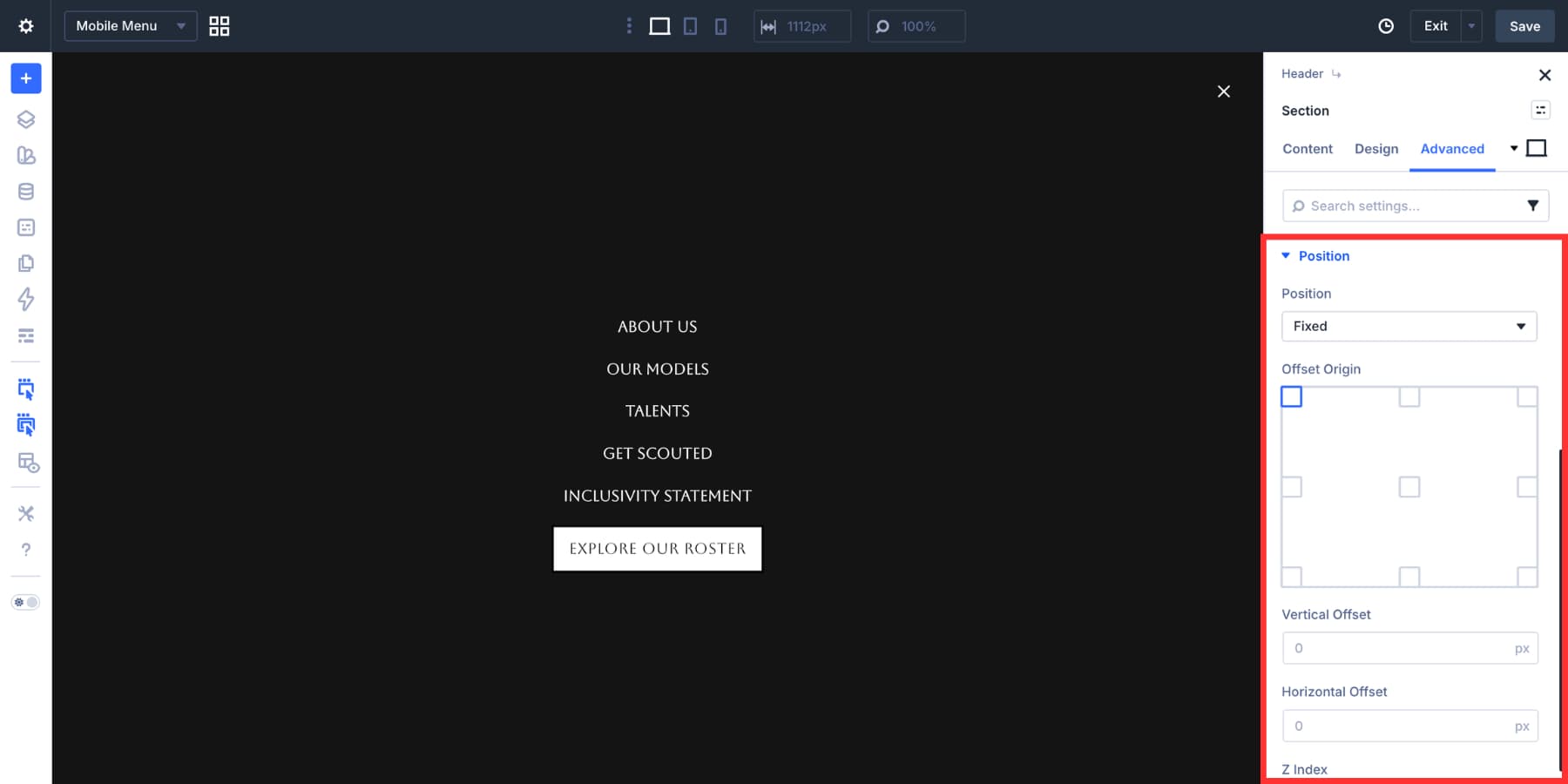
Then open Design > Sizing and set the Section width to 100%. This helps the menu cover the viewport when it is shown by an Interaction.
Step 7: Add Dropdown Cards For Mobile
If your mobile menu needs dropdowns, add Dropdown modules inside the static Link modules just as you did on desktop. On mobile, set Show Dropdown On to Click. Touchscreens do not have reliable hover behavior, so click is the better choice.
Inside each dropdown, add the same content structure from the desktop menu. Then open the row settings and set Layout Direction to Column.
This stacks the dropdown cards vertically. Set Align Items to Center so each card keeps a consistent width. For this example, each card uses a max width of 150px.
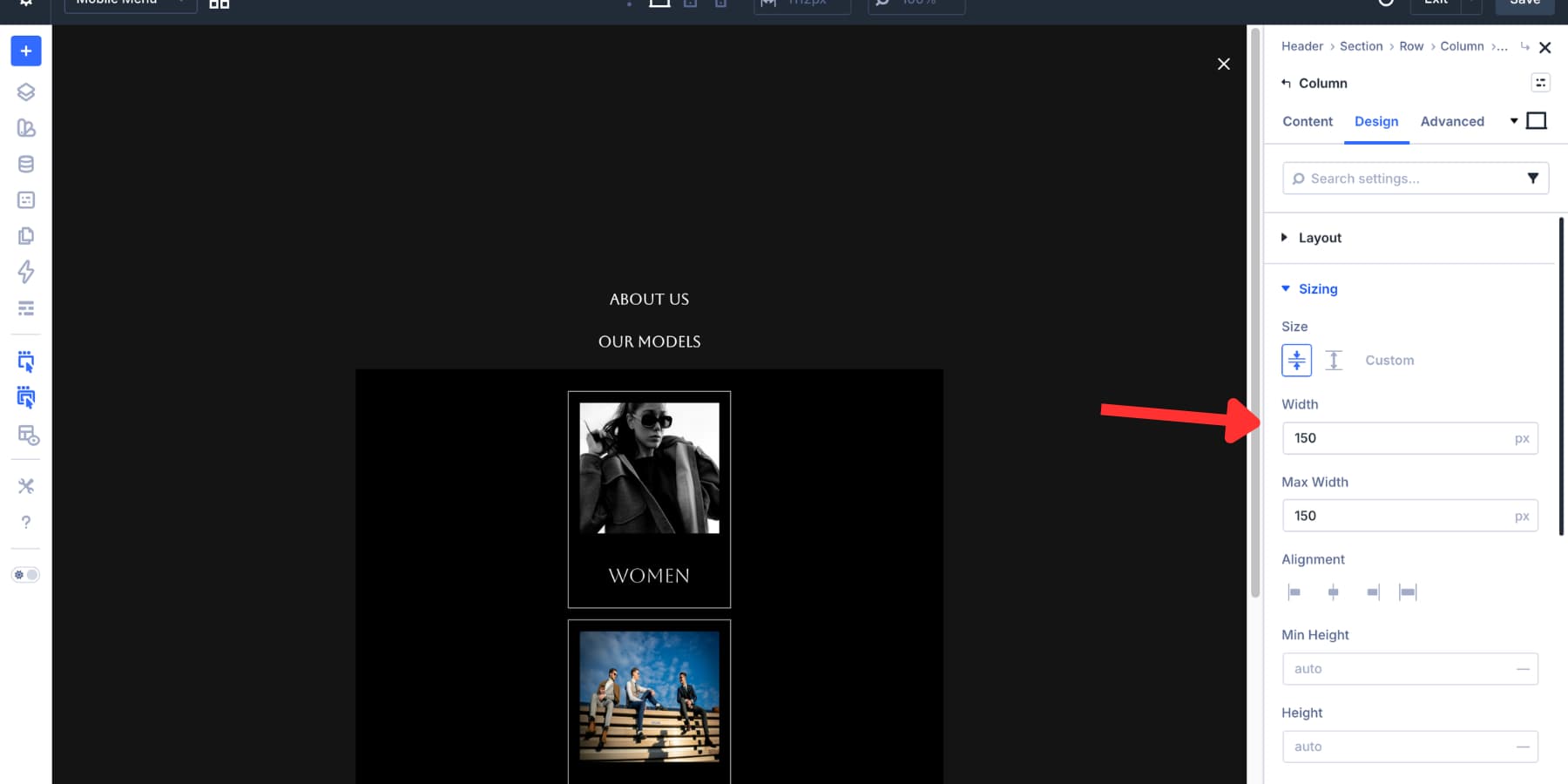
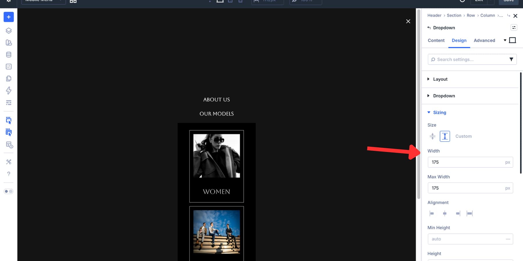
Set the Dropdown module and the inner row width to around 175px so the stacked cards align cleanly.
If the dropdown feels too tall on smaller screens, make these adjustments:
- Hide decorative images on mobile using Advanced > Visibility.
- Reduce column padding to 8px or 10px.
- Lower the heading font size at the mobile breakpoint.
- Keep dropdown labels short so the menu stays easy to scan.
Step 8: Add The Close Interaction
The mobile menu is built. Now the open and close controls need to target it. Start on the Mobile Menu Canvas. Select the close icon and open Advanced > Interactions. Add a new Interaction with these settings:
- Admin Label: Close Mobile Menu
- Trigger Event: Click
- Effect Action: Hide Element
- Target Module: Mobile Menu Section
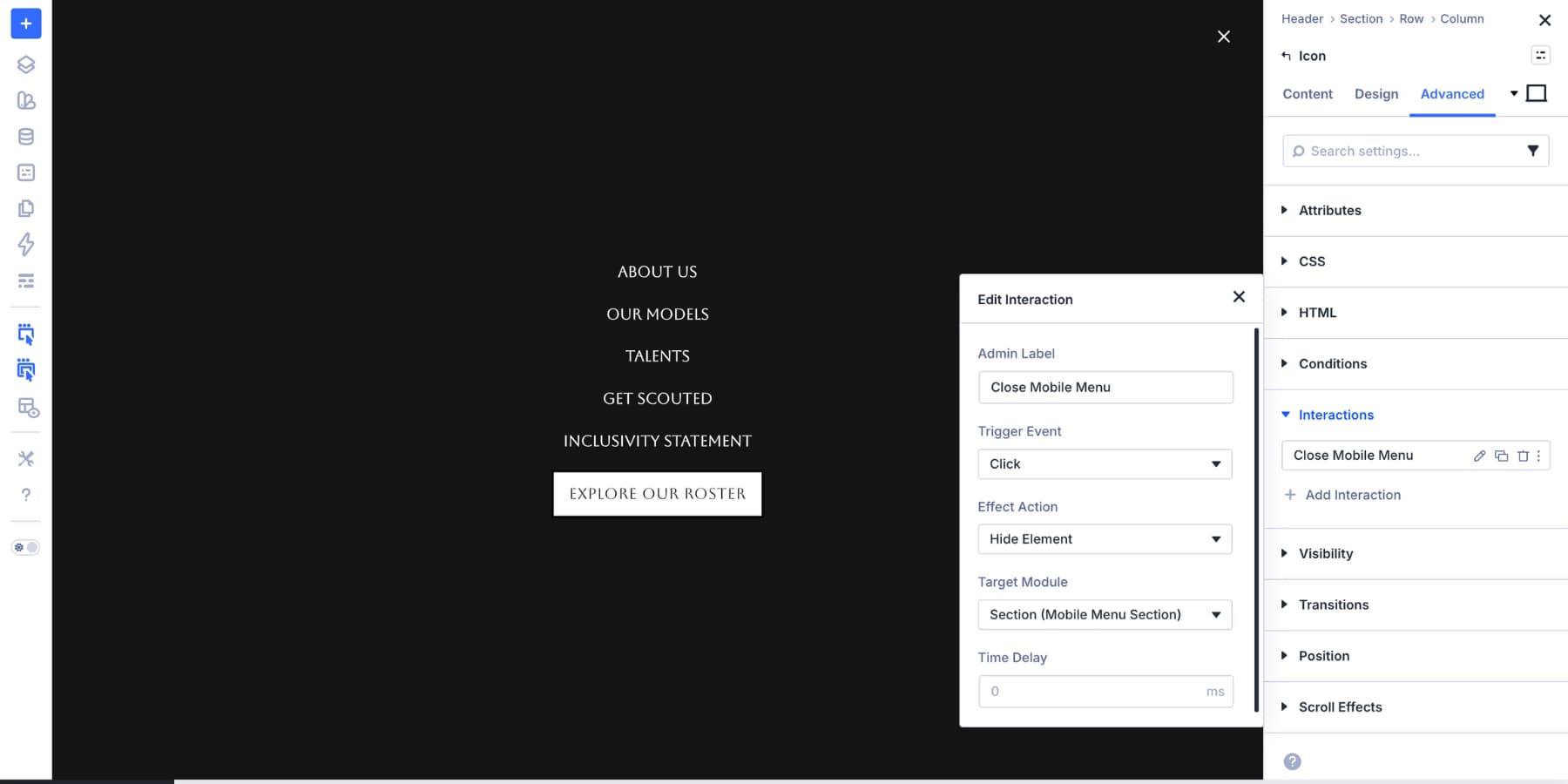
Now the close icon can hide the Mobile Menu Section.
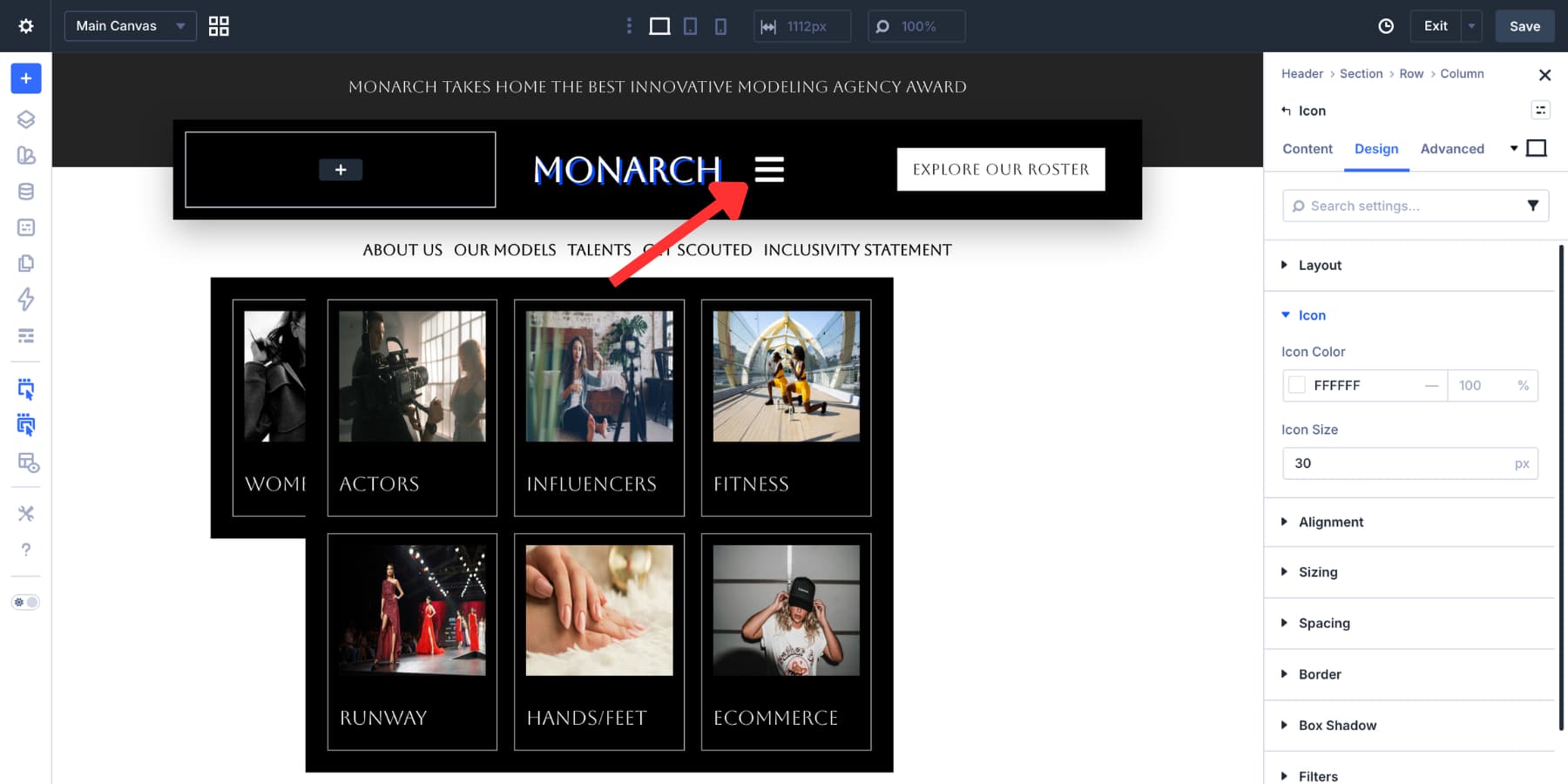
Step 9: Add The Hamburger Trigger
Switch back to the Main Canvas from the Canvas dropdown. Add an Icon module next to the logo and choose a hamburger icon. Style it to match the header.
Use Advanced > Visibility to hide the hamburger icon on desktop and show it on tablet and mobile.
Where possible, set the hamburger icon’s semantic element to button and add an accessible label such as Open menu.
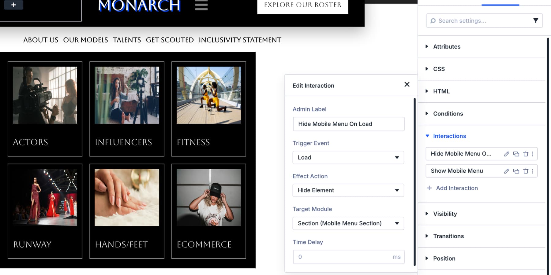
Add A Load Interaction To Keep The Menu Hidden
Select the hamburger icon and open Advanced > Interactions. Add the first Interaction:
- Admin Label: Hide Mobile Menu On Load
- Trigger Event: Page Load
- Effect Action: Hide Element
- Target Module: Mobile Menu Section
This acts as a safety step so the mobile menu starts hidden when the page loads.
Add The Click Interaction To Open The Menu
On the same hamburger icon, add a second Interaction:
- Admin Label: Open Mobile Menu
- Trigger Event: Click
- Effect Action: Show Element
- Target Module: Mobile Menu Section
Use breakpoint settings so this Interaction applies only on tablet and mobile.
Now the hamburger icon opens the menu, the close icon hides it, and the desktop header stays unaffected.
A responsive menu should do more than fit the screen. It should stay easy to update, easy to tap, and easy to understand.
- Use WordPress menus for dynamic links: Menu loops help your header stay in sync with Appearance > Menus.
- Keep desktop and mobile structures separate when needed: A detailed desktop dropdown may not be the best mobile experience.
- Use click behavior on touch screens: Hover-based dropdowns are unreliable on phones and tablets.
- Label important targets: Element Labels make Interactions easier to configure and troubleshoot.
- Test tap targets: Icons should be large enough to tap comfortably and have sufficient padding around them.
- Use accessible labels: Hamburger and close icons should communicate their purpose to assistive technology.
- Check every breakpoint: Test desktop, tablet, and phone layouts before publishing.
A little structure up front makes the menu easier to maintain later.
Navigation is one of the first things visitors use on a website. A good menu should stay clear on desktop, adapt cleanly on smaller screens, and remain easy to update as the site changes. Divi 5 gives you the pieces to build that system visually. Use Link modules and Menu Loops for dynamic navigation. Use Dropdown modules for richer desktop menus. Use Canvases and Interactions for mobile overlays.
The result is a responsive menu that works across screen sizes without custom code, extra plugins, or duplicated manual updates.


Leave A Reply