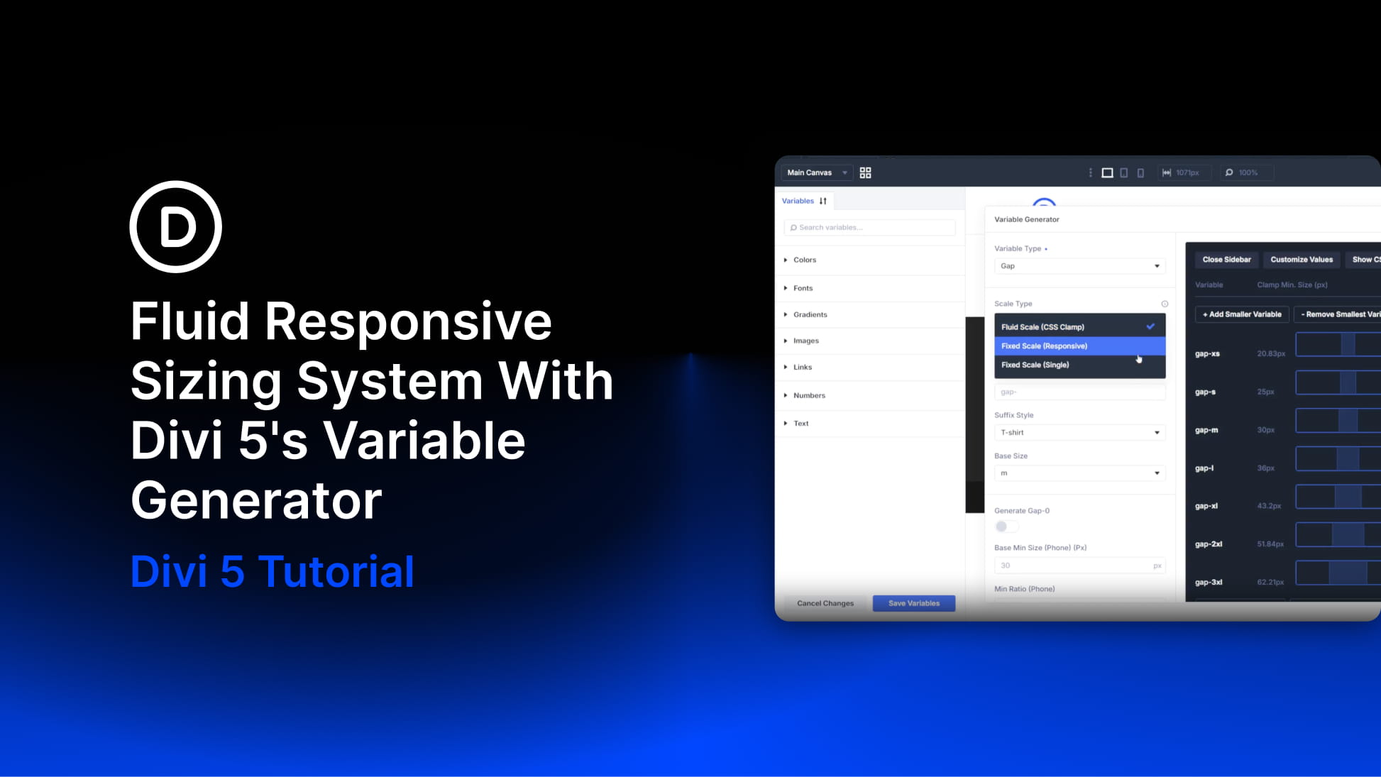
Creating A Fluid Responsive Sizing System With Divi 5’s Variable Generator
Most designers do not size things once. A heading that looks balanced at 56px on desktop can feel oversized on a phone, so you create a smaller mobile value, then a tablet value between the two. Then you repeat that work for font sizes, section padding, margins, gaps, border radius, widths, and...
View Full Post


