
One of the most common mistakes web designers make is including too many animated elements. The thinking goes: “Animations are cool, so the more, the better”. However, too much of a good thing such as this can affect your website’s usability negatively.
Animations, much like every other web element, need to fulfill a practical purpose. In this article, we’re going to talk about some of the most common types of animations you can expect to see online. Then we’ll break down four situations where using animations in your designs is warranted.
Let’s take a look!
An Introduction to Animations in Web Design
Animations are everywhere on the web, even though sometimes you might not realize it. In the past, animations were much more pronounced. For example, it wasn’t strange to find entire websites running on Flash, where every element was animated.
Thankfully, those dark days are behind us. Nowadays, it’s much more common to make animations a part of an overall design, but not a centerpiece. One of the most common examples of animations on the web are transitions within sliding galleries. Other animations are even subtler. For example, buttons that change colors when you hover over them:
Another example of simple animations serving a purpose are fields that highlight when you click on them. This way, you always know what field you’re typing into:
However, not all web animations are so benign. There are still plenty of examples offering more flash than substance (such as websites that hijack your scrolling, for instance).
In our opinion, it’s entirely possible to construct an entire website without using animations, so if you choose to add them, they need to fulfill a purpose. Namely, they should make your website easier to use, as do practically all of the examples mentioned earlier. However, a lot of people fall into the trap of wanting to animate every aspect of their website just to add some visual flair.
There’s nothing wrong with wanting a stylish website. However, too many animations can cause a visual overload. In some cases, they might even slow down your site, depending on how you implement them, which is something you want to avoid at all costs. With this in mind, let’s talk about some situations where using animations in web design does make sense.
4 Situations Where It Makes Sense to Use Animations in Web Design
Keep in mind – this isn’t a definitive guide to the situations where you can use animations in web design. It’s just a collection of suggestions born from our experience. If there’s another situation you think animations can enhance your user’s experience, feel free to try them out!
1. Highlight Actions Using ‘Microinteractions’
Animations don’t need to be flashy to be effective, hence the term microinteractions.
When we talk about microinteractions, we’re referring to simple animations with single-use cases. Take the example above, where the button you choose highlights itself when you click on it. This type of animation fulfills two purposes, it gives you visual feedback when you interact with an element, and provides you with information on how to use it.
Ideally, you want microinteractions to be subtle. They shouldn’t steal the spotlight from the elements they highlight, but simply make them easier for you to use. However, it can be hard to determine when to implement microinteractions on your site. After all, even the most straightforward page usually has dozens of elements you can potentially animate. Here are a few quick tips for when it makes sense to implement them:
- To highlight when you turn a feature on or off.
- As a way to let users know a particular action was a success, such as submitting a message through a contact form.
- When highlighting specific pieces of information, such as prices within a table.
- To animate icons on your site.
As for how to implement microinteractions, it can be difficult if you don’t know your way around Cascading Style Sheets (CSS). However, Divi provides you with built-in options to animate many of the elements on practically every module. We’ve even previously talked about six types of microinteractions you can implement using the theme.
Hidden menus are somewhat controversial design elements. A lot of people think that menus should always be visible, since they’re the primary way users navigate through your website. We would tend to agree, but in some cases, hidden menus make sense if they’re easy to access.
You can also use animated drop-down menus if you’re working with a large number of pages. In either case, using animations makes sense since it helps soften the reveal of the hidden menu. Without them, menus would just appear instantly on the screen, which can be too abrupt.
As for how to add animations to your menus, Divi includes several options you can use. For example, you can choose between fade, expand, slide, and flip animations for your drop-down menus:
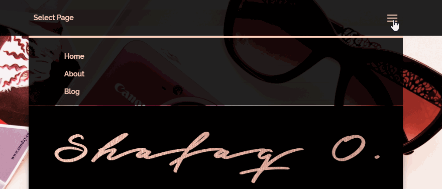
You also have several options when it comes to hidden menus. For example, you can set up a ‘hamburger’ menu with a sliding reveal, which can make for very clean designs:
Regardless of what type of animation you choose to implement, remember you need to test it on both desktops and mobile devices. Menus are an essential part of your website, so you need to make sure animations don’t interfere with their functionality.
Simple hover animations are a great way to include more information into smaller spaces.
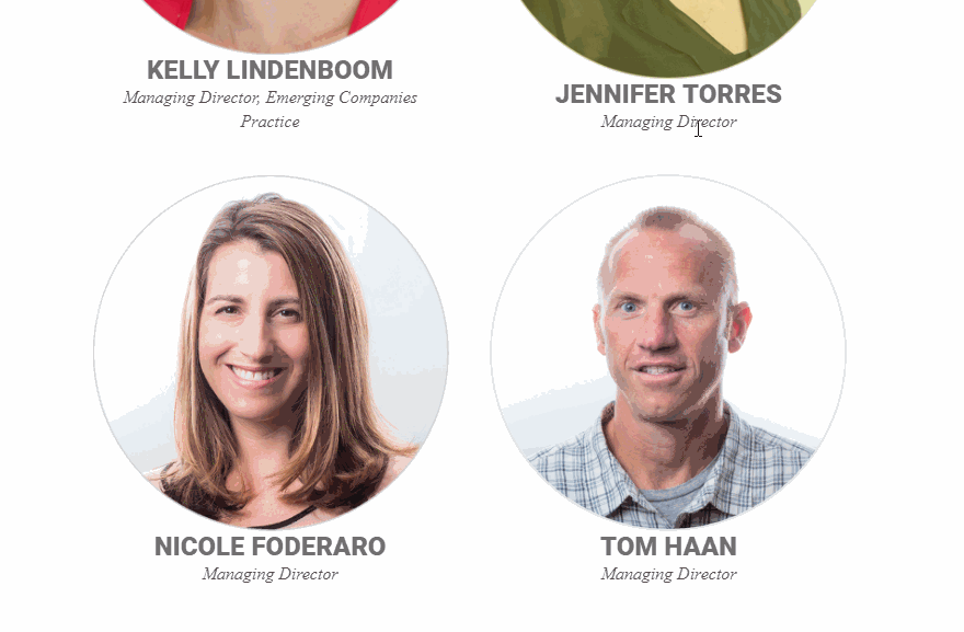
Hover animations are a great way to maximize the information you provide in the space available. For example, you can add mouseover effects to gallery items that show you each picture’s name or the date when they were taken.
The key with hover animations is to add information your visitors will be interested in reading about. For example, with Divi you can create a section to introduce your team members and add biographies that display when people mouse over their pictures:
If you want to keep things simple, you can also use hover animations as microinteractions. This way, when visitors mouse over an element, they’ll know it ‘works’, or get a clue as to how to use it.
Both these types of hover animations require you to use a bit of CSS. However, they’re easy to implement, and they can add some depth to otherwise simple websites.
4. Create Sliding Galleries Using Transitions
Sliding galleries are elegant and they enable you to tell a story.
Out of all the ways to add animations to your website, sliding galleries are probably one of the most common. In fact, most people probably don’t realize they’re looking at simple animations when they slide from one image to another.
Without animations, the transitions between images would be instant, which can be jarring. In this situation, animations are mostly about style, but they can still make your galleries more user-friendly.
There are a ton of great WordPress gallery plugins you can use to add animated galleries, each with their own set of effects. However, if you’re using Divi, you don’t need to add any extra plugins in the first place. The Divi Slider module enables you to add sliding galleries to any of your pages, as well as customize their transitions:
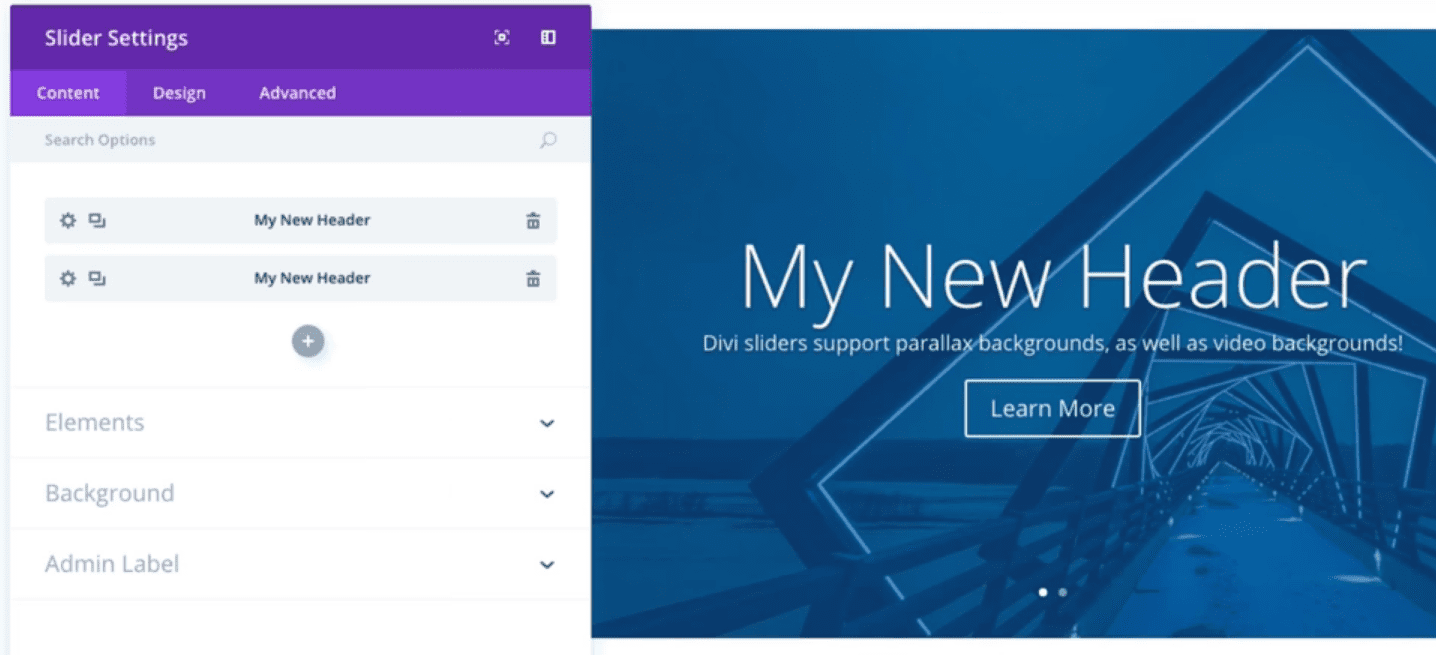
Most websites use ‘sliders’ on the top of their pages. However, you can break the mold and use sliding galleries in plenty other situations, such as to display testimonials for your products and services.
Conclusion
Too much of a good thing often ends badly, and animations are no exception. When it comes to web design, you want every element you add to your pages to fulfill a purpose beyond looking pretty. Plus, you have to keep in mind that animations can slow down your website, which is something you want to avoid.
If you want to put your web animations to good use, here are four scenarios where it makes sense to implement them:
- Highlight actions using microinteractions.
- Reveal hidden menus using animations.
- Display hidden information with hover animations.
- Create sliding galleries using transitions.
Do you have any questions about when to use animations in web design? Ask away in the comments section below!
Article image thumbnail by Olha Chernova / shutterstock.com.


Animation always causes sites to slow down. Always. Think about it before you add it. It’s not only visual noise — it’s a drag. Resist the temptation in the name of UX.
When would Divi would address the mobile menu? While there are quite a few desktop menu styles to choose from mobile menu is pretty much single type experience. I’d be a blast to have a mobile menu built in the builder like the one on elegant themes blog.
I know that while I’m reading this and other ET blogs I get distracted WHILE I’M READING by an animated GIF at the bottom edge of the screen I can see out of the corner of my eye. When that happens, I have to either: Fight like hell to KEEP reading and THEN look at the GIF when I’m done, or jump to the GIF immediately, watch it, and then try to find where I was to keep reading and try to remember what the words were all about.
The PURPOSE of animations is to draw your attention. SOOOO, when you WANT to draw attention, animations may be good choices. When you DON’T want to draw attention and you use them, they will draw attention ANYWAY. And that’s not good.
When I was learning to be a television director, we were taught that during a talk show you NEVER let your mechanics show. That is, don’t zoom live on the air from a two shot to a single shot because the motion of the zoom will make the viewer think about the movement and NOT about what’s being said. So we had to pay closer attention and anticipate when someone was GOING to talk and get our cameras and shots in place so that when they DID talk, we had a camera on a close up and went to it, hopefully before their first word was even out of their mouths.
By paying attention to what was going on we taught ourselves NOT to use the easy way. We created a show that was much easier for viewers to understand because they were not distracted by extraneous motion. TV talk shows are about listening. ANYTHING that gets in the way of that is NOT good. No matter how pretty or cool you think something might be.
The same is true in web design. If you WANT them to look, motion is great. If you DON’t, then it’s not. And “wanting” is not “your choice.” The use of motion/animation is an intention that should make them understand better. If it doesn’t, don’t use it.
Web sites are about reading. Anything that gets in the way of that is NOT good design. No matter how pretty or cool you think something might be.
Thank you for sharing your thoughts on this, Randy! I think this is a very good way of looking at it. 🙂
You could also use an animation:
– when you have a huge website >> as a preloader >
– when designing a login form > something that shows you if the username is available or not, or if the passwords don’t match ..etc
– when you’re showing some statistics (charts, pies ..etc)
Actually ..you can use it whenever you want but just keep in mind that all these animations make your site load slower, and the more bling you put in it ..the things the end user needs to pay attention will get less visible.
As most things in life: less is more. Use it only if you have to emphasize something.
That’s a very good point, Cornel. Thanks for sharing. 🙂
Tomorrow’s blog post: “When and why to use more than 4 columns”
Can’t wait for that theme update.
“Hey guys, I’m going to make this awesome article one what you CANNOT do with Divi just to point out how much the on-hover animation fonctionality is lacking in our builder.”
“Awesome, let’s do that. The comments under this article are going to be a blast”.
Still waiting for on-hover animation settings in Divi core. It’s been a very long wait.
Yeah…. That special update is coming.
+1
+2