
In today’s Divi tutorial, we’ll show you how to add some advanced hover effects to Divi’s Blurb Modules using Hover.css. Of course, out of the box, Divi has all you need to create stunning blurbs for any kind of page you could think of. But in our community we know there are a lot of designers always looking to push Divi to (and sometimes beyond) its limits in order to make a client site just that much different from the competition. So this tutorial goes out to all of you bleeding edge folks who enjoy taking advantage of Divi’s advanced features.
Let’s take a look at what we’ll be creating today.
Preview: The Final Result
At the end of this post (and after having guided you through hover.css), we’re going to show you how to achieve the following result:
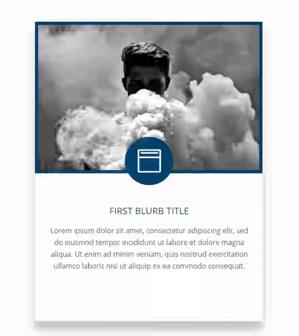
Of course, that’s just the tip of the iceberg in terms of what’s possible with hover.css, but it’ll help you get started.
The Inspiration
We got our inspiration from XD Web Design that uses the hover.css effects for different blurbs on their website. In previous posts, there have been comment requests that showed interest in how to recreate certain Blurb Modules. Although we’re not going to recreate them exactly, we will show you the basics of adding these effects so you can experiment easily afterwards.
How to Add Advanced Hover Effects to Divi’s Blurb Module Using Hover.css
Subscribe To Our Youtube Channel
Get Hover.css on Your Website
Before getting into anything else, we’re going to introduce you to hover.css first. Hover.css consists of plenty of effects you can use on whatever kind of element on your website. There are two main ways to add the hover.css effects to your website; by adding the CSS file or by choosing the effects you want to have and simply using that CSS within the Divi Builder.
Since we’re going to need to make some small adjustments to the CSS code lines for elements within modules, we’ll show you how to manually add the few CSS code lines you’ll be needing to create the end result. If you, however, prefer to have all the effects on your website, you can do that as well by simply adding the CSS file to your WordPress directory.
Download Hover.css
Now, to get started, you’ll need the hover.css file which you can find by going to Ian Lunn’s website. Alternatively, you can also click here to be directly sent to the files on Github. Once you’ve downloaded the file, unzip it.
Purchase License
The next thing you’ll need to take into account is the fact that hover.css isn’t free. If you use your website for commercial purposes, purchasing the license is a must. You have two types of purchase possibilities:
- The Developer License ($14 and good for 1 project)
- The Team License ($18 and good for unlimited projects)
Depending on your need, you can purchase your license and use the effects on your website(s).
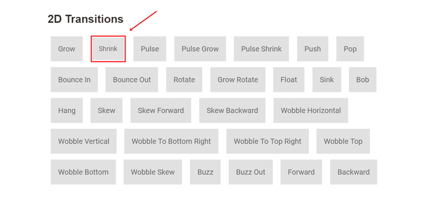
The List of Hovers
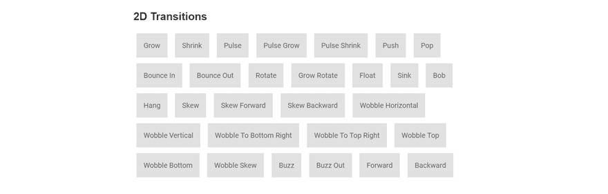
Moving on, let’s take a look at the different hover effects that are at your disposal with hover.css. You have a bunch of them that belong to various categories. There are seven categories in total:
- 2D Transitions
- Background Transitions
- Icons
- Border Transitions
- Shadow and Glow Transitions
- Speach Bubbles
- Curls
Each one of these effects contains a series of effects that can give that extra tweak to your Blurb Modules or any other kind of module on your website.
Installing
Although you can install hover.css by including it directly into your child theme, you can also use bits and parts of it. That’s what we’re going to do in this tutorial. We’ll take the CSS code of a particular effect and add it directly to our Divi Builder. The reason why we’re doing this is that in some cases (where we want to make an effect apply to an element of a module only), you’ll have to slightly modify the code that is being provided.
Go to your unzipped downloaded folder and find the hover.css file.
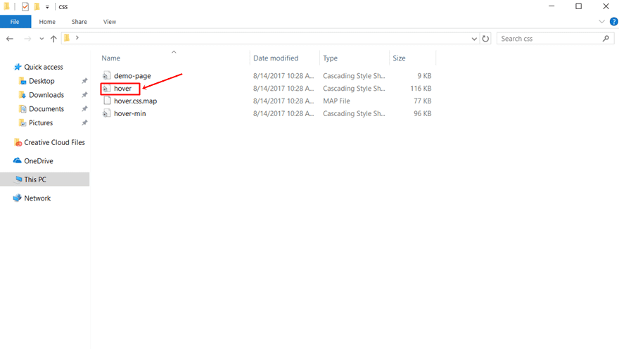
Open this file with a code editor, such as Notepad ++, and you’ll see all the effects being lined up one after another. The names that are used in the CSS file are the same as on the website. You can go to the website and see which animation you like. Afterwards, you can come back to the CSS file and just look for the name.

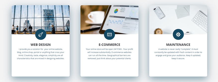
Creating Your Interactive Blurb Module
Now that we’ve shown you how to easily make use of hover.css, it’s time to show you how to recreate an interactive Blurb Module while using the effects that are provided. As a reminder, let’s take a look at the end result:
Add a Three-Column Row
The first thing you need to do is add a three-column row to a new section on a new page or existing page. We’ll show you how to add the first Blurb Module and you afterwards, you can add Blurb Modules to the other columns as well by repeating the same steps.
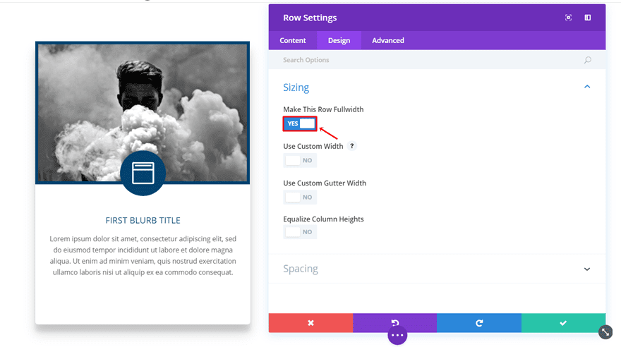
Make The Row Fullwidth
The next thing you’ll need to do is make the row fullwidth. To do that, open your row settings and go to the Design tab. Within the Design tab; enable the ‘Make This Row Fullwidth’ option within the Sizing subcategory.
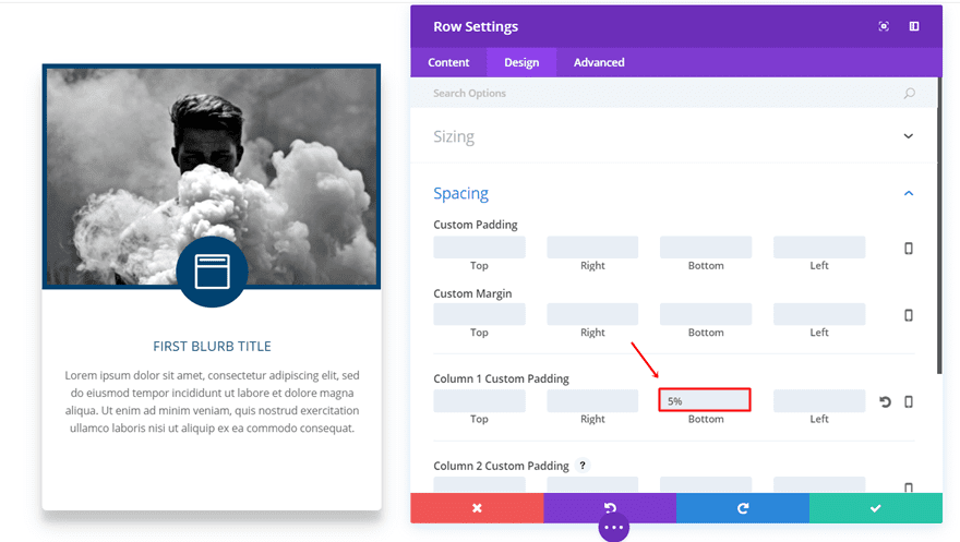
Apply Column Padding
The next thing you’ll need to do is add some column padding while you’re still in the Design tab of the row settings. Scroll down and add 5% to the bottom padding of column 1.
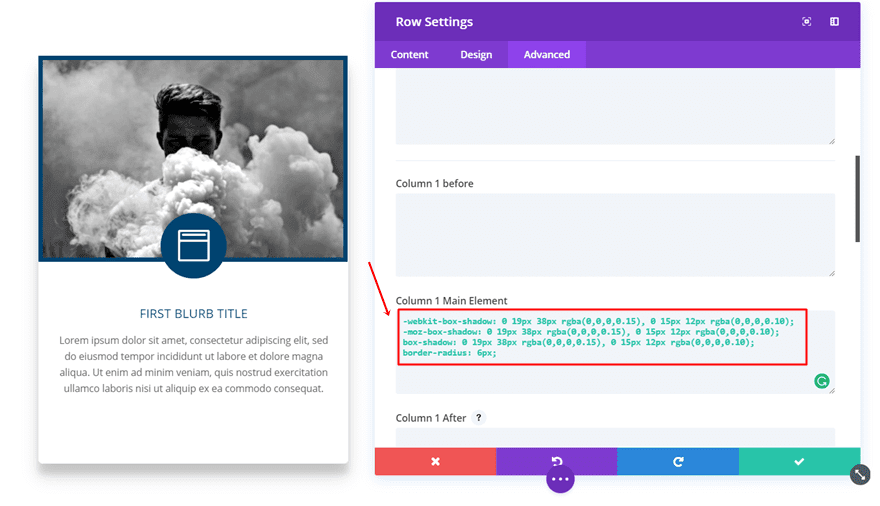
Apply Box Shadow & Border Radius to Column
And the last thing you’ll need to do within the row settings is go to the Advanced tab. Within the Advanced tab, scroll down to the Column 1 Main Element and copy and paste the following CSS code lines:
-webkit-box-shadow: 0 19px 38px rgba(0,0,0,0.15), 0 15px 12px rgba(0,0,0,0.10);
-moz-box-shadow: 0 19px 38px rgba(0,0,0,0.15), 0 15px 12px rgba(0,0,0,0.10);
box-shadow: 0 19px 38px rgba(0,0,0,0.15), 0 15px 12px rgba(0,0,0,0.10);
border-radius: 6px;
Once you’ve done that, you can close the row settings.
Add Image Module
The next thing we’re going to do is add an Image Module to the first column. Technically, this is not a part of the Blurb Module but in its final result, it does look like they belong together. That’s mainly because we’re using the column as a kind of box that gathers all the modules and makes them fit with one another.
Upload an image and leave the Image Module as it is for now.
Add Blurb Module
The next thing we’ll need to add to the row is the Blurb Module. Once you’ve added the Blurb Module, you’ll need to make several changes to it. Start by adding the header text, content text and choosing the icon and move on to the Design tab.
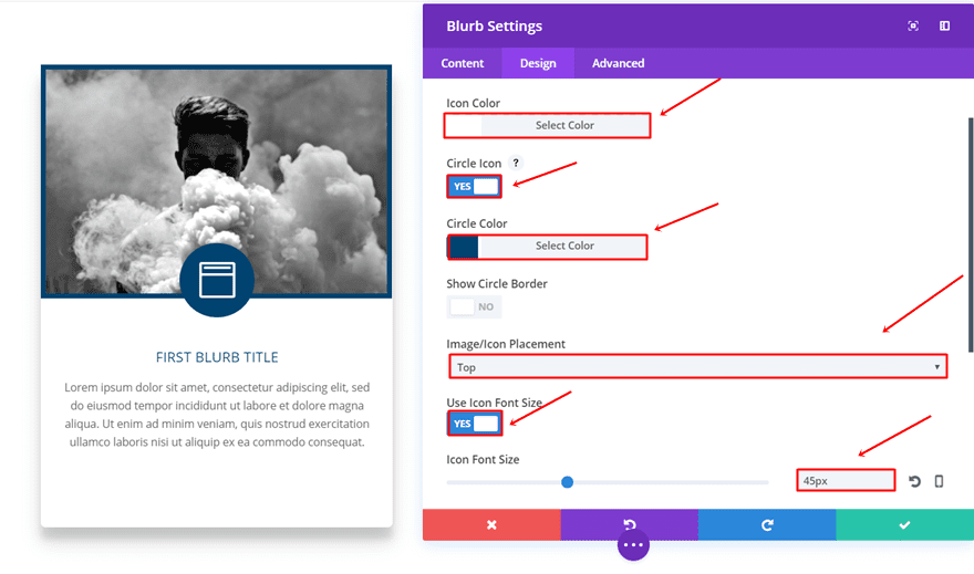
Customize Icon
Within the Design tab, the first thing you’ll come across is the Image & Icon subcategory. Within that subcategory, make sure the following changes apply:
- Icon Color: #FFFFFF
- Circle Icon: YES
- Circle Color: #004370
- Image/Icon Placement: Top
- Use Icon Font Size: YES
- Icon Font Size: 45px (desktop), 40px (tablet), 37 (phone)
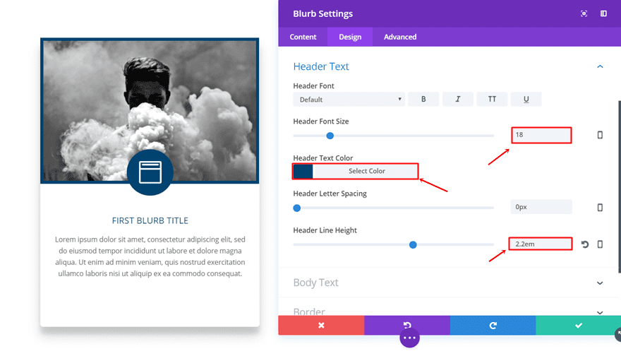
Customize Header Text
Scroll down the same tab and make the following changes to the Header Text subcategory:
- Header Font Size: 16 (desktop & tablet), 14 (phone)
- Header Text Color: #004370
- Header Line Height: 2.2em
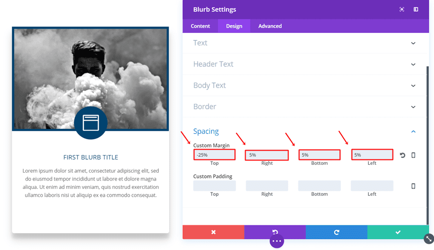
Add Custom Margin
Next, you’ll have to add the Custom Margin to the Blurb Module:
- Top: 25%
- Right: 5%
- Left: 5%
- Bottom: 5%
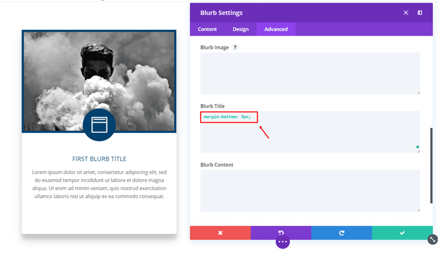
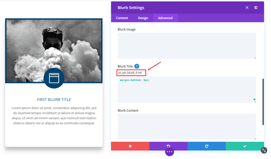
Add Bottom Margin to Blurb Title
Last but not least, go to the Advanced tab and add ‘3px’ to the bottom margin of the Blurb Title:
Adding Hover.css Effects to the Modules
The last part of this post involves adding the hover.css effects. We’ll add the hover effects to the Image Module and Blurb Module first and in the next part of this post we’ll add a hover effect to only one element of the Blurb Module.
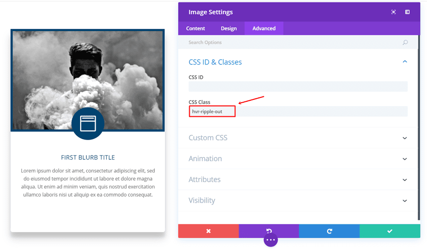
Add the CSS Class to the Image Module
Open the settings of your image and go to the Advanced tab. Within the Advanced tab, write down the hover effect CSS class that you want to use. In this case, we’re applying the ripple out effect which has ‘hvr-ripple-out’ as its CSS class name. Again; you can find these class names within the hover.css file in your zipped folder.
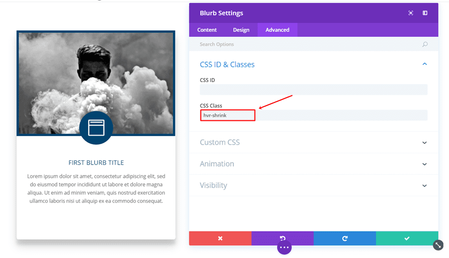
Add The CSS Class to The Blurb Module
Likewise, open the Blurb settings and go to the Advanced tab. In this case, we’re going to apply the shrink hover effect to the complete module. So, type down ‘hvr-shrink’ in the CSS Class field.
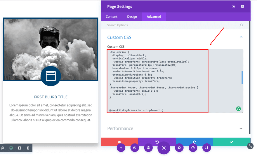
Add The CSS Code
Moving on, add the following CSS code lines to the settings of your page by clicking on the following button:

Continue by placing the following lines of CSS code in the Custom CSS field:
.hvr-shrink {
display: inline-block;
vertical-align: middle;
-webkit-transform: perspective(1px) translateZ(0);
transform: perspective(1px) translateZ(0);
box-shadow: 0 0 1px transparent;
-webkit-transition-duration: 0.3s;
transition-duration: 0.3s;
-webkit-transition-property: transform;
transition-property: transform;
}
.hvr-shrink:hover, .hvr-shrink:focus, .hvr-shrink:active {
-webkit-transform: scale(0.9);
transform: scale(0.9);
}

@-webkit-keyframes hvr-ripple-out {
100% {
top: -12px;
right: -12px;
bottom: -12px;
left: -12px;
opacity: 0;
}
}
@keyframes hvr-ripple-out {
100% {
top: -12px;
right: -12px;
bottom: -12px;
left: -12px;
opacity: 0;
}
}
.hvr-ripple-out {
display: inline-block;
vertical-align: middle;
-webkit-transform: perspective(1px) translateZ(0);
transform: perspective(1px) translateZ(0);
box-shadow: 0 0 1px transparent;
position: relative;
}
.hvr-ripple-out:before {
content: '';
position: absolute;
border: #004370 solid 6px;
top: 0;
right: 0;
bottom: 0;
left: 0;
-webkit-animation-duration: 1s;
animation-duration: 1s;
}
.hvr-ripple-out:hover:before, .hvr-ripple-out:focus:before, .hvr-ripple-out:active:before {
-webkit-animation-name: hvr-ripple-out;
animation-name: hvr-ripple-out;
}
These are almost the exact same CSS code lines as you can find in the hover.css file. The only thing that differs is the border color that is being used for the ripple out effect. It’s the same color as the one being used in the circle icon.
Use Hover.css Effects For Separate Elements Within The Blurb Module
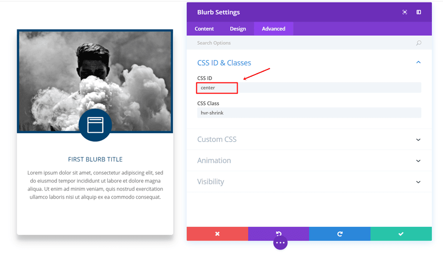
The third effect we have added to this blurb is the line that appears after hovering over the Blurb Title. The Blurb Module contains different elements. Therefore, we cannot just simply use the hover.css class in the list. Instead, we have to assign a CSS ID to the module and use the CSS class specifically assigned to the Blurb Title.
Add The CSS ID to Blurb Module
Start by adding the CSS ID to the Blurb Module. In this case, we’re using ‘center’.
Add The CSS Code
Continue by copy and pasting the following lines of code in the same place where you’ve placed the previous CSS code:
#center.et_pb_blurb_0.et_pb_blurb h4 {
-webkit-transform: perspective(1px) translateZ(0);
transform: perspective(1px) translateZ(0);
box-shadow: 0 0 1px transparent;
position: relative;
overflow: hidden;
}
#center.et_pb_blurb_0.et_pb_blurb h4:before {
content: "";
position: absolute;
z-index: -1;
left: 50%;
right: 50%;
bottom: 0;
background: #004370;
height: 4px;
-webkit-transition-property: left, right;
transition-property: left, right;
-webkit-transition-duration: 0.3s;
transition-duration: 0.3s;
-webkit-transition-timing-function: ease-out;
transition-timing-function: ease-out;
}
#center.et_pb_blurb h4:hover:before, #center.et_pb_blurb_0.et_pb_blurb h4:focus:before, #center.et_pb_blurb_0.et_pb_blurb h4:active:before {
left: 0;
right: 0;
}
The class name you use within the code differs from module to module. If you want to make this apply to only one module, you’ll have to use the class assigned to the Blurb Title of that particular module:
If you, however, want to make the code apply to all the blurbs instead, use the following CSS code lines:
#center.et_pb_blurb h4 {
 -webkit-transform: perspective(1px) translateZ(0);
 transform: perspective(1px) translateZ(0);
 box-shadow: 0 0 1px transparent;
 position: relative;
 overflow: hidden;
}
#center.et_pb_blurb h4:before {
 content: "";
 position: absolute;
 z-index: -1;
 left: 50%;
 right: 50%;
 bottom: 0;
 background: #004370;
 height: 4px;
 -webkit-transition-property: left, right;
 transition-property: left, right;
 -webkit-transition-duration: 0.3s;
 transition-duration: 0.3s;
 -webkit-transition-timing-function: ease-out;
 transition-timing-function: ease-out;
}
#center.et_pb_blurb h4:hover:before, #center.et_pb_blurb_0.et_pb_blurb h4:focus:before, #center.et_pb_blurb_0.et_pb_blurb h4:active:before {
 left: 0;
 right: 0;
}
That’s it! You can now use the same steps to achieve the same result. Continue by cloning the modules and using them in the other rows as well.
Final Thoughts
In this Divi tutorial, we’ve primarily shown you how to use the many effects that are provided by hover.css. Besides that, we’ve also shown you how you can use the different effects to create interactive Blurb Modules on your website. If you have any questions or suggestions; make sure you leave a comment in the comment section below!
Be sure to subscribe to our email newsletter and YouTube channel so that you never miss a big announcement, useful tip, or Divi freebie!
Featured Image by Art work / shutterstock.com


This is brilliant! Thanks for sharing it.
But for everyone complaining It’s not that hard to do. It took me a good 20 minutes and Now I can save it and use it again. I I could create all the effects and save them as Json files. once it’s done I got it forever.
Wow, really impressed to see my website 2nd time on your newsletter.
Thankssss! Nice tutorial. The effects looks great!
With Divi it´s easy.
That was great! Thanks a lot!
I am new to Divi (and CSS). I followed the tutorial but the video didn’t go through the last bit which was adding the line under the header. I tried to follow the text instructions but it is not working. I tried copying both suggestions underneath the other two css in page setting but nothing works. Help! Also made round corners at the bottom of the blurb but can’t seem to add at the top left and right of the image (want similar to the website you referenced)
Performance first. As long as Divi allows you to do these customisations by adding code I am more than happy.
Agreed and for two reasons.
1) Performance – don’t load Divi up with too much additional bloat. If I want to turn a blurb module into a piece of performance art I can add just what I need – not everything conceivably possible as standard.
2) Constantly adding those things that 3rd parties are developing is a sure way to starve out the plugin/add-on developer community which makes Divi so compelling.
Divi Builder should have hover effects BUILT-IN.
All of these effects.
Please add them. Make it simpler for your customers.
They are too important to leave out of Divi.
They are relatively easy for Elegant Themes to add.
Elementor added them to their Page Builder. So I wish Divi would have it also.
What is important is that I want Divi to be as powerful as possible
and to make it easier for customers to use in sophisticated ways
such as the hover css, without having to code it.
The less coding the better.
Make it easy and powerful with Divi.
no. I am aginst it. That would add one more css to Divi js and css librabry, more http requests by browser, more respond time of server, and lower Google ranking. So no. These customisations are optional.
agree. the performance is #1 priority
While I am not for everyone having this knownledge especially a client. OMG. Could imagine the damage they would do an probably blame on the web guy. lol However, Can it still be speeded up and have these items added. In the latest upgrade, Animation styles were added, which now makes it easier to add animation. The reason why I join divi was because of the ease of doing things. I am also old school but I believe in simplicity and ease of work. AFter all people, all we have is our time. That said the quicker we can get things done the better off we are.
There is no need to put this kind of power in the hands of regular users and want to be web designers. They wouldn’t know what to do with it aside from junk up the web and complain about a product that they don’t know how to use.
If you don’t have the talent or time to work with code, you shouldn’t be trying to build websites for other people.
When you do these tutorials are you able to provide the jsn files to download for library? This would save us users a lot of time.
Also, where is the demo page?
I come from a background where we didn’t have everything spoon fed to us, we had to code it ourselves and go through the work of actually doing some work. I find it curious no one wants to earn anything anymore, they just want everyone to do the work for them.
Personally, I hope she doesn’t release json files just so you are forced to go through the steps to LEARN how to do it yourself. Tough love, yes. you’ll be a better developer in the long run.
my 0.02
It’s old school separation consciousness/thinking that everyone must struggle. We each have our areas of expertise or inner genius. It is meant to be shared so we move out of survivalism and finally begin to thrive–we don’t all have to do ALL the work. When everyone contributes and shares, life becomes joyful and creative rather than having to work your ass off all day. Let us teach this to our children. This is unity consciousness. Namaste.