
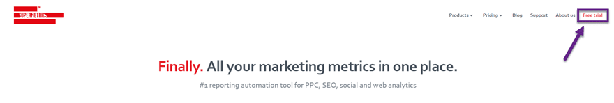
Data management is imperative to understand what your business is doing well, and where you could be putting in the extra effort. Tools like Google Analytics, SEMRush, Moz Pro, and even Jetpack give you these much-needed insights into your business. But to really make the most of them, you have to go to where that data lives. That’s in separate dashboards all across the internet. To remedy that, however, you can use Google Sheets as a one-stop metrics dashboard for your business.
Doing so will not only free up a ton of time. It will also give you more control over what data you see and when. You can keep the info clear of chaff, showing only the stats you need. This whole article assumes that you’ll be using Google Analytics for your website tracking. We suggest using these GA4 plugins to make setup simple.
But Google Sheets? Really?
Yes, really. Google Sheets is an often-ignored tool for online data management. Many people may not realize the power a good spreadsheet can give you over your business. If you haven’t touched Google Sheets in a while (or ever), getting your team or company this kind of dashboard will give you a good reason to do so.
And don’t be intimidated. If you are thinking, “whoa, nope. I don’t do spreadsheets, buddy”, I’d like to introduce you to a product called Supermetrics. It may change your outlook on Google Sheets (and spreadsheets in general). It did mine.
Supermetrics Makes Things Super Simple
In a nutshell, Supermetrics is an add-on for Google Sheets that connects to pretty much any and all of your analytics, advertising, social, and email services. Once any services are connected to Supermetrics, you can pick, choose, and sort every byte of data it has collected for you and export it (or is that import?) to Google Sheets. And while that’s pretty awesome, the best part is that you only have to do it once. You can always just refresh the data to bring in new numbers. Or schedule Supermetrics to do it automatically.
Getting Started
Supermetrics has a really cool way of signing up for their free trial: you don’t. When you hit the free trial button on their homepage, you are given the choice of two extensions: Google Sheets or Google Data Studio. While GDS is a great suite for you data geeks out there, Google Sheets is the more accessible choice. We’ll go with that since we’re making this to share with our teams.
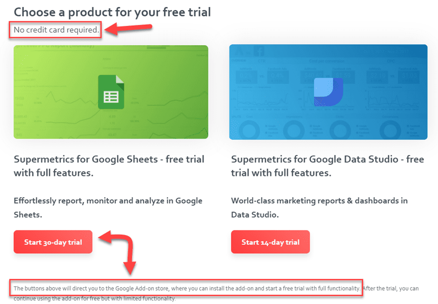
You don’t have to give a credit card or sign up for an account or anything. To get access to the free trial, you hit the button and install the add-on. When your trial runs out, you won’t lose access to Supermetrics. You can stay on their free plan if you don’t feel like joining up immediately.
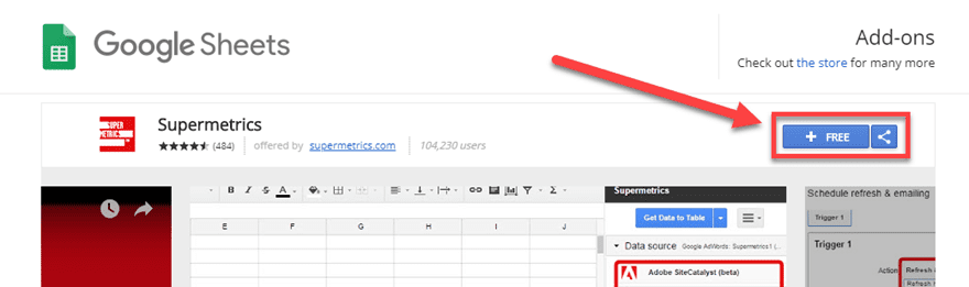
Hit the + FREE button, and Supermetrics will connect to your Google account (which you have because we’re using Sheets) when it opens up a new spreadsheet. Just give the add-on permission, and it’s pretty much done setting up.

You will get a couple of quick dialogues telling you how to access Supermetrics: Add-ons -> Supermetrics -> Launch Sidebar. You will access almost everything about Supermetrics through this sidebar, so make yourself at home.
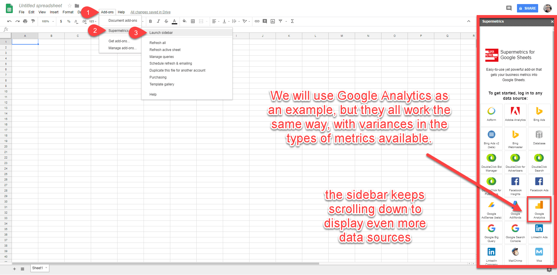
To get you through the basics of Supermetrics, we’ll dive into the basic reporting that comes with Google Analytics, a free platform most people use. Once you see how to fiddle with the options in there, you will be able to move forward with any of the other supported services.
Google Analytics
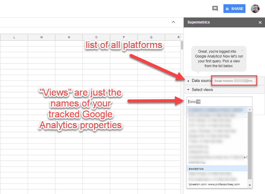
Like everything else, sign into your GA account and give Supermetrics permission to touch its data. Once you’re back into the spreadsheet, you’ll see the Data Source and Select View dropdowns. The source is what platform you’re working with (either Google Analytics or Facebook Insights or Mailchimp or something else). And the view will be specific to the service you’re viewing.
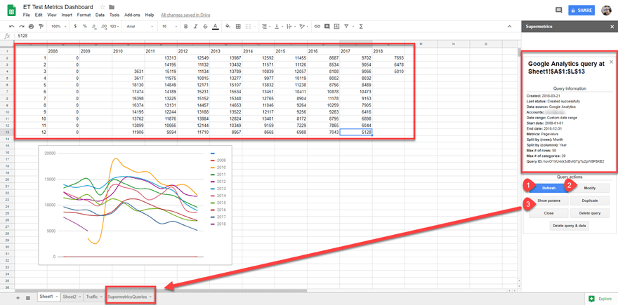
When you know where you want to pull your data from, you have to tell the add-on where you want to pull it from. The specifics will differ from service to service because they all collect different tidbits. (Did you know that 8 tidbits make up a tidbyte? Hilarious.) For Google Analytics, we want to set the metrics to show pageviews, the date from 01-01-2008 to 12-31-18, and the columns and rows to be split by Month and Year.
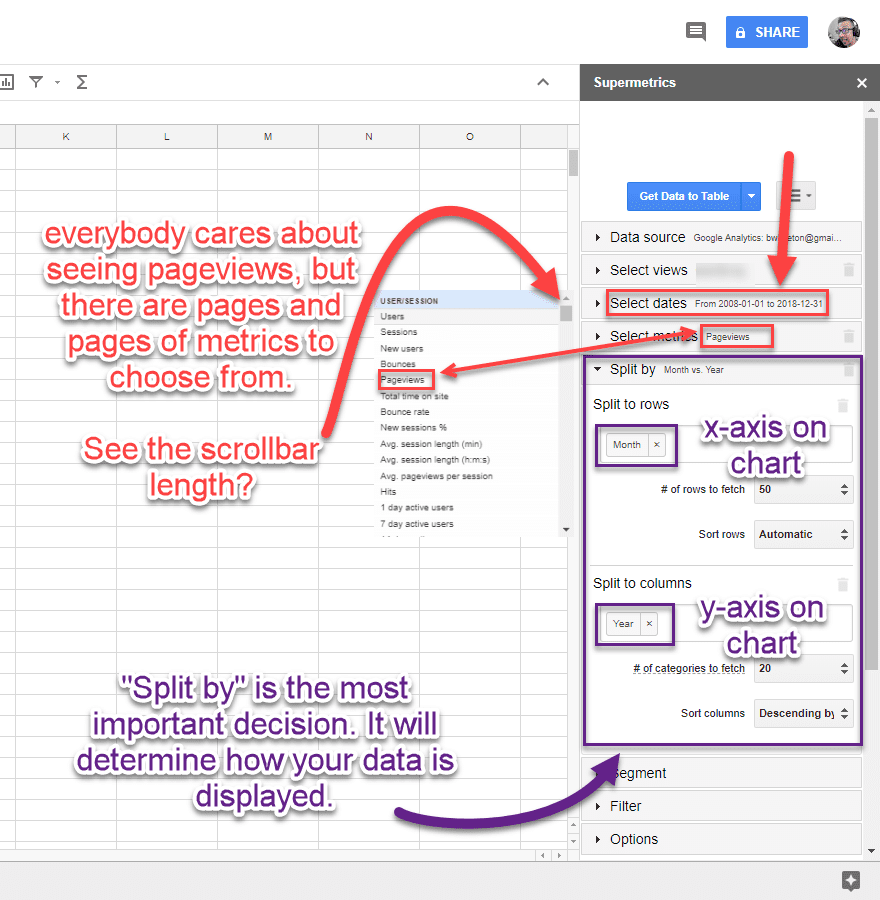
With those set, you may be ready to go. The Segment, Filter, and Options menus are optional. Under Segment, you can break down your results by referrer, mobile traffic, iOS traffic, etc. Filter gives you the chance to numerically filter out unnecessary results, and Options just lets you tweak minor things like using header rows and replacing blank cells with zeroes.
Charting Your Progress
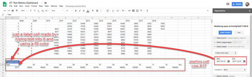
Once you’ve decided what you want to see, it’s time to grab that data. Highlight the cell you want as the upper-left corner of your data. (For me, that will be cell A1, but you can put the data on the sheet wherever you want).
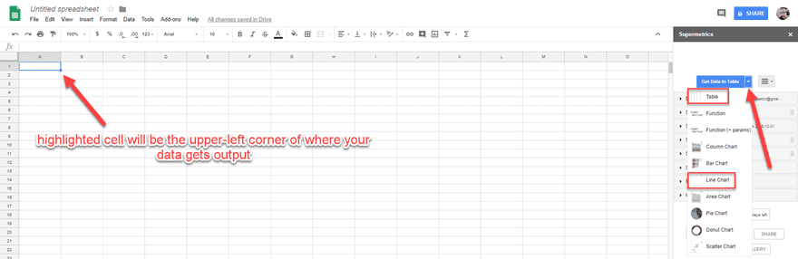
When you press the blue arrow in the Supermetrics sidebar, a menu of different output formats drops down. The two I find the most useful are Table and Line Chart. They essentially do the same thing. But you choose the starting cell for the table if you select Get Data to Table, and you choose the starting cell for the chart if you choose Get Data to Chart.
Generally, it’s better to choose Get Data to Table. That way you have a bit better control of your dashboard’s configuration.
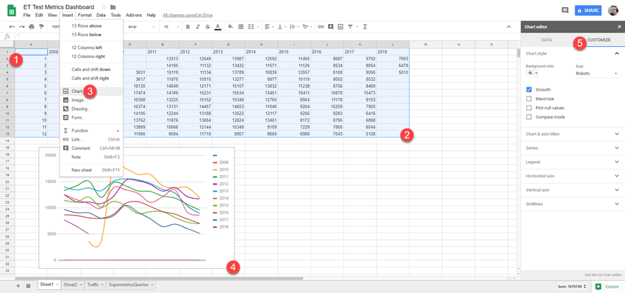
- When you hit the big blue Get Data to Table button, whichever cell you have highlighted will be the beginning of your results table.
- Highlight any columns and rows you want included in the chart. Remember, CTRL/CMD lets you individually add cells/rows/columns, and shift lets you select a range. Dragging lets you select cells and columns, too.
- Go to Insert -> Chart
- A chart appears! You can use the corners and sides to drag it into different shapes, and you can also drag it around the spreadsheet itself (very important). Charts do not take up cells. They float above the sheet on a z-axis.
- Google Sheets gives you a ton of options in the Customize tab to style the charts to match your company, team, or business’s aesthetic, as well as make the data more readable. Choose your chart style and displayed information in the Data tab.
- However, upon a Supermetrics refresh, any data you change, remove, or add by hand will be overwritten.
The Fun is Just Beginning
Okay, now we know how to get data into the spreadsheet. That’s really the first step in setting up a metrics dashboard with Google Sheets and Supermetrics. There are a lot more feature, but for setting up your dashboard at first, that’s the gist of it. Except for one thing: data refresh.
The whole point of Supermetrics is that you don’t have enter data by hand. It does a bunch of stuff for you. If you click into any cell within the data query, a new window of query information pops up in the Supermetrics sidebar. The big deal here is the big, blue refresh button. You press it, and you don’t have to rerun your query for new data. And your chart updates automatically.
Other than that, you should know that Modify lets you change any parameters you set above, even adding params or altering dates. Any changes you make will be reflected upon the next refresh in your chart and data table.
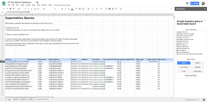
And the Show Params button opens up a hidden sheet within the workbook called SupermetricsQueries that shows the science behind the magic (or the formulas and query strings that you’re using Supermetrics to avoid. You can, however, modify anything here to your liking, and it will be reflected when the data refreshes again.
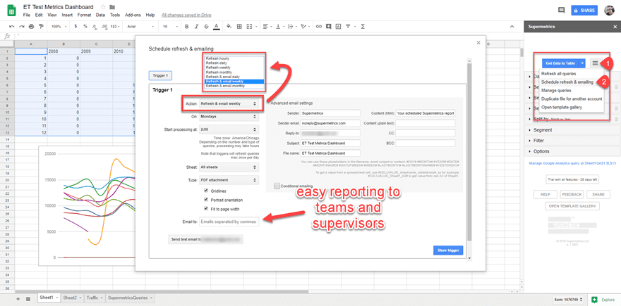
Speaking of data refreshment (and no, that doesn’t mean spilling your Mountain Dew on your keyboard), the Supermetrics paid plans allow you to schedule regular email updates with refreshed data as often as you want, down to hourly updates of specific sheets in the workbook.
Okay, now we can get to the fun part — using this to populate the dashboard itself.
Creating and Styling Your Metrics Dashboard
One of the benefits of using Google Sheets as a dashboard is being able to cut out any extraneous details that you don’t need. The UI for your dash should be simple and effective (and if I have my way, delightfully pretty).
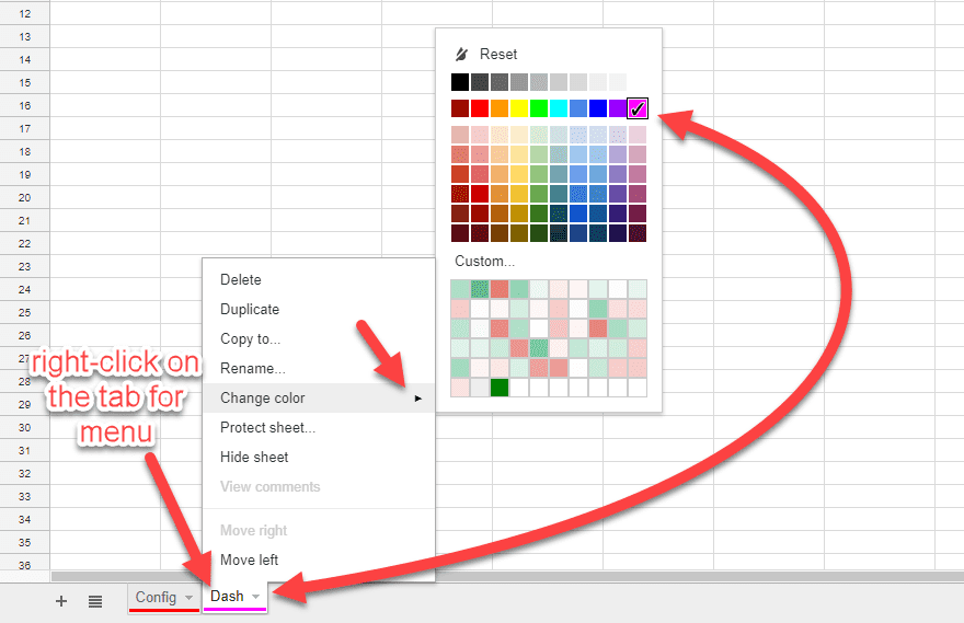
First off, you will need two tabs (at least) for the sheet. You will have the tab(s) that displays your charts and graphs and information, and you will have a configuration tab where you import and organize all the data the charts pull from. I like to color code mine so I can easily tell them apart at a glance, in addition to labeling them. You can do all that by right-clicking a tab in the lower-left corner of the screen.
Now, go back to the chart you generated and get ready to move it into the dashboard. When you generated it above, it popped up in the same sheet as your data. We don’t want that. So click once into the chart to highlight it. You can then either hit the three dots and select Copy Chart, or you can simply hit CTRL/CMD – C or X to copy it . Then move over to the newly created dashboard tab and CTRL/CMD – V to paste it into its new home. (Note that for some reason, even when you use X to cut the chart, it remains even after pasting.)
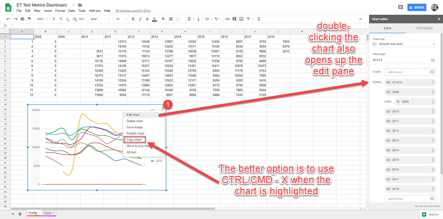
Either way, when you paste the chart into the new tab, you’ll want to return to the Config tab and delete the original chart. You can do it by the three-dot menu, or you can simply hit the delete or backspace key while highlighting it. The new chart will still be connected to the same data set as the original, so no worries there.
Voila! Technically, you have a dashboard! Now let’s pretty it up and make it one for real.
Making the Dashboard a Dashboard
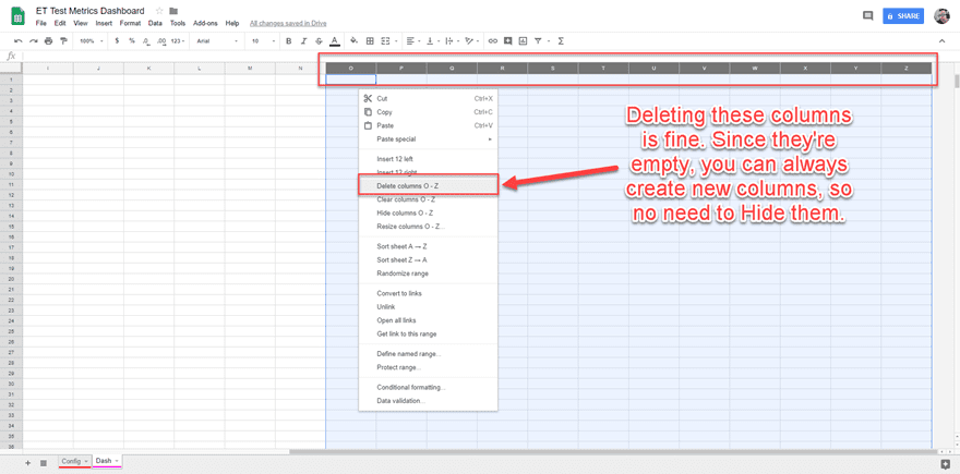
The first thing to do is make the dashboard a manageable size. Keeping through maybe Column N will be fine, so highlight and delete Columns O-Z. You can always insert them if you need extras, and since they’re empty, hiding them is just using bits of data for no reason.
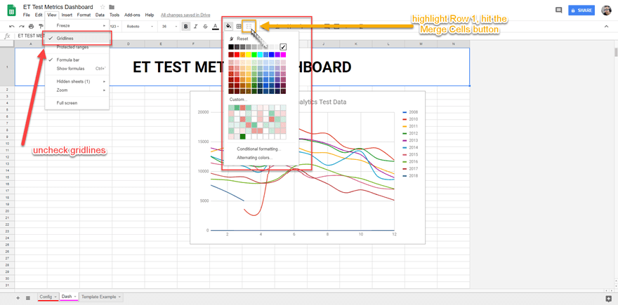
Format the remaining ones as you like. For this, we are going to keep a white background and turn off all the gridlines (View -> Uncheck Gridlines). Fill the background with any color you want. White is default, and it works well. If you do want to change, use CTRL/CMD – A to select all the cells and click the fill icon in the toolbar and change the color.
Then unselect all the cells (just click into a single one) and highlight only Row 1. Rezize it vertically and then merge all the cells.
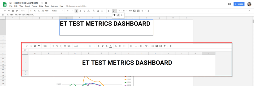
Then you can style the header like you want. I went for Roboto 36pt bold (everyone loves Roboto these days, right?). Then put the horizontal and vertical alignment for the cell text to the center.
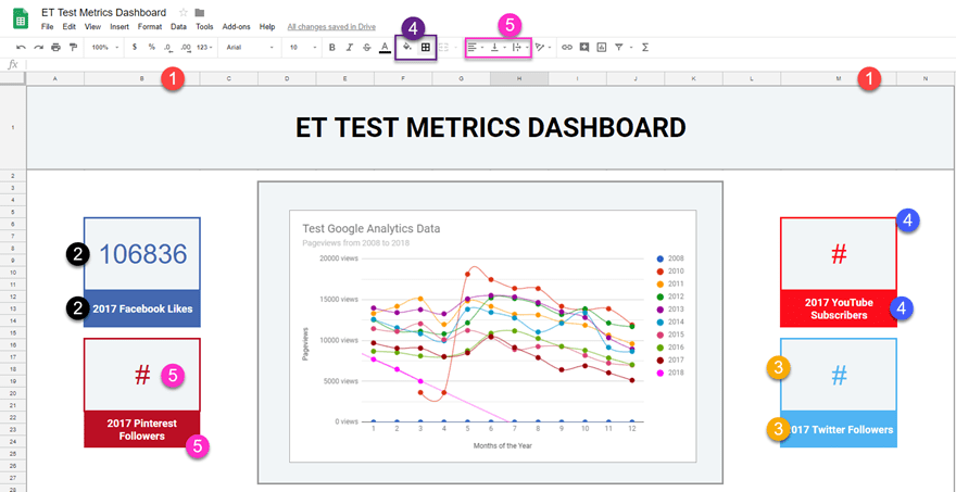
With the header in place, you can start to lay out how you want the rest of the dashboard to look. Depending on what metrics you need to show, it will look different. But with our Google Analytics ten-year overview, we can put it up top, front and center.
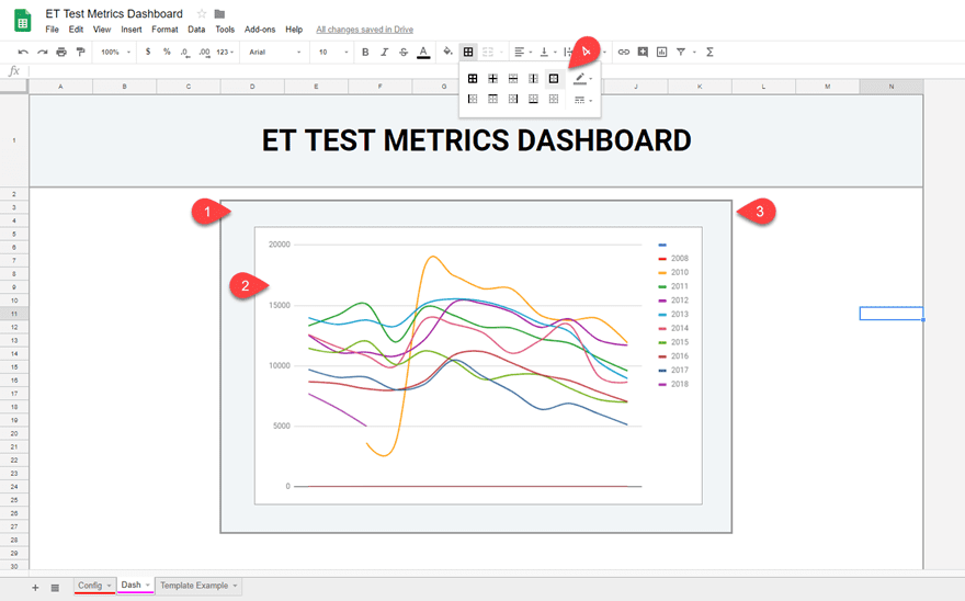
- Highlight rows D3 to K27 and merge the cells into one.
- Center the chart within that cell and resize it to fit.
- Highlight Row 1 and the newly merged cell, filling them with the same color.
- Then hit CTRL-A to select all cells and apply a border around just the outside of the cells. You have to give the merged cell behind the chart a border separately.
Customizing the Chart
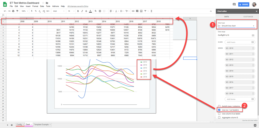
Now that’s the most fundamental way of beginning to set up the dashboard. But that’s not terribly useful yet. So we want to make the Google Analytics chart a little more presentable. So double click on it and bring up the chart Data tab.
I am going for a Smooth Line Chart and using Row 1 as the headers so the lines will be labeled by the data that was imported. (I’ve super imposed the data from the Config tab to show where it comes from.)
Under the Customization tab, you can tweak everything you’d ever want to about the chart. From the background color to the size and shape of each data point, all the way down to the suffix on the axis labels and how many pixels minor gridlines are. If you want to display your company’s data in the best way possible, you’ll be able to do it in here.
Note: any customizations you do to the chart itself will not be overwritten by refreshing Supermetrics. That only happens with the data table itself or adding/removing elements in the data tab.

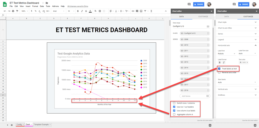
- The gridlines section lets you add or subtract the intervals your points cross. For this dashboard, I did not change the horizontal, but I did add a single minor gridline between each number, bisecting the segments and making the gains and losses more apparent.
- I wanted the smooth curves on the line chart, not sharp corners. I also thought the white background worked well. Maximize looks really nice, too, and removes much of the whitespace. But I didn’t want the first chart on the dashboard to be overwhelming since there are already many different colors. The whitespace around this one works.
- The horizontal and vertical axis sections let you work with the labels and how your data is presented. I wanted to make sure the data was not misunderstood, so I added the suffix views to the numbers generated by Supermetrics.
- The chart & axis titles section is appropriately named. You can pick how you want your stuff styled. I personally think it’s better to label the chart in this tab than within the dashboard sheet itself. So I just called this one Test Google Analytics Data for the title, Pageviews from 2008 to 2018 for the subtitle, and Pageviews/month of the year for the vertical and horizontal axes.
- The series section is the most important one. It’s how you display your data the most. A series is a single data set. So the pageviews from 2018 is a single series on the chart. To make the lines stand out and not be a jumbled mess, I gave each year a 7px circle shape and a 1px line. I also changed the color of the most recent set to a fluorescent pink to make it stand out more. I also gave it a trendline that will show how the current year is going as the data refreshes (not too great in 2018, it seems).
And finally, you’ll want to make sure the chart is labeled correctly. You can use the Customize tab under Horizontal Axis to make sure Treat Labels as Text is checked. You will get every interval listed if you imported numbers rather than words. (Like with GA using month numbers rather than words — 1 for January, etc.) In the Data tab, check Use Column A as Labels. Your chart may list a different column ID, but that just indicates the first column of your imported data, which is usually a descriptor.
Adding Other Metrics to the Dashboard
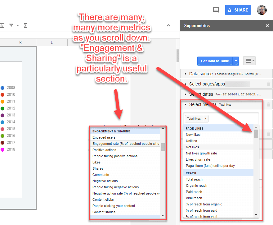
Because of what Supermetrics can do, you can import any number of other metrics into your dashboard and chart them automatically. A typical functionality that is good for at-a-glance boxes are social numbers. Supermetrics gives you the ability to check tons of social stats that your team will need. The Engagement & Sharing section, in particular can give you a lot of fantastic insights. For the demo here, though, we’ll just look at Total Likes because it’s clean and simple.
The table output will be exactly the same kind as the pageviews. I thought the previous year’s data would be a good fit for a single chart. However, the display in the actual dashboard will only show the final count at the end of the year (cell M18). Use Get Data to Table instead of chart to get more control.
Now’s the real fun part. And we’re not gonna use a chart! Just old-fashioned spreadsheet goodness.
- Make Columns B and M 200px wide (right click the column letter -> resize column… -> 200px)
- Merge Rows 6-11 and 12-14 in both columns. You will have 2 new cells this way.
- Merge Rows 16-21 and 22-24 in both columns as well.
- Set the colors for each of the smaller cells’ fill and border to the social network’s trademark color. (Make the text white for legibility.) Match the larger cells’ border and text to the social color, and their fill to match your chart/header’s fill.
- YouTube red: #FC0D1B, Facebook blue: #4468B0, Twitter blue: #50B4F2, Pinterest red: #BB0F24
- Align the text in each cell to be vertically and horizontally centered. You will also need to set the text wrapping to wrap instead of clip or overflow.
I’ve left three of the demo numbers blank. The Facebook number is pulling automatically, and here’s what you will do to fill in any of them.
You can make any cell in a spreadsheet mirror the value of another one, as long as they’re in the same workbook. So for each of the large cells you merged, you’ll use this function: =[sheetname]cellreference, or =Config!M18 in my sheet’s case here. That tells the merged cell B6 to grab the value from cell M18 in the Config sheet.
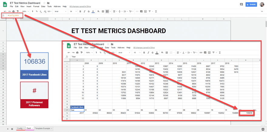
You will do the exact same thing for the rest of the social networks you include, only with their respective table’s cells. You can also use this method to call any values you want within the spreadsheet tables for your dashboard, not just numbers. URLs, anything you can put in there. If you just want a dynamic cell in your Config sheet that correlates to a static cell in your dashboard, use the =[sheetname]cellreference function.
Voila! You Just Made a Dashboard!
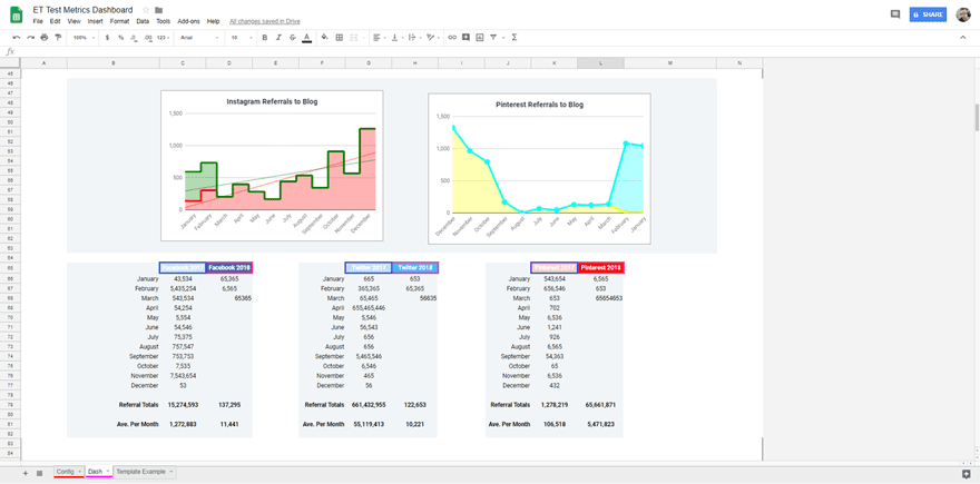
Congratulations. Remmeber you can add all sorts of other data and metrics in there, too, and format them in any way you want. From refferals to your blog from different sources to AdWords conversion rates. Whatever you need for your team is right there, now that you’re familiar with the process and have the metrics dashboard itself set up.
One More Thing
I do want to point you in the direction of one more resource you can use from Supermetrics. They do have a series of templates you can download and use for your metrics dashboards, but I always prefer custom to pre-made on this kind of stuff. The templates can teach you a lot about how the Google Sheets metrics dashboard works, though. And I’d be lying if I said I didn’t poke around them before doing it manually myself.
First, you’ll go to the Add-ons -> Supermetrics -> Template Gallery menu option. That will then open up a huge gallery of the choices you have for pre-made templates. To keep with our theme, let’s just take the Google Analytics Traffic Dashboard template.
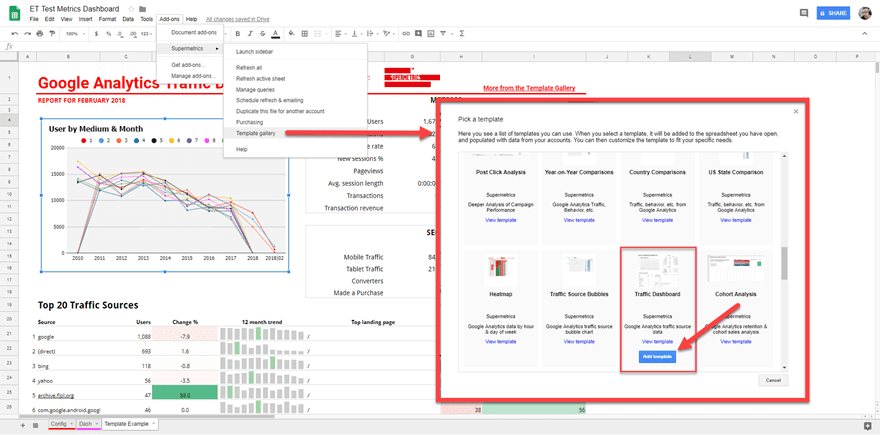
The basic template gives you a lot of information all at once, and it pulls all this data the same way that our manual one did. The difference is that there is no Config tab here. Instead the Supermetrics template separates the data into a section of the same sheet (which means you can’t restrict access to it like you can a separate spreadsheet).
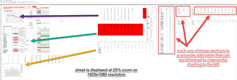
You can absolutely change around any of the data in these templates, fix the formatting and colors, and even add your own charts and pertinent information. Nothing is set in stone because they’re just templates. Use any of these as a starting point for your own metrics dashboard using Google Sheets. In the template, the data tables are lined up out of view, and clicking on any of them will give you the option to modify the query.
Wrapping It All Up
Hopefully, any fears you had about spreadsheets have been assuaged. While they can certainly be intimidating, the benefits of using Google Sheets or another spreadsheet software as a metrics dashboard for your business far outweigh anything negative. And when you add tools like Supermetrics to the mix, even the more complicated and time-consuming parts of spreadsheet dashboards get minimized.
You really can’t go wrong with automated data refreshing that makes your team more efficient, you know?
If you want to create data tables and charts for your public content (which is a killer way to stand out) consider these table plugins that make it easy.
What kind of metrics dashboard does your business use?
Article featured image by Min200dgr / shutterstock.com


Amazing post. Great detail. Looks like I have my work cut out for me. Thanks for help!
Gr8 blog very useful. Nice job B.J.
Hi,
I just wanted to say thanks.I enjoyed the nice & excellent blog post.
Well detailed post. I was really looking for this kind of stuff.
Nice B.J., thank you for the post.
I had looked at Supermetrics before, have the site bookmarked to look at later.
Now I’ll put up a bit higher on the to-do list…. :-))
Rob
Google Data Studio is great and free.
+1 for Google Data Studio!
Supermetrics also ties in with it, so you can make it even better! 🙂