Scrolling is a basic functionality of the web as we know it. However, some websites like to alter the way scrolling works, which can not only take you by surprise, but affect your overall experience in a negative way.
In a nutshell, functionality such as scrolling should be kept simple. In this article, we’re going to talk about how scrolling can affect your user’s experience. Then we’ll discuss two popular scrolling UI tricks you should avoid, and talk about better alternatives.
Scroll down to keep reading!
Why Scrolling Has an Impact on Your Website’s Functionality
Websites these days can be incredibly complex, both from functionality and style standpoints. However, the way we interact with them is usually very simple. In most cases, interactions with a website come down to either clicking, typing, or scrolling. We all know how those three functions work, and more importantly, we expect them to be universal.
For example, imagine visiting a website that scrolls down the page each time you click anywhere within it. It would make navigation confusing, and in some cases, it might even make you believe there’s something wrong with your browser or computer, particularly if you’re not tech-savvy.
However, there are ways you can change how scrolling works without it impacting your website’s usability. Take parallax, for example. It works by creating a false sensation of depth, achieved by scrolling through sections at different speeds:
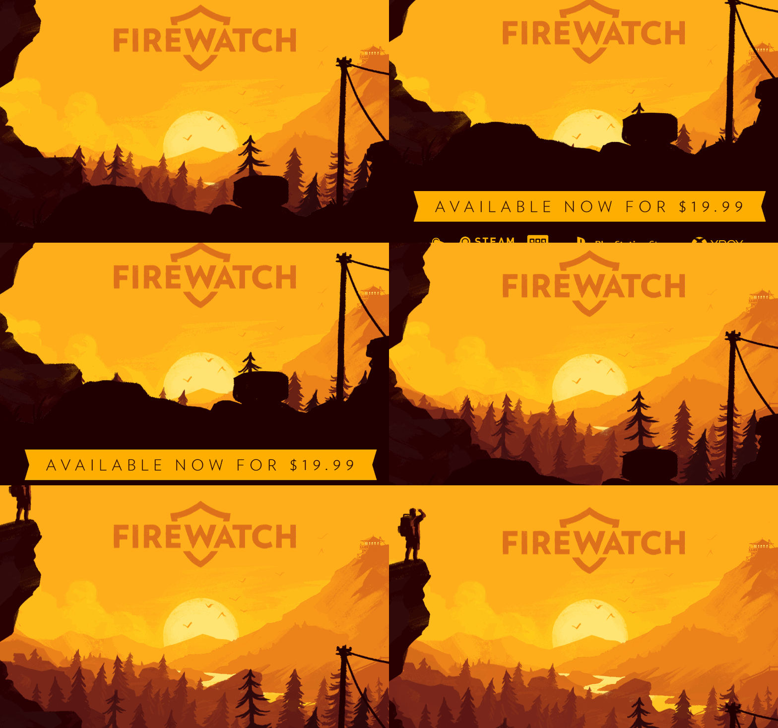
However, parallax works because the scrolling functionality remains the same for the user. It’s simply a visual trick, and if implemented well, looks stunning. With this in mind, let’s talk about some types of scrolling UI tricks that don’t necessarily improve the user experience, but are commonplace.
2 Scrolling UI Tricks You Should Avoid (And Why)
Whenever you implement new functionality on your website, you need to ask yourself two things: Does it fulfill a purpose, and does it make your site more complicated to use? The answers, ideally, should be “Yes” and “No” respectively. Otherwise, you have a problem on your hands.
Here are two common scrolling tactics that offer different answers to the questions above.
1. Infinity Scrolling
An infinitely scrolling site is stylish, but it’s not overly practical.
Infinity scrolling is a catchy name for websites that never seem to end – almost literally. Implementing it means users will load more content dynamically as they scroll, until you run out of content.
Often, infinity scrolling is used on either galleries or blog indexes. The goal is usually to improve time on site metrics, without having to jump through several pages. While the effect can look cool, and has a logical purpose, there are three key downsides to implementing the tactic:
- It doesn’t work well with most footers. If your site has no end, you won’t be able to use a footer unless you make it sticky, which takes up screen real estate.
- Too much content on a single page can impact performance. Increasing the content on a page will eat up resources for your visitors. This means your website can potentially start to feel sluggish as users scroll through.
- You need to implement loading animations. You’ll often need to add some sort of visual cue to indicate more content is loading when you scroll down to the bottom of a page. Otherwise, visitors may not understand what’s going on.
The simple alternative to infinity scrolling is ‘pagination’. If your website is content-heavy, it makes sense to break it down using pages. Not only will your layout look less cluttered, but jumping from one page to the next is about as simple as navigation gets.
Divi users can choose how many posts to display on an index, and the theme will automatically add pages relative to the content. The same goes for the Gallery module, which supports pagination for those occasions where you have too many images to fit in a single page comfortably.
You can avoid adding more pages to your website if you only have a modest amount of content. However, as it grows, you need to make design choices that don’t impact user navigation. Adding pages is an elegant solution to a complex problem, and we bet none of your users will complain about it.
2. Scroll Hijacking

Scroll hijacking can make for an interesting, yet user-unfriendly narrative experience.
Normally, scrolling happens at a set speed depending on whether you’re using your keyboard or a mouse. However, some websites ‘hijack’ those functions, making you jump between sections with little transition. It sounds minor, but can be jarring when you encounter it in the wild.
Usually, design- and style-heavy sites implement scroll hijacking. They have lots of animations, video backgrounds, and other bells and whistles. While they can look stunning, they’re also overwhelming. Here’s why we’re against scroll hijacking specifically:
- It makes navigation seem sluggish. In most cases, transitions will be artificially slowed down, so as not to seem instant. The result, however, is your website ends up feeling sluggish.
- It takes away freedom from your users. Users should be able to navigate your site freely, and scroll hijacking can make them feel like they’re constrained by what you want them to see.
- Some visitors can be confused by the change. If a user needs to be tech-savvy to navigate your website, it probably scores very low with regard to usability.
The goal behind scroll hijacking is to increase interactivity. It’s perfectly fine to have this as a goal, and fortunately, there are several ways you can do this without affecting your website’s usability. Adding microinteractions, for example, is an excellent way to make visitors feel like your website is more ‘alive’.
However, you don’t need to fill your website with animations to create a compelling user experience. If you want your site to break the mold, the best way to do it is to design a unique navigation scheme, which is something Divi can help you achieve thanks to its modular system.
Conclusion
Scrolling is not something a lot of us pay attention to when it comes to web design. After all, the functionality works the same in most platforms and applications. With this in mind, altering it is usually a bad idea because your website’s usability is inherently affected for all visitors.
Generally speaking, we’re against making changes to your website that negatively impacts its usability, and altering the way scrolling works is one of those. There are two scrolling UI tricks we recommend you avoid in particular, and they are:
- Infinity scrolling: This design trick can look great, but it can affect your website’s performance.
- Scroll hijacking: Basic functionality such as scrolling and clicking should remain the same on any website you visit.
What do you think about altering the way scrolling works on your website? Share your thoughts with us in the comments section below!
Article image thumbnail by mamanamsai / shutterstock.com.




I completely disagree with continual scrolling being a wrong choice. If used properly it can save anxiety from pagination, which is a horrible way to navigate with load waiting times. Great for SEO.
If you manage your Json and DOM correctly, you won’t have too much weight. Load lightweight images until clicked. If you have a huge amount of content add a fetch on scroll up so you can manage the page at only x number of posts at any given time.
But this scroll, scroll, pag, wait, scroll, scroll, pag, wait is horrible.
If you need access to the footer, then create a [View Footer] button below the [Back to Top] which will pause the fetching and scroll to the footer. Then below the last post add a [Load More] which will resume fetching.
If you want to get creative you can have two buttons [Load Next 5] [Auto Load]
Thanks for sharing your views, I think it’s important to note that there is no “right” choice here. Both approaches have pros and cons, so I appreciate you raising your opinion. 🙂
if you use the two buttons, then the button below the [Back to Top] can become [Stop Continuous Load] or whatever.
I enjoy these “what not to do” type posts – they help avoid the temptation to use “features” just because they are there! KISS is the best guiding principle in UX.
As a side note, I am a little compulsive and detest infinite scroll – I want to get to the end and find myself scrolling and scrolling and… A good example of this is LinkedIn offering you additional contacts to connect to – I swear they would offer all 400m+ users if you just kept on scrolling.
I’m really glad you enjoyed the article. You also make a good point about the infinite scroll, so thanks for sharing! 🙂
Good article! And I would add that after scrolling tricks (or none) ….if you don’t put a “return to top” (scroll) button on your website your going to annoy pragmatic designers like me 😉
Thank you, I’m glad you like it. 🙂
I don’t like when websites do the scrolling hijack method. I’ve seen Apple do it on their sites and it’s very annoying.
I have a doubt about this statement:
“2 – Too much content on a single page can impact performance. Increasing the content on a page will eat up resources for your visitors. This means your website can potentially start to feel sluggish as users scroll through.”
The paragraph above was used referring to the infinite scrolling topic. In my point of view (I’m not sure if I am right), as long as we have an infinite scrolling page, the content may not affect the performance, since the page will load only the first available content and not the whole page hidden before the scroll.
But, if it is a regular page, the content matters on page load because it will be loaded thoroughly, as opposed to the infinity scrolling that loads only the first available content.
Someone please let me know if I made any mistake.
Thank you.
Thank you for that insight. If there is compelling evidence that infinite scrolling does not affect performance, we’ll take another look at it.
The Infinite Scroll feature is one of my most hated design features for Facebook, Pinterest, and Instagram. Though when running metrics on my own site I found a staggering number of users entering my site on mobile and scrolling all the way to the bottom and trying to drag a little extra to get it to load more content even though there was a prominent well designed and displayed pagination right in front of them.
It seems that the age of social media has changed some of the aspects of what we expect. Almost to a point that users have also forgotten how to use the simplest of features.
What do you use to measure someone tugging on the footer? Why would you even bother implementing this?
That’s a good point, thanks for sharing your thoughts. 🙂
Thanks John, I completely agree. There’s no more annoying thing than when a website focuses on design rather than usability and content. I remember the old days when cursors were altered into fancy graphics or when snow was falling when Winter came – now these other techniques hijacked the grounds but they are still irritating sometimes.
You’re welcome, I’m glad you enjoyed it!