
Welcome to part 1 of this 6 part series that will teach you how use Divi and its new Animation options to design awesome page sections. I’m going to be walking you through how to build the different sections of our live demo page in order to show you techniques for adding animations to your website. The Animation features truly are fun and easy to use. And with the Visual Builder, you can see your creation come to life every stage of the way. Come and join me as we explore the power of Divi animation.
Animation can bring a page to life. If done effectively, the user can become engaged and more inclined to explore the content on your page. If done poorly, animations can completely distract the user and drive them away in a state of dazed disappointment. The speed, timing, and intensity of the animation all play a significant role in this symphony of movement as the user scrolls down the page.
Divi’s advanced animation features allow you to add animation to any element of your website. And you can combine these animated elements to create countless combinations of movement that make your sections come alive.
In part 1 of this series, I’m going to show you how to use the visual builder to build and animate the first two sections of our live demo page showcasing the power of Divi’s animation features.
Let’s get started.
- 1 Here is a Sneak Peek of What We Will Build in This Series Part 1 of the Series Section 1
- 2 Part 1 of the Series Section 1
- 3 Preparing the Design Elements
- 4 Understanding Animation Terminology
- 5 How to Use Divi’s New Animation Effects
- 6 Add Your New Page Settings
- 7 Building Section 1: Fullscreen Header Design and Animation
- 8 Building Section 2
- 9 Bonus: Download These Sections for Easy Import
- 10 Download For Free
- 11 Wrapping Up
- 12 Coming Up
Here is a Sneak Peek of What We Will Build in This Series
Part 1 of the Series
Section 1
Part 1 of the Series
Section 1
Section 2

Part 2 of the Series
Section 3

Section 4

Part 3 of the Series
Section 5
Part 4 of the Series
Section 6

Part 5 of the Series
Section 7

Part 6 of the Series
Section 8

Section 9
Preparing the Design Elements
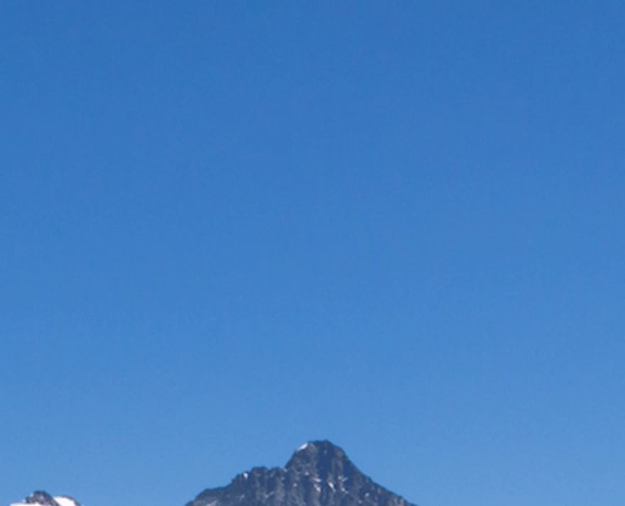
For the first section, you are going to need two images. The first is your fullscreen background image with dimensions around 1280×800. Here is the one I’m using:
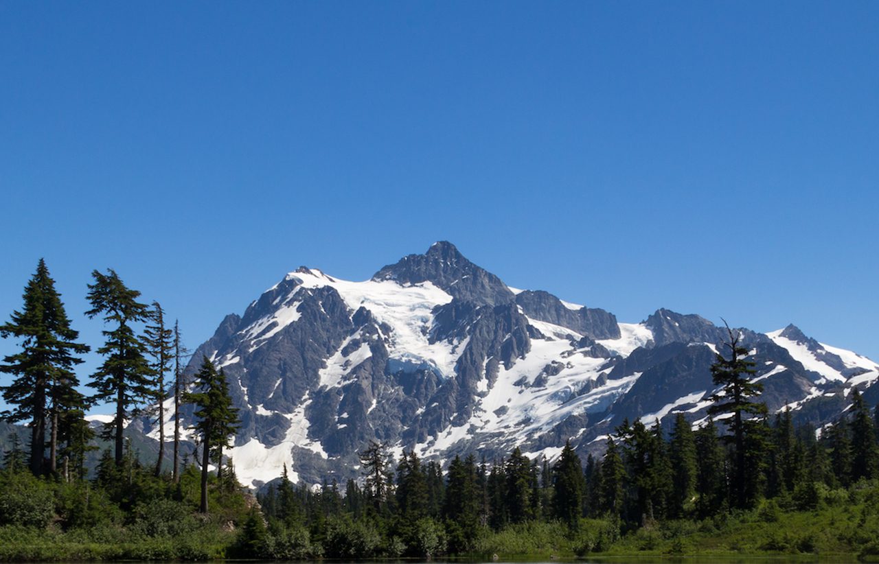
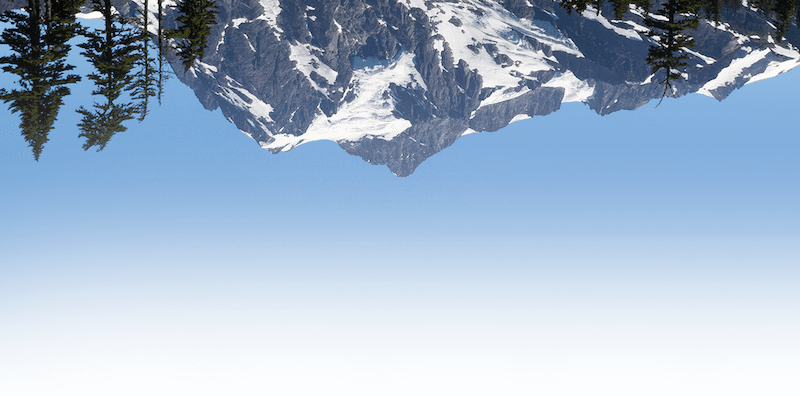
The second image is an edited version of the same image that has been flipped vertically and faded out toward the bottom. This second image will serve as the background for you main headline and should be around 800×400.
To create the upside down image, either open the image in Preview and select Tools > Flip Vertical or open the image in Photoshop, select Image > Image Rotation > Flip Canvas Vertical. To add the fade out effect to the bottom of the image, I used the eraser tool in brush mode with a size of 800px and 0% hardness. Then I held shift and dragged the brush along the bottom edge.
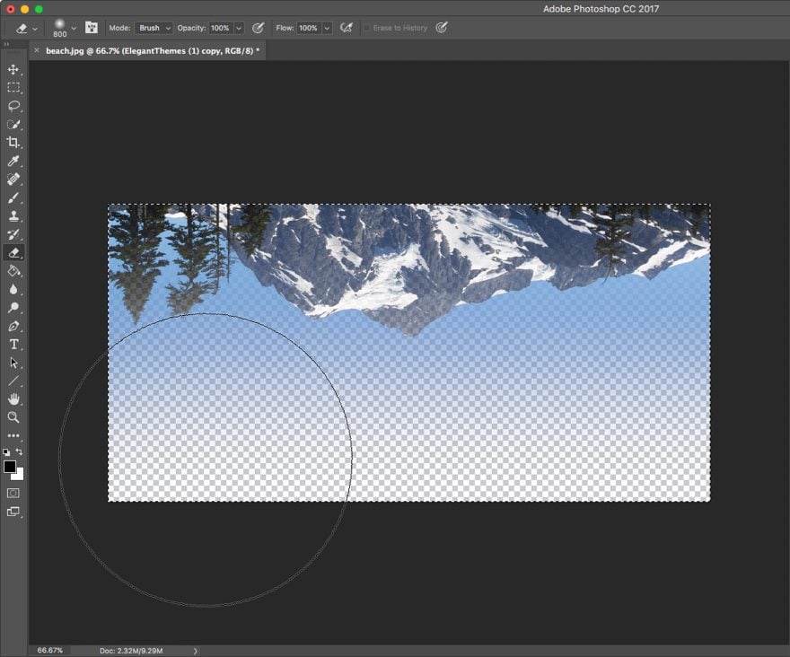
Make sure to export it as a png file.
If you don’t have Photoshop, you can try a free photo editing solution like gimpshop to accomplish many of the same design edits. If you don’t know how to use a photo editing software (and don’t care to learn at this point), feel free to leave out the second image for now, or use the one below (click and drag it over to your desktop).
For the second section, you will need two images. The first should be around 730×490 like this one.
And the second should be around 525×660 like the one below.
Understanding Animation Terminology
If you haven’t already, go ahead and read the feature update post introducing advanced animations. At the end of the post, Nick gives a helpful definition/description of each of the animation features you will find throughout the builder. Understanding what these animation features actually do is important to the creation process.
Once you have an understanding of what these animation features are, let’s dive in.
How to Use Divi’s New Animation Effects
Subscribe To Our Youtube Channel
Add Your New Page Settings
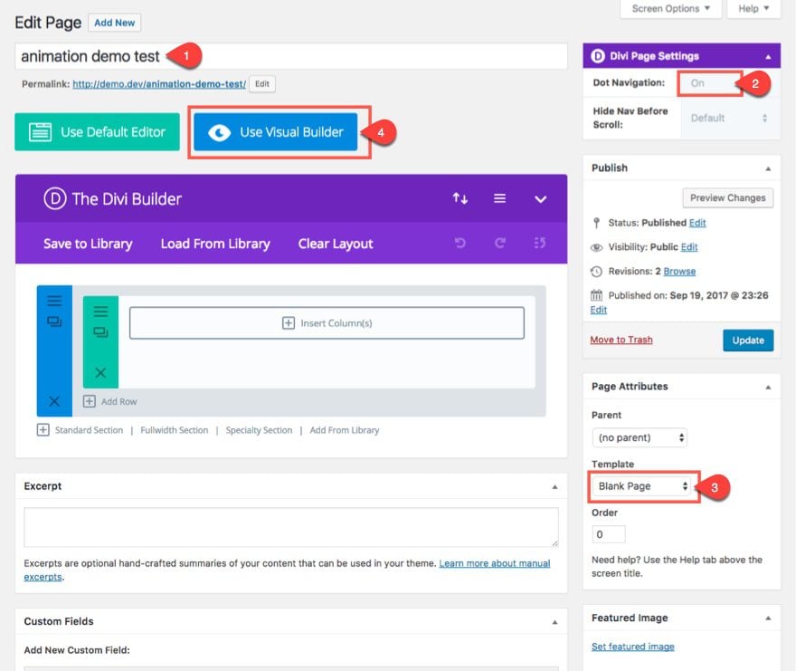
From the WordPress Dashboard, go to Pages > Add New. Then add a title to your page. Next, find the Divi Page Settings in the box at the top right of the page and select Dot Navigation “ON”. In the Page Attributes box, select Blank Page for your page template. Finally, click the “Use Divi Builder” button and deploy the Visual Builder to start building your layout.
Building Section 1: Fullscreen Header Design and Animation
This header section is going to behave much like a fullwidth header module set to fullscreen. In other words, when the site loads, the section will fill the entire width and height of the browser window no matter the size the window. But instead of using the fullwidth header module, we are going to use a standard section and set the height to 100vh. That way we can add a text module inside of it.
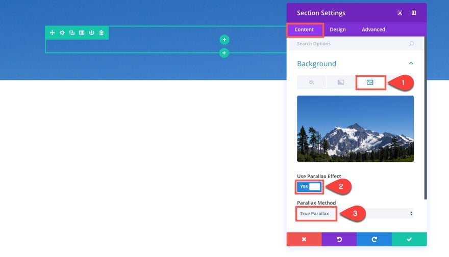
Using the Visual Builder, click to edit the section settings of the standard section already displayed by default when launching the builder. Update the following:
Under the Content tab…
Background Image: [enter your 1280×800 background image]
Use Parallax Effect: YES
Parallax Method: True Parallax
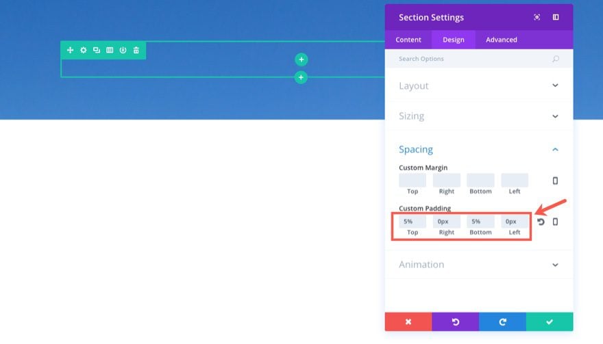
Under the Design tab…
Custom Padding: 5% Top, 0px Right, 5% Bottom, 0px Left
Under the Advanced tab…
Add the following Custom CSS in the Main Element box:
min-height: 100vh
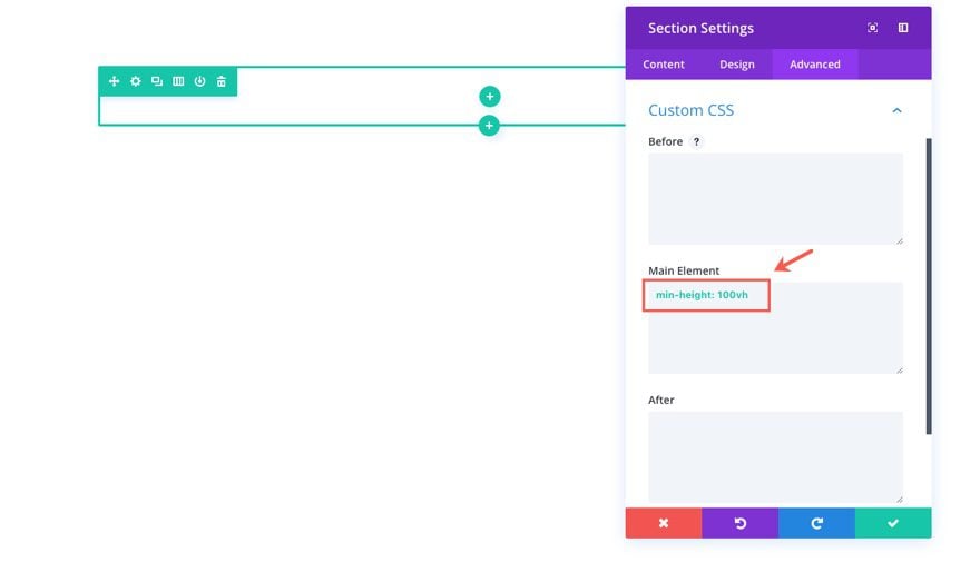
This one line of css tells the section to display 100% of the viewport height.
Save Settings
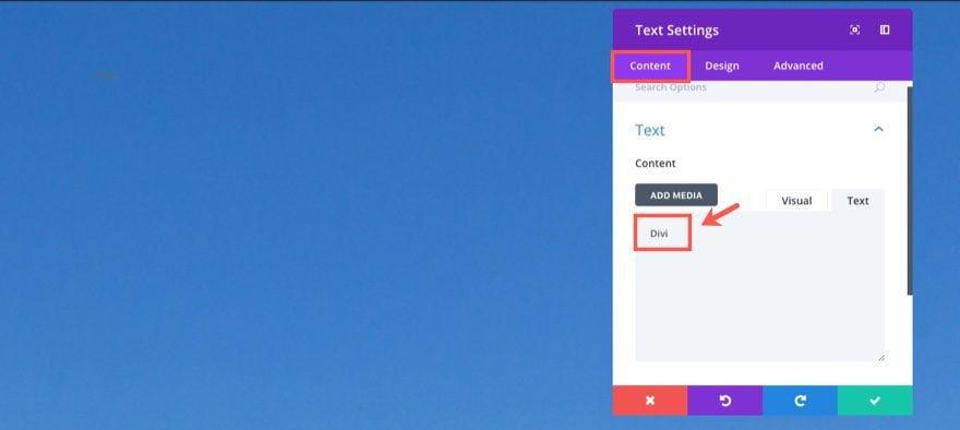
Next insert a one-column structure to your row and add a text module to the column. Update the text module settings as follows:
Under the Content tab...
Simply add the word “Divi” inside the content box.
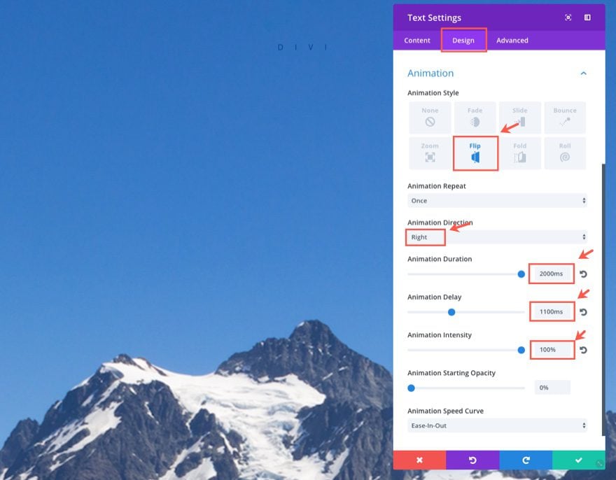
Under the Design tab…
Text Font: Oswald, Uppercase (TT)
Text Font Size: 14px
Text Text Color: #08408e
Text Letter Spacing: 1.5em (you will need to type this in)
Text Orientation: Center
Custom Margin: 2%
Animation Style: Flip
Animation Repeat: Once
Animation Direction: Right
Animation Duration: 2000ms
Animation Delay: 1100ms
Animation Intensity: 100%
Animation Starting Opacity: 0%
Animation Speed Curve: Ease-In-Out
Time Out… Let’s pause for a minute so I can show you what it would take to add this similiar animation manually.
Here is the html with inline styling needed for the animation:
<div class="et_animated flipLeft" style="position: absolute; animation-duration: 2000ms; animation-delay: 1100ms; opacity: 0; animation-timing-function: ease-in-out; transform: perspective(2000px) rotateY(-90deg);">
<div style="position:relative;">Divi</div>
</div>
And here is the CSS needed for the animation:
@keyframes et_pb_flipLeft {
    from {
        transform-origin: center
    }

    to {
        opacity: 1;
        transform: rotateY(0)
    }
}

.et_animated.flipLeft {
    animation-name: et_pb_flipLeft
}

.et_animated {
    animation-fill-mode: both!important;
}
And this doesn’t include the code necessary to activate the animation when it becomes visible in the browser window. Anyway, all that to say that having these built in animation features are a huge time saver. And being able to see the animation live as you edit the animation options is considerable bonus.
Now let’s continue with updating our Text Module Settings:
Under the Advanced tab…
Add the following line of Custom CSS to the Main Element box:
text-indent: 1.5em
Save Settings
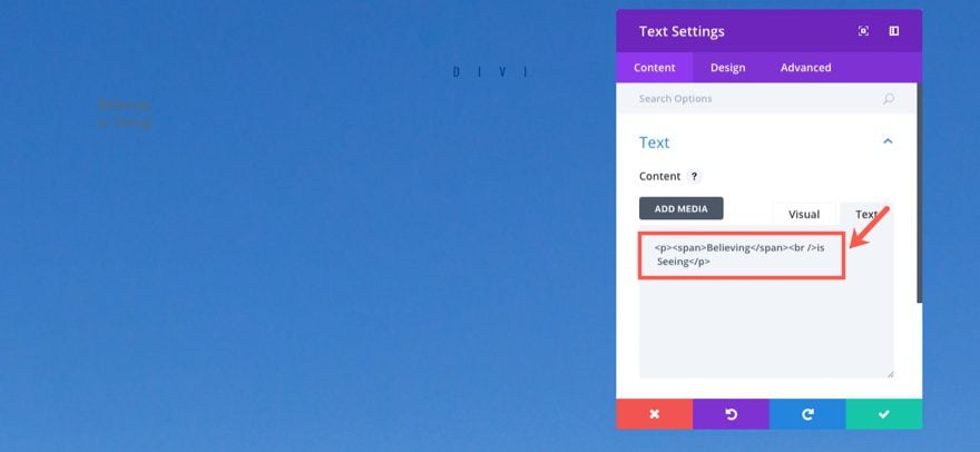
Next add another Text Module directly under the one you just created and update the settings as follows:
Under the Content tab…
Add the following html in the text tab of the content box:
<p><span>Believing</span><br />is Seeing</p>
Under the Design tab…
Text Color: Light
Text Font: Oswald, Uppercase (TT)
Text Font Size: 8vw (you must type this in; this makes the font size 8% of the viewport width)
Text Text Color: rgba(255,255,255,0.79)
Text Line Height: 1.4em
Text Orientation: center
Animation Style: Fold
Animation Direction: Up
Animation Duration: 1800ms
Animation Delay: 0ms
Animation Intensity: 60%
Save Settings
This animation effect will reveal the main headline by folding (or standing) it up from a seemingly flat position. Now that we are done with our main headline text, let’s add our upside down background image to the row.
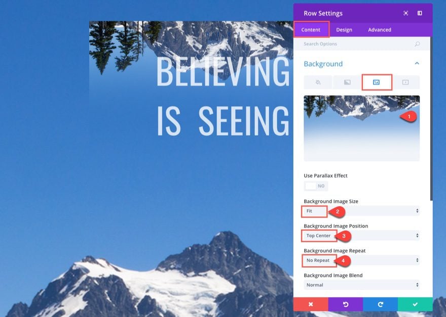
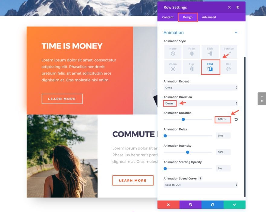
Now go to the Row Settings of the row containing the two text modules you just created and update the Settings as follows:
Under the Content tab…
Background Image: [insert your 800×440 image]
Background Image Size: Fit
Background Image Position: Top Center
Background Image Repeat: No Repeat
Under the Design tab…
Use Custom Width: YES
Unit: %
Custom Width: 50%
Custom Padding: 12% Top, 0% Right, 5% Bottom, 0% Left
Animation Style: Slide
Animation Direction: Up
Animation Delay: 300ms
Animation Intensity: 20%
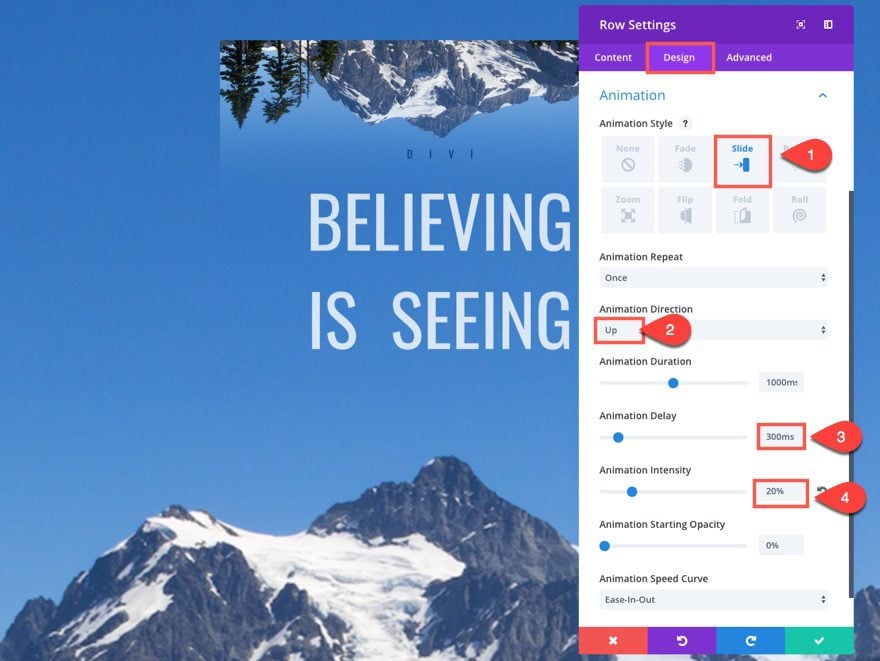
This animation effect slide the image up, almost as if it is rising up from behind the mountains.
That’s it for the first section. Let’s check out our final design and animation.

The three animated elements here include the Row (which is sliding up), the text module with the text “Believing is Seeing” (which is folding out from its center), and the text module with the text “Divi” (which is delayed to flip open to the right after the other elements have come to a stop). The combination really engages the visitor by revealing different pieces of content in a purposeful and timely manner.
Building Section 2
This second section of our animation demo page showcases a subtle, yet extremely cool, way to reveal content on your page. In fact it is almost impossible to recognize all the movements at first glance.
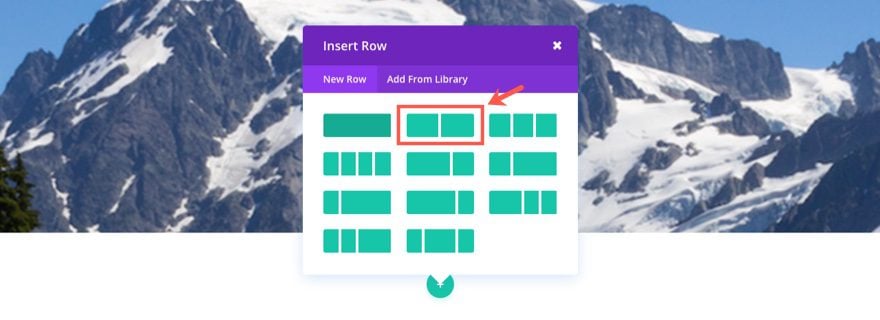
To build the second section, add a regular section under the previous section. In the section add a two-column (one-half one-half) row.
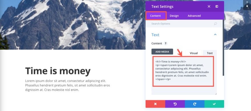
In the left column, add a text module with the following settings:
Under the Content tab…
Enter the following html in the text tab of the content box:
<h1>Time is money</h1>
<p><span>Lorem ipsum dolor sit amet, consectetur adipiscing elit. Phasellus hendrerit pretium felis, sit amet sollicitudin eros dignissim at. Cras molestie nisl enim.</span></p>
Under the Design tab…
Text Color: Light
Text Font: Montserrat
Text Font Size: 18px
Text Line Height: 1.8em
Header Font: Montserrat, Bold (B), Uppercase (TT)
Header Font Size: 39px (desktop)
Header Line Height: 2.2em
Margin-bottom: 50px
Animation Style: Slide
Animation Direction: Up
Animation Intensity: 10%
This animation effect will reveal the block of text by sliding it up into view.
Save Settings
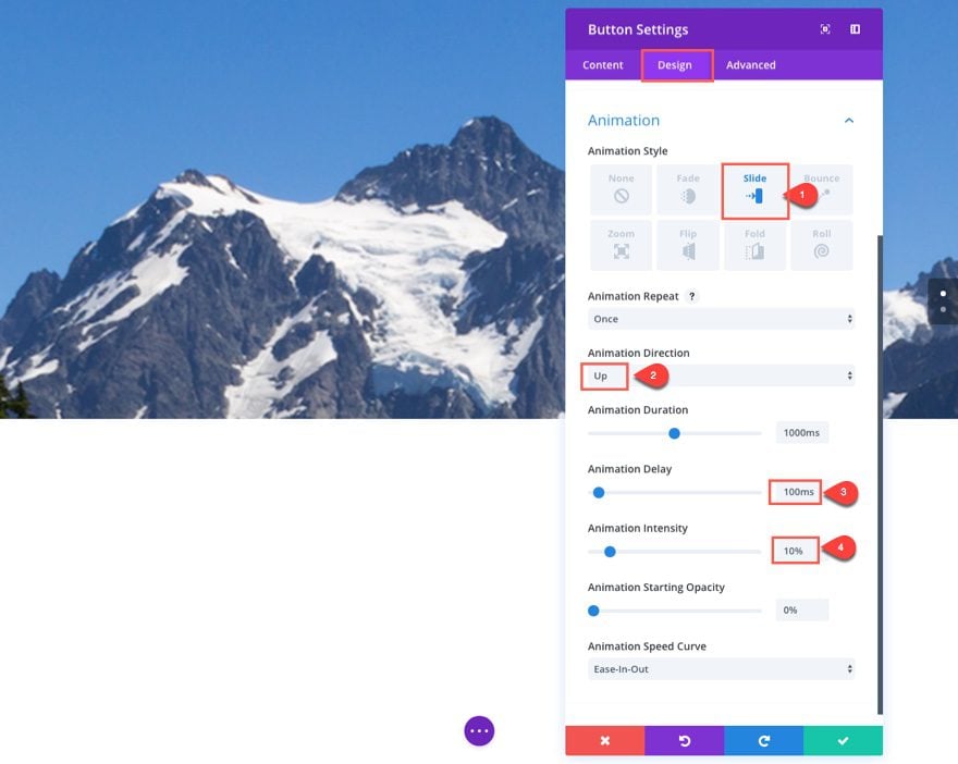
Next add a button module under the Text module you just created. Update the button module settings as follows:
Under the Content tab…
Button Text: Learn More
Button URL: # (or whatever you want it to be)
Under the Design tab…
Button Alignment: Left
Text Color: Light
Use Custom Styles for Button: YES
Button Text Size: 15px
Button Border Radius: 0
Button Letter Spacing: 3px
Button Font: Montserrat, Bold (B), Uppercase (TT)
Show Button Icon: YES
Custom Padding: 10px Top, 30px Right, 10px Bottom, 30px Left
Animation Style: Slide
Animation Direction: Down
Animation Delay: 100ms
Animation Intensity: 10%
To counterbalance the effect of the previous text above, this animation effect will reveal the button by sliding it down into view with a slight delay.
You can’t see your text and button yet because it is currently white text on a white background. That’s okay. We will be adding our background soon.
Next add a Divider Module to the right column.
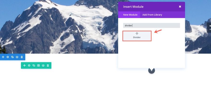
Then update the Settings as follows:
Under the Design tab…
Height: 260px
Under the Advanced tab…
Disable visibility on Desktop
Adding a divider here will help the background image remain visible on mobile devices.
Save Settings
Now Let’s add our backgrounds to each of our columns. Go to the Row Settings and update the following:
Under the Content tab…
Column 1 Background Gradient Colors: #fe8840, rgba(238,78,78,0.9)
Column 1 Gradient Direction: 135deg
Column 2 Background Image: [enter your 730×490 image]
Column 2 Background Image Position: Top Left
Column 2 Background Image Repeat: No Repeat
Under the Design tab…
Use Custom Width: YES
Custom Width: 1366px
Use Custom Gutter Width: YES
Gutter Width: 1
Equalize Column Heights: YES
Custom Padding: 0px Top, 0px Right, 0px Bottom, 0px Left
Column 1 Custom Padding: 5% Top, 7% Right, 5% Bottom, 7% Left
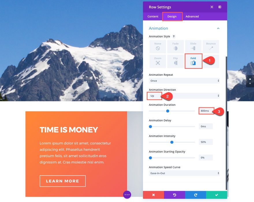
Animation Style: Fold
Animation Direction: Up
Animation Duration: 800ms
This animation effect will reveal the entire row by folding (or standing) it up into view.
Under the Advanced tab…
Add the following Custom CSS to the Main Element box:
box-shadow: -20px 0px 60px -20px rgba(255, 130, 65, 0.88);
Save Settings
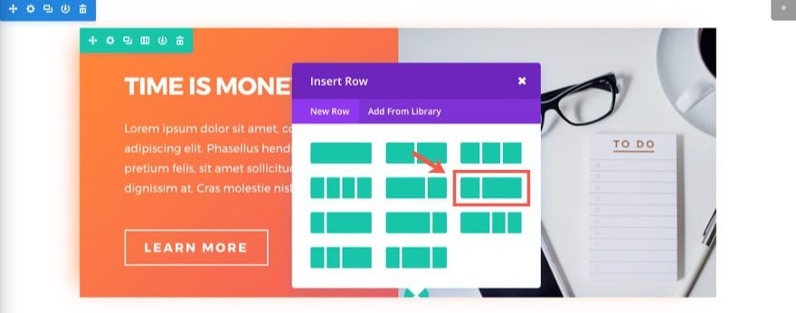
Next add a two-column (one-third two-thirds) row under the row you just finished creating.
In the left column add a Divider Module and update the settings as follows:
Under the Design tab…
Height: 400px
Under the Advanced tab…
Disable visibility on Desktop
Adding a divider here will help the background image remain visible on mobile devices.
Save Settings
To save time, go ahead and right click and copy the text module in the left column of the Row above containing the text “Time is Money”. Then paste it into the right (two-thirds) column of the Row below.
Update the new Text Module settings as follows:
Under the Content tab…
Change the h1 header text to “Commute Like a Pro” in the content box.
Under the Design tab…
Text Text Color: #a8a8a8
Header Text Color: #414159
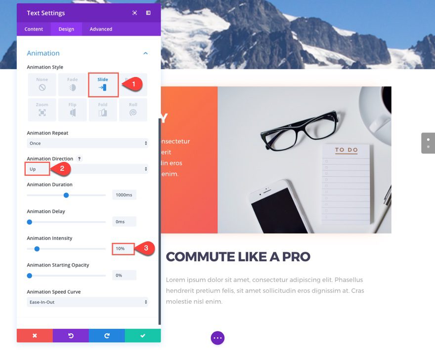
Animation Style: Slide
Animation Direction: Down
Animation Intensity: 10%
This animation effect reveals the block of text by sliding it down into view.
Now right click and copy the button module in the left column of the row above and paste it under the text module you just finished editing.
Update the Button Module Settings as follows:
Button Text Color: #ff4823
Button Border Color: #ff4823
Button Hover Text Color: #ff2323
Save Settings
For the last step, edit your Row Settings by updating the following:
Under the Content tab…
Background Color: #ffffff
Column 1 Background Image: [insert your 525×660 image]
Column 1 Background Image Position: Top Left
Column 1 Background Image Repeat: No Repeat
Column 2 Background Gradient Colors: rgba(255,255,255,0.91), #ffffff
Column 2 Gradient Direction: 135deg
Under the Design tab…
Use Custom Width: YES
Custom Width: 1040px
Use Custom Gutter Width: YES
Gutter Width: 1
Equalize Column Heights: YES
Custom Padding: 0px Top, 0px Right, 0px Bottom, 0px Left
Column 2 Custom Padding: 5% Top, 7% Right, 5% Bottom, 7% Left
Animation Style: Fold
Animation Direction: Down
Animation Duration: 800ms
This animation effect will reveal the entire row by folding it down into view.
Under the Advanced tab…
Add the following custom CSS under the Main Element box:
box-shadow: 0 40px 90px -35px rgba(0,0,0,.3);
That’s it for this section. Check out your results.
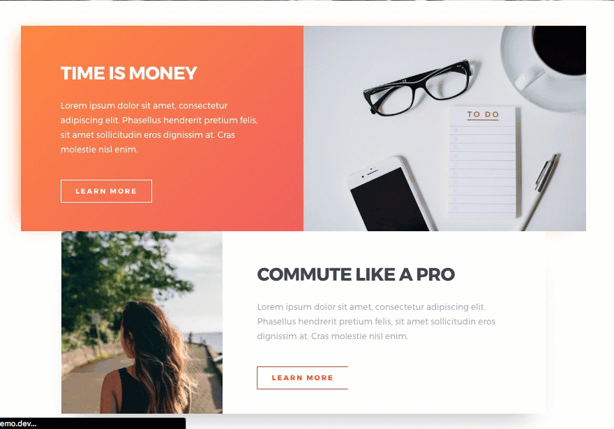
Because the animation and design elements of this section are subtle, I think it is a great example of the kind of design and animation that could be used on most pages. The top and bottom rows open up like you would be looking at a book opening from behind. The text and buttons move slightly up on the top row and down on the bottom row. A great combination.
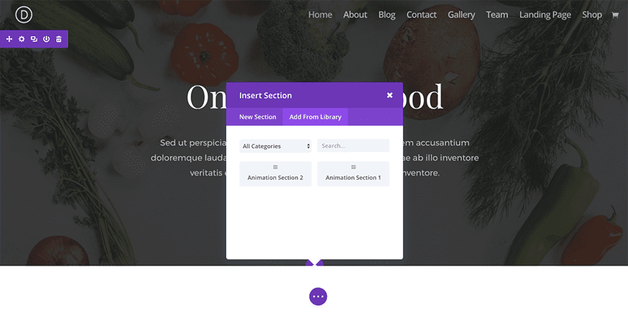
Bonus: Download These Sections for Easy Import
As a bonus perk we’ve packaged the sections built in today’s tutorial into a free download that you can get using the email opt-in form below. Simply enter your email and the download button will appear. Don’t worry about “re-subscribing” if you’re already part of our Divi Newsletter. Re-enter your email will not result in more emails or duplicates. It will simply reveal the download.
Enjoy!

To use these downloads, start by locating the zipped file called Animation_Effects_Part_1.zip in our downloads folder. Unzip it to reveal the following imports.
Animation Effects Part 1 (section 1).json
Animation Effects Part 1 (section 2).json
Navigate in your WordPress Admin to Divi > Divi Library > Import & Export. When the portability modal pops up, click the import tab and the button labeled choose file.
Select the json file you prefer and click “Import Divi Builder Layouts”. Once the import is complete navigate to the post or page you would like to add one of the above sections to.
Activate the visual builder. Navigate to the part of the page you would like to add one of the above sections to. When you click the add new section icon, you will be presented with the option to “Add From Library”. Choose this option and select the layout you want.
Wrapping Up
I hope that these two sections will serve as an inspiration for future builds using Divi’s animation features. The design concepts alone are great and the layouts can easily be adapted to any website with just a few minor tweaks. Stay tuned as we will be covering a lot more in this series.
Coming Up
In the next part of this series I will be continuing our exploration of Divi’s advanced animation features by building sections 3 and 4 of our animation demo page.
Here is what you can expect to build.
Section 3:

Section 4:

Please leave any comments you have below.
Cheers!


When will you be posting the next animations in the blog? Thanks Heda
Hi, I have a problem with the animations of the call-to-action modules. When you open the page where they are inserted they are slow to load, they do not appear until you update or resize the browser window, which appears immediately. Does anyone know how to fix it? Thanks!
It seemed like right after this was released my grid galleries stopped opening in lightbox. Now, when you click on the photo it does nothing. The gallery grid is acting like one large animated section now.
There is danger with this stuff. Unless animation adds something to the user experience, it amounts to what I call “Dancing Baloney”. It reminds me of presentations that have things flying in from all directions and bouncing around.
I would check also to see what this stuff does to page score on Google’s Page Speed Insights. If it hurts your score, the cost could be very high.
Very cool animations, but I also think they are not ready for mobile use.
Great Design staff !!
How about SEO supporting settings?
h1 is possible to make adjustments per text module
But h2 is only on global font settings – How can I adjust color ect. on each text module (like regular text + h1)
Thx Tom
Thanks for pointing this out. We will keep this in mind going forward. In the meantime, you may want to just add inline CSS to the h2 tag.
This is great. But there are huge problems on mobile. So for now I cannot use this amazing feature and “have to” 😉 live with no animations. Please make it work correctly 🙂 Because it is really great step forward to create much richer web-design then we had before, thanks to your incredible efforts. Thank you for your work!
Unrelated to the post but would you please consider adding a switch on Divi Options to turn off the Divi translation inside the admin panel? I mean, keep the site translated to the visitors but prevent the translation of the modules, menus and terms inside the builder.
Why the server is taking to long to load. And if its loaded after a couple of minutes, it doesnt show up the images?
How do you turn off animation for mobile devices?
Preston,
Unfortunately, there isn’t a one-click solution to this. You can either duplicate the item to include a none animated version to display on mobile, or you can use CSS media query to override the animations.
1. Copy row or section.
2. In section settings
In one copy set: turn off on PC
In the second copy set: turn off on Tel, tablet
If there is another option let someone write
@KArol Thank you, I had the same doubt. 🙂