
Footers are an important part of a website’s design, but they can also be one of the most difficult areas to design. Most include the basic elements such as navigation, contact information, and social follow buttons, but making them stand out or even looking interesting is another story. In this article we’ll look at 15 Divi websites with excellent footer design to help inspire you for your next Divi website.
I chose these sites based on their use of color, images, typography, navigation, social icons, contact information, calls to action, newsletter signups, etc. I’ll point out what I find interesting about them. I’ve included the full screen-shot so you can see how it fits in with the rest of the website.
Hang around until the end for a few links to Elegant Themes’ tutorials and a free layout pack from Divi 100 to help you build your footer with Divi.
Now, on to the footers, which are in no particular order…
- 1 1. JC Pohl
- 2 2. Benton Brothers Fine Cheese
- 3 3. SpotX
- 4 4. Outreach Plus
- 5 5. GCON
- 6 6. HEJ Coffee Company
- 7 7. Les Anagnou
- 8 8. Newton Software
- 9 9. eGaushala
- 10 10. Kickbike
- 11 11. Telepizza
- 12 12. Cloud Nine
- 13 13. Ebert Studio
- 14 14. Lauren K Stein
- 15 15. KR Digital Solution
- 16 Ending Thoughts
1. JC Pohl
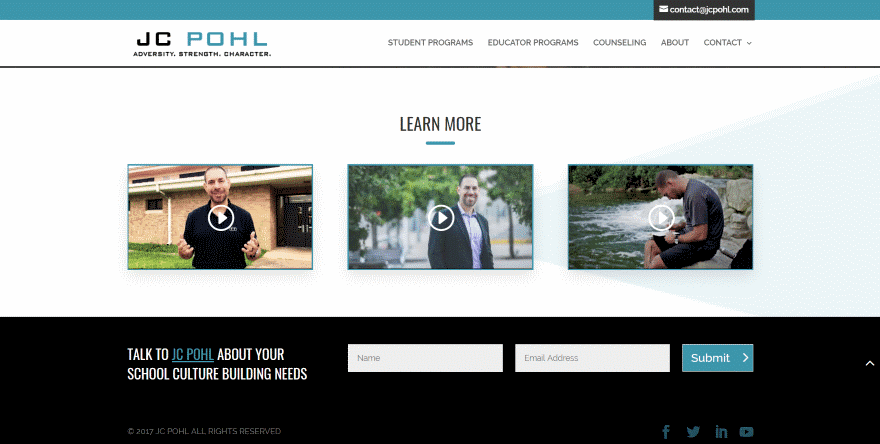
This is a simple footer to provide an email signup form in full-width. It uses a dark background with white and blue/green text, button, and icons. The colors blend perfectly with the website. The text provides a short call to action to sign up to the newsletter.
2. Benton Brothers Fine Cheese
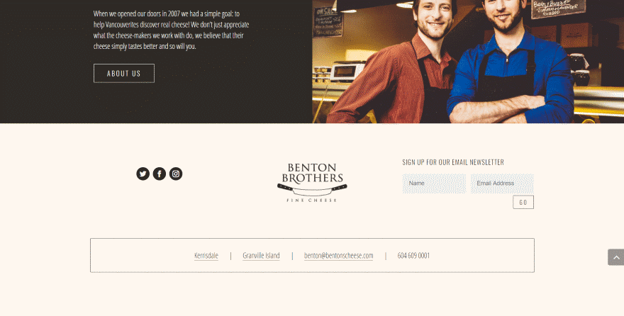
This one uses a light cream background with dark text to create a two-color design in two rows. The first row places social follow buttons, the logo, and newsletter form apart from each other. The second row displays the footer menu and phone number within a box with each link separated by a bar.
3. SpotX
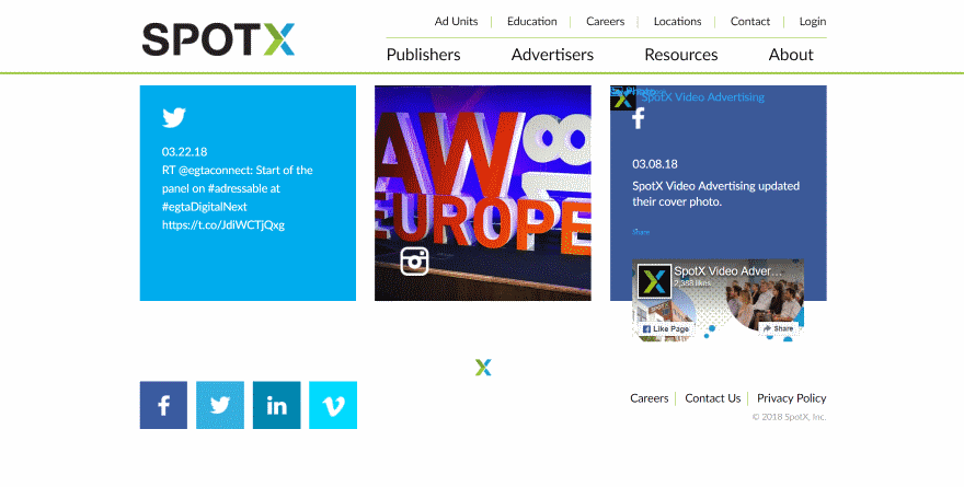
This footer uses two rows. It places social feeds for three social networks within the first row, while the second row displays large square social follow icons on one side, a small logo in the center, and a small footer navigation on the far right. The copyright notice is placed under the navigation.
4. Outreach Plus
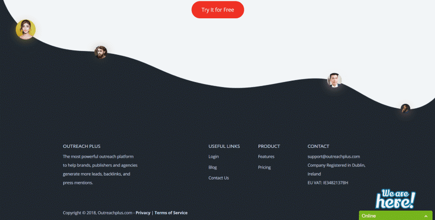
This one uses an interesting section separator with team member’s images within circles placed along the wavy separator line. The footer area uses a black background with white text with information, links, and contact information.
5. GCON
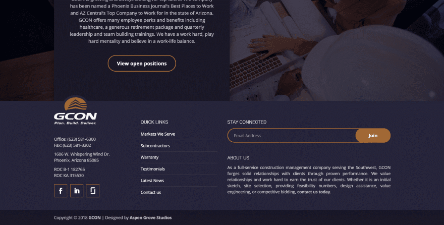
This website’s footer has a dark blue background with white text and orange highlights. It uses three columns with the third column having two rows. The logo overlaps the previous section. Contact information includes social icons with orange square borders. The footer navigation is placed vertically with each one separated by a faint line. The newsletter form is simple but stands out. The about us information isn’t crowded and is easy to read.
6. HEJ Coffee Company
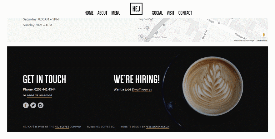
This site’s footer uses an image with black background taking most of the space. The image and text create three columns. It uses white text with each element displaying a title in all-caps. Social icons and links are slightly gray. It’s simple and bold at the same time.
7. Les Anagnou
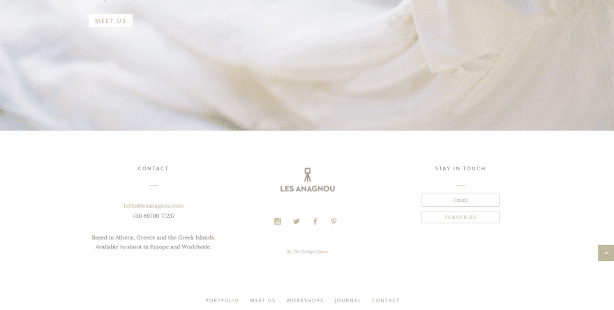
This one uses a white background and soft colors that blend perfectly with the website. The text is small, creating lots of white-space. It uses two rows. The top row displays three columns with contact and about information. The middle column displays the logo with social icons and the designer’s link. The right column provides a call to action and a small email signup form. The second row displays footer navigation. Both rows are separated by a line.
8. Newton Software
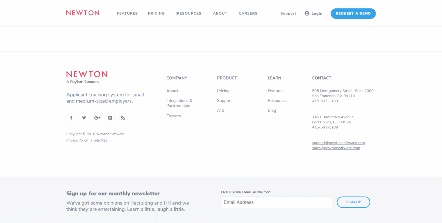
This one looks simple and clean. Typical footer layouts use four columns of widget areas. This one has five columns and still manages to keep lots of white-space. The left column displays the logo (which is the stand-out color) with about info, social links, copyright, and links. The other four columns separate out the typical footer navigation followed by detailed contact info. Across the bottom is a full-width email signup form.
9. eGaushala
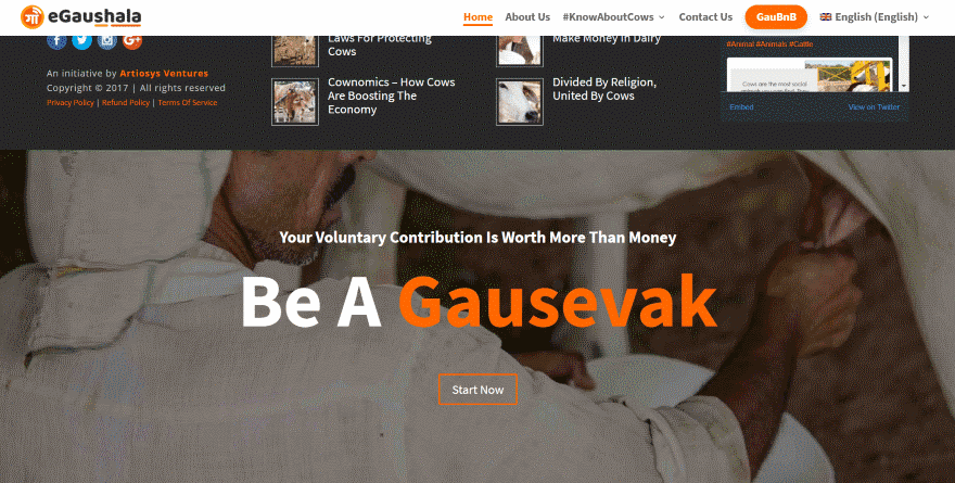
This website utilizes a revealed footer. The overlay portion displays four columns. It shows the company logo, information, social buttons, copyright, designer, and links. Next are two columns that link to articles- displaying thumbnails and titles. The last column displays an embedded Twitter feed. The revealed section is a full-screen image with CTA in an overlay. The colors match the site’s branding.
10. Kickbike
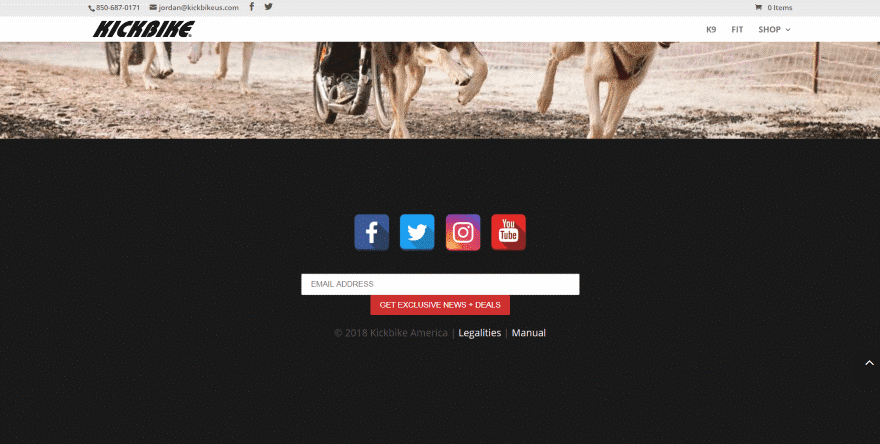
This website also uses a revealed footer. The overlay section displays a full-screen image with title and CTA. The revealed section uses a black background with content in the center. It displays large square social icons, and email signup form with button underneath, and a line with copyright and links.
11. Telepizza
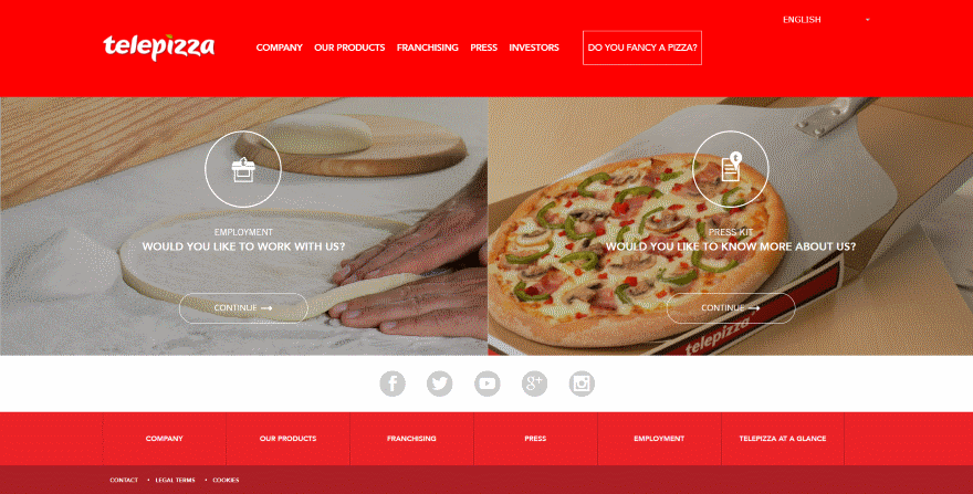
This one uses three sections just under the CTA’s in the content area to display links. All three sections use colors that match the rest of the site. The first shows gray social icons over a light background. The second displays footer navigation as white text over a red background with each link living in its own box. The third has a darker red background and contains links to the contact page and legal information.
12. Cloud Nine
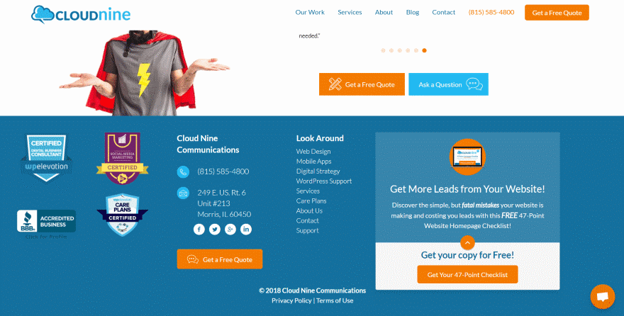
This one displays a lot of information within the footer area, but it still manages to keep it easy to follow. It displays four columns over a blue background with white and orange highlights. On the far left is company badges to show certifications. Following this is contact info and a CTA. The next column displays navigation vertically. The last column displays a link to a CTA page with an email signup form.
13. Ebert Studio
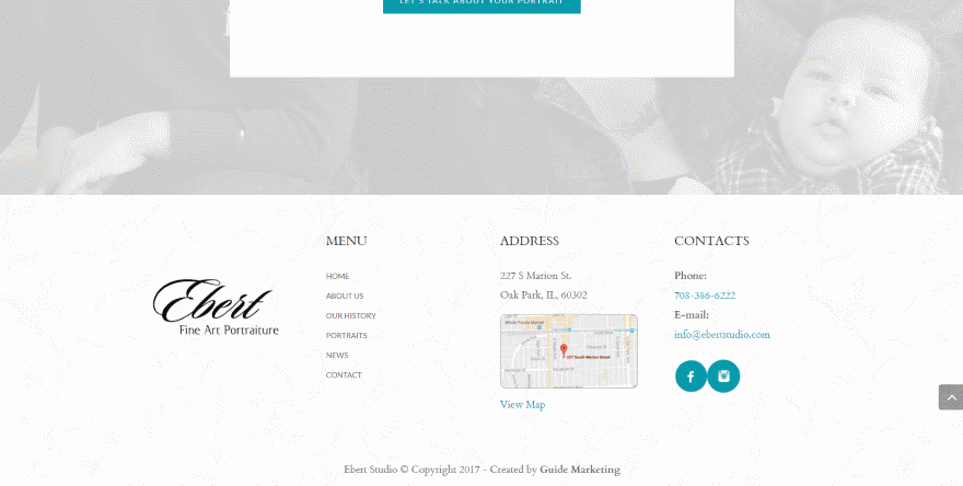
This website displays a simple footer in four columns over a patterned background. Four columns is common, but I like the way this one embeds the map. Selecting the text under the map opens Google Maps in a new tab, allowing you to see the map in full-screen. Also included are the logo, vertical menu, and contact information with social follow buttons. The colors match with the website’s branding.
14. Lauren K Stein
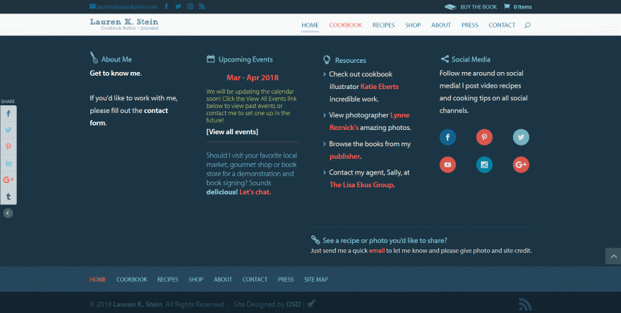
This one was one of the Footer Design Challenge winners in 2015. It includes a ton of information, but it’s easy to see and navigate. It uses a dark blue background with multi-colored text to display about information, links to events, links to resources, and social follow buttons. The icons in the titles help the sections to stand out. Under this is the standard footer navigation using the same colors as the rest of the website.
15. KR Digital Solution
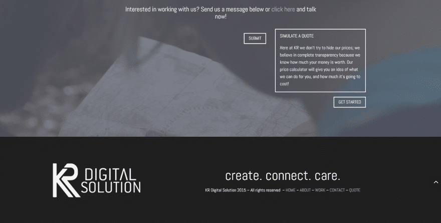
This one was also one of the Footer Design Challenge winners in 2015. It’s one of the simplest and cleanest footers I’ve seen, yet it still looks elegant. Using a black background with white text, it displays the logo on side and links on the other. The links include title text as a simple tagline. The links are separated by dashes. The copyright is in a brighter white to stand apart from the menu.
Ending Thoughts
That’s our look at 15 Divi websites with excellent footer design to help inspire you for your next Divi website. I like some of them for their simplicity. I like others for how they provide complex information that’s easy to follow. These are excellent examples of how lots of information can be placed in a little bit of space and remain readable.
For more information about footer design with Divi and a free layout pack, see the articles:
- How to Create a Footer Reveal with Divi
- How to Make Your Divi Footer Fixed
- How to Make Your Divi Footer Sticky
- Free Divi Footer Layout Pack: 10 Unique Footer Designs to Give Your Site a Leg Up
We want to hear from you. Which of these footer designs is your favorite? Let us know in the comments below.
Featured Image via VectorA / shutterstock.com


My site is not live yet. I am new to Divi and to website design in general. Trying to switch from Pure & Simple to Divi. Finding it very challenging. Should I get rid of all my formatting and start with nothing? Appreciated viewing these sites. Especially enjoyed KR Digital Solution. Thank you!!!
Thanks for these. Just in the process of doing a client site that I need to incorporate a fair bit of info into the footer. And while I’m using Divi for the site I don’t like the footer controls inherit in Divi, so I tend to design my footers from scratch.
Thanks again for the inspiration.
ernie
Thanks for the inspiration!
I’ve put in more effort on my footer designs as of late. I want the my projects to embody my design style from top to bottom.
Newton Software is a really nice site. I especially like the email subscription at the very bottom. I’m going to try that out soon on one of my own sites.
Liked some of these. Some not so much. But I’m confused. Why did you say, “…It’s one of the simplest and cleanest footers I’ve seen, yet it still looks elegant.”?
The use of “yet” implies that simple and clean are normally NOT elegant. To me, simple and clean are the DEFINITION of elegant.
Just wondering.
I agree that the definition of elegant is simple and clean. I had intended to develop that thought a little differently to indicate that it wasn’t plain.
I agree.
So many inspirations 🙂
Thanks for mentioning GCON, Randy!
Hey Cory,
Nice site. Just signed up to your member zone at Aspen
You’re welcome Cory!