
A well-designed navigation structure is crucial in meeting the goals of the website. Navigation can be simple or complex, but it needs to be effective. Of course effective doesn’t always mean pretty. It means that for the amount of content the site has, it’s easy to find what you’re looking for. In this article we’ll look at 13 Divi websites with effective navigation design.
In creating this post, my goal was to determine the objective of the website and then gauge whether or not the navigation design is effective based on that objective. I considered primary and secondary menus, but I wasn’t only looking at menus. I also looked at links within or under the hero section that creates a navigation structure.
Some of the websites below will provide information that’s aimed toward a specific industry with language that industry understands. Others provide icons to make navigation understandable at a glance. Others provide links to make it easier to reach their potential audience. Within the images I focused on the navigation, so you’ll see open menus which sometimes makes the site look much different than you’d expect.
Now, on to the websites…
1. Harvest on Main
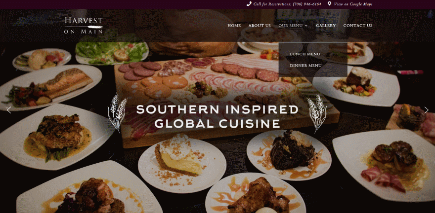
Restaurants need to provide contact information for directions, reservations, and a food menu that’s easy to find and understand. The navigation in this website provides all of that in a simple structure. It adds a clickable phone number and link to Google Maps in the secondary menu with icons so they’re easy to understand at a glance. Links to the food menu are easy to use in the primary menu.
2. The Wesleyan Church
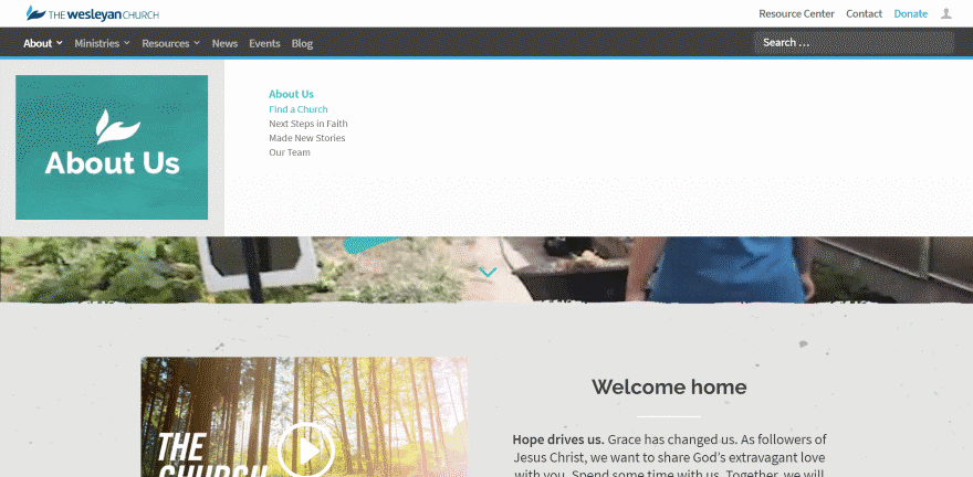
Churches need information about the Church, events, ministries, resources to learn more, location, and a donation link. This one includes all of those elements in either the primary or secondary menu. The primary menu is a mega menu with a graphic and simple links to that category. The donation call to action is blue, so it stands apart without standing out too much. The colors work perfectly for the site’s design.
3. Warner University
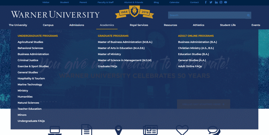
Schools have to provide a ton of information for several different purposes and audiences including teachers, students, prospective students, parents, and information about the campus, courses, online courses, admissions, and lots more. It’s difficult to provide that amount of information in a way that’s easy to find. This one accomplishes the goal with a mega menu that breaks the major topics into sub-topics and displays them in columns. The secondary menu provides another round of links, but it’s easy to understand that those topics are not within the primary menu so you’re not looking in the wrong places.
4. Olivet College
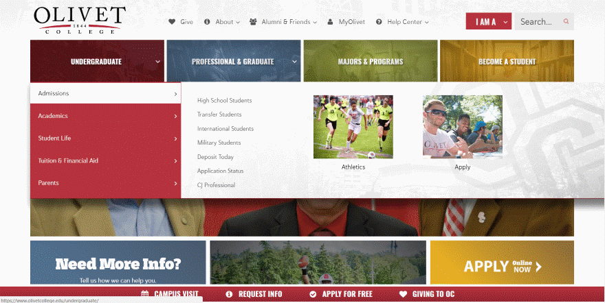
This school takes a different approach but provides the same amount of information. The primary menu provides the major links with icons and uses an effective search tool. The mega menu uses large images with overlays. When opened the mega menu provides tabs with links and images. More links are placed at the bottom of the page and remain in place on scroll.
5. Skyfox Design
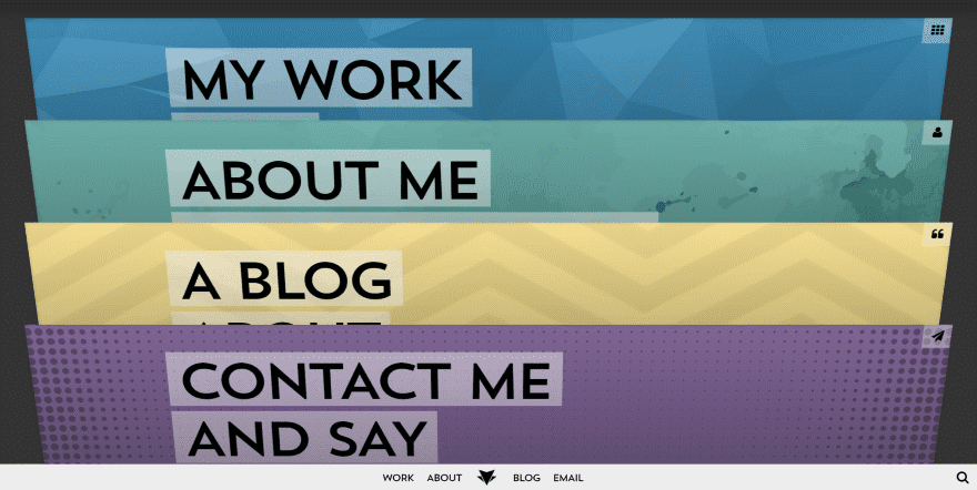
Online portfolios need to provide some basic information that doesn’t get lost within the content. This site does that by using the pages themselves as the navigation, creating a filing cabinet design. Each page is labeled well and you can see exactly what you’re looking for as soon as the page loads. Click on any page and it tilts forward, hiding the rest. Each page includes a menu link in the corner that tilts the page back to show the homepage, which shows the snapshot of the pages as you left them. Another menu stays at the bottom of the page that takes you directly to each page.
6. Recubre
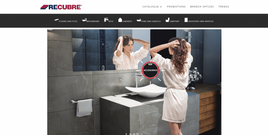
Home improvement websites often have massive amounts of products to categorize and present in an easy way to understand. This site simplifies navigating through those products by creating a new menu under the primary menu that includes icons of the product-types. You can tell at a glance which link to click just from the icon alone. Clicking them takes you to the list of products.
7. Ryan Welch
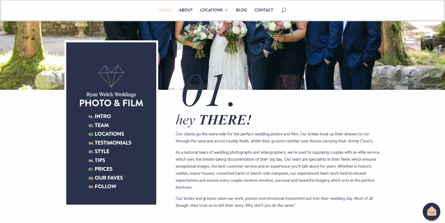
Photographers typically need to provide information about themselves and the work they do, like any good portfolio, but they also need to step the potential client through the process. This one uses a numbered navigation design and places the navigation within a box that overlaps the hero section. On scroll, the numbered navigation is added under the primary menu, making it easy to step through the process. Each of the sections are numbered to match.
8. Gruissan Mediterranee
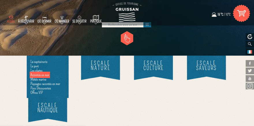
Tourists’ websites need to provide lots of information about a location that includes things to see in the area, places to eat, hotels, entertainment, etc. This one uses fonts that work perfectly with the site’s design and provides two areas of navigation. The first is the primary menu which includes icons so you can understand it quickly. The second is a menu under the hero area that open on hover. This area provides more detailed information about the specifics of the area.
9. DJ Charlie Villas
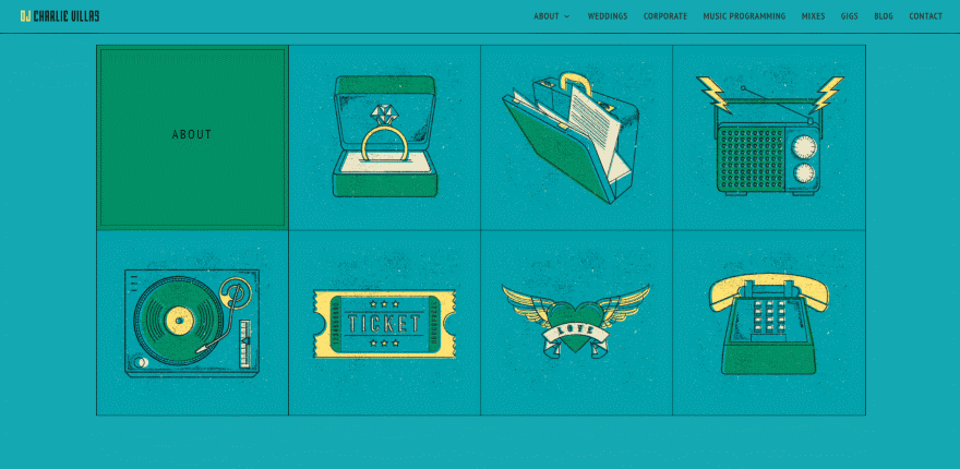
DJ’s often utilize stylized graphics to connect with their audience. This one provides the standard primary menu and text links, but there’s another menu at the bottom of the simple homepage that displays illustrations that fit within the style of the website. This menu works as a call to action to the various pages and services. The illustrations show visually what the link is for. Hovering over a graphic reveals the text that matches the primary menu. It includes hover animation.
10. Sleeknote
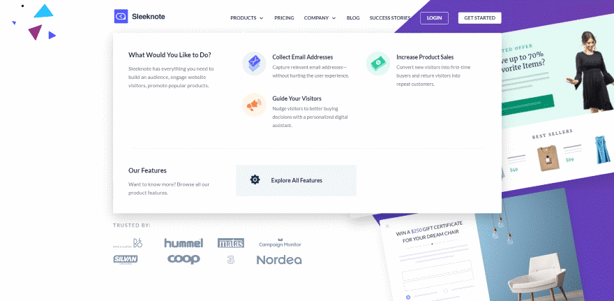
One of the best ways for businesses to help customers discover exactly what they need from you is to ask them questions. This website asks those starting questions within the mega menu. The Products link opens the menu and asks the question, which then leads to several solutions in the next couple of columns. The solutions provide information visually with icons, and include a title and short description. A simple call to action at the bottom invites the client to see all of the features available. The mega menu is clean and easy to follow.
11. Film School
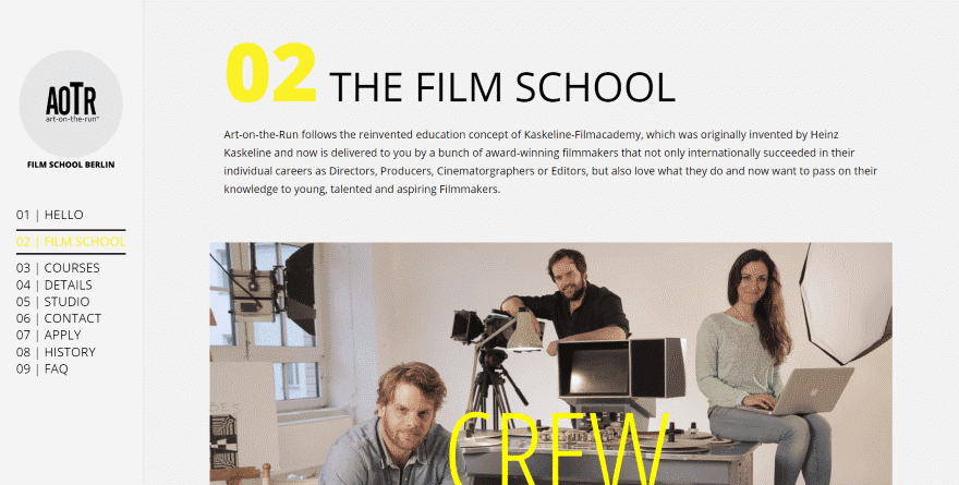
Here’s another effective use of numbered navigation. A topic as unfamiliar as film school needs to step potential students through the process. This numbered navigation does that. The menu is provided vertically and remains on screen at all times. As you hove over the menu the links reacts and highlights that link. Hovering over the screen reveals where you are within the menu. Each of the sections are numbered to match the navigation.
12. Mambo Media
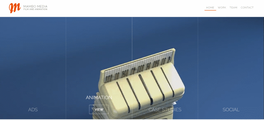
This one creates a unique navigation for the portfolio. It adds the menu structure directly into the hero area, displaying animated links to the portfolio over a background video. The video only plays while hovering, which means the links are directly in your view so you don’t have to go looking for them. This is an interesting way of making the portfolio visual while keeping it out of the way at the same time. Even though the links are placed over the video, the hero area still looks clean.
13. Willow Creek Falls
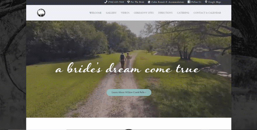
Locations that caters to certain types of events need to provide lots of information about the events and the surrounding area. The links within this website’s primary menu are easy to understand and follow, but it’s the secondary menu that I’m drawn to. It provides links that includes a clickable phone number, bridal information, a website for cabin rentals, the company’s Facebook page, and Google Maps. Each of the links include icons so you can tell at a glance what they’re for.
Ending Thoughts
That’s our look at 13 Divi websites with effective navigation design to help inspire you for your next Divi website. I especially like the use of icons and mega menus. Even though some have a lot of content within the menu it’s sorted well and easy to follow.
Navigation that’s designed well can make your website more effective in reaching its goals. For more information about navigation design and styling with Divi see the articles:
- How to Add Labeled Dot Navigation to Elegant Themes’ Free 10th Anniversary Timeline Layout
- How to Create a Navigation Homepage with Divi
- 3 Creative Ways to Style Your Divi Vertical Navigation’s Active Link
- How to Create a Vertical Navigation with Divi that Drives Business
- How to Make The Standard and Vertical Navigation Overlap on Your Divi Website
- 3 Creative Ways to Style Your Vertical Sub Menu Navigation
- How to Create a Transparent Vertical Navigation That Overlaps Your Divi Website
- How to Make Your Divi Navigation Start at the Bottom, Then Stay Fixed at Top When Scrolling
- How to Create a Navigation Mosaic with the Divi Slider Module
We want to hear from you. Which of these navigation designs are your favorites? Let us know what you think about them in the comments.


It would be much cooler if you posted the references and explained step by step to make these customizations.
All the collection of Divi is just awesome thanks for sharing the post is just great!
Great article! Fantastic!
Thank you so much!!!
Would really like to see Divi’s menu/navigation module get an overhaul.
Here’s an example of what we did. Used MMM with DIVI. Nice for desktop, though it still needs some tweaking to optimize on small footprint screens.
Nice article. Would be good to link this to other articles showing us how we would set up similar navigation in Divi for our own sites?
Thanks 🙂
+1
Mambo Media was VERY SLOW. I only stuck around to see what YOU saw. When I clicked on the webdesign company, it said their site was incorrectly set up. So, I bailed.
But I DID find a use for the UberMenu. SO thanks.
You should check menus on mobile also – http://www.warner.edu/ is a mess with a looooong scrolling menu as far as i can see. I think thats is also something to take into consideration when designing/planning for this amount of content. Maybe nested items would be a solution.
But interesting and cool looking. Thx for your efforts.
That Olivet College has the most complex navigation I have ever seen. Not convinced their solution is entirely on the mark, but its far from easy with that level of complexity.
Great looking options, but the Mambo Media example had me pinching my old eyes. I Would want to work on the accessibility there.The idea is very cool, though.
Yes, I agree with Richard. The reasons these sites are great it is the way they communicate with the reader at first glance and that is through a great MEGA MENU. That should be the great goal of the NEXT for Divi or at least make the Heading.php file more receptive for immersion with great mega menu plugins out there. Make it happen Divi! Personally, I do like Ubermenu as it is probably the best with providing support detail material but I also like MDF megamenu which combines bootstrap and as a totally different approach in using the Menu WordPress backend, and which I believe would work also nicely with Divi.
Wow! Sleeknote is absolutely stunning!
Nice group of sites. I do see a couple sites using plugins like Ubermenu and Max Mega Menu for the menu.
The DIVI theme needs a more powerful standard menu.
+1
Both for mobile and desktop. A majority of all internet traffic is mobile today.