
This post is part 5 of 5 in our mini series titled 5 Interesting Ways to Style Divi’s Slider Module. Stay tuned for even more Divi awesomeness every single day!
The slider is probably one of the more popular design elements seen in websites today and has been for some time. Most people probably think of hero sliders or gallery sliders as two of the most common uses for them, but really they can be used for all kinds of applications — for CTA areas, to display team members, to use for testimonials, or even as navigation as I’ll show you today.
This is the last in this slider module mini-series and we hope you’ve enjoyed them all!
- 1 Today’s Before & After: Divi Slider Modules as a Navigation Mosaic
- 2 How to Create a Navigation Mosaic with the Divi Slider Module
- 3 The Concept & Inspiration
- 4 Preparing the Design Elements
- 5 Implementing the Design with Divi
- 6 Configuring the Navigation Sliders
- 7 Configuring the Photo Sliders
- 8 Configuring the Text and Social Media Follow Modules
- 9 Finishing Up with Middle Row Settings
- 10 The Final Result
- 11 Tomorrow: How to Add a One Click WordPress PDF Download Using Divi
The slider doesn’t come with any default images stored inside so I’ve added images to some of the slides ahead of time but have not touched any settings or added any CSS. As you can see it’s not looking very uniform, certainly the readability is very bad with the default button style over a white background.
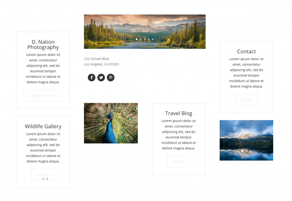
But with a bit of setting changes and some CSS used inside the page builder modules here’s what we’ll end up with in the end.
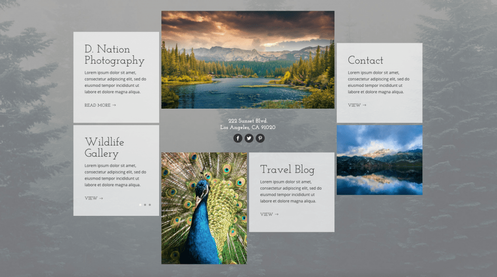
What makes this layout unique is that we’re not only using sliders for images, which is what we expect them to be used for, but we’re also using them as menu links. For this reason this layout is ideal with Divi’s normal navigation turned off, or better yet, using a blank page template. We’ll also be adding a bit of code to make sure it takes up the entire viewport so it will have the feel of a landing page.
Subscribe To Our Youtube Channel
The Concept & Inspiration
This concept is based off a slider layout I did for a photography-centric Divi child theme. I had used multiple sliders in a grid layout with automatic sliding turned on at varying rates of speed. This just took that concept a bit further by adding more sliders to act as the actual navigation links. Instead of using a uniform grid where all heights were the same for each slider like my original idea, here I thought a more masonry style look would be more appropriate.
Preparing the Design Elements
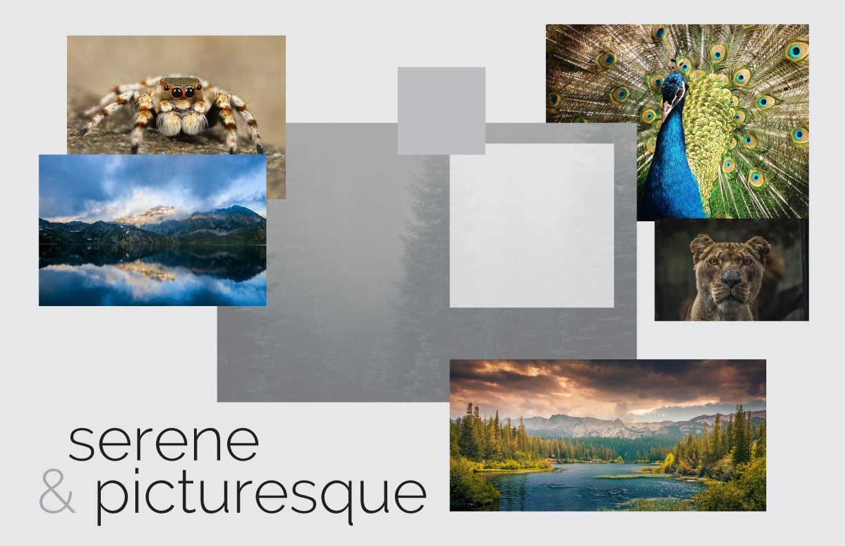
I’ve gathered my images ahead of time as well as chosen the menu titles I’d like to use. It’s best to optimize your images beforehand, and also size them down close to the size they’ll actually be appearing on the frontend when possible.
There are many ways to optimize images, you can use software like Photoshop, you can have an image optimization plugin on your site like Imagify or EWWW, or you can use an online tool like TinyPNG (which also has a plugin available if you prefer to optimize on upload).
There are plenty of places online to purchase stock photos as well as find free photos, I tend to stick to pexels.com and that’s where I’ve found all the images being used in this post.
To follow along with my tutorial below, you’ll need images in the following sizes:
- Section Background Image: 1920px by 1280px
- Landscape slider images: 900px by 600px
- Bottom portrait slider images: 600px by 800px
Implementing the Design with Divi
I’ll be using the classic backend builder because that’s what I’m most comfortable with, but everything we do can certainly be accomplished and edited with the new front-end Visual Builder–as you can see in the video above.
Section Settings
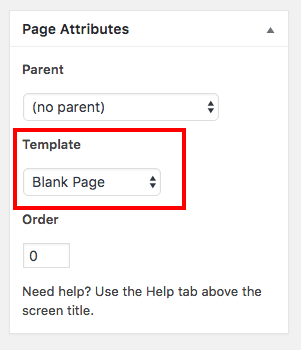
So we’re going to start by creating a new page and selecting the the blank template in the page attributes meta box.
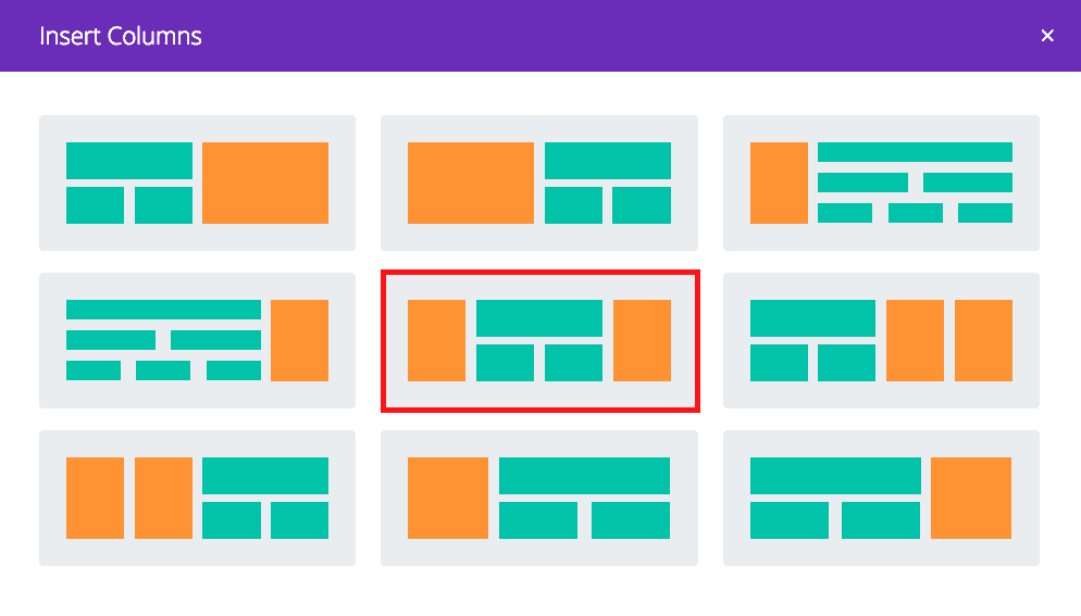
This design calls for just one section and we’re going to use a specialty section. I personally don’t take advantage of Divi’s specialty sections enough so I was quite happy to be able to use it here.
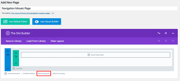
You’ll want to choose the layout in the very middle that allows for ¼ – ½ – ¼ and ¼ – ¼ – ¼ – ¼ options.
When the new layout is loaded, delete the default standard layout so that your new specialty layout is the only one.
Next lets add the main section background image by clicking on the hamburger icon in the upper left-hand corner of our specialty section.
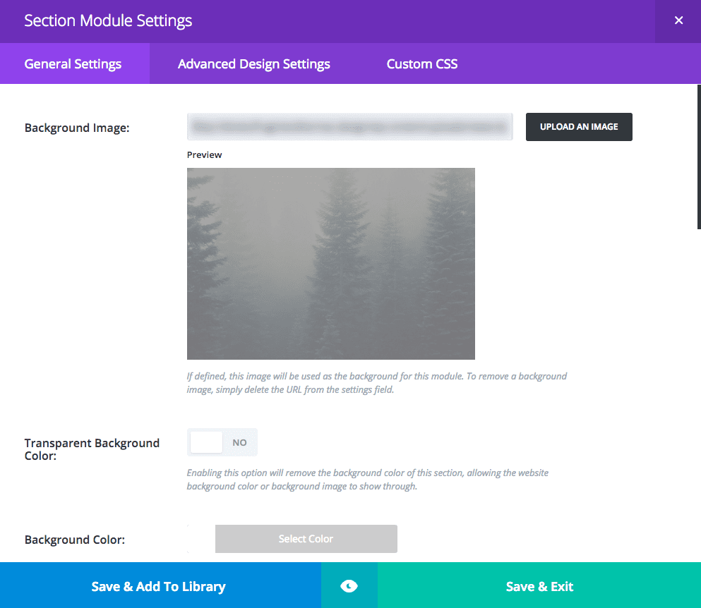
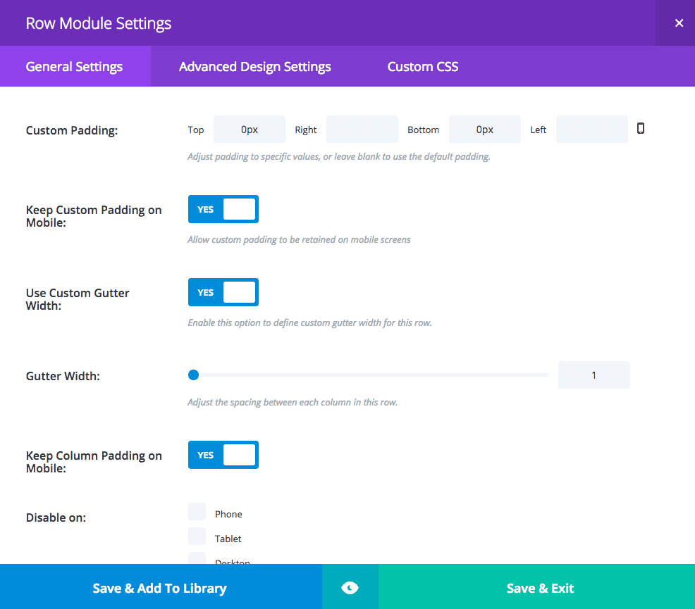
Then, go to the Advanced Design Settings tab and set the following:
Finally, go to the Custom CSS Settings of the Section Module Settings and add the following code under main element:
min-height: 100vh;
This ensures that even on big screens the background image takes up the entire viewport.
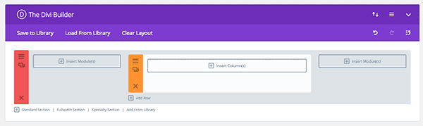
Adding Modules
Next we’ll add our modules. I’m using a combination of sliders, text, social media follow, and dividers. I’ll explain the text and social media follow in a bit 😉
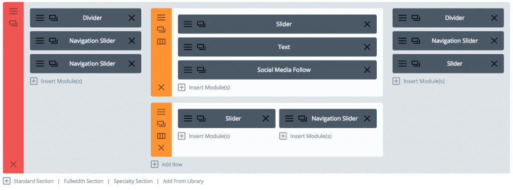
Here’s the breakdown:
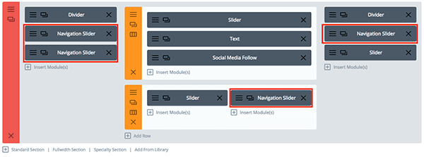
In the left hand column place a Divider module at the top, and then two slider modules (which will double as navigation butons).
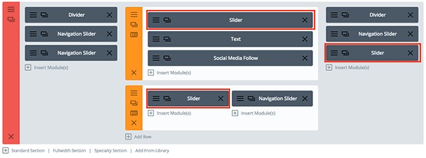
In the center column place a slider module at the top (which will be for photos), followed by a text module, then a social follow module. In the row below, place a slider module in each one. We will use the left slider for images and the right slider as a navigation button.
Finally in our right-hand column put a divider module at the top, followed by two slider modules. The top slider module with be a navigation button and the bottom slider module will be for images.
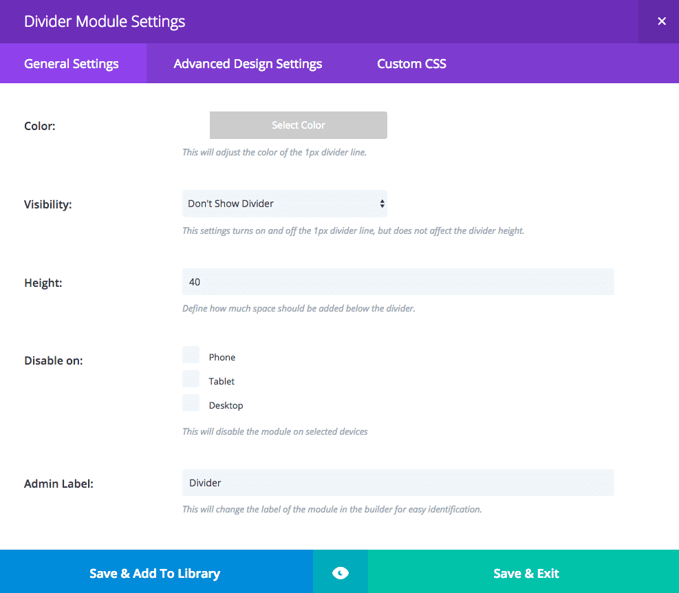
The dividers are there to initiate a masonry look where the grid is staggered. The divider on the left I’m giving a height of 40px. The right divider I’m giving a height of 80px purely for asymmetry. Nothing else is changed in the divider settings.
Next I’ll begin the settings for the navigation sliders, or the sliders that will be used as menu links. This slider will be repeated for the other navigation sliders. The following settings are for the slider module itself, not any individual slides inside of it.
For the General Settings set the following:
- hide arrows
- show controls: yes
- automatic animation: on
- animation speed set to 6000
- continue automatic slide on hover: on
- remove inner shadow: yes
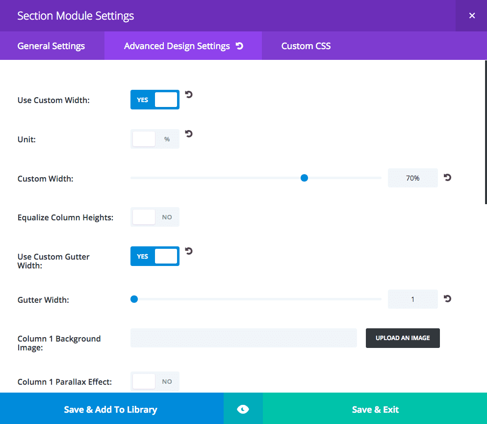
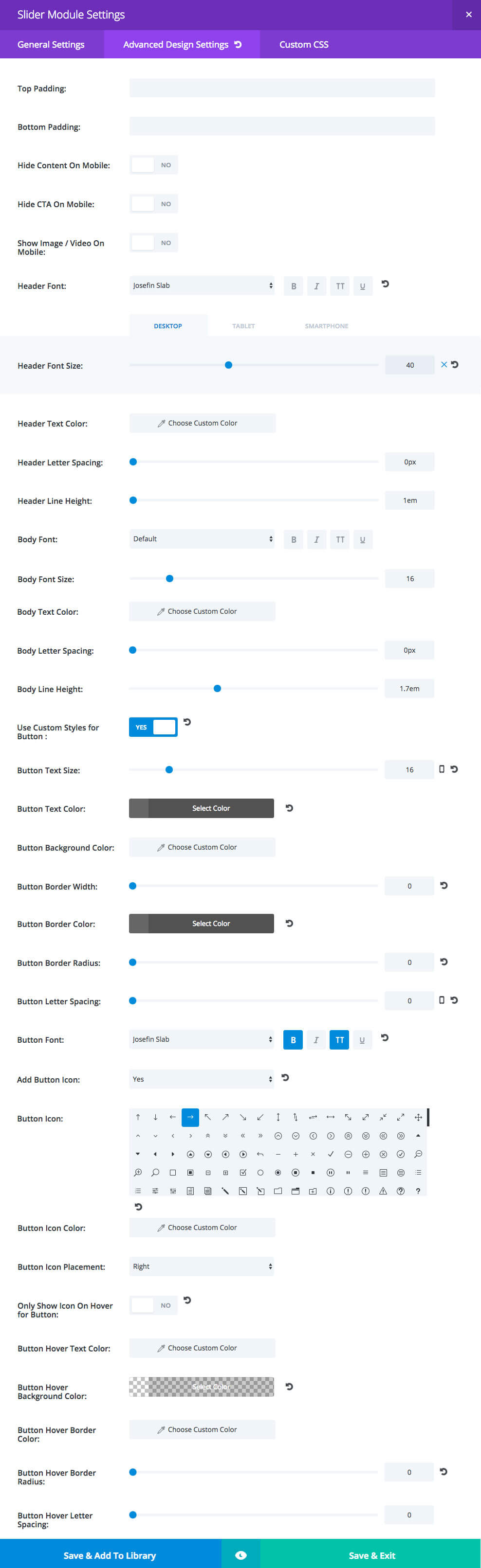
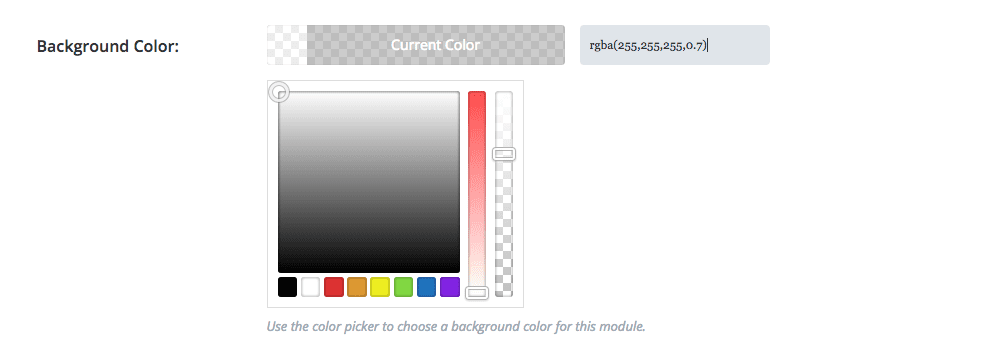
For the Advanced Design Settings a picture is better, but where you see the grays the color I’m using is #666666 and the header font sizes are Desktop: 40 / Tablet and mobile: 30
For the Custom CSS Settings the following bits of code go in their respective CSS boxes:
Main Element – what this is doing is adding a transparent border around this element. This is so the main section background image can “peek through” between the sliders. My first inclination was to use margin but this just worked out better for this tutorial. I also prefer to use rgba instead of the word “transparent” but that’s a personal preference. I’m using 4px here but if you’d like a wider gap you can certainly raise that number a bit. Remember all the modules will have this 4px border applied so the gap is really 8px throughout.
border: 4px solid rgba(0,0,0,0);
Slide Description – Here I’m changing the animation name (transition effect) to “Grow” instead of the default “fadeBottom”. There’s actually quite a few options for transition and I’ll use one in each post in these mini series, at the end of this tutorial I’ll include a list of Elegant Themes’ animation options. I’m also aligning the text in the entire module to the left but we have to use !important to override Divi’s CSS (only use !important where you absolutely have to).
text-align: left !important;
animation-name: Grow;
Slide Button – I took the border off the button in the Advanced settings before so now I have to take out the left padding so there’s not a weird space that is normally the buffer between the text and the outline.
padding-left: 0 !important;
Slide Controllers – For the instances where there are multiple slides used for navigation (like I’m showing the different Gallery pages) this is moving the dot controllers to the right and also removing any pesky controller numbers that may show up.
text-align: right;
padding-right: 30px;
font-size: 0;
For the slides inside you need to add the title, button text and URL, and any description text and you’ll also need to set the background color to rgba(255,255,255,0.7).
Now you can duplicate and re-place your navigation sliders in the appropriate spots throughout the layout and fill them with your slides. I only recommend having one navigation slider actually have multiple slides, the way I’ve done with the Gallery pages. We don’t want to require the user to have to do too much clicking around or else they may leave.
Configuring the Photo Sliders
Next I’ll begin the settings for the photo sliders. This slider will be repeated for the other photo sliders and like before, these settings are for the slider module itself, not any individual slides inside of it.
For the General Settings set the following:
- hide arrows
- show controls: no
- automatic animation: on
- animation speed set to 9000
- continue automatic slide on hover: on
- remove inner shadow: yes
For the Advanced Design Settings set the following:
- top padding: 150px
- bottom padding: 200px
For the Custom CSS Settings the following bits of code go in their respective CSS boxes:
Main Element – Adding that transparent border around like before.
border: 4px solid rgba(0,0,0,0);
Now you can duplicate and place your sliders in the appropriate spots throughout the layout and fill them with your slides. For the slides inside you only need to add the background images. Also for my photo sliders I’ve set them at different speeds for variation. One is at 8000, one is at 9000 and one is at 11000. It doesn’t really matter which ones are set at what, I do recommend not setting them to switch out too fast because it could get annoying for the user. If they don’t sit through each slide before clicking through that’s okay so don’t worry about thinking they need to go fast.
Why are these even included you may wonder. Since this is to be used as a landing page it makes sense to have this type of information included. This is the only time in this mini series that the layout includes other modules alongside the slider.
Type your text as you normally would, then set these settings for the Advanced Design Settings:
Set up your social media follow as you normally would then add these settings:
Custom CSS – This centers the social icons.
display: table;
margin: 0 auto !important;
Finishing Up with Middle Row Settings
We just need to finish up by making sure we set the correct General settings for both yellow rows in the middle of the section:
The Final Result
If you’ve followed along from the beginning, you should now have yourself and snazzy new layout using Divi’s versatile sliders. Feel free to mix things up to get your own unique take; now that you know how it’s done.

Tomorrow: How to Add a One Click WordPress PDF Download Using Divi
This post concludes our series of 5 Interesting Ways to Style Divi’s Slider Module. Tomorrow we’ll be publishing a one-off Divi tutorial that shows you how to add PDF downloads to your Divi sites for your visitors to download.
Be sure to subscribe to our email newsletter and YouTube channel so that you never miss a big announcement, useful tip, or Divi freebie!


I am having a problem getting the photo sliders to render nicely. Mine are much too long. Part of my problem is that the photos I have are not exactly 900 by 600. Some are 900 x 550ish and some are 900 x 750ish. So I know there is a problem there. But the height of the slider is still twice as tall as it should be.
I tried playing around with the top padding and bottom padding settings, but no luck. Any ideas?
Hello!
I loved this idea of mosaic slider as I was looking for something similar for the homepage of my travel blog website. I am not really a designer and this Divi platform is just perfect for me.
Now, the problem is, although I imitated everything you did with this slider tutorial, I am still not able to get the results I was looking for. I can’t see the whole slider without scrolling down. Here is the link, in case you have time to look into my problem. I would really appreciate, if you could.
Thanks!!
Great post, thanks!
In this tutorial, it says that at the end, a list of animation constants will be provided, but I can’t see where.
Can you provide a list of available animation constants?
Thanks kindly,
Hi all,
any idea how to get this done in divi?
http://www.benchmarkcorporate.com/Home/Index
Interesting. I’ll have to look into it!
Hi,
Is there any progress?
Hi,
Thank you for your interest in this. Is there any update? where can I find out if you manage to make something? is it going to be a reply to this post?
regards.
Thanks, Leslie!
I’ve been wanting to mess with the background and sidebar to create something like http://www.bluthemes.com/item/katla/preview how the sidebar widgets are separated and the background shows. I have had no luck though. Any help would be appreciated. Thanks!
Ah, ok. I think I can help with that on a future post 🙂
I’ve added it to my blog post ideas list!
Hi Leslie… I’ll try following your guidance to create divi slider module
I followed this while trying to redo my homepage, but try as I might I can’t get the ‘view’ or ‘read more’ buttons to behave. I think I have everything set up as per the instructions, it shows ok on preview in the slider module settings, but the reality has it with a border, large font and awful blue colour. Help!
Got it, you have to go into Appearance/Customise/Buttons/Buttons Style and make the changes there – not sure if that is as well as the changes in the slider module or instead of.
I think it would be great also if there is an online demo of all the final results of tutorials in every series, so we can see how it looks like in a live website and mobile devices..anyway..I really appreciate these tutorials..thank you
Thank you very much, your tutorials are very interesting.
We didn’t ended up going with demos on these, I do have them on my site though. If you click on my name and go the page called Tuts y Mas there’s links to all 5 demos that I’ve done on these Divi Daily posts 🙂
Gracias Leslie.
imo this needs to be wider so D. Nation Photography can be on two lines instead of three.
On 1600 by 900 screens the Y in Photography gets pushed down to the third line.
Just my minor gripe from my look at the demo you posted.
Still a nice looking design.
Nice Leslie Thanks a lot
Hello, wanted just to address that customizing accordion, toggle and tabs would be more interesting to people!
demo is always missed from these tutorial…
Where is the demo ?
^ ditto ^
+1 for this. Would love to be able to play around with a demo to see how it feels, how it looks on mobile, etc.
Very inspirational tut! Thanks!
Yes, it would be fantastic to see ET have a demo site / pages setup with the end result of these tutorials, Divi layouts etc.
Would allow us to better decide whether or not to try to implement etc.
Wow! Amazing idea! Thank you!!
This is fantastic! I was considering something similar for my website. This solution is making my life so much easier…thank you!
Thanks Leslie! Another great tutorial. Can’t wait to try it.
There are some subjects that I’d really appreciate if there were some tutorials about. I’m listing all here, hoping it’s not too much:
– horizontal parallax or fake horizontal parallax;
– ken burns effects on slider or images;
– fading slider background, with a background changes with a fading animation and not to the side.
(Not a native English speaker, sorry for the bad explanations)
+1 to Raquel!
i want to know how to do something this: https://codepen.io/zabielski/pen/MyoBaY
it is possible to do in divi? multi-layer parallax (actually we just can work with 2-layer parallax)
(Not a native English speaker too, apologize for my bad english)
Okay David Since you want to know if it can be done with the DIVI theme and I am going to say YES!
Now you are going to have to:
convert the HAML to HTML
Convert the SCSS to CSS
Covert the CoffeeScript to Javascript
Now what I did was create a wordpress page as a blank page in my very messy junk DIVI test installation.
The CSS got put up in the DIVI builder settings for the page. Then I used a fullwidth code module and put all the Javascript and HTML code in it. I did put the converted coffeescript code into a script tag.
Now you are going to have some extra CSS you are going to have to deal with like background color CSS, creating columns, etc.. to get the same exact design.
I hope this helps.
Oh! thx a lot Richard… 🙂