
Choosing the right CSS units is more than a technical detail. It’s what helps your design stay consistent, flexible, and responsive across all devices. Pixels may seem like the easy option, but they don’t always behave predictably on different screens.
In this post, we’ll explain the difference between absolute and relative units, and show how Divi 5 helps you use them more effectively from the start.
CSS Units Explained: Why Do They Matter For Your Website?
CSS units control how big everything appears on your site. Pick wrong, and your design breaks on different devices.
Most people use pixels because they are straightforward and easy to comprehend. But pixels don’t naturally adapt well to responsive design. They require media queries or CSS functions like clamp() to respond to screen changes.
Other units adapt automatically. Viewport units scale with the browser window. Relative units like em size are based on the surrounding text. Different units solve different problems. Pick well, and your design adapts across devices without extra work.
Breaking Down Absolute Units: When Fixed Sizes Work Best
Absolute units keep the same size no matter what happens around them. If you set something to 20 pixels wide, it stays 20 pixels whether someone views it on a phone or a massive desktop monitor. The value never changes based on screen size, parent elements, or browser settings.
Pixels (px) rule this space. Other absolute units like centimeters, millimeters, and inches exist, but they belong in print design where physical measurements matter. For web design, pixels handle almost every absolute measurement you’ll need.
Why Pixels Work Great For Small Details
Some design elements need exact control. A 1-pixel border should look crisp and thin everywhere. Drop shadows need precision to look right. Small icons work better when they stay consistent across devices.
Pixels work excellently for these tiny details. Your button border should be precisely 2 pixels thick, that subtle shadow should be exactly 4 pixels offset, and your navigation icon should be exactly 24 pixels square for perfect alignment.
These measurements don’t need to scale with screen size. A border that’s 1 pixel on desktop should stay 1 pixel on mobile. Making it 2 pixels on mobile would look thick and clunky.
Other elements work well with pixels, too. Brand logos often use pixels for brand consistency. Small decorative elements like dots or lines need exact sizing. Loading spinners and progress bars work better with fixed dimensions.
Making Pixels Responsive With Media Queries
Pixels aren’t completely rigid. Media queries let you swap different pixel values at various screen sizes. Your heading might use 32-pixel text on desktop, then jump to 28 pixels on tablets and 24 on phones.
This approach takes more work than relative units. You need to define breakpoints and write separate rules for each screen size, but you have total control over how things look at each size.
This approach works well when you want specific control at each screen size. You decide exactly how your text looks on phones versus tablets versus desktops at specific dimensions. No surprises.
The extra CSS is worth it for elements that need precise sizing. Logos look best when they stay exactly the right size for each device. Navigation elements often need specific dimensions to work correctly. Decorative borders and shadows depend on exact measurements to look crisp.
Understanding Relative Units: The Flexible Approach To Web Design
Relative units, in contrast, stretch and shrink based on what’s around them. This flexibility makes websites work across phones, tablets, and computers without breaking. Unlike absolute units that stay fixed, relative units adapt to screen size, parent elements, or user preferences.
These units solve the problems that pixels create. Your 75-pixel-wide button works fine on desktop but becomes dominant on mobile. Relative units automatically adjust, saving you from writing separate styles for every screen size.
How Em Units Build On Each Other
Em units are relative to the font size of their immediate parent element. If your base font size is 16px and you set a container to font-size: 1.25em, that becomes 20px. A child element inside it set to 1.5em will now be 30px (1.5 × 20px), not 24px, because it’s based on the parent, not the root.
This compounding effect is powerful for scalable spacing around text. But if you keep nesting elements with em-based font sizes, your values can increase in size quickly. Em units work best for padding, margin, or elements closely tied to nearby text. For consistent sizing across your layout, consider using rem instead.
Rem Units Keep Things Simple
Rem always looks at the root HTML element. Set something to 2rem and it’s the same size everywhere on your page.
Most browsers default to 16px for the root. So 1rem = 16px, 2rem = 32px. Change the root size, and everything rem-based scales together.
Viewport Units Follow Your Screen
Viewport units scale with your browser window. 50vw = half the screen width, and 100vh = full screen height. This is great for hero sections that fill the screen.
Mobile browsers usually don’t play well with viewport units. The address bar hides and shows when you scroll, and your 100vh section might get cut off when the address bar appears.
Vmin and vmax compare your screen’s width and height, then pick one. Vmin uses whichever is smaller. On a phone held upright, the width is smaller, so 50vmin = 50% of the width. Rotate to landscape and the height becomes smaller, so 50vmin switches to 50% of the height. Vmax does the opposite: it always picks the larger dimension. This is useful for elements that need to scale with the bigger measurement.
Percentages Adapt To Containers
Percentage-based widths always relate to the width of the parent element. Height percentages can scale the same way, but only if the parent has a defined height; otherwise, they may not work as expected.
Padding and margin percentages are always calculated from the parent’s width, even for top and bottom values. This makes it possible to create consistent spacing and proportional layouts, especially in fluid designs.
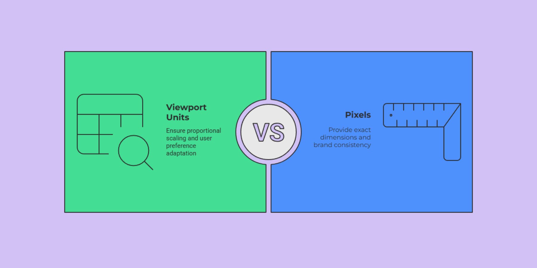
The Difference
Absolute units are like a rigid ruler, while relative units behave more like a measuring tape. Both measure things, but they respond very differently when conditions change. Here’s how they compare:
| Absolute Units | Relative Units |
|---|---|
| Fixed size no matter what | Adapts to surroundings |
| Perfect for borders, shadows | Great for text, layouts |
| Same on every device | Changes with screen size |
| Easy to predict | Requires more planning |
| Breaks on small screens | Stays proportional |
| Uses px, pt, cm | Uses em, rem, %, vw, vh |
| No math needed | Multiplies parent values |
| Works with media queries | Works automatically |
Most developers end up using both: pixels for the small stuff that needs to stay crisp and relative units for the big structural pieces that need to flex.
Choosing The Right Units For Your Design
Different parts of your website need different approaches. Some elements stay the same size everywhere, while others adapt based on screen size or user settings. Most developers overthink this. There’s a more straightforward way: match the unit to what you want that element to do.
Think About Your Users First
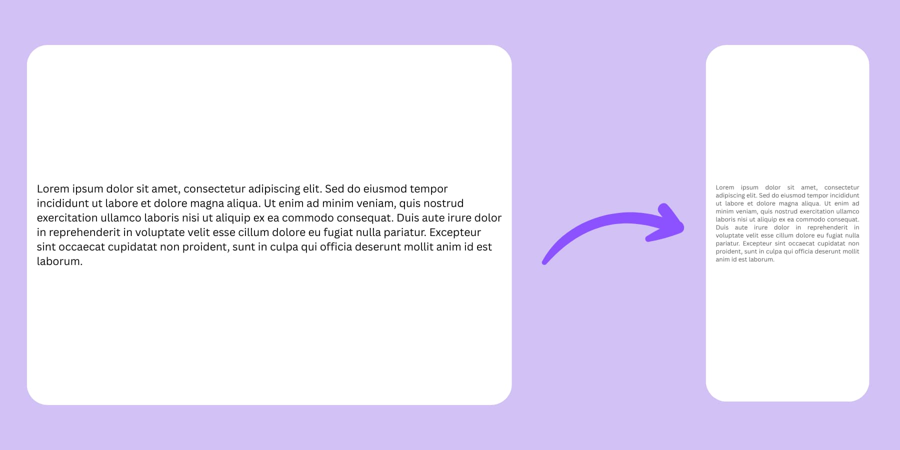
People browse your site in unexpected ways. Someone visits on their phone. Your text looks tiny, so they pinch to zoom. If you built with rem units, everything grows together proportionally. If you used pixels everywhere, things start overlapping and breaking.
Main navigation needs consistent sizing across pages. Rem units tie it to your base font size. Your logo needs exact dimensions for brand consistency. Pixels keep it crisp.
Many users change their browser’s default font size for better readability. When you hardcode pixels, you ignore their preferences. If someone zooms in to 125%, your pixel-based layout falls apart. Relative units adapt automatically.
Quick Ways To Pick The Right Unit
Here’s how to break down your choices without getting lost in the details:
- Text and spacing around it: Use em or rem. Button padding scales with text size. Margins stay proportional to headings.
- Screen-related elements: Use viewport units. Hero sections that fill most screens. Sidebars that take specific screen percentages.
- Elements needing exact control: Use pixels. Thin borders that stay crisp. Small icons with perfect alignment. Drop shadows with precise offsets.
- Container-based elements: Use percentages. Flexible grids that adapt to parents. Images that scale with containers.
Start simple. Use pixels for decorative bits, Rem for text and related spacing, viewport units for screen-sized sections, and percentages for flexible containers. Pick a system for related elements and stick with it.
Common CSS Unit Mistakes To Avoid
You pick pixels for everything because they feel safe. Your button looks perfect at 75 pixels wide on your laptop. Then someone opens your site on their phone, and that same button eats half the screen. Your logo needs exact dimensions, but your content areas need flexibility. Mix these approaches randomly, and you create chaos. So, here are some tips on avoiding standard CSS units mistakes:
1. Picking Pixels For Everything
Pixels feel safe because 20 pixels means 20 pixels. Simple, right? Your 300-pixel-wide sidebar works fine on desktop. On mobile, it becomes a massive block that crushes your content into a thin strip. Your 16-pixel text becomes unreadable on high-density screens.
When someone increases their browser’s font size, your pixel-based layout doesn’t adapt. Text overflows containers. Buttons disappear behind other elements. Your sidebar crashes into your main content.
Save pixels for things that truly need exact control: thin borders, small icons, and drop shadows. For everything else, try to use relative units.
2. Em Units That Multiply Out Of Control
Em units scale based on their parent’s font size. That sounds flexible, until you start nesting. Say your container uses 1.2em, and your heading inside it uses 1.5em. That heading becomes 1.8em relative to the root because 1.2 × 1.5 = 1.8. Keep nesting, and sizes can snowball. Change one parent font size, and everything downstream shifts.
Rem units fix this. They always reference the root element, so 2rem means the same thing no matter where it’s used. That makes your typography easier to scale and control.
3. Viewport Units That Jump Around On Mobile
Set your hero section to 100vh, and it fills the screen perfectly. Except mobile browsers hide and show their address bars when you scroll. Safari on iOS and Chrome on Android all do this. When the address bar disappears, your 100vh section suddenly becomes too tall. When it reappears, your content gets cut off.
The newer DVH unit adapts to the changing viewport size. Browser support is still catching up, though. As a fallback, a JavaScript solution using CSS custom properties works.
Breaking Accessibility With Fixed Sizes
Users often adjust their browser’s default font size to improve readability. When you hardcode text, buttons, and spacing using fixed pixels, your layout can break — text may overflow, buttons may become unusable, and critical elements might disappear at higher zoom levels.
Touch targets are recommended to be at least 44×44 CSS pixels, according to accessibility guidelines like WCAG and Apple’s standards. Smaller targets can be challenging for users with motor impairments to tap accurately.
Instead of locking in fixed sizes, use scalable units like rem to create layouts that respect user preferences. Set your base font size on the element, then consistently scale headings, buttons, and spacing with relative units across your site.
5. Tiny Text On High-Density Screens
Different devices pack pixels differently. Your phone’s screen might have 400 pixels per inch while your monitor has 100. The same pixel count looks completely different on each device.
Your 14-pixel text looks fine on a desktop monitor. On a high-density phone screen, those same 14 pixels become microscopic. Users squint and pinch to zoom.
Operating systems and browsers handle scaling automatically when you use relative units. Your 1rem text becomes larger on high-density screens and smaller on low-density ones.
6. Mixing Units Without A Plan
You use rem for some headings, em for others, and pixels for body text. Your design lacks rhythm because different elements scale at different rates. Pick a system for related elements. If your headings use rem, all your headings should use rem. If your spacing uses em, keep using em for related spacing.
Test your choices across devices and user settings. Check how your design looks when someone increases their font size. A few minutes of testing saves hours of bug fixes later.
How Divi 5’s Advanced Units Simplify CSS Management
Wrestling with CSS units gets old fast. You spend hours tweaking values, testing on different devices, and fixing broken layouts. Divi 5 changes this completely. The new system takes the guesswork out of unit selection and gives you visual control over responsive behavior without touching code. But first, let’s understand what Divi is.
What Is Divi?
Divi is a website builder that turns WordPress into something that actually makes sense for people who want their sites to look good.

Drag any of 200+ modules around your page. Change the text right where it sits. Pick new colors and watch them appear immediately. You’re working on the real thing, not some preview mode that lies to you.
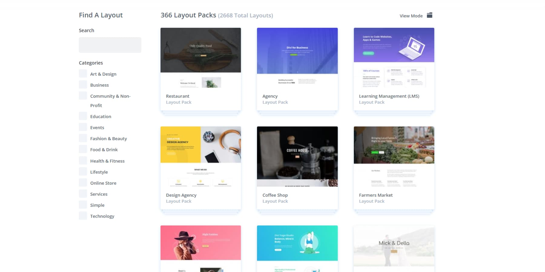
The theme includes 2000+ layouts that don’t suck. Real designs for restaurants, photographers, consultants, and dozens of other businesses. Find one you like and tweak it until it feels right.
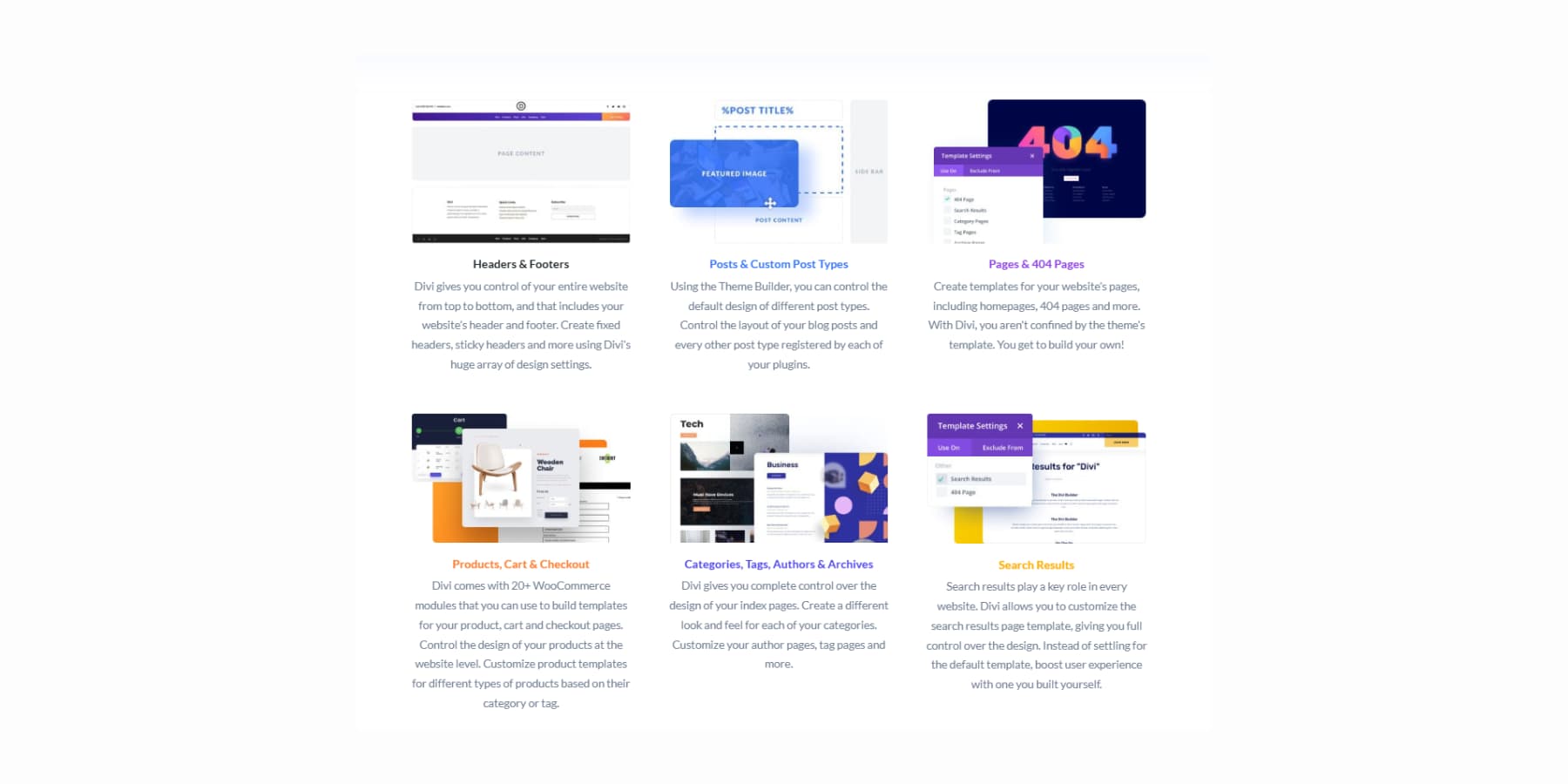
The Theme Builder lets you control everything. Create headers that don’t look generic, build standout blog pages, and turn your 404 pages into something people might actually want to see.
Build Websites Using AI
Divi AI works right inside your design area. Need text? It writes it.
Want images? It makes them. You can even describe photo edits, and it handles the work.
Likewise, for code and new sections.
Divi Quick Sites solves that terrible moment when you stare at an empty page with no clue where to start. Pick from starter sites our team actually designed, complete with original images and artwork.
Or describe your business to Divi Quick Sites + Divi AI and let it build something from scratch.
These AI-built sites will have real headlines, copy, and images that match what you told it. Generate everything with AI, grab photos from Unsplash, or drop in placeholders for your own shots. Set your fonts and colors first, then let AI work around them. You can still edit everything afterward.
What’s New In Divi 5
Divi 5 rebuilds everything from scratch. We scrapped the old shortcode system and built something that works better with today’s web standards. Sites load faster, the editor responds quicker, and you get access to tools that were impossible before.

But what’s new? Have a look:
Flexbox Layout System
Building modern, responsive websites in Divi is now faster and more intuitive. We’ve introduced a full Flexbox layout system into Divi 5, giving you simple controls for vertical alignment, content wrapping, and spacing. Create the exact layouts you want without fighting with code or using complex workarounds.
Option Group Presets
Option Group Presets let you save styles that you can mix and match anywhere. Make a shadow style once, then use it on buttons, cards, sections, whatever needs it. Update the preset, and everything changes instantly across your whole site.
Design Variables
Brand colors, fonts, and spacing all live in one spot now. You can switch from blue to green by editing one variable. Your entire site updates automatically, so you won’t have to hunt through dozens of modules.
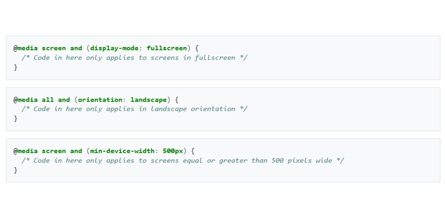
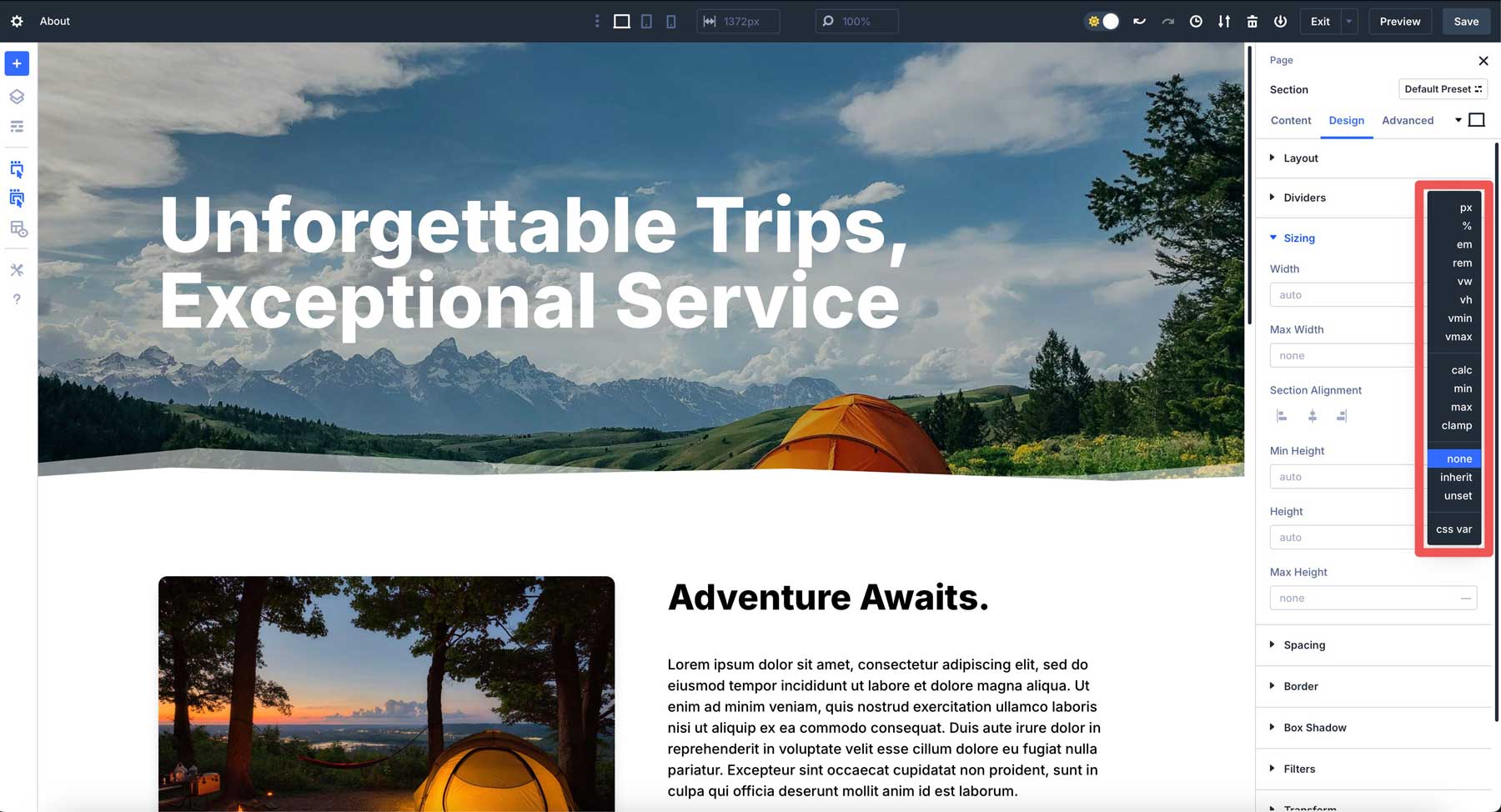
Advanced Units
Now, you can use all advanced CSS units with Divi 5: from px to vw/vh. CSS functions also work right in the builder now. Want a section that’s 80% of screen height minus your header? Type calc(80vh – 100px) and you’re set. The interface handles clamp(), min(), max(): all those responsive tricks.
Nested Rows
Rows go inside other rows now, as deep as you need. Build complex magazine layouts or detailed product pages without fighting the structure. Each level gives you full control over spacing and device behavior.
One-click Editing
Point and click anywhere on your page to start editing. The days of searching for tiny edit buttons or navigating through multiple menus are behind us.
Customizable Breakpoints
Instead of being stuck with three, Divi 5’s Customizable Breakpoints allows you to enable seven different screen sizes. Set each breakpoint exactly where your design needs it, whether 1200px for large monitors, 900px for tablets, or 650px for phones.
Multi-Panel Workspace
Arrange your workspace panels however you want. Keep multiple setting panels open simultaneously instead of constantly jumping between different interface areas.
Attribute Management
Copy specific elements between different parts of your site with surgical precision. Grab just the spacing from one element, just the colors from another, or just the presets from a third. No more all-or-nothing transfers.
Canvas Scaling
Adjust your workspace size to preview how your site appears on different devices. See mobile, tablet, and desktop views without switching to separate preview modes.
Performance Improvements
Everything feels snappier now. Pages load quicker, the builder responds faster, and complex layouts don’t bog down the interface like they used to.
Module Groups
Bundle multiple modules into one container. Treat text blocks, images, and buttons as a single unit. Move them together, style them together, and copy the whole thing to other pages.
HSL Color System
Build color schemes with hue, saturation, and lightness controls. Create brand color variations that look professional. The math creates pleasing combinations automatically.
More Are On The Way…
- Loop Builder: Build templates for repeating content like blog grids or product listings. Design it once, let the system fill it with your actual content.
- WooCommerce Modules: Store-specific modules for product grids, individual product pages, and cart functionality. Everything online stores need, built specifically for selling.
Using CSS Variables In Divi 5
Website styling becomes tedious when you need consistent values across multiple elements. CSS variables solve this by storing reusable values in one location. Divi 5 supports both traditional CSS variables and its own Design Variables system, giving you flexibility in how you manage your site’s appearance.
Divi 5 accepts any CSS unit directly in its input fields. Write rem, vw, or percentage values where you previously could only use pixels. The builder processes these units immediately without additional setup.
CSS functions work the same way. Enter clamp(1rem, 4vw, 3rem) for fluid typography or min(500px, 90%) for responsive widths. The visual builder handles these calculations in real-time as you design.
Variables integrate seamlessly with this system. Define a CSS variable like –header-height: 80px, then reference it using var(–header-height) in any field. Divi recognizes the syntax and applies your stored value automatically.
This direct integration means you can mix traditional units, modern CSS functions, and variables within the same project. Use pixels for borders, viewport units for sections, and variables for repeated measurements.
Design Variables: A Better Way To Apply Advanced Units
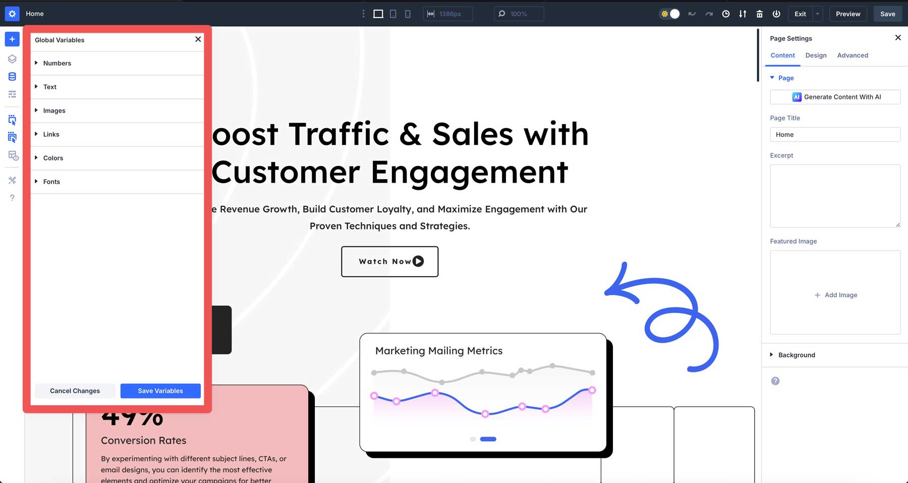
Design Variables are Divi 5’s built-in alternative to CSS variables. They work entirely through the visual interface without requiring any code knowledge. You create and manage these variables using Divi’s Variable Manager panel.
These variables extend beyond simple numbers and colors. Store complete image URLs, text content, or complex styling values. When you update a Design Variable, every element using it changes instantly across your entire website.
Divi 5 offers several variable types to handle different content needs:
- Color Variables store hex codes, gradients, brand colors, text colors, backgrounds, and borders.
- Font Variables manage typography globally beyond Theme Customizer limitations and work for any text areas.
- Number Variables accept any CSS unit plus CSS functions like clamp(), calc(), min(), and max() for spacing, sizing, and animation.
- Image Variables store reusable images like logos, backgrounds, and patterns.
- Text Variables store reusable text strings like contact info, taglines, and business details.
- URL Variables store reusable links for social media, affiliates, promos, and tel/mailto links.
Setting Up CSS Units With Number Design Variables
Number variables give you the building blocks for designs that stay consistent. They work best when you repeat the same measurement across different elements. Plus, they’re much simpler than wrestling with CSS code.
Find the Variable Manager in your Divi interface. Create a new number variable and give it a value that fits your design. Use clear names like “button-padding” or “section-gap” instead of vague labels.
Creating Your Variable Library
You may add common variables, such as:
- “button-height” at 3rem – buttons scale with text size
- “section-padding” at 8vh – spacing adapts to screen height
- “border-radius” at 0.5rem – rounded corners stay proportional
- “hero-height” at 75vh – hero sections fill most screens
- “fine-border” at 1px – crisp lines stay sharp
- “fluid-text” at clamp(1rem, 2.5vw, 2rem) – text scales smoothly
- “content-width” at min(90%, 1200px) – containers stay readable
- “dynamic-gap” at calc(2rem + 2vw) – spacing grows with screen size
Apply these in your module, section, or row settings.
Your rem variables scale with text size. The vh units adapt to smaller screens. Variables with clamp() adjust automatically between your minimum and maximum values.
Building Connected Presets
After styling your element with variables, save the spacing as an Option Group Preset. This preset now holds references to your number variables.
When you apply this preset to other modules, they inherit the same variable-based spacing. Update “card-padding” from 2rem to 3rem in the Variable Manager, and every element using that preset updates automatically.
The preset stays the same, but the values change. This works for all Design Variables: colors, fonts, images, text, and URLs. Your presets become dynamic instead of static, making site-wide updates possible with a single change.
Build Better Websites With CSS Units And Divi 5
Getting CSS units right changes how you build websites. You’ll fix fewer broken layouts and create designs that work across devices. Pixels nail precise details. Relative units adapt to different screens and user preferences.
Divi 5 makes building with advanced CSS units a breeze. Type any unit into the builder and see results instantly. Design Variables keep measurements consistent across your site. Change one value, and everything connected updates automatically.
Your websites deserve better than breakpoint battles and endless layout fixes. Try Divi 5 and watch CSS units turn frustrating design sessions into smooth workflows.


Hi Aayush,
a first-class contribution to this topic that succeeds in conveying a sense of the subject.
Thank you very much.