
In today’s Divi tutorial we’ll show you, step by step, how to create a sticky navigation bar from bottom to top in Divi. This will allow the navigation bar to stick at the bottom of the page initially for a unique above-the-fold layout. Then once you scroll past the above-the-fold section of the page, the navigation bar will stick to the top of the page and remain there throughout the rest of the page. You could say that the page will “pick up” the menu at the bottom of the screen and bring a nice interacting effect to your primary menu and to your website.
Let’s get started!
Sneak Peek
To help you visualize the result we’re trying to achieve, let’s take a look at the final result:
Download the Layout for FREE
To lay your hands on the designs from this tutorial, you will first need to download it using the button below. To gain access to the download you will need to subscribe to our newsletter by using the form below. As a new subscriber, you will receive even more Divi goodness and a free Divi Layout pack every Monday! If you’re already on the list, simply enter your email address below and click download. You will not be “resubscribed” or receive extra emails.

To import the section layout to your Divi Library, navigate to the Divi Library.
Click the Import button.
In the portability popup, select the import tab and choose the download file from your computer.
Then click the import button.

Once done, the section layout will be available in the Divi Builder.
Let’s get to the tutorial, shall we?
What You Need to Get Started

To get started, you will need to do the following:
- If you haven’t yet, install and activate the Divi Theme.
- Create a new page in WordPress and use the Divi Builder to edit the page on the front end (visual builder).
- Choose the option “Build From Scratch”.
After that, you will have a blank canvas to start designing in Divi.
Part 1: Creating the Above-the-Fold Section and Heading
For the first part of this tutorial, we are going to create the above-the-fold section and heading that will serve as the main header section of our page. The section will be fullscreen on desktop in order to make sure the section takes up the entire viewport.
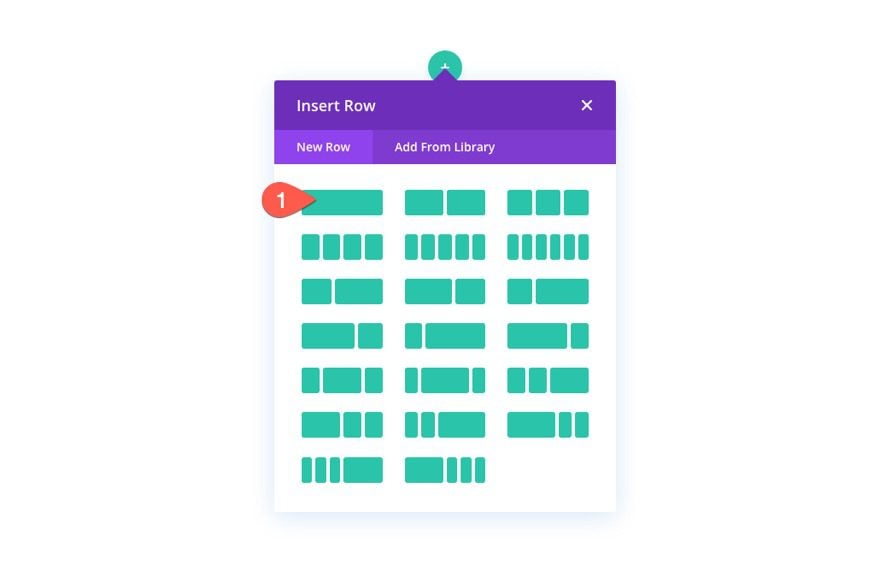
Add Row
To start, add a one-column row to the default section.
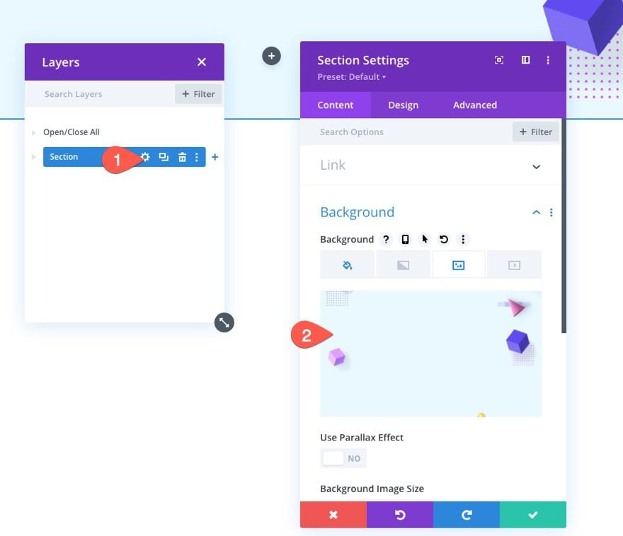
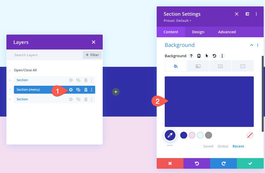
Section Settings
Before adding a module, open the settings for the section and add a background as follows:
- Background Color: #e9f9ff
- Background Image: [add image]
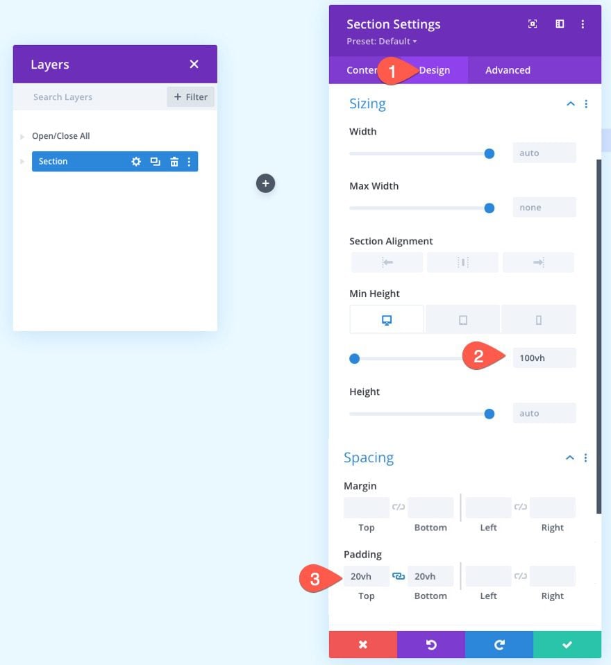
Under the design tab, update the min-height and padding.
- Min Height: 100vh (desktop), auto (tablet and phone)
- Padding: 20vh top, 20vh bottom
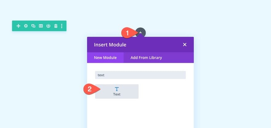
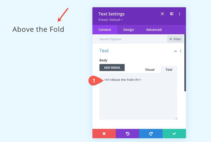
Heading Text
To create the heading text, add a new text module to the row.
Then update the content with the following H1 heading:
<h1>Above the Fold</h1>
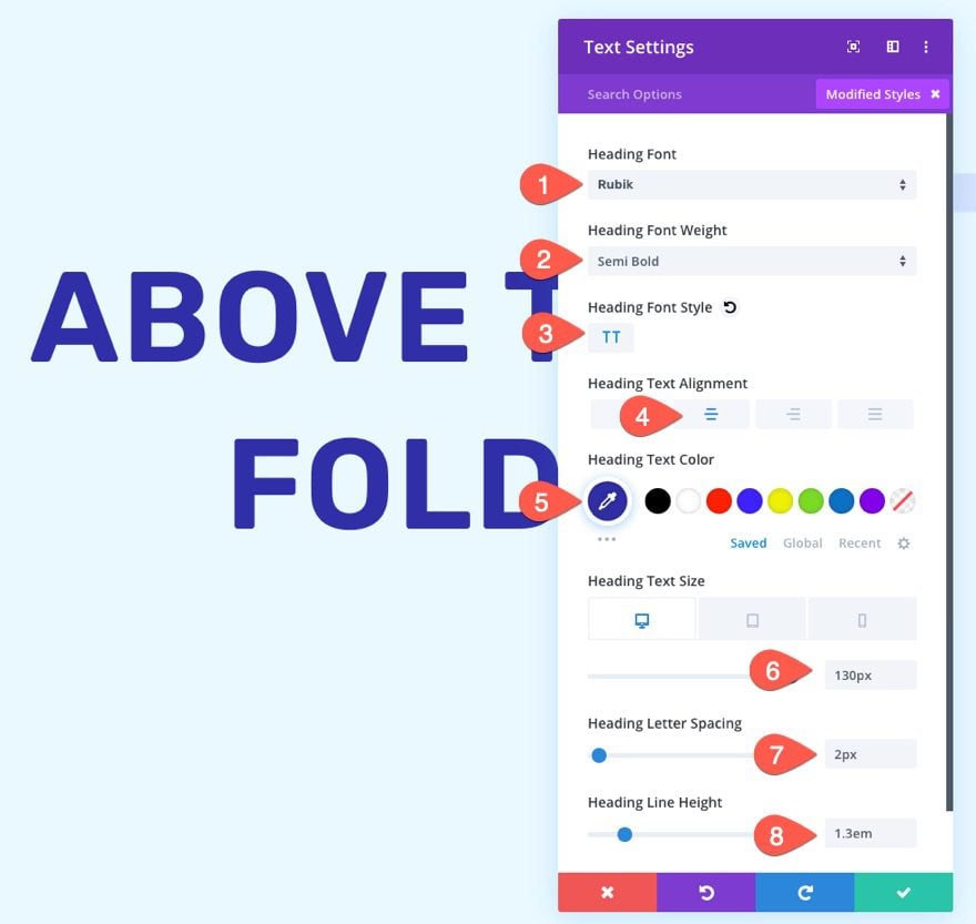
Text Settings
Under the design tab of the text settings, update the heading font styles as follows:
- Heading Font: Rubik
- Heading Font Weight: Semi Bold
- Heading Font Style TT
- Heading Text Alignment: Center
- Heading Text Color: #302ea7
- Heading Text Size: 130px (desktop), 70px (tablet), 40px (phone)
- Heading Letter Spacing: 2px
- Heading Line Height: 1.3em
Part 2: Creating the Below-the-Fold Section
In order to demonstrate the functionality of the sticky navigation bar, we need to add a below-the-fold section so that we can have some room to scroll.
To create the section, duplicate the above-the-fold section we just created.
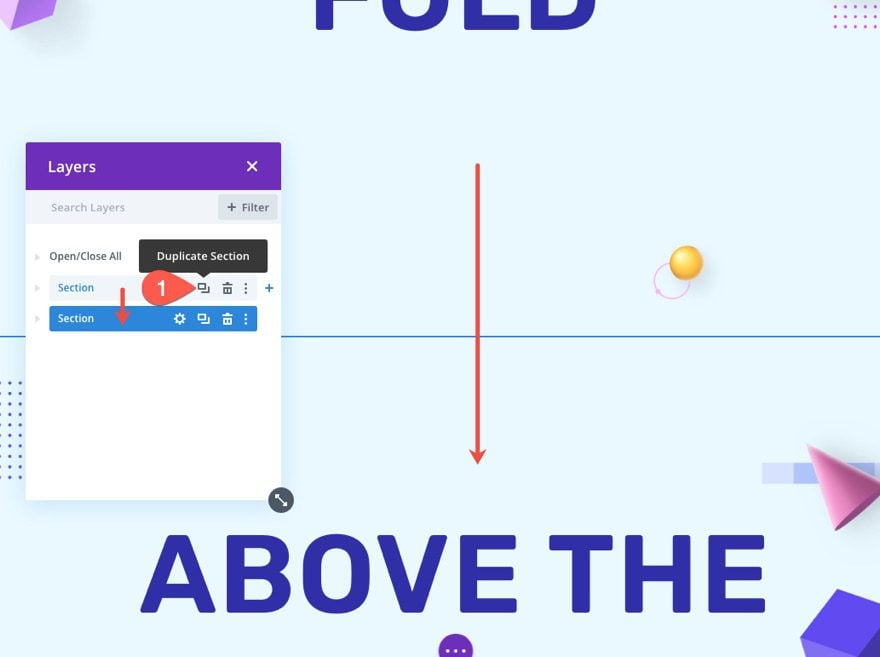
Update the duplicate section background.
- Background Color: #f4def1
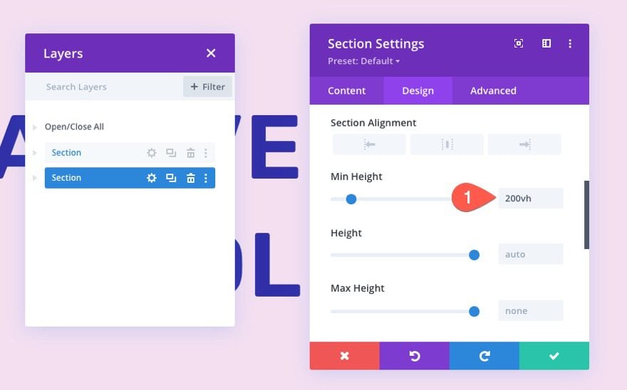
Then give the section a large min height so that we have room to scroll down the page. This is just a fill-in section in place of the actual content of a page.
- Min Height: 200vh
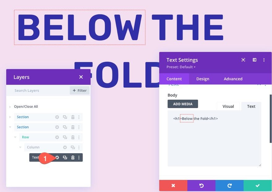
Then update the text module content by replacing the word “Below” with “Above”.
To create the sticky navigation bar from bottom to top, our first step is to create a new section with a one-column row.
Add New Section and Row
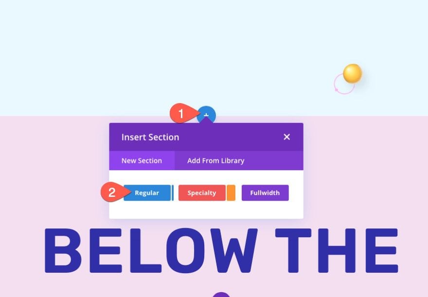
Add a new regular section directly below the above-the-fold section.
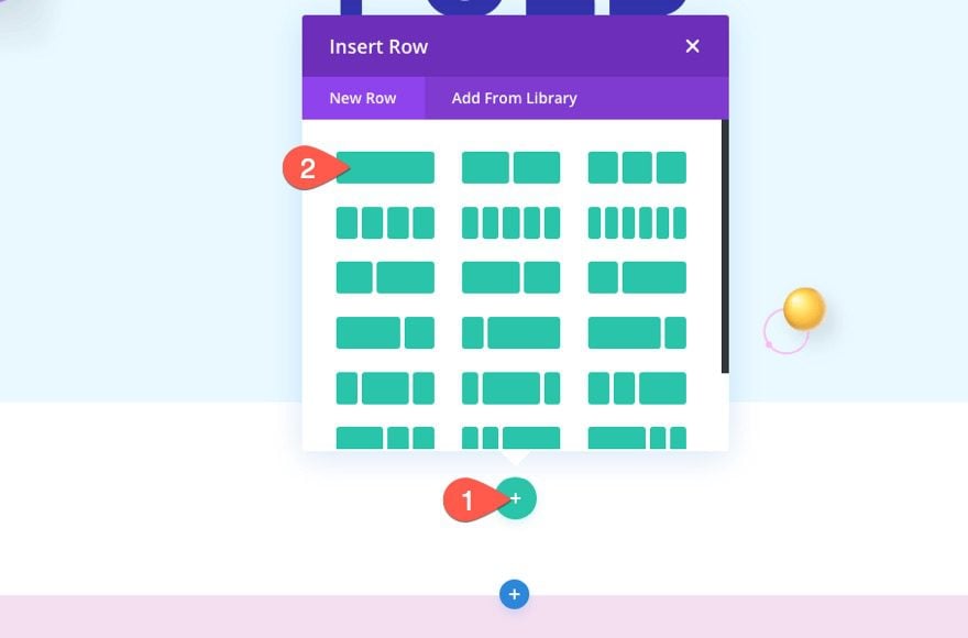
Then add a one-column row to the section.
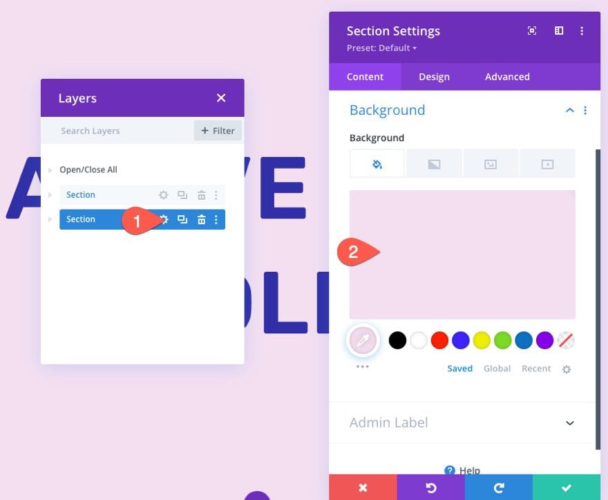
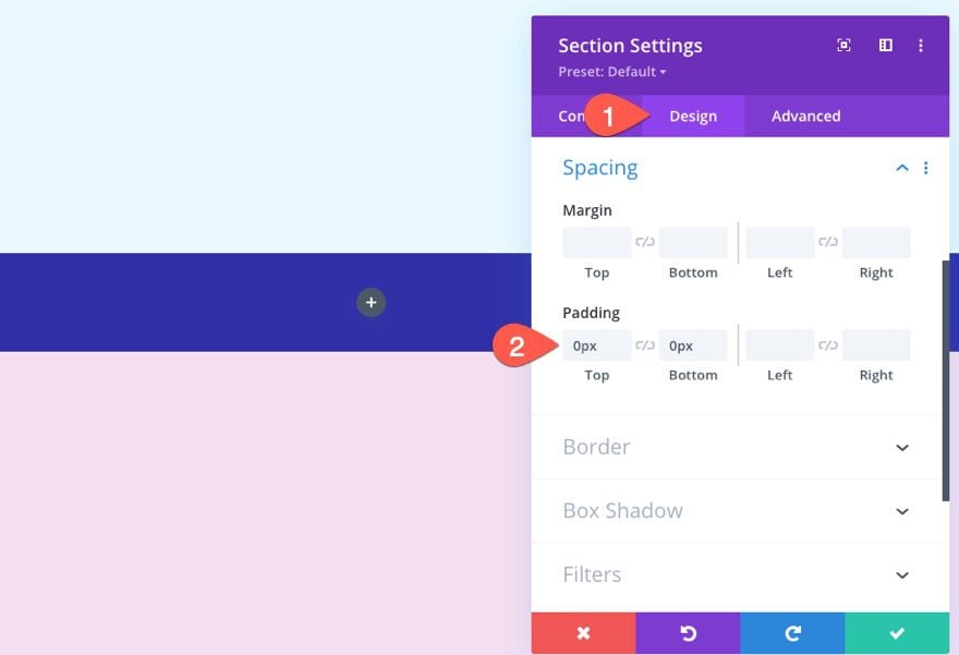
Section Background and Padding
Open the section settings and update the background color.
- Background Color: #302ea7
Then take out the top and bottom padding so the navigation bar has less height.
- Padding: 0px top, 0px bottom
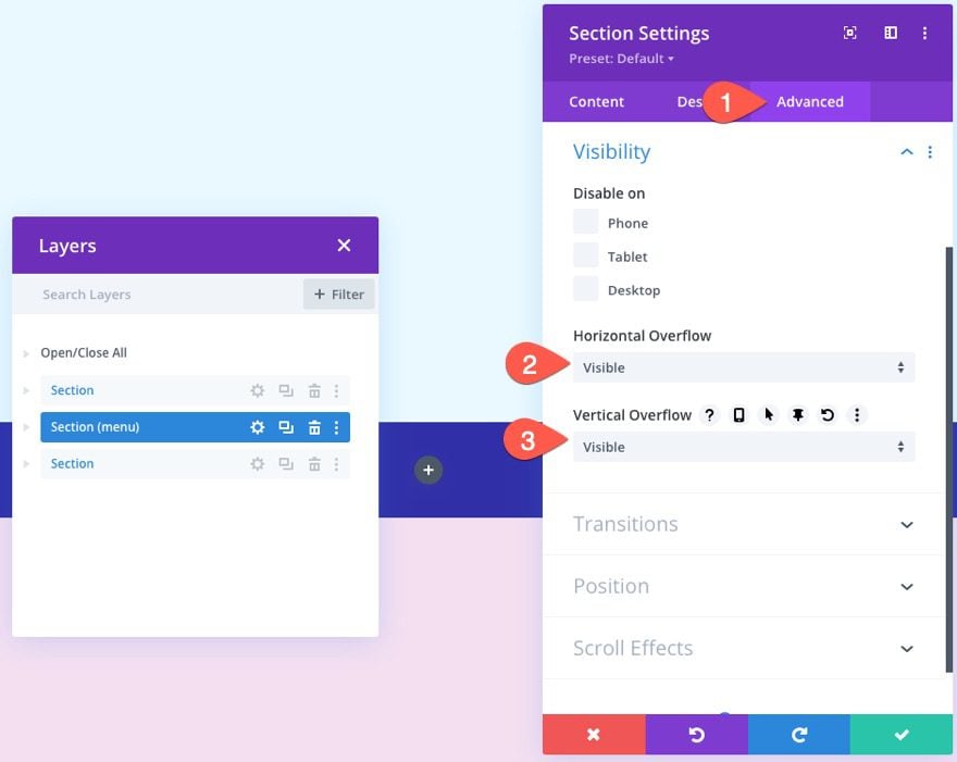
Add Visible Overflow
In order to make sure the dropdown menus will remain visible, update the visibility options as follows:
- Horizontal Overflow: Visible
- Vertical Overflow: Visible
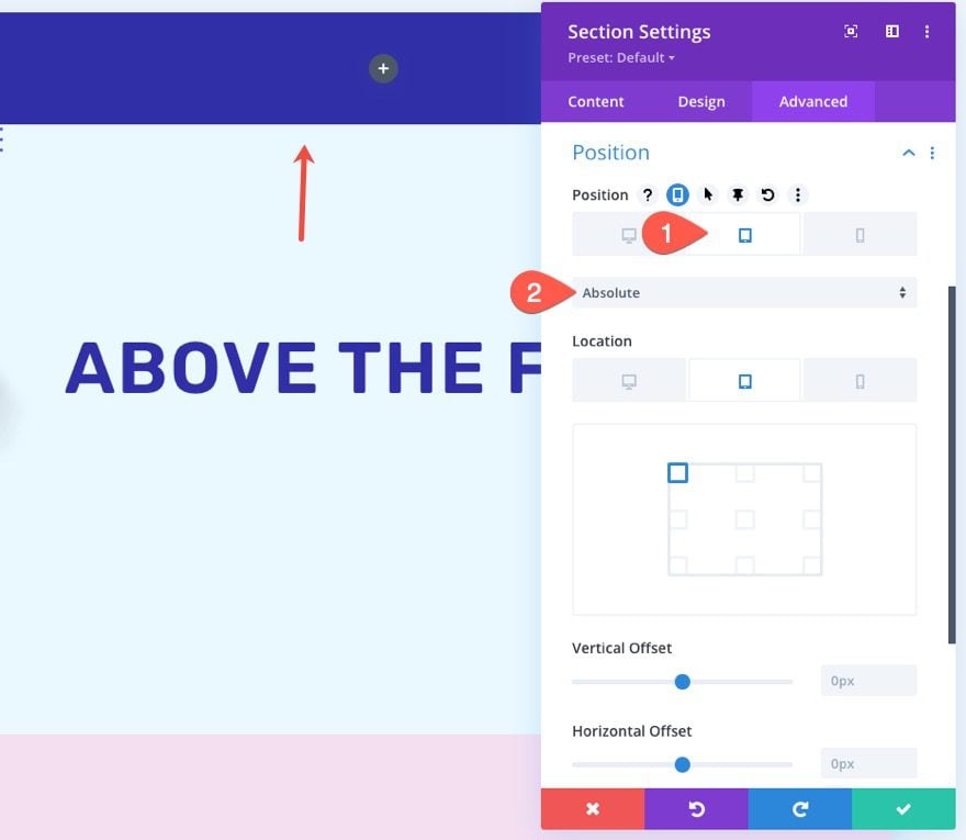
Give Section an Absolute Position on Mobile
The mobile dropdown menu will open below the hamburger icon by default. If we keep the navigation bar at the bottom, this would hide the dropdown menu if the user clicks it at the bottom position. For a better user experience, we want the navigation bar to start at the very top of the page on tablet and phone display.
To do this, give the section an absolute position on tablet and phone.
- Position: Relative (desktop), Absolute (tablet and phone)
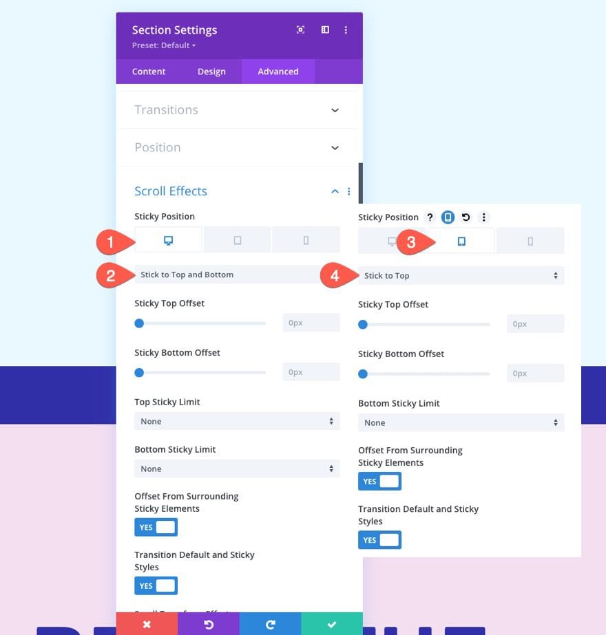
Add Sticky Position for Desktop and Mobile
To add the sticky position to the navigation bar section, update the following:
- Sticky Position: Stick to Top and Bottom (desktop), Stick to Top (tablet and phone)
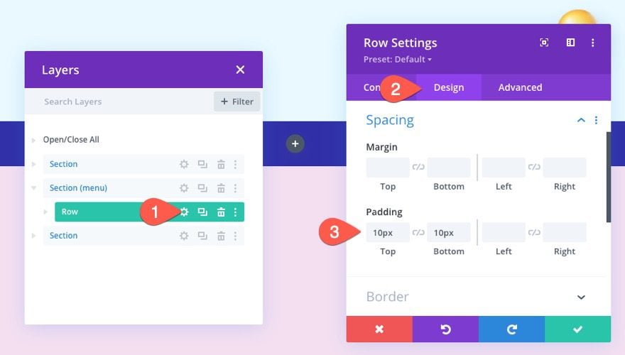
Update Row Padding
Once the sticky section is complete, open the settings for the row inside the section and update the padding as follows:
- Padding: 10px top, 10px bottom
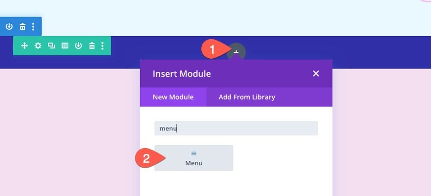
Create Navigation Menu
With the section and row in place, we are ready to create the navigation menu.
Start by adding a menu module to the one-column row.
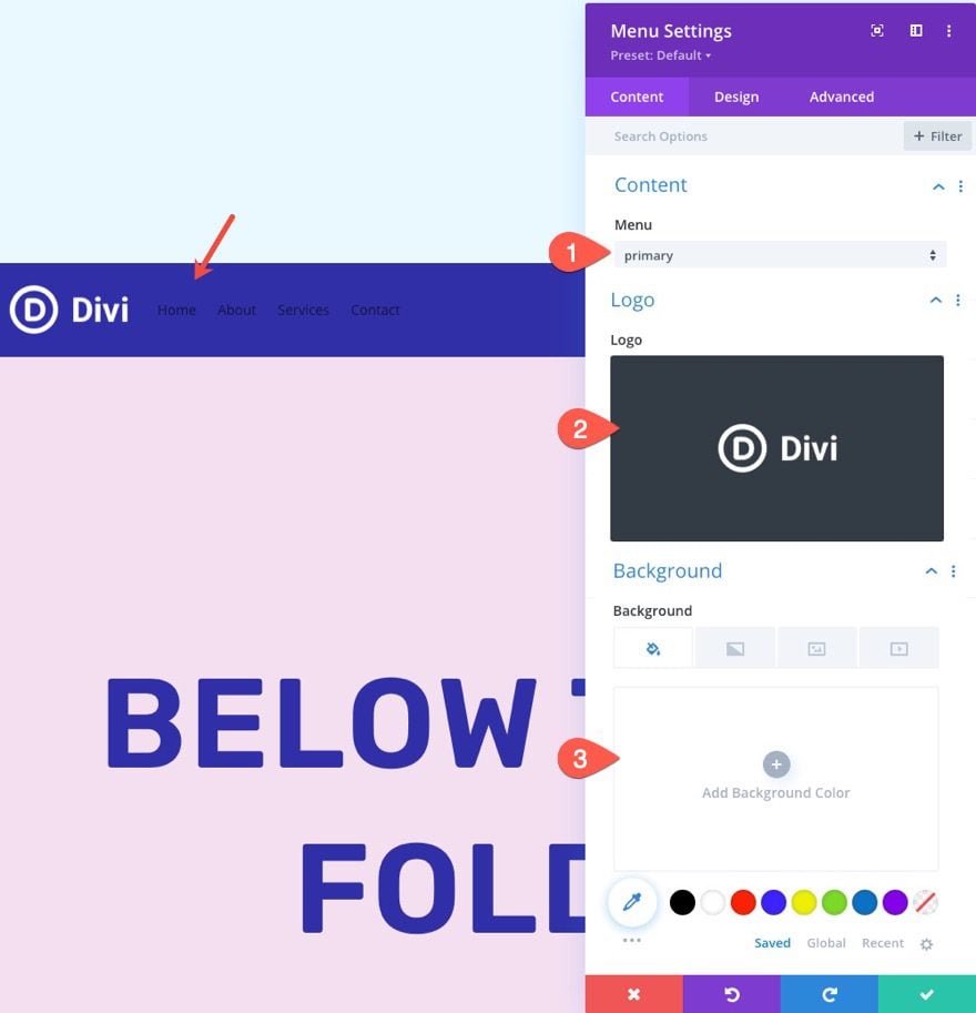
Menu Content
Update the content of the menu as follows:
- select menu from the dropdown
- add logo image (I’m using an image that is 122px by 52px)
- take out the default background color
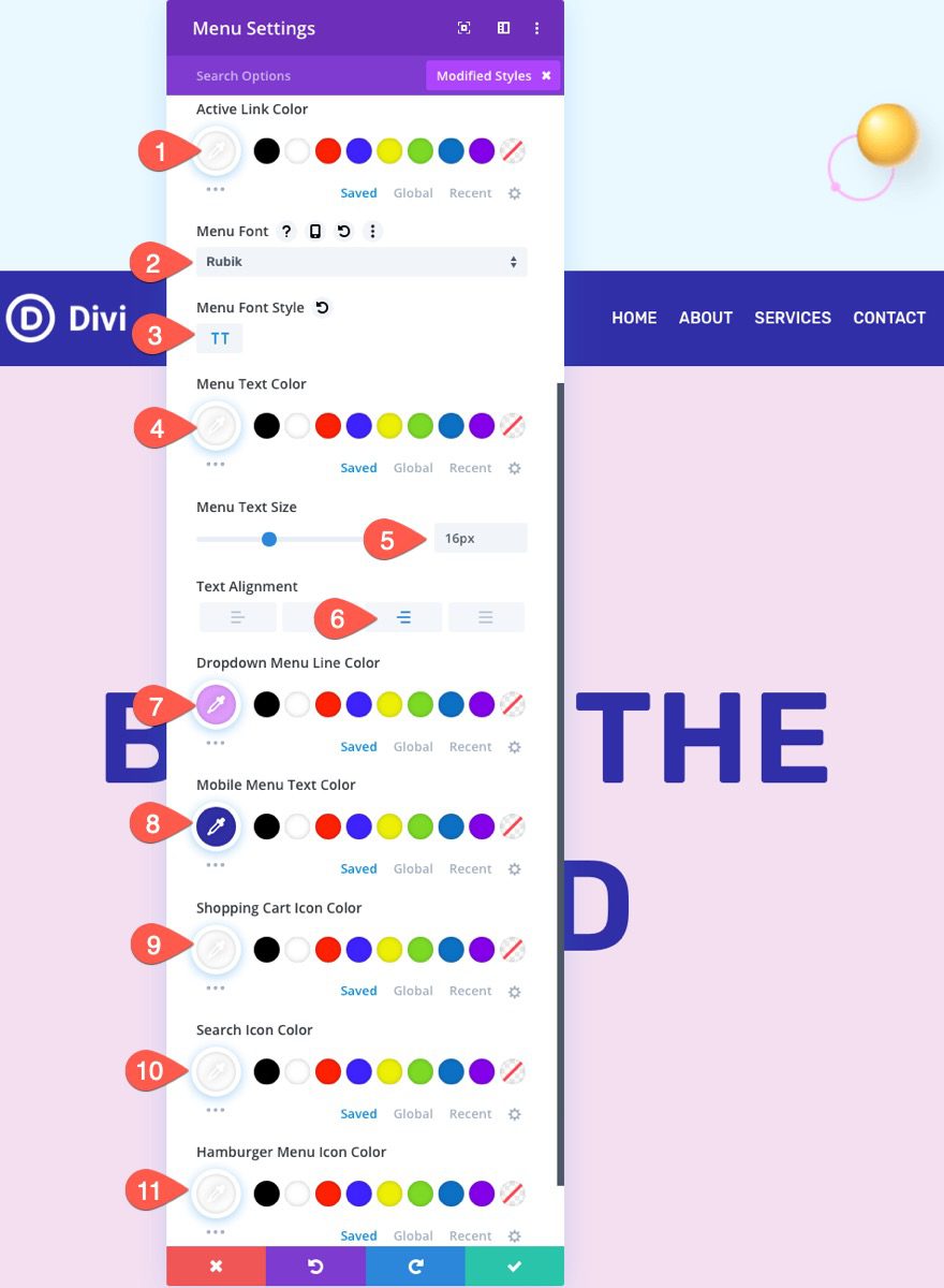
Under the design tab, update the following menu text and icon settings:
- Active Link Color: #fff
- Menu Font: Rubik
- Menu Font Style: TT
- Menu Text Color: #fff
- Menu Text Size: 16px
- Text Alignment: Right
- Dropdown Menu Line Color: #e19dff
- Mobile Menu Text Color: #302ea7
- Shopping Cart Icon Color: #fff
- Search Icon Color: #fff
- Hamburger Menu Icon Color: #fff
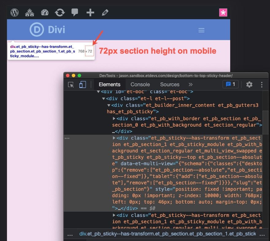
Because the navigation bar section has an absolute position on mobile, the bar will sit above (and cut off) the top section of the page. In order to fix this, we need to offset the top section using a top border that is the same height as the navigation bar/section.
Inspect the Height of the Navigation Bar Section on Mobile
To determine the height of the navigation bar on mobile, open a live version of the page in a new browser window. Then you can shrink the browser width below 980px to see the mobile menu. Right-click on the section containing the menu and choose the inspect element option from the right-click menu on the browser. You should see a toolbox below the section showing the dimensions (including the height) of the section. For this example, the height of the navigation bar section is 72px.
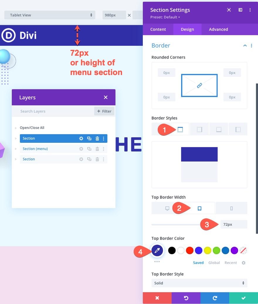
Add Top Border Offset to Above-the-Fold Section
Now that we have determined the height of the section, open the settings for the top (above-the-fold) section.
Under the design tab, add the following top border on tablet and phone:
- Top Border Width: 72px (tablet and phone)
- Top Border Color: #302ea7
Because the border is the same height as the section with the absolute position, you won’t be able to see the border because it only serves to push the section down so that it doesn’t get cut off.
Final Result
Check out the final result!
Final Thoughts
Creating a sticky navigation bar from bottom to top can easily be accomplished by using Divi’s built-in position and sticky options. The key is to give the above-the-fold section a height of 100vh and then add the navigation bar section below that sticks to the bottom and top of the browser. Hopefully, this will help to add a more unique and engaging above-the-fold to your website.
This sticky navigation bar works best for a single page design rather than a global template. That said, you can easily choose to use this as a homepage design and use a global header for the rest of the pages using the Divi Theme builder.
I look forward to hearing from you in the comments.
Cheers!


Great tutorial! One issue I’m noticing is that when you resize the browser window to make it bigger, the nav bar doesn’t remain full width. The right side loses its connection with the edge of the window until you’re done resizing, then it snaps back. Any thoughts on why this is happening? Is there a fix for this? Thanks
Thanks for your nice article about Sticky Navigation Bar.
You’re welcome. Glad it was helpful.