
In today’s Divi tutorial, we’re primarily going to focus on doing something special with the vertical navigation on your website. Vertical navigation a often forgotten option that the Divi theme provides. Although not often used, it can change the complete look and feel of your website and bring it to the level you want. To help you make your vertical navigation even more special than it already is, we’re going to make it transparent. Besides that, we’ll also ensure that the transparent menu overlaps the rest of your website.
Currently, we don’t see many websites with vertical navigation out there. But in certain cases, it can deliver stunning results. In one of our previous posts, we showed you 12 examples of Divi websites that use the vertical navigation to enhance their web design.
When you’re making the vertical navigation overlap your website, using a transparent background color is important. If you’re not making use of a transparent background color, the vertical navigation might overlap with some content on your website. You don’t want to get rid of the main focus on the content of your website and you absolutely don’t want to overlap it either.
To demonstrate what we exactly mean, we’ve made an elegant and simplistic example that we’ll show you how to make. Step by step, we’ll guide you through the different steps that are needed to achieve the following results.
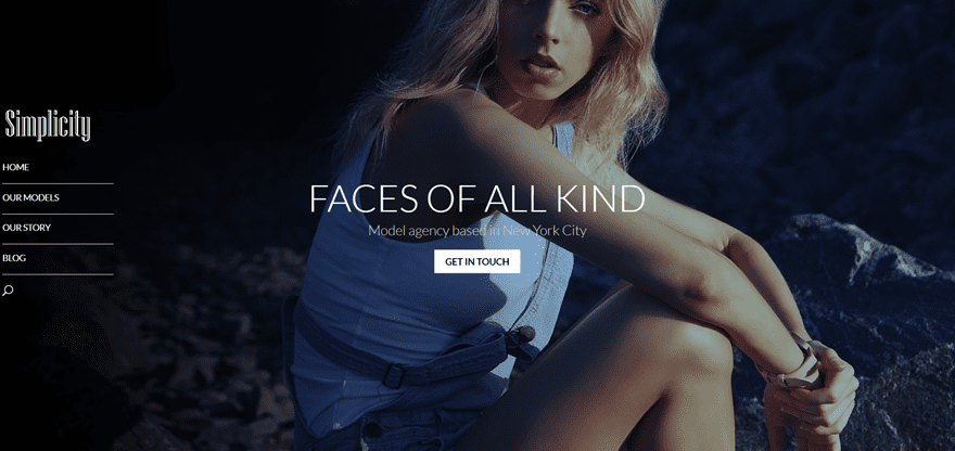
In the image above, you can notice the simplicity that a transparent vertical navigation can bring to your website. Besides showing you how to create the transparent vertical menu, we’ll also give some general design tips that you can use when recreating it to match your own website.
Creating the Design in Divi
Subscribe To Our Youtube Channel
General Settings
Before we dive into the example we made, we are going to provide you with some general information (and CSS code lines) that helps you integrate the transparent navigation in a simple way (without all the other modifications we’ve made in the example).
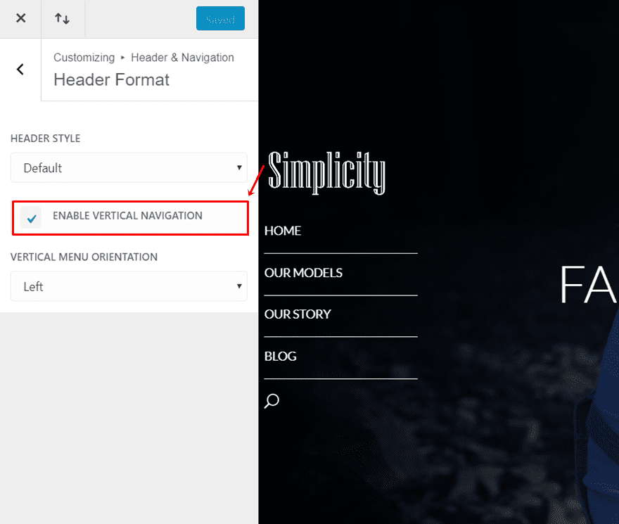
To begin with, you need to enable the vertical navigation on your website. To do that, go to your WordPress Dashboard > Appearance > Customize > Header & Navigation > Header Format > And enable the Vertical Navigation.
Choose Your Design Settings in The Theme Customizer
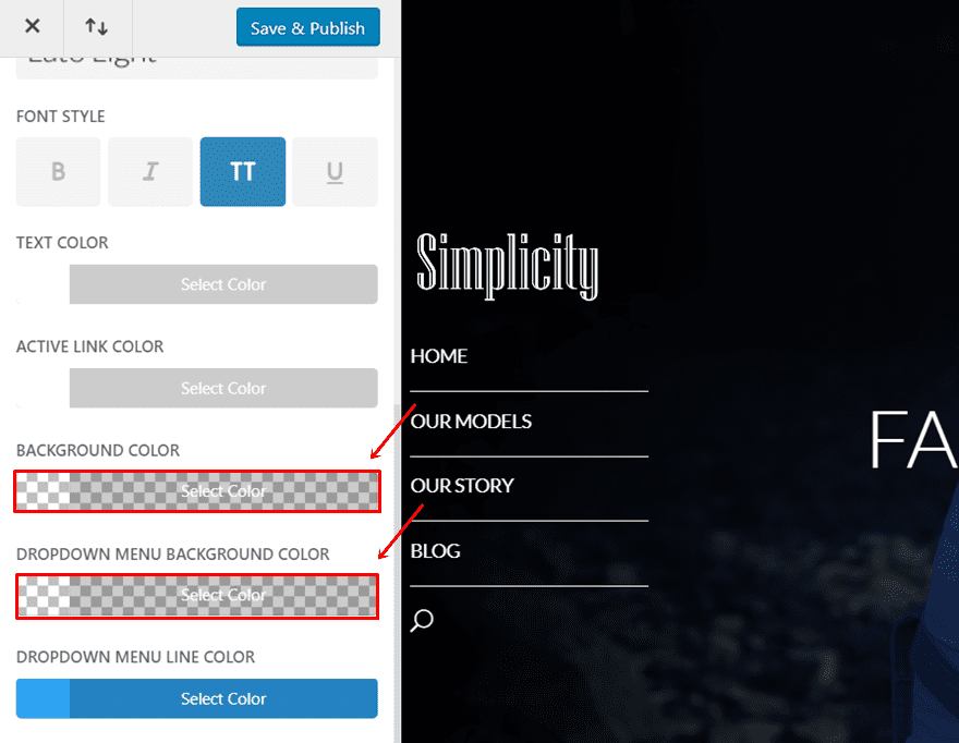
Now that you’re still in the Theme Customizer, you can adjust all the settings of your vertical navigation in the same way as you change your top navigation. Go back to Header & Navigation > Primary Menu > And make all the modifications you wish to make to your primary menu.
In this part, it’s important to provide a background color to the menu that has an opacity of less than 1. Preferably, even less than 0.5. Make sure that this applies the background color. If you want the same to apply to the dropdown menu background color, choose the same color there as well.
Add The CSS Code
Once you’ve made all the desired changes to the design part of your vertical navigation, you can move over to the CSS part. Since we’re already in the Theme Customizer, we’re going to add the custom CSS code over there. You can, of course, add the CSS code to one page in particular as well or through your Theme Options.
The CSS code we’ll provide you with does two things. First of all, it makes sure that your transparent vertical navigation and website overlap. Secondly, it helps you adjust the width of your vertical navigation. If you don’t want to change the width at all, you can leave that piece of code out of your website and just make the transparent vertical navigation and your website overlap.
These changes will only apply to the desktop version of your website. On screens that have a width of smaller than 981px, the modifications won’t apply.
Add CSS Code in Theme Customizer
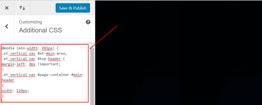
Firstly, we have the code that makes sure your website fills the whole width of your browser. Copy and paste the following code into the Additional CSS tab of your Theme Customizer:
@media (min-width: 981px) {
.et_vertical_nav #et-main-area, .et_vertical_nav #top-header {
margin-left: 0px !important;
}
}
Additionally, if you want to adjust the width of your vertical navigation as well, copy and paste the following lines of CSS code instead:
@media (min-width: 981px) {
.et_vertical_nav #et-main-area, .et_vertical_nav #top-header {
margin-left: 0px !important;
}
.et_vertical_nav #page-container #main-header
{
width: 120px;
}
}
Now that we’ve handled the necessary steps of creating a transparent vertical navigation that overlaps your website, we’re going to recreate the example. The example, once again, looks like this:
Overall Design Tips
Before we get started, we’ll share some general design tips and thoughts that you should keep in mind. These tips will help you get the best out of the elegant and simplistic website you’re creating. Let’s have a look at the two tips we definitely want to emphasize.
Centralize Everything
Firstly, make sure you centralize the content on your website. It’s self-evident but worth mentioning. If you’re using a transparent vertical navigation that overlaps your website, centralizing your content will fit best with that. If you, instead, align everything to the left side of your website, it’s more likely that the transparent vertical navigation and the content will get mixed up. That’s probably not the result you want to achieve. You want to prioritize the symmetry and readability on your website.
If you do opt for differently aligned content, make sure you check the padding and margins of the content. If you modify the margin’s and paddings accordingly, the results can still turn out looking great. But, you’ll probably have to make a lot of manual modifications.
Same-Color Background Everywhere
If you’re using a fully transparent background color for your vertical navigation, like we’re using in this example, it’s important to maintain a certain consistency. You want the color in your vertical navigation to be readable and be noticeable because people should be able to smoothly navigate through your website.
If you’re choosing a light font color in your transparent vertical navigation, make sure your background images or colors contain dark colors. Likewise, if you’re using a dark font color, make sure the background images or colors you use have light colors.
Start Creating The Example
Without any further due, let’s start recreating the example we showed you. First of all, create a new page and add a Fullwidth Section to it. We’re only going to show you how to recreate one section of the page. Of course, you can then continue and add as many sections as you want. The menu will remain exactly the same when scrolling.
Create Fullwidth Header
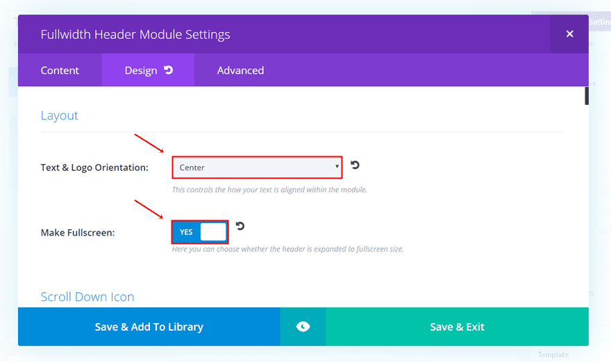
Within the Fullwidth Section, add a Fullwidth Header. Then, go to the Design tab, put the Text & Logo Orientation to ‘Center’ and enable the fullscreen mode of your Fullwidth Header as well.
Title Settings
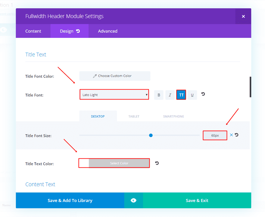
Also, scroll down the same tab and make the following changes to the Title Text subcategory:
- Title Font: Lato Light
- Title Font Style: Capitals
- Title Font Style: 60 (desktop), 50 (tablet), 40 (phone)
- Title Text Color: #FFFFFF
Subhead Settings
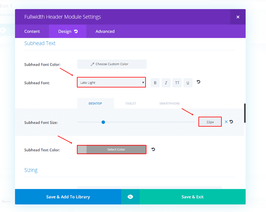
Furthermore, continue scrolling and make sure the settings of the Subhead Text subcategory are the following:
- Subhead Font: Lato Light
- Subhead Font Size: 22px (desktop & tablet), 19 (phone)
- Subhead Text Color: #c4c4c4
Button Settings
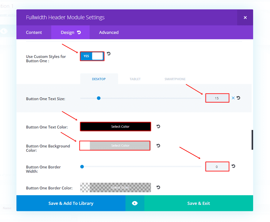
Finally, make the following changes to the Button subcategory of the Design tab:
- Use Custom Styles for Button One: Yes
- Button One Text Size: 15 (desktop & tablet), 12 (phone)
- Button One Text Color: #000000
- Button One Background Color: #FFFFFF
- Button One Font: Lato Light
- Button One Font Style: Bold & Capitals
Gradient Background Settings
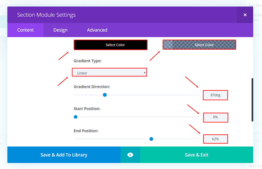
Next, open the settings of the Fullwidth Section to add a background image with gradient overlay within the Background subcategory of the Content tab. Depending on the type of background and colors you’re using, add matching colors.
In our example, we’re using dark backgrounds. Therefore, we’ll start off with a black color in the gradient. The other color, we matched with the background image is ‘rgba(0,49,109,0.43)’.
Furthermore, the settings we’ve used for the gradient colors are the following:
- Gradient Type: Linear
- Gradient Direction: 87deg
- Start Position: 0%
- End Position: 62%
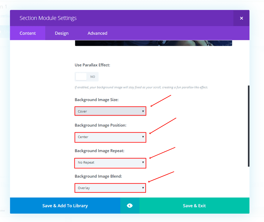
Moving on, add a background image and apply the following settings:
- Background Image Size: Cover
- Background Image Position: Center
- Background Image Repeat: No Repeat
- Background Image Blend: Overlay
Changes in Theme Customizer
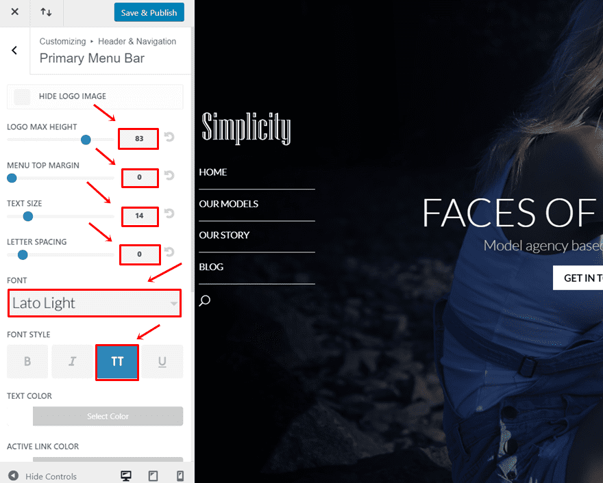
For the next step, we’ll need to make some other modifications in the Theme Customizer. If you’re on your WordPress Dashboard, go to Appearance > Customize > Header & Navigation > Primary Menu Bar > and make the following changes:
- Logo Max Height: 83
- Text Size: 14
- Letter Spacing: 0
- Font: Lato Light
- Font Style: Capitals
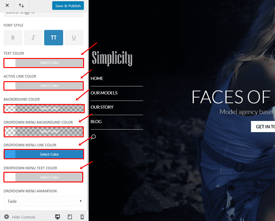
- Text Color: #FFFFFF
- Active Link Color: #FFFFFF
- Background Color: #FFFFFF
- Dropdown Menu Background Color: rgba(221,153,51,0)
- Dropdown Menu Line Color: #1E73BE
- Dropdown Menu Text Color: #FFFFFF
Add Custom CSS Code in Theme Customizer
While you’re still in the Theme Customizer, we’re going to add the needed CSS code lines to make the layout look they way it does.
The first part of the code removes the left margin of the website when using a vertical navigation. The second part puts the menu closer to the left. The third part places a top margin and a bottom border to each page in the menu. The fourth part adds a top margin to the logo and removes the margin after the logo. And finally, we made sure the menu keeps the same distance between the logo and the menu items by removing the top padding. These changes also apply to the menu when scrolling. Therefore, the menu will look the same throughout the whole website.
@media (min-width: 981px) {
.et_vertical_nav #et-main-area, .et_vertical_nav #top-header {
margin-left: 0px !important;
}
.container {
margin-left: 3% !important;
}
#top-menu li {
margin-top: 15px;
border-bottom: 1px solid #FFFFFF;
}
.et_vertical_nav #main-header #logo {
margin-top: 80% !important;
margin-bottom: 0px !important;
}
.et_vertical_nav.et_vertical_fixed.et_header_style_left .et-fixed-header #et-top-navigation, .et_vertical_nav.et_vertical_fixed.et_header_style_split .et-fixed-header #et-top-navigation {
padding-top: 0px !important;
}}
Final Result
As a result of all the steps you’ve followed throughout this post, you should have the following result on the website you’re working on:
Wrapping up
In this post, we’ve shown you how to make a transparent vertical navigation that overlaps your website. Besides, we’ve also shared an elegant and simplistic design that you can use for your own website if you follow this post step by step. If you have any questions or requests, make sure you leave a comment in the comment section below so we can get in touch!
Be sure to subscribe to our email newsletter and YouTube channel so that you never miss a big announcement, useful tip, or Divi freebie!


hello very great but is it possible to have different color of background on desktop and on mobile ? Thanks
Many many thanks for this elegant design!
Please, can this be applied to a background slideshow?
…if yes, how?
Love the look of the menu but how do I keep content (text, contact forms, etc) from going behind it?
Lovely concept. This is awesome. But how can you pad the menu away from the computer wall, to me, maybe its my computer, the menu is too close to the wall of the computer.
Thank for this creative design tips.
Cheers!
Very nice. Thanks Donjete!
Great!
Nice menu, thanks!!
What an awesome addition! I’m not much into CSS use, I admit, but this I had to try. Still need a little tweaking on my site and required a lot of changes to web pages. Wondering if this would work on horizontal menus as well. May have to experiment.
Great tutorial Donjete. And the 12 examples are much appreciated to see the many possibilities. Thanks for sharing.
Thanks for very content rich post
Thanks for the article, and video link. But…
I may have missed the link for this, but is there a link to the demo site so your readers can look at a live version of the finished product?
In my opinion, in a perfect “How To” article there would ALWAYS be a link to a live demo for a “How To” article like this, and the link would ALWAYS appear right at the top.
Thanks!
+1
+1