
Off canvas menus appear everywhere on the web, but building one that works smoothly on desktop often means fighting with custom CSS or patching together mega-menu workarounds. Divi 5 handles this differently with Canvases and Interactions.
We’ll build a global off canvas services menu triggered from a Theme Builder header template. The menu sits in its own canvas, completely separate from your page layout, and stays fixed while visitors scroll. On mobile, it gets a max-height and internal scroll so everything stays accessible on smaller screens.
- 1 What Are Canvases In Divi 5?
-
2
What We’re Building
- 2.1 1. Create The Header In Theme Builder (And Add The Button)
- 2.2 2. Create A New Canvas For The Menu
- 2.3 3. Design The Off Canvas Menu Layout
- 2.4 4. Set The Menu To Fixed Position
- 2.5 5. Optimize The Menu For Mobile With Max Height And Scroll
- 2.6 6. Hide The Canvas On All Breakpoints
- 2.7 7. Add Interactions To Open And Close The Menu
- 3 Preview The Menu On The Front End (Desktop & Mobile)
- 4 Download The Tutorial Template
- 5 Download For Free
- 6 Try Canvases In Divi 5 Today!
What Are Canvases In Divi 5?
A canvas in Divi 5 is a separate workspace that exists outside your main page layout. Your page content lives in the main builder area, but canvases operate independently and stay hidden until triggered.
Think of them as dedicated containers for interface elements that only appear when needed. You build off canvas menus, slide-in panels, popups, or drawers inside a canvas, and they wait in the background until a button click or interaction pulls them into view. The page doesn’t register their presence until that moment.
After updating your Divi 5 theme to the latest version, you’ll see a new Canvas dropdown in the top bar.
The dropdown lets you switch between canvases you’ve created. The Canvas Grid View option shows all canvases in a single dashboard for quick access.
You can create both local and global canvases. Local canvases belong to a specific page or template. Global canvases work across your entire site, so you build a navigation panel once and reuse it everywhere without duplicating design work.
Canvases connect directly to Divi’s Interaction system. Trigger them with clicks, hovers, scrolls, or other events. They appear dynamically on the front end but remain organized in the builder as their own layer, so updating a menu design doesn’t ripple into the pages where it appears.
The old approach to mega menus often meant embedding them directly into your header layout. A spacing tweak or responsive adjustment could break the menu entirely, and fixing it meant digging through nested sections to untangle navigation logic from layout code. Canvases eliminate this by giving the menu its own isolated space.
This separation makes maintenance easier as your site grows. Update the menu’s layout, links, or styling once in a global canvas, and the changes take effect everywhere. Canvases also eliminate the need for workarounds such as custom CSS, negative margins, or third-party plugins. Trigger the menu through Divi’s Interaction system and let the builder handle the rest.
Learn Everything About Divi 5 Canvases
What We’re Building
We’re building a global off canvas slide-in menu triggered by a button in the site header. The button sits in a Theme Builder header template, which means the menu works site-wide without rebuilding it on individual pages.
The menu lives in a canvas set to “Don’t Append”, so it stays out of your page layout until an interaction reveals it. When triggered, it appears as a fixed overlay that remains on-screen as visitors scroll. On mobile, we’ll add a max-height and internal scroll container so the menu remains accessible even when content extends beyond the viewport.
By the end, you’ll have a menu that behaves consistently across breakpoints and doesn’t interfere with page layouts.
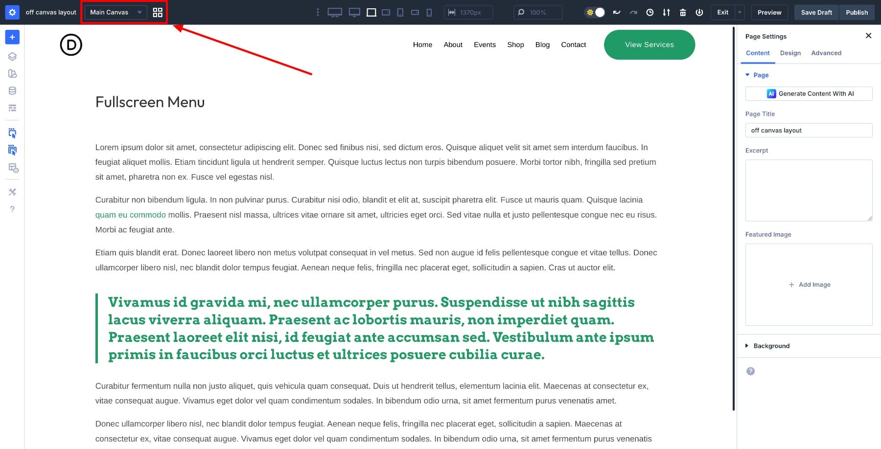
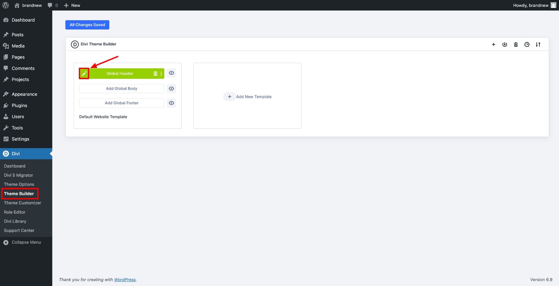
Open Divi > Theme Builder and edit your existing Global Header. We’re working at the template level so the menu button appears on every page without manual placement.
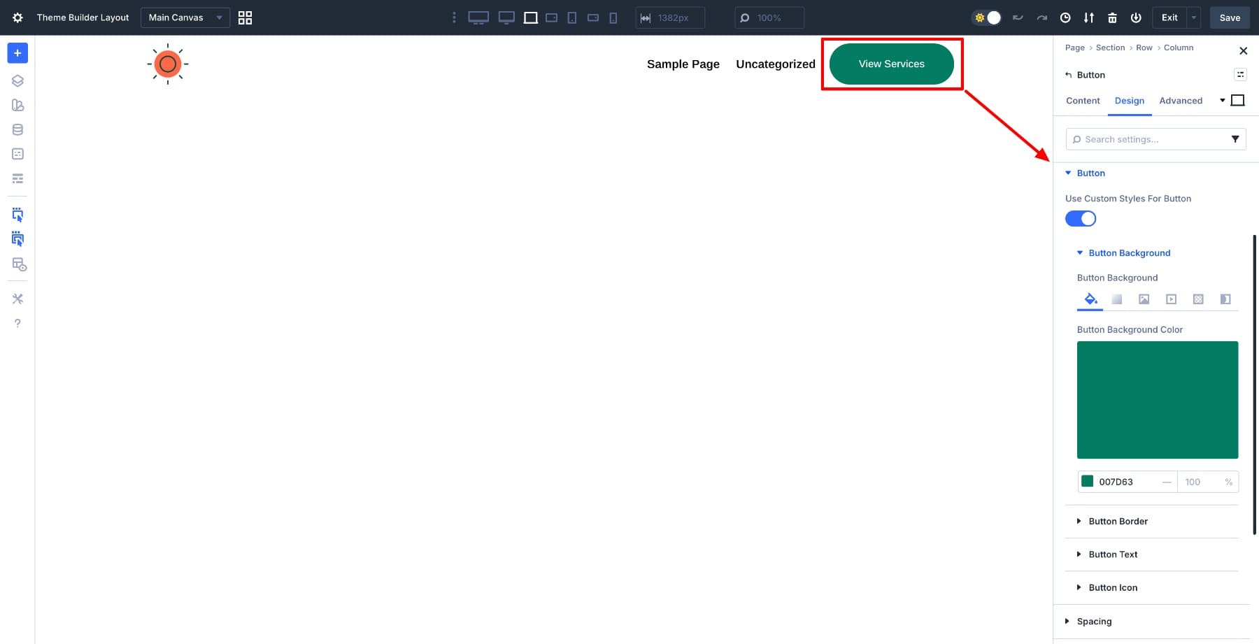
Inside the header layout, add a Button module and place it inside an existing header row next to your Menu module. Label it View Services and style it to match your header design. This button will trigger the off canvas menu, so its placement and styling should feel natural within your navigation.
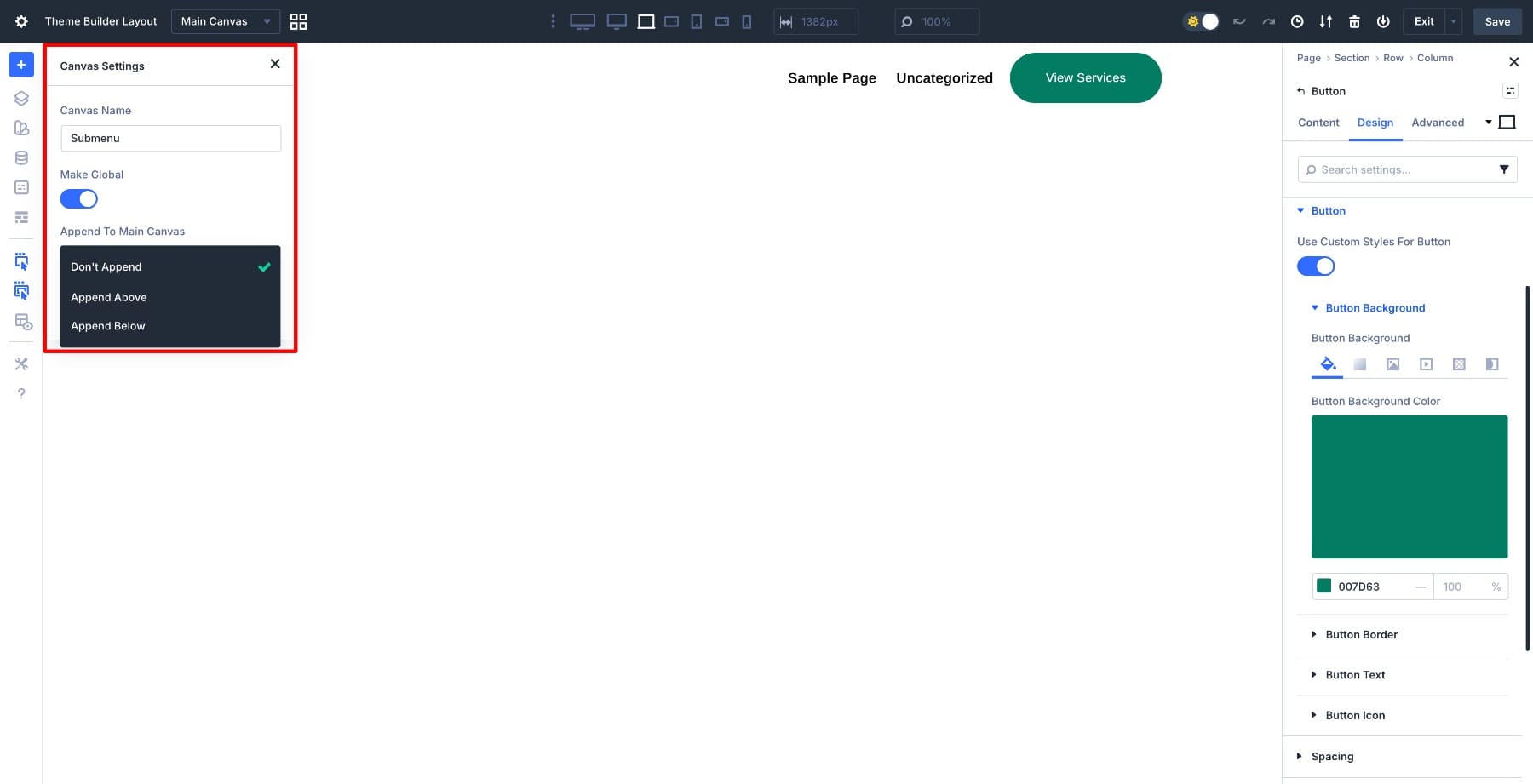
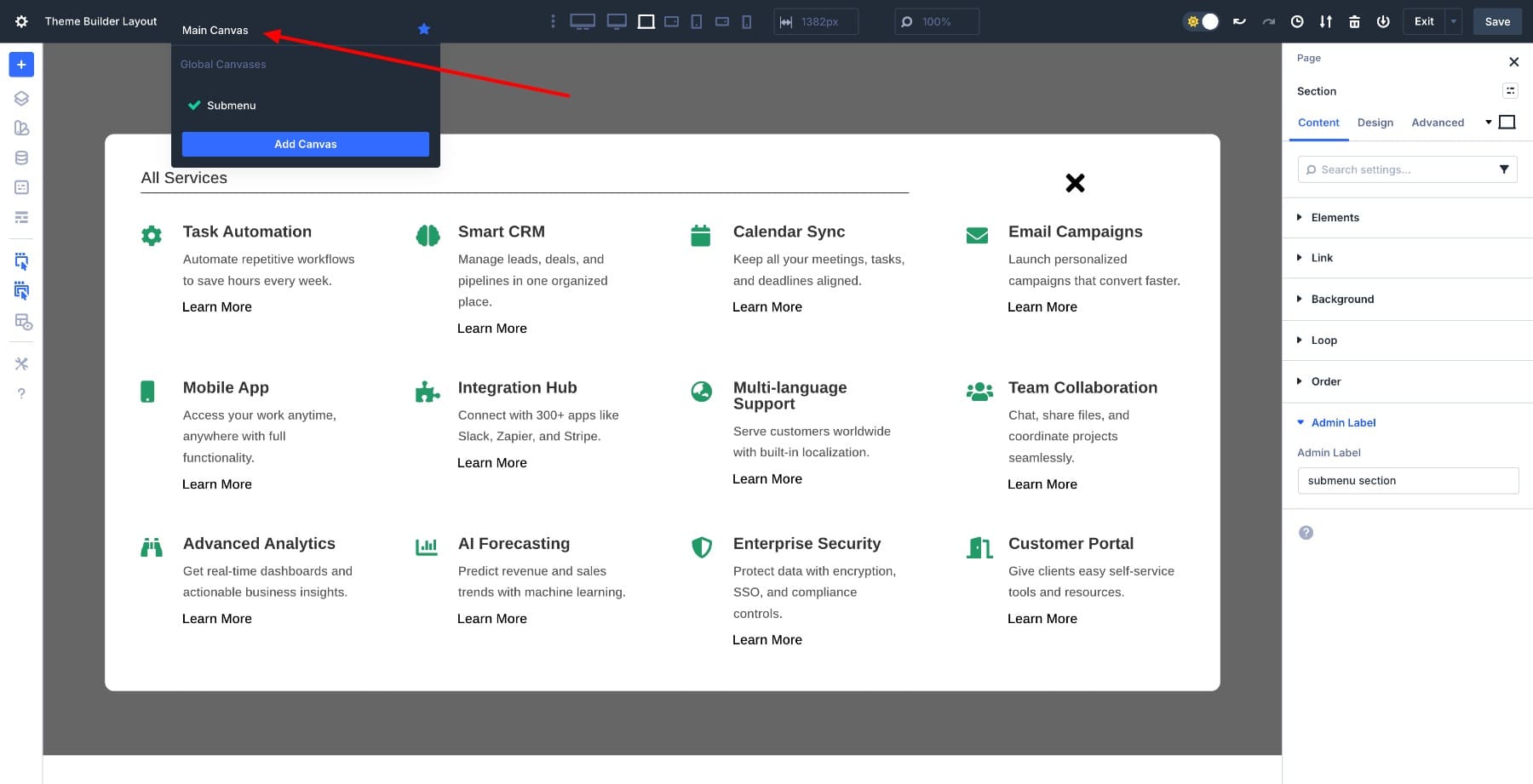
With the trigger button in place, we need somewhere for the menu to live. In the Visual Builder, open the Canvas dropdown from the top bar and click Add Canvas.
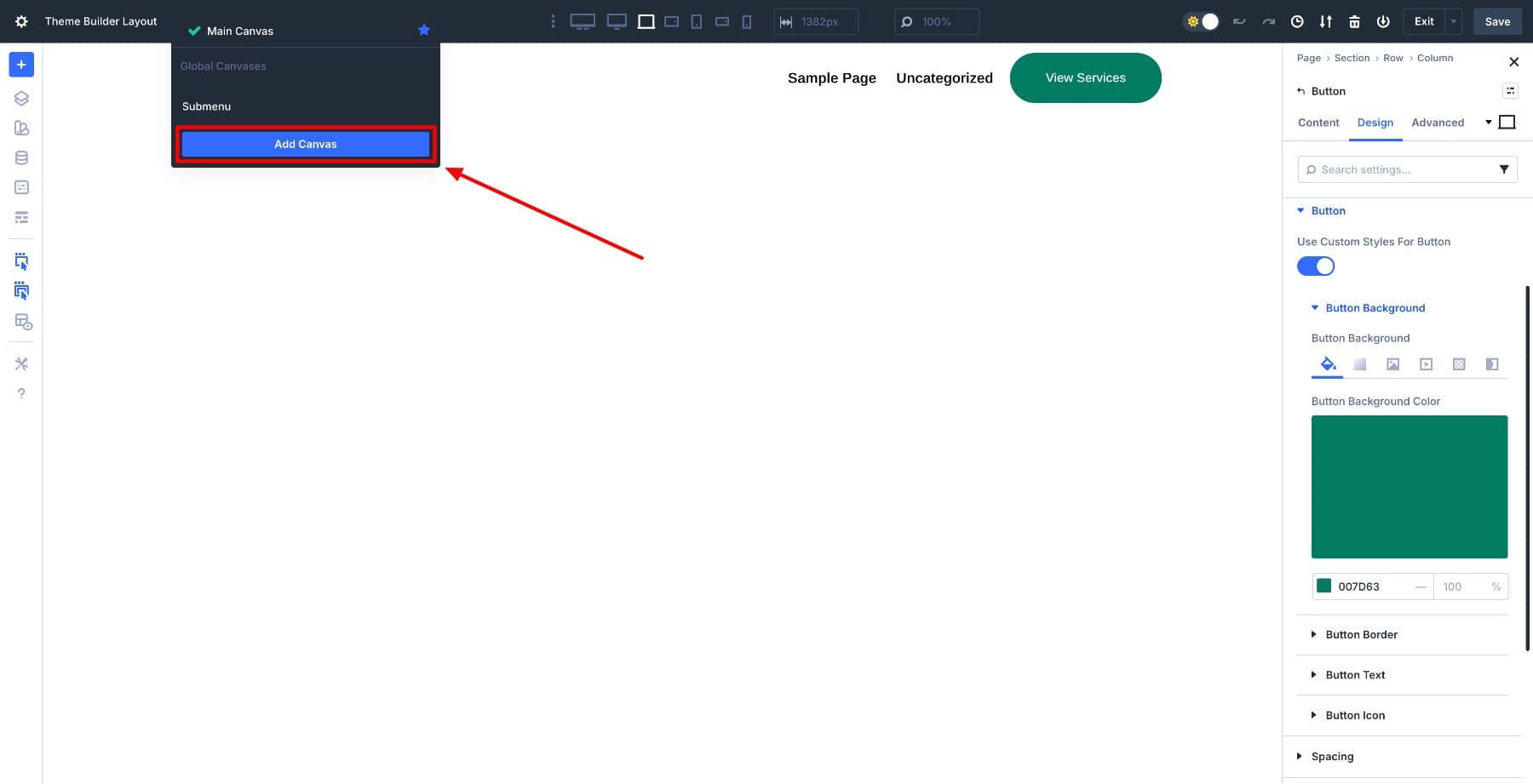
Name the canvas Submenu, so it’s easy to identify when setting up interactions later. Make it Global so it’s accessible across your entire site, and set it to Don’t Append.
This setting keeps the canvas completely detached from your page structure, which prevents it from interfering with page layouts while still making it available for interactions to target. Click Add Canvas when done.
Divi automatically switches you into the canvas workspace. You now have a blank area where you’ll build the menu structure.
Start by adding a regular section with a black background color set to 70% opacity. This creates the overlay effect that dims the page content when the menu opens.
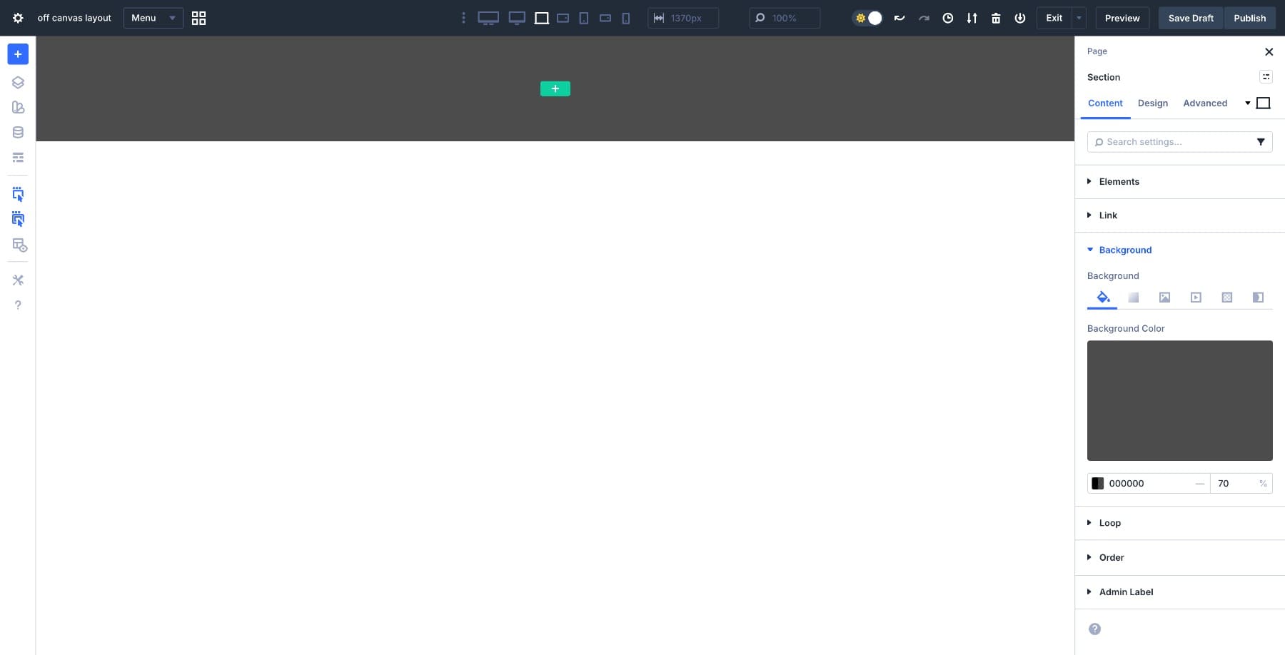
Set the section’s Width to 100vw and Height to 100vh so it covers the entire viewport. Inside the section, add a single-column row. This row will hold the actual menu content. Set the Background to White and add a 10px Border Radius for visual polish. Go to Design > Layout and set both Horizontal and Vertical Gaps to clamp(20px, 4vw, 50px).
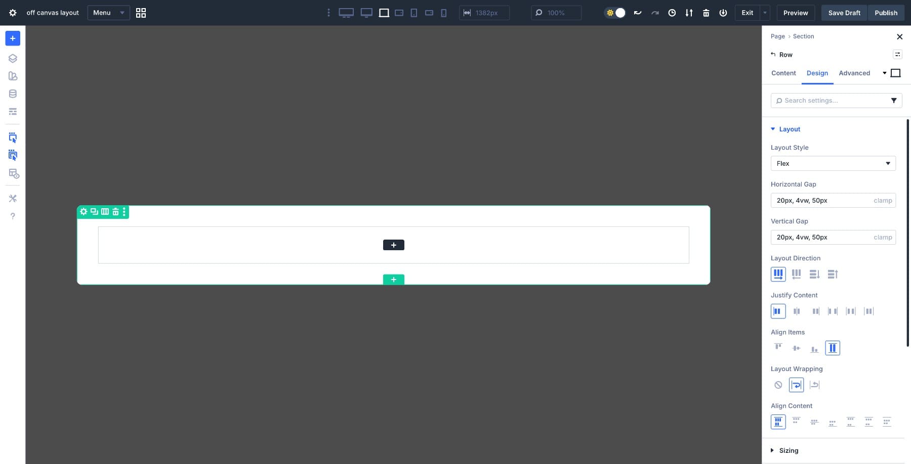
This fluid spacing value keeps the layout breathing naturally across screen sizes without manual breakpoint adjustments.
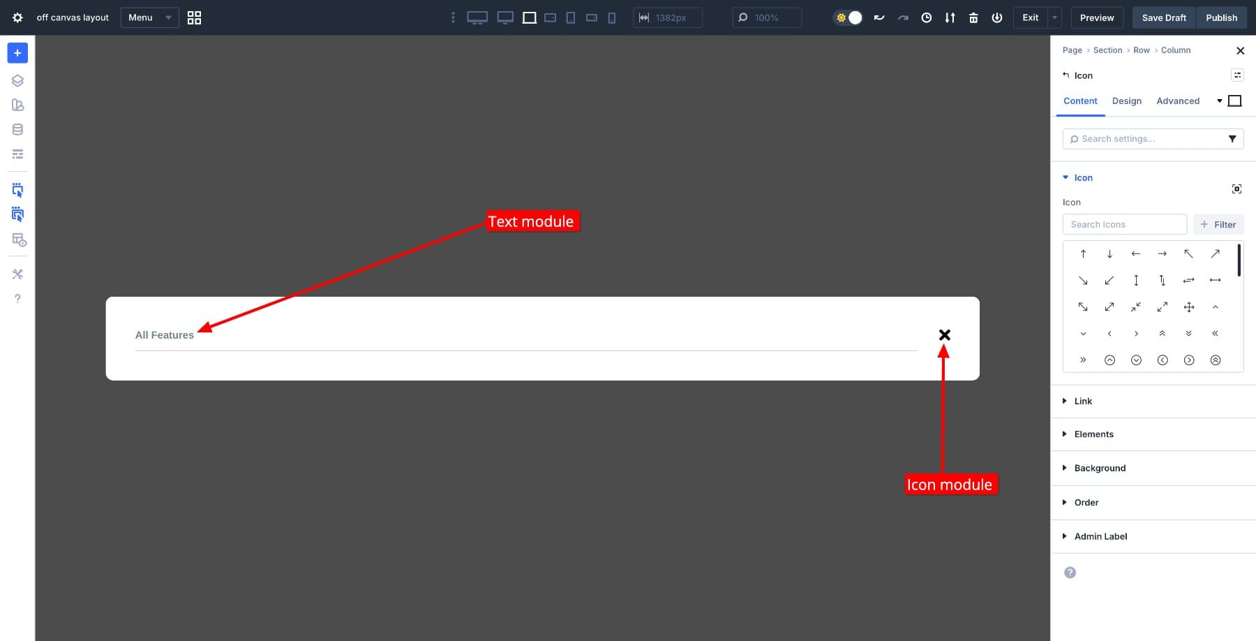
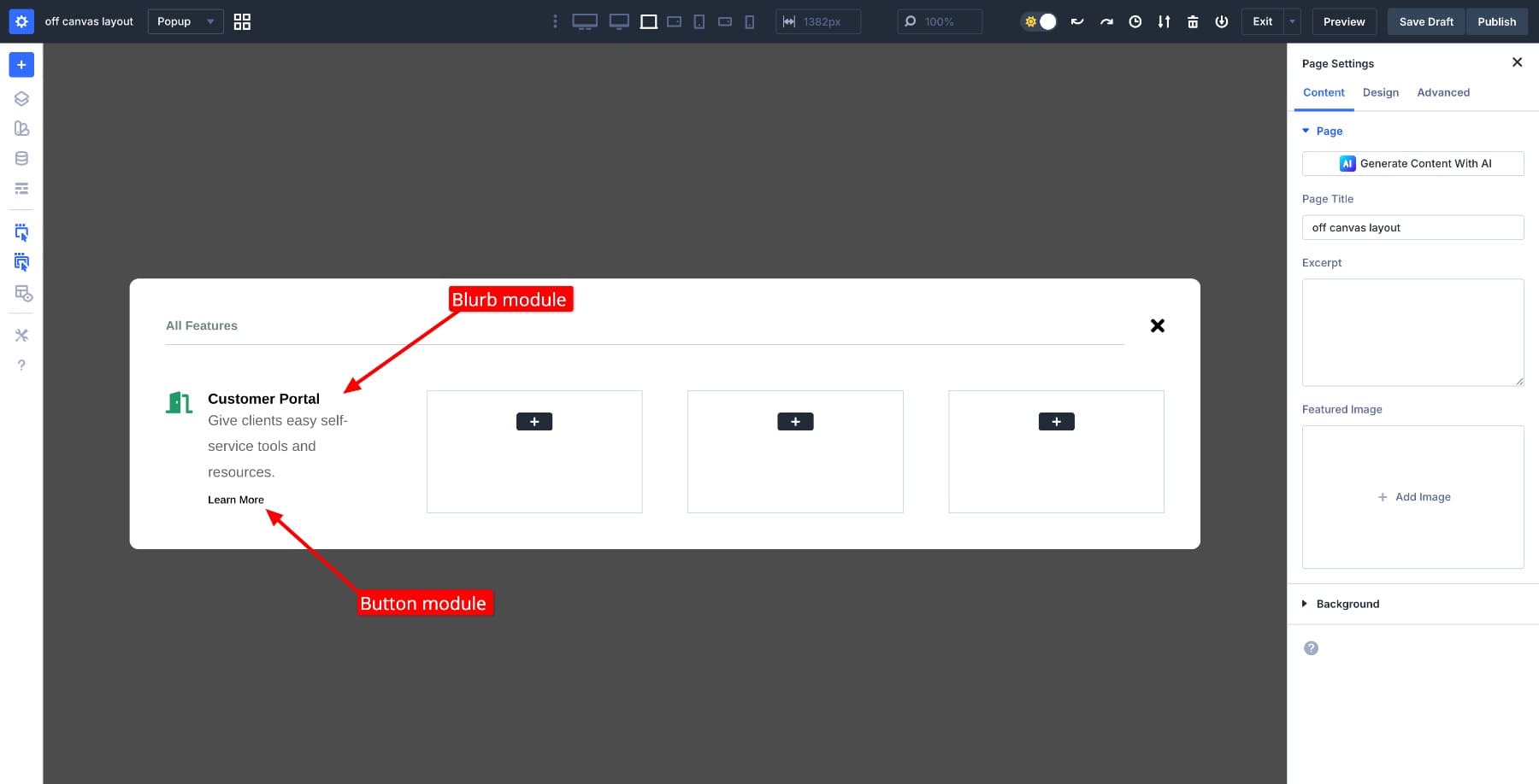
Add a Text module at the top for a heading like “All Features”, then place an Icon module next to it for the close button. This close button will trigger the interaction that hides the menu, so keep it visually distinct and accessible.
Below the header row, add a 4-column row to structure your service offerings. Divi 5’s Flexbox system handles the column layout, so the 4-column layout automatically turns into two and single-column layouts based on available space.
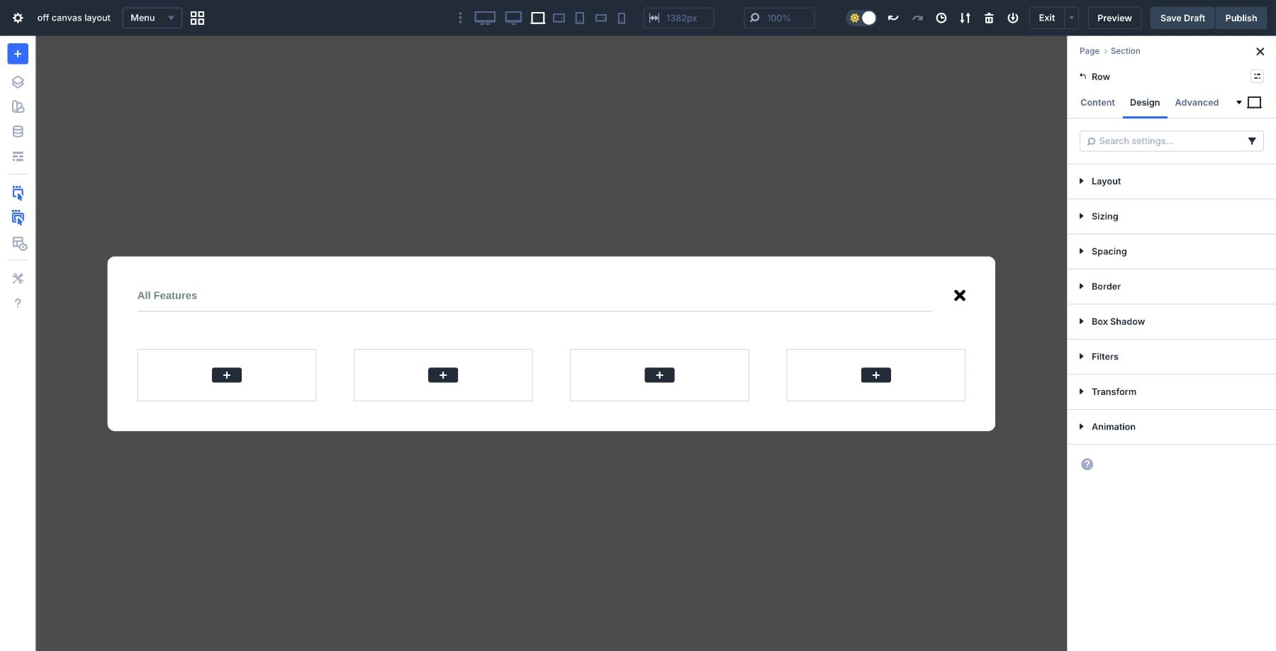
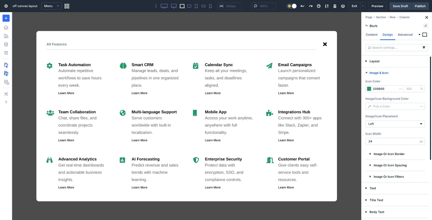
In each column, add a Blurb module with the service name as the title and a short description in the body text. Below each blurb, add a Button module labeled “Learn More.”
Repeat this pattern across the remaining menu items to complete the menu structure.
The menu needs to stay anchored on screen while visitors scroll the page beneath it. Without fixed positioning, the menu would scroll with the page content, breaking the overlay behavior.
Select the Section and set Position to Fixed. Then set the Z Index to 9999 so the menu appears above all other page elements, including sticky headers or other fixed elements.
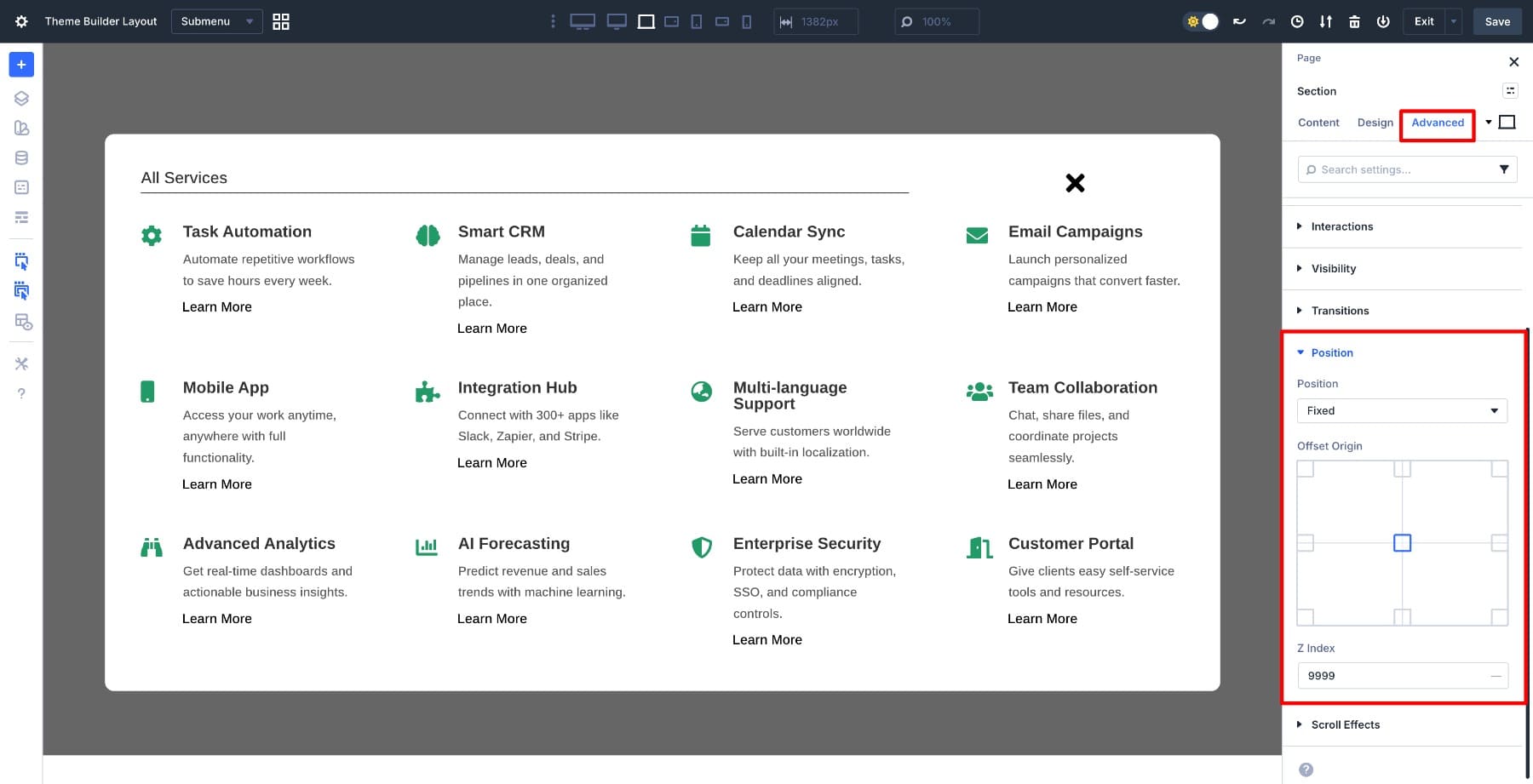
If your panel shifts while scrolling, apply the same positioning settings to the Row that holds the menu panel. This helps maintain the layered structure.

With the menu structure and positioning in place, we need to handle how it behaves on smaller screens. The header row needs adjustments to prevent stacking on mobile.
Switch to tablet view and select the header row. Go to Design > Layout, set Align Items to Center for consistent vertical alignment, and enable No Wrap to keep these elements side-by-side rather than stacking vertically.
This keeps the heading and close button in a single horizontal row across all screen sizes.
Now we need to address the overall height. On smaller screens, the entire menu panel can exceed the viewport height, pushing content off-screen. Select the Row that contains all the menu content (the white container with the heading row and menu items), and set the Max Height to 80%.
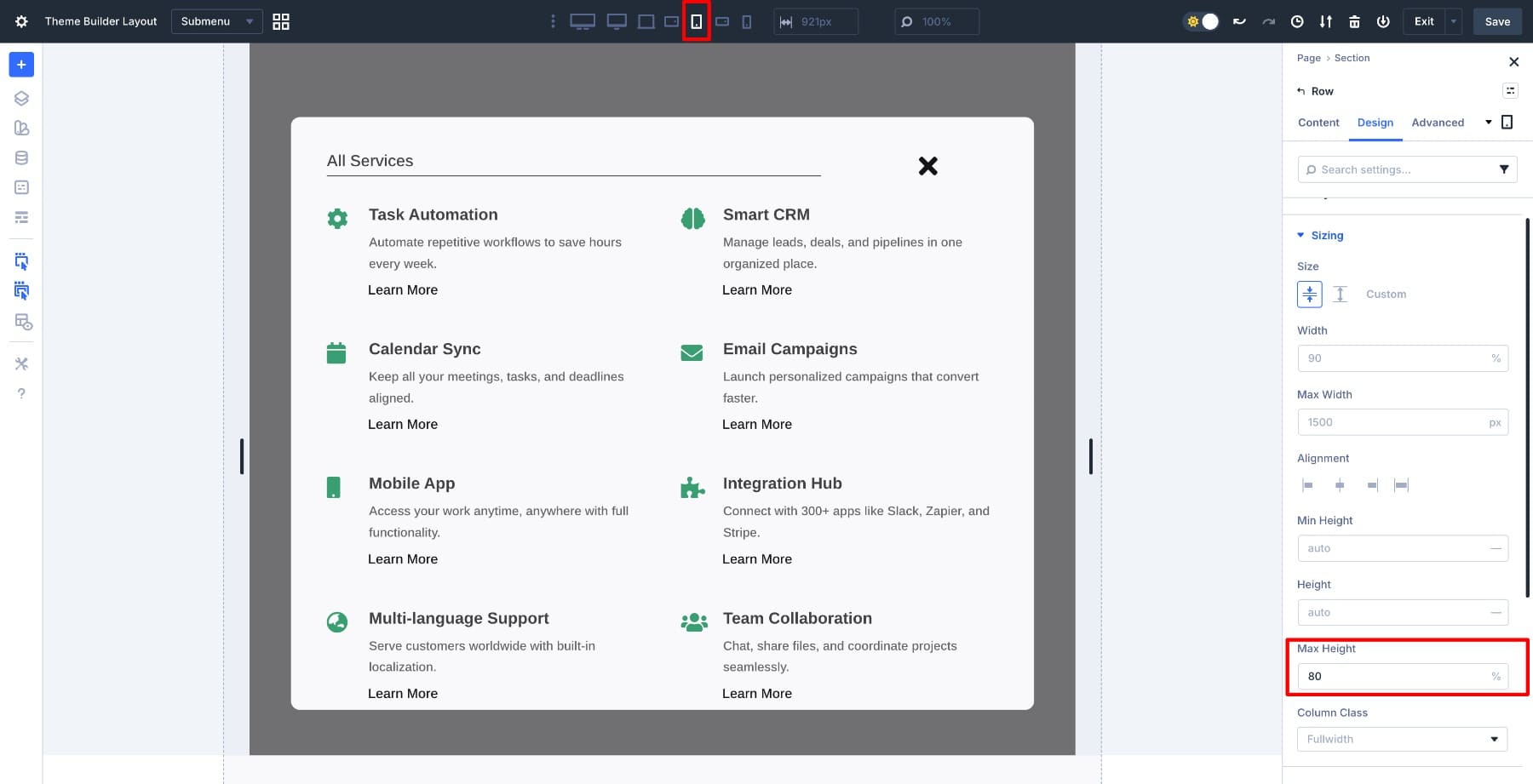
This constrains the menu to 80% of the viewport height, leaving breathing room at the top and bottom. Now go to Advanced > Visibility > Vertical Overflow and select Scroll.
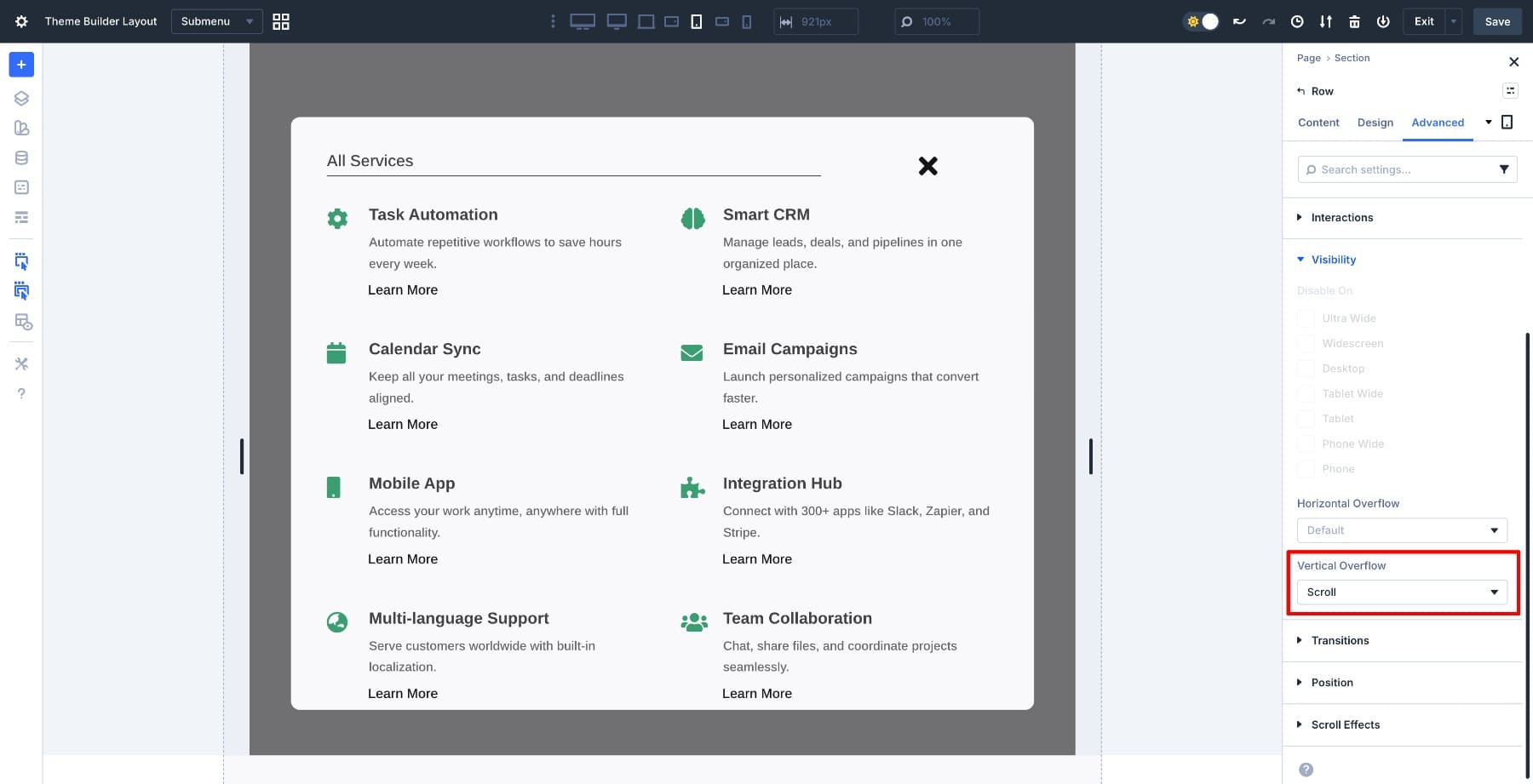
This creates an internal scroll container. Visitors can now scroll through the menu content without the panel itself extending beyond the screen boundaries.
Apply these same settings (Max Height 80% and Vertical Overflow Scroll) to mobile view to ensure the menu works consistently across all small screen sizes.
6. Hide The Canvas On All Breakpoints
The menu is built and optimized, but it’s currently visible in the builder. Since this is an off canvas menu that should only appear when triggered, we need to hide it by default across all breakpoints.
Open the Section settings, go to the Advanced tab, and find the Visibility options. Disable visibility on desktop, tablet, phone, and other breakpoints.
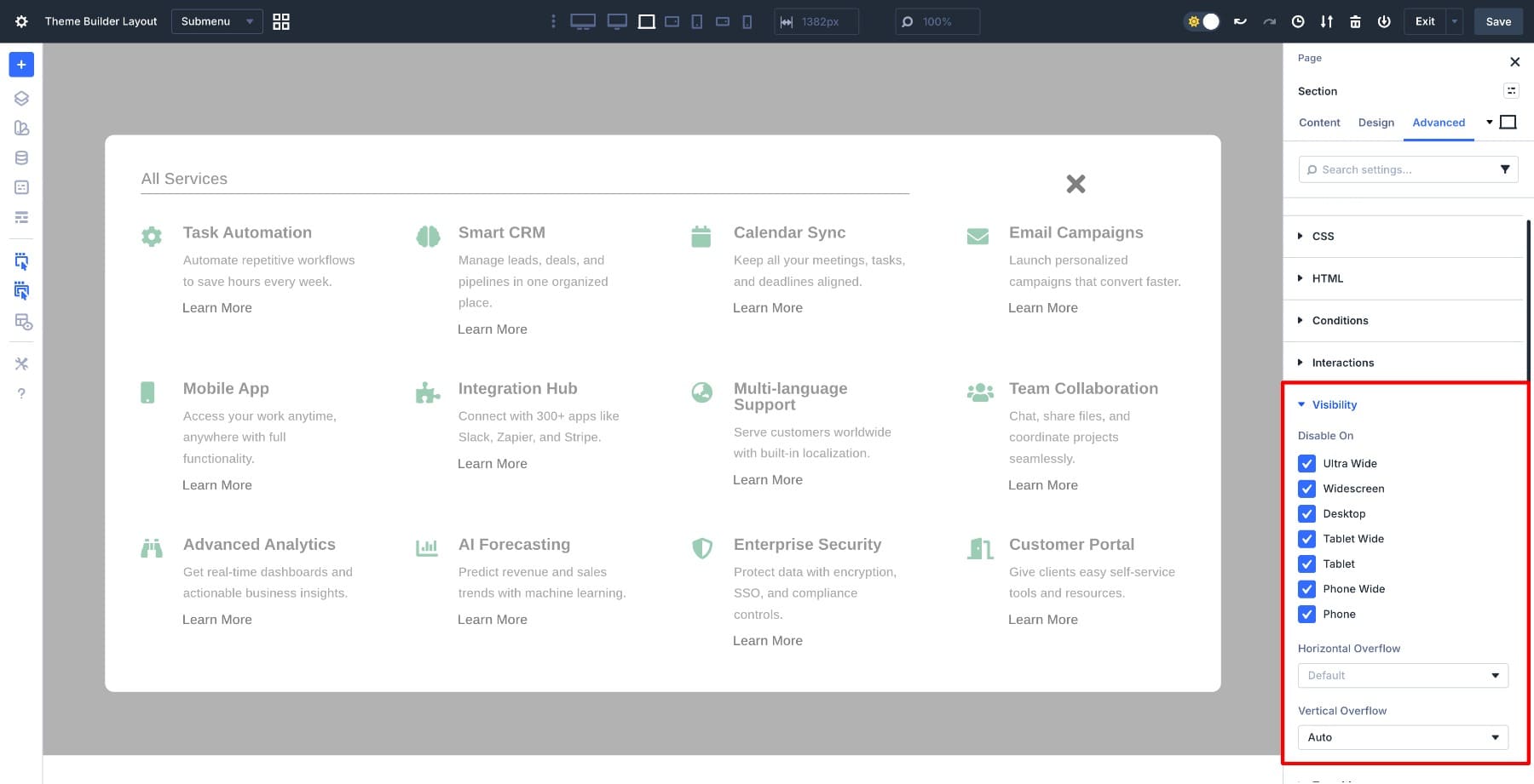
This hides the menu from view, but interactions can still target it and toggle its visibility. While you’re in the Section settings, also set Advanced > Visibility > Vertical Overflow to Auto so the section itself can handle overflow gracefully if needed.
Alternative Method: You can also hide the section using custom CSS. Go to Advanced > CSS > Module Elements and type display: none; in the Main Element field. This achieves the same result using CSS rather than visibility controls.
This keeps the menu hidden across all breakpoints. Even if interactions haven’t fired yet, the menu won’t appear. Think of this as your baseline state: hidden unless told otherwise.
With the menu built and hidden, we need to wire up the interactions that control its visibility. Divi’s Interactions system works through three components: a trigger (what initiates the action), an effect (what happens), and a target (what element is affected). We’ll set up two interactions, one to show the menu when the button is clicked and one to hide it when the close icon is clicked.
First, give the menu section a clear Admin Label so it’s easy to target in the interaction settings. Select the Section that holds your menu content, go to Settings > Content > Admin Label, and name it Submenu Section.
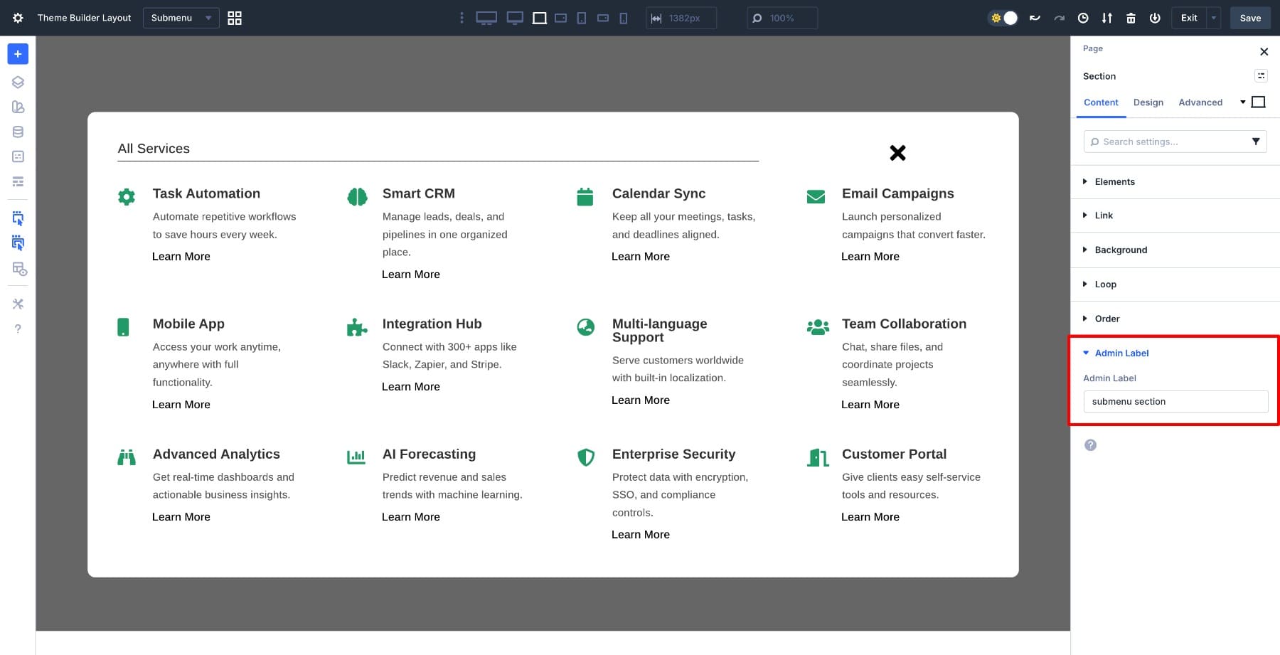
This label makes the section identifiable when you’re selecting targets across different canvases.
Now switch back to the Main Canvas using the dropdown at the top of the builder. This takes you to the page where your header lives.
Select the View Services button in your header. Go to Settings > Advanced > Interactions and click Add Interaction.
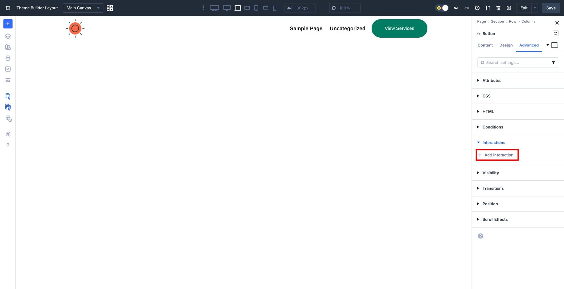
In the interaction editor, set the Trigger Event to Click. This tells Divi to initiate the interaction when someone clicks the button. For Effect Action, choose Show Element, which makes a hidden element visible. Then select Submenu Section as the Target Module.
This is where the Admin Label you set earlier becomes essential. Leave the Time Delay at 0ms for instant response, then click Save.
When the interaction runs on the front end, Divi loads the canvas content and toggles the section’s visibility. The menu appears as a fixed overlay without disrupting the page structure.
Before moving on, add one more interaction to control the menu’s default state.
Select the View Services Button again and add a new interaction. Set the Trigger Event to Load, choose Hide Element as the Effect Action, and keep Submenu Section as the Target Module.
This forces the menu into a hidden state on every page load. Even if the canvas was visible during preview or a previous interaction, it resets on refresh and never flashes on screen. The earlier visibility settings define the baseline, and this interaction controls the menu’s state at runtime so it always starts closed.
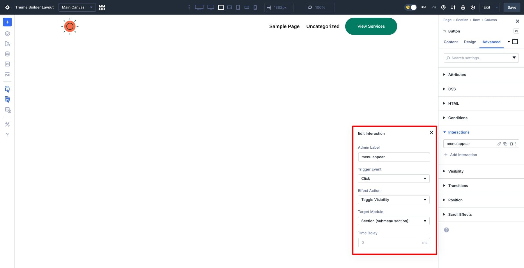
Now set up the close interaction. Switch back to the Submenu Canvas using the dropdown, and select the close icon next to the “All Features” heading.
Go to Settings > Advanced > Interactions and add another interaction. Set the Trigger Event to Click, choose Hide Element as the Effect Action, and select Submenu Section as the Target Module. Keep the Time Delay at 0ms, then save.
This interaction reverses the visibility toggle. When clicked, the menu disappears, and the canvas detaches from the page until triggered again.
The interactions are now live. The button shows the menu, the close icon hides it, and both work across your entire site because the canvas is global and the button lives in the Theme Builder header.
With the interactions configured, save both the Theme Builder header and the canvas. Now test the menu on the front end to confirm it behaves correctly across devices.
Open any page on your site and click the View Services button in the header. The menu should slide in as a fixed overlay that sits above the page content. Scroll the page while the menu is open to verify it stays anchored in place instead of moving with the page. This confirms that the fixed positioning is working and the menu functions as a true overlay, not as part of the page layout.
Switch to a mobile device or use your browser’s responsive view, then tap the View Services button again. The menu should stay contained within the viewport without extending beyond the screen boundaries. If the content is taller than the screen, you should be able to scroll through the menu items within the overlay while the overlay remains fixed.
Testing on both desktop and mobile validates that the canvas system, Flexbox settings, and interactions work together properly. The menu now functions as a professional navigation component that adapts to any screen size without breaking your page structure.
Download The Tutorial Template
If you want to use this tutorial’s header template, you can download it below!

Try Canvases In Divi 5 Today!
Canvases and Interactions in Divi 5 handle off canvas menus cleanly. The canvas keeps the menu separate from your page structure, fixed positioning makes it behave like an overlay, and Flexbox handles responsive behavior without custom CSS. Set it up once in a global canvas, trigger it from your Theme Builder header, and it works site-wide.
This same approach applies to product menus, feature showcases, or any navigation element that needs to slide in on demand. The mechanics stay the same: build in a canvas, set visibility rules, and wire up the interactions.


Congratulations, I loved the tutorial, I’m going to try it right now.
Very cool new feature and great tutorial, thank you! Any info on how this method holds up regarding accessibility? Do screen readers recognize this as a menu and can it be accessed via keyboard control instead of mouse/touch?
Thanks so much! Yes, this can be accessible, but full accessibility depends on the implementation details. For screen readers and keyboard users, the popup should use proper semantics, move focus into the panel when opened, support Tab/Shift+Tab and Esc, and return focus to the trigger when closed. The tutorial covers the visual setup well, though you’d still want to test those accessibility behaviors on the front end.
Off Canvas Services Popup In Divi 5 – Is this readable by the LLMs? I see it has to be triggered and my current understanding of LLMs is they will not read past triggered events.
Great question! Content won’t be reliably readable by LLMs/crawlers because the off-canvas content is injected only after a trigger event.
Since the markup and links are not present in the initial rendered HTML, many bots won’t execute that interaction path, so the content is often missed for indexing and AI retrieval.
Best practice is to keep important service copy/links in server-rendered HTML (or a crawlable on-page fallback), and use the off-canvas version purely for UX. Hope this helps!
Please advise me how to apply the downloaded Jason file.
before I dive into this i want to know if this works for mobiles too
and…congratiolations a;; of you for this big upgrade to divi 5! well done!
Thanks so much for the kind words! Yes, it works on mobile too. The setup includes mobile optimization with max-height and internal scrolling for smaller screens. 👍
I made my header stick to top. When I scroll down and click the menu, it doesn’t show on top of my page. Basically it only pops up at the top of the page not over the page content. I tried making the menu canvas stick to top too but that didn’t work right
It sounds like the menu/canvas may be opening behind the page content or inheriting the wrong sticky/z-index behavior after scroll.
Please reach out to our support team via the website chat with your site URL and a short screen recording if possible. We’d be happy to take a closer look and help troubleshoot. 👍